#cssgrid
Explore tagged Tumblr posts
Visit Tumblr Blog
Explore Tumblr blogs with no restrictions, modern design and the best experience.
Last Seen Tumblr Blogs


Fun Fact
Mobile Tumblr US users spend an average of 4.04 minutes per session on the app.
Text
CSS Tutorial for Web Developers: Modern Layouts and Responsive Design
Master modern layouts, flexbox, grid, and responsive design in this hands-on CSS tutorial—perfect for web devs and beginners alike!
0 notes
Text
🌟 Webflow Tip of the Day 🌟 🎯 Use Grid for Precise Layouts
Tired of struggling with complex multi-column designs or uneven spacing? Webflow’s CSS Grid gives you pixel-level precision and total control when building structured layouts.
💡 Why use CSS Grid in Webflow?
Visually define rows and columns without writing code
Great for magazine-style layouts, portfolios, product cards, or dashboards
Easily align nested elements exactly where you want them
Adapt designs across breakpoints with full responsiveness
🔧 Quick How-To:
Drag a div block onto the canvas
Set its display to Grid
Customize your row & column structure
Place content inside and position it within grid areas
Adjust gaps, alignment, and responsiveness with ease
✅ Pro Tip: Use Grid Template Areas in Webflow’s advanced settings for even more layout flexibility—great for asymmetrical designs!
🧩 Example Use Case: Creating a portfolio section with a 3-column grid:
Column 1: Project image
Column 2: Project title and short description
Column 3: Technologies used and a “View Project” button With Grid, this layout is easy to manage and fully responsive—no extra classes or complex positioning needed!
💼 Want expert Webflow layouts built the right way? 🌐 Portfolio: www.webflowwork.com 🎯 Upwork: https://bit.ly/4iu6AKd 🎯 Fiverr: https://bit.ly/3EzQxNd
#webflow#freelancewebdeveloper#web design#web development#webflowdesign#webflowexperts#webflowlandingpage#website#nocode#ui ux design#webflowTips#cssgrid#nocodedesign
0 notes
Text
CSS (Cascading Style Sheets) is a styling language used to control the appearance of HTML elements. It allows developers to separate content from design, making web pages more visually appealing and easier to maintain.
#CSS#WebDevelopment#FrontendDevelopment#WebDesign#CSS3#TechEducation#CSSForBeginners#TechBooks#CSSStyling#CSSGrid#CSSFlexbox#ResponsiveDesign#WebAppDevelopment#CSSAnimation#CSSLayout#TechLearning#UIUXDesign#WebDesignTips#CSSBestPractices#TechTutorial#FrontendWebDesign#CSSDesign#WebDesignSkills#CSSVariables#MobileFirstDesign#CSSFramework#HTMLCSS
0 notes
Text
Introducción a CSS: Estilizando la Web
Introducción
CSS (Cascading Style Sheets) es el lenguaje que se utiliza para describir la presentación de un documento escrito en HTML o XML. Mientras que HTML estructura el contenido de la web, CSS se encarga de darle estilo, desde la disposición de los elementos hasta los colores y las fuentes. Si estás empezando en el mundo del desarrollo web, aprender CSS es esencial para crear sitios atractivos y funcionales. En este blog, te proporcionaré una introducción a CSS, cubriendo sus conceptos básicos y algunas prácticas recomendadas para que puedas comenzar a diseñar páginas web impresionantes.
1. ¿Qué es CSS?
CSS es un lenguaje de hojas de estilo que permite definir cómo se muestran los elementos de un documento HTML en la pantalla, en papel o en otros medios. Gracias a CSS, puedes separar la estructura de un sitio web de su presentación, lo que facilita el mantenimiento y la escalabilidad del diseño.
a) Características Principales de CSS:
Selección de Elementos: CSS te permite seleccionar y aplicar estilos a elementos HTML específicos o a grupos de elementos.
Diseño Responsivo: CSS facilita la creación de diseños que se adaptan a diferentes tamaños de pantalla, desde dispositivos móviles hasta monitores de escritorio.
Control de Estilos Visuales: Con CSS, puedes controlar el color, el tamaño, la fuente, el espacio entre elementos, y mucho más.
2. Cómo Empezar con CSS
Para comenzar a usar CSS, puedes incluir las reglas de estilo directamente en un archivo HTML o en un archivo CSS separado. A continuación te muestro cómo hacerlo:
a) CSS en Línea:
Puedes aplicar estilos directamente en los elementos HTML utilizando el atributo style.

b) CSS Interno:
Puedes definir un bloque de CSS dentro de la etiqueta <style> en el <head> de tu documento HTML.

c) CSS Externo:
La mejor práctica es usar un archivo CSS separado para mantener el estilo y el contenido por separado.

Contenido de styles.css:

3. Conceptos Básicos de CSS
CSS se basa en reglas que constan de selectores y declaraciones. A continuación te explico los conceptos más importantes:
a) Selectores:
Los selectores indican qué elementos HTML deben ser estilizados.
Selector de Elemento:

Selector de Clase:

Selector de ID:

b) Propiedades y Valores:
Las propiedades son aspectos específicos del estilo que se aplican a los elementos, como color, fuente, y margen.
Propiedad color: Cambia el color del texto.

Propiedad font-size: Cambia el tamaño de la fuente.

Propiedad margin: Define el espacio exterior alrededor de un elemento.

c) Especificidad y Herencia:
La especificidad determina qué reglas CSS se aplican cuando hay conflictos, y la herencia permite que ciertos estilos se transmitan a los elementos hijos.
Especificidad:

Herencia:

4. Diseño de Páginas Web con CSS
CSS permite controlar el diseño y la disposición de los elementos en una página web, facilitando la creación de sitios visualmente atractivos y organizados.
a) Modelos de Caja (Box Model):
Cada elemento en CSS se representa como una caja que comprende márgenes, bordes, rellenos y el contenido.

b) Layouts (Diseños):
CSS proporciona varias técnicas para organizar elementos en una página, incluyendo Flexbox y Grid.
Flexbox:

Grid Layout:

c) Media Queries y Diseño Responsivo:
Las media queries permiten que los diseños se adapten a diferentes tamaños de pantalla, lo que es fundamental para crear sitios web responsivos.

5. Recursos para Aprender Más CSS
Documentación Oficial:
MDN Web Docs: Una guía completa que cubre todo lo que necesitas saber sobre CSS.
Tutoriales en Línea:
CSS-Tricks: Un sitio repleto de tutoriales, ejemplos y trucos para mejorar tu uso de CSS.
W3Schools: Un recurso fácil de seguir para aprender los fundamentos de CSS con ejemplos prácticos.
Libros Recomendados:
“CSS: The Definitive Guide” de Eric A. Meyer: Un recurso profundo para desarrolladores que quieren dominar CSS.
“CSS Secrets” de Lea Verou: Este libro revela técnicas avanzadas para crear efectos y diseños sorprendentes con CSS.
Conclusión
CSS es una herramienta poderosa para cualquier desarrollador web. Desde controlar la apariencia básica de los elementos hasta diseñar sitios complejos y responsivos, el dominio de CSS te permitirá crear experiencias web atractivas y profesionales. Comienza practicando con los conceptos básicos, y poco a poco, profundiza en las técnicas más avanzadas para llevar tus diseños al siguiente nivel.
#CSS#diseñoweb#desarrolloweb#estiloweb#frontenddevelopment#aprendeCSS#webdesign#cssbasics#webdevelopment#responsiveweb#flexbox#gridlayout#webstyling#tutorialesCSS#cssdesign#cssgrid#htmlandcss#webdev#cssforbeginners#diseñoresponsivo#coding#webcoding#frontend#webcss#estilosweb
0 notes
Text
Create Beautiful Card Placeholders with CSS!
🔲 Elevate your website's design with stylish card placeholders! Learn how to craft stunning placeholders for images, titles, and text using CSS. Watch our short tutorial to discover the power of CSS grid and animations in creating visually appealing placeholders.
1 note
·
View note
Text
𝐂𝐒𝐒 𝐭𝐚𝐛𝐥𝐞 𝐥𝐚𝐲𝐨𝐮𝐭𝐬 𝐝𝐞𝐦𝐲𝐬𝐭𝐢𝐟𝐢𝐞𝐝! 𝐔𝐧𝐜𝐨𝐯𝐞𝐫 𝐭𝐡𝐞 𝐬𝐞𝐜𝐫𝐞𝐭𝐬 𝐨𝐟 𝐜𝐫𝐞𝐚𝐭𝐢𝐧𝐠 𝐟𝐥𝐞𝐱𝐢𝐛𝐥𝐞, 𝐛𝐞𝐚𝐮𝐭𝐢𝐟𝐮𝐥 𝐭𝐚𝐛𝐥𝐞𝐬 𝐟𝐨𝐫 𝐲𝐨𝐮𝐫 𝐰𝐞𝐛 𝐩𝐫𝐨𝐣𝐞𝐜𝐭𝐬.
Official website, link below ⤵️ 🌐 www.skillboatlearning.com
Business phone number : Call 📞+91 7717427009
#skillboatlearning#CSSTableLayout#WebDesignCSS#TableStyling#CSSGrid#ResponsiveTables#WebLayoutDesign#FrontEndDevelopment#CSSMagic#TableDesigns#LayoutMastery
0 notes
Text
Preventing Product Image Height Shrinkage: Latest Solutions

Introduction
When designing product pages, a common challenge arises when the underlying text starts wrapping, causing the product image's height to shrink. This can result in a less aesthetically pleasing layout and potentially compromise the visual impact of your product presentation. In this guide, we'll explore effective solutions to address this issue, ensuring that your product images maintain a consistent and appealing height even as the accompanying text wraps. The goal is to find solutions that not only prevent image height shrinkage but also contribute to an overall visually pleasing and responsive design. By implementing the latest techniques in web development, you can strike a balance between text wrapping and image presentation, creating a seamless and engaging user experience for visitors to your product pages.
CSS Flexbox Solution
CSS Flexbox is a powerful layout model that provides a flexible and efficient way to handle the arrangement of elements in a container. In the context of preventing product image height shrinkage, CSS Flexbox offers a solution by allowing the container to adjust its items' size dynamically. This means that even if the text within the container wraps, the Flexbox layout can maintain the height of the product image. Let's delve into a practical example of using CSS Flexbox for a product card layout: CSS/* CSS Styles for Product Card with Flexbox */ .product-card { display: flex; flex-direction: column; } .product-image { flex: 1; /* Additional styling for the image */ } .product-description { /* Additional styling for the text */ } In this example, the product card container is set to a flex container using display: flex;, and the items (product image and description) are stacked in a column direction with flex-direction: column;. The key part is the flex: 1; property applied to the product image, indicating that it should take up all available space within the flex container. This ensures that the image maintains its height even as the text within the description wraps. HTML Read the full article
0 notes
Text
no longer ripping my hair out over spacehey layout . For Now
#we are tentatively back#i found someone who provided a cssgrid template with all the spacehey stuff (which was what i never knew How to use)#and i Know cssgrid . so its become much easier :)#cupid.txt
3 notes
·
View notes
Text
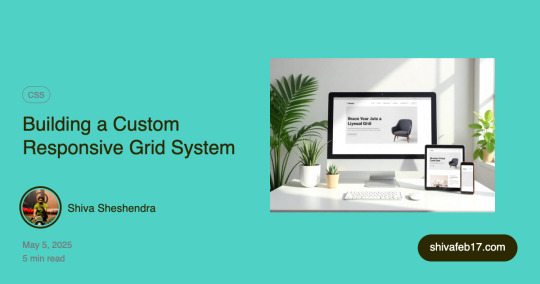
🚀 Build Your Own Bootstrap-like Grid System – Lightweight & Responsive!
Tired of using full frameworks just for layout? I created a custom CSS grid system that mimics Bootstrap’s responsiveness with just the essentials. No bloat. Full control. ✅
👨💻 Flexbox-powered
📱 Mobile-first design
💡 Easy to scale across breakpoints
Check out the blog to see how it works (with full CSS code at the end)!
👇
🔗 https://www.codenbrand.com/blog/building-a-custom-responsive-grid-system-bootstrap-like-and-why/
🤝 Want to collaborate or have questions?
#WebDevelopment #FrontendDevelopment #ResponsiveDesign #CSSGrid #Flexbox #BootstrapAlternative #FreelanceWebDev #HTMLCSS #WebsiteDesign #WebDesignTips #DevCommunity #TechBlog #FreelancerLife #CleanCode #MinimalCSS #UIUXDesign
#web design#freelance#web developers#web developing company#web development#freelancing#php programming#phpdevelopment#php#wordpress
0 notes
Video
youtube
🇺🇦 Грід для новачків. CSS GRID - як користуватися? Complete beginners grid tutorial. Частина 1 ч1 - https://www.youtube.com/watch?v=RUu14DvGUJ4 ч2 - https://www.youtube.com/watch?v=BJHOlgDM0ek ч3 - https://youtu.be/m71efWeX5sQ ч4(зе ласт) - https://youtu.be/kP_CvF5lu3o Зроби цей світ краще 👇 👇 👇 🇺🇦 Фонд Притули - https://prytulafoundation.org/ 🇺🇦 Стерненко - https://www.youtube.com/@STERNENKO 👻 На розвиток каналу Frontend Shinobi БАНКА - https://send.monobank.ua/jar/5tEodxQoEu Крипта - USDT 0x284eF2F4db8B27905d68bBBECBC95a119259A395 Ще про GRID Сабгріди - https://www.youtube.com/watch?v=eBqrDg5KJJA Full-width банер - https://www.youtube.com/watch?v=Tj7B7lXVyrs Grid stack - https://www.youtube.com/watch?v=o2-CVtk17To Посиланнячка https://bitbucket.org/fairproject/frontend-shinobi-yt/src/main/45-grid-tutorial/ https://css-tricks.com/snippets/css/complete-guide-grid/ Опис відео роліка: Простий туторіал як користуватися основними фішками CSS Grid - частина 1 Поговоримо про те як створити GRID і як керувати розміром і кількістю колонок та рядків #CSSgrid #grid #CssGridTutorial #alignContent #css #html #js #курсиCSS #урокиCSS
0 notes
Photo

Hello Developers , here we put small difference between , inline - block , inline block... 🔥 Follow👉🏻@rehman_coding🔥 🔥 Follow👉🏻@rehman_coding🔥 🔥 Follow👉🏻@rehman_coding🔥 . . . .. ⭕LIKE | SAVE | SHARE | COMMENT . . . . ⭕Visit my profile to learn more❤️ . 🔔Turn on Post notifications! . . ❤️Keep learning, Keep coding! 🤩 ⏩ you will understand easily this CSS diffrence.. ⏩ If you're working or learning on Html css javascript python Java then you should follow our page ⏩ Because here we are put many kind of tips and tricks about Html , css , javascript, python, java etc etc language.. ⏩ Here you will get all type of programming related knowledge that will help you to grow your journey.. ⏩ Just check once our profile, and don't forget to follow ☺️☺️ ⏩ I Hope. You will like this post , so don't forget to share with your programming buddy ,and stay here for more programming knowledge ⏩ Collaboration with 🔥 Follow👉🏻@rehman_coding🔥 🔥 Follow👉🏻@rehman_coding🔥 🔥 Follow👉🏻@rehman_coding🔥 . . . .. ⭕LIKE | SAVE | SHARE | COMMENT . . . . ⭕Visit my profile to learn more❤️ . 🔔Turn on Post notifications! . . ❤️Keep learning, Keep coding! 🤩 _________________________________ _________________________________ ।। Like ।। ♥️ ।। ।। Comment ।। 📜 ।। ।। Share ।। 💫 ।। _________________________________ _____ Hashtag : #htmlcoding #html_css #html5 #htmlacademy #htmlindonesia #htmlandcss #htmlcssjs #htmltags #htmltutorial #cssakuhinpost #css #cssgrid #cssinformation #csscoding #webdesign #webapp #websitedevelopment #webdevelopment #webdesigns #web3 #webtips #webdeveloping #websitemaker #developpement#html #javascript https://www.instagram.com/p/CfyEfqXt4oL/?igshid=NGJjMDIxMWI=
#htmlcoding#html_css#html5#htmlacademy#htmlindonesia#htmlandcss#htmlcssjs#htmltags#htmltutorial#cssakuhinpost#css#cssgrid#cssinformation#csscoding#webdesign#webapp#websitedevelopment#webdevelopment#webdesigns#web3#webtips#webdeveloping#websitemaker#developpement#html#javascript
3 notes
·
View notes
Photo

😎😆😆 Follow @frontendforever for further updates #htmlandcss #htmlmeme #htmlcoding #htmltheme #htmlcode #htmlifestyle #htmlmemes #htmlskills #htmlcanvas #htmlcodes #htmlcssjs #htmlprogrammer #htmltricks #htmlcss #html #htmlforbeginners #cssmeme #css #cssgrid #css2021 #csstudents #cssmemes #cssanimation #csstutorial #css3 #csstricks #htmlcss #webdevelopermeme #webdevelop #webdesignmemes #webdesignerlife https://www.instagram.com/p/CThUmRHpRbc/?utm_medium=tumblr
#htmlandcss#htmlmeme#htmlcoding#htmltheme#htmlcode#htmlifestyle#htmlmemes#htmlskills#htmlcanvas#htmlcodes#htmlcssjs#htmlprogrammer#htmltricks#htmlcss#html#htmlforbeginners#cssmeme#css#cssgrid#css2021#csstudents#cssmemes#cssanimation#csstutorial#css3#csstricks#webdevelopermeme#webdevelop#webdesignmemes#webdesignerlife
3 notes
·
View notes
Video
instagram
Most Popular CSS Framework. #css #cssgrid #framework #uiuxdesigner #responsivewebsite #responsivewebsitedesign #developers #programmerlife #programmer #bootstrap #bootstrap4 #bootstrap5 #bulma #materialize #semantics #foundation #webdesign #webdesigner #frontenddeveloper #frontenddevelopment #htmlcss #javascripts #develeper #coder #girlwhocode #codingislife #codingisfun #ui #ux #free_courses_online1 https://www.instagram.com/p/CQscGDnlxp6/?utm_medium=tumblr
#css#cssgrid#framework#uiuxdesigner#responsivewebsite#responsivewebsitedesign#developers#programmerlife#programmer#bootstrap#bootstrap4#bootstrap5#bulma#materialize#semantics#foundation#webdesign#webdesigner#frontenddeveloper#frontenddevelopment#htmlcss#javascripts#develeper#coder#girlwhocode#codingislife#codingisfun#ui#ux#free_courses_online1
1 note
·
View note
Photo
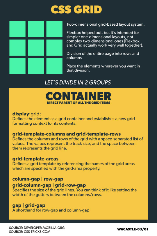
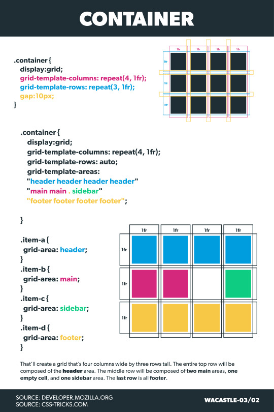

CSS Grid simplifies the layout of web pages.
CSS Grids: Two-dimensional layout system Easy to layout elements within the page. Flexbox or Grid? Flexbox works in one dimension while a Grid with two dimensions but both complement each other.
Grid Steps 1 - Define the container settings 2 - Set up columns and rows 3 - Define the location of the elements within the grid
1 note
·
View note
Photo

Hello Programmers ! 🔶🔶🔶 Credit : @code__buddy__ Follow them for such beautiful Posts. 🔶🔶🔶 Follow @html_pro93 Follow @html_pro93 Follow @html_pro93 #htmltemplate #htmlcssjs #coding #cssanimation #codingbootcamp #cssgrid #softwaredeveloper #googlecode #codewell #cssbattle #programmingcontest #programminglife #programminglanguage #javascript #javascriptdeveloper #javascripts #frontenddeveloper #frontenddev #frontenddevelopment #frontendchallenge #frontendfridays #frontendloader #frontendwebdeveloper Removal of the post can be requested by the Copyright Holder of the property through DM or message. ©️ No Copyright infringement intended. (at Banglore) https://www.instagram.com/p/ClAlePMjRgm/?igshid=NGJjMDIxMWI=
#htmltemplate#htmlcssjs#coding#cssanimation#codingbootcamp#cssgrid#softwaredeveloper#googlecode#codewell#cssbattle#programmingcontest#programminglife#programminglanguage#javascript#javascriptdeveloper#javascripts#frontenddeveloper#frontenddev#frontenddevelopment#frontendchallenge#frontendfridays#frontendloader#frontendwebdeveloper
0 notes
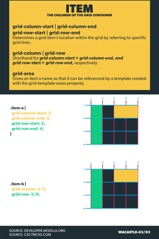
Text
CSS Grid Box
CSS Grid is a two-dimensional layout system, with lines and columns, more straightforward and much easier to use. It allows us to control the size and position of the interface components and their contents. Like flexbox, to use this element, we have to use the display property with the value Grid so that all children from the Grid container will become grid items. We have also to use the property to set up the number of columns and rows on the Grid box, using the property grid-template-columns or grid-template-rows. So, after that, we can move columns and rows to give the desired position of the elements inside the Grid box.

Some examples of Grid Properties
- grid-column-start -
- grid-column-end
- grid-row-start
- grid-row-end
- grid-column-gap
- grid-template-areas
0 notes