#designhistory
Explore tagged Tumblr posts
Visit Tumblr Blog
Explore Tumblr blogs with no restrictions, modern design and the best experience.
Last Seen Tumblr Blogs


Fun Fact
Tumblr was named as a finalist in Lead411’s New York City Hot 125 in Aug 2010.
Text


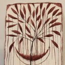
Briefmarke / Postage Stamp / Známka
Československo Mezinárodní rok míru 1986 Ausgabetag: 02.01.1986 Design: Karel Svolinský / Václav Fajt
#Tschechoslowakei#Československo#1980er#1986#Karel Svolinský#Václav Fajt#Philatelie#Philately#Pigeonometry#PigeonsOnStamps#StampDesign#Friedenstaube#Design#Designgeschichte#DesignHistory#Tauben
13 notes
·
View notes
Text
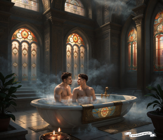
The Significance of Art Nouveau for Private Bath Culture
The fascination with bath culture in the Art Nouveau period and the resulting artistic design of bathrooms reflect the spirit of an era that placed high value on beauty and art in daily life. By merging functionality with aesthetic enjoyment in private bathrooms, Art Nouveau demonstrated its innovative power and its desire to blur the boundaries between different areas of life. Thus, bathrooms of this time were not just places of cleansing but also spaces where residents could experience relaxation, inspiration, and a deep connection to nature and artistic creation.
In the Art Nouveau era, the bathroom was reinvented as a place that nurtures both body and spirit and is seen as an integral part of an artistically designed home. These spaces stand as testimonies to a time when the art of living and the joy of daily routine were seen in a new light, reminding us how design and aesthetics can enrich the human experience.
Text supported by Chat GPT-4 Base Image generated with SD-1.5, overworked with SD-1.5, SDXL, inpainting and composing.
#ArtNouveau#BathCulture#DesignHistory#HistoricHomes#InteriorDesignInspiration#ArtNouveauDesign#gayart#queer#jugendstil#bathhub#manlovesman#boylovesboy#lgbt
22 notes
·
View notes
Text
Pioneers of Color: From Newton’s Prism to Munsell’s Master Plan
These are the pioneers who didn’t just marvel at rainbows—they dissected them, charted them, and gave us the tools to describe every shade of blush, rust, or regrettable avocado fridge. Let’s raise our color wheels and take a quick, vibrant stroll through the minds who gave color its soul, structure, and swagger.

Isaac Newton: The Prism Pioneer
We know Newton for his run-in with gravity, but the man also gave color theory its first major plot twist. In 1666, he aimed a beam of light through a prism and discovered that white light was actually a sneaky blend of colors. Voilà: the spectrum. He then arranged those hues in a circle, creating the first color wheel. Because nothing says “science” like a good pie chart.
But Newton didn’t stop at optics. He linked each color to a musical note, turning the whole thing into a 17th-century rave. It was pure Enlightenment-era maximalism. And the birth of modern color theory.
Johann Wolfgang von Goethe: The Emotional Alchemist
Fast forward to 1810, when Goethe (yes, the playwright) decided Newton’s light show was a little too... rational. In Theory of Colours, he argued that color wasn’t just physics. It was feeling. Yellow, he said, was the color of joy. Blue evoked melancholy. Red? Let’s just say it depends on your mood and maybe who you're texting.
Goethe’s take was more poetic than precise, but his influence on artists, designers, and even advertisers has never dimmed. He gave us permission to feel our colors. And boy, did we.
Josef Albers: The Perception Trickster
Jump to the mid-20th century, where Bauhaus veteran Josef Albers was blowing minds with nothing more than colored squares. His 1963 book, Interaction of Color, is a classic exercise in visual mischief. Albers showed that color isn’t fixed. It shifts, bends, and changes depending on what’s around it.
He turned perception into a playground and trained generations of artists to see beyond the obvious. If Newton was the scientist and Goethe the poet, Albers was the magician.
Albert H. Munsell: The Scientific Strategist
And then there was Albert Munsell, the guy who finally said: “Enough with the vibes. Let’s measure this thing.” His Atlas of the Munsell Color System (1915) was revolutionary. Where others had feelings or wheels, Munsell had a three-dimensional model: hue (the type of color), value (lightness), and chroma (intensity).
This was no abstract theory. It was practical, portable, and precise—a standardized system that allowed artists, designers, and scientists to describe color with uncanny specificity. Munsell gave us a way to settle arguments about "harvest green" once and for all. (It’s more yellow than you think.)
The atlas itself is a marvel: a tactile grid of painted color chips arranged like a sculptural rainbow. It bridged the gap between beauty and science, and its impact rippled across industries. From agriculture to advertising to interior design.
Today, Munsell’s system is still taught in design schools and quietly underpins everything from Pantone books to Photoshop sliders. Our curated reprints of his original plates honor the man who made color communication as precise as poetry.
Why It Still Matters
Color isn’t just decoration. It’s emotion, identity, instruction. It tells us where to stop, who we root for, and what kind of cereal box screams “buy me.” And none of that would be possible without Newton, Goethe, Albers, and Munsell. The original color commentators.
So the next time you fuss over just the right shade of seafoam, remember: behind that swatch is a 300-year history of obsession, innovation, and beautiful debate. We’re just here to keep the spectrum alive. And maybe sneak a few of Munsell’s classics onto your wall while we’re at it.
Add a splash of history to your space
Our hand-picked prints from the Atlas of the Munsell Color System are now available in the shop. Archival reproductions of a color system that changed the world? Now that’s a conversation starter.
See the Collection →
#ColorTheory#DesignHistory#VintageDesign#Munsell#IsaacNewton#Goethe#JosefAlbers#Bauhaus#Typography#ColorPalette#Prism#ScientificIllustration#ArtHistory#GraphicDesign#PosterArt#MidcenturyDesign#MuseumCore#RainbowCore#ArchiveFever#CarthayStudio
3 notes
·
View notes
Text


typeface Bau
Continuing the work on my typeface — bau, a modular grid-based alphabet inspired by the structural clarity of the Bauhaus. Each letter is constructed within a strict square system — limiting expression to geometry, yet revealing rhythm through form.
This is not a decorative font. It’s a study in structure, in constraint, in balance. Where every shape follows a logic, but keeps its own identity.
Built on the principle: less, but better.
instagram: hlianiesonca
#typeface#typedesign#modulartype#gridbaseddesign#bauhausinspired#geometrictype#experimentaltype#customtype#monospacetype#minimaltype#alphabetdesign#brutalisttype#typelab#typographyart#formfollowsfunction#lessbutbetter#bauhausdesign#typographydaily#typographyinspiration#designresearch#graphicexperiment#typedesigncommunity#experimentaltypography#designhistory#bauhauslegacy#modulartypography#gridtypography#systemaesthetic#bauhaus#graphic design
2 notes
·
View notes
Text

French Art Nouveau snake serpent urn by Jean Dunand (around 1900)
#reddit#designhistory#ready+gi#french#art nouveau#snake#serpent#urn#vase#jean dunand#around 1900#cobra#art#artist
5 notes
·
View notes
Photo

The Manila City Hall and its iconic clock tower, designed by Antonio Toledo and completed in 1939, are symbols of our city's resilience. These structures have withstood the test of time and the ravages of World War II. I was reminded of the strength and endurance embedded in our architectural heritage. What's the best way to incorporate resilience into our designs today?
#historicalarchitecture#manila#resilience#antoniotoledo#worldwar2#architecturalheritage#cityhistory#urbanhistory#architecturaldesign#architecturelovers#architecturephotography#designinspiration#cityhall#clocktower#neoclassicalarchitecture#architects#designhistory#architectureandpeople#architecture_view#architecture_best#architectureilike
2 notes
·
View notes
Text
How can I find budget-friendly furniture without compromising on quality or style?
Certainly! Here are some budget-friendly furniture shopping tips: Set a Budget: Determine how much you’re willing to spend on furniture and stick to it. This will help you prioritize your purchases and avoid overspending. Shop Sales and Discounts: Keep an eye out for sales, promotions, and clearance events at furniture stores. You can often find great deals on quality furniture during these…

View On WordPress
#acacia furniture#bespoke furniture#Cafe#cafe design#cafe furniture#cafedecor#cafes#chair#chairs#choice of design#classic furniture#compact furniture#contemporary furniture#custom furniture#customdesign#customised furniture theme#design patio#design trends#design trends 2019#design your space#designdetails#designhistory#designtrends#durable furniture#furniture#interior design#interiors#kernig krafts#solid wood furniture#Themed cafe
3 notes
·
View notes
Text

The Revolutionary Bauhaus Movement: Where Form Meets Function
Born from the chaos of post-WWI Germany in 1919, the Bauhaus school revolutionized how we think about design forever. Under Walter Gropius's visionary leadership, this groundbreaking movement merged art with industrial production, creating a design philosophy that continues to influence everything from your iPhone to your IKEA furniture.
The iconic Bauhaus color theory centers around primary colors (red, yellow, blue) balanced with neutrals (black, white, gray). Each color was deliberately paired with specific geometric shapes—squares with red, circles with blue, and triangles with yellow—creating a visual language that feels just as fresh today as it did 100 years ago.
From Marcel Breuer's tubular steel chairs to Marianne Brandt's geometric tea sets, Bauhaus designers stripped away unnecessary ornamentation to celebrate honest materials and pure functionality. Their radical idea? That beautiful design should be accessible to everyone, not just the elite.
Though the school lasted just 14 years before political pressure forced its closure, Bauhaus principles continue to define modern aesthetics—clean lines, geometric forms, material honesty, and form following function.
Want to bring this timeless look into your home? Start with our Bauhaus color palette and add one authentic geometric piece. Less truly is more!
✨ JOIN OUR DESIGN COMMUNITY ✨ Check the link in our profile to request access to our closed beta home decor game, Decor Society! Our exclusive community brings together passionate interior design enthusiasts who are experimenting with these principles in virtual spaces. Connect with like-minded designers and put your Bauhaus knowledge to the test in our interactive platform!
#BauhausDesign#ColorTheory#InteriorDesign#DesignHistory#ModernDesign#MinimalistHome#PrimaryColors#GeometricDesign#DesignCommunity#InteriorDesignGame
1 note
·
View note
Text

2025 | Instagram Archive:
As we begin our 31st year together, we want to share the archive, and to acknowledge all those people who have been firm supporters from the start, as well as those who joined us along the way. We live in precarious times. WD+RU continues to work in educational activism, committed to the inclusion of diverse and pluralistic voices in the conversation. Our hope is to inspire a new generation of those who feel as we do. Women graphic designers have a right to be heard and seen as part of the profession, its history, and its future. See our new archive with additional images and commentary on Instagram @wdandru Project team: Teal Triggs & Siân Cook
0 notes
Text
Big Ideas Small Companies #shorts #ideas #smallbusiness #big #behindthescene
Big Ideas, Small Companies #shorts #ideas #smallbusiness #big #behindthescene https://www.youtube.com/watch?v=G5_IhqRnFuY @DesignTimeChronicles via Design Time Chronicles https://www.youtube.com/channel/UCm6uc9NVpguBHXtX1gtAzyA January 30, 2025 at 07:00PM
#timelessdesign#architecturalevolution#designclassics#design#fashion#productinnovation#evolutionarydesign#designhistory
0 notes
Text
Baltimore Ravens Logo Evolution Project
The Baltimore Ravens' logo isn't just a symbol—it's a journey through literature, design, and technology! 🏈📚🎨

From the haunting works of Edgar Allan Poe to the crisp lines of modern SVG graphics, the Ravens' visual identity has evolved while staying true to its roots. Here's a quick flight through time:
Literary inspiration: The team name and original logo draw from Poe's famous poem "The Raven"
Design evolution: From a winged shield to the iconic bird head we know today
Tech revolution: Enter SVG, keeping our beloved bird sharp across all screens and sizes!
Did you know? The Ravens' logo was once at the center of a legal battle! Talk about high-stakes design drama. 😮
Whether you're a die-hard fan or a design enthusiast, the story behind this NFL team's emblem is sure to capture your imagination. So next time you see that fierce raven, remember—there's more than meets the eye!
Source: https://svgbank.com/baltimore-ravens-logo-history-design-vector-graphics/
0 notes
Text


Briefmarke / Postage Stamp / الطوابع
Irak / Iraq / العراق Farm Pets
Ausgabetag: 22.03.2016
#Briefmarke#الطوابع#العراق#Philatelie#Philately#Pigeonometry#PigeonsOnStamps#StampDesign#Design#Designgeschichte#DesignHistory#IrakPhilatelie#FarmPets#Tauben#Taubenphilatelie
3 notes
·
View notes
Text

If you are looking for your favourit blog and you cannot find it on tumblr ... this is the place to be: design-is-fine.org
1 note
·
View note
Text
Understanding Typeface History: From Bembo to Didot
This blog explores the history and cultural significance of key typefaces, from Bembo, designed in the 15th century, to Didot, created in the 18th century. It highlights how typefaces evolved from humanist styles to rational designs, reflecting broader cultural movements. The blog emphasizes the importance of understanding these historical contexts to make informed typographic choices in modern design.
#TypefaceHistory#TypographyDesign#FontEvolution#BemboTypeface#DidotTypeface#TypographicDesign#FontCulture#Typography#DesignHistory#TypeDesign#ModernTypography#GraphicDesign#TypefaceStory#HistoricalTypography#TypographyMatters#dmygraphic#design#my#graphic#designing#designmygraphic#typography
0 notes
Text
SNOOPY _ FLOS _ ACHILLE & PIER GIACOMO CASTIGLIONI
SHOP


#snoopy#snoopylamp#flos#floslighting#floslamp#tablelamp#lightingproduct#lightingdesign#light#icon#icons#iconlamp#designhistory#designicon#mustseegallery
0 notes
Text
Karst Galleria: Luxury Tiles to Suit Your Functionality | Designer Marble & Granite.
Elevate Your Space with Karst Galleria’s Exquisite Tiles
At Karst Galleria, we are committed to offering not just luxury but functionality through our range of designer marble and granite tiles. Our carefully curated selection combines elegance with practicality, making them the perfect choice for enhancing any space in your home or business.
Why Choose Karst Galleria’s Tiles?
Versatile Designs: Our tiles are available in a variety of styles, finishes, and sizes to match different design aesthetics and functional requirements. From sleek modern patterns to classic designs, we have tiles that suit every taste.
High-Quality Materials: Crafted from premium marble and granite, our tiles are chosen for their durability, beauty, and performance. They withstand daily wear and tear while maintaining their luxurious appearance.
Functional Elegance: Our tiles are designed not only to enhance the visual appeal of your space but also to provide practical benefits such as easy maintenance, stain resistance, and longevity.
Custom Solutions: We offer custom tile solutions to fit your specific needs, whether it's for a high-traffic area or a serene retreat. Our team will work with you to create a bespoke design that aligns with your vision.
Our Tile Services Include:
Design Consultation: Our experts will help you choose the right tile designs and materials based on your functional needs and aesthetic preferences.
Material Selection: Browse our extensive collection of luxury marble and granite tiles, each offering unique patterns and textures to complement your space.
Custom Fabrication: We provide precision cutting and fabrication services to ensure that your tiles fit perfectly and are installed seamlessly.
Professional Installation: Our experienced installers guarantee that your tiles are laid with expertise and care, resulting in a flawless finish.
Why Karst Galleria?
Expertise and Craftsmanship: Our team brings a wealth of experience and skill to every project, ensuring that you receive top-notch results.
Commitment to Quality: We are dedicated to providing high-quality products and services, making sure that every tile installation meets our high standards.
Customer Satisfaction: We prioritize your needs and work closely with you throughout the process to ensure that the final result exceeds your expectations.
Enhance both the functionality and beauty of your space with Karst Galleria’s luxury and designer marble and granite tiles. Contact us today to explore our collection and find the perfect tiles for your project.
#interior decorating#interior design#marble hornets#marble statue#floor tiles#home design#home decor#home renovation#interiors#interiordesign#upgradeyourspace#timelessdesign#evolutionarydesign#architecturalevolution#designhistory#designclassics#renovationideas#homerenovation
0 notes