#digital line art
Text

Some quick little baby men!
References:
top
bottom left
bottom right
LBM is @tourettesdog's
479 notes
·
View notes
Text
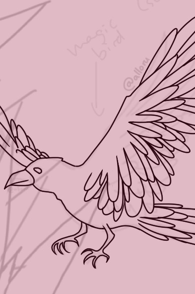
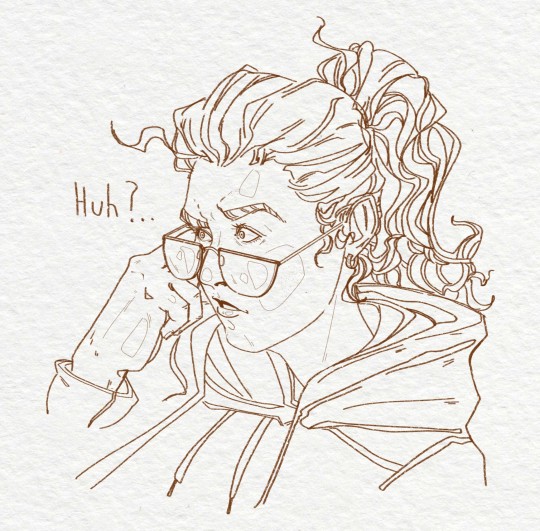
I'm working on some line art heehoo
what are your opinions on flower-themed witches and their familiars? I gave this one a bunch of rose-motifs and elements in her design (thorns included)!
anyone can already guess this will take a while to finish - the answer is quite long. I'll keep you updated every couple steps of the way however!! <3
have an enchanting next 24 hours everyone!
#wip#work in progress#bird art#digital art#my art#character art#drawing#fantasy art#fantasy character#witch character#roses#line art#digital line art
22 notes
·
View notes
Text
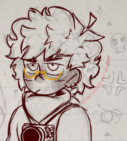
I'm making it digital, babyyyyyyyyyyyyy
#his camera is everything to me tbh#and his glasses#he's just so baby#want to ruffle his hair and say I'm proud of him#camp camp#camp camp fanart#cc max#cc max fanart#camp camp max#max camp camp#traditional sketch#digital line art
30 notes
·
View notes
Text
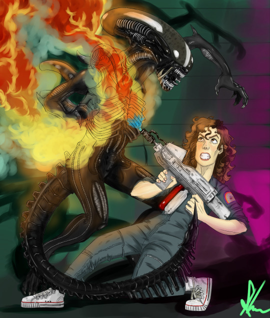
IT IS FINALLY FINISHED. I know it took me a few months but I am very proud with the final product. Ripley is an important character to me so I wanted to do something special to show my love to Sigourney and the movies! I stayed up for hours on end making sure this would get finished. I am very tired. But happy late alien day!

#art#my art#fan art#alien#ellen ripley#sigourney weaver#alien movie#digital painting#digital line art#i never thought I'd put so much detail into a drawing before#the magic of drawing tablets#alien day#alien 1979
45 notes
·
View notes
Text

kylux advent calendar day 1: Turn of the season, part three.
Part one Part two
82 notes
·
View notes
Text


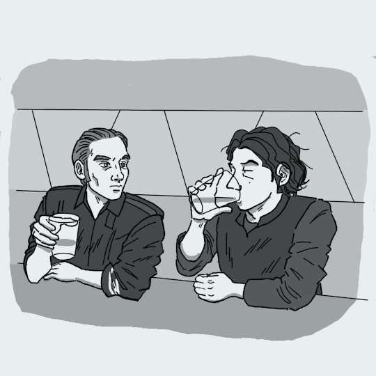
Night out
#digital art#digital sketch#digital drawing#digital line art#digital media#digital illustration#art#my oc art#drawing
7 notes
·
View notes
Text

MurderBot, in its preferred state (armor: on, visor: opaque), from MurderBot Diaries
287 notes
·
View notes
Text

Tattoo C*mmission
I was really excited about this one! I'm a huge fan of the Laura Gilpin poem, so I was pretty psyched when I recieved this commission. I think the quote they chose fits really well too.
#my art#art#artwork#digital art#illustration#two headed calf#commission#tattoo design#tattoo art#tattoo artwork#artists on tumblr#inktober#lineart#welcome to night vale#digital drawing#digital illustration#digital line art#line art#laura gilpin
12 notes
·
View notes
Text

hehehehehe
#art#digital art#digital drawing#sketch#sketches#lineart#digital line art#digital arwork#digital aritst#digital illustration#silly#the silly#THE SILLY EVER!!!#procreate#procreate artist#procreate art#procreate artwork#i’m silly i’m silly i’m silly i’m silly#my father says he is proud of me for my artistic skills#artistic or autistic#hahah anyway
9 notes
·
View notes
Text


COMMISSIONS ARE OPEN!
SFW/NSFW welcome!
More detailed info on my Comiss.Io listings page
Commission Price ranges for different types:
-Sketch - 30-50USD
-Portrait - 50-80USD
-Illustration - 80-150USD
-Comic - 50-200USD/Page
Will draw:
-OCs
-Furry/Anthro
-Animals
-Monsters
-Backgrounds
-Fanart
-NSFW/SFW
Will not draw:
-Overly complex designs.
-Mechanical stuff (Vehicles, mechas) → Mechanical parts, for example a robotic arm or small background vehicles are okay.Certain fetishes (See the NSFW listing for more details)
-Gore (Excessive blood and violence) → Tasteful amounts of blood and violence are okay.
-Political stuff (Anything that can be perceived as clearly promoting certain political ideals, discrimination, hate or anything otherwise harmful towards anyone or anything)
OTHER SOCIAL MEDIA:
Instagram - tinosawrus
DeviantArt - MoonCora
ArtStation - Valentino Takala
#oc#oc artwork#oc art#original character#digital art#artists on tumblr#illustration#digital drawing#digitalart#digital illustration#full color#digital painting#flat color#greyscale#lineart#digital line art#digitalcomic#fanart#commission#commissions#commiccionsopen#opencommissions#fullcolorcommissions#shadedcommissions#fanartcommissions#occommissions#portfolio#artportfolio
5 notes
·
View notes
Text

The hour for Lost Time brainrot has struck once more!
But jackdaw, you say, that's every hour.
So it is.
A random au where Clockwork raises Danny / takes him in. Danny has a cloak because he kept stealing Clockwork's.
This has been in the works a while (and sat gathering dust even longer), but I'm finally happy with it!
#danny phantom#danny phantom dp#clockwork dp#jackdraw-sprite#lineart#digital art#digital line art#I may color this later but I really want it to see the light of day because I'm so proud of the lineart#I learned a lot about line weights and communicating contrast#and light and shadow#and depth while working on this#jackdraw-spwrite
605 notes
·
View notes
Text


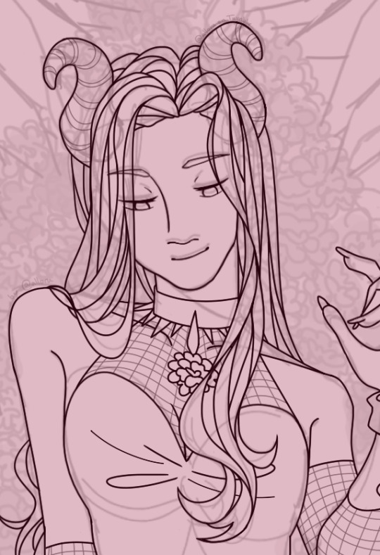
greetings, fellow human beings! ^v^
I had a really cool idea for a character design this week and just had to make a quick sketch of it. that (admittedly not-short) sketch ended up turning into full line art yesterday, so I figured now would be a great time to post it!
I didn't use many reference images or specific sources of inspiration for this one surprisingly. the only parts I was a little stumped on were the hairstyle and horns, but I quickly figured out how to make both of those look believable!
have a nice wip wednesday and take care of yourself for the next 24 hours! you deserve it c:
#wip wednesday#art#character design#original character#oc#sketch#digital sketch#line art#digital line art#original art#character art#digital art#wip#work in progress#drawing
55 notes
·
View notes
Text

I finally finished it! Hooray!
anyway I was distracted a lot by different things these days like falling into batjoke fandom and reading books so I can write my own fanfic and etc but I finally finished it.
in this scene the red head man is Rosa who is judging with his eyes and the boy who is glaring in the background is Barty and harry in casual clothes is talking some sense into Sirius who had came to the valley without warning, I designed some red clothes for Sirius, see?
hope you like it @mishqua
#fanart#harry potter fanfiction#harry potter#fanfiction#hp fanart#hp fanfic#digital art#artwork#art#artists on tumblr#my art#art style#finished#dogitalart#procreate#digital illustration#illustration#digital line art#digital drawing#digital painting#digital aritst#my art <3#my artwork#my artwrok
9 notes
·
View notes
Text
🎶 Звери - Районы, кварталы 🎶
✨ Ярко жёлтые очки, два сердечка на брелке ✨
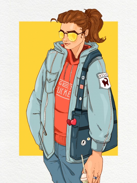
это не ОС, просто я 😚✌️

#my art stuff#art#my stuff#art stuff#digitalart#digital art#digital illustration#digital line art#digital sketch
10 notes
·
View notes
Text
Kylux advent calendar day 1: Turn of the Season, part two.
Part one Part three
40 notes
·
View notes
Text
Hi! @velvetcloak asked me to do some kind of lineart tutorial/step-by-step, I'm by no means an expert so don't hesitate to ask if you need some things clarified! Always glad to help.
I use three different methods that are pretty much trial and error, depending on what works best for the artwork but I'll do my best to explain with screenshots - these were taken on photoshop, I draw with procreate, but I'm guessing the layer modes are similar on other softwares. (Also mine are set in french, sorry in advance for the confusion.)
If you're already familiar with digital lineart and softwares, this probably won't be of much use, it's very basic stuff.
Otherwise, more below the cut! (It got a bit long.)
I. Solid black lineart, with this illustration used as reference.
I used the basic gesinski ink brush in procreate, 100% opacity in normal mode to get pure black. Very basic, it's set on top of the colour layers, everything above that is just additional effects and filters + textures. Note that I always draw separate elements on different layers and fuse them later, it's easier to deal with details this way.
The isolated layer looks like this (I changed the colour of a disappearing hair lock, more on this later):
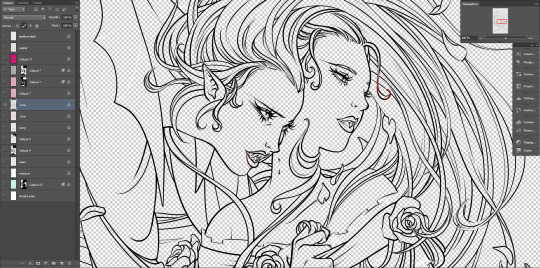
And the colours without it, like this (my style relies heavily on lineart, lol):

Both:
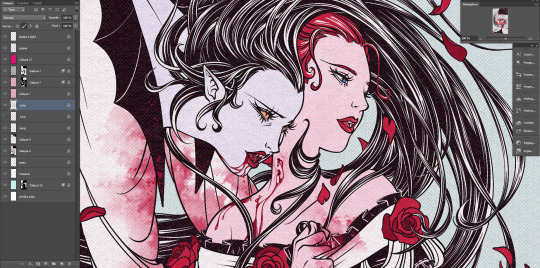
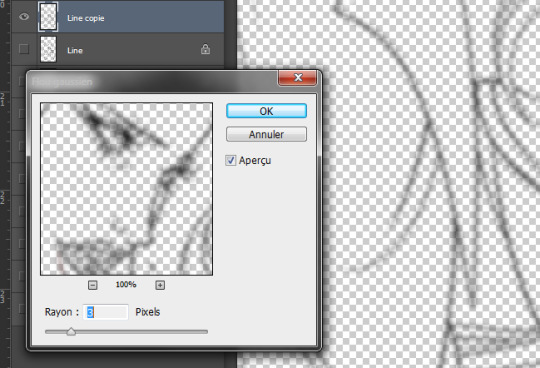
Good! It's a bit harsh though, I like to add a second layer to soften things up, set in 45% opacity multiply mode right under that. I duplicate the main lineart, and add a gaussian blur to the copied layer (between 3 and 5px, values vary from one artwork to another, same with the layer modes.)
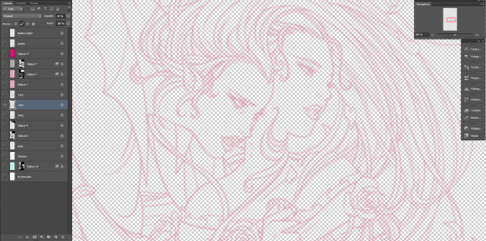
Not done yet! I use the blured lineart as a colour filter by locking it to pixels only and filling it with the tone I want. In this case, red. Isolated layer:
And the end result:
The second method, I tend to use more on sketches and loose drawings to get a better blend of lineart and colours:
II. Semi-transparent lineart, with one of these sketches.
Basic 6B brush in procreate (my fav), quite thin here but you can get great results with a larger brush. It's not really obvious looking at this scale, so here's a comparison between a black solid lineart (1 layer, normal 100% - the scars are on a separate layer because of the colour, otherwise it's the same setting) and a semi-transparent one (2 layers), especially visible in lighter areas, note how the second one lets hues show through. I find this to look a bit less stiff.
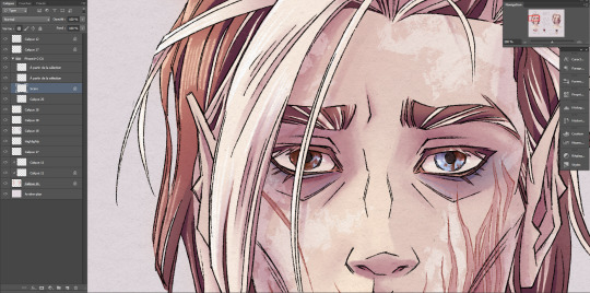
Now for the method! Since this relies on the layers underneath, you want your colours to a bit more precise than the previous example. Without lineart:
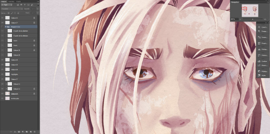
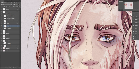
TBH it's also a two layers solution, super easy. Once you're statisfied with your basic lineart, set the layer to overlay 100%. You'll get something like this:
Then duplicate this layer, put the copied layer above the overlay one and set it to normal 70% (or whatever looks best, this is 67%) and you'll get the final result as previously shown! In this particuliar case, I erased the black circle around the iris in the normal mode layer to keep the blue of the overlay one. You could also skip step two depending on the desired rendering.
The third method is a blend of the other two result-wise:
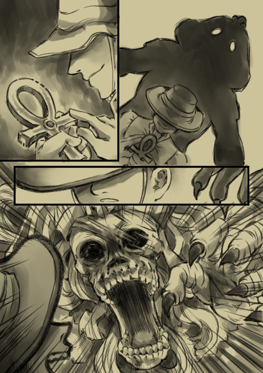
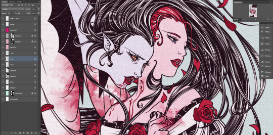
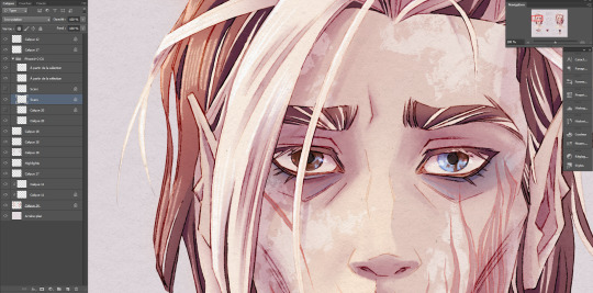
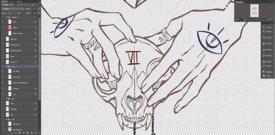
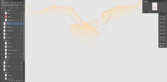
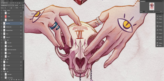
III. Coloured lineart, with this illustration. (tw: a bit of gore and blood in the full artwork, I'll crop it out of the screenshots. Poor guy can't get a break. It's the only file in this style with a semblant of organization, don't be like me, rename your layers and use folders.)
Fountain pen toothy brush, from the MaxPack watercolor set. It has a bit of a texture to it, and isn't entirely opaque so it blends nicely with the layers below. The lineart is set to normal 100%, for this method it's preferable to have separate layers for each elements, since you'll be recolouring them individually. Here, the hands, skull and additional details are all on individual layers.
Just like the blurred layer in the first method, you need to lock your pixels (the little grid to the left on photoshop):
And either fill you layer with colour, or paint on it with an opaque round brush/a soft one depending on the desired outcome. (Some zones might need a gradient, or various colours.) You can also use another normal layer on top of a black lineart and set it as a clipping mask, same result, different method. But I prefer to keep the layers count to a minimum when possible.
With the layers below, it will look like this:
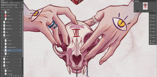
You can notice a bit of lineart transparency over the skull colour layer, cool stuff. (The shading of the skin is set on top for some reason, I don't remember why but surely there was a reason.)
However! In this illustration, I need a yellow glow for the fire so let's create yet another layer, shall we? This affects the whole rendering. I painted a diffuse light source using a soft gradient brush, and set the layer to hard light. Isolated layer:
End result:
All done!
Now go create!
8 notes
·
View notes
Last Seen Blogs
skrip-o4ka
ckpNn-o4ka
carmenfalling
dream into the future

bobbiefiles
MA Real Estate Daily News

bilalsalhab-blog
Bilal Salhab
rhade-zapan
Rhade-Zapan