#drawerlayout
Explore tagged Tumblr posts
Visit Tumblr Blog
Explore Tumblr blogs with no restrictions, modern design and the best experience.
Last Seen Tumblr Blogs


Fun Fact
The total number of visits Tumblr.com received during January 2021 is 327 million.
Text
android NavigationView, DrawerLayout, Navigation drawer template 기본개념
https://youtu.be/kRSIWh4WlMc?t=365
DrawerLayout
의 사용예시를 보여준다. DrawerLayout은 화면 양 옆에서 서랍처럼 등장하는 추가 layout을 만들수 있게 해준다. 이는 단순히 layout의 구조만을 만든다. 양쪽에서 등장하는 내용과는 무관하다. 이 서랍에 해당하는 부분에 NavigationView를 만들어 넣으면 아래와 같이 만들수 있다.

NavigationView
는 menu xml화일을 ��용해서 navigation menu를 생성한다.
Navigation drawer template
은 아래 그림과 같이 android studio에서 주어지는 template이다.이를 통해 NavigationView, DrawerLayout 를 종합으로 사용한 구조를 만들수 있게 된다.

0 notes
Text
Android - Attach a view on hamburger menu icon
Android – Attach a view on hamburger menu icon
Hamburger menu icon is common to most of the Android developers. But have any one of you tried to overlay another view on top or side of this menu icon ? if not then this article will help you to achieve this with a simple trick. Lets have a look –
Prerequisites –
You have to use android.support.v7.widget.Toolbar if not using it.
You have to use android.support.v4.widget.DrawerLayout, Navigation…
View On WordPress
0 notes
Text
FantasySlide
FantasySlide Android Visual | Android Design Library | Android Template | Android Design | Android Library http://www.androidvisual.com/fantasyslide/
0 notes
Text
Android App Entwicklung: ESP Controller ansprechen #3 Navigationsmenü erstellen
In diesem dritten Teil der Reihe "Android App Entwicklung: ESP Controller ansprechen" möchte ich gerne erläutern wie wir unsere AndroidApp umbauen damit wir ein schönes Menü zur Auswahl von Seiten bekommen zbsp. um die Daten des Fotowiderstandes in einem Liniendiagramm anzeigen zu können. Ich empfehle die beiden zuvor veröffentlichten Tutorials zu lesen, damit du auf dem aktuellen stand bist. Wir haben bisher einen Text an den ESP Controller gesendet und eine Begrüßung empfangen und einen Request abgesendet damit wir den aktuellen Wert des Fotowiderstandes als Respond erhalten. Wollen wir nun die Android App umschreiben so das wir neue Seite erstellen können denn alles auf eine Seite zu pressen sieht nicht schön aus.

Anzeigen eines Wertes vom Fotowiderstand
Erstellen eines Layouts mit Navigationsleiste
Zunächst wollen wir ein neues Layout erzeugen. Denn wir benötigen die Möglichkeit die Daten für den Aufbau einer Verbindung zu einem ESP Controller einzugeben und eine Navigationsleiste zum aufrufen von neuen Seiten in der App. Erzeugen wir also zunächst unser Menüelement, dazu klicken wir auf das Projekt und wählen aus dem Kontextmenü aus dem Pfad "New" > "Activity" > "Navigation Drawer Activtiy", oder aber aus der "Gallery".

Navigation Drawer Activtiy Nachdem wir nun einen doppelklick auf diesen Eintrag vorgenommen haben müssen wir im neuen Dialog einige Einstellungen vornehmen. Zuerst ändern wir die Bezeichnung in "NavigationActivity" und setzen den Haken bei "Launcher Activity".

Daten "Navigation Drawer Actitivy" Nun wird AndroidStudio einige neue Dateien erstellen und das Projekt neu bauen, dieses kann je nach Rechenleistung etwas dauern. Ist der Vorgang abgeschlossen so können wir das Projekt auf dem mobilen Gerät deployen. Wir sehen nach dem erfolgreichen starten dann eine leere Seite mit dem Titel "NavigationActivity" und rechts und links jeweils ein Menüpunkt.

neue leere Seite für Navigation in der App Klickt man nun auf den linken Menüpunkt so wird eine Menüleiste eingeblendet.

neue Navigationsleiste für den Aufruf von Funktionen Ändern der Icons Jedoch haben wir nun 2 Icons für unsere App auf dem Homescreen erzeugt. Einmal mit dem Einstiegspunkt zu unserer "alten" Activity und einmal zu unserer neuen.

AppIcons ESPTutorialApp Um hier nur ein Icon als Einstiegspunkt in unsere App zu haben müssen wir die Datei "AndroidManifest.xml" anpassen. Wir sollten hier 2 Activitys deklariert haben, einmal unsere neue "NavigationActivity" und einmal die "alte" MainActivity. Um nur ein Icon zu haben müssen wir lediglich den gesamten Tag zu ".MainActivity" entfernen. ... ... Nun heißt die App auf unserem Homescreen jedoch "NavigationA..." das ist natürlich sehr unschön. Es sollte also zusätzlich das Attribut "android:label" in "@string/app_name" geändert werden. Nun haben wir nur ein Icon auf unserem Homescreen. Auf meinem Handy wird das Icon rund dargestellt, je nach verwendetem Gerät & Android Version kann dieses abweichen. Hier sollte beachtet werden, wenn die App verteilt wird das andere Geräte ggf. andere Icons benötigen. Menüpunkte verwalten Die Menüpunkte werden in der Datei "activity_navigation_drawer.xml" verwaltet. Hier werden wir nun etwas einkürzen denn wir benötigen z.Zt. nur die Menüpunkte: Fotowiderstand Impressum Datenschutzerklärung Auswahl eines neuen Icons Als Icon für den Menüeintrag können wir einmal aus dem Pool von "android:drawable/*" wählen.
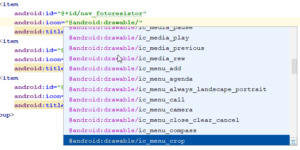
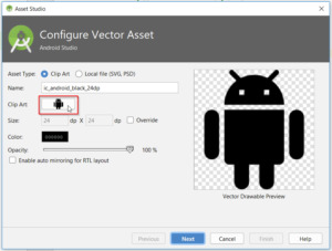
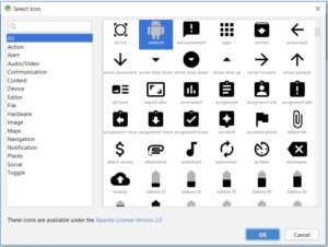
Neues Icon für einen Menüeintrag wählen Oder aber man wählt aus einem "Asset" Vector Asset erstellen Ein Vector Asset erstellt man indem man das Projekt wählt und mit der rechten Maustaste das Kontextmenü öffnet, dort wählt man aus dem Pfad "New" > "Vector Asset". In dem neuen Dialog tätigt man einen Doppelklick auf den "Androidrobot".
Vector Asset erstellen Es wird sich nun ein neues Fenster öffnen wo man links eine Kategorie wählen und recht ein Bild auswählen kann.
Auswahl eines Vector Assets Hat man eine Grafik seiner Wahl gefunden so tätigt man auf dieser einen einfachen Klick und betätigt die Schaltfläche "OK" nun kehren wir in den Dialog "Asset Studio" zurück, hier können wir nun den Dateinamen, sowie die Farbe anpassen.
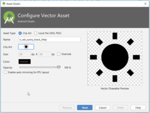
Vector Asset gewählt, Einstellungen setzen Wenn alle nötigen Einstellungen getroffen wurden so werden diese mit der Schaltfläche "Next" bestätigt. Im nächsten Dialog wird nun lediglich angezeigt in welchem Verzeichnis diese neue Datei abgelegt wird. Möchten wir diese nun in unserem Menü verwenden so wird in der XML Datei auf den Dateinamen wifolgt verwiesen: android:icon="@drawable/ic_wb_sunny_black_24dp" Dieses machen wir nun für alle weiteren Menüpunkte. Alte Referenzen entfernen Bevor wir uns jedoch das neue Menü live in der App anschauen können, müssen wir noch die alten Referenzen auf die gelöschten Menüpunkte entfernen bzw auf die neuen Umschreiben. Dazu öffnen wir die Klasse "NavigationActivity" und bearbeiten die Funktion "onNavigationItemSelected" wie folgt: @Override public boolean onNavigationItemSelected(MenuItem item) { // Handle navigation view item clicks here. int id = item.getItemId(); if (id == R.id.nav_fotoresistor) { } else if (id == R.id.nav_imprint) { } else if (id == R.id.nav_privacynotice) { } DrawerLayout drawer = (DrawerLayout) findViewById(R.id.drawer_layout); drawer.closeDrawer(GravityCompat.START); return true; } Zwischen den geschweiften Klammern schreiben wir später unseren Code um den Seitenwechsel zu vollziehen. Wenn wir also nun die App einmal bauen und starten so sollte unser Menü nun wiefolgt aussehen: Neues Navigationsmenü in der ESPTutorialApp Ich habe hier zusätzlich noch das Icon & die E-Mail Adresse angepasst. Wenn du dieses auch machen möchtest so kannst du die E-Mail Adresse in der Datei "strings.xml" im Ordner "app" > "res" > "values" ändern. Als Bild kannst du jedes Bild nutzen, jedoch darf der Dateiname keine große Buchstaben enthalten. Das Bild selber wird im Ordner "app" > "res" > "drawable" abgelegt. Dieses kannst du per Drag'n Drop einfach hineinziehen oder aber über den Explorer deines Betriebssystems. Wenn das Bild abgelegt wurde muss noch die Datei "nav_header_navigation.xml" angepasst werden, hier gibt es einmal die Möglichkeit die Änderungen über die XML Ansicht zu vollziehen oder aber auch über ein Menü.

Anpassen des Bildes im Navigationmenü Neben dem Bild ist noch genügend Platz für weitere Informationen, hier könnte man ggf. noch Versions & Build Nummern anzeigen lassen. Wie man dieses macht erläutere ich in einem weiteren Kapitel.
Download
Fazit & Ausblick
Wir haben nun unsere App erweitert so das wir ein Seiten Navigationsmenü haben. Als nächstes wollen wir nun die Aktion für den Menüpunkt "fotoresistor" ausprogrammieren. Read the full article
0 notes
Text
Android Q Beta 5 Update

Posted by Dave Burke, VP of Engineering
Android Q Beta 5 launches today! Today we're rolling out Beta 5, bringing Android Q Beta very close to the system behaviors you'll see in the final release. Developer APIs were already finalized in the previous update. So, now is the time to test your apps for compatibility and make sure they are ready!
You can get Beta 5 today on Pixel devices by enrolling here. If you're already enrolled and received Beta 4 on your Pixel device, you'll automatically get the update to Beta 5. Partners participating in the Android Q Beta program will also be updating their devices to Beta 5 over the coming weeks.
To get started with Android Q Beta, visit developer.android.com/preview.
What’s in Beta 5?
The Beta 5 update includes the latest Android Q system images for Pixel and Android jEmulator, along with the final Android Q developer APIs (API level 29), the official API 29 SDK, and updated build tools for Android Studio. These give you everything you need to test your apps on Android Q and build with Android Q features.
Gestural navigation updates
As we talked about at Google I/O, we’ve been working closely with device-maker partners to ensure a standardized Android gestural navigation for users and developers. Gestural navigation lets apps use the full screen for content while minimizing the visible system chrome and navigation – which is particularly important on today’s edge-to-edge screens. In Beta 5 we’re continuing to improve and polish based on your feedback and we wanted to provide an update on a few key areas.
We’ve introduced a swipe gesture from either corner to get to the Assistant - you’ll notice indicators in the bottom corners that we’re continuing to tune.
For apps using a navigation drawer, we’ve added a peek behavior when users have grabbed the drawer to indicate that a swipe will bring in the navigation drawer. This works for all versions of DrawerLayout, with DrawerLayout 1.1.0-alpha02 optimized for the best experience.
Custom launchers are another area where we’ve heard feedback and we’re continuing to work on issues, particularly with stability and Recents. Starting in Beta 6, we’ll switch users to 3-button navigation when they are using a custom launcher by default. We’ll address the remaining issues in a post-launch update allowing all users to switch to gestural navigation. Meanwhile, please continue to give us your feedback.
Get your apps ready for Android Q!
With the consumer release coming soon, it’s highest priority for all Android developers to update your current apps for compatibility as soon as possible.
Here’s how to do it:
Install your app on Android Q: Install your current app from Google Play onto an Android Q Beta device or emulator, then test. Your app should run and look great and run well, with full functionality. handle all of the Android Q behavior changes properly. Watch for impacts from privacy changes, gestural navigation, changes to dynamic linker paths for Bionic libraries, and others.
Test with the Android Q privacy features, such as the new location permissions, restrictions on background activity starts, changes to data and identifiers, and others. See the privacy checklist to get started, and review the behavior changes doc for more areas to test.
Test for uses of restricted non-SDK interfaces and move to public SDK or NDK equivalents instead. Details here.
Test the libraries and SDKs in your app: Make sure they work as expected on Android Q and follow best practices for privacy, performance, UX, data handling, and permissions. If you find an issue, try updating to the latest version of the SDK, or reach out to the SDK developer for help. You can also report SDK compatibility issues here.
Update and publish your compatible app: When you’ve finished your testing and made any updates, we recommend publishing your compatible app right away. This lets Android Beta users test the app now, and helps you deliver a smooth transition to users as they update to Android Q.
We realize that supporting these changes is an investment for you too, and we're working to minimize the impact on your apps and be responsive to your input as we move toward the final release.
Enhance your app with Android Q features and APIs
Next, when you're ready, dive into Android Q and learn about the new features and APIs that you can use. Here are some of the top features to get started with.
We recommend these for every app:
Dark Theme: Ensure a consistent experience for users who enable system-wide dark theme by adding a Dark Theme or enabling Force Dark.
Support gestural navigation in your app by going edge-to-edge and making sure your custom gestures are complementary to the system navigation gestures.
Optimize for foldables: Deliver seamless, edge-to-edge experiences on today’s innovative devices by optimizing for foldables.
We recommend these if relevant for your app:
More interactive notifications: If your notifications include messages, enable suggested replies and actions in notifications to engage users and let them take action instantly.
Better biometrics: If you use biometric auth, move to BiometricPrompt, the preferred way to support fingerprint auth on modern devices.
Enriched recording: To support captioning or gameplay recording, enable audio playback capture -- it’s a great way to reach more users and make your app more accessible.
Better codecs: For media apps, try AV1 for video streaming and HDR10+ for high dynamic range video. For speech and music streaming, you can use Opus encoding, and for musicians, a native MIDI API is available.
Better networking APIs: If your app manages IoT devices over Wi-Fi, try the new network connection APIs for functions like configuring, downloading, or printing.
These are just a few of the many new features and APIs in Android Q -- to see them all, visit the Android Q Beta site for developers.
Publish your app updates to Google Play
As soon as you're ready, publish your APK updates to Google Play that are compiled against, or optionally targeting, API 29. To make sure that your updated app runs well on Android Q as well as older versions, try using Google Play testing tracks. With tracks you can safely get early feedback from a small group of users -- including Beta 5 users — and then do a staged rollout to production.
How do I get Beta 5?
It’s easy! Just enroll any supported Pixel device here to get the update over-the-air. If you're already enrolled, you'll receive the update soon and no action is needed on your part. Downloadable system images are also available here. Partners who are participating in the Android Q Beta program will be updating their devices over the coming weeks. See android.com/beta for details.
To get started developing, download the official API 29 SDK and tools into the stable release of Android Studio 3.4, or for the latest Android Q support update to Android Studio 3.5 Beta. Then follow these instructions to configure your environment, and see the release notes for known issues.
There will be one more Beta release before the consumer launch later this quarter. Please continue to share your feedback and requests -- you can use our hotlists for filing platform issues (including privacy and behavior changes), app compatibility issues, and third-party SDK issues.
Also, the Android engineering team will host a Reddit AMA on r/androiddev to answer your technical questions about Android Q later this month. Look out for an announcement on r/androiddev with details in the coming weeks. We look forward to addressing your questions!

Android Q Beta 5 Update published first on https://phonetracking.tumblr.com/
0 notes
Photo

https://ift.tt/2NpFSJF The drawer behavior is changing. Users will be able to open the drawer by peeking the drawer, and then swiping. Big benefit is that this works with existing apps with "old" DrawerLayout versions. (from r/GooglePixel) via /r/Android
0 notes
Text
Tempo (Silver Edition) Great templates for incredible projects (Templates)
Tempo’s a mobile app templates built on top of material design that’s suitable for Android app developers. It Includes all the default screens with many elements that you would need and it is ready to use, just put your logo, change the colors and call your APIs.
Please note this is the Silver Edition, and you will get just the List Views section, if you want all the Package go to the Gold Edition. Tempo (Gold Edition)


Material Design: following Android Design Guidelines.
Many widgets: Toolbar, CollapsingToolbarLayout, SlidingPaneLayout, DrawerLayout, RecyclerView, SwipeRefreshLayout, FloatingActionButton, TextInputLayout, TabLayout, ViewPager, CardView.
Icons: A wide range of free Google icons and Fontello (Icon fonts).
Activity Transitions: Beautiful transition between Activities (For the list views and details).
Beautiful Animation for RecyclerView: Using Android Animations.
Supporting Tablets and Handsets: Multi-pane layouts on tablets and single-pane layouts on handsets.
Flexible Layout Design: Allows application to adapt to all variations of screen sizes.
Orientation change: Both landscape and portrait orientation supported. (except User login and registration and welcome screen interfaces).
High performance: Optimized for high performance and high-resolution displays.
Caching images: Using Universal Image Loader for displaying and caching images.
Sources and Credits
a wide range of free Material Google icons.
All the dummy graphics from freepik.com.
Material Ripple Effect library.
Universal Image Loader library.
Circle Indicator library.
Circular Image View library.
Merriweather Fonts from fontsquirrel.com.
What you Get:
Full source code in Android Studio.
Documentation.
All screenshots in PDF and PNG types.
Adobe Illustrator app design file organized and layered.
APK file
from CodeCanyon new items http://ift.tt/2Fi7aZL via IFTTT https://goo.gl/zxKHwc
0 notes
Link
original source: https://updateunlimited.blogspot.com.au/2015/12/double-sided-nav-drawers.html
Hello guys, this post will teach you how to add both Left and Right Navigation Drawers in your Android App. You may need one Nav Drawer on the right to give your users a different set of options, not to distract them from the main navigation items on the left. I have used Android Studio 1.5.1 Build 141.2456560. So here we go. 1) Navigation Drawer Activity When creating a New Project, choose Navigation Drawer Activity. This makes things easy. If this option is not available, you can the simply choose Blank Activity and later make the project structure similar to Navigation Drawer Activity. See the layout files here. If you run the app at this point, you will see the Left Nav Drawer. 2) Navigation Views <?xml version="1.0" encoding="utf-8"?> <android.support.v4.widget.DrawerLayout xmlns:android="http://schemas.android.com/apk/res/android" xmlns:app="http://schemas.android.com/apk/res-auto" xmlns:tools="http://schemas.android.com/tools" android:id="@+id/drawer_layout" android:layout_width="match_parent" android:layout_height="match_parent" android:fitsSystemWindows="true" tools:openDrawer="start"> <include layout="@layout/app_bar_main" android:layout_width="match_parent" android:layout_height="match_parent" /> <android.support.design.widget.NavigationView android:id="@+id/nav_left_view" android:layout_width="wrap_content" android:layout_height="match_parent" android:layout_gravity="start" android:fitsSystemWindows="true" app:headerLayout="@layout/nav_header_main" app:menu="@menu/activity_main_drawer" /> <android.support.design.widget.NavigationView android:id="@+id/nav_right_view" android:layout_width="wrap_content" android:layout_height="match_parent" android:layout_gravity="end" android:fitsSystemWindows="true" app:headerLayout="@layout/nav_header_main" app:menu="@menu/activity_right_drawer" /> </android.support.v4.widget.DrawerLayout> view rawactivity_main.xml hosted with ❤ by GitHub As you can see I have added 2 Navigation Views inside Drawer Layout...one for left-side and other for right-side. For the Right-side, add android:layout_gravity="end"Other thing you will notice is app:menu.The easiest way to add menu items within the NavDrawer is through XML. 3) Drawer Menu Items Inside menu folder, add two XMLs --- activity_main_drawer.xml (for left-drawer) and activity_right_drawer.xml (for right-drawer). <?xml version="1.0" encoding="utf-8"?> <menu xmlns:android="http://schemas.android.com/apk/res/android"> <group android:checkableBehavior="single"> <item android:id="@+id/nav_camera" android:icon="@drawable/ic_menu_camera" android:title="Import" /> <item android:id="@+id/nav_gallery" android:icon="@drawable/ic_menu_gallery" android:title="Gallery" /> <item android:id="@+id/nav_slideshow" android:icon="@drawable/ic_menu_slideshow" android:title="Slideshow" /> <item android:id="@+id/nav_manage" android:icon="@drawable/ic_menu_manage" android:title="Tools" /> </group> <item android:title="Communicate"> <menu> <item android:id="@+id/nav_share" android:icon="@drawable/ic_menu_share" android:title="Share" /> <item android:id="@+id/nav_send" android:icon="@drawable/ic_menu_send" android:title="Send" /> </menu> </item> </menu> view rawactivity_main_drawer.xml hosted with ❤ by GitHub <?xml version="1.0" encoding="utf-8"?> <menu xmlns:android="http://schemas.android.com/apk/res/android"> <group android:checkableBehavior="single"> <item android:title="Account"> <menu> <item android:id="@+id/nav_settings" android:icon="@drawable/ic_menu_share" android:title="Settings" /> <item android:id="@+id/nav_logout" android:icon="@drawable/ic_menu_send" android:title="Logout" /> </menu> </item> <item android:id="@+id/nav_help" android:icon="@drawable/ic_menu_camera" android:title="Help" /> <item android:id="@+id/nav_about" android:icon="@drawable/ic_menu_gallery" android:title="About" /> </group> </menu> view rawactivity_right_drawer.xml hosted with ❤ by GitHub4) Icon to open Right-Drawer To the main.xml file which shows Settings in an overflow menu on the top-right, make these changes. You can add any icon of your choice. <?xml version="1.0" encoding="utf-8"?> <menu xmlns:android="http://schemas.android.com/apk/res/android" xmlns:app="http://schemas.android.com/apk/res-auto"> <item android:id="@+id/action_openRight" android:orderInCategory="100" android:title="@string/action_settings" android:icon="@drawable/ic_open_right" app:showAsAction="always" /> </menu> view rawmain.xml hosted with ❤ by GitHub5) Navigation Item Selected Listeners package com.blog.navdrawer; import android.os.Bundle; import android.support.design.widget.FloatingActionButton; import android.support.design.widget.NavigationView; import android.support.design.widget.Snackbar; import android.support.v4.view.GravityCompat; import android.support.v4.widget.DrawerLayout; import android.support.v7.app.ActionBarDrawerToggle; import android.support.v7.app.AppCompatActivity; import android.support.v7.widget.Toolbar; import android.view.Menu; import android.view.MenuItem; import android.view.View; import android.widget.Toast; public class MainActivity extends AppCompatActivity { DrawerLayout drawer; @Override protected void onCreate(Bundle savedInstanceState) { super.onCreate(savedInstanceState); setContentView(R.layout.activity_main); Toolbar toolbar = (Toolbar) findViewById(R.id.toolbar); setSupportActionBar(toolbar); FloatingActionButton fab = (FloatingActionButton) findViewById(R.id.fab); fab.setOnClickListener(new View.OnClickListener() { @Override public void onClick(View view) { Snackbar.make(view, "Replace with your own action", Snackbar.LENGTH_LONG) .setAction("Action", null).show(); } }); drawer = (DrawerLayout) findViewById(R.id.drawer_layout); ActionBarDrawerToggle toggle = new ActionBarDrawerToggle( this, drawer, toolbar, R.string.navigation_drawer_open, R.string.navigation_drawer_close); drawer.setDrawerListener(toggle); toggle.syncState(); NavigationView leftNavigationView = (NavigationView) findViewById(R.id.nav_left_view); leftNavigationView.setNavigationItemSelectedListener(new NavigationView.OnNavigationItemSelectedListener() { @Override public boolean onNavigationItemSelected(MenuItem item) { // Handle Left navigation view item clicks here. int id = item.getItemId(); if (id == R.id.nav_camera) { Toast.makeText(MainActivity.this, "Left Drawer - Import", Toast.LENGTH_SHORT).show(); } else if (id == R.id.nav_gallery) { Toast.makeText(MainActivity.this, "Left Drawer - Gallery", Toast.LENGTH_SHORT).show(); } else if (id == R.id.nav_slideshow) { Toast.makeText(MainActivity.this, "Left Drawer - Slideshow", Toast.LENGTH_SHORT).show(); } else if (id == R.id.nav_manage) { Toast.makeText(MainActivity.this, "Left Drawer - Tools", Toast.LENGTH_SHORT).show(); } else if (id == R.id.nav_share) { Toast.makeText(MainActivity.this, "Left Drawer - Share", Toast.LENGTH_SHORT).show(); } else if (id == R.id.nav_send) { Toast.makeText(MainActivity.this, "Left Drawer - Send", Toast.LENGTH_SHORT).show(); } drawer.closeDrawer(GravityCompat.START); return true; } }); NavigationView rightNavigationView = (NavigationView) findViewById(R.id.nav_right_view); rightNavigationView.setNavigationItemSelectedListener(new NavigationView.OnNavigationItemSelectedListener() { @Override public boolean onNavigationItemSelected(MenuItem item) { // Handle Right navigation view item clicks here. int id = item.getItemId(); if (id == R.id.nav_settings) { Toast.makeText(MainActivity.this, "Right Drawer - Settings", Toast.LENGTH_SHORT).show(); } else if (id == R.id.nav_logout) { Toast.makeText(MainActivity.this, "Right Drawer - Logout", Toast.LENGTH_SHORT).show(); } else if (id == R.id.nav_help) { Toast.makeText(MainActivity.this, "Right Drawer - Help", Toast.LENGTH_SHORT).show(); } else if (id == R.id.nav_about) { Toast.makeText(MainActivity.this, "Right Drawer - About", Toast.LENGTH_SHORT).show(); } drawer.closeDrawer(GravityCompat.END); /*Important Line*/ return true; } }); } @Override public void onBackPressed() { if (drawer.isDrawerOpen(GravityCompat.START)) { drawer.closeDrawer(GravityCompat.START); } else if (drawer.isDrawerOpen(GravityCompat.END)) { /*Closes the Appropriate Drawer*/ drawer.closeDrawer(GravityCompat.END); } else { super.onBackPressed(); System.exit(0); } } @Override public boolean onCreateOptionsMenu(Menu menu) { // Inflate the menu; this adds items to the action bar if it is present. getMenuInflater().inflate(R.menu.main, menu); return true; } @Override public boolean onOptionsItemSelected(MenuItem item) { // Handle action bar item clicks here. int id = item.getItemId(); if (id == R.id.action_openRight) { drawer.openDrawer(GravityCompat.END); /*Opens the Right Drawer*/ return true; } return super.onOptionsItemSelected(item); } } view rawMainActivity.java hosted with ❤ by GitHub The only important line to notice is drawer.closeDrawer(GravityCompat.END); for the Right NavDrawer. Otherwise the code is simple,well-commented and easy to implement.
0 notes
Text
What’s New in Navigation 2020
Posted by Jeremy Woods, Software Engineer, Android UI Toolkit
The latest versions of the Jetpack Navigation library (2.2.0 and 2.3.0) added a lot of requested features and functionality, including dynamic navigation, navigation back stack entries, a library for navigation testing, additional features for deep linking, and more. Let’s go over the most important changes, see what problems they solve, and learn how to use them!
Dynamic Navigation
We’ve updated Navigation to simplify adding dynamic feature modules for your application.
Previously, implementing navigation between destinations defined in dynamic feature modules required a lot of work. Before you could navigate to the first dynamic destination, you needed to add the Play Core library and the Split Install API to your app. You also needed to check for and download the dynamic module. Once downloaded, you could then finally navigate to the destination. On top of this, if you wanted to have an on-screen progress bar for the module being downloaded, you needed to implement a SplitInstallManager listener.
To address this complexity, we created the Dynamic Navigator library. This library extends the functionality of the Jetpack Navigation library to provide seamless installation of on-demand dynamic feature modules when navigating. The library handles all Play Store interaction for you, and it even includes a progress screen that provides the download status of your dynamic module.
The default UI for showing a progress bar when a user navigates to a dynamic feature for the first time. The app displays this screen as the corresponding module downloads
id=“imgCaption”>
To use dynamic navigation, all you need to do is:
Change instances of NavHostFragment to DynamicNavHostFragment
Add an app:moduleName attribute to the destinations associated with a DynamicNavHostFragment
For more information on dynamic navigation, see Navigate with dynamic feature modules and check out the samples.
NavBackStackEntry: Unlocked
When you navigate from one destination to the next, the previous destination and its latest state is placed on the Navigation back stack. If you return to the previous destination by using navController.popBackBack(), the top back stack entry is removed from the back stack with its state still intact and the NavDestination is restored. The Navigation back stack contains all of the previous destinations that were needed to arrive at the current NavDestination.
We manage the destinations on the Navigation back stack by encapsulating them into the NavBackStackEntry class. NavBackStackEntry is now public. This means that users can go a level deeper than just NavDestinations and gain access to navigation-specific ViewModels, Lifecycles, and SavedStateRegistries. You can now properly scope data sharing or ensure it is destroyed at the appropriate time.
See Navigation and the back stack for more information.
NavGraph ViewModels
Since a NavBackStackEntry is a ViewModelProvider, you can create a ViewModel to share data between destinations at the NavGraph level. Each parent navigation graph of all NavDestinations are on the back stack, so your view model can be scoped appropriately:
val viewModel: MyViewModel by navGraphViewModels(R.id.my_graph)
For more information on navGraph scoped view models, see Share UI-related data between destinations with ViewModel
Returning a Result from a destination
By combining ViewModel and Lifecycle, you can share data between two specific destinations. To do this, NavBackStackEntry provides a SavedStateHandle, a key-value map that can be used to store and retrieve data, even across configuration changes. By using the given SavedStateHandle, you can access and pass data between destinations. For example to pass data from destination A to destination B:
In destination A:
override fun onViewCreated(view: View, savedInstanceState: Bundle?) { val navController = findNavController(); // We use a String here, but any type that can be put in a Bundle is supported navController.currentBackStackEntry?.savedStateHandle?.getLiveData<String>("key")?.observe( viewLifecycleOwner) { result -> // Do something with the result. } }
And in destination B:
navController.previousBackStackEntry?.savedStateHandle?.set("key", result)
See Returning a result to the previous Destination for more details.
Testing your Navigation Flow
Previously, the recommended testing solution for Navigation was Mockito. You would create a mock NavController and verify that navigate() was called at the appropriate time with the correct parameters. Unfortunately, this solution was not enough to test certain areas of Navigation flow, such as ViewModel interaction or the Navigation back stack. The Navigation Library now offers a well-integrated solution for these areas with the Navigation Testing library.
The Navigation Testing library adds TestNavHostController, which gives access to the Navigation back stack in a test environment. This means that you can now verify the state of the entire back stack. When using the TestNavHostController, you can set your own LifecycleOwner, ViewModelStoreOwner, and OnBackPressDispatcher by using the APIs given by NavHostController. By setting these components, you can test them in the context of navigation.
For example, here’s how to test a destination that uses a nav graph-scoped ViewModel:
val navController = TestNavHostController(ApplicationProvider.getApplicationContext()) // This allows fragments to use by navGraphViewModels() navController.setViewModelStore(ViewModelStore()) navController.setGraph(R.navigation.main_nav)
The TestNavHostController also lets you set the current destination. You can move the test directly to the use case being tested without the need to set it up using navigate() calls. This is extremely convenient for writing tests for different navigation scenarios.
When setting the current destination, you might do something like the following:
val navController = TestNavHostController(ApplicationProvider.getApplicationContext()) navController.setGraph(R.navigation.main_nav) navController.setCurrentDestination(R.id.destination_1)
Remember that when setting the current destination, that destination must be part of your nav graph.
For more information about TestNavHostController, see the Test Navigation docs.
Nav Deep Linking
Deep linking allows you to navigate directly to any destination no matter where you currently are in the NavGraph. This can be very useful for launching your app to a specific destination or jumping between destinations that would otherwise be inaccessible to one another.
When navigating using a deep link, you can now provide deep link query parameters in any order and even leave them out altogether if they have been given a default value or have been made nullable. This means that if you have provided default values for all of the query parameters on a deep link, the deep link can match a URL pattern without including any query parameters.
For example, www.example.com?arg1={arg1}&arg2={arg2} will now match with www.example.com as long as arg1 and arg2 have default values and/or are nullable.
Deep links can also be matched using intent actions and MIME types. Instead of requiring destinations to match by URI, you can provide the deep link with an action or MIME type and match with that instead. You can specify multiple match types for a single deep link, but note that URI argument matching is prioritized first, followed by action, and then mimeType.
You create a deep link by adding it to a destination in XML, using the Kotlin DSL, or by using the Navigation Editor in Android Studio.
Here’s how to add a deep link to a destination using XML:
<fragment android:id="@+id/a" android:name="com.example.myapplication.FragmentA" tools:layout="@layout/a"> <deeplink app:url="www.example.com" app:action="android.intent.action.MY_ACTION" app:mimeType="type/subtype"/> </fragment>
Here’s how to add the same deep link using the Kotlin DSL:
val baseUri = "http://www.example.com/" fragment<MyFragment>(nav_graph.dest.a) { deepLink(navDeepLink { uriPattern = "${baseUri}" action = "android.intent.action.MY_ACTION" mimeType = "type/subtype" }) }
You can also add the same deep link using the Navigation Editor in Android Studio versions 4.1 and higher. Note that you must also be using the Navigation 2.3.0-alpha06 dependency or later.
Adding a deep link to a destination in the Navigation Editor
id=“imgCaption”>
To navigate to a destination using a deep link, you must first build a NavDeepLinkRequest and then pass that deep link request into the Navigation controller’s call to navigate():
val deepLinkRequest = NavDeepLinkRequest.Builder .fromUri(Uri.parse("http://www.example.com")) .setAction("android.intent.action.MY_ACTION") .setMimeType("type/subtype") .build() navController.navigate(deeplinkRequest)
For more information on deep links, visit Create a deep link for a destination, as well as the deep linking sections in Navigate to a destination and Kotlin DSL.
Navigation Editor
Android Studio 4.0 includes new features for the Navigation Editor. You can now edit your destinations using a split pane view. This means you can edit the XML or design and see the changes in real time.
Viewing a navigation.xml file in split view mode
id=“imgCaption”>
In Android Studio 4.1, the Navigation Editor introduced the component tree. This allows you to traverse the entire nav graph, freely going in and out of nested graphs.
Navigating through a graph in the Navigation Editor
id=“imgCaption”>
Additional Changes
NavigationUI can now use any layout that uses the Openable interface. This means that it is no longer limited to DrawerLayout and allows for customization of the AppBarConfiguration. You can provide your Openable and use it as the layout instead.
Navigation also provides support for Kotlin DSL. Kotlin DSL can be used to create different destinations, actions, or deep links. For more information see the documentation for Kotlin DSL.
Wrap up
Navigation added lots of useful features over the past year. You can simplify your dynamic feature modules by taking advantage of the Dynamic Navigator library, use a NavBackStackEntry to help correctly scope your data, easily test your navigation flow using the TestNavHostController, or even match your deep link using intent actions and/or MIME types.
For more information about the Jetpack Navigation library, check out the documentation at https://developer.android.com/guide/navigation
Please provide feedback (or file bugs) using the Navigation issuetracker component.
What’s New in Navigation 2020 published first on https://phonetracking.tumblr.com/ What’s New in Navigation 2020 published first on https://leolarsonblog.tumblr.com/
0 notes
Text
Adding Tools Attributes to your Toolbox
Android Tools Attributes are a critical element of any well designed app that uses Data Binding, a RecyclerView or top level navigation, such as a Navigation Drawer or Bottom Navigation View. Yet, they are often overlooked by developers.
In this post, we’ll look at why these attributes are important and how you can apply them to provide design-time hints to Android Studio about what type of data and attributes will be applied to your views at runtime.
To illustrate the concepts, we will look at a sample app called Weather. This app displays a list of cities and their current weather forecast summary. Clicking on one of the summary rows, shows a details screen with more information about “today’s” forecast.
The app looks relatively straightforward when you see it running, but how does that look in the Layout Editor at design time. Well that depends!
This project is built using Data Binding and uses a RecyclerView to show the list of cities on the summary screen. If you’re not using tools attributes to give design time hints, it will look something like this…
As you can see, there is no indication of what this view may look like when rendered on a device. It’s hard to even tell what the screens are, let alone:
How will this look on a 5” screen vs a 7” screen?
How does it look in landscape vs portrait?
How does screen density affect the layout?
This becomes even more obvious when you are using the Navigation Architecture Component, where instead of a rich graph showing each of your screens and their relationships to each other:
Image generated from navigation_graph of the Google Codelabs - Navigation Sample
…you see a bunch of white boxes with no meaning, connected by arrows.
Image generated from navigation_graph of the Google Codelabs - Navigation Sample(With tools layout references removed.)
Coming back to the weather app sample. This is a fairly simple app consisting of two screens. So why can’t Android Studio just figure this crap out? 😡
The answer is that Android Studio does not have enough information to figure it out. Data-bound views use binding expressions to describe how to evaluate the contents of the view at runtime. Similarly, RecyclerViews depend on dynamic views being attached at runtime, facilitated by a RecyclerView.Adapter.
At design time, Android Studio has no way of knowing what data will be placed in the views. However, you as the developer do know what types of data will be placed into your views. The tools attributes give you a way to provide hints to Android Studio so that it can render an accurate preview of your views at design time.
Note: Of course things like (the effects of density, orientation, and screen size) are things that you will want to test before shipping your app, but you could get a good idea of how it will render at design time if you use Tools Namespace attributes in your layouts.
Tools Namespace
The Tools Namespace is an XML namespace that declares attributes you can apply to your views. These attributes give design time rendering hints (such as which item layout to show in a RecyclerView) and designate compile time behaviors (such as specific lint rules to ignore or even specific resources to keep during proguard minification). You are probably already using some of these attributes and may not have noticed.
If you’ve ever suppressed a warning in your layout using the Android Studio quick assist helper, you may notice that it adds a tools:ignore attribute to the element that was triggering the lint error or warning.
There are 3 categories of attributes:
Error handling attributes - Provide hints to lint, to suppress lint warnings.
Resource shrinking attributes - Provide hints to proguard, to prevent shrinking or removal of specific resources.
Design-time view attributes - Provide hints to Android Studio, so that it can render the view appropriately at design time.
We will focus on the design-time view attributes in this post.
Now, there are dozens of tools attributes ranging from ones that define sample text to show in a text view or a sample image source for an <ImageView>, all the way to illustrating DrawerLayout states and providing sample data for your RecyclerView. You can find a complete list in the Android Documentation. One good thing to remember though is that any android attribute associated with the view has a corresponding tools attribute.
Common Scenarios
A few common examples where tools attributes can help.
Providing Sample Text
Consider adding a tools:text attribute for any android:text attribute that has a binding expression value.
<TextView ... android:layout_width="match_parent" android:layout_height="wrap_content" android:text="@{vm.forecast}" tools:text="Expect a high today of 96, with winds out of the northwest at 21 mph" />
Providing a Sample Image Source
Add a tools:src inside <ImageViews>s where the image is dynamically loaded.
<ImageView android:id="@+id/weather_icon" android:contentDescription="@{vm.weatherIconContentDesc}" tools:src="@mipmap/ic_snowy" app:weatherIcon='@{vm.weatherIcon}' /> <!-- This example uses a BindingExpression to provide `app:weatherIcon` not shown here -->
Designating a RecyclerView’s Item Layout
Use tools:listItem to indicate what layout will be inflated and placed into your RecyclerView at runtime. (This assumes homogeneous item types).
<androidx.recyclerview.widget.RecyclerView android:id="@+id/weather_list_recycler_view" android:layout_width="match_parent" android:layout_height="match_parent" app:layoutManager="LinearLayoutManager" tools:listitem="@layout/weather_item" />
If you really want to be fancy, you can populate lists with sample data, as Thibault de Lambilly shows in his post titled, Android Tools attributes: listItem & sample data rocks!. Although I personally find that providing sample data usually requires more effort to setup and maintain than is worth the effort. Still, if you have a RecyclerView that has vastly different data or you would like to see specific data entries and how they render at design time, you have this as an option.
Improving Weather App
Applying these techniques to Weather App (for the list, details and weather summary item layouts) its navigation graph looks much easier to follow, as can be seen in the diagram below.
CompletedWeatherExample
You can find the sample project for this post in my Github Repo. If you have questions, the best way to reach out to me is on Twitter @emmax.
Thanks for reading!
Adding Tools Attributes to your Toolbox published first on https://johnellrod.weebly.com/
0 notes
Video
youtube
Liked on YouTube: Navigation Drawer, DrawerLayout, and NavigationView (Android Development Patterns Ep 8) https://youtu.be/DkT0vS14Um0
0 notes
Text
What’s New in Navigation 2020
Posted by Jeremy Woods, Software Engineer, Android UI Toolkit
The latest versions of the Jetpack Navigation library (2.2.0 and 2.3.0) added a lot of requested features and functionality, including dynamic navigation, navigation back stack entries, a library for navigation testing, additional features for deep linking, and more. Let’s go over the most important changes, see what problems they solve, and learn how to use them!
Dynamic Navigation
We’ve updated Navigation to simplify adding dynamic feature modules for your application.
Previously, implementing navigation between destinations defined in dynamic feature modules required a lot of work. Before you could navigate to the first dynamic destination, you needed to add the Play Core library and the Split Install API to your app. You also needed to check for and download the dynamic module. Once downloaded, you could then finally navigate to the destination. On top of this, if you wanted to have an on-screen progress bar for the module being downloaded, you needed to implement a SplitInstallManager listener.
To address this complexity, we created the Dynamic Navigator library. This library extends the functionality of the Jetpack Navigation library to provide seamless installation of on-demand dynamic feature modules when navigating. The library handles all Play Store interaction for you, and it even includes a progress screen that provides the download status of your dynamic module.
The default UI for showing a progress bar when a user navigates to a dynamic feature for the first time. The app displays this screen as the corresponding module downloads
To use dynamic navigation, all you need to do is:
Change instances of NavHostFragment to DynamicNavHostFragment
Add an app:moduleName attribute to the destinations associated with a DynamicNavHostFragment
For more information on dynamic navigation, see Navigate with dynamic feature modules and check out the samples.
NavBackStackEntry: Unlocked
When you navigate from one destination to the next, the previous destination and its latest state is placed on the Navigation back stack. If you return to the previous destination by using navController.popBackBack(), the top back stack entry is removed from the back stack with its state still intact and the NavDestination is restored. The Navigation back stack contains all of the previous destinations that were needed to arrive at the current NavDestination.
We manage the destinations on the Navigation back stack by encapsulating them into the NavBackStackEntry class. NavBackStackEntry is now public. This means that users can go a level deeper than just NavDestinations and gain access to navigation-specific ViewModels, Lifecycles, and SavedStateRegistries. You can now properly scope data sharing or ensure it is destroyed at the appropriate time.
See Navigation and the back stack for more information.
NavGraph ViewModels
Since a NavBackStackEntry is a ViewModelProvider, you can create a ViewModel to share data between destinations at the NavGraph level. Each parent navigation graph of all NavDestinations are on the back stack, so your view model can be scoped appropriately:
val viewModel: MyViewModel by navGraphViewModels(R.id.my_graph)
For more information on navGraph scoped view models, see Share UI-related data between destinations with ViewModel
Returning a Result from a destination
By combining ViewModel and Lifecycle, you can share data between two specific destinations. To do this, NavBackStackEntry provides a SavedStateHandle, a key-value map that can be used to store and retrieve data, even across configuration changes. By using the given SavedStateHandle, you can access and pass data between destinations. For example to pass data from destination A to destination B:
In destination A:
override fun onViewCreated(view: View, savedInstanceState: Bundle?) { val navController = findNavController(); // We use a String here, but any type that can be put in a Bundle is supported navController.currentBackStackEntry?.savedStateHandle?.getLiveData<String>("key")?.observe( viewLifecycleOwner) { result -> // Do something with the result. } }
And in destination B:
navController.previousBackStackEntry?.savedStateHandle?.set("key", result)
See Returning a result to the previous Destination for more details.
Testing your Navigation Flow
Previously, the recommended testing solution for Navigation was Mockito. You would create a mock NavController and verify that navigate() was called at the appropriate time with the correct parameters. Unfortunately, this solution was not enough to test certain areas of Navigation flow, such as ViewModel interaction or the Navigation back stack. The Navigation Library now offers a well-integrated solution for these areas with the Navigation Testing library.
The Navigation Testing library adds TestNavHostController, which gives access to the Navigation back stack in a test environment. This means that you can now verify the state of the entire back stack. When using the TestNavHostController, you can set your own LifecycleOwner, ViewModelStoreOwner, and OnBackPressDispatcher by using the APIs given by NavHostController. By setting these components, you can test them in the context of navigation.
For example, here's how to test a destination that uses a nav graph-scoped ViewModel:
val navController = TestNavHostController(ApplicationProvider.getApplicationContext()) // This allows fragments to use by navGraphViewModels() navController.setViewModelStore(ViewModelStore()) navController.setGraph(R.navigation.main_nav)
The TestNavHostController also lets you set the current destination. You can move the test directly to the use case being tested without the need to set it up using navigate() calls. This is extremely convenient for writing tests for different navigation scenarios.
When setting the current destination, you might do something like the following:
val navController = TestNavHostController(ApplicationProvider.getApplicationContext()) navController.setGraph(R.navigation.main_nav) navController.setCurrentDestination(R.id.destination_1)
Remember that when setting the current destination, that destination must be part of your nav graph.
For more information about TestNavHostController, see the Test Navigation docs.
Nav Deep Linking
Deep linking allows you to navigate directly to any destination no matter where you currently are in the NavGraph. This can be very useful for launching your app to a specific destination or jumping between destinations that would otherwise be inaccessible to one another.
When navigating using a deep link, you can now provide deep link query parameters in any order and even leave them out altogether if they have been given a default value or have been made nullable. This means that if you have provided default values for all of the query parameters on a deep link, the deep link can match a URL pattern without including any query parameters.
For example, www.example.com?arg1={arg1}&arg2={arg2} will now match with www.example.com as long as arg1 and arg2 have default values and/or are nullable.
Deep links can also be matched using intent actions and MIME types. Instead of requiring destinations to match by URI, you can provide the deep link with an action or MIME type and match with that instead. You can specify multiple match types for a single deep link, but note that URI argument matching is prioritized first, followed by action, and then mimeType.
You create a deep link by adding it to a destination in XML, using the Kotlin DSL, or by using the Navigation Editor in Android Studio.
Here's how to add a deep link to a destination using XML:
<fragment android:id="@+id/a" android:name="com.example.myapplication.FragmentA" tools:layout="@layout/a"> <deeplink app:url="www.example.com" app:action="android.intent.action.MY_ACTION" app:mimeType="type/subtype"/> </fragment>
Here's how to add the same deep link using the Kotlin DSL:
val baseUri = "http://www.example.com/" fragment<MyFragment>(nav_graph.dest.a) { deepLink(navDeepLink { uriPattern = "${baseUri}" action = "android.intent.action.MY_ACTION" mimeType = "type/subtype" }) }
You can also add the same deep link using the Navigation Editor in Android Studio versions 4.1 and higher. Note that you must also be using the Navigation 2.3.0-alpha06 dependency or later.
Adding a deep link to a destination in the Navigation Editor
To navigate to a destination using a deep link, you must first build a NavDeepLinkRequest and then pass that deep link request into the Navigation controller's call to navigate():
val deepLinkRequest = NavDeepLinkRequest.Builder .fromUri(Uri.parse("http://www.example.com")) .setAction("android.intent.action.MY_ACTION") .setMimeType("type/subtype") .build() navController.navigate(deeplinkRequest)
For more information on deep links, visit Create a deep link for a destination, as well as the deep linking sections in Navigate to a destination and Kotlin DSL.
Navigation Editor
Android Studio 4.0 includes new features for the Navigation Editor. You can now edit your destinations using a split pane view. This means you can edit the XML or design and see the changes in real time.
Viewing a navigation.xml file in split view mode
In Android Studio 4.1, the Navigation Editor introduced the component tree. This allows you to traverse the entire nav graph, freely going in and out of nested graphs.
Navigating through a graph in the Navigation Editor
Additional Changes
NavigationUI can now use any layout that uses the Openable interface. This means that it is no longer limited to DrawerLayout and allows for customization of the AppBarConfiguration. You can provide your Openable and use it as the layout instead.
Navigation also provides support for Kotlin DSL. Kotlin DSL can be used to create different destinations, actions, or deep links. For more information see the documentation for Kotlin DSL.
Wrap up
Navigation added lots of useful features over the past year. You can simplify your dynamic feature modules by taking advantage of the Dynamic Navigator library, use a NavBackStackEntry to help correctly scope your data, easily test your navigation flow using the TestNavHostController, or even match your deep link using intent actions and/or MIME types.
For more information about the Jetpack Navigation library, check out the documentation at https://developer.android.com/guide/navigation
Please provide feedback (or file bugs) using the Navigation issuetracker component.
What’s New in Navigation 2020 published first on https://phonetracking.tumblr.com/
0 notes
Text
Android Navigation Drawer Tutorial
In this tutorial you will learn about android navigation drawer.
There are so little possibilities when it comes to choosing the main menu of an android application. If we start enlisting, we have TabLayout (used by the very famous WhatsApp), Bottom navigation drawer (used again by a facebook product Instagram) and then we have the most common form of menu ui and i.e. Navigation Drawer. Using a navigation drawer really adds a professional cover sort of thing to an android application and as an android developer, once you learn to implement it, trust me when I tell you this, it makes you feel as if you can now implement anything in an android application. I have been through that feeling and I wish you to experience the same. So, without any further delay, let’s get started on how to implement an Android Navigation Drawer.
Android Navigation Drawer Tutorial
Creating a New Activity
To begin with, hit the create a new project button in Android Studio and follow the steps below:-
Step 1: Assign a good name to your project.
Step 2: Select the minimum android version that you want your app to support to.
Step 3: This is most important step in which you need to select the navigation drawer activity in order to implement the navigation drawer. So, go ahead and select the navigation drawer activity from list and hit next and then hit finish.
Now let the project load and gradle be built and then we shall start configuring Navigation Drawer Activity.
The project is all set by now to get started with code. Before doing so, let me give you a quick walk through of the file structure of this activity.
In the XML
In the first folder of res, we have directory by the name drawable and it simply contains all the xml icons for the drawer menu items.
In the next directory called layout, we have the all the layout files required for this activity. On the top of the list, we have the activity_main.xml which looks as shown below:-
activity_main.xml
<?xml version="1.0" encoding="utf-8"?> <android.support.v4.widget.DrawerLayout xmlns:android="http://schemas.android.com/apk/res/android" xmlns:app="http://schemas.android.com/apk/res-auto" xmlns:tools="http://schemas.android.com/tools" android:id="@+id/drawer_layout" android:layout_width="match_parent" android:layout_height="match_parent" android:fitsSystemWindows="true" tools:openDrawer="start"> <include layout="@layout/app_bar_main" android:layout_width="match_parent" android:layout_height="match_parent" /> <android.support.design.widget.NavigationView android:id="@+id/nav_view" android:layout_width="wrap_content" android:layout_height="match_parent" android:layout_gravity="start" android:fitsSystemWindows="true" app:headerLayout="@layout/nav_header_main" app:menu="@menu/activity_main_drawer" /> </android.support.v4.widget.DrawerLayout>
In the above xml code, we have an include envelope and then we have the NavigationView. This include envelope is being used here to render the code in the app_bar_main.xml layout file. The purpose of using include here is to maintain the cleanliness and readability of the code. The Parent layout for activity_main.xml is DrawerLayout.
The next layout file in the list is app_bar_main.xml and it looks something like below:-
app_bar_main.xml
<?xml version="1.0" encoding="utf-8"?> <android.support.design.widget.CoordinatorLayout xmlns:android="http://schemas.android.com/apk/res/android" xmlns:app="http://schemas.android.com/apk/res-auto" xmlns:tools="http://schemas.android.com/tools" android:layout_width="match_parent" android:layout_height="match_parent" tools:context="dev.android.manish.navdrawertutorial.MainActivity"> <android.support.design.widget.AppBarLayout android:layout_width="match_parent" android:layout_height="wrap_content" android:theme="@style/AppTheme.AppBarOverlay"> <android.support.v7.widget.Toolbar android:id="@+id/toolbar" android:layout_width="match_parent" android:layout_height="?attr/actionBarSize" android:background="?attr/colorPrimary" app:popupTheme="@style/AppTheme.PopupOverlay" /> </android.support.design.widget.AppBarLayout> <include layout="@layout/content_main" /> <android.support.design.widget.FloatingActionButton android:id="@+id/fab" android:layout_width="wrap_content" android:layout_height="wrap_content" android:layout_gravity="bottom|end" android:layout_margin="@dimen/fab_margin" app:srcCompat="@android:drawable/ic_dialog_email" /> </android.support.design.widget.CoordinatorLayout>
It simply has the Toolbar layout enclosed by the AppBarLayout which adds a shadow underneath the toolbar. Again here also we have a include envelope which refers to content_main.xml. So, content_main would be the place to display the different drawer screens. It also has a FloatinActionButton just as we have the YouTube App as the upload button. Well, it’s got nothing to do with navigation drawer activity so, we’ll just remove it once we start working on the navigation drawer.
The next layout file is content_main.xml and it looks as shown below:-
content_main.xml
<?xml version="1.0" encoding="utf-8"?> <android.support.constraint.ConstraintLayout xmlns:android="http://schemas.android.com/apk/res/android" xmlns:app="http://schemas.android.com/apk/res-auto" xmlns:tools="http://schemas.android.com/tools" android:layout_width="match_parent" android:layout_height="match_parent" app:layout_behavior="@string/appbar_scrolling_view_behavior" tools:context="dev.android.manish.navdrawertutorial.MainActivity" tools:showIn="@layout/app_bar_main"> <TextView android:layout_width="wrap_content" android:layout_height="wrap_content" android:text="Hello World!" app:layout_constraintBottom_toBottomOf="parent" app:layout_constraintLeft_toLeftOf="parent" app:layout_constraintRight_toRightOf="parent" app:layout_constraintTop_toTopOf="parent" /> </android.support.constraint.ConstraintLayout>
The above code is where the content of the drawer screens is configured. Presently, it has nothing but a TextView saying Hello World but it’ll once we’re done configuring the Navigation Drawer.
The next layout file is nav_header_main.xml and it occupies the header of the drawer layout as shown below:-
Now you might wonder how has it been included in the main layout file i.e activity_main.xml. Well, it’s pretty simple. In the activity_main.xml, in the code for NavigationView, it has been included as the app:headerLayout to the drawer.
The next directory is menu in the res folder and it has activity_main_drawer.xml which looks something like as shown below:-
activity_main_drawer.xml
<?xml version="1.0" encoding="utf-8"?> <menu xmlns:android="http://schemas.android.com/apk/res/android"> <group android:checkableBehavior="single"> <item android:id="@+id/nav_camera" android:icon="@drawable/ic_menu_camera" android:title="Import" /> <item android:id="@+id/nav_gallery" android:icon="@drawable/ic_menu_gallery" android:title="Gallery" /> <item android:id="@+id/nav_slideshow" android:icon="@drawable/ic_menu_slideshow" android:title="Slideshow" /> <item android:id="@+id/nav_manage" android:icon="@drawable/ic_menu_manage" android:title="Tools" /> </group> <item android:title="Communicate"> <menu> <item android:id="@+id/nav_share" android:icon="@drawable/ic_menu_share" android:title="Share" /> <item android:id="@+id/nav_send" android:icon="@drawable/ic_menu_send" android:title="Send" /> </menu> </item> </menu>
This file accounts for the all menu items which show up in the drawer, their titles, icons other behaviours. It has been set as menu to the NavgiationView in the activity_main.xml as app:menu.
That’s all for xml. Now we shall look into the java section and understand it’s flow.
In the Java
In the java part, we have just one class and i.e. MainActivity.java. It’s code looks as shown below:-
MainActivity.java
package dev.android.manish.navdrawertutorial; import android.os.Bundle; import android.support.design.widget.FloatingActionButton; import android.support.design.widget.Snackbar; import android.view.View; import android.support.design.widget.NavigationView; import android.support.v4.view.GravityCompat; import android.support.v4.widget.DrawerLayout; import android.support.v7.app.ActionBarDrawerToggle; import android.support.v7.app.AppCompatActivity; import android.support.v7.widget.Toolbar; import android.view.Menu; import android.view.MenuItem; public class MainActivity extends AppCompatActivity implements NavigationView.OnNavigationItemSelectedListener { @Override protected void onCreate(Bundle savedInstanceState) { super.onCreate(savedInstanceState); setContentView(R.layout.activity_main); Toolbar toolbar = (Toolbar) findViewById(R.id.toolbar); setSupportActionBar(toolbar); FloatingActionButton fab = (FloatingActionButton) findViewById(R.id.fab); fab.setOnClickListener(new View.OnClickListener() { @Override public void onClick(View view) { Snackbar.make(view, "Replace with your own action", Snackbar.LENGTH_LONG) .setAction("Action", null).show(); } }); DrawerLayout drawer = (DrawerLayout) findViewById(R.id.drawer_layout); ActionBarDrawerToggle toggle = new ActionBarDrawerToggle( this, drawer, toolbar, R.string.navigation_drawer_open, R.string.navigation_drawer_close); drawer.setDrawerListener(toggle); toggle.syncState(); NavigationView navigationView = (NavigationView) findViewById(R.id.nav_view); navigationView.setNavigationItemSelectedListener(this); } @Override public void onBackPressed() { DrawerLayout drawer = (DrawerLayout) findViewById(R.id.drawer_layout); if (drawer.isDrawerOpen(GravityCompat.START)) { drawer.closeDrawer(GravityCompat.START); } else { super.onBackPressed(); } } @Override public boolean onCreateOptionsMenu(Menu menu) { // Inflate the menu; this adds items to the action bar if it is present. getMenuInflater().inflate(R.menu.main, menu); return true; } @Override public boolean onOptionsItemSelected(MenuItem item) { // Handle action bar item clicks here. The action bar will // automatically handle clicks on the Home/Up button, so long // as you specify a parent activity in AndroidManifest.xml. int id = item.getItemId(); //noinspection SimplifiableIfStatement if (id == R.id.action_settings) { return true; } return super.onOptionsItemSelected(item); } @SuppressWarnings("StatementWithEmptyBody") @Override public boolean onNavigationItemSelected(MenuItem item) { // Handle navigation view item clicks here. int id = item.getItemId(); if (id == R.id.nav_camera) { // Handle the camera action } else if (id == R.id.nav_gallery) { } else if (id == R.id.nav_slideshow) { } else if (id == R.id.nav_manage) { } else if (id == R.id.nav_share) { } else if (id == R.id.nav_send) { } DrawerLayout drawer = (DrawerLayout) findViewById(R.id.drawer_layout); drawer.closeDrawer(GravityCompat.START); return true; } }
In the onCreate method of this class, we have Floatingactionbutton and the DrawerLayout initialized and configured. Also, we have the NavigationView initialized and the onItemClick listener has been set to display the screen as per the menu item selected.
The options menu has been rendered and their actions have been defined in the onCreateOptionMenu and onOptionsItemSelected methods respectively.
Then, we have the OnNavigationItemSelected method where we’d handle the different menu item when clicked to render different screens as per the menu items.
That’s all you needed to understand the flow of the code for the NavigationDrawerActivity.
Let’s start setting the NavigationDrawerActivity.
Removing the FloatingActionButton:-
Alright, we shall begin with removing the FloatingActionButton from the navigation drawer. To do so, remove the xml code for FloatingActionButton in the app_bar_main.xml. After removing it, the app_bar_main.xml would look something as shown below:-
app_bar_main.xml
<?xml version="1.0" encoding="utf-8"?> <android.support.design.widget.CoordinatorLayout xmlns:android="http://schemas.android.com/apk/res/android" xmlns:app="http://schemas.android.com/apk/res-auto" xmlns:tools="http://schemas.android.com/tools" android:layout_width="match_parent" android:layout_height="match_parent" tools:context="dev.android.manish.navdrawertutorial.MainActivity"> <android.support.design.widget.AppBarLayout android:layout_width="match_parent" android:layout_height="wrap_content" android:theme="@style/AppTheme.AppBarOverlay"> <android.support.v7.widget.Toolbar android:id="@+id/toolbar" android:layout_width="match_parent" android:layout_height="?attr/actionBarSize" android:background="?attr/colorPrimary" app:popupTheme="@style/AppTheme.PopupOverlay" /> </android.support.design.widget.AppBarLayout> <include layout="@layout/content_main" /> </android.support.design.widget.CoordinatorLayout>
Next in the MainActivity.java, we need to remove to code relating to FloatingActionButton. To do so, go ahead and delete the following lines from the onCreate method of MainActivity.java:-
FloatingActionButton fab = (FloatingActionButton) findViewById(R.id.fab); fab.setOnClickListener(new View.OnClickListener() { @Override public void onClick(View view) { Snackbar.make(view, "Replace with your own action", Snackbar.LENGTH_LONG) .setAction("Action", null).show(); } });
After deletion of the above lines, the MainActivity.java would look something as shown below:-
MainActivity.java
package dev.android.manish.navdrawertutorial; import android.os.Bundle; import android.support.design.widget.FloatingActionButton; import android.support.design.widget.Snackbar; import android.view.View; import android.support.design.widget.NavigationView; import android.support.v4.view.GravityCompat; import android.support.v4.widget.DrawerLayout; import android.support.v7.app.ActionBarDrawerToggle; import android.support.v7.app.AppCompatActivity; import android.support.v7.widget.Toolbar; import android.view.Menu; import android.view.MenuItem; public class MainActivity extends AppCompatActivity implements NavigationView.OnNavigationItemSelectedListener { @Override protected void onCreate(Bundle savedInstanceState) { super.onCreate(savedInstanceState); setContentView(R.layout.activity_main); Toolbar toolbar = (Toolbar) findViewById(R.id.toolbar); setSupportActionBar(toolbar); DrawerLayout drawer = (DrawerLayout) findViewById(R.id.drawer_layout); ActionBarDrawerToggle toggle = new ActionBarDrawerToggle( this, drawer, toolbar, R.string.navigation_drawer_open, R.string.navigation_drawer_close); drawer.setDrawerListener(toggle); toggle.syncState(); NavigationView navigationView = (NavigationView) findViewById(R.id.nav_view); navigationView.setNavigationItemSelectedListener(this); } @Override public void onBackPressed() { DrawerLayout drawer = (DrawerLayout) findViewById(R.id.drawer_layout); if (drawer.isDrawerOpen(GravityCompat.START)) { drawer.closeDrawer(GravityCompat.START); } else { super.onBackPressed(); } } @Override public boolean onCreateOptionsMenu(Menu menu) { // Inflate the menu; this adds items to the action bar if it is present. getMenuInflater().inflate(R.menu.main, menu); return true; } @Override public boolean onOptionsItemSelected(MenuItem item) { // Handle action bar item clicks here. The action bar will // automatically handle clicks on the Home/Up button, so long // as you specify a parent activity in AndroidManifest.xml. int id = item.getItemId(); //noinspection SimplifiableIfStatement if (id == R.id.action_settings) { return true; } return super.onOptionsItemSelected(item); } @SuppressWarnings("StatementWithEmptyBody") @Override public boolean onNavigationItemSelected(MenuItem item) { // Handle navigation view item clicks here. int id = item.getItemId(); if (id == R.id.nav_camera) { // Handle the camera action } else if (id == R.id.nav_gallery) { } else if (id == R.id.nav_slideshow) { } else if (id == R.id.nav_manage) { } else if (id == R.id.nav_share) { } else if (id == R.id.nav_send) { } DrawerLayout drawer = (DrawerLayout) findViewById(R.id.drawer_layout); drawer.closeDrawer(GravityCompat.START); return true; } }
Now, Run the app and you shall find the FloatingActionButton gone.
Configuring Drawer Menu Items
Now, we need to configure the menu items in the activity_main_drawer.xml file. To do so, open the aforementioned xml file and overwrite it with the code shown below:-
activity_main_drawer.xml
<?xml version="1.0" encoding="utf-8"?> <menu xmlns:android="http://schemas.android.com/apk/res/android"> <group android:checkableBehavior="single"> <item android:id="@+id/nav_one" android:icon="@drawable/ic_menu_camera" android:title="One" /> <item android:id="@+id/nav_two" android:icon="@drawable/ic_menu_gallery" android:title="Two" /> <item android:id="@+id/nav_three" android:icon="@drawable/ic_menu_slideshow" android:title="Three" /> </group> </menu>
Each menu item has three basic attributes viz. id, title and icon. In the above code, we replaced the previous menu items with 3 menu items having titles One, Two and Three with item ids as nav_one, nav_two and nav_three respectively. The icons of these menu items have been left unchanged to avoid unnecessary imports. You can import the icons and change it later.
Now change the OnNavigationItemSelected method of the MainActivity.java class with the code as shown below:-
@SuppressWarnings("StatementWithEmptyBody") @Override public boolean onNavigationItemSelected(MenuItem item) { int id = item.getItemId(); if (id == R.id.nav_one) { // Handle the camera action } else if (id == R.id.nav_two) { } else if (id == R.id.nav_three) { } DrawerLayout drawer = (DrawerLayout) findViewById(R.id.drawer_layout); drawer.closeDrawer(GravityCompat.START); return true; }
In the above code, we just updated the ids of menu_items through which their actions were defined in this method. Like earlier you had, ids such as nav_camera, nav_gallery, etc here, but now we have ids such as nav_one, nav_two and nav_three and this is because we just updated the menu in the last step.
Now run the app and you shall find the drawer menu changed as shown below:-
Setting Up the Screen Contents
To set up the screen content, begin with changing the content_main.xml. Overwrite content_main.xml with the code shown below:-
content_main.xml
<?xml version="1.0" encoding="utf-8"?> <FrameLayout xmlns:android="http://schemas.android.com/apk/res/android" xmlns:tools="http://schemas.android.com/tools" android:layout_width="match_parent" android:layout_height="match_parent" tools:context="dev.android.manish.navdrawertutorial.MainActivity" android:id="@+id/container" />
In the above code, we replaced the constraint layout with a FrameLayout which is used to block an area of the screen to display a certain content. You’ll realize later how it is being used exactly. So, keep moving.
We’re going to have three Fragments here in this project each having it’s class and a layout resource file. If you don’t have any idea of fragments, don’t worry. Consider fragments just as parts of an activity. i.e An activity can contain multiple fragments.
Next, for the three fragments, create three java classes by the names of the drawer menu items viz One.class, Two.class and Three.class.
Next, make each of them extend them to Fragment v4.
Next, override the onCreateView method in each of these classes. This is the method where we’d specify the layout files for each of these fragments.
After the steps mentioned above, the One.java class would look something like shown below:-
One.java
package dev.android.manish.navdrawertutorial; import android.os.Bundle; import android.support.annotation.Nullable; import android.support.v4.app.Fragment; import android.view.LayoutInflater; import android.view.View; import android.view.ViewGroup; /** * Created by Manish on 9/27/2017. */ public class One extends Fragment { @Nullable @Override public View onCreateView(LayoutInflater inflater, @Nullable ViewGroup container, @Nullable Bundle savedInstanceState) { return super.onCreateView(inflater, container, savedInstanceState); } }
Next, create three xml layout resource files by the names viz. fragment_one, fragment_two and fragment_three.
Each of these layout files would simply have a textView saying the name of the fragment.
fragment_one.xml would look something like shown below:-
fragment_one.xml
<?xml version="1.0" encoding="utf-8"?> <RelativeLayout xmlns:android="http://schemas.android.com/apk/res/android" android:orientation="vertical" android:layout_width="match_parent" android:layout_height="match_parent"> <TextView android:layout_width="wrap_content" android:layout_height="wrap_content" android:text="One" android:textSize="25sp" android:textColor="@android:color/black" android:layout_centerInParent="true" /> </RelativeLayout>
Now, we have three Fragment classes namely One, Two and Three and we have three layout files for these fragment classes. To hook them up together, just update the onCreateView method in the three classes as shown below:-
For One.java, do it as shown below:-
One.java
@Override public View onCreateView(LayoutInflater inflater, @Nullable ViewGroup container, @Nullable Bundle savedInstanceState) { View view = inflater.inflate(R.layout.fragment_one, container, false); return view; }
For Two.java, do it as shown below:-
Two.java
@Override public View onCreateView(LayoutInflater inflater, @Nullable ViewGroup container, @Nullable Bundle savedInstanceState) { View view = inflater.inflate(R.layout.fragment_two, container, false); return view; }
For Three.java, do it as shown below:-
Three.java
@Override public View onCreateView(LayoutInflater inflater, @Nullable ViewGroup container, @Nullable Bundle savedInstanceState) { View view = inflater.inflate(R.layout.fragment_three, container, false); return view; }
Now, we have the three fragments all set.
Hooking the Fragments to the Drawer Menu Items
To set the fragments up with the drawer menu items, we need to add a new method to the MainActivity.java and i.e. displaySelectedFragment(). The code for this method is given below. Just copy it and paste it in your MainActivity.java class.
public void displaySelectedFragment(int item_id){ Fragment fragment = null; switch (item_id){ case R.id.nav_one: fragment = new One(); break; case R.id.nav_two: fragment = new Two(); break; case R.id.nav_three: fragment = new Three(); break; } if( fragment!=null ){ FragmentTransaction ft = getSupportFragmentManager().beginTransaction(); //this is where the id(R.id.container) of the FrameLayout in content_main.xml is being mentioned. Hence the fragment would be loaded into the framelayout ft.replace(R.id.container, fragment); ft.commit(); } }
In the above method, according to the menu items of the drawer, different fragments are being loaded into the FrameLayout in the content_main.xml file.
Now, update the OnNavigationitemSelected method in the MainActivity.java class with the code given below:-
@Override public boolean onNavigationItemSelected(@NonNull MenuItem item) { // item id is being passed into the method here displaySelectedFragment(item.getItemId()); DrawerLayout drawer = (DrawerLayout) findViewById(R.id.drawer_layout); drawer.closeDrawer(GravityCompat.START); return true; }
In the above code, the displaySelectedFragment method which we just created has been called. We’re just passing the selected item_id in this method so as to display the fragment as per the item id.
That’s it. You just linked all the fragments with drawer menu items successfully.
Run the app now and you shall find the fragment showing as per menu item selected as shown below:-
Setting up Home Screen
If you wish to have Fragment One as default fragment i.e. it appears as home screen, then just call the displaySelectedFragment() method at the end of onCreate method in MainActivity.java and pass the item id for the Fragment One i.e. R.id.nav_one just as shown below:-
Setting Screen Titles
If you wish to change the toolbar title as per the selected drawer menu item, then first of all you need to make a reference global and that is navigationView.
Mention the navigationView reference at the top of the MainActivity.java class as shown below:-
Next, initialize it in the onCreate method as shown below:-
Next, we need to add a method to the class MainActivity which would change the title of the screen as per the selected menu item. So, create a method by the name setScreenTitle() in MainActivity.java and copy the code given below into it’s body.
public void setScreenTitle(int item_id){ String title = ""; switch (item_id){ case R.id.nav_one: title = "One"; break; case R.id.nav_two: title = "Two"; break; case R.id.nav_three: title = "Three"; break; } getSupportActionBar().setTitle(title); }
Now, just call this method in the displaySelectedFragment method as shown below:-
And you have done it. You have successfully learnt the implementation of Android Navigation Drawer.
Run the app now and you shall see your drawer running well as shown below.
To help you even further, we have the source code available here for this project.
Project Source Code
Comment below if you have any queries related to above android navigation drawer tutorial.
The post Android Navigation Drawer Tutorial appeared first on The Crazy Programmer.
0 notes
Text
ポップアップウインドウ PopupWindow(this); mPopup.setWindowLayoutMode( ViewGroup.LayoutParams.WRAP_CONTENTE, ViewGroup.LayoutParams.WRAP_CONTENTE); mPopup.setContetnView(popupView); mPopup.showAsDropDown(btnPopup); mPopup.sidmiss();
リストポップアップウインドウ ListPopupwindow(this); ... mListPopup.setAdapter(adapter); ... mListPopup.setAnchorView(btnPopup); mListPopup.show();
ドラック&ドロップ iv_drop.setOnDragListener(new View.OnDraglistener() { public boolean onDrag(View v, DragEvent event) { ... ClipData clipData.getItemAt(i); Toast.maketext(getApplicationContenxt(0, ... switch (event.getAction()) { ... v.startDrag(clipData, new DragShadowBuilder(v), null 0);
src/DragView.java ... onDragEvent(DragEvent event) { ...
src/DropView.jaba ... public boolean onDragEvent(DragEvent event) { switch(event.getAction()) { case DragEvent.ACTION_DROP; ...
カレンダー表示 <CalendarView ... />
カレンダー日付変更イベント src/MainActivity.java... calView.setOnDateChangelistener(new OnDateChangeListener() { ... public void onSelecteDayChange(CalendarView view, int year, int month, int dayOfMonth) { ...
リストビュークリックイベント listView.setOnItemClickListener(new AdapterView.OnClickLidtener() { public void onItemClick(AdapterView<?> parent, View view, int position, long id) {
リストビュー表示位置 lv.setSelection(lv.getCount() - 1);
リストビュー先頭末尾 lv.addFotterView(mIvFooter); lv.removeFooterView(mIvFooter); return ture;
オーバースクロール setOverScrollMode(OVER_SCROLL_ALWAYS); @Override protected boolean overScrollBy(int deltaX, int deltaY, int scrollX, int scrollY, int scrollRangeX, int ScrollRangeY, int maxOverScrollX, int maxOverScrollY, boolean isTouchEvent)
折り畳み可能リストビュー expandableView.setAdapter(adapter);
開閉リストビュークリックイベント expandableListView.setOnChildClickListener(new ExpandableListView.OnChildClickListener() { @SuppressWarnings("unchecked") @Overridepublic boolean onChildClick(ExpandableListView parent, View v, int groupPosition, int childPosition, long id) {
グリッドビュー gridView.setAdapter(adapter);
セルがクリック画像 gridView.setSelector(android.R.drawable.alert_light_frame);
セルクリックイベント gridView.setOnItemClickListener(new AdapterView.OnItemClickListener() { public void onItemClick(AdapterView<?> parent, View view, int position, long id) {
クロノメター <Chronometer ... />
クロノメター盛業 chronoMeter.setBase(SystemClock.elapsedRealtime()); chronoMeter.start(); chronoMeter.stop();
シークバー <SekBar ... />
シークバー最大値初期値 max Progress
シークバーイベント処理 @Overridepublic void onStartTrackingTouch(SeekBar seekBar) { setProgressBar IndeterminateVisibility(true); } @Overridepublic void onProgressChanged(SeekBar seekBar, int progress, boolean fromTouch) { TExtView tvprogress = (TextView) findViewById(R.id.tvProgress); tvProgress.setText(Progress + "%..."); } @Overridepublic void onStopTrackingTouch(SeekBar seekBar) { setProgressBar IndeterminateVisiblity(false); } });
スピナー <Spinner ... />
スピナー表示項目 adapter.stDropDownviewResource(android.R.layout.simple_spinner_dropdown_item); spinnerAge.setAdapter(adapter); spinnerAge.setAdapter(adapter); spinnerAge.setPrompt("年齢の選択"); spinnerAge.setSelection(3);
スピナーの���ロップダウンリスト spinnerAge.setOnItemSelectedListener(new AdapterView.OnItemSelectedListener() { @Overridepublic void onItemSelected(Adapteriew<?> parent, View view, int position, long id) ... public void onNorthSelected(AdapterView<?> parent) {
スクロールビュー追加 <ScrollView ... </ScrollView>
スクロールバー表示位置 sv.setVerticalvarPosition(ScrollView.SCROLLBAR_POSITION_LEFT);
日付ピッカー <DatePicker ... />
日付ピッカーイベント処理 datePicker.init(2013, 6, 1, mLidtener); ... public void onDateChanged(DatePicker view, int year, int monthOfYear, int dayMonth) {
時刻ピッカー <TimePicker ... />
時刻ピッカーイベント処理 public void onTimeChanged(TimePicker view, int hourOfDay, int minute) {
数値ピッカー <NumberPicker ... />
数値ピッカー最大値最小値 numberPicker.setMaxValue(50); numberPicker.setMinValue(10);
数値ピッカーイベント処理 numberPicker.setOnValueChangedListener(new NumberPicker.OnValueChangedListener() { @Overridepublic void onValueChange(NumberPicker picker, int oldVal, int newVal) {
アラートダイヤログ setMessage("アラートダイヤログ。\nAndroid SDKポケリ") setPositiveButton("OK", new DialogIntegerface.OnClickListener() { ... .setNegativeButton("Cancel", new DialogInterface.OnClickListener() { ... public void onClick(DialogInterface dialog, int which) { ... .setNeutralButton("Neutral", new DialogInterface.OnClickListener() { ... return builder.create(); ... newFragment.show(getSupportFragmentManager(), "showAlertDialog"); }
日付ピッカーダイヤログ return new DatePickerDialog( getActivity(), DatePickerDialog,THEME_HOLD_DARK, this, 2013, 6, 1); } @Overridepublic void onDateSet(DatePicker view, int year, int monthYear, int dayOfMonth) { ...
時刻ピッカーダイヤログ return new TimePickerDialog( getActivity(), TimeActivity(), TimePickerDialog,THEME_HOLD_DARK, this, 12, 34, true); } ... public void onTimeSet(TimePicker view, int hourOfDay, int minute) {
プログレスダイヤログ ProgressDialog dialog = new ProgressDialog(getActivity()); dialog.setTitle("処理中..."); dialog.setMessage("少々お待ちください...'); dialog.setProgressStyle(ProgressDialog.STYLE_SPINNER);
Notification表示 builder.setWhen(System.currentTimeMills()); ... notificationManager.notify(NOTIFY_SAMPLE, builder.build());
ステータスバー通知 icon level tickerText views
通知領域通知 autoCancel intent title text info icon
通知プロパティ defaults sound streamType argb onMs offMs pattern
消せない通知 notification.flags += Notification.FLAG_ONGOING_EVENT;
通知大きい画像 new NotificationCompat.BigPictureStyle(builder);
通知大きいテキスト bigTextNotification.bigText("文字が大きいです。"); bigTextNotification.setSummaryText("スタイルがBigTextStyle");
通知複数行 inboxStyleNotification.addLine("1"); inboxStyleNotification.addLine("2"); inboxStyleNotification.addLine("3"); inboxStyleNotification.setSummaryText("BigTextStyle");
通知UIカスタマイズ RemoteViews remoteView = new RemoteView(getPackageName(), R.layout.notification_layout); remoteView.setImageViewResource(R.id.ivIcon, R.drawable.ic_lancher); remoteView.setText(R.id.tvMessage, "..."); builder.setContent(remoteView);
通知ボタン追加 builder.addAction(android.R.drawable.stra_off, "Google", contentIntent1); ... builder.addAction(android.R.drawable.star_off, "...", contentIntent2); ... builder.addAction(android.R.drawable.star_off, "buildebox.net", contentIntent3);
スイッチ表示 <Switch ... />
スイッチイベント処理 ... sw.setOnCheckedChangeListener(new CompoundButton.OnCheckedChangeListener() { ... public void onChackedChanged(CompoundButton buttonView, boolean isChecked) { ...
メニューレイ���ウト res/menu/main.xml <menu xmlns:android="http://schemas.android.com/apk/res/android"> <item .../> <item .../> <item .../> <groupPosition...> <item .../> <item .../> </group> </menu>
src/MainActivity.java... public boolean onCreateOptionMenu(Menu menu) { getMenuInflater().inflate(R.menu.main, menu); MenuItem item = menu.add(Menu.NONE, MENU_SAMPLE, 600, "..."); ...
メニュー選択 ... public boolean onOptionsItemSelected(MenuItem item) { switch (item.getItemId()) { ...
ポップアップメニュ ... popupMenu.getMenuInflateer().inflate(R.menu.popup_main, popupMenu.getMenu());
ポップアップメニュ処理 popupMenu.setOnMenuItemClickListener(new PopupMenu.OnMenuItemClickListener() { ... public boolean onMenuItemClick(MenuItem item) { ...
コンテキストメニュ ... registerForContextMenu(lvFruits); ... public void onCreateContextMenu(ContextMenu menu, View v, ContextMenuInfo menuInfo) { ...
コンテキストメニュ選択 onContextItemSelected(MenuItem item)
HOMEウィジット設定 <appwidget-provider ... </appwidget-provider>
<appwidget-provider... </appwidget-provider>
マニフェストHOMEウィジット <reciver ... <intent-filter> ... </intent-filter> <meta-data ... </reciver>
HOMEウィジット通知 ... onEnabled(Context context) { ... public void onUpdate(Context context, AppWidgetManager appWidgetManager, int[] appWidgetIds) { ... public void onDeleted(Context context, int[] aqppWidgetIds) { ... public void onDisabled(Context contxt) { ... public void onReceive(Context context, Intent intent) { ...
HOMEウィジット更新 widgetManager.updateAppWidget(widget, removeViews);
HOME画面作成 ... <action android:name="android.intent.action.MAIN" /> <category android:name="android.intent.category.HOME" /> <category android:name="android.intent.category.DEFAULT" />
プリファレンス画面作成 <PreferenceScreen xmlns:android="http://schemas.android.com/apk/res/android"> ... </PreferenceScreen>
src/SettingPrefActivity.javapublic class SettingPrefActivity extends PreferenceActivity { ... addPreferencesFromResource(R.xml.setting_pref);
src/SettingPrefFragment.java public class SettingPrefFragment extends PreferenceFragment { ...
プレファレンス画面レイアウトカテゴリ <PreferenceCategory ... </PreferenceCategory> <PreferenceCategory ... </PreferenceActivity>
プリファレンスチェックボックス ... <CheckBoxPreference .../>
プリファレンスエディットテキスト <EditTextPreference .../>
プリファレンスリスト <ListPreference .../>
プリファレンス複数選択リスト <MultiSelectListPreference ... />
プリファレンススイッチ <SwitchPreference .../>
着信音通知音アラーム音 <RingtonePreference ... />
クリックイベント btn_click.setOnClickListener(new View.OnClidkListener() { ...
長押しイベント btn_longClick.setOnLongClickListener(new View.OnLongClickListener() { public boolean onLongClick(View v) { ...
タッチイベント ... public boolean onTouchEvent(MotionEvent event) { ...
ViewPager画面切り替え <android.support.v4.view.pagerTabStrip ... />
src/MainActivity.java mViewPager.setAdapter(mPagerAdapter); ... public Fragment getItem(int position) { ... public int getCount() { ... getPageTitle(int position) ...
アプリーションアイコンナビゲーションドロワー res/layout/activity_main.xml res/layout/activity_main.xml... mDrawerLayout = (DrawerLayout) findViewById(R.id.drawer_layout); mDrawToggle = new ActionBarDrawerToggle(this, mDrawerLayout, R.drawable.ic_drawer, R.string.drawer_open, R.string.drawer_close) { ... public void onDrawerOpened(View drawerView) { ... public void onDrawerSlide(View drawView, float slideOffset) { ... public void onDrawerStateChange(int newState) { ... mDrawerLayout.setDrawerListener(mDrawerToggle); ... mDrawerToggle.syncstate(); ... public void onConfligurationChanged(Configration newConfig) { ... mDrawerLayout.openDrawer(Gravity.LEFT); ...
0 notes