#drawn with ink and coloured digitally
Explore tagged Tumblr posts
Visit Tumblr Blog
Explore Tumblr blogs with no restrictions, modern design and the best experience.
Last Seen Tumblr Blogs


Fun Fact
Total funding amounts to $125.3M.
Text

Sleeping Telvanni novice
Prints
#based on one of the random bedrooms in tel naga#drawn with ink and coloured digitally#morrowind#tel naga#house telvanni#telvanni#tes#the elder scrolls#tes fanart#illustration#fantasy art#fantasy illustration#vvardenfell
742 notes
·
View notes
Text
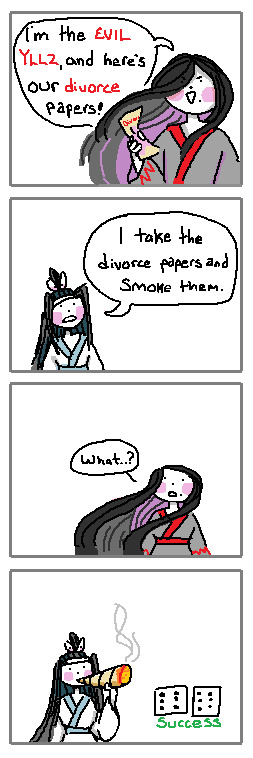
If I was in a lucid dream with a ghost, I would simply impress them with my blunt rolling skills
#poorly drawn mdzs#mdzs#wei wuxian#lan wangji#mdzs au#MDZS disco elysium au#This is brought to you by my Scrambled Egg brain - slowly burning up as I try to finish a long comic for this AU.#I hoped it would be done several days ago but I've changed things so many times....It is now Very Close to being done!#I probably should have just posted each page daily but at this point I'm just being stubborn. I want it complete and together.#Ruining the surprise a bit to say 'yeah its a digital art comic'#But its been tricky figuring out the style I want to use for it!#hence the swaths of MSpain(t) doodles that boil down to 'how would this look if I did X?'#I wanted to do a fully Black & White Ink style. But I scrapped it. Then I did small bits of colour. And scrapped it. Sigh.#This comic started out as just the first panel and then my brain went 'hold on. Its time to make a dumb joke'#Any disco elysium fans who finished the game probably know the scene I'm doing for the *actual* comic after seeing this <3#Anyways I know in my heart LWJ would roll the worst blunts ever his first time. And then dedicate himself to the rolling craft-#-until he has finally mastered it. He would roll blunts so good that people would hire him and pay him a monthly salary for it.#But he declines. His master blunts are for his beloved and his beloved alone.#wwx would roll above average but after having lwj do it for him he can ever go back.
2K notes
·
View notes
Text

My second favourite moment from Frequency by @cryptocism
Which you should go read, for all your Bart Allen Angst/Feels.
Black and white version under the cut.

#frequency fic#too many thads au#bart allen#impulse#frequency fic spoilers#this was the last art i completed before my wrist crapped out on me#art#drawing#ink#pen#digital#colour#if you're curious my fave part is thad swearing on the side of the highway#which has already been drawn by op#thanks for reading all the tags#enjoy your day
306 notes
·
View notes
Text

bosom friend
#art#my art#artists on tumblr#digital art#oc#pink space#it has been AGES since i've drawn rose !! she's had some redesign but Ayyy ! ! !#i should really be drawing her more she's fun to think about...#her and her Problems(TM)... ehe.....#//also did the detailing on the hair Why Did I Dooo Thaaat 💥 jfhjsfh#i had a good flow going for the first 3 panels but i almost gave up entirely while inking the last one i shan't lie lmao#/oh and ever since i figured out how i like to colour (i don't = i made it so so easy to just Do) i haven't had to spend so much time#colouring and picking out colours it's so niiiceeee :3 :D#/though i still struggled on the shading rn cuz i was tired of working on this already hjfh :'3 it's taken me way too long imo lmfhsf#/glad it's finished though!! and i learned a bit more about drawing noses so that's cool :D#//Ah but i hunger. i must depart now lol#maybe i'll get to some other stuff i wanted to do this weekend...#i have friday off so plaaaany of time! that i will undoubtedly spoil BUT. at least i can dream jjfjfhjghjf#alr alr. toodles ciao >wo
21 notes
·
View notes
Text


The first part of my comic!!!
I'm going to post a masterlist so you guys can navigate easier. I also kind of figured out the camera settings near the end so hopefully things should be a little more consistent from here.
It is drawn traditionally for now but I'll be inking and colouring it digitally at some point.
Next Page
360 notes
·
View notes
Text
@kikker-oma
Happy Fan Joy July, Oma!!!
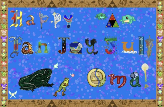
Oma, thank you so so much for making Fan Joy July and sharing it with us! Our fandom, our artists, writers, readers, etc have loved seeing or taking part in this crazy challenge.
This is our gift to thank you- from artists all around who were affected by, or got gifts from, or took part in Fan Joy July. We all love you so much- so we made letters/art for this (Zelda themed!). Many said that they had already wanted to make/write you something, and this gave an opportunity.
One of the things I've loved about this month is how community/interaction centered you made it. The challenge was for yourself to make art each day (you absolute maniac /affectionate)- but then others joined. This July we saw or made art or fics with recommendations. Every day you made art for a writer with a scene from one of their fics, and inspired others to do the same, and writers even wrote every day for an artist based off an art piece they made! This led to a month of gift giving- everyone interacting and getting love for creating.
You truly led to a month of Joy for a lot of loz/lu fans- making the name "Fan Joy July" quite accurate
Thank you, Oma
Thank you for the gifts you gave all of us and the way you inspire others
Additional ramblings and art credits below the cut :P
I'm so grateful to all my artists who stepped up so we could do this when I asked- almost 36 hours and 19 artists. The art is like patchwork, with all these different styles, both traditional and digital put together. But that's exactly what happened- we all got drawn together, just like the other month-long challenges. It's so cool how art always connects people.
The artists who participated are @zolanort @la-sera @nancyheart11 @galenfeadraws @shade-pup-cub @arecaceae175 @isasan347 @ghosthoard @smilesrobotlover @unexpectedstormy @skyloftian-nutcase @knight-of-aether @uniquevoidflowers @jinxedruby @windwakingwhale @skyward-floored @xaeorian @blarefordaglare and me Thank you to all of you- You are all so cool and I'm glad! If I accidentally missed tagging or listing someone please let me know I'm so scared of if that happened djskdjdkd
There are letters based off of the colours/theme of each of the Lu boys- it's mainly Zelda and linkeduniverse themed... but we couldn't not have frogs for Oma! I did a frog, his name is Froggy and I'm very proud.
Here's a picture with a list of who did what-
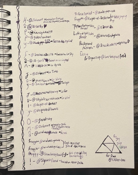
Normally I would apologise for my handwriting, but you guys would just tell me it looks good anyways and honestly it does look good. :D Sorry for the ink splotches tho, and I hope you can read it.
We did this for you, Oma, because... well you are awesome /gen. You gave us the opportunity for a great month and we wanted to say thank you for all the joy you brought us so... thank you :)
Art :D
As for everyone who said they wanted to talk to Oma or other Fan Joy July artists who they loved sharing this month with... feel free to tag and share in the reblogs. Share the joy I guess- there's enough to go around :D
Happy Fan Joy July, Oma :))
#fan joy july#fanjoyjuly#<honestly considered putting a shortcut for that phrase in my phone with the amount of times I said it in DMs and this post#I hope the final result is put together ok- this is my first time doing something this crazy. like a patchwork quilt of love :)#thank you again to all my artists yall came through- this place really is like a family#linked universe#linkeduniverse#smoll art#art#Lu#Loz#lu twilight#lu wild#lu four#lu time#lu sky#lu wind#lu chain#lu fic#lu flora#lu legend#lu hyrule#lu warriors#lu wars#lu fierce deity#Lu first#yep those two are there too#Oma#did I really just tag all those arsonists? yes yes I did apparently#my very favourite froggy friend
239 notes
·
View notes
Text

Tigrex VS Rathalos territorial battle, a tattoo design commission in commemoration of a great hunter. My client wanted to include many iconic elements. Funny story, my computer fried for a time while I needed to work on it (anyone want to fund a new one? Hahaha... -sweats while looking at Monster Hunter Wilds minimum GPU requirements), so I ended up doing the sketching in pencil, inking in ink, and then scanning them and colouring digitally at the end. Drawing the Aptonoths was fun. I think their design/model varies the most from game to game than any other monster I've drawn so far.
151 notes
·
View notes
Note
if it's okay to ask, how do you get the lines from your sketchbook to look so good in a digitally coloured drawing? i can see the paper texture but the lines look like you drew them digitally somehow? very clean, i mean. i always struggle to get rid of the colour of the paper, but being able to colour my pencil sketches would be so nice. do you edit it in a specific way?
usually i just take a photo on my phone because it has a better camera and then put it on the procreate app and adjust levels and turn down saturation on there until its ok. i usually colour with the paper colour around it a bit to even out the background. that drawing specifically i also had to draw over an ink drawing i'd drawn first that overlapped it . sometimes i adjust the sharpness too but only a bit. i dont mind it looking a bit crunched

#also editing the angle etc bc photos always make it wonky looking#also i drew the patterns on the sketchbook one after bc i liked them in the digital version . it was blank before the digital one#ive scanned stuff to colour digitally before which looks nicer but i can only do that when im in college bc i dont own a scanner#asks
53 notes
·
View notes
Note
How tf do you make your comics look like they're drawn in real ink... like what do you do to the colors to make them look like that o_o
part of it is learning to do comics through framed ink, which means i use a lot of techniques in common with real ink comics just as a matter of course, and some of it is the brushes! any large filled in areas i do with the squeegee. some people use screentones but i just don't have the patience lol, even digitally. the colours are really simple, i work in black and white and use gradient maps! make a gradient map layer, then set it to colour, and suddenly you have some fun effects

#text post#coming up for one year on doing comics! i thought i'd never be able to do these#i'm so thrilled!#the lines i do with yeti_rough from that brush post i linked#i have a hard time doing stuff super clean and polished and this style lets me lean into it#and lets me avoid the pitfalls of web comic style stuff i don't suuuuuuuper dig the look of. such is taste!
35 notes
·
View notes
Text

I've drawn a lot of designs like this recently since I got to saw them at the Brisbane concert! I might post the rest here later too.
Made on Photoshop, took about half a day coming up with a concept on paper and then making it digitally. I originally wasn't going to have the stitches, I only added them when I started inking but I think it made it look 10x better.
I tried to make each quarter show their most iconic part of face paint, while still making sense to be done in some type of order. Luckily I was able to capture that with everyone; the messiness of Papa I's makeup, then the more modern design of Papa III's eye and nose, Copia's black lips, cheek design, big ass chin, and Papa III's edgy mouth lines and cheek design. Papa III's hat was a fuckin pain to detail.
I was also going to make each quarter's smoke be the colours of their respective albums but I just could not make it look good or harmonize so I stuck with just Opus Eponymous since it has a better striking palette for something with limited colours.
Top left is Papa I,
Bottom left is Papa II,
Top right is Papa III,
Bottom right is Papa IV.
#artists on tumblr#digital art#fanart#ghost band#ghost bc#papa emeritus iv#papa emeritus iii#papa emeritus ii#papa emeritus i#ghost band fanart
245 notes
·
View notes
Text

Tel Branora
#drawn with ink coloured in digitally#glad i stuck with this one cos i wasnt sure how it would look#morrowind#tel branora#house telvanni#tes#the elder scrolls#tes fanart#illustration#fantasy art#art#fantasy illustration#vvardenfell
250 notes
·
View notes
Text
CONCEPTS AND RAMBLINGS | "animal" cult pmv extras
thank you everyone for liking my pmv (and on yt and twitter) !! i got more attention than i thought it would and that means the world to me! <33
here’s some of my concept art + rambles for it!

the first thing i made up, the character designs!
i didn’t think to refine them because they were good enough to use LMAO... so i scribbled colours down, threw a filter and called it a night
i wanted a sharp change from the verses and chorus (since the song goes from calm to... louder) so i made it greyscale (with a red filter) that changed to brighter colours!
also changed the text font/colour for ignacio hmm. the font was hard to read, in my opinion.
ignacio's design
ignacio loses his bandage colours because that was too many colours for my liking… i completely forgot his hair highlights tho
ah and he doesn’t get a mouth until the fire scene too…
it was only meant to be done for a few frames but i thought it be cooler if it was consistent.
the missing mouth represents his repressed feelings/silence, or something like that.
skidad's design
i got a few questions on whether skidad was a goat. despite looks, skidad’s design is actually based on the herbiadean/jacob sheep! four horns!
i have drawn skidad as a jacob sheep before as well!

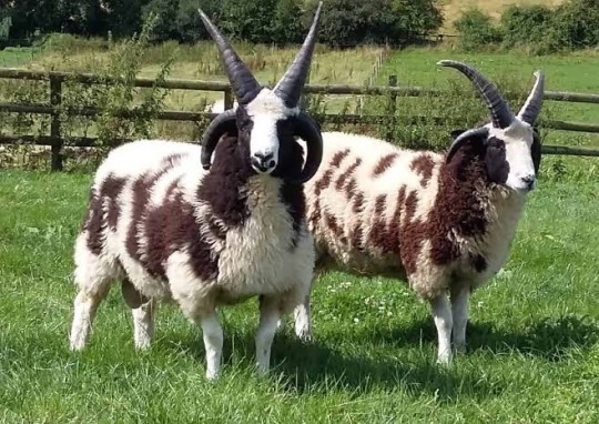
look at them ominous friends.
the resemblance to goats is something i considered as well (links with cult/sacrifice) so i think of it as a fun bonus
i gave him wolf teeth because the whole “wolf in sheep’s clothing” but also because i like it when prey animals are given predator features
i left the body as "human" because i only wanted the face to be censored… i considered clawed/darkened hands too but nah
skidad was originally going to be lined like ignacio, but i liked the lineless look for him so voila! makes it feel like he’s “not bound by anything”... actually, this is the same reasoning for the match to be “out” of the border, even though it’s ignacio’s hand
storyboards
i rarely storyboard (most are locked in my mind) but i figured it'd be fun to try!
halfway, i got bored of drawing digitally so i moved onto my notebook. i think it was a good decision; since i drew with my ink pen, it forced me to move on with my mistakes instead of clicking "clear canvas" lol
i had a pretty solid idea of what i wanted after weeks of listening to the song over and over again. the only thing that really changed was the mirror, which was replaced with a shadowy ignacio
the coloured thumbnails i actually did first, just to figure out out what i’m doing for the chorus part… limited palette my beloved
i didn't know where to put the text so i was scribbling everywhere lol

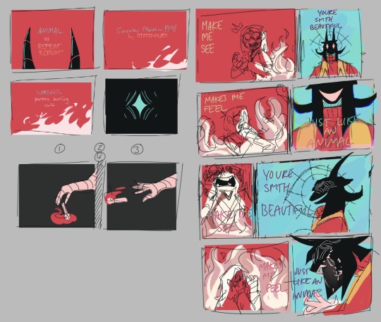
ratio changes
in the chorus, the ratio of ignacio and skidad’s frames changes! it’s more obvious if i combined them together, like this
less for ignacio, more for skidad


did you notice that the fire in this shot look like the cult ?!!! why did i do that, you ask? well:
the fire is the same “red”as the robe
too lazy to draw fire without abusing motion blur
mmm symbolism idk. it's somewhere there
it wasn’t in my plans but i’m happy i made the choice in the last minute. this was the last thing i needed to finish before syncing it up with the music

also this… i just wanted to point it out… make sure everyone knows... did you notice this? did you? did you did you? well now you do!!!
that's it !!! that's your trip into my mind!! okay byeeeee !!
#even though i gave my own reasons; i welcome any other interpretations!#/gen !! i'm very interested to hear! throw an ask or in the reblogs!#[ mourn's mourns ]#[ the art of mourning ]#spooky month ignacio#spooky month skidad#not apologising for the absolute chaos of my writing... its rambling for a reason........ /J LOL#i won't be free from skidad videos ough#but now im starting university so i guess they won't be out anytime soon HAHAHA#hope you enjoy reading this!
59 notes
·
View notes
Text


I finished the trad sketchbook I started last year, funnily enough on the exact same day (25.03.24 - 25.03.25) and it was nice enough today to take some photos to mark the occasion :)
Also I thought I'd share bc it's important to remind myself to make scrungly, scruffy art and not get hung up on "perfect" (the downfall of most of my digital work) - so here's your gentle reminder to make 'bad' art on purpose and have fun doing it!!
sources + a little explanation of my process under cut 🧡
images 1 + 2: Messmer the Impaler from Elden Ring, and my Tarnished knight having a nice moment with the Spirit Jellyfish Aurelia. Pretty sure I just used screencaps from the game for these and riffed off of that - Messmer might have been a fanart of a fanart?? I'll be honest, it's been well over a year so I'm a little unsure on that one. Made with alcohol markers, paint pens, colour pencils. Also a little bit of mixed media for the Tarnished background. images 3+4: ink study/ mixed media collage and pencil sketches of my beloved rookie from Dragon Age: Veilguard, because its not my art if I don't sneak in some dragon age somewhere! Again just used screencaps from my own game. Doodled with colour pencils, and added various scraps of mixed media/some notes I took while gaming. images 5, 6, 7: all of these are from Pinterest, specifically thelastcoffeebean references board. (Although a couple of them were found in the search more like this function). They have some excellent sources if you're just looking for random practice/inspiration. Also highly recommend their YouTube content, it's wonderful! Drawn with colour pencils mostly, with a black 2.0 fineliner/brush pen for shading and hatching and a gold paint pen for highlights. images 7, 8, 9: ink ghost doodles from my own brain with a brush pen and my favorite blue pencil/a blue highlighter. You can also see a smidgen of a cool sticker from the very talented Crom, I recently bought art prints from them and ofc had to hoard all the packaging stickers. The raven is a lino carving I made myself and then printed during a photography course I took part in last year and every time i see it I want to carve more lino things but alas. Think I just used a reference off the net for the birb. Think that's it! If you made it to the bottom of this ramble, I appreciate you<3 And if you have any questions feel free to drop me a comment :)
#traditional art#make bad art#you'll feel better i promise#sketches#sketchbook#mixed media#oscar thorne#the flock#datv rook#messmer the impaler#elden ring tarnished#still life#urban sketches
7 notes
·
View notes
Note
Where or how did you learn to draw?? You're so good at it 😭

Aww thank you!! I'm mostly self-taught, so it's been a lot of trial and error. I started with realism before going stylized, and I still draw mostly still life, especially pet portraits, in my free time! I'm honestly still pretty new to digital art.
When I first watched ROTTMNT, I fell in love with its bright, colourful art style and attention to detail. It’s one of the few shows that's held my full attention LOL. I ended up redrawing a lot of screenshots, which helped me learn a LOT (legit finally understood how line art worked thanks to this)! Eventually I felt comfortable making fan-art, mostly thanks to the Risetober challenge. And SO many silly doodles in my class notes.
I've never been good at putting HOW I learned these things into words, sorry! BUT I'll include some more detailed stuff under the cut if anyone is interested. Honestly, drawing Rise makes me insanely happy, and I think that helps more than anything else!😂
Thank you so much!!
If you're curious what I use to make my stuff, I use Procreate and Procreate Dreams on the iPad.
I always start with a quick 'pencil' sketch, which I then do a rough inking over (I generally either use the inking brush Mercury or Baskerville for this). Once this looks good, I go over and do a final line art with the inking brush Baskerville. It has a pretty intense stabilizer, so it takes some getting used to, but it'll keep the lines smooth! Then I colour in everything (I have saved colour palettes for each of the turtles, which makes this step WAY faster), and shade (again with Baskerville). I'm sure better brushes exist out there, but these all come with the base app and they're what I've use for everything thus far😅
A really good website I've found for learning how to draw figures and proportions is called Line of Action! One of it's most interesting features (at least for me) is it's timed classes, which basically gives you 30 seconds to 10 minutes to draw a person. This helps you to learn how to quickly block out a pose, which is really handy when drawing.
Also, because I did mention class doodles, here is one of my first ever bits of Rise fan-art (drawn during a very boring lecture).

15 notes
·
View notes
Text
Today I sorted through my "working" pile, sorting it into the following categories:
I don't need this anymore. (e.g. sketches I have already completed, correspondence, notes from the veterinarian)
Unfinished parts of finished projects (e.g. lineart that I then coloured digitally)
Projects in progress (e.g. assets for unfinished animations; partially drawn pictures I had to interrupt for some reason)
Paper I can still use (either empty or there are enough empty areas on at least one side to still sketch on)
Sketches I haven't done yet (some examples: the lancets and oculus window; Osculum infame; portal through the grave; Strauss lying on a bed; mystical vials; stained glass wings; cigarette kiss; animation of a vampire unfolding its wings)
Tissues with some ink on them that are clean enough and can still be used to wipe a pen/brush (improbably numerous)
This is not a project, this is a book, why was it here?! (4 altogether, of which 2 fiction and 2 nonfiction)
7 notes
·
View notes
Text

Brown hare colour sketch | Limited edition fine art print from an original drawing. My sketches start life as hand-drawn graphite images made on cartridge paper. I often work on these with charcoal, oil pastel or Caran d'Ache to create the look I'm after. The artwork is then scanned and finessed digitally ready for fine art printing. This process often referred to as Giclée printing uses the highest standard of printing methods to give gallery quality results that maintain all the details of the original sketch. The graphite pencils I use are Faber-Castel, the oil pastels are Sennelier and the china-graph is Caran d’Ache. The inks are pigment based archive quality (100years+). The heavyweight specialist papers I use are of the best professional quality, having a wonderful surface designed specifically for fine art drawings and illustrations. Very limited editions with only ten per size printed. All artwork is signed and includes a certificate of authenticity. The A5 are 5.8" x 8.25" (14.8cm x 21cm) The A4 are 8.25" x 11.7" (21cm x 29.8cm) The A3 are 11.7" x 16.5" (29.8 cm x 42cm) Custom sizes are available on request up to A2 Original sketches may also be available on request. Frames not included in price. Free shipping on artwork to all destinations. https://www.seanbriggs.co.uk/product/brown-hare-colour-2/?feed_id=6551&_unique_id=67d28a157a6cf
7 notes
·
View notes