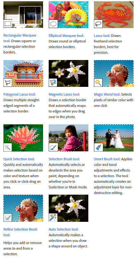
#elliptical marquee tool in photoshop
Explore tagged Tumblr posts
Visit Tumblr Blog
Explore Tumblr blogs with no restrictions, modern design and the best experience.
Last Seen Tumblr Blogs


Fun Fact
Kazakhstan’s Minister of Communications and Informatics has blocked the Tumblr site because it contained 60 sites of terrorism, extremism, and pornography in 2015.
Note
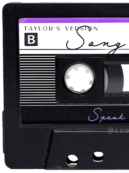
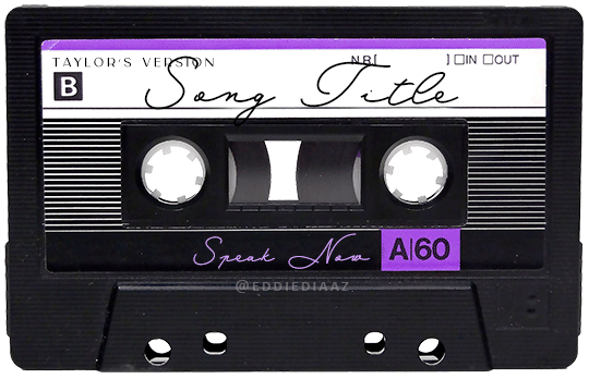
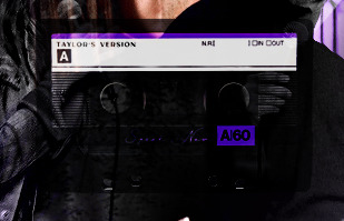
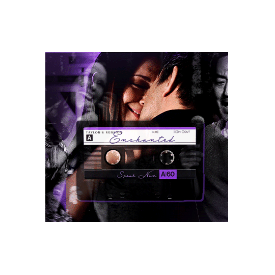
Hey!! I just wanted to say that your recent speak now gif set is sooo stunning. I was wondering how you managed to create that cassette tape effect if it isn’t any trouble? It’s really so pretty.
Have a great day! ✨
ahhh thank you so so much! first of all, i cannot take any credit for this effect, as it was greatly inspired by this amazing yellowjacket gifset by @thewintersoldier!!
but here's how i recreated the effect, from a cassette png (found on pngwing here), to this animated cassette effect (as seen in my speak now set):
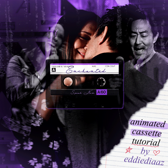
psst: i usually always create in photoshop cs5, but for this effect you need a recent version of photoshop because it's using transform keyframes (i think cs5 doesn't let you do that, or i just don't know how to lol). i used cc 2019 for this.
sorry if this is lengthy or has too much or too little details haha, but i hope it's comprehensible! english is not my first language so i also apologize in advance for any mistakes!
I. PREPARING THE CASSETTE
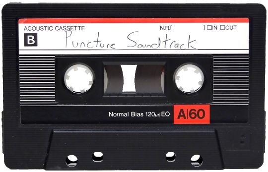
so, starting with the png here:
i removing everything i didn't want on the cassette png with the brush tool by just drawing the right color over the unwanted text. for the color, i then went to image > adjustments > hue/saturation and in the red tab, i played with the hue slider to get that purple color. finally, i added some text to my liking, and this is what i ended up with:
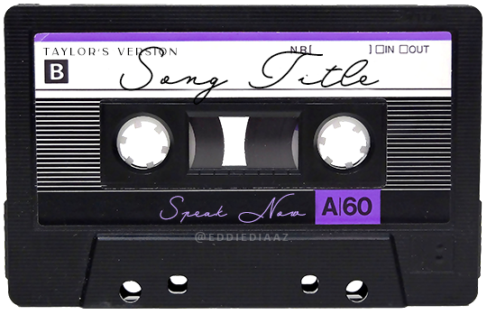
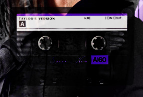
(not necessary but: i also selected the white lines on each side with the magic wand tool because i wanted these lines to be transparent. once your selection is done, go right click > layer via cut. it will create a new layer of the cutout you just made. you just need to disable or delete the layer to make the selection (lines) transparent.)
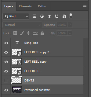
at this point you want to have only 2 layers: the revamped cassette and the text layer. you can remove the text layer actually, and just add the title back at the end, as it is not necessary for this effect. i just like to have the visual.
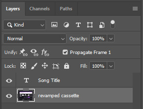
if you have multiple layers, you need to select all of them (except the song title layer), right click on the png layer and click on merge layers. this will create one layer with all the editing you made on the cassette. if you think you will need to edit this later though, i would save the file as a psd before merging the layers.
II. THE EFFECT
okay, so now that you have your cassette, make sure your video timeline is activated, not frame animation, and you are ready to go.
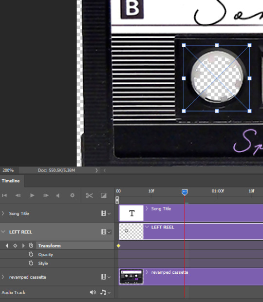
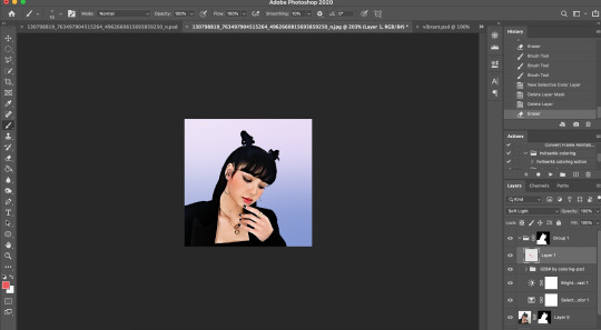
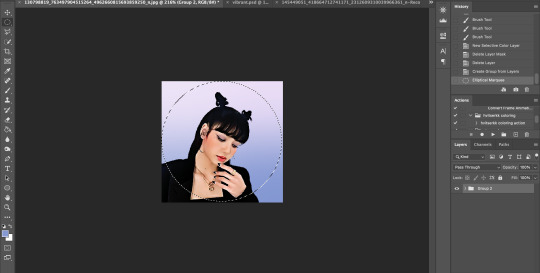
first, you want to create a perfect circle shape around one of the reel with the elliptical marquee tool (hold shift while dragging the circle). make sure it covers the entire area that will later be rotated. make sure this circle is perfectly centered around the reel or otherwise the animation will be a bit lopsided.
then right click on this selection and go "layer via copy". this will create a layer of only that circle selection. important step: right click on that new layer and go "convert to smart object". the layer should look like that, i've renamed mine:
now if you go to your timeline and open that new smart object layer, you will see that you have 3 keyframe options. we only need the transform one.
go to the start of the timeline and activate the transform animation by clicking on the stopwatch button. a keyframe will be created automatically.
to create the actual animation, move the position of the cursor on the timeline further, i put mine at the 01:00f mark so it's easier to create the right timing.
then what you want to do is select the reel smart object layer and hit ctrl + T. a box will appear and this is how you will make the reel rotate.
to rotate the reel shape, move your cursor near the blue box on your canvas and drag it until you have rotated the shape halfway through and hit enter. another keyframe will be created and if you play your animation, the reel should rotate on itself for half a turn

move your position on the timeline to 02:00f and do the same thing: select the left reel smart object, hit ctrl + T, rotate for another half turn, and hit enter. this third keyframe should be the last one needed for the animation and you should have a full animated rotation of the reel.
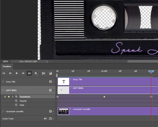
play your animation, and adjust the speed to your liking by dragging the keyframes on the timeline (but make sure they stay within the same distance from each other). the closer the keyframes are, the faster the animation are, and the further they are, the slower it'll be.
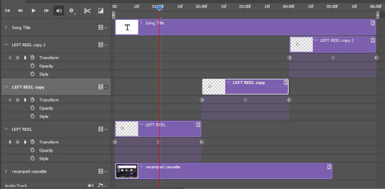
then you can just trim the smart object to your animation's length, and duplicate (right click the smart object > duplicate layer) this layer the amount of times needed (i find this less finicky than duplicating keyframes), and placing them one after the other. three full turns should be enough. this is what my timeline looks like right now:
and my animation for the left side looks like this:
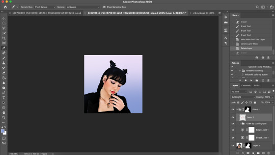
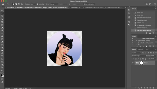
as you can see, we can see the little "dents" peeking through behind the animation. we don't want that! to remove it, select the revamped cassette layer (that should be under the reel smart object), and create another perfect circle around it with the marquee tool. this time make sure it's smaller than the previous one, it just needs to cover these dents.
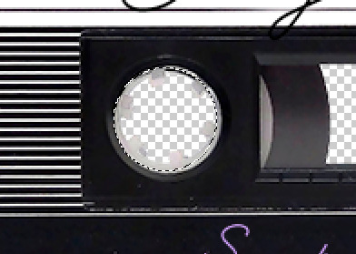
then right click on this selection on your canvas and go "layer via cut". this will create a new layer with that selection, and all you need to do is to disable it. this is removing the information in that circle.
once you are happy and the animation works, you can just delete that cut layer. now the animation is done and looks like this:

III. SECOND ANIMATION
one you have done it on the left side, you just gotta do the same thing on the right side. you can also try duplicating it, but i found it finicky for some reason (or maybe i'm just not used to the controls of this 2019 photoshop version?).
this is what i have once i've done the same thing on the right reel:
once i am happy with the speed and everything, i want to have only one layer so it's easier to use on gifs. first, i will save this animation as a psd file, in case i want to reuse it. then i am removing the song title layer and will be flattening everything and creating frames from this animation. to do so i am using the "save" action from here.
i'm not sure why it does that, but it's creating a couple of frames where the reels are a bit offset from their position everytime there's a full circle done, so i just delete these 5-6 frames. you can also change the speed here, but by default it should be 0.05.
once you are happy with it, just turn these frames into a smart object with the video timeline again (convert frame animation to video timeline and select all the frame layers > right click > convert to smart object)
now you have a smart object that is ready to be used anywhere!
IV. FINAL TOUCHES
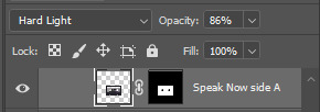
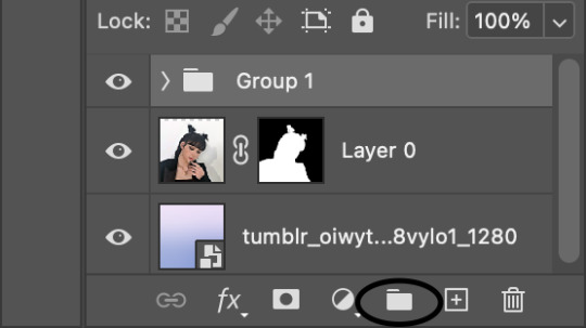
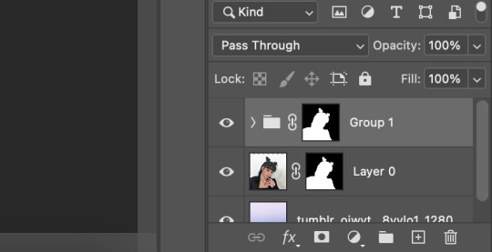
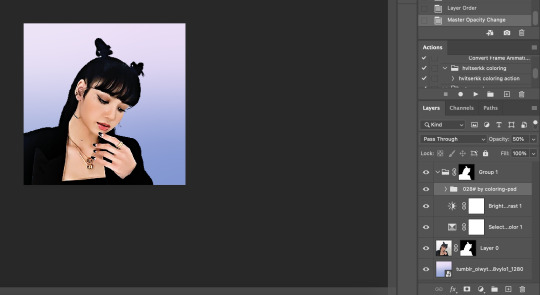
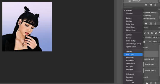
for my particular speak now gifset, i have multiple layers of the animated cassette on each gif:
1, bottom one - cassette layer set to the blending mode "hard light" and set to opacity 86%:
2, middle - this same cassette layer set to hard light, but with the opacity at 100%, AND with a layer mask so it's only applied to the animated reels (i wanted them to show up more):
3, top one - and finally a third layer with another layer mask because i wanted the white label and speak now area to be less see through. it's set to the normal blending mode and the opacity is at 75%

and then i just added the song title on top at 100% opacity and normal blending mode, and added some drop shadows, and tada!
there we have it, i hope this was helpful <3
#alie replies#Anonymous#photoshop#tutorial#*ps help#completeresources#allresources#resourcemarket#userrobin#userraffa#userpjo#usertreena#tuservaleria#tuserheidi#userdean#userrainbow#usersalty#userzaynab#usernik#swearphil
423 notes
·
View notes
Note
how do you get the UI with phone calls (where they put sim portraits in a circle) to have a transparent background? every time I try in photoshop it ends up looking wonky and parts are erased that shouldn’t be
hi! I use the marquee tool in photoshop. for the icons, I use the elliptical selection tool, and for the text, I switch to the rectangular selection tool. hope this helps!
2 notes
·
View notes
Text
How to Create a Realistic Spotlight Effect in Photoshop

Creating a realistic spotlight effect in Photoshop can alchemize your images,drama, adding depth, and focus to your subject. Whether you're working on a portrait, a product image, or any creative project, mastering this effect can elevate your design. In this guide, we'll break down each step to help you achieve a realistic spotlight effect in Photoshop. Let’s dive in!
Get More>>How to Create a Realistic Spotlight Effect in Photoshop
Step 1: Open Your Image Photoshop
Start by opening your image in Photoshop. Choose an image that could profit from a spotlight effect, such as a portrait or or still life shot. Make sure your Layers Panel is visible. If it isn’t, press F7 to toggle it on.
Step 2: Duplicate the Background Layer
In the Layers panel, click on the background layer and select “Duplicate Layer.” This creates a copy of the original image, which allows you to work on the spotlight effect out of altering the original.
Step 3: Create a New Layer for the Spotlight Effect in Photoshop
Click on the New Layer icon at the bottom of the Layers Panel, or press Shift + Ctrl + N (Cmd + Shift + N on Mac) to create a new blank layer. Name this layer “Spotlight” for easy identification. This is where the spotlight effect will be applied
Step 4: Choose the Elliptical Marquee Tool
Select the “Elliptical Marquee” from the toolbar. You can find it by right clicking on the “Marquee Tool”. We’ll use this tool to make the shape of our spotlight.
Step 5: Draw the Spotlight Shape
Click and drag to create an ellipse on your photo, encompassing the area you want to spotlight.This should be roughly centered on your subject. Don’t worry if the shape isn’t perfect; we can refine it after.
Step 6: Feather the Selection
To make the spotlight effect more realistic, you’ll need to feather the section. With the selection active, go to Select > Modify > Feather. In the Feather dialog box, enter a pixel radius. A value between 50–100 pixels often works well for a soft spotlight effect, but this depends on the image resolution. The higher the radius, the softer the edge.
Click OK to apply the feathering. This will blur the edges of your selection, creating a soft transition
Step 7: Add a Solid Color Fill Layer Photoshop
In the Layers Panel, click on the New Fill or Adjustment Layer icon at the bottom (it looks like a half-filled circle). Select Solid Color from the list that appears. Choose a color for the fill layer. For a spotlight effect, you might start with black to create contrast with the spotlight itself, or experiment with other colors for creative effects. Click OK to confirm.
Step 8: Adjust Layer Blending Mode
In the Layer panel, set the blending mode of your solid color fill layer to “Overlay”. This blending mode will allow the image to show through, creating a realistic spotlight effect.
Step 9: Refine the Spotlight with Gaussian Blur
With the “Spotlight” layer still selected, go to Filter > Blur > Gaussian Blur. Edit the radius until you achieve a soft edge for the spotlight. This will help blend the spotlight naturally with the image. A radius of around 50–100 pixels often works well, but it can vary depending on your image size.
Step 10: acclimate Opacity
To fine-tune the strength of the spotlight effect, adjust the opacity of the accuret Color Fill Layer in the Layers panel. Reducing the opacity will create a softer, more subtle spotlight, while increasing it will intensify the effect. Try different opacity settings to find the perfect balance for your image
Step 11: Create a Vignette Effect (Optional)
To add drama and focus even further, consider adding a vignette:
Create another new layer and fill it with black.
Go to Filter > Lens Correction, and in the Lens Correction dialog, select the Custom tab.
Use the Vignette slider to darken the edges, enhancing the spotlight effect.
Step 12: Final Adjustments
To make your spotlight effect even more realistic, you can make adjustments to your photo. This might include adjusting contrast, color balance and brightness. Use tools like Levels, Curves, and Saturation to fine-tune your photo and make the spotlight blend seamlessly.
Tips for a Perfect Spotlight Effect
Use Layer Masks: To blend the spotlight subtly, apply a Layer Mask on the spotlight layer and use a soft brush to gently erase parts that may appear too intense.
Experiment with Colors: Try using different colors in the Gradient Editor for creative effects.
Apply Multiple Spotlights: For complex compositions, duplicate the spotlight layer and adjust the size and position for added visual depth.
With these steps, you’re now ready to create an eye-catching and realistic spotlight effect in Photoshop! Remember, practicing these techniques will improve your control over lighting effects, enhancing your overall design skills. Happy editing!
Get More>>How to Create a Realistic Spotlight Effect in Photoshop
#How to Create a Realistic Spotlight Effect in Photoshop#How to Create a Realistic Spotlight#Realistic Spotlight Effect in Photoshop
0 notes
Text
Most Common Photoshop Tools for Beginners

Adobe Photoshop is a powerful tool for photo editing, graphic design, and digital art. However, for beginners, navigating through its vast array of features can be overwhelming. To help you get started, here’s a guide to the most common Photoshop tools every beginner should know.
1. Move Tool (V)
The Move Tool is one of the most basic yet essential tools in Photoshop. It allows you to move layers, selections, and guides within your project. To use it, simply click and drag the object you want to move. You can also use arrow keys for precise positioning.
Quick Tip: Hold down the Shift key while dragging to constrain the movement to vertical or horizontal directions.
2. Marquee Tool (M)
The Marquee Tool is used to make rectangular or elliptical selections. It’s perfect for cropping or isolating parts of your image. You can choose between the Rectangular Marquee Tool and the Elliptical Marquee Tool by holding down the Marquee Tool icon in the toolbar.
Quick Tip: Hold down the Shift key while making a selection to create a perfect square or circle.
3. Lasso Tool (L)
The Lasso Tool provides more control over your selections. It allows you to draw freeform selections around objects in your image. There are three types of Lasso Tools: the standard Lasso, the Polygonal Lasso for straight-edged selections, and the Magnetic Lasso, which snaps to the edges of the object you’re selecting.
Quick Tip: Combine the Lasso Tool with the Alt key to subtract areas from your selection.
4. Crop Tool (C)
The Crop Tool is essential for resizing and framing your images. It allows you to cut out unnecessary parts of an image and focus on the main subject. You can adjust the crop by dragging the edges or corners of the crop box.
Quick Tip: Use the Rule of Thirds grid that appears when cropping to improve your composition.
5. Brush Tool (B)
The Brush Tool is one of the most versatile tools in Photoshop. It’s used for painting, drawing, and even retouching photos. With the Brush Tool, you can adjust the size, hardness, and opacity of your brush strokes to achieve different effects.
Quick Tip: Press the left and right bracket keys ([ and ]) to quickly resize your brush.
6. Eraser Tool (E)
The Eraser Tool works like a digital eraser, removing pixels from your image. It’s particularly useful for cleaning up edges or creating transparent backgrounds. There are three types of Eraser Tools: the standard Eraser, the Background Eraser, and the Magic Eraser.
Quick Tip: Lower the Eraser Tool's opacity for a more subtle erasing effect.
7. Clone Stamp Tool (S)
The Clone Stamp Tool is used to duplicate parts of an image. It’s ideal for removing blemishes or imperfections. To use it, hold down the Alt key and click on the area you want to copy, then paint over the area you want to cover.
Quick Tip: Adjust the brush hardness for softer or sharper edges when cloning.
8. Healing Brush Tool (J)
The Healing Brush Tool is a must-have for retouching photos. It blends the sampled area with the surrounding pixels, making it perfect for removing spots, wrinkles, or other imperfections.
Quick Tip: Use the Spot Healing Brush Tool for quick fixes, as it automatically samples nearby areas.
9. Text Tool (T)
The Text Tool allows you to add text to your images. You can choose from a wide range of fonts, sizes, and styles to customize your text. This tool is essential for creating posters, banners, or any design that requires text elements.
Quick Tip: Use the Character and Paragraph panels to fine-tune your text settings.
10. Gradient Tool (G)
The Gradient Tool is used to create smooth transitions between colors. It’s often used for backgrounds, overlays, and effects. You can choose from linear, radial, angular, reflected, or diamond gradients.
Quick Tip: Hold down the Shift key while dragging to create a perfectly straight gradient.
11. Zoom Tool (Z)
The Zoom Tool helps you zoom in and out of your image, allowing you to focus on fine details or view the entire composition. You can activate the Zoom Tool by pressing "Z" or using the magnifying glass icon.
Quick Tip: Hold down the Alt key while clicking with the Zoom Tool to zoom out.
Conclusion
Mastering these common Photoshop tools will provide you with a solid foundation for more advanced techniques. As you become more familiar with Photoshop, you'll find that these tools are not just helpful but essential in bringing your creative vision to life. Practice using each tool, experiment with their settings, and soon you’ll be creating stunning designs with ease.
0 notes
Text
How to Create a Vintage Photo Look in Photoshop
Creating a vintage photo look in Photoshop is a popular technique for giving your images a timeless, nostalgic feel. This process involves several steps, including adjusting colors, adding textures, and applying various effects to mimic the characteristics of old photographs. This guide will walk you through the essential steps to create a vintage photo look in Photoshop.
Step 1: Open and Duplicate Your Image
Begin by opening your image in Photoshop. Go to File > Open and select the photo you want to work on. Once the image is open, duplicate the background layer to preserve the original image. Right-click the Background layer in the Layers panel and select "Duplicate Layer," or press Ctrl+J (Cmd+J on Mac). This will create a new layer on top of the original, which you will use for your edits.
Step 2: Adjust the Colors
Vintage photos often have a distinctive color palette with faded tones and warm hues. To achieve this effect, start by adjusting the color balance. Go to Image > Adjustments > Color Balance or use the shortcut Ctrl+B (Cmd+B on Mac). In the Color Balance dialog box, adjust the sliders to add more red and yellow tones to the image. This will create a warmer, aged look.
Next, add a Curves adjustment layer by going to Layer > New Adjustment Layer > Curves. In the Curves panel, create a slight S-curve to enhance the contrast. This will make the dark areas darker and the light areas lighter, mimicking the higher contrast found in vintage photos.

Step 3: Apply a Sepia Tone
A sepia tone can further enhance the vintage look. To apply a sepia tone, add a Hue/Saturation adjustment layer by going to Layer > New Adjustment Layer > Hue/Saturation. In the Hue/Saturation panel, check the "Colorize" box. Set the Hue to around 30 for a sepia color and adjust the Saturation to your liking, typically between 20 and 30. This will give your image a warm, brownish tint characteristic of old photographs.
Step 4: Add Film Grain
Film grain is a hallmark of vintage photography, adding texture and authenticity to your image. To add grain, create a new layer by going to Layer > New > Layer and fill it with 50% gray by going to Edit > Fill and selecting 50% Gray from the drop-down menu. Next, go to Filter > Noise > Add Noise. In the Add Noise dialog box, set the Amount to around 10-15%, choose Gaussian, and check the Monochromatic box. Change the blending mode of this layer to Overlay and adjust the opacity to achieve a subtle grain effect.
Step 5: Apply a Vignette
Vignettes are common in vintage photos, drawing attention to the center of the image by darkening the edges. To create a vignette, go to Filter > Lens Correction. In the Lens Correction dialog box, navigate to the Custom tab and adjust the Vignette sliders to darken the edges. Alternatively, you can create a vignette manually by creating a new layer, using the Elliptical Marquee Tool to draw a circle around the center of your image, inverting the selection (Shift+Ctrl+I or Shift+Cmd+I on Mac), and filling the selection with black. Apply a Gaussian Blur to this layer (Filter > Blur > Gaussian Blur) and adjust the layer opacity to create a subtle vignette effect.
Step 6: Add Light Leaks
Light leaks can give your image an authentic vintage feel. To add light leaks, create a new layer and fill it with black. Go to Filter > Render > Lens Flare and choose a flare type that suits your image. Position the flare where you want the light leak to appear, then change the blending mode of the layer to Screen. Adjust the opacity to make the light leak look natural. You can also experiment with different colors and positions for a more customized effect.
Step 7: Final Adjustments
To complete the vintage look, make any final adjustments to enhance the overall appearance. You might want to tweak the brightness and contrast, add a slight blur to soften the image, or use the Burn tool to darken specific areas. Consider adding a border or frame to give the photo an authentic old-fashioned look.
Conclusion
Creating a vintage photo look in Photoshop involves a combination of color adjustments, texture additions, and effects to mimic the characteristics of old photographs. By following these steps—adjusting colors, applying a sepia tone, adding film grain, creating a vignette, incorporating light leaks, and making final adjustments—you can transform modern images into timeless, nostalgic works of art. Experiment with these techniques to find the perfect vintage style that suits your photos, and enjoy the creative process of bringing the past to life.
0 notes
Video
youtube
Everything You Need to Know About Marquee Tools in Photoshop #photoshopt...
Everything You Need to Know About Marquee Tools in Photoshop #photoshoptutorial #viral This article provides an overview of the various marquee tools available in photoshop, including their features, benefits, and drawbacks. It also offers tips on how to choose the right tool for your needs. Please subscribe for updates on upcoming videos. You Can Also Follow me On Facebook : https://www.facebook.com/onesecond0 Playlist : For Graphic designer : https://www.youtube.com/playlist?list=PLpuSKeQTK63WUXCzJRAiiOLbEhgsOaQnH&jct=zaPg_1Q7qPe8KyKJXXUqSuqDIqTNAg For Web developer: https://www.youtube.com/playlist?list=PLpuSKeQTK63V9UvuXSr45UECL-0kl2HzA&jct=3jowbQcVBDuX8C_RFtYH1_2lWq88zw and more Videos : https://youtu.be/X-dKOQSY-Bw https://youtu.be/IvEl3sJ7-B0 https://youtu.be/BRWrrFnUCUY https://youtu.be/BRWrrFnUCUY photoshop,marquee tool in photoshop,marquee tool,photoshop tutorial,adobe photoshop,elliptical marquee tool,photoshop marquee tool,rectangular marquee tool,adobe photoshop (software),marquee tool photoshop,photoshop for beginners,single column marquee tool,photoshop cc,elliptical marquee tool photoshop,photoshop tutorials,photoshop marquee tools,marquee tools photoshop,marquee tool use in photoshop,marquee tool in photoshop cs6,photoshop course
0 notes
Text
Layers, Masks and Selecting
Layers, Masks and Selecting are photoshop tools used for compositing images like combining different images, parts of images,...
Layer mask:


With this photo, I used selection tool to duplicate it. Then to remove some of the extra components that didn't match the image, I used pen tool while in layer mask. In layer masks tool, painting black color means making pixels transparent.
Selection mask:


To change the fruit colors, I needed to use elliptical marquee tool to select them but to have that exact selection shape in the image, I had to mess around with lasso tool with add selection( shift) or subtract ( option) to carefully selected what I want.
Work path to selection:


To select these 5 leaves, we can use lasso tool but we use pen tool in this case because It can handle many curves especially with these leaves but it demands more carefulness to do so. After using the pen tool, it just made a line around it but not actually selected it. We have to use work path ( command + click it ) to select it. Now we can chang it the way we want.

Select the bird then put it in layer mask to make it easier to edit its overall shape to better looking one by using pen tool to for curves and paint it black at some unwanted parts to make them transparent.
0 notes
Text
06/03/2024
lesson 5
working on layers
back ground colour is solid

X = swap for the stroke and fill
B = brush
E = Erase
[ ] = shrink/enlarge tool

playing around with the brush and eraser, stroke size and harshness
option = colour swab
option delete = full layer with colour
command = delete = full with background colour
command A + delete = colour layer

playing with a new layer, the opacity of he stroke.

shift = add to selection
option = subtract from selection
space= repositions marque
using the marquee tool to make coloured shapes, cutting out shapes and multiplying shapes.
while using move tool (v):
photoshop will move whatever is under your pointer (selection or whole layer)

command j = select w/ marquee and go onto own layer
command t = tranform gizmo

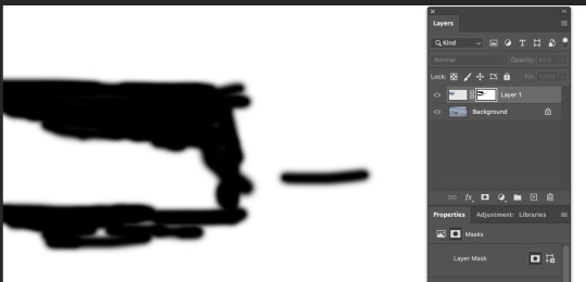
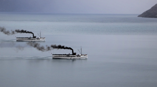
We copied and pasted the boat and then blended it into the water, by creating a mask on the copy and pasted layer and then going option and clicking the mask. then we had brush on making sure it was on black as,
black = visible
white = hidden
and then we made the stroke soft to help blend. Then to finish it off we made it smaller and put the opacity down as in background.

We used the orange to practise with the elliptical morquee tool and outline the orange, then adding more to make the outline of orange. then used the polygonal lasso tool for the other part by pressoption then go to hue and satuation and change the hue.

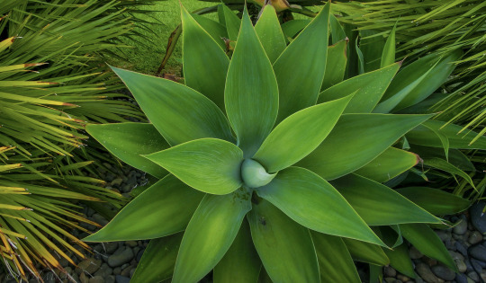
We used the pen tool for this plant. by making handles and pressing option to direct the handles. We trace around the coloured parts and then we went to satuation and hue to change the colouring.
path tool (p)
pen tool
arrow tool
tweak path
window path
command click path thumb nail to turn path into select

For the Humming we used all the skills we worked on the other photos and put them all together as one.
1 note
·
View note
Text
Photoshop - heading
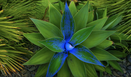
Leaf cut out + colour:
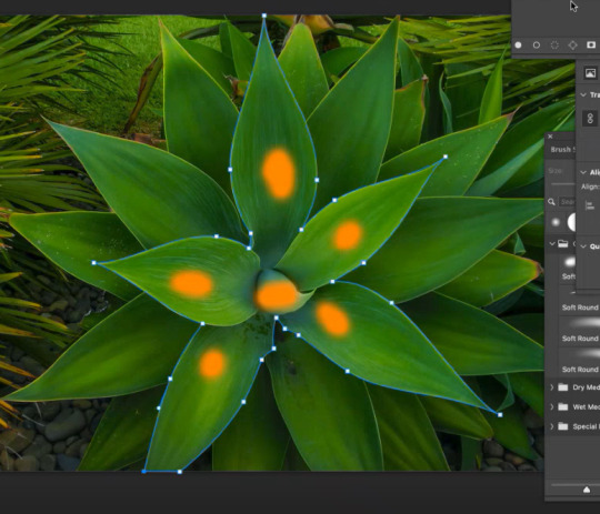
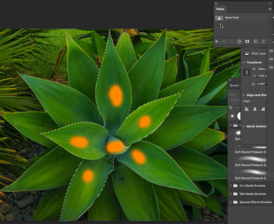
Use pen tool (p) and raw over the area I want to work with to make a path. ~ You can tweak the path by press 'A' and modifying the anchor points and moving the handles. (IMG1) Then to chnage the path from a path to a selection, you need to open the 'Paths' window. Go to Window -> Paths. Then press command + click on the thumbnail image of the paths window to turn the path into a selection. Now you have selcted soemthing using a pen tool (IMG2)

After making this into a selection I then changed the selection of the leaves by using colour balance and I made the leaves fade blue.
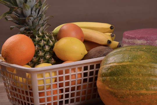
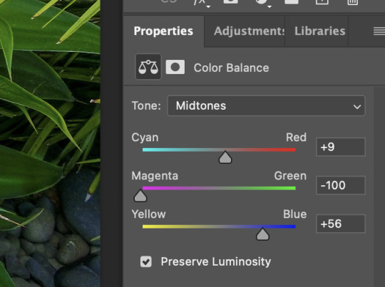
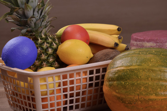
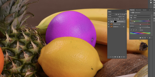
Fruit colour: Select an area
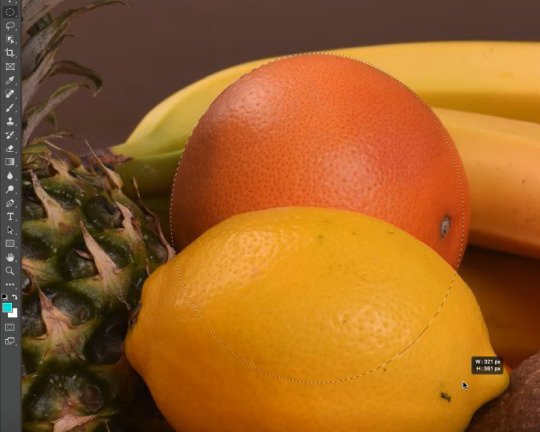
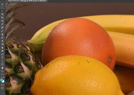
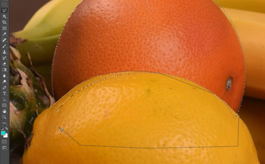
I used the elliptical marquee tool to highlight the orange roughly. ~ I can use the spacebar to move the selection around while making the selection. I then used the elliptical tool to remove part of the selection by holding down option while making an elliptical shape over the area I didn't want apart of the selection. I then went over in finer detail of the orange selection by using the polygonal tool. I used this tool to draw custom lines of the areas I did and didn't want to be apart of the selection (shift to add, option to remove from the selection)


After making this selection more accurate and fine, I then modified the colour of the orange, I decided to make it red tones. (IMG1)
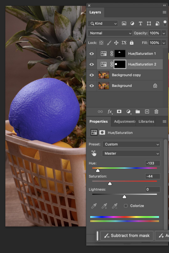
We then picked a second orange and this time used the object selection tool to select it quickly. We then applied the colour balance adjustment to the selection layer. This effect goes onto all the layers. But there is a button (IMG2) when it is clicked it will not have the effect (e.g, colour balance) on every layer below (white square with little arrow). This is found in the adjustments layer, properties section at the bottom of the window. I then did the same thing with another orange, except this time I made this 2nd orange become blue (IMG3)
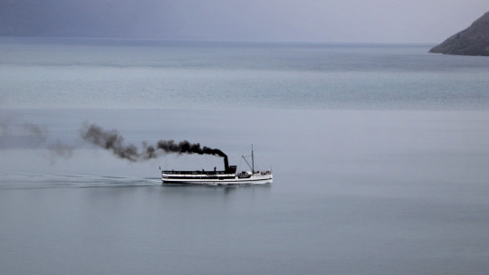
Ship duplicate:
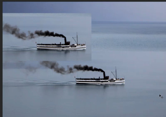
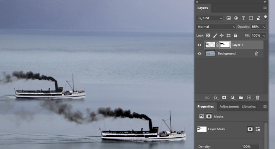
Use masquee tool to select the boat Command + J to copy and paste the selected area on a ne wlayer by itlsef. Move the new layer to another spot on the water (to look like two boats) Press the masking icon (japanese flag) to turn the copied boat into a mask. Use thw brush tool to help blend in the image and get rid of excess parts of the image you dont want. ~ White brush = 100%. Black brush = 0% opacity. Grey brush = some opacity (closer to black, less opacity, closer to white more opaxity.) Ypu can also use the soft and hard brushes to chnage how the image fades from one to the other. I used the softer brush so the water from both images faded into eachother more.
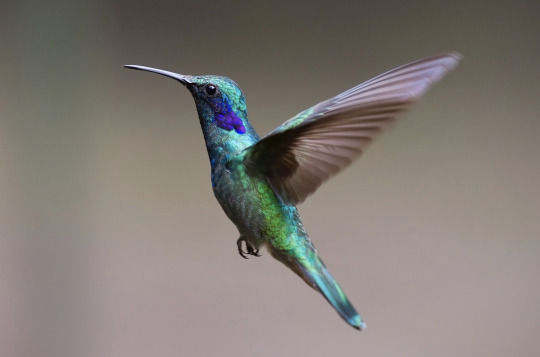
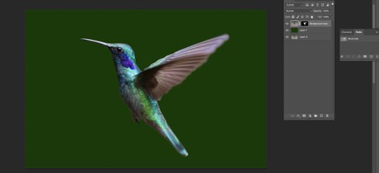
Hummingbird: Cutout & Paste
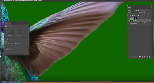
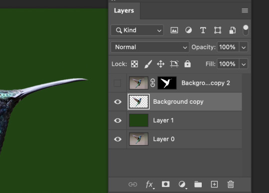
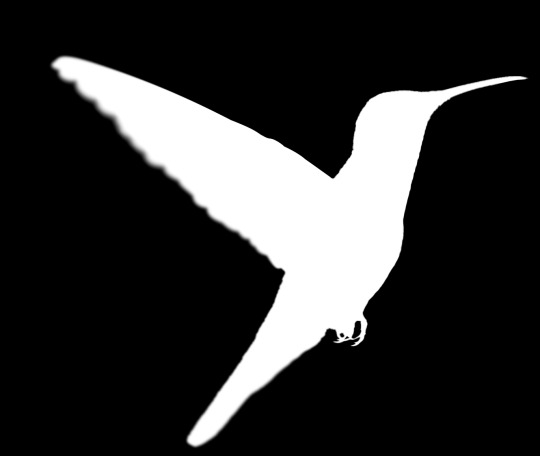
I created a duplicate of the bird image to work with as a spare. I then used the object selection tool to quickly select the bird shape from the background, but this object selection tool made some errors, so I had to fix them. I made a new layer and made it a dark green colour to help me easily see the mistake and things I need to work on with the outside of the bird selection. (green screen) After looking a the green screen image bird (IMG1), I then realized the wing ends of the bird were quite sharp and not very realisic, so it would've looked weird when I paste it into the new photo background. To fix up the shaping of the bird cut out I made a mask layer of the bird (IMG2)
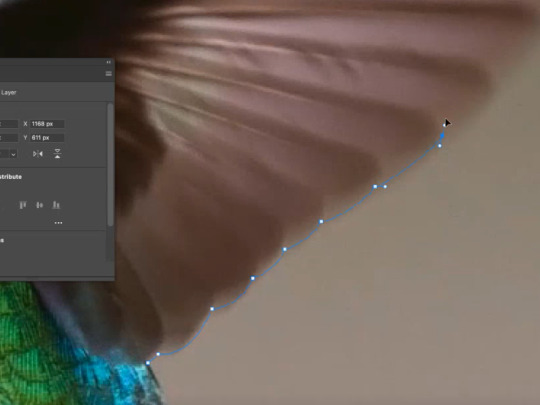

I used the pen tool and went along the bird wing. I drew the line very close to the edge of the bird wing, because I didn't want any of the original background still in the cutout image of the bird. (IMG1) We then went onto the masked layer and coloured the wing section in white (so it fully showed), and coloured the exterior of the wing section in black (so it was invisible). (IMG2) This then made the wing very crisp, so I had to change that. I could tell it was very crisp because I had created a greenscreen layer to help me see what I was working with against something. (IMG3) To do this I used the blur tool to blur the edges of the wing of the bird, so that the shape of the bird looked more natural and less crispy and unrealistic when it was put into the new photo background.
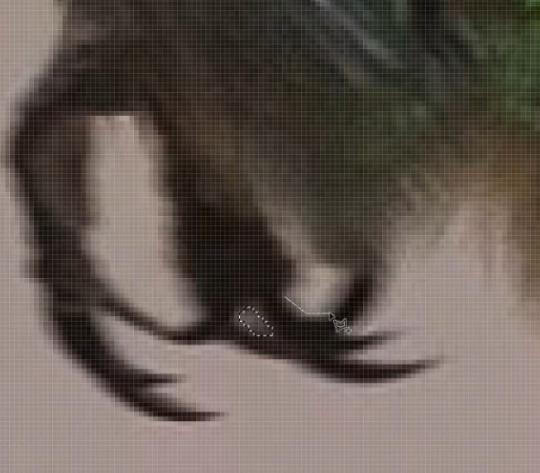


I then went around the bird shape and made sure everything was properly cutout using the pen tool so that when I placed the bird image on the new background it would only contain the bird, and nothing else. I removed a bit of dark background below the beak, and between the toes of the bird. (IMG1) The background can also blend into the photo and/or effect the colouring of the image so I re-coloured some parts of the bird such as the top of the bird head and underneath and belly I used the brush tool and used the lighten and dark effect to change how the brush was applied. (IMG2) I then flipped the picture of the bird so that the bird image would face in a better direction for the new background image. I did this by going to Image -> image rotation -> Flip image (IMG3) I then adjusted the lighting on both the bird image and the background image to better fit and blend in with each other (IMG4)

REFLECTION: I loved doing the leaf cut out one, because I enjoy using the pen tool and I also enjoyed using the colour balance tool to make the plant appear to have a fading blue power stemming form the middle!! I was easy, but helpful and I enjoyed learning what I could do.
The fruit activity was super helpful in teaching me the different ways to use selection tools, what works best and why, and what I prefer. I prefer starting the the object selection tool, and then cleaning it up afterwards with the pen/lasso tool.
I found the boat activity very fun because it was as if I was creating something new all together. I have also always wondered the technique of copying something and making it fade into the background smoothly, so it was great to see how to do it using the different opacities and brush tools.
The humming bird was definitely the hardest, more complicated one of the 4 different tasks. But this task proved to be super helpful when moving onto doing more photoshop cut out (such as the jumping man). It was good to know the techniques of changing the colours of some edges, to remove unwanted light and shadow sources to help blend things in, and also to learn the techniques of blurring the edges of the moving wings to fade in better!
Overall I enjoyed this lesson a lot and learning various skills, tricks and techniques of the different possible ways to manipulate photos in photoshop!
0 notes
Text
Class Notes 6/03/24
practicing using the brush and keyboard cuts.
b= brush
e= eraser
[ ]= bigger or smaller brush size

changing the opacity of the brush -> can use number tools to change 0-9 on the keyboard for each percentage of opacity.
Hold down option to get the eyedropper tool to get the colour you want from somewhere else on the page.
Option delete -> will fill selection with foreground
Command and delete -> will fill selection with background colour
Command A -> select all
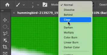
Command A and delete -> Clear Layer

Using the Option delete fills selection with colour, elliptical marquee tool to create the circle.
While selecting:
Shift: Add to selection
Option: Subtracts from selection
Space: Reposition marquee
V -> to remove selected part from other shape
While using move tool (v): photoshop will move whatever is under your pointer (selection or whole layer)

Have the object clicked, then option and drag to duplicate


two images on screen and then create mask
to go inside the mask -> hold option then click on the mask
using black paint brush to erase parts of the image (have to be clicked on the white box but don't have to be inside it) and using white coloured paint brush to bring it back.
use the elliptical marquee tool to select object then use polygonal lasso tool to remove and make selection to the thing its connected to and close it by clicking where you started but hold option when first placing lasso, then use hue/saturation to change colour.


I applied different selection techniques to remove backgrounds and change the colour of objects. i practiced these processes by trying it on different objects while using slightly different techniques each time. although the class was fast-paced and got more technical towards the end, i managed to keep up and accomplish the tasks. the main tools and techniques used in this were the marquee tool, lasso and the pen tool. these were good to get a hang of in photoshop and doing these tasks allowed me to practice these techniques and gain more confidence on photoshop.
Path tool:
Pen tool -> Draw a path
Arrow Tool -> Tweak paths
windows -> path
Command click on path thumbnail to turn path into selection.
0 notes
Text
Lesson #5 Layers, Masks and Selecting
x =swaping foreground and background with colour picker
B = Brush
E = Erase
Z = zoom same as illustrator
[ ] = Shrink/Enlarge Tool
Number keys adjust 1.............9,0 = percent of opacity
Option + delete = fill selecton with foreground
CMND + delete = fill selection with background colour
CMND + A
While selecting, Shift= add to selection Option = Subtract from selection
Space = Reposition marquee
While using move tool (V) : Photoshop will move whatever is under your pointer (selection or whole layer)
CMND + T = Transform gizmo
The screenshots below are just some examples of us experimenting with the paint brush tool and the styles and strokes you can pick, as well as using our keyboard shortcuts to adjust size, thickness and opacity. We also used multiple layers during this which helped us to practice more of using layers when having busy pictures and drawings going on below.
On the third image down, we learnt about the selection tools and using them by filling them, layering them holding option and deleting to carve other shapes inside of them and also adding shapes together using the keyboard shortcuts above.


This image is us as a class learning many new and mostly advanced tips and tricks. This was practising to use of layers and especially keyboard shortcuts that allow us to duplicate and rearrange and also use the marquee tool that allows us to make a selection around the boat we can press option shift which allows us to move the selected image around. We placed the boat just above and started selecting the paintbrush tool on a separate layer then held the option that deleted and blurred away the water background on the second image and carefully went around the boat not removing that part of the image. This gave the effect of us duplicating the second boat without it having its selected background that we got rid of. This is a good skill to know when putting other objects in other pictures that can seem like they belong with a bit of Photoshop editing.

This fruit bowl was hard to get the hang of when trying to select part of an image, in this case, the orange. We started by using the elliptical tool to get some sort of outline around the orange as best as we could and then cut it off using a creative mask with selection tools. This was a hard tool to master as it behaved differently than tools on Illustrator. Then after that, we chose colour balance in our layers and gave the orange a different colour to get an idea of how we can change the appearance of an object when selecting it.
Creative Mask
White = visable
Black = Hidden
Path tool, Pen Tool / Draw a path Arrow tool, tweak path CMND click on path

This plant was us exploring the pen tool in Ps, just like we used in Illustrator, sort of the same process and hybrid points and handles. We started by tracing the front leaf shape very slowly and steadily which took a couple of tries and then turning the corners holding option to get a good turning point. After that, we selected the path we had made and clicked on that in our layer to change the mid-tones in the shape we had selected using the colour balance tool. While making sure the colour was different to the original colour. I thought this came out quite well in my opinion and found it to be very satisfying after.

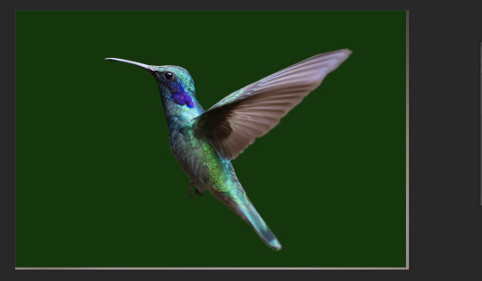

This task of the hummingbird was quite enjoyable and had a rewarding end result with all of the skills we had practised and learnt new when doing this task. We started by selecting the bird with the selection tool to get a fair outline of the hummingbird. When we did this, however, we found that the feathers on the wing were blurred from the original and wanted to prove we could fix that by selecting our own path of the wing using the pen tool again, following the wing line quite seriously. After that, we closed that off and were left with the shape of the wing. We then looked at our layer afterwards and saw the moment of truth as what our wings came out to be (first image) We then applied another green layer and decided to fix up making the bird look even more realistic by using the blurring tool and the pain brush tool by choosing to 'darken' and 'lighten' certain parts of the bird, like on the beak, and belly side of the bird. When it all looked ok, we made a few more adjustments to make it look perfect, then reflected the bird and loaded up a background of a close-up tree, to then place the bird seeming like it it actually flying in that environment. We then adjusted its curves and made the bird look a bit more bright and more fitting to the light of the background layer, a wha-laa (final image). I was very happy with how this came out and how well I followed along with it. This was a very good skill to learn as it taught me and gave me the confidence to do this on other projects in the future. As well as this being a very good sum up of everything we had learnt in this lesson.
0 notes
Link
Here you will learn #Marquee_Tool to select, cut, re-size, rotate, unlock in Photoshop 7.0 CS2 CS5 CS6 CS3. Here is the complete guide to Learn #Adobe_Photoshop_in_Hindi with Practical Examples.
#elliptical marquee tool in photoshop#marquee tool photoshop cc#photoshop marquee tool tutorial#rectangular marquee tool photoshop#elliptical marquee tool#photshop in hindi by rajan tech shows#how to use elliptical marquee tool in photoshop
0 notes
Photo

GIF ICON & HEADER TUTORIAL
I was asked to do a tutorial on my old mobile layouts where I had a gif as both my icon and header, so here we are! I also uploaded a PSD here that you can use either as a template or as a guide/reference point in case you get lost somewhere along the way.
You’ll need Photoshop and basic knowledge on how to make gifs using the timeline.
I think this goes without saying, but before I get into it, I do want to clarify that you won’t actually be uploading a gif as your icon. It’s just the illusion of having a gif as your icon, when in reality it’s just an all-in-one header image. You’ll need to make sure your icon is disabled, though!
[NOTE: This is using the old dashboard’s mobile theme dimensions, because new dashboard is truly whack and I haven’t the slightest clue what the new dimensions for headers are. If you know the new dimensions, you’re welcome to change numbers and dimensions as you see fit—which you’re welcome to do regardless, obviously—though I do think it’s a bit of a vice versa situation, where anything that looks normal on the old dashboard may look off on the new, and anything that looks normal on the new dashboard may look slightly off on the old.]
I. MAKE YOUR GIFS
We’ll be making two gifs separately.
Here are the dimensions I’ll be using:
583x327 for the actual header itself (I normally size my headers 640x360, but these are the dimensions I pulled when I took a screenshot on desktop and measured the mobile header in PS)
135x135 for the icon, later to be cut to a round 128x128
Again, you’re free to play around with the dimensions! I did these particular dimensions to get as close as possible to the actual header and icon size.
This is more of a recommendation than an actual necessity, but what I like to do when I make my headers (and I do this for all my gifs in general as well) is oversize. For example, I make the gif 587x331 so that I can crop it down to 583x327. This is to avoid having borders on the edges.

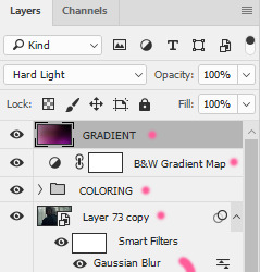
Here's my header after sharpening and coloring:

And here's my icon:

When I want that extra pop of color, I go ahead and play around with gradients. Not Gradient Map, or Gradient Fill, but actual gradients. You can play around with the Gradient Tool, make your own using the Brush tool, or download gradient textures. @argetnallison has a great tutorial on making your own gradients here.
This is my header after adding my gradient and setting it to Hard Light:
II. GROUP YOUR LAYERS
After you’ve sharpened and colored, you should put all your layers into a group. Make sure to do this for both gifs.
CTRL + A or Select > All
Layer > Layer Mask > Reveal Selection
Both your gifs should now be in a group with a Layer Mask.

For the icon, you'll want to use the round selection tool (Elliptical Marquee Tool) to make a 128x128 selection.

SHIFT + CTRL + I or Select > Inverse
CTRL + I or Image > Adjustments > Inverse (ON THE LAYER MASK!)
III. FINISHING TOUCHES
Before we actually bring the two gifs together, we’re going to go back to our header gif and make our borders. What kind of border you use at the bottom is entirely up to you, so long as it's the same color as the background of your mobile theme. My personal favorite is the ripped paper effect.

To make the border for the icon, we're first going to make a guide in the middle of the gif. I use guides to make sure everything (like text, for example) is perfectly centered.
View > New Guide > Vertical > *WIDTH DIVIDED BY 2*
Using the round selection tool again, we're going to make a selection of 135x135 (7px bigger than our icon, which means we'll have a 3.5px border) and paint it the same color as our other border. Place this in the center, 3px from the bottom.

From there, all that's left to do is drag the icon group onto the same file as the header and center it with the icon border.

And tada! We have our final product.
#completeresources#allresources#yeahps#itsphotoshop#resources#tutorials#ps asks#mine*#please feel free to send me a message if any of this is too confusing or too vague#it always takes me eons to write tutorials because i feel like i'm not adequately explaining things
2K notes
·
View notes
Note
hola! cómo le haces para que tus icons te salgan en buena calidad?
Hi! I apologize but I cannot speak Spanish, so I am going to have to translate your ask through Google Translate. Which I know isn’t the best method, I’m sorry!
According to Google Translate, you’re saying “wave! How do you make your icons come out in good quality?”
Hopefully, that is close enough to what you’re saying and if so, first off, thank you for saying they are good quality! Secondly, I’ll walk you through my icon making process. It’s actually very simple and fast (at least IMO lol I can make an icon in like 5 minutes but I also use PS for a living so I’m pretty used to the program)
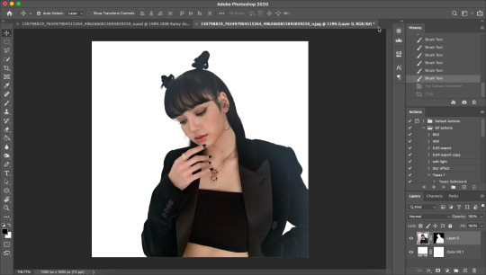
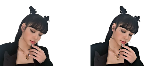
I’ll show you how to go from this random image from Lisa’s Instagram:
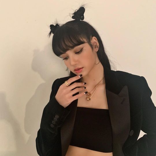
to this icon

FULL TUTORIAL UNDER THE CUT
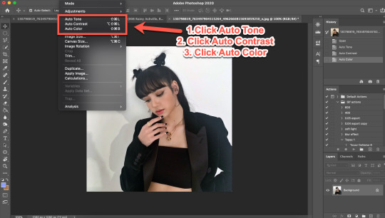
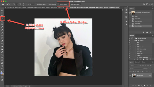
First off, open Photoshop and drop in your image (I have Adobe Cloud PS 2020) Then I want to clean up the colors of the image, because the image is too yellow, and was clearly taken in bad lighting.
1. Click Auto Tone 2. Click Auto Contrast 3. Click Auto Color
That should help give the image a much nicer, natural color, as shown below:
4. Select the Selection Tool 5. Click Select Subject
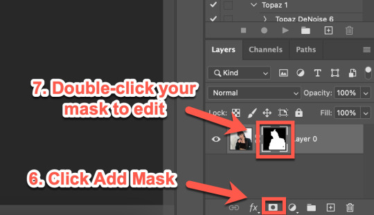
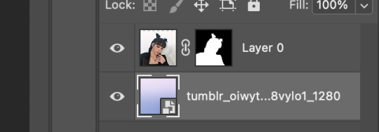
6. Click Add Mask 7. Double-click your mask to edit
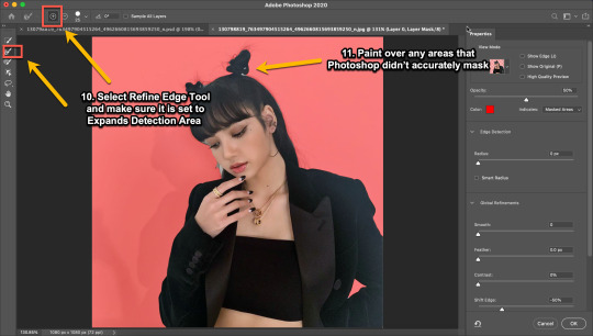
8. Click View, then select Overlay V (this will help you see where you need to clean up your image) 9. Adjust settings to the image (This part really just depends on your image. Generally, I always set the Shift Edge to -50%, as it helps take away any white fuzziness around the image. Smooth obviously smooths the edges, Contrast helps sharpen them, and Feather...feathers them....just don’t use Feather okay?)

10. Select Refine Edge Tool and make sure it is set to Expands Detection Area (aka the + symbol lol) 11. Paint over any areas that Photoshop didn’t accurately mask
12. Select your mask again 13. Select your Paint Brush tool (make sure it is set to Hardness 100 and an appropriate size for your image) 14. Set your Foreground and Background colors to White and Black (Just click the little black and white boxes above them)
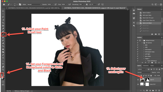
15. Using your paintbrush tool paint in (or out) details you need (In this case I just need to paint her face back in, so I use the brush tool set to white and paint where the pixels are distorted)
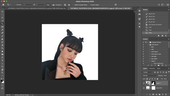
Now she is ready to be cropped and edited.
16. Flip/crop/adjust the image as desired (My best tip is to use the crop tool and put the focus of the image in the center of the grid)
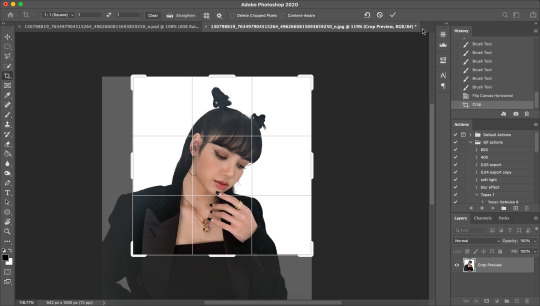
Here’s the final cropped image:
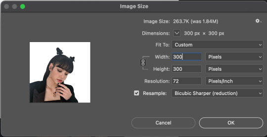
17. Click Image>Image Size
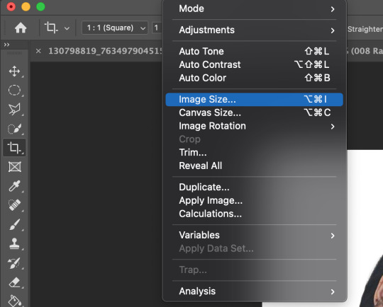
18. Set the Image Width to 300 Pixels, check Resample, and set to Bicubic Sharper (Reduction) and click OK
19. In your Layer Panel, select your Image, NOT your mask (nothing will happen if you edit your mask lol)
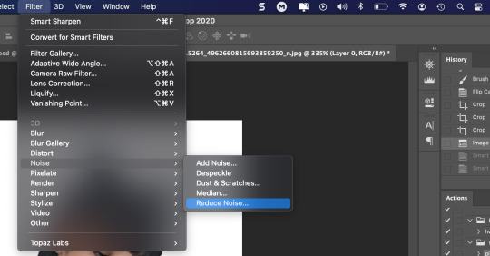
20. Click Filter>Noise>Reduce Noise...
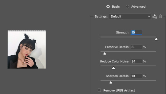
21. Adjust to the following settings (or whatever you prefer to get the image looking smooth) Click OK
Now my image is smooth and free from noise and grain, but I want her to be more in focus.
22. Click Filter>Sharpen>Smart Sharpen
23. Use the following settings
This is a basic sharpen that many editors use for gifs, edits, icons, etc, and you can just stop there for the sharpening step if you want, but I prefer my icons sharper, so I click Filter>Sharpen>Smart Sharpen again and this time, I use these settings:
You can see the differences below. The left side has just the basic sharpen, and the one on the right has both sharpens (you can clearly see the difference)
Once you’ve sharpened as desired, we’re ready to finally get to the fun and colorful part!
24. Add a gradient bg below your image (There are tons of free ones you can download from Tumblr or Google, or you can just make your own with the a gradient layer)
This next step is optional as not all images need it, but for this image, I need to do some badly needed image adjustments
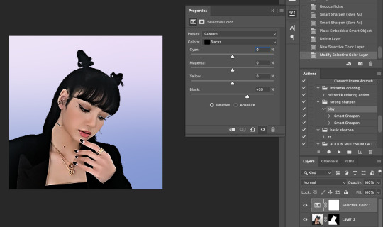
First I click the adjustment layer on my layer panel and click Selective Layer

Then I set the colors to Blacks and drag the Black to +35 to darken up the blacks on the image and give it a nicer contrast (selective colors are great, mess around with them as much as you want until you find a look you like!)
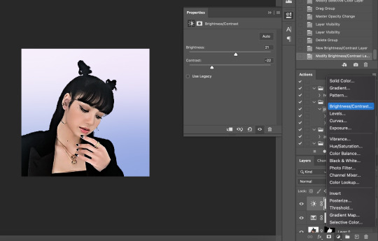
Then I make a Brightness/Contrast layer and adjust to what I feel works best for the image
26. Create a folder (if you did the above step, select the layers and then click the folder icon, it’ll just put them in the folder)
27. Holding down the alt key on Windows (or the Option key on Mac) click and drag your mask to the group layer. Now you have a folder that you can put PSDs and adjustment layers in without affecting your gradient background
28. Drag your PSD of choice. I am using this amazing PSD that is perfect for pale photos. I set the PSD to 50% opacity and it looks like this
Now, I could stop here, but I’m extra so I want to doctor up her face a little.
29. Above your PSD folder, create a new layer and set it soft light
30. Select your brush tool again, and pick a color that will work for enhancing an area of the photo. Then paint over that area.
Lisa is already pretty pale here, so I won't paint over her skin with a nice peach color like I do sometimes in darker photos. But I will add a nice pink flush to her cheeks and her lips.
Then I will use a lilac purple to paint over her eyeshadow. This brings an element of the background onto her face.
There’s not a lot that needs to be added to this particular photo, but here’s an example of another icon without and with soft light painted layers:
The left has no soft light painted layers, the right does. You may be thinking it looks too gaudy, but icons are tiny! Adding strong colors will help painted areas stand out. However, this is a completely optional step of course :)
31. Back to our current icon. Select all your layers, and click the folder icon again to place them all in a folder
32. Select your Elliptical Marquee tool and make a circle over your image
33. Click your mask button in the layers panel, and tada! You can now save out your icon and put it to use
Here is the completed icon:
If you got this far, thank you for reading, and let me know if you have any questions!
#ggnet#kgirlsquad#blackpinknet#idolady#femaleidols#lisa manoban#photoshop tutorial#icon tutorial#photoshop#tutorial#icon#icons#if this type of post doesn't belong in any of the group tags just let me know and i will remove the tag#wasnt sure if tutorials counted lol#Anon#ask
103 notes
·
View notes
Text
Illusion- Photoshop Research
What are the benefits of using layer masking?
the benefits of using layer masking are that it is a non-destructive process that does not harm the pixels when editing.
How do you use them?
You use them by adding a layer on top of your image and then creating a mask on that layer to be able to select different parts of the image that you want to edit.
Selection Tools
There are a few different types of selection tools in Photoshop they are : Quick Mask, Rectangular marquee, Elliptical marquee, Lasso, Polygonal Lasso, Magnetic Lasso, Magic Wand and quick mask tool.
There are a lot of selection tool as they all do different things and are all useful in different situations.
2 notes
·
View notes
Text
lesson 4 - 04/3/2024
WE worked with the colour wheel
hue, tone, tint and shade
RGB = Additive colour
CMYK = Subtractive colour
Value
shade = add black
Brightness for both
tint = add white
more satiation = more pure and intense
less satiation = more grey and less intense
Today we worked with photoshop. We started on a light-low end. we worked with the curve tool (command M). to look at the white to grey scale of the photo. We played around with the scale to see the contrast off the lighter and darker shades.
BEFORE

AFTER

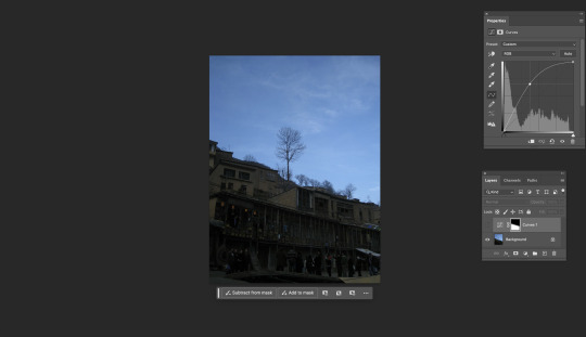
With the next image portrait - low high endss. it's lacking white shades therefore why the imagine is so dark. So we corrected it.
BEFORE

AFTER

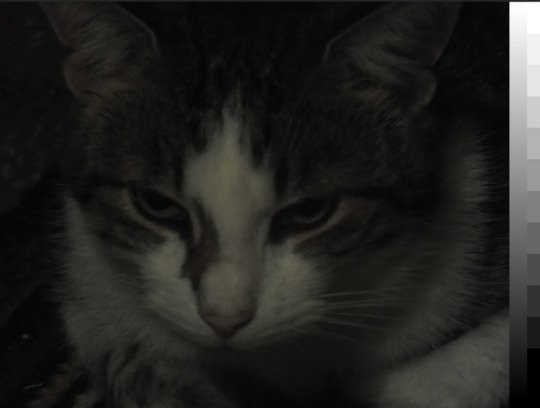
For the next one is the cat. The satuation is low is this image so we fixed it. it was dark so we needed to brighten it. So we used the curve tool again to adjust it we then used another layer for the hue as the quality wasn't great and needed to put some more colour into the cat.
BEFORE
AFTER

This Next one was a very underexposed image. So used the curves again. we made more points of the scale. We also used the Hue again
BEFORE
AFTER
this next image we just had a play around. So did make it look better just practised more curves and we played around with colour balance and just look at the effect it had. we changed the midtones, hightlights and shadows


with the next image we are just playing around with everything we have learnt and used today. practising we looks good and what doesn't.
BEFORE

AFTER


then I did a bunch of normal adjustiment to the next photo. Then we made a new layer and made it black, then we used the elliptical marquee tool and made a circle we then deleted circle, making a circle cutout. We then went filter - blur and adjusted it to be blur slightly seeing it. So just looking a little darker around the edges. we also put down on the opacity. We then used photo filter to wrm the image up
BEFORE

AFTER

For this image we used a mask with the gradient which fix the potion of the sky. black is hidden and white is show.
BEFORE
AFTER

1 note
·
View note