#et cetera et cetera
Text
What the fascistic hatred for abstract art and idolisation of only the Rational, Realistic Art, the only one that comes close to a science, the only one that can be excused as existing (because the more realistic it is the less you see the artist in it and the more it can conform to a standard) have done is unforgivable. btw
Fascism notoriously hates abstract art, and positivism's legacy was a degradation of humanities that led to a distate for art that couldn't be objectively graded on a clear scale or measures in scientific truths. The result is the need to be able to give a correct and rational value to art, and the scale chosen for it was realism.
Which inevitably brings the thought that was isn't realistic is bad, on principle! It is idiotic because art is inherently subjective! You cannot grade it in such a way because it is not meant to be a surefire and technically onthologically correct or incorrect pursuit, it is meant to be art, but fascism hates what it cannot grade as either superior or inferior, degenerate or inspiring, and therefore makes up ways to do that that actually have no meaning and make no sense.
+ It is also why hyperrealistic art is often soulless - not always - but think of (as the example that Jaja gave me, hi) those Instagram drawings of perfectly photorealistic lips or eyes. They all look the same. They all look maybe even incredible, but by virtue of all looking the same, they lose the artist. Could you tell if two drawings of the same set of lime-biting lips were made by different people, when they are so so similar, and so so realistic? What of the prevalent AI art artstyle, a mesh of perfect rendering, all looking the same? Where is the individuality in making all art look identical! Where is the artist in a drawing that does not show any stylistic choice!
The point is. Your art style isn't holding you back because it isn't "realistic enough." You can do what you want forever
#[.txt]#et cetera et cetera#art#I'm not meaning for this to be A Statement btw I was talking to a friend and I care about this topic. end of#also once again etc I'm not any kind of... particularly intelligent person and this is An Opinion and I am Fallible#meaning I'm sure there are mistakes in what I say and since tumblr is the bad faith website I'm putting that out there#this doesnt mean I hate realistic art this means that I hate the act of grading art based on its realism
944 notes
·
View notes
Text

Did anyone order One handsome boy
369 notes
·
View notes
Text
Crosshair really said, “Kids aren’t your area of expertise” and Hunter took it personally lmao
#hunter: bet *gets in tune with his paternal instincts*#rewatching the first episode has me going absolutely FERAL#s3 has so many callbacks#the foreshadowing is insane#et cetera et cetera#i’m Scared lol#the bad batch#tbb season 1#tbb hunter#tbb crosshair#the dad batch
143 notes
·
View notes
Note
Did anything at all come of the "Save Our Salmons" post? I just remembered it and was like, "... huh. Whatever happened with that?" I guess it could've been in reference to Grizz using the eggs for the rocket, but the egg usage feels somehow disconnected from the Salmonids in RotM. :/
yeah no I still think about that, 'save our salmons' really amounted to nothing <3
ROTM's human extinction lore was amazing, and then everything else.....a whole lot of wasted potential
#asks#octavio. save our salmons. the bear foreshadowing made way too obvious/poorly handled. idols feeling shoehorned in there.#missing basic explanations for why things are the way they are#no further info on orca and what it thinks of grizz despite it possibly betraying him?#whatever the fuck sealife energy sudden magic bullshit#fuzzy octarians are just there how did grizz get them#poor explanation on how grizzco came to be#weird lack of mention of the judds which may be intentional but it feels kind of. weak imo#literally no good reason for why grizz took cuttlefish the brain thing makes no sense. poorly done plot device.#et cetera et cetera
118 notes
·
View notes
Text
can’t believe i spent this morning making such an Um Actually ass post lmfao
#tumblr user cord spaghetti fighting the gender war on the side of …. THE WAR???????#whatever gerard way putting on their moms lipstick in the transgender bathrooms still real and true#and then came the clothes still real and true#art school drag forever and ever#‘total riot-boi’#girl to a lot of people growing up#et cetera ET CETERA
68 notes
·
View notes
Text
wow, what a complex protagonist of this prestige television drama. i hope he doesn't make choices that play into his greatest fears of who he could become and suffer terrible consequences that can only be blamed on his own actions
#jillian.txt#succession#better call saul#barry#et cetera et cetera#just started bcs season 6. kill me
11 notes
·
View notes
Text


Sketch dump
13 notes
·
View notes
Text
i think, at the end of the day, you have to respect the work you are adapting. a writer doesn't have to be a fan of the source material, or strictly follow the primary story, but you have to understand what made it good, what made it appealing, and what it meant to say.
i would say netflix's dungeon meshi rigorously follows the original manga, often panel for panel, to great effect. it's an excellent adaptation that understands the themes and character of the work. it celebrates it for what it is. conversely, i'd argue that amc's interview with the vampire is spectacular precisely because of the way it breaks from canon. it actively 'yes, and's the book, imo, thoughtfully exploring the themes on its own terms. changes are not inherently bad, nor is a perfect replica inherently good.
you can like a work, and not understand it. you can understand it and not be a fan. but if you can't respect it, you should just be writing original work.
#ie i dislike ender's game but i get what it was going for#and if someone changed it to a lesbian space opera about child soldiers i would probably like it more. but then it wouldn't be ender's game#also i have seen some Terrible interpretations/adaptations from fans. just loving something isn't a guarantee that it will be good#frog croaks#thinking about the rash of adaptations and remakes over the last decade and feeling very tired#natla is another in a long line of adaptations that wanted the IP for the inherited fanbase#assuming they are idiots who will eat up any slop served because it was a kid's show#the witcher's writing room actively making fun of the books. classy.#the rings of power wanted a cheap fast lotr with some ~grrl power~ slapped in to shield themselves from criticism#(which is a symptom not the REASON it is bad)#et cetera et cetera#anyways. original works are not inherently perfect but you should at least have enough writing chops to understand what they are about#before you start yammering how they're dumb
8 notes
·
View notes
Text

Art from the newest chapter of my fic, Hey Four, Wanna Kill A Dragon With Me?
(oh yeah chapter 7’s out. ta-daaaaaaaaa! hope you enjoy!)
https://archiveofourown.org/works/36465094/chapters/96948144
#linked universe#linkeduniverse#squido draws#squido writes#lu wind#lu four#linkeduniverse fanfic#linkeduniverse fanfiction#lu fanfic#et cetera et cetera#digital drawing#blending modes have spoiled me so rotten you guys
251 notes
·
View notes
Text
Thinking abt Jessica Cruz and the ability to overcome great fear again
#everybody including canon: omg hal is the greatest lantern kyle is the best etc. etc.#HOWEVER OKAY. my vision.....#with like 15 to 20 years of our time i could expand on stuff and give her THE character arc okay#like im just saying yellow lantern jess arc could ACTUALLY be so good bc i would do it as a way to bring her back to the corps stronger and#better and more assured#in herself because like its not about NOT being afraid is about OVERCOMING it and bravery isnt the absence of fear but action in spite of it#et cetera et cetera#like okay i was kidding when i said i think shed be more powerful than kyle or hal#because theyre both totally overpowered in their own way ofc with hal's willpower abilities at like insane levels and kyle's command of the#emotional spectrum being what it is et cetera#BUT. jess has such an interesting relationship with the ring and BEING a green lantern and its like i want to go deeper with that. like down#to the center of the earth deeper. because i feel like shes a character that would have such a great connection to being a lantern and would#especially be the one to embody the 'overcome great fear' phrase at its core#also like THE RELATIONSHIP SHE HAS TO BEING A LANTERN-#all the lanterns have interesting relationships to the corps or what it means to be a gl but for me jess's is just SOOOOOO compelling and#rich and just. being a lantern saved her life. becoming a lantern GAVE her her life BACK. on multiple levels!!!#like quite literally bc of the fact that volthoom died in her body before she got the ring but like before she became a gl she wasn’t living#a life at least not socially. even when she was power ring i still doubt HIGHLY that she even really left the watchtower when not on mission#because like. they glossed over it but the power ring doesnt come off. she was always like that and even with her control over it always a#little primed to blow and i think that's something jess was aware of even if the rest of the jl wasn't as much#bc she like was always reminded of how precarious her power over the power ring could be like it said HORRIBLE things to her all the time!!!#like on power it would be just calling her names like verbal abuse#so even while she had control over the ring it was a tenuous sort of precarious state and she was very aware of that!!!#and i feel like thats what it often comes down to for jess: control. i think its a key part of her character that she desires that sort of#control over herself and her fear due to feeling a lack of it for so long. and THATS why i think that yellow lantern jess has SO much#potential bc it has a huge chance to explore her relationship with the concept of control and harken back to her origin and early days as a#hero.#gosh i went on a tangent here but yeah. LOTS of feelings abt jess#basically a whole meta in the tags tbh#jessica cruz
7 notes
·
View notes
Text
I do hear a lot of talk about anti-intellectualism on the online sphere but I really and truly cannot stress enough that the act of discouraging the general public from critical thought or from reflecting on political matters in an informed way or on discussing nuanced issues with said nuance is not an online-only problem and it has been the death of politics in my country since the 26th of january 1994*
*the date Berlusconi announced his entrance into italian politics
#[.txt]#et cetera et cetera#which is to say this isn't an online go touch grass issue + it is of political significance. Who do you think benefits from it#because it is not the left#viktor discussing politics on tumblr dot com? Might as well#do I look like I have any other platform? I don't. I could get a substack ig but
42 notes
·
View notes
Text
I hate having big emotions
#because i never know how i should react to anything#is me being bothered by something normal#is my level of pain normal#am i crying over something that doesn't need to be cried over#et cetera et cetera
2 notes
·
View notes
Text
I’VE BEEN SAYING LET MY BOY COOK LET HIM COOKKKK
15 notes
·
View notes
Text
Pride Flag Iconography in BIRDMEN
There’s one motif scattered throughout official BIRDMEN illustrations that haunts me to no end, appearing in not just throwaway holiday illustrations, but also in chapter title pages and most significantly, on the final volume cover. It is, of course, the striped banners.

Anyone with a passing familiarity with pride flags will recognize the horizontal, multi-colored, and evenly spaced stripes, present in nearly every iteration of the pride flag. Juxtaposed with the midair setting that these illustrations all take place in, the link to the rainbow flag, the most well-known of the pride flags, is undeniable.
What stands out to me especially is the tangibility of these banners. See the way Kamoda is grabbing it? The way it sags under the weight of the birdmen sitting on it? It’s easy to forget in the digital age, when so many pride flags have been turned into abstractions of color, that the hex codes are meant to represent a real, physical object.
Of course, there’s a reasonable in-universe explanation for this, see, every character has a color associated with them, and it’s just a simple and convenient way to show a particular group of characters. In the first two illustrations, for example, there are five stripes, one for each member of the Bird Club. In the final cover illustration, the stripes are meant to represent the Seven of Beginning.

Even when I read through BIRDMEN for the first time, it struck me as peculiar that the Seven of Beginning didn’t quite follow the rainbow color scheme. Gayness aside, it’s a reasonable choice that creators have chosen over and over again. I mean, what’s with the indigo and the violet. They’re WAY too close. Why isn’t there a red. And turquoise, of all colors? What kind of weird and fucked up choice is that? And from the start Karasuma’s black stripe had already thrown a wrench in things. But then I realized… it’s not this pride flag. (Which has 6 stripes instead of 7, anyways.)

It’s this one.
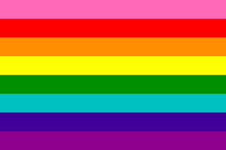
If we include the prophet, Takayama, as the 8th stripe, taking the red slot, and replace Karasuma’s black stripe with the pink, it’s almost precisely the original, 8-striped Gilbert Baker pride flag. (If we’re going to be technical, the orange and yellow stripes are slightly off– Raphael and Malaika’s colors are more desaturated than the colors in the flag. These colors are actually closer to Robin and Arthur’s colors, which… hm… food for thought…)
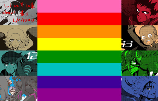
Well, alright. Depending on how strict or lax you are with the cutoffs, maybe these aren’t statistically significant enough to you. Maybe it really is a genuine, honest-to-god coincidence and Tanabe just happened to pick these colors, completely independently of the Gilbert Baker pride flag. The probability of this happening is pretty low, but certainly not impossible. If we factor in the meaning of the stripes, however, it reveals this to be either the greatest string of coincidences known to man… or the alternative— that Tanabe chose to correspond these colors with their respective characters on purpose.

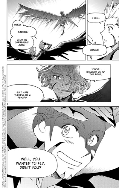
Let’s put aside the hot pink stripe for now. (There’s a lot to unpack there.) Takayama’s red stripe represents Life– fitting for a Birdman who can hear the voices of the dying despite not being a Linker. Even from the start, Takayama’s opening line forced our characters to confront death, and is a symbol for their will to live.

Orange for Malaika is perhaps one of the clearest connections. Her ability as an Eraser is to lift the emotional burdens from the mind– to restore the mind to a state of peace. It’s pretty clear that her ability is one of healing.
Yellow for Raphael might be hard to argue– but fascinatingly enough, the motif of sunlight has followed Gabriel since her very first introduction. (It’s a motif that has also followed Arthur and Wang Guang Feng… interesting, hm?)
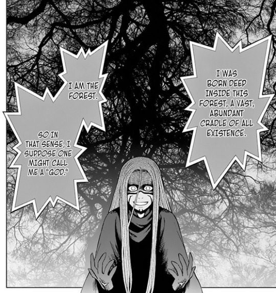
Green, then, is Ende’s color— not only were they born in and raised by the Amazon jungle, they also claim to actually be the forest… “nature”, indeed.
Saqr’s color is turquoise for magic and art, and looking at his Phantom Master ability, which conjures illusions from thin air, I’d say that’s a pretty reasonable match, whether you want to interpret those illusions as magic or art (really, I’d argue it’s both).
Serenity for Barbara might seem difficult to interpret— isn’t agitation, at its core, the absolute opposite of serenity? However, the indigo stripe doesn’t stand only for serenity, but also for harmony (included in the French and Chinese wikipedia pages, but not the English or Spanish one, for whatever reason)— and from that perspective, it’s much easier to see how her Agitator ability exemplifies the concept of “Harmony”. When Barbara was introduced, Adler says this about her ability, in contrast to Karasuma’s Bellwether capabilities:

Not a controlling ability, but one which encourages teamwork and cooperation without coercion— an ability of harmony.
And finally, we have Eva as spirit. This might seem like a difficult and abstract concept to embody in the text, but thankfully BIRDMEN is chock-full of Christian references, and in particular, Ende, Takayama, and Eva are very clearly alluded to as the Holy Trinity— The Father, The Son, and finally, The Holy Spirit, respectively, tying Eva very closely to the concept of “Spirit”. (Personally I think the Holy Trinity deserves its own essay, which is why I’m not expanding on textual evidence. I’ve seen enough people nodding their heads about this interpretation so I don’t really feel the need to expand at the moment.)
Obviously I’m at the mercy of confirmation bias, but I feel like these are reasonably well-backed rationalizations, and while I think individually these arguments may not be the strongest, the fact that all of these arguments coexist is extremely telling.
So then we return to the pink stripe. The pink stripe, which is definitely not black.
Pulling our heads out of the text for a moment— let’s look at the work as a real and tangible thing in the world, shall we? BIRDMEN was a monthly publication in the Weekly Shonen Sunday, which is a relatively mainstream, family-friendly manga magazine. I think even if Tanabe intended to gun for the queer metaphor from the very beginning (which, for various reason, I do believe), even if color matching the Seven of Beginning with the Gilbert Baker pride flag was in her plans from the start, she still would have had to take out the pink stripe.
Like obviously the most immediate issue with assigning Karasuma the pink stripe is that he, uh… He’s just a middle schooler? Like he’s a kid. But even if we dodge the faux pas of associating a minor with sex by giving the sex stripe to an older character, like Eva, I still think it’s playing with fire, because I think the concept of sex itself is still very much a cultural taboo.
Hopefully everyone’s seen the post about how everything is pornographic and nothing is erotic, and the decoupling of sexiness and desire, because I can’t find it in my tumblr backlogs LMAO if anyone has that post on hand please give me a link <3 thanks <3
That is to say, for media that is aimed towards a shonen audience, you can have fanservice, you can have the occasional tit or ass as a treat, and maybe there are characters who have sex (Milan and Gabriel, for instance), but like. That’s in the gutters, in the fade to black, something done offscreen. We don’t show it, and more importantly, we don’t fucking talk about it. (This is meant to be more of a blanket statement, by the way. They did talk about it eventually in BIRDMEN and I liked what Miguel said. Good for Milan indeed…)
Not to mention that queer sex is, if possible, even more taboo than just, oh, you know. “Regular” sex. “Normal” sex. BIRDMEN is acutely aware of the persistent reputation of queer people as predators [insert The Battle Against the Press, Pt. 1 whenever I finally finish writing it], and the author is more than aware of just how easily things could be misconstrued if she chose to delve into this topic at length. Better to leave this unspoken than to make things worse.
Though I think there’s definitely something to be said about putting the sex stripe back on the pride flag, that even queer folks these days sometimes seem afraid of gay sex and sexuality, I view the deliberate exclusion of the pink stripe as a choice made out of safety. That in the absolute worst timeline where BIRDMEN is widely and negatively interpreted as a queer metaphor by the public, both the author and the magazine can, at the very least, duck out of the worst of the scrutiny by avoiding the, you know, the s-word altogether. That it’s actually fine if it doesn’t make things better for queer people, so long as it doesn’t make things worse.
So whatever. I can respect this choice. It’s a mainstream publication, neither Shogakukan nor Tanabe want to die on this hill; fine. But now comes the hard part of the essay, the part that made me drag my feet about this for ages: if Karasuma doesn’t represent sex, what exactly, then, is he meant to represent?
Well okay obviously the first thing I did was pore through all the major pride flags containing black stripes to see if I could find some type of connection there. Obviously I had to tread with caution because some of these flags are actually younger than BIRDMEN, but here’re some things that the color black stands for: genderlessness, asexuality, the sexuality spectrum, and people of color. Nothing in particular really jumps out at me— the sexuality spectrum, maybe, but the aromantic flag was created in 2014, so I’m inclined to disregard this particular piece of evidence. People of color? I mean I suppose he is, but the connection kind of falls short when he’s from such a homogenous society. I’m happy putting this down here just for the sake of saying I did look into it, and also that I personally feel like this is a dead end.
Because really, this approach feels like I’m really letting confirmation bias do the heavy lifting here, which in general is not good practice, so I’m also going to examine this question from a canon-centric point of view, rather than just a irl-queer-iconography point of view.
What I find interesting is how Karasuma defines his own color in New Gear:

Here he’s assessing his color black based on the Hue-Saturation-Brightness model (HSB, better known as HSV model, for value instead of brightness). He says nothing about hue here, because regardless of what the hue is, it still doesn’t matter if the saturation and brightness are zero. In a sense, one could say that black encompasses all the different hues… which certainly ties into his role as the Everyman protagonist. This too deserves its own essay, but once again I feel like most of us can agree on this. In one sentence, his cynicism paired with how lost he feels is easy for many people to relate to.

But more than the fact that he simply stands for all of us— I think he stands for the potential we all have to make a change. If there’s a little text caption next to Karasuma’s black stripe, I think it would say “empowerment”. It’s not the first time I’ve made this claim, but this whole story is a tale of empowerment for queer youth, in my opinion. That if we were willing to link hands and unite, we could achieve anything that our hearts dream of.
#birdmen#birdmen meta#just thinking thoughts...#jesus CHRIST it's not everything I hoped this essay to be but it's already almost 2k words and is almost CERTAINLY insufferably long#idk. NOT sold on what the black stripe means#BUT I'M SO SERIOUS ABOUT THIS ESSAY GUYS. I REALLY THINK SHE DIDN'T DO IT ON ACCIDENT. WHAT ARE THE ODDS#I wanted to talk about probability in the essay so bad.#what's the probability of birdmen ending up like this with this cast and these colors. GIVEN she was gunning for a queer metaphor#et cetera et cetera#versus if she was doing this on accident. argh.#augh.. the end of the essay is kind of weak sauce. I don't know. Although I really believe in the queer metaphor I also think like. idk#maybe it's all in my head. LOL#what if I AM delusional. did you think about that#EVEN THOUGH I FEEL LIKE THIS EVIDENCE IS?? INSANE ? ? ?#yeah idk. guys be nice to me. give me a pat on the head for this one idk#lol this is a long post innit#long post
37 notes
·
View notes
Text
whenever i make a personal post tumblr is always like “hey. check out these posts you made when you were miserable.” which on one hand: man. mildly embarrassing. i really posted like that. but on the other hand, at least i can remind myself that i will never be in high school again
#it’s honestly a little interesting to see Where My Head Was At and how my perspective on those events has changed since then#but mostly i wanna go back in time and shake myself by the shoulders and say like. ‘kiddo. you are not unlovable you are just 14.’#et cetera et cetera#things may be bad but at least i’m not in high school!#or god forbid Middle School ms me was miserable#it only goes up from there! presumably. we’ll see!#yeah i mean no matter what happens i have friends and a better overall outlook on the world#hey. it could always be worse#yellings
8 notes
·
View notes
Text
guys with black hair and brown eyes and bushy eyebrows I am literally eating out of the palm of ur hand
#half my posts are like (I see a man) wow he’s so beautiful I have to make a post about him#(sees another man) wow he’s so beautiful I have to make a tumblr post about him#et cetera et cetera
2 notes
·
View notes
Last Seen Blogs
yena48
(inactive / don't follow)
kykyonthemoon
ky ky
y00ngix
kim !
mergoatmagic
~Mergoat Magic~

aprendoviajando-amaiaiturri
Aprendo viajando