#expressionist lighting
Explore tagged Tumblr posts
Visit Tumblr Blog
Explore Tumblr blogs with no restrictions, modern design and the best experience.
Last Seen Tumblr Blogs


Fun Fact
28.6 is the average number of monthly visits per US mobile user.
Text


M (1931) Directed by Fritz Lang
#m#fritz lang#1931#german expressionism#film noir origins#psychological thriller#crime drama#peter lorre#shadow and light#classic cinema#visual storytelling#cinema of paranoia#serial killer film#existential horror#law and morality#dark storytelling#haunting atmosphere#pre-noir aesthetics#cinema of suspense#expressionist lighting#timeless classic#early sound film#1930s movies
51 notes
·
View notes
Text

Mark Rothko
Orange and Yellow
1956
Oil on canvas
#mark rothko#abstract expressionism#abstract expressionist art#orange and yellow#oil on canvas#oil painting#painting#20th century art#1950s art#classic art#classic#light academia#chaotic academia
83 notes
·
View notes
Text


“living in my own head feels scary and therapeutic too, sometimes mother.”
#dark academia#dark aesthetic#dark art#brown aesthetic#dark academic aesthetic#dark and moody#art aesthetic#art academia#art inspo#abstract expressionist art#classical art#light academia aesthetic#dark academia aesthetic#chaotic academia#light academia#romantic academia#classic academia#academia aesthetic#classic literature#classic#classics#classical literature#russian literature#books and literature#literature#vintage#art#pinterest inspo#pinterest inspired#pinterest
25 notes
·
View notes
Text
I just realized who some of the first season shots of Star Trek remind me of. Morticia Addams.

Couldn’t find an example in gifs but I did find this

#they got the German expressionist lighting#Star Trek#star trek tos#star trek the original series#morticia addams
15 notes
·
View notes
Text

An abstract flower vase in natural lighting🫶🏼💛
The magic of life is in the little mundane moments.
I hope today is kind too you my friend 🫂����

#artists on tumblr#inspiration#artistic expression#self expression#acrylic on canvas#artwork#acrylic paint#art#original art#canvas art#abstract expressionism#abstract expressionist art#abstract#abstract flower art#flowers#natural light#nature art#yellow aesthetic#landscape art#art therapy#fun art#messy art#bright colors#color splash#colorful#colorful art#muse's art#joy#mental wellness#daily encouragement
8 notes
·
View notes
Text
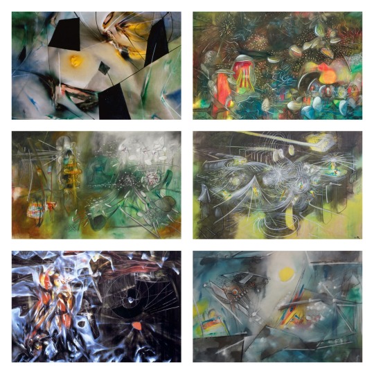
My Top 5 Painters 1/5 - Roberto Matta
Roberto Sebastián Antonio Matta Echaurren, better known as Roberto Matta, was one of Chile's best-known painters and a seminal figure in 20th century abstract expressionist and surrealist art
#surrealism#artwork#art movement#art#roberto matta#dark academia#light academia#art academia#abstract expressionism#abstract expressionist art#chilean art#expressionism#expressionist art
10 notes
·
View notes
Text


Cleanliness
Acrylic on canvas
June 2023
[My original painting] [reblogs are little gifts to artists like me!]
#nature painting#painting#acrylic painting#nature art#impressionist art#contemporary impressionism#expressionist art#contemporary art#light academia#cottagecore art
4 notes
·
View notes
Text


-PRIMA [facie] - [prima] FACIE-
11 July 2024
1431 x 3588 Digital Unedited
#digital photography#digital art#expressionist photography#expressionist art#expressionist visions#light photography#light art#original photography on tumblr#original photographers on tumblr#original photographer#original photography#original photographers#original character#about face
0 notes
Text
BIG thing i get teased about over the years (in playful ways, it is fine buckaroos, but a light tease none the less) is the DIRECTNESS of my titles. many who stumble upon my books will immediately comment 'the title is so long it just says what happens'. here are some of my thoughts on that...
as with a lot of things in the tingleverse, my unusual artistic choices end up being a sort of TROJAN HORSE, called unserious and mocked by many, but hopefully over the years revealing something to buckaroos who are not tied to the separation of ‘low brow’ or ‘high brow’ art
i feel understood by most, but for some who JUST NOW encounter the tingleverse there is an automatic apprehension, from outright to subliminal. things like scoffing ’im not going to try and find meaning in a chuck tingle book’ (real quote) or 'skeptical of the horror, ive seen his OTHER books'
i have written a LOT about how much of this, whether buds know it or not, is not just about the dinosaurs and the living objects. it is about a culture that is built to see queerness and neurodivergence and (drumroll) SEXUALITY as fundamentally unworthy of ‘real’ artistic merit. this trot runs deep
theres SOMETHING ELSE i dont talk on much however, which is directness of my writing style, both in titles and on page. why i do it is this: AS AN ARTIST it is never my intention to impress you. my books are not the 'ME show' theyre the 'US show’ so i simply want my sentences to express what happens
i wont dance circles around you, leading you through the story saying LOOK AT ME LOOK HOW GOOD I AM IM SO COOL. i want to walk BESIDE you. of course, writing to impress is also great and valid art too, just not MY preference. this is ARTISTIC choice, but i want to talk for a moment on politics of it
i tend to see buckaroos holding a sort of STRICT interpretation of what makes ‘good’ art. it is a training that has been pounded into their heads declaring ‘real art cannot just come out and say what it means.' a good example would be if someone was being critical by just saying 'its heavy handed'
the thing is, there is a huge difference between saying ‘it was blunt.’ and ‘it was TOO BLUNT for what it was trying to accomplish.’ TIME AND TIME AGAIN however, you will see folks simply deciding ‘this art just said what it meant on the surface’ and leaving it there, as if that is INHERENTLY WRONG.
and the question i am forced to ask myself is ‘WHY is this wrong?’ in the vast, infinite pantheon of WHAT ART CAN BE why are we so obsessed with hiding ourselves? obscuring our thoughts? removing our politics? there is certainly a time for subtly, but it seems there is NEVER a time for being blunt
some say this is because arts more DIFFICULT to craft when it is subliminal, but folks do not REACT that way. art that is both direct AND subliminal and layered will STILL get torn down for leaving things on the surface, even when technically speaking it is probably most impressive to juggle both
there is plenty for you to research on this regarding the CIA secretly funding abstract expressionist art during the cold war. it is still HOTLY DEBATED, but i will mention it here for anyone reading my thread who is interested in a deep dive. HERE, however, i will talk about it on a personal level
i think that culturally we are CONSTANTLY told to not take up space, especially in marginalized groups. there is decades and decades of programming telling us ‘you can express yourself, but in a CIVILIZED WAY, not too loud, not too direct. CERTAINLY not too political.' i flatly reject this
of all the places to do what you want and say what you want to say, ART IS THE PERFECT ARENA. your writing, your songs, your music can absolutely be as subtle as you want, but especially during times like this, dont let anyone tell you that youre too dang loud. lets trot buckaroos.
and since i spent all morning writing this is am going to leave a link for my new book LUCK DAY, which is LOUD AS HECK. now is a time to make art, and it is also a time to support the artists you love. give a preorder if you can. LOVE IS REAL
2K notes
·
View notes
Text
ok thinking about the shows more while i wait at the airport, just going to ramble. i love mcr. i expect grandiosity from them and i feel like they brought that by sort of performing in front of a blank monument to the Thing that is the black parade. and i feel like the experience they built on stage was very psychological maybe like as opposed to sensory or physical as u might with pyro, sculptural set pieces etc—they brought shadows, minimal projections, their german expressionist visual influence, lights… it was all kind of immaterial. which i think bore some connection to the interiority of the black parade as an album all essentially happening in the patient’s mind (most likely from within the confines of white hospital walls, even) and also allowed the audience to project whatever they wanted onto the stage. or like, the band will not show you what the black parade is supposed to mean to you now and they won’t show you what it was supposed to mean to you then. they are just there to make it real for 2 nights. and to command you to feel to the fullest i think, whatever those feelings may be or i guess whatever the album may bring to you. gerard’s speech about violent grief felt like a plain grant of permission & i am glad that they kind of stopped us in our tracks with that. i don’t know. from extraordinary narratives to larger-than-life productions mcr like to process heavy realities through beautiful fictions and for those shows i feel like the audience was what realized that aspect of their art—the presence of however many tens of thousands of people gathered together to scream every word an album front to back—it was amazing and i don’t know how to compute it. it was very silent from where i was between songs also, like we had some kind of singular mission. doesn’t that sound like mcr? it felt like we were their beautiful fiction
#they are really good at making art i think has anyone else noticed this#reading back after 1 of 2 red eye flights this post dissolved into cheese fr
684 notes
·
View notes
Text

Hans Hofmann
The Gate
1960
oil on canvas
#hans hofmann#painting#oil painting#classic art#oil on canvas#light academia#classic academia#classical art#chaotic academia#20th century art#abstract expressionism#abstract expressionist art#abstract#abstract art#abstract painting
8 notes
·
View notes
Text
“in my russian era”
#russian literature#russian#russia#dark acamedia#dark academia#dark acadamia aesthetic#dark academism#dark acadamia quotes#dark aesthetic#dark art#dark and moody#dark and beautiful#dark ambient#dark academic aesthetic#lightacademia#light acadamia aesthetic#dark academia aesthetic#academia aesthetic#art aesthetic#art academia#abstract expressionist art#art#spilledink#dark femininity#dark feminine energy#dark feminine aesthetic#dark femenine#dark femme#dark fantasy#dark feminine moodboard
11 notes
·
View notes
Text


The Einstein Tower, Potsdam, Germany,
The Einstein Tower, is one of the best-known examples of German expressionist architecture. Designed as an amorphic structure of reinforced concrete, Mendelsohn wanted the tower to represent as well as facilitate the study of Einstein’s radical theory of relativity – a groundbreaking theorem of motion, light and space.
Astrophysicist Erin Finlay Freundlich commissioned Mendelsohn (along with a young Richard Neutra on his team) to design the Einstein Tower as a research facility for the theory of relativity. Between 1917-1920 Mendelsohn made numerous sketches of the facility, attempting to create a dynamic structure which would give form to Einstein’s groundbreaking theories. The resulting plan revealed a centralized observatory tower, banded by rings of windows, raised on top of a wavelike platform that would house the laboratories.
Influenced by the work of expressionist artists of the time, such as the painter Wassily Kandinsky and designer Hermann Obrist, Mr Mendelsohn began to search for new methods of construction that would allow expressional freedom, which is why he eventually settled upon easily sculpted reinforced concrete as his material.
Building commenced in 1921. Unfortunately, however, the sculpted concrete structure proved difficult to execute with the technological capabilities of the time. The failure to complete the building according to his original plan prevented him from designing such ambitious projects in the future, and the Einstein Tower remains his best known building.
The research center opened in 1924 and held the most important solar observatory facilities until World War II, when it was severely damaged. In 1999 the building was reopened, in honor of its 75th anniversary, following two years of renovation; today it houses a working solar observatory as well as a visitors’ center.
Erich Mendelsohn Architect
#art#design#stairwell#stairway#architecture#staircase#stairs#interiors#tower#observatory tower#1920s#concrete#solar observatory#observatory#potsdam#germany#expressionist architecture#einstein#einstein tower#amorphic
127 notes
·
View notes
Text
In light of the most recent Redemption episode I’m bringing back this bit from the commentary for The Rashomon Job, when talking about shooting Parker’s version
John: We actually talked about for a while the idea that we would shoot this in like a really weird black and white expressionistic idea… everyone would be wearing the same clothes, and just like it's only the objects that have reality. And then we realized that was just from a production standpoint, impossible.
#this was what I first thought of when I saw the black and white from this ep#leverage#leverage redemption#redemption spoilers#side job#Parker#rashomon job#m speaks#commentary
113 notes
·
View notes
Text
Lads men x Reader who's really into horror movies
masterlist
this was a request from a kind anon.
summary: reader who really likes horror movies.
xavier | zayne | sylus | caleb
rafayel x reader | fluff
Rafayel watches you from where he's lounging sideways on your couch, head propped on a pillow like some tragic Victorian poet. He looks criminally comfortable for someone sitting through a 1970s horror slasher. The kind with grainy film and uncomfortably long shots of people doing absolutely nothing before something awful happens.
But you, you are in your element.
You're sitting cross-legged with your notebook in your lap. Well, notebook is a strong word. It's more like a fabric-bound monster of its own. A monstrosity of dog-eared pages, scribbled thoughts, bookmarks made of candy wrappers, and a paperclip that's given up on doing anything useful.
You're scribbling furiously with a glittery gel pen as the killer's silhouette appears behind the protagonist on screen.
''You see that?'' you say, eyes gleaming as you pause the movie, so you can better gesture with your pen. ''They used high-contrast techniques to create deep shadows and strong highlights, blurring the line between the physical and the psychological. It's a callback to The Cabinet of Dr. Caligari-expressionist influences, full circle. Ugh! So good.''
Rafayel raises a perfectly groomed eyebrow.
''Cutie,'' he says, voice thick with amused affection, ''only you could make murder sound like a love letter.''
You grin without looking up. ''I don't like the gore, I like the craft. There's intention in every frame. Every light. Every angle. The violence is just…contextual punctuation.''
He hums thoughtfully. ''A semicolon of suffering.''
''Exactly!''
There's a moment of silence as you flip a few more pages, trying to find your breakdown of the film's lighting progression. Rafayel leans over a little, pretending to peer into the book, but mostly just using it as an excuse to get closer.
He taps one corner gently. ''Is that…a pressed flower?''
''Yes. From the Suspiria screening. The remake, not the original.''
''Of course,'' he murmurs, clearly having no idea what that means but delighted all the same.
Then, softly, ''You carry entire universes in this book of yours.''
You blink, caught off guard. ''It's just a notebook.''
He smiles like you've said something heartbreakingly naive. ''It's a testament. To what you love. To how your mind works. And if I may say so,'' he traces the notebook's tattered edge with a fingertip, ''that is its own kind of romance.''
You feel your face heat up.
''I mean, if you really want romance,'' you say, trying to regain footing, ''we could watch Crimson Peak next. The actors have said that it's a very passionate love story, supported and complemented by fantastic elements. And not to forget, it's the first film in the Mystery Horror Genre. ''
He exhales a laugh. ''That might be the most you version of flirting I've ever heard.''
You bump your shoulder against his, smiling. ''You're still here listening.''
''Cutie, I would sit through a thousand jump scares and a dozen cursed VHS tapes just to hear you talk about third-act structure and prosthetic gore.''
''…Even found footage films?''
He shudders. ''Let's not test the strength of my devotion.''
You laugh, leaning your head against his shoulder as you unpause the movie. He adjusts slightly, letting you rest against him while your chunky notebook stays balanced in your lap. His hand finds yours, thumb brushing softly over your fingers as the scene resumes.
Blood erupts on cue, the soundtrack crashing down like a closing curtain.
And Rafayel smiles, because nothing makes him feel more enchanted than seeing you light up in the dark, explaining why fear on film is just another way to understand the human heart.
#lads#lnds#love and deepspace#rafayel#lads x reader#lnds x reader#love and deepspace x reader#rafayel x reader#lads fluff#lnds fluff#love and deepspace fluff#rafayel fluff
92 notes
·
View notes
Note
Can you share what your art-making process is? What software and tools do you use?? I'm falling in love with your work!!
Thank you, I'm so happy you like my work and are interested in the process. The short answer is I mostly use Adobe Animate.
I hate how I'm using an Adobe product (although I still regard it as a MacroMedia Flash product), but there's just no other software that compares to its jankiness. Perhaps it's just my long familiarity with the program, but nothing I've experienced matches how it simultaneously feels like drawing in MS Paint and using Microsoft PowerPoint vector shapes. The result is something that feels in-between the two; handmade yet computer-generated.
Typically, I'll start with a hand-drawn sketch, often beginning as a thumbnail done with pencil and paper.
I'll then do a mix of hand drawing and vector shape tool rendering. I use the Paint Brush tool to hand draw strokes, and the line and shape tools mixed with transform to make more geometrically accurate shapes. The design is rendered into divided closed loop shapes, ready to be filled with a solid. The strokes are kept or removed depending on the design.

These fill shapes are then either coloured and rendered in Adobe Animate, using fills, gradients, or a more complex process of masks and effects.
Alternatively, I'll bring all these vector shapes into Photoshop and use them as clipping masks. The vector shapes act like masking taped areas or shields to maintain sharp edges, while the brush is like an atomized airbrush used to build soft volumed forms.
Please excuse all that horrible Adobe Cloud and AI bloatware...
And there we go!
Variations in the process include just using MS Paint, index color in Photoshop, or 3D programs.
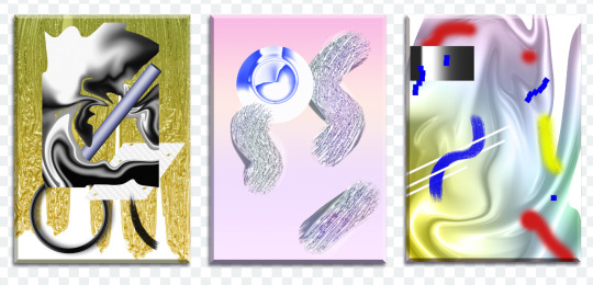
Very old works of mine were almost abstract, just exploring digital mark-making, which was a trend I was following in the mid 2010s that I loved. This kind of stuff.
While my current work uses its digital material specificity as an intermediary to the subject in the illustration.
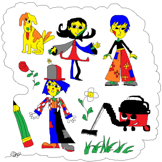
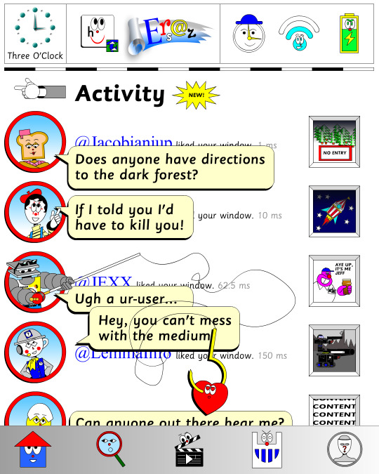
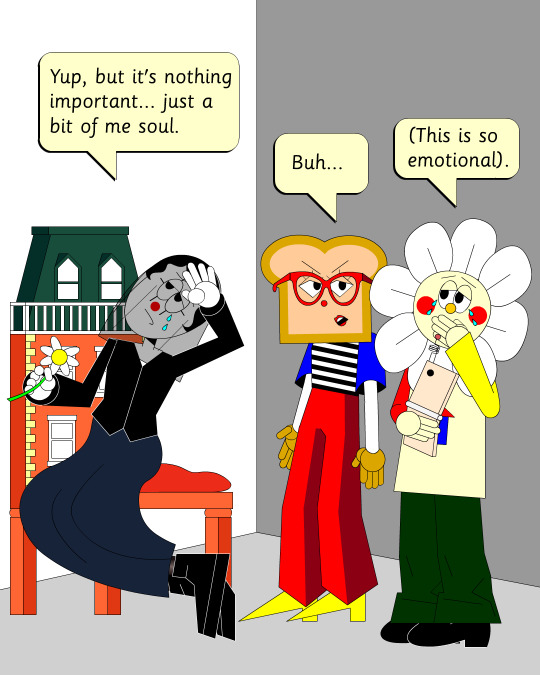
For example, #ersatz.world parodies clip-art and flash edutainment styles but imagines the characters living within that kind of world. The designs are meant to be cute, easy to read, light in computer processing, but also irreverent, janky, and generic too.
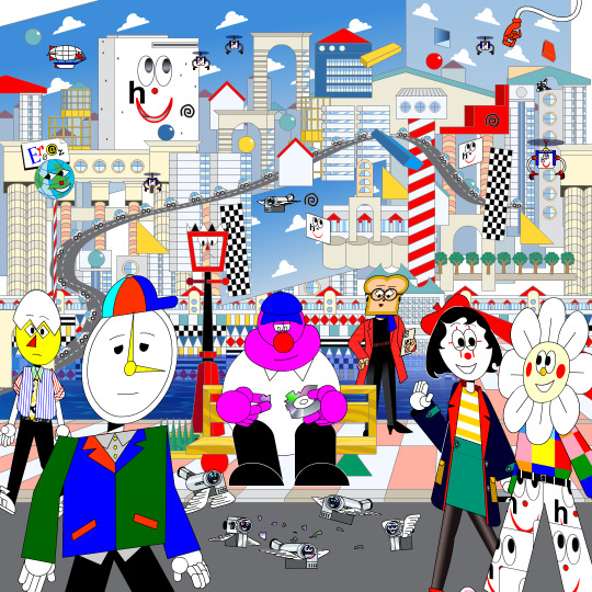
People typically regard this sort of clip art style as ephemeral trash, but I always found them charming. I use Ersatz World primarily as a satire vehicle, parodying educational formats to spoof corporate explainer content and digital media.
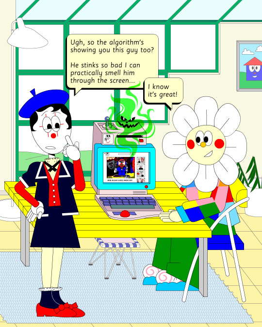
However, part of the problem with Ersatz is I've made it look too polished, complex, and I've grown too attached to the characters, which I imagine is a typical issue with overbuilding a world. So recently, I've made an even jankier Ersatz-like set of characters to play about with, using an even simpler style with less cohesion. I like to try and use slightly different styles and digital material styles to relate to the property at hand.
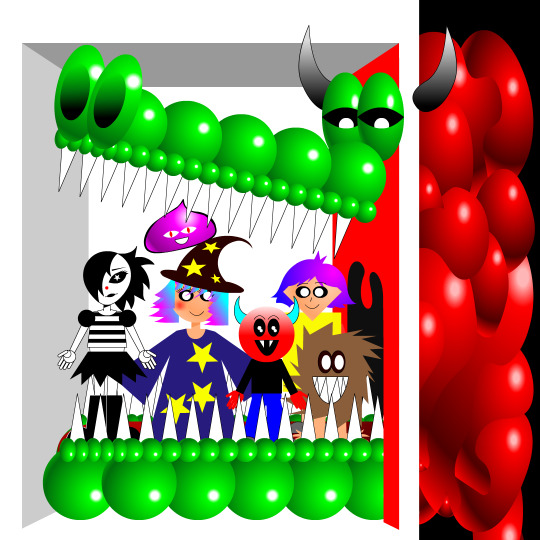
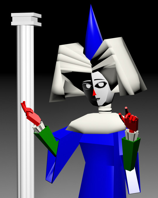
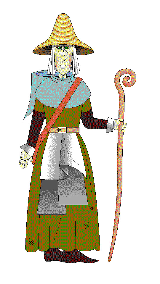
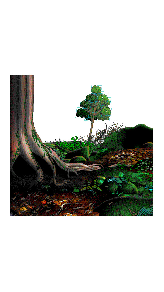
That’s why #autonymus has a bitmap digital material and a denser feel to it. Unlike Ersatz, Autonymus is not meant to be an overt semi-meta fiction. It’s not exactly pixel art, but the pixels are just about visible, as the intention is to create a digital expressionist depth to the setting. Although it’s still stylized and not realistic to our world, I definitely still want to evoke semblances of our world. That’s why there’s attention to landscape, plant life, and implied life beyond what you see in the frame with the characters, etc. But I'm still making a cartoon, and I still want it to feel at ease with itself being a digital material work. Characters are therefore flat, simple, stiff, and the speech style is like a bad Shakespeare parody. I like to balance between ugly and appealing, simple and complex, familiar and unfamiliar.
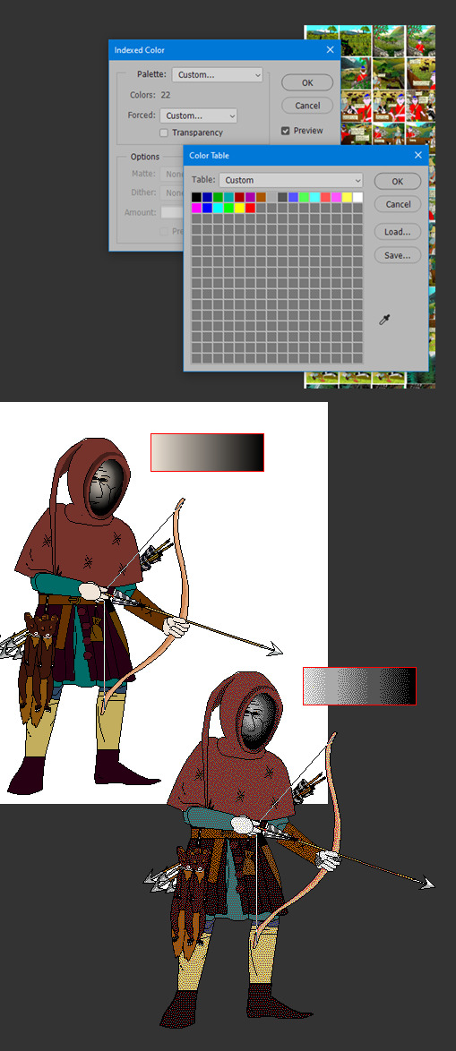
In regard to things like inspiration, references, and my relationship to aesthetic genres; these things certainly factor into my work, perhaps I'm even overtly dependent on them. My work can definitely be post-modernist in method; creating new, ironic, or fragmented interpretations through deconstructing a mix of various styles or methods. But at the same time, I'm still trying to make a digital gestural representation where the aesthetic is driven by my relationship to the software and techniques directly—not simply in an attempt to reference a style. For example, I like drawing lines in sweeping strokes, not to a point of geometric perfection, but just in a way where the curves are smooth and simple. But if I want perfectly curved or straight lines, I'll use the vector tools.
Working this way, you can sort of learn why certain styles and design choices in past vector aesthetics were made, as they would have also needed to make similar choices. That’s why I’m more mindful of using digital material specificity as a foundation to build narrative and subjects upon these days.
For example, genre references like cyberpunk clichés for #cyberhell or late medieval design for #autonymus or 2005 to 2015 era subculture fashion for #gradientgoblinz.
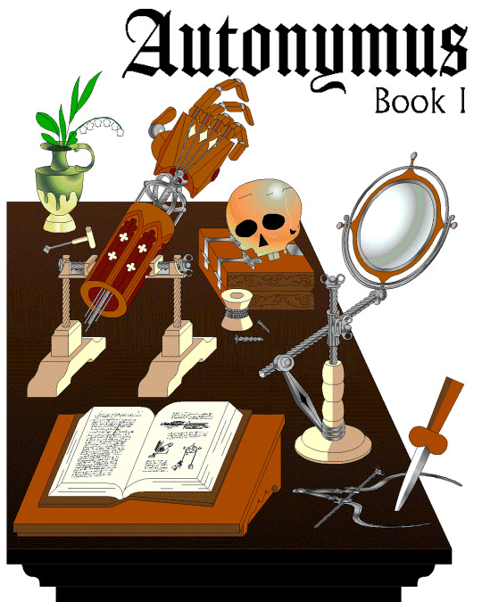
I think it’s important to take inspiration and reference from a wide variety of sources, but I think they’d mean nothing without having something to say or express. Autonymus, although it is a collection of tropes and clichés, isn’t just about that. It’s a story about the tensions of socially constructed systems and how that shapes faith, technology, and the natural world, or at least that's what I'm aiming for anyway.
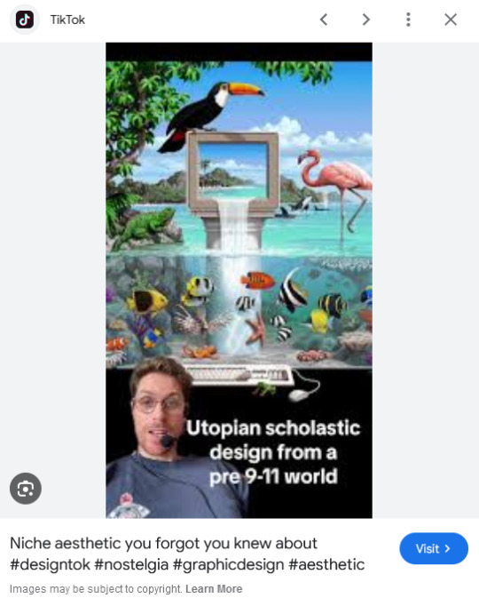
But despite all that, I think there’s a danger of locking myself into the past by using these methods. For example, using nostalgia and references to past aesthetics can result in just recreating the past in a form of role-play. To avoid that, I try and evoke the past through a messy, inaccurate pastiche rather than caring to accurately re-enact anything. I’m probably not always successful at communicating the deliberateness of this, and it can certainly get very frustrating and pedantic. To be honest, I do kind of hate aesthetic labels (terms like Y2K, global coffee house, utopian scholastic designs from a pre-9/11 world).
I do not believe that a project aimed solely at mapping history through aesthetic styles is worthwhile. Sure, they can be handy for organizing style trends, but they can also be reductive and ahistoric. Who are these people to define the history of these design eras? The result is a kind of suffocating simulation of design history but removed from context, perfect for moodboardism. I wish it felt more tongue-in-cheek, less absolute of itself in its own practice. Instead, it acts to legitimize and engender those making these labels, almost giving them ownership of the design styles. It’s similar to the logic and process of generative AI and its databases in a way, just done manually.
I’m very inspired by artists like Oneohtrix Point Never in this regard, as I think he’s able to create an aesthetic portal to all kinds of memories, feelings, and worlds reminiscent of the past, while still being in the present. It’s more a reflection of how timelines are messy now, like a memory or dream, rather than an audacity to say the past was actually like that, or to try to actually map some kind of timeline.
I think the benefit of this process is how it avoids the other side of the spectrum—being locked into chasing the cutting edge of digital processes. I don't necessarily think using an old digital process means your work inherits the semiotics of old aesthetics. Non-digital mediums don’t have this issue to this degree, as you can still paint in oils and be considered contemporary, or at least it's not frowned upon to such a degree. And I also don't think anyone in the heyday of Flash ever made work the same as I do, especially as computers are more powerful now so can handle more. I probably shouldn't boast too much about that though, as artists at the time probably just had more sense than to use Flash like a painting program! So then, why is my use of Adobe Animate critiqued as obsolete and an aesthetic dead-end? Because to whose standards is this process obsolete? If you value digital aesthetics as an apparatus in industry practice, then sure, my work is redundant.
But as wonderful as the latest tech can be in creating new aesthetics, I do feel it can be overtly dependent on the trends and directions of tech corporations, and therefore act as an indirect propaganda tool to their hegemony over digital aesthetics, such as the ever-demanding processing power needed for simulated realism. If anything, work that does follow in the direction of the latest tech trends is ironically the quickest to date once the trends move on.
I've noticed I've not really described what my work is about, just the process, in this text. But I don't know, maybe I like Flash because it is regarded as redundant. No one really cares about it, so I feel free to make whatever I want, and can decide on form myself, to my own standards, the quality of my work. As fun as making images is, I find it difficult to put into words what it is exactly I'm expressing in my work, and perhaps that would spoil it anyway.
221 notes
·
View notes