#fixed the image so the text is more legible
Text
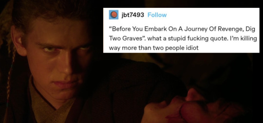
#anakin skywalker#star wars#i saw the revenge post and immediately ran to make this#fixed the image so the text is more legible
2K notes
·
View notes
Text
I think the postage stamp sized image on the physical switch cartridges should be designed like memory card data icons
#both because i think that sort of aesthetic would be charming as hell there#but also the image on the card is SO small that it really should be designed to be visually clear in the same way the tiny icons are#just slapping the logo on the card is fine i guess but that logo was not designed to remain clear when scaled down to literal thumbnail size#like ultimately its small potatoes#but theres becoming a consistent issue with pillbottle text#i get that Japanese lettering stays more legible when scaled down and trying to fix that would mess with graphic design or text length#but there surely is a better way to do this#why doesn't it matter that the text is near illegible#they know how big the screen is at least when its not docked#they should maybe design around that#so that the games actually convey visual information the way they are trying to on a phone sized screen. dammit.
1 note
·
View note
Text


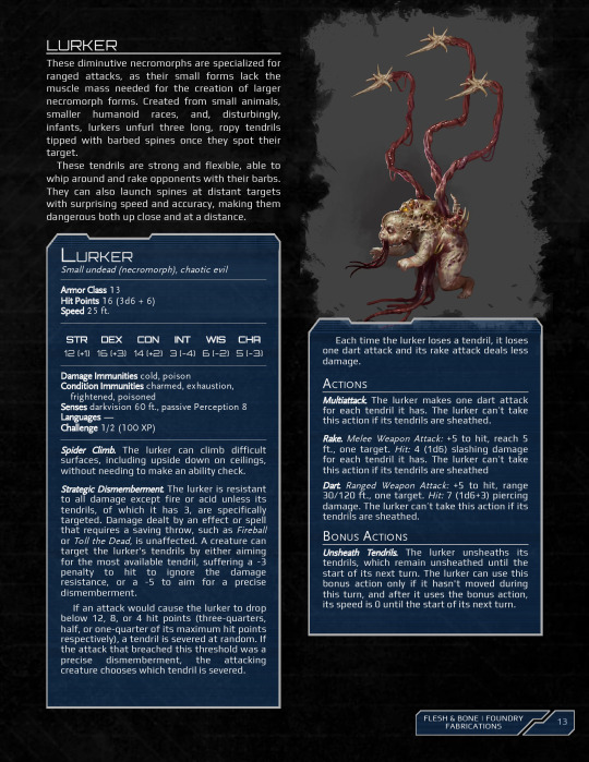

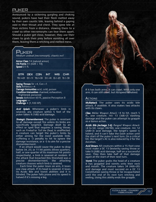


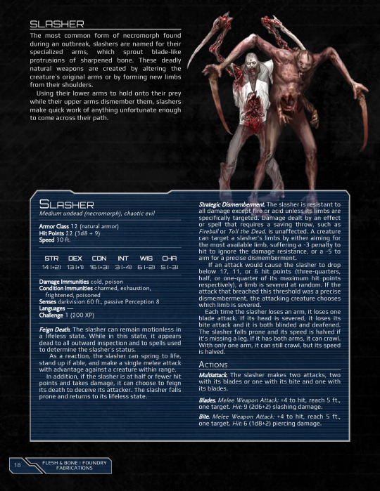

Happy Halloween everyone! It is with immense pleasure and excitement that I present to you a labor of love, the long awaited rework of Flesh & Bone! Originally, I had intended to release this shortly after the absolutely stellar remake of Dead Space, but that obviously wasn't going to happen. So as to not repeat my last mistake with big projects and arbitrary deadlines, I took things nice and slow, took my time to give this work the true love and attention it deserved. Anything for my beloved Dead Space.
And I couldn't be more pleased with the result! Well, I can always be happier. There's always something I wish I could have added or done differently, but I won't dwell on that. "Don't let perfect be the enemy of done". But it makes me so happy to see it in its full gorey glory after all this time. But that enough preamble, let's get into the changes from the original!
Being the result of a 3-week mad rush to release on time for Halloween, the original brew has a LOT of problems. I forgot a lot of details and made a lot of mistakes just by the nature of not having enough time to do it justice. Having had, what, 2 years, between now and then has given me a lot of time to hone my skills as a creator and figure out exactly what I wanted to do for the eventual rework.
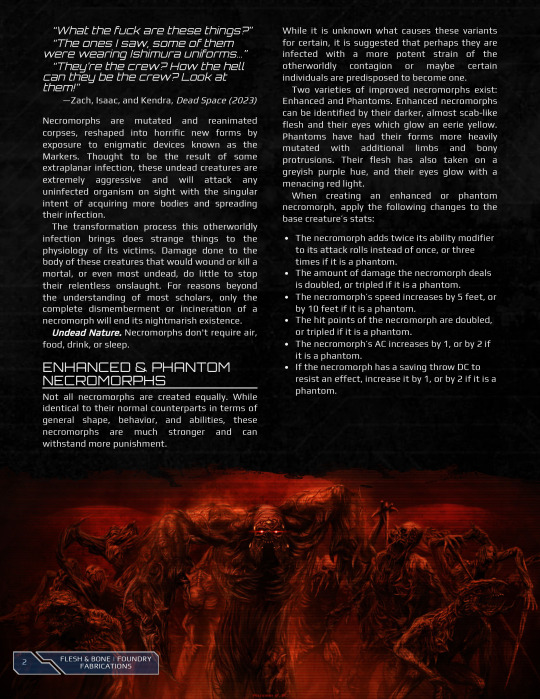
The first and most obvious thing is the aesthetics. Flesh and Bone was the first time I ever tried to make a Homebrewery theme from scratch, so I had a LOT to learn in a very short timeframe. I got it most of the way there for what I wanted to do, but it still had a lot of issues, namely a lack of integrated stat blocks. Formatting was also just awful. I just couldn't get them to work quite right, and they always looked super off, so I elected for images instead. Since then, I've made my Xenomorph supplement which used that initial test as a starting point, and I was able to fix a lot of the issues I ran into. I also want to change the overall look of the theme itself. When I designed it, I was going for a design mix based on the Dead Space wiki and the holographic UI from the games themselves. The result was...not the most legible. I've taken a new approach with the rework, made everything MUCH more readable, and borrowed heavily from the aesthetics of the 2023 remake.
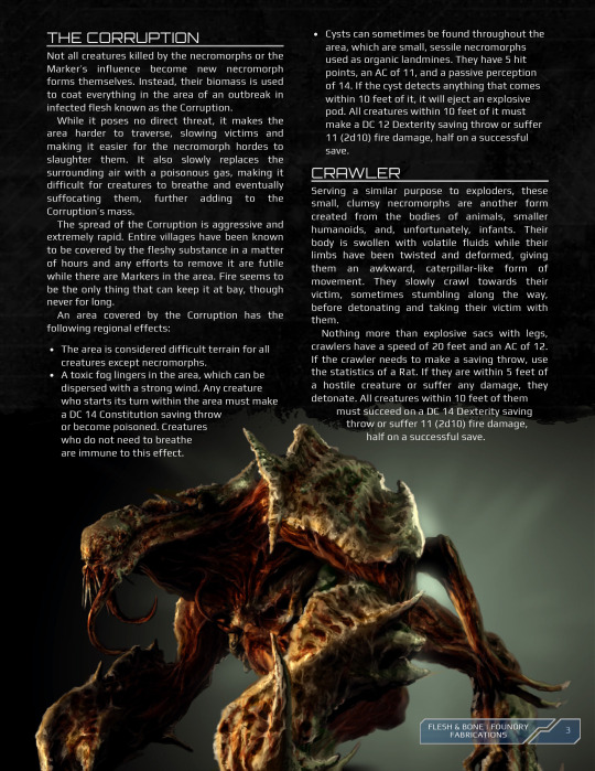
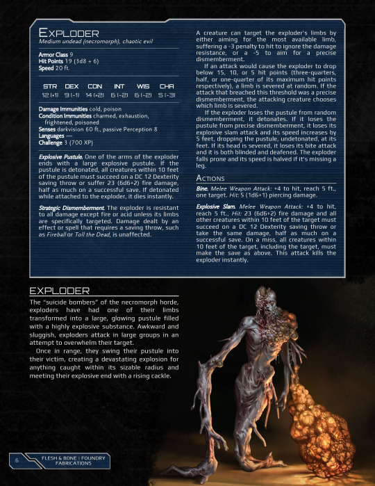
As for the contents themselves, turns out there were a bunch of really cool necromorph variants that I just completely forgot about like the Twitchers, those reanimator swarms from DS3, and the Ubermorph. With that last one in particular, I reworked the old Hunter into the Regenerator with Hunter and Ubermorph variants, like I have with the Slasher, Spitter, and now Twitcher. In general, most of the necromorph forms were in dire need of reworks up in one way or another, especially their descriptions. I pulled almost all of that text directly from the Dead Space wiki, and it showed real bad. Again, 3 weeks, all panic. All the descriptions have been rewritten to be more in line with my other writing.
I also removed that section at the beginning about the Markers. I originally included it to give context for the rest of the brew, and I just really wanted to talk about the Markers, but the more I looked at it that section honestly added very little to the rest of the brew that couldn't be done in other areas. And let's be real, the Markers are SO IMPORTANT to the Dead Space universe that they really need their own dedicated brew. So, I pulled that section out, and it will go in said dedicated brew another time.
And the final change is I actually included some form of boss necromorph this time! I hadn't planned to, but I started thinking more and more about it, and I was also asked by one of my lovely patrons about it, so I gave in and made stats for really the only Dead Space boss worth talking about: The Hive Mind. I actually had fun writing it, working out its abilities from both the original and the remake, as well as taking some creative liberties and giving it some fun new abilities as a result of it being a Nexus necromorph.
So that's everything! I hope this gruesome creation of mine brings you as much joy and terror as it has to me. Stay safe, stay spooky, don't forget to love each other, and m̵̧̈́ͅa̴̜͑̍ḳ̵̍ë̷͍͇́ ̶̖̾̏u̸̪̅͜s̷͙̟̓ ̷̬̩̒w̸͇͘h̶̠̳͆̽o̶̻̺͂̀l̴̛͍̦e̸̡̡͗. See you next time.
Enjoy my work? Consider leaving me a Tip or supporting me on Patreon! Patrons gain access to high quality PDFs for all of my content, weekly updates, early access, and more!
Want to hang out with other followers and myself, talk about games, and share ideas? Come join my Discord!
#dungeons and dragons#5th edition#dnd#homebrew#5e#dnd 5e homebrew#5e dnd#dnd homebrew#dead space#body horrow cw#horror#body horror tw#blood#cw gore#necromorph#undead#monsters#tw dismemberment#tw body horror#tw horror#wotc#wizards of the coast#tabletop#Tabletop Games#Tabletop RPG#tabletop roleplaying#ttrpg
74 notes
·
View notes
Note
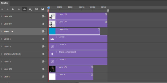
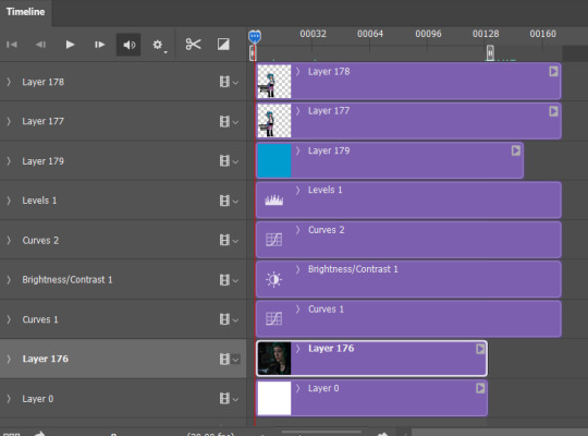
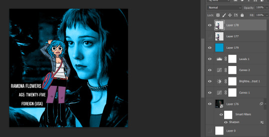
hii, megan! I hope everything is going well for you. I was wondering if you'd be willing to share how you created the gifs and images overlay effect in this /post/727210103698259968/scott-pilgrim-2010-lgbtqcreators-bingo pretty set? Have a nice day.
I will do my best!
First and foremost shout out to @nelsonnicks Norah whose beautiful gif set here inspired me!
In order to make this as succinct but also thorough as possible, there are some assumptions this tutorial makes:
We are working in photoshop
You know how to make a gif using photoshop
You know how to use the timeline feature to make/edit gifs
Okay let's learn how to make this gif:

(Due to Tumblr's image number limitations, there is a PART TWO linked where I add that "item" and gif, which you can find by clicking this entire sentence.)
STEP ONE: The Image Overlay
Pick your image! Here's the one I've picked, I cropped a page of the graphic novel:

From there, I'm going to click on that magic wand tool:

And select subject (crudely circled for emphasis)
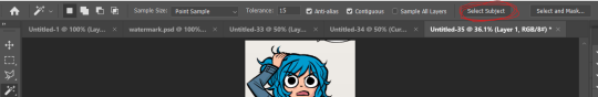
If it's not perfect, you can either use the quick selection tool to refine the selection before or continue on with these steps and use the eraser later. I do both, but it's up to you.
Now I have a lasso around the subject, and I'll click that "Select and Mask" button next to "Select Subject"
Now I can see what my lasso'd image looks like against a white background, and I see that it's pretty good, nothing I can't fix with an eraser if I really want to later.
If the image looks rougher than you were expecting, use the SMOOTH option and play around with that slider.
If it looks a bit more smooth than you wanted (not clear defined lines where you were aiming for clear defined lines) use the CONTRAST option and play with that.
And if you wanted a little more or less around the edges, you can use the SHIFT EDGE tool to grab like 1px-ish of additional space.
Anyway, I like what I've got, so I am gonna CLICK OK
And I'll either cut or copy it onto a new file, and throw away my scraps.
Now it's time to add my character details! I'll use the same format I did for the original set here, and create 3 equal-sized rectangles using this lovely shape tool tool:

So my working file now looks like this:

I move the rectangles closer, I'll want them behind the image of Ramona after but here's just what it looks like while I'm adjusting them.

Then I add the text:
Now, it looks like when I put the bars behind her it'll cut off her name! I don't want that, so I'll adjust the side of the bar for her name and scoot it over....

Nice!
Now I'll adjust those layers to be closer together and behind Ramona...
And this is what my screen looks like now!
It looks how I want it, so now I'm gonna merge all of the layers EXCEPT the background layer. This makes it so the part that's merged has a transparent background.
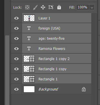
Highlight the layers, right click, and find the "Merge Layers" option
And now it looks like this:
Step one COMPLETE. Great job. Have you been drinking water? It helps you think clearer. Or something.
STEP TWO: Make the gif you want. Sorry I'm not doing this step-by-step it would be so long I'm sorry!!!
STEP THREE: Put Ramona on the gif!
So I just use the selection tool and make a square around my bestie Ramona here to create this:
And then paste her right on top of my gif here:
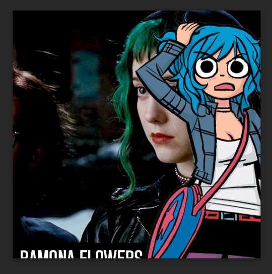
Woah! She's ginormous!
Let's resize her by hitting CTRL+T....
This is where we get a little creative. Personally? I think the font is legible, but doesn't look nice now that I've resized it. So I'm going to back to the original file and UNDO my last action (merging the files):
And hit CTRL + T on the Ramona layer (Layer 1 pictured) and adjust her size:
Time to merge these layers again, and redo the process:
MEGAN SHE'S LARGE AGAIN! I know, I'd rather work with big files I have to make smaller than small files I have to make bigger. Sue me.
Resize the layer, make any adjustments to the gif you have under it in terms of placement/size:
And WHEW we got this part done.
STEP FOUR: Add color overlay
I'm gonna make her color overlay blue like her cartoon hair, so I'll eyedrop tool her hair:
Go to Layer:

Add new, and then using a regular brush at like 5000px just click onto that new layer, and...
Bump that layer under your Ramona cut-out,

Go back to the layer drop-down menu, and select Blending options...
And this little menu will pop up:
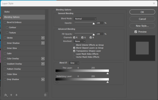
MAKE SURE YOU HAVE THE PROPER LAYER SELECTED FOR THIS. Otherwise you're going to be very confused.
See where it says "Blend Mode" and it has a drop down under normal? For these purposes, I'm gonna use the drop down and select COLOR:
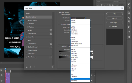
Now you can see that all-blue layer in the background now is showing the original gif behind it, but you know your original gif? "I know of it." It's all blueee. /ref
This is what it should look like:
Before I go any further, I'm going to check my timeline to make sure this is covering the WHOLE duration of the gif:
It does, so let's drag that bar on the right to line up with the end of the gif:
All fixed!
So now we've got this:
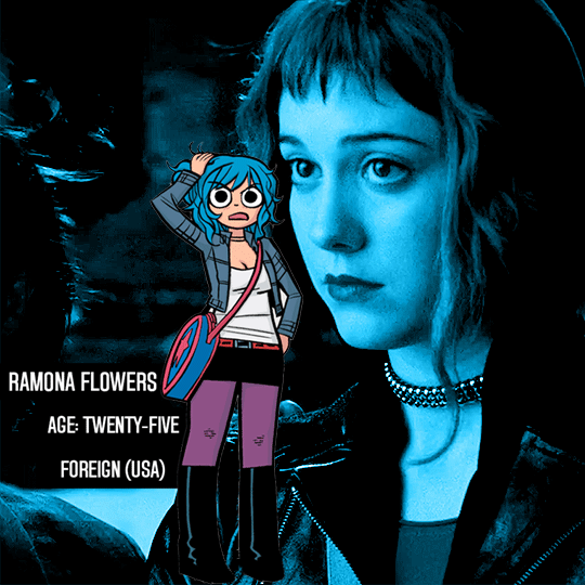
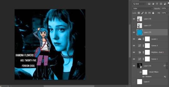
Oh man! See those white spaces between her arms? I'm gonna go back and fix those now, fortunately I can edit it directly on the full file itself, by just editing that layer.
Using my magic wand tool, I'm selecting those white spaces between her arms and her jacket and deleting them-
She's not perfect but you can always be nit-picky and zoom in really close and refine with the eraser.
PART TWO
#answered#Anonymous#usergif#userairi#usernorah#userbarrow#userhallie#usercats#tuserheidi#tutorial#gresource#gif tutorial#pscentral
49 notes
·
View notes
Text

RE's Dulvey Daily newspaper, and the Deep Lore (TM) of the sinister Horn of Plenty pharmaceutical company
There is some wonderful nonsense to be found in the unused assets of RE8. One favourite examples is this one texture asset created for the collectable-document-item titled simply "Old News Clipping" that you can find early on in Ethan's home. This is not an item you can pick up and examine, the screencap above is all you can see of the newspaper: folded so that the name is abbreviated to "The Du", with the cover article similarly cropped down to "Horn of Plenty Facing F". The actual headline referenced in the document text ("Curtain Closes on The Dulvey Gas Incident") isn't visible here at all.
But the complete texture created for this double-folded paper covers the newspaper's whole front page, and it is huge. I've broken it in half to make it a little more tumblr-friendly.
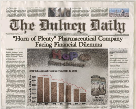
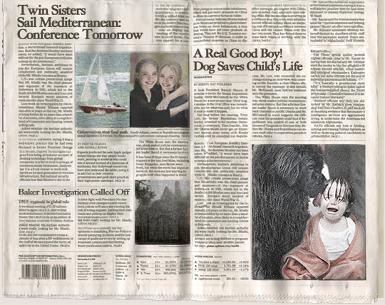
The full front page shows the paper is called "The Dulvey Daily", with the headlining article, "Horn of Plenty Pharmaceutical Company Facing Financial Dilemma". But it doesn't stop there: beneath the fold we've got two more huge articles ("Twin Sisters Sail Mediterranean Conference Tomorrow" and "A Real Good Boy! Dog Saves Child's Life"). There's no real text for these ‒ text is deliberately blurred what little is legible suggests it's basically a lot of lorem ipsum-style placeholder material ‒ but someone put some real work into all those photos all the same.
The article we're actually looking for is the smallest on the page, crammed down into a corner (and here, confusingly, titled "Baker Investigation Called Off" ‒ presumably the English title was changed later and no-one saw the need to update an image that wasn't going to be visible anyway). And that's a detail I like a lot, given the whole point of this file is to communicate the way the whole Dulvey incident has been swept so far under the carpet by the authorities that it's not even worth a proper local headline. Really, and it's a shame the full asset isn't viewable in-game, given how effectively the layout communicates how un-newsworthy the events of RE7 are now thought to be.
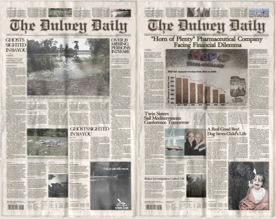
You can actually find another issue of "The Dulvey Daily" in RE7 ‒ and it's more what I'd expect for this kind of asset, in that the same title "Ghosts Sighted In Bayou" appears twice on the same page. Nothing wrong with that kind of shortcut: if people aren't going to see both sides, why bother adding more individuality? The asset team's got better stuff to do.
Still, it's a nice touch that both games uses the same fonts and layouts for these two issues of "The Dulvey Daily," so here they are side by side.
But by far my favourite thing about this page is another detail you won't notice unless you get to see that whole asset. Let's take another look at that headline story:
Now, in the RE universe, you tell me a "pharmaceutical company" is involved in "financial dilemma", and my instant response is, oh shit, did they just get busted for making bio-weapons on the sly? Are they about to try and 'fix' their financial woes by getting into dodgy research areas? Don't tell me it's not likely!
But it gets worse, because I have seen that baby food jar somewhere before! Heck, I have formulated semi-serious theories about the whole pre-timeline of the game based on those baby food jars!
The game draws your attention to them on both your visits to that pantry (in slightly contradictory ways, but shh, just put those little details aside).
We can get an even better look at the label on the asset texture, and...
...yup, Horn of Plenty baby-food, right there in orange-and-white. Yikes, maybe it's a good thing Miranda!Mia wasn't keen on letting Rose actually eat any of that stuff! XD
Now, I don't really think this is pointing to any deep-lore about the Horn of Plenty company or their potential role as the New Big Bad of RE9, or anything. Far more likely, this is just someone on the asset team amusing themselves with a cute little call-back to some other asset they just worked on, where no player is ever likely to see it.
But now I've seen it. And now I too am duly amused.
14 notes
·
View notes
Note
hi it's @maddgical-boy! sending you some numbers for the ask game in return :0 how abt 9, 19, and 33?
AYYYYYYYY hello!!
9. If your paras found out you were their creator, how would they react?
This one is complicated because my paraself is a big part of my paracosm and uh he has broken the fourth wall a few times... so how would he react? "Oh hey alternative universe self, how's it goin?"
I think my other main paras would be like "ahah no way, I always knew everything was fake"
My other paras would be very confused. Like genuinely confused because they are mostly atheistic so that explanation would be out. "Who are you??" Like overall wouldn't believe me.
19. What are your paras typing styles?
NONE of them use emojis. Such things are outlawed in my brain lol. Axel, Theo, Bingo, and rarely also Tamara, use emoticons [:>, :3, :/, etc]. On paper Axel would write tiny and have a sort of fake fancy handwriting because he never learned to write, but he doesn't want to seem pathetic. Milo would have simple writing with no connection between any letters, fully legible. Theo and Tamara both connect letters. Tamara actually tries to have good handwriting while Theo is a scribbler. Natty would write in big letters and insane spacing between each word. Through text, Milo and Tamara are the only ones who use punctuation. Theo does sometimes but it's not correct (like me lol). Axel just types and types and types and relies on autocorrect to fix everything. Natty doesn't misspell but she just writes big chunks with no stops. And the rest of my paras are fact-paras... and I struggle so much with comprehending other people so yeah I can't even begin to tell you their writing styles.
33. If you make images of your paras with meiker/picrew, what is usually missing from the meiker/picrew?
Uhgggg Milo has to have freckles because acne rarely exists. I also can never find the right middle part. Axel of course I have to draw in his extra eyes on my own. Also there's never the right amount of hair colors. Tamara is whitewashed so much and that drives me insane. I've spent ages searching for black centered picrews. Theo rarely gets his fangs. Natty doesn't ever get her like half shaved head look. Bingo never gets multi colored hair. AND SO MUCH MORE. Which I respect picrew creators and allat but personally I just want my people to look accurate. I learned a lovely skill of editing picrews so it's alright usually. EXCEPT FOR THE PICREWS WITH NO SKIN COLOR OPTIONS.
Thank you SO MUCH for the ask :>
2 notes
·
View notes
Note
How do you feel about ethical AI generation? (e.g. where all data is properly licensed and sourced)
I don't think that's possible. It's literally a pandora's box technology.
Public tools (GigaPixel, etc.) might lean towards more ethical and more legal eventually, but there will always be instances where somebody downloads the source, rolls their own version of the generator software, and feeds it copyrighted and illegal data anyway.
This virus is here to stay. Even if it somehow becomes fully and truly outlawed, it will still continue to exist in the underground.
And imagine something like... okay so, one thing I've thought about personally is that
I'm pretty good at spotting when something is AI generated
I know my way around an image editing program pretty well
So think of a person who generates AI images and knows enough to go in and re-paint just the parts that look a little strange. They fix the weird looking irises, add or remove the wrong number of fingers, take the garbled text and make it legible...
It's still an image made with stolen data, but now it's a lot harder to tell it's AI generated, right? How many of those are out there right now?
I don't think we can escape this. But just because we cannot escape it doesn't mean we should give in and embrace the trash, either. Always uplift real art by real artists. It's more important now than ever, and will only grow more important as time goes on.
5 notes
·
View notes
Text
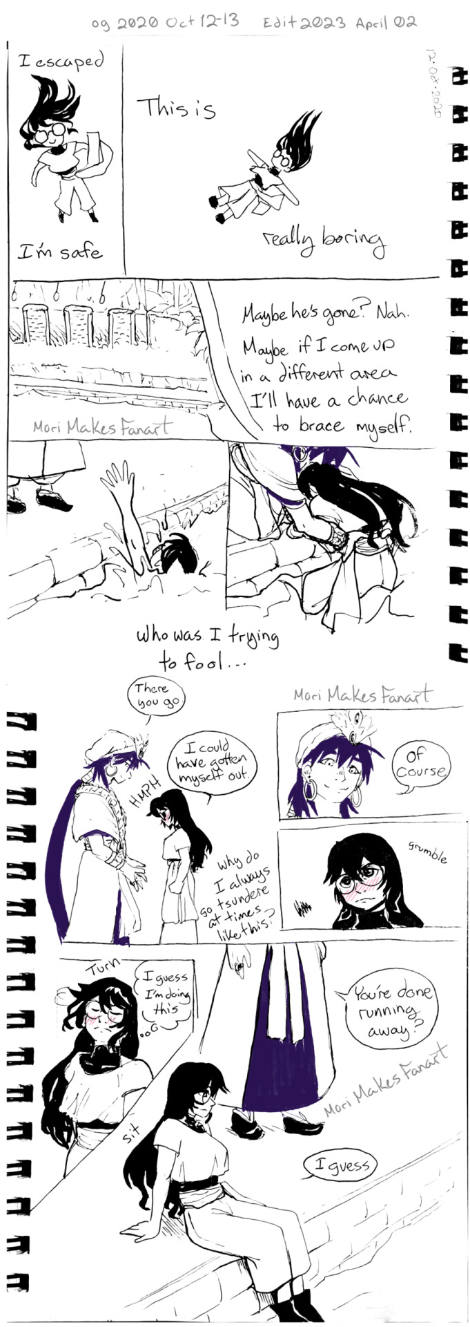
2020 Oct 10 -Lucid Dream: The Last Push to Make Sindria's Prophet
*It's my birthday, so I'm adding another chapter to the Adventures of Simpbad :D
*I have been lucid dreaming since around the age of 6. I keep a dream diary and draw parts. Sometimes I like what happens in my dreams so much that I use it in my stories; that's why I go by "Mori's Lucid Stories" for my original work.
*I have had several dreams involving Magi so I've decided to add them to the Adventures of Simpbad Collection :3 The art will mainly be edited photos of what I put in my dream diary. I will draw things digitally if I didn't end up drawing anything traditionally.
*This dream happened when I hit the first road block in writing Sindria's Prophet and was the push I needed to fix it and what lead me to choose to post Sindria's Prophet online :3 Also, I didn't think I would be posting this dream when I started drawing it, so the first half isn't as well drawn as the last few pages.
*The original versions of this are still up on Tumblr, Instagram, and Twitter. This version has a novel version of the dream added, and cleaned up art of the original photos of the pages.
*I did rewrite a bit of the text in the images, but please let me know if there's any part that still isn't legible. Also so everyone knows, all of the purple and pink was done with colored ink traditionally, so I tried to keep that feel with the edits.
~POV Mori~
I was having an anime convention dream. I get those fairly often since cons are some of the most liberating experiences I've had. I had finally accepted that I had been hyper fixating on Sinbad for the past 5 years. I had tried my hand at writing fics but most stayed as concepts and drafts. I decided to try writing my first self insert Isekai, and had hit a road block. Thinking so much about an anime/manga was probably why I was having an anime convention dream.
I passed by a manga seller and decide to take a look. The only official English translation of The Adventures of Sinbad was a short run the first few volumes in Singapore. But here in this dream someone was selling official English versions of every volume. It didn't matter if this was a dream, I was going to buy them!
Having successfully made my dream purchase, I wanted to go somewhere I could sit down and read them. As I was about to leave, a familiar color palette appeared in my peripheral vision. King Sinbad was standing by the same bookshelf I was just at!
I knew he was tall, but it's different seeing him in person. Even with all of my fixating on him, Sinbad had yet to appear in my dreams. He was right there though! 100000% That was Sinbad! But this was a convention dream. He could be a cosplayer and not the real deal. The line often gets blurred in my dreams so did it even matter?
Two gold eyes turned towards me and I ran for the cover of another bookshelf. He was gorgeous in person and my heart could not handle it! Who knows what would have happened if I actually talked to him?!
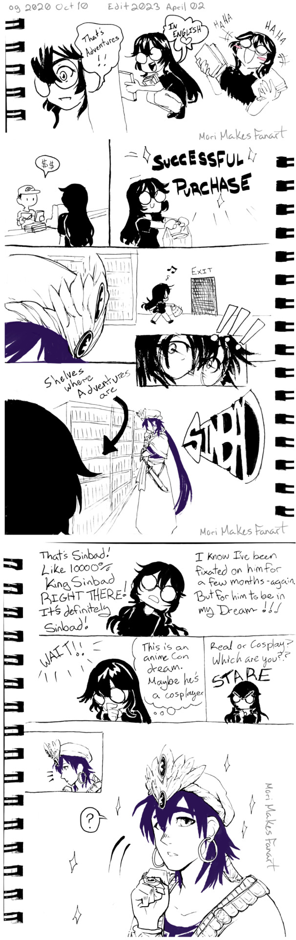
'But this is my dream!! There's no reason for me to run away.' This dream has no signs of becoming a nightmare, so I could still change or remove anything I didn't like. Sinbad would never be able to hurt me in a dream unless I let him. 'I have been under a lot of stress recently though...'
It was worth some risk, but not a big risk. I took out my phone and used the zoom function of the camera to get a closer look at him without having to get close enough to risk him talking to me. That was something I didn't think I could handle yet. I also didn't know how long I could handle being around him so I sneakily made my way to the exit like I originally planned. As I got close, the gold eye in my phone screen made contact with me, and Sinbad smirked. 'ABORT!' I ran the rest of the way out.
That was more than enough Sinbad for me, thanx. I was no longer used to experiencing any form of attraction, and it had become a bit of a trigger honestly. Liking someone could always be used against me. My ex fiance made sure I'd learn that lesson....
This was a good dream so far, so I would not dwell on such things!!! There was a whole rest of a dream con to explore. I could go to more venders for impossible finds, or a panel, or watch cosplayers or stalk Sinbad Watching cosplayers, it is!

---
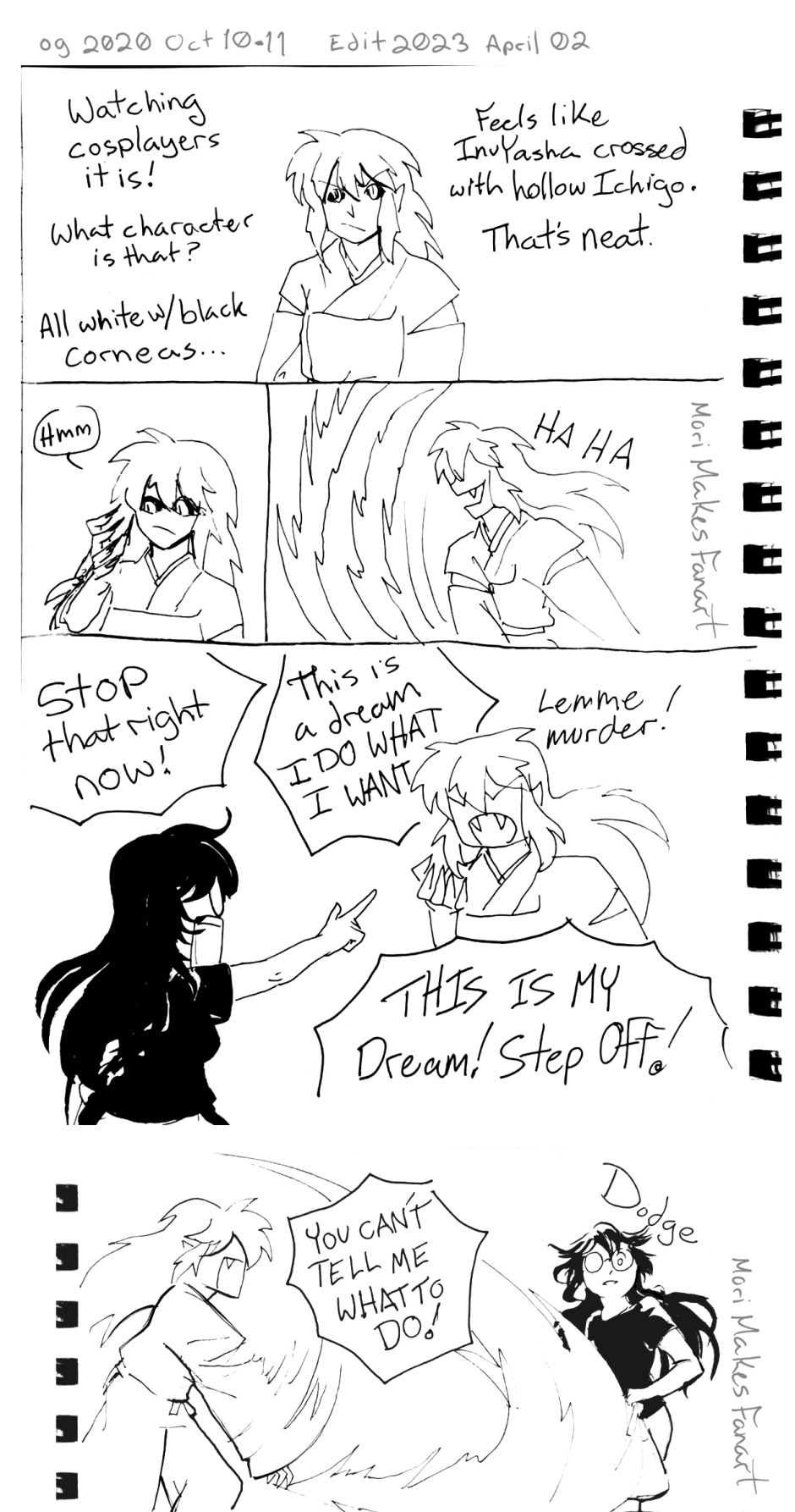
I find that the dealers room is one of the best places for spotting cosplayers, so guess where I went back to?
Cosplay is always really cool regardless of skill level or accuracy. It shows passion and love for a story. And some can be very creative in taking characters into different styles. In this dream there was a crossover cosplay of someone dressed as Inuyasha, but done in the style of Hollow!Ichigo from bleach. They even had on white body paint, and contacts that made their corneas black. Given how full demon mode Inuyasha was, the idea of a hollow version was scary, and rad as hell. His claw attack would be devastating- And he was destroying the venders with the exact attack I was just thinking about! The cosplayer was no longer a cosplayer! This is the part of lucid dreaming that isn't always the greatest. I thought too hard about something and it became a real problem.
I yelled at my mistake, "Stop that right now!!"
To which the once cosplayer yelled back, "This is a dream! I do what I want!" And what he wanted was murder.
The audacity! "This is my dream! Step off!"
He attacked me! "You can't tell me what to do!"
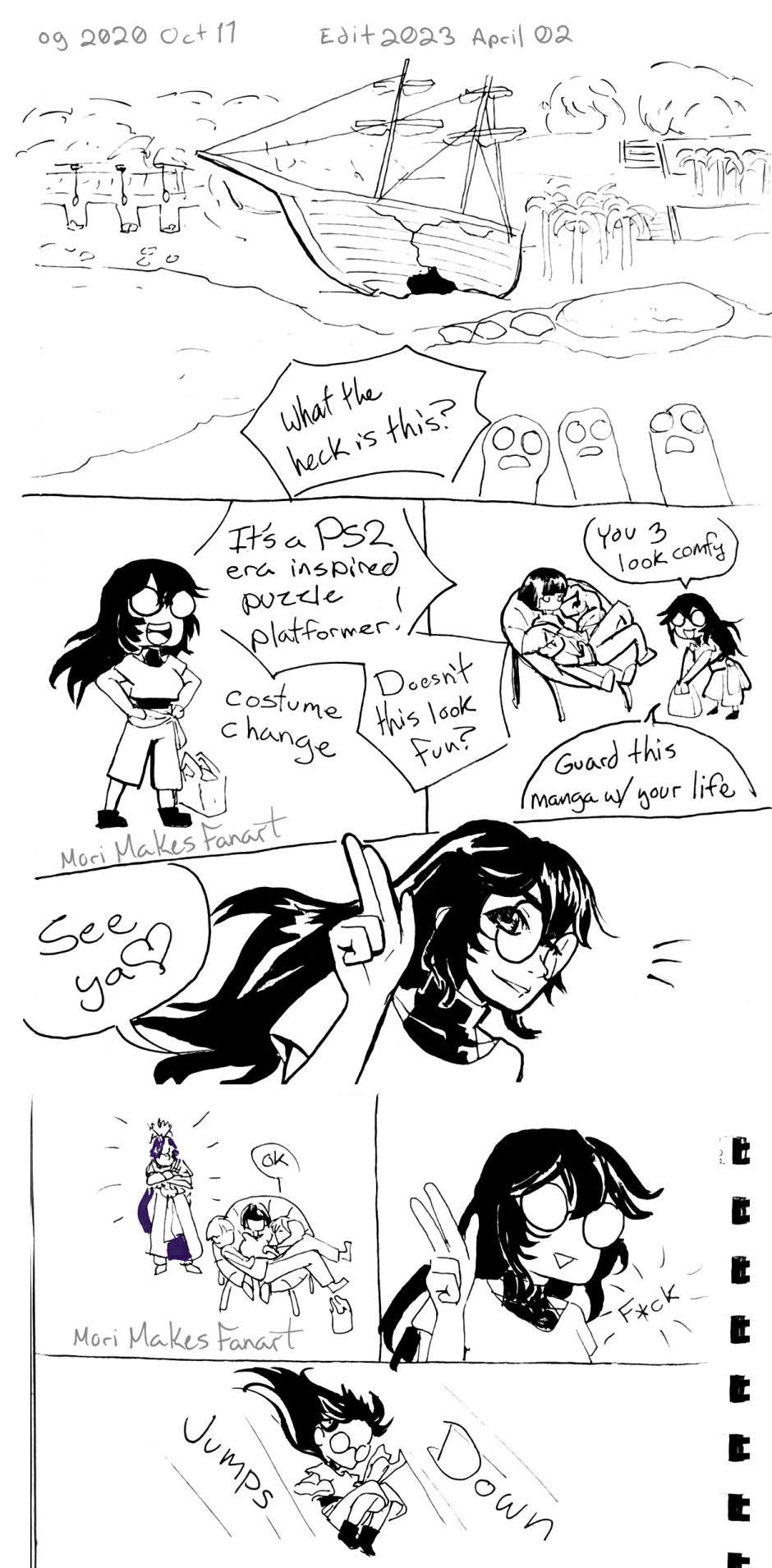
I dodged it, and I was done playing. "Yeah, no." If diplomacy wasn't going to work then there was no reason to keep him in my dream. "If you're going to be violent, you can go. This whole part of the con can go." Sometimes it's easier to get rid of the whole area than just one person since the area can hold onto the emotions and make the same type of thing keep happening. If I don't nip it in the bud it could become a nightmare or night terror, and God knows I've had more than my fair share of those.
The entire room got cleared into a white void. There was a floor and walls where doors into the room were, but everything else was gone. My emotions returned to normal too. This empty room was still attached to the rest of the dream world, so convention goers started walking in and getting confused about the missing dealers' room. Creating a new place for venders would only risk things going violent again. I made comfy chairs and cushions for people to rest on while I figured out what to do with the cleared space.

---
My safest bet was to change the genre so I could have a different type of environment. It had been a while since I had a fun adventure dream. To keep it from going potentially violent again I made it like a play ground or obstacle course instead of an actual place with real danger. I grew up during the PS2 era of games so beaches and platforming like in Kingdom Hearts, Jak&Daxter, and Ratchet and Clank are hugely nostalgic, and have become symbols of safety and fun for me. And so I made a beach with an obstacle course, platforming, and a fake broken ship. And of course, with a change of scenery comes a costume change. I went for something that was a mix of dance clothes and reenactment clothes from when I was in a reenactment pirate band -there was fake broken pirate ship here after all. (I decided it was a pirate ship because that seemed more fun.)
There was a cuddle puddle of three people in one of the chairs I made. I left the manga I bought with them, telling them, "Guard this manga with your life!" before heading out to the obstacle course I had made.
As I gave them a two fingered salute, I noticed that a familiar purple haired King was standing behind them. Everything inside me knew it was the same Sinbad from earlier and, that like the Inuyasha cosplayer becoming real, this Sinbad was real. Those metal vessels weren't only for show. What's more was I was not emotionally ready for coping with feeling attraction and fear at the same time again.
So I jumped down onto the sandy platforms below.
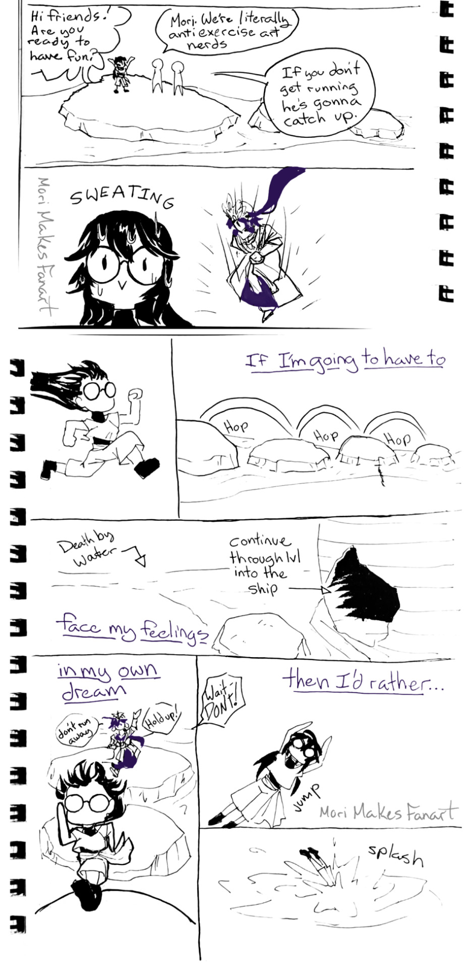
I made dream versions of my some of my friends appear. Hopefully, they would be enough of a distraction to make the Sinbad vanish. I ended up summoning art friends from highschool and college though, so they refused to explore with me. Instead, they actively reminded me who had shown up. "If you don't get running, he's gonna catch up."
Sinbad jumped down onto the starting platform and I bolted down the obstacle course. It was clear that my subconscious wanted me to face this; even if I changed the dream Sinbad would appear again. I had two options: face Sinbad and my fear of my own feelings of attraction, or turn the dream off into nothingness. Ahead of me, the platforms were leading to the ruined pirate ship; the next part would be inside it. And like a video game, the water around us meant death.
Sinbad calling behind me, gave me my answer. I jumped into the water.
---
The dream above the surface couldn't reach me here. It was quiet and calm. I could drift there forever if I wanted to -or at least until I woke up. As the feeling of safety washed over me, I started feeling bored. I had made a whole puzzle plaformer and I didn't even get to go through it! I had been in the nothing for a while; maybe Sinbad was gone.
There was no way I'd be that lucky. If nothing else, I could come up far enough away to have a chance to brace myself before he reaches me. I swam to the edge of an area further down the course. When I breached the surface of the water, I tried to will myself out faster than I could climb up. Two hands reached down to help pull me onto land. 'Who was I trying to fool...?' Of course, Sinbad would appear as soon as I returned.
He smiled down at me as I was finally standing on land again. "There you go."
"I could have gotten out on my own." Gosh, even to my own ears I sounded like a tsundere. This was the best I could do with my trust issues, huh? Dreams make emotional regulation harder too.
Sinbad's smile didn't waver. "Of course." In fact, he looked amused.
I grumbled, accepted my fate and sat down with my legs hanging over the edge. Looking at the water from here, it was obvious that I wouldn't have been able to reach high enough to pull myself out of the water on my own. If my subconscious was this determined to make this interaction happen then it was something I really needed to work through.
Sinbad walked over to where I sat down. "You're done running away?"
"I guess."
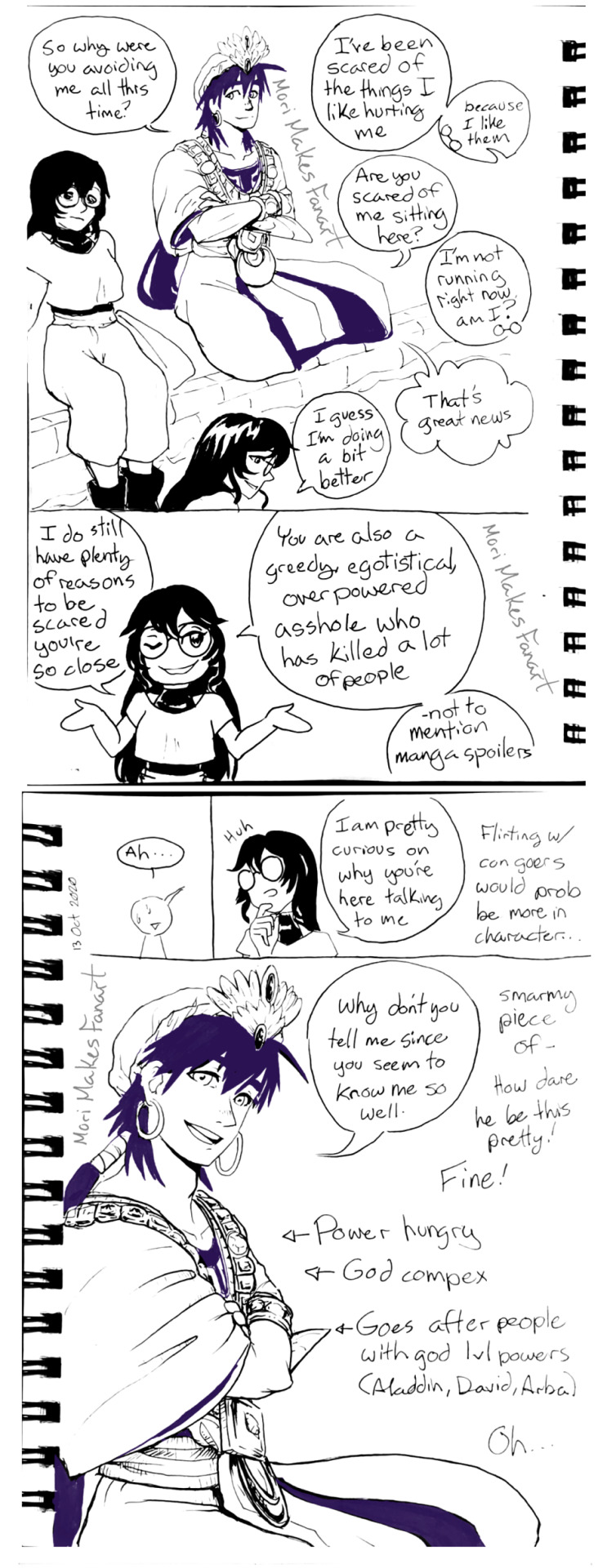
He sat down next to me, and crossed his legs and his arms. "So why were you avoiding me all this time?" He didn't look at me directly, and kept his smile.
I watched the water in front of us. "I'm scared of the things I like hurting me because I like them."
"Are you scared of me sitting here?"
"I'm not running right now, am I?" I wasn't scared of Sinbad. He was non-violent unless there were no other options, so he'd never have a reason to hurt me.
The King's voice was boisterous, "That's great news!"
I smiled at myself. "I guess I am doing a bit better." That gave me back some confidence. My smile broadened, and I made of show of shrugging as I continued, "I do still have plenty of reasons to be scared that you're close. You're also a greedy, egotistical, over powered asshole who has killed a lot of people -not to mention manga spoilers." The man was a walking death machine when he wanted to be, especially towards the ends of both mangas in the series.
"-Ah," was all he said in response. Sinbad was always the type to refrain from commenting when he couldn't deny the truth.
Now that I was thinking about the situation instead of panicking I was realizing some things. "I'm pretty curious on why you're talking to me." Flirting with con goers would probably be more in character.
He finally looked at me. "Why don't you tell me since you know me so well?" His eyes sparkled with interest and curiosity.
'Smarmy piece of- how dare he be this pretty! Fine!' My thoughts got stuck on his face for a moment since I was finally looking at him too. I thought about his question. Sinbad was power hungry by the time he became a king. And he had a growing god complex. And he actively sought out the strongest people in the world like the Aladdin, David, and Arba.
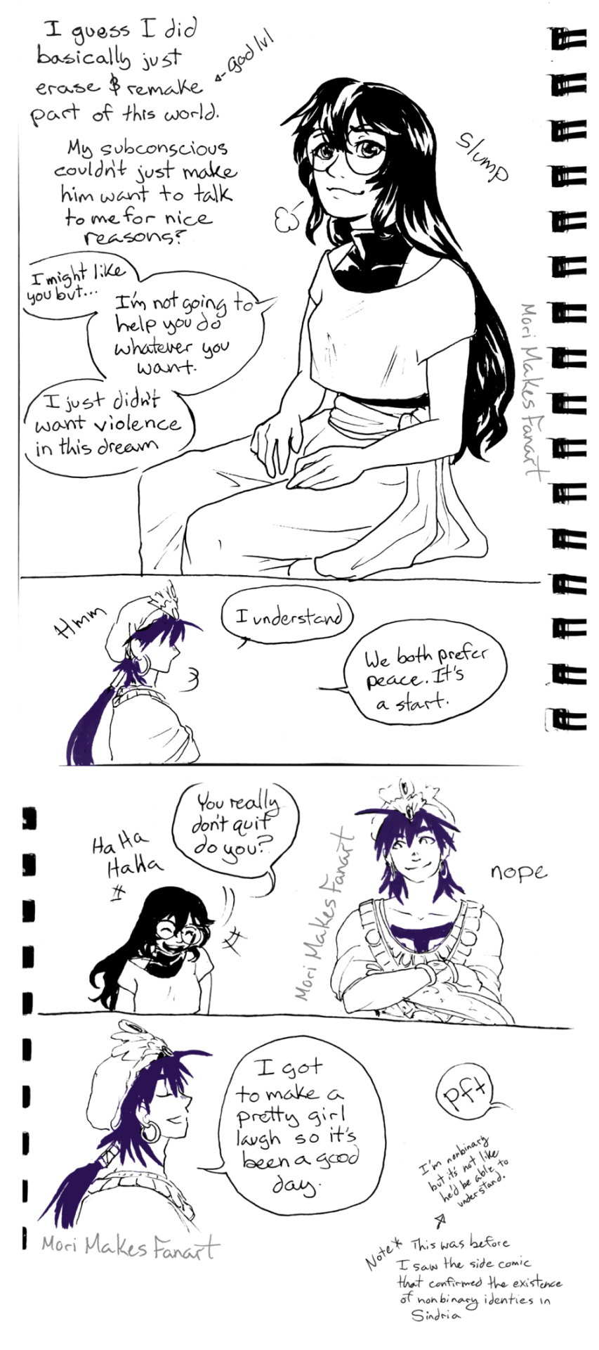
'Oh...' I had basically just erased and remade part of the world in front of him. That was why he hadn't followed after me when I first saw him; I wasn't anything special yet. 'My subconscious couldn't make him want to talk to me for nice reasons?'
I sighed. "I might like you but," that was obvious and I wouldn't deny it, "I'm not going to help you do whatever you want. I just didn't want violence in this dream." Now that I knew what was going on, I needed to set my boundaries.
Sinbad hummed, and looked out at the water. "I understand." After a moment he added, "We both prefer peace. It's a start."
That made me laugh. "You really don't quit, do you?"
Sinbad continued the good mood with flirting. "I got to make a pretty girl laugh so it's been a good day."
I gifted him another chuckle for the sentiment behind his words. I'm gender fluid, so not always a girl/woman, but I didn't think he'd understand that even if I explained. This wasn't the time to be pedantic. I was more interested in enjoying the improved mood.
We continued to talk in that light hearted manor about a handful of things. It was a bit of necessary self reflection involving my fears. It was okay for me to feel attraction, even if I wasn't ready for any of the steps that come afterwards. Maybe Sinbad was perfect for me in that way. In the whole series he never falls in love or gets married, and in that moment what I needed to feel safe was knowing that flirting was all it would ever be. I could enjoy feelings of attraction without the fear of being betrayed later because Sinbad would never promise himself to anyone.
15 notes
·
View notes
Note
could you post the gender abolitionist thing with an image description? i wanna read it but i can't see it otherwise.
sorry about that, completely slipped my mind!
heres the text of the screenshot (there are some highlighted portions for emphasis but theyre largely unimportant and not particularly legible so this is just the text formatted for clarity, but if you'd like to know what sections i highlighted i can edit this or add on just let me know!) :
Gender Identity Under Communism
Many people fear that, through the abolition of gender, our own gender identities will be taken from us. That, in abolishing gender, we will force you to stop identifying with your gender, however much you might enjoy that identity.
In many cases like this, it’s elucidative to make an analogy. For this, let’s talk about bakers. When someone engages with the capitalist system by baking, they tend to form an identity around this baking. That is, having a career in which you bake creates the identity of baker. Similarly, when you engage with reproductive labor in particular ways, you create particular gender identities, both in the ways you conform with the gender that has been given to you and in the ways in which you reject the gender that has be given to you. In both cases, an element of the base is creating within you an identity. Which is to say, your identity stemming from your social position is superstructural.
So will we force people to stop identifying with being a baker or being a woman? The short answer is, “No, we’re concerned with changing the base and allowing the superstructure to land where it may,” but a more extensive examination is in order.
What happens to my identity as a baker once the capitalist system of careers which produced that identity is abolished? This is much more interesting of a question, anyway. Without the enforcement of labor characterized by capitalism, no longer is someone who bakes bread forced into staying within that career. This abandonment of the basal causes of the identity leaves the identity unfixed. The identity may persist, for example if you really love to bake bread, you may continue to identify with being a baker, but there’s no underlying logic to the identity nor does it come out of or reinforce structures of power like identifying as a baker today. But, unlike today, you can engage with baking without it becoming something fixed to you, without becoming a baker.
Over time, the identity of being a baker will likely fade, tho there are many social factors which could allow it to persist, but it would lose its social and political significance. There is no need to enforce the abandonment of the identity of baker to do away with the career system which has produced it.
In this way, there is no need or desire to force people to stop identifying with their gender. The end of gender as a system of power is our goal, and the end to gender identities is an eventual result, if it will happen at all, not something of importance or which we should strive toward.
and the full text is available here, which is also more helpful if my formatting is a bit off because its just plain text without all the tumblr formatting fuckery required to make things look legible on this site (for me, anyways). The excerpt is the entire subheading "gender identity under communism".
4 notes
·
View notes
Text
Blog Post #5


The project so far has been going super well :) We made a few typography and layout changes, but a lot of the changes were very subtle. I love the way Ivette is going with this project.
We discussed the kerning in the body font, and how we need to find a font that is simpler and creates a more minimalistic feel, as the one chosen for the body text was the same font used for the headings, which worked well for that, but when in a smaller point size wasn’t as legible. Another typography change was page numbers as the line next to them often read as a “1” so I brought forward the idea of a more simplistic foster for the pages.
Photography wise, the images were great, all city-based biking imagery, which worked great, although I asked if we could find some images with a lower exposure and lower contrast as that is what Folklife Magazine commonly uses as they are not an illustration based magazine. I found a couple examples on Unsplash and Flickr and emailed them to Ivette for some guidance.
When it came to the layout, we discussed increasing the column widths all the way to the margins. This changed the entire feeling of the layout. Another change was the placement of the pull quotes, they way they were laid out interrupted the reader occasionally but lead to confusion as to where to go next, so moving them to places where they are still part of the design, but less intrusive of the flow of text was something we needed to change. Ivette came up with a couple concepts that really helped and fixed the solution almost immediately which was great.
Overall, working with Ivette on this project on this project has been a fun experience so far and she has proven to be a great graphic designer. I love her design process and how she is open to changes and comes forth when she needs guidance or help. It makes the project go very smoothly and we are able to work together well to create a creative and enjoyable project :)

2 notes
·
View notes
Text
Ok, so let's talk about making people appear and talk. Ren'Py is build precisely for that, so getting that much done is pretty easy.
First, one needs to get the images to be used into the images folder in the game folder. I normally trim my captures, but today I have a slow render cooking in PS that doesn't allow me to use it, so accept my apologies for the unwanted view of my messy tabs.

Here you can see that I added the two characters speaking and the background. In this case is an animated background so you see the carpark movie in a .webm format. Ren@Py accepts a couple other formats, buy my free Movavi converter does this one ok, so I'm used to it. The normal formats like mp4 or mov are not happening so you'll probably need to get a converter too. Not ideal, but one doesn't need so many movies anyway.
Next step, in my Demo script file I'll declare the charters and the movie. Look at the first three line in the script:

First, you declare the variable which is like a shorthand for the name of the characters. Since one is going to be typing those names a million times, one tends you use just one letter, but you can also use the full name if that seems easier for you. Then you add some parameters, first one refers to how the person will be called in the name box (I use full capitals for all our names) and in the second parameter you state the tag which Ren'Py will use to find the images in the folder, That's why my guys are called "adrian neutral" and marjorie angry".
In a visual novel you'll be using lots of portraits of each character to depict their moods and reactions, they all start with that name you used for the tag and then whatever descriptive word makes some sense at the moment to use it. For example "marjorie angry".
Then you define the background, in this case a movie and at this point I'm using only two parameters, size which I don't really need if it's same as the movie I'm showing. The next parameter tells the video player to play which file and where to find it. Sometimes I need masks, for example if the borders of the movies are irregulars, but that happens seldom, so I apply it as needed.
And that's that!
Then you put start label, so Ren@Py knows where the game begins.
show is a command you will be using all the time, then you tell what is to be shown and where. By default the sprite will be center vertically and horizontally, but because I wanted to place them both on screen for a conversation I specified where the guys had to be shown.
Next thing to do is even more compact. You write the variable that represents the character and then the string which contains whatever he wants to say. Notice the quotation marks, you need to wrap the lines of your dialogues in quotation marks and you'll forget it (of course) and Ren'Py will not move a finger until you fix it. Eventually it becomes mechanical.
a "Hello"
If you created a project, this is the time to fill the image folder and get your script working. Mine works and it's not too elegant in execution, but to make it more interesting is not as bad as you could imagine at this point.

If you compare the video which I showed above, with whatever you get, you'll notice that things are a lot more abrupt in the demo version. I normally slide the characters in and have a typewriter effect for the text, I feel it helps with that horrible feeling of getting a wall of text every time you click.
You'll also notice that my characters get lit when they are speaking and a bit darker when they are quiet, that's to help with the legibility.
Next post will deal with positioning and transitions and if I have the energy with the highlight effect, which in my opinion is helpful and pretty easy to do,
Now time for some online cards.
3 notes
·
View notes
Text
Best Computer Training Centre in Garhdiwala, Hoshiarpur - ND Digital Zone
About Article
In this article, we discuss the crucial SEO factors that will be important in 2024. that has a lot of effect on SEO ranking and is very useful. Also, we at the Best Computer Training Centre in Garhdiwala, Hoshiarpur, focus on these factors to give our clinics a good SEO ranking.
In addition to offering efficient SEO services, digital marketing, HTML, CSS, and other software hardware education, ND Digital Zone, our Best Computer Training Centre in Garhdiwala, Hoshiarpur provides excellent training in SEO, and we have a team of well experienced & educated trainers who have extensive industry oriented knowledge in digital marketing. Our main goals are to give our clients valuable service and to provide our students with industrial-level skills for their future success.
In 2024, SEO factors will be crucial:
1) UX:
One of the most important SEO elements is the user experience. Better user experiences result in higher search engine ranking and improved SEO performance. UX for SEO is about having a responsive mobile web design that is user-friendly, fast loading and easy to navigate.
This is done by following the rules of search engines and making sure that your website has everything it needs.
2) Mobile-friendly:
Mobile users now make up the majority of website visitors. It is crucial to make our website mobile-friendly and to give them a positive experience. It considers fast page loading, easy navigation, and readable text that can be read without zooming. This involves optimizing images, using legible fonts, and minimizing pop-ups in order to improve user experience.
These are some of the practices that enhance search engine rankings under mobile-first indexing as well as meet the increasing demand by public accessing web through mobile devices.
3) Quality content :
Content that's good for SEO keeps readers interested, gives them useful info, and includes
keywords that matter. You should organize it well with clear titles, subtitles, and short paragraphs. Adding pictures and videos can make it more engaging.
Try to be original and show you know your stuff to build trust. , make sure your content has no mistakes and works well on phones. This helps give users a great experience and can boost your search rankings.
4) Technical SEO:
Technical SEO helps search engines find, understand, and rank your website better. It's about making your site faster, work well on phones, and be easy for search engines to look through and list your pages. It also focuses on fixing problems that might stop your site from showing up well in search results. This makes sure your website is set up right to be more visible online. It's like giving your site a tune-up so it runs better and gets noticed more when people search for things online.
5) Page speed:
One of the most crucial aspects of SEO is page speed. Quick-loading websites provide a positive user experience and influence the search engine ranking factor.
It's super important for making users happy and helping with search rankings. When pages load faster, people stick around more and don't leave as To speed things up, you can make files smaller, use browser caching, and put content on special networks (CDNs) that spread it around. Quick-loading pages keep people interested and also get better spots in search results because they meet the performance rules.
6) Long Tail Keywords:
Long-tail keywords are best to rank on search engines because they are less popular and have a lower level of competition than single keywords.
Usually long-tail keywords contain at least three words. With the help of long-tail keywords, we get a push in ranking on search engines.
If you are in need of best SEO services or any other digital services, you can reach us for any further discussion.
#nddigitalzone#seo#content marketing#link building#orm#sem#smm#nddigitalzonegarhdiwala#bestseoservices#garhdiwala#bestcomputertrainingcentre
0 notes
Text
Responsive Design: Best Practices for Mobile-First Web Development

As mobile device usage continues to grow, prioritizing mobile-first web development is essential for delivering an optimal user experience. Responsive design is a key component of this strategy, enabling websites to adapt seamlessly to various screen sizes and devices. Implementing best practices in responsive design ensures that websites are accessible, efficient, and visually appealing across all platforms.
A foundational element of responsive design is the use of fluid grids. Unlike fixed-width layouts, fluid grids utilize relative units like percentages to create flexible layouts that adjust proportionally to different screen sizes. This flexibility allows the design to maintain a consistent appearance, regardless of the device. To ensure the layout does not become overly stretched on larger screens, it’s crucial to set a maximum width, preserving visual balance and usability.
Flexible images and media are also vital in responsive design. Images should scale within their containers while maintaining their aspect ratio, preventing distortion on various devices. The max-width: 100%; CSS property is commonly used to prevent images from exceeding their container's width. Additionally, using responsive images through the srcset attribute or the picture element allows the delivery of appropriately sized images based on the device's resolution. This practice optimizes loading times and ensures high-quality visuals across all screens.
Media queries are essential for adapting the layout and style of a website to different devices. They enable developers to apply specific styles based on characteristics like screen width and orientation. Adopting a mobile-first approach, where base styles are designed for smaller screens and enhanced for larger screens, ensures that mobile usability is prioritized. This approach typically results in a more streamlined and efficient design.
Designing for touch interactions is crucial in a mobile-first context. Mobile users interact with websites through touch, so interactive elements like buttons and links must be easily tappable. Ensuring adequate spacing between these elements and making them sufficiently large—at least 44x44 pixels—is important for preventing accidental taps and enhancing usability.
Optimizing navigation for mobile users is another key consideration. Traditional desktop navigation menus can be cumbersome on small screens. Alternatives such as hamburger menus or collapsible menus are more suitable, saving space and simplifying navigation. Streamlining the number of menu items and focusing on the most essential links can further improve the user experience by reducing complexity and making navigation more intuitive.
Loading speed is a critical factor in mobile-first website development. Mobile users may have slower internet connections, so optimizing page load times is essential. Techniques like lazy loading, which delays loading non-critical resources until they are needed, can improve initial load times. Additionally, compressing images, minifying CSS and JavaScript, and using efficient caching strategies help enhance site performance.
Typography must be carefully considered to ensure readability across different devices. Using relative units like em or rem for font sizes allows text to scale appropriately with the user's device settings, ensuring legibility. Limiting the number of fonts and avoiding overly decorative typefaces can also improve readability and reduce loading times.
Finally, comprehensive testing across a wide range of devices and browsers is essential to ensure consistency and functionality. Tools like browser developer tools and online services like BrowserStack can simulate different environments, but real-world testing on actual devices is invaluable. This testing helps identify and resolve issues, ensuring a smooth and consistent experience for all users.
By following these best practices, developers can create responsive, mobile-first websites that provide a seamless experience for users regardless of the device they are using. This approach not only improves user satisfaction but also enhances accessibility and performance, key factors in achieving success in today's digital landscape. Partnering with a reputable web development company in India can be an excellent choice for businesses looking to leverage expertise in these areas, ensuring their websites meet the highest standards of design and functionality.
#web development company in india#website development company in india#best web development company in india#website developer in india
0 notes
Text
Technical SEO for Forex Websites: A Comprehensive Guide

Did you know that 75% of users admit to making judgments about a website's credibility based on its design?Is your forex website one of the 75%? If so, it's time to rethink your technical SEO strategy. This guide is your roadmap to a website that not only looks good but also performs exceptionally well in search engines.We'll delve into the essential technical aspects that will boost your site's speed, mobile-friendliness, structure, and overall search visibility. Get ready to optimize your forex website for success.
Technical SEO Matters for Forex
Improve Your Forex Website's SEO
Technical SEO is crucial for forex websites. Our guide covers everything you need to know to optimize your site for search engines.
Stay Ahead of Your Forex Competitors
Don't let your competition outrank you. Learn how to improve your forex website's search engine visibility with our expert technical SEO advice.
Optimize Your Forex Website Today
Improve your forex website's search engine rankings with our comprehensive technical SEO guide.
Why Technical SEO is the Secret Weapon for Forex Websites
Have you ever wondered why some forex websites struggle to climb the search engine rankings despite hefty investments in content and marketing?The answer often lies in the neglected technical foundation. Countless forex businesses pour thousands into SEO efforts, only to see their websites underperform due to overlooked technical issues. This is where technical SEO becomes your secret weapon. By prioritizing technical optimization, you gain a competitive edge by addressing the very foundation that your competitors are overlooking. You're taking the first step by reading this guide, giving you a head start in the race for search engine dominance. Discover the technical caviar your competitors are yet to taste, and unlock the full potential of your forex website.One: Speed Up Your Forex Website for Lightning-Fast PerformanceIn the digital world, speed is king. Slow-loading websites frustrate users and send them to your competitors. To optimize your site's speed:- Optimize images: Compress images without sacrificing quality by using modern formats like WebP.
- Minify code: Remove unnecessary characters from CSS, JavaScript, and HTML files to reduce their size.
- Leverage browser caching: Store static files in users' browsers so they don't need to be reloaded on every visit.
- Use a Content Delivery Network (CDN): Distribute your website's content across multiple servers for faster delivery to users worldwide.
- Responsive design: Ensure your website layout automatically adjusts to fit any device.
- Readable text: Make text easily legible on smaller screens without requiring users to zoom.
- Appropriate tap targets: Design buttons and links large enough for easy interaction on touchscreens.
- Avoid Flash: This outdated technology isn't supported on most mobile devices.
- Logical URL structure: Use clear, descriptive URLs that reflect your site's hierarchy.
- Clear navigation menus: Make it easy for users to find what they're looking for.
- XML sitemap: Help search engines crawl and index your content more effectively.
- Breadcrumbs: Show users their path within your site and make it easy to navigate back to previous pages.
- HTTPS security: Protect user data and earn trust with a secure website.
- Schema markup: Add structured data to your content to enhance its appearance in search results (e.g., with rich snippets).
- Fix broken links: Ensure all links on your site work properly to avoid frustrating users.
- Optimize robots.txt: Guide search engines on how to crawl your site efficiently.
Key Steps to Implement Technical SEO for Forex Websites:
- Technical SEO Audit: Analyze your website for existing technical issues and opportunities for improvement.
- Prioritize Speed Optimization: A fast website is essential for user experience and SEO success.
- Mobile Responsiveness: Adapt your site to all devices to reach a wider audience.
- Site Structure & Navigation: Make your website easy to navigate for both users and search engines.
- HTTPS Implementation: Secure your site to build trust and improve rankings.
- Schema Markup: Enhance your site's visibility in search results with structured data.
- Ongoing Monitoring: Regularly check for and fix technical issues to maintain optimal performance.
- Improved User Experience: A fast, mobile-friendly, and easy-to-navigate website keeps users engaged and encourages them to explore your content.
- Higher Search Engine Rankings: Technical SEO signals to search engines that your site is high-quality and deserves to rank well.
- Increased Organic Traffic: Rank higher for relevant keywords and attract more potential clients to your website.
- Better Conversion Rates: A seamless user experience leads to more sign-ups, inquiries, and ultimately, conversions.
- Enhanced Site Security: Protect your website and user data from cyber threats with HTTPS and other security measures.
- Competitive Edge: Stand out from the competition by offering a technically superior website experience. Did you know that 75% of users admit to making judgments about a website's credibility based on its design?Is your forex website one of the 75%? If so, it's time to rethink your technical SEO strategy. This guide is your roadmap to a website that not only looks good but also performs exceptionally well in search engines.We'll delve into the essential technical aspects that will boost your site's speed, mobile-friendliness, structure, and overall search visibility. Get ready to optimize your forex website for success.
Take the Technical SEO Leap: Your Forex Website's Transformation Starts Today
Don't let technical SEO be the hidden obstacle holding your forex website back. Embrace these strategies, implement the key steps, and experience the transformative power of technical optimization. Your website will not only rank higher in search engines but also deliver an exceptional user experience that keeps visitors engaged and coming back for more.Remember, in the competitive world of forex, every advantage counts. By mastering technical SEO, you're not just optimizing your website; you're investing in its long-term success. Take the leap today and unlock the full potential of your forex website. Your journey to higher rankings and increased conversions begins now.
What is technical SEO for forex websites?
Technical SEO for forex websites involves optimizing the technical aspects of your site to improve its visibility in search engines. This includes site speed, mobile-friendliness, site structure, and security.
How does technical SEO impact forex website rankings?
Technical SEO directly impacts your forex website's rankings by improving factors that search engines consider important. These include site speed, mobile-friendliness, and secure connections (HTTPS).
What are the benefits of implementing technical SEO for a forex website?
Implementing technical SEO can lead to faster load times, better user experience, higher rankings in search results, increased organic traffic, and potentially higher conversion rates for your forex services.
Are there any specific technical SEO considerations for forex websites?
Yes, forex websites should pay special attention to implementing schema markup for financial data, ensuring fast load times for real-time data feeds, and maintaining a secure connection for user trust.
How can I get started with technical SEO for my forex website?
Kick things off with a deep dive into your site's technical underpinnings. A comprehensive SEO audit is your compass, revealing exactly what needs tweaking. Think of it as X-ray vision for your website's SEO health.
Once you've got your roadmap, don't try to tackle everything at once. Prioritize the issues that pack the biggest punch for your search engine rankings. Chip away at them strategically, and you'll see your site climb the ladder faster than a scalper chasing pips.
Remember, in the world of forex, milliseconds matter. So does a website that's secure, lightning-fast, and a pleasure to use on any device. Technical SEO is the fuel that powers that kind of performance.
Need a seasoned SEO pro to guide you through the process? I've helped countless forex websites optimize their technical SEO and skyrocket their rankings. Let's chat about how we can do the same for you. Contact me today for a free consultation and let's unlock your website's true potential.
Read the full article
0 notes
Text
Layout arrangement
As I began to design the information side of my pamphlet, I wanted to test some different layout possibilities. Below are three different variations I have tested to see the different arrangements of the images, type and how I could incorporate the red within my design.

In this design above, I wanted to test how the colour overlay on the artist's images would work with the text within each panel. I felt that it helped to display the artist more clearer and stand out against the text. With a second lot of panels, I tried to create a sense of difference, testing out different heights of the artist's names. I don't feel that it works well and doesn't connect with the rest of the layout design.

In this design above, I found that having everything in black makes it hard to be compelled to interact with the information, as it seems bland, boring and flat. I did try to test a different arrangement with the artists, creating a pattern within the design. However, I don't feel as if this worked well due to some text being hard to read with the image behind it (seen with Veronika).

In this layout, I tested using red for the artist's description/what they are known for in the design industry. I felt that this worked well as it helped to create contrast within my design and draws attention towards the tile and the artist's name. I tried to fix the previous issue of text going over Veronika's head, but I feel that this has left a strange amount of negative space. As there are large chunks of negative space above or below the information and the space between each panel has little to no negative space. This is another thing I would like to work on, to provide some more breathing space around the information, title and image so it is more compelling to read.
Overall, what I need to continue working on is producing a more captivating layout with my design so the audience is more compelled to interact with it. With all of these designs above, I feel the body text is rather clumpy within each panel and I am considering creating a variation between each one to create some visual interest. I also want to continue working on how I include the image within each panel, considering the proximity to another artist's name and ensuring that it is clear that the image fits with the artist. Within these layouts now, it is not clear and confusing to understand which artist links with their image. I would also like to try and incorporate the artist's name as one line, rather than two. I believe this will make the design more legible and constant with each panel. As some of the artists names are rather long, I will need to play around with this so that I am able to achieve constantly throughout my layout design
1 note
·
View note
Text
Week Six - Test Print + Refinement
To test out the refinements I made to the design, I reprinted the brochure and poster to size using the tiled print. Looking at the design in a physical format was again very beneficial. I printed and trimmed the 2 sides, and folded the brochure to test how it would be interacted with. I then made annotations on the print to record any issues I found and edits I need to make.
I also checked the provided copywriting material one more time to make sure I had included all information I needed to.
I got some more feedback from George, where he said that the contrast between the blue shades was too high and made the type get lost a bit. This feedback was very helpful as I did think the text didn’t have much contrast for a poster. To fix this, I will test out reducing the tint of the darker blue to bring it closer to the lighter blue.
Poster Side

Brochure Side

Refinement Annotations

- Even out spacing around the title - use a guide line/rule to make sure it lines up. Small spacing issues like this are a lot more obvious when looked at in real size, so I need to make sure this is fixed.
- Test out adding social media logos to the poster side - as per the copywriting material

- Increase point size of title type? - try out, might not fit. The point size of the other text on the cover and type weight works really well (legible)
- Add more space around information on the back cover.

- Try out adding Workshop/Keynote headings above the corresponding paragraphs on the information panel.
- Increase point size/weight of body type on information panel - stands out less against the blue, maybe the book weight or 11pt?
- map colour correct now (fixed)

Test of adding headings to the type. I didn’t like this as it created a confusing type hierarchy on the panel and the information was already written under the main heading.

- Increase point size/weight of body type on information panel - stands out less against the blue, maybe the book weight or 11pt? (make it match the size/style on the other info panel)
- Move the ‘grafika’ background text over slightly - too close to the fold line.

Artist Information panel
- I am actually pretty happy with this, I don’t think the letters are too distracting as they work visually as part of the artist images. I like the panel overlap, as it encourages the eye to follow the correct flow of the panels (left to right, top row first).
- The body text size and weight works much better here as the black contrasts more against the white.
Colour Editing
I decided to reduce the darker blue tint to decrease the contrast between the blue shades and increase the contrast of the black and white colours + type over the blue. Originally I tried out 90% tint but found it still too dark. I made it 80% tint which I was much happier with.

Original Dark Blue colour (100% tint) - text got lost in the page

Reworked Dark Blue shade (80% tint) - much easier to read the text. I like how the more similar shades make the background text more subtle, inviting the audience in for a closer look.

Original blue on brochure

Reduced tint blue - much clearer information
Reworked Colour - Test Print

Left - 80% tint
Right - 100% tint (original)

Left - 80% tint
Right - 100% tint (original)
While this is definitely an improvement, I think it needs to be reduced slightly more. I think 75% will be more suitable. Lightening this darker blue tint was a very useful tip from George. Even decreasing it by 20% made the type stand out so much more. The increased contrast between type and background increases readability and legibility, which is so important for an informative design product.
0 notes
Last Seen Blogs

juszupell-blog
Bepanten Dino

goodforalotofthings
♡lover_pie♡

livrotecaria-blog
Livrotecaria

applesucks345-blog
Untitled