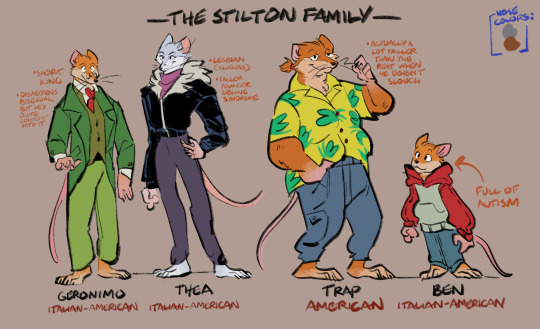
#geronimo stilton books
Text
*Insert spiderman meme but it’s Geronimo Stilton instead*
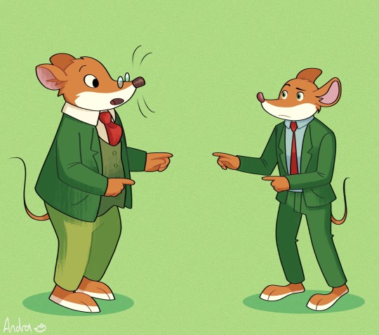
Can’t forget that tv show G is canonically a short king (but they’re so inconsistent w it in the animationnnn)
125 notes
·
View notes
Text

Ok but why does trap has the most goofy face expressions in the books?? Like why does bro look like he is scaring the kids 🤨
#geronimo stilton#fuck you trap you goofy ass bitch#trap stilton#goofy#goofy ass#like 💀💀💀#uhhh how do i tag this#gs safe space#geronimostilton#geronimo stilton books#he looks so stupid
18 notes
·
View notes
Text


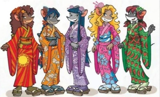
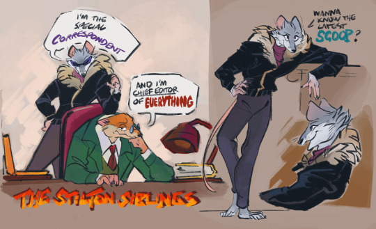
The Stilton Siblings mystery duo (Early years) set
#myart#doodle#geronimo stilton#thea stilton#rodents gazette’s early years#the books should do more duoship with these two#cmon where’s my pines twins (but not twins) mystery adventure again#cause istg the newer ones keep phasing those two out#deadkat’s stiltons
579 notes
·
View notes
Text
regarding tv Geronimo Stilton with utter disgust in my eyes and tears on my face
#that man is an INTROVERT wifh SOCIAL ANXIETY and ZERO ATHLETIC CAPABILITY LET US OUTSIDER GIRLIES HAVE HIM#No honestly i geronimo stilton was my first ever book series as a very very sad and isolated child#i fucked heavy with how he couldnt say no to people and seemed depressed always#and the anxiety disorder? chefs kiss#how DARE u change the ancient magic witch i was there when it was on my school library shelves
193 notes
·
View notes
Text

A study on different art styles of mice
#if you can’t tell I grew up with geronimo Stilton and Angelina ballerina#some of the most iconic books#mice are just so much fun to draw in general#mouse#angelina ballerina#geronimo stilton#art#my art#muminshoom
307 notes
·
View notes
Text
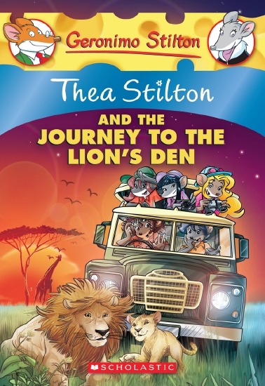
were you straight or did you read these growing up
363 notes
·
View notes
Text
#best childhood book#poll#preliminary round#deltora quest#a dog’s life#journey to the River sea#babe the sheep-pig#the chronicles of chrestomanci#i survived#geronimo Stilton#silverwing#the little white horse#cold awakening
411 notes
·
View notes
Text
Does someone you know operate a vehicle in your business? Has it directly affected you?
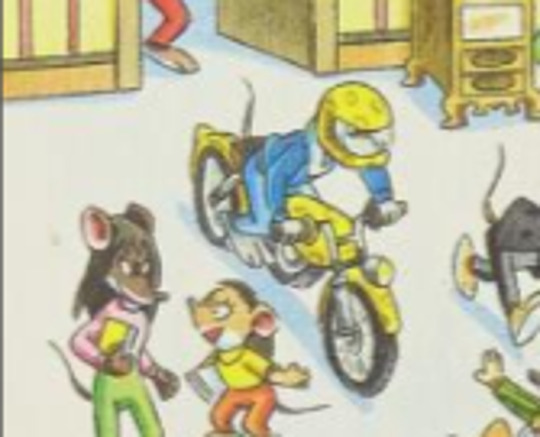
If so, we can help! Here at Law-Firm and Law-Firm, we deal with those individuals that have a complete disregard for the traffic laws of New Mouse City. Our team is dedicated to fighting for your rights to a safe-motorcycle-free workplace and we will get the justice you deserve. If you or someone you know is a victim of someone who drives a vehicle while indoors, you may be entitled to financial compensat-
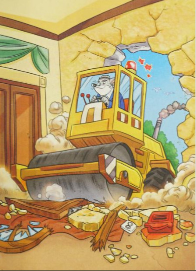
OH GREAT GATSBY HE'S GOT A STEAMROLLER-
#geronimo stilton#thea stilton#william shortpaws#bruh this part of the book was insane#this man destroyed 1/4 of geronimo's house to watch golf on the tele#he couldn't use the front door???#who even let him have a steam roller????#WHERE ARE HIS CREDENTIALS
116 notes
·
View notes
Text
NEW UQUIZ JUST DROPPED STAY CALM
based somewhat on the current TikTok trend of people discussing obscure books from their childhood. enjoy! let me know ur favorite books from when u were a kid!
#uquiz#polls#I have polls now#obscure childhood book series#the mysterious Benedict society#the secret series#a series of unfortunate events#asoue#asoue fandom#middle school the worst years of my life#the hitchhiker's guide to the galaxy#geronimo stilton#dear dumb diary#the 39 clues#the popularity papers
121 notes
·
View notes
Text

Your Honor, he’s just a little guy
97 notes
·
View notes
Text

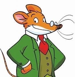
The Mouse Journalist from my Childhood 🧀
#geronimo stilton#fan art#art#mouse#hiiiii 😁 excited about the movies in the work !!#Seeing him again is gonna be a treat#I was very obsessed with the books when I was younger#didn’t expect to see him get a movie but I’m pumped !!!!!!
405 notes
·
View notes
Text
There's so many series I couldn't include so I'm doing a few more polls! I love seeing all the love and nostalgia pouring out of the notes <3
~
Part 1
#Polls#children's literature#children's books#books#Artemis Fowl#Eragon#Wings of Fire#Maximum Ride#Geronimo Stilton#Guardians of Ga'hoole#Skullduggery Pleasant#Redwall
628 notes
·
View notes
Text
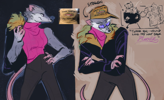
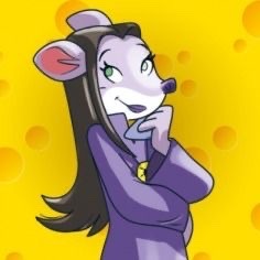
Uh oh…someone’s been reading too many of the Stilton books lately…
I want his sister.
#i only read the books for the subplot#and the subplot’s just her…#I gotta get the Thea books later#I hope you all enjoy my shitty headcanons#geronimo stilton#thea stilton#myart#doodle#furry art#deadkat’s stiltons
699 notes
·
View notes
Text

Someone behind her just mentioned they hate Geronimo Stilton books (he's her biggest crush)
#art#doodle#drawing#ratatheart#rat at heart#rat#librarian#rodent#books#geronimo stilton#crush#heartbroken
54 notes
·
View notes
Note
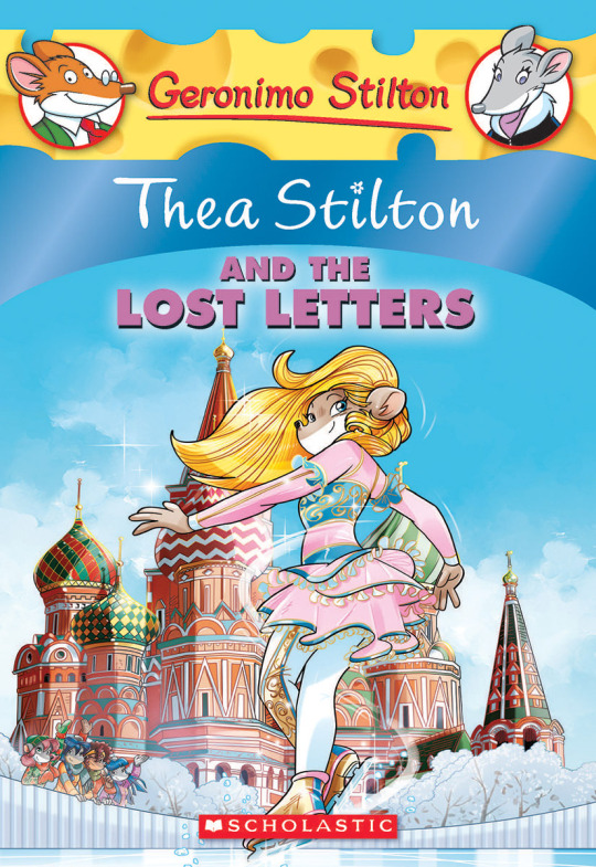
The art style of Cloud Castle is absolute ass bro why are their eyes so big
Idk man it just looks.... off
I wish they brought back the og art style like Blue Scarab Hunt because that was gorgeous
Well if you’re referring to the book's artstyle as a whole, then calm down buddy the illustrations as a whole are pretty good all things considered (believe me some of the illustrations in the later books are waaaaayyyyy iffier)
But if you are referring to Danilo Barozzi’s illustrations in the book then uhhhhh… yeah I don’t blame you, I didn’t like the big anime irises either, she didn’t cook with this one,,,
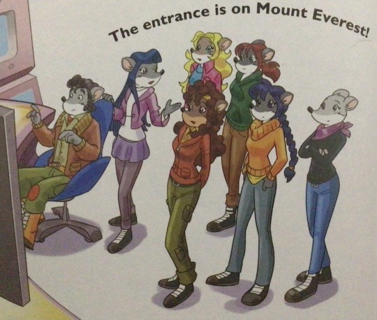
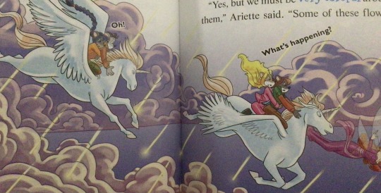
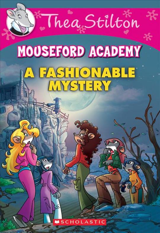
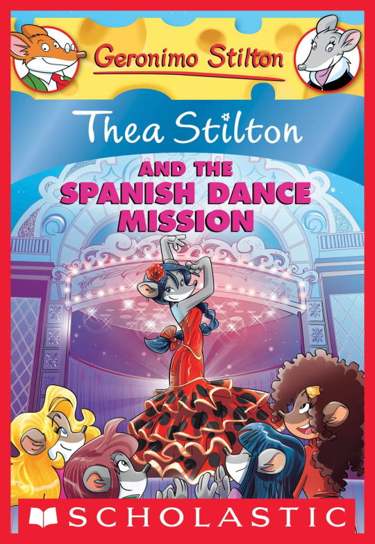
The interesting thing is Barozzi also did pieces for Secret of the Snow and those looked fine (she did well enough that I have to squint to determine which ones were done by her). My guess is either she did a lot of the illustrations for the latter half of SotS and we just got used to it, or it’s because the artstyle of special editions 2 and 3 were more… experimental? Books 4 onwards developed a very specific… look for the artstyle that adhered very closely to the main book illustrations of Spanish Dance Mission onwards, thus the illustrators had to follow suit, resulting in whatever looks off to look especially off.
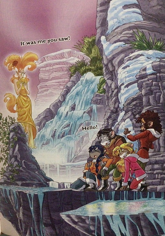
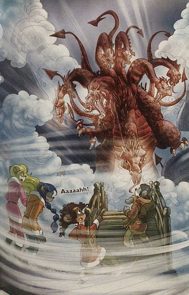
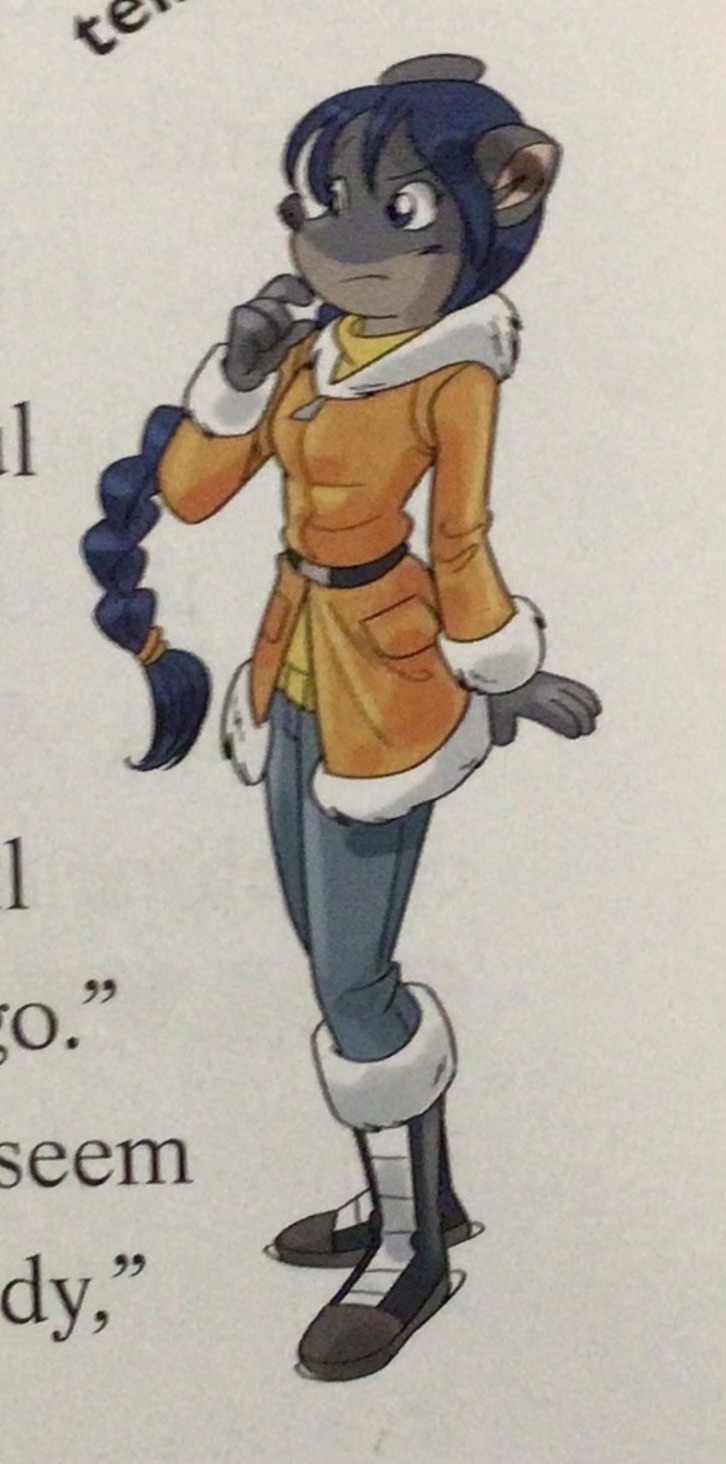
(Even with this set of pictures, I’m only about 70% sure these are Barozzi’s because of how alike yet different the styles are from each other in the book. The first one could be Barozzi’s, but it could also be Giuseppe Facciotto’s, since he also did illustrations for SotS and his stylization means he sometimes puts the eyes really close to each other in a way that’s weird but still makes sense somehow.)
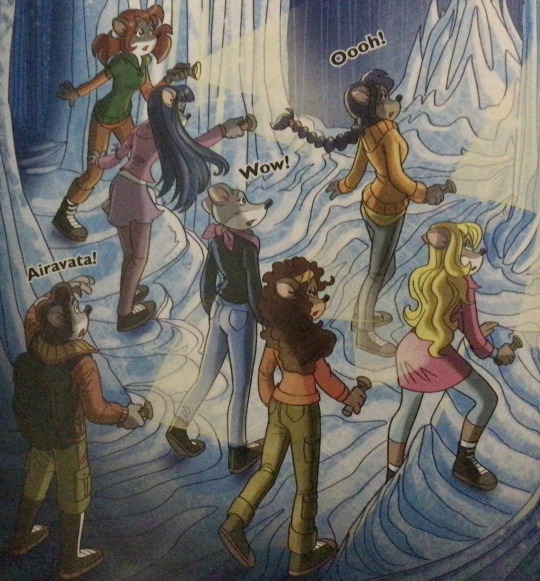
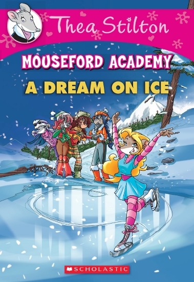
On the contrary, books 2 and 3 (and I would probably even include book 1 there) had a more experimental look to the illustrations, which seems to be based more on (and this is just a theory of mine) Giuseppe Facciotto’s iconic work for the covers of Mouseford Academy books 2-12, 14, 15 and 17 in the English books (he did waaayyy more covers for the Italian Mouseford books— he was basically the cover guy for the Mouseford books for a WHILE) as well as the books from Spanish Dance Mission to Lost Letters. If you’re wondering why those covers go as hard as they do, then now you know why.
(These aren’t all of Facciotto’s works for the covers we know in English but you can see that he popped off <3)
But yeah as you can see with special editions 2 and 3, the art direction seems to be heavily inspired by Facciotto’s artstyle.
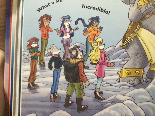
However, when Barbara Pellizzari’s works became the aesthetic poster child of the books’ brand, that was reflected in the illustrations and how their aesthetic changed, as seen in the main books and how they look currently, special editions 4-9, and the Treasure Seekers trilogy.
This new profile thing of the girls? This was done by Pellizzari (coloring was done by Flavio Ferron), and thus it became the main reference for how the girls look in the book’s illustrations.
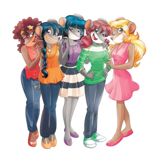
And it’s not just in the general direction to the artists for how to draw the Thea Sisters, but also in the direction given to the colorists. Alessandro Muscillo was the colorist for the special edition books since book 1 and the Treasure Seekers trilogy, and you can see that the direction for the style varied through books 1-3, like maybe direction was experimenting with the mood the illustrations were to convey, beginning with the cartoony and bright colors of book 1, easing into the more grounded and layered palettes of books 2 and 3
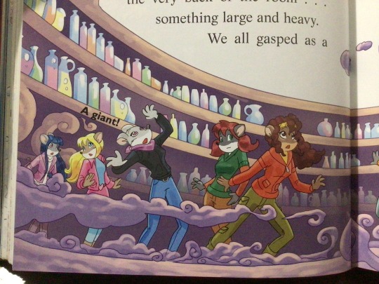
Then book 4 was when they transitioned to using digital art /j
I jest, but seriously book 4 was the debut of the coloring style we end up keeping for the rest of the special editions and for all of Treasure Seekers, which is very… bright :D
(I would show more picture examples but I manually took pictures of my physical copies for the Cloud Castle and SotS illustrations and gwuh I’m too lazy to grab my entire collection just to take pictures,,)
Bright as in like… the colors are very defined and saturated. I dunno how to describe it, but when you see it, you get what I mean. It’s very bright and pretty and colorful and it stands out. There are still variations that happen on occasion (Star Fairies in particular uses a good dose of airbrush for the lighting and shadow effects, and Crystal Fairies looks like someone had a bit of fun using sparkle brushes), but other than that, it’s very bright. I don’t hate it, but I do acknowledge that yeah, if I was introduced to the series when it had fully transitioned to the new style, I never would’ve gotten into the series in the first place, because the older books had something that didn’t make it feel specifically catered to girls. The colors were bright, but not too bright. Colorful, but unified. They weren’t that complicated, and they didn’t have to be because the colorists (plural, there were at least 3 per book once upon a time) were popping the hell off with the colors they were given. But y’know, the newer books’ consistent style did give me a good spot to practice drawing mouse furries so I’m not complaining too much about the newer style, haha.
(Tiny baby E’s (it’s literally from 2020 what’re you on about mate) her first mouse Violet drawing using Barbara Pellizzari’s artstyle in Treasure Seekers 1 as an anatomy guide!!)
With that said tho, yeah I miss the old books -m- dunno if it’d fit the aesthetic of the special editions but m a n we could’ve had it and it probably would’ve looked cool
Also the illustrations go way harder in the older books, like Prince's Emerald? I've talked about Prince's Emerald and how it goes hard before, and I still stand by it and say that it does in fact still go hard
Maybe it won't fit the uh splash of color they gave the hardcovers, but imagine they grabbed Giulia Basile's coloring work for the graphic novels and used that as sort've a basis for the coloring style of the hardcovers. Not exactly the same-- would probably still add a touch of whimsical watercolor and/or paint to the very cel-shaded style, but we could've had something pretty dope -m-
Anyway that's my ramble simultaneously defending the hardcovers' artstyle and reminiscing on what could've been haha
#geronimo stilton#thea stilton#thea sisters#questions with e#rambles#the style of the older books is gorgeous but the main thing I'm wondering is can it pull off fantastical whimsy#that's the main thing i dunno if it can do (i would love to be proven wrong tho)#the style is so grounded that i'm wondering if it can pull off what the hardcovers needed it to do#which is convey the otherworldly fantastical thrill of exploring the fantasy worlds (which uh the newer books were able to do but#my main gripe is that fantasy and reality are near indistinguishable in vibes coloring-wise#sure there are sparkles and stuff is more saturated but the girls' dorm in book 4 still has the same-ish feel of the land of clouds#i dunno what it is. the bright colors just feel mundane somehow and don't take a shift when returning to reality)#looked at my books again and i think it might be the fact that the later books have no grounding color?#compare book 3 to book 5 and you'll see it the most distinctly methinks#the newer coloring style doesn't have a color that grounds the illustrations' palettes and thus everything's always bright 100% of the time#the girls' colors are always at their most saturated#like they're always under broad daylight in terms of lighting#it's not eyebleeding or anything but they don't look affected by the lighting in the setting they're currently in#and the result is it looks.... meh?#we get so used to the bright colors that they end up looking meh somehow#i'm not an art expert by any means this is just my observations as someone with a little too much brainrot
35 notes
·
View notes
Text
More childhood books
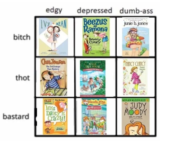
This feels a bit more obscure
#nostalgia#nostaliga#how the fuck do you spell nostalgia#meme#alignment meme#childhood books#god I remember loving so many of these#ivy and bean#ramona and beezus#junie b jones#cam Jansen#magic tree house#Nancy Clancy#miss Daisy is crazy#geronimo stilton#Judy moody
435 notes
·
View notes
Last Seen Blogs
dramadeer
Oh Romeo, you son of a bitch!

dokidobe
yellow.dr.monv

adl2001
Adl

queenpinkireellylikethisname
mbarakaja

tiredsmashbros
tomm / tsb - tired af