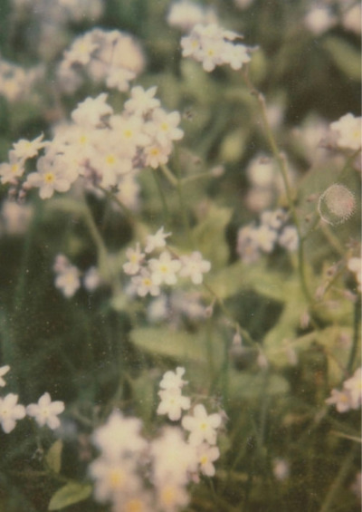
#green magazine headers
Text


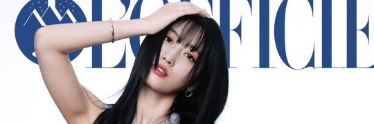
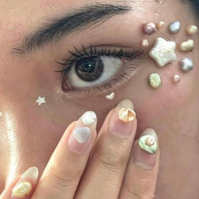
and yes. i hate my feelings about you.
#moodboard#alternative#mb alt#kpop gg#red velvet rv#joy#park sooyoung#amy winehouse#icons lq#headers#purple#green#archive visual#random#omar apollo#photoshoot magazine#photography landscape#carrd stuff material#vintage indie retro
390 notes
·
View notes
Text
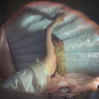
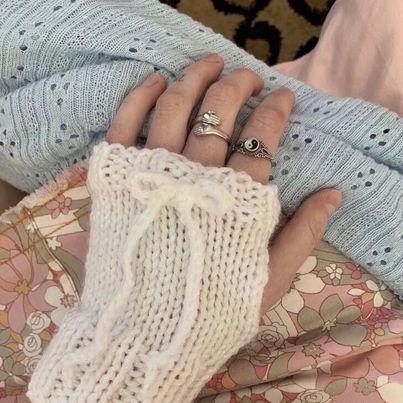
୨ daydreaming ୧
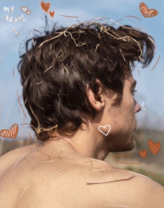

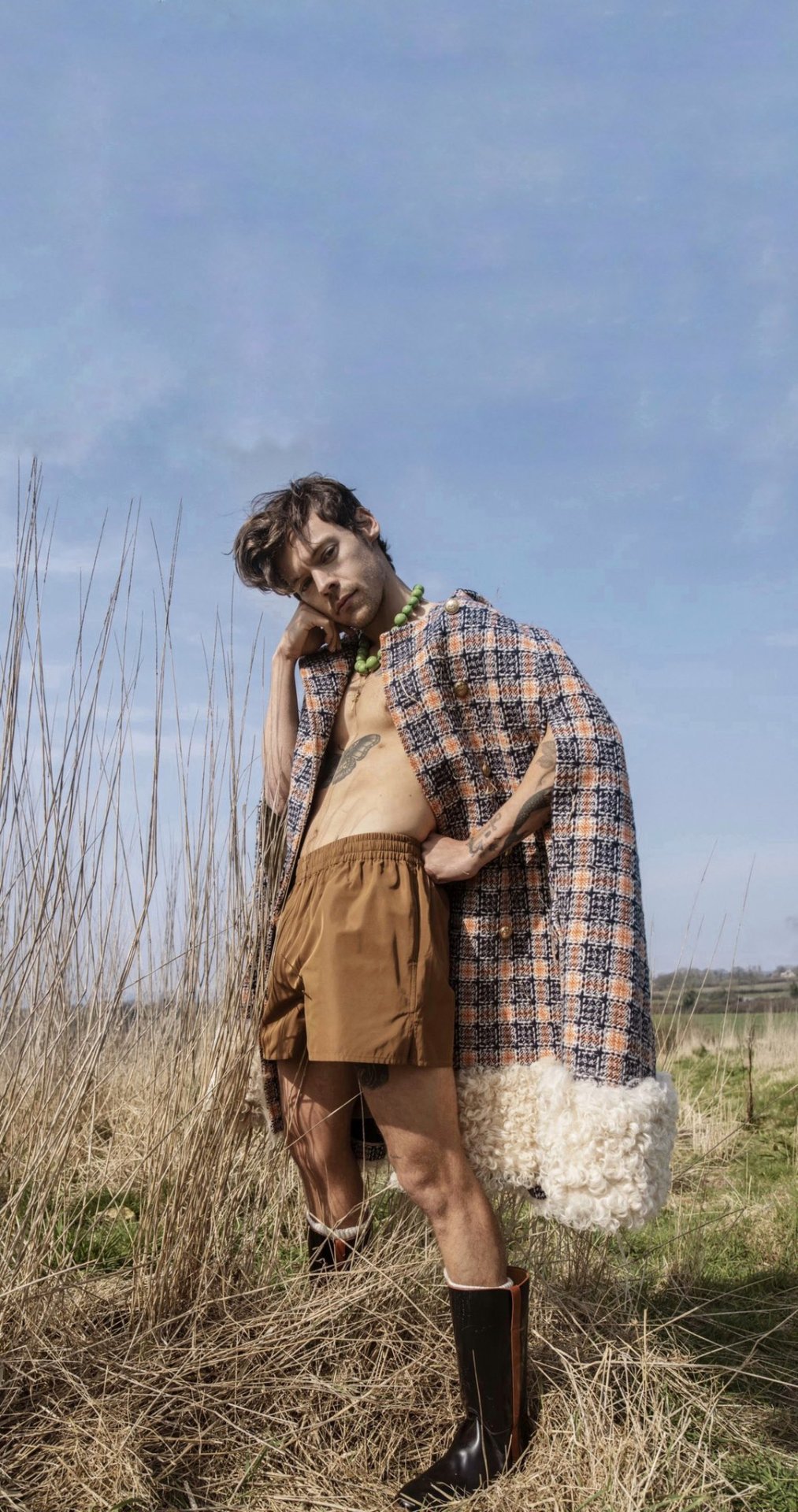
#harry styles#moodboard#harry styles moodboard#soft moodboard#harry styles icons#harry styles headers#harry styles collage#messy layouts#harry styles aesthetic#cottagecore#cottagecore moodboard#harry's house#daydreaming#harrycore#harry styles photoshoot#harry styles tattoos#harry styles coachella#harry styles magazine#green moodboard#colours#as it was#harry styles edit#harry styles messy headers#harry update
984 notes
·
View notes
Photo
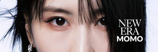
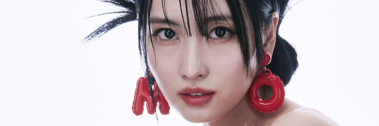

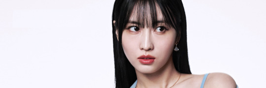


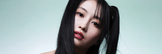
just like - 愛 ♥ ︎
#momo headers#twice headers#gg headers#headers#white headers#green headers#pink headers#random headers#magazine#photoshoot#l'officiel#japanese headers#twice#hirai momo#hirai momo headers#twice hirai momo#hirai momo twice#momo#momo twice#twice momo
119 notes
·
View notes
Text


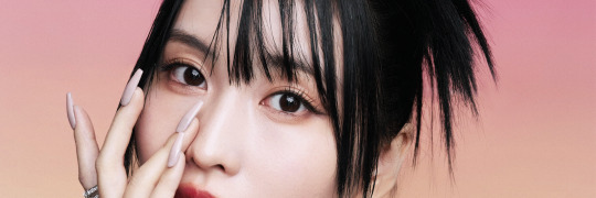
aespa for vivi magazine
#by synkmydyve#by synkmydyve aespa#aespa#aespa kpop#aespa icons#aespa moodboard#aespa aesthetic#aespa pics#aespa headers#vivi magazine#mermaid#mermaid aesthetic#makeup aesthetic#makeup inspo#mermaid core#green#pastel#pastel moodboard#giselle#winter#karina#ningning#aespa giselle#aespa winter#aespa karina#aespa ningning#aeri uchinaga#kim minjeong#yu jimin#ning yizhuo
46 notes
·
View notes
Text
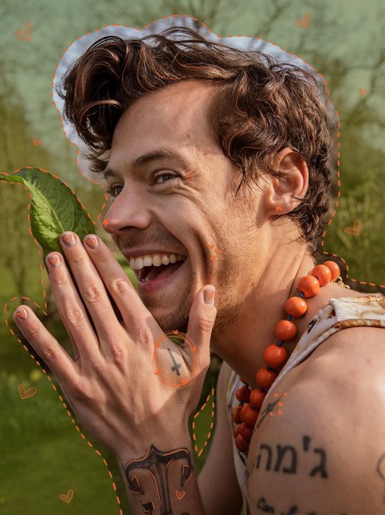
hash brown, egg yolk
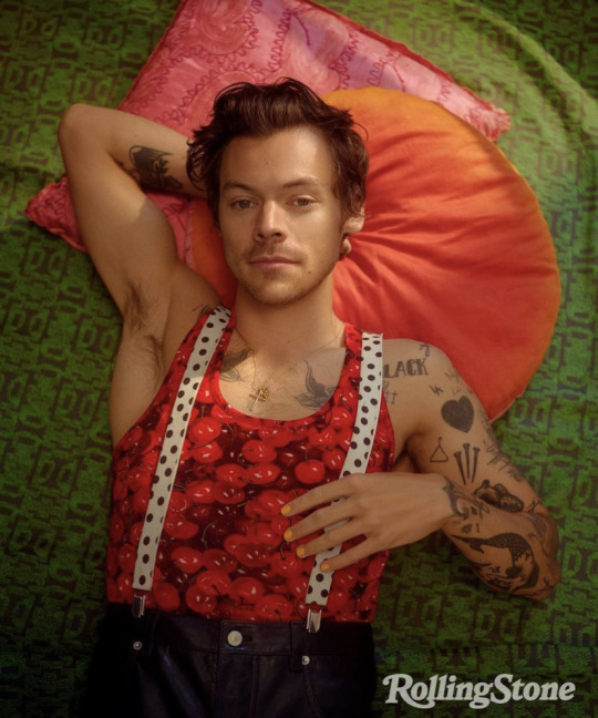


i will always love you -> ♡
#messy aesthetic#messy moodboard#aesthetic#moodboard aesthetic#cute#grunge moodboard#cute moodboard#harry styles moodboard#punk moodboard#harry styles#green moodboard#rolling stone magazine#harry styles gif#harry's house#harry styles icons#messy headers#vintage moodboard#red moodboard#orange moodboard#messycore#messy icons#alternative moodboard#random moodboard#moodboard#harry styles messy moodboard
121 notes
·
View notes
Text


i don't care, get your sh!t.
#alternative moodboard#aesthetic moodboard#lq moodboard#random moodboard#messy moodboard#edgy moodboard#green moodboard#magazine moodboard#palette moodboard#black moodboard#complex moodboard#indie moodboard#cute moodboard#y2k moodboard#egirl moodboard#ugly shadow lookbook#ugly shadow lookbook aesthetic#ugly shadow lookbook headers#ugly shadow lookbook icons#ugly shadow lookbook moodboard#ugly shadow lookbook layouts#aesthetic#messy#complex#y2k#cute#aes#egirl#hot#indie
16 notes
·
View notes
Note
Regarding those Edwin doodles, why was he beaten up? Who was talking to him? 👀
Also, moomoo Edwin is so cute >:3c 💕💕💕
context
Oh, it was no one in particular (Maybe a rival gang member if I were to specify…? Probably not his former creative partner Thea though. She’s not that violent haha..) (I haven’t thought of details of Thea and Edwin’s backstory in a long time now, and surface personality traits are hard to pin down without a backstory.)
The joke was that in the first scenario he was painting and in the second he was in pain because of the meme (?) that there’s “pain” in “painting” haha (I don’t believe painting/drawing has to inherently be a painful process though, or that only painful emotions make good art)
Also I wanted to draw him beaten up (either it was just for fun or I was maybe frustrated? Probably just for fun though.) I like drawing characters looking up defiantly even as they’re beaten up✨
moo moo Edwin hahaha— Thank you! I’ve heard that cows can be fluffy…
Come to think of it, I dunno what animal motif he’d have if he were to have one.
A cheerful artist… with some sort of identity confusion due to winter depression (old 2019 concept. Looking back, the severity doesn’t seem to match my knowledge of winter depression)(if he’s ashamed, does he feel it so deeply that he voluntarily uses a slightly different name, uses a mask to cover his face, AND grows out his hair & dyes it, all for the sake of… having his orange look be the happy/cheerful/friendly one?) (If he hides himself in plain sight, if he can’t accept this as part of himself, this can lead to some troublesome identity issues…)(unrelated to gender)
-
“I’m Edwin! Nice to meet you too!” —Edwin, usually in spring/summer
“Hey, just call me Devin for now. No, it’s not because I want to change my name or anything. It’s, uhh… an… alias…? Haha…” — Devin, on the outside probably, in winter
“What is this ‘Devin’ name to me? Am I even allowed to feel this way as myself? God, but what am I supposed to do? I can’t just tell people that it comes every winter and gets better in spring.” —Edwin, on the inside probably
-
(…I almost want to compare him to “Childe” Tartaglia Ajax simply for his multiple names/identity thing but uhh, that guy’s on a whole different level. Venti/Barbatos? Hmm but to my knowledge nothing particularly bad happened to Edwin.)
What would be an animal that emphases this duality I wonder… An animal that looks friendly and colourful but isn’t what it seems…
…poison dart frog???
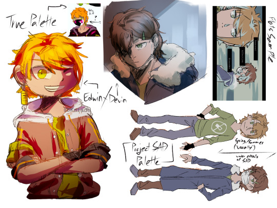
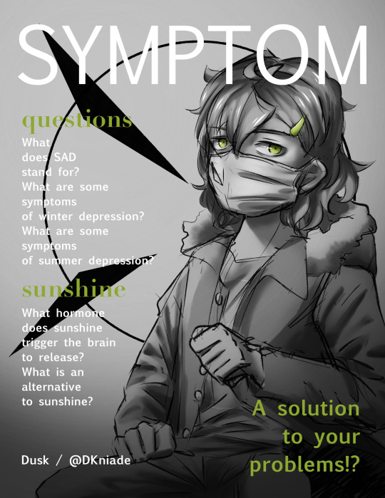
(SAD = Seasonal Affective Disorder)
[Start transcript
first image: the concept sheet
a flat colour sketch in upper corner is labelled True Palette. A cartoony waist-up version with bright warm colours is labeled Edwin and an anime headshot version with desaturated colours is labeled Devin. Another flat-colour shot of Edwin/Devin is labeled flat sample. A full body reference of both is labeled Project SAD Palette. Edwin is labeled spring/summer (“usually”) and Devin is labeled under effects of SAD
second image: the mock magazine cover
knees-up greyscale illustration of Devin sitting with his winter coat and mask, looking at the viewer, his hands in fists. His eyes and hair clip are light green. Behind him is a black circle outline with two sharp black triangles pointing at him. White magazine header: SYMPTOM. separate subheadings in green: questions, sunshine. separate text in white: What does SAD stand for? What are some symptoms of winter depression? What are some symptoms of summer depression? What hormone does sunshine trigger the brain to release? What is an alternative to sunshine? In the right corner, in green: A solution to your problems!?
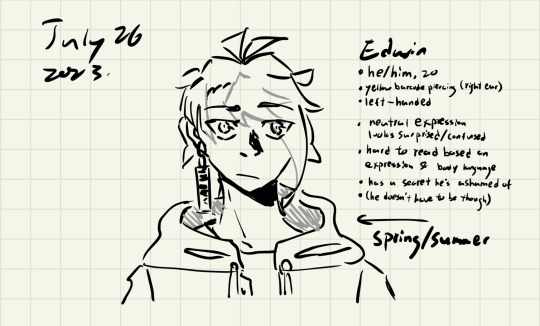
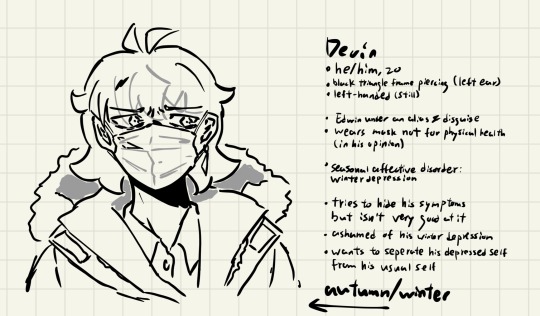
third and fourth images: sketch of Edwin/Devin with some information
Edwin. he/him, 20. yellow barcode piercing (right ear). left-handed. neutral expression looks surprised/confused. hard to read based on expression & body language. has a secret he’s ashamed of. (he doesn’t have to be though.) arrow points to him, saying spring/summer.
Devin. he/him, 20. black triangle frame piercing (left ear). left-handed (still). Edwin winter an Alia’s & disguise. wears mask not for physical health (in his opinion). seasonal affective disorder: winter depression. tried to hide his symptoms but isn’t good at it. ashamed of his winter depression. wants to separate his depressed self from his usual self. arrow points to him, saying autumn/winter.
end transcript.]
#dusk oc writing#Edwin#Devin#winter depression#seasonal affective disorder#dusk answers#in hindsight#I know why I wrote him that way#in truth because of my own condition back then
13 notes
·
View notes
Text
"I don't... really know."
TOMMY LE HOMME - "No matter. Great verse is like that sometimes -- ephemeral. You might not look it, but seems you have some literary chops. Maybe there's hope for me yet!"
"That's... a strange compliment."
TOMMY LE HOMME - "Just messin' with you. It's cool, you're an okay guy, for a cop."
"For a cop?"
TOMMY LE HOMME - "They're more often into fists than rhymes, see. Let alone *honesty in verse*."
5 notes
·
View notes
Text
Third Doctor Rankings One Week in
the DWM rank is the rank from Doctor Who Magazine earlier this year

you can submit your scores here (the form will close on the 16th of August)
image description under the cut
ID: a table, the header row reads, RANK, STORY, DWM RANK, the contents is
1, The Green Death, 2 (+1)
2, The Three Doctors, 5 (+3)
3, The Daemons, 4 (+1)
4, Inferno, 1 (-3)
5, Spearhead from Space, 3 (-2)
6, Terror of the Autons, 9 (+3)
7, The Mind of Evil, 14 (+7)
8, The Curse of Peladon, 12 (+4)
9, The Sea Devils, 8 (-1)
10, The Time Monster, 24 (+14)
11, The Time Warrior, 6 (-5)
11, Invasion of the Dinosaurs, 13 (+2)
13, Carnival of Monsters, 7 (-6)
14, Planet of Spiders, 16 (+2)
15, Dr Who and the Silurians, 10 (-5)
16, Frontier in Space, 17 (+1)
17, The Claws of Axos, 19 (+2)
18, The Ambassadors of Death, 15 (-3)
19, The Monster of Peladon, 23 (+4)
20, Colony in Space, 21 (+1)
21, The Mutants, 22 (+1)
22, Day of the Daleks, 11 (-11)
23, Planet of the Daleks, 18 (-5)
24, Death to the Daleks, 20 (-4)
5 notes
·
View notes
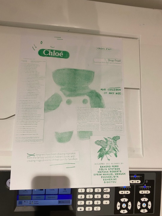
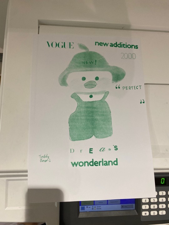
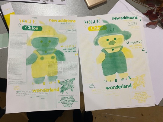
Text

Workshop - Colour separation
7/11/2022
I did the colour separation workshop in the afternoon, since I just finished the photoshop workshop I thought for this week I could try experimenting with creating a magazine cover for my plastic bears.
Fiona, who was hosting the workshop, showed us examples of what we could do with the risograph machine. I really liked how you can scan any type of material onto it, and ended up cutting letters, headers, and text from magazines to recreate that “magazine” effect


Green & yellow layers respectively
I was under the impression that you could only use tracing paper for the highlight colour & cartridge paper for a darker, definition colour however I later found out that was not the case. We tried inverting the colour, as the yellow was not as defined as I originally thought it would be & I ended up with 2 final products.
I like different aspects of each version so I think I will cut them up and merge them together to make one final piece tomorrow
Below are pictures of the inverted and un-inverted green layer & a video of how the risograph machine scanned
8 notes
·
View notes
Text
Simple and Inventive Ideas for Teacher Diary Decorations
Teacher Diary Decoration Ideas:
Teacher diaries are not just practical tools; they can also be a canvas for creativity and self-expression. Decorating your teacher diary can add a personal touch to your daily planning and make it a joy to use. In this article, we'll explore some easy and creative teacher diary decoration ideas to inspire you.

1. Washi Tape Magic:
Washi tape is a versatile and colorful option for decorating your teacher diary. Use it to create borders, frames, or even to highlight important dates. With various patterns and colors available, you can switch up the look of your diary anytime.
2. Sticker Stories:
Stickers are a delightful way to add charm to your diary. Choose stickers that resonate with your teaching style or the subjects you teach. Seasonal stickers, motivational quotes, or themed stickers for special occasions can bring your diary pages to life.
3. Doodle Diary:
If you enjoy doodling, turn your diary into a canvas for your creativity. Doodle around the margins or create small illustrations that relate to your day's plans. It's a great way to personalize your diary and make it uniquely yours.
Also Check: School app for Parents
4. Inspirational Quotes:
Paste inspirational quotes or affirmations on random pages of your diary. These quotes can provide a positive and uplifting boost when you come across them during your planning.
5. Collage Chronicles:
Collect images from magazines or printouts and create collage-style decorations in your diary. You can make themed collages for different months or simply add images that make you smile.
6. Color Coding:
Assign specific colors to different types of tasks or activities. For example, use green for meetings, blue for lessons, and yellow for personal reminders. This color-coded system can help you quickly identify priorities.
7. Nature's Touch:
Press small flowers or leaves between the pages of your diary to create natural decorations. This not only adds a unique touch but also connects you with nature.
8. Dainty Découpage:
Découpage involves pasting decorative paper or fabric onto surfaces. Apply découpage to the cover of your diary to create a textured and visually appealing design.
9. Themed Borders:
Decorate the edges of your diary pages with themed borders that change with the seasons or holidays. It's a subtle way to infuse a festive spirit into your daily planning.
10. Hand-Lettered Headers:
Enhance your diary with hand-lettered headers for each day or week. You don't need to be a calligraphy expert; simple, handwritten titles can make a big difference.
11. Travel-Inspired:
If you're a fan of travel, incorporate travel-themed decorations in your diary. Maps, postcards, or travel quotes can take you on a mental journey during your daily planning.
12. Minimalist Elegance:
Less can be more. Embrace a minimalist style with clean lines and subdued colors. Sometimes, a simple and clutter-free diary can be incredibly pleasing.
13. Sticky Note Surprises:
Use colorful sticky notes as interactive decorations. Write notes, reminders, or even doodles on them, and place them throughout your diary.
14. Crafty Corners:
Decorate the corners of your diary pages with small craft elements like buttons, ribbons, or small fabric swatches. These tactile additions can be visually appealing.
Also Check: Best Preschools in India
15. Monthly Themes:
Select a theme for each month and decorate your diary accordingly. Whether it's seasons, holidays, or educational topics, themed decorations can keep your planning fresh.
Remember that your teacher diary is a reflection of your personality and teaching style. Experiment with these decoration ideas and find what resonates with you. Creating a visually appealing diary can make the process of lesson planning and organizing more enjoyable while adding a touch of creativity to your teaching routine.
Originally Published by HelloParent.
0 notes
Text

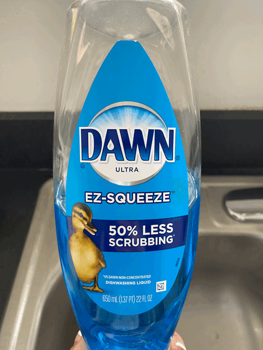

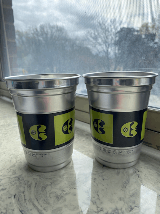
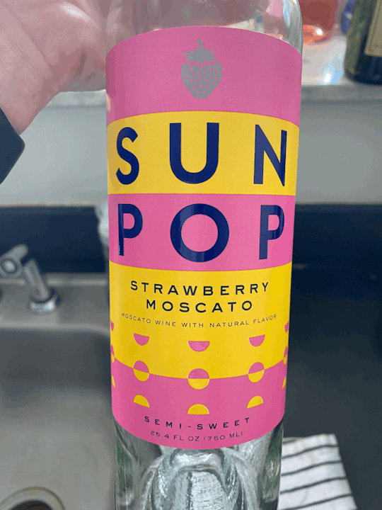

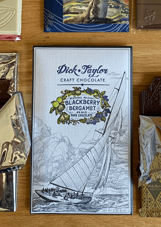
Image #1: Complementary Colors - Blue/Orange. The contrast between the blue and the orange draws the viewer’s eye to certain information. The orange text placed over the blue background is used as headers to separate the categories of food that Cottage Inn offers.
Image #2: Analogous Colors - Yellow-Green. The analogous colors are used to create a simple and cohesive poster design. The colors used at the top and the bottom of the poster connect to the colors used in the middle, so that all of the information flows/matches.
Image #3: The Dawn dish soap label uses color colors such as: white, silver, light blue, and dark blue. I think the cool colors are trying to communicate the cleanliness of the product. Cool colors have a tendency to depict ideas that are either cold or clean. The designer is hoping to elicit that the product works and cleans dishes.
Image #4: Warm Colors - Reds/Oranges/Yellow. Warm colors are used in the package design of Simms (an off brand Slim Jim company) to communicate that the product is smoky, fiery, and hot. The designer is hoping to elicit a sense of fire.
Image #5: The contrast between the use of lime green and black brings attention to the company logo on the cup. The contrast is communicating the importance of the logo.
Image #6: Proximity - At the bottom of the Sun Pop wine design, you can see 4 rows of half circles that are pink and yellow. We can see two groups of half circles based on the difference in colors and the proximity between them. The proximity between design elements creates an eye appealing design that adds a touch to the overall design of the bottle.
Image #7: The design featured in the magazine article uses an active figure-ground relationship. The use of white within the teal square creates the look that there’s two heads on the page.
Image #8: The graphic design used as the packaging for dark chocolate looks like something historical. The use of thin, fine lines and image of an old sailboat gives an old time feel. The font used for the brand name with the use of cursive text gives a historical look. #module3
0 notes
Photo
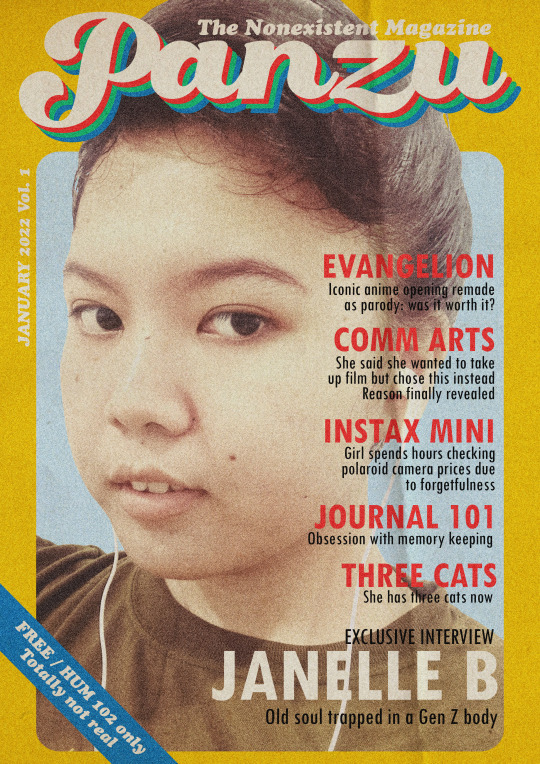
RETROZINE: A 70s-INSPIRED DIGITAL ART
“And I find it kind of funny, I find it kind of sad. The dreams in which I’m dying are the best I’ve ever had.” —Mad World, Tears for Fears
The idea for this art piece sparked when I revisited my numerous 70s and 80s hits playlists on the streaming service Spotify. I always had a soft spot for everything retro-themed as if I lived the decades myself. While I do have somewhat of an old soul in me, I still very much appreciate what we have today and how post-postmodern pop culture is now.
“Panzu” is a digital self-portrait that combines the art styles of the 70s with current meme culture humor. The picture I used was actually a selfie, which is one of the more recent trends in photography. I then took inspiration from the packaging for the UNO card 1970s as well as magazine covers from the 70s and the 80s.
The fake headlines on the magazine cover represent tidbits of my interests and favorites. I referenced another digital artwork I made, which was the Neon Genesis Evangelion parody. I also hinted about my hobbies which include journaling and memory keeping (looking at camera prices). The form of humor used involves self-deprecation, also called a self-roast by today’s generation.
Aesthetics-wise, I focused on using only a few fonts and a few colors while also maximizing their use. I stuck with system fonts such as Cooper Black which was similar to the font used in the UNO 1970s box. The color palette includes variants of the primary colors and a green to compliment the colors used on the header.
For the final touches, I decided to add a crease texture and grain effect on the final product to elevate the vintage look I was going for. Overall, I think it was an accurate representation of the part of my personality that loves art. It is humorous, self-aware and also very conscious of the art styles it is trying to replicate.
0 notes
Text


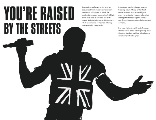


Final Critique (23/11/22) - ISTD Project
My final critique of this term was an opportunity for me to showcase my final outcome (so far) in order to present the concept of my project, and then receiving feedback from my tutor about what can be improved visually, and other content that can be included within my work.
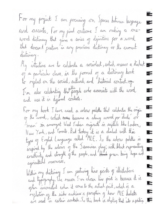
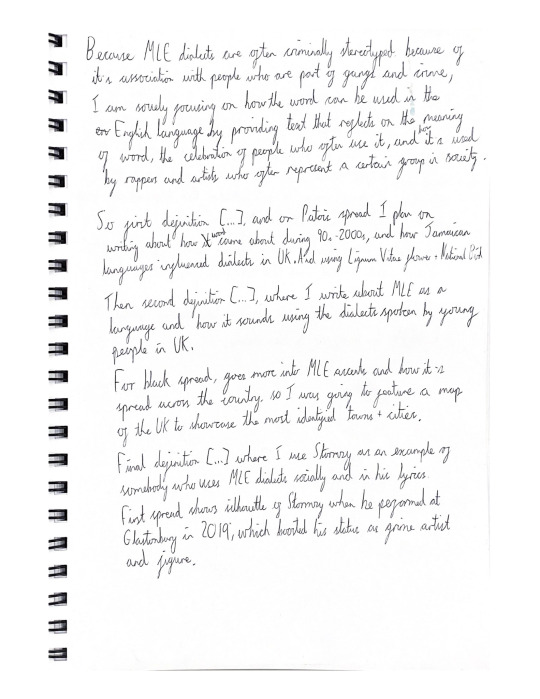
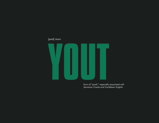
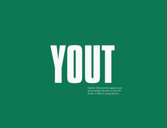
I came to the critique with a script so that I could speak about the key points in my presentation. I was able to show some designs of my spreads for my one-word dictionary, in which I explained that I am writing about the cultural, social, and historical context of my chosen word ‘yout.’ In addition, I gave an explanation as to why I have decided to produce a series of Lino print illustrations to support the text (because I wanted to challenge myself with new materials, which is something that I hadn’t previously done.)
After my presentation I received some really helpful feedback for where I should go with my outcome. Firstly, one of the key points brought up was about the feel of the “dictionary” because I had placed my main header in the centre of the page where my margins are too close to the gutter. This means that the text that is presented close to the gutter may not be visually outstanding for the reader, so my tutor suggested that I have my title and definition on one page and aligned to the left so that it’s similar to a traditional dictionary. Secondly, the colour palette didn’t feel like a reflection of Jamaica because the green was more of a “military” colour rather than a bright, vibrant green that is within the Jamaican flag. I could also feature colours like yellow or red that also associate with the country. Thirdly, I need to revise on the narrative structure of my spreads because although I am providing three different definitions that require information that contrast with each other, the Stormzy sections feels too separate with the other content. Ultimately, I need to produce a visual system that balances the text and illustrations for each definition. Moreover, my tutor suggested researching a graphic designer called Matt Willey who is the art director of the New York Times Magazine. I can look at his editorial designs and how he scales the tone of his typography.
In conclusion, there is a lot of work to be completed between now and the final deadline day. On the other hand, the foundation for my final piece is in place, but now I have to develop my Lino printing, and digital layouts of my spreads quickly in order to be able to print my final outcome, as well as my process book in the same week.
1 note
·
View note
Text
Goodbye deponia hints

#Goodbye deponia hints how to#
#Goodbye deponia hints full#
#Goodbye deponia hints series#
#Goodbye deponia hints free#
Use the new Interface (RT) to select Green Rufus (Left) and Pick Up the Acid from the other two. Next, close the inventory and use the acid on Middle Rufus so that they fight over it. Next you need to cycle through each Rufus until you find the Acid (Blue Rufus/ Right), Press X to Inspect the Acid. This promts a new dialogue introducing a new interface. Sex Goodbye Deponia Walkthrough porn images goal pin up by bolongo hentai foundry, post chaos on deponia deponia goal goodbye deponia, post deponia goal. More help, hints and discussion forums for on Supercheats. To solve this puzzle you need to press Down on the d-pad to actually look inside your iventory, close the inventory and press X (the look option) on a different Rufus. See our member submitted walkthroughs and guides for Goodbye Deponia. I spent a fair bit of time pressing the A and X buttons on all 3 Rufus' and would only get dialogue when interacting with Left and Right, and i thought this was a bug but now i think its part of the game's design.
#Goodbye deponia hints how to#
description of how to get every achievement/trophy (in addition, list of all achievements/trophies, magazines, and all combinations of jackalopes you can find in the last chapter of this guide).So this isn't so much a guide to the acheivement as the acheivement is based on progression and should have unlocked already at this scene, however it is the solution to what i thought was a bug preventing you from intereacting with one of the Rufus clones.
Countless clues can be found in imaginative scenes that make fun out of. Notice that also your Suitcase has survived the trip. Adventure fans can say a sad but fond farewell- Goodbye Deponia closes the. Youll find yourself on the outer part of the ship. Click twice on the Chain and Rufus will get up. Youre in kind of difficult situation - tied in chains and with head down, on the Organons cruiser. Goodbye Deponia does offer one very interesting mechanic when it lets you play as 3 people at the same time, even being able to swap items among them.
explanation of all the puzzles and mini-games with appropriate screenshots Next Part 1 - Kuvaq Find Goal Prev Part 1 - Kuvaq Prepare the pod.
got it 0 / 0 reset back 7 more guide s Cutter The Hotel Organon cruiser.
#Goodbye deponia hints free#
detailed description of how to end this game Welcome to spoiler free hints for Goodbye Deponia Goodbye Deponia is a point-and-click adventure, developed and published by Daedalic Entertainment.
#Goodbye deponia hints full#
In this game while trying to save Deponia planet, you and Professor McChronicle will make an exciting, full of unexpected situations, surprising plot twists, and humor journey in time. All objects you need to take are marked in red, trophies are marked in orange, and important information are bolded. Moreover, puzzles are highlighted by using headers to let you find them quickly. To make using this game guide easier to navigate, each chapter has been divided into subchapters with describing all tasks which you need to deal with. It is thorough, illustrated solution which will guide you through all adventures of cynical Rufus, the hero with a talent to create explosive situations. Goodbye Deponia picks up right where Chaos on Deponia left off, with our ragtag band of heroes Rufus, Goal, Doc and Bozo on their way to the floating utopia. Still, Goodbye Deponia is quite a text-heavy game and there’s a lot of chatting on subjects that dont really have. It is thorough, illustrated solution which will guide you through all adventures of cynical Rufus, the hero with a talent to create explosive situations.
#Goodbye deponia hints series#
Deponia Doomsday game guide contains lot of tips useful during this crazy adventure which is a fourth part of game series by Daedalic Entertainment. Goodbye Deponia Soundtrack, Empire Total War, Cheap Video Games, Battlefield 4, Game. Players will get a lot of hints from conversations, as well as a good laugh. Deponia Doomsday game guide contains lot of tips useful during this crazy adventure which is a fourth part of game series by Daedalic Entertainment.
0 notes
Text
How may the design of wedding invites be improved? (تصميمدعوةزواج)
The Wedding Invitation Card Layout (تصميمدعوةزواج) is fundamental but great at promoting the importance of the occasion. It's employed to greet guests with a party or commemorate a tremendous occasion. The appearance of a fantastic wedding invitation card must be vision-capturing and remarkable. There are many approaches to construct a one-of-a-type wedding invitation card. There is the option of utilizing fundamental typography or tinkering with imaginative images or images.
Designing your wedding invitation cards may look like a challenging task in the beginning, but when you obtain started off, it's not bad. To boost your models, simply stick to these guidelines.
1. Get influenced – When building a wedding invitation card design (تصميمدعوةزواج), it’s greatest in the first place ideas. Search through magazines, textbooks or websites for tips. Many people even use wedding invites like a template to assist them think of an authentic thought.
2. Outline your preferences – Upon having obtained your inspirations, outline what exactly you need your greeting card to accomplish. This may include things such as branding elements, hues, and fonts. Be sure that you consider the concept you wish to deliver with the design before you begin.
3. Stay consistent – Create some policies you could adhere to when you put together a wedding invitation card design and style. This includes such things as making use of related font styles and colors for headers and footers.
4. Ensure that is stays small, and straightforward – Try beginning with smaller jobs as opposed to getting a sizeable challenge. If you’re sensing stressed, break up your project into elements. Then focus on them separately and later on build them.
The aim of the wedding invitation card design and style (تصميمدعوةزواج) is to produce a visual feeling that excites and intrigues company. Whilst numerous models may be used, the typical concept must not be overly jumbled or basic. This encourages guests to concentrate on your meaning, that could incorporate a picture in the couple, the wedding ceremony site, or another information. Remember that yellow-colored shows warmth and reddish colored symbolizes passion when picking colors for the announcements. To create an optimistic ambiance, brilliant greens, blues, and white might be employed in the wedding shade layout.Wedding cards are wonderful ways of expressing your emotions and admiration towards somebody special. And this is what means they are distinctive from the other sort of greeting card. You have different choices when making wedding cards. There are many styles you could choose from and you may decorate these charge cards as outlined by your personal preference and preference. While searching for a web template on the internet, be sure that you get free free samples also. This way you can consider them prior to buying them. Once you see the correct format for the task, start generating your own wedding cards.
The goal of the wedding invitation card design (تصميمدعوةزواج) is to create a visual mood that excites and intrigues guests. For more information please click on this particular link wedding cards (كروت زواج).
0 notes
Last Seen Blogs
sjr-red-art-blog
The-Red-Painter

4herpleasure101
safe word please
techarchsoftwares-blog
Untitled

leejongsuki
twisted love and hate

vedleevacations
VedLee Vacations