#guide to linocut
Explore tagged Tumblr posts
Visit Tumblr Blog
Explore Tumblr blogs with no restrictions, modern design and the best experience.
Last Seen Tumblr Blogs


Fun Fact
Tumblr is available in 18 languages.
Text
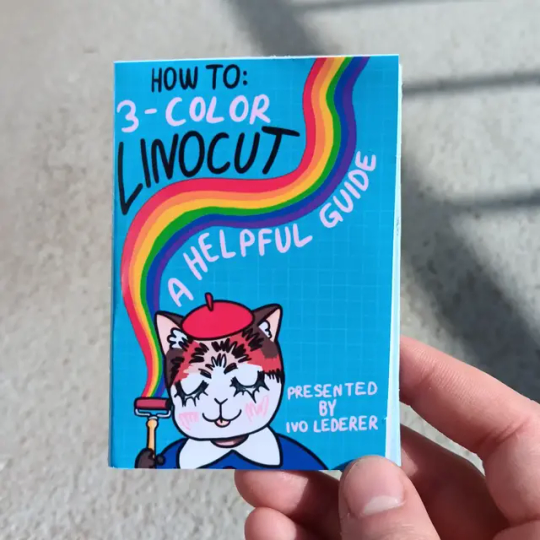
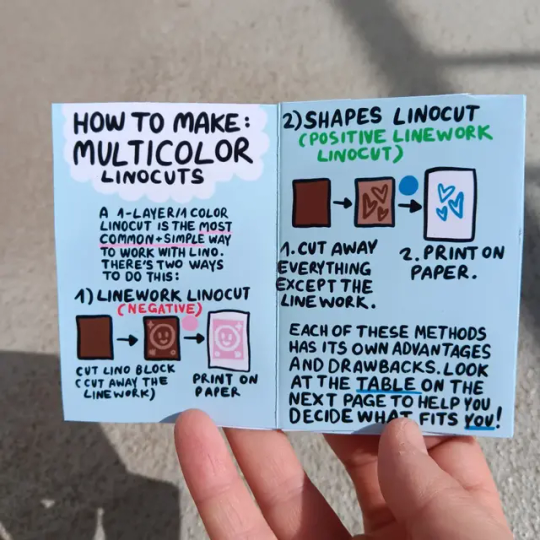
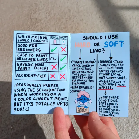
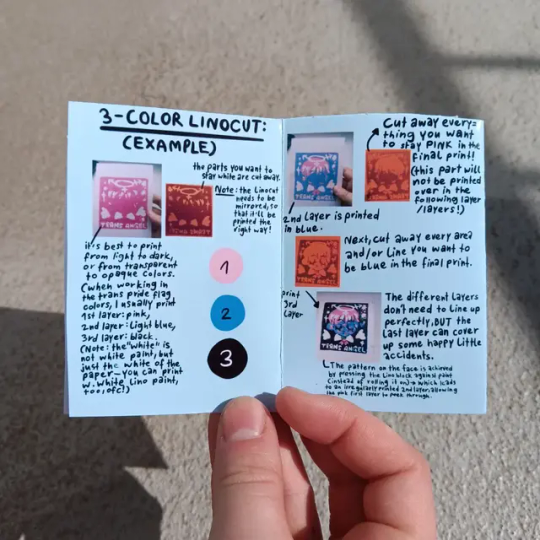
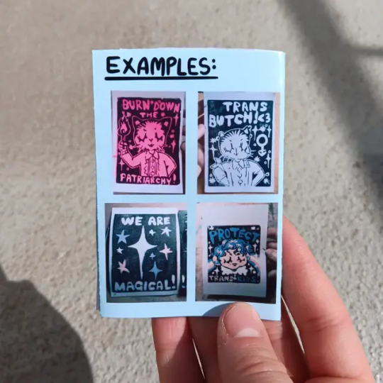
Did you know I made this handy zine to introduce people to the pleasures of multicolor linocut?☺️🫶 I'll revise it soon.
#transartist#queerartist#queer artist#queer art#trans artist#printmaker#printmaking#druckgrafik#linoldruck#queerprintshop#diy art#linocut guide#guide to linocut#lino love
94 notes
·
View notes
Text


Stickers from a linoleum block I carved.
9 notes
·
View notes
Text


november patreon reward prints! 🌿 had extremely mixed results with registration for the two colors so did some just plain black as well :’) // shop
#printmaking#block print#block printing#relief print#linocut#patreon tag#art tag#i’ll be honest i’m so tired i just printed for four hours#my back is killing me#i have a half ass registration setup which normally doesn’t matter too much but this time it mattered lmfao and it SHOWS#so i only got a couple that weren’t super off#doesn’t help that the brown block is pretty different from the black one. if i was smart i would have used the black one as a guide#instead of retracing my original bc i changed stuff on the block that i forgot about. oh well
16 notes
·
View notes
Text
So, you want to dupe a book from a show you're obsessed with?
(or, how I recreated one of Claudia's diaries)

Step 1: Assessment
The diary I chose to recreate is a hardcover with a floral pattern on it. I still can't tell if it's covered in book cloth or decorative paper, but I chose to cover mine in cloth because it'll last longer (and because this was for a class and I had to cover in cloth)


Step 2: Plan
What techniques will be required for this project? What materials are you going to need? In my case, I knew I was going to need some way of printing the pattern onto book cloth and coloring it in - that meant ink, lino blocks, carving tools, and googling around to see if my alcohol markers would be permanent. I was also originally planning to back my own book cloth, so I planned to buy fabric for that.
Step 3: Gather Materials
I ended up using a linocut stamp, oil-based black ink, alcohol markers, and pre-made book cloth for the final product. I also had to use mineral spirits to clean up the ink, which required some research in advance to make sure I wasn't about to poison myself. Make sure you're being safe!
Step 4: Execute
Do the damn thing. For me, this involved:
4a. Tracing the pattern on Krita using the cleanest screenshot I could get. Reformat it so that it will work as a repeating design. IF YOU'RE STAMPING, REVERSE YOUR DESIGN. SAVE YOURSELF FROM MY HEADACHES.

4b. Print out the design in a few sizes. Pick a size, and transfer it onto a lino block by covering the back of the paper in graphite and tracing over the pattern. Cut the pattern into the lino with a cutting tool (or, if you're a detail freak like me, use a lino cutter for most of it and then scrape out the fine lines with an awl).
4c. Test out your stamp. Cut away excess material, thin some of those lines, practice repeating the design. If you're having trouble lining up the repeating design, draw a guide on the back of the stamp so you know where things are positioned while you're stamping. (on mine, I drew a dot in each corner that lined up with those center flower dots)

4d. Print! Listen to a podcast and stamp that shit.

4e. Color - I opted to color in my design like a coloring sheet rather than make a bunch more stamps for each individual color. I tested out my alcohol markers on a scrap of book cloth I'd printed on, in case the markers made the print ink bleed and so that I could match the colors from my screenshot.
I also covered a test board with that colored-in scrap, just in case the glue interacted weirdly with the design, but it turned out fine, so I went ahead and colored in the full sheet.

4f. Covering the case - this part was standard bookbinding, just a full cloth case with 5/8th'' turn-ins. The most stressful part of this was cutting into the sheet of beautiful cloth I'd just finished!


4g. Casing in - Again, standard bookbinding, there are lots of tutorials for this online.
Final result:
76 notes
·
View notes
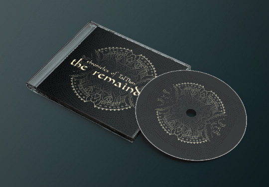
Text
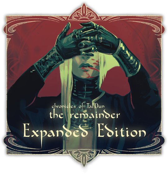
Our Kickstarter for the Expanded Edition of Chronicels of Tal’Dun: The Remainder is starting on 1st of August. Follow our prelaunch page here.
This is a story of two magi, Vyn and Ilar, who find themselves trapped in a collapsing tower with their only hope for salvation being a difficult ritual. Or at least that is what Ilar tells you. The thing is - you don’t remember anything, and Ilar’s story makes less and less sense the closer you are to the ritual. Are they hiding things to protect you from the bitter truth, or are they deceiving you for some more nefarious reason?
Guide Vyn’s actions to death and beyond and uncover Ilar’s truth. Are they your colleague, lover or something completely different? Read between the lines of what they are telling you, explore your surroundings for clues and use hands-on deduction to break the viscious circle and set them free.

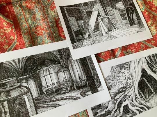
What we want to do
Our main focus is to polish the writing in some areas, add more variations on the true endings and implement sound effects to accompany the music for better immersion.
We also plan to make some new art and to improve certain existing pieces. These are artworks we already made for the expanded edition:
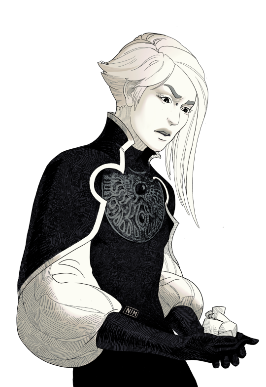
We also want to make a short side story where characters from our other game Our Winding Road visit the tower of our magi. This will be a stretch goal, but I already drew the sprites for the characters. ^^ (I’m not very good at being patient hehe)
Rewards
Aside from the game itself and digital goodes like soundtrack, art and lore booklet and wallpapers, we prepared many physical rewards for our backers.
You’ll be able to get your hands on signed art prints, linocut block prints, handwritten letters and even the original ink drawings from the game.
And for those who like to own a physical editions, we’ll have a game + ost cd as well.

We hope you are looking forward to our expanded edition! Help us out by sharing this post so we can reach more people and make this a success. ^^
238 notes
·
View notes
Text


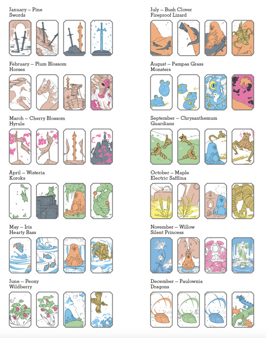
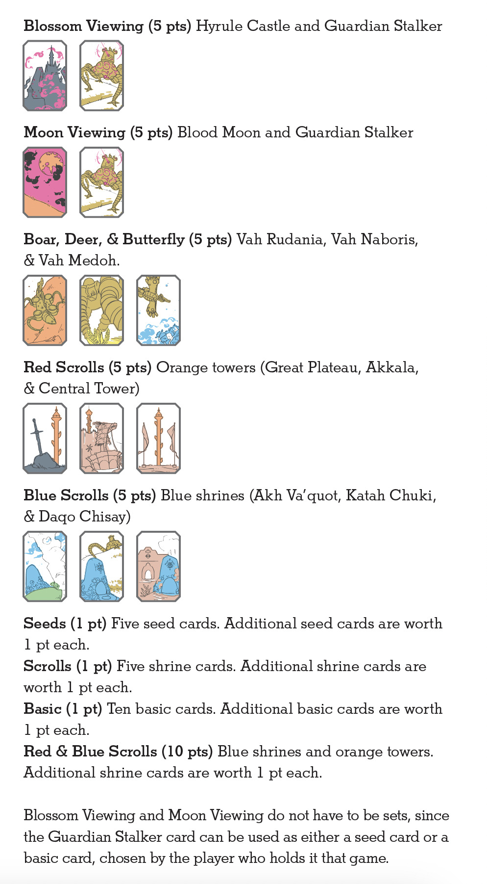
[image description: photos of a Breath of the Wild-themed hanafuda card deck, art rendered with hand-drawn inks and colors printed letterpress from linoleum blocks. hanafuda are a Japanese style of playing cards where the faces only use imagery, with no pips, ranks, or point values printed. there are 12 suits of 4 cards each, 48 total. in the classic deck design, suits are unified by particular flowers or plants; in this version the unifying elements for each suit are plants, creatures, or items from Legend of Zelda: Breath of the Wild. suits of horses, Guardians, koroks, dragons, ex. there are also photos of the small linocuts used to print each color, one cut for every color on each card. cards are about 1 3/8 inch by 2 1/8 inch. end description.]
🎊🎊 tadaaaaa 🎊🎊 here tis, my craftalong project for Desert Bus for Hope 2024! the event starts Nov. 8th this year, and this card deck is up for silent auction starting 6pm PST on Saturday the 9th.
hanafuda!! very very fun to get familiar with this card deck and its games. i think about doing other formats of card deck all the time and always just have to wait for a subject matter that compels me to intersect with a structure that interests me. nintendo started out producing card decks, and maybe they have made LoZ hanafuda in the past—i didn't find one but i'm truly bad at web research—anyway there isn't one available now, only a 52-card deck with alternate Zelda art.
i limited the scope to BotW for lots of reasons, big one being keeping the suits tightly defined to specific things and places, & utilizing one singular map type/environment interface. even adding TotK seemed like a nightmare for keeping suit assignments tidy. each place is a specific location in-game (with some adjustments for better composition, like, Akkala tower is there behind Foothill Stable, but i made the angles of the view cleaner), and wherever applicable, items rendered with surrounding context are done as a specific location where that item appears in-game (the sword in the rock is a real place, where you can pick up a rusty sword and see the Great Plateau Tower beyond). i'll admit to some extra heavy lifting on Satori Mountain but i only actually cheated once: Silent Princess flowers don't grow at the Springs around the statues of Hylia. but that's it!! everything else is real.
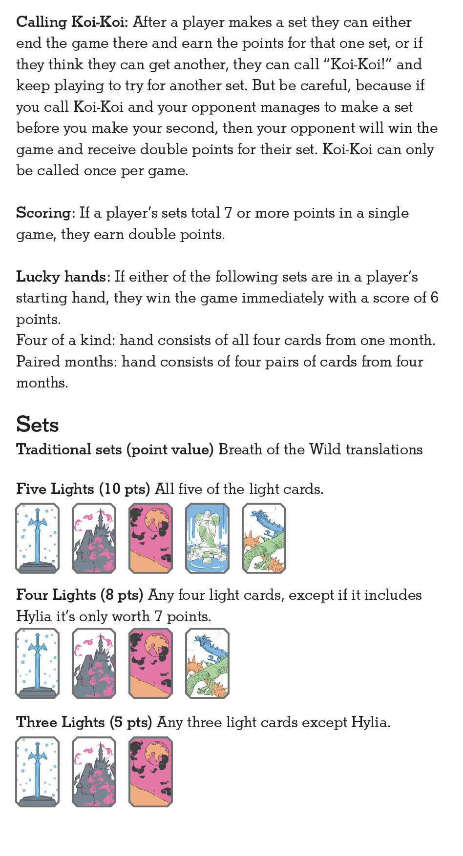
the Brights are the Master Sword, Hyrule Castle, the Blood Moon, Hylia, and the Dragons; tanzaku are shrines and towers; instead of Boar-Deer-Butterfly it's Rudania-Naboris-Medoh; instead of sakura-viewing and moon-viewing parties there are…………oh no and oh NO parties?? (guardian stalker + hyrule castle, stalker + blood moon.) in these photos, the suits are laid out in order, January to December. I made a little guide to go in the box based on the one for Nintendo's Mario Hanafuda, which also includes instructions for playing Koi-Koi.
8 colors, 88 blocks, +1 very simple reduction cut for the Sheikah eye on the back side. the classic deck is completely blank on the back, but if i hadn't done the eye i think the deck would've been missing some kind of unifying umbrella. and if you're asking yourself, hey, even with overage it’s only 5 copies of each card, why not hand color the cards? i also asked this. i tried some things and unfortunately did not like the texture at all. Only 88 little lino cuts would do for my brain worms. each card is two layers of 120# cover cross-laminated together. the drawings went down first on each copy; the back sides were printed on separate sheets before lamination. laminated, pressed, colors printed post-lamination, then each card die cut out of the 3x3 inch sheet. i very much like the color palate that came out of it; since the pen drawings went down before colors i printed the grey first to find the bottom end of the value range, bookended it with the yellow, and filled in the middle. my favorite color of the bunch turns out to be the soft brown, or maybe the "gold" with no metallic in it.
i would say this card deck was about as much work as last year's tarot deck but it wasn't all the same kind of work—i didn't have to trawl through a novel of text for excerpts and battle feelings of intellectual inadequacy to have confidence in my reading comprehension, for instance. i had to learn how to draw, like, 20 things i hadn't drawn before, and carve 88 little lino cuts, but it's just not the same kind of effort. long hours, but largely calmer. the tiny but thicc little cards are so nice to hold. i am quite happy with the style of the illustrations i found, trying to make them recognizable objects, so small, and two-color. all in all very satisfying!! (confession: i logged quite a bit of footage from my own BotW playthrough to get reference material but i still haven't actually finished Medoh myself. or fought Ganon. i keep putting it off to mess around and get armor upgrades instead. gotta get to that finally.)
wip
under the cut: the body of the little game guide that went in the box, with instructions for Koi-Koi and explainers on the yaku.


#desert bus for hope#desert bus for hope 2024#letterpress#letterpress printing#linocut#printmaking#book arts#legend of zelda#breath of the wild#botw#loz#db2024#finished works#long post
20 notes
·
View notes
Text
about me: normal & definitely not evil or perverse. 1996. theythem. pacific time zone. i don't know how to use tumblr 👍
art tag: sketches. comics: comix. i also make linocuts. i tag basically any dark urge or bhaal-related projects with bhaal autism.
linocut patches are available on etsy for the time being. i'm always happy to send people misprints for the price of shipping.
various projects:
- dark urge dialogue masterlist ( + wip dialogue transcriptions) - bg3 audio extraction guide - my tag for extracted audio is bg3 audio
my blorbos: c. purpur, c. the end.


9 notes
·
View notes
Note
What's your background before doing pixel art? I was stunned to see you only now getting into painting because it feels like you have an artistic background to begin with.
i did art pretty much through school until i dropped out in uni. however my art schooling was pretty loose and self-driven. honestly looking back it was not great, i should have chosen better schools but i had no idea what i was doing back then or even what i liked. we didn't learn a lot of fundamentals, i can remember doing like two still lifes ever, and that was in secondary school.
in college we were allowed to do whatever we wanted really, and i gravitated more towards printmkaing, silk screen and linocut. if i did paint i would use watercolours with my drawings in my sketchbook.
we did have weekly life drawing for a while which i really enjoyed!!
then in uni it was even more self guided. i was an on illustration course, i was totally lost and having a terrible time, wondering wtf i was paying for, and ended up dropping out. so i can draw alright but painting is something i never did somehow lol
42 notes
·
View notes
Text
Over the last 6 weeks I have been working on a book for a LARP here in the UK, the holy book of one factions god of the hunt, Kubeth. Leant into a woodcut style that I think came out well. The title page came in mostly to make a nice symetry in the binding, bringing the total to 36 pages, also made the font and a lil moose for a makers mark.

The writing was done by the player of Ardentia, she wanted something simple and rustic, Kubeth is one of the most feral gods of a faction with a lot of gods that lean towards people and civilisation. I wanted a nice rough look to the images, looking at actual woodcuts is impressive, I honetly feel like my facimilie is a bit of a disservice to how wonderful they can be. I have two @3eyedog linocut prints above my desk and I'd often look at them for inspiration on texture and technique.


The hare here is the second image I did and when i really felt confidence that the style would work, angular, defined prints with some soft watercolours is just nice, and quite striking. the occasional bits of ink running throughout. The pup in spoils was a lot of fun, and while the subject is grim I don't think the gore of it is initially striking, with the indistinct shape of the kill in the background, a little "it gets worse the longer you look".


The "Eyes of the Hunted" 'chapter' was the first section I fully finished, the "To Survive" and "Too Slow" are majority black ink, I wanted the hunted to feel a bit opressed, minimal colour. "Too Slow" was the style test concept image, to make sure the writer was happy, it turned out a bit more stylised than the rest of the book imo. "Defend yourself" is one of my favourite pages, the page turn for it is great. After the darker pages it is quite barren, with a little running ink. There isn't much triumph to the page, for the hunted the victory is only temporary. Finally the "Prey Medley" (and therefore all of the medleys) are very inspired by @mothsprout, I was constantly looking in their blog for vibes, and when I saw "Canis Lupus + Flora" I knew that this was how I'd want to end each chapter to end.


Probably my favourite section, every one of this images fights for my favourite, the bear intentionally pushes up on all the margins for the power, the swooping eagle for the speed, the utterly desolate hungry wolf, it's also where the colour pallet shined, I used a pallete someone kindly put on the CSP asset store featuring historical pigments so i could stick with a little fantasy, even the black ink is "bone charcoal ink" rather than just pure digital black. The "Hunters" medley took a couple goes, the first one was mostly neutral, writer wanted snarls, I had put a wolf head on in the center, then again Moth Sprout as an inspiration with the swooping owl, looks so much better. There's more than a few hidden layers of different animals on that file.


Ok cutest image in the book, writer insisted that not all this section would be human, and i struggled to think, until she suggested just a cuddle relaxed pile of wolves which I felt like, of course, I had been wanting to make some hunters not on the hunt. This whole section was very guided by her, and I feel that it comes off well. The "Gifts Medley" is my least favourite, I think it was the one place where I found the style to lack, I also had issue coming up with enough items to feel I'd fleshed out the medley, and then also depicting them in such a style, I think the message is conveyed, but at the cost of some of my self imposed style rules.

And here we go, the final image, I like this one, the final medley as a probably the most colourful page. This was a really fun project, different from OCTs I had a more intricate brief with a longer time frame, so I took my time, grabbed refs overall I'm happy with the project. Though I do now have a goal of trying to do some linocut prints of some of the pages.

Ardentia did the bookbinding, and a pretty good job of it too!
My greatest regret? I didn't take any good photos of the finished product, I did a rambly video but it was finished day of the event it was due for, and has now left my hands and is loose in the system. Below are the links to the CSP pen, watercolour brush, and historical pallete I used to complete this.
#art#self reflection#retrospective#illustration#long post#very long post#for real noone cares this is too long
10 notes
·
View notes
Text


i created registration guides for my linocut greeting cards today and oh my god...why have i not started doing this sooner????
makes it sooooo much easier to center my prints and keep them consistent

4 notes
·
View notes
Text
Going to the art market this weekend was genuinely such a major inspiration for my art block
Everyone there had such a unique art style and sold a combination of not just original and fan art, but had a huge variety of media such as regular prints, riso prints, linocut prints, hooographic trading cards, handmade ceramics, papier mache sculptures, then a lot of typical merch like stickers and charms and phone case stuff
My only exposure to art markets for the longest time was comic con artist alley and although I have found some fun art there, it’s not inspirational to me and a lot of the art feels more like it’s designed for what’s popular (versus the unique art that was designed for the artist first like I saw over the weekend)
It restored a lot of my faith in fanart, especially knowing that there is a huge demand for original art that I haven’t seen online or at comic con. I think what I really just need to focus on is finding my artistic voice, which is already hard enough. I just need to also let my interests guide me to the art I want to make, I’m not really interested in making things like ship art and selling that… but what I am really interested in is exploring the horror elements of media im interested in. Also aliens.
Getting into things like dandadan and dorohedoro around the time of my major art block has been a huge relief, they’ve been fueling my passion both art/style wise and story wise.
How much art I post online will still be pretty limited, most fanart I do nowadays are for zines (other than the odd study or two like my fashion studies using Zelda as a model). I’ll be taking art classes but I want to not make any fanart in those classes and work on my own creativity.
So the art online won’t be as frequent, but at least for fanart my art will be much more refined pieces just from the nature of participating in zines. It’s also nice to type this out for myself to breakdown how this market made me feel, I can’t wait for classes to begin so I can bother my professors every week with a million questions lol
5 notes
·
View notes
Text

WELCOME TO MY BLOG!
✧ snoopy, they/them, 20, hispanic ✧ [bluesky]
interests: general - graphic design, typography, linocut + lithography media - persona, cult of the lamb, sam and max, resident evil, ace attorney, tmnt, usagi yojimbo, etc!
navigation: #chatter - personal posts #arts - art made by other people #arts inspo - art that inspires me #save file - art resources/guides #info - infographics, guides, etc #fandom - universal fandom tag #games/#manga/#shows/#movies - universal tags for various media
5 notes
·
View notes
Text


Laura Boswell RE, British printmaker.
"I am printmaker working with linocut, woodblock and traditional Japanese woodblock printing. I have a degree in Art History/Visual Art from the University of Wales, Aberystwyth and am elected to the Royal Society of Painter Printmakers.
I have attended three printmaking residencies in Japan, studying woodblock printmaking with master craftsmen and my book ‘Making Japanese Woodblock Prints’, Crowood Press, was published in 2019. My second book with Crowood ‘Linocut and Reduction Printing, Design and Techniques’ came out in early 2022".
32 notes
·
View notes
Text
Lord of the Rings Tarot
my sister gave me the Lord of the Rings tarot by Tomás Hijo. it's such a beautiful deck.
the box is fantastic quality. a lovely two piece box covered in beautiful art that well represents the card inside. it has an insert to hold the deck snuggly and the guide sits on top. the art style of both deck and box uses either linocut or woodcut printing, which is a style that I really love.
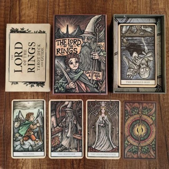
The cards themselves are all beautiful, and the guide to go with it ties the lore from Lord of the Rings into the meaning behind each card so beautiful. The design on each card is printed with care and skill that I, as someone who has done lino cut projects, am amazed by. The artwork truly is stunning.
This is fast becoming my new favourite deck, it's such a pleasure to do readings with. The cards are easy to read and interparate, the guide is succinct. The card are fairly thick and sturdy cardstock and are unlikely to get damaged when used and stored with care, and the same can be said for the box and guide. It is, overall, a high quality deck and I couldn't recommend it more!
#pagan witch#witch#witchcraft#witches#norse paganism#pagan#paganism#tarot#tarot deck#runestones#tarot reading#tarot cards#tarot community#tarot witch#divination#lord of the rings#lotr#lord of the rings tarot
8 notes
·
View notes
Text
Transferring colour
So beyond the pleasant production of scene by adding watercolours to the print, which is nice.

There was an additional method which I was keen to investigate: press transfer of watercolour or gouache unto a print.
I found that the best plate was the same dry point plastic, or acrylic as this was resilient enough to go through the press and remain plate like. My attempts with laminated photocopies of my plate was not so spectacular as the small fine grooves in the laminate did not do any favours to the reenergising process with wet paper. Neither did simple overhead projector plastic pages - they were not robust enough for the transfer.
Assisted by both Rhonda and Louisa (from the next studio watercolour class), the following procedure was:
Using the print plate as a guide paint using straight watercolour or gouache onto a decent thickness plastic plate where you wish for colour to be present on the print. I used a photocopy of my plate as a stencil underneath the plastic.
Dry the watercolour or gouache plastic with a hairdryer so that it is only the pigment remaining.

Wet your dry print (yes the printed ink from your linocut needs to be dry) in a water bath for 1-2 mins.
Set your print onto a vertical press (I used an old screw type press) with the dry point/acrylic registered on top of the print.

Cover with multiple sheets (3-4) of newsprint as water will be lost to the sides.
Tighten the press as tight as you physically can and leave in place for 1-2 minutes.
Lift the press and gently peel the plastic transfer plate from the print and voilà.

It is a nice process as it can allow you to transfer texture of brush strokes to your print that you wouldn’t normally see with watercoloring.
You need to limit your water or you will allow the pigment to go where it wants to i.e. all over the print and even off the paper.

You need to use a vertical press or you are going to end up with the pigment catching a wave in the direction of your press and the colour will not be limited to your print boundaries.

#artists on tumblr#art#printmaking#original art#landscape#linoart#linoprint#linocut#mixed media#watercolour#gouache
7 notes
·
View notes
Text
NEW! Next LINOCUT WORKSHOP🌈🏳️⚧️💅✨ 3/8 spots AVAILABLE!)🥺🫶
Looking forward to seeing your projects come to life!🥰 Btw, if you have ever attended one of my workshops, you are entitled to a FREE copy of my Linocut Guide (Zine); DM me and I’ll mail it to you, or pick it up at a con/market.😉
There will be coffee and cake + some other light snacks, since we enjoyed that a lot last time.🍰☕️
See ya there!<333
#linocutworkshop #linocut #linocutartist #linoldruck #linolschnitt #artworkshop #kunstworkshop #wienworkshop #transartist #queerartist #lgbtartist #druckgrafik #druckgrafiker
instagram
If you are in Vienna, maybe you wanna learn linocut w me on Saturday?☺️🫶
#transartist#queerartist#queer artist#trans artist#queer art#printmaker#printmaking#linoldruck#druckgrafik#queerprintshop#workshop#printmaking workshop#art workshop#vienna workshop#Instagram
2 notes
·
View notes