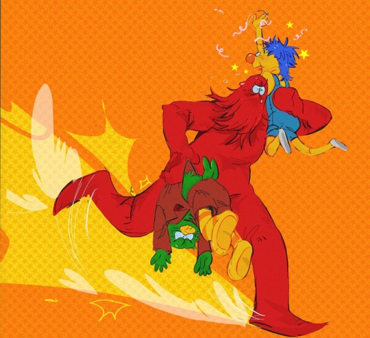
#having a round and cartoonish art style????
Note
This might be out of left field, but when it comes to art, I'm having an issue where I keep getting bogged down in the details and creating overcomplicated works that I'm ultimately unhappy with.
I love your art style so, so much and you somehow manage to capture a perfect balance of simple shapes and colors while adding just enough detail to make it perfectly dimensional and recognizable.
If it's not too taxing, do you think you could explain how you determine how much detail and shading to include?
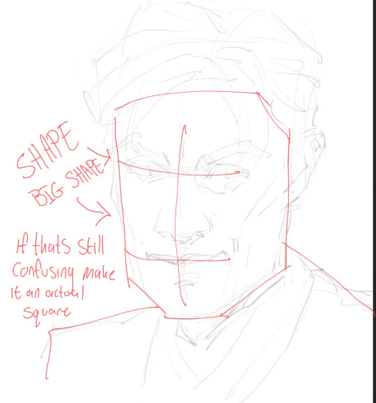
Oh that‘s a tough one 🤔 I must admit that most of the time I am just winging it and try around till it looks right or at least feels like it XD
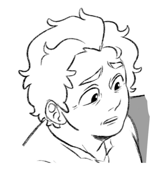
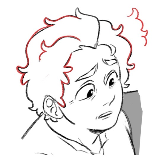
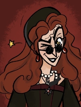
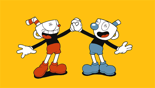
Sooo, I draw in a more cartoonish style so it kinda works when I use less lines or use the few ones to exaggerate a movement or feeling. Let‘s look at Azira‘s hair for example:
That‘s not how in a realistic sense hair works but instead of drawing every single lock I am more focusing on the feeling of floofy by drawing wavy, round lines
I don‘t even have a clue how it would look like if I tried to draw more „realistic“ XD There are so many things I leave out like parts of the nose, proper upper and lower lip, eyelashes, etc etc etc.
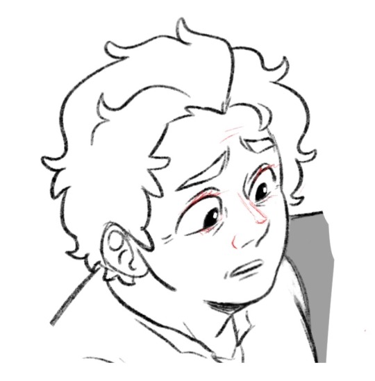
So yeah if I draw more realistic I would defintiely do a different shading but since that‘s not the case here is how i do it:
I don‘t shade.
Ok I barely shade. There is definitely always that shadow I draw under the chin but otherwise it‘s also rather… minimalistic? But yeh, I also keep it simple and don‘t give every detail (like every strand of hair) a shadow so it‘s more like looking at a ball, drawing a curved line and then shade everything under it.
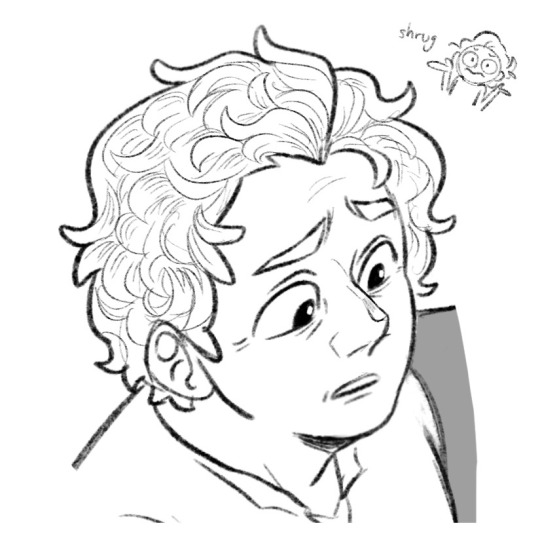
So in conclusion:
I am probably the worst person to ask for art advice XDD
203 notes
·
View notes
Note
hi hi how have you been if it's no trouble and if you are taking requests can I request your ocs with an artist reader that gives them a painted picture of themselves, If it's too difficult pls ignore this. Thanks and have a great day/night♡
(sorry if my grammar is bad)
A/N: I'm so sorry, there might have been some translation error in my brain that said that yn gave the yanderes a picture of themselves, not of yn! I'm still not 100% sure what you mean, but I wrote this. I hope you'll like it even if it's the wrong interpretation :(♡
Warnings: a bit suggestive parts in Edmund's and Silas’s
Silas:
You’re quietly coming into his office with something behind your back. Silas looks curious, asking you what you want since you never come down to his office. Youquickly give the paper over to him and attempts to run, but he lets his men lock the doors before you have the time to reach them.
“Now, now, don’t run. Let’s see what you’ve given me … wow, baby, this is magnificent. You drew me? Why haven’t you told me that you have such a talent, little thing? Now, don’t get all shy now. I really like it. I’ll keep it right here on my desk. Come here now so I can give you a kiss.”

Dr Kry:
He can tell that you’ve been drawing something for over an hour by now, but you haven’t let him see it. Everytime he comes close you pull the paper away. He’s growing curious, he can’t deny that. By lunchtime, you give him your artwork. He scans it with a small smile on his face.
“You made this of me? How sweet of you. I will cherish this dearly, I promise. Do you like to draw? Do you want me to buy you some supplies?”
King Edmund:
He has hundreds of portraits from all ages. Every year there's a new portrait of him (and you) hung in the throne room. But when you give him a messy sketch of him that you made while waiting for him to finish a meeting, he's mesmerized. You've caught something that the other painters haven't. There's something real about your sketch. Something human that has gotten erased in the official portraits.
"This is so beautiful, my jewel. You have a wonderful talent. I want you to paint my next portrait. And I'll do whatever pose you want, wearing whatever you want."
Jerry:
She likes to make some sketches too. But nothing professional. Just some doodles when she's bored. She has let you borrowed her sketchbook while she's gone in a warehouse to retrieve stuff you want nothing to do with. You draw her from memory and when she returns you hand the book back. She catches a glimpse of the small cartoonish sketch you've made of her.
"Is this supposed to be me? Why did you make my face so round? I have a jawline, you know. I'm just teasing, I know it's an art style. It's stupidly cute somehow. I'll make one of you later and then we'll keep them in our phonecases, got it?"
Hedwig:
You're not paying attention in class again. It's okay, though! Hedwig will give you her notes. You're leaning against the wall, doodling. You start to draw your girlfriend, picturing her side profile magnificently.
"Y/N, we'll work in pairs now- … oh, is that me? Wow, you're amazing! You have to show me more later, I didn't know you had such good talent! Can I keep it? Thank you, I'll hang it in my locker and get reminded of you every time I open it!"
#yandere#yandere x reader#yandere x you#yandere drabbles#yandere imagines#yandere fics#yandere mafia#yandere oc x you#yandere headcanon#yandere reactions#yandere ocs x reader#yandere ocs#yandere oc x reader#yandere doctor#yandere king#yandere female#yandere x darling
574 notes
·
View notes
Note
im new to dhmis tumblr do you have any dhmis blogs you recommend i check out?
OH HIIIII HI HI HI
OKAY SO. I HAVE A LOT OF FRIENDS IN THE LIL. tumblr dhmis sphere and theyre all great and lovely and I'll introduce you to them all and YOU can decide who you want to follow okay? OKAY!!
First up is my lovely friend Lulu @lulu-draws-stuff who has a cute very crayony pastelly style! :] They also have a keen fashion sense and love drawing the guys in new and fun outfits! They also have some very cute funny comics in there that I very much reccomend -v- )b
Next is my good friend Sodie.. @mtsodie who also runs the account @dailydogdadduo and he has a very textured, experimental style with a lot of variety! Very fun! A lot of his pieces like, you could swear were by different people if you didnt know better, that's how good he is at it!
Also my friend @its-mayo0 draws a TONN of great DHMIS stuff, their style is very loose and colorful! It's extremely funny stuff and I love the way they mix cartoonish antics/proportions with sincerity, their stuff is SOOO FUN!!
theres also @carehounds which is run by my buddy Fio! Theyre most well known iirc for spurring off the little fandom thing of people making their own versions of the trios? Though if you're new you might not know that. Good stuff, esp if you want to see a new spin on the old guys!
There's also all these great pieces from other friends of mine who aren't necessarily DHMIS centric blogs!
On the more written side of things, one of my friends Pere ( @marsupials-of-mars ) is actually writing a pretty good fanfic atm that's still currently updating- but they also do art as well if youre SOLELY looking for that.
Then there's Am @gnomeniche who I believe is mostly well known for their DHMIS analysis posts, they break down a lot of different aspects of the characters and the show (usually with a twinge of meta in the analysis) and, like Pere above, also make fanart on top of that! Though I will warn you a bit that their analysis is very… academicy? Lots of complex concepts and big words that you might not fully get on the first go round. But thats okay! Theyre lots of fun to reread! ^_^ )b

Also in the analysis sphere is my friend Gray @yellow-pig! They also do a pretty good job breaking things down and they talk often about theories and parallels and reoccurring elements in the show, some that I didn't even notice myself! Very fun. As with my other analysis friends, they ALSO draw some! Isn't that wonderful! How the love of this show supersedes mediums!
Also on the writing side but more on the funny side I would say is definitely Roswells' DHMIS blog @joepelling , lots of headcanons and jokes and fun info about the people BEHIND DHMIS. Their side blog, @dailythreeofthem is also really good if you want references for drawing the main three yourself!
I hope this was helpful and I hope it was a good start!! :D
113 notes
·
View notes
Note
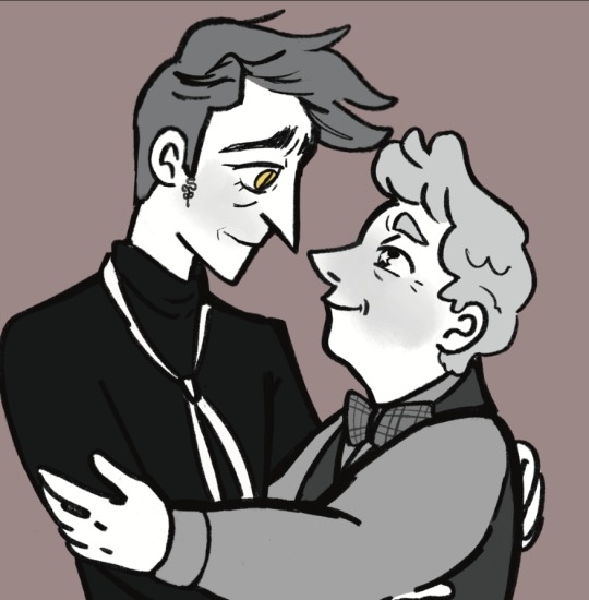
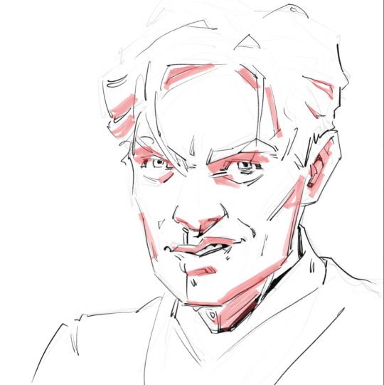
Hi! Just wanted to say that I love your art so so much! I love how much you just *scrunch* them. They're so expressive and have so many lovely wrinkles and are built of such good shape language!! I appreciate that you focus on emotions more than anything and use all your lines to communicate those feelings in such fun and adorable ways. Your style so perfectly encapsulate both Crowley and Aziraphale in a way that I utterly adore.
Scrunched up disaster with the lower lashes and long nose and forehead lines!! Love!!

Scrunched up disaster with the round face and crow's feet and upturned nose! Love!!

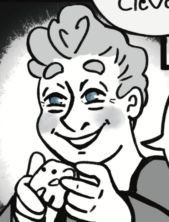
(I just love this particular expression on Aziraphale so much!)
Them. 💜💜💜
Aaa your style is just 🥺🥺🥺🥺🥺🥺🥺💜💜💜💜💜💜💜
Oh, Gosh, thank you! What a sweet comment, I don’t know what to say🙈
I thought a lot about shape language with the duo. I was heavily inspired by some great artists here on tumblr like hg-aneh and owlygem, in that regard 😊
I have always used black lines that way. I think it comes from growing up as an Egoraptor fan lol I never thought of it as scrunching, but that is a very good way of describing it!


Cartoonish expressions are my favorite thing to draw, so it’s great hearing that other people enjoy them🥰 I joined the fandom in August and I feel I’ve gotten progressively better at drawing since then and all the nice compliments are very encouraging.
Here’s is a silly doodle for your incredibly thoughtful message🐍💜🕊️

117 notes
·
View notes
Note
Brushes maybe?
I’d love to figure out how you render that way ur stuff is so good! Any advice you could give maybe? The texturing is STUNNING
Hi! Thank you :]
To be fair, I'm not sure where to start as I have multiple ways to draw things, but I'll try. (Also I might show more if you choose an example if you had any specific brushes in mind)
For most recent art my favourite brushes that were used in rain world fanart have some color jitter. It's a feature that can be enabled in clip studio, but I'm sure that other programs have similar setting.
When I'm less confident in general execution of the idea or have many details to pay attention to and want to take things slowly i like to use oval marker brush. It doesn't have any texture and has somewhat soft edges so i can work from very loose blob of sketch. Its flat shape that doesn't turn with the movement allows me to "chisel" out the shapes and volume in the drawing. That's why many prefer using flat brushes instead of round.
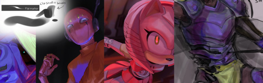
Sometimes I straight up sketch with thin brush for lineart and clean excess lines so it looks like lineart instead of drawing one over the sketch layer from scratch. This hoverer requires a lot of practice and generally clean confident strokes so I resort to it rarely and use it for more stylised cartoonish things. Tip: you can also duplicate lineart and blur the layer and lower its opacity so the whole thing will look more interesting and less sharp.

And then there's this thing :) not sure what to add here other than that they're pretty.
As for the advice hmmmm… Probably I'd say that many brushes show their potential if you adjust your style to each, like you'd usually do with traditional medium. While keeping one favourite consistent style may be comforting, and I respect that as drawing should be what brings you joy, sometimes experimenting might be useful for you. I do have limited amount of styles for some of my favourite brushes and don't go as crazy as I could, but sometimes it feels more satisfying to let the brush guide your process with its shapes and textures instead of breaking it into your already existing pattern.
At least that's what I've been enjoying recently :) Keeping up with developing multiple styles might distract you from learning other aspects, so to choose what's better is always up to you.
I wish I'd had more in-depth advices on how to render in general but figuring it out was a complex and long process for me as well
#hrishchask#first ask! yay#my art#i assume that op probably wanted me to give them some brushes as files but i have no idea how to export the entire pack lmao sorry#i probably build sentences in a weird way but english isn't my first language sorry
40 notes
·
View notes
Text
Kingdom Hearts Destiney Trio Character Design Analysis
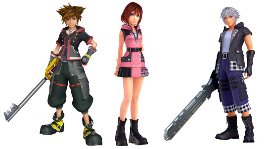
This is another character design post based on Kingdom Hearts. I said before that Kingdom Hearts is a convoluted game. It's mainly because how it's just so much to remember so it is difficult to compile everything in his post. This is going to be taken from interviews or design notes from the creator.
I wanted to talk about the main Kingdom Hearts trio Sora, Riku, and Kairi. Their names mean sky, ocean, and land respectively. The meanings in their names might have been obvious but in Japanese, the important thing is the context in which those names' meanings are used in Japanese. Knowing Nomura he puts as much meaning in the games as possible the same can be said with the trio's names.
The sky, ocean, and land are components that make up the world. These three act as the basis of the worlds we live in, worlds are an important terminology in Kingdom Hearts Sora, Donald, and Goofy travel around worlds fighting heartless and places where one resides and calls home. The meanings in the trio's name note their close relationship with each other, their importance to each other, and the importance of the friends that make up their worlds; they are each other's world so to speak.
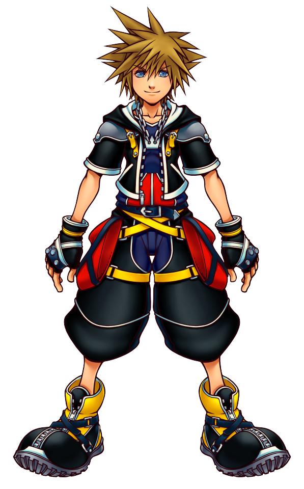
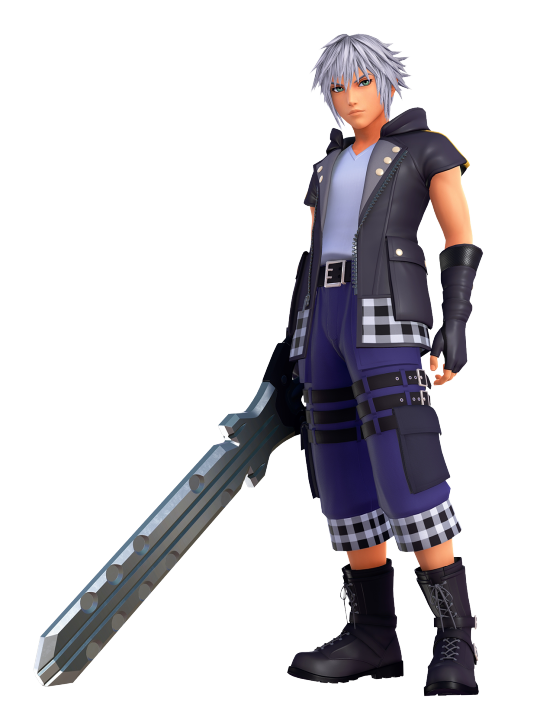
Sora

You can’t talk about Riku and Kairi without talking about Sora, the main character of the series. The series started with him and his character design goes through the most changes in the series. When he goes to many worlds he takes on different forms to suit the world he is in. Sora goes through numerous changes in the series; this is seen best in his design; the character design notes his growth and change in the series.
Name:
Sora's name in Japanese means “sky, (空)” it references his role and personality he displays that being his adventurous spirit, cheerful, bright, friendly, and light-hearted personality and he can easily make friends due to his outgoing personality and he seems to look at the bright side of things.
There is something to how it's used in the game: sky is referred to as heaven's source of goodness sky where the light comes from references to the goodness in Sora’s heart that has the power to mend the hurting. The sky connects all worlds as sort of an interdimensional pathway that Sora uses to travel to worlds to fight heartless and seal keyholes. There are many worlds but they share the same sky which can mean they share the same Sora. This can refer to the people connected to Sora’s heart, hence the same sky.
Design:
Tetsuya Nomura designs his characters based on their names and outfits related to their personalities the same is said about Sora, Nomura created Sora’s design based on Sora’s cheerful outgoing personality. Sora has spiky hair in his design. This is a Nomura-styled character art so having spiky hair characteristics is a signature of Tetsuya Nomura.

When it came to designing Sora Nomura placed roundness in his designs and designed Sora with soft curves to fit with the Disney universe art style in which soft curves reflect Disney's style. Sora has soft curves to match Donald and Goofy. He is traveling with Donald and Goofy so he would be designed to match them.
Why the designs of Kingdom Hearts characters designs look deformed because they capture that Disney cartoonish look so you see more shapes in Sora's hair since it is a trademark of the cartoon art style that Disney has looking at Sora’s design has fewer details and triangle shapes in Sora hair it's simple not overly complicated much like the cartoon style Disney is known for.

Mickey Mouse was originally going to be the main protagonist but Sora was created instead, Sora's clothes are based on Mickey Mouse Sora is wearing clothes similar to what Mickey is wearing in Disney with the red shorts, yellow shorts, and white gloves resembling Mickey's clothes. Sora’s base colors reflect the colors of Mickey Mouse; his colors are red, yellow, white, and black.
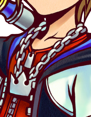

An interesting detail in Sora’s character design is that he wears a crown necklace and has a crown chain hanging on his waist. Sora wears a crown necklace which is prominent in all the designs; the crowns in his design are a reference to the crown logo in Kingdom Hearts fitting since he is the main protagonist of Kingdom Hearts.
The blue eye color is a reference to the sky color being blue.
Sora is a character created as a link between Disney and Squire Enix and his design tells.
Kingdom Hearts 2 clothes
Kingdom Hearts 2 Sora goes through another design as he matures throughout the series Kingdom Hearts 2 design is notably mature and it shows how much Sora as a character has grown.
In case you didn’t notice sora’s Kingdom Hearts 2 outfit has sharper edges the designs lost the soft curves and were replaced with sharker lines Nomura tried incorporating sharper elements in their designs how much they grew compared to the first Kingdom Hearts they appeared.
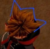
Sora’s hair has changed a lot which means that he grows more, his hair was pointed down as a kid now it's stuck outside. If you look at his design the spikes in his hair are more vertical. Sora now has lighting in his hair because of Roxas influence.

Sora's base color is black so Sora’s clothes have an entirely black color, his base color is used to contrast with Roxas base color white, nobody even his Kingdom Hearts 2 clothes are designed to contrast aside from Roxas black base reference to Mickey Mouse's own body which is colored black.
The designs in Kingdom Hearts 2 are slightly more realistic and more like Final Fantasy design.
Kingdom Hearts Dream Drop Distance

For Sora’s clothes in Dream Drop Distance, his outfit is taken from the first game but has a few differences, black and red are Sora’s main colors, and it's prevalent in his clothes. dream drop distance primarily on growth it would make sense if they take us back to his look from the first kingdom hearts.
As I stated before black is a reference to Mickey Mouse's body and it shows up again in his clothes.
There is a new detail in the design its sora has an x in the middle of his chest, x is a sigel that Xemnas uses with nobodies to make the members of the organization vessels of Xehanort mark the death of a self this is what Xehanort is planning to do to sora make him a vassal of Xehanort hence the death of his self this a foreshadow that Xehanort interferes with the exam.
Kingdom Hearts 3 clothes

Sora’s Kingdom Hearts 3 clothes show how much Sora grew as a character And faced bigger challenges.
Sora's clothes design is a mix of his Kingdom Hearts 2 clothes and Dream Drop Distances clothes his clothes are more sleek and sporty to reflect Sora’s new battle style that he moves around more sora does a lot more acrobatic action-oriented movements and his clothes show that. Since Kingdom Hearts 3 is a new game, Sora's Kingdom Hearts 3 outfit reflects that.
The hair in Sora’s Kingdom Hearts 3 design is muted and his hair points back, the bits that are used to stick outside or folded back.
If you look at Sora’s hair from the top view in Kingdom Hearts 3 it's shaped like a crown. This is unintentionally from Nomura, the use of crowns in the game references Kingdom Hearts.
His current design is from Kingdom Hearts 2 clothes might have some Roxas influence in them if you put Roxas and Sora Kingdom Hearts 3 clothes together you can tell that parts of his clothes are taken from his like the plaid is a reference to the light and darkness motif a callback to Roxas wristband.
Sora’s clothes in Kingdom Hearts 3 are red and black, black to reference his Kingdom Hearts 2 clothing base color his Kingdom Hearts 3 clothes are black it's just the graphics make his clothes gray.
Sora has buttons on his clothes the button is a reference to the buttons that Micky Mouse has on his shorts, Sora 3 buttons on his jacket are a reference to the 3 in Kingdom Hearts 3.
Sora’s design looks more realistic and more defined as compared to his design in Kingdom Hearts 2.


Here is an interesting detail I want to mention it's about Mickey Mouse, Mickey's clothes in Kingdom Hearts are based on what Soras wears in the game which would make sense since Sora is designed after Mickey Mouse this is used to resemble what Sora wears in the game this is a clever reference to the fact that sora is based on mickey mouse mikey had the same clothes to match Sora.
Riku

Okay, the next design to discuss in the trio is Riku, Sora’s best friend aside from Kairi. Riku’s design, much like Sora's, goes through numerous clothes changes due to his character development in the games. Riku goes through a lot of growth across the series and the clothes in his design prove that.
Name:
Riku’s name in Japanese means "land, (陸)” Land is one of the components that make up the world land is associated with being strong and unmovable this can reference Riku’s newfound strength and resistance towards the darkness and desire to have the strength to protect those who matter like his friends Riku and Kairi.
Unmovable can infer how Riku is steadfast in his convictions demonstrated in how he is determined to wake up Sora no matter what form he takes and his ambition to travel to other worlds.
The land is a common feature in all the worlds, landforms are the physical core of all the worlds this notes Riku’s personality being that Riku is more mature, grounded, and realistic compared to his other friends.
Design:
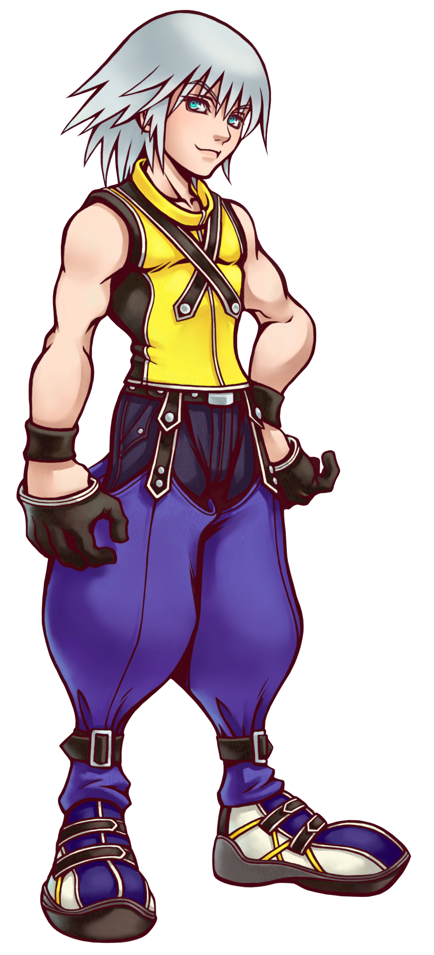
Riku is drawn as an old-fashioned rival character, rival designs have a contractional design their rival is the same is said with Riku whose entire design heavily contrasts with Sora’s. He is created based on the series' main theme of being able to choose light and darkness so it would make sense that he is created to contrast Sora.
Riku is designed to balance Sora, he is created as a foil in Sora’s which is seen in his design If you put the characters together you can tell how much they contrast one another, even their clothes show contrast, Riku has long hair to Sora’s spiky short hair, sora wears a jacket and Riku wears a sleeveless shirt. Riku’s color scheme contrasts with Sora’s color scheme where Riku's main base color blue contrasts with Sora's and the rest of the colors in Riku’s design contrast with Sora’s colors in his design.
Riku’s eyes are green, this is a reference to what earth or land appears to have a green color.

Riku’s hair color is silver, Riku's silver hair is a clever nod to how he was possessed by Ansem before even took on his appearance in Kingdom Hearts 2 Riku’s silver hair references Ansem's gray hair notes his possession of Ansem, and his hair color foreshadowed that.
Riku is ashamed of his actions in the first game which still haunts him until Dream Drop Distance, Ansem references his darkness Ansem haunts Riku in the form of his darkness until Riku reconciles with his darkness in Dream Drop Distance.
Riku is close to a final fantasy protagonist or a Squire Enix-style character due to the fact he plays a worried protagonist and it shows well.
Kingdom Hearts 2 clothes
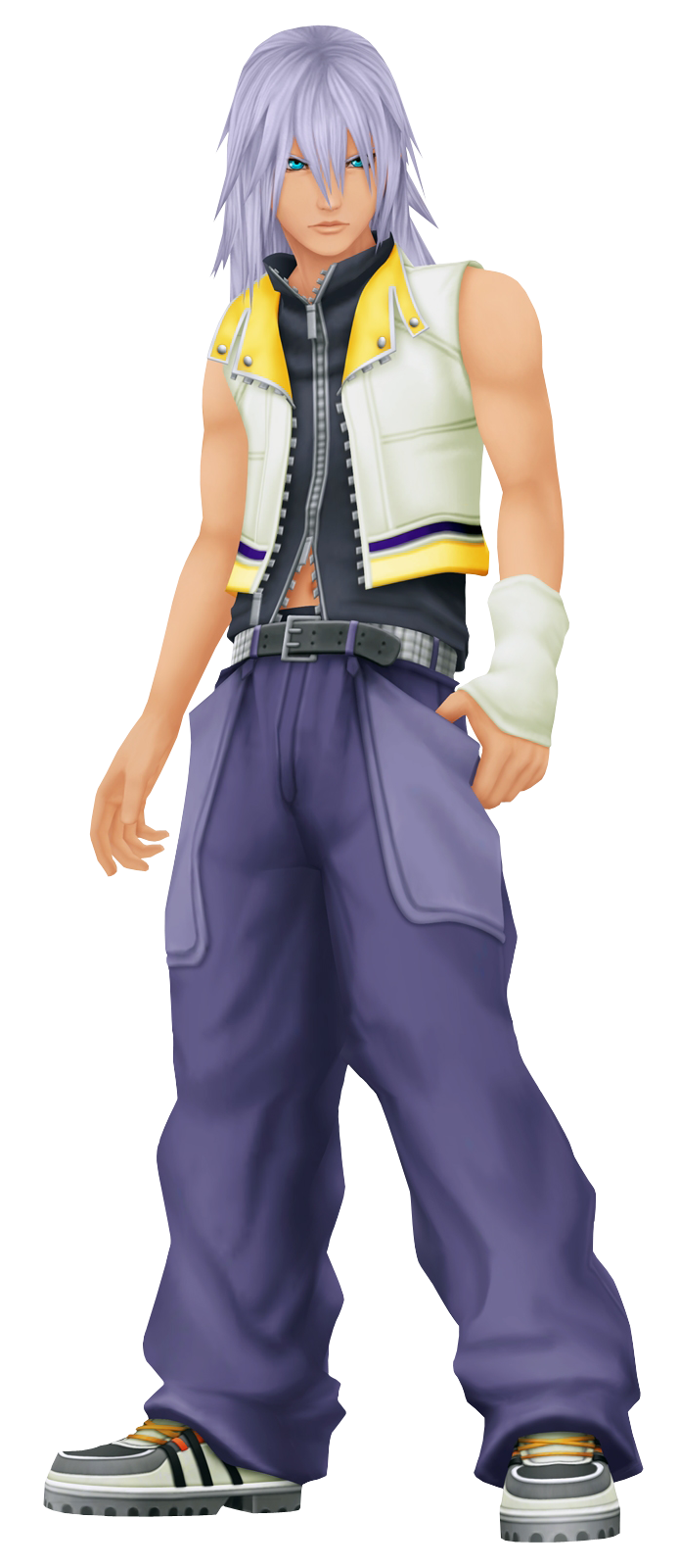
I don’t know what to say about Riku’s clothes in Kingdom Hearts too other than his clothes follow the same pattern that I previously mentioned His clothes are still made to contrast Sora he has a similar color scheme to Sora The white in Riku’s jacket contrasts to soras black base color.
Riku’s hair becomes long in Kingdom Hearts 2. This could infer how he is trying to control the darkness his hair is the last thing to think about.
Riku looks much more mature and cool in his Kingdom Hearts 2 design.
Dream Drop Distance

Time for Riku’s design one thing to notice is Riku’s short hair, his hair is altered in Dream Drop Distance and is focused on Riku’s growth in the series. I think there wouldn’t be the best way to show his growth by cutting off his long hair. growing long and then getting cut off in a new style is symbolic of a new beginning.
Riku’s clothes in Dream Drop Distance resemble his Kingdom Hearts 2 and the first game outfit his shirt resembles his jacket from Kingdom Hearts 2 and his pants come from his Kingdom Hearts 2 clothes. His appearance is back to what he appears in the first game. This game is a reference to Riku’s growth so that would make a reference to it.

Riku has a dream eater symbol on his back this notes that he is Sora’s dream eater Riku is Sora’s dream eater he's supposed to protect Sora from nightmares and shows up to wake him a reference to Riku’s true wish which is to protect the things that matter in his case it's Sora so Riku being Sora’s dream eater is fitting. He is protecting Sora from a distance.
Kingdom Hearts 3 clothes
Riku gets a new outfit in Kingdom Hearts 3 Riku’s clothes are black and blue with a yellow accent on his shoulder blue is widely dominant in his Kingdom Hearts 3 clothes this is in contrast to Sora’s black and red base color in his clothes.
Riku’s new clothes design is made to match Sora's clothes in Kingdom Hearts 3, they share the same chequered pattern which is a reference to the close relationship that the three have.
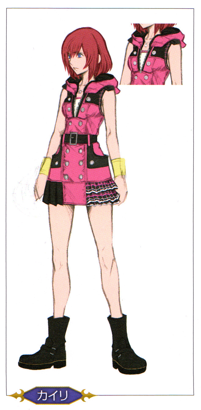
Kairi

Last but not least the third of the trio: Kairi, the girl with whom Sora has strong feelings.
Name:
The “Kai” in Kairi’s name means "ocean,海” in Japanese, “ri” has no meaning to it in particular “ri” was added to her name because Nomura felt “Kai” wasn’t feminine enough.
When I look up what “ri” means in English there is one kanji that comes to mind it's “里”, which means village. “ri” is another way to say village in Japanese and if you put her name together it means ocean village this can reference to how she lived on destiny islands. the context of the kanji for “ri” not only comes from the village but is used in the context to mean one's hometown. Kairi is Sora’s home the person that Sora is going back to, a village among the ocean where you hear ocean waves evoke nostalgia and peace which is what she is to Sora, Kairi is the girl Sora has strong feelings towards and gives him peace she is the wildfire that eats soras anger as Saix puts it.
The ocean plays a part in Kairi’s role and personality in Kingdom Hearts, the sea is home to all life forms, a reference to how Kairi is Sora’s home as I previously mentioned. There is a lot of symbolism with the ocean that has to do with Kairi’s personality of nurturing and caring. This can infer how she cared about her two friends Sora and Riku and how she helps others. The ocean connects to the world; this references how Kairi can connect to others in the series like Namine and aqua. The ocean is the bridge between the worlds this references Riku’s and Sora’s goal to save her in the first game the ocean acts as a bridge between the lands which infers how Kairi helped Sora see Riku in his Ansem form connecting them again.
The ocean symbolizes purification and healing; it references Kairi being the princess of heart. She heals others like how Kairi saved Sora many times in the series, able to return Sora to his form when he was heartless and helped Axel steadily restore some of his memories of Xion she saved Sora not physically but through his heart.
The ocean reflects the sky, the horizon is where the sky and sea meet; this refers to Sora and Kairi's inseparable connections. Kairi serves as a motivation throughout his journey.
Nomura wanted to depict her personality against Sora, Riku and her past in Radian Garden Kairi is the exact opposite of her friends in many ways.
Kairi is a special individual you think that might be her princess of heart power but that is not it, Kairi recognized Sora when he was heartless just like she saw Riku through their Ansem form. Kairi was initially frightened about the prospect of training with Axel but was able to make peace with it to befriend Axel despite the fact he kidnapped her. She can make peace with Axel; she saves Sora and the other guardians by using the power in her heart to hold on to and believe in Sora; faith and belief are products of the heart, a reference to why Kairi is a princess of heart; she has that sort of strength.
This might be what Nomura meant that Kairi is the strongest person on the island, not a reference to Kairi’s princess of heart powers but that Kairi has a powerful inner strength.
Design:
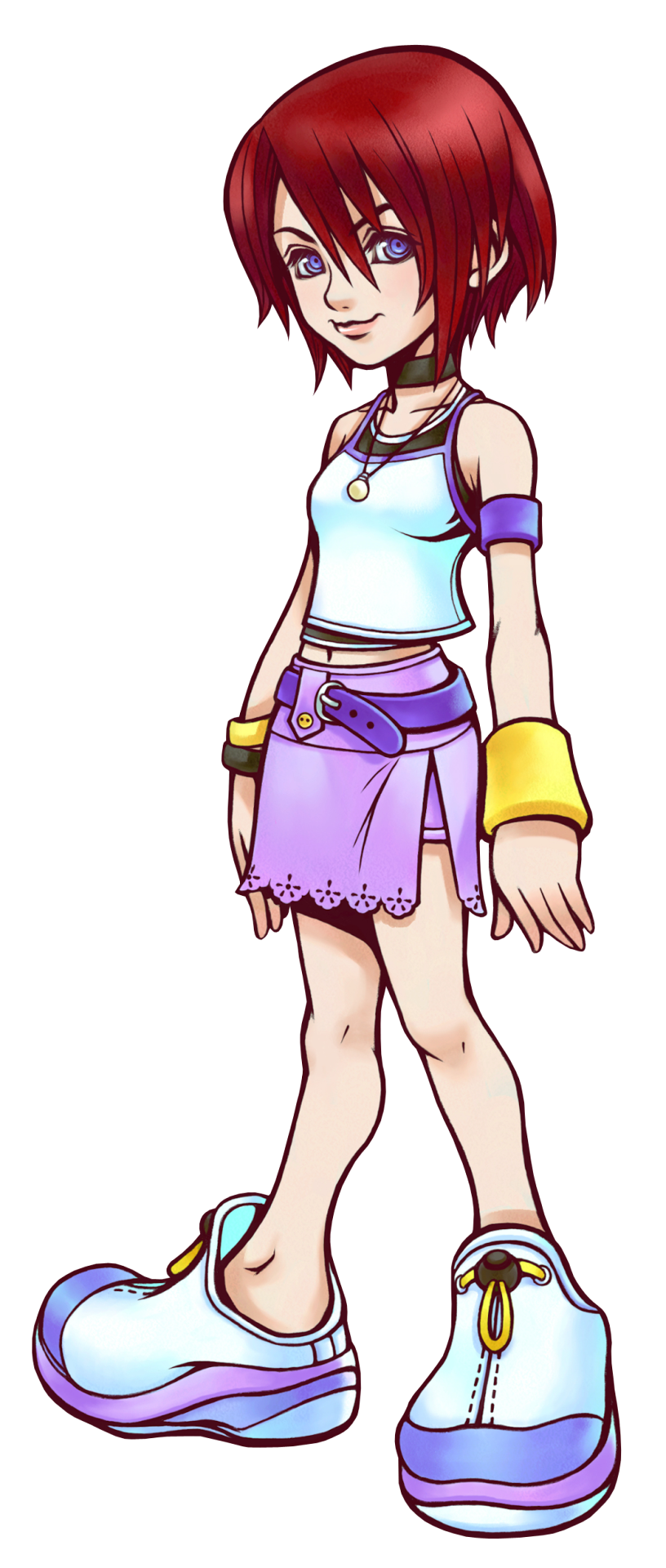
Kairi is drawn as somewhat of a tomboy with short hair and active clothes references that, her clothes reflect that she is a country child since she lives on the islands.

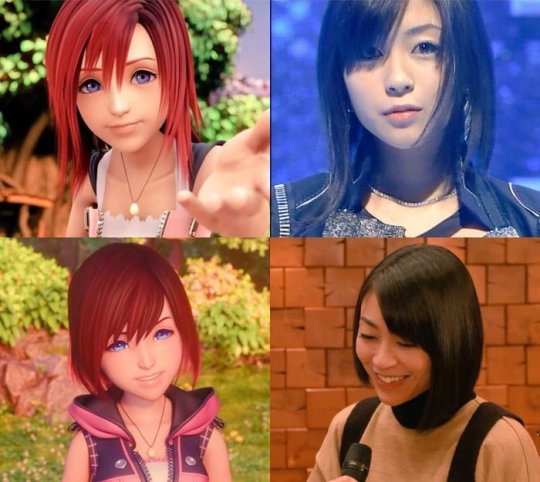
One notable thing about her design is how it references the game, Kairi hair is an homage to Utada Hikaru the one who provided the theme song for Kingdom Hearts, kairi hairstyle that changed throughout the series is credited to Hikaru Utada. The clothes that Kairi wears in the first game are taken from Hikaru which serves as a basis Kairi’s clothes are based on what Hikaru puts as much meaning as possible and he references certain people when he designs his characters.
Kairi has blue eyes in her character design, a reference to the ocean whose color is blue.
Kingdom Hearts 2 clothes

Kairi had a different design in Kingdom Hearts 2 Kairi became a bit more mature because she is at the Age when girls grow a lot faster than boys.
Kairi is noticeably a lot more feminine in her design, pink is Kairi's image color, it's the color of femininity. Kairi wears a pink one-piece dress and has long hair and ribbons on her heels; this makes her look much more feminine than her first design in Kingdom Hearts.
The one-piece dress and the white can be a reference to her nobody Namine who wore a white one-piece dress.
Kingdom Hearts 3 clothes

Kairi has a brand new design in Kingdom Hearts 3, her clothes in her design are made to align with Sora's clothes are made to match Riku and Sora this is a reference to the trio's close bond to each other and her close bond to Riku and sora is referenced again in the chequered pattern in her clothes.
Kairi’s pink dress is her image color that carried over from the second game as well as the hoodie too passed on in her design in the game.
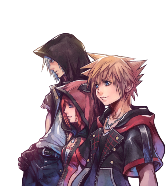
There was one interesting detail in her hoodie. In her design it has cat ears on her hood, They are folded ears from a Scottish fold cat this is a reference to Chritihy. The car ears on Kairi’s hood are not cat ears but Chirithy ears not just in the game but in the concept art as well. You see the ears in Kairi’s concept art.

Chirithy are dream eaters who bond to the wielder to oversee them and their progress and help them where they may they act as guidance of sorts Chirithy is a guardian to the player this might be a reference to the fact that Kairi is one of the 12 guardians Chirithy is a close companion to the player this references to her relationship with sora that she is close with sora Kairi is there to guide sora back like how a surrogate Chirithy would act to the player like she has always has done in the series when she saved Sora.
you can see how much Nomura put as much meaning as possible in her design and it shows.
#kingdom hearts#sora#kairi#riku#character design#my meta#sora kingdom hearts#kairi kingdom hearts#riku kingdom hearts
14 notes
·
View notes
Text
rtc art style hcs (bc im an artist and i think they all like art even if they aren't good at it)
ocean: girl does semi-realism and realism exclusively. she's an overachiever, what did you expect? she prefers pencil, but will resort to charcoal or oil paints if given the chance.
constance: she has a dorky-cutesy more cartoonish art style. She likes chibis and generally round shapes. I think she'd draw little comic strips on the kids menus at her parents' cafe or on a big chalkboard wall there. her art is almost always bright and colorful, except for the stuff in her closest-held sketchbook full of vent art completely drawn in black and white. I think Constance would dabble in every medium of art and also has a soft spot for ceramics and sculpture.
mischa: he doodles ironically and shittily. he's not good at art but he does enjoy fucking around and doodling on papers or occasionally noel's arms. He's not a good artist, but he does like to design rap album covers. he draws exclusively in blue or black ballpoint pen
noel: oh, you know he's dramatic with it. his favorite medium is oil paint, though he hates the mess. he pains exactly what you think he'd paint.
ricky: i'm not sure if ricky's disability caused him to lose mobility of his hands (i think they would have mentioned that?) but i think he likes colored pencil and he draws comics. it's something he and constance bond over! he has that classic superhero comic art style and a cartoonish one.
jane/penny: she loves charcoal and oil pastels, but will use just about anything. She also likes those doll repainting videos and digital art. Her art style is more haunting and filled with hidden meanings, but she also draws stuff for her friends. She draws scenes from 1920s France for Noel, Zolarian cat women for Ricky, etc. She once surprised Mischa with a custom painted rap-record cover based off of one of his designs. There's an oil painting of the choir of hers hanging up at the Blackwood Cafe. Ocean owns a charcoal portrait of her cat and a miniature painting of her betta fish that Penny made.
#bird likes to write#rtc headcanons#ride the cyclone headcanons#rtc#ride the cyclone#jane doe rtc#rct jane doe#penny lamb#ricky potts#mischa bachinski#noel gruber#ocean o'connell rosenberg#constance blackwood
151 notes
·
View notes
Text

[Image Description: 2 drawings of an original character in two styles. They wear a green tunic with a pinkish red scarf. They wear a white shirt with ties around the bicep, and brown bracers and boots. They have short brown hair and brown eyes. Their brows are furrowed, grimacing or yelling as they hold up a sword. The first drawing is in brighter colors, with a semi-realistic body shape and a cartoonish face. It is cel shaded. In the second drawing, the lineart is heavier and darker, with a more angular and cartoonish approach. Their eyes and expression are smaller. The shading is a soft brush, more loosely done. End ID]
Evil Art Style Challenge! Featuring an OC I've been considering different art styles with.
Asker Notes: Starry eyes, curly hair, cute noses, short-looking, saturated/bright colors, detailed hair, faces, shading style
Personal Notes: (pulling from older asks and observations)
Very thin “invisible” line art, semi-realistic with cartoonish expressions, very rounded/curved
Evil Art Style: Thick line art, cartoonish exaggerated body, desaturated colors, ‘flat’ hair, overall shade instead of shading features, Sharp angles
#I do think I might borrow some of the Evil Art Style for cartooning purposes#It seems pretty good for flat colors#the darker lineart definitely impacts how flat colors look#idk might not have exaggerated the other style enough#fanart's art#not fandom#evil art style challenge
18 notes
·
View notes
Note
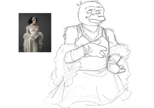
uhm can i ask how you got so good at character likeness? as in how do u practise/what steps do you take?
Omg?! Thank you!!! I’m still asking other people for the same advice, I don’t know how I’m on the other side of this question.
My explanation might not answer ur question properly, or even be comprehensible but I’ll do my best
Learning about your subject is the best way to understand how to draw it. So here some thoughts on how to do that
Blur your eyes when looking at your reference. What things that pop out the most?
Study different angles of their face
What makes them unique to others?
Look at different expressions they make
Is there a way they usually present themselves?
It’s easier if you know how to draw anatomically correct, or even just believable characters. And by that, I don’t mean muscles and bones. I mean placement and perspective.
But everybody starts somewhere. If you don’t know how to do that it’s ok. I didn’t know jack squat when I started, and I’ve learned a lot since then.
For starters, everyone has different strengths and weaknesses, so what applies to me may not apply to you. Seeing as I don’t know where ur at, I can’t help you with specifics
how do i practice?
Answer: Honestly I don’t. Either that, or all my work is practice. If I’m not feeling super involved, but still want to draw I’ll do “warmups” but it’s just me doing low effort work.
what steps do I take?
I have good Pinterest algorithm, so when I like a character, their pictures will flood my feed. When I see an image that looks, for a lack of a better word “catchy” I’ll screenshot it.
It usually has a well defined light source shadows lines etc. and I don’t even have to draw it (I try to though) but even if I just look at it for a while, I can visually break it down to simple shapes/shadows.
That helps me to understand the picture for what it actually is, and not what I think it looks like. 5 times out of 10, I do end up drawing what I screenshot. But I don’t always post it. Sometimes it turns out bad, sometimes I just don’t feel like completing it. And that’s fine :) having fun is the best motivation to keep going, and getting better.
When I do post art, it can vary from a cartoonish line art, to ¿almost? Realistic. But in both situations I’m trying to simplify my subject into the most simple form.
This isn’t a great example but you get the idea


For my line art, I:
keep the shapes, basic, big and blocky. Just so I have an idea of where everything is. if things get too confusing, you can honestly just make a silhouette and go from there. REMEMBER TO KEEP IS SIMPLE, DO NOT GET CAUGHT IN THE DETAILS you can do that later
Once you’re done with the VERY LARGE SHAPES, then map out the features. Let it look ugly cuz heaven knows it will be. And that’s ok too. You just gotta get it down.
Then focus on perspective. Like if his head is facing right, the outside corner of his eye will look round instead of sharp. And in his nose will be touching/covering part of his eye
Then, lastly, and most importantly look at the shadows. Your lines on the line art will look heaviest where the shadow is the darkest 
And remember, the brain will fill in information, so just focus on the shadows. Look at kaz’s hair. I have a couple triangles to show the gaps. I hardly even touched the top. I only drew the bottom of his nose, but you know the whole nose is there
+Never underestimate the power of multiple references.


OH!!! I’m revising my previous statement, this is the most important rule. The non-conventional features are what make or break your character. Don’t try to avoid them, make them work with your subject.
If you don’t draw them, your style might turn out looking like the “anime” style new artist try to avoid.
And if your wanting to go more realistic there are no lines. The only way to tell anything apart is value.

Not saying this is realistic, but all the “lines” are actually just value contrasting between shadow and highlights. So generally the only things that should look dark have the most depth.
And then there’s the whole deal with expressions. They have a huge part to play in character likeness. If you know how a face functions, you can add so much nuance to your art. But I’m just starting to learn that so I can’t help you yet.
Any way GOOD LUCK!!!! GO FORTH AND DRAW
#wish I could communicate this telepathically#idk if I explained this good enough#bc likeness is all about the specific person#so everything I’m saying is generalized#if there’s a specific person you want me to break down I can do that too#love u anon have a good day#ask box
15 notes
·
View notes
Text

Feed me, Illie. Feed me all night long.
A little Halloween treat for our beloved Illie, and it comes with a singing blood-thirsty Portfish - It's her own Little Shop of Horrors!
I watched the movie the first time in October and got a little into it. Thought of Illie and her... one out of five lines of dialogue, but I think it's fun to imagine songs from the musical with adapted lyrics - "The guy sure looks like Portfood to me. The guy sure looks like Portfood to me!" - though I wouldn't know who to make the other characters
Below the cut are things that managed to stick around on the canvas, so I'm just going to explain both MSPaint thangs and adaptation AU things down there ... It's, uh... It's awfully long-winded.

Here's something rare. Because layers don't exist on MSPaint (I don't care for Windows 11 and AI image generation), you'll have to settle for other methods. One of them is just drawing over with another colour, since MSPaint has that cool eraser trick, and this is the other that makes use of MSPaint's faux-transparency. I'd always think of them like. "save states". Drawing in this program always was like the Ship of Theseus anyway.
The purpose of these were to, for whatever reason - whether it's making a mistake or erasing/drawing over too much or because of MSPaint's sometimes short undo memory, they're there to copy sections (or the whole thing if you want) and paste unto the one you're working on, like a bandaid. Or, if you've messed the whole thing up, you've got the back-up right there. It's the save state! For this, the arm and the shape of the Portfish gave me some trouble - which is why the sketch and just the lined part was put aside. It helps that MSPaint is so pixels and you're able to move the selected thing with the arrow keys.
This is kind of a big example, where the whole drawing is put to the side, but it can be smaller things too. For this, it was cases of arms and her glasses and buckets and Portfish (as seen later below) etc.
Here's a example that I managed to dig up from Artfight of Binx that shows both drawing with different colours and the scattered bits put to the side.
Obviously the right was a WIP. These things never stick around when getting to the final product, so having all of these Illies stick around after was great to write this much about. Moving on...

When drawing Find Everything, I do try to stick to the art style (while incorporating my own elements) - but I feel as if Illie is much more realistic compared to, say, Capri or Mayor Majig who's emphasis is on silhouette and strong poses. For example, hands. Hands in Find Everything can be varied, but are always consistent and usually simple or cartoonish. Capri has circles for hands, Mayor Majig has mitten for hands. But I look at Illie and her four-fingered hand (not uncommon, Orsten and Ratthew have them too), the subtle distinction between her shoulder and her arm, the roundness of her elbow (which has inconveniently been erased...), the single fabric fold on her dress, the shape of her hand against her hip...
What was I talking about? Oh, right, somewhat adhering to Find Everything's art style where possible. I always like to keep in mind other characters when drawing. Seymour Illie's (Illie Krelborn's?) fly specifically call back to Chatti, while her collar and cuffs nod to Mayor Majig (although his coat's cuffs are only sometimes seen, and I would've liked to have Illie's collar flared out more to match Seymour's) - though, I did briefly think to have a triangular neckline, but a rounder one is a nice connection to Illie's original sprite. Another was placing Seymour's iconic glasses on top of Illie's head instead of it being in her hair - a big part of it being because of how the bridge of the glasses blending into Illie's hair, but the other being because I think Illie is needing of a top-of-the-head accessory as a stand-in for her sunhat. After all, both drawing and seeing her without the accessory was a bit odd. But I did look to other glasses-wearing NPCs for that and, I suppose fun fact, I guess Purrtrude and Bouncer (and I suppose Radical Duck) are the only characters who have a gap between the lenses of their glasses to have a bridge- despite the number of NPCs that wear sunglasses. I did also think of Lennard, who has those solid white glasses lens, which Purrtrude does have also.
I did worry a little about the cream of the vest outlining the zipper line breaking the art style (only Ratthew really has the line of his zipped-up jacket showing), which is why you see the three of them showing a difference there - but I decided to hell with it. The Find Everything NPC art style is versatile and changing anyhow, and the back of Seymour's vest is that same colour. I felt the same with the pants pockets, but I wasn't too worried about it since... It was plausible enough, and Seymour puts his hands in his pockets enough for it to matter. To me, at least (I call back to his little bridge in Feed Me where he wanders over to the mirror). It kind of went similarly with the pattern on her dress shirt - Seymour's subtly patterned shirts were important to me, and I think it just looked better.
The Illie on the right shows the original idea for her expressed in the sketch above, where she has the glasses in her hair, none of that beige in the middle or pant decoration.
You would think it would be a bit of pre/mid-sketch, but I drew these in the middle of lineart (or colouring, I don't remember) out of boredom or need of change, and out of the possible need to have an obstructed look at Illie in her Little Shop outfit. It did help regardless in terms of messing with colours though, and quickly redrawing Illie's sprite was fun.
Speaking on colours, the left one uses altered default MSPaint colours, the right uses altered colours picked from Illie's sprite - with the browns coming from Illie's dress, the beige coming from her yellow accents (which just turned into a sad yellow-green), and the shirt coming from her sunhat. The middle, of which is the final and accepted Seymour Illie, uses a combination of the two.

Portfish things! It was a bit of a struggle to make Portfish look less like a goofy little guy and more like a living, intelligent, and conniving creature.
Its walleyes were a bit of a problem, before I realised when drawing it that wait... Portfish doesn't need eyes. Especially if Illie gets to look more like Seymour, then it being without eyes makes it look closer to Audrey II. It also reminds me of the Flappy Fish in Bloohoo Beach. If they can be without mouths, who's to say Portfish can't be without eyes!
I did want to keep it's iconic gaping mouth, but it never did sit right - kind of looks like a leech, no? - and the Portfish can close its mouth anyway (thus a different shape), so its wicked smile was a fine excuse enough.
There was also something about the state of the bucket, whether it would be lined or lineless. Originally, I wanted the bucket to be lineless to imitate the 3D word and objects of Find Everything, but it clearly looked better for it to be cohesive to Illie. It's not like it's entirely unheard of for NPCs to use temporary 2D props either (see: Epic Monkey signing the Celebrity Autograph).
Some other variations to the water bucket I had thought of was adding a state of rust or wear to it, with it being alike to the dinky used can that Seymour first puts Audrey II in, or having it be a beach toy-like bucket as Illie is found in Bloohoo Beach (and it could be a little nod to the Sandcastle Thing, with it's toy spade), but ultimately these were left only as brainstorms for time, as I wanted to finish drawing this in time for Halloween fhsdkh (which it was, this whole spiel is what took it so long to be uploaded here)
And yeah... That's it! Something about the water having that wavy pattern to resemble the water texture of Find Everything, and yep! There's that for you! The End. Don't Feed the Ports or something.
#find everything#fe roblox#illie fe#portfish fe#little beach of bloohoo au#<- i forsee i might draw more of this#:halo:s at suppertime#fe au#mspaint is an awesome program#2023#a lotta words for something that looks so simple ...#i'm not even that proud of this thing anyway#but aoughhh i can nerd out on my own blog forever#textberg#artberg
15 notes
·
View notes
Note
If you don't mind me asking,
What's art styles ended up influencing .. Well your art style?
Oh, this is a fun question, thank you for asking!
Hmm, I think it's a little hard to say since I've been drawing since I was basically a toddler, lol. Every little thing I've ever enjoyed has had some sort of influence. I'll try to go through the timeline though.
When I was a little kid, I had a special interest in zoology (still do! but it's not as obvious as it was back then.) I used to wake up first in the house specifically so I could turn on the tv to the animal planet channel and just watch documentaries all morning, and I carried a giant animal kingdom encyclopedia with me to school every day to just flip to random pages and read whatever popped up. During this time of my life, I pretty much exclusively drew animals- particularly elephants, canines, and horses. I had no interest in people.
I had no real interest in stylization at this point- obviously as a little kid I was never able to achieve perfect anatomy or anything like that, but I was more interested in making my animals look real than cartoonish- which meant I was never really influenced by the disney movies I was watching, since they stylized their animals so heavily.
I remember the dreamworks movie Spirit held my attention for a very long time, and I think it may particularly have been that way because the horses looked and acted more real than they did in disney movies. They were still stylized of course, it was a cartoon after all, but it wasn't to any extremes. I still find myself wanting to mimic that in my animals now; cartoon, but not cartoon-y.
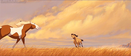
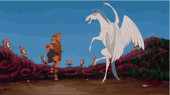
I think these two gifs help illustrate my point lol.
After this exclusive animal obsession (followed by dinosaurs, and then dragons) I got really into Sonic the Hedgehog around age 11. Drew sonic characters, and made my own OCs for it, for basically the entirety of middle school. I've pointed out in the past that it seems the way I draw hands was heavily influenced by this phase
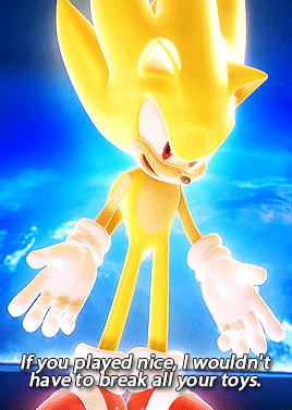
Very round, almost rubbery, where the ends of the fingers tend to flare out a little bigger than they are at the knuckles.
Then after sonic, I got into my first anime, Soul Eater, and this is really where I first started venturing into drawing people and more realistic human anatomy.
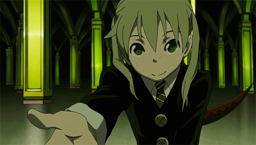
Interestingly, this artstyle seemed to also do the Sonic Hands thing, lol
After this I had a big anime phase, as well as just a general "I want to study actual human anatomy" phase during early high school. I was following a lot of skeletal/muscular system tutorials during this time.
Following that I started getting back into american media, in particular I remember invader zim, steven universe, and tmnt 2k12. I'm not sure I can really tell myself where the steven u artstyle is present in my own, but I've had people tell me they can tell I was into it at some point after saying so.

Then there was the Rubberhose Boom of 2017, with the release of Cuphead and BATIM very close together; I had a big hyperfixation on that artstyle specifically at that time, and I feel like I may owe some of the loose-ness in my artstyle to that.
Then, I suppose, we come to Rise of the TMNT. That show ended up being a major inspiration to me, and I think I owe a LOT of recent artistic growth to it. Rise pushed me out of my comfort zone big time. I always liked doing dynamic poses, but rise encouraged me to push things further, and I started drawing more backgrounds and making bolder color choices because of it as well.
I think my artstyle became just a bit more angular after drawing so much fanart as well.
And I suppose that's where I'm now at presently! Aside from media, I also can't say I'd be where I am artistically today without the influence and support of my many friends. :) I owe a lot of things about my artstyle, particularly specific things like my lineart, to compliments my friends paid me which made me pay more attention to the things I was doing accidentally that they happened to like, then making it purposeful and more refined as a result.
13 notes
·
View notes
Note
Do you have any tips on how you make your drawings look so fluid and so... shaped? If you get what I mean
I'm terrible with giving this sort of advice cause I'm not 100% sure myself. I'll try, but my general advice is know how your character would move and have references to compare and contrast. Especially for movement, analyzing individual frames of an animation or video can help a lot.
A lot of this is more just me working through my thought process as example than straight tips cause I have difficulty with just giving straight tips, sorry.
I suppose messing with your sketch a lot until things look Right and references, and just, generally thinking it through? What are the shapes you want to convey? How satisfying are each of these lines? Not on a composition level (I'm terrible with composition) but does it scratch that itch in your brain sort of thing.
Figuring out what shapes best convey what you want the character to convey is important. I wanted Tango to be sharp, a bit odd in proportions, so triangles worked. Satisfying curves and curls are also important to his character. The whole reason I wanted to draw him to begin with was for animation, and specifically a cartoonish style of animation, so I took a lot from simplified and abstract styles with clean silhouettes like Kim Possible, Gatchaman Crowds, and Birdy the Mighty.
His gloves and boots flow into his coveralls and the bands, pockets, and stitching on them are flat. The only thing that breaks it up is his vest It emphasizes his base shapes and lines I think, and makes it easier to animate him, makes him look more streamlined so it's easier to see him moving even when he isn't. He's also very exaggerated in his flow and movement. His tail helps a lot to in that regard, it's literaly a line so it's easy to use to express satisfying flow or movement like a snake or cat's tail even when still. The flames help set the type of jumpy, jerky, but still flowing movement he has and his hair is styled in a way to emphasize those qualities.
Compare that too Jimmy who is very long, stiff, and snappable. He's much more elongated and square, and is joints are more well defined and emphasized by the sleeves of his coat, form-fitting clothes, his body type being more like a stick figure, and the joints on his bird legs and knees being clear compared to how Tango's are hidden by the bagginess of his clothing. The only flowy part of him is his wings and hair and I - for lack of a better way to describe it - lower to poly count on both in his sheriff design to make him more angular. His face is also rounded though, unlike Tango's more pointed chinned heart-shape, to general make him cuter and dopier. I take all that into account when posing them, using straighter angles and lines for Jimmy. He's someone who folds, compared to Tango who is someone who curls.
I watch a lot of anime and cartoons with posing and linework I like, like heartcatch precure and Saint Seiya Omega's dynamic shots and updates to the 70s/80s shojo aesthetic. Looking at a lot of different art styles helps you hone in on what about them is appealing to you and making the shapes Work, even if you can't put it into words like me.
You can also, if you see something you like about someone else's style and you can't pinpoint what it is, trace it, break it down to your sketching steps, try and draw it yourself, then apply what you've figured out to your own sketch. Getting your hands on something yourself is usually gonna give you a lot more insight, at least that's how it is for me lol.
Studying real life posing will help you with basic structure that's the foundations and help you learn the basic Shapes of people you should always have in your mind, but I think studying other art will help a lot with the exaggeration, simplification, and abstraction needed to make people actually appealing to look at and satisfying to draw.
Honestly, also, save any lines you draw randomly that are pleasant, too. I have a whole folder of half-finished things and scribbles that I look through to help figure out what about them attracts me. It really helps you mentally break down your art and see it on a technical/abstract level rather than just a whole. Don't try to 'correct' a line that isn't 'right' on a technical level if it's satisfying. Drawings don't have to be realistic, unless that's what you're going for of course.
Also also also also also, study cloth and hair physics. Just, study cloth physics. It's THE most important thing to controlling a character's weight imo. You know how Kyoani and Ghibli like to emphasize emotions with floating hair and clothing reacting like cat's fur? Knowing how something is supposed to act is important to utilizing it, including breaking its rules for emphasis like that.
Um, I don't know if ANY of that actually helped, but I hope it did.
51 notes
·
View notes
Text
Friends vs Friends Review
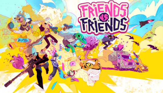
Friends vs Friends is a PvP first person shooter mixed with a deck-builder. You fight against one or two other players, depending on the mode you picked, using cards to gain an advantage. This game is my first review on the blog, so this might be messy and not as well written as some of the later reviews I will release down the line.
The game has two modes, 1v1 and 2v2. The game is very fast paced and skill based (hey, that rhymes!), but still manages to be somewhat casual friendly with the cards. There are a lot of characters to choose from, all with their own passive abilities. I personally like Duck Anderson, the stoner duck whose passive ability gives him weed in his hand every round that heals him. You can see the friends scattered around the hub doing their thing, where you can approach and switch with them, or you can switch to whoever you want in the bathroom. The hub has 2-3 main locations depending on your gender. The hub’s main area is a shopping square that houses a “PalPrize Machine”, which takes what I’ll call “Pig Coins”, and it dispenses card backs, keychains, and friend avatars. The Diner is a place where you can pick up quests (once you hit level 8) and build decks/open booster packs. It has a nice little ambient jukebox where you can change the background music, and the walls are full of different souvenirs, some mildly graffitied. The bathroom of the Diner allows you to change characters, as I brought up before, and houses the entrance to the shop, Cash’s Corner. There you can practice your aim with the shooting range or buy booster packs to add new cards to your deck, or duplicates which you can use to level up your current cards. In matches, you’ll get 5 seconds to scroll through your cards and pick one you want to use once the match starts. Then from there on out it's just you and your opponent having a shooting match to see who the best player is. After you use the cards in one round, they won't be available for the next round, so it’s recommended to not use too many cards all at once. There are around 4 or so maps in the game, with more sure to be added later.
Now, I implore you not to click off this article until the end, because I’m bringing up my criticisms first. I like to get the cons out of the way so we can end the article on a positive note. Some issues I do have is that the game doesn’t run flawlessly. I personally had to turn down some settings, and a big one was having to turn off bloom, and there were still some frame drops in matches, however it didn’t happen too often, and I occasionally rubber banded during a match. I feel like the frame drops differ from map to map, with the biggest culprits being the Trucks map and the Subway. A problem I do have is with booster packs being luck-based, it could be hard to get a card you really want or a new card, especially with the fact there ARE dupes. As well with the pig coins, it's a pain in the ass since you have to finish 3 daily quests to get one.
Now onto the much, much longer list of things I like. First of all, the art style. The art style is a mix of pixel art with 3D models, and it looks great, though of course it depends on your preferences. Just the intro alone is so charming. The card art is also great, able to convey what card it is with just a look at the art, along with it just looking good in general. While the game does feature cartoonish blood and bones, there’s an option to turn it off, making it even more accessible to people who may be more squeamish. The hub oozes with charm and personality, with the calming guitar playing in the lobby it really gives you the idea that the friends made a lot of memories here and it feels lived in. It's great, it makes my soul happy. There’s also a lot of LGBT rep, with there being the progress flag and the trans flag available as keychains from the get-go, and DJ Newton's original design even had a trans rights shirt. The cards feel fun and creative and combine quite well with each other. The music sounds great and the voice acting is amazing for all of the characters, being very charming and filled with personality. The matchmaking is also level-based, so you wont be matched against someone who has better cards or a better character, and you can still turn it off if you like. The best part of all of this? The game is 10 dollars. It honestly feels like a robbery that they’re selling it that cheap and with the sale I got it even cheaper for 6. If you want to support the developers even more though, they have a deluxe edition which pays forward to get access to the first two premium expansions they’ll be releasing later this year. All the premium content is purely cosmetic, however, and it's decently priced, at least compared to most other games, with the DLC costing around 8 dollars, which is around 4 dollars for both expansions. Even then, you can still unlock a multitude of cosmetics just from playing. With how low the price is and how much accessibility they put into it, if this game piques your interest in any form I urge you to pick it up. It’s a great time, and you’ll definitely enjoy it. If I had to give it a score out of 10, it’s definitely a solid 8/10. Might not be for everyone, but if you like shooters you’ll love this.
-Logan Laws
14 notes
·
View notes
Text
Saw a post earlier talking abt rottmnt disliking the more humanoid designs and them looking more like the people they mutated with and I just want to explain why I, someone who is a lover of the movies and is good friends with someone who watched and read every piece of tmnt media, dislike that one point. They aren't supposed to mutate from people (unless you're bebop and rocksteady from the Bay movies). They are mutated turtles and nothing more, which is probably why people have an issue with it.
Rise of the teenage mutant ninja turtles has three main issues that I dislike. One, they jumped the wrong shark by giving the turtles powers (which imo removes some of the point of them). They are jumping the shark in premise, ots why they can become dinosaurs and go to the future or fudual Japan. The magic happens to them because they already are so strange as a concept. Everything else is trying to one up that.
Two, the art style no longer gives them a united look as a team. Other movies and shows have been able to have similar shape nut distinct body differences to differentiate the turtles. 80s shoe was the letters, 2003 was the color of their skin, and often they have different colored bandanas and weapons (the comics had them all wearing red!!).
And three, the show deviated too far from the turtles as characters and turned them into caricatures. Raph and Splinter are the most egregious of these, since splinter is a martial arts master and cares deeply for his sons and raph is not just a dopey muscle man. There is a difference between remaining how something so old works and completely redesigning FUNDAMENTAL CHARACTER TRAITS
Also the ONLY show to have a more rounded art style was the 80s sitcom cartoon style one? 2003 was more gritty, 2012 has cheap CGI but was going for younger turtles anyways, and even then their shredder was more intense than the 80s shredder. Not to mention the movies which were full body puppets that needed to do stunt work a lot for the first three live action ones, 2007 TMNT isn't rounded and cartoonish at all and in fact proves that raph isn't supposed to be big and muscular just literally built different, batman vs TMNT is the LEAST cartoonish the cartoons get, and the Bay movies are just transformers turtles. Not to mention the latest movie is an actual reimagined turtles movie that still has the important aspects there.
So my tldr is that rottmnt is a show that would be really good if it wasn't a tmnt show because it simply ignores the foundations of tmnt. Thank you
8 notes
·
View notes
Text
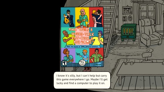
Game 244 - Welcome to Elk by Triple Topping
I picked up this game through the itch.io Bundle for Ukraine. I chose to donate 10 dollars, and I found about 38 games in the bundle that I was actually interested in. So, the consideration for this game will be if it was worth the 26 cents (rounded up) that I paid for it and the hours that I played it for. The bundle has since ended, but I still encourage you to make a donation to the organizations listed here.
What did I think it was at first? This was recommended in some kind of Facebook Gaming Article out of the Ukraine bundle. It had been on my Steam wishlist for a while so extra double bonus!
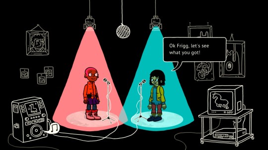
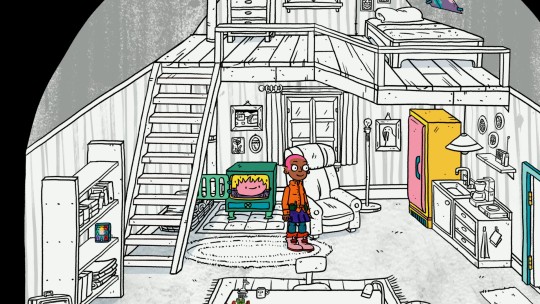
How was the character creator? None, you just play as Frigg, a carpenter. You don't really get to make choices for Frigg, but you play as her in minigames and you can decorate her house.
How was the game? This is a game that will be tough to talk about without spoiling it - but mostly, Welcome to Elk is about stories.
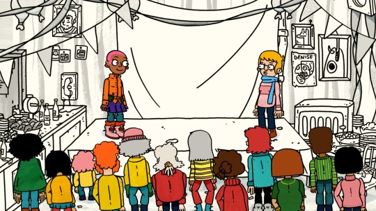
You arrive at the island and are immediately swept into community with a rich cast of characters. One thing I really enjoyed about the game is that you get to take quick breaks from the story with minigames that keep you involved and invested.
Throughout the whole game, a mystery about the island is hinted at - there are a few fourth wall breaks that work very well to develop this mystery. The game also uses perspective changes (third person to first person) to make particular scenes a lot more visceral and emotionally heavy.
I also really like the soundtrack!
What did I not love? There are a lot of darker moments in the story, from sexual harassment of the main character to a variety of types and methods of death. The tone swings wildly, which isn't helped by the cartoonish art style and walking animations. It was a little jarring for me to leave an emotional scene with Frigg's cute Cartoon Network smile looking out the screen at me.
In order to enjoy this game, you have to be ok with the lack of a narrative payoff. There are a lot of loose threads left at the end of the game for the player to contemplate, but ultimately the game builds toward a climax it doesn't deliver. And that's ok? I still really enjoyed it, but I remember finishing it and then trying to reload in because I expected there to be more.
At 3 hours and 26 cents, was it really worth it? If you don't like story games, Welcome to Elk may fall flat for you. However, if you're looking for something reflective with light gameplay and humorous moments, this might be a good fit for you. I really enjoyed this game.
6 notes
·
View notes
Note
you have a very round expressive art style. It's full of details, but it still gives a pleasant cartoon like stabilization.
Thank you! I'm glad the detail + cartoonish-ness are combined well lol.
My family likes to debate what my cartoonish‐ness + soft/roundness + detail make my art categorized into. My mom settled into "Renaissance if it was slightly toony" which is interesting shfhk
3 notes
·
View notes
Last Seen Blogs
themoulinblue
Kary ❤️

kittenyu
Untitled

mogaimagic
💛🤍Flag Coinings Closed!💜🖤

agen777
Untitled

castromberg
when life hands you lemons, fuck the lemons & bail