#how-to-deselect-in-photoshop
Explore tagged Tumblr posts
Visit Tumblr Blog
Explore Tumblr blogs with no restrictions, modern design and the best experience.
Last Seen Tumblr Blogs


Fun Fact
Tumblr has 411 employees.
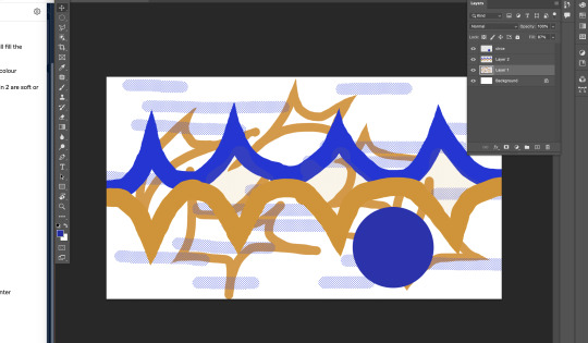
Text
A Very Basic How to Edit a Screenshot Tutorial
I had a request by PeachPlumbobs on Bluesky about how I edit my moodlets and use them on my Sims 4 screenshots. I used this as an opportunity to brush up a little on my Photopea skills to offer a free solution to anyone editing their sims screenshots. This is a quick and dirty tutorial. There are SO MANY MORE THINGS you can do with Photopea. Its basically a free to use, browser based, Photoshop. If you've ever worked with Photoshop, you will be comfortable here.
To follow along with this tutorial you need:
A screenshot of a moodlet and a screenshot you want to put it on top of.
Open Photopea in your browser
** I play and edit on a PC. Any keyboard shortcuts I mention are for PC.

First, we're going to open Photopea. It really is browser based. You don't need to download a thing to your computer. For this basic edit tutorial, I dragged and dropped a screenshot with a moodlet and a screenshot I wanted it overlayed on.

Notice how Photopea will open each image as its own tab. That's good. The question I was asked was how I edit and add moodlets. Personally, I use exactly what the game gives me. I'm going to show you how to cut them out with rounded corners here.
*To make your life easier, feel free to use the magnifier glass tool on the left to make the area you are working on bigger. If you need to move the whole image around, use the hand selection tool on the left side.
On the left side with the tools, you will find a button for shapes, click the rectangle one. On the top bar, just below the "Edit" button, you will see a drop down box that lets you change this from a shape to a path. Make it a path. On that same bar you will see an option to edit the corner radius. I changed it to 5px.
Use this path drawing tool to draw a rectangle over the part of the moodlet you want to see. I cut out the time remaining on the moodlet when I do this. I also cut out the icon - that's optional of course!

Once you have your path drawn, look to the right side of the screen. Over there, you want to switch it from layer view to Paths. After that, on the bottom of the right side is a button that lets you make that path into a selection. Switch the view on the right side back form Paths to Layers. Use the Arrow tool on the left side and click the center of your selection to make sure it is active.

On PC, you can use the keyboard short cut "Ctrl C" to copy the selection. Or, you can go to the top and click "Edit - Copy"
Switch tabs to the image you want to place the moodlet on. The PC keyboard shortcut is "Ctrl V" to place your copied selection on a new layer of this file. Or, you can click, "Edit - Paste"
Again, this is how I edit my moodlets and you don't have to do the same thing if you don't want to! Once my moodlet is placed as a new layer, I use the square selection tool on the left side to create a box around the moodlet icon. I then use the arrow tool to move the icon on top of the moodlet box with the text. Once completed, go to the top and press "Select - Deselect"

How to add that nifty translucent outline around the moodlet. Make sure you are on the layer your moodlet is on! Go to the bottom right and click the button labeled, "eff." Go up the pop-up list until you get to "Stroke." Click on that and a layer style box will pop up. For this example, I set the width to 10px, the opacity to 40%, and the color to white. There you go, you've given that moodlet a little pop!

This is a quick tutorial, but I'd be remiss if I didn't follow through with the rest of the image editing process here. I know I plan to make this image a square when I save it, so I moved my moodlet over where the square would be. Using the rectangle select tool, you can press "Shift" while dragging the rectangle out and you will get a perfect square. Once you are happy with your selection, go to the top bar, and click "Image - Crop"

Now that I know the size of my image that I plan to post, I can adjust the size of the moodlet. Again, make sure you are on the layer with the moodlet when you try to do this! Go to the top bar and click, "Edit - Free Transform"
Free Transform is a lot of fun. You can make the moodlet larger, smaller, or rotate it! If you hold down the "Alt" button while resizing, the moodlet will keep it original aspect ratio as well. Once you are happy with the size and rotation of the moodlet, click the arrow tool on the left to exit Free Transform mode.

This screenshot was taken at night and is very dark. There is a very easy and quick way to make it a little brighter. Click the layer with your screenshot. By doing this first, the following edits to brightness will not affect the Moodlet layer. From the screenshot layer, go to the bottom right and click the half and half circle button. From the drop down list, click "Levels"
Levels brings up a bar graph looking screen. On the left is darks, on the right is lights, in the middle is midtones. Pull the slider button just below the bar graph around until you find a happy level of darks and lights. In this case, I played more with the midtones. This is a quick and dirty adjustment method! there are so many other ways to do this! But, if I'm in a hurry, I go straight to levels to adjust my screenshots.

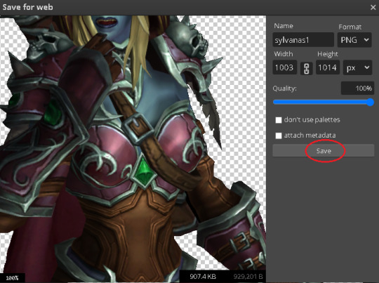
Finally, save your final product! In my case, I'm going to file and exporting it as a .jpg or a .png. If you save it as a .PSD, you can open it and work on it again in the future if that's something you want to do. When I export the save as a PNG or JPG - it automatically saved it to my downloads folder.

There you go! One quick Photopea to edit your sims screenshots tutorial!
Have fun.
#ts4#sims 4#ts4 screenshot editing#photopea#photopea screenshot editing#photpea screenshot editing tutorial
35 notes
·
View notes
Text
Krita tutorial the way I know it.
Basics: What is where.
Gimmicks.
Specific advice on specific tools.
Basics: What is where.

Upon opening the program this is what you're met with. First of all, must comment: The layout is HEAVILY editable so you can just drag menus anywhere you want, even leave them floating amidst the sheet you're drawing on.
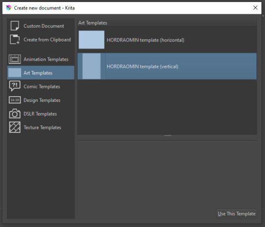
You can create custom art templates, I have two o'mine here as both have my signature background color.
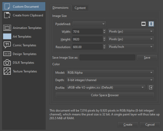
As well, you can edit the custom document settings, as in what size you want it, what resolution, even the initial content of the image. As well you can create from clipboard: Just copy some image from your browser and Krita will recognize it (useful for making meme edits lol).

Now, once you have your file, I will show you what is where.
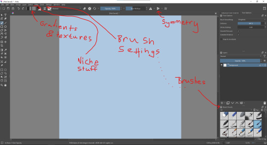
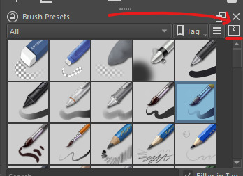
Brushes:
Brushes are easy to edit and there are tons of free bundles to download online. I myself only got one bundle, Jackpack (bit hard to find now due to original source being lost, it is still available but bit tricky to come by).
There. Are. Tons.

Some of these are my custom brushes for calligraphy in neography, you might even guess which ones. You can edit existing brushes, make new ones from the ones you've edited without changing the original, and all sorts of stuff (more below in the third chapter).
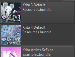
There are numerous packages of brushes once you enter Krita, but only one/two are available when you first open it. To unlock them all, click here:
And make sure all bundles are dark gray in color (example of both dark and light below).
Now Tools Options: those will pop up depending on what tool you're using.
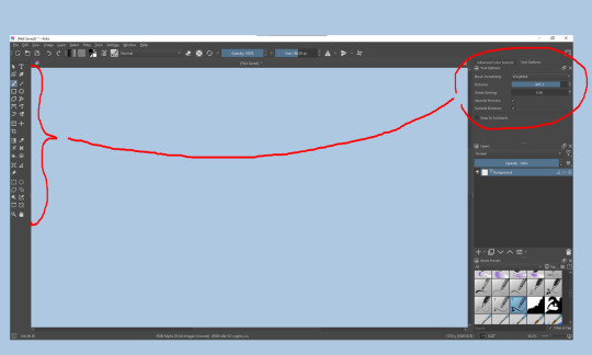
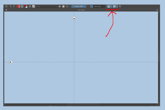
Symmetry: Fun stuff. You can drag the lines depending on how you need them and then center them back to the center of the screen if needed.
Gradients and Textures also have their tools options, you can play with those to get the feeling what they can do (more in third chapter).

The Filters tab is useful too. Blurring, motion blurring, color mapping, artistic filters and all that: Quite fun.
Gimmicks.
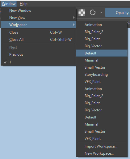
Krita allows you to customize your workspace freely. Floating menus, tabs, anything you want. It has quite many drivers at that-
To access the workspace templates, go to Window and choose Workspace.
Krita allows for copy-pasting any image onto the sheet. Though, for me it sometimes crashes if I accidentally copy-paste text into it without choosing the Text tool first.
The software allows for both raster and vector work. It is basically Photoshop sharpened to be used by artists primarily.
There are some interesting mechanics regarding the Eraser (default bind E).

You can use it with any brush, allowing for textured erasure/quick work. Good for sketching.
You can use it on gradients (given there's a transparent point on the gradient preset).
There's a Multibrush tool:

People say Krita is good for animation but my brain can't wrap around it yet honestly @~@.
The keybinds:
B - Brush tool.
E - Erase tool option.
M - Mirror (useful for checking accuracy from a new angle).
Ctrl - Color pick (when used with brush or other color-using tools).
Shift+L.Mouse+drag - Changes the size of the brush by dragging left and right.
Ctrl+E - Merge layer with the one below.
Ctrl+G - Group selected layers.
Ctrl+A - Select whole sheet.
Ctrl+Shift+A - Deselect everything.
F - Bucket tool.
G - Gradient tool.
Ctrl+S - Save document.
Ctrl+Shift+S - Save As document.
Ctrl+N - New document.
Ctrl+O - Open document (will be seen in a new tab on top of the sheet).
Ctrl+C - Copy selected layer or selection.
Ctrl+X - Cut selected layer or selection.
Ctrl+V - Paste copied/cut layer or selection.
Q - Multibrush tool.
R.Mouse - Interesting thing: Opens up a quick selector for brushes and colors you've already used in the piece.
1 - Zoom 100%.
2 - Zoom to fit the piece vertically.
3 - Zoom to fit the piece horizontally.
4, 5, 6 - Turn 15 degrees (4 and 6) or undo the turning whatsoever (5).
Ctrl+I - Negative filter applied to layer.
Ctrl+U - Color editing on the layer.
Ctrl+Y - Soft proofing mode (for color mistakes and stuff like that, mostly annoying for me tbh).
Ctrl+T - Transform selection/layer.
Ctrl+R - Square select tool.
Ctrl+J - Lasso select tool.
Honestly you can just hover your mouse over tools and see their shortcut binds, as well. Or edit them in Settings.
Specific advice on specific tools.
Brush:
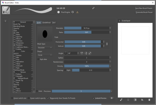
Brush editor is a great tool for making custom brushes, and it even has a sratchpad to test them out. Lots of settings, but no need to be afraid; Most of them you might never use on purpose.
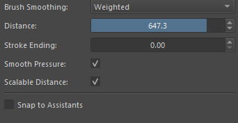
Use Brush Smoothing for great and pretty lines in lining pieces or making calligraphy.
Gradient:
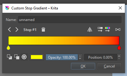
The four icons to the right top are:
Mirror gradient.
Arrange by lightness value.
Arrange by color value.
Space the stops evenly.
Click the gradient to add a new stop. The three things to the left are:
Make the stop use Primary Color.
Make the stop use Secondary Color.
Make the stop use a fixed color.
319 notes
·
View notes
Note
ok i cannot figure out how to word this but when u click thru the photos of ur post, the text is always the same height like from the bottom of the screen (!?!??!?!) how do u get it not centered ik how to center text but like, the height accurate lmao im so sorry
hiiii anon! i'll put this under a cut bc it's a bit long, if you need a visual please lmk and i can record one for you really quickly but otherwise i hope this helps ❤
write out some text, then center it by selecting the text's layer, then selecting the "move" tool in photoshop (default shortcut is v).
while using the move tool and with the text layer selected, i press ctrl + a to highlight the entire picture. you'll see a bunch of options light up on the top of the screen
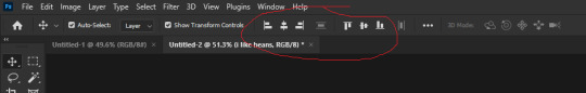
up there! the 1st set of three will move your selected text from left to right while the 2nd set of three will move your selected text up and down.
so i center the text first by clicking the two middle options, write out the whole text, and then once everything is written out in a way i find aesthetically pleasing i recenter everything.
then once the text is perfectly center i use the very last button on the 2nd set of three so that the text is brought down all the way to the bottom of the screen.
then i deselect the whole screen by pressing ctrl + d, and then i use the move tool in photoshop (again, v is the shortcut) to select the text layer one final time.
hold down shift and click on the up arrow on your keyboard 5 times!! and now the bottom of your text will always be 5 spaces above the bottom of your picture. i hope this helped :D
11 notes
·
View notes
Note
Your VTM comic book covers are simply GORGEOUS, I'm totally in awe! How did you get the super cool halftone/coloured dots effect? It looks super cool and realistic, I love it! Have a lovely day! :)
Thank you so much!
So to get the halftones, I use an old-ass tutorial I got off deviantArt literally....more than a decade ago? (Rosalarian's Golden Age Tutorial). The account appears to be deactivated, but I'll go through the steps here:
For reference, I bounce between Clip Studio Paint and a very old-ass copy of Photoshop, but if you're using other programs that have fun pixelate filters and you can change the color mode, you should be ok.
NOW...
Ink your drawing in straight black on its own layer
Block your colors on another layer (I hunted up some old comic color palettes thanks to madformidcentury dot com/2013/10/mid-century-color-palette-in-comics dot html)
Turn off any and all blackwork (this is INCREDIBLY important), and take your colorwork into Photoshop. (if there are any gaps in your color work, fill a separate layer with white and then merge the layers so it's all solid)
Set the mode to CMYK
Go to Artistic Filters >> Pixelate >> Color Halftone (the only thing I mess around with is the size of the dots; the default for my era of Photoshop is 8 and that's a lil big for my taste--all the VTM covers are between 4-6. It's up to your own best judgement, but I go by how "readable" things look--does the face still look like a face at a reasonable distance or is it just a smudge? If it's not readable, undo and change your dot size)
Add 3 new layers to your document and LABEL THEM: Cyan, Magenta, and Yellow
Then go to your channels panel and click on the Cyan layer to make a selection of it
Back to your Layers panel, make sure you're on your Cyan layer, and SELECT INVERSE
Then FILL the selection with the CMYK cyan that you've picked out
Deselect your selection, move to the next layer (and make sure you've got CMYK magenta in your bucket) and repeat steps 6-8 selecting Magenta and Yellow respectively
NOW you've got the beginnings of retro-feeling halftone. At this point, I import the halftone manipulation back into CSP and turn my blackwork back on.
For the ✨ grunge ✨ effect, I grab an old paper texture (after reducing its saturation and upping the contrast until it's mostly black and white splotchy) and set it to OVERLAY at anywhere from 50-20% (this is a 'let your soul decide' moment) over the whole thing
Then I grab another old paper texture and put underneath the Overlay Texture Layer, on MULTIPLY, at anywhere from 65-25% (again, let your soul decide). Both layers will give you a nice level of funk to go with your halftone shenanigans
A lot of the colorwork is going back and forth and back and forth because what looked ok in flats didn't translate after toning, but it works out eventually!
Some important things to remember:
Cool tones tend to fade back and warm tones tend to move forward if you're gonna use this method on any kind of scene
Keep your shapes SIMPLE; don't get bogged down in tones of gradients and fades and all of that because most of it WILL NOT come across once you start toning! Think of it this way: mass-production doesn't have time for fine detail, that's why comics are a lot of heavy black inks and flat color contrast
Experiment with the colors! You're working in a limited palette (if you're using any of the old Marvel/DC print books especially), and it doesn't have to be photorealistic/absolute. For instance, my Nos isn't actually green, but the tone suited the funky retro vibe so I went with it!
Let yourself fall down the research rabbit hole of pulp covers because they're both hilarious and informative. Same dot energy is an interesting collection website to go through, you can also go through your search engine (remember to add -pinterest -youtube to your search term to filter out that crapola)
HAVE FUN!
💖
25 notes
·
View notes
Text
okay! this took a bit to type out, but here we are!
disclaimer: my way might not work for you and that’s okay! there’s no right or wrong to make gifs, so long as you enjoy the way you make them then that’s all that counts. this is only a detailed look into my own personal process and things i’ve learned along the way. i'm also an idiot who sometimes doesn't know what he's talking about, so if something doesn't make sense let me know so i can fix it!
but these are some of the things i'll be going into a little more detail than before:
tools
importing & converting to smart object
smart filters
coloring (lighting, basic, and gradient)
exporting
tools
there are a few things i use in the process, some new and some old. whether you want to use them is entirely optional, given that it can be a lot to take in at once.
photoshop 2024
if you use an older version of photoshop, then i think the layout is similar to newer versions. though iirc some older versions don’t have the timeline function so you might have to look that up yourself since i’m not familiar with any ps version without it.
handbrake
i only use handbrake if the recorded video is super long. usually i try to record each scenery shot (4-8 seconds at a time) or an entire cutscene so i don’t have to use handbrake to trim the video. if i do, then i have the settings set to export as super hq with 60 fps, deselecting align a/v start and passthru common metadata. the rest i leave alone.
vapoursynth
this is really useful and makes coloring easier imo. you can download it from the official site, but i found a portable version (i have the 200722 one) for windows here. i’m not sure how to set it up for mac users, and, truthfully, to this day i still don’t know how to use it entirely. i just followed a tutorial i i found on youtube and only changed the amount for the denoise filter and turned off the sharpen filter since i do that in photoshop itself. so it’s trial and error, and i’m erroring a lot sometimes ajdkjasvjdas. it’s also where i crop the video to my preferred dimensions, unless you choose to crop in ps.
jsfiddle code playground
if you want to have the text in the tumblr post be a gradient, then type whatever you want in the first box on the bottom right, change the color from red to your starting color of choice, then the same of the green for the ending color. hit run, copy the code, and paste it inside the text post while in html mode. ngl, i stared at the site for like ten minutes before i figured out how to use it asjdjasdasd
nvidia shadowplay
i use shadowplay since it comes with my laptop’s gpu, set to record in 1080p60. i’ve seen other giffers use obs for recording, but i don’t have any experience with it. there are scenepacks and gameplay walkthroughs on many sites, which you can use as long as you have the uploaders permission and credit them as they ask! please don't steal their videos!
reshade
i’ve started using reshade recently to tone out the blue tint of the game and sharpen it up a bit more. it makes a big difference and helps with coloring if you start out with near neutral colors. the effects i use are: • deband • clarity • sharpcontrast • emphasize • amd fidelityfx contrast adaptive sharpening • fxaa • prod_80_04_colorisolation • adaptivetonemapper i'm pretty sure some of these are redundant, but i’m too lazy to go back and see which ones i don’t need lol. but it’s all personally preference with how you want the game to look, and there are many effects to choose from.
importing & converting to smart object:
my preferred method is the video frames to layers, which is: file > import > video frames to layers, and then select the video. if you use vapoursynth, then there might be duplicates frames (or at least there are for me) so when the popup window appears i check the box to limit the frames to how ever many duplicates there are of each frame. usually in my case, it’s three.
after the video has been imported, i select all frames in the timeline and change the frame delay to either 0.03-0.04 depending on how fast or slow i want the gif to be. for converting to smart object, i recorded my own action set to save time by clicking on a couple of buttons, but the process is: select all layers currently > convert frame animation > convert to smart object.
let me know if you want the action set! it saves a lot of time in the process
smart filters
i don't think sharpening before or after coloring matters, but definitely do not sharpen before cropping if you haven't done already.
vapoursynth combined with the in game reshade sharpening effects doesn’t require as much sharpening as i normally use. just note that it varies from scene to scene, and whatever you're giffing. these are just the settings i used for the pirates’ cove set.:
smart sharpen #1: 500% with a radius of 0.2 px
smart sharpen #2: 10% and 10 px radius
gaussian blur: 0.7 px at 30% opacity
add noise: 1% uniform at 30% opacity
on to the coloring, which i'm breaking this up into three sections: lighting, basic coloring, and gradient coloring, with a brief description and the result after each section.
something to note is that all coloring is personal preference, and how you want your gifs to look. if you're just starting your giffing journey, here's a site i bookmarked that explains pretty well the adjustment layers and what they do if you have questions for how they work. but i'd be more than happy to answer any that you guys have!
lighting:
brightness/contrast:
with this, i’ve found that changing the blending mode to screen brightens it up well enough without having to move any on the sliders. if it’s too bright, then lowering the opacity should do the trick.
curves:
before, i used the white and black point with the eyedropper tool, but now i’ve started using the auto function that can be found in the four horizontal bars in the top right of the adjustment properties. i choose the find dark & light colors options and check the enhance brightness and contrast box. if it’s too bright or tinted too much one color, then i fiddle with the rgb curves individually to get it as neutral as i can.
levels:
with levels there’s not much to adjust other than moving the sliders for the shadows and midtones to give it a little more contrast.
basic coloring:
selective color #1:
for the first selective color set to absolute, i use it for the white/black colors to make them as white and black as possible. increasing the black can make it too dark, so i limit the increase by two or three. sometimes i change neutral if it needs it, after all the coloring is done if it still looks too much of one color that the other adjustment layers can’t fix. i don’t know exactly what the difference is between absolute and relative is, i just remember it being part of a tutorial i read and have been doing it ever since.
color balance:
i only change this as minimally as possible, usually one for cyan, one for magenta, and one for blue for all tones. sometimes i increase it more, but it all depends on how you want it.
selective color #2:
the last selective color i use it for all the other colors, set to relative, usually for reds, yellows, and blues. if there are people in the gif, then i focus mostly on skin tones, bringing out reds and yellows to make it look as natural as possible. a hue/saturation layer can be useful to even out darker skin tones by lowering the saturation for red or yellow. with scenery, i boost whatever dominate color pops up while lowering the other colors by adding in a lot of white if the lighting is bright, or adding black for dim scenes. again, if it needs it, adding in an optional hue/saturation layer, but this time to lower the saturation for less prominent colors.
gradient coloring:
if you’re satisfied with the coloring of your gif, then this step can be skipped!
i’ve recently fallen in love with using gradient fills. there are several preset gradients available, but if you search around online there are other gradients available to download and use. or you can make your own gradient of your colors of choice.
for me, i often use blue/pink or blue/purple gradient fills. the blue/pink preset is the one i used in this case.
gradient fill:
after adding the gradient fill and choosing the colors, i change the blending to soft light and lower the opacity anywhere from 30%-50%. with darker skin tones it might be tricky as it would involve more tweaking of the settings until it looks nice.
gradient map:
i follow it up with a gradient map to help with the sharpness (i think? i’ve forgotten exactly) set to soft light again with varying opacity given how dark the scene is.
vibrancy
this is completely optional here, but i like the colors cranked to the max, boosted to 80% or slightly lower. some minor adjustments might have to be made after this, usually with it being too red or possibly yellow.
exposure
the final adjustment layer to top it all off is exposure. i like my gifs to have a matte-ish look, so i change the offset anywhere from +0.0010 to +0.0030. if the gif is still a little on the dark side, increasing the exposure helps.
the gradient coloring takes the longest to get the colors to look good, but i love my colors so much and the end result is so worth it.
logo:
this is optional of course, but since there's quite a few people out there who love to steal gifs, it's probably a good idea to put your logo on the gif to help deter them. mine's simple and uses either the font code bold or moon. i have it saved as a png so that i can go to file > place embedded and resize it to my liking before moving it to the bottom right corner.
but for me those are too many steps to do for each gif, especially if i’ve been working on them for hours. so i open up an old psd with the same dimensions and duplicate the logo layer for each gif to save time.
exporting:
under file > save for web (legacy) the window for it should pop up. i don't usually mess around too much with the settings here, keeping it at selective diffusion and changing the matte to none.
sometimes the size will be too large for tumblr's limit since i like bright colors, and depending on how many frames are in each gif, most of them end up on the large side. i have to fight photoshop sometimes to make it work by either trimming a few frames or messing slighting with the lighting. occasionally i end up having to go back and reimport the videos to divide the frames equally if i don't want to trim any off. it’s a pain, and it’s something i should honestly try to plan out before that point lmao.
but if you're satisfied with how it looks, save, and you're good to post!
8 notes
·
View notes
Note
hiiiii i really love ur gifs so much !!!!! im trying out some effects recently and i really like the third gif here : https://www.tumblr.com/khaotunqs/732573928879472640/i-cant-live-without-you-sand-me-neither?source=share how did u make this!!!! <3 (if its ok for u to share)
hello!!! thank you so much! 💖💖💖
here is the set anon is referring to!
here's me being way too long-winded about how i made that gif:
note: this assumes you use photoshop, and that you already know how to make gifs. i work primarily in timeline, so everything i talk about is specific to that method.
this wasn't super complicated, i don't think? i used @cal-kestis's tutorial on motion blur transitions with timeline to get that shift effect. i didn't make any adjustments of my own, since i liked the end result.
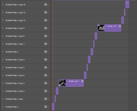
i made the two gifs that i wanted to shift between, and then clipped and blurred according to nik's tutorial. this is what my timeline looks like once i had my clips chunked:
once i had the two gifs in the motion blur transition, i wanted to add something to give it a 'shining' quality, if that makes sense? i used this light leaks video on yt to make that happen!
since the video is an .mp4, i was able to open it up directly in ps, which i always do when i can, since it means to don't have to take screencaps of it. it automatically opens as a smart object and i can get the entire clip so i can move it around in timeline to get a segment that i like over the gif.
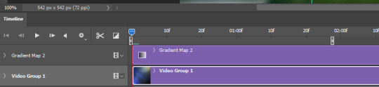
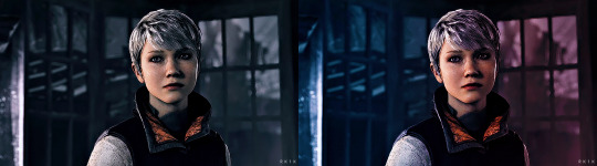
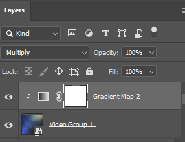
i set the video group to 'screen' and added a gradient map with my focus colors (green and yellow) on top of that. i created a clipping mask to clip the gradient map layer to the video group so the gradient map would only be applied to that specific layer. i set the gradient map layer to multiply (i found 'screen' made the whole gif too light).
so there's the gif part (i think i remembered everything?). now on to typography!

'you think i want you as my' and 'of course not' are in quicksand, bold, 10.5pt. 'boyfriend' is a font called pinch my ride, regular, 60pt. i changed the case for 'b', 'r', and 'd' from lower to uppercase bc i just thought it looked better!
in blending options, i added a gradient overlay in my focus colors and set the angle to -90 as i wanted a even lined gradient. i set that gradient overlay to 'hard light' and then set the layer to 'difference'. then (i'm sorry this is so long) i copied that text layer. went into blending options again, deselected the gradient overlay and drop shadow, selected 'stroke' and went with a 1px white stroke set to 'outside'. back in the layers, i set the fill to 0% so only the stroke was visible. once i had the stroke, i shifted that layer down and to the right (five cursor strokes each).
i converted my timeline back to frames (god bless @anyataylorjoy's action for this step) and tadaaaa:

i am truly terrible at tutorials, so i really hope this made some kind of sense! you can always send me another ask <3 thank you for asking, and happy giffing!
4 notes
·
View notes
Note
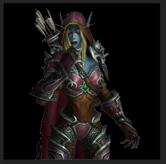
how do you make the background on the characters transparent? i'm trying to make a banner for my blog but i've never worked with WoW screenshots before.
I am not sure how familiar you are with editing software, so this tutorial is going to be detailed.
Step 1:
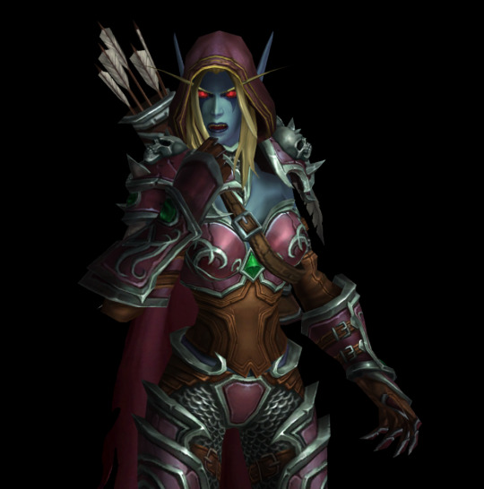
You need a simple screenshot of your character. Here are some ways you can get it:
a) in-game screenshot
b) Wowhead Dressing Room screenshot
c) Wow Model Viewer
d) WoW Tools
e) far stretch, but if you want to mess around with mogs, Epsilon Private Server is fantastic for that (they also support the Narcissus addon)
I prefer Wowhead's Dressing Room, so that's what I'll use. Recommendation: If you use Wowhead, use the PTR version of the page (right now it's 10.2.5) to remove Wowhead's watermarks in the background.
Step 2:
Take the screenshot of your character (Print Screen on Windows keyboard) + paste it to Paint.
Now you have your very own Screenshot with a background.
Step 3:
To remove the background, you will need an app that can do that for you. The two options I can personally recommend are:
a) Photoshop
b) Photopea (basically free in-browser photoshop) (link)
I will use Photopea for this tutorial.
Step 4:
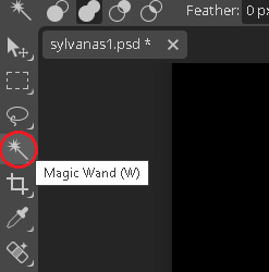
Once you upload your screenshot to Photopea, you will need to select the character with the Magic Wand tool.
Everything you select will be outlined with a scissor line.
Step 5:
There will be some areas where the tool might 'overselect' and get bits of the background. There might also be areas which the tool will not select. To fix that, use the Lasso tool (red circle).
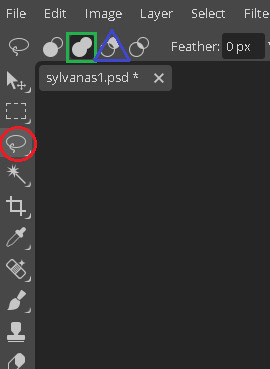
If there are any areas that are on the character, that the Magic Wand did not get, draw over them with the Unite option (green square). If there are bits of the background, exclude them with the Subtract option (blue triangle).
If you need to zoom in or out, hold Alt and use your scrolling wheel. It will make some smaller areas easier to see and select/deselect.
This is the most important step, so be meticulous.
Step 6:
After you mess around with the Magic Wand and Lasso tools, you will have something like this.
Now you need to remove the background completely. On the right side of the screen, there is the Add Raster Mask option. Click on it.
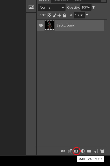
Voila!
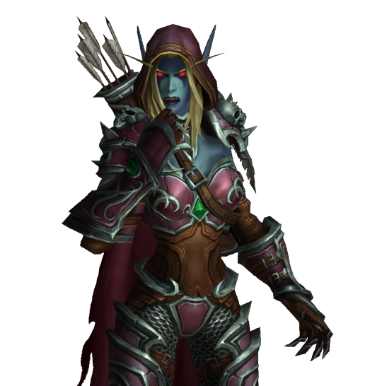
Your character is separated from its background!
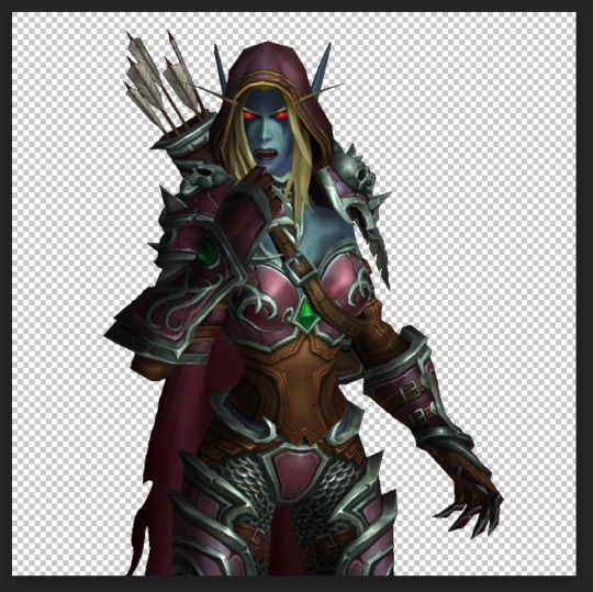
Step 7:
To save it, you will need to export it. Here's a quick how-to:
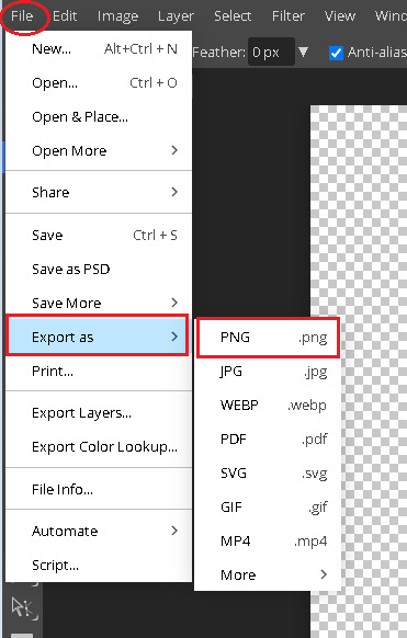
Press on File in the top left corner. Then Export as. Then save it as a PNG (make sure it's a .PNG as .JPG / .JPEG do not support transparency).
After that, you will be prompted again. Just click Save.
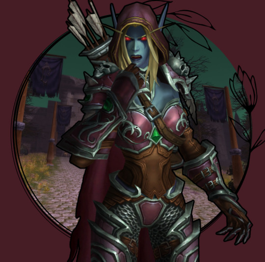
Step 8:
And here's your character, completely divorced from the background! Now you can use an editing app to put her in any background your heart desires. If you don't have any software of that sort, there are also plenty of websites that you can use.
Some that I know of:
a) Pixlr (link)
b) Canva (link)
c) BeFunky (link)
d) Picsart (link)
I often use BeFunky because it's easy to get the hang of, minimalistic and convenient to use!
At this point, only your creativity is the limit.
This is by far not the only way to do it (and not the fastest), but it's the simplest one that I could come up with.
It might seem a bit tedious, but I find it quite relaxing :3
Good luck, anon!
3 notes
·
View notes
Note
hi, can i ask how u animated the highlighting in this set? it's so smooth!!
/wolfes/739978245525602304
Hi anon! It's actually super easy. I'm working on Photoshop 2022 in timeline mode. I'm on Windows, but you can use the appropriate shortcuts for Mac. See under the cut.
Going to start with my base gif. I have a layer under the text with the highlight (I made it with a brush and pressed Shift for a straight line):

Now the animation part! First things first we're going to make a layer mask on the highlight layer. I use the Rectangle Tool (shortcut U)

and create a black rectangle that covers all my highlight like so:

Then, I exit the rectangle tool and press Ctrl while I click on the rectangle layer so that it's selected. You'll know when you see the dotted lines on the selection. I press Ctrl+C to copy and exit this layer; then I press Alt and click on the highlight's layer mask (not the layer itself). You'll see an all white screen so you know you're on the layer mask. I then press Ctrl+P to paste and you'll see the rectangle is now on the layer mask. You can deselect with Ctrl+D, exit the layer mask, and go ahead and delete the rectangle layer because we don't need it anymore.
Your text should look like this; the highlight is now completely covered.
Now I'm going to do the animation! This is super simple, just make sure the layer mask is unlinked from the layer itself. Then you're going to expand the view of the highlight layer so you can see all the options like so. Press the Layer Mask Position option to get this yellow diamond so you know you've started animating.
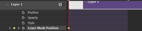
Then I'm going to take the playhead to the frame where I want the animation to be finished. I went for this frame ~16 so you can see the highlight for a bit at the end of the gif.

Now, click on the layer mask and press Shift so you can move it in a straight line, and use the arrow keys or your cursor to nudge it so you can see all of the highlight again.
And that's it! You'll see another yellow diamond when you move the layer mask. When you're done you should be able to see the animation as you move the playhead along, for this finished product:

2 notes
·
View notes
Note
Can i ask how you cut your sims out/remove the background without a fringe?
Aye aye
Note: I do this in photoshop cs6 though other programs will likely have a similar feature + I am not a photoshop master so there might be better ways to do it!!
Anyway, super easy for the most part: Magic wand tool > Select background (You can select multiple sections by shift clicking, often I'll zoom in with alt + scroll wheel to get smaller sections and strays) > Delete > Put down a background on a different layer so you can see the fringe if you haven't already > Layer tab > Matting (at the very bottom on cs6) > Defringe. I just go with 1 and haven't seen much difference with 2 or 3 but you might play around with it, see if you get better results. I find this gets rid of most of it, you may have some stray spots here and there you'll want to erase but they're super manageable. Takes me under a minute usually?
Now the only tricky thing is if something on your sim is blending into the background and also wants to be deleted in which case I do this:
This might be unnecessary bc I've seen people say the quick selection tool is more helpful than the magic wand, I KNOW you can have more control with it, I just haven't got around to learning it yet. So We Make Do
I do my selection as usual and if I notice a chunk is going to get deleted, I duplicate the layer as is and then delete, defringe. After that: Go to duplicated layer > Lasso tool > Select area that was cut > Copy > New Layer > Go to new layer without deselecting area > Paste > Deselect > Manually erase any background > Merge with original layer and ta-da!!
3 notes
·
View notes
Text
🖱️ How to Deselect in Photoshop (Quick Shortcuts & Tips!)
Stuck with an active selection in Photoshop? 🎨 Learn the fastest ways to deselect (keyboard shortcuts, menu options, and pro tricks) to streamline your editing workflow! Perfect for beginners & pros.
0 notes
Text
Photoshop is undoubtedly the world’s best-known and robust photo-manipulation software. The title is something nice to have, but it also means that Photoshop remains rather complicated. It isn’t so easy to get used to, and every time you do, it’s a whole learning adventure. As a student, don’t make the mistake of falling into the habit of thinking there’s nothing new you could learn from the software. Photoshop for students presents an opportunity for the discovery of features that could raise your skill level to new highs. The "Blend If" feature The "Blend If" feature is one of the most powerful tools you can have in your Photoshop arsenal, but it’s not always immediately apparent how it's used. It allows you to blend one layer into another based on its content. Used right, this feature can be used in several different photoshop tricks. A common way this feature is normally used, for example, is to replace a sky without having to make a complicated selection. It might take a while to get used to, but don’t get frustrated along the way. While you’re busy learning how to use the more advanced features, have a look at Australian assignment service EduBirdie that specializes in delivering quality written papers. Getting a thesis or dissertation or any other writing work done from experts should free up some time to let you practice. Instant automatic fixes One of the ways Photoshop manages to be so good is by doing some of the boilerplate work for you. It offers various options for automatically processing photos and correcting things it thinks are off. The most basic of these are auto contrast, auto color, and auto-tone, which all do just what their names suggest. Once applied, any of these options can also be adjusted manually through the edit menu. Using the Fade option, it’s possible to lessen the effect of the change applied. More advanced functionality that supports auto settings includes creating an adjustment layer for Levels. Illustrator-like layer auto-select Illustrator is Photoshop’s distant cousin. Illustrator is being used in many awesome ways, especially for UI and logo design rather than photo manipulation. One thing it does very right is the fact that you can see the actual selection in your working space when you select something. Photoshop implements the same feature by forcing you to select what you want to work on in the layer panel and click on the element. This is not only cumbersome, the ‘how to deselect in photoshop’ functionality isn’t immediately apparent to most users. Once you select the Move Tool, you should see a checkbox labeled ‘auto-select’ and a dropdown just next to it. Check this box and pick the layer from the dropdown list. Now, whenever you click on an element that isn’t locked, it’s going to be selected in your layers panel. Getting new brushes By default, Photoshop makes a nice collection of brushes available within the app. If you’ve never bothered to explore beyond these, we’re here to tell you there’s a brush for literally everything out there. There’s a brush to simulate what it would be like to paint with eggs and there’s a brush that shows every strand of hair. A lot of photo editing tips and tutorials make use of custom brushes. Precise lens flare The lens flare is a well-known feature within Photoshop, but what most beginners are likely not aware of is the ability to precisely place the flare. Firing up the info palette (in the Window menu) and placing your cursor at the exact spot you want your lens flare will let you set its center. Take note of the X and Y coordinates of the lens flare and choose the Lens Flare option under Filter Menu > Render. A preview dialog will launch. Hold onto the alt key to bring up the Precise Flare Center dialog. Enter the X and Y coordinates from before, and voila! Conclusion Getting used to all the functionality Photoshop has to offer requires a lot of time and practice. Students that are just getting started with the software may find the above tips either useful when working on their projects.
It may also serve as an introduction to Photoshop free functionality such as that offered in Illustrator. The number of possibilities when it comes to Photoshop is only limited to your imagination. As you begin to venture the platform on your own, explore and create new projects to get even more used to what it has to offer. Joshua Robinson is an academic writing expert working with online agencies that provide services in dissertation, thesis and college essays. He’s also an expert animation and Photoshop and his work has received many accolades from the industry’s best. In his free time, he likes to play tennis, learn drone photography and explore local street food.
0 notes
Text
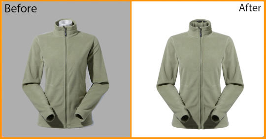
Remove ghost mannequin parts?
Product Photography Is An Absolute Necessity In E-commerce.
One popular technique is ghost mannequin photography, which allows you to showcase clothing with the shape and structure intact, while keeping the focus solely on the product itself.
However, to get that clean, professional look, you need to remove any mannequin parts that are still visible in the photo.
In this guide, we’ll walk you through how to remove ghost mannequin parts using Photoshop, so you can get those perfect product shots every time.
So, we can start now!
What is Ghost Mannequin Photography?
Ghost mannequin photography, also known as the invisible mannequin technique, is a way of displaying clothing without showing the mannequin itself.
This style gives off a floating appearance that will let viewers interested buyers funnel their attention to the product itself.
Commonly used in the fashion industry, especially for e-commerce websites, as it does not distort clothing allowing it to retain its natural shape without much distraction from a human model or mannequin.
Why Use Ghost Mannequin Photography?
Professional Appearance: Showcases the product’s fit and structure without distractions.
Focus on the Product: Keeps attention on the garment instead of the model or mannequin.
Consistent Look: Ideal for creating uniformity across all your product photos on your site or online store.
The Importance of Removing Ghost Mannequin Parts
Clear photos without any mannequin parts are important for your brand’s professional look and customer experience.
If parts of the mannequin are still visible, it can take away from the smooth, polished look you want.
Without the mannequin there to distract them, customers are better able to see the clothes and how they will look on.
Benefits of Removing Ghost Mannequin Parts:
Improved Visual Appeal: The focus remains on the product.
Higher Engagement: Clearer images can attract more clicks and views.
Increased Sales: A clean, professional image leads to higher trust, and in turn, more conversions.
Tools You’ll Need in Photoshop
To get started, let’s make sure you’re familiar with the tools you’ll be using in Photoshop for removing ghost mannequin parts:
Quick Selection Tool: Best for selecting broad, well-defined areas quickly.
Polygonal Lasso Tool: Perfect for manually selecting areas with more complexity, like areas where the mannequin and product colors blend together.
Eraser Tool: For fine-tuning and erasing any remaining traces or tones after removing the mannequin part.
Step-by-Step Guide: Removing Mannequin Parts
Select the Arm with the Quick Selection Tool
For sections where the mannequin and t-shirt have clear color contrasts, you can use Photoshop’s Quick Selection Tool. Here’s how:
Select the Quick Selection Tool from the toolbar.
Click and drag over the mannequin’s arm. The tool will automatically detect the edges and create a selection around the arm.
Press Delete on your keyboard to remove the selected area.
Switch to the Eraser Tool (shortcut key: E).
Carefully erase any leftover tone or edge to create a smooth transition between the t-shirt remove background.
When Quick Selection Won’t Work: Using the Polygonal Lasso Tool
When the mannequin and product share similar colors (like white-on-white), the Quick Selection Tool might struggle to differentiate between the two.
This is where the Polygonal Lasso Tool comes in handy.
Choose the Polygonal Lasso from the Toolbar.
Pinch-to-zoom in for finer detail. (Use Ctrl + Plus on your keyboard to zoom in, or Cmd + Plus on a Mac.)
Click along the edges of the t-shirt, tracing around the mannequin’s arm. Clicking until you’ve created a complete selection.
Once the selection is closed (by connecting the last point to the first), press Delete to remove the selected area.
Deselect the selection by pressing Ctrl + D (or Cmd + D on a Mac).
Pro Tips for Perfect Selections
To achieve best results, consider these additional tips:
Zoom in for Detail: Always zoom in when making selections to ensure accuracy, especially around edges.
Feathering the Edges: Use feathering to soften the edges of your selection, creating smoother transitions.
Refining Edges: Photoshop’s Select and Mask feature can help you refine the edges for a cleaner, more professional result.
Final Step: Adding a Clean White Background
Once you’ve removed the mannequin parts, you may want to place your product on a simple white background for that professional, e-commerce-ready look.
In Photoshop, create a new layer by going to Layer > New > Layer.
Drag the new layer beneath your t-shirt layer in the Layers panel.
Select the Paint Bucket Tool and fill the layer with white.

Credit: fotor
Common Challenges and How to Overcome Them
Here are a few challenges you might face when removing mannequin parts and how to tackle them:
Dealing with Color Overlaps: The Polygonal Lasso Tool is your best friend when colors between the mannequin and clothing blend together.
Take your time and careful selections.
Avoiding Jagged Edges: Use edge refinement tools to smooth out any jagged lines, and don’t be afraid to use the Eraser Tool for minor corrections.
Handling Shadows: Sometimes, shadows from the mannequin linger. Use the Clone Stamp Tool to blend and remove unwanted shadows while maintaining a natural look.
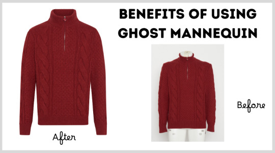
Before and After Comparison
For a more eye-opening example of what this does, keep in mind the change below on the left.
On the left, you have the raw photo with mannequin arms visible, and on the right, the clean, finished product after following this guide.
Notice how removing mannequin parts enhances the professional quality and visual appeal.
The Benefits of a Mannequin-Free Product Image for Your Business
By investing the time to remove ghost mannequin parts, you ensure that your product images look polished, professional, and appealing to potential buyers.
Here’s how this can benefit your business:
Boost Your Brand’s Professionalism: Clean, mannequin-free photos elevate your brand image.
Increase Conversion Rates: High-quality product images build customer trust and encourage more sales.
Consistent Visual Branding: Creating uniform product images gives your website a cohesive, sleek appearance.
Credit: linkedin
Conclusion
For e-com and fashion brands removing the ghost part on path is required to be skilled in converting image into final product picture With those steps,
You get a high-quality edited professional look that increases the aesthetic appeal of your products.
Whether it's a single image on your to-do list for some fine-tuning, or you're batch-editing photos, these tricks will have you creating consistent,
Mannequin-less images that make your customers do a double-take.
If you have any problems working on the above tasks, you can definitely seek professional help.
And please don’t hesitate to let us know your thoughts.
FAQ:
How to remove models from clothes?
To remove models from clothes in photos, you can use Photoshop or similar editing software. Here’s a simple process:
Use the Quick Selection Tool or Lasso Tool to select the model’s body.
Once selected, delete the model, leaving the garment intact.
Use tools like the Clone Stamp Tool or Healing Brush to fill in any areas that need retouching. This technique is similar to ghost mannequin photography,
where the focus is on the clothes without the distraction of a visible model.
How to effect ghost mannequin photography?
The ghost mannequin effect can be achieved by following these steps:
Photograph the clothing on a mannequin or model.
Take separate images of the garment's inside (like the collar or back).
In Photoshop, remove the mannequin by selecting and deleting the visible parts using tools like the Quick Selection Tool or Pen Tool.
Merge the separate images to recreate the garment’s natural shape without the mannequin showing.
How can you obtain a ghost figurehead?
To obtain a ghost figurehead effect (similar to ghost mannequin photography):
Photograph the product (such as clothing or accessories) with a mannequin, ensuring the focus is on the product’s shape.
In post-production, carefully remove the mannequin’s head using Photoshop, keeping the garment intact.
For a full "ghost" effect, you can also blend multiple images to ensure the inner details of the product are visible.
How do you unlock the ghost set?
The ghost set often refers to the process or technique needed to unlock the ghost mannequin effect in product photography:
Prepare a mannequin with detachable parts (such as arms, legs, or heads) for easy photo editing.
Shoot the product in multiple angles (including an inside shot of the garment).
In post-editing, remove the mannequin from the product photos and merge the different shots for a seamless, floating look.
1 note
·
View note
Text
7/03/24 Notes - selection and Marquee tools
select most of the thing using the easiest tool
work on the layer mask with more manual tools
paint on layer to finesse selection
when selecting:
holding shift adds to selection
holding option subtracts from selection
holding space allows repositioning of marquee


creating a mask and creating a shape to draw on in the mask. Editing the shape in the mask with black and white adjusts the shape outside of the mask allowing you to add or erase parts of the shape easily.

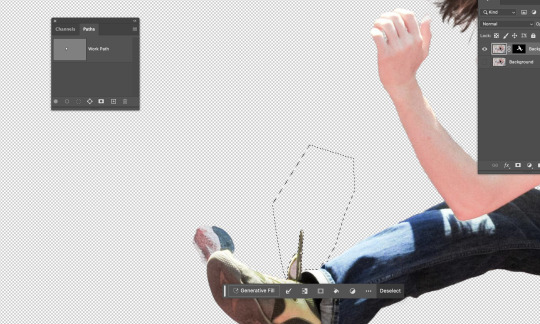
option delete in the mask with white as the colour to delete segment
command A - select all
command D - deselect
command i - invert selection
using the polygonal marquee tool and outlining the parts you want to delete then enter the mask and go option delete
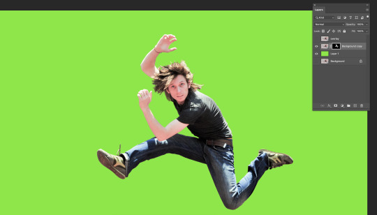
using the paint brush tool to erase and tidy up the hair, adjusting the size of the paintbrush to get in between the hair, to make it less spikey and un-natural you can change the opacity to make it blend easier and look less harsh.

turned it into a single layer file and put it into illustrator and used the pen tool to draw an S like shape, then created a heavy stroke and rounded the ends in the stroke menu.

Put it back into photoshop using place linked and placing it behind the man, using place link allows me to edit it in illustrator and save it then my changes will be transferred to photoshop automatically.

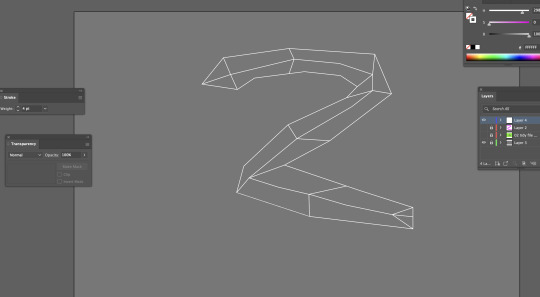
Went back into illustrator to use the pen tool to create a snake looking thing using straight lines and then adding the lines inside the snake with the pen tool and adding it to the points.

added colour to the segments by using the pen tool with coloured fill and traced the different segments with the pen tool, then saved on illustrator and it automatically updated in photoshop and then tidied it up using the paintbrush in the mask.

adding a background by copy and pasting one off the internet and pressing command t to enlarge it while holding option so it doesn't distort the image.
I enjoyed this task as it wasn't too hard but also allowed me to use and practice majority of the skills we have been working on in the previous sessions. I felt confident while working on this and was able to keep up and understand what we were doing. This task helped me to understand masks and painting with the white and black more as well as using the object selection tool to create an original cut out of the man, and then being able to tidy it up in the mask as well as with the marquee tool. It was also beneficial for me to know how to transfer images from illustrator to photoshop as that will be useful to know for projects. Overall, I felt confident with what i had done and my amount of knowledge and understanding i had by the end of the session.
0 notes
Text
Fundies 1 Week2 : Wed
Photoshop short cuts
B= brush
E= Eraser
Option delete= Fill selection with foreground colour
command delete= Fill selection with background colour
Window - brushes - general brushes TRY SOFT OR HARD BRUSH
[ ] Shift / enlarge tool
comand a= select (delete clears everything on that layer)
number keys: tool transparency
Option = colour picker
v= move tool
commnad d= deselect
command z= undo
In move tool photoshop will move whats under your pointer
comand j= copy selection to new layer
new layer mask
PATHS
create with pen and arrow to finish
window - paths
command click path thumb nail
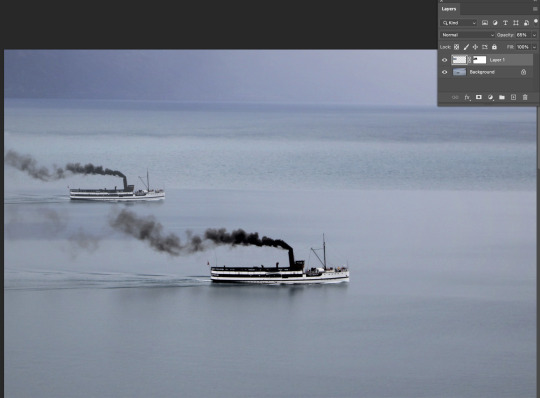
We began today by going the tools that you can use to draw things in photoshop. We played with the size of the brush and also the hardness of it. We also looked at the opacity which means how much colour is coming out of the brush. You can see this with the image above.


We first learnt how to take a part of a image and copy and move it to another part of the image. Above you can see we book the boat and made a copy of it and it looks like theres one further away. We had to fix the water at the bottom of the boat so it blends in to that part of the water. We also bluffed the back boat to make it look more further away and made it smaller than the closer boat.

2. Next we learnt how to select a part of the image in this case the orange and learnt how to change to colour of it using the hue and saturation tool.
3. For the plant image we learnt how to draw over a part of a image to select it. Because has alot of curves we have to use the pen tool and make curves. Once we did that we could go back to the point and move them to make sure they are in the right place. Once we had done that the front leaves were selected and we could change the colour of them by using the hue and saturation tool.

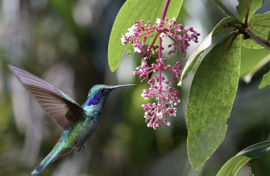
4. We lastly learnt how to cut out a object in a image and move it to another background. It was harder with this bird because the outline didn't capture everything because of the wing edge being blurry.
0 notes
Text
W2D2 fundies (software)
(more) photoshop tools:
layer 1 is transparent and background is solid
b = brush
e = eraser
option, delete = fill selection. (if nothing is selected it will fill the whole screen)
shift, command, delete = fill selection wth background colour
window, brushes, genera; brushes = brush options (main 2 are soft or hard brushes)
can get soft or hard erasers too
[ ] = shrink or enlarge brush stroke
command A = select all
delete = clear everything on that layer or selection
number keys = tool transparency:
1=10% 5=50% 9=90% 0=100%
option= colour picker
command D= deselect (so helpful!)
command z = undo
shift, command, z = redo
hold down v then option and copies selection
-in move tool photoshop will move whats under your pointer
command j = like paste in place
holding shift = add to your selection (shape).
holding option = subtract from your selection
holding space = reposition the selection segment.
masks:
new layer mask looks like black and white japan flag (beside layer adjustmentd)
white pixels means visible
black pixels mean clear
option click mask to see inside
when using mask and using black brush make sure you are on the mask part of ur layer and not on normal layer
command t = tranform gizmo
in adjustment layer properties pallet there a setting that effects only the layer you are on
p = pen
same as illustrator really.
arrow, direct selection tool (the one that looks like mouse) same as A on illustrator.
window, paths, command click = shows paths an make adjustments after clicking.
shift command i = inverse selection
messing around with pen tool on photoshop. we used brush (b), eraser (e), fill selection which s just what you have selected and then option - delete. we also used shift - command - delete which is fill selection with background colour. We also played around with brushes and found how to access all the different brushes that are available. I found a spotted one and played around with it. the square brackets means you can change brush larger or smaller quicker. command a was select all -which is different than illustrator that uses A for direct selection tool (on photoshop its on the tool panel). we also played around with transparency.
we also learnt taking cuts out of selections, like circles and overlay another circle a scissor tool shows up and allows you to cut the shape. when selecting while holding shift you could add to your selection (shape). holding option you could subtract from your selection. holding space allows you to reposition the selection segment.
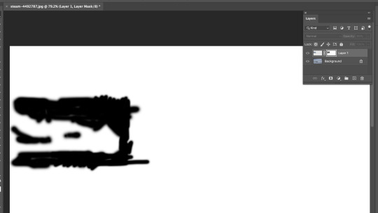
we also learnt layer masks, which is a good tool to help edit in other images to photos seamlessly. in layer settings beside image adjustments there is a tool that looks like a little japan flag and you just select the layer you want a mask on and then click the layer mask button. you can then click into the mask by option - lick. then you just can use black pen in the mask selection to rub out part of the mask. so for the boats above i used black pen to rub out the water around the boat we added in so it looked more realistic. then we changed free transformed the boat to make it smaller. then made the boat lighter by turning down the opacity so the boat looked further away in the distance.

bird edited ready to go into new photo. turned background into layer one so there was a transparent background. used = image - image rotation - flip horizontally to flip bird. then used pen tool to make the wing cleaner so there wasn't any of the original grey background when the image is put into its new background. doing this with the pen tool did get rid of the grey colour but it made the lines very clean and removed the blur effect of the beating wings. so we went back in with blur tool and blurred the ends of the wing and tail so the bird looked in motion still.
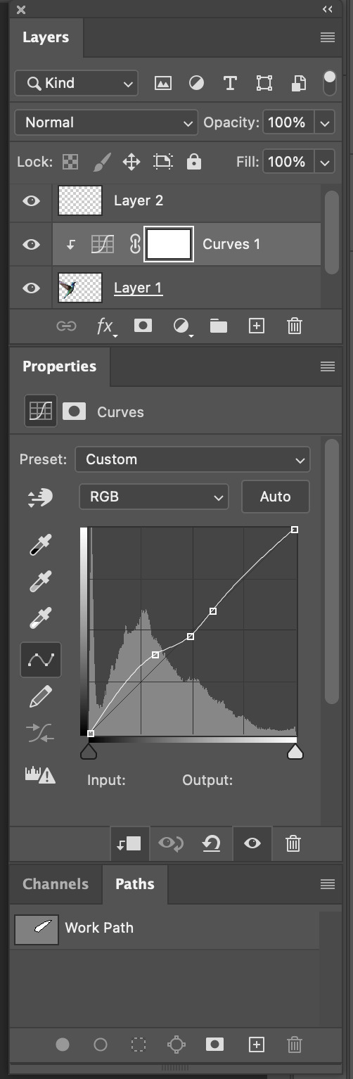
some of the settings i used when i put the bird into the new backround. then we used curve adjustment to make the bird look like it had the same lighting as the background picture, which makes it look more realistic. i used the square box pointing down tool to make the curve settings only apply to the bird. for a little extra fun i created a small segment copy from the background and created a 2nd layer of some small flowers which i placed in front of the birds beak so it looked like it was getting food and actually at the plant. You can see this in my final image below.

really enjoyed this task it was fun. :)
0 notes