#retro tutorial
Explore tagged Tumblr posts
Visit Tumblr Blog
Explore Tumblr blogs with no restrictions, modern design and the best experience.
Last Seen Tumblr Blogs


Fun Fact
There were a total of 171.5 billion posts on Tumblr in 2019.
Note
Your VTM comic book covers are simply GORGEOUS, I'm totally in awe! How did you get the super cool halftone/coloured dots effect? It looks super cool and realistic, I love it! Have a lovely day! :)
Thank you so much!
So to get the halftones, I use an old-ass tutorial I got off deviantArt literally....more than a decade ago? (Rosalarian's Golden Age Tutorial). The account appears to be deactivated, but I'll go through the steps here:
For reference, I bounce between Clip Studio Paint and a very old-ass copy of Photoshop, but if you're using other programs that have fun pixelate filters and you can change the color mode, you should be ok.
NOW...
Ink your drawing in straight black on its own layer
Block your colors on another layer (I hunted up some old comic color palettes thanks to madformidcentury dot com/2013/10/mid-century-color-palette-in-comics dot html)
Turn off any and all blackwork (this is INCREDIBLY important), and take your colorwork into Photoshop. (if there are any gaps in your color work, fill a separate layer with white and then merge the layers so it's all solid)
Set the mode to CMYK
Go to Artistic Filters >> Pixelate >> Color Halftone (the only thing I mess around with is the size of the dots; the default for my era of Photoshop is 8 and that's a lil big for my taste--all the VTM covers are between 4-6. It's up to your own best judgement, but I go by how "readable" things look--does the face still look like a face at a reasonable distance or is it just a smudge? If it's not readable, undo and change your dot size)
Add 3 new layers to your document and LABEL THEM: Cyan, Magenta, and Yellow
Then go to your channels panel and click on the Cyan layer to make a selection of it
Back to your Layers panel, make sure you're on your Cyan layer, and SELECT INVERSE
Then FILL the selection with the CMYK cyan that you've picked out
Deselect your selection, move to the next layer (and make sure you've got CMYK magenta in your bucket) and repeat steps 6-8 selecting Magenta and Yellow respectively
NOW you've got the beginnings of retro-feeling halftone. At this point, I import the halftone manipulation back into CSP and turn my blackwork back on.
For the ✨ grunge ✨ effect, I grab an old paper texture (after reducing its saturation and upping the contrast until it's mostly black and white splotchy) and set it to OVERLAY at anywhere from 50-20% (this is a 'let your soul decide' moment) over the whole thing
Then I grab another old paper texture and put underneath the Overlay Texture Layer, on MULTIPLY, at anywhere from 65-25% (again, let your soul decide). Both layers will give you a nice level of funk to go with your halftone shenanigans
A lot of the colorwork is going back and forth and back and forth because what looked ok in flats didn't translate after toning, but it works out eventually!
Some important things to remember:
Cool tones tend to fade back and warm tones tend to move forward if you're gonna use this method on any kind of scene
Keep your shapes SIMPLE; don't get bogged down in tones of gradients and fades and all of that because most of it WILL NOT come across once you start toning! Think of it this way: mass-production doesn't have time for fine detail, that's why comics are a lot of heavy black inks and flat color contrast
Experiment with the colors! You're working in a limited palette (if you're using any of the old Marvel/DC print books especially), and it doesn't have to be photorealistic/absolute. For instance, my Nos isn't actually green, but the tone suited the funky retro vibe so I went with it!
Let yourself fall down the research rabbit hole of pulp covers because they're both hilarious and informative. Same dot energy is an interesting collection website to go through, you can also go through your search engine (remember to add -pinterest -youtube to your search term to filter out that crapola)
HAVE FUN!
💖
25 notes
·
View notes
Text
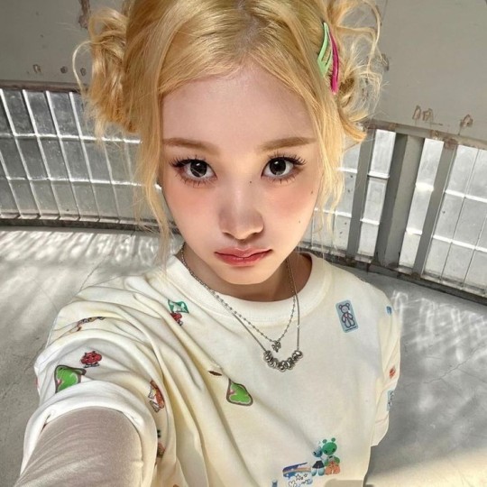
🥖 𝓨𝗈 𝗍𝖾𝗇í𝖺 𝗎𝗇𝖺 𝖾𝗌𝗉𝖾𝗋𝖺𝗇𝗓𝖺 ᭪ᬻ𓏸𓈒゚⃝
𝅄 ི۪۪۪ ֯ ּ ֗ ۫ 𝖤𝗇 𝖾𝗅 𝖿𝗈𝗇𝖽𝗈 𝖽𝖾 𝗆𝗂 𝖺𝗅𝗆𝖺 𝅘𝅥𝅮♪ ˟̫ː᜴ 🍰


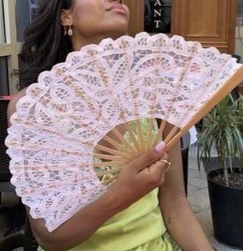
#꒰ atsubie ꒱ ౨ৎ︵⠀⠀#gif by me#heres how the mb from my tutorial turned out ☆#ㅤㅤㅤㅤㅤㅤㅤㅤㅤㅤㅤㅤㅤㅤㅤㅤㅤㅤㅤㅤㅤㅤㅤㅤㅤㅤㅤㅤㅤㅤㅤㅤㅤㅤㅤㅤㅤㅤㅤㅤㅤㅤㅤㅤㅤㅤㅤㅤㅤㅤㅤㅤㅤㅤㅤㅤㅤㅤㅤㅤㅤㅤㅤㅤㅤㅤㅤㅤㅤㅤㅤㅤㅤㅤㅤㅤㅤㅤㅤㅤㅤㅤㅤ#stayc layouts#stayc moodboard#stayc j#kpop icons#kpop layouts#messy moodboard#kpop themes#kpop moodboard#kpop aesthetic#alternative moodboard#alt moodboard#colorful moodboard#yellow moodboard#pink moodboard#indie moodboard#y2k moodboard#fresh moodboard#nature moodboard#soft moodboard#simple moodboard#maximalist moodboard#retro moodboard#vintage moodboard#dark moodboard#edgy moodboard#divider by im4yeons
234 notes
·
View notes
Text

Barbie and the Three Musketeers ♥ 2009
#barbie and the three musketeers#barbie#barbie movies#barbie movie#barbie classics#nintendo ds#video game#dailygaming#dailyvideogames#pixel art#pixel#pixel game#nostalgia#gif#y2k#2000s#2000s games#2000s nostalgia#barbie nostalgia#retro barbie#ysigifs#that view from the window is genuinely breathtaking#AND AGAIN this room is barely used!!! it looks gorgeous but you can only visit it during the tutorial for each character!!!!!!!
144 notes
·
View notes
Text


Tutorial: C64 Meatloaf Part 2 - Overview of the functions (German)
66 notes
·
View notes
Text
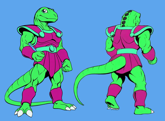
Using Vidu to Make Character Turnarounds
Disclosure: I am in the Vidu Artist Program.
Having (at the very least) front and back reference greatly improves the quality of character image prompting. And very often, one finds that they were lazy and only got a couple of bits of character reference. Or they have tons of it in the wrong art style.

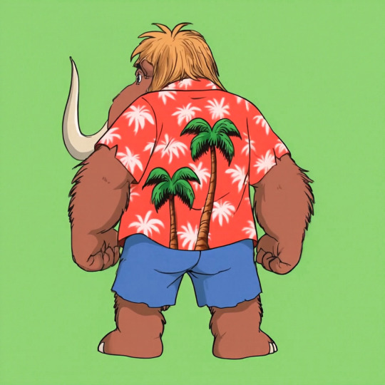
A character like Wally Manmoth requires some good reference to work right.
Now, it's not that hard to prompt up something that matches close enough and then modifying the stuff manually until it works, such as I did with TriceraBruce and DeinoSteve:


You can tell Steve's the bad boy because he's got a cool rip in the back of his jacket.
But for Wally, I decided to try out Vidu as a means of getting turnaround frames.
So I loaded Wally's front-view pic (above) into the image-to-video feature, and prompted with:
vintage traditional animation scene (1985) humanoid mammoth/furry elephant wearing a red hawaiian shirt and blue shorts, by filmation and sunbow productions, 90s colors, friendly on green background, streamlined black line art with cel shaded vintage cartoon color, official media, character design fullbody shot on green background. The mammoth-anthro starts facing the camera, turning around to face away from the viewer, providing a view of his back.
I gave it two shots at the 720x quality setting (12 points per, total of 24), and got:


Huh. Weird it happened twice, etc.
This demonstrates both that the tech is viable for this use, and the reason you'd want to have that multi-view reference. The robot clearly assumes that a luau shirt would have a large print on the back, whereas wally's is a more basic print. That's ultra easy to fix, though.
I started by exporting the last frame of each (or close to it, picking the one that looks cleanest)

While its image editing features and often touch-and-go, one thing the Midjourney edit feature has going for it is it's utility as an upscaler. You load the image in, make your tweaks (just a little bit of background if you're just upscaling) and then upscale and at the very least you have 2048x2048 worth of resolution.
I used the midjourney edit process, that got those two images to the following state, as a test.


The results are good, but getting the large trees to erase-and-replace out took several attempts, and just doing it in photoshop then using the editor to upscale would have been faster.
This is why we do tests.
I went with the slightly-at-an-angle one for the main reference sheet. I'll be keeping the straight-on-back-shot in case it winds up being useful for specific scenes down the line.

In photoshop, I touched up the shirt print, made sure the colors where consistent, and simplified the hair coloration to something more period-plausible.


No more giant trees on the back! On the other hand, I think the feet sprouting toes on the heel is going to be something I'll be fixing frame-by-frame until there's another revision.
Human characters will induce these issues less often. I just stick with my genre of choice.

Midjourney was not cooperating with TyrannoMax (it really doesn't like giving him the proportions I like, preferring to make him a weird big-head salamander), so I went the same direction, resulting in this stage 1 front/back:

Only Midjourney refused to work with it, at all. Declaring everything that came out of it too lewd for its internal censor. Apparently, this hunky relative of cheesasaurus rex is too sexy for general consumption. Nevermind that it's a cartoon lizard in a shade tangello orange.
The workaround is too dumb for words.
Slam the hue slider until it's off anything that could be perceived as a human skintone.

Then make the modifications. Here I had to rework the leg several times, and do a lot of tweaking to remove-overinking. Then I popped it back out, droped it back into lineart, re-colored it, and and composited it back together:

And voila, a front and back for Max. I shortened his tail, as the longer tails have been causing problems with confusing the image prompting systems. The armor skirt has scallops to accommodate the tail, which looked better more consistently than the flaps folding around the tail.


The results are, thus far, encouraging.
Of course, if the back of your character has any unexpected details, you're going to have to add those in after the fact or include them in the prompting, and you're going to be making a lot of edits regardless (as you should).
Oh, and Max has a sword now.

A blade of amber crystal with a fossilized femur grip and a faceted dino-eye that should be far enough away from the Eye of Thundera for safety. A roleplay-toy friendly trademark weapon, usually a sword, was a must-have for 80s action-adventure lines despite the fact that you'd never see it used on anything that wasn't a robot, living statue, or skeleton.
Thus the sword's gimmick is it cleaves through non-living matter with ease but anything BS&P doesn't want subjected to a stabbin's is encased in amber crystal: locked in place if partially encased, put into suspended animation if fully encased. A nice, nonlethal use for a magic sword.


It's proportioned like a gladius, but is generally interpreted as larger, approaching a broadsword, in keeping with the generally ridiculous blade sizes of kidvid fantasy. They're just more fun when they're stupidly huge.
Is "Sword of Eons" too on the nose?
#tyrannomax#tyrannomax and the warriors of the core#vidu ai#midjourney v6#niji journey#animation#cartoons#retro#fauxstalgia#unreality#ai tutorial#vidu tutorial#vidu speed
73 notes
·
View notes
Text
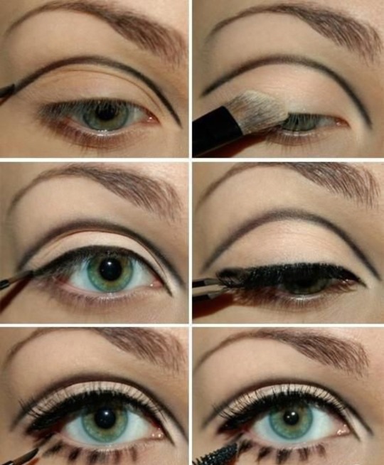
Twiggy makeup
#twiggy#60s#60s aesthetic#60s vibes#vintage#retro#green eyes#eye makeup#eyeliner#eyes#aesthetic#makeup ideas#makeup inspiration#makeup#makeup inspo#lashes#coquette#lana del rey#tutorial#makeup tutorial#makeup tips#makeup tumblr#makeup trends#moodboard#70s#hippie#60s makeup#60s retro#60s girl#60s glamour
441 notes
·
View notes
Note
Hi! I saw a post where you had a game made in godot with old school rendering, do you maybe have any tips on how to make godot render a game like that instead of its normal rendering method?
I'd be right happy to!
I'll try to make this concise lol, I always end up overexplaining and then getting lost in the weeds. Buckle up, it's a loooooot of little little things that all add up.
First off, you should decide which look you're going for. N64 and PS1, the two consoles I'm emulating, both had drastically different specs. (plus, there's plenty of other early 3D systems I've not even touched!)
The N64 had texture filtering (textures were interpolated aka "blurry"), it had floating point vertex precision (points moved correctly), it had perspective correction on its textures (no warping)
The PS1 had no texture filtering, no floating point vertex precision (vertices snap and pop around), affine texture mapping (textures warp weird). I also think the color space they operate in is different? Don't quote me
So you can go hard one way or another or pick and choose what you think looks good! We don't have anywhere near the hardware restrictions they did in the 90s so go nuts.
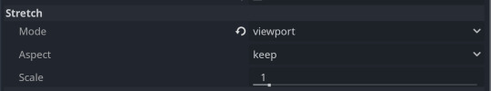
RESOLUTION
To get a low resolution window, I set the window size of the game and the window override size to different amounts

In green is actually how big the window is on my screen (4k monitor) and in red is the retro resolution I want. If you set the stretch mode correctly (an option a little further down the Window tab) then it'll make the pixels big
COLORS
Now the PS1 had the capability of showing you over 16 million different colors, but it could only display 50,000-150,000 at a time, so in order to get more fidelity out of it, the engineers implemented a dithering effect to better blend the otherwise sharp edges between colors.
I used this shader to achieve the dithering effect. If you don't understand shader languages, that's fine. There are a few different pre-built ones for looking like the PlayStation 1 out there.
TEXTURES
Textures for the PS1 could be as big as 256x256, but they were typically 128x128. And they would squish everything a model needed into there usually, at least with like player models and objects and such.
As mentioned, if you're not good with shader language don't worry. There are countless resources out there that people will either let you use or teach you how it works. But I'm gonna touch on it a little bit here.
PS1 textures had no pixel filtering, so you could see individual pixels.
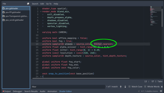
This is what determines that in the shader code. If you want it to look like the N64 (blurry lol), the proper hint is "filter_linear". Note that it won't be 1:1 with N64, cuz they used bilinear filtering (which kinda sucks and causes weird quirks) whereas now you'll only find linear or trilinear filtering. It's a negligible difference imo.
PS1 textures also were only saved using 15 bit color. I'm told that Photoshop's "Posterize" filter set to 32 can achieve this, but don't use photoshop if you can help it. I use GIMP, and while a newer version might have a posterize filter, or there may be a plugin out there, my version doesn't so I cluge it a little.
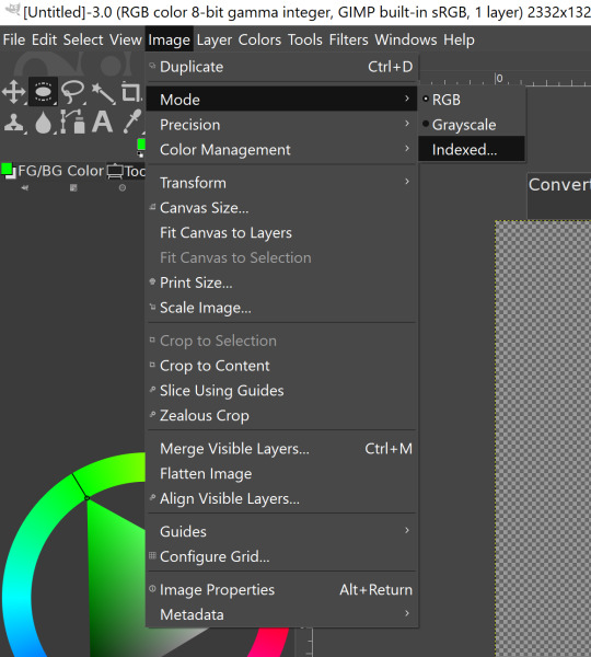

Change your color mode to "indexed", set color dithering to how you like it, and the number of colors in the palette to a number to get a good result. Usually I'll do 16, 8, 32, but occasionally I'll cheat and do a non-multiple-of-8 teehee >:3c
You can change it back to RGB after to make further editing easier.
LIGHTING
N64 and PS1 both implemented vertex lighting, as opposed to the more modern and (now) ubiquitous per-pixel lighting. Godot as it is right now (4.2 i think?) claims it has vertex lighting that you can set as a shader property but they're lying and it doesn't work yet.
The old consoles could only handle like, 2 lights though so it doesn't matter much.
The real star of the show, and in my opinion the one thing that makes a game most look like the 90s is the inclusion of vertex colors.
By multiplying the color of your texture by its stored vertex color, you can do all the shading yourself!
Plus you can reuse textures like crazy just by coloring them differently. The N64 also made heavy use of vertex colors by forgoing a texture on models entirely and just painting them using verticies. The only textures on SM64 Mario are his eyes, stache, hat emblem, buttons, and sideburns. Everything else is done with vertex colors.


Here you can see this level from my Crock Land with no vertex coloring, with some of the vertex colors only, and then with the two combined.
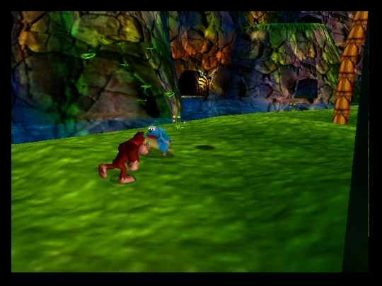
Rare loved this. Look at how colorful that cliffside is in Jungle Japes. It makes it so much more interesting than just a brown cliff face. Plus you can see the vertex coloration instead of textures at work on DK and the Gnawty.
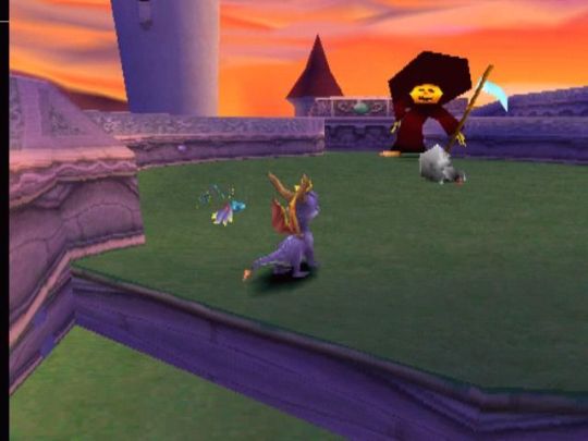
My go-to example for PS1 is always Spyro, what a gorgeous game. All of those colors there are not made by a light or an environment. They're hand painted babey! Also! With spyro! The skyboxes are actually just huge domes made up of vertices that are colored in different ways! That's how they can look so colorful and "hi-res".
There's plenty more you can do, like adding a CRT filter or a little bit of chromatic aberration which I haven't gotten into yet.
The way I've learned all this is just by being curious as to how the old consoles did their thing, and slowly accruing the knowledge over time. There's still infinite stuff I don't know too.
I hope that helped! And wasn't too longwinded or confusing! Like I said, it's all about piling up tons and tons of little things, small details, weird graphical quirks that really bring out the retro 3D feel for me.
And I didn't even get into the modeling side of things! That's an entirely different "color-of-the-sky"-sized post though.
I'd be happy to re-explain or explain more about any of this!
214 notes
·
View notes
Text
I just posted a character texture deep-dive where I take an in-depth look at one of my character textures used in Of Love and Eternity ✨
Watch the full breakdown by becoming a patron! There's a link to that in my bio 🎊
P.S. The video includes a surprise face reveal 🎃
#indie dev#indie game#indie game dev#low poly#3d#3d game#game art#retro style#retro game#retro aesthetic#tutorial#art resources#game development
46 notes
·
View notes
Text
youtube
This video by "Employee A" basically motivated me to try and recreate Korean 90s looks IRL, until then I was like "no way anyone can walk around like this". So yeah. I had been searching for the advert that was shown in this video for THE LONGEST TIME until I found it recently :
youtube
#retro#90s#1990s#90s makeup#makeup#90s kdrama#80s aesthetic#90s aesthetic#90s tutorial#makeup tutorials#kbeauty#90s beauty#inspo#makeup inspo#Youtube
13 notes
·
View notes
Text
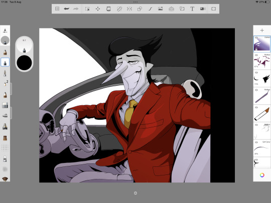
Retro tutorial?
Disclaimer: Tumblr, for some reason, likes to dullen the colour of the screenshots, just know that they're actually a bit more saturated and brighter than how they appear here.
So, after posting my recent retro drawings on Reddit, and getting some comments that genuinely made me cry (/pos), I noticed I also got quite a few comments asking me how I actually do these drawings.
Er, I'm not the best teacher, really, and honestly, there's probably an easier, faster way to do it. But, this is my way of doing it, lmao. I work on a Gen 2 iPad Pro with a Gen 1 Apple Pencil, just in case you're wondering.
Firstly, here are the four apps I use for this kind of drawing:

From left to right: Sketchbook Pro, Pixlr, Photoleap and CapCut. Sketchbook Pro is what I use to draw everything. You could honestly use any drawing app though. We will talk about the other three when we get to them.
Step 1: draw whatever it is you want to draw.
I'm going to use the first drawing I did in this style to help me explain: my simpy Spamton drawing! Firstly, basically draw whatever your little heart wants. Get your sketch layer down. Here's what my sketch layer looked like:
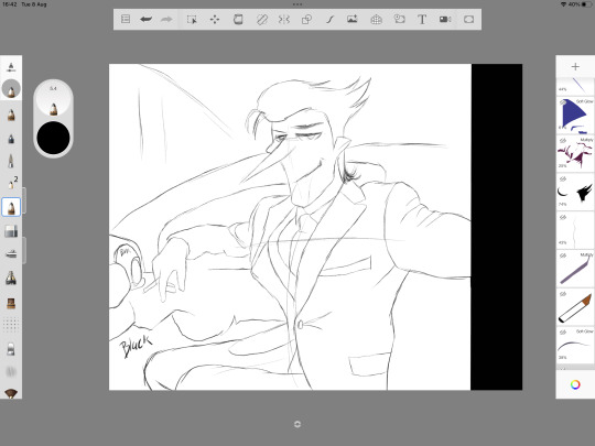
Looks bad, no? Lol, it always starts that way. Just get your drawing down first. I rely heavy on references for clothing. I found this particular pose on Pinterest. Pinterest is great for finding references.
Notice that I have some spaces filled in with the word 'black'. This is literally just to remind me that the particular space will just be filled with a solid black.
This particular pose and setting is tricky, I'm just using it as an example and because I still have the original files for it. I recommend maybe starting with a portrait or a face first.
Step 2: fill in and clean your lines. This is important, especially for the anime look.
When I do linework, I tend to make the lines thicker wherever they meet one another. For this style, it doesn't really work, and I had to train myself to stop doing that.
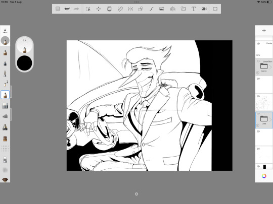
As you can see, I made some changes along the way, such as making Spamton's expression softer and making him grin instead of smirking. How do I know when to make something solid black? This is mostly for clothes. If you are following a reference, and you notice that some of the shadows are darker than others on the reference, make those darkest shadows your solid-blacks.

So, here we have the finished lines! Remember: no making the lines thicker where they meet! Keep the lines thin all around. If you're wondering what brush I use in Sketchbook for the finished lines, it's this one:
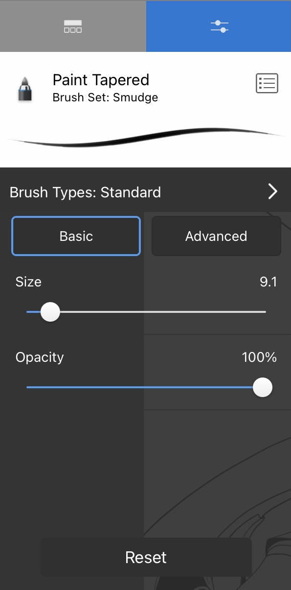
This is the ONLY brush I use for the retro drawings, besides a pencil for the sketch layer. It provides a nice, solid, thin line.
Step 3: Filling Flat Colours.
The easiest step IMO. Choose your colours, fill those babies in.
Unfortunately, I think I deleted my flats layer (I have no idea why, but I cannot find it, lmao), so I don't have an image to show for this step. But, it's self-explanatory. Just colour it in with your flats.
You can choose saturated colours if you wish, but we'll be editing that sort of stuff later.
Step 4: Shading.
Ooh, the tricky stuff. But this is what will make or break the look of the drawing. Besides lines, shading is important as fuck for this style. I recommend pulling up some screenshots from actual 80s/90s anime. For this Spamton drawing, here's some of the ones I used as a reference:
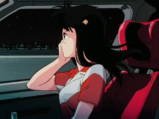
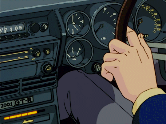
Remember to make your shading on separate layers! You may want to change their tone and opacity later, as I did.
The shading in old anime is usually done with one colour, which is cooler-toned than the flat it is based off. Remember to keep the shading as simple as you can if you want to actually make it look like a screenshot from an anime or cartoon.
For shadows, I used the multiply tool or the overlay tool. You can mess around with these to see which one suits your drawing best. It mostly depends on the colour.
For 'lights', I used either the soft glow tool or the overlay tool. However, I don't recommend spending too much time 'lighting' your colours. Retro anime tends to focus more on shadows rather than lighting (obviously there are exceptions).
As you can see, the only 'lighting' I used on Spamton was a small section of his hair, and a shine on his suit. The rest is either shadows or flats:

For clothing, follow a reference or follow where your light is coming from. For this, I followed the reference.
Step 5 (Optional): Adding Gradients.
You don't need to do this, but to help with the 'mood' of the drawing, I added a gradient over the top of the layer. I chose a dark purple/blue to give that city vibe, then I used the darken tool and turned the opacity down. So, it looks like this:
The difference isn't much, but it will add a lot to the vibe!
Step 6 (Optional): Backgrounds. *Shudders.*
I'll be real, I can't do backgrounds for shit. Well, I can sort of do them, but I definitely don't enjoy it. If you can do your own backgrounds, this will probably come easier. I have a sneaky, maybe cheaty method, however, to make it look good.
Firstly, make sure any 'windows' or areas in your drawing that you want to add a background to are empty. The windows in Spamton's car here are transparent. You'll want to put your background layer at the very bottom, behind everything else.
Firstly, I choose a solid colour and fill the entire layer. I chose a navy/purple for this one, since it's always dark in Cyber City.
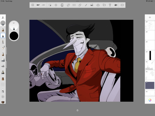
Then, and here's the cheat part, I find a stock image of a city skyline. I deliberately picked one that had sort of 'basic' buildings. Put this on top of your solid colour and use the hard light tool.
The hard light tool tends to focus on the lights and basic outline of the image. I did do some smudging and added some lights to give it that 'retro' feel. The lower quality it looks, the better. So then it looks like this:
But the car needs windows! Easy. I chose a blue colour with the soft glow tool and added them like so (on top of all the background layers):
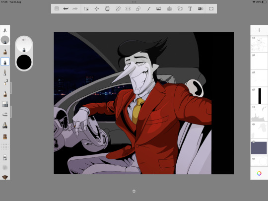
Step 7: Editing in Pixlr.
Now, this is my favourite part: the editing to really make the image pop! Firstly, we are going to use Pixlr, so save your image and open it up in Pixlr.
So, in Pixlr I only do two things: choose some overlay editors and up the saturation. Firstly, the overlay editors. The ones I choose for the retro look are:
Antonio - this blurs the lines somewhat, and makes it overall darker/softer. I obviously do not use it to its full capacity (there's a slider you can mess around with under each tool to find your desired effect, though I recommend using Antonio only a little.)
Hagrid - this will make it look slightly more saturated and sharper. It also adds a sort of 'burn' effect on each outline of the colours. Again, I use this one only slightly.
Ivan - One of my favourites for Big Shot Spamton. Again, I only use it slightly. This one will add an orange effect and 'fix' some of your shading. Though, it only works to its full potential if you have your shading as best as it can be.
Sara - Another really good one for retro anime. It's sort of like Hagrid, but softer. Depending on your colours, it will also add a soft 'glow' effect. Because of this, I only use it a little, as older anime does not have the intense glow you see in more recent anime, in general.
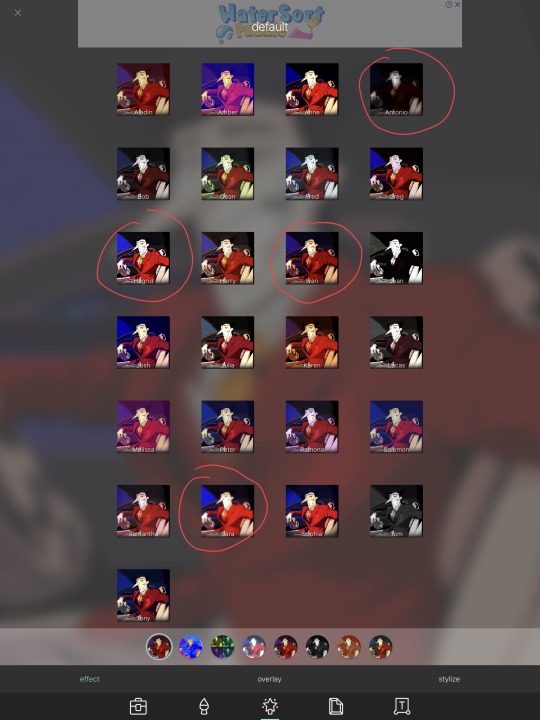
There are lots of other options. You can play around to see which one will suit the vibe you're going for best!
Then, we go into the general menu and up the saturation if needed!
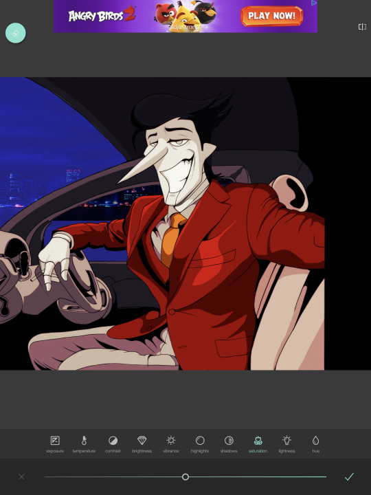
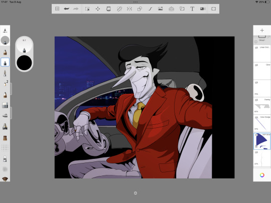
Step 8: Editing in Photoleap - then back to Sketchbook!
Why the fuck do you use two editors? Simple - Photoleap has some cool options that Pixlr does not, and vice versa. We won't be spending as much time in Photoleap compared to Pixlr.
Now, Photoleap does NOT allow screenshots within the app, so I just have to explain it without any images.
In Photoleap, we're only going to be doing two things, and one of those things are optional. Firstly, using the grain tool. This will really add to that 'old' look. Don't go too hard on it!
The optional thing you can do is add a red chromatic abberation. It's under the 'effects' tab in Photoleap. However, sometimes this will take away from the retro look, so use it carefully. I only used the tiniest amount for this drawing to make the lines look 'cleaner'.
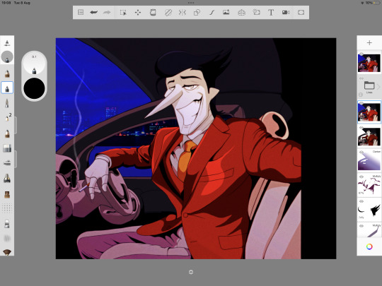
Once I'm done in Photoleap, I save the image and export it back into Sketchbook. This is where I'll add/fix some things, such as adding a shine in Spamton's eyes, a shine on the car window and the smoke coming from his cigarette. I also bring the gradient layer back up and mess with the colour a bit (optional).
Have you noticed the large, black border to the right of the drawing? Yeah, that'll be cropped. I decided to make the overall image smaller and, unfortunately, Sketchbook Pro does not allow you to change the canvas size once you've started a drawing (please add this option, Autodesk!)
Step 9: CapCut Editing.
This will seriously be the cherry-on-top to actually make this thing look like a screenshot. Save your image and open it up in CapCut.
Firstly, you'll want to add an 'effect' to the photo. Under 'retro', I personally choose 'frosted quality', because it adds a moving grain and gives an 'old cartoon' feel, which is what I'm after. There are lots you can choose from, it's up to you to play around with it! You can also adjust the effect as you wish. I tend to turn the blur completely off.
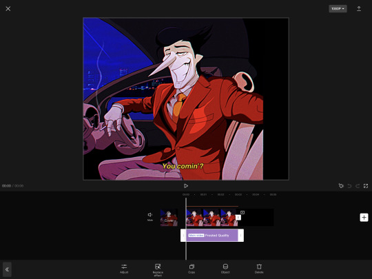
Then, the last step in CapCut: adding a caption, if you want. I make the text yellow and add an italic effect to make it seem like an actual subtitle.

Step 10 (Final): Exporting.
That's us basically finished! I'll export it as a video from CapCut, crop it using my iPad's default editing software in the gallery, then export it as a GIF. Exporting it as a GIF lowers the quality a tad further, which is a bonus for this type of drawing. Viola! You now have a retro-anime-inspired piece!
Final Notes
Again, I'm not a good teacher and this is kind of all over the place, lmao. But, I hope it can guide those who wish to try this style!
If you do try it, maybe tag me and let me see if my tutorial worked for you? Or maybe you were just curious, lmao. There's a LOT of steps here, lol, and I'm not a professional artist by any means, so...
Anyway, that's all from me for now!
342 notes
·
View notes
Text
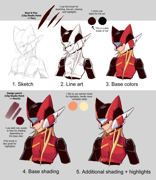
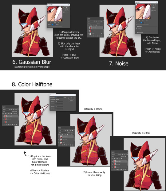
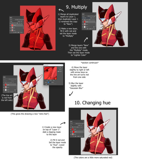
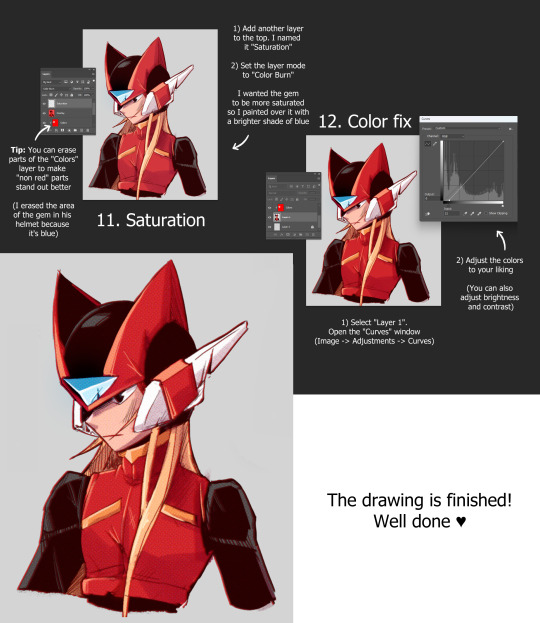
My drawing technique explained
(Programs used in sections: 1-5 Clip Studio Paint, 6-12 Photoshop)
#art#drawing#sketch#digital art#tumblr art#milaisa art#art tutorial#drawing tutorial#tutorial#halftone#retro style#photoshop#clip studio paint
54 notes
·
View notes
Text
A little preview of something I’ve been working on ❤️♌️
•
Guess I’ve been feeling nostalgic as I’m redrawing my Legacy of Winx OC’s AND reanimating my Sailor Senshi OC, Leo! I suppose I really meant it when I said I was going to learn OpenToonz since my CSP license is about to expire, I might even fully switch over!
•
Would y’all like to see a process/comparison video? The initial plan was to post a comparison gif like I did in 2019, but I love sharing my processes when it comes to art 🤔🤔🤔
⬇️Comparison gif under the cut anyway ⬇️

#after I finished that Flybeau animation I started watching more OpenToonz tutorials#and came across NobleFrugal’s Texture-in-Color which was the impetus for this project#because my biggest gripe with doing it before was how much labor it was overlaying the moving body texture with the BG#but with the FX nodes in OT and can just key it in and drop in the background!#Also also that retro looks I’ve been struggling to get in Davinci I can fully do in OpenToonz!#I just have to get OUT of the habit of turning off my tablet when I’m done drawing because my phone and tablet screens are more alike#my monitor has blue cast and a slightly lower resolution so the retro effect is dulled when I transfer it over to my phone#my art#digital art#fan art#fan animation#opentoonz#opentoonz animation#digital animation#hobbyist animator#amateur animator#sailor moon#sailor moon oc#sailor senshi#sailor soldier#zodiac soldier: Leo#retro anime#retro anime aesthetic#do NOT ask why I put Leo in the 4th house I don’t remember but it was in the storyboard#music and sound fx sourced from Sailor Moon Classic!#except for 2 specific sounds which come from Tropical Rouge: PreCure ❤️#I’d like to finish this before my birthday#but with less than three weeks before my internship I’d really like to use the rest of June for cosplay and sewing projects#I also have an embroidery commission that I should finish the bulk of before I leave#so this will just have to wait for now
10 notes
·
View notes
Text

Crochet Round Stool Covers 🌈
Add a dash of colour to your home with these seat covers. Ideal for using up scrap yarn, they’re a fab way to refresh an old dull chairs for a bright new appearance 🧶
#crochet tutorial#bar stool#cafe aesthetic#crocheting#yarn#granny stitch#easy crochet#cheerful#yarn crafts#retro lovers#design#makers#crochet#crochet pattern#summer crochet
7 notes
·
View notes
Text

Commodore 64 - Sending messages with Webnoter (German Tutorial)
53 notes
·
View notes
Text
Would you be interested in videos like this one, showcasing the design process for my Patreon? Working on the book prevents me from spending more time on video editing :D
#artists on tumblr#fantasy#fantasy illustration#character design#character art#dark fantasy#retro scifi#artbook#indie ttrpg#video process#tutorial#art tutorials#how to draw#worldbuilding#ttrpg#costume design#costume#character illustration#art tutorial#drawing#procreate#artwork#digital art#sketch#ilustration
7 notes
·
View notes
Text

Another iteration, another new color scheme, extract from this one we originally built 6 years ago in the recording of a tutorial
youtube
#after effects#tutorial#spiral#hypnotic#mesmerizing#loop#motion#retro#moodboard#seamless#gif art#animation#trapcode#trapcodeTAO#Youtube
58 notes
·
View notes