#krita tutorial
Explore tagged Tumblr posts
Visit Tumblr Blog
Explore Tumblr blogs with no restrictions, modern design and the best experience.
Last Seen Tumblr Blogs


Fun Fact
Tumblr is used by 21% of adults online aged 18-29 years.
Text
Krita tutorial the way I know it.
Basics: What is where.
Gimmicks.
Specific advice on specific tools.
Basics: What is where.

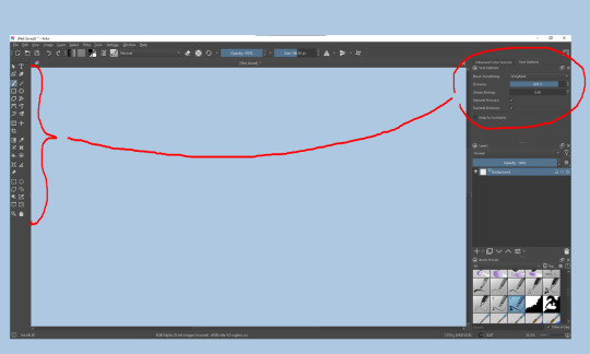
Upon opening the program this is what you're met with. First of all, must comment: The layout is HEAVILY editable so you can just drag menus anywhere you want, even leave them floating amidst the sheet you're drawing on.
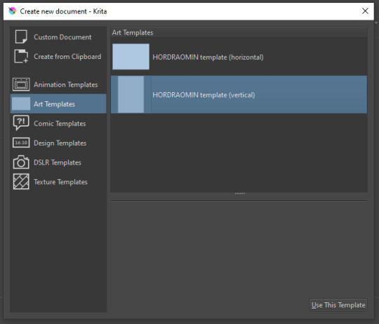
You can create custom art templates, I have two o'mine here as both have my signature background color.
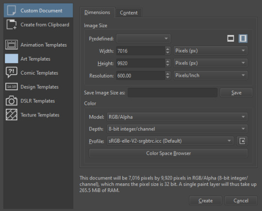
As well, you can edit the custom document settings, as in what size you want it, what resolution, even the initial content of the image. As well you can create from clipboard: Just copy some image from your browser and Krita will recognize it (useful for making meme edits lol).

Now, once you have your file, I will show you what is where.
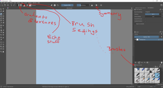
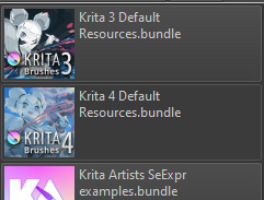
Brushes:
Brushes are easy to edit and there are tons of free bundles to download online. I myself only got one bundle, Jackpack (bit hard to find now due to original source being lost, it is still available but bit tricky to come by).
There. Are. Tons.

Some of these are my custom brushes for calligraphy in neography, you might even guess which ones. You can edit existing brushes, make new ones from the ones you've edited without changing the original, and all sorts of stuff (more below in the third chapter).
There are numerous packages of brushes once you enter Krita, but only one/two are available when you first open it. To unlock them all, click here:
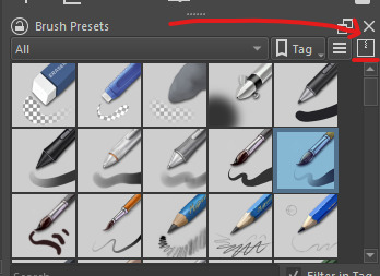
And make sure all bundles are dark gray in color (example of both dark and light below).
Now Tools Options: those will pop up depending on what tool you're using.
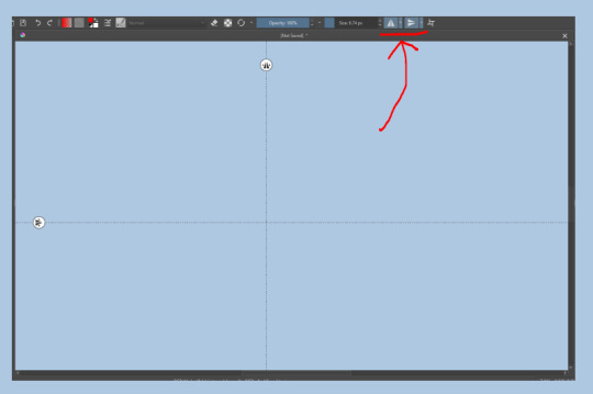
Symmetry: Fun stuff. You can drag the lines depending on how you need them and then center them back to the center of the screen if needed.
Gradients and Textures also have their tools options, you can play with those to get the feeling what they can do (more in third chapter).

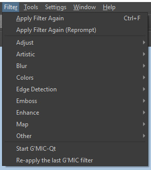
The Filters tab is useful too. Blurring, motion blurring, color mapping, artistic filters and all that: Quite fun.
Gimmicks.
Krita allows you to customize your workspace freely. Floating menus, tabs, anything you want. It has quite many drivers at that-
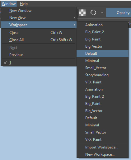
To access the workspace templates, go to Window and choose Workspace.
Krita allows for copy-pasting any image onto the sheet. Though, for me it sometimes crashes if I accidentally copy-paste text into it without choosing the Text tool first.
The software allows for both raster and vector work. It is basically Photoshop sharpened to be used by artists primarily.
There are some interesting mechanics regarding the Eraser (default bind E).

You can use it with any brush, allowing for textured erasure/quick work. Good for sketching.
You can use it on gradients (given there's a transparent point on the gradient preset).
There's a Multibrush tool:

People say Krita is good for animation but my brain can't wrap around it yet honestly @~@.
The keybinds:
B - Brush tool.
E - Erase tool option.
M - Mirror (useful for checking accuracy from a new angle).
Ctrl - Color pick (when used with brush or other color-using tools).
Shift+L.Mouse+drag - Changes the size of the brush by dragging left and right.
Ctrl+E - Merge layer with the one below.
Ctrl+G - Group selected layers.
Ctrl+A - Select whole sheet.
Ctrl+Shift+A - Deselect everything.
F - Bucket tool.
G - Gradient tool.
Ctrl+S - Save document.
Ctrl+Shift+S - Save As document.
Ctrl+N - New document.
Ctrl+O - Open document (will be seen in a new tab on top of the sheet).
Ctrl+C - Copy selected layer or selection.
Ctrl+X - Cut selected layer or selection.
Ctrl+V - Paste copied/cut layer or selection.
Q - Multibrush tool.
R.Mouse - Interesting thing: Opens up a quick selector for brushes and colors you've already used in the piece.
1 - Zoom 100%.
2 - Zoom to fit the piece vertically.
3 - Zoom to fit the piece horizontally.
4, 5, 6 - Turn 15 degrees (4 and 6) or undo the turning whatsoever (5).
Ctrl+I - Negative filter applied to layer.
Ctrl+U - Color editing on the layer.
Ctrl+Y - Soft proofing mode (for color mistakes and stuff like that, mostly annoying for me tbh).
Ctrl+T - Transform selection/layer.
Ctrl+R - Square select tool.
Ctrl+J - Lasso select tool.
Honestly you can just hover your mouse over tools and see their shortcut binds, as well. Or edit them in Settings.
Specific advice on specific tools.
Brush:
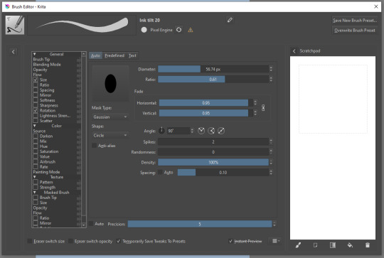
Brush editor is a great tool for making custom brushes, and it even has a sratchpad to test them out. Lots of settings, but no need to be afraid; Most of them you might never use on purpose.
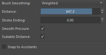
Use Brush Smoothing for great and pretty lines in lining pieces or making calligraphy.
Gradient:
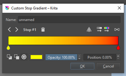
The four icons to the right top are:
Mirror gradient.
Arrange by lightness value.
Arrange by color value.
Space the stops evenly.
Click the gradient to add a new stop. The three things to the left are:
Make the stop use Primary Color.
Make the stop use Secondary Color.
Make the stop use a fixed color.
317 notes
·
View notes
Text
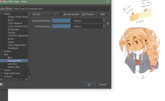
so i discovered filter layers on Krita today (I've been using filter masks more so far)

and it looks pretty good so far! no one told me how cool filter layers are?? I'm gonna use these all the time now.

while I'm out of energy creatively, I do these little tests with the fonts I have + random backgrounds I draw under the tests to have a bg.
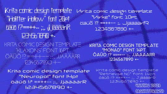
Fonts listed here:
Holitter Hollow
Kirke
Klaxons
Monad (Personal use only)
Neuropol
Retrievse NC
How to get a filter layer: Go to the Krita layers docker (the layers tab you usually see on the left or right), go to big plus sign for "add", select the "Add Filter Layer" option from it.
And then you can just choose any filter from the list and the prorgram, it seems, combines it from the layers under it. Enjoy! :)

#aghhtdraws#tho not really a full drawing#krita#made with krita#free fonts#i think most these should b free#random#Filter Layer#Krita Filter Layer#Krita tutorial
10 notes
·
View notes
Text

Tutorial: How I sketch in Krita
Tutorial: How I sketch in Krita
In Krita, I make my sketches and shading studies, using a (I believe) little-known method of the program… and, since this might be useful to other people, I decided to share it.
No, you won't need to install any additional resources: everything is already inside Krita, you just need to perform some small and easy configurations. And it also works in older versions (mine is Krita 5.2.3).
I made a small free manual (a 10-page pdf file), explaining what you need to do and giving some usage examples. The manual has two versions: English / Português Brasileiro.
1 note
·
View note
Text
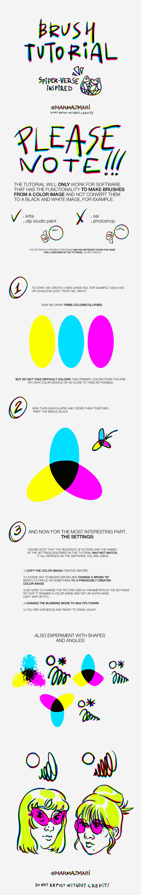
#across the spiderverse#spider man: across the spider verse#spiderman#spiderverse au#spidersona#spideverse#miles morales#gwen stacy#migeul o'hara#my art#custom brushes#brushes#digital art#art tutorial#art tumblr#krita#krita brushes
809 notes
·
View notes
Text
experimental renderingg
#skykid#sky children of the light#sky cotl oc#that sky game#half of the time I'm watching krita tutorials DHHSFHXBF
45 notes
·
View notes
Text

A friend of mine introduced me to a new art program yesterday and it is my new favourite thing, so I had to draw at least one Feanorian to properly test it out :D:D:D
#maglor#feanorians#silmarillion#the silmarillion#silm art#silmaril#hehehe#this is either a nightmare or the silmaril decided maglor's hands were that dirty it had to float away~#>:D#or it could be symbolism or smth.#take your pick#:D#I absolutely love this art program btw.#it's called sketchbook#and it is way better than krita#kinda reminds me of a bunch of stuff I liked about photoshop#specifically with blend modes doing WHAT THEY ARE SUPPOSED TO and it doesn't have weird 'bloom' effects where they SHOULDN'T BE-#and I just like the lineart brush options so much more#Krita didn't even taper the brush. if you wanted brush sensitivity you had to look up an entire tutorial on how to add it >:(#there are some lil annoying bits about this program too (changing brush size - and choosing colours for example)#but like.#I'm still figuring it out so I might be able to just program some shortcuts or smth#Ye#all in all I prefer this program#:)#but it's been less than 24 hours so I'll probably have a more grounded view of it by the end of the week#:):):)
26 notes
·
View notes
Text

So I made myself a little visual guide to keep a few things in mind as I write or draw. It was entirely based on manuscript art and archeological findings. Hopefully it can be useful to someone else too.
#my art#artists on tumblr#digital art#krita#haireomai#tutorial#medieval art#medieval fashion#historical illustration#medieval core#historical clothing#middle ages#medieval aesthetic#reference sheet#13th century
96 notes
·
View notes
Text

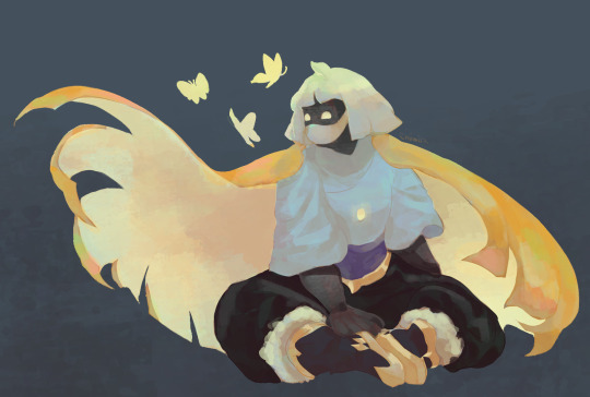
This lovely lady helped me make a coloring technique tutorial! The full tutorial is under the cut, or you can download the PDF for free or check out the timelapse over on my Ko-fi Kofi | Inprnt | Cara | Twitter
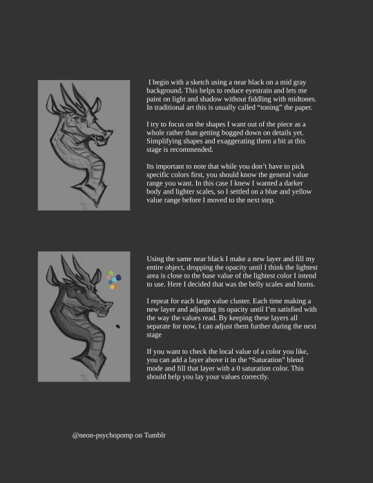
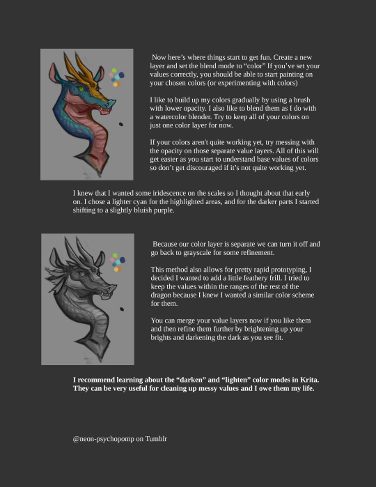
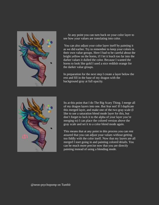

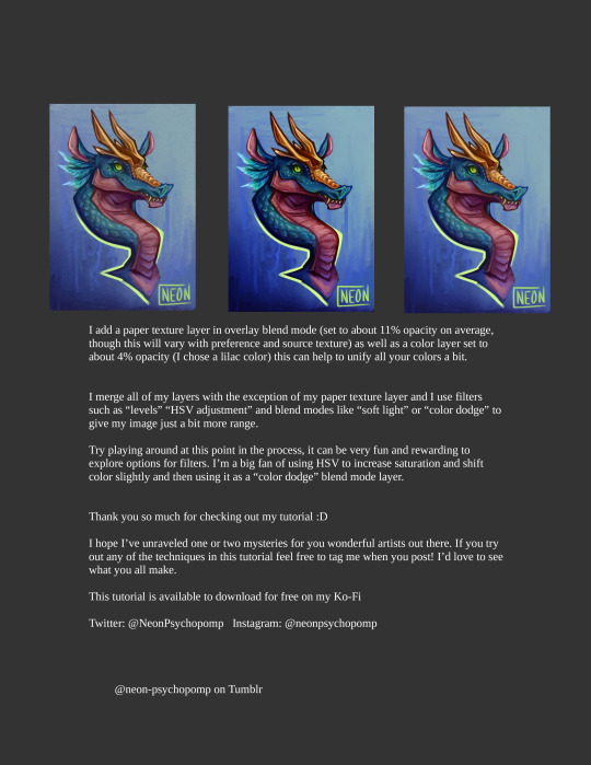
A special thank you to @eatember for showing interest in a coloring tutorial :D I hope this helps a bit ^^ If this helps anyone out, consider donating over on my ko-fi to help me fund future tutorials :D Have questions or want to request a tutorial? Feel free to drop a comment and I'll do my best to oblige.
#krita#digital art#artists on tumblr#art#digital painting#fantasy#creature design#tutorial#color tutorial#krita art#art tutorial#dragon
70 notes
·
View notes
Note
Holy shit krita user teach me how to animate on krits please please plea
Oops forgot to answer this ask hi
First thing you gotta do is enable the "animatio timeline" and "onion skin" dockers
"animation curves" is useful for certain stuff but not strictly necessary
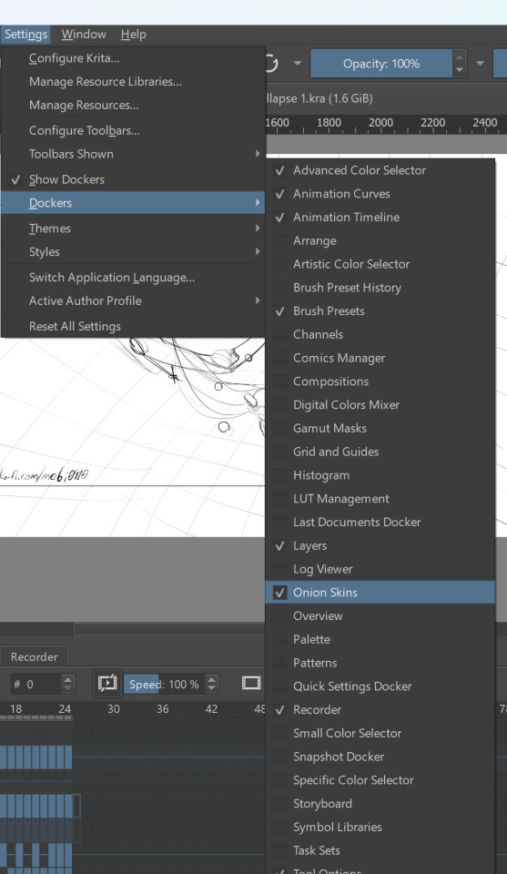
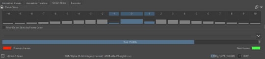
onion skin is to see what the previous and following frames look like
within the docker you can set how many frames are shown, with what intensity and what colors
animation timeline is the most important docker
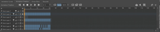
after selecting a layer you can add keyframes to that layer and overall control the frames and the framerate etc
for more details you can look at the official documentation
now, for a slightly more technical tip: you can add a transform mask to a layer then control that transform mask in the animation curves docker by adding keyframes on it; that way you dont have to modify the size or position of an otherwise static object in each frame, you can just set it up to move from point A to point B (or grow X amount) from frame 1 to frame 15
I think you can do it too with other masks but I haven't tried yet
#krita#there's probably tutorials on youtube that explain it better than me lol#I did search for tutorials on youtube myself to get started on it#btw some of these are for more recent krita updates so make sure to have krita up to date
43 notes
·
View notes
Text

Joyous little flower man
#art#fan art#roblox#dandy's world#dandys world#dandy's world fanart#dandy's world art#dandys world art#dandys world fanart#dw dandy#dandy#dandy dandy's world#dandy dandys world#dandicus dancifer#still learning krita#i genuinely have no idea how to get the effects i want on my art when i render#i want something kinda painting-like i think#idk#i'll just have to keep messing around until i find out what i like#if anyone knows of any good tutorials or has some advice for me feel free to send it my way#but yeah#hope you enjoy
23 notes
·
View notes
Text
Learning krita is so fun! (Pls kill me)

#my art#digital art#wip#art wip#krita#kritadigitalart#krita is kicking my ass#but id rather die then watch more then three minutes of a tutorial#y r they all so slow n for computers 😖#RAGGHH#bungou stray dogs#bsd dazai#bsd#15 dazai#tw fake blood
28 notes
·
View notes
Text
Mmmh... Here's a post :>
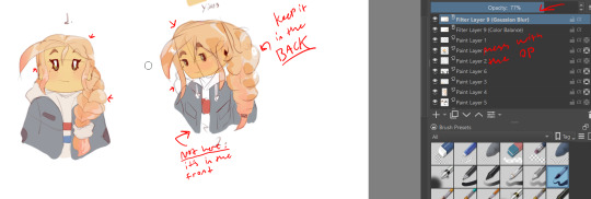
Wow, I spent all day on my graphics tablet today.
On a bright note, I'm rendering in a way I like now and my screen is all fixed. I decided to make a quick tutorial on using Krita filters to help enhance your images with blurs and color corrections. I know some people dislike Krita, but I like how clean it is and it's similar to Photoshop.
Some key notes: Keep any blur in THE BACK. Anything that's in the front should not be blurred such as the face, clothes(in the center), and bangs.


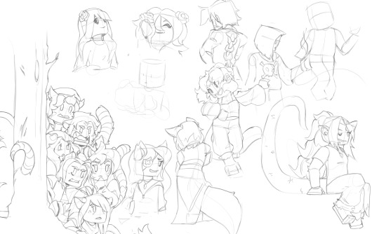


Decided to sketch some more OCS(Not mine) on one big page with past ones and use one OC to practice coloring on as well.
Obviously some are not finished, I'm just doing things at my own pace.
OC Credits:
@camhues @manonim @skylinx2o @samstwilightzone @oprahthepoprah @sillyg00fyg00ber @yourlocaleggperson @ask-observer-ron @eikisem @nacho-business1 @avitskiz @blueroseangelshaven (test @ to see if the @s are working) @aerkame
#lego monkie kid#art#lmk#fanart#lmk fanart#my art#sketches#lmk art#lmk oc#oc#not my oc#not my character#oc art#lego monkie kid fanart#lego monkie kid ocs#ocs#art help#krita#art tutorial#rendering
85 notes
·
View notes
Text
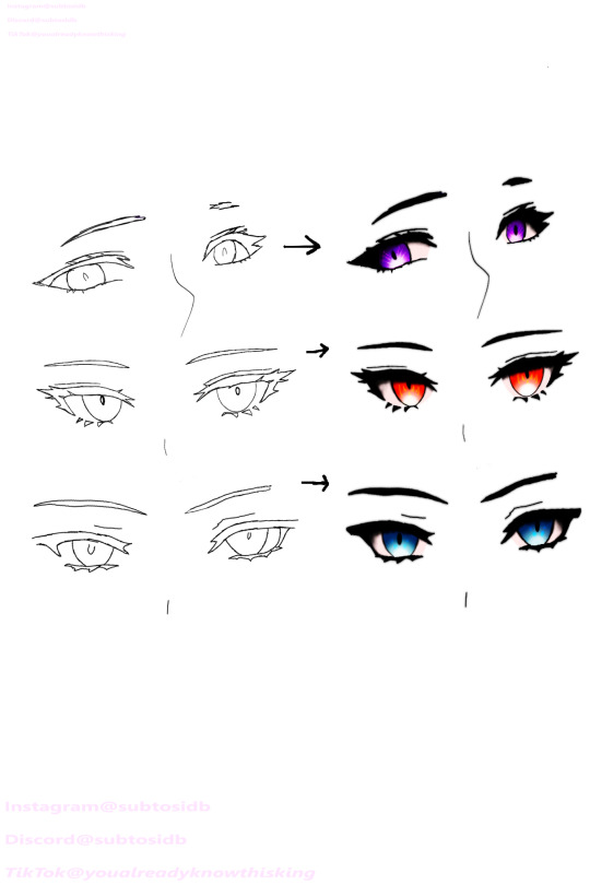


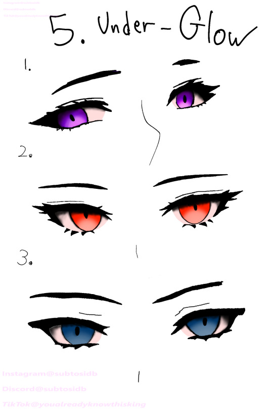


How I draw my eyes, Simplified
#artists on tumblr#my art#drawing#art#digital art#fanart#eyes#eyedrawing#eye#tutorial#tips#process#krita#anime eyes
11 notes
·
View notes
Text
Using Masks
youtube
Quick art tutorial I did on using masks to create compositions which are easy to edit and how to use masks to control where color is applied
#art#artwork#krita#tutorial#masks#mask#イラスト#teaching#artists on tumblr#digital art#learn to draw#art community#art tutorial#artists of tiktok#Youtube
7 notes
·
View notes
Note
I CANT- BrOoo!!HOw dO YoU drAw a hAlOoooo??!!! AND NOW DO YOU MAKE IT GLOOWWWOWOOW?!?!🔥🔥

edit i misread cuz im dumb and sleep deprived just draw a circle and follow the light part
first, you need to know where your hair is coming from in the first place. i like to divide it in lenght so here we have bangs (pink outline), side hair (green outline) and back hair (blue outline).
in most front facing works the attention will be on the face so our priority is bangs, side hair then back hair. you can divide all of them into smaller subsections too but its most commonly done with the bangs, such as how i showed with the different bisexual colors.
think of hair flowing like the wind, despite there being imperfections, overlaps, strong and weak areas it all follows a general flow.
know what your hair is like in 3d and see how strands would overlap and interact like strangely shaped ribbons, which you can mostly do just by feel but still follow the wind rule
feel free to twist and turn them like ribbons too
for longer hair, strands might pop out just to loop back in as shown on her back hair (shes wearing loose twintails), those most often show ribbon-like behavior
make sure their thickness doesnt decrease too abruptly and that the lenght of the stray hairs is the same as the section they come from
now light:

know where your light source is coming from, here its useful to think in 3D instead of just picking a side of the canvas. Here, the light source is above and slightly in front of the character.
Those ball-shading exercises your art teachers made you do will come in handy here, so map out how light would fall on your characters mostly round head
now just think about which strands stick out enough to catch more light than the others, and carve shadows into sections that wouldnt catch light like that

you also just follow the general flow here, its all about that flow
pro tip: use a low opacity big size airbrush to erase the lower part of the bangs that cover ur characters face to make them ~glow~
and remember, dont be shy with the aggressiveness of your lighting
#tutorial#art tutorial#hair drawing#hair shading#hair tutorial#catfans art#digital art#artists on tumblr#sketch#krita
33 notes
·
View notes
Text
How I color manga panels: a tutorial
I'm no expert at doing recolors, I'm simply an artist who's occasionally too lazy to do my own lineart, and uses that of my favorite mangaka's so I can focus on other styles to simply have fun with my colors. I always try and choose panels or pages that are high quality, to avoid too much pixelization. Often I end up sourcing these from scanners or google images.
As far as programs, I use Krita (a free software). This all can be done with the standard brushes and tools that come with the software. But for some of the coloring, I have brushes from brush packs i like to use, as well as a few brushes I have customized myself. The main ones I use are from David Revoy, so if you want a recommendation for a great free brush pack, that's mine.
For this example I'll be using this panel from Chapter 58 of Moriarty the Patriot (I believe this would be Volume 15 of the manga) that I posted earlier here.

I'm not including the step where I crop the image, but I personally chose to remove some of the white borders that are needed for a traditional volume's page borders. Since I'm doing digital art, I don't always include them.
My next step is always to outline and fill the individual base layers. This includes the speech bubbles, each character, any independent props, the panels themselves and the backgrounds. There's no correct way to do this, but personally I use a brush to outline the object, then fill tool to well. Fill it, as well as the rectangle tool for the panels or straight lines I need to do.
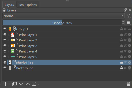
For layers, I usually put all of these color base layers in a single group that's set to multiply, and change the opacity of the base panel so that I can fill the blacked out areas with a solid color easily, here you can see I was working with the base panel at 50%, but honestly i just kind of turn it down to whatever I think looks good.
The colors I use for this step are usually brightly saturated rainbow colors so it's easy to tell the different elements apart from each other. So you end up with something that ends up looking rather horrific like this:
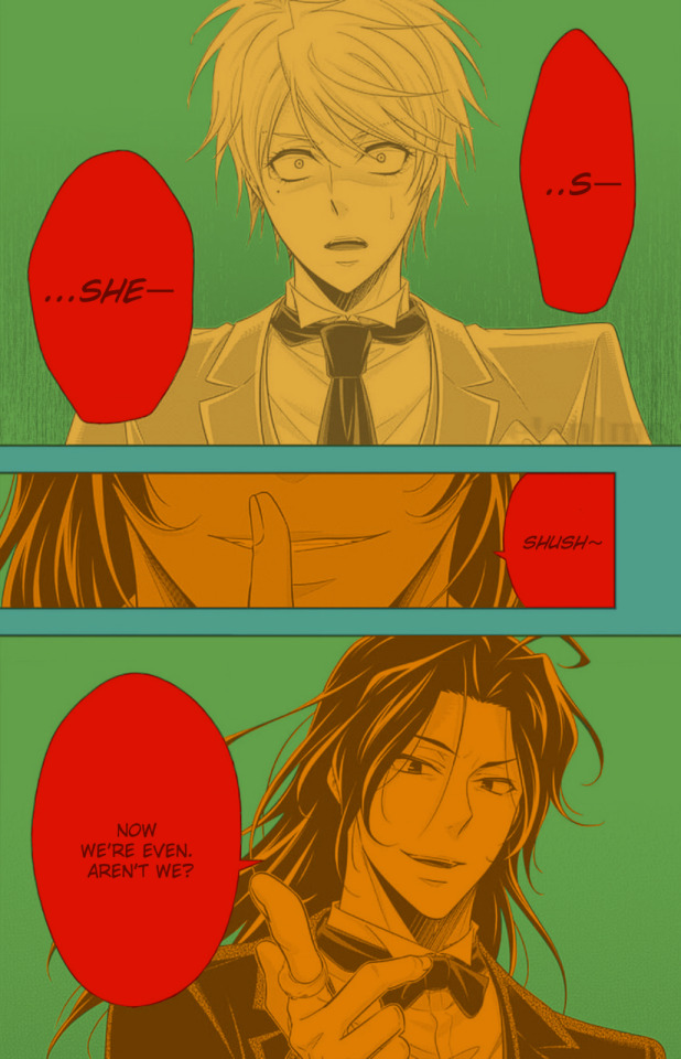
From here, I usually create a copy of the base panel to put over the top of the colors. This way I can have transparency for the colors on some of the blacked out parts, but don't loose some of the nuance of the shading entirely. Moriarty the Patriot is a very black heavy cell style, which is the style I find the "panel above, panel below" method works best on. However as I work on the colors, I tend to toggle between having it on or off.
It's about here where I start doing my coloring. Of course this will depend on your coloring style and art habits, however personally, I like to start with the characters. I use those colored layers as the base layer I can clip my coloring layers to.
I will often turn off the layers that I'm not currently using so I don't have to deal with eyestrain, and will change the base layer to something more suitable (often a grey or light tan) so my color theory doesn't get all messed up. The bright colors in previous steps are to make sure they're visually separate. Now they've been established, I don't have to worry about that.

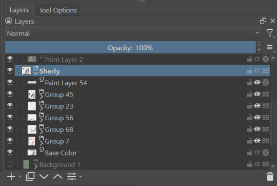
I don't usually label my layers, but for the sake of the tutorial I have to make it clearer which layer grouping is which.
I find in this step because of the multiply layer the colors can be a bit washed out, so I tend to either use much more saturated colors than I usually do, or switch to another layer style like Linear Burn of the overall color group to make the colors pop more. Ultimately though this comes down to personal preference. If your coloring style is very de-saturated, you might not have any problems with it. (I do suggest making your base color white, so the coloring of the base panel isn't off, you'll see in the screenshots above I forgot to when working on Sherlock. Ignore my mistake)
For the parts of the image where it's primarily blacked out (such as Sherlock's hair or coat) I don't bother shading at all, and only do the highlighting, as the black takes care of the darkest tones anyways.
During my coloring, I also add a separate grouping above everything for adding rendering and details above the panels. This includes things like the eye highlights (which I always do in pure #000000 white) and making certain parts of the heavily blacked out areas pop more.
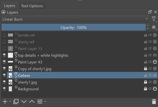
(those refs and paint layer 13 are what I'm using to color pick off of, and keep the shading colors consistent throughout the piece. There's probably a better way to do it, but I just paste them directly into the image and then delete them at the end, paint layer 43 is a color dodge layer, and so has to be outside of the layer grouping to work)
Comparison of the art without:

And with the top details and white highlights:

It's a pretty subtle difference, but I find it's the little things that truly make the piece. Especially with the strands going over the face, they need just a bit more to make them really pop. I also just really like my fancy eyes which is hard to do without the top layer.
Insert several hours of coloring here, and about another hour just trying to figure out what gradient to use for the background, and you end up with the the base colors. From here I usually mess with overlay layers as well to get the colors to all look fancy and nice together without having to do color theory (pro tip /lh).
I forgot to grab screenshots while doing the background, but for the top panel I essentially just used the [deevad 5c screentones] brush and a transparency mask to add a screentone gradient, and totally didn't google "splatter overlay" or something like that and picked something off of google, and added some borders.
Because both the base manga panel and manga panel over the top are both not at full opacity, if there is text in the page or panel (such as this one) I like to copy the just the text part of the panel and add it as full opacity in the "colors" folder to make sure it's legible and matches up the rest of the colors.
And after all that, its basically done. I'll sometimes continue to mess around with certain aspects to make sure I like how it look, but that's essentially it. This is when I add my signature, and then it's queued to post!

#krita#long post#eyestrain#art tutorial#tutorial#digital art#my art#manga recolor#manga edit#manga pannel#manga coloring#sherlock moriarty the patriot#moriarty the patriot fanart#yuukoku no moriarty#moriarty the patriot#james bonde#james bonde mtp#artists on tumblr#art resources#art help#art tips#drawing tips
83 notes
·
View notes