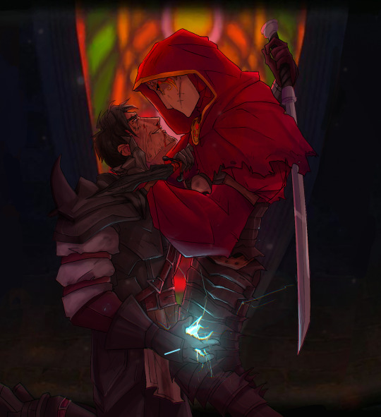
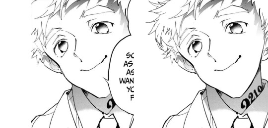
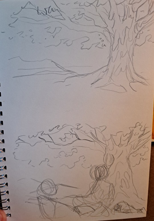
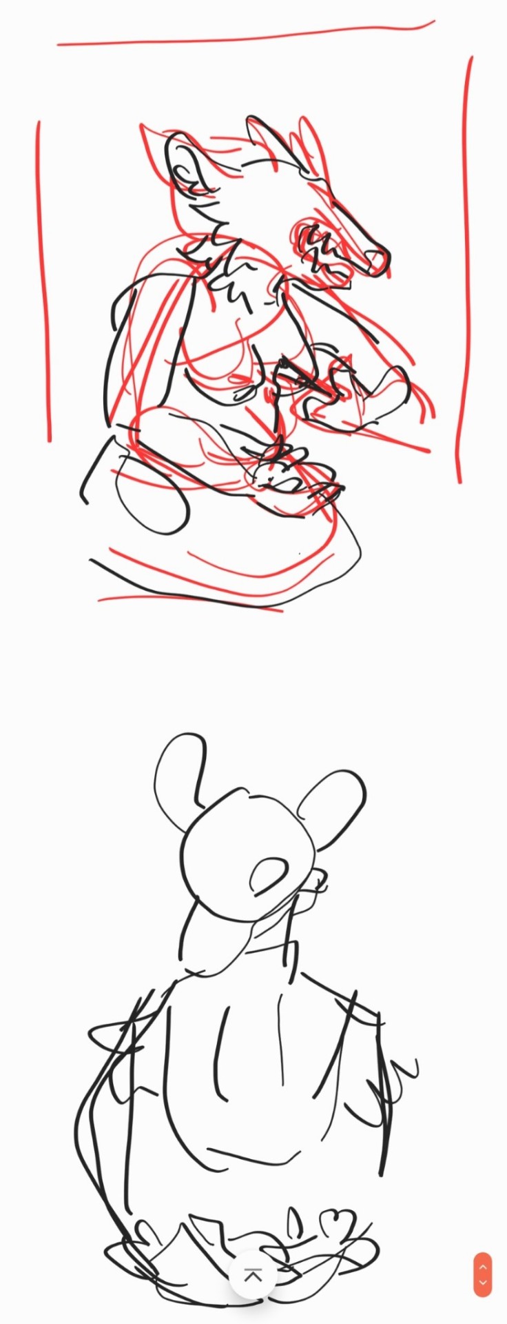
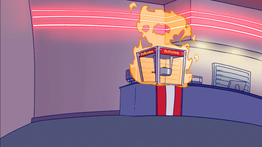
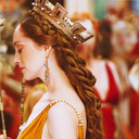
#i FINALLY finished this piece after a year of having the lineart in my files
Text
i eat boys like you for breakfast
#reaper: ahaha nooo don’t systematically fuck up and kill everything I’ve ever cared about you’re so hot#i FINALLY finished this piece after a year of having the lineart in my files#hero of oakvale#jack of blades#chicken chaser#fable#fable tlc#fable games#my heroes#he ended up accidentally taking the mask in the end so now they’re together forever and there’s nothing either can do about it#hero of oakvale x jack of blades#you know what I’ll make a ship name#hero of blades#oakblades#fuck it
196 notes
·
View notes
Note
I really like your art! Do you have any tips for drawing environments?
Ahhhh thank you so much!
I did some thinking before answering this ask... a lot of general drawing advice absolutely applies to creating backgrounds (such as using references, keeping perspective in mind, etc). But the #1 tool that especially helps me with environments is creating thumbnails!

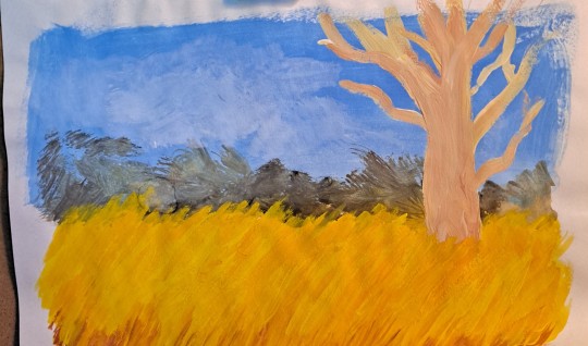
I depend massively on the thumbnail process, especially for environments. I use them to resolve almost every major detail before painting the real thing! It makes it so much easier to experiment with colors, values, etc. and figure out the important stuff in your image. You want to keep them very blobby and sketchy so you aren't afraid to make big changes!
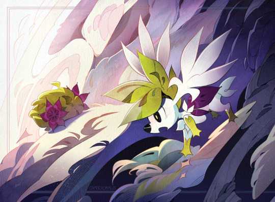
The thumbnail shown above for my shaymin drawing leaves very few questions about what the final should look like. It only took around an hour to create, and the time it saved me from making any mistakes is massive! This is especially helpful as someone who has immense trouble visualizing color schemes and has struggled numerous times trying to make color work after finishing lineart without a good thumbnail.
The more complex an environment, the more I suggest a thumbnail. Some of my recent zine pieces would have been impossible for me to complete without a detailed sketch to guide me.


Another big piece of advice, mentioned above, is USING REFERENCES! I think this is especially helpful for creating interesting and detailed backgrounds. Doing research on objects/props/scenes will enrich your drawing and make it more engaging to the viewer!
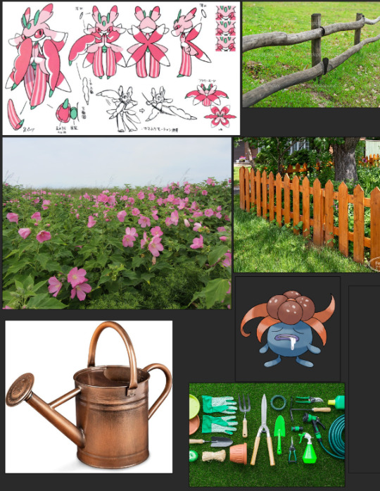
Here is an example of the reference I gathered for my lurantis+gloom drawing. I brainstormed different plants/items I thought would be fun to include with grass-type pokemon, and threw them together in a PureRef file! (I highly recommend using PureRef, it's an excellent software for making reference boards). Generally speaking, it's difficult for humans to conjure up exactly how a watering can/gardening tool/fence/flower might look like down to super specific details, so obtaining reference to fill in those gaps is essential.
Finally, advice that applies very broadly to all types of drawings: do lots of studies! Starting last year I have done 50 environment/scene studies, and they have been extremely helpful for improving my general skill and ability to compose backrounds! I can't recommend this enough to all artists!

And that's about it! I think it's easy for artists to be intimidated by drawing backgrounds, but it can be so much fun! Take it slow, do research, and create thumbnails for your drawing. And don't forget to do studies, they are good for you!
429 notes
·
View notes
Text


Hello! I’m excited to open commissions after a long time! Below you will find information about how to commission me! (ノ^ヮ^)ノ*・゚✧
Prices (Click Images for Better Quality)
❁ Simple Sketch = $10 ($5 per additional character)

❁ Simple Flats = $25 ($15 per additional character)

❁ Rendered = $40 ($30 per additional character)

Terms of Service
❁ By commissioning me, you agree to my Terms of Service and confirm that you are 18 years old or older.
❁ My artwork can not be used for commercial use unless its discussed prior.
❁ You can not use my artwork to create NFTS.
❁ I have the right to deny your commission.
❁ I will not draw anything extremely sexual. I will not draw dark content and violent/gory art. I can not draw cars, mechas, or extremely muscular bodies. I’m not very experienced with extremely complex or technical backgrounds. Please make sure you view my artwork above to give yourself a general feel of what I do and do not draw.
Payment Details
❁ I will only accept payment through PayPal.
❁ I will request payment from you once I have finished the commission. Once I have been paid, I will send the commission to you. I will send it to you as a jpg., png., and psd. file.
❁ If for some reason, I can not finish your commission, all payment will be refunded. At any moment, I am allowed to refund your commission.
The Commission Process
❁ If you want to commission me, send me a private message through tumblr.
❁ In your message please let me know the following: (1) what kind of commission you are looking for (the more information, reference pictures, etc. you can provide the better!) and (2) the number of characters you would like in your commission.
❁ After we have fully discussed all the details of your commission, you will receive an initial sketch of your commission so that I can make any changes to the art piece before I work on the proper lineart, colouring, background, etc. After the final lineart is drawn, you will have another chance to request minor adjustments such as colours and small background changes, but nothing extreme such a different pose or additional details that you did not mention in our initial discussion. For this reason, please remember to tell me all the little details you want in your commission!
❁ You can ask me about the status of your commission at anytime.
❁ The estimated time needed to complete a piece will be one month, although the estimated time may vary based on the difficulty of the piece, my personal circumstances, etc. If you need the commission to be completed by a certain time, please let me know ahead of time!
38 notes
·
View notes
Note
4, 8, 6, 9
Did you really want to know the answers to these or--
4. Fav character/subject that's a bitch to draw
My OC, Edward. I can never seem to draw him the same way twice.
Furthermore, since I'm primarily a fanartist, my usual modus operandi is to mostly emulate the style of the source material. There's no style to emulate with something that is entirely my own, so drawing him-- and any other of my fandomless OCs-- always (and automatically) makes the road to a finished piece a lot longer than any fanwork.
8. What's an old project idea that you've lost interest in
I don't really lose interest in projects? Motivation, yes, but I have some reaalllyy old projects still sitting in my WIP folder because I always think that one day... one day I will return to them t.t
I guess if I had to pick anything, it would be these Zoids-themed coasters I started back in 2020. I don't have any pictures, sadly. They're themed after an Alesaurer shirt I had made the same year and I intended to make 25 or so to accompany some custom-etched pint glasses to sell as a drinking bundle.
Well, I had already printed the coasters (the cheap cardboard kind you can customize and buy for weddings), ordered/applied a sticker to the back to make it "double-sided," waterproofed the entire coaster with Mod Podge sealer, and had moved on to the final stage of sealing the tops with resin, when... idk, I got discouraged or something. If you know anything about resin pouring maybe you'll know trying to control teeny-tiny pours on an inadequate surface is foolish. I had very little room for error and I could never get the pours to be even (which is... kind of important on a coaster) and just gave up after only a handful.
Maybe it wasn't a complete waste though. Incidentally, I use the very first "test" coaster regularly for any drinks I sip on while working at the computer:

6. Anything that might inspire you subconsciously (i.e. this horse wasn't supposed to look like the Last Unicorn but I see it)
Kinda ties in with my answer for #4! Emulating styles on the regular is a two-way street and I am inevitably influenced by the things I imitate.
The most prominent silent influences for the visual aspect of my art I can think of are all from my childhood (and by that, I mean anything pre-uni). Yu-Gi-Oh, Zoids, Detco, etc. I know Invader Zim influenced the way I handle lineart.
Music is constantly influencing me, too, but that's significantly more difficult to read from the viewer's perspective. My taste in music tends to be aggressive (not all of it, but most of it), on the wavelength of "if you pass the AUX cord to me I will give it right back," and I don't really doubt that the sound and lyrical content feeds into the thematic flavors I try to portray in any of my work.
9. What are your file name conventions
MASTER.psd/.pdf -> working doc
final.png -> finished image
final-tr.png -> finished image w/transparency (if applicable)
final-tr1000 -> finished image w/transparency (if applicable), 1000px across*
final-tr1000-bw -> finished image w/transparency (if applicable), 1000px across, in grayscale
final-tr1000-bw-watermark -> finished image w/transparency (if applicable), 1000px across, in grayscale, with watermarking
etc.
*This was necessary for my garbage internet to cope. It could barely handle uploading anything at 1000px, let alone anything bigger
---
Ask me weirdly specific artist questions!
1 note
·
View note
Text
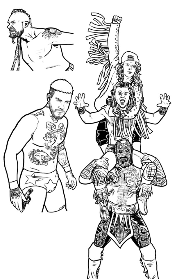
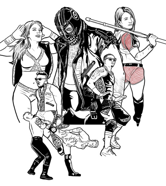
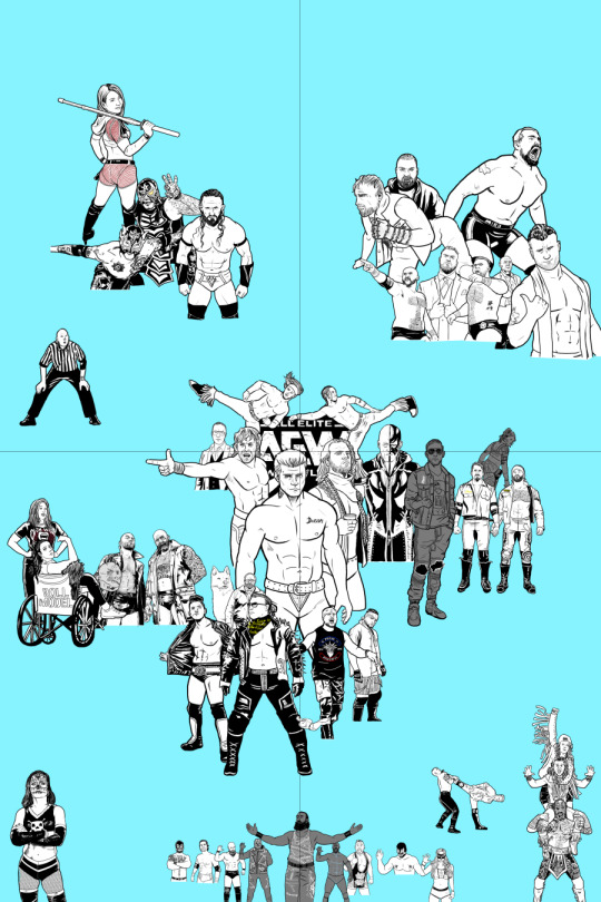
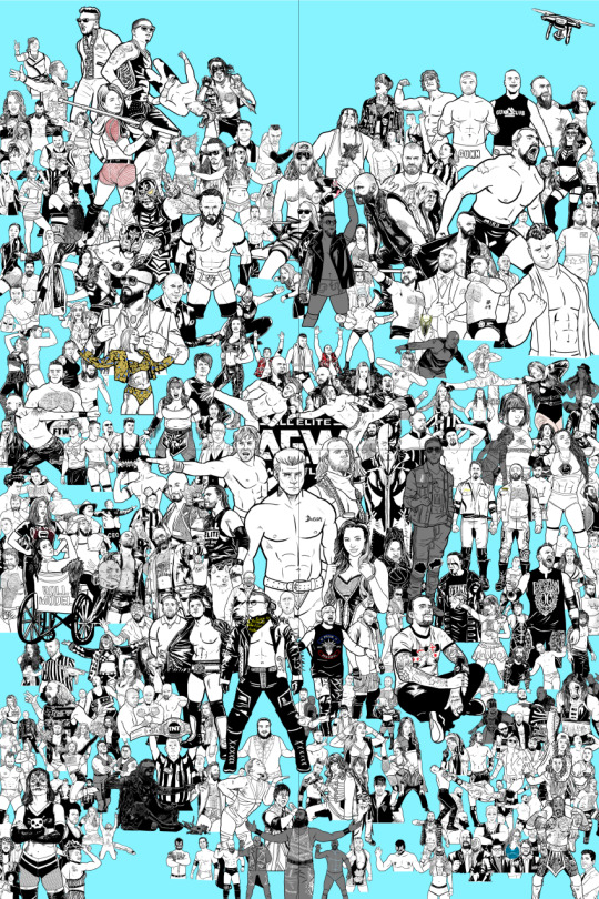
AEW Poster info dump
Okay, so, if you're reading this you've probably seen my AEW poster that I'm working on. This post is to sort of explain everything about who's in it and stuff like that.
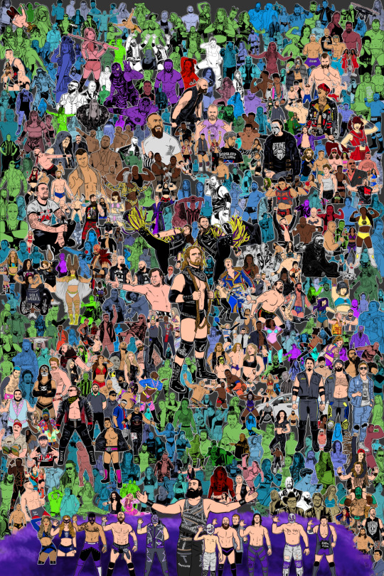
The poster as of 3\10\21, roughly 45% complete
What is this?
It's a poster with 563 people (well, 560 people, 2 drones, and 1 dog) that have appeared on AEW in the first two years or so of it's existence.
Who is on here?
I have a Google doc of 563 people that can be found here: Spreadsheet
How did you get 563 people?
I took everyone that wrestled on an AEW pay-per-view, Dynamite, Dark, or Dark Elevation, as well as commentators, referees, notable guest appearances, and so on.
How long has this taken you?
I didn't write down which day I actually started (since I didn't realize how big the project was going to end up) but my best guess is that I started it in August of 2020 (at least, that's the earliest digital file I have saved. I know there were initially older files though.) Also, there have been breaks while I work on other things.
That must be a really big canvas you're working on.
It is, but since I'm working digitally, I've broken it down into multiple smaller files so my computer doesn't explode when I need to open it. I would make a new canvas, draw several wrestlers on it, then copy the finished inks to the full sized one. That way I can move people around, resize them if need be, and make changes relatively easily. The final piece will be 24 inches by 36 inches.
How do you keep track of all of this?
Well, I've got a spreadsheet that I linked to above. It tells me which wrestlers I need to draw, and breaks that down into inks, flat colors, and shading. It also tells me if I've placed them on the final canvas, which file the original lineart is in, and even when they first appeared for AEW.
Do you draw this or trace it?
Okay, this is difficult to explain: I use a ton of reference. In order to get the likeness right, I'll do a quick sketch over the reference to place where the eyes and nose go. Then I'll move the reference pic to the side and draw the rest. I'll draw guidelines to show where various parts of the body should be. If I'm done and it still looks wonky, I'll put the lineart over the reference and adjust lines where needed. Usually it's the eyes are crooked. Anyway, here's an example of my process:
Where's [wrestler] or [wrestler?]
When this is all done, I'll have a key to show who's who and where they are.
Why isn't [wrestler] in here?
When I started this project, I was going to draw the roster, plus the indie wrestlers they started bringing in for Dark when Covid hit. So every few weeks I'd add more people to the list. And more. And more. Until finally I decided that the limits of this drawing would be drawing anyone between AEW Double of Nothing 2019 (the first official AEW pay-per-view) and the episode of Dynamite on October 6, 2021 (the two year anniversary of Dynamite.) If they debuted after, they're not in there. Which sucks because that includes Danhausen, one of my absolute favorites.
Why is [wrestler] in here? Aren't they a horrible person?
So yeah, right when I was starting this, the Speaking Out stuff started coming out, and I was torn between leaving people out of a project who's entire point was to get "everyone," and adding known creeps to the piece. I tried to compromise by having them getting kicked in the face and\or making them quite small and obscured. It's why I know a bunch of people are going to ask why I drew one of the "four pillars of AEW" so small. It's 'cuz he's a creep.
Hey, some wrestlers change between process shots, what gives?
Since I've been working on this for two years, I'll look back at some of the older art and realized I could do it better. And sometimes gimmicks change. And sometimes the guy dead center of your original draft leaves the company and sometimes the guy you put off to the side because you didn't really care about him at the start goes on to become one of your favorites and AEW Champion. So in short, I'll redraw stuff if I think the original drawing doesn't work.
Anything else you want to say about this?
Uh . . . it's well over 1500 layers in Clip Studio as of this writing. The file is almost an entire gigabyte. That's insane.
Oh yeah, meant to ask . . . WHY are you doing this? It's insane.
Well, I like to draw large group shots. One of my favorite artists growing up was George Perez, and he drew every single Avenger on the cover of Avengers #1 in 1998 and it made an impact on me. As a kid, I would take large rolls of paper (my dad worked at a printer at the time, would bring home leftover paper rolls) and draw these ten foot tall super posters with all my favorite characters. Then as I got older, I started tabling at conventions. I didn't feel like my art stood out very much, so I drew a print with a dozen or so characters. Then one with twenty. Then fifty. Then the next thing you know, I'm drawing a "Where's Waldo?" picture where you have to find John Cena among 300 wrestlers. (The joke is, he's not actually there.) It sort of became my "thing." I may not be the best artist, but I'm certainly going to be the most artist.

The "Can U C Me?" Where's Waldo print, the biggest thing I had drawn until this AEW project.
Got any process pictures?
Of course. I can't go two years on a project and not periodically post something to try and get that sweet, sweet validation.
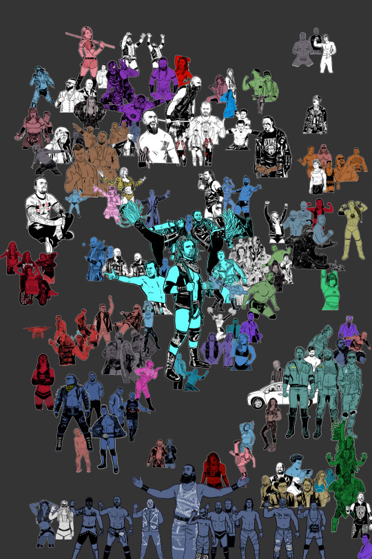
Drawing wrestlers in smaller chunks before copying them over to the main canvas.
Placing them together to figure out the best layout.
The first draft of the large canvas. The blue background is just so I can tell where I've got space.
I quickly started running out of room.
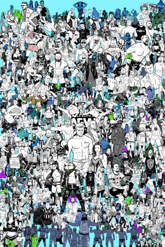
Around this point I realized I needed to move people around so I decided to scrap this layout and move people around. Also, Cody left so I decided to redraw the EVPs.
Redrew the EVPs and started the new layout.

The most up-to-date version as of 3\15\21. Started keeping track of percentages complete on the spreadsheet, started adding them to process shots.
5 notes
·
View notes
Text
A totally self indulgent compilation of my favorite works on this blog of the year June 13, 2020 - June 13, 2021
2019-2020
The following lists are all in chronological order according to the date each post was first published.
Top 10 panel edits:
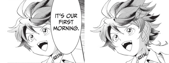
#1: It's our first morning
Date: Aug 20th, 2020
Time: ~ 2:18 h
I really like how this one turned out!!! The 2020 Emma b-day edit has a lot of major panel redraws, but this is probably my favorite. I I really enjoy how I made the shadows work!! And the ear banfage looks pretty neat. Nice!!!
Immagine
#2: Norman birthday edit 2021
Date: Mar 20th, 2021
Time: ~ 2:21 h
Awww, soft Norman :')
There was a bit to redraw, but I think everything turned out pretty neat!!! I believe everything works out fine. Though looking back at it, the part of the ID I added is definitely top small :')
#3: Manga dub: Yuugo gets knocked out
Date: Mar 27th, 2021
Time: ~ 5:05 h
Here start the Manga Dub redraws to which I gave my everything ahah. This one turned out nice! I think the shoes turned out particularly good eheh. I like how Yuugo's clothing lineart- for the texture, I wanted to go for something heterogeneous, but I'm not fully confident in the final result. Gilda looks very rushed but ¯\_(ツ)_/¯
#4: Manga dub: Yuugo makes his dramatic entrance
Date: Apr 5th, 2021
Time: ~ 4:02 h
This is pretty cool!!!! The coat took ages to redraw, but sis it turned out perfect!!! I'm very proud of this.
#5: Manga dub: RayGildEmma hug!!!
Date: Apr 9th, 2021
Time: ~ 1:31 h
Awww, a beautiful panel I was really happy to have the chance to redraw. Taking into account what there was to redraw, I'm actually surprised with how little this took! Ray's backpack was a pain to make, but I think it turned out fine. I'm very happy with Emma and Ray's heads!!
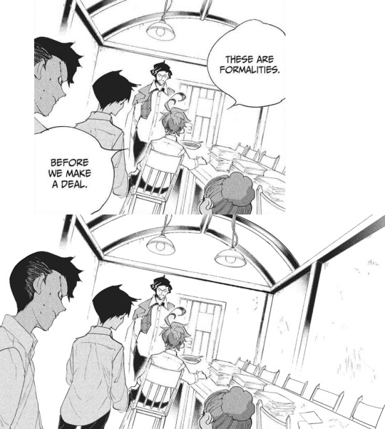
#6: Manga dub: Formalities
Date: Apr 12th, 2021
Time: ~ 5:31 h
It is not always easy to give sense to Demizu's perspective, but I do my best!!! In this I am *so* happy with how Don and Ray turned out, they look neat! The background on the other hand... It took hours to make ahah. I'm not fully confident in the perspective, but I'm happy with the details I've added- I really did my best to make it look like athe other manga panels and I think it paid off!!!
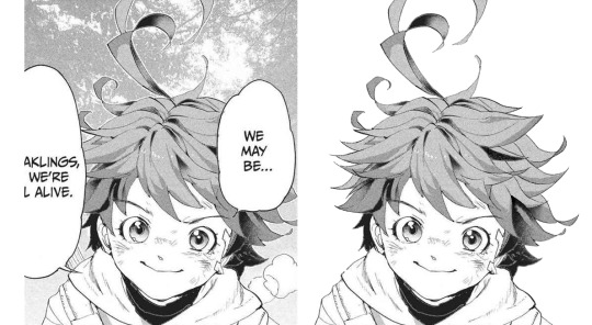
#7: Manga dub: We may be weaklings, but we're still alive
Date: Apr 30th, 2021
Time: ~ 1:37 h
This little Emma is so cute!!!!!! I think the redraw turned out pretty perfect. I'm really satisfied with how this one turned out, and it's such a cute little Emma!!!! She's so brave and optimistic, I love her. It's a shame this panel didn't make it to the episode :')
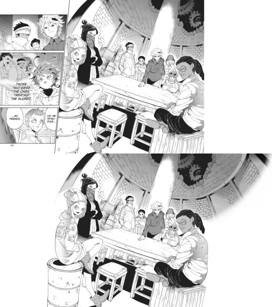
#8: Manga dub: Goldy Pond Gang
Date: May 7th, 2021
Time: ~ 8:44 h lmao
This is probably the panel redraw I'm the most proud of ever :')
Just think everyone turned out very nice!! The ceiling is not exactly perfect, but it still works somehow. I'm very happy with how Gillian's back turned out!! I don't really like the fading effect on the right, but 8h in I got pretty tired of working on this ahah
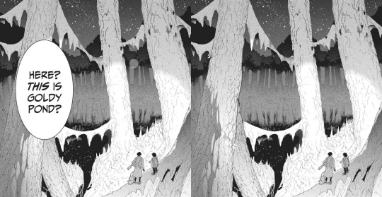
#9: Manga dub: This is Goldy Pond
Date: May 21st, 2021
Time: ~ 1:29 h
I'm very glad for how the Manga dub has been challenging me to learn to redraw backgrounds, something I had quite literally never tried before. It can be a little frustrating, but it's so satisfying to see the final cleaned piece!! With this panel, I also learnt to use copy and paste, which is something I had never done before beyond texture
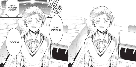
#10: Manga dub: Good morning doctor
Date: May 21st, 2021
Time: ~ 3:42 h
This is another background that turned out pretty good!! That one Norman is one I knew I would have had to fully redraw sooner or lager- the background was a bonus ahah. I'm very happy with the final result!!
Top 5 edits as whole:
#1: The Promised Neverland manga ending edit
Date: Jun 14th 2020
Time: ~ 12h 41min (5h 45min of cleaning panels in the edit + 5h 37min of cleaning panels that didn't make it to the edit + 1h 19min of resizing) + time spent cleaning panels I've deleted the file of so I can't see lmao
This is overall very nice!!! The concept of an Emma evolution through her back is cool, and I think overall the edit turned out very aesthetically pleasing. The concept idea came to me while I was working on the 2019 Emma's birthday edit, a long time before the manga ending announcement- back then I wouldn't have imagined using it in occasion of the manga ending, but I think it ended up making a nice tribute. The colors add a nice touch, since so far my edits had always been black and white- it makes a sweet closure. To make that edit I selected 76 panels of Emma framed from her back; I plan to make other versions of that edit using the discarded panels eventually!
#2: Emma - Chapter 181: Beyond Destiny
Date: Jul 12th 2020
Time: 2h 57min
My last edit for the manga 🥺🥺
I think this one is my very "manga ending edit" because to me it really signed the ending of weekly chapters and their weekly chapter edits. It makes me a little sad to look at it, but it's also, I don't know, kinda sweet to see how I grew both in my panel cleaning and as a person since I first started my blog. I'm glad I got into TPN!
#3: Emma birthday edit 2020
Date: Aug 22nd 2020
Time: 8h 54min
This one turned out so well!!! Though I used the same concept for all the trio edits, I think this one is the best one. The two panels on the left / two panels on the right alternation combo never fails ahah. The colors are nice (shout-out to my sister for making me a palette), despite the fact that it was hard for the lighter ones to make them work with the images without having those disappear. I'm very satisfied with the panels I chose for this, I think they work really good together! Also, it got me very happy to read everyone's comments saying they liked the fading effect in the last panel :)
#4: Emma + Eyes Close Ups [1/?]
Date: Jan 24th 2021
Time: 5h 55min
This one was really nice!! Another idea I got when working on the 2019 Emma birthday edit I was glad to finally execute. Started the edit in September, finished it in December. I'm overall very happy with how it turned out... I hope I will be able to make more in the future!
#5: The Promised Neverland Parallels → (9/?) » 114 // 122
Date: Feb 23th 2021
Time: 5h 7min (panel cleaning only)
Aaaaahh I really like this one!!!! A parallel I love very much, and I'm really happy with how the edit turned out. All the hair redrawing looks neat!!!! The gif is maybe a little excessive, but I think overall it's a nice edit. I like it!!! Fun fact, I completed it on August 26th 2020, but I couldn't find the right moment to post it ahah.
Honorable mention: The Promised Neverland Parallels → (5/?) » 08 // 16
Date: Aug 30th 2020
Time: 2h 52min (Second picture cleaning only; I deleted the first picture art file so ¯\_(ツ)_/¯ )
I don't have much to say about this one except!! It turned out very nice!!!!! Love the pen lmao.
Top 10 analysis:
Too many analysis,,
#1: Post chapter 181 Emma analysis
Date: Jul 9th 2020
Mmmh a nice analysis. I think it was important for me to put down in words what I think of Emma's characterization and the manga ending, so I'm happy I did it!
#2: A long Oliver analysis because I love him very much
Date: Dec 6th 2020
What can I say I just love Oliver tons 😔😔💕💕
This was very fun to make!!!
#3: TPN s2 previsions
Date: Jan 14th 2021
Really love the effort that went into this + me proving that 11 episodes GP could have possibly worked + it's just a lot of fun to read again after s2 ended pffft
#4: More s2 delusional previsions lmao
Date: Jan 27th 2021
I think the points and previsions I made where pretty neat!! In my defense, it was pretty impossible to predict the anime would have ended with this season. I always feel honoured when friends and Anon ask for my opinion, I'm like "you wanna know what I think? Wow. I'm flattered (◍•ᴗ•◍) "
Thank you to anyone who ever sent me an ask!!
#5: Why Emma not wearing pants is 𝕨𝕣𝕠𝕟𝕘
Date: Jan 29th 2021
Really proud of this!!! Pants Emma is important!!!!!
#6: Post episode 5 manga Emma analysis
Date: Feb 4th 2021
A depressed analysis, but a necessary one 😔
#7: Norman analysis
Date: Feb 12th 2021
I love him!!!! And I'm happy I eventually got to put down in words what I love about his character. The day I posted this ww3.readneverland was in maintenance so I couldn't use the volume scans for it- the thought of that post having fan edited and fan translated scans still haunts me
#8: RayDon rambles
Date: May 12th 2021
I had a blast writing this and like. It's likely the post of mine I reread more often of them all. I love this ship tons!!!!! I'm satisfied with how I put down in words what I like about them. I LOVE THIS SHIP
#9: Chapter 58 analysis
Date: May 23th 2021
I've wanted to express this concept since like the first time reading the manga- I'm so happy I finally did!!!! This concept is one of my absolute favorite things about tpn- the feelings that people are good. The concept that kids who got to live in an healthy and supportive environment will always be inclined to kindness and altruism, because humans are just inherently good. From the Three Character Classic: “people at birth are inherently good”. I want to have faith and courage to hold on the goodness in myself, and to hold on the goodness in the world, no matter how difficult it to do that (Chloé Zhao).
#10: Norman and Lambda squad relationship analysis
Date: May 24th 2021
I think this was a pretty sharp analysis and I like what I did with it!!
Other stuff:
#1: Krone birthday edit
Date: Jul 15th 2020
This edit is so good ;; Like not perfect since it was my first attempt at coloring gifs but still I believe it turned out so good ;;;;;;
The time and effort that went unto this is crazy, but... Maybe I'm happy to have dedicated time to something I like for a satisfying result.
#2: Get to know my ship- Wolfpack Trio
Date: Aug 24th 2020
Uuuh a good post. A good ship.
#3: Gilda + blank glasses
Date: Aug 27th 2020
This is such a cute nice compilation!!! I love looking at it. A few panels are missing but still :')
#4: Apollo Ray AU
Date: Sep 7th 2020 (Though it was written Sep 2nd 2019 lmao)
I'm so happy I finally gathered the courage to post this 😭😭
I really enjoy what I did with this AU, so this one and its other installments are all posts I have a lot of fun rereading. More than everything, I was astounded and overjoyed by the positive response it got: that gave me tons of confidence to put my ideas out there, no matter how unique they sound!!! Here's to hoping I will be able to post my RayEmma Hadestown AU, by other big AU from late summer 2019 :')
#5: TPN timeline project
Date: Dec 2nd 2020
This is like. I don't know it's a lot ahah. Arguably the project I'm the most proud of ever making. I'm just so happy of all the months long hard work and of the final result!! The post didn't receive much response (though the ones I got were extremely kind and sweethearted so that totally makes up for it), but in the end I don't really mind? I'm just so proud I accomplished that idea :')
#6: TPN calendar
Date: Jan 4th 2021
A nice sum of the tpn timeline + everyone's birth dates!!! I really like how it turned out visually. It's a cute little tpn calendar!!!
#7: Ray smiles compilation
Date: Jan 17th 2021
Ray's smile. That's it that's the post :')
#8: Trans Oliver headcanons
Date: Jan 24th 2021
MMMH really like this headcanon I think about it a lot
#9: Thoma and Lani theory
Date: Jan 28th 2021
I really don't want to brag but this is the best joke I've ever made :')
#10: My TPN AUs
Date: May 10th 2021
Ok you gotta admit those are very good AUs, I'm glad to have made a list out of them!!!
#11: Ranking Emma promotional art outfits
Date: May 16th 2021
This is one people seem to have liked a lot which makes me happy ahah. I'm glad to know we can all agree Emma deserves more pants outfits!! Please stop it with the gendered clothing :')
This is the post I want to be remembered for
#12: TPN musicals AU part 2
Date: May 20th 2021
A GREAT POST I can't stretch enough how happy I am with those character-song associations. I hope I have time to make a part 3 in the future!!
#13: TPN Drive folder
Date: May 30th 2021
This was born as a way for me to have all the tpn extra contents easily accessible, but I'm happy to have shared it with people- I hope it will turn out to be useful to others too!
#14: TPN s2 recolorings
Date: Jun 12th 2021
A more diverse children cast is good for the soul :')
That's it, this year was really fun!! Thank you to everyone who supported me through it, I can't express how grateful I am for all the kindness and validation I received. Here's to many more months in the fandom!!! (ノ◕ヮ◕)ノ*.✧
#mine#tpn#the promised neverland#tpn manga spoilers#Tumblr: *literally refuses to let me open the post*#Me: *Turns on my computer* B*TCH YOU THOUGHT I'M POSTING THIS TODAY AND NOTHING IS GOING TO STOP ME#Been working on this for four hours now.. I'm literally dead...#Also thank you Tutu for deleting the other post you're the sweetest :')#Once again this is just a personal report you don't have to read all (or any) of it unless you want to :)#Ok to reblog btw#I'll click the post button now I don't want to hear anyrhing else
26 notes
·
View notes
Text
Process Breakdown: Starfall
Since I got some positive responses to my question on process stuff I’m gonna do a behind the scenes breakdown for my most recent piece to help people see the process I use and how I problem solve. I didn’t plan to do this initially so I won’t have a ton of process shots but I did save a handful. There’s a few scattered hyperlinks to other pieces I reference too. Just a warning this is mostly train of thought so it’s super verbose.
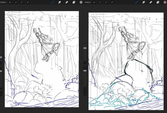
So base sketches were mostly focused around me defining the shape of the girl since she was the focal point and building the environment around her. Going in the things I knew I wanted were a girl precariously balanced on top of a massive capybara catching a falling star, while surrounded by smaller sleeping capybaras on rocks. I layered out a general forest scene surrounding it but didn’t really commit to much in the sketches. Messed with the angles of the large capybara a few times to make it feel less flat and more 3D in the space, used a lot of reference photos of capybaras and sorta simplified them to what I thought was cute/ what stood out to me as their defining features.

Skipping ahead a solid amount is midway through the initial lineart, with some areas just colored in to define them as separate. Initially this piece was supposed to be in a similar style as my “Stratosphere Dreaming” art, with a single uniform line thickness, bright colors, and no gradient shading at all, but I realized pretty soon after I finished the lineart and started coloring that I had done what I tend to do a lot and made it too complex to pull off successfully in that style so I had to pivot to using gradient shading and other non-cell style techniques (though you can see a lot of those methods still in the coloring of the girl). This caused an even bigger challenge as I was drawing on a large canvas with high DPI in Procreate which resulted in me having a cumulative 50 layers to work with at any given time (hell).
Now once I made that rendering style pivot is when the really hard part began, and why on top of my persistent arm injuries this took me about two months to finally finish.
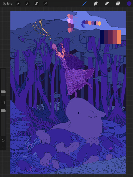
1.) I had an extremely difficult time trying to figure out the color pallet for the piece. I had an idea of the values and general colors I wanted (you can see some pallets and random base color tests in the image above) but I just couldn’t get them to look right and I became extremely more aggravated as I kept trying new and different things. My biggest mental block was feeling like I was stuck trying to make the initial pallet idea work, but eventually I was able to bump it to a slightly adjacent pallet and it worked far better. Essentially a lot of angry experimenting and testing.
2.) I made the piece too complex for its own good when it came to the foliage and scene. After finding success with a very specific way to render foliage in one of my favorite pieces I started to use it as my standard, but that standard started to show cracks when I had foliage heavy scenes like in my Hollow Knight piece from last year. The rendering style became insanely too time consuming, and incredibly distracting when used in abundance, taking away from the focal point. I knew this but I still attempted to use the same style to render the foreground foliage MULTIPLE times in increasing states of frustration until I stepped back, evaluated it wasn’t working, and tested out a very similar style with the same effect but that I could throw together twice as fast without the aggressive distraction and minuscule details that were irrelevant in the scheme of the art. This frustration in the rendering not working was only exacerbated by the color pallet indecision making a lot of the attempts just look bad both color and style wise.

Due to the limited layers I had to finish rendering out the girl very early and merge her together to free up layer space, and couldn’t keep my lineart layers as separate as I would have liked to allow for quick line color swaps. She ended up being a key point in defining the rest of the color pallet of the piece. The dress shape was indeed inspired by the Lirika Matoshi strawberry dress, but with my own twist.
Once I got a more solid color pallet down the rest started to come a lot easier and I was able to begin filling stuff in and doing general color adjustments to make the backgrounds darker and give it more depth. I don’t have any more process shots beyond the initial color pallet exploration unfortunately, but the last hurdle I hit was at the very end once I was doing final touch ups. I found that with the only light source/ lighter color being the falling star that it washed out a lot of the rest of the pieces and made the details I spend so much time on feel unnoticed. I found though that adding the bright orange stardust specks into the trees, the girls hair, and falling from the star itself gave the last bit of color I think it needed without completely destroying the atmosphere. Originally (you may see it in some of the process shots) there were going to be jars with stars already in them illuminating the bottom of the piece, but after multiple trial and error iterations it just didn’t work out and ended up taking the focal point away from the girl and the star too much so I scrapped it.
Finally once I got everything done I made a copy of the entire art file to save as a backup, then with one of the copies merged all the layers together. Once all merged I made a copy of the fully merged layer, and went and adjusted the entire layer copy using a Gaussian Blur, reduced the opacity of the blurred layer to a super low percent, and put it on top of the original merged layer. This gave it that ethereal sort of feel that is difficult to notice unless you zoom in but really helps soften the piece and make it more dreamlike overall. Then I merged that blur layer down, and turned on about a 3% noise layer on it all to give it a bit of texture.

But that’s enough rambling from me, hope this helps give a bit of background to my process and decision making and it wasn’t just a wall of random musings.
My last piece of advice is if you’re looking to do art professionally, do commissions, or make a lot of pieces in a short period of time I would highly advise against directly copying techniques I use. Because while I’m always working to improve I do only do this as a hobby rn so I have the luxury of being able to invest a lot of time, energy, and details into higher complexity pieces that would take way too long in a professional environment. I can put a lot of time into making a single piece exactly as I want it since I’m not reliant on art as my sole income. As I improve I can make things faster, but it’s still an overall slow process and I just end up moving my quality standards up with any level of improvement anyway. Use stuff I do as inspiration but I cannot stress enough to learn as many shortcuts as possible (I’m still struggling with this myself).
If y’all have any questions about bits feel free to dm, if I do something like this again I’ll try to get better screenshots during the process n try to be less verbose.
52 notes
·
View notes
Text
the always wonderful shelley @shanheling tagged me to do this thank u so much!! i think that everyone i wanted to tag has already been tagged to do this but if you feel like doing this feel free to consider urself tagged by me!! im putting this under a readmore bc its long and i ramble a lot
the piece i was tagged to explain my process on is this oc piece! unfortunately i have a habit of deleting my original clip studio file once ive finished my art and saved it as a new png file, so i dont have the file to show the sketch and different stages of this piece. but I still can go through my general process and talk about how i did that piece!
1. planning
honestly i think about the art that i want to do a lot, and in this last year or so ive thought about the art i want to do more than ive been able to actually create and finish that art that i want to do. for my planning i tend to do a lot of different thumbnail sketches for the art im thinking of
these are some examples of thumbnails, a lot of times ill do thumbnails just on pencil and paper and with some of these theyre done quickly with my fingers on my phone note function on a day where i was feeling too bad to get up and draw on paper but still wanted to get the thumbnail ideas down. two of these are for the same songxiao piece that i still havent finished and i have more thumbnails digitally on clip studio for the same piece, i do a lot more thumbnails when a piece isnt working the way i want it to and theres times where ill completely scratch a thumbnail or a sketch and start over in order to do more thumbnails because i dont feel happy with some aspect of it.
two of these are small gouche painting thumbnails for two pieces i did maybe a month or so ago, i did the thumbnails and then tried to expand on them digitally and im wanting to do more thumbnail paintings like this in the future because it was fun
for the piece of my oc trio it was based off a series of ask prompts i got for a few different outfit prompt memes i had reblogged, so i based their outfits on the ones in the meme. when im drawing figures i tend to try and get the movement down in the poses when im sketching, i do several rough sketches of the pose before beginning to start setting down lines (if im doing lineart at all because sometimes i dont like doing lineart and do a more lineless painting kind of style). i really try to get my art to convey some kind of emotion, in the oc piece i wanted it to feel fun and like youre seeing three best friends while theyre out on the town having a fun night
2. creating
this is the only real example i have of a piece in the middle of being filled in and created, this piece is one that im really not very happy with & have had lying around for a while and ill probably scrap it and try to come at it from a different perspective at some point. but anyway it still shows what i do, i lay down a kind of neutral gray color underneath my final sketch/lineart if im doing lineart in that piece and then i start picking out the colors that i want for the piece and kind of setting out a pallette for myself. i dont do this color pallette thing 100% of the time but i do it really often, especially if im working on a commission or a larger piece where i know theres going to be a lot of colors or if its a piece where im not sure exactly what color scheme i want so laying out the colors together helps me kind of decide what kind of scheme i want. i am sooooo picky about my colors in my art i am genuinely obsessed with colors in art and there are times where i really have to stop myself from working on something forever just constantly adding more colors or putting little tiny changes and gradients in the colors.
after ive got the colors i want down i tend to try and block out parts of the piece with the base color for that section, and then i start to paint with the colors that i want to go on top of that base color from there.
once im satisfied with the colors/shading/rendering and everything ill go back and look over things and will fix things that look off or sometimes completely redo segments if they dont look right to me. when i was younger and mainly doing digital art using my phone and my fingers i would use a lot of filters and overlays on top of my art once i was done, and honestly im glad to not be doing that anymore because i dont think it made my art look any better. i do color adjustments and sometimes will put on a color overlay or a layer to emphasize the shadows and the light in the piece, but i try to keep those layers to a minimum and like i said before i have a tendency to obsess over the colors and ill spend a good amount of time in the color adjustment tool of clip studio and then ill just decide "actually it looks fine as it is" so yeah!
3. posting
i feel like i dont have a lot to say here gbfm i mean i honestly have a lot of thoughts about the relationship between artists and social media and how social media changes our views on art including our own art and how we can feel like we constantly need to be posting new art and just become content machines churning out new stuff. but ill save that rant for another time. i used to be really concerned about how many notes my art would get when i was younger, and i dont at all blame anyone who still is very concerned about that bc it sucks when u work hard on something youve created and then you dont get a lot of recognition for it, but honestly within the last two years or so i feel like ive begun to have a lot healthier relationship with posting my art. i really just post my art on my art blog, reblog it to my main blog, and then thats that yknow! i do really appreciate any and all support people give me, it means the world to me, but for me having the mentality where i dont need to post all the art i make and i dont need to be posting every day or every week or every month even has been a lot healthier for me because then im not constantly asking myself why didnt this get notes is my art awful??? and yeah i just kind of post it and my brain goes okay were done with that art we gotta make more
ive honestly been struggling a lot with art thru the pandemic and if youre reading this and have been struggling with creating in any way recently or even before the pandemic, please know theres no shame in having trouble creating and it doesnt make you bad at whatever it is u create!
thank you for reading this, feel free to consider urself tagged by me again if u want to do this!! love u all
6 notes
·
View notes
Text
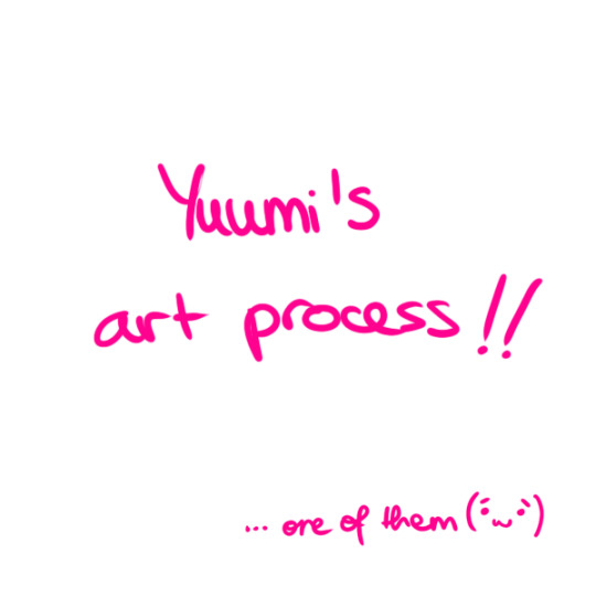
Yuumi’s art process (with pics!)
This is how I go about doing the art palettes, and generally how I do art (specially on lose, not so long pieces such as these). I’ll breakdown the process under the cut so I don’t spam people’s timelines (´・ω・`)
I was going to put these final advises at the very end but someone else might make use of these instead of going through the whole thing so here:
Important things to keep in mind in case you’re learning and actually think I’m worth being listened:
References are GOOD. No one is perfect and no one knows how to draw stuff from their memory so go google weird things, Google-sensei won’t judge. Hopefully. (else set your navigation on private).
Brushes and whatnot don’t make the artist, but it sure as hell help you feel like you’re doing what you like or not. I can’t stress enough how many times I’ve just not finished works because my brushes felt “off”.
Posemaniacs is very good for both anatomy and speed practise (I’m aware I’m really fast compared to my fellow artist friends but by no means it’s a standard, I just got used to work fast uwu)
Be careful with your wrist!!! use your whole arm when drawing!! and also T a k e · b r e a k s.
Art block is a bitch and strikes anyone. I’m usually artblocked but if you find something you’re passionate about go draw that, whatever it is. (I hadn’t consistently drawn in p much 5 years after college and thanks to MLB season 3 here I am LOL)
And now for the actual breakdown:

Step 1: Sketch
My first step is the sketch, which some of you might think “but it’s SO CLEAN!!”, yes, sometimes I leave my sketches as lines and polish them a bit. Anyways, these is what my sketch looks like and next an important thing:
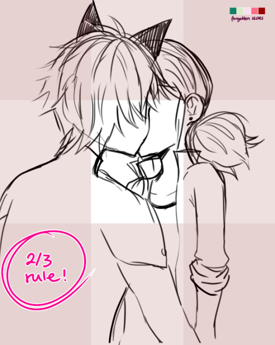
...which is the 2/3 rule! Photoshop blabbery ahead, tl:dr how i made the grid
I’ve been doing this small trick by filling a layer of any color, lowering the opacity to 50% and transforming it to 33,33% it’s height duplicate and place on each side of the canvas and then merge, and then another layer doing the same but doing 33,33% width instead of height. Then I merge both layers, set the opacity to 30% and the result is that perfect 2/3 rule.
If you don’t really know what the rule is, I kindly suggest this instead of my explanation bc words are not my forte.
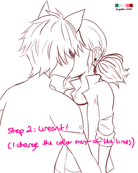
Step 2: Lineart!
Nothing to say here other than cleaning the lines from earlier with a different (or the same in this case) brush as the sketch one. Opacity varies from day to day.
I have several styles of lineart and they all come with the mood I feel on that day, so don’t be afraid of experimenting and finding what you like most! I personally like thin lines a lot but also thick lines too! i’m constantly looking for the perfect line™ and to give an idea this is what my brushes look like:
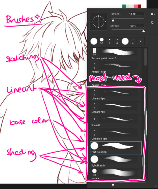
in summary, practise with as many tools you can find around and see which ones you like most uwu

Step 3: Base Color
This is probably the part where I give up the most bc it boooooores me LOL. I try to spend as little time as possible in order to overcome this step. These are usually colors I use in 99% of my pics, since... idk years. If you look in my old arts in twitter you’ll see them haha.
Something important I’d like to mention here is ✨LAYERS✨:
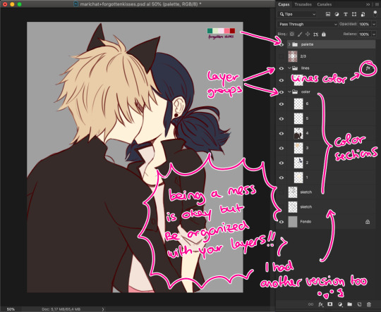
This is how my layers look like in the base color part. I tend to do 1 for skin color, 2 for hair / eyes, 3+ for clothes and stuff. I tend to separate them in colors so they don’t merge! I go with numbers because... I think it’s faster to type and I’ve been using this way of naming for years so it works for me, what matters is that you group your layers and keep them organized uwu (specially if someone else has to look at your psd files >>)

Step 4: Shading!
Normally, I shade every single layer with a proper shade but on the case of the palette challenge I’m doing just the skin because I want to stress the light mood. Liiiike if I want to go with a softer light I’d use lighter shades or a stronger light = stronger shades. To pick colors, I usually go with that brown from Chat Noir and Marinette’s jacket as my universal black (I don’t like working with black, I’m weird), and most of the colors I just eye pick from the Color Picker on Photoshop. In the right you can see my swatches:
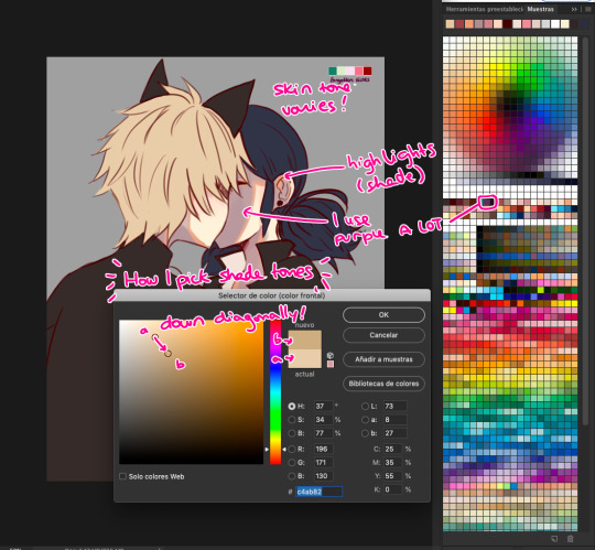
To choose the shade tone (in this example we’ll use Chat Noir’s hair), I picked a Yellow -Adrien’s hair is specially hard to color ugh- And then with that same tone I’d choose its shade going diagonally looking for a darker tone. This way you can find interesting colors! On this pic I did that for Adrien’s hair and... the rest I did the following:

I did my lazy shading™ : which consists in a layer set to Multiply with 50% opacity (this varies depending on the light, again), and I shade everything with the same tone (my to go is purple, but sometimes I use other colors too). This gives a sense of uniformity and the resulting shades are way nicer in my opinion.

Step 5: But Yuumi... where are the palettes???
I take that people straight handpick the palettes and use them to shade all the way and I respect them for that. I instead decided to do whatever floats my boat so I color regularly but add the palettes over the whole thing to change the overall mood and colors of the illustration. I randomly use the Gradient Tool and use the palettes’ colors around and then set that layer to Screen, Multiply, Focal Light, Overlay... etc etc, whatever I feel like doing in that moment, and so the magic happens! :’D
I don’t usually do this on my works but this is a new way to experiment for me and I’m having fun with it!
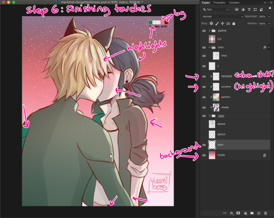
Step 6: Finishing Touches
Here is where I use the palettes the most, adding random highlights in whatever way I feel like. Yep, I pretty much Ladybug my whole coloring process: Wing it and go with the flow™. I’m still learning about lighting and whatnots but I really don’t care at this point LOL
To which you’ll say: But Yuumi?? In art school they told me that---
To which I say: shhhhhhhhhhhhh assigntments are over for me. go watch some Bob Ross (I am serious). Do whatever you feel like. Be happy. No one is going to judge you, and if they wanna judge they better be paying for your work first. so. whatever you do: BE HAPPY. or don’t do it. unless it’s a school assignment, in that case go do it or i’ll kick your ass.
✦ Finishing Notes ✦
So yea, that’s my art process in how I’ve been doing these Miraculous Color Palettes and generally how I go about my illustrations most of the time. For more complex illustrations, I need to remember how I did those (oops). And actually, do them. These illustrations usually take up 2 or 3 hours to make, on other pieces i’ve been working on them for up to 8 hours, it really varies from piece to piece, but I hope this was helpful!
Please let me know if you have any questions, commenting in this very post will help me -and others?- keep track of things and learn together! My asks are also open and I’ll reply as fast as I can uwu (my requests are still waiting there, don’t worry).
aaaaand that’s all, folks. Stay Peachy!
53 notes
·
View notes
Photo
BRAND NEW 10/31/03 16x22 screenprint I have a few copies from the original run left. LINK IN BIO! . In continuation of #everydayishalloween here’s a #gigposter I designed for @brandnewrock @hotrodcircuit @eisley @orangeislandrock ’s show at the @trocphilly waaaay back on October 31st, 2003! . At the time, I had just finished a #screenprinting class at the Pasadena Community College with one of the BEST printers (and teachers) I know - @j.e.miner Thanks to John, I learned how to design for screenprinting. I got the idea to overprint the ghosts after meeting Jordan Crane @jdrancor who was printing in the back of @meltdowncomics around then. PLEASE check him out! . Looking back at the file info I guess I designed this early in March of that year. It wasn’t until a few months later that the band asked me to design their 2003 tour poster, shirt, and backdrop. There are a few funny stories that go with that project. (Buy me a beer someday and I’ll tell ya.) A few months after that I designed the cover for their “Holidays ep”. Wow…I’m old. . I’m racking my brain as to what was the inspiration for this. #Halloween obviously. But why is a half-naked lady wearing a cat mask? I have no clue. I know I had just quit working at #HustlerMagazine and I was/still am HEAVILY inspired by @artofcoop & @atomhues! If you dig #pinup art CHECK THOSE GUYS OUT! . When you scroll through - you can see the stages of the piece from sketch, to inks, and to the final piece. The final inks were 11x17 on 3 ply bristol board. I used a @winsorandnewton series 7 no.2 brush and @fabercastellusa pens for inking. The sketch is around 3” tall. . . . ALL ORDERS are shipping tonight, tomorrow and Monday. THANKS to everyone that ordered and for being patient! I’m juggling a lot of cats right now! #DeadlinesRuleEverythingAroundMe . If you wanna see a new print I designed go here now - https://www.facebook.com/groups/2026554894327690 I'll have copies available soon! . . . . . #brianewing #inking #comicartist #comics #brushandink #posterart #posterartist #line #lineart #illustration #design #details #darkartists #stickers #rockposters #halloweenart #fabercastellusa #winsornewton (at The Trocadero) https://www.instagram.com/p/CG_F-n7FYx4/?igshid=146or84nybtvj
#everydayishalloween#gigposter#screenprinting#halloween#hustlermagazine#pinup#deadlinesruleeverythingaroundme#brianewing#inking#comicartist#comics#brushandink#posterart#posterartist#line#lineart#illustration#design#details#darkartists#stickers#rockposters#halloweenart#fabercastellusa#winsornewton
1 note
·
View note
Text
Week 16 - Alex - Dénouement
--- Opening Thoughts:
Here we reach the end of the story of this project; the final knot, which took so many threads to tie, yet seemed not long ago to be little more than a tangled mess.
This week, our group achieved more than what seemed achievable, given the time constrains and pressure. And although so much could have gone wrong, this was truly a very ‘right’ conclusion to an epic semester-long project. I’m so very, very thankful, and proud, of each and every member of our our group - without whom this film would never have been possible. And I’m honored to have been a part of what may very well be one of the finest films produced here in ACM Animation since its inception.
I also would like to give a huge thanks to all the colorists who made the production pipeline go so much smoother and faster - sacrificing their own time and effort to be a part of something amazing! I also would like congratulate our terrific voice actor Justin Bendo, for his incredible work as the voice of Angel. And to our composer Joshua Namba, who breathed life and vigor into our film through his music.
--- Weekly Deliverables
For my work this past week, a lot has happened, as most of our group can probably agree to. It’s difficult to bring to memory every individual thing, but the core tasks were these:
Coloring Sq13s6, a shot I originally roughed for. Although the final version would go on to have some major alterations to Angel, I’m happy to see it least one rough of Phantom I did pretty much stuck all the way to final:
youtube
Colored Sq13s16; took a heck of a long time even using pre-programmed inputs for the coloring process. But it turned out good, and due to me needing to use base layers for the characters, Gavin came up with an interesting blending mode for the Old Man which we can see in the final film:
youtube
For the next two shots I finished line from last week, plus color and shading for this week. They turned out pretty good I’d say:
youtube
youtube
We ran into some technical issues when it came to rendering out certain files, and one in particular that comes to mind is Sq9s16, as imaged below.
I don’t know how it was possible to even work on a file this large on Photoshop, with the hardware we have. It was so big that most of our group’s computers couldn’t even open it. Mine struggled big time to load it, let alone render it as an uncompressed .mov. I had to clear almost all my ram, and even then it crashed before finally managing to render it, which only took around 10 minutes (for one shot mind you,) and then uploading it which took a solid three and a half hours.
This one file almost stopped our whole production. It was amazing, kind of hilarious, and a bit scary, but we managed to pull through. I added a clipping mask to the fire’s lineart to make it orange.
The next thing which ate up a lot of time and energy this week was sound. Basically, I expected have sound done in maybe 5 or 6 hours over the weekend. Turned out it required almost two full days to finalize. Me and Gavin met up to discuss corrections and adjustments, and after some last minute feedback, all the retiming work was done, and we got an incredible audio track.
Even though it was a heavy tax on my very tight finals week schedule, I think having those two days to work on it really raised the fluidity and creativity to provide something almost of a remaster to the animatic audio track we’ve been using up to this point. The premiere file itself is kind of a convoluted mess:
Nevertheless, it gets the job done, and taught me a whole lot about sound editing and design over the course of the semester (except organizational skills.)
--- Last Reflections
This semester has been such a momentous one for so many reasons. If 320 taught me “how to work on animation,” then 420 taught me how to work on animation for real. The jump is so tangible, not necessarily in a “workload” sense (although that may be part of it) but more so as an appreciation for the art of animation itself as a collaborative medium, and a visually exploratory one.
I am much more aware now of every element that goes into a piece of work, and I think I can see the great value in attempting to discerning the purpose behind everything we see in Animation, as with any art piece. While it was easy to get away with seemingly arbitrary choices of shape, color, motion and such in the past, it has become especially necessary now to be deliberate in making choice, since the workload falls on someone else’s shoulders.
- Adjustments to the Process in the Future:
Not all of this is necessarily in my control, nor should this be held against anyone or any part of the film making process here, since after all we’re learning and exploring how to work in teams with new techniques.
That being said, one thing I would aim to sharpen in the future is the pre-production estimates of workload times/levels, as well as the overall film length. I think I speak for most of us when I say that the film’s scope grew a lot over the course of the semester. And I’m not saying having a large or ambitious idea is bad - that’s my favorite kind of project! But it can become a bit of an issue when it grows to such a scope that we are having to recruit outside helpers and dedicate most or all of the 24 hours we have in a day to be able to manage finishing on time. Basically, just have a more rigid plan from the start, and be very cautious towards anything that adds unnecessary levels of complexity. That’s something that can be addressed at the animatic stage.
Beyond that, being more cautious with the estimates of time and energy requirements per shot would help. I noticed that some (or maybe most) of the shots required quite a bit more time than originally intended to be roughed, lined, colored, and shaded. That’s not taking into consideration all the revisions they may go through as they are reviewed, given feedback, and trade hands between group members. Production schedule-wise, it’s much better to undershoot I think, and have a lot of extra time to hammer out details, maybe refine shots, and properly apply feedback versus feeling the dread of being behind schedule and cutting years from your life due to the amount of sleep lost to try and catch up.
A general rule of thumb is that specificity helps. Despite how meticulously we planned, we would still occasionally run into issues such as what color a prop might be, or how the shading might change between environments. Or another example might be how a character’s physical attributes such as stretchiness might change or remain consistent throughout the film. Although these were minor things that got addressed in the end, baring those details in mind in the future would be of great help I think.
- Words of Advice to Future 420 Students
You have three options: either become a cyborg, learn to hate sleep, or adapt to being powered by copious amounts of coffee every day. As for me, I took something from all three of those this semester.
Joking aside, these are some general pointers I would give to incoming 420 students:
-Choose your story and teammates carefully: This semester can be as fun (or unfun) as you make it to be. No matter what though, the people you have at your side are the people you’re stuck with. Hopefully by this point in the major you would be familiar with your teammates and their individual strengths and quirks, so if you’re having trouble picking a team in the beginning, go with the people you feel are the most self-determined, hard working, and whom you can adapt to their mold (not necessarily vice versa.) If you hate your team, you will hate your semester. But if you love your team, it doesn’t matter how tough the work gets, because you can still come to class with a smile (a very dead inside smile.)
-Come in with a strong concept: Even if your idea doesn’t get picked, being able to receive other people’s ideas and represent them faithfully is vital to the overall success of the production. The better you understand the idea you are working on, the better prepared you will be to make it a reality. Also, simple designs and ideas tend to get picked more often. Keep that in mind when developing your idea.
-Diversity is a strength: Having a broad skillset on your crew is incredibly important. Ideally, everyone can functionally perform any given task on the production. But having specialists assigned certain specific tasks is very helpful. It serves to balance the workload more or less equally among members based on their strengths, and the result is a product where you have good work reflected in all aspects of the film.
-Be prepared to change your schedule: Unless your group’s idea is ridiculously simple, chances are you will be losing sleep, possible questioning your choice of major, and being forced to change both when and how you are available to people and things you care about in the world outside the borders of your computer screen. It is not a joke to say that this course can affect your health, your diet, and maybe even the way you view other people - or even yourself! If done properly, this class should challenge you in the way you live and handle work. It should force you to adapt to an animator’s lifestyle. Not that you need to forsake life to be an animator necessarily, but to give you a taste of what the industry may demand of you through certain seasons of life.
-Be able to take a joke: By the end of the project, you’re going to be throwing shots at each other left and right. It is a crazy, whacky time - and you may find yourself forgetting this is all for a school project. Learn to enjoy acknowledging your own weaknesses, and have fun pointing out the flaws in others, when its appropriate. This makes the experience not only more enjoyable, but in a strange, ironic way it makes us become comfortable with our shortcomings, and enables/pushes each other to genuinely improve our skills, and ultimately create a better product.
-Communication is key: You need to keep up with your group. Period. If you are our of the loop for even a day, it can throw things off big time. Setup a chat group via text, setup a Discord server, or find some other means to talk to one another that is reliable. Even if you don’t always feel like chatting, just be ready when somebody needs you (which will happen quite a lot.) Also, having a system of file sharing such as Google Drive is indispensable. You may find yourself keeping certain tabs open and rarely closing them, just to check for updates and be able to send/receive files when you need them.
-Practice makes perfect: I don’t care how good or bad you think you are at animating up till this point; if you do your best in this class, you will grow. You may find yourself drawing in a different art style than you’re used to, and implementing work methods and software that you’ve never used before. And that’s wonderful! Be open to experimenting and exploring new styles of work. I’ve found that is a big part of what makes animation enjoyable and inexhaustible. Just when you feel like you’re set in your ways, the moment you step into something new, it’s a whole other world, and you just might find something you like about it.That opens the door to not only other ways of being creative, but on a practical level, makes you a much more viable component to a team when being considered for hiring. Don’t let the early hardships bog you down; with time and practice, there’s nothing you can’t do.
--
Well that pretty much wraps up this last blog post and the semester for 420. The experience has been life altering, no joke. I have no regrets, and I’m so thankful to have had the chance to work so closely with everyone. In my experience, this class has been the difference between being an animation student and becoming a professional animator. Even though it was as a real challenge emotionally and physically, I would take the class again if I could, and I very much look forward to working with you all - my fellow animators - in our continuing classes, as well as our careers beyond. You all have been my family here while I’ve been without one since moving all the way out here for school.
Thanks to Brittany for teaching our wonderful class! And to everyone who has fought through this semester together and made it something special, right up until the very end. Until next time my friends, this is the Undercover Animator signing out.
0 notes
Text
Evaluation
Context
For this year’s final major project, I have originally come up with four different initial ideas. I have ended up mixing two ideas together; one idea was related to character design and the other was related to digital illustration of an environment. My project was about creating a digital illustration / painting of a concept environment featuring a concept character.
I think that the purpose of my final piece in the creative industry could be used for a poster of a video game / movie, or my final piece could be used as a front cover for a comic.
Whilst working through this project, I felt that I have understand the specialist area of design my project was about for the most part (which is digital painting), as this was my first attempt at digital painting, but managed to pick up some of the methods and techniques shown on tutorials. I have also understood the specialist area by frequently practicing with shapes, body proportions, perspective and landscapes in my sketchbook.
I plan to build my skills on this area of art by keep on practicing with proportions, perspective, different anatomy poses, etc. by frequently doing rough sketches in my sketchbook as well as watch different tutorials to improve techniques with paint, shading, etc. on art software.
Research
I think that I have done my research well for this project, as I have collected initial research right at the start of the project by looking at some concept art done by some artists which I like the look of. I have collected primary research by uploading photos that I took from my travels that may influence the concept environment of my final piece, collected secondary research by researching different artists who specialise in digital painting, illustration and concept art. For my further research, I have looked at photos of landscapes around the world and written how they could influence the landscape of my concept world. Because I think that a large proportion of my target audience will be members of the furry fandom, I have also written about it and uploaded some photos that I’ve taken at previous conventions. I have also looked at some tutorials online on digital painting as part of my pre-production work.
For my research, especially initial and secondary, I have looked at many different websites featuring the biographies of different artists to collect as much information about the artist for my research.
In terms of using my research for my final project, for me, the primary research I have collected from the photos I took have greatly influenced the type of environment and what the concept world would look like. I also believe that the secondary research has influenced my final piece as the artwork I have collected from artists for my research has been digital paintings and I have created a digital painting piece on a concept environment. I also think that secondary research has influenced the perspective lighting and shading for my final piece.
One of the things that I think will make my research more affective for next year is creating a survey as part of my primary research to collect information from other people who I ask on what they think on the topic of what my project’s about and the specialist area that my project is centred on as well as collecting photos I’ve taken personally that may influence the artwork I create.
Problem Solving
The main problem that I have faced during my final project was the fact that I wasn’t able to start my project till around early to mid-May as I still had a load of coursework to finish off. Another problem that I have faced was towards the end of finishing my final piece, when my computer was running slow whilst screen recording the production of my final piece and it eventually automatically shut down without managing to save it as a Photoshop document. There have also been times where trying out techniques on the software I’ve used didn’t turn out as I wanted, e.g. not smooth enough, wrong highlights and shades, etc.
I have managed to overcome the problem of having to finish of my other coursework and my final project with limited time by attending college on the days where I don’t have any lectures as well as staying in college for extra hours and working in the library at different campuses. I’ve also partially was able to overcome the problem of the crash of the software as I’ve had the software set on autosave with the frequency every 10 minutes, but it was saved as a png image file instead of the software file. I was able to overcome the problem when the techniques didn’t turn out as expected by trying out different brushes on my software and looked at the tutorials to get the image as good enough as I wanted it to look.
During this project, I learnt that there are many different ways to tackle problems during a project like this, e.g. I learnt that if something went wrong with creativity on my final piece, I just keep continuing and try something different to try and get the result I want. If I was to do a project like this again, I would make sure that I got all my previous projects done beforehand before the start of a project and I would also try and tackle the problem with software by saving it as two different documents frequently. One file being an image file, whilst the other being a document file. Again, I will try and tackle the problem of unwanted visuals and appearances of an art piece on software by allowing myself time to watch and concentrate on tutorials and try more techniques on software to get the visual I want.
Planning and Production
I think I have planned the production of my final piece well, as I have been watching online tutorials on features and techniques on digital painting, and using these different videos, I have experimented with one of my sketches by importing them onto my art software and tried to use these techniques and features on my sketch on the software to get similar results. I have attempted different features on digital painting, and there were times where I have started from scratch and tried other features because I think the visual looked rough or didn’t look good enough for the production of my final piece. Eventually I have managed to finish an experimental piece by using the features and techniques on one of the videos and used them for my final piece. I have also been using the hours where I don’t have any lectures by spending extra hours in college to work on my pre-production work and trying different techniques used to produce an experiment.
One of the things that I would probably do differently in future projects is maybe upload the experimental illustration drafts and first tries onto my blog to show how much I have improved with skill and techniques within a few hours. I will also probably look at other tutorials on how to paint certain things instead of a whole image.
Practical Skills
During my experimental and final pieces for this project, I think that I have used more tools and techniques to create those two pieces than I would usually use to create a piece for myself during my spare time. I have also tried out the practical skills I have learnt in one of my projects this year, which is perspective shading; I have had the close up areas of the final piece more bright, but had the areas further away from the character in the distance darkened, as the image is set during dusk.
One of the techniques I have extended on was painting the hair of my character. I have looked at a tutorial a while back on how to paint hair which I got the wanted results from, but I have also extended this technique by using it on the tail. I have also challenged myself during this project by trying out some new techniques after watching the online tutorials I’ve watched as part of my pre-production work. Using the brush techniques, I learnt before the project during my spare time which I’ve used to draw certain things, e.g. hair, tail, etc. And extended the technique by using it to paint and blend the sun glitter / sun reflection on the lake, etc.
During this project, one of the new techniques I have acquired was going straight to painting from digital sketch. Usually I would draw fine line art around the sketch outline and then go to colour and shade, but for this project, I have decided not to use lineart and go straight onto colour to try and create a digital painting. I’ve also tried out a new method of shading by filling the whole of a certain area, e.g. character, trees, landscape, etc. In a black fill colour and using the eraser with a different brush with modified presets to create a shading effect. I have also extended this technique by filling in certain areas in black colour and lowering the opacity to make certain areas darker to make it look more realistic. With the new techniques I have learned, I will plan to improve them by using them in other illustrations I plan to create in the future, and will have will have a look at different brushes and presets to make improvements with the pieces I make in contrast with the ones I’ve created before using these techniques.
Evaluation
During this term, I have evaluated my final project creating a schedule of what tasks need to be completed on my final project for each day from Monday to Friday for every week. I have also written a brief evaluation on my journal about what’s been completed for each week as well as a summary of what’s left to be completed.
I have also written weekly journals for each week from the beginning of this term of what I’ve done and learned for the week, what was successful for that week, what problems I’ve faced and how they’ve been dealt with, what’s left to complete and how I’ve rated that week. If I was to do a project like this next time, I would probably use a more detailed schedule with a more detailed evaluation and reflection of each week.
Presentation
I think that my blog is structured enough as I tried my best to explain the pre-production work and research of my final project and I have tried to explain the process of the final piece in as much detail as I can. I have also shown the process of my final piece via time lapse screen recording, so I’m able to simplify the description of the process of the final piece. I think that maybe the process of my final and experimental pieces could’ve been explained better if went more into depth of what presets of the brushes I’ve used to create my experimental and final pieces, but I think that would be too much words. In terms of presenting my final piece after finishing, I have uploaded my project on Bēhance and written a brief description of what it’s about, what inspired me and a brief summary of the process.
One of the main things that I have learnt doing this project is learning different techniques on software that is out of my comfort zone, e.g. drawing and painting without lineart, shading and higlight techniques I’ve never used before by waching and reading online tutorials, which is what I will hope to do in future projects to improve the appearance / visual of future artwork I create.
0 notes
Last Seen Blogs
lemonylepid
Lemony's blog
lacunae-inc
tiny history
lucrezia-beatrice
Lucrezia Beatrice
bangtanbeingbangtan
boys will be sonyeondan

aquasnails
Aquasnails