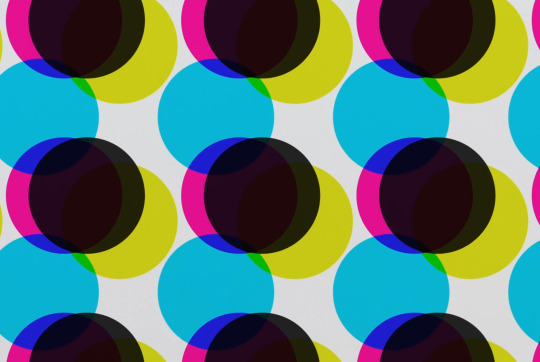
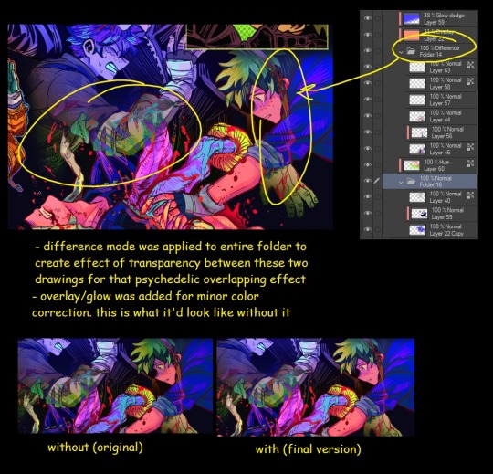
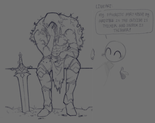
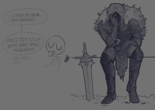
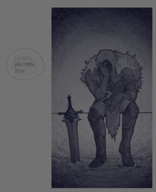
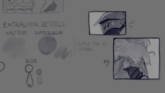
#i learned how to use halftones
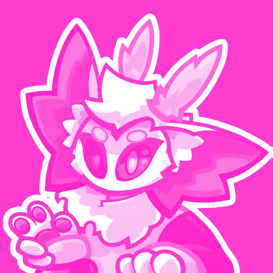
Text
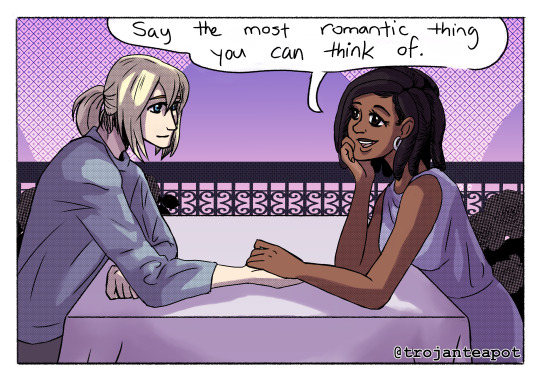


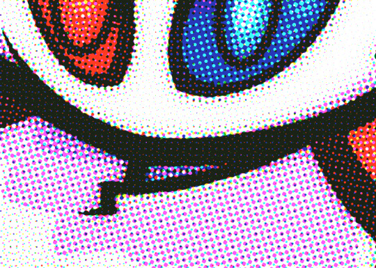
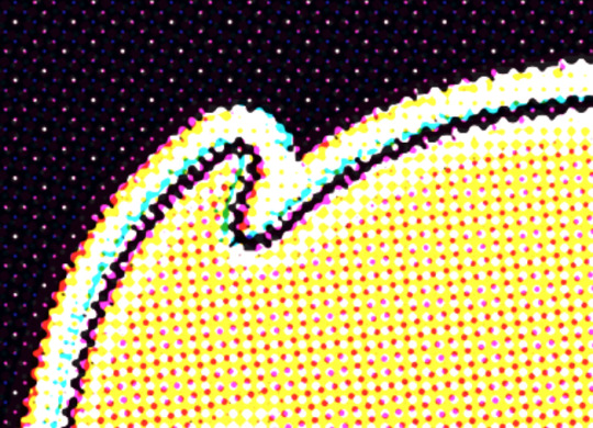
she won at flirting
#infinity train#infinity train fanart#fan comic#grace monroe#simon laurent#grimon#infinity train book three#infinity train book 3#non canon#stuff i made#i learned how to use halftones#and now i abuse em#get ready for wanton abuse of halftones
110 notes
·
View notes
Text

Wink!! (he’s trying to distract Wolfwood from the fact that he lost his gun)
#get vaguely jojo posed IDIOT !!!!!#trying to remember how to draw on an ipad and learning how to use halftones#i love this sketch sm i literally just finished drawing it#it took about 40 mins which i cant tell if its too long or not#trigun#trigun maximum#vash the stampede#my art#trigun fanart#trimax#vash trigun
167 notes
·
View notes
Text

I've always wanted my current webcomic to have halftones (à la manga!), and never really took the time to "learn" how to do it.
And whaddya know... it's super easy and changes everything and I LOVE HOW IT LOOKS 💙💙💙
www.littletinythings.com
#ltt#webcomic#halftones#screentones#anyone wanna know how I do it it's so easy#though there are variants of how to use halftones and i'm gonna learn how to use them in different ways
216 notes
·
View notes
Text
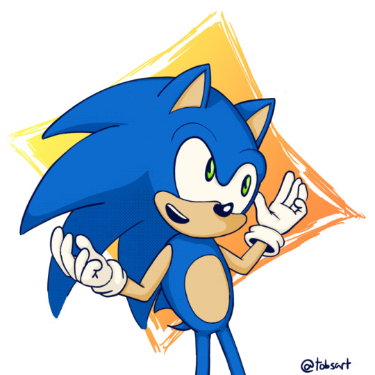
Learned how to use Clip studio Paint!!! :D
#sth#sonic the hedgehog fanart#sonic the hedgehog#sonic#sonic fanart#tobsart#i don't know how to use halftones AT ALL but i have learned a lot about how they work :D#also clip studio is remarkably easy to use??? idk i just find it's wayyy better than using sketchbook#it's definitely better for full drawings and comics tbh#but how do you find the halftones in the materials tab? none are showing up for me (except some i downloaded)#do they not come with the software?#anyways i need to do more art to see if it's worth it (i changed styles to one i liked better almost right after getting CSP)#but i think it's really good#id in alt
16 notes
·
View notes
Text
Did I just find myself a new art style??
I mean I’ll still do my old one but like another one? For differ stuff??? Maybe?
I can’t draw trolls yet BUT
but but but
Maybe I’m getting somewhere.
#ngl I kinda love how my pf turned out even tho I only spent like half an hour on it???#like I just swished with my fav lineart brush like whatever#and splashed some color#I love love love halftones#I gotta learn to use them better#I used to be obsessed with hatching as a kid now it’s half tones lol
4 notes
·
View notes
Text
i think my quest for the next year might be to try and learn to replicate multiple styles better, because i want to use all sorts of different tools and textures and techniques but theres only a few things that i feel look good with the style that i have. and its a good style that i like! but i want to be able to experiment more efficiently, because i think that will help me learn better. i wont figure out how to use a tool if im using it for the wrong thing u know
#not art#i want to learn how to use watercolor/oil/pencil brushes but my style is very geared toward smooth things with minimal texture#i use thick swooping lines and flat colors and blocky shading if i remember to do it. whenever i try to add texture it looks a bit strange#the biggest thing i want to learn to use more in my art is HALFTONES...... i had a few different moments of using them a lot but#they looked weird to me. and also i keep forgetting to use them. i feel like i could make them work but again.. experiments#im posting this here so i can see it and remember btw. every year this becomes less of a pure art blog but thats what the not art tag is fo
0 notes
Text
every time i get sent moro or maru art my head mcfuckin explodes
#i refuse to learn how to use twt but that's what friends are for 🖤🖤#yessa used to send me kika's works ALLLL the time n that's how the psycho pass au came to be#lowkey all my friends know i love sa so every time one breaches containment and gets on their feed#they're like oh!!!!! let's send to che#anyway i got hit w a double whammy today aaaaaaaa i love maru's use of halftones smmmmmm#i was trying to remember if i got either of their books for xmas but i looked and it wasn't#not to say if they did put out a dj i would get it if i has the chance#the one i was thinking was mawakos which is super cute#but the book is rly tall like i have to lie it on its spine to fit on my shelf#anywayyy x2 i have sa brainworms n so much to do for school ugh#ill prolly forget abt it for my sanity but if i ramble on here it'll be under a cut+untagged
0 notes
Note
Hello!! Your 3D renders are SUPER inspirational! If possible, could you tell me how you composited or overall edited your pokemon renders to look the way they do? (i.e the Nosepass in bed). I've been trying to capture a similar effect hehe... Thank you!!
Thanks so much! I usually do a few things in Photoshop after I render. Details below!
This is the Nosepass straight out of Blender - I try to get the colors and effects as close as I can off the bat.

Then, I usually do a color correction pass using the Color Lookup function. (I learned this from the master, Kat Tsai.) Usually, I use a combo of the 3-Strip and the Kodak presets. It's a function that basically maps colors across the spectrum of your original image to a new set of colors - often used in photography and film (which I'm using Blender to emulate!)

I often then draw in 2D details. Finally, to emulate that sort of old-video-game-magazine look, I duplicate the image and use Color Halftone on it. Find a decent blending mode, and voilá!

The post-Blender editing is super fun. I often try weird blending modes and overlay textures at this stage to get the effects I want. Hope this helps! (I also plan on making a beginning-to-end Blender video at some point.)
2K notes
·
View notes
Text
Was experimenting with halftone effects after watching this video and it almost has spiderverse vibes honestly. I actually learned some neat things about why printers use CMYK instead of just CMY so I thought I'd share !!
So in our optimal little computer space, Cyan (0,255,255), Magenta (255,0,255) and Yellow (255,255,0) all multiplied together gives us a perfect black (0,0,0) Awesome! The issue is that ink colors irl arent exactly perfect like this, and color is a bit more complicated irl compared to how computers represent it, so they aren't the greatest at combining into black if they aren't those perfect CMY values:
Left: CMY
Right: CMYK

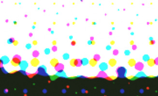
(thats not even black, its a dark blue in the original image but dark colors just look so much richer)
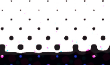
An important step to make sure you arent doubling up on the black values though is to divide the image by it's own "value" (the max of all 3 color channels) that way the value is equal to 1 everywhere, and you're letting the black ink take care of the value on its own.
Left: CMY (normalized value)
Middle: K (black)
Right: Combined


Now obviously the grids of dots cant be aligned perfectly with each other because you'd just get a bunch of black dots in unwanted areas, but if the grids are misaligned, then some dots become more prominent than others which tints the whole image. This was an issue because older printing methods didn't have great accuracy and these grids were often misaligned.
The solution was to rotate these grids such that they can move around freely while getting rid of that tint effect if they aren't perfectly aligned :D
(I have no idea how they came up with these angles but that might be something to look into in the future who knows)
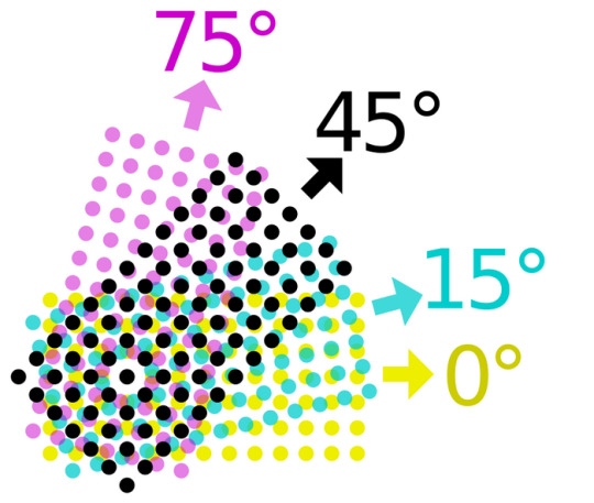
SPEAKING OF MISALIGNMENT
I wanted to implement that in my own filter to get some cool effects, and I discovered another reason CMYK is better than CMY for lots of stuff !!
With CMY, you're relying on the combination of 3 color channels to make the color black. This means if you have thin lines or just details in general, misalignment can make those details very fuzzy. Since CMYK uses a single color of ink to handle value, it reduces color fringing and improves clarity a lot even if you have the exact same misalignment as CMY!
Left: CMY
Right: You guessed it! CMYK


(yes these comparisons have the exact same color misalignment, the only difference is using a fourth ink color for black)
ANYWAY I just thought there was a lot of cool information in this tiny little day project, I also just think it looks really neat and wanted to share what I learned :3c


EDITING BECAUSE THERE'S ONE MORE THING I WANTED TO ADD
So, I talked about how to get K in addition to CMY instead of just CMY, but how exactly do you separate CMY from an image in the first place?
Well, CMY is a subtractive color space, meaning the "absence of color" is white, compared to RGB where it's black. This makes sense because ofc ink is printed on white paper. You can use dot product to get the "similarity" between two vectors, and this can be used to separate RGB actually! Using the dot product of a color and red (255,0,0) will give you just the red values of the image. This is cool though because if we get the dot product of our image and the color cyan (0,255,255), we can get the cyan values from our image too! If we first divide our colors by their value to separate the value from them, then separate CMY using those dot product values, and using K for our final black color value, our individual color passes end up looking like this:
While it's called a "subtractive" color space, I find it more intuitive to treat white as the absence of color here, and then multiply all these passes together. It makes it much easier to understand how the colors are combined imo.
Notice how cyan is the opposite of red: (255,0,0) vs (0,255,255) and magenta and yellow are the opposites of green and blue respectively! This means you can actually kinda get away with separating the RGB values and just inverting some stuff to optimize this, but this example is much more intuitive and readable so I won't go too deep into that.
THANKS FOR READING
I know it's a very long post but I hope people find it interesting! I try my best to explain things in a clear and concise way :3

oh thank you I realized I should probably add an eyestrain tag
1K notes
·
View notes
Text


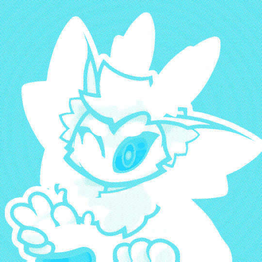
Ace Attorney with pride color palettes part 1!
Featuring: Bi Phoenix, Trans Apollo and Aroace + Lesbian Athena!
This was my first time using halftones so they're VERY messy, but I'm learning! It's a great way to deal with limited color palettes!
Feel free to request any characters with any flag you want! (even the ones I already did, the colors are very easy to change!) Also if anyone wants to use these as icons or whatever go ahead :) 👍
(love how aroace athena is just her color palette. literally nothing changed lmao)
#ace attorney#ace attorney fanart#phoenix wright#apollo justice#athena cykes#my art#ace attorney pride#ace attorney headcanons#pride
866 notes
·
View notes
Note
Hii first of all, I FUCKIN LOVE YOUR ART! ITS GORGEOUS AND IM SURE EVERYONE CAN UNDERSTAND YOU REALLY GIVE YOUR SOUL INTO THAT🤧 Your color palette looks so good, What do you pay attention to when painting? (Like when do you think its better to use multiply or something like that and etc.)
first off, I'M HAPPY YOU CAN TELL THAT I PUT MY SOUL INTO MY ART!!! im genuinely in love with drawing and am always finding ways to make creating art enjoyable and impress myself with what i can achieve and learn :D
second, thanks for asking your question!! i dont mind answering it, but my response is quite long. here's my thinking process:
(you specified layer modes like multiply, so im gonna gear my answer towards that a bit)
1. REFERENCE SEARCHING IS KING. color is actually extremely hard for me, so i search around for artworks with palettes i'd like to use and study how an artist uses it. some situations i have a clear idea of what i want, but usually the images in my head are extremely vague, so i borrow palettes from various other artworks that fit the vibe of what i want. an example is this one. my main palette reference were from these artworks. im looking at this artist's use of high saturates and how drawings are overlayed on top of each other.
while looking at references, im asking myself how is this artist using warm/cools, where are these warm/cools placed, if their illustration used any form of texturing (like halftones, hatching), how do they use their palette to render form/shape/gradient, when/where do they saturate/desaturate their colors. those questions inform my decisions when using colors too.
2. USING LAYER MODES WHEN NECESSARY. i used to be reliant on multiply for everything, which atp i dont do since i can definitely push colors more first before using layer modes. only when i feel like my current colors are lacking do i start tinkering with tone curves and/or brightness/contrast/hue/saturation/luminosity settings. and if that doesn't work, then i start using layer modes.
using layer modes do help with achieving certain effects, color corrections, or when i want to fuck around and find out. i think having a better understanding of what these modes can do makes you more decisive on how you can properly utilize them and to achieve a particular look (like using multiply for a cel shaded style). here's an example:
this leads into my next point:
3. BALANCING OUT VALUES. big thing that makes an illustration hard to read is if values blend together which affects the hues and contrast. i check for what elements need to be distinguished from one another and if it can be read clearly. using layer modes can either help with this or not help at all. it's very dependent on the type of layer mode. here's this example where i applied pin light:

back to #2, there are various instances where i'm using layer modes for quick color corrections and/or to help with readability:


other times, i start off having my entire subject in gray and to figure out main shadow/lights (similar to the multiply cel shaded process i linked ealier). im thinking about what this should look like if i only used 2 value tones:


when in doubt though, i check my artwork in grayscale to ensure values aren't overly blended into each other, especially if i didnt start with grayscale like this one:

painting for me takes into consideration a lot of different aspects. im thinking about how colors should interact, where/when to give contrast, checking/balancing out values, etc, but im also making it a time to study off of how other artists use their colors through the references i collected.
hope this answered your question! lmk if there's more :]
#answered art process questions#answered asks#this one took me a couple of hours to form out my thoughts while editing in examples ngl
139 notes
·
View notes
Note
Been absolutely obsessed with your vintage inspired designs, i have been staring at them for the past hour just trying to wrap my brain around how you are able to create something SO CONVINCING that im incapable of distinguishing your designs from legitimate works from 70’s indie zines(great work btw) so i have to ask, how do you do it, how long do you spend on an average piece? How the HECK do you make your color halftones identical to news print? I have so many questions!!!
Gee Willikers! Why, Thank you!!
I think the time I invest into submerging myself into the art of that time really helps! I accumulated a library of old print media that I study up and down-- I love it, I love seeing the process in the works, themselves 🥺
So, I tend to take what I learn from that and apply it to the processes that I use to make my art :D I layer the colors separate on different blend modes (which makes it look like printed ink!), shade the canvas like a piece of paper, bleed lines, desaturate and fade colors according to age and wear... And work with the idea that I'm not making digital art per se, but rather working with a digital medium while using traditional techniques!
And I spend about 3-5hrs give or take on single piece! But I've been doing this for abt 2 years now... dang.
This is how I started! ^
And one of my more recent pieces :3 there's a lot more going on, but you can still see similarities
It's super fun when you get into it! Next time you're at an antique store, pick up an old magazine or book. Look through the art and see if you can figure out how they made it (which colors they layered, if they printed it using riso, what tools were used: ink pen, brush, pencil...) I GO NUTS FOR IT IF IT'S NOT PLAIN TO SEE BY NOW LOL
And thanks for askin! :3
116 notes
·
View notes
Text
Whisper

Go on... this apple will give you...
...my contribution to week 7 of the Ineffable Prompt-A-Thon by @ineffablyruined.
Edited to add: I thought of a lil limerick to go along with it lol
There once was a Garden of Eden
where an apple ought not to be eaten.
"Taste it, my dear",
into her ear
whispered Crawly the slithering demon.
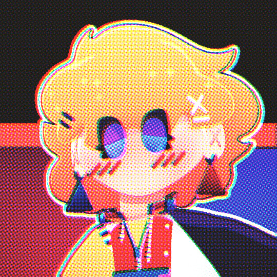
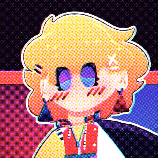
Anyways! This was my first time using halftone brushes, and there was definitely a learning curve, but I really love how it turned out!


Reference image

Source: quiteunlikely.net/screencaps/displayimage.php?album=652&pid=410863
#my art#IneffablePromptAThon#IneffablePAT#IPAT#ipat week seven#ipat week seven: whisper#good omens#good omens art#good omens fanart#good omens redraw#screencap redraw#crowley#anthony j crowley#crawly#snake crowley#digital art#affinity designer#halftone#halftones#ben day dots#retrosupply#retro supply co#colorlab#duplitone
16 notes
·
View notes
Note
Art tips? Bro ur 13 or somin' and a FRICKIN MASTER.
How
How
How
How
How
HELP MY ART IS LITERALLY SO BAD PLEASE TELL ME. ART TIPS, YOUR ART MEDIUM, YOUR TECHNIQUE, HOW YOU DO ANATOMY... JUST GIVE US A STEP BY STEP!!
PPPPLLLEEEAAASEEEE
SURE WHY NOT!
first, we'll get to my art tips, my advice is that, learning from the other cool artist youtubers like SamDoesArt, Marc Brunet for his perspective and art school stuff
second, i think using pinterest for me is hella good, but you might get lost, tracing the references is okay, as long as you dont actually fully trace it and just, SLAP your character in there
how about you learn how to actually draw that pose by drawing simplified shapes instead? better!
( note : i don't really know bout my techniques, i just do random stuff around my work )
ANYWAYS, HERE IS THE STEP BY STEP, OF HOW I DRAW! PART I

LINEART
for my lineart, you may see some blur, n halftones, its my favorite thing to do when im finishin' my work because it makes it cooler 😎

using the selection tool to do shadows like this one above ^
saves more time for me btw, and my other cool stuff below here! v
42 notes
·
View notes
Note
How can i learn to render like you??? ;-; That joker drawing tickles my brain, it's so good i want to cry and kiss it.(the order of actions may change).
But seriously do you have like a yt recomendation for rendering classes? i'm STRUGGLING.
tbh the joker piece was quite an underendered piece , most of it was just colour blocking and spiked shading but i tried to make a breakdown of how i approached the colouring ! (also did it with the original i didnt post, the final one just has a red hue layer on it to make it all one colour since i felt it was better)

this is the level of rendering i do for doodles tbh and just add some extra layer effect or halftones or some strokes of colour (for example purple, i usually paint the hair on a layer above the lineart)
and i also take a lot of inspirations from other other artists like @/sinlizards and @/nesskain, and some most recently rick leonardis hatching techniques he uses in his comics (specifically early issues of spiderman 2099)
but i do a similar approach with fully rendered pieces, with strong contrasting light or just a dash of colour

i hope this was somewhat helpful, cuz honestly i havent looked at a rendering tutorial or video in ages so idk what would be useful for others, since its not what i learned from )--)0
86 notes
·
View notes
Text
Artfight Postmortem
as you may know, i am prone to reflection on my art and process and progress. herein, i'm gonna navel gaze a bit about artfight 2024.
top line: really enjoyed myself, did a bunch of new things and this was "The Year of Artist Friends" which is spectacular.
i completed 20 attacks this year, including my first ever mass attacks! altogether I drew 28 different characters (incl 4 of my own).
for the first time, I had *users* i wanted to attack, rather than just characters i'd gathered via search or discord. honestly, three years ago when i picked up the stylus i was just excited at the prospect of drawing for other people, period. artfight was a cool way to be in community without prerequisites. i didn't quite dare to dream i might make some real connections and make proper friends. and yet :) here we are! i went in with three 'art friends' and i'm leaving with at least three more
in addition to being the year of artist friends, this could be "the year of clip studio paint was on megasale a week before artfight" because i knocked out like 2 practice pieces before July 1st so i wouldn't be starting with completely unfamiliar tools, but i used/learned csp for the vast majority of my attacks. one i finished in krita (lonnie), and my final attack i only used krita.
definitely trial-by-fired myself! but it motivated me to explore csp, and most important, gave me a reason to practice practice practice. last year i drew almost exclusively humans, lots of full bodys, because i wanted to get a better grip on anatomy and drawing a variety of faces. it worked then, and, well, i think i learned more of csp in one month of artfight than i would have if i was just plodding through my personal projects for 33 days :) *looks at my wip folder with months old files* pretty sure.
ok i'm gonna look at a few faves/standouts now:


came in hot with 0tt0 here! the main brush for this one (froggy pencil) was a mainstay for the whole month. so versatile!!! and lovely texture. this isn't quiiite brat green but this was what made me go, hmm, what if i... did a few pieces inspired by this album i can't stop listening to?
and then i took a huge turn and just used a soft round brush for Desa and Iryna for my dear friend @bobomcfoe bc i really wanted to turn these out in something approaching my "usual style" of late and i feared getting too deep into the temptations of csp if i put them off. and, um, yeah i love them. i got sooo close to matching that angle but ahh i can see the tilt now! nonetheless, love these two, not least bc brookie has some of the most pleasing color palettes to work w :)


then on to Rosé and baby's first vector lines! you can RESIZE lines in csp. did you know that? i didn't know that. i did forget to use it as much as i could have in later ones though, so i still only kinda know it ig. and halftone shading! bc why not? another thing i really only did this once, but want to experiment with more
Rook here, for my new friend @gender-premium-tm, was me realizing how to use filters/filter layers in csp. now THAT is something i used a lot this month! also something i use often in krita. i must say, though the csp options are slightly more limited (afaik), they have oomph!


okay these two are my "explicitly brat pieces"! artfight keeps you moving, which i find really valuable, bc i could have dithered foreverrr over Lonnie's gif here. like, do i add his arm? maybe he should be wearing a shirt? or, what if i just draw him twice, instead of splitting the expressi--see it just never ends. and as i am always going on about, art is so precious bc it is a reflection of us when we make it. maybe for some future artfight i'll redraw this (as Lonnie's artist @wenmistry did for me with Ebon this year), but for july 2024, i'm amazed at how well i executed this for just 2.5 days of work! (i did forget his glasses, which realization gave me a different take on the composition, so this is high on my list of potential redraws)
and then Aagatha. this is in my top 3 for this year. the pink just works so well with the green and her artist added the song to her character playlist AND added the necklace to her actual dnd inventory. like. omg. the impact your art can have!!! how freaking cool is that???


two mass attacks! i was in a silly goofy mood. i feel like i really got a handle on vectors w the anthro mass attack, i adjusted every single point on that one by hand. weird what hyperfocus makes you do sometimes, but i learned a lot from that. mainly that i will probably never user vectors as my main linework tool. there are circumstances it is perfect for, and outside of that i'm good w my raster lines lol
which is exactly what i used for this other mass attack, featuring mostly my ocs. hey, sometimes you need to shake things up! i can see here the style starting to hew back to my "usual style", though i'm thinking that might have a lot to do with drawing 5 people very quickly. falling back on practiced techniques. and by this time i apparently knew csp well enough to reproduce them pretty closely! ooh, one thing this made me miss was the transform tool in krita. that floor was ROUGH to wrestle into place in csp.


purple and green turned up a lot this year!
Echo is my crowning achievement with the froggy pencil, most of the shading here is just layers w that. and one last nod to brat green :)
i've worked in the paper cut style before (both my pfp's use it) but i really exploited csp's clipping layers to make Scraps here. they did make me briefly forget how they work in krita when i switched back, so well done w that
i played with gradient maps a little earlier in the month but for Okanar i actually made my own gradient! really a useful tool for ref'ing real human skin tones to make non-human ones, without muddying them up too much.

finally, Chaos. this actually might be my favorite! ironically this is the one that i made in krita. it was like, ahh, yes my old friend. wait where is the scroll bar. ah, okay, yes my old friend... the line layer is set to burn which just makes the whole thing so warm (and the cause of the red outlines on the earrings). used my old sable brush, a pattern fill set to overlay... my old stomping grounds! but plus a rendering technique i picked up this month and some other random habits i picked up in csp (like copying a detail to a new layer, moving it where i want a copy, and drawing/tracing it back onto the original layer in the new position. nothing i couldn't have been doing in krita all along, but made easier by the tool layout in csp, and therefore now discovered by me. amazing how one integrates new knowledge. it's like magic sometimes!!!)
that was a good roundup! if you actually read this to the end, wow! and thank you! i hope it was interesting... and inspiring! bc i want to read about your process and reflections too! yes you! and plz tag me, i'm always down to gush about art XD
7 notes
·
View notes
Last Seen Blogs

rajshreeupadhyaya
Rajshree Upadhyaya

shameless-photographer
Bad Photography

carlacross
Carla Cross

scrindie
indie
angerandcontrol
The Law