#i like that i went zine level of detail for just a fun drawing
Text
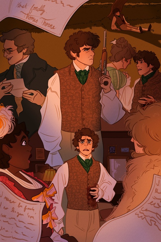
The Thomas Thorne Affair
#thomas thorne#bbc ghosts#bbc ghosts fanart#bbc ghosts kitty#bbc ghosts robin#artists on tumblr#the thomas thorne affair#i was absolutely ZOOTED and FEVERISH with the flu when i colored this yesterday and was very pleased with how everything turned out#like i was so so sick#how Romantic of me to create art while bedridden lmao#art#digital art#six idiots#i like that i went zine level of detail for just a fun drawing#i showed my mom and the first thing she said was 'oh you would look so pretty in that (Thomas's) outfit'#like slay mother thank you#mathew baynton#mat baynton
2K notes
·
View notes
Text
Diary Post: My Thoughts and Processes on Making “Silent Strength”
It’s lengthy, taking place over long period of time. Mainly written for my future-self to remember what I went through, but also for anyone who is curious. Now that the project is over, I can post without reservations. There are certain things I need to keep secret though, so if I’m vague I do so intentionally!
Basically, a lot of number-crunching, physical labor, and psychological labor.
It started off as kind of a joke tweet I made. I had enough content to make a Tales Of art book and people were receptive to it. So… I thought maybe I could go somewhere with this. A few weeks later, I suddenly had a lot of Kratos art. Like. 80% of all my Tales art was Kratos. It didn’t make sense to make a broad Tales Of book when really most of it was Kratos.
I hadn’t made a book since I was in college despite it being one of my favorite things to do. They were never art books, just some editorial design projects that totally didn’t count. This book… would be my first-ever art book.
Several times, I came close to having enough art to print a book - the last time was my large collection of Yusuke Kitagawa, but the quality wasn’t where I wanted. At that time, I was still experimenting with my iPad Pro and figuring out Procreate, so that was what I used him for.
NGL, I was pretty afraid of looking like a clown. After doing all this work, what if no one actually buys it? I was talking to some friends and they said they would buy it. It was enough for me. In the end, I’m creating something that I love.
-
The first thing I really wanted to work on was the cover. It needed to be epic but also mysterious (lol)… It was a good time to practice lighting and backgrounds. The cover had to be freaking Fantastic. I spent 3 days drawing nonstop. I was on vacation so I could spend full days just drawing. It was really intense. I would stop in the evenings to go for a run or else my legs would never get circulation again.
The hardest part was keeping it secret. I wanted to share it with the world right away bc I was so proud of it. Well, all I could do was show it to my parents and some close friends. They didn’t know who Kratos is, but it was obvious I was crazy about him.
Initially, I was doing some hand-lettering for the zine title instead of using a typeface. Tbh, I was so sure I was naming this zine “Blame Your Fate!” bc that is such an iconic line. But it just didn’t work with my cover, which looked… a little too serene for that. So… Silent Strength or Divine Strength? I asked around and got my answer.
But what size? All of my art has been on letter canvases. I wanted it to be large so you could see the details in the art. I’ll just start with that.
-
Luckily, I had all my Kratos-related art in one place. I started my InDesign file and threw everything in there just to see what it looked like. Man, I draw a lot of boxes… But I didn’t want them all next to each other. I also wanted to kinda organize it by the people Kratos hangs out with. There’s a Yuan section LOL… and a Lloyd section… and an Anna section. Idk, I tried to get some kind of order in there with a sprinkling of full spreads here and there to keep it fresh and interesting for the eyes.
I hadn’t worked with InDesign on such an intense level since college. I forgot all of the tips and tricks we learned in class. Spent some time reading on how to do things again… like adding page numbers.
-
I started drafting my pre-order form. It’s my first time making a google form like this. It’s kind of fun? I spent a long time on it, despite how simple it was. This was going to be my “Store” so it had to look and sound good.
-
My friend introduced me to charm-making. It seemed easy enough, and I wanted to give my zine more oomph. Besides, I’ve always wanted to make a charm.
I remember someone saying they’d buy a book of just the 4 Seraphim if it existed. I like them too and they lack art imo. In the end, I decided to do a polaroid charm. It’s not really that unique but I wanted Kratos to have actual friends to hang out with for once LOL.
She was going to do a group order to try to reduce the costs. I thought maybe 4 weeks would give me enough time. In the end she said I only have 2. I work well under pressure, so needless to say, I did make that deadline. I actually sketched the whole thing on the plane headed home.
-
After playing the game the second time, watching the OVA again, and reading “Offerings to a Star,” I have gained a real soft spot for Yuan. My friend once said, “If you weren’t stolen away by Kratos, you would be in love with Yuan.” Lol. I’ve been in a “Kratos and Yuan hanging out” mood lately, so of course I needed something good for the zine. They’re so cute together! Now… what is the bro-est thing I can draw?
I was currently in Florida for my friend’s wedding. I was friends with the groom and his best man since high school, so that makes it 10 years now. Seeing how they’re still friends after all this time, despite living in opposite sides of the country, was really moving to me. Of course, me being me, I could see Kratos and Yuan’s long friendship being similar to this, if they had gone to school together. I just had to draw it.
-
When I got back from vacation, I did some research on zine sizes. Mine was HUGE compared to others. I just didn’t quite realize it until I held a magazine in my hands. It really is huge…
I settled for a medium size. 7x9. I really liked how it looked. Petite but not too petite. Unfortunately resizing my book had messed up my artwork placement so I spent hours rearranging all the text and resizing my images. I found out afterwards that there’s a way to retain the format while changing the document size. Gee, that would have been helpful 4 hours ago.
Sadly, choosing a custom size booklet makes printing more expensive. But I wanted it badly enough that I’d be willing to pay for it. Letter size is just too large…
-
I decided to stop dragging my feet and post a promo. I just really needed a deadline for myself to get this all done before July ended. I’m happy it was well-received. A lot of people like Kratos huh…
Anyway, the pre-order is due in a week and I still don’t know what all the costs are yet. I need a physical proof ASAP to weigh at the post office!
-
Something possessed me one day to do another drawing. I don’t usually do painterly style (mainly because it’s really difficult and takes 10x longer) but I just REALLY wanted to push myself on this Final Piece to the zine. I wanted it to be… radiant. Almost religious. I worked on it obsessively. From breakfast to sundown. The only time I would stop was at 7pm to go running or else my legs would give out on me.
Call me crazy, but I would save my progress on my phone so I could examine it for errors during my warmup. I also spend an hour examining it for errors before going to bed. It’s a miracle I hadn’t dreamt of the painting.
-
I sent my files in on Sunday in hopes that they start working on it first thing on Monday…. and it HAPPENED! They finished before I even woke up. I think they start work at like 6am…
Of course, I drove over there as soon as I heard so I can get a look. “Please… please let the colors be okay,” I prayed as I was driving. I barely remember driving there, I was so lost in thought. It would be another long ordeal if I had to fix all the colors.
Thank the stars. The press proof looked BEAUTIFUL!! I was screaming to the client coordinator how much I loved it. I mean, I worried for a looooong time that everything would turn out too dark (it usually does) but it was PERFECT. I was especially worried about the cover, which contained a lot of yellow and I def did not want it to come out mustardy… But it was great in the end!
The press operator is a quiet man. He’s got a scary face and never smiles but I think he’s secretly nice. He has done a lot of favors for me in the past without my asking. He was the one to print, bind, and trim the book for me. Obviously he had to have seen what I was drawing. I wonder what he thought of it…? He walked away before I could express how happy and thankful was. He didn’t need to hear it. It was like he already knew. So cool…
I immediately took it to the post office to weigh it. I needed as much info as I could get and plus, I was dying to know for myself. This is the week I was supposed to open pre-orders and there was still a lot I needed to do. Take pictures, create mockups, pricing, etc.
NGL, all of these costs were building up fast. It was so darn expensive to make a zine while also keeping prices down. But I wanted so much more for my baby. Extra glossy cover, perfect binding!! I knew by the end of this, I probably wouldn’t make much money. It hurt a little, but I tried to think that it was for the greater good. Learning experience and all that. And creating something beautiful. Especially something beautiful of Kratos.
-
Pricing was really the hardest part. I pretty much threw profit out the window. However, I definitely did not want to be losing money. My dad and I had worked together to create a spreadsheet of expenses to make sure my head was above water. I followed it… loosely.
My friend came to talk to me at the right moment. I was sort of panicking at the prices. She made me realize I was thinking way too hard about it and gave me some tips based on her own experience. It really put my mind at ease talking to someone who understands my woes.
The truth of the matter is, the book is wonderfully made and has a lot of pages - countless hours of drawing. There is only so much I can do about pricing. It is what it is… I just needed to come to terms with my own worth.
-
Boy, what am I going to do once the zine is done? My friend says that I’ll be so over Kratos that I’ll stop drawing him (but the love remains). It’s like… all of the intense planning, working, struggling nonstop will just suddenly… stop. TBH, I’m running out of ideas. I spent it all on the zine.
-
Photoshoot today. I had to paint my nails purple for this occasion.
Unfortunately, I couldn’t get the look I wanted in the apartment. It’s just so naked without props. I think I’ll take it to a cafe for some nicer backgrounds. I talked it over with my friend and decided to do a quick flip-through of the zine as a promotional video. I used the most professional video program I had on hand… Snapchat. It actually turned out pretty legit and of course I slapped stickers on there because it’s Snapchat.
I had to tape/hide some of the pages for the video because I wasn’t actually done with the drawings. I had the printers print it anyway so I could examine it for color accuracy.
I’m really stressed about pricing now. It turns out I had a lot more international fans than I anticipated. I wish I took notes on interest earlier in the game to cater to them. I had a list of “possible buyers” and I only just now decided to check where they live? Foolish.
I did another cost analysis on paper to figure out what my goal was to make up for the charms. Right now they’ve cost me a fortune for something that was supposed to be giveaway. Other things that rack up are packaging costs, PayPal fees, and some other supplies I needed for this project.
Maybe I shouldn’t have made it 40 pages. It is an impressive number, but no one is really paying for quantity. I think 25 is a better number lol. If I had done that, I could have had my super-gloss cover like I wanted. :’(
There is hope though. And I’ve placed it in the hands of my followers to come through for me. I think I’ll open pre-orders on Saturday or Sunday, depending on what I finish.
-
“Losing your cool will only lead to poor decisions.”
Thanks, Kratos twitter bot. You always know what to say.
I read this post today on what makes people buy zines. Very interesting!
https://twitter.com/andythelemon_/status/1141469048653398019
-
Photoshoot part 2 today. My friend and I went to a cafe nearby that had some nice atmosphere in hopes of finding the right shots. I brought all of my Kratos merch just in case. I’m glad I did though, since the tables were pretty sparse and it was difficult to capture the backgrounds without getting a bunch of random people in it too.
I would have been the photographer, but I definitely wanted my hands in the shots. In a way, it was meaningful - to show that this was made by my own two hands. Plus, I wanted to depict natural interaction with the product. It made it feel real.
The photos were cute! I feared it would look a little amateurish with all the merch in there, but I think fun was what I was really going for, not “professional.” And plus the flip-through was a Snap anyway LOL. As long as the photos have good lighting and tasteful composition, you really can’t go wrong with “fun.”
Now that I’ve finished editing my photos, there really isn’t anything holding me back from opening pre-orders. I’ve pretty much come to terms with my pricing. If I fail to break even, I’ll just have to open commissions to try to make up for it.
I was telling my friend on the way home, “I gave this zine EVERYTHING I had to give. So at the very least, I won’t be disappointed in myself.” No stone left unturned, no detail left unchecked. It was perfect according to my standards. I really love my zine okay?!
I thought I was crazy for not only choosing a small fandom, I narrowed it down even further by picking ONE GUY to make this zine about. She replied, “Even if it’s small, those people who love him now must be EXTREMELY LOYAL to still be in love with a character from a 15-year-old game. All of them will want your zine.”
-
I went to bed that night with the intention of making the pre-order post live in the morning. I was so nervous I couldn’t sleep. I was wide awake until at least 5 or 6 am. Luckily, I was able to doze off for a an hour or two before I would shake myself awake again. It was a mixture of anxiety and excitement. It was the moment of truth - to see if all my effort made a difference. Was it going to sell?
-
The pre-order post looked really freaking good. I’ll give it that. I even made a YT account just to post that darn preview video on tumblr lol. It was definitely fun seeing everyone’s excitement and we all just freaked out together.
I broke even! That’s what really matters. Honestly at this point, I couldn’t care less if I made profit or not. I now know how much people really like the zine and that alone made me so happy I could die.
I was particularly fascinated at Google Form’s ability to transfer all the data collected into a spreadsheet. That is extremely helpful. I spent hours organizing the data. It was really fun…?! Now I can tell who gets invoiced and who paid and separate them into categories. IT’S FANTASTIC!
Stayed up late researching how much adding tracking could be. I had a slight panic attack thinking “what if my books got lost in transit?” It would really hurt me to have to reprint books and ship them again. And then I realized I will need to fill out customs forms for all international orders. Yikes, I’m gonna be living at the post office lol. You can print them out at home if you fill out the form online but there are still some things I’m uncertain about. I may visit the post office later this week to ask all my questions.
-
This morning I sent out everyone’s invoices. I gave the international people the option to purchase tracking. It’s expensive… but I need to provide that option just in case.
I received a nice message from someone who offered to advertise for me on Instagram. Of course, I gave them the OK! I’m really so shocked they would do that… They said the liked the zine so much it deserved more exposure. My dude… I love you… T_T
I thought about advertising on insta myself earlier in the week. For some reason I felt it was going to be fruitless since I don’t have an art account on there with a following. So, I gave up on the idea. Hey it worked out in the end.
I’ve never been so organized in my entire life. I want this zine experience to be perfect. The people have placed their trust in me, so I cannot mess up.
-
Edited some pages in the zine. The typography must be perfect… It made me think back to undergrad days in graphic design school. Man, if only I can present this as a project - photos, videos, matching accessories and all. I’d probably get an A lol.
-
Orders slow down after the first day. The rest is just about getting new people to see the post and giving other people more time to decide.
I finished my Kratos stationery today. It’s going to be so cute. My friend said people would want to buy it but I don’t have it in me to do more products at this time. Plus, I want it to be a surprise.
Why make stationery? Well my real job (no, I don’t draw Kratos all day for a living) is a stationery designer! It would feel really wrong not to put into practice what etiquette I’ve learned in this business. Plus, I felt that it was necessary to properly thank all those who ordered. And it’s fun?
I started designing the shipping labels for the domestic orders since I don’t need to fill out a customs form for those. I wish I had sticker labels but… it’s okay. It will still look good in the end.
-
Every so often, I would get nervous at the amount of money I’m responsible for. Perhaps, if I had a store with existing products I wouldn’t feel this way, but the fact that the books haven’t been printed yet made me scared. I know, I need this money to even print the books in the first place, but I’m just baffled at my customers’ trust in almost a total stranger. I felt pressured that I could not let them down and lose that trust. It probably didn’t help that I watched a documentary on Elizabeth Holmes (Theranos) that day.
So, I prayed every single day that nothing would go wrong. I’d check my spreadsheet constantly for any mistakes. It was a little obsessive, but I would rather be that than overlook something.
I began collecting cardboard boxes. My plan was to cut them up to protect the books during transit. I would have preferred hard envelopes but they were a bit pricey. If I have to do more work myself, so be it.
I’ve been getting nice DMs from some buyers. I think my invoice due date scared them… I really did not intend to be strict, but I wanted people to pay now if they can rather than forget about it. This happens at work all the time, so the best thing to do is have it due immediately. It would not look good to have to wait on stragglers when I close pre-orders, so I’ll probably reach out when there is one week left.
-
My Kratos stationery arrived! Aww it is SO CUTE!!! My babies…
I have a lot of notes to write so I got started right away. It’s going to be a lot of work trying to come up with creative ways to say “thank you,” but I don’t mind. I said I was going to put my all into the zine experience so I will.
At long last, the charm order has been put in motion. My friend said it could take a while… I hope it won’t be longer than 3 weeks. I really do not want to keep everyone waiting. I may ship out the ones who did not win a charm first. I mean, there is no reason to make those guys wait. I should ask the charm winners if they still want to wait and see if anyone wants to give it up for someone else who is more patient. Hm.
-
I finally stopped by the post office today to collect customs forms. I have my work cut out for me since I’m filling all of them in by hand. D:
I’m not used to international addresses so I think I’ll ask for help in checking them for spelling errors and typos. Heaven forbid I mess up on the very last part of the zine experience.
In my nervousness, I decided to reach out about invoices early on. If someone wanted to cancel, I would rather find out sooner rather than later. Everyone was really nice about paying and thank goodness they’re still excited.
Feeling kind of overwhelmed by all the things I need to do, but it’s a good thing. If I don’t know what to do, I can either: cut cardboard, write letters, type shipping labels, draw more Kratos for a… possible volume 2? Someone I talked to today already said they’ll pre-order a second book if I make one. Omg I think I’ll die. But we’ll see. It’s just a joke right now haha…
-
Preorders end today. I had another nightmare last night that the books could not be printed properly and there was nothing I could do. Why do I keep getting nightmares about the zine! I had one a few days before about people canceling their orders when I asked them about the invoices. I’ll take these dreams with a grain of salt. I’m probably just stressed/worried but everything is going to be okay. When I open my eyes, nothing is on fire.
I received my final proof a few days ago. With all of the artwork completed and changes applied. The book looks good, no doubt about it. There was only one thing I was nit-picky about but it can be fixed. The press operator offered to print another book for me to inspect. I’ll go see it on Monday and then submit the rest of the orders. I also asked to to have a meeting with the press operator so we are on the same page. It would be beneficial to have an understanding of how my book is made so that I may be more helpful to him.
I spent the day preparing shipping labels. I hate to admit, I am not too familiar with the format international addresses so I had an address validator open as I was typing them in. For the most part, everyone was helpful in already formatting their addresses in the preorder form!
-
My parents called me the day after preorders were closed. They wanted to say congratulations on my success. No one thought it would do this well. I couldn’t be offended by that since I was also guilty of it. I’m happy though. It feels like my love spread across the world and was contagious.
I tried to think of what advice I would give to others. Obviously, genuine love for the subject and hard work were a necessity. But it would be good to consider value. If I were selling it at this price, I had to make sure my pieces and presentation looked the part. I ask myself, if someone else sold it, would I buy it?
I sent out messages to all the charm winners in the morning. I wanted to apologize profusely at the ridiculous amount of time it has taken to get them made. But no, I’ve got to stop apologizing. I stated the facts and left it at that. Everyone was really kind and patient—to which I was thankful for. I don’t usually get that when I’m working customer service.
-
All the books were done printing in one day. Wow! I went to pick it up immediately of course. I can’t believe all of this is coming to an end. I finished preparing the mailers. All that was left was to stuff and seal the domestic orders. They were the easiest to do so I’m going to ship those first. The rest will need customs forms, which I haven’t filled out just yet. It’s going to be a while for those…
The mailers were quite sturdy with the cardboard cutouts I slipped in them. I have nothing to worry about. I’m sure my babies will be okay!
-
I took a whole box of domestic orders to the post office today. Wasn’t sure what to expect. But my clerk had to input every single address one at a time while I checked for errors. Omg, why are the post office shipping labels SO HUGE. I thought it was going to be half the size. And they’re ruining my designer labels! Slight panic but oh well…
I had a long long line behind me. I’m so sorry, people. Luckily there were two clerks or I would be really sweating. Despite my intimidating box of zines, the clerk and I had Synergy and we managed to ship all of these in about 15 minutes. I received a very long receipt and quite the bill lol.
-
Shipped the international orders today. I was kind of a mess since I had no idea what to do. I keep wondering if I can help speed up the process in any way but I don’t think I have the option to ship first-class at home.
When shipping international, keep the post office copy of the customs forms together with the package since they use that to type the address info into the system. Also, we get free tracking, which I did not know about. The other clerk told me that we did not get tracking for international first-class but I guess he was misinformed. It’s good to know for next time.
-
The charms finally arrived!! And THEY’RE HOLOGRAPHIC?! It was pretty awesome, but it makes picture-taking kind of difficult!! Anyway, I was a tiny bit disgruntled that they got my order incorrect, and I even asked for a reprint. But they said no, so I left it at that. Besides, it seems the holographic effect was well-received.
I like this size that I made. It’s really cute! Larger than your normal charm but not too huge. It’s almost like an Instax photo!
-
There was one customer who I found lives near me! I asked her if she wanted me to hand-deliver it to her in a public setting and she agreed (to my amazement). We finally met a few days ago and talked for hours and hours lol! I’m glad to have finally made a new friend here in this town but of course she’s moving away in two weeks. <:’3
We’re going to meet again to make the most of her time left.
-
I shipped the rest of the orders on the following Monday. I HAD to get these out. The poor guys have been waiting over a month! I think I picked a bad time to go because I had a huge line behind me and only one guy working. People in line were getting antsy or mad. The clerk at the other post office was super fast but not this guy…
For some reason shipping to the UK and Japan nearly doubled in price since the last time I checked. RIP. T_T
-
Omg I finally made a mistake. I wrote a letter to the wrong person. And the contents of that letter are too personalized!!! I am dying of embarrassment!!!!! Screams!! Had to apologize to both customers too!!! Luckily they were good sports about it but I’m seriously kicking myself AAAAAAAA!!!!
-
The most rewarding part after sending all my babies away is seeing the commentary on my project. It is so so nice to receive positive feedback. People are happy! Happy with something I created out of thin air. Everything was worth it 1000 times over. I can die happy!
I’m especially thankful to those who show understanding for how much effort went into it. It definitely wasn’t easy and I poured way too many hours into it… not that I regret that.
I don’t want to jump the gun but I would really love to make a volume 2. Because I know I can do better than last time. New and improved art and comics! But we’ll see if I make enough pieces for another book. I was against printing 40 pages before but now I kind of like it. It feels more worth it than a 25-page zine. If i’m going though so much effort, might as well bring in the entire package.
I’ll be printing more of this volume for Aselia Con 2020. Now I know people will appreciate it.
16 notes
·
View notes
Text
MY AMAZING FRIENDS Part Seven. the revenge of the Prequel to the sequel
So anyone new to this, hi, this is a massive list where I tell everyone about how great my friends are, why I love them and just how much they mean to me! It’s shrunk and grown over the years as friends have gone away or I’ve gained new ones, but it doesn’t change the most important things, these are the people I want in my life more than anything.
SO, normally I’d post this list around December Christmas, cause, it’s meant to be a treat, a Christmas treat, as I can never get out presents to everyone and I felt it meant something important, well Christmas has come early, why? Cause life is hard right now, people are scared, things are getting tougher and it’s just so frustrating seeing all the people I care about disheartened and worried, I want to do something important for them, so I’ve decided to post the list early, for the people, who need it the most.
@mistercrowbar
BEHOLD probably one of the most important people in my life right and I don’t mean that lightly, Crowbar has been everything to me, a friend, a teacher, a companion, a voice of reason and even a critic, she’s taught me so much about art, myself and even the universe we currently inhabit, seriously this woman is a wealth of knowledge you would not believe.
But more importantly, she is my friend and I care so much about this girl, I want nothing more than her absolute happiness, if I could give up everything just to see her smile, I would, she’s been in such dark places and battles them everyday, I’d do anything to stop that from ever happening to her again. she has done so much for me, hell she became a friend to me when I was a nobody and I still am, she encourages me to do better, to push and challenge myself every day, I owe her so much, I care for her so much. Please do yourself a favor, check out her amazing artwork and get to know this beautiful person.
@nightmargin
MY GUUUUUUURL, Holy fluffy apples infested with Caterpillar demons, when I first met this girl, she was awesome, as we talked, she was more awesome, her ideas, her imagination, if she didn’t go somewhere, I’d imagine the world would implode for making a mistake, AND NOW MY GURL MADE A GAME AND IS ACTUALLY BEING PLAYED AND ENJOYED LIKE IT’S THE NEXT UNDERTALE!
For better or for worse.
I always believed in her, I can’t ever recall a time where her art style a beautiful mixture of darkness and whimsy has ever disappointing me, I’m so proud of her right now, i wish her nothing but the best going forward and if you’ve not bought her game Oneshot, WHAT ARE YOU DOING.
@articbleu
Oh hey is this one of the greatest people ever, why yes it is! Artic’s determination and drive is, MIND BLOWING, I always feel like I’m trying to catch up to her, but in a good way, I’ve also never met someone who agrees with me so much, from video games, story structure and politics, it’s actually a tiny bit creepy. BUT IT A GOOD WAY.
When I first met this amazing blazing comet of a woman, she was drawing rose themed anime girls for Original character tournaments, now she has her own store, plans on making a comic and has been in several zines, like, WHAT and, and the best part, SHE AIN’T SLOWIN DOWN. She is such a kind and thoughtful person, fueling with the fires of determination and passion, there is something inside Artic that could fuel the planet. Go check out her art blog, Go check out her store, IMPROVE YOUR LIFE.
@tuz-ohtopia
Have you ever met someone who you graverly underestimated and regretted, I SURE HAVE, I’ll openly admit when I first met Tuz back in the days of Deviant art, I didn’t think much of him, CAUSE I WAS A FOOL.
His story chops, his character designs and his overall whit and personality is probably some of the best things you’ll ever run into, if you ever get the chance ask him about his amazing DnD campaign that he runs with some of my other fave nerds, the plans he has are stellar, I just wish I’d gotten to know him better. This guy is pure gold.
@knifetotheback
the moment when you’ve refereed to someone by their nickname so much that just becomes their name, meet Smudge, I met smudge somewhere most people regret to meet their friends, IN A ROLEPLAY GROUP, and at the time I didn’t really know smudge that much, we’d chatted by not a lot, not until I have the pleasure of having them as a player in my DnD game, and while they did grind on others nervous, I am surprised to find someone who put so much effort and emotion into something they cared about. Smudge is a person who is open to criticism and willing to sit down and talk about problems, a rarity in many things, but also very enthusiastic and supportive of peoples decisions, I’ve not had the pleasure of talking to smudge much due to their work. But I do miss them, very much so.
@sunshinedrago
have you ever met someone who screamed excitement, I don’t mean figuratively, I think my ears have actually ruptured thanks to this wonderful human, I’M SENDING YOU THE BILL.
This beautiful person, whose actual name I can’t ever type correctly..., is so full of energy and wonder, she is a delight to have in my DnD games just because of the drive she brings, even if it does get the better of her at times. They are also some who actually gets some of my strange interests, such as slice of life anime and cute shit with no shame, it’s beautiful. But more importantly they are a person, a real down to earth person who actually understands people, it’s a rare thing to see and must be treasured, like the dragon she wishes she could be.
@GrittySugar
LOOK AT THIS BEAUTIFUL MOTHAR FUKAR, when I first met this wonderful person she was a funny silly girl who did fun silly, DARK, comics, it was amazing, (Hellen X Ralph OTP), but NONE of us, were prepared with all the stuff she has done recently, the animations, the videos it’s also just so! I am so happy and proud for her, this is a person whom I competed against at one time and got to talk about silly things with and now look at her, look how far she has come and she’s still going. If you haven’t go to her youtube channel, check out her shit, DO YOURSELF A SOLID.
@roseillustrates
Speaking of beautiful people, here is someone I’ve sadly neglected, she is a beautiful friend whom will also be Bubby to me, her art is dark, twisted and fucking amazing! And she herself is also amazing. Some whom I miss dearly and wish I held onto so much tighter, cause I barely get to see them much, their head is swimming with such, amazing potential and stories, like, my god, please, I beg you, do your self a service and check them out!
@ssksscrapboard
BROOOOOOOOOO, I have missed you! but it’s nice to see you’ve been keeping busy, like seriously people if you are looking for fun expressive art that captures personality and humor check this guy out, he has a really addictive style that is fun to look at, with well designed characters, all detailed and simplistic, it’s so fun, he himself is a great guy, probably one of the friendliest guys I know, easy to talk to and always encourages.
Please check him out, look at his art, enjoy his humor, all that fun stuff.
@spesiria
Well, well, well, if it isn’t the person whom adore the most, or at least one of them, god I miss you, your activity is either lost in the sea of 639 people I follow on tumblr, or simply you’ve just disappeared. I really wish I had the chance to talk to you more often as you are such a lovely and interesting person, you are the best, I miss you.
@thelovelyghosty
I met this lovely loveable through a friend of mine and I’ve not regretted it, she might have, but not me. She’s fantastic and very smart, probably WAY too hard on herself and probably puts more effort into her writing than I have ever done, I love the time I spend with her, she always make me smile. I hope to spend more time over the following years getting to know her and hopefully making her smile.
@hunnylou0
When I first started out on Devinatart Lou was one of the first ‘big’ artists whom I had the privilege to get to know, it was so weird at the time and to think that I’ve manged to continue following someone whose been such a big influence to me all this time really means something, I know I’ve sadly not been the best of friends, but I have been trying to keep in contact and I hope nothing for the best for this person, she’s such an interesting and fun individual, I hope I get the chance to meet them in person and thank them, please check out her stuff, commission her if you can.
@nickala
Sometimes you need someone who knows what your thinking to make life a little easier, this is my person! Nicky is an amazing girl, she has a great sense of humor, a level head and has a job at cutting up guts and gore, best, person EVAH.
Also! Also! She has some dope ass art that will just blow you away with it’s creativity and design work, her colour it’s all just, FWAH! Not to mention with the top included, she’s a person whose helped me realise I’m not.., a freak, to be quite honest, for the longest time I knew there were others out there like me, but I never, connected with them, I felt that I was always on a different wave length that life was just, impossible to understand, then I sat and talk with Nicki and she has helped me so much with stupid brain things and I could never thank her enough, for listening to my insane ramblings and just being a great friend.
@valbey
MAN WHAT AN ASSHOLE, okay, okay not ‘completely’ true, this dude has been with me since my days in college and even went on to be my roommate, for better or worse and despite how we can sometimes get on each other nerves, he still tries to understand and respects my opinion, sometimes, dick, But he is probably one of the most level headed and thoughtful people you’ll ever know, who is also doing commissions, please check him out and call him a dick from me.
@doodlediddydaisy
Do you know many people whom you could say ‘If it wasn’t for them, I don’t know if I’d still be here today?’ Well meet the godsend here, in the literal sense, she saved me during a very dark moment in my life, where I was depressed, unmotivated and scared about the future so much, I was an emotional wreck and she manged to help me, I owe my life to her!
And now she’s happily married and I don’t get to speak to her much -cries-, but I’m not gonna be down, why? CAUSE SHE’S HAPPILY MARRIED’, that doesn’t happen a lot to people, so I’m so glad it’s happening to her, and I know she has been through a rough patch this year, but I’m sure she can pull through, she is a strong person.
@funktrash
MY GIRL HAS HER OWN FUCKING COMIC YOU SHOULD GO CHECK IT THE FUCK OUT, WHAT THE FUCK ARE YOU WAITING FOR! Okay so I knew Hyper all the way back in my early days of creating mary sues and weeb art on DA, back then I wasn’t the best of guys, but I was amazed that someone could find my art.., inspiring, it was so..., INSPIRING! And I hope I leave or left some impact, even if I don’t deserve it, I’ve come to admit my faults and I don’t want to forget them, so I’m gonna do something good for this person who deserves nothing but the best.
CHECK OUT HER FUCKING COMIC! No seriously, do it, it started out as an idea, that became a DA group and now it’s own work, if you followed her on DA do it, it’s so amazing to see these characters that you saw from her early days and see how far they’ve come! so, I’m just gonna grab the link and you better be clicking on it!
[Link to Comic]
@clauseart
HOLY FLYING CRAB APPLES, MY GURL HAS HER OWN COMIC AND IT’S JUST SO, MMM, MMMMMMNG GOOD. When I first met her she did comics about a crazy girl with an over side pinwheel and I loved her for it, found out she was English and loved her even more, Now she’s writing a modern fantasy story where the real world and the magic community co-exist together, while a buff ginger haired lady punches the undead and has to baby sit a brat, CHECK IT OOOOUT, I want her to succeed so much, she is worth it, here is a link, if you haven’t checked it out, I’ll know.
[Comic Link]
@velkro-bitch
I WILL NEVER FORGIVE YOU FOR LETTING ME MISGENDERING YOU!, wait is it misgendering if they don’t apply to one gender or the other? Either wait, I love this person, they were the voice of reason in my DND group and continue to be a person who’ll always make me laugh and miss so much, they’ve gone off to live a successful and hardworking life and I could not be more proud of them, but it doesn’t hurt that I still them so much!
@a-trashcan-in-a-corner
You and your fucking sibling, I love this girl so much, funny, kind, compassionate and a no shit taker, they are a great source of joy and sadness, cause very much like their sibling, life took over and they had to leave my DND, I try to keep in contact, but as anyone who knows me, knows I’m terrible at that, but if you ever just want to talk to some this is someone whom is the best at doing that and is very good at playing sexy buff shy dudes.
@flunafloon
I WUB MY HEAD, and I’m a terrible friend again this year, I’ve not been as active and as friendly as I would like to be, MAYBE IF SOMEONE WAS ACTIVE ONLINE MORE AND DIDN’T HIDE, HMMM! but I seriously do miss you, I hope you are doing well and everything is going well for you, please take care of yourself.
@mercuziades
I love gothic art, I love this girl and I love her art! Sadly I’ve not seen much of her work of late, as sadly much with many friends I’ve come to know life has gotten in the way, but I’m always hopeful to speak to her more, when my life isn’t getting in the way, but to any and all out there, check out her work, if you love the Gothic esthetic and do mean romantic Gothic, the true Gothic, got do it. NOW!
@riyamilea
So, I’ve followed this person for sometime and I’ve only gotten to know them recently, which is strange, cause I’ve been following them since the rise OCT, and for anyone who still remembers the rise OCT, don’t you feel old now, HUH!
But seriously, she has such an amazing body of art work, her designs are outstanding, her skill with anatomy and detail is breath taking and she’s so fun to talk to! She’s level headed, smart and never argues her opinion, she acknowledges other peoples points either adding to them or deconstructing them, talking to this person is a breath of fresh air. And I really hope I get to know them more.
@seriousmealtime
HERE’S SOMEONE WHO MAKES ME FEEL UNCOMFORTABLE, in a good way, I only met Sam briefly last year and thanks to some close friends we’ve been talking a lot more and what I love/hate about this person is they are always lavishing me in praise. IDON’TTAKECOMPLIMENTSWELL,LETMEFEELUSELESS!
Sam is great and I love them to bits, their crude enough to get my stupid sense of humor, but kind enough to sympathies with, sadly Sam is dweeb and doesn’t upload any of their amazing art so I can sell it to you, but it’s amazing and if they ever do decided to get off their butt and actually show it, I’d highly recommended them.
@ioanaartblog
I remember meeting this girl after attempting to join a deviantart Roleplay group that went, nowhere and after talking for a bit and introducing them to Critical Role, we started a DnD group, that has lasted for about two years now. It is my first and longest DnD session that has taken up so much of time and energy as a creator and it all started with her, if it was for Ioana I wouldn’t have such wonderful memories as well as a burning desire to improve on what I have done, I’m so exictied each session to challenge my players and watch their reactions with what I have planned.
It has meant to so much to be and it of never been possible if it wasn’t for Ioana, likewise, Ioana has gotten herself noticed in many ways, after watching Critical role she became inspired and now she has some of her artwork up for sale in the their official store, not joking, here is the link,
[Shop Link]
And now she is currently at university studying art and improve her skills, despite anyone else who’d of called it quits and ridden he coat tales of their first success, I’m proud to see her chase her ambitions.
@phantomdotexe
Sometimes it really helps to have someone to talk with, cause not everyone wants to hear EVERYTHING about yourself and we are flawed deep down, it’s what makes life so interesting, no one is the messiah. So I’m really happy I met her, she’s smart, funny and more importantly she allows me to be more open than I have ever been with some other people and she is very supportive, if not a bit nagging ‘why aren’t you in bed’
SORRY YOU GET ON SO LATE!, hehe but if you ever into anything, risque, I suggest taking out her library of work, she’s a writer you see and while her taste lends to the mature, it doesn’t stop it from being an engaging series of work, please check it out if you are into rope and gags, also send her a hi and let her know how amazing she is.
@dansome0203
Mother fucker, let me love you! This guy, besides me being envious of this skill to draw such beautifully curvaceous women, he is just such a nice guy, like, stupidly nice, He’s probably an alien, hmm. I’ve sadly not had the time to talk to him much STILL! God I feel like those assholes who refuse to talk their fav artist then whine about it on their art blog!...wait.
But this guy, he just continues to surprise me, found out he’s not just a nice guy and an amazing artist, but he also runs a very good DND session! The stuff I have seen pour out of it has made me so excited if this guy ever plans to do some writing in his own free time.
@totalobelisk
A friend of mine for the longest time, who I’ve sadly not stayed in contact much with, cause I am a terrible human being. That said he’s incredibly bright and funny as well as creative, I’ve never met a guy who just doesn’t give up, he’s driven and determined, willing to do what he enjoys more than anything! I wish I had some of that drive, his work might not be everyone’s cup of tea, but hey, in the end, it matters if it makes him happy and he being happy makes me happy.
19 notes
·
View notes
Text
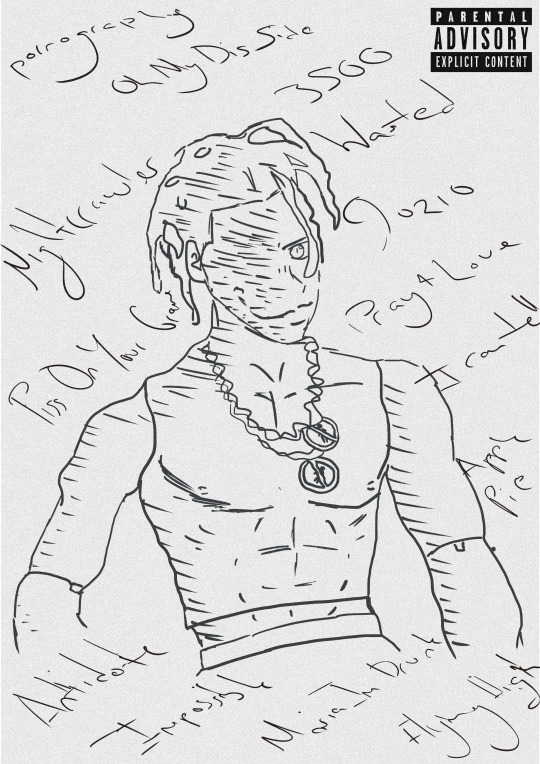
ZINE - La Flame
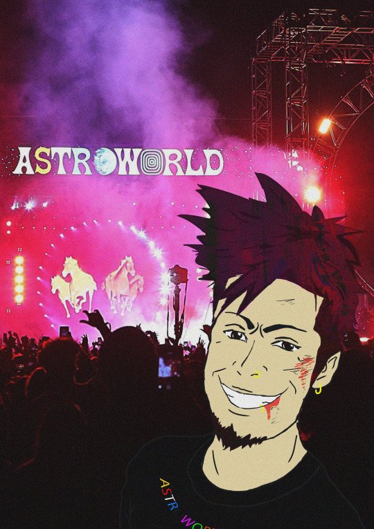
In all honesty, I first thought I was going to just stick to the theme “CUT-COPY-PASTE” but the more I started to create my zines the more I wanted to be creative and make my zines truly outstanding. In total, I covered three themes for my zines. I covered “CUT-COPY-PASTE”, Layered chaos and Sparton zen. With my first zine that I created, I did not use the theme cut-copy-past. I ended up doing my own illustration and doing a sparton zen themed zine. I wanted the zine to be aggressive but peaceful at the same time, or dark / gritty and show enlightening hope. Because my zines involved around the artist Travis Scott, I thought it would be a good idea to portray his dark and gritty albums ( RODEO / DAYS BEFORE RODEO ) to his new bright up beat albums ( Birds In The Trap / ASTROWORLD ). With this idea in my head I thought it would be cool to illustrate a drawing of him with half of his face being blacked out with white sharp teeth. That would portray his old albums that were dark and gritty. On the other side of the face, It would still show sharp teeth with him smiling but with his face not being blacked out. This would portray his current album ASTROWORLD. He would still have the sharp teeth because In ASTROWORLD it still has slight dark themed meanings in some of the songs. I thought having a pink background would look cool as well and make the face pop out. In the beginning the split Travis Scott face had more detail in the creases of the mouth and chin but I wanted to make it more mundane. I ended up using the level tool and darkened one side while keeping the teeth bright and sharp. I wanted to use this as a front and back cover for the zines. The front would be the dark themed (Travis Scott) and the back would be the light themed (Travis Scott). I am happy about how my front and back cover looks but I think I feel like I could have added something more like a simple text.

The second page that I had created ended up being a mix of layered chaos and CUT-COPY-PAST themed zine. I looked for images where Travis Is performing and going all out in performing. I got about three where he is live and looking intense. I wanted to use three to show his energy and craziness but also show that he is not just some crazy person. I got a pictured of him smiling to the fans as well. I used the magnetic lasso tool, magic wand tool, quick selection tool and move tool. This allowed me to take the images and cut out anything that I didn't want. I overlapped the images of Travis over each other and had the ASTROWORLD concert in the background. Because this page specifically has to do with ASTROWORLD, I tried to make it not look super dark or gritty. Hence why the biggest picture out of all the Travis's is him smiling looking over all the other Travis's. The last thing that I added was a grainy effect. I wanted it to look a little like an advertisement for a magazine ( just a little ). I thought it looked amazing and was not to complicated to create. It took time and patience to make sure I cut out each of the Travis Scott pictures. I have no regrets as to how this page came out for the zine. It was fairly easy compared to the other pages that I had to create.
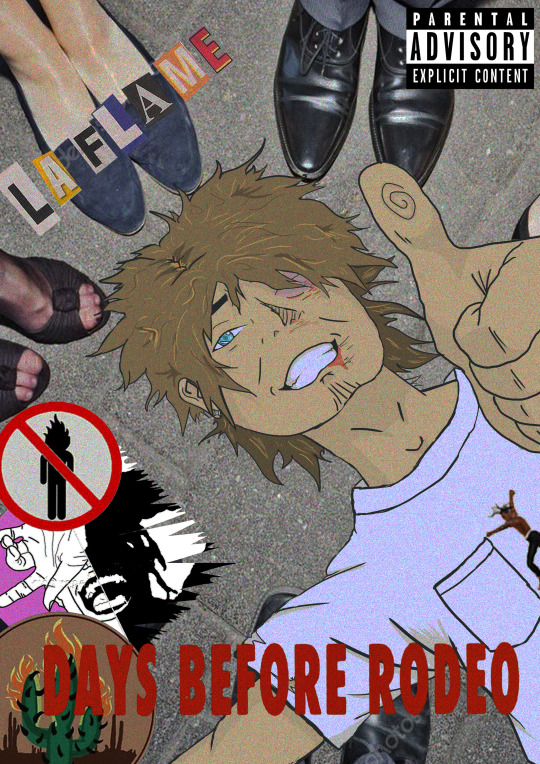
Moving on to the third page for the zine, It was now time to create A RODEO themed page. In the album rodeo, there is a very significant and recognizable figure in the album. The doll of Travis Scott is heavily shown for the cover of the album. I thought it would be a good idea to now base this page as a sparton zen themed page. I would then draw the doll with the names of the songs in the album around it. I wouldn't draw to much detail nor add colour. Why not add colour? I thought it looked better and would stand out more if it didn't have any colour. I kept that sketchy draft look of the doll by not erasing to much of the outline of the doll. Mainly used the brush tool and changed the hardness and texture of the brush to a more flow look. I added a grainy texture to it all to make it look even more cooler. If I had not added the grain, I feel like it would been to plain. I added the parent advisory explicit content box to make it look like an actual vinyl cover, or cd cover. I love this page because of its simplicity. I am indeed happy with this page. Because it is rodeo and sparton zen themed, I wanted to have the doll staring at you to indeed portray it as creepy but at the same time peaceful. Once again, I was trying to have all my ASTROWORLD themed pages not as dark and grimy as the RODEO themed pages.
The fourth page that I had was pretty fun to make. I was on face time with my friend in my country, who listens to Travis Scott as well. We were talking about cool ideas and interesting things that a photographer could see at a Travis Scott concert. He started to talk about mosh pits and I instantly thought about what others don't see unless they down and dirty in the mosh pits. I decided once again to do a sparton zen theme page which would show aggressiveness but peaceful vibes. A person can indeed get a bloody nose and bruises on their eye in the mosh pit but they could also be enjoying themselves and have the adrenalin so they could possibly not even feel the bruises that they have. All true Travis Scott ragers know that If you go to a Travis Scott conert, there are no bystander's. You best be jumping and moving like there aint no tomorrow. I decided to illustrate a person who is at an ASTROWORLD concert a little bloody and bruised from being in a mosh pit but having a great time. This was very fun for me because I was able to draw a character from my imagination. Because I love drawing characters and in a manga style, I decided why not add a little manga inspired illustration to the page. I ended up with a character who had brown hair and wearing one of his merch t shirts. I got the ear piercing an nose piercing inspiration from myself. When I had initially finished it, I didn't like how the character looked unnatural and unrealistic. I added a grainy effect to it and also made his hair transparent a little bit and flow with the background lights and strobes. It shocked me as to how it looked way better than just him having brown hair looking at the photographer. Because it is sparton zen, I did show that it could be dark and gritty with the blood and bruises but I also wanted to show he is not angry and is actually enjoying himself. He is smiling. The main tools I used to illustrate this page was the brush tool, magic wand tool and quick selection tool. I also played around with the curves to change the darkness of his hair and transparency. I am extremely happy with what It looks like. I didn't expect it too turn out as good as it looks. I originally didn't like that he stood out that much because he is a manga inspired illustration but I think that when people draw non realistic drawings into realistic photos it looks eye catching. I had to fiddle around with the transparency and blending mode to get the proper colours set for his hair skin and t shirt. With the drawing tablet I have at home, it allowed m to draw it better than a mouse. But because it is a very tiny and cheap one, its not easy drawing like how I do on paper. I am currently saving money for one that the college provides or better.
For this page, it has to be by far my favourite out of all of the pages for the zine. I personally like Travis Scotts old albums where his music was dark, grimy and gritty. Because this next page had to be RODEO themed I decided again to pick sparton zen. I also did a little bit of layered chaos for this page. This pages illustration was way harder to draw than the previous page. The previous pages illustration had slight bruises and blood but because this person went to a Travis Scott concert where mainly rodeo and days before rodeo songs where playing, the moshpit was a lot more aggressive with day one OG Travis Scott fans. I had to step out of my cum fort zone and draw a different perspective of a person lying on the floor chin up and thumbs up looking ok. I am terrible at for shortening so it was difficult drawing and SHADING the hand. I find shading hard but I tried best. Another thing is that I am very unused to drawing on a drawing pad compared to a good old pen and paper. The main reason why I ended up drawing on my pad Is because I didn't have enough time to copy and render anything where I could colour it in the computer. I did enjoy drawing the character though. In the page it shows the illustrated character ( wearing Travis Scott RODEO merch t shirt ) lying down on the floor with a bloody nose, swollen eye, bloody lip and dazed but HAPPY. You have other people around him enjoying the the party. This specific page took me a good set of hours to create. In total it took me about 8 hours straight no break to finish. The main tools that I used as the brush tool to draw the character, quick selection and magic wand tool to cut out the images that I would layer on top of each other. I also thought it would look sick as either an album cover, vinyl cover or CD, so once again I added the Parental Advisory image. I used once again a grainy layer over everything to make it even more grimy and dark. I honestly love this page a lot because I am proud as to how I am being aware of the importance of layers. Separating and creating new layers for each and every important thing. This shows that I can step out of my comfort zone and illustrate things I wouldn't usually. So yes I am extremely hay with what I created for this page. Love it!
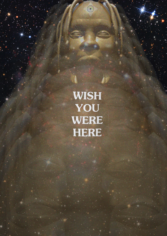
With the 5th page coming along , I wanted to create something pretty eye catching and tripy to look at. Because this page had to be ASTROWORLD themed, I thought it would be cool to implament a songs meaning. One of the songs of the album is STARGAZING. I thought it would be cool to have a galaxy looking page with the golden Travis Scott head fading towards the person. At the very end I made the Travis Scott Head pretty visible but bright. I also made sure there was a alaxy with sparkling stars and distant plants. I ended up putting the same text tat you get on the back of a t shirt if you get on of his merch T shirts. I decided to put it directly in the middle because It grabs the viewers attention. The eyes might wonder all around the page to see and view everything but in the end the main thing that will immediately grab their attention is the test “ WISH YOU WERE HERE”. I kept the text bright and white. In order to create such A cool page for my zine I had to duplicate the head, make them transparent at a certain limit and make them smaller as they move towards the back ( top of the page ). I left one of the heads not as transparent as the others and changed the blending mode. I also used the quick selection tool, magic wand tool and the magnetic lasso tool. This allowed me to cut out the golden Travis Scott head. The zine theme that I had chosen was layered chaos. Each head was being layered on repeat. I thought that this zine page was unique and outstanding like the others as well. It was simple but eye catching. I honestly do not really have any regrets o
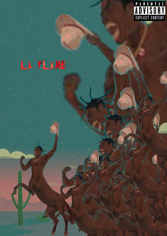
Coming to the last page of the zine, It had to be Rodeo themed. If you look closely you can notice a pattern. Rodeo themes page, astro themed page, rodeo … astro... etc. I decided to make the last page not only rodeo themed but also layerd chaos. I feel like the picture of Travis Screaming or galoping, what ever you want to call it , its a good representation of layers chaos. Truthfully when I finished this page, I thought it was a good way to end it. It shows a bunch of crazy, chaotic Travis Scott raging off into the Texas night. I put the text La Flame there in bright red letters because it is another name fans call him. Its red to implement ( flame/fire ) as well. I didn't want to add to much texts or random objects in it. I decided to put the main Travis Scott horse slightly away from the others to represent leadership. It looks like its Travis leading his loyal fans into the night to rage and party to the end. There is no size or gender that Travis will deny to follow him into the night. Creating, I used the magic wand tool, quick selection tool and move tool. This allowed me to cut out Travis and duplicate him. With the colours that you see that fade into the night, I made sure it all faded smoothly and pretty by messing around with the blending mode. I kept the parental advisory explicit content icon because once again it look kind of like a vinyl or cd cover. Because Travis Scott is from HOUSTEN TEXAS and names his album RODEO I thought it would be pretty smart to implement that into a zine page. In Texas the first thing that comes to my mind is cowboy hats, horses, bulls, cactus etc.
0 notes
Photo
Alright here we go! I’ve recently noticed I’ve become the sort of person people go to for advice, and while I’m still very much figuring things out myself I guess I do have a fair bit of experience by now. So I thought I’d compile a list of advice I have, combining answers to questions people have been asking me as well as stuff I feel is useful but I never got around to discussing.
Keep in mind that all of this comes from my own personal experience, I am in no way an expert and what works for me may not work for you. If you’re curious to my art journey so far, check out the addition I made to this post a while back. Long story short: I’ve been drawing forever, but only got serious about it in 2013 or so.
Also, this is by no means a definitive list! I will keep adding to this as I go along, and you’re always welcome to ask me questions.
This is basically a novel so let’s put it under the cut!
ART
Draw what you like and don’t feel bad about it
This is by far the biggest lesson I’ve learned about art in all the time I’ve been doing this. Drawing what you like, be it fanart or your OCs or horses or self portraits, helps you in so many ways. Not only does it allow you to be more productive when you don’t have to come up with new subject matter all the time, it also keeps art fun. You’ll never get the mileage you need to level up as an artist if you’re not enjoying yourself enough to do it over and over and over again.
Draw A Lot
Sorry. I know you’re tired of hearing this, as was I before I tried it, but you can’t improve if you don’t draw. There’s this saying that 10.000 hours in anything will make you an expert, and while that statement is not entirely true, there is definitely some truth to it. The trick is you have to spend those 10.000 hours working towards a goal, consciously aiming to improve, for it to fully work. But even 10.000 hours spent casually doodling make you a better artists than you were before. And obviously you’ll notice your skills improving all the while, not just after you’ve reached the end!
I did daily drawings for three years, and have a fair amount of things to say about it. I’m definitely not saying daily drawings are a ‘must’ for every artist, but if you’re curious if you should give it a shot, you can find my first year overview here, my second year here, and my final year here! I also compiled a zine with all the drawings and some more in-depth views on my struggles and the things I learned.
How do you draw the same character consistently?
Somebody asked me this and I had to do a double take, because I honestly don’t feel like I’m consistent at all haha. When I look back on all the Alistairs I’ve drawn, they look super different to me everytime. So there’s that: you will always be more critical of your own art than others are, keep that in mind. I have, however, actively tried to be consistent about Alistair so I can tell you how I went about that. I basically took a bunch of screenshots of his face from different angles and traced over them, to figure out a ‘pattern’ of some sort. I explained it in more detail here. After that I went back to studies a bunch more times, mostly looking at other artists’ versions of him that I liked, trying to pinpoint what they were doing that I wasn’t. That gave me new ways to draw his jaw, his eyes and his hair so that I keep inching closer towards what I actually want him to look like. Another thing that probably helps with consistency from different angles is studying general anatomy, so that you know how to make those facial features feel real instead of being stuck to one angle, but to be honest I still have a lot of studying to do myself in that department.
Studies!
Speaking of studying, let’s talk about studies! If you’re serious about improving your art, you can’t escape doing studies. Here’s an overview of the kinds of studies I do every now and then, and what I aim to learn from them.
- Colour studies: take a picture and try to replicate that picture as closely as possible without using the eyedropper tool. Don’t worry too much about getting the shapes right, focus on the colours. This is a great way to train your eye to see subtle differences and to learn how lighting affects colour. Setting a time limit can be a good idea too, so you don’t get lost in the details.
- Value studies: same general idea, only without colour. Values are the foundation of every painting and they determine whether your character looks three dimensional and stands out from the background. Either take a black and white photo or de-saturate a photo, then try to copy it without using the eyedropper tool. This video tutorial helped me out as well!
- Landscape studies: this is just me trying to practice backgrounds but being too scared to take on perspective just yet, but I generally just try to copy landscape photos as closely as possible, this time paying attention to the shapes and composition too.
- Portrait studies: this helps me get a more diverse visual library which is really helpful when designing new characters. It also helps me understand skintones and textures better. You can use any photo for this, but I’ve found the Humanae project really helpful, as well as Reference Angle.
- Master studies: I haven’t done a lot of these myself, but they’re very interesting. You basically just take a painting by one of the old masters (Renaissance, Romanticism, anything that floats your goat) and try to copy it. This helps you see what artistic choices these people made when painting their subject matter, as opposed to just aiming for realism. If that makes sense.
- Material studies: pick a shape (a sphere or a cube or what have you) and now draw that shape multiple times as if it were made out of different materials. Leather, glass, metal, orange peel, jello, anything goes. It’s a good way to learn to understand materials by applying what you see in your reference to a different shape. There’s a lot of these out there if you need inspiration!
- Figure studies: if you’re sick of drawing only headshots but you don’t know how to draw bodies, figure studies are the way to go. I took a nude drawing course for a couple of months during my semester abroad and learned SO much. I wholeheartedly recommend in-person figure drawing sessions, but if you don’t have access to one there’s always the internet. This website has a large database of pictures, both nude and clothed, and lets you set a time if you want. There’s also the ever helpful Adorka Stock! Some tips from my teacher you can use to challenge yourself: draw a pose in ten seconds, draw a pose without looking at your paper, draw a pose with your non-dominant hand, draw a pose in a single line. It’s fun! The key is to not try and produce pretty artworks during these sessions, but just to get your eye and hand used to these shapes enough that they become ingrained in your visual library and you can build on that when you’re drawing your own stuff. It can be hard to let go of the need to make pretty art, but it’s actually pretty nice to know that even if you spend an evening making godawful sketches you’re still leveling up!
- Movie still studies: I’ve seen these around a lot and really want to try them myself sometime. Put on your favourite movie, animated or live action, and pause it when there’s an interesting colour scheme or composition. You can either make several quick thumbnails or colour keys, or take one screenshot and make a detailed copy in your own style.
I keep several pinterest boards for studies. Mind that whenever I post a study I always make sure to trace the source image back to the original artist so I can credit them (reverse image search often helps)! If you’re not posting them, there’s no harm in using uncredited resources for your studies.
Art books
I own several books on art, and while I’ve read them all I have yet to properly study them. It’s on my to-do list though! Try James Gurney’s ‘Colour and Light’ or Andrew Loomis’ ‘Figure Drawing for all its Worth’. I also own the art books to Brave, Tangled and Song of the Sea, as well as concept art books for Avatar: the Last Airbender and the Legend of Zelda franchise, which are just super fascinating and inspiring.
Revisit old art
If you’re feeling like you’re stuck, or just curious to see how far you’ve come, it’s always fun to take an older piece of yours and redo it! For this reason it’s always a good idea to save your old art. You don’t have to save it all publicly, though, if that makes you uncomfortable. Having a private folder marked ‘old crap’ will do just fine.
YouTube classes
Something I’ve been doing a lot is watch YouTube videos on specific art topics. When I feel overwhelmed and don’t know where to start studying, or just don’t understand enough about the subject matter to get a lot out of it, it helps me to watch what others have to say about it. I’ve enjoyed the videos of Borodante, Sinixdesign and CG Cookie
Determine what it is you like
Something I’ve been doing when I look at art I love, is to specifically determine what it is I love about it. Not only is it fun for the artist to get these kinds of comments, it also helps me have a clear view of what I would like my own art to be and what I can still work on. For example, I’ll love the way someone handled the composition, or the colour palette, or the way they draw hands or noses. Note that you can both love one artist’s linework and another artist’s lineless art, and you don’t have to strive to be good at both of those yourself. But you could try both and see which one fits you best!
How do you keep yourself motivated when you’re not satisfied with the quality of your art?
I made art everyday for a while, and there’s a clear pattern of alternating levels of motivation. I’d have a couple of good days and then some off days, neither mood ever lasted too long. I think drawing everyday has put that into perspective for me: now when I’m in a slump, I know by experience it’ll never last more than a couple of days. And since I set myself the rule of having to draw at least SOMETHING everyday, even when I’m not feeling it, it’s easier to just let go and draw something you’re not happy with because you can try again tomorrow. It doesn’t matter as much anymore. Which is great because that’s exactly what I wanted to achieve with this challenge! In a sense, I think the same is true for my larger illustrations now. Even when in hindsight I’m not as satisfied with one, I move on to the next and just strive to do better.
Also in general if you’re feeling art blocked, it probably means your eye for spotting mistakes has developed and your art skill is lagging behind a little. That’s a natural process! And it will pass eventually. Doing studies can help your skill catch up with your eyes during those times, because it doesn’t matter what they look like only that you learn from them. But taking a break and going out to find some inspiration is always a good idea too. You can’t create art in a void: you need input from all kinds of places that will help you make your own. Take a walk, watch a movie, read a book.
Brushes
My general advice about brushes is: don’t focus too much on those, especially in the beginning. They do matter, but the backbone matters way more. I make 90% of my art with the standard HB pencil brush that comes with Procreate, only using fancy textured ones or final details in the skin or the background. When I used Photoshop, I’d stick to the basic round brush most of the time. I’ve puzzled together a collection out of existing brush packs from different artists, like Charlie Bowater, and free brush packs I’d downloaded over the years. Google goes a long way! What works for one artist may not work for another, so try out plenty of brushes to see what matches your work flow!
Software
I worked in a not quite licensed version of Photoshop for years and years, switching to Procreate on the iPad in late 2019. There’s loads of people who prefer Clip Studio Paint or other programs. I mostly used Photoshop because that’s what I started with and I’ve gotten too used to it to bother trying anything else. It has about a gazillion features I don’t touch or even understand, even after using it daily for years, because I only need my specific set of tools to make the stuff I make. So don’t let the scale of the software scare you too much! When I got the iPad, I found switching my workflow over to Procreate was easier than expected. It’s a very intuitive app that has all the stuff I need! Very much worth the handful of dollars they charge you for it.
When I first started out, I used freeware called ‘Pixia’, which allowed me to try out working in layers and had all the basic functions. I believe it still exists, but maybe there’s better free stuff out there nowadays.
I also used an app called ArtFlow, when I still worked on my Samsung tablet. It was recommended to me by a friend and it was a much better app than I’d expected. It has a free version (which I believe limits the number of layers you can use?) but the full version was only 5 bucks I think.
Hardware
Some people can make gorgeous art using a mouse. I am not one of those people. I’ve used different variations of Wacom tablets over the years, which can be pricey but have served me pretty well. Though I hear nowadays there’s a lot more competitors out there that make quality stuff for less, I personally have no experience with those so I suggest a quick Google search if you’re interested in getting one. Anyway, a tablet provides you with a digital pencil and paper which allows you to draw sort of like you do traditionally. I say ‘sort of’ because most (cheap) tablets don’t come with a built in screen, meaning your eyes are not where your hand is, which can trip people up. Try to borrow one for a bit or try it out in a store if you can so you can get an idea about whether or not it’s something you see yourself getting used to. I honestly never had any trouble with it, and I think most people get used to it fairly quickly. You can also scan traditional sketches or line art and color them digitally, which could be doable with a computer mouse if you can’t splurge on hardware.
The first graphics tablet I ever bought was an A4 sized one by Trust. It was terrible. I switched to a smaller one by Wacom, I think it was a Bamboo, which I upgraded to a small intuos after a couple of years. I liked the small size better because I could carry it with me in my laptop bag when I went to class. In 2015 I bought a Samsung Galaxy Tab 10.1 2014 edition (yes it’s very specific lol) which came with a stylus and allowed me to draw straight onto the screen for the first time (using the ArtFlow app mentioned above). Now that I could sit on the couch and draw, I was suddenly drawing a lot more too! In 2016 I even made my dailies on it. At that point, after 1,5 years of intense use, I felt like I had to upgrade to something with a more ergonomic stylus, and preferably something that could handle large resolution files so that I wouldn’t have to transfer them over to my laptop anymore. I decided to go all out on a Wacom MobileStudio Pro, because it runs Windows and can therefore run Photoshop: meaning I wouldn’t have to get used to new software again and could store all my important files on there as well. For about two years I made all my art on the MobileStudio, often with a cheap bluetooth keyboard hooked up to it, and while it was definitely a great step up for me, there were a lot of things I disliked about it. It was still very bulky so I wasn’t quite as ‘mobile’ as I’d wanted. I also experienced a lot of bugs in Photoshop, where my pen pressure would drop away for no clear reason, for example. Especially considering how expensive this thing was, I felt a little disappointed with it.
In late 2019 I sold the MobileStudio and bought an iPad Pro 11 inch with an Apple Pencil (2nd generation), after hearing many artists praise it. I’ve been using it daily for a couple of months now, and am 100% happy with it. I use the Paperlike screenprotector, that gives the screen a very nice texture and also works against glare. That is definitely a game changer. This iPad allows me to really draw anywhere anytime, it can easily be slipped into my bag and is very light. I now make all my art on this!
On-screen drawing tablets vs tablet-to-monitor drawing tablets
I feel like this is a much discussed topic nowadays so let me add it here, as well. It may sound like a tablet where you draw directly on the screen (ie a Cintiq, or the iPad) is the Ultimate Final Stage in drawing tablets that we should all strive towards. This is not the case. They have been very popular among professionals for a while now, but I’m starting to notice more and more of them popping up to say they now have back pain or tendonitis, and are switching back to a tablet with a separate monitor. On-screen drawing tablets can feel very precise and that’s neat, but they also tend to support terrible posture, and we should all be careful with that! As with everything: different people prefer different things. So don’t feel like you have to make that switch if you’re comfortable where you’re at!
SOCIAL MEDIA
How do you get noticed?
For me, everything changed when the fire nation attacked I discovered Dragon Age. Being a naturally obsessive person I suddenly had loads of inspiration and drew a LOT, and for the first time there was an actual response from people on tumblr. I was pretty much instantly hit with a bunch of people who were supportive, enthusiastic and actually eager to see my work. I interacted with artists I admired, sharing and commenting on their stuff, and I joined two secret santa art exchanges that helped me get more followers as well. Honestly, from there on it just… happened. I’m not sure how. I started making dailies, most of which were Dragon Age fan art as well, and as my output went up so did my follower count. I was afraid the amount of shitty drawings I’d inevitably be making would scare people off, but people have been nothing but lovely to me on this website. <3 I think what you can take away from this is basically just: draw what you like, preferably a lot of it.
Also be aware that every platform is different. My follower count on instagram and twitter is very different from the one on here, and all of them work in different ways and with different algorithms. There’s whole studies about the optimal time to post on each platform and the best hashtags to use to ‘beat the algorithm’, but I honestly cannot be bothered to keep up with it. For me, the stress of figuring that out is not worth the extra followers, since to me it’s really just a number. But if your livelihood depends on it, it may be worth googling some articles.
Your fellow artists are not your competition
I can’t stress this enough. If you start viewing your fellow artists as collegues and -potentially- friends, you can build each other up and help each other out. In my experience, that shit goes a very long way. It’s a much better feeling to be in this thing together, rather than feeling inadequate when someone else achieves something you haven’t yet. I’ve made some real friends this way, which is incredibly valuable to me as a person but also as an artist in this industry. Friends can get you into places and audiences you’d never reach alone. Now two important notes on this: first, you should never force a friendship with someone just so you can get ahead. That’s not what this is about. Second, you obviously don’t have to be friends with everyone. But thinking of people as coworkers rather than rivals is better for both your mental health and your career path. Be kind.
COMMISSIONS
Offering commissions: where do you start?
I’ve only been getting regular commissions for a handful of years; in the beginning it took me a while to get noticed. Mostly because I’d hoped to get noticed on deviantART, while my actual first jobs all ended up coming from facebook contacts. I think I did two commissions in my first year, then maybe three the year after, all for friends of friends and such, and only after I started gaining a bigger tumblr following (mostly by drawing fanart) did I start getting commissions from the random internet people I’d been expecting. Take note that I personally have only ever done part-time commission work beside a day job: I’ve never been fully financially dependent on it. If you are, things will probably work a little different!
What will you offer?
An important thing to know when doing commissions is what exactly you’ll be offering. Many artists have multiple available options. Mine, for example, make two types of distinctions: level of detail (sketch/flat color/full color) and crop (bust, waist-up, full body). I did this so I could offer lower price options for people who don’t have much to spend, without having to compromise my hourly wage. The different options require different amounts of time and effort from me, and the prices reflect that. But there’s also artists who offer one type of commission only. Consider what you’re good at and what you enjoy working on. If you dislike painting backgrounds, don’t offer them. If you struggle drawing hands and feet, only do portraits. Decide what your distinctions are, then make examples of everything and compile them in a graphic. I recommend having some options, but not too many as to overwhelm your clients. You can also do short runs of specific commissions, the way I offered headshot sketches for a limited time.
Setting prices
Next comes The Big Struggle: setting your prices. The first thing to remember is that your time is always valuable, no matter your skill level, so take care not to underprice yourself. The way I did it is I found commissions sheets by other artists who were offering similar commissions on a similar skill level, and compared their prices. I also tracked the time I spent on art (I used ManicTime, which autotracks your used software and lets you label time blocks. Procreate automatically tracks the amount of time you work on a specific file!). Once you know how much time you spend on average on your different types of work, you can decide on an hourly wage (do not work for less than minimum wage!!) and calculate your prices and add them to your commission graphic. Be sure to round up your time estimate to account for the time spent on client communication. It’s also helpful to keep tracking your time when working on commissions, so you’ll know when you stray too far from your estimate and when you need to adjust the price. And don’t forget to account for taxes, too! If you really want to offer cheaper commissions, don’t just slice your prices - offer something that works for a lower price. For instance, my limited headshot sketches were cheaper because they didn’t come with a correction round. This meant I could draw them in one sitting, cutting down the time spent on them, thus making them cheaper without slicing my hourly wage.
Make a form
When I relaunched my commissions in 2020, I decided I wanted communication to be as clear as possible. One of the most stressful things about taking commissions for me was the awkward back-and-forth of emails to work out the details of the assignment. In order to eliminate that, I set up a google form (now JotForm). This way, when clients apply for a commission, they have to fill out all the required fields before it even gets to me. This means if their information is incomplete, they’ll know, and they have a chance to figure out their stuff before contacting me. This has made a world of difference. So far, 99% of my commissions have gone incredibly smoothly, with clients knowing exactly what they want and communication going quickly and clearly. It’s been absolute heaven. 11/10 would recommend. When the filled out form gets to my inbox, I use it as the start of my email conversation with that client, so all the info is always at the start of that thread. I recap what I think they’re asking of me, I ask for any additional information I may need, and then make an official price quote and time estimate for their commission. If they agree to both, I put their name on the wait list (more on that later) and once I’m ready to start working on their commission, I contact them again, asking if it’s alright with them if I send them the first invoice (sometimes people might want to wait for their next pay check).
Getting clients
A great method when you’re first starting out is to announce your commissions your real life contacts, your friends/family/coworkers. Now when someone brings up illustration they’ll go ‘oh I know someone who can do that!’. These are usually not the most interesting jobs but they do help you get an idea of what it’s like to draw for a client and practice your business skills. And make a bit of money. Warning: In my experience, these clients are also often the most difficult ones. This is probably because they commissioned you because you’re the only one they know that offers them, as opposed to internet contacts who picked you out of this huge database of artists because of your specific style or skills. This often results in these clients asking things of you that are way outside your comfort zone. Be prepared for that and set boundaries beforehand! Right now I’m in a position where I can afford to turn down clients like this. I’ll often have a gut feeling about the ones that are going to be difficult, and I’d like to spend that time on projects I enjoy instead. If you can be picky from the start: great! But it took me years to get here and there’s no shame in that. :)
If you don’t get commissions at first, I promise you dropping prices is not the answer. Getting yourself out there is. So post a lot of art! Make some stuff you enjoy making! This will both help increase your skill and increase the chances of people finding you online. There’s also often threads on social media that will boost your commission information, or you’ll find people asking for an artist to work with and you can drop your info in the replies. If there’s companies you know are looking for artists, you can always send them your information directly as well. Just please don’t do that with regular people. Always make sure your commission information is easy to find when people visit your page.
Communicate with your clients
I used to postpone sending ‘unpleasant’ emails, (“I said I’d have the sketch to you by Tuesday but I didn’t get around to it”, “I still haven’t received your payment” or “I haven’t heard back from you in a while”) but I’ve been actively trying to get better at that and I’m already noticing the benefits. In my experience clients rarely mind the delay as long as they know what’s going on. So I keep that in mind, try to swallow my discomfort, and update them on their commissions often. Pro tip for ‘please respond’ emails: “Hi! I haven’t heard from you since ____ and I was wondering what the status of this project is, so that I can arrange my schedule accordingly.” and for ‘please pay me’ emails: “I just wanted to check if you’ve received my invoice, or if maybe something went wrong on my end.” (implicating email problems takes away the awkward accusation, which makes me feel more at ease). Also I once read that saying ‘thank you for your patience’ instead of ‘sorry I’m late’ is a good tactic, and I’ve put that to good use ever since.
Another great new tool I’ve used is a public wait list. I made a trello board that showed the status of all my current commissions. This way, my clients can immediately see whether I’m still waiting on their reply or payment, and new clients can check how many people are on the wait list before them. Having this information readily available takes a lot of pressure off me.
Ask more for rush jobs, even if you have the time
I’ve had many people contact me about a commission a week before their deadline, causing me a lot of stress. Since I don’t do this full time, my experience is that anything with a deadline less than 14 days away is going to be a close call (also since it takes a bit of back-and-forth through email and you never know how quickly someone responds) so I now ask a 20% rush fee for anything that crosses that threshold. This window is very personal though, you’ll figure out yours once someone crosses that line for the first time. The rush fee is out of principle, because if I have other commissions going on I’ll have to postpone those to make room in my schedule for theirs. Even if I don’t have other commissions, I don’t want people thinking they can come to me with rush jobs all the time because I don’t like working like that. There’s still people who will accept the fee, but some people just weren’t aware that it was a tight deadline and can postpone it. Be sure to put this in your commission info!
Ask more for extra corrections
Every commission will have a certain amount of tweaks and corrections, which is to be expected. If at some point you feel like you’re just endlessly altering things, or if a client asks for a fundamental change later on in the process causing you to have to redo a lot, charge an extra fee. I don’t have a set percentage or a clear threshold for this because it varies per commission, but you’ll know when they’re about to cross a line and as long as you communicate before you let them cross it (“any corrections after this point will cost ___ on top of the agreed price”) you’re good. I try to emphasize this too during the sketch stages: “please let me know anything and everything that catches your eye: at this point I can easily change everything but later on it will take more effort”. This usually works for me and I’ve rarely had to charge the extra fee. And when I did, clients often realized they were asking a lot and offered to pay more before I even brought it up.
Don’t overdo it!
Something I still have to remind myself of sometimes is to not put in more work than you’re being paid for, just because you want to please a client. There’s nothing wrong with putting in a little extra effort for clients who are great or if it’s a subject you really enjoy, but don’t make a habit out of it. You set your prices for a reason and by spending more time on something you’re essentially lowering your hourly wage, plus the client isn’t expecting more than you agreed to offer. Now if a commission takes more time than expected because you miscalculated or the client needs more corrections done than anticipated, that’s a different matter and you either leave it be or communicate about the added costs (more about that later). Just don’t let yourself be taken advantage of!
Reflect
Once you’ve done a couple of commissions, look back and think about how it went. What did you struggle with? Is there a way you can improve that? Does the time and effort still match the limit you were aiming for?
Also, don’t forget to raise your prices every year or so. Inflation is a thing, and you’ll have grown as an artist, so your prices should reflect that!
PATREON
Question by by @maartje-sue: “How do you deal with the stress of having to create things because you have patreons? I'm thinking about starting a subscription-system where people receive some kind of merch from me every month but right now I think I would die of performance anxiety.”
I created my Patreon because I noticed I was only drawing client work and quick dailies, and didn’t make time to create full artworks of the things I liked. Which was a shame because that’s where you have the most room to experiment and work out your art style, and it’s the art that is best for your portfolio. So I created Patreon specifically for that pressure to create things, because that sort of pressure is what worked for keeping up with my dailies as well. The cool thing about Patreon is that you are free to decide for yourself what you offer. You don’t have to put out something every month: you can charge your Patrons per creation. You don’t have to offer commission tiers. And lastly, the people who become Patrons are usually the people who just really want to support an artist, so in my experience they’re amazingly kind and chill people who are super understanding about you needing to take things slower sometimes. Patreon also offers a ‘pause’ option if you need a break. My advice would be to try it, see what works and what doesn’t, and make changes along the way. You can always quit if it’s not for you! No shame in that.
I’ve enjoyed using Patreon for several years, but eventually I realized the Patron commissions were taking up a lot of my time, and I wanted to be able to open up commissions to others outside the platform again as well. After removing those tiers, many people canceled their pledge. Which is completely understandable, of course, I’ve never felt bad about that. But eventually I felt like I didn’t have the time to offer rewards that were worth a higher tier, leaving the payout fairly low, so I decided to quit so I could focus my energy on other things instead.
RUNNING A BUSINESS
Question by @imrowanartist:
“Hey Eef! Immediately sending in a question regarding your freelance art haha. If you think this is too personal feel free not to answer or not post it publicly. I was just wondering how you handle payments, especially with your online commissions?”
PayPal invoices
I get most of my payments through PayPal, and there’s been a lot of posts floating around on tumblr about people getting in trouble when they’re not shipping physical goods. I’ve never had issues with this, but just to be safe this is how I do it: I create an invoice on PayPal (under ‘tools’) and fill out the fields. For ‘description’ I always put ‘digital art commission’ and one or two words about the subject matter. Then in the bottom right box with the terms and conditions, I put ‘digital goods only: no shipping required’. This is so that I can prove that the client knew they weren’t getting any physical goods, just in case someone decides to file a complaint to get a refund. It’s weird that you can’t just check a box somewhere for this, but there you go. The nice thing about PayPal invoices is also that you have more control over the specifics and a better overview of what is still pending. And you have an option for the client to add a tip! The downside is that this way PayPal takes a small cut of the payment as a fee, but I’d rather pay a small fee than run the risk of a whole legal battle.
Split payments
This is a system I’ve used to divide the risk between me and my client. If I asked for all of the payment upfront, the client runs the risk of me not delivering. If I asked for all of the payment afterward, I run the risk of the client running off with their commission without paying. I decided to split payment in half: the first half is due up front, the second half comes at the very end right before I send out the high resolution image. It’s all a worst-case-scenario plan, but it’s always worked fine for me. Nowadays I give all my clients the option to pay in split-payment or the full amount up front. It can work well for people who’d like to spread the costs over multiple pay checks, for example.
Have a filing system
I learned this from my part time job at an ad agency: file your projects right. Especially if, like me, you work on different devices and need to access the same files, be careful not to overwrite things. Here’s the system I use, again, shamelessly stolen from my old office job: I make a new folder for every client with their name (or company name). Within that folder, I make a folder named CLIENTNAMEXYYY project description. The X corresponds to the final digit of the year we’re in, the YYY will start at 001 and increase with every new assignment in that year by the same client (You could probably make do with just one or two Y variables, but the ad agency often had dozens of assignments per client each year). This way I can immediately see in what year a certain commission was made and it will make it easily searchable. Within this folder I make a separate folder for references, and if it’s a revision of something I did before I’ll make a folder called ‘archive’ in which I put the copied archived project. This is so I can’t accidentally overwrite it.
When an assignment is done and paid for, I archive it by copying it to my ‘stack’ account. Which is basically dropbox or google drive, whichever works best for you. Hard drives crash, so having everything in the cloud is reassuring to me.
Save psds!
In my early commissioning days I didn’t use the cloud and so to save space on my computer I’d delete the work files of my projects after they were done. Only to panic a year later when a client asked for an update and I didn’t have the original anymore. Don’t be like me, kids. DON’T DELETE PSD’s. If you need to save space, you can delete any previous versions you have or reference materials. Or spend a couple bucks to upgrade your cloud storage.
Sort your emails
I have a separate Gmail account for commission business and I use labels to keep it organized. The most used ones are ‘working on’ ‘waiting for reply’ ‘waiting for payment’ ‘discussing terms’ and ‘completed’. The labels all have their own color which makes it easy to see at a glance where you’re at. It’s a little thing but it helps!
HEALTH - MENTAL
Take at least one full day off every week
I’ve found that working from home on commissions, I rarely ever make 8 hour work days. Depending on the amount of work and the other plans I have I clock in between 1 and 5 hours throughout the day. This is also because there’s only so much work I can do on a commission before having to send it off to the client for approval again. I have three or four days a week to myself, but part of that is also my weekend so I always make sure there’s at least one day a week where I don’t do work at all. Which day that is, varies depending on what plans I have (that flexibility is great!). I’ve recently noticed it works best if I specify beforehand which days are going to be days off because otherwise I just sort of float about without really enjoying my free time. If I don’t watch out I’ll spend ten days working back to back, and that’s not healthy, however enjoyable your job is!
Don’t read email on free days
One of the best decisions I’ve made for my mental health is to make a separate email account for commission matters. Not only because it helps me be organized, but also because I haven’t installed it on my phone so I can’t see work emails coming in while I’m at my office job or when I have a day off. Cause if I did I would feel antsy about not replying or doing something right away. I used to set weekly auto-replies for office days that says ‘Hi I’m at my office job, I’ll get back to you this weekend, if it can’t wait please contact me at -my personal email- ’. Nowadays, my office days are more spaced out, so I usually get to check my email every other day.
Take a break every now and then
Something I’ve noticed in the last couple of years is that there comes a time each year where I feel overwhelmed. What I’ve done is just take a full month off from commissions. If you plan it beforehand you can make sure to finish up all running assignments so you can sit back without feeling guilty and recharge for a bit. Since I still have my office job I’m not entirely work-free, but it does free up my schedule to either just relax and play video games for a while, or to finally get around to larger projects. It’s a great time to do things like build a portfolio website, for example. I’ve also had much longer breaks in between commission periods, when I needed all my mental energy to deal with my new job for example, or when I needed to recharge from three years of daily drawings. If you can afford to, make sure to check in with yourself if you need to close commissions for a while. This also gives you a great opportunity to reflect and make adjustments to your setup and your prices if you have to.
HEALTH - PHYSICAL
What to do when your wrist hurts
I always knew I should be stretching my wrist regularly, but it’s the kind of thing you don’t start actually doing until it’s too late. One night in October 2015 I suddenly felt this horrible ache in my right wrist, I couldn’t move it without it hurting, so I did what any artist would do: I freaked out. I feared this is what I’d read about: the kind of injury that would severely impact my ability to draw forever. I went to see my doctor who referred me to a physical therapist, and she showed me some stretches and exercises that would strengthen the muscle to prevent it from happening again. It slowly improved, but it still took over a month for me to slowly start drawing again. That month was a difficult time, not just because I was in pain, but also because not being able to draw felt like losing part of my identity. I suddenly became much more frustrated with my day job because I felt like I wasn’t good at it, and that was much harder to deal with now that I couldn’t come home and do what I was good at. When it eventually healed, I knew one thing: I never wanted to go through that again.
So what do you do when your wrist hurts?
1. Drop EVERYTHING. Don’t draw. Don’t force a stretch.
2. Try alternating hot/cold baths, they helped improve the bloodflow and alleviate the pain for me.
3. Buy a cheap drug store wrist brace, it helps prevent accidental movement. Wear it night and day.
4. If the pain lasts for over a week, go see a doctor or a physical therapist!
How to keep your wrist from hurting
Ever since that time I’ve made it a point to stretch my wrist. I’ve installed timers on all my computers (I use ‘Time Out’ on my work Mac and ‘Stretchly’ on my Windows pc) that will pop up and lock the screen every 15 minutes, counting down 15 seconds which I need to spend stretching. I removed every ‘skip’ button so that I absolutely HAVE to do it. There’s never something so urgent it can’t wait 15 seconds. I usually hold my hand and gently bend it one way for five seconds, then the other for five, and then I roll my shoulders and stretch my arms for the last five. So far it’s helped prevent a fallback, even though I sometimes get a slight ache when it’s been busy. Honestly, I can’t stress enough how important this is. Do your stretches. Building the muscle in your wrist also helps, by doing yoga or pushups (if you’re one of those people who can do pushups lol). Other things to do to keep your wrist from hurting: try doing more with your non-dominant hand. Things like brushing your teeth, unhooking your bra, carrying that heavy grocery bag, I found that even using a computer mouse left-handed isn’t that hard to get used to.
Also take care of everything that isn’t a wrist
Learned this the hard way: stretching your wrist is all well and good but don’t forget to stretch your whole body sometimes too. You can seriously mess up your back and shoulders by hunching over your tablet for extended periods of time. I’ll be adding longer hourly breaks to my time-out apps so I have to get up and do some yoga stretches for my back and shoulders. I also have a desk I can convert into a standing desk, so when I feel like I’ve been sitting down all day I can work while standing for a while which is a nice change. It’s the SKARSTA from Ikea, which is even relatively cheap.
Go to sleep.
Something I noticed while doing daily drawings is that they cut into my sleep time. I usually would only remember to start drawing at the point when I was about to go to bed, effectively postponing my bed time for at least another hour. Eventually I couldn’t remember the last time I’d been asleep before 1 am and I was just always tired. Not to mention that the middle of the night isn’t exactly when I’m at my most creative, so I wasn’t even making art I was happy with. I set myself the goal that year to try and turn off all screens after 10pm, and be in bed by midnight everyday. I then set an alarm in my phone for 8pm everyday to remind myself to start drawing. I didn’t make it every single day, but every small step helps. I immediately noticed a change in both my energy levels and my mental state!
... Whew! I think that’s about it for now! If there’s anything I haven’t answered yet, or something you’d like me to talk about more: don’t hesitate to ask.
No go out, have fun, and take good care of yourselves :*
X Eef
182 notes
·
View notes
Photo

An Indian Walks Into A Bar
It sounds racist the moment you hear it, but today I’m the extremely light skinned Indian (Mi’kmaq, Two Spirit), and the bar is telling me that beer is my spirit animal.
Synchronicity is a funny lady. When she thinks you’re ready, she’ll hand you something that will change your life – but it’s up to you how.
This morning, I talked with my partner about white folks using the term Spirit Animal (he brought it up due to something he saw on tumblr – he is white), and like everything else, it’s not black and white. Colonists have their own roots where animals were spiritual to them, but like most things, the predominant amount gave up those cultural memories long ago when trying to assimilate themselves to religion and nation. It seems with it went the ability to respect a fair number of things, from spiritual practices, to cultural differences, to their own elders. At times, it is questionable if this level of cultural deficit disorder not only created massive intolerance for anything unlike them, but also about learning to think outside of their own comfort zones and show compassion and empathy.
A few weeks ago, I did what a lot of Indians do – I found a way to laugh to cope while watching Standing Rock get closer and closer to what many of us knew would be an outcome. Not an outcome of failure, but the constant cycle of growth in resistance where you’re handed something painful, and you take that and grow. I’ve been reminding so many people, and especially myself, that the last time indigenous folks really dug their heels in, people died. One of the many, Anna Mae Pictou Aquash (who was raped and murdered horribly), is one of the many reasons I do what I do. Why I stepped out of the shadow of a slow, miserable death that was passing as a white male (ftm), and embraced what I had known I was since childhood: A Mi’kmaq/MicMac Two Spirit (in my case, a nonbinary queer trans person).
I had decided to start doodling a comic, “Indian Curse (Or A Blessing?)” which is intended to be a comic about decolonizing through pointing out inherit racism in American Culture in amusing, but educational ways. Largely this was for my own benefit, but also because I have an art show coming up soon and thought it’d make a few fun and educational zines.
This morning, as I worked on a resistance art piece for a café off of Newark Ave, I detailed the line work on my connection to the mntu: my guides Apli’kmuj (rabbit), Mishipeshu, Wobe/Wape’w (Swan), and Wowkwis (Fox). My “spirit animals”, who have all been with me for some time and represent the four seasons of the circle. I listened to interviews in the background of Chase Iron Eyes and Regina Brave. I thought of rallies coming up, people I’ve been helping emotionally through these times, and how I can look back now to when I used to try to be part of the colonial machine. How empty and lost and angry I constantly felt.
So, when I walked down Newark Ave, a spot covered in local businesses I support and surrounded by clients and partners of my own (because I too am a local, small business owner who pushes my own clients to support local, as well as host and attend gatherings at many of the bars in the area), I had to stop short talking to a friend on the phone because of a sign waiting for me outside a new bar.
“You have to be fucking.. No way.
Hold on I need to see something.”
I’ve run my share of local storefronts, both in the NYC area as well as in Richmond VA, so between this and being in the behavioral science field for a living (conflict resolution being one of my things), I’m sometimes overly aware of body language. So, going in, I tried to keep my body calm, remain civil, but be clear when one of the bartenders approached me.
“Excuse me, who would I talk to about the sign outside? I was wondering if it could be changed – it’s offensive to indigenous peoples, like myself.”
There’s always that moment colonized people get when you bring up bigotry or racism pertaining to themselves (whether intentional racism or not, and I’m sure in this case it was not intentional). They pause, their eyes do a momentary unfocusing before becoming sharp, like they’ve been hit over the head or someone has threatened them. Often, after this, two things happen: aggression or emotional and mental removal from the situation. The bartender, who was far darker skinned than I, chose the second. With an eye roll and a look of annoyance, I was told I would have to talk to the manager, and I asked if I could.
After removal, people’s behavior tends to slow and draw out, as if you’ll go away if they take longer and stall you. I didn’t, and so the next textbook step occurred: The bartender grabbed a coworker and began to explain, while making a point to laugh it off, and the two engaged in staring at me, chuckling and making comments I couldn’t hear. This second bartender, who was extremely light skinned, left to get the manager.
If nothing else, the fact that this is how the bar staff behave at Atlas Public House. As a business owner and someone who has managed staff for over a decade, there is absolutely nothing appropriate about how they handled this situation, and their manager would proceed shortly to make it worse. The question of course comes up if how I look: a queer/Two Spirit trans punk of ambiguous gender, added to how they handled the situation. However not only should how I look not matter, but Jersey City is full of people like me that own and support businesses here, as well as people of many other cultures. It’s why I love JC – the diversity here is beautifully staggering, and doing its best to remain so.
Being an old pro at dealing with aggression from unintentional racism, I stepped outside so that the owner and I wouldn’t be cramped in the doorway. Atlas House had its entire front glass walls open, so my hope was to be able to talk with space, but also while being on semi-neutral ground. I took a picture of the sign, because I know how this often goes.
When the manager stepped out, his body language seemed panicked and hyper alert, so I can only imagine what had been said in the game of telephone before he had come out to speak to me. The look was quickly followed by a look of a removal bordering on possible aggression: his body language was hunching, there was very little blinking going on, but he did a very good job of orienting his weight away from me when I approached.
He also completely refused to look at me.
Not in just his eyes being elsewhere, but his head being completely turned away. It was not loud in the establishment, nor outside, and as much as I would like to chalk it up to his not being able to hear me properly, I can’t. However, once again, this is where as someone managing a business, you say “I’m sorry, I can’t hear you properly, could you please speak up” or something else to alleviate the problem. I should have accepted it as the precursor to aggressive body language (hell, I teach that precursor), and likely due to how I look, but I’m still trying to give the guy benefit of a doubt.
Now I’m sure my body language was tense as well – seeing this just days after Standing Rock was raided was already emotionally difficult, but I’m accustomed to handling that. I’ve been educating people and businesses about unintentional and intentional racism and other forms of bigotry most of my life because I exist, and see it around me repeatedly, every day. And to continue existing, I resist the white supremacist patriarchy, colonization, that many folks in the United States are indoctrinated into, but don’t recognize for what it is (which is not their fault, but they do need to wake up to it). I’d worked for years a couple blocks from the Redsk*n’s training camp. I have called in other coworkers at business meetings and in the work place for making racist and trans/queerphobic statements when it could have lost me my job, I contact companies and institutions that uphold racism, and I walk around looking like myself every day.
I explained briefly that the sign was inappropriate to indigenous folks, and asked that it could be changed. I think I said about a sentence and a half.
I tried to keep my tone level but still be heard over the minor amount of noise in the environment. I use my hands a lot when talking, and I made sure to be doing a lot of palm open and up gestures. I tried to maintain physical space, not out of any concern for myself (which other activists constantly tell me I should be more worried about, but when you work conflict resolution for a living for more than fifteen years, you get so used to setting yourself up to receive minimal damage that it becomes less a worry and more just how you naturally interact with the world), but to try and keep thing comfortable. We had ended up back in the doorway, as the manager had not come outside and planted himself firmly where he chose, so giving that space was a bit difficult.
People are not good at controlling their faces when stressed. We all know it. I’m lucky, I’ve had to refine the faces I make to minimize getting hurt at my own job for quite some time. I’ve had practice, and I still screw up. However, the sigh, disgusted and annoyed look (and I really wish I was being melodramatic here and not just good at reading body language and writing about them), and muttering of that it would get changed “but we were just having fun” just falls into more bad business management.
It also makes a person look like they got their hand slapped in the cookie jar.
It doesn’t matter how good you look in a nice suit if your hospitality skills in the face of a tough customer aren’t good. And while I wouldn’t consider an Indian or any other BIPOC asking civilly you to remove an insensitive statement (yup, I still hadn’t said racist by this point, and I wouldn’t have by the time I’d left – I was trying to keep tensions minimal) from your marketing as a tough customer, I’m decolonized. Maybe that’s why my clients like me so much. My empathy skills are customer first, if they’re not saying or doing anything harmful (and even then, maintaining empathy in the face of the tough customer prevails).
The “we were just trying to have fun” is one of the best-known tropes in colonized America for racists, sexists, and bigots. It’s also a knee jerk for men of privilege, who have been taught that dehumanizing other cultures or peoples is fun, because it’s what their culture teaches them from birth. As a Mi’kmaq Indian, I’ve heard that line thousands upon thousands of times in media, and to my face. As a person that identifies as (and am read as) femme when I feel like it, I’ve heard the line just as many times for just as many reasons from transphobic bigots and womanizers. That line has preceded and followed attempts at assault on my person in the past. The joys of being an indigenous Two Spirit in this country.
I explained, as calmly as I could, that it is not funny, a joke, to the people it effects. He argued, and I asked
“An indigenous person walks into your establishment and tells you the sign is inappropriate, and you argue?”
Which is when the manager’s body language changed, and I in turn made sure my breathing was steady, because I was being hard stared.
You’re taught in conflict resolution and self-defense that a hard stare is really one of the last warning signs before escalation and reaction. It is the “back off or I will make you back off”, and I’m very thankful that the manager did not follow the look with becoming physically aggressive. That isn’t a jab at him, he avoided the situation when he was already setting the chemistry in his body to fight mode, and that takes an incredibly amount of emotional and mental restraint.
There was a motion forward towards me first, the mouth made a rictus (teeth baring) that often follows a hard stare, and I was told “You know, I was going to change that sign, but you kept talking. So now it stays.” and, thankfully, he began to turn and walk away. Thankfully. Because he had made a clear physical crowding of space, and his body language was everything I should have instead been walking away from.
There were a few more words exchanged. I said there were other people in the area that would be hurt by this when told, and he reiterated his statement. I left, and headed in the direction of my next client, shaken and pulling up my social media.
While I don’t think this manager, or the staff at Atlas Public House are bad people by any means, they are doing poor job showing respect to a community they are looking to serve. They owe that community (not me) an apology, and need to work on their customer service.
To those looking for more info on “spirit animal” appropriation, feel free to use your Googling skills.
To the manager of Atlas Public House:
Just this past fall on October 9th, Newark Avenue saw indigenous rights protestors walking from Christopher Columbus Ave down Newark. Having stepped outside of Raval a moment, I and many others cheered them on.
Only a block or so from you, a café called Lackawanna sits and creates safe space that promotes indigenous resistance and rights, whom used to have a poster at the door that said “This Is Not Neutral Territory”. The art I mentioned earlier commissioned by them, and speaks of many things that attempt to destroy indigenous peoples, including microaggressions through cultural dehumanizing.
Only days ago, grandmothers, children, women, and men were forcibly removed from Standing Rock. They were tackled, grabbed, dragged, jailed for asking colonized peoples to wake up and take responsibility for their actions. On March 4th, people of all kinds march in NYC for indigenous rights and clean water for not only Standing Rock, but other areas, such as Flint. On March 10th, we do the same in DC.
You are surrounded by cultures of all kinds here in Jersey City. Your bar is new. I humbly request that as you get used to your new space, you do not follow the path of colonizers when they too were new in the Americas: To bite the hand that feeds you. It is a habit, once started, is hard to break.
#jersey city#indigenous#indigenousrising#racism#riseup#notyourmascot#idlenomore#two spirit#queer#trans
0 notes
Text
Zine Evaluation
Before I started my zines I was required to look up what a ZINE is, collect a variety of visual zine examples and annotated why did I like it, what methods have been used in the design what it’s about, research into other graphic and illustrative styles, find at least 20 examples and annotate 3 in detail, why did I like it, what methods have been used in the design, what is it about, which style theme was I thinking of using , find visual references and influences online that helped me develop a style and consistent aesthetic and annotate.
In all honesty, I first thought I was going to just stick to the theme “CUT-COPY-PASTE” but the more I started to create my zines the more I wanted to be creative and make my zines truly outstanding. In total, I covered three themes for my zines. I covered “CUT-COPY-PASTE”, Layered chaos and Sparton zen. With my first zine that I created, I did not use the theme cut-copy-past. I ended up doing my own illustration and doing a sparton zen themed zine. I wanted the zine to be aggressive but peaceful at the same time, or dark / gritty and show enlightening hope. Because my zines involved around the artist Travis Scott, I thought it would be a good idea to portray his dark and gritty albums ( RODEO / DAYS BEFORE RODEO ) to his new bright up beat albums ( Birds In The Trap / ASTROWORLD ). With this idea in my head I thought it would be cool to illustrate a drawing of him with half of his face being blacked out with white sharp teeth. That would portray his old albums that were dark and gritty. On the other side of the face, It would still show sharp teeth with him smiling but with his face not being blacked out. This would portray his current album ASTROWORLD. He would still have the sharp teeth because In ASTROWORLD it still has slight dark themed meanings in some of the songs. I thought having a pink background would look cool as well and make the face pop out. In the beginning the split Travis Scott face had more detail in the creases of the mouth and chin but I wanted to make it more mundane. I ended up using the level tool and darkened one side while keeping the teeth bright and sharp. I wanted to use this as a front and back cover for the zines. The front would be the dark themed (Travis Scott) and the back would be the light themed (Travis Scott). I am happy about how my front and back cover looks but I think I feel like I could have added something more like a simple text.
The second page that I had created ended up being a mix of layered chaos and CUT-COPY-PAST themed zine. I looked for images where Travis Is performing and going all out in performing. I got about three where he is live and looking intense. I wanted to use three to show his energy and craziness but also show that he is not just some crazy person. I got a pictured of him smiling to the fans as well. I used the magnetic lasso tool, magic wand tool, quick selection tool and move tool. This allowed me to take the images and cut out anything that I didn't want. I overlapped the images of Travis over each other and had the ASTROWORLD concert in the background. Because this page specifically has to do with ASTROWORLD, I tried to make it not look super dark or gritty. Hence why the biggest picture out of all the Travis's is him smiling looking over all the other Travis's. The last thing that I added was a grainy effect. I wanted it to look a little like an advertisement for a magazine ( just a little ). I thought it looked amazing and was not to complicated to create. It took time and patience to make sure I cut out each of the Travis Scott pictures. I have no regrets as to how this page came out for the zine. It was fairly easy compared to the other pages that I had to create.
Moving on to the third page for the zine, It was now time to create A RODEO themed page. In the album rodeo, there is a very significant and recognisable figure in the album. The doll of Travis Scott is heavily shown for the cover of the album. I thought it would be a good idea to now base this page as a sparton zen themed page. I would then draw the doll with the names of the songs in the album around it. I wouldn't draw to much detail nor add colour. Why not add colour? I thought it looked better and would stand out more if it didn't have any colour. I kept that sketchy draft look of the doll by not erasing to much of the outline of the doll. Mainly used the brush tool and changed the hardness and texture of the brush to a more flow look. I added a grainy texture to it all to make it look even more cooler. If I had not added the grain, I feel like it would been to plain. I added the parent advisory explicit content box to make it look like an actual vinyl cover, or cd cover. I love this page because of its simplicity. I am indeed happy with this page. Because it is rodeo and sparton zen themed, I wanted to have the doll staring at you to indeed portray it as creepy but at the same time peaceful. Once again, I was trying to have all my ASTROWORLD themed pages not as dark and grimy as the RODEO themed pages.
The fourth page that I had was pretty fun to make. I was on face time with my friend in my country, who listens to Travis Scott as well. We were talking about cool ideas and interesting things that a photographer could see at a Travis Scott concert. He started to talk about mosh pits and I instantly thought about what others don't see unless they down and dirty in the mosh pits. I decided once again to do a sparton zen theme page which would show aggressiveness but peaceful vibes. A person can indeed get a bloody nose and bruises on their eye in the mosh pit but they could also be enjoying themselves and have the adrenalin so they could possibly not even feel the bruises that they have. All true Travis Scott ragers know that If you go to a Travis Scott conert, there are no bystander's. You best be jumping and moving like there aint no tomorrow. I decided to illustrate a person who is at an ASTROWORLD concert a little bloody and bruised from being in a mosh pit but having a great time. This was very fun for me because I was able to draw a character from my imagination. Because I love drawing characters and in a manga style, I decided why not add a little manga inspired illustration to the page. I ended up with a character who had brown hair and wearing one of his merch t shirts. I got the ear piercing an nose piercing inspiration from myself. When I had initially finished it, I didn't like how the character looked unnatural and unrealistic. I added a grainy effect to it and also made his hair transparent a little bit and flow with the background lights and strobes. It shocked me as to how it looked way better than just him having brown hair looking at the photographer. Because it is sparton zen, I did show that it could be dark and gritty with the blood and bruises but I also wanted to show he is not angry and is actually enjoying himself. He is smiling. The main tools I used to illustrate this page was the brush tool, magic wand tool and quick selection tool. I also played around with the curves to change the darkness of his hair and transparency. I am extremely happy with what It looks like. I didn't expect it too turn out as good as it looks. I originally didn't like that he stood out that much because he is a manga inspired illustration but I think that when people draw non realistic drawings into realistic photos it looks eye catching. I had to fiddle around with the transparency and blending mode to get the proper colours set for his hair skin and t shirt. With the drawing tablet I have at home, it allowed m to draw it better than a mouse. But because it is a very tiny and cheap one, its not easy drawing like how I do on paper. I am currently saving money for one that the college provides or better.
For this page, it has to be by far my favourite out of all of the pages for the zine. I personally like Travis Scotts old albums where his music was dark, grimy and gritty. Because this next page had to be RODEO themed I decided again to pick sparton zen. I also did a little bit of layered chaos for this page. This pages illustration was way harder to draw than the previous page. The previous pages illustration had slight bruises and blood but because this person went to a Travis Scott concert where mainly rodeo and days before rodeo songs where playing, the moshpit was a lot more aggressive with day one OG Travis Scott fans. I had to step out of my cum fort zone and draw a different perspective of a person lying on the floor chin up and thumbs up looking ok. I am terrible at for shortening so it was difficult drawing and SHADING the hand. I find shading hard but I tried best. Another thing is that I am very unused to drawing on a drawing pad compared to a good old pen and paper. The main reason why I ended up drawing on my pad Is because I didn't have enough time to copy and render anything where I could colour it in the computer. I did enjoy drawing the character though. In the page it shows the illustrated character ( wearing Travis Scott RODEO merch t shirt ) lying down on the floor with a bloody nose, swollen eye, bloody lip and dazed but HAPPY. You have other people around him enjoying the the party. This specific page took me a good set of hours to create. In total it took me about 8 hours straight no break to finish. The main tools that I used as the brush tool to draw the character, quick selection and magic wand tool to cut out the images that I would layer on top of each other. I also thought it would look sick as either an album cover, vinyl cover or CD, so once again I added the Parental Advisory image. I used once again a grainy layer over everything to make it even more grimy and dark. I honestly love this page a lot because I am proud as to how I am being aware of the importance of layers. Separating and creating new layers for each and every important thing. This shows that I can step out of my comfort zone and illustrate things I wouldn't usually. So yes I am extremely hay with what I created for this page. Love it!
With the 5th page coming along , I wanted to create something pretty eye catching and tripy to look at. Because this page had to be ASTROWORLD themed, I thought it would be cool to implament a songs meaning. One of the songs of the album is STARGAZING. I thought it would be cool to have a galaxy looking page with the golden Travis Scott head fading towards the person. At the very end I made the Travis Scott Head pretty visible but bright. I also made sure there was a alaxy with sparkling stars and distant plants. I ended up putting the same text tat you get on the back of a t shirt if you get on of his merch T shirts. I decided to put it directly in the middle because It grabs the viewers attention. The eyes might wonder all around the page to see and view everything but in the end the main thing that will immediately grab their attention is the test “ WISH YOU WERE HERE”. I kept the text bright and white. In order to create such A cool page for my zine I had to duplicate the head, make them transparent at a certain limit and make them smaller as they move towards the back ( top of the page ). I left one of the heads not as transparent as the others and changed the blending mode. I also used the quick selection tool, magic wand tool and the magnetic lasso tool. This allowed me to cut out the golden Travis Scott head. The zine theme that I had chosen was layered chaos. Each head was being layered on repeat. I thought that this zine page was unique and outstanding like the others as well. It was simple but eye catching. I honestly do not really have any regrets or thoughts of changes to it. I didn't want to add a whole lot to it and wanted to keep it like it is.
Coming to the last page of the zine, It had to be Rodeo themed. If you look closely you can notice a pattern. Rodeo themes page, astro themed page, rodeo … astro... etc. I decided to make the last page not only rodeo themed but also layerd chaos. I feel like the picture of Travis Screaming or galoping, what ever you want to call it , its a good representation of layers chaos. Truthfully when I finished this page, I thought it was a good way to end it. It shows a bunch of crazy, chaotic Travis Scott raging off into the Texas night. I put the text La Flame there in bright red letters because it is another name fans call him. Its red to implement ( flame/fire ) as well. I didn't want to add to much texts or random objects in it. I decided to put the main Travis Scott horse slightly away from the others to represent leadership. It looks like its Travis leading his loyal fans into the night to rage and party to the end. There is no size or gender that Travis will deny to follow him into the night. Creating, I used the magic wand tool, quick selection tool and move tool. This allowed me to cut out Travis and duplicate him. With the colours that you see that fade into the night, I made sure it all faded smoothly and pretty by messing around with the blending mode. I kept the parental advisory explicit content icon because once again it look kind of like a vinyl or cd cover. Because Travis Scott is from HOUSTEN TEXAS and names his album RODEO I thought it would be pretty smart to implement that into a zine page. In Texas the first thing that comes to my mind is cowboy hats, horses, bulls, cactus etc.
Overall, I think that my zine looks eye catching. It inst a bunch of flashy pictures on the front cover. Its got a simple face in the front which would possibly encourage others to open it and see what its about. I am profoundly happy as to how it came out. I was nervous because I originally created my zines as an A4 document but I was later able to change it. With my zines, it leaves the person not knowing if every single page will look the exact same. For example, If I had a zine about fruits. You could possibly assume that each page would have an image of a fruit. For me its different. The person would flip the page and see Travis Scott but automatically assume that it will be photos of just him page after page. As they flip though the pages they would see that it is Travis Scott inspiration illustrations and graphic designs. So YES, I do think that I have visual consistency. When the person flips to the next page its not something that they should possibly expect. With my zine, It actually ended up better than what I wanted to achieve portray. I am very proud of what I have created.
0 notes
Last Seen Blogs