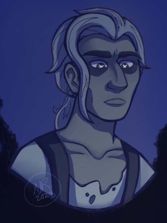
#i literally just sketched with a ‘gel pen’ brush and colored it
Text
*draws the Caleb crumb*
No, but really, the contempt “are you done?” look has reawakened my ability to art.
Come on, I can’t be the only one who sees the face of a disgruntled dad waiting for their toddler to get over their temper tantrum. Which, considering the seemingly large age gap and probably more parent-child dynamic between Caleb and Phillip, is entirely possible. He’s just so fucking over his little brothers shit.
#the owl house#toh spoilers#toh fanart#toh caleb#caleb wittebane#dana terrace#my art#I AM VERY NORMAL ABOUT THIS CHARACTER#I CAN AND WILL CONTINUE TO DRAW THE WORMS LONGER THAN THEY ARE SUPPOSED TO BE#DANA PLS GIVE US SOME RESOLVING WITTEBRO CONTENT IN THE THIRD SPECIAL#ALL I CAN OFFER IS A 50 CENT PEICE AND A SHEETZ CARD BUT I PROMISE THAT IM ASKING VERY NICELY#I made this in a little over an hour so if it looks sloppy that’s because it is#i literally just sketched with a ‘gel pen’ brush and colored it#I’m just sick of doing lineart man#but I also don’t have it in me to render without it#so now imma just stick w/ my sketch being my lineart#what can I say except IM FUCKING LAZY
14 notes
·
View notes
Text
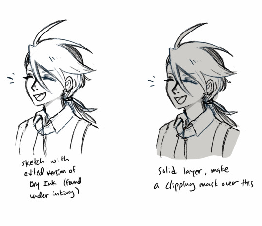
btw literally no one asked but i use procreate gel pen and hb pencil for all my sketches and lineart! and then flat brush for colors :))
i do basically all my sketches on one layer and just erase guidelines as i go, i don’t do separate lineart i just clean up my sketches!!


examples :))
#ninjago#lego ninjago#ninjago fanart#kai smith#ninjago lloyd#lloyd garmadon#ninjago nya#art tips#character art
89 notes
·
View notes
Note
Just out of curiouse, do you have any tips for beginner artists? I would really appreciate one
Of course! ^-^ I'm more than happy to help!
Let's see...without the ability to have a conversation, I'm not sure where exactly you are in skill level, so I guess I'll start with some basic quality-of-life tips.
General:
You don't have to go to college to get good at art. I didn't go to art school!
Watch youtube videos from good artists, or those you admire!
What kind of art do you ultimately want to produce? This isn't an instance of "I can only pick one thing", it's more like...each type of art requires different skills, and if you know ahead of time what you want to do FIRST, you can narrow down what you have to learn.
learn proper sketching and use of circles and other shapes to build the figure, don't just jump in making the final lines right away! It's not a "cheat", it's proper technique. It's "caring about your work".
Same for references. Google up some images of what you want to draw and look at them while you draw your own picture. It's not only okay, it's what professionals do. You need to train your EYE as well as your hand.
It's okay to mimic styles you like! But be aware that each artist may stretch or squish or exaggerate proportions to fit what they personally like to see. This is why it's IMPERATIVE that you learn realism alongside any manga style you want to try. Once you learn where the eyes sit on the face, the different facial planes and what bones they relate to, and different sizes and builds for the face, you can then manga them up to any style you want!
For real paper:
Use a protector sheet, or wear a glove on your drawing hand. You want to make sure you don't get graphite or colored pencil on the side of your hand, and then smear it on your drawing. Placing a piece of paper under your hand will protect your work!
Don't touch your art with your fingertips. Fingertips have oil and gunk on them, and will smudge your drawing. (If you're working with charcoal, this could work to your advantage! But you're probably not using charcoal. It's messy and usually limited to college art students.)
Get the right tools! You can buy a small eraser set in the art section of Wal-Mart for like $3 -- it has a polymer eraser, a smaller white eraser, and the all-important KNEADED ERASER. This thing can be squished and torn apart and it'll pick up graphite like a champ! Do not bother with hard pink erasers, they're trash.
You don't need special paper to learn. I used to draw on the backs of my dad's extra math photocopy papers. Copy paper is smooth and not too fussy and I like it. "Sketch pads" usually have a rougher grain, and I hate the way the paper feels. Also there's a lot of ugly white spots when you try to shade or use colored pencils. Only use that if you're keeping a cute little book or using pastel crayons or something (or it's all you have). Don't fuss over it too much while you're learning. It won't make much difference until you're ready to specialize!
Blending stumps are cool and even pros use them.
Get a small electric pencil sharpener. They're less than $10 at places like Dollar General, and those stores are literally everywhere.
If you get a manual sharpener in an "art set", that's fine, too, but it hurts my hand to do it manually. I like the ones that have little covers.
It DOES matter what kind of ink pen you use. Gel pens will smear. Most markers are washable, and you better believe they will run at the first hint of moisture. India Ink also smears and runs with water. I recommend Sakura Micron pens, Zig Mangaka pens, or my favorite --- the Kuretaki Bimoji felt tip brush pen. You can get all that on Amazon, and it's like $6. I got the superfine tip.
LET YOUR INK DRY BEFORE YOU PUT MARKERS OR WATERCOLOR OR ANYTHING AT ALL OVER IT. It takes maybe 20 minutes.
If you don't plan to color it, you CAN draw with a ball point pen and it'll look just fine.
Do a tiny little water streak test with any markers you plan to use with watercolor. Just brush a tiny bit of water over the mark after it's dry to see if it bleeds. I use that bleed to my advantage sometimes, but you just gotta be aware of what's what.
Digital:
You can buy a small, cheap tablet from HUION for less than $40. MAKE THE INVESTMENT. IT'S WORTH IT.
Clip Studio Paint is EXCELLENT. Well worth the $50-$60 price tag. I think you can try it before you buy it, too. It gives you access to the Asset Store -- which is the single greatest artistic sharing tool I have EVER seen, and I've used SAI for ...probably a decade... I've used dozens of custom brushes and even made my own, and I just can't even believe what is available with CSP. Do yourself a favor and get it.
"But I can't use a tablet! I can't look at a screen while I draw!" Yes you can. YES you can. Yes you can, if you'll just try it. "but I tried once and it didn't work" Well YEAH, if you only tried a handful of times, OF COURSE it didn't work. Do you know what practice is? HUION screen tablets are over $300!!!!! Do you have that kind of disposable income lyin around? (plz donate some to me if you do lololjk =u=; )
Start saving a folder full of refs.
Ask people to tell you what to draw. Let them request something for free. This makes you draw things you wouldn't normally draw, and there is INCREDIBLE value in stepping outside of your comfort zone. You will level up in no time.
Whew...that covers most of the basics, I think. If you have something specific you want me to go into more detail on, please let me know! I love helping ;w;
23 notes
·
View notes
Note
sorry if this question is annoying—but what program and brushes do you use? also how the hail do you render i literally dunno how to not over render every
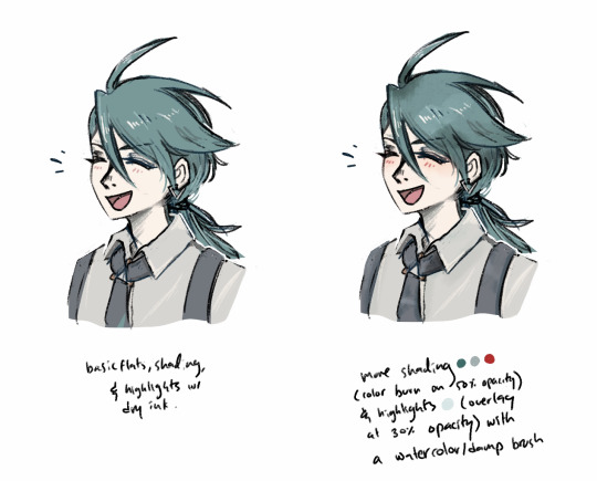
Oh its not annoying at all dont worry!!! I use procreate :) and for my brushes, i usually use the gel pen brush or narinder pencil to sketch (and for lineart if i feel like actually lining my pieces lol) for color i use the syrup brush or the hard airbrush! Also to be perfectly honest i dont know much about rendering, what i mainly do is just color in all the base colors and the add the shadows where i like! Then i just merge the color layer and sketch layer and then start adding more shadows and highlights wherever i like! When i finish coloring i usually add an clipped overlay layer! Most of the time its a warm tone like orange or red. Im sorry if that didnt help much TuT im not very good at explaining my process;;;
7 notes
·
View notes
Note
not sure if this has been asked before but. what brushes are you using? your art is always so stunning
askldjflkj thank you!!!
this got a bit long but here you go:
for procreate:
edited dry ink brush link - for sketching/lining/coloring/etc
the only thing different from the default should be that it's edited so it doesn't change size based on pen pressure and only changes opacity, since i have problems w/ my wrist/shoulder that make it difficult to control pen pressure more delicately & i end up drawing in more line thickness myself or using the eraser to make lines thinner/sharper. if that's not a problem for you, i think you can just use the default brush (?)
default gel pen (also found under inking) - for sketching, sometimes (note i do use sketches as my lines, and either clean them up or color over them as i go)
watercolor/damp brushes - for shading or for more watercolor style art
i tend to use maxpack watercolor flow (not free), but the all-star watercolor round (free) or sinix's damp brush (also free) are fine alternatives. any watery brush with textures/flow should work? these are just the ones i keep using because i personally vibe with them and have them on at least one of my gesture shortcuts
for paint tool sai 2:
i use a pencil and marker brush with the below settings:


(i haven't worked in paint tool sai 2 since i've moved because i still haven't found my tablet pen lmao, so i don't have much to say rn...)
tbh i think my process itself gives my art more of its style than the brushes so you can also look through these (they're sai2 files* and some videos from procreate) + i have uploaded the kokomi and phantom procreate process vids on insta
*my favorite layer mode happens to be "shade/shine" in sai2 but it also happens to be the one layer mode not found in literally any other program ive tried and the files do not look as they should in other programs ><;;;
and here's a very short version of what i do on procreate:
i didn't demo it here but you can probably see this in the videos:
i usually lower opacity of the flats and make the BG a colored bg and use a lot of overlay layers to give it the general mood/colors i want.
i also change the lines/sketch layer after coloring in the flats -- i change the color, duplicate it and set one layer to 1-5% opacity+linear burn and the other to 30-90% opacity+color burn
9 notes
·
View notes
Note
i hope it’s okay to ask, and my bad if you already answered this, but what kind of pens/pencils you use in your traditional drawings? heh, furthermore how do you get your pics of your drawings to come out so nice
Hi there anon! It’s all good, here are my most commonly used liners, from top to bottom we have

- STA Water Based / Resistant Pigment Liner, I have the whole collection but I use the one with the 0.05 tip the most, since I draw SUPER SMALL in my 5”x8” sketchbook haha
- Pigma BRUSH tip, I use it for shading n stuff in my inked sketches! It is quite satisfying to use, the brand is called Micron, and I really recommend these over the STA pens! (They’re more pricey, but they’re worth it IMO!)
- Uni-ball Signo Broad white gel pen, WHICH IS SO WORTH IT, it adds so much dimension to colored works. I get this at my local craft shop, just make sure you store it horizontally, otherwise the ink won’t come out as smoothly D:
- Papermate 0.5mm mechanical pencil, this has been my best pal since my senior year of high school!!! Never failed me once, I know a lot of artists are against mechanical pencils, but since my traditional art is just a hobby and my digital art is more business, I am quite content with this tool
For coloring I just use Copic markers, I’ve been collecting em for about 6 years now, and one word of advice I have for you if you want some: buy in bulk!!
As for taking photos of my art, I literally just use my phone LOL, I have an iPhone 8, and I just use the Vivid Warm filter in direct light from the lamps in my room. I’ve found that tapping on the brightest part of your drawing and adjusting the lighting to make it a little darker helps a lot with contrast!
Keeping my sketchbook upright (vertically) while it’s propped up on a few blankets is the way to go, it’s a little silly but it keeps my hand/phone shadow out of the way when taking pics, since my lamps are basically on the ceiling.
I’m glad you think my photos are clear, tho! I’ve actually considered getting a new phone just so I have a better quality camera to take pics of my sketchbook doodle, since I’ve been doin a lot of em as of late. But that’s all I got for ya, hope this helped anon!!
14 notes
·
View notes
Text
LITTLE CHARACTER THINGS
Just a fun little character game.
Fill in the below categories with 3-5 things that your character can be identified by.
Repost & tag away !

tagged by: @citialiin suplexes you into the sun bc i luv u
tagging: whomever wants to !!
EMOTIONS / FEELINGS:
001. DISGUST – Filth, filth, it’s all filth. Everyone is squirming underneath his boot heel, and they’re doing it with a smile. How awful. And yet, he can’t help but smile right back at them. So delighted that they understand their place. If only he could sleep, he might very well get some god-damned peace...
002. ISOLATION – Why is it that looking at the sea reminds him so much of the things that he’d lost? Maybe that’s why he spends so much time sitting out there in the sand, looking out at the ocean as it ebbs and flows, leaves behind the darkened, wet sand. Sometimes, he planted footprints there, and watched them vanish as the water took them away. And no, it wasn’t a comfort. It was, maybe, some sort of reminder to himself.
003. ENVY – WHY does it always have to be that way? Smiling faces admiring another’s work - someone younger than him... he wants it all. He’ll take it for himself if he has to. Why can it not be him at all hours of the day? Always worshipped, always admired. Look at his talent, bask in it... but why do they all head the opposite direction? Could it be that... he’s losing relevance? No, it couldn’t be. And yet, that pain in his stomach simply won’t go away...
004.YEARNING – He has always had a habit of grabbing at things he can’t have. If he can’t have it, he only wants it more. Once he has it, he holds onto it as if he had been utterly fulfilled every which way.
005. RAGE – Always seeing red, always wanting nothing more than to tear at those that denied him a chance at success. Claws that have grown over the years, from frustrated, suppressed anger that originated from the time he was born, perhaps. Now, they slash at whatever they can find; not enough to kill, but enough to leave a scar. A wound. A reminder that he was there once.
GREETINGS:
001. A sarcastic remark, a seemingly chatty man. He seems to have opinions on everything, no matter what the subject. He seems remarkably interested in you, but only insofar as to how involved you are in the subject at hand.
002. He offers you a half-smile. A laid-back appearance. Extends his hand to meet yours to greet you. When you shake his hand, you make note of how strangely callous his hands are. How cold they are, made even colder by the metal rings on his fingers that brush uncomfortably against your skin.
003. He pokes fun at you, makes jokes. But they’re never meant to necessarily harm you. That would be rude, oh no. He can be a bit much, but he only means to make you laugh. But there’s still a strange distance to him. You can’t seem to penetrate him, necessarily - no matter how you may retort. But maybe, if you say something right on point at the right moment, he might just remember you.
004. After an exciting conversation, he asks for your number. Or your contact details. Anything to potentially arrange another meeting down the line. It’s a sign that you’ve attracted his attention in some way. Maybe he’ll contact you down the line.
005. Perhaps, after some time of meeting, if you’re lucky, he’ll show you his genuine smile rather than his half-smile. Right then, you realize that the man you met way back when may actually have more secrets than you could have ever comprehended - if his smile was fake, what else is fake?
COLOURS:
001. Pitch black, of course - the color of choice for the ex-goth.
002. Crimson red, the color of beating hearts and throbbing flesh.
003. Forest green, the color of D.’s forest before it began to rot as a consequence of his deteriorating psyche.
004. Murky blue, the color of the ocean at midnight as the moon is hidden in the Los Angeles smog. It seems endless the more he looks into it.
005. Earthy brown, the color of Annie’s sweater the night she vanished into the darkness forever.
SCENTS:
001. A consistent reek of cigarette smoke on his clothes, his breath, his every word.
002. A faint scent of hair gel and mousse - faintly applied, to keep his hair as voluminous as possible.
003. The equally as faint trace of after shave after he’s taken care of himself. Though there is a stronger smell of hair dye, as he obsessively covers every white hair that may emerge on his head.
004. The strong smell of permanent marker, inking pens, and lead from his furious sketching.
005. Then, there’s his own natural smell - cinnamon mixed with a musty pine; it’s a bit like the smell of a forest filled with pine trees after a heavy rain. Overwhelming, powerful, and stuffy.
CLOTHING:
001. Three skull rings on each hand, on your index, middle, and ring fingers. It’s perfect symmetry, and they shine against whatever light might hit it. But they are always so very cold to the touch.
002. Black, black, and more black - but the occasional muted green or brown enters the palette. Never any colors brighter than those, however - it would be far too much of an eyesore for someone like him.
003. Three gold and black earrings on the top of his ears. Again, symmetry is key. Keeping that image of control and collection is exactly what he wishes above all things; that alternative look.
004. Combat boots, black and laced up to the top. They’re impeccably buffed and shined, though the soles look a little worse for wear. It must be all the walking he does at night when sleep simply won’t come.
005. Baggy shirts and sweaters, occasionally dress shirts, that hide his figure. He’s disproportionate, far too thin; the longer the clothes, the better he can hide how odd and lanky he truly is from his point of view.
OBJECTS:
001. His drawing tablet, always sketching something idly while at home and daydreaming. There are hundreds of random sketches collected on the pages, though some consistencies are quite visible if one took a closer look.
002. His collection of various statuettes and figurines. He has placed them in detolfs for everyone to see, fawn over, and be amazed by. If anyone so much as looks incorrectly at his more precious ones, he will have a close eye on them in fear that they will somehow break merely by being looked at.
003. Signed copy of one of the few produced vinyl records of Oingo Boingo’s Forbidden Zone hanging on his wall. It’s framed, and he’s very proud of it! Often shows it off, in fact. He’s a big fan of theirs.
004. A safety deposit box filled with his biggest secrets - specifically a thumb drive filled with Annie’s e-mails to him. He backed them up there so he can read them on occasion and not have people discover them on his actual computer - he’s quite the paranoid man.
005. Post-its on the walls of his workroom. There is literally no more space for plaster, only post-its of notes and ideas that he has while he conducts research for his next project.
VICES / BAD HABITS:
001. OBSESSIVENESS - Look at him, so utterly fixated on someone who will never love him back. But what he feels isn’t love, oh no. It’s rather a completely unhealthy adoration and veneration of someone he felt understood him. But it is arrogant, of course, to assume that you are so complex as to feel as if there are only a select few who understand you ( in his very unfortunate case ). He has gone to horrific lengths to keep tabs on Annie, and does so as covertly as possible. Nowadays, he uses his intelligence to fuel his obsessive tendencies.
002. LYING - Covers the truth up with layers and layers of sarcasm and lies so that he, or rather his true self, can never be discovered. The result is that he keeps people in a web of extremely elaborate deception, the likes of which they can never escape. But there are cracks in the facades occasionally, they just have to be found.
003. COVETING YOUTH - He is so obsessed with youth that he cannot handle anybody or anything maintaining the status that he had when he was their age (20s, in other words). He especially applies it to himself, though no amount of primping and covering up the blemishes on his face can ever erase the fact that he’s slowly growing crow’s feet around his eyes, made even worse by the bags under them - and my, they’re growing a fine mixture of blue and purple, like fresh bruises.
004. UNWARRANTED SELF IMPORTANCE - He is completely self centered, and thinks of the entire world on his own terms. This is how he’s been wired ever since he can remember, and he always puts himself and his survival first. He makes friends and connections based on this principle, and has a great amount of pride because of this. It is unfortunate, but it is one of his biggest flaws and ultimately what has led him down the slippery slope to irrelevance and isolation.
005. LACK OF EMPATHY - On top of being self involved, he struggles to feel for the plight of others. In fact, it can be said he struggles to feel much of anything, as he worries far more for his current predicament rather than for the difficulties of those in his life. He will only assist or even understand if he can relate in some way from personal experience, or if it benefits him and his career. There is very rarely an instance he will help someone or something because he feels it is the right thing to do.
BODY LANGUAGE:
001. The aforementioned half-smile - the Jonathan trademark, something he has rehearsed ever since his career started to take off. Perhaps even before then, while he was still in high school. It is boyish, youthful, playful - and it is always followed by a sarcastic or joking remark.
002. Hands in pockets - The sign of deceit, hiding something, keeping his distance from you. He is very secretive at all times, and often feels uncomfortable in social situations, and feel better as long as he has his hands in his pockets. That said...
003. Wild gesticulations - When passionately discussing something, he has a tendency to make hand movements of all kinds. Circling his hands, stretching his arms out, pointing, doing anything and everything to get his point across. He becomes expressive in a rather charismatic way. It’s truly odd, considering how often he keeps his hands in his pockets.
004. Hunched over - Slouching half the time, his true height is hidden by this decision to constantly look as if he’s three inches shorter than he is. Rather it is a symptom of his insecurity over his appearance ( he does think he’s weird looking to begin with ), or from a life of leaning over a desk, he certainly rarely stands up straight.
005. Leaning on his right foot versus the left - When standing, and talking to someone, he always puts all his weight on his right foot, and leans to that side. It’s his dominant side, and it gives him his lackadaisical appearance. This likely helps people approach him in many ways.
AESTHETICS:
001. BIOMECHANICS. - Feeling flesh on metal is one of the most skin-crawling sensations, but Jonathan is fascinated with it. He draws it, he lives and breathes it, one of his favorite films of all time is Tetsuo: The Iron Man. Not because he himself would want to put metal on his body, but the very idea is where he believes humanity is headed in the next decade or two. Biomechanics, while cold, is something that gives Jonathan some sense of comfort - that there is a way to marry technology and flesh. Maybe he, too, can be a biomechanical humanoid - so he fantasizes.
002. GOTH ( AS IT SHOULD BE ). - A goth since his teen years, Jonathan knows the fashion and subculture inside and out; or at least, he did once. Though an ex-goth from his early 30s, he still maintains some interest in the culture all the same. He may have stopped dying his hair and wearing “goth” accessories and clothes, but he enjoys the lifestyle and still generally keeps it close to his heart. Just don’t call him Goth Bomb.
003. BODY HORROR. - Flesh mutating and intermingling with itself, a David Cronenberg nightmare that he experienced firsthand in his own dreams. Eyes in places they shouldn’t be, hair where it should never grow... the list goes on and on. It, like biomechanics, sends chills running up and down his spine in a way that excites him. Perhaps he is like Tetsuo, a man who finds a grotesque fascination in manipulating the flesh with the unnatural. But in this case, it’s how naturally manipulation can occur without the introduction of foreign objects, to word it somewhat scientifically...
004. SCI-FI HORROR. - The darkness of space, it’s vastness. It’s quite horrifying, the more he thinks about it. But it’s exciting too. All the possibilities that lie in the stars, all the worlds he could visit as someone quite tired of Earth... but what horrors await behind each planet, each moon, even within each star? They would simply jump at the chance to devour an unimportant human whole, and Jonathan is unsure if he wants to take that chance. All the same, he dreams of that world, hoping that one day he may get to experience it - but, perhaps, from a distance.
005. DEEP COLORS IN CINEMATOGRAPHY / CHIAROSCURO. - Intense lighting, mood lighting, anything that brings out the terror or intensity of a scene is something Jonathan imitates in his works. By deep colors, it is meant that he adores the use of intense reds, blues, and purples in cinema - these often pop up in his work as mood lighting for his set pieces. They signal to him a fantasy world that is not our own. Chiaroscuro simply refers to the film noir technique that he grew to adore from a young age. The harsh black against white, signalling mystery and evil lying behind every corner entranced that young and intelligent mind, sparked his terrified imagination to what monsters could hide in the faces of his favorite noir protagonists...
SONGS / PIECES:
001. montezuma ── fleet foxes
002. little lennon ── asian kung fu generation
003. sabertooth tiger ── cage the elephant
004. controller ── oingo boingo
005. dark entries ── bauhaus
#DRAWN SO FAST I FORGOT I HAD IT IN MY SKETCHBOOK. - DASH MEMES.#( this took way longer than it shoULD HAVE GKDMKSLAD )#( i have a few things to do for tomorrow night and monday so i'll do them then!! )#( that includes starters ask memes and replies. )#( 4 now have this infodump on why jonathan vastielle is a horrible person )#( but also why he is i hope a tragic horrible person )#( he made the choice to be complicit )#( sad. )
4 notes
·
View notes
Photo
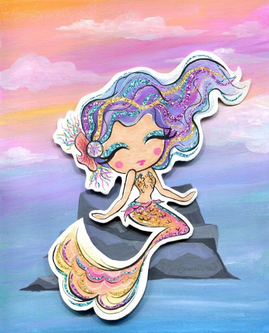
Sparkle By the Sea
Pardon me as I just barely squeeze a MerMay piece of art in.
I'll be honest with you guys, I've been pretty lacking in artistic motivation since NaPoWriMo ended. Although if you've noticed my lack of uploads, you probably could've already guessed that. This isn't abnormal for the aftermath of a month-long challenge for me, especially with a brand-new video game calling my name at every moment of the day, but even so I feel like this particular motivation drought was a bit different.
Part of it definitely had to do with the changes to DeviantArt that I'm sure I don't need to remind everyone of, but that's been more of me dreading seeing what the state of the community is than anything else. (However, I have noticed I'm not a fan of the new tag system over the old category one, as confusing as the category system could be sometimes.) Rather, I think this lake of motivation has more to do with the fact that being largely absent from all social media during NaPo reminded me...well, that I hate social media.
This is really a bigger discussion for a journal or something, but suffice to say it did not feel good to realize just how many literal hours I had previously been spending trying to desperately to scrape up just a little bit of support on other social media platforms (namely Twitter), versus the more natural growth I see here on dA that also feels a lot more genuine and less forced/obligatory.
I can't really explain it, but that reminder/realization really helped my brain slip back into a place where I felt like creating again. And with that, I'll transition into talking about the art and save the social media talk for, as I said, a journal or something later on.
Naturally, I've been seeing a lot of mermaid art this month and every year I feel the urge to get in on the fun, though I know better than to try actually doing the MerMay Challenge (especially not this year after having just done NaPo), so I usually either do a one-off drawing or if I'm too busy with other projects I just skip it. But I was starting to feel that need to make art in my brain again and I've had a specific set of stickers from the dollar store sitting in my stash for quite a while now that more or less sealed the deal for me.
How do these stickers fit into the mix? Well, I originally fell in love with/picked them up because they are mermaid-themed and absolutely adorable--See for yourself! And I thought they would make for nice decals in a book project since they're wall stickers and therefore repositionable with minimal adhesive-yuck. And at first, I thought maybe I'd end up making them into said hypothetical book project in time for MerMay...except that felt a little cheap in combination with my lack of uploads. Did I really want to come back with a book project featuring mermaids I didn't even draw? And for MerMay of all things?
So I sat on the idea and left the stickers out where I could see them, and eventually I sat down and took a closer look at them. The art style, upon further inspection, actually didn't look like it would be too far outside my usual art-making realms...Most of the coloring looks a lot like watercolor, except for the skin which I thought was flat and smooth like alcohol marker and the glitter accents which from my perspective pretty much had to be digital, but could potentially be replicated with glittery/metallic supplies...
And that was the moment the idea hatched. I decided I'd try drawing a mermaid myself in the same style. This would work for MerMay, have something to do with the stickers, and based on my plans would work well for me as a mixed-media project, which as I'm sure I've said before is where I think my artistic talent shines best.
I thought the scariest part was going to be replicating the looser and less strict line style, and to a point it was, but it wasn't nearly as bad as I thought it was going to be. I find it's usually kind of tricky to explain this, but really what this part of the process boils down to for me (if I'm replicating an existing style and not using my own), is really just studying the original artwork(s) and looking for patterns, then trying to stick to those patterns. For example, the style here features fairly large & rounded faces, and the hands are more like hand-shaped mittens (which was great news by the way because hands are always a pain in the butt for me), so I did my best to emulate those features.
As per usual, I did start with a sketch, but I tried to keep it looser than usual, and then when I did the inking I started with my 0.2 Micron, again trying to keep things loose and no be too fussy if I could help it. Then I went back with a brush tip liner from Prismacolor to get more natural variation in the lines and to force myself to not have quite so much control over the line weight.
I was also very careful with my choice of liners because I knew pretty much everything except the skin was going to see a lot of watercolors, which meant the lines had to be waterproof. And of course, I went with watercolor paper (my nice 100% cotton stuff this time) to make sure I didn't have any issues with blending or layering.
Now, at this stage, I didn't know what I was going to do for the background, though I was leaning towards the idea of making one separately and placing the mermaid on top afterward, as sort of a nod to the original mermaids being stickers. But I wasn't totally sure yet.
What I was sure of was how scared I was to just dive into coloring. The sketching and inking and gone so well I was thinking I was in for a rude awakening at any moment. So, just in case, I scanned my uncolored lines as a fall-back if I royally screwed up. With my paranoid mind set at ease (for the most part), I could begin with color application.
I started with the skin since it was the easiest; Just one good layer of alcohol marker, leaving a little white space here and there like the artwork I was emulating. Although 1. The marker color turned out a bit darker than I was expecting and later blended too well with her tail, so I had to lighten it in Photoshop, and 2. because watercolor paper really soaks up the ink, I ended up with less white space than I thought I would. But beyond that, this step went off without a hitch.
So then came the second-scariest part: The watercolor. I used a mixture of my Master's Touch watercolors and Mermaid Markers (yes, that was a very conscious supply choice ) and tried to take my time and be mindful of the color balance I was looking for.
I'd decided ahead of time that I wanted to try and stick with a soft-ish palette like the original art, but I still wanted my choices to be different. Since yellow/gold is featured in the original but not used for a tail color, that's what I went with, and I opted for the blue-y-purple hair since a soft blue and purple are also prominent in the original and based on color-theory would be a nice contrast to the gold-orange tail. Though I did also try to get some pink in both the tail and the hair for a bit of unity and calling back to the pink in the original art.
The trickiest part with the coloring was actually the tiny lips and blush spots. I ended up using a fluorescent pink for that turned out as more of a red originally and had to be touched-up via Photoshop because of that and also because of the lightening I did to the skin. It's more that it was a bit of a challenge to get the shapes of these much smaller areas right and in the correct place, since I had to use very minimal pencil markings, lest I end up with nasty graphite marks mixed into the paint.
Getting the hair to be dark enough without being extreme compared to the rest of the drawing was also a great test of patience, but it ultimately worked out, I think.
I also had a hard time deciding what color the piece of coral in her hair should be, which is why it ended up as this vague dusky-orange color. And I got more pink on the sand dollar next to it than I intended, but neither of those things is a huge deal.
While I waited for all that to dry though, I had to decide how I was going to go about tackling all that extreme sparkle the original art had. I could have just added it in digitally and not even attempted it traditionally, but everything else had gone so smoothly that I decided to push my luck this time.
Originally, I started with just glittery gel pens, but I found pretty quickly that they were sinking back into the colors underneath them too much and thus just weren't doing what I wanted. I wanted high-impact sparkle. After some brief consideration, I turned to the metallic watercolor sets I have made by Art Philosophy, which are very high-impact metallic and pretty opaque, which would work well over my failed gel pen and would work wonders for the areas where I wanted that high-impact over an opposing color. (I.E. Where I wanted the blue sparkle over a very orange-yellow area, which would normally make brown mud if the color on top wasn't opaque.)
The funny part about that is that I originally used a different shade of purple and gold for those areas of sparkle that I ended up completely covering with different shades (the purple needed to be lighter and the gold needed to be darker/more gold and less yellow). And her eye shadow cover saw all three colors before I settled; The purple just seemed wrong, and the gold blended too well with her skin. I thought the blue wouldn't work so close to her blue hair, but it actually ended up looking the best out of the three.
Although, I do have to make a full disclosure that the high-impact sparkle you see here is in fact where I went in and re-did it digitally once I scanned the artwork in. Unfortunately, glitter and metallic supplies just don't scan very well and usually end up looking too dark, dull, or flat by comparison. The metallic paints work just fine in person since you can move the art and see how they reflect the light, but it just doesn't work in a still image that's been captured by having a bright light uniformly shined over it.
Still, re-tooling the sparkle digitally ended up being an interesting challenge, especially since it's been a fairly long time since I was messing with digital textures like this.
Also worth noting is that I had to re-paint some of the metallic areas because they weirdly lifted off onto the plastic cover I used to protect the art when I pressed it onto the background to make the glue stick. I'm not sure if it's because those were the extra-layered areas and they hadn't fully dried all the way down to the paper, or if that particularly plastic just picks up this metallic paint really easily or what.
And speaking of that background...
Like I said earlier, I wasn't really sure what I wanted to do for a background for a while, but after reviewing my mermaid-centric Pinterest board I decided a simple rock seat and something to vaguely suggest the ocean/water without getting too detailed would suffice just fine. Based on that, I felt like using gouache would work nicely (and I just really felt like using the gouache since I don't find a lot of opportunities to use it) and that a color scheme that flipped her hair and tail colors would be best for the effect I wanted.
I've found I really like the Strathmore 400 series mixed media paper for gouache because of how smooth it is, so I cut a piece down to size and got busy.
For the most part, I just kind of went in with the colors doing whatever felt right, and trying to use some gouache I'd already mixed from past projects (since gouache can be reactivated and I've found this kind, in particular, seems to reactivate really nicely) either on their own or to mix the colors I felt like I needed. And I also tried to do a lot of blending straight on the paper to get more variations in color and make things a bit more lively.
Oddly enough, this ended up being a good example of gouache's covering power because I accidentally started applying the colors upside down--using more greens and blues on top and more pinky-purple on the bottom--and not only had to flip the paper around but also had to do a fair amount of covering the colors I'd already put down with colors you don't really want to mix with them because they don't make very pretty results. But it worked out just fine, so yay!
I also added some clouds for a little extra ambiance, which I think looks quite nice.
Believe it or not, the most difficult thing about the background was the rocks. I spent far longer than I care to admit (or bothered to document, for that matter) trying and in many ways failing to mix the proper shades of gray I wanted, and the end result didn't turn out quite as clean and graphic as I had hoped, but by the time I put the mermaid on top, you really can't tell because you can only see a fraction of what's actually there. And I mean, the end result isn't terrible, it's just not quite what I was picturing in my mind's eye is all.
Personally, I know it's kind of an odd choice, but I really like how there's no defining line between the water and the sky, and yet you still get a clear idea that they're separate and the rocks aren't just floating in space. I'm not sure how, but I think I'd like to work with this kind of ambiguity more often. It's like a step between abstract and more structured art.
Anyway. With the background done, the next step was to attach the mermaid, which I felt like doing in a more 3D and less flat manner, so I chopped up a cardboard box that previously held a chocolate bunny I had on hand and glued some pieces together to boost the mermaid up a bit. This where those deep shadows between her and the background are coming from.
Here I feel the need to insert a comment about how difficult it was to get my tacky glue to dispense the glue for me, though there's a chance this is because I need to poke the opening in the tip to be a bit wider. (You have to poke it open yourself and I always felt like I never did get it open quite enough...unless you like strenuous hand exercises...)
Of course, once all the above was done then I had to scan the art in, which I was admittedly a bit nervous about after the incident with the plastic cover peeling off the metallic paint (though fortunately, the scanner glass didn't have the same effect), and then all that was left wad the digital retouches.
Overall, I'm really happy with how this turned out. It doesn't blend in as well as I originally wanted it to with the original art, but in the end, that doesn't really bother me. It's just a nice piece of art on its own that is also unique from what I normally do...except it's still got a lot of similar elements to how I normally make art. It feels a lot like the days when all I made was fanart. The key difference here is that I know myself better as an artist now and thus can use that knowledge to my advantage.
I can't promise this a return to regular posting for me, though I do hope it's a gateway to me posting more frequently at least, but I can say I do intend on getting back to working on art more often and therefore being more present online again. At the very least, I can happily tell you guys that I have a couple of new art supplies en route to me that I've been wanting for a while and am excited to share with you once they arrive. If nothing else, we at least have that to look forward to!
____
Artwork © me, MysticSparkleWings
____
Where to find me & my artwork:
My Website | Commission Info + Prices | Ko-Fi | dA Print Shop | RedBubble | Twitter | Tumblr | Instagram
1 note
·
View note
Last Seen Blogs

jwmppmwj
題名未設定
2hipp0
That One Little Red Bucket

conceptofpeace
Concept of Peace

idreamofempire
Space Cowboys Anonymous

captainmalewriter
Captain Raza