#i might start coloring via grayscale now
Text


due to the nature of a greyscale world, sif could actually just be in pastels and we’d never know.
alternatively they could also be in eyebleeding colors, which is why i put that one under the cut. (that one is actually easier to tell then the pastels lol. maybe for the other party members… madam odile in hot barbie pink…)
cw: eyestrain

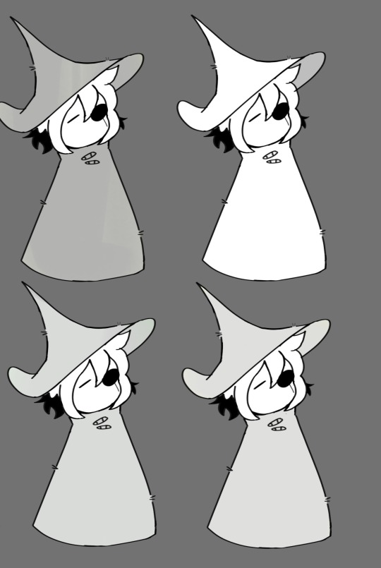
#i might start coloring via grayscale now#and then just hitting color shift off to see how it turns out#if it looks bad that filter can just go. right back on lmao.#in stars and time#isat#cw eyestrain#also if red comes back does pink come back to?#does the red hues in orange and purple come back as well??#i saw some aus where sif could see red and like. i wanna know.#bee art#in stars and time spoilers#isat spoilers#FORGOT TO ADD THOSE WHOOPS
47 notes
·
View notes
Note
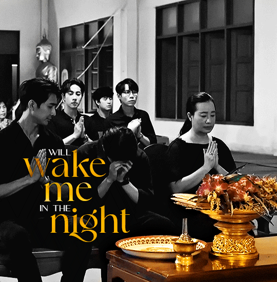
Hi, this is Dani (aka @5racha) and I just saw your "event 12: loss" gif set (which is a spoiler for me but i don't care) and I absolutely love the fact you can do black and white with the gold showing. Is there a tutorial out there how to gif black and white with a colour? I mean, an easier way than to just colour each frame individually. Do you have one or is there one? I've been wondering about that for a while now and your gif set is looking absolutely incredible.
ah hello!! thank you for liking my set ;u; <3 fair warning, i notably love talking about this kind of thing and i am incredibly longwinded so i'll get the direct answers out of the way first and then i'll ramble at you about my own gif process for a bit
here is a color isolation tutorial (found via @usergif, who have many such good things). i havent specifically used this one but it's good and im basically about to rephrase it for many words
and basically.... there are ways to do it and sometimes it can be genuinely quite easy (hue/saturation is your friend!) but if your scene is problematic (lots of movement, the color youre trying to isolate is a skintone, low contrast between colors etc) it's still going to be really hard, and in the end some things Will be an every-frame or close to it kind of deal if youre still determined to do it
my eclipse prefects set basically demonstrates -- the blue ones were really really easy, since you just have to desaturate all colors except blue. the reds, because some of the backgrounds also contained red and because it's a skintone you then need to readjust, is much harder. you can kind of tell by the curtains in the first gif how this might cause a problem
and now im going to talk your ear off trying to explain applying that to the gaipa set in. far too many words. sorry
this set, being that the color is "yellow", is one of these problem children, some more than others -- for example, i tried to do the first one like this but gave up (check out the cool gray spots near his temple and his collarbone :'D)

the middle two were problematic using keyframes too, but a bit easier because they have less movement and the backgrounds are also darker, so ill try and show you, in case it helps??
here is the base coloring (ignore the orange skin, i knew i wasnt keeping this and also moonlight chicken is kind of like that)
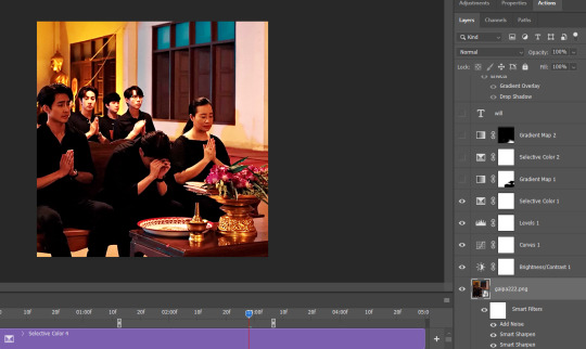
then, the bw layer is added (i use gradient maps for grayscale usually), and then i crop out the section i wanted to stay colored using the ps pen tool -> path -> selection and then use that to apply a layer mask. you can also kind of handpaint this sort of thing if that's easier for you
the next couple layers up are color adjustments for this section, to make the yellow that already exists at base brighter & tone down the red. i have four more layers at the very top to do this and adjust the colors golder & more vibrant.
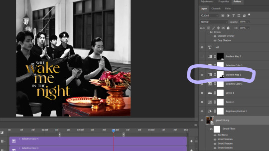
now then the actual trick is in keeping the layer mask on the correct part of the gif. so if i just did the layer mask on the b/w layer like that and didnt keyframe, because this gif moves itd stop working - it isnt Super movement, so it's not actually that big of a difference, but you can see (no keyframes on the right:)

the gray creeps onto the vase, the table, and the upper part of the flowers. if you overcorrect in the other direction, the skin of the woman right behind the flowers will become visible. so ! problem solving: keyframes

that's how it looks like - you start at the beginning of the gif with your layer mask selected, then click the stopwatch next to 'layer mask position'. then i usually use the move tool and arrow keys just to shift it along with movement of the object, and you press the yellow diamond at each point you do so
this is not foolproof and im still sort of new at it, so it can sometimes look odd. case in point if youve spent as long staring at this gif as i have you probably noticed the keyframe movement (it kind of jumps.....) but i decided i could live with that. sometimes you just have to figure out where your standards for 'looks bad' are, too OTL
gif 3 is like this too -- the only notable difference is that, instead of just desaturating the colors i didnt want i covered over them with a gold gradient map layer


so, basically, all of these gifs do originally have yellow in them, but i bass boosted the shit out of it and also colored over it in some places, and i used keyframes to fix movement
i hope this is at least interesting & that you can get use out of the tutorial, hehe. thank you for asking! enjoy finishing moonlight chicken, my belovedest of series
#ro's ps adventures#rowan asks#long post#this is too much. i know. you can basically just take the link hehe#i enjoyed talking about it though !
2 notes
·
View notes
Text
youtube
Watch the American Climate Leadership Awards 2024 now: https://youtu.be/bWiW4Rp8vF0?feature=shared
The American Climate Leadership Awards 2024 broadcast recording is now available on ecoAmerica's YouTube channel for viewers to be inspired by active climate leaders. Watch to find out which finalist received the $50,000 grand prize! Hosted by Vanessa Hauc and featuring Bill McKibben and Katharine Hayhoe!
#ACLA24#ACLA24Leaders#youtube#youtube video#climate leaders#climate solutions#climate action#climate and environment#climate#climate change#climate and health#climate blog#climate justice#climate news#weather and climate#environmental news#environment#environmental awareness#environment and health#environmental#environmental issues#environmental justice#environment protection#environmental health#Youtube
16K notes
·
View notes
Text
Color Craft & Counterpoint: A Designer’s Life with Color Vision Deficiency
So, what is it like to be color blind and also work in the web design and development industry? I'll answer that question throughout this article, but it's something that's always factored into my thoughts, given my passion for design and now my career. I wonder if having “normal” vision would have made me a better artist growing up. Would it make me better at my job now? Would I have pursued a more design-oriented career, as opposed to one that’s more dev-focused? These are just some of the things that pop into my head.
As to my job and my color vision, no, colorblindness doesn’t affect my work as much as you’d think. During design meetings, I can quickly point out areas where we need to reconsider our color palette. While reviewing layouts, I’m able to explain why we need to evaluate how—and if—we’re only conveying information with color. I like that I can bring a singular perspective to the table and a voice for others like me; I am able to offer insights that others don’t necessarily have.
When you can see a larger set of colors, it’s easy to gloss over those issues because they’re functionally invisible in the moment. If a design team doesn’t have a member who sees color differently, it’s important they find a way to test with actual users who do. There is no substitute for the real thing.
Between workarounds anyone can use when color-sensitive situations crop up, and knowing how to separate myth from actual, smart usability practices for vision differences (and which design tools to use)—I want to set the record straight on a few things about designing with color and designing for color accessibility.
What it means to be color blind
The term color vision deficiency, or CVD, more accurately reflects the type of impairment I have.
When someone hears that I’m color blind, most immediately think that I can’t see colors whatsoever—that my entire field of vision is in grayscale, that I’m truly color blind. The term is very misleading and confusing because most people living with CVD are able to see many colors. (There are people who have a type of CVD called “monochromacy,” which is complete color blindness. About 1 in 30,000 people are affected, and they see the world in shades of gray.)
Red-green color blindness is the most culturally-familiar type, but CVD is a lot more interesting and varies far more in definition.
So what colors can’t you see?
I have been asked this question more times than I can count. My answer is always the same: it’s practically impossible for me to say. For me personally, colors become harder to distinguish the less bold they are. I can attest with absolute certainty that the sky is blue, a stop sign is red, the grass is green, and Big Bird is yellow. I can see those colors because—whether by design or by mother nature—they’re bold. But start placing certain colors adjacent to each other, and it becomes more difficult for me. There are no colors that I can’t see, rather, certain colors become muddied and start blending together. It’s not the same for everyone; that’s just my version of CVD.
As light sensors go, humans don’t have the best eyes for color. Truth be told, they’re subpar compared to most species. WE are dismally color blind—as a species.
On top of that, normal, “accurate” color vision varies from person to person; only minor anatomical differences determine whether your eyes are normal, “color blind,” or have extra (!) color vision powers. Let’s unpack all of that.
Without getting too technical, what I can tell you is that our retinas are responsible for our color vision. Retinas have two main types of cells: rods and cones. Rods are primarily responsible for reading brightness/intensity levels, while cones are more specialized for detail and for picking up a particular range of light wavelengths. A person considered to have normal color vision has three types of cones, one each for bandwidths of short, medium, and long wavelengths of light. The bandwidth each cone can perceive is shaped like a bell curve and is unique to that cone inside your eye, and there are overlaps between cones. Cones also don’t actually correspond to specific colors, but because long wavelengths fall more toward the red part of the spectrum, medium wavelengths hover closer to green, and short wavelengths tend toward blue, you’ll hear them called red, green, and blue cones, due to sheer convenience (Fig. 1).
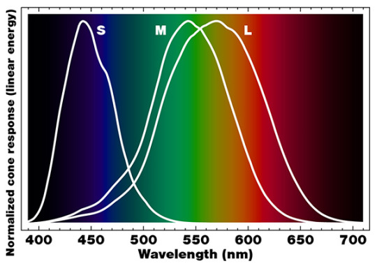
Fig. 1. Normalized cone response spectra in humans for short (S), medium (M), and long (L) wavelengths. Notice the overlapping nature of the bell curves, and that the peak sensitivity for each cone doesn’t neatly match up with red, green, and blue.
Color vision deficiencies occur because one or more of these cones is missing or has limited sensitivity (such as a narrow range), or when color perception in the brain is influenced by various other phenomena. This means that those colors in the spectrum effectively “drop out,” but since the light is still there, the brain translates it into a color based on peripheral data picked up by the other cones, combined with its brightness level.
Since color vision is based on how our eyes and brain perceive light, and since our eyes have different genetic sensitivities to light, we can say that “accurate” color vision is somewhat subjective. Even people with “accurate” color vision don’t see things exactly the same way.
Some people even have a fourth cone cell in their retinas; "tetrachromats" have enhanced color differentiation due to extra sensitivity between red and green. The extra cone actually came standard for most mammals in the past, but ongoing studies have suggested that 12% of the world's women might still have this fourth type of cone.
There are some colors and wavelengths we can’t see because our eyes don’t have the right sensors, but for others, it’s due to anatomical make-up. The lens and cornea physically block very short wavelengths; it's why we can’t see ultraviolet light directly, even though we have the sensor capability. For people with aphakia (lack of a lens in one or both eyes, whether congenital or due to surgical removal), that’s not a problem; they see the color variations in near ultraviolet light naturally.
Inside look at living with CVDs
I think each person who has a CVD has their own set of challenges. There are also a lot of commonly-experienced situations, social and professional obstacles, and forms of discrimination and bullying we’re expected to just quietly put up with.
Vision disabilities and color vision differences are often treated as quirky, entertaining phenomena on some mysterious map between normal vision and “blind.” People with CVDs encounter condescending remarks and dismissive treatment as part of daily life. It’s an invisible and misunderstood struggle that doesn’t have to be that way. I want to make a difference, and it fuels my desire to educate people on this topic.
Insults and passive-aggressive comments
I’ve heard my fair share of passive-aggressive comments about my career choice. Also about my passion for art and design. Because how could I possibly be a designer if I can’t see colors?
A question like that is condescending on two levels. One, it’s as if no one should be allowed to be an artist unless they can see colors accurately. And two, it shows a complete insularity or misconstrued awareness about color vision deficiencies.
Nowadays, I work primarily as a front-end developer, but early on in my career, I designed web layouts in Photoshop. I didn’t code anything. I didn’t even write HTML. I never had an issue with colors because I was typically starting with a client’s corporate branding guidelines, so I was able to take those colors and use color palette generators to help me build out the look of my designs. I was never called out for making poor color choices, so I felt like I was doing a good job. It wasn’t until I was having a conversation with my boss, a man I looked up to as a professional, when I dropped my guard and mentioned that I was color blind. He then proceeded to question my entire decision to pursue the career I love. For a new professional, it was a pretty rough and demoralizing encounter to sit through and try to process, to say the least.
Justifying my skill set
It feels as though I have had to justify my career decisions and my skill set on a regular basis over the years—as if CVD prevents me from being good at my job. By and large, it’s truthfully not something that comes up most of the time in my day-to-day work.
At this point, most coworkers only find out that I have a CVD if I talk about it. Sometimes I even get a kick out of seeing how many months can stretch out before a situation comes along where I can mention it. It’s become an increasingly minor issue over the years, what with updated software and web technologies I can put to use when needed.
Life via form factor (or winging it)
Think for a moment about ways that color is used to convey information in the world around you. One thing that comes to my mind would be traffic lights. Color is used to let drivers know how they should proceed. No additional information is provided in case a driver is color blind. Traffic lights also use two of the colors most commonly associated with color blindness: red and green. Thankfully, most traffic lights have a common form factor. The top light is red, the middle light is yellow, and the bottom light is green. Even if I couldn’t tell the color, as long as I can tell which light is lit, then I’m able to get the necessary information.
Unfortunately, not all designs are created equal; there may be no secondary or supplemental indicator to go by. When something is only conveyed with color, that’s a gap where information can get lost on a large group of people.
Everyday social interactions
Exchanging stories with others who grew up color blind sounds unfailingly familiar. Most of us have had similar experiences when it comes to people first finding out. As in part Q&A, part dog and pony show.
We’re constantly asked, “What color is this?” (points to a nearby object) and “What color does this look like?” Then we watch as the person who asked us the question has their MIND BLOWN because we can’t see the correct color. Meanwhile, getting the color correct can sometimes be worse. First, there’s a look of confusion on the asker’s face. They can’t comprehend how we can both be color blind and see color at the same time, which leads to even more questions and “tests.” It turns what could have been a brief exchange into a lengthy and technical conversation, maybe at a bad time or inconvenient location.
What I ended up learning is that these encounters will never go away, since most people I come into contact with have no knowledge about color blindness. I can either get annoyed by getting asked so many questions, or I can use it as an opportunity to educate.
Getting passed over for jobs
The first time I was passed over for a job specifically due to my CVD was when I was a teenager. It was a part-time job after school, and I was told—point-blank—it was because I’m color blind. A position had opened up in the frame shop at a big-box crafts store I’d been working at for over a year. After having been told I was getting the position, my boss somehow found out I’m color blind, then informed me that I wasn’t qualified to work in the frames department for that very reason. That was it, no discussion. I had to watch the position go to one of my coworkers.
That may have been a minor blip on my teenage radar at the time, but little did I realize it was the first of many. Between the discrimination and frustration I dealt with at various jobs over the years, I eventually convinced myself to not tell new employers or coworkers about my color vision deficiency. I wasn’t going to lie about it if I got asked, but I wasn’t going to offer up that information unsolicited.
After working in the web industry for many years, I eventually transitioned to a new approach. At this point, I have successfully proven to myself that my color vision deficiency doesn’t negatively impact my job, and that bringing it up via the lens of accessibility makes it more of a natural thing I can discuss with coworkers so we can put it to constructive use on projects.
Inside look at how I do my job
Relying on tools for help
Being a professional front-end developer and designer with a CVD is easier than ever because there are so many tools and resources out there. Professionally, I have relied on color picker tools, websites that offer predefined color combinations, image editing software, and the mere fact that all colors can be represented by a hexadecimal value.
In front-end tasks, I’m able to modify my code editor to suit my needs, for instance. I can use light or dark mode and a wide variety of color themes. I often use high-contrast themes that have been thoughtfully designed for developers with color vision deficiencies.
Tools and resources I use regularly:
Trello — Trello has a nice item labelling feature that takes CVDs into consideration. Not only can users label cards based on color, they can also use stripes, zigzags, polka dots, squiggly lines, and other shapes.
VSCode — Visual Studio Code is my preferred code editor. I’m able to customize the interface with pre-built themes, and I can further modify those themes if I need to. I’m currently using one called Vue Theme, which I feel works really well for me. I choose themes based on what feels like the appropriate color contrast for my specific color vision deficiency. I lean toward dark backgrounds with brighter, higher-contrasting text colors that stand out against the background color. Another one of my favorites is Sarah Drasner’s Night Owl theme.
Dev Tools — Whether it’s Chrome, Firefox, or Safari, I am constantly in the browser’s dev tools. There’s an ever-increasing number of features in dev tools that I can use to get the color information I need. Something I find handy is being able to Shift + click on a color value to cycle through various color formats (3 digit and 6 digit hexadecimal, RGB, HSL, and color name).
Color Pickers — I installed a color picker Chrome browser extension called Eye Dropper to help me quickly grab colors from web pages. It allows me to sample colors from any web page, and provides me with the color in every format. This provides me with a secondary reassurance that the color I wrote in my CSS is truly being rendered. I wish I could trust the code as I see it in dev tools, but occasionally my eyes play tricks on me—I would swear that the color I’m seeing rendered on the screen isn’t the color value in dev tools. When I think that’s the issue, I can just grab the eye dropper and triple-check.
Contrast Checker — I use the WebAIM Contrast Checker to make sure that the colors I’m using are in compliance with the guidelines.
Accessibility and inclusion
Statistically, 1 out of every 12 men and 1 out of every 200 women have a color vision deficiency. Across the world, approximately 300 million people are color blind. Those are significant numbers to factor in, especially if all those users are hampered by usability issues. Color alone can prevent them from completing interactions, receiving pertinent information, and from having the same experience as users with better color vision. That last fact alone is reason enough to pay attention to the concerns outlined here.
Color disabilities and the Web Content Accessibility Guidelines
The ADA doesn’t specifically call out color blindness; it simply refers to visual disabilities. However, the Web Content Accessibility Guidelines (WCAG) does specifically mention color. Compliance with the WCAG helps as a first step toward ensuring your site is usable by everyone, regardless of disabilities, but keep in mind that there could be additional factors at play with your site which may be “compliant” but still create difficulties for users.
Color contrast
For those of us who have a CVD, one of the more prevalent issues is a site’s color contrast; trouble with specific colors doesn’t necessarily mean we’ll have trouble with the site.
If a site doesn’t have the proper color contrast ratio (text color on top of background color), then the site’s information may be more difficult to see or understand. WebAIM, a non-profit organization, published reports in 2019 and 2020 outlining accessibility issues in the top one million home pages. As of February 2020, 86.3% of home pages tested had insufficient contrast.
So, what does that mean? It means that the information on those sites is not being conveyed equally, to everyone. That’s 863,000 of the most influential and high-traffic sites on the web delivering an unequal user experience to billions of users worldwide on a daily basis.
Data visualization
Color contrast is not the only issue when it comes to color blindness and accessibility. Data visualization is one area in particular that often relies heavily on color to convey information. It is also a prime example of what the WCAG mentions in their success criteria:
Color is not used as the only visual means of conveying information, indicating an action, prompting a response, or distinguishing a visual element.
– Web Content Accessibility Guidelines 2.1 - Success Criterion 1.4.1 Use of Color
I follow a few accounts on Twitter that bring attention to improper use of color in data visualizations. I would recommend getting started with these—they provide a lot of useful information and raise awareness surrounding issues that those of us with a CVD face:
@colourblindorg
@wearecolorblind
@WeTheColorBlind.
Thankfully, making charts, graphs, and other visual aids color accessible isn’t that difficult. There is no need to remove colors altogether. Just try to use colorblind-friendly color palettes and don’t use problematic color combinations. Make sure all the data in your charts is labeled appropriately so that your readers can get the information in multiple ways. Our World in Data—a scientific online publication that focuses on large global problems such as poverty, disease, climate change, war, and inequality—has great examples of data visualizations of all types that I would consider to be colorblind-friendly.
Whenever possible, I try to provide feedback from the perspective of someone who has a CVD, but I don’t make recommendations for specific color changes; I leave the color choices to those who aren’t color blind. Instead, I describe which elements I find difficult to interpret, and why. I tell them which information is getting lost on someone like me. The hope is that my feedback informs other designers of the need to make charts, tables, graphs, and maps more inclusive.
Adding people with a CVD to your team
As far as those of us who do have a CVD and work in the web industry: we are just as skilled and knowledgeable about our professions as anyone else, and there are plenty of ways that we can contribute to the visual aspects of projects—especially regarding color. We have the ability to review designs and report back whether any information is getting lost due to poor color contrast. We can inform designers if the chosen color palette is problematic. We can be the test subjects for our fellow UX designers during their usability research.
There is also another point I’d like to get across here. There is a common misconception that a designer with a CVD doesn’t have the ability to do their job effectively. Hiring managers and other coworkers often make this assumption. Much to the contrary, people with CVDs have ways they work smart to work around their limitations. I mentioned earlier about the different tools I personally use to help me in my job. There are plenty of web industry professionals like me who use features in the tools at their disposal, getting the job done right, and so seamlessly that no one would guess they are color blind.
That brings me to a broader point—the importance of hiring people with disabilities. I won’t go into the many, many, many reasons why companies should do that. Rather, I’ll mention some of the benefits from a design perspective.
First and foremost, if you don’t have a disability, then how can you say conclusively that you know your product will work for those who do?
The answer is, you can’t. Not without proper testing. Sure, there are companies out there that can help designers and developers conduct usability tests. But how amazing would it be if you had team members who could provide you with that invaluable feedback throughout the duration of each project? Think about all the knowledge you’ve accumulated about your profession. Think about all of the wisdom you can teach others. Now think about all the knowledge and wisdom that could be passed on to you by teammates living with a disability. Together, you can make your products truly inclusive. Trying to do it separately will always produce and reinforce limitations.
Critical CVD tips for your projects
Color can enhance the message, but shouldn’t be the messenger. UX and UI designers have within their power the ability to take color blindness into consideration—or to ignore it. You can make sure information is conveyed to everyone, not just people who see color “normally.” That is a great responsibility, with real life-or-death repercussions at stake for many users.
For those of us in the web industry, there are specific action items I’d like you to take away from all this.
Design color palettes for “everyone”
Carefully plan your color palette—not for those who are color blind, but for everyone. Always keep in mind that ALL the information you provide in your product needs to be easy to recognize and easy to understand by anyone who touches it. We can get too familiar with what we’re doing and forget that information is delivered in multifaceted ways, so we need to be mindful of what’s specifically being conveyed by color.
I highly recommend Geri Coady’s book, Color Accessibility Workflows; it’s a fantastic resource. In it, she discusses color blindness, choosing appropriate color, compliance and testing, implementation, providing alternatives, and she includes some tips and tricks.
Don’t assume, and be careful what you ask
Do not assume which colors are difficult to see—actually do the research and testing. At minimum, please check the color contrast in your layout.
The reason I say that is because although the ADA doesn’t call out color blindness specifically, it does call out visual disabilities. In the U.S., it is illegal in the workplace (not to mention insulting and unwise) to ask people if they have a disability. In my book, that also applies to color blindness, and while it may not be illegal to ask in non-work contexts, it is definitely personally intrusive.
However, if people volunteer to help you with your testing and they offer up that information about themselves, that’s a different matter. It may also be a good idea to reach out to some companies that specialize in user testing with people with disabilities.
Companies such as Level Access help organizations incorporate accessibility into their daily workflows. They offer tailored training, auditing services, document remediation, and other services to help organizations achieve—and maintain—compliance with Section 508 and the WCAG.
Test with colorblind simulators AND colorblind users
Don’t rely on colorblind simulators alone. I could write an essay about this topic. Those simulators are not accurate enough to give you a proper understanding of color vision deficiencies.
Seek out first-hand perspectives
Actually speak to someone who has a color vision deficiency to get their perspective, and listen with an open mind. I can’t recommend this enough. There is no better way to get an understanding of what it’s like to live with a CVD than to hear about it first hand.
Stand up for coworkers and users
Don’t make light of color vision deficiencies. It’s difficult enough living with it, let alone being an artist with it or trying to make sense of information you literally can’t see.
Tools and further reading
Accounts on Twitter
@colourblindorg
@wearecolorblind
@WeTheColorBlind
Usability and UX
The Myths of Color Contrast Accessibility — UX Movement
Resources for Designing for the Colorblind — We Are Colorblind
The WebAIM Million
WebAIM Contrast Checker
Organizational resources
Color-Blindness.com
ColourBlindAwareness.org
OurWorldinData.org
Color perception and the brain
Chromatic adaptation
Color constancy
Nocturnal color vision
Spectral color
Continuing to make progress
Loving design is something that has always come naturally to me; I didn’t have to force myself down this path. Growing up, I didn’t know that I wanted the exact job that I have, but by the time I graduated high school in 2000, I knew that I wanted to combine my passions for art and computers.
I’m thankful to have been around long enough to have watched the web community evolve into what it is today. I’m thankful for all the tools that exist to help me do what I love in spite of my color vision deficiency. I’m thankful that color blindness is recognized by the WCAG, and that considerations are made for people living with color vision differences.
There is a lot of information out there, and I recommend that people go out and read as much as they can on the topic. If you’re on Twitter, then follow people who have a CVD, or the organizations that deal with it in various ways. There is so much knowledge that can be gained by doing some simple research and adding it into your workflow.
0 notes
Photo
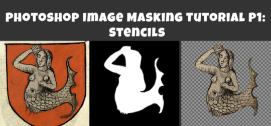
Photoshop Image Masking Tutorial Part 1: Simple Layer Masking to Image with Alpha, for Stencils and Overlays
As promised to a few people now, here is a (probably overly long) tutorial on masking in photoshop. Masking is where you use another image to show what parts of the main image you want to be visible and which parts invisible (or transparent). White = visible. Black = invisibile. Gray = various degrees of transparency. Alpha layers in DDS images do this for the entire image. Masks of individual layers do this for individual layers. This is a really really helpful skill for making textures.
This is all aimed at people who enjoy using Photoshop but are primarily beginners at it. I think I can safely say that masking is a “hump” skill for people who are otherwise pretty handy at Photoshop. I’m told it is a tricky thing to learn and an easy thing to forget, and it doesn’t help that there are several ways to approach it. This is the way I learned that actually stuck for me, so maybe it will make sense for you, too.
Part 1 (below) walks you through how I do overlays/stencils with transparency, from an image that is NOT neatly clipped.
Part 2 will cover RGB masks.
Part 3 will be masking of paint layers and other things in Create A World.
Part 4 will be masking in World Machine.
Part 5 will venture away from masking to cover novel uses of CAW, World Machine, and Crazy Bump for making textures, primarily normal maps, for CC objects and CAS (yes really!).
This is written for TS3 modders, but TS4 and TS2 modders might find it useful as well.
Skills covered:
Select --> Color Range, Inverse
Edit --> fill
Image --> adjustment --> Hue/Saturation(/Lightness), Brightness/Contrast
Filter --> Blur --> Gaussian Blur
Layers: New Layer, Merge Layers, Delete Layers, Mask Layer, Apply Mask
Channels: Edit Mask of Layer, Create Alpha Channel, Edit Alpha Channel
Save as DDS with transparency, Save as PNG for opening in Gimp with transparency
Importing into TSRW stencil OR package file via S3PE
If you already use photoshop, you probably have done some form of creating layers with transparency. You may have selected a portion of your image and copied it, or erased everything but the parts of your image you want. That is all VALID, but working with masks instead has two advantages: first, it is non-destructive. Your image remains intact in case you delete something you might want later. Second, you can make softer transitions with greater detail than is ever possible from hand selecting or using the magic wand tool.
To begin, you can open your image directly in photoshop and just start working with it as is, or if you prefer you can copy it over to a document of the right size for your final texture (ie. 1024x1024 at 72 px per inch ARGB). You might want to do that if you already have other elements of your texture going on, but if you edit this image separately you don’t risk accidentally messing up your existing work. So:
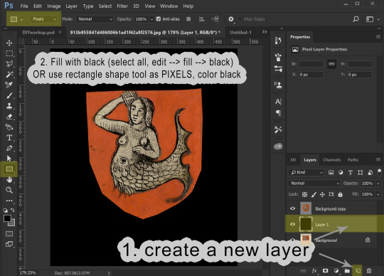
1. Open your image. In Layers, right click your background to create a copy. Please leave the background layer there for now, or make a second copy to save for later. You need TWO layers with your image in, because the layer we are working with is going to be transformed into a masking layer.

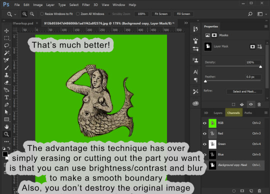
2. I’m aiming to isolate the mermaid. I definitely don’t need any of the beige background and I don’t care about the shape of the shield, so I’m just going to use the marquee tool to select the areas I don’t want and delete the. I select the area I want to keep, then go to select --> inverse selection to select the surrounding areas. I can then hit delete and place a black layer underneath to merge down on OR I can go to the edit menu --> fill --> black. The goal here is to gradually make the areas we don’t want BLACK and the areas we do want WHITE.


3. We now have our mermaid on the red shield sitting surrounded by black. This is a pretty good image to work with because what I want to isolate is a different color than the part I don’t want to keep. I’m going to now use the select --> color range tool to select red, and then the hue/saturation adjustment to make all of the red go black:


If you haven’t already merged your image with a black background, you can do that now.
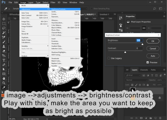
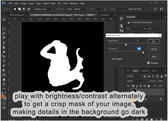
4. Before proceeding, make sure your image is entirely desturated (in grayscale). If you haven’t already, go to image --> adjustments --> hue/saturation, and drag the saturation levels all the way down. Now we go into the Image menu --> Adjustments --> Brightness/Contrast and start playing with these to make the area inside the mermaid as white as possible and the areas surrounding the mermaid as dark as possible. I find it helps to adjust brightness first to bring the areas I want to go to white above a 50% gray and then use the contrast to drive those values apart. This might sound weird, but just play around, and you will get the idea.
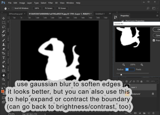
You likely will find that the image has too much detail. The scales on the mermaid I don’t want to be transparent. I want those dark details on my image to show! So, I go into Filter --> Blur --> gaussian blur to help make those details more light gray. This also make the white outline leftover from the shield shape darker by blurring the surrounding black into it.

I can then go back into brightness/contrast. You can jump back and forth between the two tools until you get a nice, crisp mask.
You can then go back into gaussian blur one more time to make the edges a little smoother.
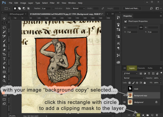
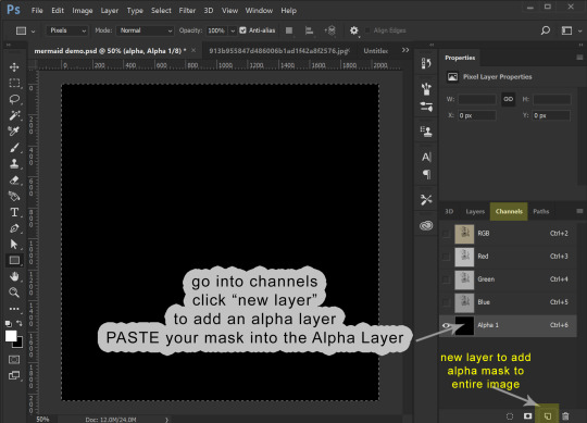
5. I now am going to copy this black and white image and add it as a masking layer of my original image. You need to be working with a copy layer of your original image. This will not work with the background layer (unless you want the mask to be the alpha of the entire image).

You have your black and white “mask” layer copied. Now you select the layer with your original colored image and add a masking layer to it. From within the Layers panel (really important to be in the Layers panel, NOT channels) click the rectangle with the circle in it. This will add a masking image to your layer.

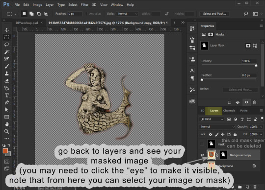
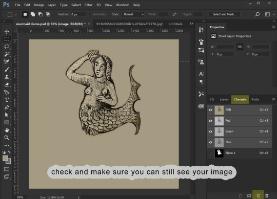
For that layer, click the channels panel, then click the “eye” visibility to the left of each channel to turn off the visibility of the RGB channels and turn on the visibility of the Mask channel. Select the mask channel and paste your mask image into it. Click back on the “eyes” to make everything visible, then go back to the Layers panel to see your image, now transparent because of the added mask. Note that from within the layers panel you can select either the image or the mask (the little “link” symbol in between can be turned on and off to link them or not, but you can ignore that for our purposes.)
6. Now we are going to edit the mask. I like to make a layer of a contrasting color to my image and place it underneath, so I can better see what the mask leaves and keeps.

Making sure your layer with your masked image is selected in the layers panel, go back to the channels panel, and select the mask channel to work with. You can leave the RGB/red/green/blue channels enabled and edit the mask directly, using either brightness/contrast OR a paint brush with black or white color. As you paint black on the mask you will see this “erases” the image (but it isn’t actually erasing the image, just adjusting the mask).


Playing with brightness will push the boundaries of your mask in and out, and contrast will make the boundary crisper. You can always adjust the layer with blur, too.
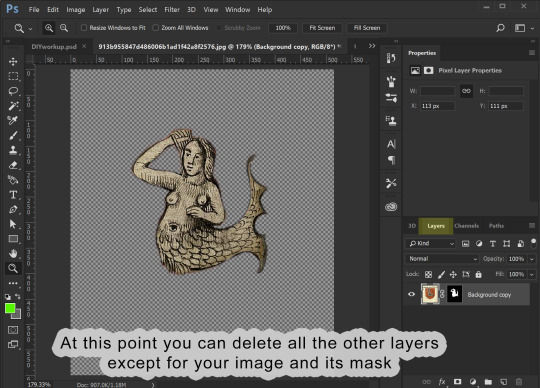
7. OK, cool! The mask is how I want it. Now I can prepare it for use. At this point you only need the layers with your image and its mask.
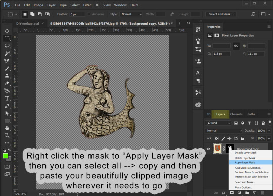
Assuming that you now want to transfer this image elsewhere and perhaps edit its shape to fit something else, you can then right-click the mask and select “apply mask”. This will delete the parts of your image that are masked out. Now you can copy your image and past it wherever you want it to go.
8. I’m making an overlay for a banner deco object. I already have a template made showing me where the banner is. I past the image into it and adjust its shape to look how I want.

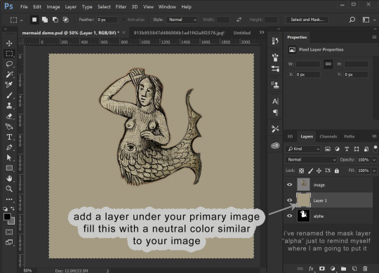
9. Once you have it looking how you want, the final step is to prep it for saving as a DDS file. Assuming your image is the correct size (ie 1024x1024), we are once again going to use our image to make a mask. Only, this time, it already is at the correct opacity and transparency. So, duplicate your image. You can also at this point create a solid black background layer underneath it (new layer, fill it with edit/fill or with a the rectangle (pixel) tool). Choose one of your two image layers to make the new mask from. Select that layer, and go to image --> adjustments --> hue saturation. Drag the lightness ALL the way up (+100). You will see all of your image turn white. Click ok, then merge your all-white image down onto the black layer! Presto! This is your image mask again, only adjusted to fit your final image. In fact, this is what is going to become the mask of the entire image, the Alpha channel.


In my example below I’ve renamed that layer “alpha”. This does NOT make it the alpha channel, it is just to remind myself this layer will become the alpha channel. Now I make a layer behind my primary image filled with a color that matches the overall hue of my primary image. The point of this is so that any transparency created by the alpha layer will catch this color instead of filling it with white. You can then merge your primary image down onto this color layer, making it a solid image with no transparency.
Now we COPY your “alpha” layer in its entirety, and go back into Channels panel. At the bottom of the channels panel, click the “new channel” (same image as “new layer” in the layers panel. This now creates the ALPHA channel for the ENTIRE IMAGE (not just whatever layer). Make sure that just the Alpha channel is selected and paste your copied “alpha” layer into it. Make sure that your entire image is still visible when the RGB channels are all visible.
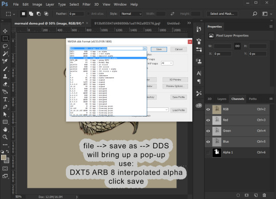
10. We can now save this image. (If you don’t have the NVIDIA plug in or it doesn’t work for you, you can use this plugin: https://software.intel.com/en-us/articles/intel-texture-works-plugin OR you can save the image as a PNG with transparency and open it in GIMP to save it as a DDS. JPEG formating does NOT carry the Alpha channel transparency!). The correct format is DXT5 ARB 8 with interpolated alpha. You can name it whatever you want.
11. To use this stencil in TSRW, simply open up your project, go to the texture variation you want, go to stencil, and import the DDS image. You could also import it as an overlay.

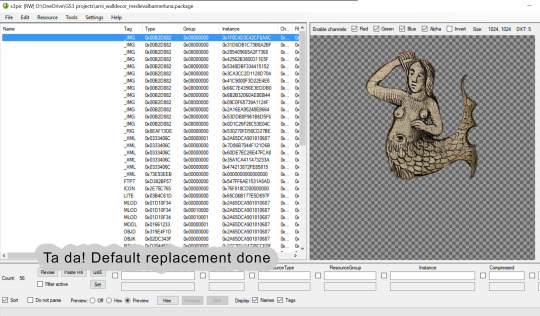
To import it is a default override of an image for an object you have as a package, open the package in S3PE (clone it first with S3OC if you want to make a NEW non-default object) and then right-click the _IMG you want to replace, select replace, and then navigate to your saved image. S3PE will automatically change to file name to whatever the name of the image you are replacing is. And that is it!
Alternately, you can use Texture Tweaker to create new texture variations and add new stencils. But, I’m not going to explain that here.


That is all I’ve got for now!
28 notes
·
View notes
Text
Adult Coloring Books for Men
I used to be attempting to determine an excellent reward for my dad who’s beginning to have indicators of Alzheimer’s for Christmas and remembered that since he was a child, he beloved to design and paint giant mannequin airplanes… so why not coloring books for males? But in fact, he most likely wasn’t going to benefit from the flowery, tangled kind that I like so I began my search for Coloring Books for Grownup Guys.
Men’s Coloring Books for All Occasions
Intricate Ink Animals in Detail Volume three by Tim Jeffs
Son of a Mother Trucker
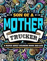
A Manly Adult Coloring Book: Dad Life: Clean Dad Swears & Old Coot-isms: A Unique & Funny Antistress Coloring Gift for Men
Click to Order Amazon US, UK or Canada
One of the most well-liked books for males in our coloring group proper now could be the most recent one from Kerby Rosanes World inside Worlds.
World Within Worlds
I personally personal this pretty e-book and the largest downside is deciding which cool image to paint first. Paper high quality is nice too.

Click to Order Amazon US, UK or Canada
Dad & Me Coloring Book

I obtained a replica of this lovely e-book and was very impressed with each the illustrations, the standard however principally with the distinctive concept of the softer aspect of fatherhood being present and celebrated all through the e-book. The pages are perforated and TOP sure so it’s great for lefties in addition to those that need to show their creations after you shade them in.
Click to Order Amazon US, UK or Canada
The Men’s Coloring Book by Nathaniel Wake

Nathaniel says it’s a Manly Mans Adult Coloring Book with Cyborg Women, Military Machines, Futuristic Battles, Western Armory, Fish Illustrations and Cars… nonetheless I completely beloved this e-book so that you might need to struggle your feminine vital different for among the illustrations on this e-book.
Click to Order Amazon US, UK or Canada
Mythomorphia: An Extreme Coloring and Search Challenge by Kerby Rosanes

Click to Order on Amazon: US UK Canada or Book Depository
Animorphia
An wonderful coloring e-book for adults that includes the super-detailed animal pictures from artist Kerby Rosanes. Known for his common Sketchy Stories weblog, Kerby works in intricately detailed black and white line to create creatures, characters, patterns, and tiny components to type compositions of mind-boggling complexity. Bring your creativity to finish the breath-taking drawings and discover hidden treasures and creatures scattered all through its pages

Order on Amazon US ~ Amazon UK ~ Amazon Canada ~ Book Depository
Imagimorphia Coloring Book by Kerby Rosanes

Fans of grownup coloring books are invited to enter the extraordinary world of Kerby Rosanes, the illustrator behind the Sketchy Stories weblog and Animorphia, the worldwide phenomenon and New York Times bestseller. In Imagimorphia, animals, and objects morph and explode into astounding element. Bring every intricate picture to life with shade and discover the objects hidden all through the e-book.
Printed on high quality paper, Imagimorphia is a unusual coloring and search e-book for followers of grownup coloring books like no different.
Dad Life – A Manly Adult Coloring Book
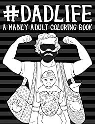
Color in humorous issues that EVERYONE’s Dad says to them.
Click to Order Amazon US, UK or Canada
ColorArt Coloring Book – Real Men Color
This e-book is spiral sure eight half x 11 pages with over 100 pictures to paint in.

Click to Order Amazon US, UK or Canada
The Art of the Cigar: Vintage Labels Coloring Book
Based on the attractive lithographs of cigar field labels from years passed by. Each of the 40 gorgeous labels is pre-1920 with elegant designs that wrap you within the nostalgia of an age when life was less complicated and folks knew easy methods to benefit from the second. The pages on this e-book are one-sided professionally printed by Vintage Pen Press.

Click to Order Amazon US, UK or Canada
Oldtimer Grayscale Adult Coloring Book for Men
This e-book contains 43 Oldtimer Images of Vintage Rustic Cars, Trucks, Tractors, Tools, Motorcycles and different Things for Men to Color. Creator Timothy Parks has his pictures printed on eight half x 11 paper printed solely on one aspect. He has penned a couple of different coloring books with related themes however this one has the most effective opinions.

Click to Order Amazon US, UK or Canada
Die Hard Coloring Book

If you reside in a home the place Die Hard IS a Christmas film custom, then this coloring e-book is for you. All your favourite scenes and quotes are on this official Die Hard coloring and exercise e-book. This coloring e-book from Harper Design is superb high quality. I obtained a pattern of it from the writer and it’s Coloring Book Addict accepted!
Hans Gruber and his posse crash the Christmas social gathering at Nakatomi and take the tower hostage;John McClane’s limo trip with Argyle;The tension-filled crawl via the constructing vents;John’s morbid message supply to Hans (written on the corpse of one in every of Hans’ males);The well-known bloody footprints;And in fact, John leaping off the Nakatomi tower.
The Book of Beasts

A buddy of mine in Scotland (Kemberlee) ordered this e-book within the UK and he or she couldn’t cease gushing about how fabulous it was. It’s obtained a hardcover with fabulous paper and wonderful illustrations of Dragons of all kinds. Filled with legendary monsters from around the globe, The Book of Beasts will take younger readers on an epic coloring quest via historical lands and lore. As they fill within the pages, kids will encounter creatures from Aboriginal, African, Mesoamerican, Greek, Roman, Indian, Norse, Chinese, and Japanese tales. On the again of every web page, children will discover background on the beasts within the e-book.
Click to ORDER Amazon US ~ Amazon UK ~ Amazon Canada ~ Book Depository
Full Metal Coloring – A Book of Down Range Reflection

Along with the pages to paint, you’ll discover some historic background of the firearms and weapons on every of the pages which had been written by a aggressive shooter and veteran who can be the artist. I’ve a replica of this e-book from the artist and have gifted it to the gun fanatic in my life. Its unique artwork on respectable paper. As at all times use a sheet between your pages to keep away from bleed-through and stress marks.
Click to Order Amazon US
Bennett Klein’s model is very detailed tattoo inked line artwork.
Colour my Sketchbook – DRAGONS by Bennett Klein


The coloured in dragons on this cowl had been executed by members of his Facebook web page linked right here.
Click to order Amazon US Amazon UK Amazon Canada Book Depository
This is simply one of many Bennett Klein Books, discover the remainder right here.
Tattoo Art Coloring Books for Men
The Tattoo Art of Freddy Negrete
I obtained this e-book from the writer and was fairly happy with the number of pictures contained inside. There is so much to select from however most do have a Hispanic, Chicano, Mexican taste to them. There are a lot of the Virgin Mary in addition to Sugar Skulls which make sense culturally. There’s even a sugar cranium Virgin Mary to paint in. As a colorist, most weren’t tremendous detailed so when you choose that kind of coloring e-book this one most likely received’t be your cup of tea, however when you like so as to add your personal patterning or are studying and working towards shading and contouring this e-book is ideal.

Click to Order Amazon US UK or Canada
Kitchen Overlord’s Colorable Compendium of Geek History: An Adult Coloring Book and Companion to the Illustrated Geek Cookbook

I haven’t seen this one in particular person, however its on my record and from the opinions, it seems enjoyable. “The creators of Kitchen Overlord’s Illustrated Geek Cookbook invite you to paint together with 120 years of geek historical past!
Start with H.G. Wells Time Machine in 1885 and produce the black and white pages to life because the world grows geekier with each decade.
See Cthulhu rise in 1928, shade Captain America in 1941, depart the Shire for Mordor in 1954, boldly go on a 5 12 months mission beginning in 1966, lastly be taught what “inconceivable” means in 1973, struggle Zuul and Gozer in 1984, assist the Scooby gang shield Sunnydale in 1997, turn into a Big Damn Hero in 2002, and assist Ichabod Crane turn into a contemporary man in 2012.
You recover from 50 enjoyable illustrations representing your favourite books, comics, motion pictures, TV, and video games – organized chronologically so you possibly can see how geekdom has developed over greater than a century.”
Click to order AMAZON US AMAZON UK AMAZON CANADA BOOK DEPOSITORY
Guys have a tendency to like Science Fiction so most of the books on my nerds and geeks web page would possibly work for the boys in your record too!
Military Coloring Books for Men
The very first thing to do is work out hobbies and issues that the person in your life is into.. my dad loves airplanes and was within the USAF in order that was my first search. I discovered these two: Airplanes of the Second World War and Jet Fighters. Both are Dover Coloring Books so the worth level is correct, underneath $5.


If you want freebies take a look at the free coloring web page and e-book excepts from Dover too.
Other Military Coloring Books for Men embody:
Many of those navy books additionally work in case your man is a historical past buff.
American Muscle Cars Coloring Books for Men
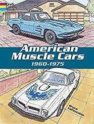
Expertly rendered illustrations of quick, flashy, and highly effective sports activities vehicles, amongst them the 1962 Ford Thunderbird, 1964 Corvette Stingray, 1968 Chevy Impala SS427, 1969 Camaro Z-28, 1970 Ford Torino Fastback, 1971 Mustang Boss 351, 1974 Firebird Trans-Am, and 37 others. For coloring e-book lovers and “muscle car” followers.
Click right here to Order American Muscle Cars Coloring Book
There’s additionally Classic Cars of the 50’s Coloring Book
Luxury Cars Coloring Book
Sports Cars Coloring Book &
History of Trucks
Motorcycles Coloring Book – This assortment chronicles over 100 years of bike historical past with illustrations of 45 precisely detailed fashions, together with Gottlieb Daimler Motor Bicycle (1885), 1913 Royal Enfield, 1947 Indian “Chief,” 1966 BSA A65 Lightning, and the Honda ES21 Future Motorcycle Concept Prototype.
Dover Books has an excellent number of History Coloring Books
Looking for an excellent historic coloring e-book? Dover may also help you add shade to among the most exceptional occasions in historical past! From dinosaurs, the Old West, the Civil War, Native Americans, the house race, American presidents and first women to classic cars and trains, castles and cathedrals, well-known explorers and inventors, historic structure like Famous Buildings of Frank Lloyd Wright and landmarks. Black historical past coloring books function genuine illustrations in regards to the Underground Railroad, the Amistad, Barack Obama, and extra. Each version gives fantastically detailed illustrations and fact-filled captions.
Click right here to see the complete choice.
The Bicycle Coloring Book

This e-book blew me away once I began seeing coloured in photos from it. It is full of cityscapes and countryside illustrations that function a motorbike and a cat. It’s like nothing you’ve ever seen earlier than. The paper is fabulous artwork high quality and the illustrations are one-sided with a middle fold-out part for a big poster-sized creation. On the dealing with aspect of the web page is an illustration of the identical cat you see in every image (generally you must hunt to seek out him) however what’s actually cool in regards to the cat is that once you flip the pages he animates. This will for certain convey you again to your faculty days once you used to make flipbooks. If you’re a bicycle fanatic or the person in your life is, you possibly can’t go fallacious with this coloring e-book. It’s eight.2 x zero.eight x 10.eight inches and has 144 pages.
Click to order Amazon US Amazon UK Amazon Amazon Canada Book Depository
100 Animals by Jade Summer
An Adult Coloring Book with Lions, Elephants, Owls, Horses, Dogs, Cats and extra. 100 pictures printed on one aspect of the web page.

Click to Order Amazon US, UK & Canada
Ill-Gotten Brain Coloring Books by Chris Guest
I wished so as to add a few books from a brand new illustrator that I do know guys will love. Thanks to one in every of my coloring group, Shawn B. for the heads up about his enjoyable books! Meet Chris Guest aka IllGottenBrain. He has 2 books out, Beyond the Fairytale Forest and Monsters Eat Everything that you’re certain to get pleasure from.

His books remind me of Steve Squidoodle’s illustrations too.. enjoyable and funky, verify his work out right here.
Walking Dead Coloring Book
This e-book is completed in a graphic novel model so LOTS of black and background particulars so it’s alongside the strains of a grayscale coloring e-book. The illustrations are from the Walking Dead graphic novels and it’s very detailed. We are hoping they arrive out with one other that follows the TV present a bit extra but when you recognize a Walking Dead addict, this may be an ideal reward.

Click to order Amazon US ~ Amazon UK ~ Amazon Canada ~ Book Depository
Steampunk Devices
Dudes like to tinker with devices so this Steampunk Devices can be an excellent alternative for the artsy man in your purchasing record.
Click to order Amazon US Amazon UK Amazon Canada Book Depository

We discover heaps extra Steampunk and Science Fiction choices for guys right here.
Intricate Ink – Animals in Detail

After seeing colorings from this e-book on Instagram I bought it on Amazon. It’s a greyscale e-book that makes your colorings actually come to life. It’s a hardbound e-book that opens on the prime so nice for left-handed colorists too.
Click to Purchase Amazon US
Lost Ocean by Johanna Basford
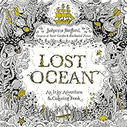
Although Johanna Basford is understood for her fairly flowers and delicate leaves, guys can fall just a little in love along with her illustrations in her third Inky e-book, “Lost Ocean”
Visit coral reefs and barnacle-studded shipwrecks, uncover intricate shells and pirate treasure. Secret Garden and Enchanted Forest followers and newcomers alike will welcome this artistic journey into an inky new world.
Click right here to order Lost Ocean Amazon US Amazon Canada Amazon UK Book Depository
Bugs & Creepy Crawling Coloring Books for Men
Maybe your grown guys nonetheless have that little boy in them that loves spiders and snakes… There are some decisions for them too.
Check out this Complicated Spiders Coloring Book… This distinctive coloring e-book is eight inches broad x 9 inches excessive, it has 25 completely different illustrations of intricately adorned spiders; every illustration is printed within the e-book twice, one on a black background and the identical illustration on a white background with mild grey strains. Lots of spider and bug e-book right here too.

Fantasy and Dragon Coloring Books For Men
Amazon has dozens of Fantasy & Dragon coloring books that guys would possibly like right here.

Funny Coloring Books

Coloring for Grown-Ups: The Adult Activity Book
Electile Disfunction – The Story of the 2016 Presidential Election Coloring Book

Click to Order Amazon US
You can see extra Political Coloring Books right here.
Unicorns Are Jerks: a coloring e-book exposing the chilly, exhausting, sparkly reality

Coloring for Grown-ups – Holiday Fun Book
There are extra right here of the extra “R” rated variations as nicely.
See a big itemizing of our favourite humorous naughty & horny coloring books right here.
Steve MacDonald’s Cityscapes e-book “Fantastic Cities“ will even attraction to the fellows our there with a e-book the place no flowers or fairies are anyplace to be seen. Steve McDonald applies his distinctive photo-based strategy to create lovely, detailed line drawings of wonderful buildings and different constructions from around the globe in Fantastic Structures and his third e-book contains less complicated designs in Fantastic Collections,

Comic Book and Graphic Novel Coloring Books
DC Comics Coloring Book
Featuring iconic paintings by famend comedian artists, DC Comics Coloring Book contains gorgeous line artwork of beloved characters corresponding to Batman, Superman, and Wonder Woman. Click to Order on Amazon
Wonder Woman Coloring Book

This graphic novel options basic illustrations from among the most well-known Wonder Woman artists of all time, together with George Pérez, Jim Lee, Brian Bolland, Amanda Conner, Ross Andru, H.G. Peter, Cliff Chiang, and Phil Jimenez printed on each side of the web page.
Click to Order the Wonder Woman Coloring Book
Coloring DC Batman Hush Volume 1

This grownup coloring e-book options chapters from one of many biggest graphic novels of all-time, BATMAN: HUSH. Illustrated by Jim Lee, identified for his intricate strains and distinctive element, this story is ideal for coloring. Click to Order this totally illustrated Batman graphic novel right here

Civil War – All your favourite Avengers battle on this graphic novel coloring e-book
120 pages of all-out costumed warfare, that includes Steve McNiven’s exquisitely rendered paintings simply ready for you so as to add the colour! Captain America and Iron Man are the feuding Avengers main the 2 sides of heroes that battle it out over the rights and wrongs of Superhuman Registration. Click to order Civil War
Color Your Own Age of Ultron
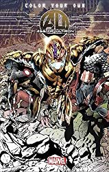
Color in your favourite Marvel Heros and Sinister Bad guys on this graphic novel. Difficulty ranges from simple to superior so there’s something for each graphic novel fan.
Click to Order Age of Ultron Here.
Color Deadpool Graphic Novel
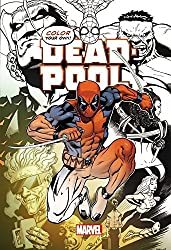
This e-book contains covers from New Mutants 98, old-fashioned Pool, New Pool, the Daniel Way years, and Deadpool vs; Thanos, carnage, zombies, Cable, and Spider-Man. Click to order Deadpool
Assassins Creed Coloring Book
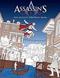
Click to Order Assasins Creed Coloring Book
Guys which are into Science Fiction and Fantasy can discover a big number of SciFi Coloring Books right here.
Steve Squidoodle has a implausible following on Facebook which is the place I found him. Like Bennett Klein, he’s at all times gifting away freebies on his fan web page. Learn extra about Steve Turner the illustrator right here.

Squidoodle’s Book of Fancy Letters – Click to Order
All 26 letters of the alphabet, on single aspect pages with doodles objects to paint in. Taken from the intricate hand-drawn pen drawings of Steve Turner a.ok.a Squidoodle. Each letter is detailed and ornate, with doodled objects starting with that letter.
Each letter sits centrally on the web page, away from the backbone – you possibly can minimize the letters out, shade them and provides them as presents to household or mates. All the pages inside this e-book are taken from the hand-drawn illustrations by Steve Squidoodle Turner. He rigorously chosen objects to be contained in every letter – making it enjoyable for children and adults alike. The A incorporates an astronaut, an apple, an aeroplane, an anchor…. The B incorporates a bee, Big Ben, a beetle, balloons…. you get the concept!!
Squidoodle’s Book of Fancy Letters: An Adult Coloring Book – Click to Order
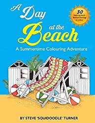
A Day on the Beach by Squidoodle – Steve Turner
The Natural Atlas by Squidoodle – Steve Turner

Creative Insults for Foul-Mouthed Beasts – A UK Sweary Coloring Book by Squidoodle – Steve Turner

I STRONGLY advocate downloading the Hobby Lobby & Michaels App to your smartphone. That manner you at all times have the coupons with you. Being the clumsy particular person I’m.. I ALWAY neglect the coupons at house or within the different automotive or the opposite purse.. you get me.. proper? You can usually discover artwork provides there for a very good worth with the coupon however most frequently I purchase books and provides on Amazon.
AMAZON PRIME – If you aren’t a member it’s best to look into it.
You get free 2-day transport daily at Amazon with Amazon Prime. You can attempt it for free proper now.
The Amazon Prime membership program gives different particular advantages for simply $99 per 12 months. Members can immediately watch over 40,000 motion pictures and TV episodes and borrow 1000’s of books from the Kindle Owners’ Lending Library.
Have the boys in your record loved coloring books I haven’t listed right here? Please let me know within the feedback beneath or on one in every of my social media accounts.
The post Adult Coloring Books for Men appeared first on XNX Adult Store.
0 notes
Photo


Assignment #3
Jamie Wiedmann
I really enjoy the rule of tenths because I love the drama of having a subject against a vast background, as I sort of did for Week 2’s assignment unknowingly! I think it works really well for scenery or larger subjects, but the drawback to that is you don’t always get the detail you would with a closer photograph. I also liked the framing technique a lot; it is so creative and lead to some fun photographs. I liked coming up with different ways to frame a subject, it also changes the way you might take a picture, such as the angle you take it from, the framing makes it look very realistic, like an image you would see in your daily life, looking through a crowd of people or a window.
Overall I found this assignment much more challenging than Assignment 2, but particularly the dynamic diagonal was the hardest for me because I didn’t quite know what would fall into that category and it was hard finding preexisting conditions or objects I could use to manufacture the diagonal shape. Also finding objects to photograph for the rule of tenths with a primarily plain background was challenging as well.
I disagreed with John Berger from the very first paragraph, as I had always considered photography to be a form of art. However as I read further to understand the main points of his argument, I found myself agreeing partially with him, but mostly disagreeing. Berger is not wrong that many more museums are dedicated to paintings, sculptures, drawings, etc. however modern art exhibits are becoming more commonplace. Additionally, even if the resulting work of art is not a photograph, people have been using photographs in art for decades. I also disagree with the argument that a photo is not unique. As we saw with our last assignment, lighting and exposure can alter an image entirely. The shadows, colors, and organization of the objects will never be the same again. Iconic photographs capturing scenes from history (riots, celebrations, performances) will never happen again. The angle from which the photograph is taken, how small or large the subject is, where the subject is positioned also make the image unique, as we saw from assignment 3. Yes, locations do stay the same and they do not belong to an individual (usually), a field or hiking spot will still exist tomorrow and hopefully a century from now, but the minute details that make a photograph unique do change. This paragraph also reminded me of a documentary my art philosophy class watched on Andy Goldsworthy. Goldsworthy goes out into nature and creates beautiful arrangements and manipulations with the objects around him but they are not meant to last, part of the beauty in some of the pieces is watching them be absorbed back into nature. The only way anyone besides him gets a chance to see his work is via photographs he takes. I agree the more something is done the less meaningful it becomes, however meaning is entirely subjective. 100 photographs of a child’s first birthday or a wedding or graduation are different from 100 photographs of a car or household appliances. Also, the beauty in photographing daily life objects that are somewhat meaningless is the fact that the photographer can make them beautiful using lines, focus, lighting and various other elements.
I understand where Berger is coming from when he says composition should not enter into photography, there are many aspects of a photograph that are out of the photographers control, especially when photographing outside a studio. In a painting, everything from the size and color of an object are under the painter’s control, in photography one must work with objects that already exist. However a photographer can have manipulation over many elements in a photograph. Just because composition is challenging or limited does not mean that it should not enter into photography, so I disagree with his statement. Being able to manipulate models, alter the arrangement of objects, is part of what makes photography an art form. By saying one should not be allowed to influence the image is not pointing out why photography should not be considered art, but simply ignoring or discrediting one of the reasons it already is considered art.
Prior to this assignment I mostly only took pictures when I was moved to, pictures with friends and family, pretty scenery or really good food. I like to keep my picture-taking spontaneous and try my best to capture the emotion of the moment then move on and experience it, before coming home and immediately looking at my pictures. I’d say I had a good mixture of unplanned photographs and planned ones. When I take pictures with my friends sometimes we choose where/how to stand, like if we are at a specific place or scenery, or where the lighting is best, other times there is not as much planning. When I am taking pictures of objects like food I do plan more, I usually consider the lighting and arrangement of the objects as well, although I often find the less planning and fussing the more I tend to like my pictures, which helped me notice that just because I can take unlimited photographs of an image does not mean that I usually do, as I often go with one of my first attempts, I do not take many photos of the same thing. I had always been aware of things like balance, perspective, symmetry, and so on, but I feel like they are easy things I often forget that could enhance my photographs even more. This assignment challenged me to think about all 10 basic elements before taking a photograph, and I was able to include more of them in my photographs. The assignment also made me consider things like the dynamic diagonal and the way space is broken up in the image and how that space is filled or not filled.
Rule of thirds: My subject in this photo was the book I was reading. I found an empty table and used the grid lines on my camera to line it up with one of the intersecting points. I wanted a fairly plain background to help the book stand out more, but I wanted a slightly visible pattern in the wood to create more interesting texture so the background was not completely solid. There was light coming in from a window that created a gradient effect where it was lighter on the side opposite the book, which formed a nice balance. I angled the book intentionally but wanted to keep the table straight. I took this photo from directly over the table looking down as opposed to straight on from the side because I wanted to show different shapes you get from a different perspective. Originally I put the image in grayscale because it enhances the effect of the light and the white pages of the book in contrast to the dark wood of the table, I also like that being in black and white unifies the elements of the image, making everything seem less distracting as I wanted to highlight the book itself. However after reviewing the document I realized my goal was to capture the moment of curling up with a good book and I think using the natural brown colors in the image conveys that more.
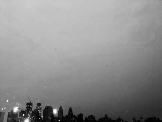
Rule of tenths: It was a rainy evening when the sun was setting and the lights were starting to come on in the buildings and I was actually driving home, but it looked really pretty outside. I was not going to use this originally because it turned out pretty messy, but the more I looked at it I liked the way the water on my windshield distorts the shapes of the buildings and the lights as well, it’s an effect that is harder to get by only using your phone. I put this one in black and white to enhance the lighting and in an attempt to create stronger, more defined lines due to the image being out of focus. My goal was to capture the setting of a dark, rainy city.
Diagonal: My subject was the houses and wires. I took the photo from my viewpoint where I was standing, slightly diagonally off to the side, to capture the natural angle formed by the houses, and use the wires, which were hanging at an angle to accent it. I placed the houses at the bottom of the frame to draw attention to the top half of the houses as well as the space and lines formed by the roof and wires. I put this image in black and white mainly because I did not like the color combination of the sky and the fronts of the houses, and by getting rid of the distraction of the colors the diagonal lines are more apparent as well. The sky was grey and cloudy so it caused the light to disperse and shine from the sky as a whole instead of one specific point like on a clear day, which provided a bright background against the buildings and dark wires. I also like the marbled effect grayscale has on the clouds in the sky.
Frame: I wanted to use a real frame to frame my subject but in a more creative way. So I stood in front of a plain background to make the subject pop more and held an empty frame out in front of me. I wanted it to look like a 3D photograph, like the subject is coming off the page, or out of the frame. I also put this one in black and white because the colors clashed, but also to highlight the shadows adding to the 3 dimensional feel of the image. I tilted the frame because it was more natural to hold it that way; I wanted to convey a more relaxed version of those famous portraits I’ve seen where the subjects look very upright. I was inside so I turned the lights up so it would mirror a photography portrait session with artificial lighting. Looking back, I wish I could have fixed the shadow on my forehead from the frame but I tried several angled and, because the light was coming from the ceiling instead of straight on, or various angles as in a photo shoot, it was hard to avoid.
Middle Placement: I liked the idea of using the sun in the middle because it was so condensed and defined, which has not been happening lately due to cloudy, rainy weather. I used the weather and time of day to my advantage because my goal was to depict the sunset and the nice weather in between several days of bad weather. I remembered that objects should be towards the bottom of the frame, so I put the sun fairly low in the image to help show the expanse of the sky above. While the sun is technically the main subject, the additional subjects, the road, trees, and sky play off each other to emphasize each other without distracting from the sun. The distance allows the viewer to get a sense of place and time. I took this photo straight on to get a realistic representation of what my view was from where I was standing.
6 notes
·
View notes
Text
youtube
Watch the 2024 American Climate Leadership Awards for High School Students now: https://youtu.be/5C-bb9PoRLc
The recording is now available on ecoAmerica's YouTube channel for viewers to be inspired by student climate leaders! Join Aishah-Nyeta Brown & Jerome Foster II and be inspired by student climate leaders as we recognize the High School Student finalists. Watch now to find out which student received the $25,000 grand prize and top recognition!
#ACLA24#ACLA24HighSchoolStudents#youtube#youtube video#climate leaders#climate solutions#climate action#climate and environment#climate#climate change#climate and health#climate blog#climate justice#climate news#weather and climate#environmental news#environment#environmental awareness#environment and health#environmental#environmental issues#environmental education#environmental justice#environmental protection#environmental health#high school students#high school#youth#youth of america#school
17K notes
·
View notes
Text
Photo editing software for Windows 10 to scale images or resize photos
Great photo editing software for Windows 10 with a lot of nice gadgets to easy brighten images
Interesting photos are indicated to record the essence of a thing, or a gathering of it, minus exposing the full situation overall. As well as topics with drawings or rep are excellent candidates for edited pictures, such as in a image of sliced things listed below. Photo editing software carries out have a few of the functionalities is actually effectively known for, which comes very beneficial when you have actually picked you have actually like to try your give on one thing even more extravagant than sharpening and add symbols in photos.
Photo editing software for Windows 10 can easily similarly bring in freeze frames coming from video clips, alongside different documents. And also when you are actually really feeling a little careless or even it is just ordinary oblivious concerning exactly how to make use of some of the tools, an assistant may support you to change the basics just as lights, focus, shade, and sharpening of graphics. For those that like their photos in wider screen versions, the software application supports you flawlessly created pictures to create a beautiful photo. As well as if it's a chance to unveil off your digital photography skills, you can decide on one of the graphic bunch design templates to promptly publish all of them in a certain measurement.
Free photo editing software for Windows 10 download
This photo editing software for Windows 10 is better for thrilled learners along with a bunch of attend their hands to determine the also technical components that would certainly frighten first opportunity photo editing and enhancing individuals. It additionally comes prepared along with a 360 scenery system. Perhaps the shiniest treasure in the package would certainly be the wonderful skin layer result, which evens out and also acquires rid of colored spots out your skin layer hue.
Whereas there is actually no automatically different colors solution choice quite necessary to remedy the poor illuminating very most digital cameras capture, there are the fundamental features of crop a photo. One of the most well-known misconstrued components of digital photography is what happens once you made the shot actually editing your picture. This is where you edit the pictures you have actually taken, to produce the end product. Modifying your pictures is the equivalent of the dark chamber from the time very long time ago. We are most likely to be covering some concepts for editing your photos, from the essentials like photos grayscale and also cropping a photo, via more complex functions.
The crop appliance allows you to transform the dimension of your image, and likewise to change the facet proportion. As an example, you can chop an image from a rectangular form to a square shape. There are several factors you would want to cropping, consisting of for publishing in different formats as well as element ratios. Compared to the initial, I have actually chopped the photo with photo editing software to eliminate the shining component of the left side of the image as well as recomposed using the guideline of quarters. That makes the coloring screw more the focus of photograph. When taking the picture, you could ask yourself why I did not just make up appropriately. So in this situation, I was organizing a long exposure photo shooting without any a tripod, so had the video camera stabilized on the side of the street for security. That significantly restricted my ability to flawlessly mount the minute, so I simply shot wider, knowing I had to be able to crop the image properly as a result of the reality. In this both cases, cutting out is very basic as well as it is simply involves you picking the cropping appliance and afterwards picking the location you wish to keep with your touchpad. You use the changes as well as your new cropped photo is ready. Learn here about cut a photo with the photo editing software for Windows 10 download and great photo editing software for experts to uncomplicated colorize an image. Blur a picture is uncomplicated with the photo editing software for Windows 10. Get this photo editing software for speedy and easy saturate pictures.
Easy flip an image with a photo editing software for Windows 10 for photographers to color splash
Download now the photo editing software for Windows 10 download for trainees and experts with a lot of cool functions and brand new photo editing software for Computer to edit photos. Simple sharpen images with a photo editing software for amateurs to insert cliparts in photos. Download free the photo editing software for Windows 10 for prompt and smart cut photos. Just one of my own personal scratch nuisances in photography is if the perspective boundary in a https://j9uzaew663.doodlekit.com/blog/entry/6851348/brighten-photos-in-windows-10-with-the-uncomplicated-photo-editing-software-for-windows-10 picture is uneven. Occasionally if we are actually caught up in the moment, this simple guideline is neglected yet the bright side is such modifying your photos with the photo editing software for Windows 10 to make them level is additionally extremely manageable.
Balancing the cam at the corner of the boat dock implied that the photo was not degree this is specifically visible to the sight if the image has actually a clearly identified horizon line, like the seashore. This level technique becomes part of the crop tool, and you can easily simply just revolve the photo to suit. Whenever you choose the focusing technique, a grate is going to turn up to aid you obtain the positioning correct. Leveling an image is an actually basic task in which will certainly get just a few seconds, resulting in a far more aesthetically hitting the spot photo. Occasionally when we take a picture, sections of the picture may wind up being darker than we want. We describe the brighter spots of the picture as shadows, as well as the colorful areas of the shot as high light.
Variance has to do with accentuating the contrast between the brightness and also darker areas of the photo. Boosting the comparison of a photograph can drastically boost the graphical effect in which had, by creating the borders in between those light as well as dark sections more clear.
Color scheme change is another vital part of the photo editing software for Windows 10. We can change picture color scheme in all type of means, starting with altering the overall charm of the photo such as just how yellow or blue it appears, to independently changing the shade and saturation of details color schemes within a photograph. We simply want to cover a few really helpful color scheme adjustments you can easily make use of to help to make your photography just a bit a lot more visually effective.
The fastest method to correct the different colors related to an image is actually with the hue gadget from the photo editing software for Windows 10. That modifies the look related to every coloring in a photograph to generate it basically condensed. Just like numerous changes, the trick is definitely to locate a really good harmony way too much coloring the photos often tends to seem instead unusual. Saturating pictures can easily be actually truly efficient, and naturally bright white as well as dark is an outstanding option for all kind of scenarios, in particular, snapshots, as well as specific garden images.
Free download photo editing software for Windows 10
From time to time there will be a little something within a photograph that you definitely do not intend to be right there, just like a troublesome beauty spot on a person's nose. That is very simple to remove in all the main photo editing software for Windows 10. It is usually no problem to clear away any type of objects out of a photography but the photo editing software operates best on distinctive, small-sized objects that are bordered by even colorings. This is since the heal device has to change the location you desire to erase with something else, and also this works finest when it has an area nearby that looks similar. So for instance, a red point on a face is surrounded by a lot of likewise colored skin, so the heal tool can conveniently calculate what to replace the dark point based upon the surrounding area. That is probably just because the photo editing software for Windows 10 has to displace the location you like to take out along with another thing else, and also this does work most ideal if it gets a section near that looks relatable to each other.
Photo editing software has actually ended up being very intricate and also effective and it is usually possible to control images and so they end up being entirely different from the original. There are definitely dozens of photo editing software for Windows 10 as well as wide ranges of methods of creating the very same or similar outcomes.
My intent very most when it comes to many photographs I publish procedure is definitely to produce all of them look being all-natural as you possibly can. I know this is a good point to start off, also when you really want to go on and also develop even more unique appearing pictures. Hue range on a photo is one of the main worries. You have the ability to typically see a more comprehensive variety of coloration than your electronic camera possibly shot.
The definition of picture modifying is the act of altering a picture, basically. But this is simplifying a case which is rather problematic. You can generally execute basic image editing strategies just like remove objects from photos relatively conveniently as well as quickly but intricate strategies and digital modifying might require photo editing software for Windows 10 and more experience. Photo editing software for Windows 10 is a tool that you can make use of to control and increase images. Since photos contain an enhancing amount of uses, even more firms are discovering methods to reuse images and also use them on a lot of media.
0 notes
Text
Functional photo editing software for Windows 10
Great photo editing software for Windows 10 for amateurs to professional flip a picture
Additional reading to cut images with this photo editing software for Windows 10 download or top photo editing software for Windows 10 for PC with a lot of nice features to practical crop images. Photo editing software to convenient color splash or convenient improve an image. Download here free this photo editing software for speedy and easy sharpen photos.
Crazy photographs are suggested to catch the significance of an object, or a compilation of them, excluding disclosing the overall backdrop overall. And also topics with patterns or repetition are excellent candidates for edited images, like in a photo of sliced up fruits listed below. Photo editing software carries out have some of the functionalities is well-known for, which comes fairly useful when you have actually selected you have actually like to try your hand on something a lot more trendy than cliparts in photos as well as print thumbnails. Photo editing software can easily also bring in freeze frames from video clips, along with varied files. And when you are actually really feeling a bit idle or even it is actually just ordinary oblivious regarding exactly how to usage a few of the tools, a helper can easily assistance you adjustment the essentials just as lighting, concentration, shade, as well as sharpening of photos. For them that love their photos in widescreen versions, the program helps you effectively produced images to develop a scenic photo.
As well as if it's time to unveil off your photography skills, you may select among the graphic deal concept themes to instantly imprint them in a certain size.
Brand-new photo editing software for Windows 10 download
Practical photo editing software for Windows 10 to resize pictures or powerful perspective distortion
This photo editing software is actually better for enthusiastic pupils along with a large amount of time in their manpower to find out the too technological functionalities that would certainly terrify first opportunity picture editing and enhancing customers. It additionally come got ready with a three-sixty view program. Most probably the shiniest gem in the plan will be actually the gorgeous skin layer influence, which evens out and removes reddish patches out the skin tone.
Whereas there is actually no self-regulating color fix option quite necessary to repair the bad illuminating very most digital cams squeeze, there are actually the basic features of insert objects into photos. Among the most well-known misinterpreted parts of digital photography is what takes place once you made the shot in reality editing and enhancing your photos. Here we will cover some suggestions for modifying your photos, from the basics like insert people into photos and also correction of contrast, via extra difficult actions. The cut out device permits you to change the dimension of your photo, as well as also to change the facet proportion. For example, you can cut out a picture from a rectangle-shaped shape to a square form. There are lots of reasons you would certainly intend to cut out, including for posting in different formats as well as facet proportions. Compared to the original, I have chopped the picture with photo editing software to eliminate the dark component of the left side of the pic and recomposed utilizing the regulation of thirds. This makes the darkness bolt much more the emphasis of the shot. You could wonder why I did not just compose properly when taking the photo. So in this case, I was preparing a longish direct exposure shot without any a camera stand, so had the cam stabilized on the edge of the pier for stability. That significantly limited my capability to flawlessly frame the moment, so I simply shot bigger, recognizing I had to be able to chop the shot suitably soon after the truth. In both instances, cropping is very simple and also it is just involves you selecting the cropping item and also after that choosing the area you wish to maintain with your touchpad. After that you apply the adjustments as well as your new chopped image prepares to go.
In this moment when I was looking for a powerful photo editing software for Windows 10, I finally stumbled over this really great app
When the horizon contour in a picture is not level, one of my individual casual aggravations in digital photography is. Occasionally if we are actually taken up in the minute, this standard rule is failed to remember however the bright side is such editing your pictures with the photo editing software for Windows 10 to make them degree is also extremely manageable.
Adjusting the cam on the edge of the boat dock meant that the picture was not level this is specifically visible to the sight anytime the photo has actually a plainly defined perspective line, just like the sea.
This level https://5e1d0c6042195.site123.me/#section-5e1d0d0f44eef technique becomes part of the cropping method, and also you can easily just rotate the photograph to suit. The moment you take the level gadget, a grate will seem to help you obtain the placement correct. Pointing a photo is an actually simple job that will certainly take just a few minutes, leading to a much more aesthetically hitting the spot photograph.
In some cases when we make a photo, sections of the picture may end up being darker than we want. I describe the dark locations of the shot as shadows, and also the bright locations of the picture as spotlight. Contrast has to do with accentuating the distinction between the lighting as well as darker parts of the image. Increasing the contrast of an image can significantly boost the graphical influence in which had, by making the boundaries in between these dark as well as light parts clearer.
Coloring correction is yet another useful component related to the photo editing software for Windows 10. We can change picture coloring in every kind of means, starting with transforming the entire heat of the photo such as just how blue or green it looks, to separately changing the shade and concentration of certain colorings inside of a photo. We just desire to cover a few really useful color variations you are able to utilize to help to make your images simply a little much more aesthetically powerful.
The easiest technique to regulate the shade in regard to an image is actually with the shade technique of the photo editing software. This alters the appeal of every shade in a photo to produce it basically condensed.
As with many edits, the solution is to locate a great equilibrium way too much coloring the images often tends to seem rather unusual. Shading photography may be very effective, and also certainly light and black is an outstanding decision for all kind of situations, specifically, construction, and various panorama images. More helpful hints about cut an image with the photo editing software download and smart photo editing software for Computer to very easy insert texts in photos or comfortable cut photos. Rotate a photo is useful with the photo editing software for Windows 10. Free download photo editing software for Windows 10 for professionals and program to edit photos to flip pictures and photo contrast.
Photo editing software for Windows 10 for amateurs to convenient enhance an image and comfortable photos grayscale
In certain cases there may be a little something inside a photograph that you definitely do not really intend to exist, like a troublesome dark spot on anyone's face. This is simple to erase in every the significant photo editing software for Windows 10.
It is definitely easy to get rid of any sort of items directly out of a photography however the photo editing software does work well on distinctive, small things that are certainly bordered by consistent color schemes. This is because the heal tool needs to replace the area you wish to remove with something else, as well as this works ideal when it has an area nearby that looks similar. For instance, bright spot on a face is surrounded by a lot of similarly tinted skin, so the recover tool can conveniently determine what to replace the bright spot based on the surrounding location. This specific is actually due to the fact that the photo editing software has to take out the sector you will to wipe out with another thing besides, and also this works most effective if it has a spot close by that looks very similar. Photo editing software has ended up being really intricate and also highly effective and it is actually feasible to control pictures and so they turn into entirely different out of the original. There actually are lots of photo editing software for Windows 10 as well as wide ranges of means of having the same or very much the same outcomes.
My intent very most for many photos I publish process is generally to produce all of them appear as natural as actually possible. I know this is an outstanding point to make a beginning, even when you intend to continue on and also create even more surreal appearing photographs.
Coloration range on an image is among the primary problems. The human eyes can usually see a wider range of shade than the electronic camera possibly make.
The definition of photo editing is the process of reshaping a picture, just simply put. However that is simplifying a theme that is really intricate.
You can usually implement basic image editing techniques just like photo draw relatively easily and also swiftly yet complex strategies and also electronic modifying might need photo editing software and also even more knowledge.
Photo editing software is a tool which anyone can easily use to manipulate and improve photos. Because images contain a raising variety of uses, numerous businesses are looking for means to reutilize pictures and also make use of them on a couple of networks. Download now this photo editing software download for starters and pros with a lot of powerful functions and powerful photo editing software for Windows 10 for PC with a lot of awesome settings to very easy cut images. Brighten an image is very easy with the photo editing software for Windows 10. Download for free this photo editing software for fast and simple scale a photo.
0 notes
Text
AmpliFi Instant: The Best Mesh Wi-Fi on a Budget
Our verdict of the AmpliFi Instant:
At such a disruptive price point, the AmpliFi Instant is beautifully designed, and loaded with features. This makes it one of the best mesh Wi-Fi solutions on a budget.1010
With all the mesh Wi-Fi options available nowadays there should be no reason why you should be suffering from poor Wi-Fi. But even though you’re spoilt for choice good, reliable Wi-Fi comes at a price. Or maybe you’d like to have all the features of a flagship model but don’t really need the range it offers. The AmpliFi Instant may be able to address this.
youtube
Specifications
Dimensions: 3.92 x 3.85 x 1.30 inches (99.5 x 97.8 x 33.05 mm)
Weight: 7.58 oz (215 g )
MIMO: 2.4 GHz: 2×2, 5 GHz: 2×2
2.4Ghz Speed: 300 Mbps
5 GHz Speed: 867 Mbps
Gigabit Ethernet (Router): 1 x LAN + 1 x WAN
Gigabit Ethernet (MeshPoint): 1 x LAN
Maximum Power Consumption: 9W
Antennas: 1 x Dual-Band Antenna
Display (Router): Capacitive Touch, Grayscale
Wi-Fi Standards: 802.11ac
Wireless Security: WPA2-PSK AES/TKIP
RRP (Router Only): $99
Price (Router + MeshPoint kit): $179
AmpliFi Instant WiFi Router by Ubiquiti Labs, Seamless Whole Home Wireless Internet Coverage, WiFi Router w/Touchscreen Display, 1 Gigabit Ethernet, 1 WAN Port, Ethernet Cable, Expandable Mesh System AmpliFi Instant WiFi Router by Ubiquiti Labs, Seamless Whole Home Wireless Internet Coverage, WiFi Router w/Touchscreen Display, 1 Gigabit Ethernet, 1 WAN Port, Ethernet Cable, Expandable Mesh System Buy Now on Amazon $99.99
Overview
Packaging has always been a strong point for AmpliFi, and the Instant is no exception. They somehow manage to make you feel special opening up box. This may not be a big deal for some, but first impressions do count, and you get the feeling that this is a premium product from the get-go.
The router and mesh point are nearly identical. The differences being the lack of a screen and WAN port on the latter. Aesthetics is a big part of AmpliFi, and they’re designed to be put on display, not hidden away in a corner cabinet. These devices are made for the table top and should fit in with any modern decor.
There’s an LED light covering the base of the unit of which the brightness and schedule can be controlled from within the app. The LCD screen on the front shows a few things like displays the time, current upload and download speed, or your existing LAN and WAN IP Address.
AmpliFi HD vs. AmpliFi Instant
We reviewed the AmpliFi HD and were besotted with it. There are some marked differences aside from the price. In terms of footprint, there’s not much of a difference apart from the height. The screen on the HD capitalizes on the height and is significantly larger as well as having more colors as well as featuring three more ethernet ports.
In terms of technology, has a more powerful antenna allowing for more throughput as well as having more capacity for Multi Input Multi Output (MIMO). MIMO allows a device to communicate through multiple streams allowing you to transfer more data at the same time.
The mesh points are also different between the series. The AmpliFi HD’s mesh points plug straight into a wall socket compared to being a top a surface with the Instant. A mesh point plugged into an outlet might not be placed optimally in terms of clearance or interference from other devices.
Fortunately, you can use AmpliFi Instant along with AmpliFi HD, albeit with one caveat. You cannot extend an AmpliFi implementation with a kit, but you can extend it with standalone units. So if you already have an existing AmpliFi install, regardless if it’s a kit or not, and you need to add more coverage, be sure to purchase standalone units and not another kit.
The AmpliFi Teleport, which allows you to VPN into your home network, is also fully supported on AmpliFi Instant. So other than the antennas and size, both systems are pretty much identical and can be used to compliment each other.
Getting Set Up
AmpliFi have been touting a full set up in under two minutes. The skeptic in me wanted to validate this, so I timed it. After the unit powered on I plugged in an internet feed to the WAN port on the back. The unit told me to download the app, which I did, and I started the stopwatch. If I paid attention to my competitive side, I could have easily have set the system up within a minute.
The app guides you through everything you need to do, but the only thing you need to do is choose a Wi-Fi name and a password. If you have purchased AmpliFi as part of a kit the mesh point will even pair automatically.
From here it’s a good idea to do any firmware updates, speaking of which AmpliFi will notify you of on the display. If you have any other mesh points that you’d like to use, pair them now with the main router. Now all you have to do is place them around your house and do a few speed tests to make sure that you’ve got optimal placement.
One notable difference with the mesh points is that they now a LAN port on the back. So if you have some legacy devices that don’t have Wi-Fi, you can use this port to get them connected. The LAN port can also be used for connecting the router to the mesh point via a cable. This is called ethernet backhaul and can help if the signal between the points isn’t strong enough.
The App
If AmpliFi had created separate apps for their different devices, it would have been catastrophic. Fortunately, all the features and functionality are identical regardless of which unit you purchase. Parental controls are a strong point in the app, as you can create a group and apply a schedule which restricts internet access between certain times.
Guest networks can be created in just a few clicks. You can also set limits for how many devices are allowed on the guest network as well as how long it will be active for. You can even share the Wi-Fi name and password through the app via a text message or WhatsApp making it easy for your guests to sign in. One feature that would perfect this would be the ability to join the guest network via a QR code similar to what some of the other vendors offer.
To make sure your network is running smoothly you can do speed tests from within the performance section. The app also keeps track of your previous speed tests in case you need to contest the speeds you’re paying for from your ISP and for checking signal quality. If one of your users are having a problem, the diagnosis tab will give you a quick rundown of your network in a matter of seconds letting you get to the problem as soon as possible.
If you wanted to keep track of your network remotely, you can pair your AmpliFi account with your Google account. You’ll have full control from anywhere in the world. The app also allows controlling multiple AmpliFi systems if you had more than one network to manage.
Advanced Settings
Some settings are hidden in the app for the sake of simplicity. AmpliFi should work out of the box with minimal configuration, but there may be some settings that need tweaking for you to get the best experience.
You can do this via the traditional method of configuring a router, that is entering its IP address into the web browser. Some of the settings here include how AmpliFi connects to the internet and are necessary if your ISP requires a username and password for internet access.
You may also have your own preference for which Domain Name System (DNS) server to use. This can be configured from within the AmpliFi web portal.
New Developments
For companies to set themselves apart from the competition, they need to innovate. Here it seems AmpliFi has taken a book from their more elaborate UniFi product in terms of a Web Controller. The Web Controller is available in beta currently and does give a glimpse of what’s to come. So while it might seem sparse, it’s not the released version yet.
The Web Controller serves two functions. First, you can configure your network from a web browser. Then it allows you to plan your network for your premises with a visual designer. Just upload a layout of your house and use the tools to draw the walls and or partitions. You’re even able to select a material for the walls, to help the controller in determining the signal penetration.
Now simply drag your router and mesh points to where you’ve placed them (or plan to place them). The controller will give you a representation of how far the signal will reach. This isn’t an exact science as Wi-Fi is still susceptible to interference from other devices. However, it does give you a good estimation.
You’re able to see coverage from both 2.4 and 5Ghz networks and may help you understand how to get the most from your device placement. You can also see how devices are connected to your network as well as throughput for each of your mesh points. The controller is an exciting development from AmpliFi and will allow you to get the most of your AmpliFi deployment.
The Verdict
AmpliFi has put a lot of effort into the design of both the devices as well as the app. The units can be placed in plain sight and won’t spoil your home’s feng shui. The fully featured app gives you full control of your network. With the ever-increasing feature set coming to AmpliFi, it makes a compelling case.
At such a disruptive price point AmpliFi can be a perfect match if you have a small home or apartment. Finally, if you prefer a surface top solution compared to the wall socket mesh points the Instant is a fantastic solution. Hopefully, there will be an option to include DynamicDNS support as well as pairing kit mesh points to other systems.
Overall AmpliFi has added a fantastic product to their range. There’s no longer a reason to be plagued by miserable Wi-Fi.
Enter the Competition!
AmpliFi Instant Mesh Router Giveaway
Read the full article: AmpliFi Instant: The Best Mesh Wi-Fi on a Budget
AmpliFi Instant: The Best Mesh Wi-Fi on a Budget published first on http://droneseco.tumblr.com/
0 notes
Text
Android P (9.0): What’s New?
The public beta version of Android P was rolled out on May 8 and some of the exciting features were discussed at Google I/O 2018. If you’ve tuned into the Google I/O 2018 live stream or been there, you must be aware of the features in Android P or Android 9.0 (as you prefer). In this article, we’ve compiled a big list of new features introduced with Android P.
What Devices Will Be Getting Android P Beta?
The list of devices that support Android P beta update currently (in case you want to join the beta bandwagon after knowing the features) are as follows:
Essential Phone
Google Pixel, Pixel XL, Pixel 2, and Pixel 2 XL
Nokia 7 Plus
Oppo R15 Pro
Sony Xperia XZ2
Vivo X21UD
Vivo X21
Xiaomi Mi Mix 2S
For more information about the Android P update to your device, you should check out Google’s dev blog.
Android P: So, What’s New?
1. A Whole New Design
The design has been completely revamped with round corners, new icons, and a relatively new color scheme which makes the new UI look like that it has been inspired by the Flux White theme available on the Play Store for a theme engine aimed for rooted Android devices to help them utilize custom skins on top of stock Android.
Even though the design is not super unique, it is still pretty impressive and does focus on making the user experience a lot more cleaner and intuitive.
2. Notification Enhancements
There are some visual enhancements and some advances in the functionalities of how a notification helps you. For example, now you can copy your 2FA codes received via SMS directly with a single tap. It basically detects the messaging containing the One-time passcode or the 2FA code, and when you tap on “Copy” from the notifications (or the messaging app), your code will directly get copied for use.
So, you don’t have to select the code and copy/paste the authentication code received via SMS. It is definitely a useful feature for Android users in a country like India because a lot of reputable services rely on 2FA codes / One-time passcode for authentication via SMS (instead of using code generators) in those countries.
3. New System Navigation
With Android P, Google has decided to introduce smart gestures for navigation (similar to the ones on iPhone X) over the soft button keys.
The gestures might be confusing for some and would really take several days to get comfortable using it over the soft keys. For instance, swiping up all the way up to launch the app drawer or swiping halfway to see the recent apps may not be the go-to solution for some.
But, the gestures definitely add more value to the user experience once you get acquainted with them.
4. Indoor Positioning Using Wi-Fi
With the support of Wi-Fi RTT (Round-Trip-Time) IEEE 802.11mc WiFi protocol, Android P can calculate the distance to the nearest Wi-Fi hotspots or access points to approximate your position indoors. So, this could facilitate a service which would be responsible for in-building navigation, and more accurate position tracking.
5. Adaptive Battery Feature
Android P brings in a lot of A.I implementations and the “Adaptive Battery” feature is one among them. With the help of machine learning, it will study your usage patterns (which app you use the most/rare) and prioritize the utilization of system resources by the applications you have on your device.
6. App Actions Feature
App actions is a feature closely related to the frequently used applications displayed in the first row of the App Drawer. Just like you observe the most used applications in the first row of the app drawer, you can notice certain “action shortcuts” below it for even quicker access to the tasks you want to achieve.
For example, you regularly utilize the Skype app to call “Martha“. So, after a while, you will notice a direct action shortcut to call Martha using Skype app with a single tap instead of launching the Skype app separately and searching for Martha.
7. Smart Reply In Notifications
I should have mentioned this feature as an enhancement to the existing system of notifications but it’s not just a tweak, it is a very useful addition. You may have observed the smart replies while using “Inbox” app by Gmail.
If you haven’t, let me explain a bit – “When someone sends you an email, and you try to send a reply – Google’s Inbox app suggests you some preset replies for a quick reply to the email”. Now, with Android P, you can start utilizing this feature for other 3rd party applications as well (the dev team of the app needs to add the functionality for you to use it).
8. Text Magnifier
When you select a text, you will get a magnified view of it just above the selected text to easily set the position of the text cursor.
9. Background Restrictions
If an application has a very high background battery usage, Android will automatically detect that and list it in the Battery settings for you to easily restrict the background usage of that particular app in a single tap. So, if you observe an abnormal battery drain, simply head to the battery settings and check whether an app with high background activity is the culprit.
10. Biometric Prompt
While purchasing something / confirming something that requires biometric authentication, Android will now be able to display its own biometric authentication prompt (instead of a separate dialogue prompt designed for the app).
11. Protected Confirmation
There have been several under-the-hood improvements to provide better security in Android P. Here, the Android Protected Confirmation feature introduces a Trust Execution Environment to verify user’s confirmation to initiate an action (such as initiating a sensitive transaction).
12. Dashboard
Android P brings in a dashboard where you can see how much you have been using the device (and what you’ve been doing). For example, the number of times you’ve unlocked the device, time spent on YouTube, and so on.
The dashboard feature will help you be more productive while analyzing the usage patterns.
13. App Timer
Google did mention about the Digital Wellbeing of the users. App Timer is exactly a feature addressed to the same. It lets you set a timer for the applications you use so that you get notified when you use the app for a longer time.
14. Enhanced Do Not Disturb
Normally, the DND mode takes care of the notification sounds but not the visual interruptions (you still check your screen when a notification pops up even with the DND mode enabled). But, with Android P, you get the option to disable the visual interruptions for notifications. You can enable the feature by activating the “Shush” mode in the Do Not Disturb settings.
15. Wind Down Feature
The “Wind Down” feature introduces a grayscale color scheme which makes everything look dull on your screen. When enabled, it reduces the strain while checking your smartphone just before going to sleep (thereby promoting Digital Wellbeing). The color scheme of the screen will automatically turn back to its original state in the morning.
16. Adaptive Brightness
You might have already heard about this feature on Android smartphones. But, this time, it is different.
Android will learn your preferences when you manually adjust the brightness and after a certain period of analyzing your behavior, it will automatically tweak the brightness in similar situations.
17. Battery Icon In Ambient Display
In Android P, you will now notice the battery percentage icon in the Ambient Display screen.
18. A New Screenshot Button
You no longer have to juggle between the volume down button and the power button to take a screenshot.
With Android 9.0, you just need to hold down the power button and you should notice a screenshot option in the power menu. It’s definitely a handy addition.
19. System UI Notifications
Don’t want the notification icon to show up when you take a screenshot?
Fret not, Android P has the solution to your problem.
You can now disable/enable some system notification icons to show up from within the App Notifications settings using the System UI Tuner.
20. Lockdown
If you want to temporarily disable the fingerprint sensor to prevent someone to forcibly unlock your device (usually an assailant), simply hold down the power button and tap on the “Lockdown” option.
You can unlock the device using the PIN/Passcode/Pattern, which will automatically re-activate the fingerprint authentication feature.
Wrapping Up
As we keep using the Android P beta, we will start noticing new things/features which we haven’t spotted yet. So, make sure to bookmark this article to check back for updates on what’s new in Android 9.0. If you are a developer, you might want to check Android’s developer blog for the detailed list of enhancements and features in Android P.
What do you think about Android 9.0? Are the features useful to you? Also, what could be the possible name for Android P? Is it going to be Android Pie?
Let us know your thoughts in the comments below.
Android P (9.0): What’s New? , original content from Ubergizmo. Read our Copyrights and terms of use.
Original source: http://www.ubergizmo.com/articles/android-p/?utm_source=mainrss
https://news1800.com/android-p-9-0-whats-new/
More info: http://barmatsaustralia.com.au/
0 notes
Text
First antenna implanted on back of Skull, allows to hear color and connect to Internet
Harbisson was born completely colorblind and sees everything in grayscale. To get a sense of colors around him, Harbisson had an antenna implanted in his head that detects colors around him and sends him audible information about them via bone conduction.

The first implanted antenna was implanted in Neil Harbisson (UK), into the back of his skull, in 2004. The antenna allows Neil to effectively 'hear colour' as the antenna converts light waves into sound waves and transmits this to Neil's inner ear. The antenna can also connect to the internet and receive telephone calls. Neil features in the Transhumanism section of our #GWR2018 book.
He was born with a rare form of colour blindness and cannot perceive any colours other than black and white. The antenna is attached to a camera that hangs in front of his eyes and converts colour – in the form of light waves – into sound waves that he can hear as musical notes.
The colour spectrum he can now hear runs from low notes, which appear as dark red to him, to high notes, which register as purple. Because Neil's camera can perceive light waves at ultra high and low frequencies, he can sense ultraviolet and infrared light, colours that cannot normally be seen with the naked eye.
As an artist, he produces artworks from the colours that he 'sees' in famous pieces of music, and sound-portraits of famous people that you can hear. The antenna has recently been upgraded to include wireless connectivity, meaning he can both 'hear' the internet and take phone calls directly to his head.
“To me, the sky is always gray, flowers are always gray and television is still in black and white,” Harbisson explained at the start of his talk. “But since the age of 21, I can hear color instead of seeing color.”
Whenever he looks at a color, he hears a certain tone on the chromatic scale that he then associates with a given color. So for example, seeing red might trigger a C while seeing green might trigger an F Sharp. In the demonstration in his TED Talk, it sounds like these inputs are constantly flooding in, which seems like it would be extremely annoying. He’s apparently gotten used to it, however, because now he’s reached the point where he’s actually dreaming in color.
“When I started to dream in color is when I felt that the software and my brain had united,” he said. “Because in my dreams it was my brain creating electronic sound, it wasn’t the software.”
Credits: http://bgr.com/2015/10/22/neil-harbisson-cyborg-listens-to-color/ , https://www.facebook.com/GuinnessWorldRecords/posts/10155839482039032
Read the full article
0 notes
Photo

Components in Vue.js
Introduction
Vue.js components are important to understand as you work with Vue.js. In this tutorial we are going to dig into Vue.js components, understanding the basics and applying them to an application. Let's get started.
What Are Components?
Components enable us to break the complexity of an application into tiny chunks. For example, a typical web application will have sections like header, sidebar, content, and footer.
Vue.js allows us to break each of these sections into separate modular code called components. These components can be extended, and then attached to the application you are working on. Components are a great way of reusing your code throughout your application.
Let's say you have a blog application, and you would like to display a list of blog posts. Using a Vue component, you can do:
<blog-post></blog-post>
Vue handles the rest.
Create a simple HTML page that mounts a Vue instance to your DOM element. You will use this to learn about components. Here is what the sample HTML page should look like:
<!DOCTYPE html> <html> <head> <title>VueJs Components</title> </head> <body> <!-- Div where Vue instance will be mounted --> <div id="app"></div> <!-- Vue.js is included in your page via CDN --> <script src="https://unpkg.com/vue"></script> <script> // A new Vue instance is created and mounted to your div element new Vue({ el: '#app', data: { domain: 'Tutsplus' }, template: '<p>Welcome to </p> }); </script> </body> </html>
In the above, you created a simple Vue instance, with no component factor in the code. Now if you want the welcome message to appear twice, how do you do it? Try getting that to work.
Your guess might be to have the div where the Vue instance is mounted appear twice. That will not work. Try changing it from id to class so you have this:
<!DOCTYPE html> <html> <head> <title>VueJs Components</title> </head> <body> <!-- Div where Vue instance will be mounted --> <div class="app"></div> <div class="app"></div> <!-- Vue.js is included in your page via CDN --> <script src="https://unpkg.com/vue"></script> <script> // A new Vue instance is created and mounted to your div element new Vue({ el: '.app', data: { domain: 'Tutsplus' }, template: '<p>Welcome to </p> }); </script> </body> </html>
It still will not work!
The only way to get around this is to create a component. How do you create a component?
Components are created using the Vue.component() constructor. This constructor takes two parameters: the name of your component (which can also be called the tag name), and an object containing options for your component.
Let's create a component using what you have above.
Vue.component('welcome-message', { data: function() { return { domain: 'Tutsplus' } }, template: '<p>Welcome to </p>' })
In the above, the component name is called welcome-message. Your component can have whatever name you choose. Yet it is important that the name does not interfere with any HTML tags, as you will not want to override it.
The options object passed to the constructor contains the data and template. When creating components, your data should be a function, as you can see above. The data being held should then be returned as an object.
In situations where there are no data to pass, you can pass only the template like so:
Vue.component('welcome-message', { template: '<p>Welcome to Tutsplus</p>' })
With that done, you can use your component in your application by calling it like a regular HTML element using the name you passed to the constructor. It is called like this: <welcome-message></welcome-message>.
To output the template more than once, you call the component as many times as you want—as I did below.
<!DOCTYPE html> <html> <head> <title>VueJs Components</title> </head> <body> <!-- Div where Vue instance will be mounted --> <div id="app"> <welcome-message></welcome-message> <welcome-message></welcome-message> <welcome-message></welcome-message> <welcome-message></welcome-message> </div> <!-- Vue.js is included in your page via CDN --> <script src="https://unpkg.com/vue"></script> <script> Vue.component('welcome-message', { data: function() { return { domain: 'Tutsplus' } }, template: '<p>Welcome to </p>' }) // A new Vue instance is created and mounted to your div element new Vue({ el: '#app' }); </script> </body> </html>
From the above, this will display the welcome message four times.
Store Data in Components
Above I mentioned that data has to be a function, and the information it holds has to be returned as an object. Why is it like that?
When returned data is not an object, the components that make use of that data share the same source: shared data. Thus a change in data for one component affects the other component. This is not the same when the data is returned as an object.
It is important to see how this works practically. First, let's see a situation where data is returned as an object.
<!DOCTYPE html> <html> <head> <title>VueJs Components</title> </head> <body> <!-- Div where Vue instance will be mounted --> <div id="app"> <welcome-message></welcome-message> <welcome-message></welcome-message> </div> <!-- Vue.js is included in your page via CDN --> <script src="https://unpkg.com/vue"></script> <script> var data = { name: 'Henry' } Vue.component('welcome-message', { data: function() { return data }, template: '<p>Hello , welcome to TutsPlus (<button @click="changeName">Change Name</button>)</p>', methods :{ changeName: function() { this.name = 'Mark' } } }) // A new Vue instance is created and mounted to your div element new Vue({ el: '#app' }); </script> </body> </html>
Can you guess what is happening above?
There are two components, and both components share the same data source as the data is not returned as an object. How do you prove I am right? When you view the above page from your browser, you will see that a change in one component results in a change in the data of the other component. How is it supposed to be?
Like this:
<!DOCTYPE html> <html> <head> <title>VueJs Components</title> </head> <body> <!-- Div where Vue instance will be mounted --> <div id="app"> <welcome-message></welcome-message> <welcome-message></welcome-message> </div> <!-- Vue.js is included in your page via CDN --> <script src="https://unpkg.com/vue"></script> <script> Vue.component('welcome-message', { data: function() { return { name: 'Henry' } }, template: '<p>Hello , welcome to TutsPlus (<button @click="changeName">Change Name</button>)</p>', methods :{ changeName: function() { this.name = 'Mark' } } }) // A new Vue instance is created and mounted to your div element new Vue({ el: '#app' }); </script> </body> </html>
Here the data is returned as an object, and a change in one component does not affect the other. The function is executed for the individual component. When building your applications, it is important you do not forget this.
Creating and Using Components
Using the lessons learned thus far, let us implement this in a new Vue.js project started from scratch using vue-cli. If you do not have vue-cli installed on your machine, you can do that by running:
npm install -g vue-cli
Start your new Vue.js project:
vue init webpack vue-component-app
Navigate to your application, install the dependencies, and run your dev server using the commands below.
cd vue-component-app npm install npm run dev
First, you'll rename the HelloWorld component that was created when you initialized your application to Hello.vue. You'll then register this component as a global component to be used in your application.
So your Hello component should look like this.
#src/components/Hello.vue <template> <div class="hello"> <p>Welcome to TutsPlus </p> <hr> <button @click="changeName">Change Display Name</button> </div> </template> <script> export default { name: 'Hello', data () { return { name: 'Henry' } }, methods: { changeName () { this.name = 'Mark' } } } </script> <!-- Add "scoped" attribute to limit CSS to this component only --> <style scoped> h1, h2 { font-weight: normal; } ul { list-style-type: none; padding: 0; } li { display: inline-block; margin: 0 10px; } a { color: #42b983; } </style>
Nothing serious is happening here. You have your welcome text displaying the welcome message and a name which is passed as data. When the button underneath the welcome message gets clicked, the changeName method is called. This changes the name from Henry to Mark.
To use this component globally it has to be registered. Can you guess where that will be done? If you said main.js, you are absolutely correct.
To register a component, you import it and then use the Vue.component() constructor to set it up. Try that on your own.
I bet you got that to work. Here is how things should look in your main.js file.
#src/main.js // The Vue build version to load with the `import` command // (runtime-only or standalone) has been set in webpack.base.conf with an alias. import Vue from 'vue' import App from './App' import Home from './components/Hello' Vue.config.productionTip = false Vue.component('display-name', Home) /* eslint-disable no-new */ new Vue({ el: '#app', template: '<App/>', components: { App } })
Nothing new here except the line that imports your Hello component. The component is then registered using the constructor. Finally, for this part, the component needs to be displayed using the component name you entered. In this case, the component is display-name. This will be done in your App.vue file.
Open up src/App.vue and make it look like this.
#src/App.vue <template> <div id="app"> <display-name/> </div> </template> <script> export default { } </script> <style> #app { font-family: 'Avenir', Helvetica, Arial, sans-serif; -webkit-font-smoothing: antialiased; -moz-osx-font-smoothing: grayscale; text-align: center; color: #2c3e50; margin-top: 60px; } </style>
With your server on, point your browser to http://localhost:8080. Click on the button and the name should change.
Let's see how to use a component locally.
Create a file called Detail.vue in your components directory. This component will not do anything special—it will be used in the Hello component.
Make your Detail.vue file look like this.
#src/components/Detail.vue <template> <div class="hello"> <p>This component is imported locally.</p> </div> </template> <script> export default { name: 'Detail' } </script> <!-- Add "scoped" attribute to limit CSS to this component only --> <style scoped> h1, h2 { font-weight: normal; } ul { list-style-type: none; padding: 0; } li { display: inline-block; margin: 0 10px; } a { color: #42b983; } </style>
To use it in the Hello component, you start by importing it, as you did with the Hello component. Next, you register it, but this time you will not make use of the Vue.component() constructor.
You register it using the components object inside your exports. The name of the component which will be used as the element tag has to be passed as a value to the object. With that done, you can now use the element tag to output the component.
To understand all that, here is how the Hello component should look.
#src/components/Hello.vue <template> <div class="hello"> <p>Welcome to TutsPlus </p> <hr> <button @click="changeName">Change Display Name</button> <!-- Detail component is outputted using the name it was registered with --> <Detail/> </div> </template> <script> // Importation of Detail component is done import Detail from './Detail' export default { name: 'HelloWorld', data () { return { name: 'Henry' } }, methods: { changeName () { this.name = 'Mark' } }, /** * Detail component gets registered locally. * This component can only be used inside the Hello component * The value passed is the name of the component */ components: { Detail } } </script> <!-- Add "scoped" attribute to limit CSS to this component only --> <style scoped> h1, h2 { font-weight: normal; } ul { list-style-type: none; padding: 0; } li { display: inline-block; margin: 0 10px; } a { color: #42b983; } </style>
Refresh your page to see the new page.
Scoping Component Styles
Vue.js allows you to give global and local styling for your components. What do I mean? There might be scenarios where you want certain elements in a component to be styled differently from their counterparts in another component. Vue.js has got you covered on that.
A good example is available in the little app you just built. The styles in your App.vue are global; how is that possible? Open your App.vue, and the style section looks like this.
<style> #app { font-family: 'Avenir', Helvetica, Arial, sans-serif; -webkit-font-smoothing: antialiased; -moz-osx-font-smoothing: grayscale; text-align: center; color: #2c3e50; margin-top: 60px; } </style>
This is different from that of Detail.vue, which looks like this.
<style scoped> h1, h2 { font-weight: normal; } ul { list-style-type: none; padding: 0; } li { display: inline-block; margin: 0 10px; } a { color: #42b983; } </style>
Adding scoped to the style tag makes all the difference. Try editing one of the component styles by removing scoped, and you will see how that works out.
Conclusion
That was a long one, and I trust you enjoyed it.
Now you know how to work effectively with components. You understand how to construct a component in an existing application. When working with vue-cli, you can also create and use components—locally and globally. When you want to use a particular style for a component, you saw how to do that using scoped.
You can now go on to build a complex Vue.js application that uses components. Understand that Vue.js allows you to reuse code—your headers, footer, login panel, and search bar can be used as components.
by Chinedu Izuchukwu via Envato Tuts+ Code http://ift.tt/2BDGykg
0 notes
Text
How to create noisy, risograph-style gradients and textures in Photoshop in 3 ways
Risograph style, noisy gradients, spreckled gradient tutorials.
I’ve researched them all but I couldn’t find a good, free tutorial that explains properly how to create these styles in Photoshop.
So, here is my take on it.
In preparation of this tutorial I have been playing around with a few different techniques on how to create them in Adobe Photoshop CC 2017 (it should work the same in every version from CS3 upwards).
One Example of how to use this technique (from 36 days of Type 2017).
So here are the different techniques on how to create awesome looking noisy Gradients in Photoshop:
For the sake of simplicity I will use a simple black-to-white gradient for this tutorial.
4 noisy Gradients made in Photoshop, each with a different approach. The base was the same black-to-white Gradient in each one.
Just to show the difference, I also included the most used and easiest method to create a noisy gradient. The Blend Mode Dissolve (1). As you probably already noticed it doesn’t look very good. There are some applications for this blend mode, but not for the effects we are aiming to create here.
Bitmap Shading/Bitmap Gradients(2)
One of the coolest method that got a lot of steam in the last year is the use of the Bitmap color mode in Photoshop. There are many different possibilities you can play it with, enough to warrant a tutorial on it’s own. For the sake of simplicity I will focus on one of the simpler ones. This style is commonly used by Graphic Designers and Artists around the world.
1. Duplicate your layer into another image
For this step, you can either just use the individual gradient layer or the whole image with the “Apply Image” (image>apply image) function
2. Convert it to greyscale (image>mode>grayscale)
Photoshop will ask if you really want to do it if you have more than one layer because to convert it it will merge all layers together on one background layer.
Bitmap Convert with diffusion dither on 60% of original PPI
3. Convert it into bitmap with Diffusion Dither(image>mode>bitmap)
There are a a lot of awesome options but for this tutorial we will use Diffusion Dither. Don’t be afraid to try out the other methods, there are a lot of cool options. You can even create your own texture to use! Now here is the tricky part: You will need to play around with the DPI of the image to get the desired effect. I usually just use a value around 60–75% of the original PPI of the image as it works best for the style I want to achieve. But as always experiment with it and see what works best for you!.
4. Resize the Bitmap image (image>image size)
This step is really simple. Just go to image size and resize it back to it’s original PPI (in this case I used 300). If you do this while still in bitmap mode Photoshop will keep the pixels with sharp edges, if you convert the image back before resizing it the pixels will blur a bit, giving a round effect if you play around with contrast after.
Resizing with Bitmap Color Mode (Left) compared to Resizing with Greyscale Color Mode (right)
5. Take the layer back into the original file
There you can play with contrast, different colors, blending modes and generally fit the gradient to your individual design.
Risograph-Like gradient effect with noise(3)
The Method I used in most of my 36 Days of Type Letters is a bit different than the first one. Here we will play around with the noise filter in photoshop.
1. Create a new project at least twice in size of your original image
If you want to add the effect on the whole image, choose at least twice the size of your artboard. If you simply want to apply it to one gradient you can just get the size of that and double it. It isn’t important to match the numbers exactly it just has to be a lot bigger than the original gradient. Twice usually fits well for me as you might run into problems with your computer performance really fast if you create huge images. Make sure the DPI of the new image matches up with your original image.
Make sure the noise is on full strength and monochromatic.
2. Apply noise on the new, bigger project
Use a white or black layer and apply the filter noise on full strength and make sure you have the Monochromatic box ticked. As always you can play around with the settings but those are the ones that work best for my personal workflow.
3. Copy the layer back onto your original file, scale it down and set it to overlay
This is a really important part as it will make or break the effect.Scale the layer down as much as possible while still covering all edges of your artboard or gradient. The whole trick in this workflow is using noise with bigger detail than the standard one.
Now that you’ve done that, set the Blend Mode to Overlay. Others will work too but I most often use that one.
4. Increase the contrast of your project/gradient
Now the only thing left to create this effect is increasing the contrast over the gradient by a very strong margin. I usually use Gradation Curves and just go crazy with them.
Voilà, there is your effect.
Extra tips and tricks
I generally never use the standard noise but always create it first on a bigger image. It just gives a more crisp and detail look.
If you want to make the effect pop even more you can simply sharpen the final image (I like a combination of add image, smart objects and high pass for this)
It can be wise to only use this effect on the gradients themselves (which you should always have grouped in a layer by themselves) because the high contrast might make other elements of your project dissapear or generally look not so good.
If you want to use this effect with colorful shading you can always start with a black and white one, reduce all the effect layers to one gradient layer, select that and copy that selection into a new canal. After that, just click the canal while holding down and then you have a selection of the noisy gradient which can be used for any color layers you might have.
Create Spreckles with mezzotint(4)
This method is the easiest one but you also have the least control over it.
You simply use the mezzotint filter (Filters>Pixellate>Mezzotint). From there, play around with the settings to create your desired effect. I mostly use the setting “small dots”, however others could work too. As with the other methods, a good trick is to create a new, bigger image with the gradient on it, apply the filter there, move the layer back into your original file and resize it.
I hope these quick methods helped you, let me know if there are any questions! I would love to see the cool designs you came up with using these methods. Send them to me directly via mail
Originally published at Stefan Hürlemann — Designer.
The post How to create noisy, risograph-style gradients and textures in Photoshop in 3 ways appeared first on Design your way.
from Web Development & Designing http://www.designyourway.net/blog/resources/tutorials/photoshop-tutorials/noisy-risograph-gradients/
0 notes
Text
Lights On & Lights Out
This is a map showing where, in the past four years, nighttime lights have appeared, or been extinguished.
It was built using ArcGIS Pro using a raster function. It’s super easy, fun, and the results are an interesting black hole, into which you will tumble -emerging hours later unaware of the time that has passed. Here’s how it goes…
Background
Last week, Joshua Stevens, and the NASA Visible Earth team, released the most recent version of the achingly beautiful Earth At Night maps, from a series of nighttime images captured via satellite and processed to show areas of nighttime illumination. The most recent time they had done this was 2012. So, in the intervening years, many lights have come on…and some have gone off.
Their announcement provided a few before/after swipe images highlighting a handful of interesting places. It was unreasonably fun for me to swipe back and forth, looking for changes.
Since I am always on the lookout for ways that will reduce the load on my already-taxed cognitive capabilities, I wondered if I might outsource some of that mental effort of looking for change via one of ArcGIS Pro’s raster functions.
How To
I downloaded the eight high-res Earth At Night images that combine to cover the earth.
Here’s a look at the Earth At Night imagery in ArcGIS Pro. This is the 2012 version…
And here is the luscious 2016 version (released in 2017, you know, but from 2016 data)…
It’s time to mash these things together, so we don’t have to use our brains to see where lights are different. In the Imagery tab, there is a button called, “Raster Functions.” There are loads of canned robot hordes ready to unleash their algorithms on your data.
Since I want to simply see the change from 2012 to 2016, I’ll choose the “Minus” function. This just subtracts the pixel values of one image from the other. Real basic change.
Here’s the resulting image, showing where lights have increased or decreased between the two images. It is a really basic more or less sort of image, in grayscale.
The default symbology for this change image is a black (less) to gray (same-ish) to white (more) visual.
But since I don’t really care to see the unchanged pixels, I can just make them fully transparent. On the less-light end, I paint the pixels a magenta color; the more-light pixels I paint blue. I also want to be a bit more conservative about how strongly I consider change, so I set the stretch type to 4 standard deviations, pushing the coloration out to the edges of the change data.
The result of this enbetterified symbology looks like this…
Fun! Definitely some patterns emerging of reduced nighttime illumination (magenta) in some places and increased nighttime illumination (blue) in others. But it’s lacking some context, so here it is with some muted Firefly-esque background imagery, country borders, and labels.
Which, after adding a Title (which doubles as a legend) and vignettes in ArGIS Pro’s layout, you get this guy…
Next Steps
So now what? Since we want to promote the good work of mapping organizations, I’ll get going on nominating the Earth At Night imagery (and the derived change map) to the Living Atlas of the World, so more folks can find it and start playing with it in their GIS.
So I hope you try out some of the raster functions available in Pro, and I hope you consider nominating your own work to the Living Atlas.
Happy Mapping! John
from ArcGIS Blog http://ift.tt/2nWlUJv
0 notes
Text
New Post has been published on Globeinfrom
New Post has been published on https://globeinform.com/what-the-tech-new-apple-replace-kills-off-a-few-vintage-apps/
What The Tech? New Apple replace kills off a few vintage apps
We all have some favored apps we’re maintaining directly to. Perhaps you downloaded and nonetheless play the original Flappy Hen. The one’s old apps nonetheless work… Or labored.
There are over million apps in iTunes, however, masses of heaps of these apps haven’t been up to date in years. The builders abandoned them. Late last yr Apple despatched them an ultimatum: replace or get ousted from the App Keep.
With the 10.3 iOS update, time’s up.
iPhone customers simply got a notification that it’s time to replace your iPhone. IOS 10.three includes a brand new submitting system this means that whilst it’s miles set up, apps that were constructed on the old machine will forestall working.
Once I updated Monday night time, I observed some antique apps crashed once I attempted to open them. Others gave me a caution that the app desires updating and to contact the developer.
If an app hasn’t been up to date in years it has already been removed from the App Shop. Even in case, you paid for them, they not work. You shouldn’t blame Apple even though, the developer honestly left the app dying at the Apple vine.
A majority of useless or deserted apps are loose video games and trying to convince or even reach the developer is subsequent to impossible. Since the apps aren’t worthwhile for the business enterprise they don’t have any interest in spending cash to replace it.
Apple has added a section to the Settings menu to quickly pick out apps which might be inflicting a trouble with the new replace.
In Settings, visit Widespread and Approximately. You’ll discover a new tab here referred to as “App Compatability.” It indicates a list of any trouble-generating apps mounted on the phone. A click will take you to the apps list within the App Keep in which you may discover records on in all likelihood contacting the developer. Don’t get your hopes up for a solution. Those builders abandoned the apps five to six years in the past.
A way to Recognize whilst to shop for Apple Merchandise
lots of Apple iPhone proprietors were disillusioned and felt betrayed in September 2007 when just 90 days after its introduction the iPhone 4GB became out of date. Apple had determined to stop the product, to focus on simply the 8GB version, which additionally they dropped by means of $2 hundred which further infuriated iPhone proprietors.
This despite the fact that an unprecedented incidence for Apple, highlights the dangers of buying the ultra-modern and greatest Apple machine. You stand in line for hours to get the following extraordinary tool, give up your coins, for it simplest to become obsolete via a more modern version within months. Therefore in case, you’re to buy wisely, it’s worth following some easy steps.
despite the fact that Apple can change their Products at any time, they do have a tendency to comply with truly of a timetable. if you’re searching to buy an iPod consisting of the Shuffle, Nano or Touch, it would be clever to make your purchase around September time, as this tends to be whilst Apple announce their brand new iPod fashions in time for the holiday season purchase frenzy. Apple has observed this fashion for several years now and did it once more this year with the 2010 iPod Nano, iPod Shuffle and iPod Nano. However, it become thrilling that they did not replace the iPod Classic this 12 months which may imply that they are trying to section out that product.
In terms of the iPhone, Apple has a tendency to replace the product around June of every 12 months. So in case you’re looking at shopping for an iPhone, it is able to be smart to wait until June before taking the plunge, especially as you’ll more than probably be locked into a 2 12 months cell smartphone contract.
Apple computer systems are a piece more haphazard of their product updates. The MacBook and MacBook Seasoned laptops are extraordinarily famous and because of this, have a tendency to be refreshed plenty extra frequently than their laptop equivalents which includes the Mac Pro or the Mac mini. The MacBooks’ have a tendency to be upgraded to the contemporary specs round twice a 12 months – round Spring & Autumn – again in time for the vacation season shopping for spree. So the best time to shop for a MacBook or MacBook Pro might be as quickly as they are updated – then You will Recognize that you’ve in all likelihood got a good 6 months earlier than Apple updates them again.
The iMac is likewise gaining in reputation so it is beginning to see extra common updates, so watch for the subsequent refresh earlier than making a purchase. in case you’re after a Mac Pro or Mac mini, again, wait for them to be up to date, which tends to be around a yr, which is a longer refresh cycle in comparison to the MacBook or iMac line.
The iPad is Apple’s most modern and most famous product. It turned into released in April 2010 as Apple’s state-of-the-art reducing area tool. Seeing that then Apple has up to date its different cellular gadgets with quicker processors and an wonderful new retina show display. It Consequently appears in all likelihood that Apple will transition this technology to their iPad range quickly, so Don’t be surprised if an iPad product refresh takes place manner earlier than April 2011.
In end, knowing whilst to shop for an Apple product is an inexact technological know-how but as I’ve proven there are some of clues that Apple provide to make that selection less difficult. you can usually look forward to the subsequent Apple product however do not forget whilst you’re waiting, you aren’t enjoying the experience of proudly owning an Apple tool, so Do not be afraid to make that buy.
Reasonably-priced Apple iPod Nano
The iPod nano is Apple’s fourth virtual audio participant combining features of both the iPod shuffle and iPod. It changed into delivered on September 7, 2005, replacing the iPod mini, which was discontinued on the equal day. The replacement of the mini took Macintosh websites and the clicking completely by way of marvel Since, although there have been rumors About a brand new flash reminiscence-primarily based iPod, there was no prior observe of the mini being discontinued.
paintings on improvement of the new layout of the iPod nano started out simplest nine months before the release date. The iPod nano has greater flash memory storage than is used within the iPod shuffle and has a miniaturized model of the coloration display screen and click wheel located on the full-sized iPods. The screen additionally has a better decision than the antique grayscale iPod, permitting one greater line of text than the mini’s screen. The battery and other inner parts had been additionally gotten smaller. The surface of the press wheel is barely tough, allowing more tactile remarks for out-of-sight operation.
Evaluation
Size contrast of iPod nano and general-sized mouse.Marketing emphasizes the iPod nano’s small Length: it is 1.6 inches (40 mm) wide, three.5 inches (ninety mm) long, 0.27 inches (6.9 mm) thick and weighs 1.5 oz. (forty-two grams). It’s said battery existence is 14 hours. The display screen is 176 x 132 pixels, 1.five inches (38 mm) diagonal, and can display 65,536 colorations (16-bit coloration).
The iPod nano works with iTunes on Mac OS X or Microsoft Windows (0.33-party software is to be had for structures that Apple does no longer support). It connects via the identical proprietary dock connector because the 0.33-generation iPod, the fourth technology iPod, and the iPod mini, the use of a USB 2.zero port on the consumer’s PC. Even though it makes use of the equal connection of Apple’s FireWire iPod Cable and can fee its battery over FireWire, the iPod nano does no longer aid synchronizing over a FireWire connection. The iPod nano consists of a prevent watch and aa couple of time sector clock feature. There is also a combination lock function that uses the click wheel to fasten the iPod, and serves to secure the user’s calendar and speak to facts. It turned into also the first iPod to encompass a brand new lyrics display screen, modifiable the use of iTunes.
The nano turned into released in colorings (black or white) with to be had sizes: 2 GB (roughly 500 songs) for $199 USD and four GB (one thousand songs) for $249 USD. On February 7, 2006, Apple updated the lineup with the 1 GB model (240 songs) bought at $149. Apple also released a few add-ons, which includes armbands and silicone “tubes” designed to convey shade to the nano and shield it from scratches, in addition to a aggregate lanyard-earphone accent that hangs around the neck, and avoids the problem of tangling earphone cords.
The iPod nano uses flash memory as opposed to a hard disk. As a result, it has no transferring parts, making it resistant to skipping and some distance more durable than disk-primarily based players. The tradeoff is, like with all flash memory, it has a finite range of study/write cycles. Checking out via generation-enthusiast internet site Ars Technica has proven that even after being pushed over two times with the aid of a car, the unit’s display screen became broken but that it may still play track. The unit eventually stopped gambling tune after being thrown forty toes into the air.
0 notes
Last Seen Blogs

scoutisnthome
Scout/Jules

x-mimix-x
Untitled

ajax-nikias
Rusty Scalpels Aren't My Style

mohairica
Tiftik Angora Kürk Mohair Angora Fur

level2select
Level2Select