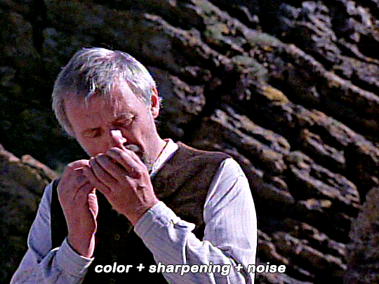
#i put..too much..unsharp mask...
Explore tagged Tumblr posts
Visit Tumblr Blog
Explore Tumblr blogs with no restrictions, modern design and the best experience.
Last Seen Tumblr Blogs


Fun Fact
In Q3 of 2020, 31% of US users access the Tumblr app daily.
Text

this outfit is cute but dear GOD the color combination is ASS i had to redraw it!!! with blank period temari for obvious reasons ;;;)
149 notes
·
View notes
Note
What is your secret image processing formula?👀
What website do you find such cool VHS effects on? Are these brushes and special textures?
A magician never reveals his secrets >:) ..... okay, I'm just kidding, I can tell how I do the effect myself! :3
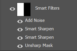
These first steps I do in my drawing program after drawing and finishing my doodle (program being Clip Studio Paint in my case, though it doesn't matter much tbh what drawing program to use, jfkjklhlj):
A little bit of unsharpen mask to add some sharpness on the finished image, then a little bit of gaussian blur to soften that sharpness. Sounds silly, but somehow it works, lol
After that, slight chromatic aberration. Doesn't have to be too much, it can reduce the retro look imo if it's applied too much.
Then I add some (either monochromatic OR rainbow) noise as an overlay on top of all, which then I put to like around 10-15% opacity depending on how much noise I want on the image itself. I sometimes blur the noise a little too in the end.
Totally optional and this is just something that I like to do, but I also like to play around with different wacky colorful gradient maps, trying out different blending layer-styles and trying out different effects overall. I tend to experiment a lot sometimes, lol. Sometimes I lower the saturation a bit too.
Basically unsharp mask, light blur, noise and chromatic aberration will be your best friends whenever making the VHS effect, lol.
Then after doing all that previously told; I flatten the image, save it as a heavily compressed JPEG-file (anything below 50-60% compression is good imo), and then I open it in another program, this being a free open-source program called "ntsc-rs". It's the program I use for nearly all of my arts nowadays, since I can add the authentic VHS-look with it and it's really easy to use!
If I wanna add a CRT-look then to my arts (like eg. those PS1-styled arts I've done or models etc.), I use another free cool program called "ShaderGlass"; it's originally meant for emulating the CRT look and such for PC video games, or when emulating/playing old retro games on PC. But you can open images in it too, apply shaders to them and then save the result as PNG-files!
Of course, alongside that program, I've also used few other programs and methods of making the VHS-effect: Signal-effect for Adobe After Effects (though that one costs money). Then there's also been ntsc-qt, another free program which iirc is an older version of ntsc-rs, I used to use it but it's no longer being worked on/supported so I stopped. And then also a VHS-plugin for Blender etc.
There's a lot of ways for doing the effect, but the ntsc-rs program has been one of the best and easiest one to me so far!
Hope this helped at least a little bit! <3
33 notes
·
View notes
Note
just wondering, do you think you might be interested in posting graphic tutorials for like promos or headers or icon borders or whatever? all your graphics are so cool!!
hello! and thank you very much! 😊 currently, the only full tutorials i have are these if you find them helpful !
recoloring icons/graphics to add skintone if it's washed out by one color. how to fix fried colors/color match fried effect on psd colorings. simple icon borders. * this is the main formula to all my borders, including the ones in my commission examples; once you're able to get yourself an icon and (if you'd like) blockquotes, you can just slap some pngs around ur icon however you see fit and add your psd and you've got the idea to make your own !
as for a tutorial, i'd have to put some thought into whether or not i could make a full fledged tutorial, since making graphics can be a little more complex than a step-by-step walk through...at least, for me. a lot of it depends on the images i use, the placement of those images && recoloring/balancing colors. it depends on what you're trying to accomplish. however, here are some quick tips i'd personally recommend. i will be referencing photopea tools, as i use photopea.
PSD/COLORING. if you plan to use a psd on your graphic, add it first so you can see your progress as you go forward with your edit. // to add a psd (file>open) // when your psd is open, right click on the psd layer, layer>duplicate into and you'll see 'destination' with a dropdown. select the tab that your edit is taking place in.
even if you don't use a psd, there are several ways you can color match or adjust images if they look out of place. i personally use image>adjustments>selective color because i find it to be a major help; other helpful adjustments are image>adjustments>color balance // image>adjustments>channel mixer // image>adjustments>hue/saturation // image>adjustments>brightness/contrast // image>adjustments>levels // image>adjustment>curves // image>adjustment>exposure. really, just play around with it, psd or no psd—you can always come back to this step if you decide to add more imagery or balance something out later.
SHARPNESS/QUALITY/NOISE FILTERS. adding sharpness to an image can improve the quality of an image; though, it's best to stray from images with too poor of quality. ways to adjust sharpness are filter>sharpen // filter>smart sharpen // filter>unsharp mask. noise && grain filters can also add a sort of 'coverage' to any quality issues && you can do this in two ways. filter>noise>add noise // as is or monochromatic or filter gallery>film grain—lower the intensity or mess with the toggles as you please. you can either do this directly to your image if you're not worried about undoing it, or you can add a layer; if you're only trying to apply the grain layer to one object/png, you can turn that layer into a clipping mask. layer>new>layer, fill your new layer with white or black(or a chosen color, if you wanna experiment) && pick a blending option from the dropdown(it should say normal by default) i usually add a white layer && choose multiply or soft light. make sure to adjust your opacity toggle as you see fit && add noise/film grain as you see fit.
OVERLAY IMAGES/BLENDING. to blend overlay images (this can be texture overlays or simply adding another image), play with the blending options && opacity of your layer like you did with the noise/grain layers. this one you'll have to play with because it all depends on the lighting of your images && whatnot. you can also erase pieces that you don't want in frame if you need. to erase a corner or part in a way that doesn't look too harsh, i'd recommend lowering the hardness of your eraser brush.
TEXT. there are a variety of free fonts out there; here are some sites i use: one. two. three. // to make your text more dynamic, click the 'warp' button at top right, and you'll encounter a popup. you will go to where it says: style && choose from the dropdown (default is set to none). you can just play with the text until you're satisfied. you can also use the blending options on your text, if you so see fit.
additionally, you can duplicate your text layer; under the opacity of your text is a option that says 'fill'. switch the 'fill' to 0% && once you've done that, you can now right click blending options && check 'stroke'. adjust the color and size of your stroke and move the stroke layer around to add dimension(i usually move it back && downwards slightly). you can click your original text layer, right click it, go to blending options and check '3d'. you can change the color && distance && adjust the "darken" toggle to 0%.
PNGS. THESE STROKE && 3D EFFECTS LISTED IN TEXT ALSO WORK ON PNGS TO ADD DEPTH. png/cutout sites i use: one. two.
CLIPPING MASKS. if you want to put an image(lets say a image of a fc you have) inside of a shape(like a heart or circle), you can use clipping masks. you can refer to this tutorial i've made to see how clipping masks work for borders/icons. to get your desired image inside of a shape, right click your image>clipping mask && your image will be within the confines of the layer beneath it—the layer beneath it should be whatever shape/png you have in place.
that's all i can think of on the spot ? hope this helps !
#answered#anonymous#sorry if this is illiterate im very spacey today#* my tutorials.#these are more like tips but bgjhdgehw#free to rb //#btw..no idea if other people do the same exact methods?#since i had to like...figure (most) things out myself#so it may not be traditional methods in some areas ? i really don't know#either way these work for me#re: editing resources
27 notes
·
View notes
Text
low quality video -> "HD" gifs tutorial! (updated version here!!!)
for the lovely @tomdestry and anybody else wanting to learn this trick (;
this works on movies/videos in 720p and lower
must have basic gif making knowledge
I'm using photoshop cc 22.3.1 (2021)
TUTORIAL UNDER THE CUT ⤵️
In this tutorial I'm gonna show u how to create an illusion of high quality and film grain in your gifs just by using smart filters, coloring, and noise! This works on 720p, 480p, 360p, and 144p resolutions
1. So to start make the gif base
I am using a scene from qb vii in (a terrible) 360p
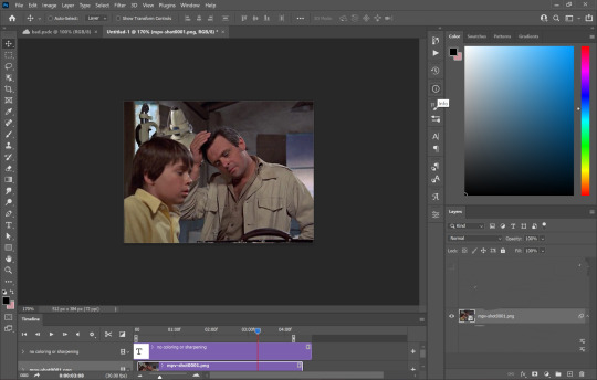
(I use the timeline version of making gifs sorry 😅)
2. Add 'unsharp mask' filter
filter -> sharpen -> unsharp mask...

Amount: between 50-110% (no higher than 110)
Radius: between 1.0-2.0 pixels
Threshold: 2 levels
3. Add 'smart sharpen' filters
filter -> sharpen -> smart sharpen...
I like to add 2 layers of smart sharpen with these settings. So overall you will have 3 layers of sharpening; unsharp mask, smart sharpen, smart sharpen 2. THIS IS OPTIONAL. Sometimes you won't need the second layer of smart sharpening but that's up to u (:
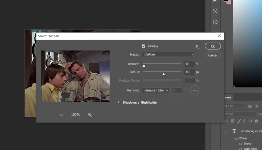
4. Add the 'add noise' filter
filter -> noise -> add noise...
the add noise filter helps soften out the hard pixels of the video and creates a film grain effect. play around with the amount to see what works best for you but I wouldn't go higher than 4%. AND GO BY DECIMALS! don't just use 1, 2, 3, 4. try out like 2.5% or 3.6%, etc. In the end i used 3.4% of noise for this gif
5. Color your gif
edit it and use any coloring u like! try to push the shadows and add more black in your 'selective color' adjustment layer just to give your gif more contrast (for an even sharper look)
6. Save!
once you're satisfied with how your gif looks, save for web and you're done! here are my save for web settings
My results!
360p video:
480p video w 3% noise:
(put too much contrast on these gifs but oh well u get the idea 😂)
End notes/tips!
obviously this trick won't work on every low quality movie
play around with the sharpening, noise, and color settings to find the best version for u!
the higher the quality (720p, 1080p dvd) the less noise you will need to add (1 to 2.5%)
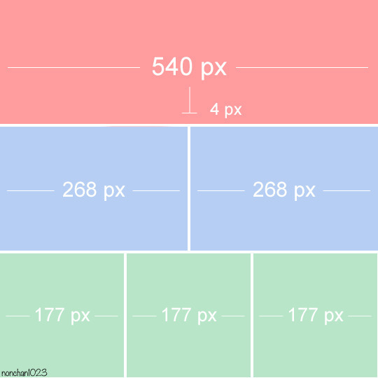
gifs look even better if they are put into 2 column posts instead of a single column (268x instead of 540x)
the noise filter does mute the fine/sharp details of the gif so take it easy on the noise. only add in small increments!
and lastly - this is fake HD, it won't turn your 480p video into a crisp blu-ray 1080p quality. it just gives an illusion of higher quality (:
Any questions or suggestions, pls feel free to dm me or send me an ask. I am more than happy to help my fellow content creators! 💙
750 notes
·
View notes
Note
Can you give me the simplest explaintion on how to make gifs. It’s literally 2022 and I’ve no clue lol
Hi! Hope you're doing great :) Hahah there's nothing wrong with that, I personally don't think learning to make gifs is something you'll regret being late for :D First off, I don’t think I can explain it simply, this is a complex process that requires constant practice. When I started making gifs again after 5 years, I realized that I actually knew nothing and I was never open to learning at that time. Now I’m constantly exploring every feature in Photoshop and reading blogger's tutorials on coloring and various other features to improve myself. I also will try to explain this process but if you want, you can check out this amazing tutorial made by one of my very dear mutual Nia <3
First you need to download Photoshop (I use CS5, I tried CS6 but not my type), you can buy it if you can, but here in my country, it's extremely expensive, so I downloaded it from t*rrent with a crack. Then you need to install MPV video player to take screencaps from videos (MPV is literally the best video player I’ve ever seen in my life when I started giffing again, like, it’s not just for giffing but other stuff as well ‘cause you can adjust it as you wish) Here’s a tutorial from this precious person I’ve never met (x) You download the first link (x) then you install it and you create a config folder (you can make as you wish but here’s mine x,) Also you can change jpeg to png if your pc doesn’t crash like mine :D

You need to download HQ videos if you want HQ gifs. I again use t*rrent to download videos, and after setting up and creating a folder for MPV player, you can start taking screencaps. As I said, screencaps are saved in a folder called “Stuff” in my PC, you can create a folder with a different name if you want but make sure to change it in config file too. After taking screencaps, open Photoshop and go to File > Script > Load Multiple DICOM Files.

I take multiple screencaps of multiple scenes and I create folders where I put these screencaps to put them in order. Here, there are lots of screencaps in my folders, I choose the folder with the scenes I want to gif and open it. By the way, Tumblr gif sizes are:

You select Window > Animations. Animation section pop up at the bottom. Now everything should look like this:


And then you should select all frames to change the speed of gifs.


After converting the frames below to timeline, select all layers on the right side and right click > Convert To Smart Object. Now everything should look like this:

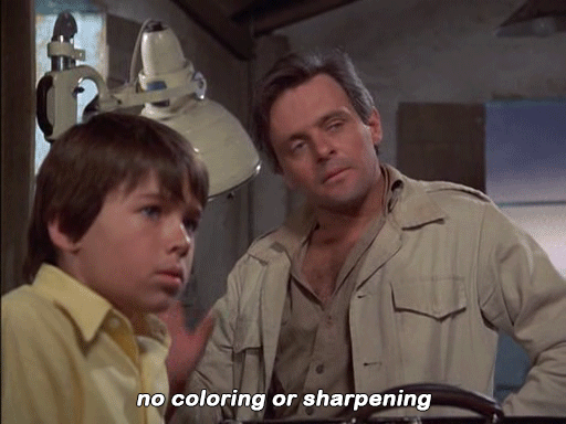
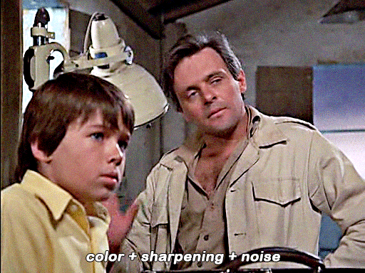
Crop the gif from the edges and zoom in 100%. Select Filter > Sharpen > Smart Sharpen. These are basic sharpen settings that everyone uses. I also add Unsharp Mask before that, you have to practice these things to find out what’s best for you.

Also there’s something called Actions to make things much more easier and quicker. You record and save some steps when you’re making a gif and later you can just click it and it does everything for you, it’s literally God’s blessing. Select Window > Actions, and it should appear on the right side.

As you can see, I have various actions for various steps which saves me from 15 minutes. After that, we colour the gif.

For this gif > Brightness: 80 / Contrast: 10 > Levels: First box = 10 / Last box = 230 > Selective Colour: Reds = +15 -3 -5 +5 / Yellows = +5 0 -5 -5 / Blacks = 0 0 0 +5 > Brightness (again): +15 > Colour Balance (lastly): Midtones = -5 +3 +3
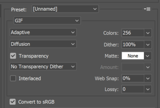
And yay, we’re done with this part! Now you select File > Save for Web Devices. (or Alt+Shift+Ctrl+S, so fun to do this) My settings and my gif looks like this.

You should select Adaptive always, and I personally love Pattern but you can also select Diffusion. (that’s what most people do to reduce MB size ‘cause it should be under 10 MB) But my work hasn’t finished yet. I open the gif again because Photoshop somehow changes the speed of gif from 0.05 to 0.07 so I should change it to 0.05 again. (I searched every single forum to find the answer but nothing) I do one more Save for Web Devices and yay I’m done!!! It’s complicated and tiring, isn’t it but once you figure it out, it’s so fun and easier <3 Here’s my gif:

Well, colouring looks like shit but this isn’t the case... That’s pretty much it, I really wanted to explain it simply but it’d be literally impossible :D If you have any questions, feel free to ask :) Have a good day.
23 notes
·
View notes
Note
your gifs are so hd!! omg how do you do it?
hiii, tysm i do try !!
i don't know how to be concise so bare with me if i ramble too much please !
i'm going to assume you know how to gif already bc i'm mostly going to explain how i use adjustment layers. but i listed the softwares i'm using here + links to gifmaking masterposts !
the process™️details under the cut :
the obvious answer would be to use high quality videos for hd gifs but i work with lq or faux hq videos all the time, so it's all about faking it ngl... my goal is to have a good contrast and full blacks.
tl;dr : play with sharpening settings, boost your black with curves/levels/selective colour, flatten&brighten then fix the contrast, exposure and voila !
also, make sure your monitor / laptop screen is probably calibrated bc i've had bad surprises lol
FOR SHARPENING :
unsharp mask -> my go-to settings are 30/30, 40/20 or 60/10. i adjust the amount/radius depending on gifsize and subject size. holy grail, it WILL add depth and dimension to your gifs just trust.
smart sharpen -> usual amount/radius : 10/10, 30/20 or 40/10. highlights are very sensitive to this one so i adjust accordingly.
smart sharpen -> for finer details, i do 500/0.3 in general, but for some fancams i put through vapoursynth 300/0.3 is less harsh
noise (optional) -> uniform > 1,5-3%. sometimes you just need texture to fake good quality lol, adding noise to flat lq gifs does magic. would also recommend if you use gradients but don't like the "smooth look". the only downside is that it makes your file larger. and i never add noise to fancams.
high pass (optional) : radius 2-5 > 30% opacity > soft light ; if you want a glowy finish, this is your filter. if i use unsharp mask i dont do high pass tho, it's just too much...
FOR COLOURING
how i use adjusment layers for contrast and depth, no particular order, i freestyle it 90% of the time :
curves/levels : use black and white points mostly, pretty intuitive to use. recently my default values in levels are (0 ; 1,27 ; 230) in rgb. both to brighten and fix contrast. i can use up to 3 of each on a single gif ngl bc do this in increments to avoid something too harsh.
channel mixers : not particularly relevant to the depth/hd thingie but it does perform witchcraft to remove tinted filters. HOWEVER, sometimes you look at your gif and you wonder why it's flat and it's because the dominant colour of your gif is tinting the rest, channel mixers is here to bring back balance and dimension !
colour balance : same reasoning as channel mixers, i try not to touch midtones and focus on highlights/shadows, but i like cold toned gifs so i'll always add some blues/cyan in there
selective colour - the star of my show, i use it 1) for colour manipulation, 2) tame harsh lights, 3) undo whitewashing -> for 2&3 i set sc to multiply > set black values to black in all tabs except white and neutral > adjust white and neutrals until i get a neutral skin colour or natural lighting, and/or good contrast. , 4) boost the blacks (2nd to last layer), +10 black values in black tab, sometimes i also add +5 black to neutrals
exposure (last layer) : the final pop, up to +0,60 ; sometimes i go with a layer mask to only target the subject/faces. sometimes i also adjust the gamma value but not often
black and white gradient map : also good for contrast, it will also reduce the number of colours on your base gif. if you have a super saturated original gif with heavy contrast this is v nice to play with to fix that
a tip specific to colourful gifs : if you're transition from vastly opposite colours, do it in increments, and have a solid colour layer of your dominant colour somewhere set to soft light or overlay (or both) on a 20-40% opacity to uniformize all that good stuff and make the blending look natural, it will prevent your gif from looking flat or hazy trust me. sometimes i also do this with a either colour balance shadows or a selective layer set to hue/color.
FOR EXPORTING
if you're working with timeline, say goodbye to exporting directecly from tl and reopening to fix the frame delay bc it causes quality loss. instead, flatten back to frames and reset the frame delay before exporting, that will save you headaches and time. -> here's a link to an action for this !
my preferred combo is adaptive/pattern
i don't know which gifset made you send the ask but here's a before/after comparaison from a gif i made from an IGTV/Reel, so not the best quality or hd finish but yeah.

3 notes
·
View notes
Text
It begins...

Harold and Norah had walked for nearly an hour when Harry suddenly stopped. “Let me cover your eyes darling, I have a surprise for you”, and promply stepped behind her and put his hands over his wife’s eyes. Norah giggled. “What are you up to, silly man?” “You’ll see soon enough. Come on, let’s walk, it’s just around the corner.” They walked on, much slower now since Harry had to make sure he kept Norah’s eyes covered. She was not very good at being surprised, being much too impatient. “Hey, no peeking!”

“Alright we’re here. You ready darling?” Harry whispered dramatically in Norah’s ear. She giggled again. “Just show me already!�� “When I say when, open your eyes!”


“Tadaa! What do you think?”

Norah just stared in shocked silence at the large house in front of her. Finally, speech returned to her. “Oh h-heavens, Harry! Is.. is that what I thi-” “Our own, brand new home, yes!” Harry interrupted her, excitement shining on his face. “I did it. I bought the farm!” “But I-I thought we c-couldn’t afford it?”

“Well... I came to an agreement with Mr Wentworth, that he’d be given 10% of any income I make from the farm until my debt is payed. We’ll struggle, but I think it will be worth it. I know you hate living with my family...” “I don’t hate living with them Harry” she said reproachfully, “I just don’t like how your mother treats me like a child and your brother seem to think I’m a nuisance.” Harold laughed. His wife could deny it all she liked, but he knew she was miserable at his family's home where they had lived for the past year since they’d been married. They had no time for themselves and there was no room for them either. With his mother and father still alive, his older brother and his wife and child, as well as their little sister, the house was crowded. Harry and Norah had long wanted to move out and start their own little family, and they had spotted this little abandoned farm owned by a man in the village. But funds were low and it had all seemed a distant dream. Until Harry had run into Mr Wentworth when tending to errands in Finchwick, and told him that he dreamed of purchasing the house from him one day. Mr Wentworth had proven to be a very kind gentleman and agreed to let them purchase it with the little funds they had in return for 10% of the farming profits yearly. So here they were. “Oh Harry. I can’t believe it! When can we move in?” Norah sighed dreamily. “Well, immediately my darling.” At these news, Norah flew into his arms.


“Oh how I love you, Harold Bradford!” “And I love you my darling. Let’s start our life together.”


PREVIOUS | NEXT
Info under cut.
Soooo... I decided to start a decades challenge. I was inspired in part by the happiness I felt when my favorite @deadlymodern returned with a new legacy post and also reading through the entire, most fantastic @pixelnrd ‘s, Langston Legacy in one go (it took me ~6 hours, I regret nothing). Thank you both of you for being amazing and SO inspiring.
I am making no promises to post regularly or anything. I don’t have the best track record with that... But I have intentions. My posts will be a mix of plain gameplay screenshots and more fancy storytelling with poses (like this one). I would love to just do that, but it takes up far too much time and I also really want to actually play the challenge. I also see this as an opportunity to play around with editing, which I am not very good at. The images above only have reshade (which I am also just learning how to navigate) and “unsharp mask” in PS haha.
Hope you’ll want to hop along for the ride. I’m excited at least!
#ts4 decades challenge#Bradford Legacy#Gen1#1890's#the sims 4 decades challenge#decades challenge#Harold Oscar Bradford#Norah Frances Bradford#ts4 historical gameplay
23 notes
·
View notes
Text
Hello danganronpa nation. Today mod Firanka has decided to bless you with a tutorial for edits. You’re welcome.
This tutorial will go through cool lighting effects you can apply so the character transparent you’re using blends a bit better with the background. This is for GIMP but you can probably apply all that to other apps and programs too. Not guaranteed though. Effect showcase below, and actual tutorial under the cut.
I’m assuming you already have some GIMP knowledge, so I’m not gonna say stuff like “right click on the layer to show the dropdown menu, and then pick “Duplicate Layer”, I’m going to just tell you to duplicate the layer. If you don’t have the knowledge, try to mess around first, or find some tutorial on youtube. You can also read the documentation if that’s your thing.


Effect 1
In this tutorial I am using this photo and this sprite edit. Use whatever you want, as long as the resolution of the image is appropriate for what you’re doing.

1. Open up the images. You can’t do shit without your image open.

2. Duplicate the layer with the character, and desaturate it. You can do it with any method you like, I usually pick Hue-Chroma and lower chroma to minimum.

3. Color to alpha the black&white layer with the character, setting the colour to black (default is white). You’ll be left with a pure white semi-opaque layer (I hid the stuff above to show what it’s supposed to look like, you don’t have to do that).

4. Alpha to Selection the main, unedited layer with the character and duplicate the background layer. Add a layer mask in Selection mode, without ticking the invert mask box. You’ll be left with a character-shaped cutout with the background image.

5. Make a layer group with the white ver of the character and the cutout. Set the layer group (not separate layers) to Multiply mode.

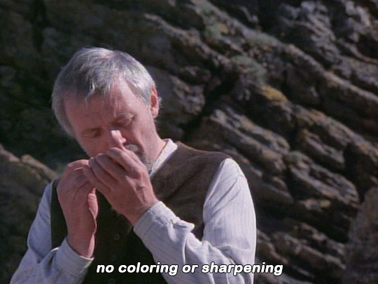
As you can see, it looks pretty good already, but you can see some of the clouds on her skirt. It’s gonna be mostly prominent on dark-ish elements if the background has some sort of uneven texture in that area. That’s why in most cases you will want to apply Gaussian Blur to the cutout.

The values depend on the image, if it’s super high contrast like the next one I’m working with, you’ll want to set it somewhere like a hundred, but here, around 50 should be okay.
Keep in mind that it won’t really work well with manga images most of the time. You want a coloured illustration.
You can also mess with alpha curves on the pure white layer so it’s more or less powerful (the white layer tones down the cutout layer so it doesn’t darken the OG image too much)
Effect 2
I am using this photo (after a bunch of editing) and one of these transparents (you may wanna adjust the curves a little). Once again use what you want.
For convenience’s sake here’s my edited ver of that photo (I inverted colours, adjusted hue and saturation, curves, and then Gausian Blurred it a little), feel free to use it lol (it’s lower scale than the OG though). I’m using it as the base background despite all the editing.


1. Duplicate the layer with the background and set it to linear light. Blur it til it looks good. It’s not necessary but it adds a nice glow and makes the image more vibrant.

2. Apply a bit of Unsharp mask on the character if they don’t have super dark outlines. It’ll make them darker. For most images, the default settings should work okay, if not, mess with them til it does. It’s not always necessary though, really depends on what you’re working with. You can add the unsharp mask later, too.

3. Duplicate layer, and set it to screen. Pick a dark colour similar to the one in the main image. The effect will be subtle, but don’t worry.

4. Put the two character layers in one layer group, and duplicate the Linear Light mode layer. Put it in the group.

5. Blur that layer a lot. Over 50 for sure, I originally used like 140. I moved the layer cuz it looks better like this, do what you want when you’re editing. And then you’re done
-Mod Firanka
48 notes
·
View notes
Note
thanks for all those wonderful gifs, I appreciate all the work you put in!! Do you mind me asking how you get them to be of such high quality and still be able to upload on here? I always have to compromise mine to be able to post them - and it wrecks the quality 😅
Hello! Sorry I took a while to reply and also sorry in advance because I'm not sure how helpful this answer is going to be I shall try :)
The process completely depends on whether you were more referring to film gifs or football match gifs. Because for the former it's all in the film file I download, unless it's already high quality to begin with (at least 720p but it's strongly strongly recommended to get a 1800p one) then you're already in a losing battle. So even if on tumblr the quality decreases there's no as much of a difference in the end. And then I use the trusty VLC to record the sections that I want to gif
For football gifs, I again always try and find a high quality file of the match. This may involve downloading a match off youtube using a converter that let's you download them at 1800p such as this one. Sometimes I'm able to download the match directly from the provider myself (like I did yesterday from kijk) which is just one less step to let the quality go down. More often than not though I just screen record parts of the match which makes the process faster but usually means there isn't as high a quality.
Once on photoshop, I think the main thing i do to try and at least fake some quality is play around with the colouring and sharpening tools. For football gifs I mainly focus on levels (mainly moving the middle one down to around 75/80 depending and the right one up which varies more depending on whether I used curves) and vibrance (I am usually way too liberal with moving the vibrance one up and only slightly if at all use saturation). Depending, I may also use curves to brighten it up properly and hue/saturation by decreasing the yellows and/or reds to make their faces less orangy. I'd like to believe these settings make the gif look more vibrant and therefore of better quality but idk.
As for sharpening, photoshop crashed the other day and reset the sharpening settings I had basically perfected so im still in the process of trying to refind those, plus they're also different depending on whether you've got people close up or its a wide playing shot. I use smart sharpen and then unsharp mask.
There's also preferred dimensions/sizes photoshop likes so for the best quality crop your images down to those:
(creds to the original poster) and they also always look of better quality when there's more than one in a row.
My exporting settings are adaptive and diffusion which I am not sure whether they are the best but ah well. And also tumblr allows up to 10mb for gifs now thankfully so im usually always able to save it fully as i wanted even if it's quite long.
Then actually on tumblr I know some people like to upload the gifs onto giphy first and then link them over to a tumblr post as they find it messes with the quality less. So perhaps try that to see whether you can notice any more improvements? Personally I gave it a few goes and decided it wasn't worth the extra effort so I now just upload them directly to tumblr, sometimes using a colour gradient on the caption to try and draw attention away from the pixelation of the actual gifs lol and tadaa that's usually the end of my process!
I hope this helps a bit, and feel free to specify more concretely where I can help you with if this hasn't totally answered your question. And also thank youuuu, I appreciate your appreciation 💞
#let me know if you wanted it less footballing-oriented#or if i didnt quite answer your bit specifically to tumblr quality decrease#the asks#gif tutorial#my tutorial#og
23 notes
·
View notes
Note
hello! i'm in love with your video edits and am currently playing around with editing myself. i was wondering how you achieved such good quality sharpening + coloring on youtube? in the editor it's fine, but it always shows up less than once i upload. any tips would be amazing! <3
Hi! thank you so much!! and welcome to the editing world :DD That's kind of a tricky question cause youtube is messing around with quality a lot lately that sometimes it just feels random... but in general the key is to get all your footage in 1080p WEB DL and then the coloring you put on the video, heavy colorings can really put donw the quality. As for sharpenning settings I just use sony vegas sharpen and I checked a couple of my colorings and it's a bit random I found one with 300 and another with 600 of sharpen XD Then appart from the sharpen I usually add a tiny bit of unsharp mask. careful with this one, when i started using it I feel like i added a bit too much and it can look weird. But it does gives the video an extra depth that I love. Anyway, I hope this was helpful. If you need any more help you can also message me on twitter. I can send you captures there of settings and it will probably be easy to explain :)
4 notes
·
View notes
Photo


ORIGINAL → EDITED | gif making process
I was tagged by the amazing @stormborndean thank you so much!!
Now there was gonna be more to this but my photoshop kept crashing and i couldn’t edit the last gifs so rip and f u ps
Unedited: The left side has only been cropped and set to 0,08 timing. I pretty much put all my gifs at that speed as i found it to be just the perfect amount, not too slow and not too fast either. I’ve also noticed that the coloring can change how the gif moves so i found that for my coloring this timing is just right.
Edited: The right side has been cropped, set to 0.08, colored, sharpened and denoised. I always do it in this order (although idk if it makes it any different) - Sharpen -> Denoise -> Unsharp mask (the UM depends on the gif and scenery itself bcs sometimes applying the same setting makes 2 different gifs in a same gifset look different). I always tend to do smaller gifs since i don’t always have my hands on the full 1080p HD versions of the episodes and making the gifs smaller makes them look sharper. Plus i’m not really good at making big gifs.
That’s pretty much my editing process, sometimes relaxing, sometimes in times like these when my PS crashes every 2 minutes it’s very frustrating and makes me want to quit lmao.
I’m gonna tag @fierydeans @starsmish @jensenckles and if anyone wants to do this feel tagged!
24 notes
·
View notes
Note
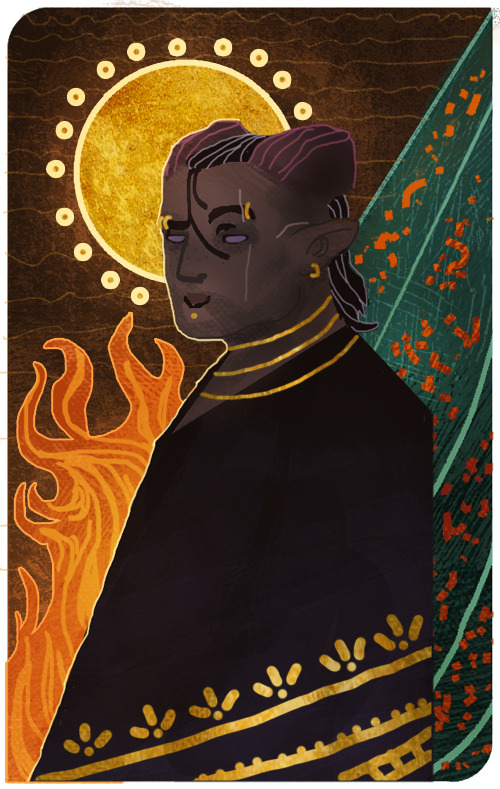
How did you make those drawing that mimic the dragon age tarot card look?
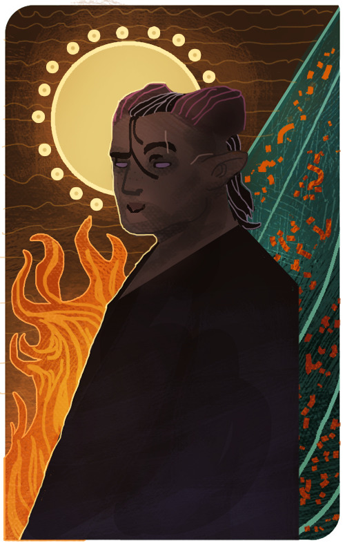
I’m sorry that it took me this long to reply, anon! There were some complications and illness that kept me away for a bit, but better late than never! I assume the drawing you’re referring to is the experimental card I made of my Inquisitor 4 years back?
It’s been a while since I worked on it, but I tried to dig up the old psd file to go through the layers and see what steps I made. The drawing itself was highly experimental, as I was completely new when it came to trying my hand at the DA:I card style. For the most part I decided to make the character and his anatomy very simplified, and rather focus on putting the details in the shading and background.
Let me show an example of what my drawing looks like without the added textures and extra overlay soft brush shading:
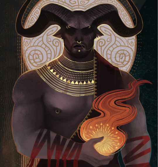
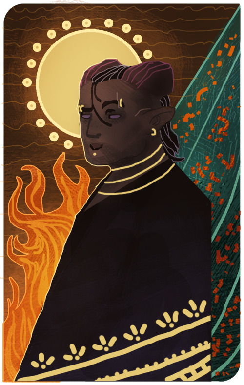
And here is the same drawing where the textures and shading are added:

But if there is one thing I’ve learned from both my own attempts and other artists, is that textures can sometimes make a very huge difference when it comes to that final touch. Whenever it’s from digital brushes or images that you’ve gathered. It’s no question that most of the work with these paintings lies in the drawing itself, but adding those final textures can really give it that ultimate DA:I card feel you’re looking for.
I’m not really experienced enough to give proper advice or tips on how to make these drawings, but for now, all I can recommend is studying the DA:I cards themselves, take inspiration from other artists, tarot cards in general, or patterns/paintings that can inspire what to use for the backgrounds. Another thing I personally like to recommend, is staying away from too much realism or overblending the image. The more the textures and those rough brush strokes are apparent, the more it adds to it. Keep it simplified, while the more detailed/realism stuff is kept to a minimum in comparison. But once again, this is my personal taste, and not the ultimate way to do this.
However, something I can add to my reply, is showing you guys a very quick, basic and simple way on how I generally go on with these paintings and how I add image textures. Please, rather look at these tips as suggestions on how to do it, as there are plenty of other and simpler ways to go about it. But since this will be a very long post filled with images, I’m gonna keep it under a cut, so that anyone interested can check it out there! Also keep in mind that I’m using Photoshop CS5 on an iMac for this.
First of all, I will apologize to everyone for the extreme low art quality, as I only have my computer mouse to draw with for this. Not to mention the extreme lack of balanced values that makes this more chaotic than it should. Make sure to always keep values in mind with these things, folks!
Anyways, I always start by making the drawing itself. Most of the work and style are put into this part of the process, as the image textures will just be extra flavoring.
Now let’s say that we want to add some fancy gold details to this drawing. We’ll be doing so by making a new layer over the drawing itself, then use a basic round brush to draw the shapes we want to be textured with gold. Wherever you choose to make something more detailed, or just make simple shapes with a single color, is all up to you.
Now I’ll be locking the layer by clicking the icon shown in the image below. It’s usually found over the layers, and make sure to keep the layer with the new shapes activated when you click it.
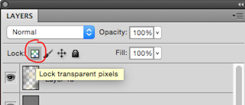
This will now make us able to draw on the shapes without going outside of them, so let’s use this to add some simple shading based on gold in general. This will add a bit extra once we apply the texture itself in the end. (References are your best friend here!) Also be aware that the colors you choose on these shapes will affect the end results once they are merged with the texture image. Here’s how it looks like after I’ve added some simple shading with a brush.

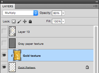
Now it’s time to add the extra gold texture itself. We’ll be doing so by first digging up your preferred gold texture image that you can either place or copy/paste into the psd file. Make sure the image is on a layer above the shapes we just added. Once that is done, we will right click on the layer with the image, and choose the option ‘Create Clipping Mask’

Now it should only be covering the shapes drawn in the layer below it. So now we can mess around with the image layer until it gives you a look you’re satisfied with. It’s mostly common to put the layer on Multiply or overlay, but try to experiment to see what you prefer. Also play around with the opacity of the layer, too! In this case, I set the layer to multiply and the opacity to 80%. I also adjusted the colors on the shape and the texture itself until I was satisfied.

I also added a gold texture to the circle in the background by doing the exact same thing. Make a layer with the shape, add the gold texture image in a layer above it, right click it and choose ‘Create Clipping Mask’. Then adjust to your heart’s content. This layer is set to multiply with 100% opacity. Colors were adjusted until I was pleased with the results.

And this is basically how I add textures to my art in general. Sometimes the Clipping Mask isn’t even needed if you want to cover the whole drawing itself with it. However, another thing you can do to add a texture over a painting, is having the image on its own layer over the drawing, but instead of setting the texture layer to Clipping Mask, you add a Layer Mask by having the layer itself chosen, then clicking the icon shown in the image below.

The texture layer should now have a white page next to it that looks like this.

This layer will now only let you draw on it with either black or white. Basically what this means, is if you draw on the layer with black, it will “erase” the texture, so that you can draw on the spots where you don’t want the texture to show on the painting. If you want to bring the texture back, all you have to do is draw over the black again with white, and it will appear.
I added a final grunge texture to the background, using the same method as we did with the gold, but simply skipping the Clipping Mask part. Instead I added a Layer Mask and drew over it with black, so that the texture would only show on the brown colored part of the background.
As a final touch, I added one more texture to cover up the whole image. It’s the same gray paper texture that I made and use for all my sketches or paintings in general. It can be found and downloaded here.The gray paper texture was set to overlay, and I darkened its values, as it tends to brighten up the drawing a bit too much when set to overlay.I also added a final layer on top of it all, setting it to overlay, and then draw with a soft brush to add some extra highlights and shadows to give it that final touch. Highlights were drawn with a very light/pale yellow, while the shadows were drawn with more dark brown tones. All in all, I used colors to match the ones used in the drawing.After all of that, this is how it finally looks.

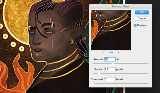
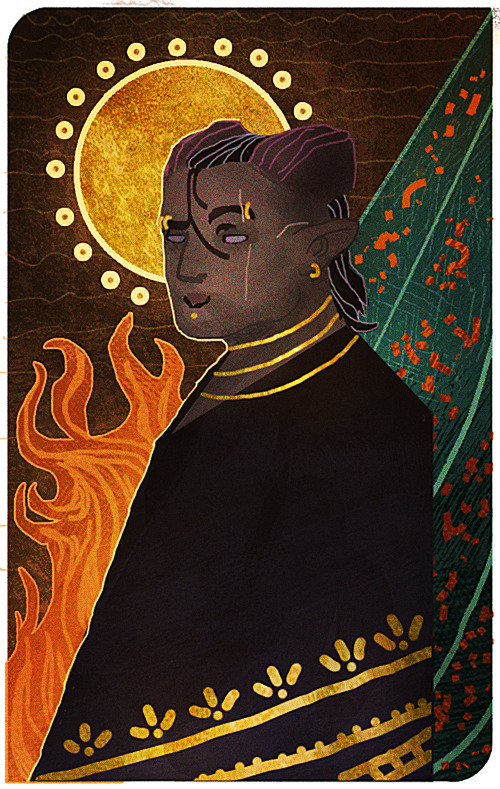
Now this last step is completely optional, but I’ll add it to this post, in case some people will find it useful. One final step you can do to give the painting that extra crisp, is to add Unsharp Mask.First you need to save the drawing as a png file, and then open that file, so that all the layers are merged into one image. From here, we will click on Filter, among the tabs found at the very top of the program. From there we will find and choose Sharpen, then Unsharp Mask. Here’s an image to make it more clearer.
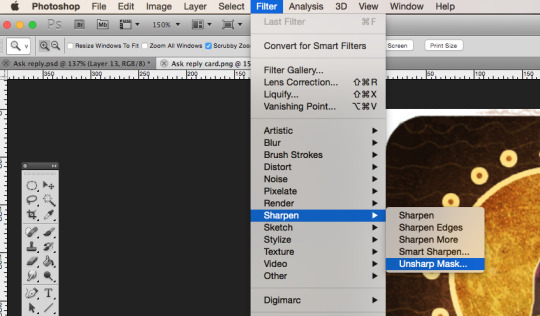
When you click Unsharp Mask, a little window will pop up, letting you adjust on three different sliders. Treshold will be on 0 levels, Radius will be on 2,0 pixels, while Amount is where we can adjust the slider to our liking. Usually it’s enough to keep it somewhere between 60-80%, but experiment and see what you prefer. Once you are done, click OK, and the changes will be added. Make sure to check the box next to Preview, to see what the changes look like before you click OK. When you resize the image to make it smaller, the unsharp mask effect can look pretty neat!
Aaaand one more optional final touch that we can add, is something called the Grain Texture. However, there is already a very great tutorial made that explains easily how to add it, so I’ll link to it here!
And FINALLY. After all these walls of texts and images, this is what the end results look like.
I apologize if my way of explaining these things is confusing and pretty bad. It’s always been a weakness of mine, so if any of you have any questions, don’t hesitate to ask! I’ll try to answer as good as I can.Other than that, I hope this is somewhat helpful to some of you. This is basically how I do things in most cases when I make art.I’m not sure how much this helped to answer your question, Anon, but hopefully it shed some light on some of it! If not, I can always try to make another tutorial some other time, once my health allows me the extra time.
Thank you so much for reading, and good luck with your art!
#Anonymous#Mieran replies#Tutorial#Long post#Anon#Ask#I'm sorry for the long post#And sorry if this whole thing is messy xD#I tried my best
32 notes
·
View notes
Note
Hi. I need your help. I would like to know how you edit your gifs, please:(
i can’t speak for all the members but i personally use photoshop portable for gifmaking. i’ll put the rest under a cut because this might get quite long:
so first of all, i have the video file that i want to gif from downloaded on my computer and then open photoshop. then follow these steps. i usually click ‘selected range only’ and drag the arrows around the section of the video that i want to make into a gif and only import every 2 layers.
after that, you should have all the layers you want loaded into photoshop and if you click play, you should see that the gif plays. now we move onto resizing and editing the gif. essentially you’ll probably need to crop your image into the shape you want it to be and then resize the gif (using ‘image’ and ‘image size’) for tumblr dimensions. a list of which can be found on a google search.
now, you should convert the gif to a timeline, rather than a frame animation, which you can do by clicking on the little box containing three little squares at the bottom right of the animation window. then right click on one of the layers on the left hand side of your screen and select ‘select similar layers’ - this should highlight all the layers in this section. click ‘filters’ and then ‘convert to smart filters’ which will turn this gif into a smart object, allowing you to add any filters or sharpening effects to all the frames rather than trying to add them to each individual frame.
for sharpening, i usually do a smart sharpen and an unsharp mask so click on ‘filters’, ‘sharpen’, ‘smart sharpen’. my settings for this are usually 0.3 and 500% but people often have different settings so play around and see what looks best for you. then i add an unsharp max and set it to 36%. i then work on the colouring. i have a general colouring that i use on all my gifs which sadly i’m not willing to post here since i use it all the time, but i’ll describe my process. before adding any kind of colouring i try to colour correct the gif. for a show like legacies, a lot of the scenes can be really yellow, or really blue/green and most of the time, they’re dark. so i add a curves layer and click on the middle pointer at the left hand side of the tab which should be ‘set grey point’ or something similar, and i usually use teeth or eyeballs as a generic grey point in a gif. this kind of neutralises the colouring in the scene and makes it a little easier to work with when colouring. after that, i add a ‘levels’ layers and drag the pointers on the far right and the far left (Don’t touch the middle one) to the edges of the black shape that comes up.
now it’s time for the rest of the colouring. i don’t use that many layers, probably 5 or so, which starts with another curves layer to brighten the gif up. generally i don’t rely too much on this layer so i usually just drag the middle pointer up a tad, but play around with this depending on how bright you want your gif to be. the next layer i add is another levels layer so just do this time, what you did before with this layer but again, feel free to play around to achieve the desired effect you want. next up is colour balance. if you find that your gif is still too red, yellow or blue, use colour balance to offset this and neutralise the tones. afterwards i add a brightness and contrast layer. again play around with this depending on what effect you want but try to keep the number you raise the brightness to, and the number you raise the contrast to at a similar number so that the effect is more balanced, but the numbers are up to you. finally i add a vibrance layer which i generally set to 50 but again, depending on how you want your gif to look, you can play around with this number.
i hope this was a little helpful for you. i’ll probably do a full tutorial with screenshots one day if i get the time to work on one since i’ve been asked questions like this before but if you need any help with gif-making, feel free to send me a message and i’d be happy to help you out as much as i can. in the meantime, keep an eye out for a more in-depth tutorial.
3 notes
·
View notes
Photo

A dear anon asked me to give tips to prevent oversharpening gifs. So if you are curious to find out how to prevent this, keep on reading. I’ll also add links to my sharpening tutorials that I’ve made.
Things you need:
GIMP
Animstack (will not be covered in this tutorial though)
G’MIC
1. Okay, so the first thing you wanna do is crop and resize your frames. Do this by going to Image > Scale Image.

2. Alright, so the first tip I would give is: Always sharpen your frames first before editing the colors! I feel like it makes your gif more grainy if you do it the other way round and this might make your gif look too sharpened.
Here are a few of my sharpening techniques: x x x
If you have looked at these tutorials, you will realize I use G’MIC to sharpen and Animstack to apply Gaussian Blur at a specific opacity.
So, now let’s open G’MIC and I’ll give you a tour of my commonly used Sharpening filters!
3. Go to Filters > G’MIC to open it. Some of the filters take a long time to load all the layers in the preview (even tho we can only see one layer in the thumbnail). So, just put input to “Active” for now so we can preview the filter much faster.

Sharpen [deblur]: I don’t use this much but in case you wanna use it, I will suggest you keep the radius to below 0.8. Whenever you see a channel setting, change it to RGBA [All] and the parallel processing to One Thread to make the processing faster. When you’re done, turn off your preview and change the input back to “All” so it affect all layers.

This is what it looks like:

Now, how to know if you have oversharpen is when the edges of the person/background look very bold/fat. Also, you will notice a sort of ‘halo’ effect here on the edges.


Sharpen [gold-meinel]: Now, I use this quite often but I try to use it really subtly as it does add a bit more noise to my gif if I overdo it. Here are my settings:

The lowest you could go for sigma is 0.5. I usually use 0.5 but 0.55 also adds a bit more sharpness to it. I wouldn’t make the sigma any higher than 0.55. Again, same thing for the channels and parallel processing settings.
This is what it looks like with this settings:

Really love this filter cuz it brings out the detail in the hair but also keeps everything else soft and not too sharp. Again, look out for the halo around the edges. It’s okay to have a bit of it but when it’s too obvious, it means you have oversharpened.
Sharpen [Inverse Diffusion]: I used to use this filter but I feel like sometimes it makes my gif have too many ‘artifacts’ from all the sharpening. So look out for that. I would keep amplitude below 0.6 and iterations at 2.


If you overdo it, it will looks like this:

As you can see there’s a lot of white dots around the edges.

Sharpen [Unsharp Mask]: I use this one a lot! I feel like this adds a nice amount of sharpening to the image without distorting it too much. Keep the spatial radius below 0.4. Usually 0.3 would do. The amount can be adjusted accordingly. I usually use 5.


After/Before applying your fav sharpening filter, you could use Animstack to add a gaussian blur to your layers. I’m not going to bore you with this step tho so do check out my sharpening tutorials (links in the beginning of this post) to learn more of that. Each sharpening techniuque is different and might require you use Animstack before and some require you to use it after sharpening.
Yep, that’s about it! So, 3 things to look out for:
Always sharpen the layers first before coloring!
Take note of the ‘halo’ effect on the edges!
Take note of white artifacts or noisy grains!

Happy giffing!!
Want more tips on other techniques? Just leave suggestions in my ask box! Thanks! <3
11 notes
·
View notes
Text
IP Roundtable (EP-238)
Click the title of the article to read this post on Improve Photography, which includes all media files mentioned.
Shooting the Eclipse
Unless you have been hiding under a rock you must know that a rare event is coming up on 8/21 where a full solar eclipse is going to sweep across America like the sash on a beauty pageant contestant. Starting in the upper north west in Oregon and ends in the south east in South Carolina.
Brent and I did an entire Photo Taco episode about photographing the eclipse and we'll make sure to put a link to that in the show notes. But a few more resources have come up since then so we wanted to briefly cover those in this IP episode.
First Brent, give like the 2-minute recap about what you need and how to shoot the eclipse.
I don’t know why I didn’t think it would be a craze to see the eclipse, but I got serious about trying to get somewhere to shoot it waaaay too late The wife and I were going to drive north 3.5 hours to Idaho Falls, find a little spot to shoot in, spend the night in a hotel, and then mosey on over to the spot for the eclipse. Turns out there are no hotels available and half of the US seems to have plans to migrate toward the spots where the eclipse will go through so now we are going to stick at home. Which means I needed to figure out where I should go to have a chance at making the most of what I will see and I am using the Photo Pills app to do that.
For those that may not have heard the Photo Taco episode covering the seriously good Photo Pills application that is indispensable for planning your outdoor photography shoot, check that one out to by searching “photo taco photopills.” Since doing that episode the Photo Pills guys have added some specific functionality to the app to help you plan your eclipse shot.
They have a really good guide online on how to use the app to do that which will be linked to in the show notes (http://www.photopills.com/articles/solar-eclipse#step1) but briefly what you do is going into the Planner pill and you swipe from right to left on the very top part of the planner until you see something that says “No eclipse is loaded”. You tap the button to the left of that wording and it will change to say “Total Solar Eclipse – August 21, 2017”
For me here in Herriman, Utah it says I will still have a Magnitude 0.916 eclipse! So I will actually see it where there is only a small sliver of sun showing that doesn’t get covered by the moon. I won’t have that hole dark shadow experience where it looks like night time outside, but it will still be kind of exciting to see.
If you swipe from right to left one more time at the top of the Planner pill you will see something that shows the different phases of the eclipse and the times they will happen in your area. For me in Herriman it will start at 10:14am where the moon will just start to block the sun, it will progress to having the moon most cover the sun at 11:34am and then be almost completely uncovered again by 12:59pm.
If you click on the icon to the left of that information then the time in the planner will change to those times of those phases. First click the planner time will change to 10:14am for me and show me where the sun will be at that point.
In fact, now that the time is moved to 8/21 at 10:14am I can swipe from left to right on the top of the Planner pill until I get to the Sun and Moon information and can see that the sun will be at 38.28 degrees of elevation at that time. At 11:34am when it is as covered as it will get for me the sun will be all the way up to 51.53 degrees and when the eclipse is over it will be at 60.52 degrees.
I can use this information, along with the Augmented Reality features of PhotoPills, to go out over the next several days to find a composition that includes the Sun being that high in the sky.
Brent, what other resources should do you want to make sure the listeners are aware of?
Nasa Safety Guidelines.
A site for the Science Geeks among us. Eclipsewise.com
TimeAndDate.com’s awesome animations
Midroll: Squarespace
Listener Questions
Bob Fishel: Do you sharpen in lightroom or photoshop.. Why? I ask because I've just learned how to sharpen in photoshop using unsharp mask and it makes me feel like I need to go back and put everything through photoshop as the sharpening is SO Much better than lightrooms….
Nelson Tapias: When round tripping from photoshop (focus stacking, panoramas, composite, etc) do you keep the GIANT tiff files or do you tweak to your liking and only keep a high quality jpeg?
Paul Pak: Hi Jeff! I would love to get your thoughts on a question I've been wanting to ask you for a long time. Anyone who learns from all of IP's resources can quickly go from beginner to hobbyist. But so many of us get stuck at that level. Can you please share your thoughts on how to go from hobbyist to the next level? Not turning into a full time professional, but how to level up from being a hobbyist. Seems like this is a place where so many of us get stuck. You've been really successful in this regard so would love to hear your advice!
Thanks so much for the very kind words Paul. I really appreciate it. So many of the IP community are so nice to me and it is really fun.
No magic bullet here for sure. Everyone’s journey is going to be a different.
The one thing I want to say first off is that gear is not that answer. It certainly can help, lenses in particular, but you can do great things with entry level and inexpensive equipment.
Become a ninja with your camera. Learn how to use every single button, menu, and option on your camera. Get so that you can handle it without thinking. The sooner you can have that camera be a tool in your hand rather than something you are fumbling around with, the sooner you can have your brain focus on creating a photo.
Keep at it, shooting as much as you can work it in, and taking risks. Annual Top Ten process has really helped me. I can see continual improvement year over year and come up with goals for the next year. My portraits made a HUGE step forward when I added flash
(Brent’s) Focus on the meaning, intent and story of your images. Pretty images are great, adding a greater context is one thing that can help you move to that elusive “next level” in your image-making process.
(Brent’s #2) Training, advice, critique
Peter Barrie: Being a hobbyist, explain your process for balancing time with all your other responsibilities.
Brent, you are not a hobbyist photographer, but you don’t do photography as your full time job either. So how do you manage your time with it? (GREAT QUESTION!:)
This is sooo hard for me.
Especially right now where the sunrise happens just after I leave my house in the morning to commute to work. I am constantly seeing things that I wish I had time to stop and shoot. I have so many ideas for personal projects and things I know I need to learn to continue down the path of improving.
All of that takes time and with 3 kids who are very active in many activities, a lot of involvement in my church, podcasting, and a 9-5 job, I get about 4-8 hours a week for photography.
What is working for me is to think through how I can incorporate photography into things my family is already doing. I can shoot my kids as they are doing all the things they are like soccer and play practice right now. I can get up early on vacations to shoot a sunrise when they are all sleeping. I can take the gear as we go on a hike.
If you follow me on Instagram you see how I am often in situations where the only camera I have is my iPhone but a lot of the technique and post processing can still be worked on using a phone. Especially with Lightroom Mobile being as fantastic as it is now. I am sooo looking forward to upgrading to iPhone 8 so that I can get Raw data finally and improve that part of my photography.
Doodads of the Week!
Jeff: Apple Watch and Clear Shot credit card tripod. Best camera is the one you have with you and I recently had a seriously fun adventure with some friends riding a Razr in the mud. We were absolutely covered in mud when we were done and wanted to get a photo. Nobody was around so I used the Clear Shot credit card tripod to setup my iPhone on the hood of a truck and my Apple Watch to trigger it. Worked super well to get a photo of the group all covered from head to toe in mud and capture a great memory.
Brent: My old receipts for my Singh-Ray filters. Breakthrough Photography is doing a 100% buyback. They’ll give you 100% of your purchase price as gift cards to use towards their products. Resin vs glass? A no brainer for me. Singh-Ray has awesome filters, but I’d much rather shoot a glass filter vs. a resin filter. Good for Lee filters too. Only good for GND filters. They’re a bit backed up right now though. Mine is in process and I had to submit it twice as the first time was “lost” in the system somehow. I never got a reply, but I’ve re-upped the request and it’s in process now. https://breakthrough.photography/pages/100-gnd-buyback-for-singh-ray-and-lee
The post IP Roundtable (EP-238) appeared first on Improve Photography.
0 notes
Text
How to Use Photoshop Layers to Enhance Your Photos
Photoshop can be a terrific tool for editing photos but can also be quite intimidating and complex to newer users. Often times, new users of Photoshop don’t realize there are often several different techniques to accomplish the same result and more often than not, resort to one of the canned filters to achieve something that is better left to using a layering technique. My hope here is to give newer Photoshop users a quick introduction to some layers techniques to fix some of the most common photo problems.
Too dark or too light?
When you first pull up your photo in Photoshop, you often get a sense from just looking at it that it is either too dark or too light. Sometimes it might be just right but I have found over the years that this happens far less frequently. If you can’t seem to figure out if it’s too dark or too light, you can check Photoshop’s Levels histogram to see the distribution of tones in the image. This is essentially a chart with dark tones on the left and light tones on the right. If more of the chart is on the left, the darker the image is and vice-versa. In some cases, it may be intentional for the image to be darker or lighter but if in your case you want to fix the problem, one of the easier and non-destructive ways to do it is to use the screen/multiply layer technique.
Non-destructive darkening of a photo
If your photo is too light and you don’t want to get into the business of using the advanced and complicated levels method of adjustment and find the results of using the contrast/brightness adjustment less than desirable try this: with the photo loaded in Photoshop click on ctrl-J(PC)to duplicate the current layer which should be the one with the photo in it. Select the new duplicate layer and change it’s blending method on the layers palette from “normal” to “multiply”. You image should now be considerably darker while maintaining the tonal qualities of the image. Now you can adjust the amount of darkening by varying the amount of opacity for the multiply level. The lower the opacity, the subtler the effect becomes.
Non-destructive lightening of a photo
For photos that are too dark, the procedure is basically the same except that instead of changing the blend mode of the new duplicate layer to “multiply” you change it to “screen” which will lighten the image while maintaining tonal properties. Again, lowering the opacity of the new “screen” layer lessens the effect.
Make it so
Once you have lightened or darkened your image in this manner, you can go back and adjust the effect at any time by varying the opacity of the layer. If you make any changes to the base layer itself especially ones involving adding or removing details you will have to toss the multiply or screen layer and redo the effect. At some point, when you are happy with the effect and anticipation of other touch-ups, you will want to merge the duplicate layer into the photo base layer it was copied from by clicking on the Layers palette menu button (the little round button with the play arrow up near the top-right corner) and selecting merge down. Once his is done, the changes are permanent and can only be undone using the history palette or undo. At this point, you can continue with your photo editing.
Non-destructive sharpening the easy way
Once you have adjusted the overall tone of your image, you may want to sharpen it. In most cases, today’s digital cameras just don’t produce sharp images. That’s not the case every time but in most cases it’s true. Where this is a very basic introduction to some easy techniques for touching up your images, I won’t get into using the advanced tools like the unsharp mask. The standard sharpens and sharpens more filters are generally too harsh and offer you no control. I prefer using the high pass sharpening method since it produces far better results with more control and it’s really easy to implement and not permanent unless you make it so. Let’s get into it: Use the ctrl-J(PC) method for duplicating the original photo layer (usually the background layer). Select the duplicate layer and change the layer’s blending mode from “normal” to “overlay”. Don’t worry if the coloration looks weird, it will get better in a minute. Now click on the Filter menu and then down to the “Other” filter in the list. Choose “High Pass” (Filter>Other>High Pass). Now you are shown a preview picture of your image and a slider for “Radius”. Sliding this value up to higher values sharpens the image more. In most cases, a value between 1.0 and 5.0 is sufficient but you can see the results as you move the slider so play with it until the image is sharper without overdoing it. Click “Ok” to accept. If you are satisfied at this point, you can merge the duplicate “overlay” layer to finalize the effect.
Removing Color Casts
Lastly, if your photo has a more or less uniform color cast to it, say blue for instance, and you want to remove it without the hassles of the more advanced Curves, Levels and Color Balance features you can try this trick: create a new blank layer above your photo using the “new layer” button at the bottom of the Layers palette. Click on the Edit menu and select “Fill” (Edit>Fill) or hit shift-F5(PC). On the now present Fill menu, select the drop-down list for “Use:” at the top under “Contents”. Select 50% Gray to fill the entire new layer with 50% gray. Change the blend mode for the 50% gray layer from “normal” to “difference”. Don’t worry about the weird look. Now click on the Layers menu and select “New Adjustment Layer” and on the next sub-menu choose “Threshold” (Layers>New Adjustment Layer>Threshold).
You are now presented with a New Layer dialog. Leave all the options including the “use previous layer to create clipping mask” option as-is. Just click “Ok”. Now you should be looking at the Threshold layer dialog which shows a black and white chart of your image and a slider. Make sure “Preview” is checked so you can see the effects on the actual image as you adjust the threshold. Adjust the slider all the way to the left down to a value of 1. As you do, the actual image should turn all white. Now carefully and slowly adjust the slider back to the right until the very first black dots on the actual image appear and immediately stop. Do not press “Ok” yet. Now hold ctrl-space(PC) to bring up the zoom in tool. Hold the tool over one of the black dots and zoom into it several times.
Release ctrl-space(PC) and the eyedropper tool should return. Hold the shift(PC) key which should change the tool from the eyedropper to the Color Sample Tool which looks like the eyedropper with a little target image in the top-left corner. Put this tool right over the black dot you zoomed into and left-click the mouse to put a little target (labeled 1) on the black dot. This precise little black dot represents an exact pixel in your image that should be neutral gray but probably isn’t due to the color cast. You may now hit the
“Cancel” button on the threshold adjustment dialog to avoid adding the new adjustment layer. You may delete the 50% gray layer you created. You should still be zoomed into the target you just dropped onto the image on what was a black dot, if not zoom into it now. Click the Image menu and choose the Adjustments option. On the sub-menu choose the “Levels” option (Image>Adjustments>Levels) or you may hit ctrl-L(PC). On the Levels dialog, you should see another black and white chart of your image. Make sure “Preview” is checked in this dialog as well. Near the bottom-right of the dialog are three eyedroppers, the left is for setting the image’s black point, the right is for setting the image’s white point, and the middle eyedropper is for setting the images neutral gray point. Click the middle eyedropper. Now move the eyedropper right over onto the actual image and precisely onto the center of the target you placed earlier. You should immediately see the effects of doing so and this should now have removed the color cast from your image. Click “Ok” if you are satisfied with the results. Please bear in mind that this technique doesn’t work in every case but is quite effective when it does and easy to tweak and or undo if need be.
Well, that’s it, just a few good layers techniques to get you going on your way. By no means are these the only tricks and I highly recommend doing some research and learn how to use the more advanced tools I mentioned since they offer way more control and much better results in the hands of a skilled user. Keep on Photoshop’n!
echo $variable;
The post How to Use Photoshop Layers to Enhance Your Photos appeared first on Photoshop Online.
0 notes