#Gif Tutorial
Explore tagged Tumblr posts
Visit Tumblr Blog
Explore Tumblr blogs with no restrictions, modern design and the best experience.
Last Seen Tumblr Blogs


Fun Fact
The “We are the 99%” Tumblr blog became the slogan for the Occupy Wall Street movement.
Note
sorry if this has been asked before but how do you make your gradients look so good?
Hi Anon! First of all thank you so much 🫶
I like to use gradient maps (which I've explained here) or gradient fills + gradient tool. I'll drop a little tutorial under the cut:
GRADIENT FILL
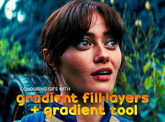
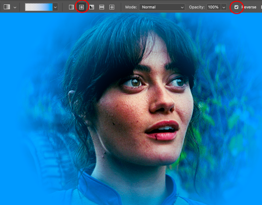
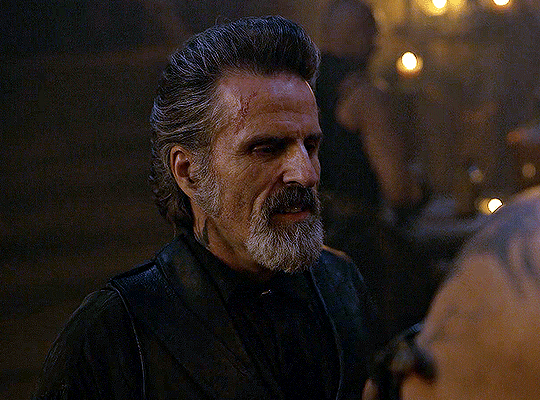
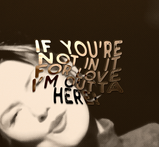
I'll be using this gif which I've already sharpened and coloured:

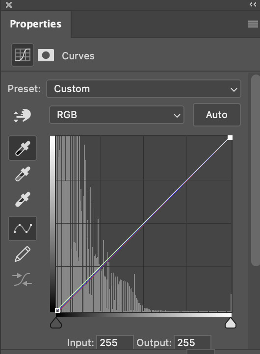
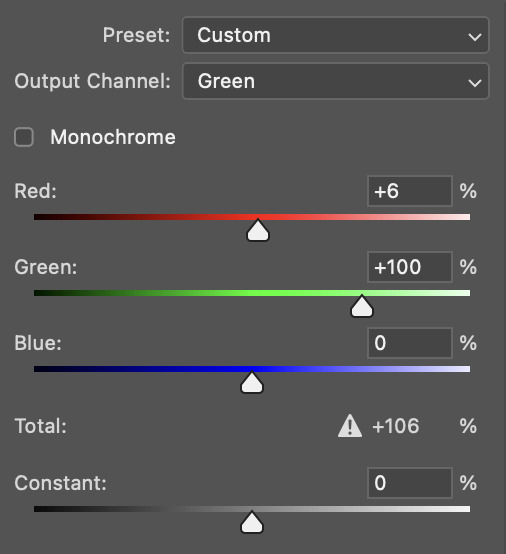
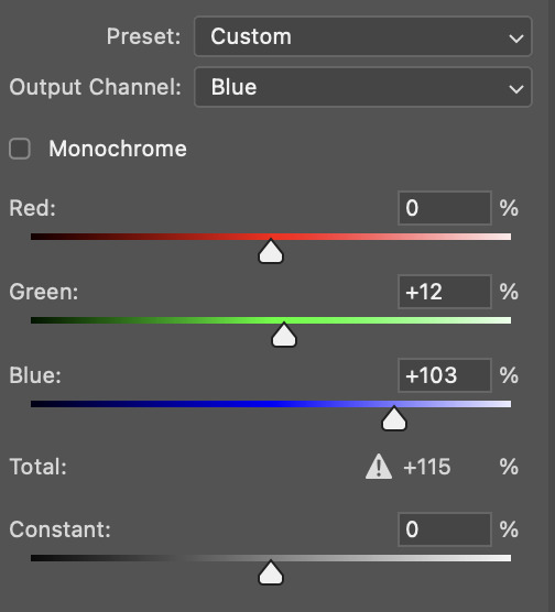
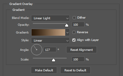
First of all let's make the background pop so I'm going to add a gradient fill (Layer -> New fill layer -> Gradient) with these settings (I'm using this colour #0099ff):

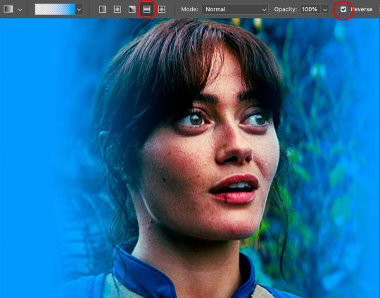
Now it's the time to play with the blending settings! Depending on your scene some will look better than others but I usually switch between Soft Light, Overlay, Color or Hue. 90% of the time I use soft light but this scene looked much better using overlay:

As you can see the background looks more blue and vibrant but it's not too much you know.
GRADIENT TOOL
Now it's time to use the gradient tool to give this gif a hazy look. I haven't seen many gifmakers talk about this tool but it's soooo useful and it takes gradients to a whole new level.
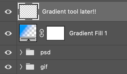
Before using this tool we'll need to add a new layer above the gradient fill, like this:
(HELP I just realised I typed “later” instead of “layer” 🤡 but let’s ignore that)
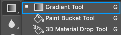
You can choose the gradient tool by pressing 'G' and then clicking here:
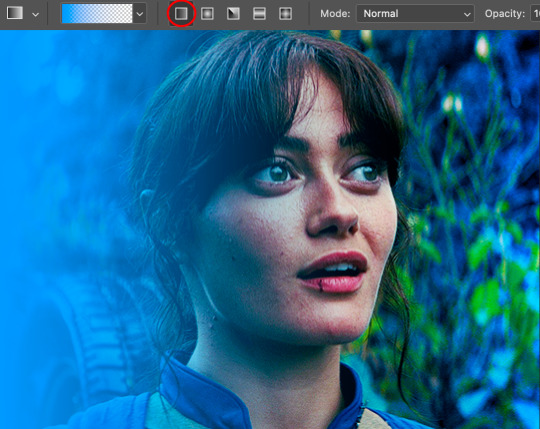
Make sure your gradient goes from any colour to a transparent background.

Okay so next to this gradient settings we have five different styles and each one will create a different shape. Depending on the scene I'll use the first, second or fourth one. Here are how they look:
1. Linear gradient
2. Radial gradient + Reverse (if you don't click this you'll end up with a blue circle above your gif)
3. Reflected gradient + Reverse
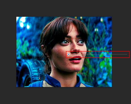
This time I'm going to use the radial gradient so to draw it start by clicking on the centre of the gif and drag the line (the farther you drag it the less intense the gradient looks):
And this is the gradient:
And here comes the fun part again, playing with the blending setting and the opacity! Before doing anything I duplicate my gradient layer because I always use more than one so this is how your layers should look like:

Let's go to the first gradient tool layer and again try different blending modes: soft light, overlay, hue... Most of the time I'll use 'Soft layer' and I'll leave the opacity at 100%.
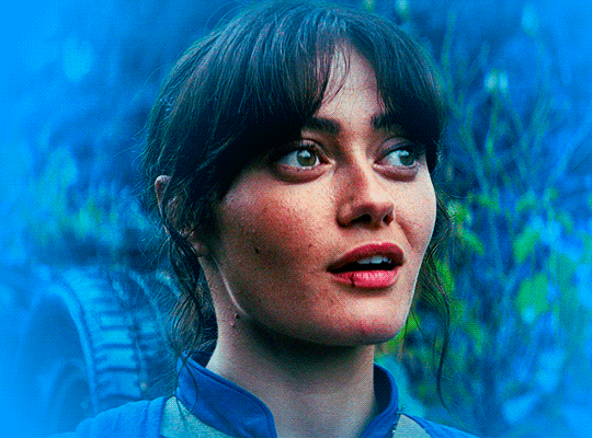
For the second layer choose 'Screen' and don't worry if your gif looks too bright because we're going to fix this by decreasing the opacity. Anything between 20-60% should look good but it depends if you want a more vibrant or more natural effect. I ended up using 40% and this is the result:

And we're done!!! As you can see the result looks much different from our first gif and it only takes a couple of layers!
Honestly the best advice I can give you is to play with the opacity and blending mode of the different gradient layers because depending on the scene some will look better than others!
#ask#Anonymous#ps tag#tutorial#usernolan#userrin#useraljoscha#uservalentina#userbunneis#userlockescoles#usernik
550 notes
·
View notes
Note
hi i'm sorry to bother you but do you have any tips on giffing dark indoor scenes? yours always look so good!
hi there! not a bother at all :) i can definitely try to explain the steps i usually take under the cut!
this tutorial will assume that you already know the basic steps of gif-making — if you don't, there are lots of great tutorials floating around on this site that can help you out! :)
here's the gif i'll work with to explain my steps, the bottom being the original and the top being the coloured/brightened version.
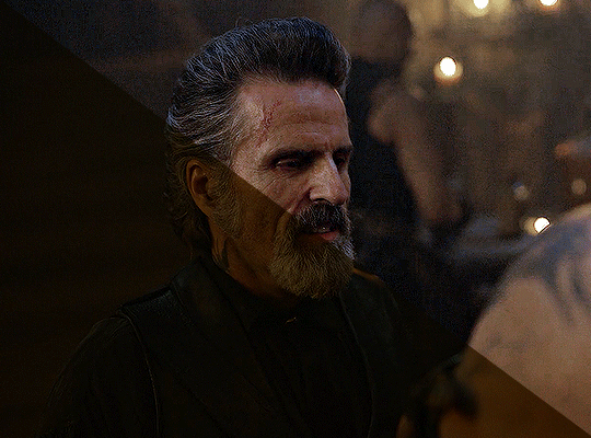
before we start, a general tip i recommend keeping in mind: if you want to brighten a dark scene, you'll want to get your hands on the highest quality download you can find. 1080p is decent, but if your laptop can handle 2160p 4k hdr files* without sounding like it's about to explode, that'll get you even better results!
(*colouring hdr 4k files requires a different set of steps — the scene will appear washed-out on photoshop, so you need to make sure that you don't end up whitewashing anyone if you do choose to work with this type of file.)
since most of my downloads are 1080p, i'll use this type of file in this tutorial.
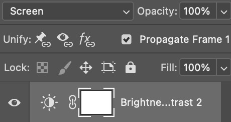
the first step of my gifmaking process with 1080p files is almost always the same no matter what scene i'm giffing. i make a brightness/contrast layer and set the blending mode to screen:
now my gif looks like this:
depending on the scene and how washed out it looks after this layer, i'll play around with the opacity. for this gif, i didn't touch the opacity at all. use your best judgement for this, because every scene is different!
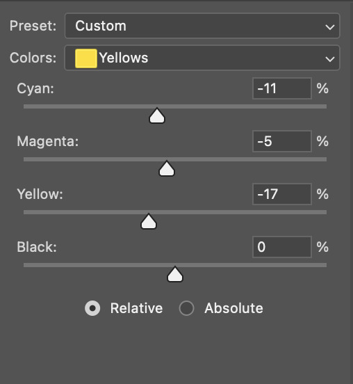
i find that dark indoor scenes are usually tinted in yellow or green. one of my first goals is to try to fix the undertone of this scene before focusing on brightening it any further. i go to colour balance for this, and play around with the midtones, shadows, and highlights.
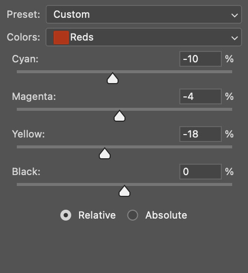
again, every scene is different, so the amount to which you use colour balance will differ, but for this specific scene, my goal was to neutralize the yellow. i focused particularly on the midtones and shadows of the colour balance layer, moving the scales to the opposite of the reds.
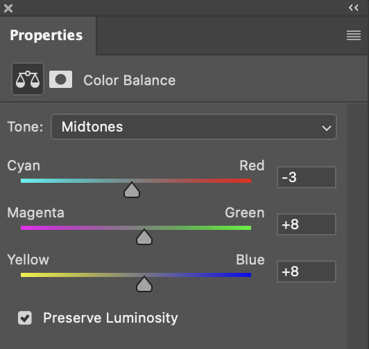
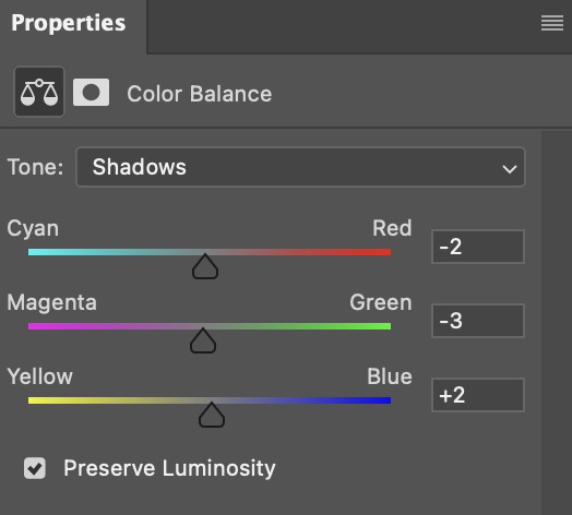
doing so will help with neutralizing the yellow. the only reason i moved the scales towards magenta and blue (therefore making it a bit more red than less) rather than green and yellow in shadows was because i wanted a darker contrast in the blacks. moving them to green and yellow made the overall scene more yellow since there were so many dark spots that shadows affected. (you'll see what i mean when you start experimenting with your own gif — this part of the process really just depends on your preferences!)
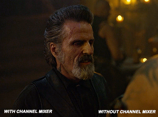
our gif might not look that much better yet, but it will soon! our best friend channel mixer is gonna help us out. for an in-depth post about how to use this adjustment layer, i recommend checking out this tutorial.
i'm someone who prefers to make more than one layer for the same adjustment layer for a reason i can't even explain (i just find that it helps me stay more organized). so don't think of this process like i can only use this layer once so i MUST fix it NOW. you can create multiple layers of the same adjustment layer, because every layer on top will affect the ones underneath it.
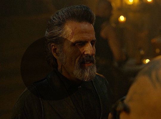
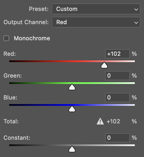
since my priority is getting rid of the yellow tint, i went to the Blue section of the channel mixer and increased it in all of the scales:
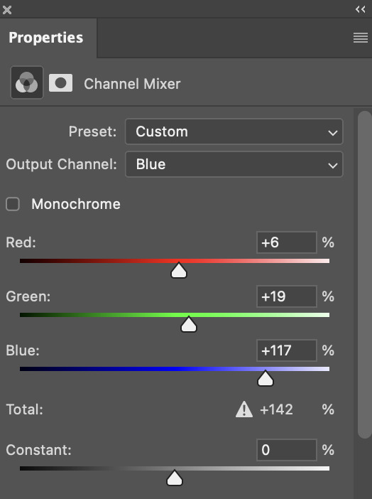
this step alone has helped us out so much, because look at our gif now!
not only does the background look less yellow, but so does izzy's skintone.
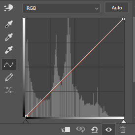
now i'm going to focus on trying to brighten the scene even more without destroying the quality. the levels layer can actually help out a lot with this.
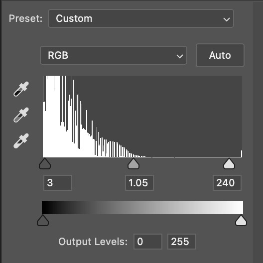
the amount to which i move each toggle differs per scene, and i think experimenting depending on your gif works best for this layer.
side note: i prefer not to use the ink droppers on the side because the contrast in the result usually ends up feeling too strong for my preferences, but if you find that this works better for you, then go for it! basically, the first dropper with the black ink should be clicked before you select the darkest part of the scene that you can find, and vice versa for the third dropper with the white ink — click it, and then select the brightest part of your scene.
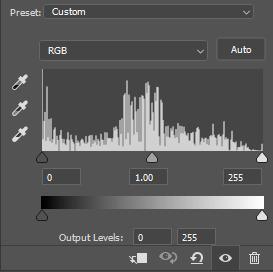
curves is the next layer that does fantastic work! unlike the levels layer, i do actually use the ink droppers for this. it's the same concept, with the first dropper being used on the darkest part of the scene, and the third dropper on the brightest.
try to think of curves as something that not only further brightens your scene, but also helps with the colour neutralizing process.
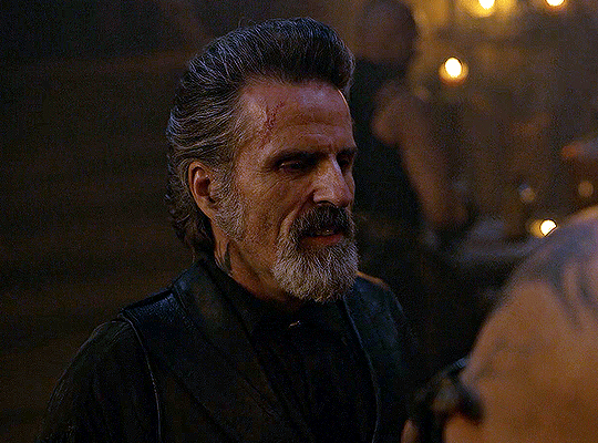
i grab the first dropper, then click the darkest parts of the gif that i can see. depending on the undertone of the blacks that you're clicking on, the tint of your gif might actually change significantly. this is why i prefer to click once, then undo the action if i don't like what it gives me. izzy's leather jacket was the sweet spot for this gif.
when i'm satisfied, i make another curves layer and use the third dropper to click the bright/white parts of the scene. for this gif in particular, the lights in the background were a good fit because they carried a yellow undertone — this meant that my curves layer actually helped to further neutralize the yellows in the scene as a whole!
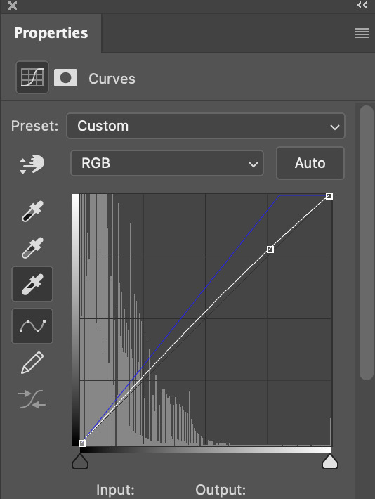
(i manually dragged the curves graph upwards for the third dropper to make it brighter. i don't need to do this if the dropper does this for me automatically, but since the lights were pretty bright, it only changed the tone of the scene and didn't increase the brightness — hence the manual step.)
pat yourself on the back, because this is what our gif looks like now!
this is good, but it's not great — there's still just a bit too much yellow in the scene for my liking (sorry, i'm picky! :P)
i created another channel mixer layer and played with the toggles until i was satisfied:
ta-da! the gif as a whole is much less red/yellow now:
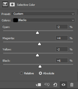
this is when i start fixing the colouring now — namely, his skin tone. selective colour will be your best friend here. i wanted to make his face just a tad brighter and less of a yellow-ish magenta shade, so i focused on the reds and yellows.
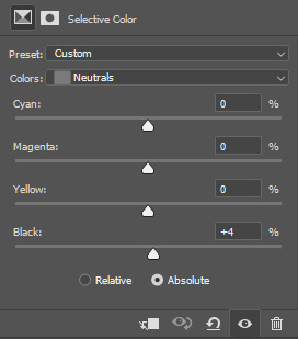
then, out of habit, i created another selective colour layer and took out more of the "yellow" in the whites to make them whiter, and increased the black (just by +1, since the contrast is pretty good enough already).
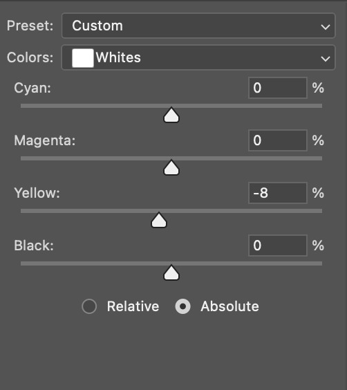
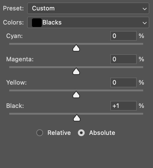
note: i switched to "absolute" for these two colours. basically, relative = less vibrant colour manipulation, and absolute = more vibrant/stronger colour manipulation. i prefer to stick to "relative" for fixing skin-tone since "absolute" can be a bit too strong for that.
our gif looks like this now!

his face looks brighter and much less yellow, so i'm satisfied!
this next step is not mandatory at all — again, i'm just picky and despise yellow-tinted scenes. i personally believe that indoor scenes that are yellow/green tinted make them look more dark than they actually are, so i do my best to get rid of these colours.
i also don't always do this, but for this gif, i just simply went to hue/saturation, selected the yellows from the drop-down menu and decreased its saturation.
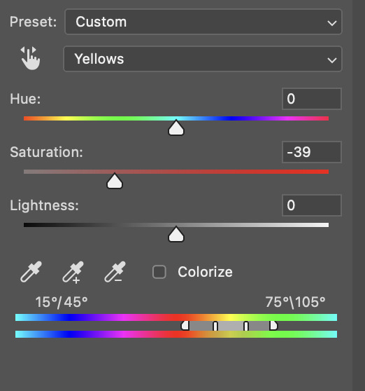
be careful not to do this too much. depending on the quality of your download, this can significantly decrease your gif quality. i tend to worry less about this when i'm working with 2160p files, but again, those files require an entirely different set of steps when it comes to brightening/colouring.
since this was a 1080p file download (and one that was actually less than 1GB, oops, don't do that), i played it safe and decreased it by -39 only.
note: you also want to be cautious of colour-washing skintone when it comes to this step. i find that another selective colour layer can help perfect the skintone in case the yellow drains out of it too much, but skip the hue/saturation step if it's too difficult to work with — better to be safe than sorry.
anyway, this is the final gif!
that's usually what i do when it comes to colouring dark indoor scenes! i hope this tutorial makes sense, and if you have any further questions, don't hesitate to reach out! :)
#tutorial#gif tutorial#resources#completeresources#coloring tutorial#allresources#dailyresources#userraffa#userdean#uservivaldi#alielook#usercats#usermoonchild#usernaureen#userbarrow#userabs#useraish#useralison#userisaiah#*mytutorials#i am so sorry if this is incoherent#it’s so hard to explain things coherently 😫
739 notes
·
View notes
Text
gif tutorial
i was asked to make a tutorial for this set i made, so let's get right into it!
first things first, i downloaded the music videos from youtube in 1080p using 4k video downloader. unfortunately, the quality of youtube videos always seems... not great, to put it simply. plus these music videos are from the 90s, so they've been upscaled to 1080p after the fact. all of this works against us, but i've definitely worked with videos of lesser quality than these, so at least there's that!
when i gif, i import video frames to layers rather than screencapping. this comes down to personal preference. after everything has loaded, i group all my layers together and set the frame delay to 0.05. i then cropped my gif to 540x500.
the next step in my process is sharpening. i did play around with my settings a bit given the quality of the footage and the dimensions of the gif. i compared both @hellboys low-quality video gif tutorial to my regular sharpening action and my vivid sharpening action and in this case, i preferred my normal vivid sharpening action. i used this tutorial to create the action for myself, and you can find other sharpening tutorials here. this action converts my frames to video timeline and applies sharpening.
once my gif is sharpened and i'm in timeline, i begin coloring. i wanted to simplify the amount of colors used in these gifs, again because of the video quality -- i knew it wasn't going to have the crispness i would normally like for my gifs. here are my coloring adjustment layers and their settings (not pictured: my first layer is a brightness/contrast layer set to screen) (explanation in alt text):

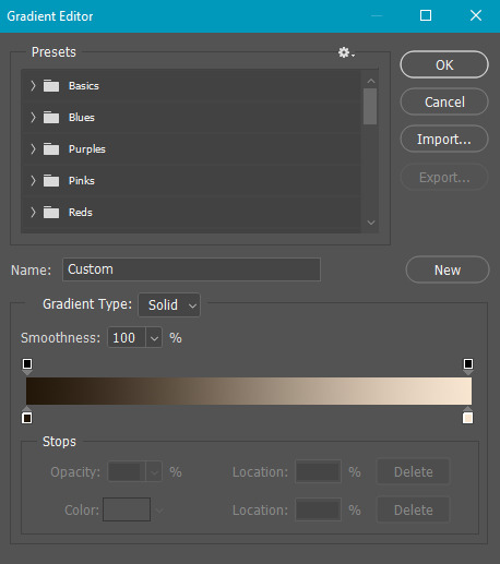
all of these layers and their settings will vary depending on your footage and its coloring (and obviously, feel free to make the gradient map whatever colors you like if you aren't going for this exact look).
pretty basic coloring, especially with just slapping a gradient map on top (my beloved), but at this point, i still didn't like the quality of the gif, so i added a couple textures/overlays.
i put the left one down first and set the blending mode to soft light and the opacity to 8%. depending on what look you're going for, you could increase or decrease the opacity or play around with different blending modes. i like using this texture with lower quality footage because even when it's sized up a bit, it adds some crispness and makes things feel more defined. for the second texture, i set it to overlay and 75% opacity. we love and respect film grain in this house.
now for the typography! sometimes i really enjoy typography and other times it's the bane of my existence for the sole reason of just how many fonts i have installed. anyway, here are the settings i used for this set:
make sure the color of your font is white and then set the blending mode to either difference or exclusion. i can almost never see a difference between the two, but for this set, i used exclusion. below are the blending options (double click on your text layer to bring up this menu or right click and select blending options).
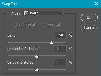
now we have to add the warp effect. with your text tool still selected, click this icon at the top of your screen:

from the dropdown menu, select twist. these were my settings, but feel free to play around with different warp options and their settings. the ones i use most often are flag, fish, and twist.
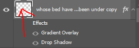
this last step is completely optional, but it's an effect i use in most of my sets with typography. duplicate your text layer (select the layer and ctrl+j), turn off the layer effects (click the eye icon next to effects), and set the blending mode to normal. right click on the layer and select rasterize type. right click on the layer icon itself and choose select pixels.
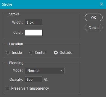
at this point, you should see the moving black and white dotted line showing that only your text is selected. then go to edit > stroke. here are the settings i almost exclusively use.
this is what your text should look like now:
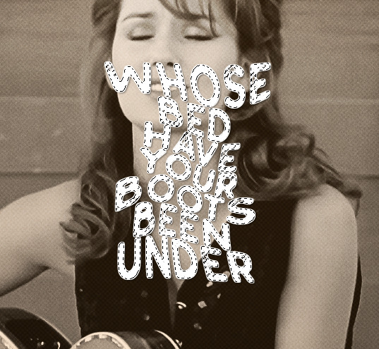
using ctrl+T, move the layer off the canvas so you can't see any of the text anymore. you should be left with only your outline. click anywhere on your canvas to de-select the text we just moved. use ctrl+T again as well as your arrow keys to nudge the outline over to the left 2px and up 2px. this is personal preference as far as the positioning, but i almost never move it any other way. you can leave it like this, which i sometimes do, or you can set the blending mode to soft light like i did for a more subtle effect.
and that's it! rinse and repeat for each gif in your set or use a different warp effect on each gif to switch it up! if you have any questions about this tutorial or would like me to make one for anything else, please feel free to ask any time!
#gif tutorial#my tutorials#gifmakerresource#completeresources#dailyresources#chaoticresources#userdavid#coloring tutorial#typography tutorial#tutorial#photoshop tutorial
268 notes
·
View notes
Text
⭐ So you want to learn pixel art? ⭐
🔹 Part 1 of ??? - The Basics!
Edit: Now available in Google Doc format if you don't have a Tumblr account 🥰
Hello, my name is Tofu and I'm a professional pixel artist. I have been supporting myself with freelance pixel art since 2020, when I was let go from my job during the pandemic.


My progress, from 2017 to 2024. IMO the only thing that really matters is time and effort, not some kind of natural talent for art.
This guide will not be comprehensive, as nobody should be expected to read allat. Instead I will lean heavily on my own experience, and share what worked for me, so take everything with a grain of salt. This is a guide, not a tutorial. Cheers!
🔹 Do I need money?
NO!!! Pixel art is one of the most accessible mediums out there.
I still use a mouse because I prefer it to a tablet! You won't be at any disadvantage here if you can't afford the best hardware or software.
Because our canvases are typically very small, you don't need a good PC to run a good brush engine or anything like that.
✨Did you know? One of the most skilled and beloved pixel artists uses MS PAINT! Wow!!
🔹 What software should I use?
Here are some of the most popular programs I see my friends and peers using. Stars show how much I recommend the software for beginners! ⭐
💰 Paid options:
⭐⭐⭐ Aseprite (for PC) - $19.99
This is what I and many other pixel artists use. You may find when applying to jobs that they require some knowledge of Aseprite. Since it has become so popular, companies like that you can swap raw files between artists.
Aseprite is amazingly customizable, with custom skins, scripts and extensions on Itch.io, both free and paid.
If you have ever used any art software before, it has most of the same features and should feel fairly familiar to use. It features a robust animation suite and a tilemap feature, which have saved me thousands of hours of labour in my work. The software is also being updated all the time, and the developers listen to the users. I really recommend Aseprite!
⭐ Photoshop (for PC) - Monthly $$
A decent option for those who already are used to the PS interface. Requires some setup to get it ready for pixel-perfect art, but there are plenty of tutorials for doing so.
Animation is also much more tedious on PS which you may want to consider before investing time!
⭐⭐ ProMotion NG (for PC) - $19.00
An advanced and powerful software which has many features Aseprite does not, including Colour Cycling and animated tiles.
⭐⭐⭐ Pixquare (for iOS) - $7.99 - $19.99 (30% off with code 'tofu'!!)
Probably the best app available for iPad users, in active development, with new features added all the time.

Look! My buddy Jon recommends it highly, and uses it often.
One cool thing about Pixquare is that it takes Aseprite raw files! Many of my friends use it to work on the same project, both in their office and on the go.
⭐ Procreate (for iOS) - $12.99
If you have access to Procreate already, it's a decent option to get used to doing pixel art. It does however require some setup. Artist Pixebo is famously using Procreate, and they have tutorials of their own if you want to learn.
⭐⭐ ReSprite iOS and Android. (free trial, but:) $19.99 premium or $$ monthly
ReSprite is VERY similar in terms of UI to Aseprite, so I can recommend it. They just launched their Android release!
🆓 Free options:
⭐⭐⭐ Libresprite (for PC)
Libresprite is an alternative to Aseprite. It is very, very similar, to the point where documentation for Aseprite will be helpful to Libresprite users.
⭐⭐ Pixilart (for PC and mobile)
A free in-browser app, and also a mobile app! It is tied to the website Pixilart, where artists upload and share their work. A good option for those also looking to get involved in a community.
⭐⭐ Dotpict (for mobile)
Dotpict is similar to Pixilart, with a mobile app tied to a website, but it's a Japanese service. Did you know that in Japanese, pixel art is called 'Dot Art'? Dotpict can be a great way to connect with a different community of pixel artists! They also have prompts and challenges often.
🔹 So I got my software, now what?
◽Nice! Now it's time for the basics of pixel art.
❗ WAIT ❗ Before this section, I want to add a little disclaimer. All of these rules/guidelines can be broken at will, and some 'no-nos' can look amazing when done intentionally.
The pixel-art fundamentals can be exceedingly helpful to new artists, who may feel lost or overwhelmed by choice. But if you feel they restrict you too harshly, don't force yourself! At the end of the day it's your art, and you shouldn't try to contort yourself into what people think a pixel artist 'should be'. What matters is your own artistic expression. 💕👍
◽Phew! With that out of the way...
🔸"The Rules"
There are few hard 'rules' of pixel art, mostly about scaling and exporting. Some of these things will frequently trip up newbies if they aren't aware, and are easy to overlook.
🔹Scaling method
There are a couple ways of scaling your art. The default in most art programs, and the entire internet, is Bi-linear scaling, which usually works out fine for most purposes. But as pixel artists, we need a different method.


Both are scaled up x10. See the difference?
On the left is scaled using Bilinear, and on the right is using Nearest-Neighbor. We love seeing those pixels stay crisp and clean, so we use nearest-neighbor.
(Most pixel-art programs have nearest-neighbor enabled by default! So this may not apply to you, but it's important to know.)
🔹Mixels
Mixels are when there are different (mixed) pixel sizes in the same image.

Here I have scaled up my art- the left is 200%, and the right is 150%. Yuck!
As we can see, the "pixel" sizes end up different. We generally try to scale our work by multiples of 100 - 200%, 300% etc. rather than 150%. At larger scales however, the minute differences in pixel sizes are hardly noticeable!
Mixels are also sometimes seen when an artist scales up their work, then continues drawing on it with a 1 pixel brush.

Many would say that this is not great looking! This type of pixels can be indicative of a beginner artist. But there are plenty of creative pixel artists out there who mixels intentionally, making something modern and cool.
🔹Saving Your Files
We usually save our still images as .PNGs as they don’t create any JPEG artifacts or loss of quality. It's a little hard to see here, but there are some artifacts, and it looks a little blurry. It also makes the art very hard to work with if we are importing a JPEG.

For animations .GIF is good, but be careful of the 256 colour limit. Try to avoid using too many blending mode layers or gradients when working with animations. If you aren’t careful, your animation could flash afterwards, as the .GIF tries to reduce colours wherever it can. It doesn’t look great!

Here's an old piece from 2021 where I experienced .GIF lossiness, because I used gradients and transparency, resulting in way too many colours.
🔹Pixel Art Fundamentals - Techniques and Jargon
❗❗Confused about Jaggies? Anti-Aliasing? Banding? Dithering? THIS THREAD is for you❗❗ << it's a link, click it!!
As far as I'm concerned, this is THE tutorial of all time for understanding pixel art. These are techniques created and named by the community of people who actually put the list together, some of the best pixel artists alive currently. Please read it!!
🔸How To Learn
Okay, so you have your software, and you're all ready to start. But maybe you need some more guidance? Try these tutorials and resources! It can be helpful to work along with a tutorial until you build your confidence up.
⭐⭐ Pixel Logic (A Digital Book) - $10 A very comprehensive visual guide book by a very skilled and established artist in the industry. I own a copy myself.
⭐⭐⭐ StudioMiniBoss - free A collection of visual tutorials, by the artist that worked on Celeste! When starting out, if I got stuck, I would go and scour his tutorials and see how he did it.
⭐ Lospec Tutorials - free A very large collection of various tutorials from all over the internet. There is a lot to sift through here if you have the time.
⭐⭐⭐ Cyangmou's Tutorials - free (tipping optional) Cyangmou is one of the most respected and accomplished modern pixel artists, and he has amassed a HUGE collection of free and incredibly well-educated visual tutorials. He also hosts an educational stream every week on Twitch called 'pixelart for beginners'.
⭐⭐⭐ Youtube Tutorials - free There are hundreds, if not thousands of tutorials on YouTube, but it can be tricky to find the good ones. My personal recommendations are MortMort, Brandon, and AdamCYounis- these guys really know what they're talking about!
🔸 How to choose a canvas size
When looking at pixel art turorials, we may see people suggest things like 16x16, 32x32 and 64x64. These are standard sizes for pixel art games with tiles. However, if you're just making a drawing, you don't necessarily need to use a standard canvas size like that.
What I like to think about when choosing a canvas size for my illustrations is 'what features do I think it is important to represent?' And make my canvas as small as possible, while still leaving room for my most important elements.
Imagine I have characters in a scene like this:
I made my canvas as small as possible (232 x 314), but just big enough to represent the features and have them be recognizable (it's Good Omens fanart 😤)!! If I had made it any bigger, I would be working on it for ever, due to how much more foliage I would have to render.
If you want to do an illustration and you're not sure, just start at somewhere around 100x100 - 200x200 and go from there.
It's perfectly okay to crop your canvas, or scale it up, or crunch your art down at any point if you think you need a different size. I do it all the time! It only takes a bit of cleanup to get you back to where you were.
🔸Where To Post
Outside of just regular socials, Twitter, Tumblr, Deviantart, Instagram etc, there are a few places that lean more towards pixel art that you might not have heard of.
⭐ Lospec Lospec is a low-res focused art website. Some pieces get given a 'monthly masterpiece' award. Not incredibly active, but I believe there are more features being added often.
⭐⭐ Pixilart Pixilart is a very popular pixel art community, with an app tied to it. The community tends to lean on the young side, so this is a low-pressure place to post with an relaxed vibe.
⭐⭐ Pixeljoint Pixeljoint is one of the big, old-school pixel art websites. You can only upload your art unscaled (1x) because there is a built-in zoom viewer. It has a bit of a reputation for being elitist (back in the 00s it was), but in my experience it's not like that any more. This is a fine place for a pixel artist to post if they are really interested in learning, and the history. The Hall of Fame has some of the most famous / impressive pixel art pieces that paved the way for the work we are doing today.
⭐⭐⭐ Cafe Dot Cafe Dot is my art server so I'm a little biased here. 🍵 It was created during the recent social media turbulence. We wanted a place to post art with no algorithms, and no NFT or AI chuds. We have a heavy no-self-promotion rule, and are more interested in community than skill or exclusivity. The other thing is that we have some kind of verification system- you must apply to be a Creator before you can post in the Art feed, or use voice. This helps combat the people who just want to self-promo and dip, or cause trouble, as well as weed out AI/NFT people. Until then, you are still welcome to post in any of the threads or channels. There is a lot to do in Cafe Dot. I host events weekly, so check the threads!
⭐⭐/r/pixelart The pixel art subreddit is pretty active! I've also heard some of my friends found work through posting here, so it's worth a try if you're looking. However, it is still Reddit- so if you're sensitive to rude people, or criticism you didn't ask for, you may want to avoid this one. Lol
🔸 Where To Find Work
You need money? I got you! As someone who mostly gets scouted on social media, I can share a few tips with you:
Put your email / portfolio in your bio Recruiters don't have all that much time to find artists, make it as easy as possible for someone to find your important information!
Clean up your profile If your profile feed is all full of memes, most people will just tab out rather than sift through. Doesn't apply as much to Tumblr if you have an art tag people can look at.
Post regularly, and repost Activity beats everything in the social media game. It's like rolling the dice, and the more you post the more chances you have. You have to have no shame, it's all business baby
Outside of just posting regularly and hoping people reach out to you, it can be hard to know where to look. Here are a few places you can sign up to and post around on.
/r/INAT INAT (I Need A Team) is a subreddit for finding a team to work with. You can post your portfolio here, or browse for people who need artists.
/r/GameDevClassifieds Same as above, but specifically for game-related projects.
Remote Game Jobs / Work With Indies Like Indeed but for game jobs. Browse them often, or get email notifications.
VGen VGen is a website specifically for commissions. You need a code from another verified artist before you can upgrade your account and sell, so ask around on social media or ask your friends. Once your account is upgraded, you can make a 'menu' of services people can purchase, and they send you an offer which you are able to accept, decline, or counter.
The evil websites of doom: Fiverr and Upwork I don't recommend them!! They take a big cut of your profit, and the sites are teeming with NFT and AI people hoping to make a quick buck. The site is also extremely oversaturated and competitive, resulting in a race to the bottom (the cheapest, the fastest, doing the most for the least). Imagine the kind of clients who go to these websites, looking for the cheapest option. But if you're really desperate...
🔸 Community
I do really recommend getting involved in a community. Finding like-minded friends can help you stay motivated to keep drawing. One day, those friends you met when you were just starting out may become your peers in the industry. Making friends is a game changer!
Discord servers Nowadays, the forums of old are mostly abandoned, and people split off into many different servers. Cafe Dot, Pixel Art Discord (PAD), and if you can stomach scrolling past all the AI slop, you can browse Discord servers here.
Twitch Streams Twitch has kind of a bad reputation for being home to some of the more edgy gamers online, but the pixel art community is extremely welcoming and inclusive. Some of the people I met on Twitch are my friends to this day, and we've even worked together on different projects! Browse pixel art streams here, or follow some I recommend: NickWoz, JDZombi, CupOhJoe, GrayLure, LumpyTouch, FrankiePixelShow, MortMort, Sodor, NateyCakes, NyuraKim, ShinySeabass, I could go on for ever really... There are a lot of good eggs on Pixel Art Twitch.
🔸 Other Helpful Websites
Palettes Lospec has a huge collection of user-made palettes, for any artist who has trouble choosing their colours, or just wants to try something fun. Rejected Palettes is full of palettes that didn't quite make it onto Lospec, ran by people who believe there are no bad colours.
The Spriters Resource TSR is an incredible website where users can upload spritesheets and tilesets from games. You can browse for your favourite childhood game, and see how they made it! This website has helped me so much in understanding how game assets come together in a scene.
VGMaps Similar to the above, except there are entire maps laid out how they would be played. This is incredible if you have to do level design, or for mocking up a scene for fun.
Game UI Database Not pixel-art specific, but UI is a very challenging part of graphics, so this site can be a game-changer for finding good references!
Retronator A digital newspaper for pixel-art lovers! New game releases, tutorials, and artworks!
Itch.io A website where people can upload, games, assets, tools... An amazing hub for game devs and game fans alike. A few of my favourite tools: Tiled, PICO-8, Pixel Composer, Juice FX, Magic Pencil for Aseprite
🔸 The End?
This is just part 1 for now, so please drop me a follow to see any more guides I release in the future. I plan on doing some writeups on how I choose colours, how to practise, and more!
I'm not an expert by any means, but everything I did to get to where I am is outlined in this guide. Pixel art is my passion, my job and my hobby! I want pixel art to be recognized everywhere as an art-form, a medium of its own outside of game-art or computer graphics!

This guide took me a long time, and took a lot of research and experience. Consider following me or supporting me if you are feeling generous.
And good luck to all the fledgling pixel artists, I hope you'll continue and have fun. I hope my guide helped you, and don't hesitate to send me an ask if you have any questions! 💕
My other tutorials (so far): How to draw Simple Grass for a game Hue Shifting
28K notes
·
View notes
Text
the people have requested a tutorial:
just need three key things for this
1. an art/photo editing application with selection tools. use whatever youre most comfortable with. the glitter police wont go after you for using ibispaint or whatever.
2. a glitter texture. you can download an image, or make the texture yourself. for example, this other tutorial uses the noise tool.
3. a gif maker. can use an online gif generator or an animation application. look up gif maker options if you dont already have one.
i'll give a little demonstration of my process so you guys can get the gist. i dont expect anyone to do the exact same things as me tho.

first i select the area i want to glitterfy, and make 3 copies of it

the key thing here is to shift the placement of the glitter on each layer so they arent identical! otherwise the gif will just look like a still image.
then i clip my glitter texture (a stock photo in this case) to each layer. i mess around with the layer modes until one of them looks good (overlay and luminosity are my usual picks).
alternatively i would just use the paintshop pro noise tool to give each layer a glitter texture, like in the guide i linked above

next i like to export my transparent layers and the base image into paintshop pro so i can use the sparkle plugin to make it extra sparkly, following this other tutorial.
you can skip this step entirely or use a different method to add sparkle! i am a weirdo for doing it this way, you dont need to copy me! a custom brush or hand-placed sparkles will definitely suffice.

once i have everything as sparkly as i want it, i merge each glitter layer with a copy of the base image layer, and then save each as a separate image file. i title them something like [name]A, [name]B, and [name]C for clarity.

to finish, i upload the images as frames of a gif, and set it to display each frame for 8-10 hundredths of a second. i like using jasc animation shop as my gif maker.

aaaaand that's it! not very hard if you already have basic editing skills.

guess who just learned how to make glitter gifs. THIS GUY
984 notes
·
View notes
Note
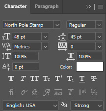
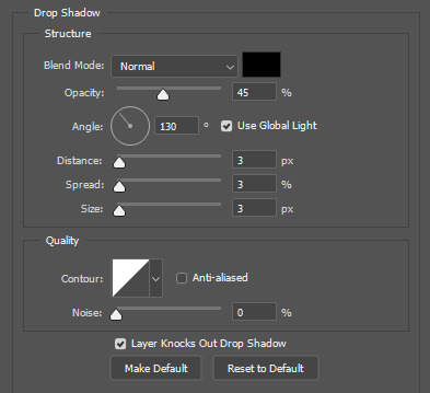
hi alie! can i request on how to do this grey-white text? /post/721285784354865152/ thanks!

hiii, sure! it's quite simple actually, here are the steps for the text effect on this gifset (and settings/screenshots under the cut):
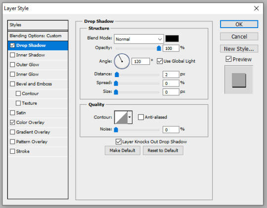
type out you text and select white for the color, then set this text layer's blending mode to Difference
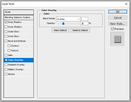
double click on the layer to get to the layer style options and add a Color Overlay. choose the color white (black also works) and set the blending mode to Overlay. play with the opacity slider as you wish, this will brighten your text and it helps for gifs that have a high contrast behind the text.
if you don't need to brighten the text, put the color overlay's blending mode to Hue, you're actually done right here, easy!
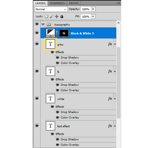
optional: if you're using the color overlay as an overlay like i have for that particular gifset, you need to create a mask of your typography. to do that hold the ctrl key and click on the text layer's icon (the "T", the yellow box on one of my screenshots). this will make a selection of your typography. if you have multiple text layers, hold CTRL + SHIFT to select multiple layers. once your selection is done, go to the top menu and Layer > New Layer > New Adjustment Layer > Black & White > Ok. make sure that layer is on top of the text layers.
add a Drop Shadow if you want, and that's it, the effect is done :)
#alie replies#Anonymous#*ps help#photoshop#resource#tutorial#resources#allresources#typography#completeresources#resourcemarket#userabs#userdahlias#usercats#usersmia
346 notes
·
View notes
Text
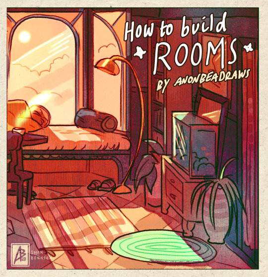
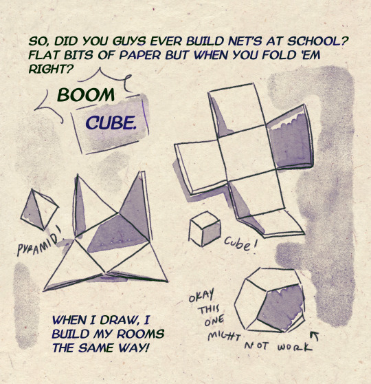
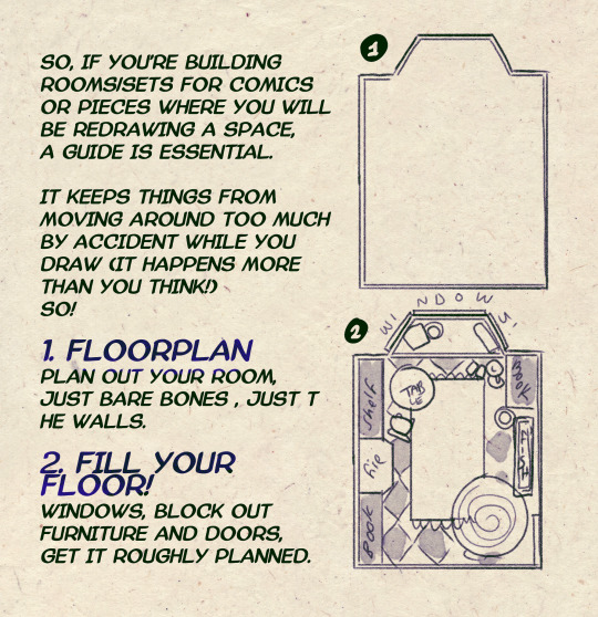
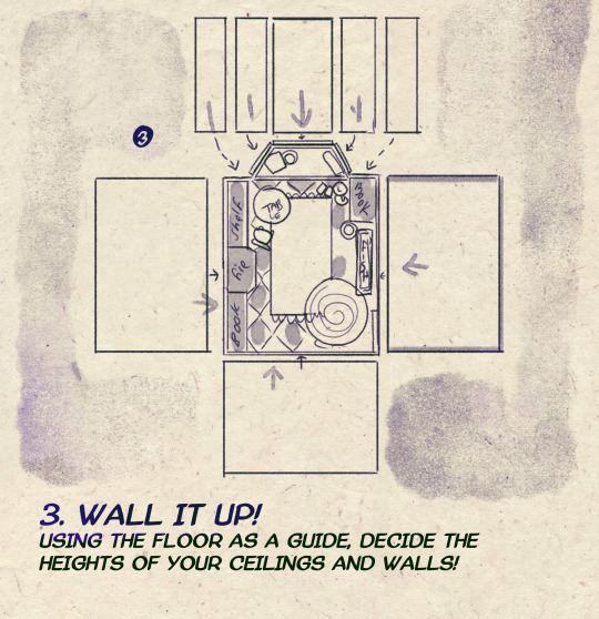
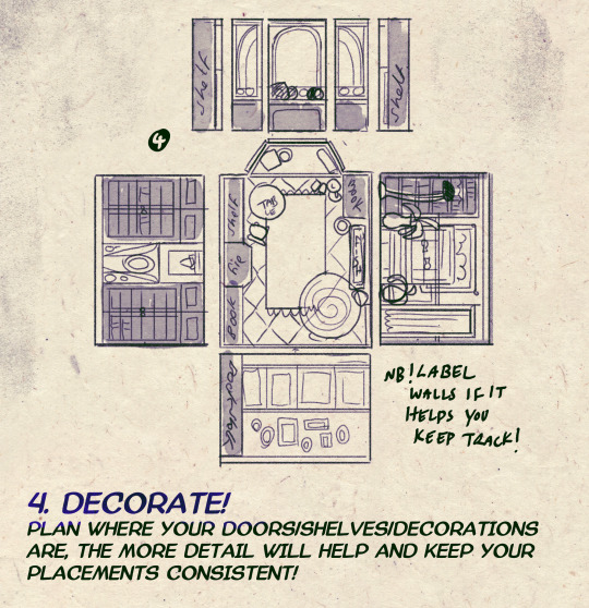
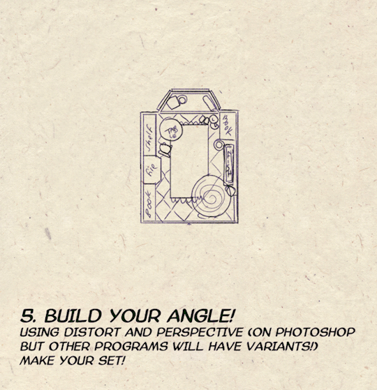
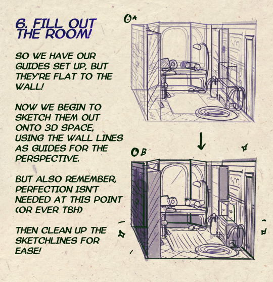

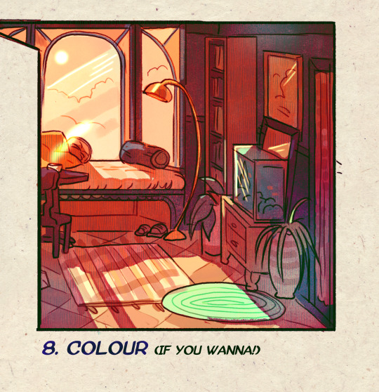
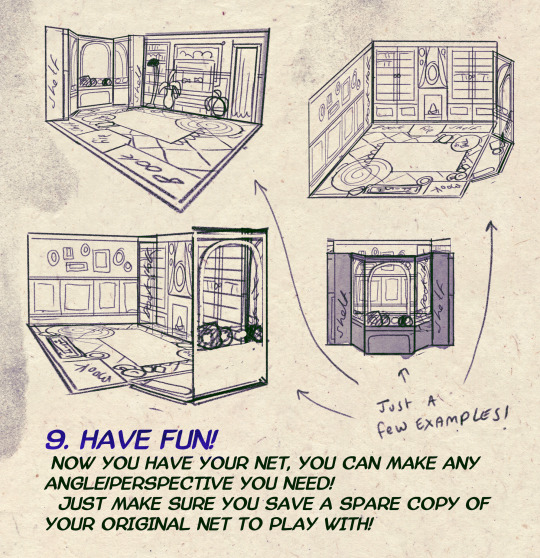
I made a Room Building tutorial! Lemme know if it helps! 🧡
Tip me here| Commission info here!
#anonbeadraws#digital#art tutorial#tutorial#room building#room design#illustration#gif#digital art#digital tutorial#art help#art resource#let me know if it helps!#tried to make it as simple as I could
41K notes
·
View notes
Text
🎮 HEY I WANNA MAKE A GAME! 🎮
Yeah I getcha. I was once like you. Pure and naive. Great news. I AM STILL PURE AND NAIVE, GAME DEV IS FUN! But where to start?
To start, here are a couple of entry level softwares you can use! source: I just made a game called In Stars and Time and people are asking me how to start making vidy gaems. Now, without further ado:
SOFTWARES AND ENGINES FOR PEOPLE WHO DON'T KNOW HOW TO CODE!!!
Ren'py (and also a link to it if you click here do it): THE visual novel software. Comic artists, look no further ✨Pros: It's free! It's simple! It has great documentation! It has a bunch of plugins and UI stuff and assets for you to buy! It can be used even if you have LITERALLY no programming experience! (You'll just need to read the doc a bunch) You can also port your game to a BUNCH of consoles! ✨Cons: None really <3 Some games to look at: Doki Doki Literature Club, Bad End Theater, Butterfly Soup
Twine: Great for text-based games! GREAT FOR WRITERS WHO DONT WANNA DRAW!!!!!!!!! (but you can draw if you want) ✨Pros: It's free! It's simple! It's versatile! It has great documentation! It can be used even if you have LITERALLY no programming experience! (You'll just need to read the doc a bunch) ✨Cons: You can add pictures, but it's a pain. Some games to look at: The Uncle Who Works For Nintendo, Queers In love At The End of The World, Escape Velocity

Bitsy: Little topdown games! ✨Pros: It's free! It's simple! It's (somewhat) intuitive! It has great documentation! It can be used even if you have LITERALLY no programming experience! You can make everything in it, from text to sprites to code! Those games sure are small! ✨Cons: Those games sure are small. This is to make THE simplest game. Barely any animation for your sprites, can barely fit a line of text in there. But honestly, the restrictions are refreshing! Some games to look at: honestly I haven't played that many bitsy games because i am a fake gamer. The picture above is from Under A Star Called Sun though and that looks so pretty
RPGMaker: To make RPGs! LIKE ME!!!!! NOTE: I recommend getting the latest version if you can, but all have their pros and cons. You can get a better idea by looking at this post. ✨Pros: Literally everything you need to make an RPG. Has a tutorial inside the software itself that will teach you the basics. Pretty simple to understand, even if you have no coding experience! Also I made a post helping you out with RPGMaker right here! ✨Cons: Some stuff can be hard to figure out. Also, the latest version is expensive. Get it on sale! Some games to look at: Yume Nikki, Hylics, In Stars and Time (hehe. I made it)
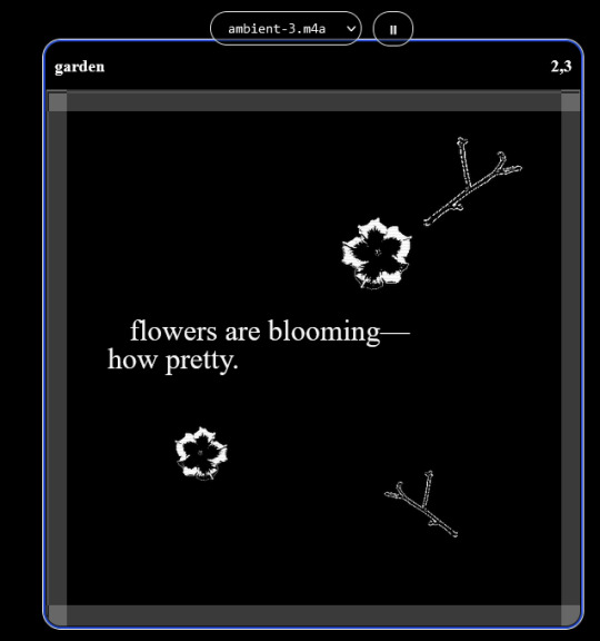
engine.lol: collage worlds! it is relatively new so I don't know much about it, but it seems fascinating. picture is from Garden! NOTE: There's a bunch of smaller engines to find out there. Just yesterday I found out there's an Idle Game Maker made by the Cookie Clicker creator. Isn't life wonderful?
✨more advice under the cut. this is Long ok✨
ENGINES I KNOW NOTHING ABOUT AND THEY SEEM HARD BUT ALSO GIVE IT A TRY I GUESS!!!! :
Unity and Unreal: I don't know anything about those! That looks hard to learn! But indie devs use them! It seems expensive! Follow your dreams though! Don't ask me how!
GameMaker: Wuh I just don't know anything about it either! I just know it's now free if your game is non-commercial (aka, you're not selling it), and Undertale was made on it! It seems good! You probably need some coding experience though!!!
Godot: Man I know even less about this one. Heard good things though!
BUNCHA RANDOM ADVICE!!!!
-Make something small first! Try making simple: a character is in a room, and exits the room. The character can look around, decide to take an item with them, can leave, and maybe the door is locked and you have to find the key. Figuring out how to code something like that, whether it is as a fully text-based game or as an RPGMaker map, should be a good start to figure out how your software of choice works!
-After that, if you have an idea, try first to make the simplest version of that idea. For my timeloop RPG, my simplest version was two rooms: first room you can walk in, second room with the King, where a cutscene automatically plays and the battle starts, you immediately die, and loop back to the first room, with the text from this point on reflecting this change. I think I also added a loop counter. This helped me figure out the most important thing: Can This Game Be Made? After that, the rest is just fun stuff. So if you want to make a dating sim, try and figure out how to add choices, and how to have affection points go up and down depending on your choices! If you want to make a platformer, figure out how to make your character move and jump and how to create a simple level! If you just want to make a kinetic visual novel with no choices, figure out how to add text, and how to add portraits! You'll be surprised at how powerful you'll feel after having figured even those simple things out.
-If you have a programming problem or just get confused, never underestimate the power of asking Google! You most likely won't be the only person asking this question, and you will learn some useful tips! If you are powerful enough, you can even… Ask people??? On forums??? Not me though.
-Yeah I know you probably want to make Your Big Idea RIGHT NOW but please. Make a smaller prototype first. You need to get that experience. Trust me.
-If you are not a womanthing of many skills like me, you might realize you need help. Maybe you need an artist, or a programmer. So! Game jams on itch.io are a great way to get to work and meet other game devs that have different strengths! Or ask around! Maybe your artist friend secretly always wanted to draw for a game. Ask! Collaborate! Have fun!!!
I hope that was useful! If it was. Maybe. You'd like to buy me a coffee. Or maybe you could check out my comics and games. Or just my new critically acclaimed game In Stars and Time. If you want. Ok bye
#reference#gamedev#indie dev#game dev#tutorial#video game#ACTUAL GAME DEVS DO NOT INTERACT!!!1!!!!!#this is for people who are afraid of coding. do not come at me and say 'actually godot is easy if you just--' I JUST WILL NOT.#long post
36K notes
·
View notes
Photo

A little tutorial about how to draw pecs!
Many asked me in the past so I hope it can help many!
33K notes
·
View notes
Note
Hi, could you please tell me how to do this slanted layout? the-borgias*tumblr*com/post/695485491217334272/one-chicago-appreciation-week-day-one-favorite
Hi, Anon! I'm sorry this took me a few days to answer but I struggled making this tutorial (not because the process itself is difficult but it is difficult to explain it properly.) Anyway, here's the gifset Anon is asking about. I hope this is easy to understand and I also included a .psd file of the layout :)

PSD FILE OF THE GIF ABOVE & TEMPLATE
What you'll need:
Basic Photoshop knowledge (I use Photoshop 2023)
Basic knowledge on how to make layouts (here are a couple of tutorials: x x)
Basic knowledge about layer masks (tutorial)
STEP 1: Make a basic layout
You can do pretty much any layout you want but for the sake of the tutorial I tried to recreate the same template I used in that gifset. I'm assuming you already know how layouts/templates work so I created a 540x540px canvas and went to View > Guides > New guide layout. I used these settings:

And this is how my canvas looked like:

Now I pressed (M) to use the Rectangular Marquee tool and create the rectangles I wanted. This is my end result:

STEP 2: Tilt the layout
This is actually pretty easy. First we're going to select all our layers. I paired mine in groups so they looked like this:

Once we've selected all of them (groups, layers, whatever you're working with) press Ctrl + T. Your canvas should look like this:

And we're going to tilt it by changing the angle to -2.00 in here:

Now our layout is slanted! But as you can see we have transparent spaces we need to fill. I don't know if this is the easier method to do it but I use the Polygonal Lasso tool (L). I'll use the first orange box as an example:

As you can see I use a ridiculously big zoom so I can be as accurate as possible but it's basically impossible to create a perfect box, so this will work. Once we have selected our desired shape we'll use the Brush tool (B) to paint in the layer of our original orange box:

You have to do this with every box so it's a bit tedious but that's the way I did it 🤷♀️ This is the end result:

STEP 3: Place the gifs (using Layer Masks)
But now, how do I know which size my gif should be? Our initial measures won't work because our final boxes are bigger so here's what I do. I'll select the Polygonal lasso tool again and make sure I select a little bit more of the box I'm measuring, like this:

It's a little hard to see it but the dots are just a little bit bigger than the orange shape. To be more accurate, my original box was 178x87px and the shape I selected is 174x100px. So I'm going to make a 174x100px gif and place it right above the background, like this:

Now we're going to select the layers of our gif (I'm assuming you're working with a Group because it's easier) and click Ctrl + the orange box. You should see this in your canvas:

And now create a layer mask in your gif group (if you don't know how to do it check out the tutorials I liked at the start of the post.)

Now you can delete the orange box. And, once again, you have to do this with every box and write down the measures (and remember that all your gifs must to have the same number of screencaps!)
I hope y'all don't mind that I didn't create 8 different gifs lmao I was too lazy so I just used a big gif as a background and made 4 small gifs. This my end result:

For the background I merged the remaining boxes and used that to create the layer mask. I'm not going to explain it since I believe it's much easier if you check out the psd file.
And that's pretty much it! It's the same as making a standard layout you just have to be careful with your gif measures. Oh and also see how my gifset shows those white marks between the gifs under a dark background?

Well, that can't be avoided since we aren't working with straight lines (you can see the same effect in the 2nd gif of this set, different layout but also not straight lines) so we'll just ignore them.
I hope this was helpful (I lowkey feel like this tutorial is a mess) and if you have any questions feel free to ask :)
#ps tag#tutorial#resources#usershreyu#userelio#userhella#alielook#userabs#useraish#uservivaldi#tuserju#tuseruta#tuserhol#tusermels#userroza#quicklings#userbunneis#userhann#tusermona#usertj#userbuckleys#usertina#useralien#userchibi#userrobin#larlies#tuserheidi
213 notes
·
View notes
Note
How do you make your stamps? :0
Disclaimer: this is an obscenely long explanation, with pictures. Efficiency is stupid
So, for the static ones, I make a 99x56 px file on ibis paint x. Other programs are probably available online but I don't use them.
After that, I either upload an image I want to make into a stamp, or I draw one.
Then, I find a frame I want to use. Ill upload them here but let it be known I stole all of these right from deviantart


Most of them are from Lil-Devil-Melii on deviantart. The rest i have no idea. They're not all 99x56px but you can crop the canvas it's fine
Make sure to erase the edges of the picture , so they're transparent. It's not as cute otherwise
Upload those frames over your image in whatever art program you're using and viola, stamp.
For moving ones, it's a lot harder. Mostly because I refuse to download Photoshop.
There are a couple ways to do this. Some are simple animations, like with flashing text and whatnot. For these, you download the individual animation frames from your art program. Make sure it's transparent.
Then, upload each frame to ezgif.com under the option "GIF maker." You can play around with how fast each frame goes and whatnot but in the end, it'll be a stamp with some rad text that moves. This is easy, and doesn't make me want to shit my pants and cry. If you're new, do this. This is fun. This is good. This does not kill me inside
I made that↓ stamp with this method :)

this next one is how we turn gifs into stamps. This one makes me sad. It involves math and sucks. But we gotta do it. For the vibe
First, grab your gif. I'm using this cow gif because it's awesome

Then, I resize it using ezgif. Literally everything for this will be using ezgif. I am a simple man
At this point you should decide what frame to use. I'm using this one because its the first one I clicked
Figured out what size the inside of the frame is. That's what I resize the gif to, so the edges can be transparent. The inside of this one is 93x50 px, so those are the dimensions I'm making the gif.
Figure it out by putting the frame into ibis paint and realizing the canvas to fit just the inside of the frame, then seeing what the dimensions are. But there could be easier ways

Woah it's so small now
Then, still on ezgif, I go to the "crop" option.
Make sureeee to upload the smaller gif
press the button that says "extend canvas size", and then put the "width" and "height" as the dimensions for your FRAME. This'll put a bit of a transparent border around the gif. For this frame, I did 99px and 56px.
The "left" and "top" boxes show how many pixels the cropping happens from the edges of the canvas. The formula for finding that is
(width of gif / 2) - (difference between gif width and frame width / 2) = left box
For me it's (93 / 2) - (6 / 2) = 43.5
Then you do the same.for the height, which for me ends up being 22 from the top
This is reallyyy touchy and annoying though
Here's my result , with no visible difference

Okay so THEN you go to the "overlay" option, under "effects." And upload your frame. If the cropping was done right, you shouldn't have to move the frame at all and can just download it
Here's my result:

if you don't care about transparency, you can resize your gif to be the same size as the frame, and then put the frame over it. But I'm a slut for transparency
Anyways. I'm sorry if anything was unclear, it's two am. And I hope this was helpful :) these really are fun to make once you get it down
also if anyone has an easier way to make stamps from gifs, please god tell me
#web graphics#old web#neocities#custom#custom blinkies#stamps#page decor#web resources#da stamps#deviantart stamps#blinking gif#How to#tutorial#How to make stamps#Spacehey#deviantart#rentry graphics#old internet#early internet#stamp collecting#ezgif#stamp making#stamp template#Stamp frames#blinkies
6K notes
·
View notes
Text
hope you'll find this little guide helpful!
here's an image version too ✨

1K notes
·
View notes
Text


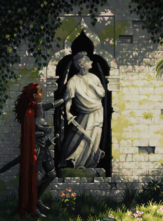
A knight and friends.
#art#digital art#original character#character design#2d animation#animation#oc#animated gif#cartoon#tutorial#art tutorial#animation tutorial#how to#knight#medieval#steed#horse#bird#pet#quest#adventure#dnd#d&d#fantasy#king arthur#arthurian#derp#derpy#equestrian#armor
591 notes
·
View notes
Text
Process of last night's drawing! I also posted a more in-depth guide for it on Patreon for those interested.
1K notes
·
View notes
Text
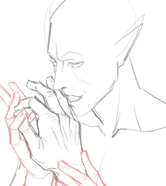
("Sonic") Hands Study
I get asked a lot how I draw hands, and particularly how I draw hands in the "Sonic" style. Let me preface by saying I am mostly self-taught, so please do your research and study what techniques work best for you. The following demonstration is what I personally use to help me draw hands in general and–more specifically–how I draw “Sonic” hands. This is less of a tutorial and more of a series of observations.
*And remember, there are always exceptions to the rules!*
I personally believe before you can go about stylizing hands, you have to understand how to draw hands in the first place. Afterall, I think you have to know the rules before you can best bend/break them. Think about super stylized hands in animation like the characters from Atlantis or Hercules. Even though these hands are unlike what we see in real life, they still look and feel ‘natural’ because the artists understand how hands function and are able to bend the rules while still demonstrating proper anatomy.
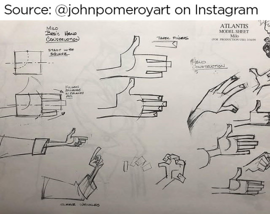
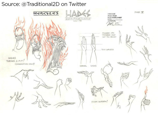
Sources: [x] [x]
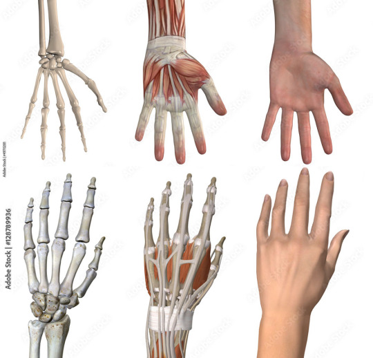
I highly recommend studying the anatomy of a hand. It’s educational and fascinating! There are plenty of free resources online!
I understand many people find hands intimidating to draw, but the best way to learn how to draw anything is by breaking it down into shapes. Everything is made up of shapes.


3 is the magic number
In simple terms, our hands can be seen in patterns of 3. Your palm can be broken into 3 segments that can move semi-independently. Your fingers are composed of 3 segments each (proximal, middle, distal). There are 3 phalangeal joints per finger. The average shape a person’s fingertips make when aligned is a triangle (a 3-sided shape), with the middle finger being the highest most point of the triangle and the other fingers cascading down (there are exceptions to this rule). Keeping the number 3 in mind will help you remember how hands/fingers articulate.
Everything is connected
Even though elements of your hand can move somewhat independently, every movement influences the other segments of the hand. Notice when you put one finger down how (most likely) at least one other finger moves slightly? Or notice how you can only do certain gestures with the assistance of your other fingers or sections of your palm? Keeping in mind how segments of the hand affect the others will help make your drawings feel more organic and less stiff.

I usually start with the palm (or back of the hand) first and that determines where everything else falls into place.

Once you grasp how hands work, that’s when I believe you can determine how stylized you want to get. There is a very large range of drawings hands from super realistic to very simplistic.

If you’re wanting to emulate a certain style, you have to study it and learn how it works.
"Sonic" hands
As far as Sonic hands go, it depends on which version you’re best hoping to emulate. Notice how the styles vary even throughout the franchise?
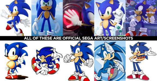
In the 3D video games, Sonic characters tend to have what I classify as more ‘cartoon-y’ hands while in illustrated media, it often leans more towards realism. (Note I said ‘leans towards,’ not full realism). How and why is that?
Let’s break it down into shapes again, Sonic Style! Pt 1
In many of the 3D rendered media, the characters’ fingers are made of more round shapes. The models also don’t conform to realistic proportions. The tips of the fingers are usually larger than the segments closer to the palms (the middle and proximal phalanges), and this helps to deviate them from a more realistic look. Speaking of proportions, the hands overall tend to be disproportionately larger than the rest of the characters’ bodies. This also makes it feel more like a cartoon, even without resorting to a super simplified, 3-fingered hand like Mickey Mouse or Bob Belcher.

Breaking down shapes, Sonic Style! pt 2
Illustrated samples vary depending on the artist/studio, but I’ve noticed that in general, illustrated Sonic characters’ hands tend to have more square/rectangular shapes. The phalanx proportions often resemble what we see in real life, with the fingertips tapering down in size compared to the segments closest to the palm. The overall size of the hands in proportion to the body are still larger than that of real humans, but they tend to be closer in proportion compared to their 3D counterparts. This is why in illustrations, the characters are more capable of crossing their arms, interlacing their fingers, or making other natural hand gestures.

Also, notice in these examples, there’s more detail to the hands than what you’d find on a Looney Tunes character? There are often folds in the material of the gloves, some knuckle definition present, more natural bends to the fingers. However, the hands are almost never as detailed as that of say, a Dragon Ball character where you’re seeing muscle tendons, veins, definition of each finger segment, finger nails, etc.

Sources: Dragon Ball Z, The Looney Tunes Show
MY STYLE
With all that in mind, I happen to find the sweet spot for the Sonic character style right in this range:

Everyone has their own preferences and it’s up to you to decide what you like best, but this is what I prefer.
MY STYLE - Cont’d
I use a blend of the two previous Sonic styles I mentioned, Cartoon-Round + SemiRealistic-Square. I like to go with a more “Squoval” shape (rounded squares) to the fingers. I try to keep the fingers in a naturally proportionate scale with the ends tapering down in size, but the overall size of the hands are still bigger than what you’d see in real life. I like to add a bit more detail when warranted, but I personally rarely resort to definition in the tendons/veins or complex wrinkles in the bends of the fingers (unless it suits a specific character or emotion).

Like I said, this is less of a tutorial and more a series of observations. But perhaps looking at hands in the way that I do might help you with your own drawings! You should absolutely do your own studies to find what works best for you. But I hope you found this helpful in some way!
#study#art study#hands#drawing hands#cartoons#sonic#reference#long post#advice#tutorial#sth#sonic the hedgehog#sonic trash
402 notes
·
View notes