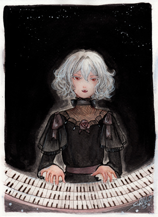
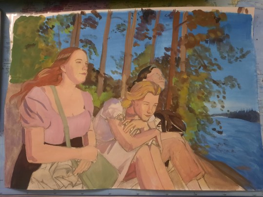
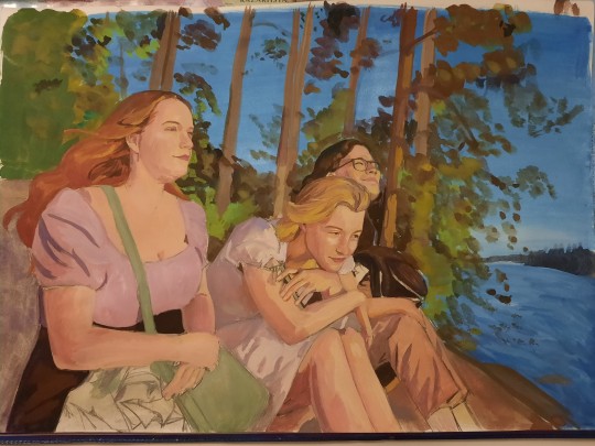
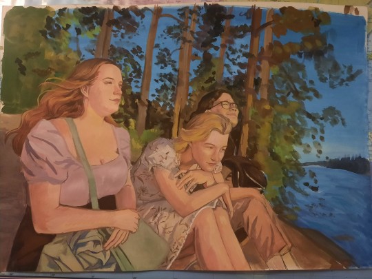
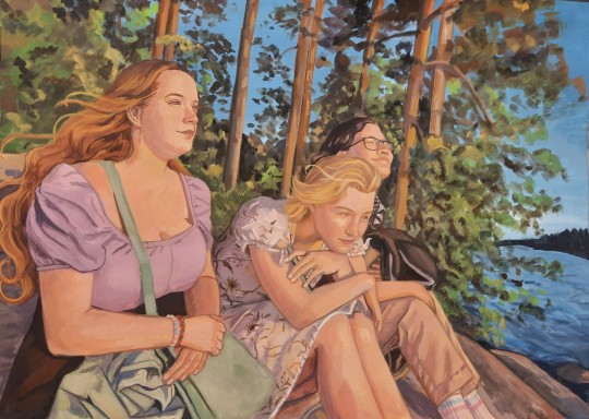
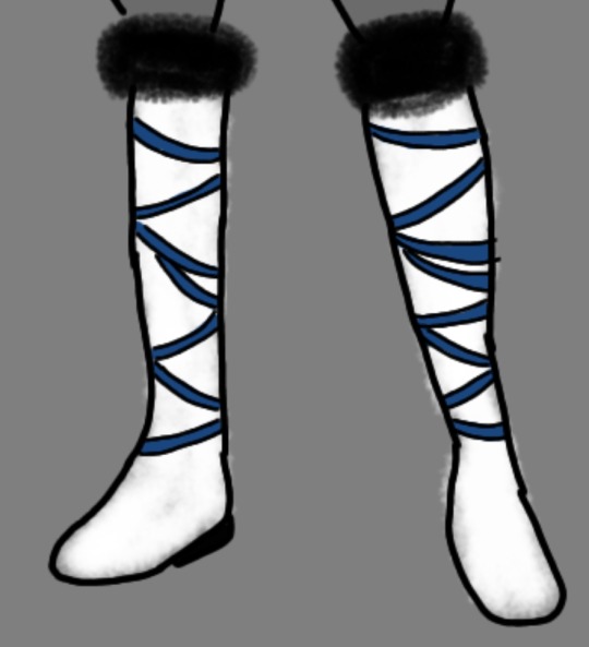
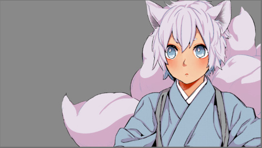
#i wanted to try using a watercolour brush for the lineart
Text
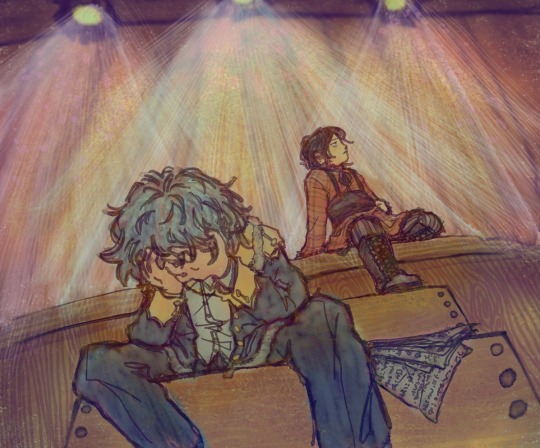
I know for a fact they both can’t act for shit and that’s exactly why I want them on stage with the lead roles
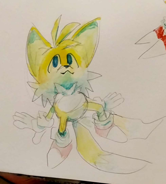
I’m so fucking tired bro, I forgot about drawing the script at the end and it just looked like Carmelo was suffering for no reason (which, with Tobias around, fair) so I had to do that whole mess of colours and filters AGAIN just for that piece of paper
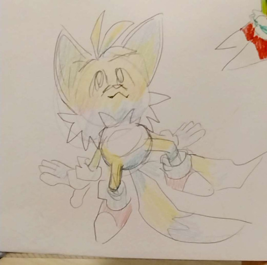
#ghost eyes#ghost eyes webtoon#I wanted Tobias to look nervous as well#so I had him do that thing where he grabs his stomach when he’s nervous#but he looked weird#so I had him hold himself up with one arm#and now it doesn’t really look like what I was trying to do#but fuck it#also#i wanted to try using a watercolour brush for the lineart#bc I thought when other artists did it it was fire#and let me tell you#it was torture#does it look good? idk#you decide that
103 notes
·
View notes
Text


Love drawing the loser4loser boyfriends from the silly skateboarding anime <3
(Langa wearing Reki's headband will always make me weak)
#i did this mainly because a) I wanted to draw Langa wearing Reki's headband#and b) I wanted to try out this brown brush pen i got (i used it for the lineart on reki)#and c) I wanna try and do more watercolour because it doesn't tire me out as much as coloured pencil does#also i know langa doesn't blush a lot in canon but please he is so pale he would blush FURIOUSLY#sk8#sk8 the infinity#renga#reki kyan#langa hasegawa#reki x langa#sk8 fanart#hasegawa langa#kyan reki#my art#seb watches sk8#i redrew langa from scratch no less than FOUR TIMES but it was worth it
60 notes
·
View notes
Text
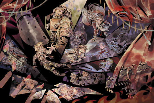
"Lament! Terror! Despair! I shall kindly teach them all to you! And in your final moment, I... shall kill you by my own hand!!"
pandora hearts print for anime north this weekend 🥀🖤🤍
I also put this up on my inprnt! there's a sitewide sale for 40% off right now 🌟
For this drawing, I really wanted to emphasize the gothic and chaotic, convoluted nature of the series. Pandora Hearts has become a lot of things to me, as someone who's read it since I was like, 14 years old. but I eventually found the perfect words to sum up the series - a cross between a Shakespearean tragedy and a Grimm fairy tale.
The ink brush + watercolour brushes I used turned out so well together!! I wanted the style to be kind of a nod to like the manga cover art you'd see from the late 90s to 2000s, kind of like Mochizuki's early approach to traditional art.
A lighter approach to both the lineart + coloring also helped me not strain my arm too much - besides work, I stopped doing full illustrations due to the amount of work being heavy on my arm/shoulder T__T. my last full illustrations were the TGAA/DGS zine + WHA zine pieces back in Dec-Jan, but my heart really lies in illustrations more than anything and I definitely want to get back into it!! (as long as my physical health allows it!!)
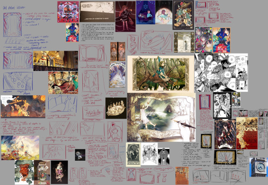
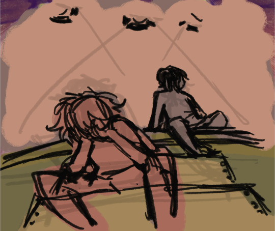
anyways, above is the thumbnail/inspiration board for this drawing! I also did some quick chickenscratch studies of others' drawings to help me get a sense of their composition. I started on the top left and then made a sort of meandering curve through... definitely went through a lot of ideas for this one. If I explained the intended symbolism.. I would be here.. all day..............
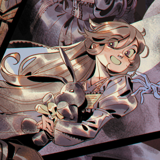
the candles were definitely first inspired by an animation of a lighter I did during art skool... and then I did this AA Dahlia animated illust... and then this OC charm (below) I did in 2022...? maybe I should draw fire more often. it's like, the way that fire looks in animated keyframes that I really like drawing out, and I guess I kinda really enjoyed translating that into a non moving visual medium??
This drawing simultaneously took SO long but I also sped through it?? I had to like... not dwell too long on certain parts... like for example I think some individual character compositions really could be a lot stronger... because I knew this would be a beast of a drawing, I didn't want to spend an unnecessary amount of time focusing on details when I should be looking at the big picture. and I know that's a bad habit of mine!! I'm trying to unlearn my perfectionism!!
thanks for reading if you got this far, hope ya enjoy it!! and I hope I'll keep drawing Pandora Hearts in the future (clearly I haven't stopped since high school omg) and I hope to draw some more Vanitas someday beyond just chibis!
#my art#pandora hearts#oz vessalius#alice (pandora hearts)#gilbert nightray#elliot nightray#leo baskerville#vincent nightray#ada vessalius#oscar vessalius#oswald baskerville#lacie baskerville#will of the abyss#echo (pandora hearts)#alice baskerville#sharon rainsworth#anime north 2023#i think i doomed myself with this post on twitter bc i forgot you cant have words like “kill”#well. die algorithm die you miserable sack of potatoes 😭#edit July 2 2023: this post was really bothering me and i think it was hard to see the details on a horizontal composition#so i added a crop of alice to hopefully spice up the visual interest
1K notes
·
View notes
Note
hi!!!! i was just wondering if you have/could do a tutorial on how you colour? particularly in reference to this post: https://www.tumblr.com/hoofpeet/753827196800499712?source=share
the rendering is just SO good, i love how it looks like watercolour and coloured pencils!!!!! i was also trying to mimic your lineart - it looks like a mix of a multiply blending layer and recolouring the lineart depending on the colour underneath? but i'm not quite sure.
anyway no worries if you're busy/don't want to, i just wanted to ask just in case. your art is so pretty!!!!<333
Here's a little timelapse I recorded for the second part actually if that helps ! Once again it's mostly just gouache brushes used to blend everything
118 notes
·
View notes
Text
"Noble d'Apchier"
A little watercolor painting of Chloe,with the Zorn palette! I found out about this palette a while ago and I really wanted to try it out! (More on that below )
Chloe's hair is something I adore, it's gotta be one of my absolute favourite character designs ever,I love how swirly and fluffy it is,very fun to draw. I've drawn her normally before,I wanted to do one with her vampire eyes and fangs too. I decided to try to draw a white fuzzy rim around the foreground against the plain background,for a change,like in some of the VnC panels.
The Zorn palette,or Apelles Palette was a colour scheme used by Anders Zorn in the late Victorian/Early Edwardian era. It ,or something similar,might have been used by artists of old civilizations too, because it avoids the use of blue and green entirely: which would eliminate the need for rare pigments . It's essentially a colour mixing challenge,to draw the entire paintings with 4 pigments,2 basic colours: Ochre yellow, Vermillion,and Black and white,which can be mixed into different shades. It can be an excellent exercise and means for portrait painting
Modern artists use red instead of vermillion,but the essence is the same. So that's what I did too. I considered using vermillion,but I realised that it would introduce a lot of yellow tint, making the picture very warm. Which is usually something I prefer honestly,but not what I was going for here. Also,I need to consider the fact that I'm a watercolour artist,which is very different from the original intended palette. Zorn used oil paints,but other artists use it fine for gouache and acrylic too, however,that too is different from watercolor, because instead of mixing with white, I'll be diluting with water,which changes the composition of the palette considerably. So I went with these supplies: ochre yellow and red watercolor pencils (for me, basically watercolor pigments,I don't use them to draw,I grind and dissolve them in water),white and black watercolor tubes,and white ink. In addition: lineart with sepia,grey and black brush pens,which are well within the bounds of the palette
To be honest,I ended up not using the white paint tube at all,water makes more sense to me. I didn't use anything else though,and stuck with the original materials.And the results:
Does it work? Hell yeah. It's not perfect,but I'm happy with how she turned out
Was it restricting? That's kind of the point,to paint with some limitations
Was it hard? Honestly? No. Not at all. It's definitely very different from what I'm used to,I use a lot of colours both as is and mixed,but this was surprisingly easy. Perhaps because of my subject,which didn't have much colour to begin with
Do I recommend it? If you want a small challenge,or to experiment or practice colour mixing,definitely
Will I do it again ? Absolutely. I feel like I haven't utilised much of the potential of this palette. I ended up using mainly red and black, hardly any yellow at all. So I'd like to do something more colourful with this palette, perhaps a sunny painting of a gingerhead girl with flowers,and for this I'll probably use vermillion,not red
Anyways, that's all! If you read all this,thank you for your time!!
#chloe d'apchier#the case study of vanitas#vanitas no carte#VnC#my art#traditional art#zorn palette#vnc fanart#vanitas no shuki#jun mochizuki#case study of vanitas
284 notes
·
View notes
Text
How to give good feedback on art (from an artist)
I often see people talk about how they want to leave good comments on art, but don’t know how/don’t know what to say. As an artist, here’s what I often look for to have something to say to other people!
The composition of the art – how different elements of the piece guide your eye, how certain parts are brighter against darker backdrop/darker against a bright backdrop. What catches your attention? How have they put the piece together to make this happen?
The lighting/shading – how have they rendered the piece? Do you like how the lighting is bright, harsh lines, or how it’s gently blended in? Do the shadows add extra depth that makes the whole piece look more 3D? Did they use funky, unconventional colours to shade?
The lineart – is it smooth? Sketchy? Are the lines thick or thin? Do they use lines at all? Are they in a colour other than black? How does it add to the piece? Do they just outline a piece, or add texture with lineart as well?
The colours – have they used a pallet of complimentary colours? Do they remind you of something specific – perhaps to the fandom, or to a season, an aesthetic, etc? Do they only use one colour? Do they use unconventional colours? Do they have one pop of contrasting colours against a monochrome background?
The anatomy – do they stick to exact proportions? Do they lean towards a more cartoon sizing? Is it like Powerpuff Girls, or like Tim Burton? 90s anime, or modern day anime? Do they make things very angular, or really smooth? What about it do you like specifically?
The texture – in the frame of digital art especially, have they used a specific brush to create a certain effect? Do you like how sketchy it all looks, or how they’ve blended the colours together? Does it look like watercolours bleeding, or a stamp/print made over the entire piece? Is it all rough, or super smooth?
The details – talk about how you love the tiny pattern on a blanket, or the multiple earrings in the characters ear. Talk about how you like how they’ve done the hair, or the little glint of light against a ring. Talk about the celtic patterns in the body, or the crooked teeth in their smile. Little things that jump out to you.
How it makes you feel – anything at all, but try to explain what in the piece evokes it strongest. Are you hit with isolation by the lonely figure in a wind-swept hill? Or joy, does that bright smile make your heart swell? Try and pick something out and babble about that.
Any meaning you can pick out – a little more tricky and often quite personal, but if you can pick something out that you think you can interpret, talk about it! I don’t think people ever get offended, even if you’re wrong – it’s interesting to see how other peoples brains work, and what they take away from something you’ve made.
Anything that stands out to you as a signature of Their Art – typically for artists you’ve followed for a long time – when you look at a piece, do you think ‘oh, this is by X’. How do you know? Is it how they draw the mouths? How they shade? The anatomy? The details? The colours? The composition? The expressions? Tell them!
I try to mix and match a few of these, focusing on things specific to the piece. Talking in depth about a piece helps an artist to know you haven’t just glanced it over and gone ‘oo cool!’ and moved on. If you want Tumblr to continue having a thriving art community, it’s beneficial to engage in and spread art around, as well as letting the artist know their work was seen and appreciated. They put the work out there for you to see for free! What can take you a few minutes of your day can make their entire week. Go support your artist friends!
#art#artist#artist on tumblr#feedback#art feedback#digital art#original art#traditional art#tumblr artist#tumblr advice#advice#yeah okay that's enough now I think#this isn't me saying 'you have to tell these things to artist every time'#god knows sometimes I see a piece and just reblog it cause I think it's cool but don't have the energy to give proper feedback on it#it's more a guide in case you WANT to do that but don't know how or don't know what's effective yknow#also as a disclaimer you really. Don't have to do this to me at all. I don't want to make ti seem like I'm annoyed people don't do that#I'm not! I'm not. Don't worry. thumbs up for you#also massive one - don't??? critique??? Pieces???? Unless specifically asked to????#I have an artist friend and we share our sketches and doodles and pieces together and we tend to just froth over them#sometimes we might go 'oh this looks a little wonky?' or ask for specific feedback but like. even with both of us doing art. we don't just.#insert out critiques into pieces. it's rude. it saps motivation. don't do that innit
131 notes
·
View notes
Note
Hello!! Your art is v cool and i was wondering what program you use and also what brush for the lineart? Thanks :D
(So sorry I'm late there was soooo much homework-)
Hiii thank you for the nice words! I had to dig a bit with brushes because they're both downloaded from Clip Studio Paint assets. But I got them!
First up is DrawingPen
Got it because the description said it was like a drawing pen, and I wanted something that was like the marker pens I used traditionally at the time. It's a neat brush, solid, very even strokes which I like a lot, and I do most of my art with this one.

The next one is fairly new to me, recomendation from a friend, these two brushes called Salmon Brushes.
Both slightly transluscent, one more than the other, similar to watercolours but more oily, and colours don't blend in fully if overlaid which is cool. My friend uses them for painting (follow her at chizz_dudlz on Instagram if you wanna see what I mean with awesome painting art) but I use it for sketch and sometimes for lineart because it feels very smooth to use them, for some reason. The lines are more modulated, unlike DrawingPen which is very even.

(You can't see it very well cuz these lines are thin overall but the line width differs more than the first piece because I used Salmon Brushes here)
Overall I pick my brushes more than anything on feel! Sometimes I've tried cool brushes other artists recommend but they felt wrong, so it's just a matter of trying things out and seeing what you like or gives you the result you want :)
9 notes
·
View notes
Note
drop ur brush presets?? 🤞🤞🤞🤞
hiii! i use soooo many brushes on each of my drawings, if there’s ever any brushes on specific drawings you want feel free to comment or msg(?) me since i have so many and i don’t wanna be giving you the wrong things😭😭
And i don’t rly wanna be overloading my page w screenshots of presets lolll
i only use procreate so i’m sorry if this is absolutely no help to you :/
This is just a little overview of the type of brushes i use 🙏🙏
These are the ones i use most!
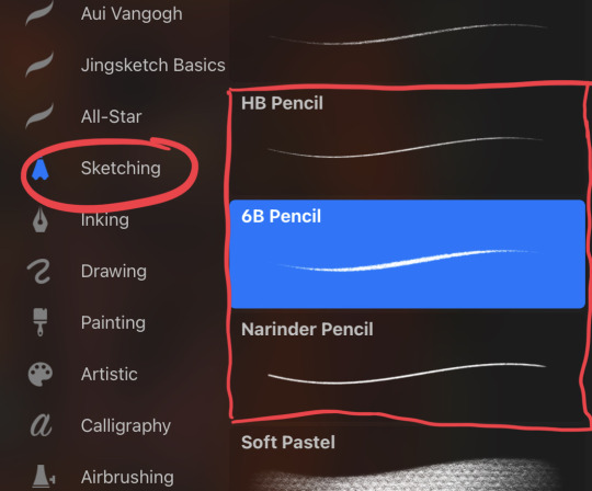
For lineart i use:
- (Comes with Procreate) Sketching: HB Pencil and 6B Pencil and sometimes Narinder Pencil
For painting i use:
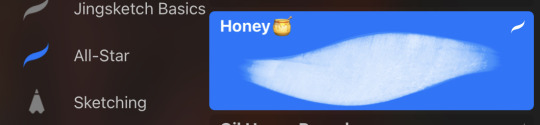
- (Preset pack called All-Star): Honey 🍯 (Made by Angrymikko)
(Unfortunately i’ve tried finding the free version i downloaded of it, but it seems to no longer be available so msg me and i’ll see if i can send you the exact presets(?) i have no idea if itll work but it’s worth a try :/ )
- (Preset pack called Travel Pencil Case): color (https://procreate.brushes.work/travel-pencil-case-procreate-brushes/) (highly recommend this pack if you have procreate!)
And then i always put a watercolour paper overlay on low opacity on top to give it the paper look!

Again,, i’m so so sorry if this isn’t exactly what you needed but i hope it helps a little 😭😭
16 notes
·
View notes
Note
Hey! Have you tried using watercolour pencils before? And if you have, do you have any tips for using them? I'm kind of curious as to what other people think of them, as I use them frequently when colouring a traditional sketch.
Hi! sorry for the wait on answering your ask. I do actually use watercolor pencils! The thing is though, i've always used them as final steps OVER my other watercolors and never really on their own.
So i tried a bit with them to see if i could find any tips to give you.
Truth be told i dont think theres anything here i can say that you probably dont already know given you use them more often than me
in fact if you have tips to share here feel free to!
Overall though: and i find it most important
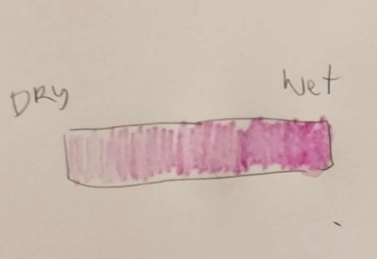
This is LIGHTLY going over the paper with my pencil, from a part that was dry to a part that was gradually wetter. The wetter your paper is the more the pigment will activate and the more easilly it will spread and paint. This means less line marks, but it also means MORE saturation
here, this one i made sure to wet all oh it before i even started going over with the pencils. he is INCREDIBLY sturated, and his colors are very even, almost a flat color look to it! had i put more effort it would look very flat, some adore this type of effect
this one though, i sketched it very lightly with some colors to use them as underpaint
and then i went over it with a wet brush to even out the pencil marks, and while it was all still wet i started applying more pencil on areas that i wanted to give focus to
it's very easy to see which areas were wetter [his face.the forehead] over areas that were drier, more moist only [such as his ears] by how the paint is spread thickly and evenly
i'll often use the watercolor pencils for texture and color saturation emphasis like here

or for lineart like here

but it was fun to try using only them fully, i might try again in the future, thanks for the ask!
Oh also if you end up setting a custom theme for your blog [so that it has a page on desktop] set a link for your art tag yeah? I got really curious to see what you've painted but couldnt find them
37 notes
·
View notes
Note
Holy cow. Your art could pass off as assets in the official Pokemon games. It's incredible.
How do you do it, if I may ask? How much time and attention goes into your craft?
Aw thank you so much!!!!
Some how-I-do-it under cut ^u^
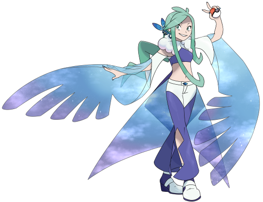
Okay so in short: I have a history in style copying bc of trying to recreate various video games sprite styles since I was in middleschool LMAO . The only issue is. Im one of those people who sketches . Fairly cleanly half the time no big line guides . UH, examples of stuff tho!!!
For CiaCM Lisia, for example, these were the guides I used! Since it's a timeskip, I proportioned her closer to the adult characters in the series! I spent a while specifically focusing on the face, as I find the face is the MOST important to get right on the style for pokemon. You can more easily get away with hands or feet being a little off if you have an accurate face! Other examples of before lineart faces V


ORAStimeskip Lucy, for example, I used these to the side as I drew for style references!
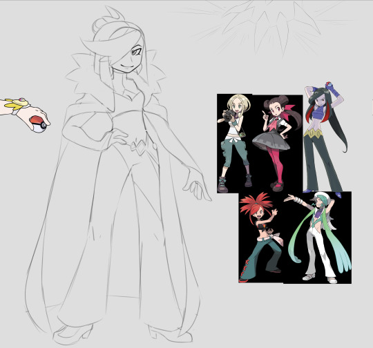
Then I move onto Lineart and flat colour!
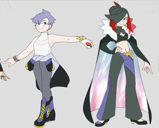
I use layers for shading overtop of the flat layers! Using the firealpaca pen and watercolour brushes. In fact.... Pretty much everything is just those two brushes unless I want some added texture!
As for how much time... It depends! Usually it takes between 2 to 4 hours depending on the complexity of the design and my familiarity with it! I think the longest I spent on any was maybe four hours for this one?
19 notes
·
View notes
Note
Ay man, I absolutely love your works!
Do you have any tips about how to make gouache work? I'm trying my best, but it just isn't arting the way i want it
But yeah I LOVE YOUR WORKS
aaAAA THANK YOU!! Thank you so much it means a lot :'>
I honestly don't know what I'm doing, figuring out gouache has been a lot of "fucking around and finding out". So I absolutely cannot speak about how one should use gouache, but what I can tell you is how I personally do things.
THE STUFF I USE
-I use the kind of gouache that you get from a tube. Apparently there are gouache that are sold in pans, but I don't know anything about those.
-Good watercolour paper is something I recommend getting, it makes painting a less of a pain.
-Because I work on a relatively small scale, I use these tiny brushes. I also have larger ones, but I like using these when painting details in faces or lineart for example.

-Paper towels for cleaning brushes but also for absorbing water/paint in case you fuck up.
SO, GOUACHE
Gouache is opaque, and the opacity depends on how much water you add. Using more water makes gouache act like watercolours, and using less water they're closer to acrylics (not sure if that if the best thing to compare it to - the point is that it is opaque, covers stuff up very well and dries fast).
With gouache you can work from dark to light, so you can add a shadow to a generally shady area and the lighten areas within it later.
HOW I PAINT STUFF SOMETIMES (this is not a tutorial lmao)
I don't always make a sketch, but when I do, I paint over it with a wash of a base colour(s), using more water. The layer(s) are trasparent enough for one to still see the pencil lines coming through. (Käärijä on the left is a better example of this). This usually helps me with mixing colours and sticking to the colour palette. Also the lines are great so I can tell what's going on.

I then add stuff until it looks about right: colours, highlights, shadows, lines, stuff, eventually the pencil lines get covered up. I use less water during these stages, and may even use colours straight from the tube. GENERALLY SPEAKING, I use slightly more water for larger areas, and less water while painting details, but that isn't really a rule or anything.
THERE WILL VERY LIKELY BE AN UGLY PHASE - that is totally normal, push through it, have a bit of faith, you'll get there.
I don't always paint like this. Sometimes I don't make a sketch, and I just layer colours until it looks right. This way has a higher risk rate for me (=nothing looks good no matter what I do and I give up), but it is fun sometimes and has yielded nice results.
SOME THOUGHTS
-Try a bunch of different stuff! See how the amound of water affects the opacity, look up tutorials from various different artists (Scott Christian Sava is a sweet man who makes short form videos on IG and YT), try painting without a sketch, etc., find out what works for you.
-A darker looking paint may dry to look light, and the other way around. So. Beware of that.
-You might dissolve layers underneath with
-Sometimes while mixing colours I add white to make it more opaque, if that makes sense? If I want to make sure that an area I'm trying to cover up doesn't peek through, I might add just a bit of white paint to the new colour.
TL;DR I GUESS
-Generally speaking I use more water in the beginning and less water later on
-There will be an ugly phase, that is normal, push through it
-Use good paper (or don't, I'm not your mom)
-Practise and experiment and try different stuff!
I hope this has been at least somewhat helpful? Again, I don't really know what I'm doing. I wish you strength, have fun with gouache and with making art in general, "hakkaa päälle" as we like to say in Finland :D
And also thank you once again for thy kind words <3
4 notes
·
View notes
Note
hi bee! what brushes do you use (are they procreate?:0) bc I love the watercolour/paper-y texture and style of ur art sm!! and I've been wanting to try a style similar to that :]] ♡ much love tyty
hi!!!!!! i do use procreate! i use the 6b pencil to sketch/do lineart, i color with the gouache brush, and shade with the spectra brush :D i also found that the mercury brush works well as an eraser but ya tysm and hope it works out for you <3
2 notes
·
View notes
Text
We haven't heard shit about Alice's husband but I designed him anyway
let me explain myself.
I don't usually do fandesigns (god knows I'm bad at drawing) but I think too much and probably shouldn't be applying our-world genetics to Teyvat. Even so, I've had the thought for a while that by the rules of modern genetics, Klee's father would need to have very pale hair and eyes for Alice's traits to be genetic, since it's semi-canon that Klee is basically a small version of her mother. So Alice's husband would have to be an albino, or something very close to that. Then I reread Alice's speech from the original Golden Apple Archipelago event, and started thinking what if Alice's family were allegories/connected to the four seasons somehow. Klee is summer, obviously, Alice is spring since she gives life and is explosively enthusiastic, also very double-sided which if you've ever seen a spring storm develop in five seconds flat you'll know what I mean with that. Albedo is autumn because he's (a.) Born in autumn for them so I don't have a choice and (b.) Sits in between warm and cold personality-wise and can easily switch between the two, sometimes he's kind sometimes he's not but he tends to lean towards the colder side by default. So that would leave Alice's husband for winter and so guess what I did? I went full fantasy mode and made him a snow spirit of some sort. Snezhnayan dad ig. It would fit ngl a multicultural family suits them.
So I grabbed a base of Genshin's tall male model (thanks to @/moinii on Hoyolab for the base, very useful) and designed him myself. Paragraph post incoming because I must explain my every action like a criminal whenever I do these

it's very much a beta design so if there's any design suggestions I'll be happy to put them in.
For reference these are his shoes since his coat covers most of them.
My colour palette:
I explained earlier that I came up with the idea for him to be a Snezhnayan snow spirit, fitting in with the winter aspect of the family's season-based theming that I came up with out of nowhere. Because of that he doesn't need a Vision (and thank god for that I don't want to draw one.) I also referenced a previous idea I had that he'd look closer to Albedo, being a sort of visual missing link between the family- as in, when all four of them are there, you can actually kind of tell that they're family.
I decided to try and look for any Slavic or Russian snow spirit mythology to see if I couldn't find a base. Surprisingly, there weren't many (probably because they had more focus on the harvest and summer seasons like most mythologies do.) The best i could find was the Mythology Wiki page for an entity known as the Zimadevushka, which from the description is an entity that uses attraction to lure people into the snow. While I wouldn't say they're the same as a Succubus, they're fairly similar in respects to their ability to shapeshift to fit someone's tastes. While Zimadevushka are usually female, there is a male version known as Zimamalchik, so that's what I based this fandesign off of. That said, I'm being tentative with this as I can't seem to find any other resources for this particular entity.
the Cicin wings were a personal choice. I wanted his back to be more interesting, and that's what I chose- despite the fact that he wouldn't nessecary need them, per se.
I found images online of 16th century Russian mens outfits and used the heavy coats as a basis for this. Although he is a Mondstadter, I wanted this to be his true form, what he looks like without any illusions. Although the original idea was more of a snowstorm spirit, I'm kinda attached to the idea of him being a Zimamalchik, since there's something romantic about an entity using love to lure others in being lured away from home by someone they themselves have fallen for.
For the brushes, I did this on Ibispaint, and while it was mostly just regular hard pen, (sizes 2.3 and 4.1 for the lineart) I used a watercolour pen for the shoes to try and convey the fact that they're furry shoes, and for the rings at the top of his shoes and the ends of his sleeves I used a crayon brush. The snowflakes I just used one of the stamp brushes, because I'm not a coward and take what I can get. His hair was modeled off my siblings' (shoutout Leo) because I wanted him to have fluffy hair. I didn't shade except for the highlights n stuff in the eyes because I wanted this to just be his base colours. And also because it took a day just to do the draft sketch so I wasn't gonna fuck around with the lineart and colour. The glasses were... Just because. I think he's cute with glasses. He's not jacked, just wearing a thick coat 😂
But yeah, my image of Alice's husband has been shaped by years of headcanons to try and make up for the empty space he's left in canon. To me he's a really nice guy who's a mediator. He was probably good friends with Ivanovna. My #1 headcanon for him is that he has more of a connection to Albedo than Alice does, but less so to Klee (although he'd gladly die for them both anyway.) While he's still sentimental about Snezhnaya, he's happy living in Mondstadt, especially since there he can get out of being drafted into the Fatui. While Alice is more connected to humanity, he's less so, which helps since he's taken up the mantle of a literal father figure for Albedo. 🤍 I realise he's not a talked about character at all but if anyone does have heacanons (or suggestions for design edits lmao) do tell!!! I can't be the only one thinking about this man can i
#genshin#fan design#alice genshin impact#Alice's husband#Hexenfam#hexenzirkel hcs#Does it count as Hexenzirkel headcanons if he's married in#I'm going to say yes
1 note
·
View note
Note
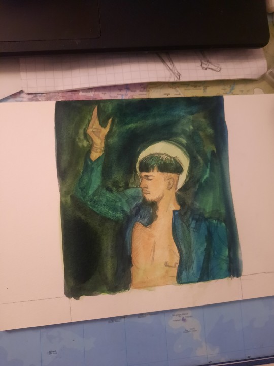
You wanted to know about my inking materials? I use the Speedball quill pen nib holders with #102 and #107 nibs -- they actually come in a set with both holders and a variety of nibs! For ink I use Dr PH Martin Bombay black india ink, it slides off the smoothest and doesn't clog much. Windsor & Newton india ink is a good second. If you ever need to ink fill in large areas with ink, something cheaper like Speeball india ink will do.
But uuhhhh if you thought I did the colours in ink, sorry! Those were done digitally. I've only ever referred to lineart as inks so I didn't think to clarify. If I had amazing ink colour skill to bestow I would, but the best I can say is get a good natural bristle watercolour brush heh.
OHH MY GOD I DIDN'T SEE THIS TILL NOW I FORGET The messaging thing is a thing!!! On Tumblr!!!! Thank you so so much for clarifying this, I was wracking my brain over that piece--I think maybe I was a bit stonked when I read your description lmfao I definitely misread it.
Thank you so, so much for the insight on the *actual* ink part of the piece, though. I've been meaning to try my hand at traditional inks again and while Sharpies are fun...... I feel limited at this point.
And Watercolours!! That's home turf!! Thank you again!!!
2 notes
·
View notes
Note
Hi raka! I have been a fan of your art for quite some time and everytime it ends up on my dashboard I 'm caught in awe! You really, really, really, good! I don't know if this is an annoying question, but I wanted to ask what brush do you use to sketch\lineart your art because I struggle to fin one that I like... Anyway your art always inspire me to keep trying and try harder! Cheers!
Hei there thank you!
Hummmm it's not an annoying question just an hard one.
The bulk of my art here on Tumblr was made in Paint Tool Sai, but about 3 years ago I switched to Clip Studio Paint. 2 years ago I also switched tablet, different brand and type, which made all my former tools react very differently!
And this partially replies to your question: it's very hard to get the same effect of another artist because even with the same tools, hardware and its settings can make the difference.
I use default tools, mostly, for the simple reason that if I reset or favour another tool for a while it's easier to find them. For sketching i find that CSP watercolour tool is great. For Mythics (job) i use CSP's GPen and Textured Pen.
Unfortunately you have to struggle to find what suits you. I am most at ease with those most similar to traditional tools, even if sometimes the best pencil-like one can be... something named watercolor.
So...good luck i guess? Try to have fun!
5 notes
·
View notes
Photo
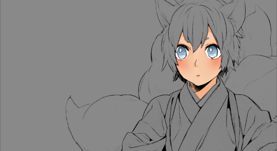
As has been requested by people here is a tutorial of how I colour mangas!!
A quick disclaimer that I am really bad at explaining things so I’m sorry if anything is confusing. Also just because I colour this way doesn’t mean it’s the right way to colour and do things. As long as you’re having fun then however you colour is the right way!! This is just my process and style of colouring.
Tutorial under the cut:
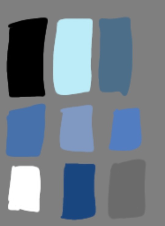
Going to start with what programs and brushes I use.
So I do all of my beginning editing and finishing editing in photoshop. Then I do the actual colouring in Firealpaca.
Considering this is a tutorial for my basic colouring style I’ll only be using four brushes/tools: a pen brush whilst cleaning line art, a watercolour brush for all of my main colouring (any kind of soft easily blendable brush will work), a textured watercolour brush for blush (any kind of easily blendable textured brush will work) and the eraser tool.
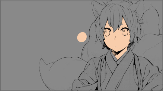
Step 1) I size my chosen panels to the dimensions I have picked in photoshop.

Step 2) Using the levels tool I fix the black to white levels of the panel and try to get rid of as much grey as I can without compromising the lineart

Step 3) Then I open the panel in Firealpaca go to ‘Filter’ and select ‘Extracting Lines’ so that I only have the line art to colour under (I use a mid-tone grey background to see colours better)

Step 4) Using the eraser and pen brush I clean up the panel getting rid of what I don’t want and cleaning up/redrawing any lines that need it

Step 5) I always colour (using the watercolour brush) the skin first and start with a base
Step 6) Taking a colour that is darker and warmer then the base I shade the skin around areas such as the eyes, nose, lips, neck and anywhere else shadow would be

Step 7) Using a textured watercolour brush I add blush which is often saturated red, pink or orange
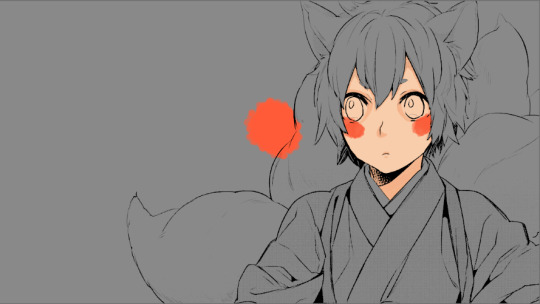
Step 8) Still using the same brush I select the base skin colour and bled the blush out

Step 9) Going back to the watercolour brush I use a highly saturated red, pink or orange to colour the lips and around the eyes

Step 10) Then add whites on eyes and anything else that needs it

Step 11) When I colour eyes I essentially just create a gradient on the eye beginning with a base colour

Step 12) Then add darker tones to the top of the iris
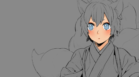
Step 11) And lighter tones to the bottoms

Step 12) Finally I add white highlights
Step 13) After this I colour in the hair (and in this case Ginji’s tails too)

Step 14) And then the clothes or any extra elements in the panel

Step 15) Following this will be shading. I create a new layer which I clip to my colouring, I change the blending to multiply and the opacity to 24%
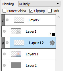
Step 16) Then using a purple colour I shade the entire colouring

Step 17) By creating a clipping mask above the line art I colour in certain sections of it. Such as using reds on the skin lines
Step 18) Then I just add my background colour and some doodles
Step 19) I make final colour adjustments in photoshop. This can be anything from fixing contrast, increasing the saturation of colours or even changing the hues of some of them. It’s different for every colouring
And then there it is!! A manga colouring!!
110 notes
·
View notes
Last Seen Blogs
milakunis22
Mila Kunis

dulcedemani24
Dulce de maní 🍋

ourladyofsorrrows
Untitled

marctriesagain-blog
Here we go again - another attempt at weight loss
art-strike
art is a weapon lets use it!!