#if they want a sidebar they should use ICONS. much less visual clutter.
Text
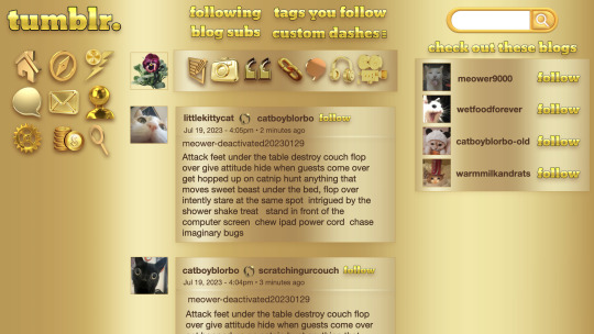
graphic design is my passion and seeing staff's newest expression of their passion for graphic design inspired me to make a dash layout of my own! :)
#text#if they want a sidebar they should use ICONS. much less visual clutter.#mine#'why is op on tumblr from the cat world' don't worry about that
543 notes
·
View notes
Text
New Desktop Dash, No Bueno
Okay so, new dash layout on desktop.
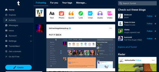
As seems to be a common reaction: not a fan.
Let's talk about some of the issues:
1. Really visually cluttered
The new sidebar crowds out the dashboard content and the bright blue popup notifications (now at the side AND top) and create-post bar pull your eyes in different directions. There is no space for the eye to rest on anymore - it's all noise. The end result is that everything flattens - there's no focal point anymore.
It's also pretty overwhelming - even for someone like me - so I can't imagine it would be very user-friendly to someone who was photosensitive or struggled with visual overload (especially when paired with the high-contrast 'true blue' default site palette and animated icons for the changes-on-tumblr/staff-picks/trending buttons).
2. The activity pop-up now covers dashboard content
This is really bad from a usability standpoint. In the old layout the activity pop-up used to drop down over the recommended blogs sidebar. Now it actively gets in the way of looking at core content. The dash is why we are here, burying it like this is baffling.
The search bar now drops down over the recommended blogs banner instead, but where the old design had non-critical space on each side of the dashboard to visually allow both features to pop in, this new layout is way worse for efficiency. And for what? Having a rarely-used former drop-down menu now permanently active? The old banner with quick-links for the key use-features (notes, messages, askbox) made much more design sense.
It also means that the activity pop-up gets now completely covered by the blog pop-up that opens when you click the notification, so double demerit there. 0/10.
3. It's harder to navigate to the activity page, and the new page-stretch means you can't see new notes without scrolling down
That first bit is kind of a nitpick but cramming the 'See everything' link down at the bottom of a browser window isn't a great navigation choice. (Again, the visual signifiers and eye-direction in this new design are incredibly poor.)
That the main activity page now requires you to scroll to even see the top note due to the new display ratio is really egregious. It makes another key site feature just slightly less convenient and accessible in a very irritating way. Bad choice.
4. The new ratio pushes the Radar and Main Sponsored slot completely off-screen
This one is directed the tumblr staff: that's also a bad choice, guys. That's your main ad-slot for people loading into Tumblr so hiding it is going to hurt both your ad-impressions and your ability to promote the ad-free option. The new layout ratio also means that the in-dash ads are going to be a lot more invasively screen-filling - and let's be real most users will either add-block or leave before purchasing ad-free. I have no idea what the new layout is trying to achieve but if ad optimisation is the goal then this ain't it, chief.
To be honest I cannot comprehend the rationale for this change. I guess it's visually a bit more like Twitter... but that site is currently being demolished from the inside by poor management decisions so maybe it's not the best aesthetic to be aping.
Well then, what do?
Okay so, new dash bad. And so, in true Tumblr spirit: we complain. However, to get results we must deploy the art of kvetching productively.
If you want the old dash back (or at least, a better new-dash design that corrects some of these big weaknesses) what you should do is head over to https://www.tumblr.com/support and lodge a feedback ticket pointing out the problems. The more users who do that, the more likely you are to see an effective response.
Remember, tagging @staff and @support in posts won't fix this. There's no guarantee they'll see it among the notes barrage.
Also: please don't be rude or abusive when you lodge tickets. Whoever is manning those blogs and inboxes probably isn't the person who forced through this change. Save an intern, be polite.

Go forth in disgruntlement to keep this hellhole a hellhome.
#tumblr#tumblr problems#new dashboard#yes it's bad#but there is a way#I've already lodged tickets about it
1K notes
·
View notes
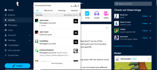
Note
Hi! You’d mentioned you hadn’t heard anything about accessibility issues with the new layout, so as someone who does actually enjoy the new layout but only reverts it because I can’t adjust it code-wise the way I’d like to make it fully accessible for my needs, here’s a few ways it’s not accessible!
OVERSTIMULATION: Compared to the previous layout, the dashboard feels very cluttered. Everything is squished together in the middle (and I’m saying this as someone running on a 1920x1080 resolution, so not a small screen). I personally had to Stylus in some extra spacing between the dashboard and the two sidebars, for example, and make the left labels slightly smaller text-wise and icon-wise so that they felt a little more spaced out. It just opened up the dashboard a bit more and made it a little bit less overwhelming.
TOO MUCH CONTENT: In addition to the above, there’s just a lot going on on the new dashboard, at least compared to the old one. Previously, with the old icon labels there wasn’t a lot of visual stimulation from those, whereas the new layout adds that. When you add in the mix of the recommended blogs, the What’s New carousel, Tumblr Live, and necessities that I use regularly from other addons (ex. xKit Tag Tracking+) it becomes A LOT. I actually had to hide a bunch of icons that I don’t use (ex. Live, Domains, TumblrMart, etc) in order to declutter the shit out of the dashboard so it wasn’t so horribly overwhelmed.
DRAFTS AND QUEUE NOT EASILY ACCESSIBLE: This I think is a big one. We as the RPC are attached at the hip to our drafts and queue, are we not?! When they had the account subnav in the left bar, I LOVED how accessible that felt; I loved how it just felt more easily accessible because I could keep it open and access it from any page in the left bar. But… then they removed it. This is probably my biggest gripe, because I just want the links to at least my drafts, queue, and blog settings back! Personally, I think in order to combat the redundancy, they should have removed the jump that was in the right menu when you’d gone to your blog’s view, not remove it from the left menu. That, or find a way to better organize/condense that blog jump so it’s not so crazy.
Personally, I think the first two are really problematic for those on the neurodivergent spectrum (which includes myself), and as someone who was in school for UI design and works in a field that involves customer feedback (I work in market research), I do feel that Tumblr’s method of sourcing feedback from users is incredibly poor. Whether that’s a monetary issue or not, I’m not sure. Thus far, it feels like support tickets go unanswered, and that Staff seems to pretty heavily handwave it as “not a big deal��� rather than finding proper ways to source community feedback. That in general is the crux of the issue, I think, and forcing users to rely on external codes to retain their accessibility is a poor method to go about things.
Hey! Thanks for this, this is a good explanation. I am not entirely sure I agree on all of these points but I appreciate the input.
I do agree that the layout feels a bit too squished -- the sidebars should really be all the way to the side rather than right up next to the dash. I'm not really sure I get the "too much content" one, though. All the same content is on the dash as before, it's just arranged differently. In fact, I actually prefer that the main links now actually say what they are instead of just the icons, and I know I'm not alone in that. It seems to be one of those things that some people find better, some people find worse, and there is no one-size-fits-all solution.
I absolutely agree on drafts and queue being so hard to get to -- I noticed that the other day. It takes quite a few clicks to get to them when they were previously available right from the main page.
And the biggest agree on Tumblr's feedback sourcing being terrible. I really don't begrudge staff for this -- they have to appease the upper management who are pushing changes without really understanding things, all the while dealing with a userbase who will flip the absolute fuck out over literally any change to the site. And staff has generally been much more communicative about changes than I've ever experienced. But it would be nice to feel like feedback is actually going somewhere other than the void.
Anyway, the ideal would be having a simplified layout that you could opt into via settings, but I doubt that'll ever happen.
2 notes
·
View notes
Text
Minimalism in Web Design: Tips to Embrace the Less is More Approach
Minimalism has become one of the most popular and influential web design styles in recent years. Also referred to as minimalist design, it is characterised by clean layouts, plenty of white space, simple navigation, and ample breathing room between page elements.

But minimalist web design is not just about aesthetics and visual appeal. Embracing minimalism has many practical benefits for both the site creator and the end user. When properly executed, it can vastly improve user experience while also ensuring easy site maintenance and updates in the future.
In this blog post, we explore some key tips to adopt a minimalist approach for your next Web Design in Melbourne. Keep reading to learn how you can leverage minimalism, even with limited design skills or budget.
Focus on Clarity and Effective Communication
Minimalist web pages prioritise clarity in communication above everything else. There are no flashy animations, cluttered menus or overlapping images to obscure the message. Every design element serves a clear communicative purpose.
That’s why you must start by defining what needs to be conveyed to visitors and plan all design choices accordingly. Determine a hierarchy that highlights the most important page elements. Then, utilise white space, size, layout, contrast and other design tools to articulate this visual hierarchy.
Direct User Attention with Strategic Visual Cues
Once site content and structure is set, direct attention smartly using some graphical elements. For example, an arresting large image, stylish fonts and complimentary accent colours can indicate what users should look at first. Or a minimalist slideshow can showcase featured content pieces.
But be extremely selective about these visual cues. Each decorative element eats up cognitive load and distracts from primary content. Use only as much graphic touches as necessary to catch the eye and then guide users efficiently to what’s important. Don’t over decorate the web design in Melbourne for ornamentation's sake.
Provide Intuitive and Seamless Navigation
Site navigation is another make-or-break area from a usability perspective. With minimal e-commerce stores or blogs, ensure each critical section is reachable within 1-3 clicks. Provide persistent, easy-to-spot main menus using chunky text or symbolic icons.
You can also try progressive disclosure to declutter - only showing secondary menus on hover or click rather than everything upfront. Breadcrumb main menus help users trace their path. Auto-hiding sidebars prevent distraction while enabling access to tools when required.
Embrace Plenty of White Space
Generous white space is easily the defining visual characteristic of minimalist web design in Melbourne. Also referred to as negative space, white space refers to the empty areas between images, blocks of text and various page constituents.
By removing needless page constituents and expanding margins, you instantly curb clutter and improve visual processing ease. Key content stands out better against negative space. There is also more room to highlight and enlarge signature graphic elements like logos.
Ensure Visual Consistency
Consistency in design systems is a prerequisite for minimalism where you only have limited elements to establish site-wide patterns. Make sure fonts, colours, layout grids and interface elements like buttons look and feel cohesive irrespective of which page users land on.
Maintaining such discipline with a style guide is worthwhile to reinforce usability intuitions. For example, if main CTAs are positioned at top right on homepage, preserve that across inner pages too instead of arbitrarily shaking things up. Adhering to an overarching aesthetic brings harmony amidst simplicity.
Choose the Right Colour Palette
Colour selection can have a major impact enhancing minimalist appeal or ruining it with garishness. As mentioned earlier, you want only a handful of colours for accents so individual hues really stand out.
Neutrals like white, black, shades of gray and tan tend to define minimalist base schemes. Then bright pops of accent colours are sprinkled in for focal points. Common accent palette choices include vibrant blues, greens, oranges, reds or pinks.
Whatever colours you ultimately select, exercise prudence. Rely more on muted earth tones over neon shades unless specifically relevant to brand identity. Too many loud colours risk clashing. The accent shades you do use should harmonise well with neutrals preserving a calm feel.
Carefully Break Rules Occasionally
Lastly, the best minimalist designers know when breaking conventions pays off. Once you get adept with the guiding principles, stay open to selectively deviating from them for strategic impact.
For instance, displaying 1 or 2 striking full-width oversized images on selective pages could dramatically underscore a specific brand quality. Or custom illustrations could metaphorically communicate value propositions like trust or innovation better than text alone. Just don’t go overboard with such departures wherever traditionalism serves best.
In Conclusion
Adapting a minimalist website design philosophy is a smart approach for both seasoned and novice designers to craft elegantly functional user experiences. Not only are such sites easier to create with smaller assets making them a cost-effective option for an Affordable Web Design Company in Melbourne, they are also simpler to manage in the long run.
With its stresses on unfussy navigation, purposeful visuals and abundant white space, minimalism ultimately places site visitors front and center letting core content mesmerisingly take spotlight. Hopefully, the tips above have inspired you to try out this contemporary web design style for your next project!
0 notes
Text
Should You Style A Site For Your Personal Enterprise?
Have you ever located yourself marveling more than a really fantastic website? From format to graphical design, there are many elements which turn an internet site from great to wonderful. This post will share with you some tips from specialists. Read on to learn all of the methods which you can use.
Keep current with information and facts related to webdesign. World wide web discussion boards are a good location to pay a visit to with this info. A Google search need to expose an abundance of very good sites which will help.
Avoid using a lot of visuals. When you will need graphics to produce a website seems nicely and functions appropriate, you don't need to have many of them, since they can clutter things. Visuals usually are not meant to be employed as mere accessories they're supposed to greater your blog information. Getting the correct quantity of images will increase your site's usability and minimize the mess.
Work with a descriptive label. Numerous website proprietors neglect to mention their internet pages, or title them one thing generic, including "Pleasant Page." Search engines like google use label explanations within their ratings, so ensure you are as descriptive as you possibly can, without going overboard. Make sure it is usable for your personal viewers and the search engines.
Regularly releasing a e-newsletter will help you to secure recurring guests. Having customers sign up for your e-zine allows you to deliver them significant upgrades about special attractions, which often could get those to always keep visiting your website. Keep track of the volume of guests who register, and place the indicator-up form in your site's sidebar. Continue to the ethical route and just send out publications to consumers who require them.
Make compelling and interesting internet content material. Even though seem is very important, information is vital to come back guests. Visitors may very well give back aimed at your website when they obtain the content material useful plus it meets their requirements.
Ensure that every one of the data files on your own website are modest in size. You require these tiny file dimensions irrespective of the total design of your web site. The sizes of the documents impact the loading time of your site. You need your blog to stress as speedy as is possible. You can still find people who will be using your website that do not have a high-pace relationship. You should try launching your website on different types of links to find out how quick it tons.
It is vital that customers can navigate any website easily. Where your back links are determines if website visitors could get close to your website. The navigational structure needs to be neat, steady, as well as simple gain access to for the users to experience a far better expertise.
Avoid using computer animated GIFs on the web site. They were preferred within the late 1990s, but modern technological innovation have substituted the purposes of cartoon GIFs which were really valuable. Computer animated GIFs are less top quality and big in submit size. Use static icons for page aspects and real video clips for complicated animation.
You need to look at your website's functionality throughout a variety of diverse internet browsers. Each system, internet browser and program changes the way your web site screens, that may create a awful customer expertise. You can do just a little on-line research to find out which internet browsers are most in-demand right now. Check out how your internet site behaves on all the major internet browsers for Personal computers and mobile phones.
Check your site periodically for damaged backlinks. You should do this well before uploading one thing for your web server. Site visitors who experience damaged links and faults is not going to continue to your blog for enough time to view your products or services. Give all of your current back links a verify just before posting in order to prevent this problem.
One of the first issues for you to do is select and arrange your website address. As soon as you've looked at a domain name which you like, you must hold it to ensure it's nonetheless there when you're willing to use it. It is astonishing the amount of other folks could have put together very similar ideas. Fantastic minds do believe as well, all things considered!
To help with making your web site much more entertaining integrate games to your site. Getting game titles on the site can make it a lot of fun to the website visitor. If your readers are not enjoying yourself on the web site, chances are they will depart and go try to find something different to perform.
For developing your own website, consider utilizing Adobe Dreamweaver. Amateurs are even able to utilize this system successfully. It is actually packed with options that allow for template creation, special features and the opportunity to preview a web site as well as analyze it prior to it goes are living.
Discover around it is possible to in regards to the many forms of web-page coding, since the web-page coding is vital to web design. If you find out about html code go ahead and make several internet pages which are form of full of the data that you might want to enhance some of the internet sites you intend on focusing on.
Usually limit your articles in early stages inside your web page design and style. You don't require a lot of items that will overpower you and confound visitors once they show up on your own web site.
You must recognize that constructing a internet site will take over you originally anticipate it will. Let's state that you think you can obtain a site done in three weeks. Nicely, when you layout it, stress your web pages, check, make your changes, and in the end complete, you could be checking out months.
If you locate oneself having to produce several similar internet pages in a subsection of your web site, use some of those web pages being a format. Rather than generating new Html code program code for every single page, duplicate the primary area of program code, tweak it in which necessary, after which save it as being a fresh submit each and every time. You can re-use a solitary "expert" list of code to churn out a essentially limitless variety of webpages.
The secrets and techniques are out, and you will now begin to build your internet site. Start Miami web design , and after that create a long list of important elements utilizing websites to be able to blend them into your own property. Be certain to never plagiarize or copy, use individuals tips being a springboard for your very own creativity.
1 note
·
View note
Text
Macos Operating System Used For

File system formats available in Disk Utility on Mac. Disk Utility on Mac supports several file system formats: Apple File System (APFS): The file system used by macOS 10.13 or later. Mac OS Extended: The file system used by macOS 10.12 or earlier. MS-DOS (FAT) and ExFAT: File systems that are compatible with Windows. Open Disk Utility for me.
17 rows May 26, 2020 If your Mac is using an earlier version of any Mac operating system, you should install the latest Apple software updates, which can include important security updates and updates for the apps installed by macOS, such as Safari, Books, Messages, Mail, Music, Calendar, and Photos.
Macos Operating System Used For Sale
Easily check which versions of mac OS, iOS, iPadOS, or watchOS are compatible with your Mac model or iDevice. Guide includes OS X 10.8.x to macOS 11.0.x. Feb 11, 2017 The 'System' category appears to be including sandboxed application data, which is stored in /Library/Containers/. I used About This Mac Storage Review Files File Browser to navigate to the folders/files using the most space and found that Docker was growing a file called Docker.qcow2 indefinitely in /Library/Containers/. Deleting the file released 30GB from 'System' while 'Documents. The macOS High Sierra is the newer version of Apple’s operating system which is still vastly used and loved by users. MacOS High Sierra was launched and put out back in 2017 WWDC. But even with the newer versions, there are still lots of users who wants to install High Sierra. It’s why there’s nothing else like a Mac. MacOS is the operating system that powers every Mac. It lets you do things you simply can’t with other computers. That’s because it’s designed specifically for the hardware it runs on — and vice versa. MacOS comes with an entire suite of beautifully designed apps. The operating system was programmed up to system 6.0 mostly in assembler and partially in Pascal and used a 24-bit addressing mode. Cooperative Multi-tasking could optionally be enabled in System 6. System 7.0 first supported 32-bit addressing. Thus allow the operating system can use more memory and more powerful programs.

macOS is the operating system that powers every Mac. It lets you do things you simply can’t with other computers. That’s because it’s designed specifically for the hardware it runs on — and vice versa. macOS comes with an entire suite of beautifully designed apps. It works hand in hand with iCloud to keep photos, documents, and other stuff up to date on all your devices. It makes your Mac work like magic with your iPhone and other Apple devices. And it’s been built from the ground up with privacy and security in mind.
Featuring all-new, dedicated apps for music, TV, and podcasts. Smart new features in the apps you use every day. And Sidecar, which lets you use iPad as a second Mac display.
Easy to Use When it’s simple to
do
everything, you can do anything.
On a Mac, everything is designed to work just the way you expect it to — from operating it with simple, intuitive gestures to having your apps automatically update themselves. Whatever you set out to do on a Mac, there’s much less to learn and that much more to accomplish.
The Finder lets you easily browse and organize the files on your Mac — and those stored in iCloud Drive. View files by icons, in a list, or with Gallery View, which helps you quickly locate a file by how it looks. Drag and drop files into folders in the sidebar. And use the Preview pane to see all of your files’ metadata, quickly create .zip files, and share using the handy Share menu.
Dark Mode adds a dramatic look to your desktop and apps that puts the focus on your content. Dynamic Desktop makes your Mac even more beautiful with time-shifting desktop pictures that match the time of day wherever you are. And Stacks keeps your desktop free of clutter by automatically organizing your files, images, documents, PDFs, and more into tidy groups.
Spotlight helps you quickly and effortlessly find what you want, like documents on your Mac, movie showtimes, and flight departure and arrival times. Just type a few keystrokes in the Spotlight search field and autocomplete immediately shows you relevant results.1
A simple two-finger swipe from the right edge of your trackpad brings up Notification Center — the same one you use on iPhone — where you can see all the alerts that have come in recently. It’s also where you’ll find your Today view, which you can customize with helpful widgets or handy information pinned from Siri searches.
Continuity All your devices.
One seamless experience.
Your Mac works with your other Apple devices in ways no other computer can. If you get a call on your iPhone, you can take it on your Mac. And when friends text you — regardless of the phone they have — you can respond from your Mac, iPad, or iPhone, whichever is closest. When you copy text or an image from one device, you can paste it into another with standard copy and paste commands. And with Sidecar, you can extend your workspace by using your iPad as a second Mac display. You can even unlock your Mac with your Apple Watch. No password typing required.
Privacy and Security We believe your data belongs to you. Period.
Everything you do with your Mac is protected by strong privacy and security features. That’s because we build data security into everything we make, right from the start.
Privacy. You trust our products with your most personal information, and we believe that you should be in complete control of it. We respect your privacy by enacting strict policies that govern how all data is handled. And when you browse the web, Safari helps prevent data companies from tracking the sites you visit.
Security. We design Mac hardware and software with advanced technologies that work together to help you run apps safely, protect your data, and keep you safe on the web. The new Find My app helps you locate a missing Mac that’s lost or stolen — even if it’s offline or sleeping. And Gatekeeper makes it safer to download and install apps from the Mac App Store and the internet.
Built in Apps Apps as powerful and elegant as your Mac. Because they’re designed for it.
With every Mac, you get a collection of powerful apps. They’re the same apps you use on your iPhone or iPad, so they’ll feel instantly familiar. They all work with iCloud, so your schedule, contacts, and notes are always up to date everywhere. And because they’re native apps — not web apps in a browser — they take full advantage of the power of your Mac to deliver the fastest possible performance and more robust features.
Media. Experience music, TV, and podcasts in three all-new Mac apps. Track the market and customize your watchlist. Peruse the best book titles from your desktop. And find the latest apps and extensions for your Mac, right on your Mac.
Podcasts
Stocks
App Store
Creativity. Enjoy your best photos and videos, showcased in an immersive, dynamic new look. Transform home videos into unforgettable movies or quickly share clips with your favorite people. Create music like the pros with a huge collection of sounds, instruments, amps, and a lineup of virtual session drummers and percussionists perfectly suited to play along with your song.
Productivity. Create beautiful documents with stunning simplicity. Visualize your data precisely and persuasively in spreadsheets with images, text, and shapes. Make stage-worthy presentations using powerful graphics tools and dazzling cinematic effects to bring your ideas to life. And collaborate with friends and coworkers in real time — whether they’re across town or across the globe.
Communication. Easily manage all of your email accounts in one simple, powerful app that works with email services like iCloud, Gmail, Yahoo, AOL, and Microsoft Exchange. Send unlimited messages to anyone on any Apple device, using the same Messages app on your Mac as you do on your iPhone. Make unlimited high-quality video and audio calls right from your Mac with FaceTime. And securely locate a missing Mac using the new Find My app on Mac, iPhone, and iPad.
Mail
Messages
FaceTime
Organization. A new gallery view and more powerful search help you find your notes more quickly than ever. Easily create, organize, and add attachments to reminders. Manage your iCloud, Google, and Exchange calendars in one place, create separate calendars for home, work, and school, and view them all or just the ones you want. Instantly capture personal reminders, class lectures, even interviews or song ideas with Voice Memos. Keep all your contact info up to date on all your devices, and easily import numbers, addresses, and photos from Google and Microsoft Exchange. And control all your HomeKit-enabled accessories from the comfort of your desktop.
Notes
Reminders
Calendar
Voice Memos
Contacts
Internet. Surf the web seamlessly with an updated start page that helps you quickly access your favorite and frequently visited sites. Map out new destinations from your desktop, with gorgeous 3D city views like Flyover, point-to-point directions, and comprehensive transit directions. And instantly search your entire Mac or get results from the internet in just a few keystrokes.
iCloud All your stuff. On your Mac, and everywhere else you want it. Automatically.
Every Apple app uses iCloud — it’s the magic behind the seamless experience you have with all your Apple devices. So you always have your photos, videos, documents, email, notes, contacts, calendars, and more on whatever device you’re using. And any file you store in iCloud Drive can be shared with friends, family, and colleagues just by sending them a link. iCloud Drive also lets you access files from your Mac desktop and Documents folder on any iOS device. It’s all done automatically. Just like that.2
Accessibility We make sure that everyone is able to use a Mac.
macOS comes standard with a wide range of assistive technologies that help people with disabilities experience what the Mac has to offer, providing many features you won’t find in other operating systems. Features such as VoiceOver, Accessibility Keyboard, FaceTime,3 and Text to Speech help everyone get more out of Mac.
What Is Mac Os Operating System

Technology Advanced to the core.
macOS features powerful core technologies engineered for the most important functions of your Mac. Thanks to Mac Catalyst, you can now enjoy your favorite iPad apps on your Mac. With SwiftUI, developers have a simple way to build better apps across all Apple platforms with less code. Create ML gives developers a faster and easier way to build machine learning into apps. And support for virtual and augmented reality lets developers create immersive worlds for you to step into.
Compatibility Need to work with Windows?
Mac does that, too.
Disk Formatting
With macOS, it’s easy to transfer your files, photos, and other data from a Windows PC to your Mac. Work with popular file types such as JPEG, MP3, and PDF, as well as Microsoft Word, Excel, and PowerPoint documents. And, of course, you can run Microsoft Office natively on a Mac. If you want, you can even run Windows on your Mac.4
0 notes
Text
Mac Find Files In Library

How To Find Files On Computer
Find Files On Rapidshare
Access Library Folder Mac
Mar 21, 2018 Many of these files are in your Mac’s main Library folder or in the /Library folder, which is in your User folder. Both these Library folders are hidden, but inside them are folders and files that hold things like preferences for apps.
Make sure the search is set to This Mac, then click the plus button underneath the search box to add System Files and are included. You’ll get a mix of small files and directories as a result (ideally). The folders are what you want to focus on. Clicking on a folder should show.
The Finder is the first thing that you see when your Mac finishes starting up. It opens automatically and stays open as you use other apps. It includes the Finder menu bar at the top of the screen and the desktop below that. It uses windows and icons to show you the contents of your Mac, iCloud Drive, and other storage devices. It's called the Finder because it helps you to find and organize your files.
So, you can pick Apple Music for thelibrary and iHeartRadio for the station, for example.5) When youfinish, you can tap the arrow at thetop to go back or just close the Alexa app. Tap DefaultServices to change it.4) You can chooseboth a Default Music Library and Default Station on the next screen.These are independent of each other. 1) Open theleft-hand menu and select Settings.2) Under Alexa Preferences, choose Music.3) Scroll down to Account Settings and you can see thecurrent default service. Where is my amazon music library stored on my mac download.
Open windows and files
To open a window and see the files on your Mac, switch to the Finder by clicking the Finder icon (pictured above) in the Dock. Switching to the Finder also reveals any Finder windows that might be hidden behind the windows of other apps. You can drag to resize windows and use the buttons to close , minimize , or maximize windows. Learn more about managing windows.
When you see a document, app, or other file that you want to open, just double-click it.
May 24, 2018 Unlike your iTunes music library, the iBooks library location is not immediately obvious to the user. Follow iDownloadBlog's set-by-step tutorial to learn where exactly your electronic books, ePubs, iBooks Author books and PDF files that you organize in the iBooks app are stored on your Mac.
Change how your files are displayed
To change how files are displayed in Finder windows, use the View menu in the menu bar, or the row of buttons at the top of the Finder window. You can view files as icons , in a list , in columns , or in a gallery . And for each view, the View menu provides options to change how items are sorted and arranged, such as by kind, date, or size. Learn more about customizing views.
When you view files in a gallery, you can browse your files visually using large previews, so it's easy to identify images, videos, and all kinds of documents. Gallery View in macOS Mojave even lets you play videos and scroll through multipage documents. Earlier versions of macOS have a similar but less powerful gallery view called Cover Flow .
Gallery View in macOS Mojave, showing the sidebar on the left and the Preview pane on the right.
Use the Preview pane
The Preview pane is available in all views by choosing View > Show Preview from the menu bar. Or press Shift-Command (⌘)-P to quickly show or hide the Preview pane.
macOS Mojave enhances the Preview pane in several ways:
More information, including detailed metadata, can be shown for each file. This is particularly useful when working with photos and media, because key EXIF data, like camera model and aperture value, are easy to locate. Choose View > Preview Options to control what information the Preview pane can show for the kind of file selected.
Quick Actions let you easily manage or edit the selected file.
Use Quick Actions in the Preview pane
With Quick Actions in macOS Mojave, you can take actions on a file without opening an app. Quick Actions appear at the bottom of the Preview pane and vary depending on the kind of file selected.
Rotate an image
Mark up an image or PDF
Combine images and PDFs into a single PDF file
Trim audio and video files
To manage Quick Actions, click More , then choose Customize. macOS Mojave includes a standard set of Quick Actions, but Quick Actions installed by third-party apps also appear here. You can even create your own Quick Actions using Automator.
Use Stacks on your desktop
macOS Mojave introduces Stacks, which lets you automatically organize your desktop into neat stacks of files, so it's easy to keep your desktop tidy and find exactly what you're looking for. Learn more about Stacks.
The sidebar in Finder windows contains shortcuts to AirDrop, commonly used folders, iCloud Drive, devices such your hard drives, and more. Like items in the Dock, items in the sidebar open with just one click.
To change the items in your sidebar, choose Finder > Preferences from the Finder menu bar, then click Sidebar at the top of the preferences window. You can also drag files into or out of the sidebar. Learn more about customizing the sidebar.
Search for files
To search with Spotlight, click the magnifying glass in the menu bar, or press Command–Space bar. Spotlight is similar to Quick Search on iPhone or iPad. Learn more about Spotlight.
To search from a Finder window, use the search field in the corner of the window:
When you select a search result, its location appears at the bottom of the window. To get to this view from Spotlight, choose “Show all in Finder” from the bottom of the Spotlight search results.
In both Spotlight and Finder, you can use advanced searches to narrow your search results.
Delete files
To move a file to the Trash, drag the file to the Trash in the Dock. Or select one or more files and choose File > Move To Trash (Command-Delete).
To remove a file from the Trash, click the Trash to open it, then drag the file out of the Trash. Or select the file and choose File > Put Back.
To delete the files in the Trash, choose File > Empty Trash. The storage space used by those files then becomes available for other files. In macOS Sierra, you can set up your Mac to empty the trash automatically.
Optimized Storage in macOS Sierra and later* can save space by storing your content in iCloud and making it available on demand. When storage space is needed, files, photos, movies, email attachments, and other files that you seldom use are stored in iCloud automatically. Show hidden library folder mac el capitan crack. Each file stays right where you last saved it, and downloads when you open it. Files that you’ve used recently remain on your Mac, along with optimized versions of your photos.
* If you haven't yet upgraded to macOS Sierra or later, learn about other ways to free up storage space.
Find out how much storage is available on your Mac
Choose Apple menu > About This Mac, then click Storage. This is an overview of available storage space on your Mac, as well as the space used by different categories of files:
Click the Manage button to open the Storage Management window, pictured below. (The Manage button is available only in macOS Sierra or later.)
Manage storage on your Mac
The Storage Management window offers recommendations for optimizing your storage. If some recommendations are already turned on, you will see fewer recommendations.
Store in iCloud
Click the Store in iCloud button, then choose from these options:
Desktop and Documents. Store all files from these two locations in iCloud Drive. When storage space is needed, only the files you recently opened are kept on your Mac, so that you can easily work offline. Files stored only in iCloud show a download icon , which you can double-click to download the original file. Learn more about this feature.
Photos. Store all original, full-resolution photos and videos in iCloud Photos. When storage space is needed, only space-saving (optimized) versions of photos are kept on your Mac. To download the original photo or video, just open it.
Messages. Store all messages and attachments in iCloud. When storage space is needed, only the messages and attachments you recently opened are kept on your Mac. Learn more about Messages in iCloud.
Storing files in iCloud uses the storage space in your iCloud storage plan. If you reach or exceed your iCloud storage limit, you can either buy more iCloud storage or make more iCloud storage available. iCloud storage starts at 50GB for $0.99 (USD) a month, and you can purchase additional storage directly from your Apple device. Learn more about prices in your region.
Optimize Storage
Click the Optimize button, then choose from these options.
Automatically remove watched movies and TV shows. When storage space is needed, movies or TV shows that you purchased from the iTunes Store and already watched are removed from your Mac. Click the download icon next to a movie or TV show to download it again.
Download only recent attachments. Mail automatically downloads only the attachments that you recently received. You can manually download any attachments at any time by opening the email or attachment, or saving the attachment to your Mac.
Don't automatically download attachments. Mail downloads an attachment only when you open the email or attachment, or save the attachment to your Mac.
Optimizing storage for movies, TV shows, and email attachments doesn't require iCloud storage space.
Empty Trash Automatically
Empty Trash Automatically permanently deletes files that have been in the Trash for more than 30 days.
How To Find Files On Computer
Reduce Clutter
Reduce Clutter helps you to identify large files and files you might no longer need. Click the Review Files button, then choose any of the file categories in the sidebar, such as Applications, Documents, Music Creation, or Trash.
You can delete the files in some categories directly from this window. Other categories show the total storage space used by the files in each app. You can then open the app and decide whether to delete files from within it.
Learn how to redownload apps, music, movies, TV shows, and books.
Where to find the settings for each feature
The button for each recommendation in the Storage Management window affects one or more settings in other apps. You can also control those settings directly within each app.
Find Files On Rapidshare
If you're using macOS Catalina, choose Apple menu > System Preferences, click Apple ID, then select iCloud in the sidebar: Store in iCloud turns on the Optimize Mac Storage setting on the right. Then click Options next to iCloud Drive: Store in iCloud turns on the Desktop & Documents Folders setting. To turn off iCloud Drive entirely, deselect iCloud Drive.
In macOS Mojave or earlier, choose Apple menu > System Preferences, click iCloud, then click Options next to iCloud Drive. Store in iCloud turns on the Desktop & Documents Folders and Optimize Mac Storage settings.
In Photos, choose Photos > Preferences, then click iCloud. Store in iCloud selects iCloud Photos and Optimize Mac Storage.
In Messages, choose Messages > Preferences, then click iMessage. Store in iCloud selects Enable Messages in iCloud.
If you're using macOS Catalina, open the Apple TV app, choose TV > Preferences from the menu bar, then click Files. Optimize Storage selects “Automatically delete watched movies and TV shows.”
In macOS Mojave or earlier, open iTunes, choose iTunes > Preferences from the menu bar, then click Advanced. Optimize Storage selects “Automatically delete watched movies and TV shows.”
In Mail, choose Mail > Preferences from the menu bar, then click Accounts. In the Account Information section on the right, Optimize Storage sets the Download Attachments menu to either Recent or None.
Empty Trash Automatically: From the Finder, choose Finder > Preferences, then click Advanced. Empty Trash Automatically selects “Remove items from the Trash after 30 days.”
Other ways that macOS helps automatically save space
With macOS Sierra or later, your Mac automatically takes these additional steps to save storage space:
Detects duplicate downloads in Safari, keeping only the most recent version of the download
Reminds you to delete used app installers
Removes old fonts, languages, and dictionaries that aren't being used
Clears caches, logs, and other unnecessary data when storage space is needed
How to free up storage space manually
Even without using the Optimized Storage features of Sierra or later, you can take other steps to make more storage space available:
Music, movies, and other media can use a lot of storage space. Learn how to delete music, movies, and TV shows from your device.
Delete other files that you no longer need by moving them to the Trash, then emptying the Trash. The Downloads folder is good place to look for files that you might no longer need.
Move files to an external storage device.
Compress files.
Delete unneeded email: In the Mail app, choose Mailbox > Erase Junk Mail. If you no longer need the email in your Trash mailbox, choose Mailbox > Erase Deleted Items.

Learn more
Access Library Folder Mac
When you duplicate a file on an APFS-formatted volume, that file doesn't use additional storage space on the volume. Deleting a duplicate file frees up only the space required by any data you might have added to the duplicate. If you no longer need any copies of the file, you can recover all of the storage space by deleting both the duplicate and the original file.
If you're using a pro app and Optimize Mac Storage, learn how to make sure that your projects are always on your Mac and able to access their files.
0 notes
Text
6 Design Tips to Make Your Calls-to-Action Stand Out

The end goal in content marketing is to use your content to generate more leads and customers, and creating engaging and stand out calls-to-action is a major part of that.
While creating your content, adding calls-to-action to read related posts, download helpful ebooks on a similar topic, or even sign up for your service or buy your products is a great way to try to convert customers through quality blog posts.
But in order to help maximize clicks on these CTAs, you need to focus on their design. Ensuring they grab attention and jump off of the page is the best way to improve conversions with your blog.
To help you turn your blog content into a conversion tool for your business, we wanted to offer a few of our top design tips to help your calls-to-action stand out.
What is a Call-to-Action?
First things first, what even is a call-to-action?
Essentially, this is a button, sidebar section or block of content that teases a feature of your service, a product, a lead magnet, an online course, a customer service chatbot and more.
The intent is essentially to get your blog reader or website visitor to take action with your business.
These can lead to anything, and can even be a basic in-text link, but the object is to let your reader or website visitor know what action to take next.
Scattering CTAs throughout your blog content and website is a great idea, but at the very least, you should always end every blog article with a clear action to take next, whether it’s reading another post or just signing up for your email list.
Why Call-to-Action Design Matters
There are two factors when it comes to a successful CTA: the copy and the design. If you don’t have an enticing offer or reason for someone to click and take action, they’re not going to.
In the same vein, if your call-to-action doesn’t stand out well enough or isn’t visually appealing, your audience might scroll right past it.
This is why you want to put just as much emphasis on the design and overall look and feel of your calls-to-action as you do the verbiage you place inside them.
Read on to learn more about all of the design principles and practices you should be keeping in mind when creating graphical CTAs for your website and blog.
Call-to-Action Design Tips
If you’re ready to create stunning and eye-catching calls-to-action, here are our top six best design practices to increase clicks and conversions.
1. Color matters.
Color psychology is always important. Colors mean different things, but there are also colors that pop more than others and entice clicks more than others.
For example, when it comes to your call-to-action button, you want to be sure to use a bright color that stands out from your website or your CTA background. Your button needs to pop.
Red is obviously a bright color that works well, but some experts say orange is a great go-to as well. Green means “GO,” so that’s a reasonable choice as well.
Regardless, take a look at your overall call-to-action design. If your background is a light color, like in this CTA below, a bright pastel color can be a great way to grab attention.

Another great example is the bright pop of color in this CTA.

By using a bright color for the full call-to-action, it really pops from their blog post and attracts attention, leading to even more conversions.
Your blog is likely a mostly white background with dark text, so you want to make sure that your calls-to-action really stick out from the rest of your content. This is why bright colors are better over dark colors, and bright buttons can help improve conversions.
2. Test different button shapes.
Sick of boring, square buttons? That doesn’t have to be the norm on every single call-to-action. Try something round or even rounded edges on your rectangle button.
Take a look at the CTA design below, and how the rounded button gives off a different look and feel than your typical rectangle.

On another note, you can even try differently shaped call-to-action designs as a whole. Take a look at this example below, where the entire CTA has rounded corners.

This can make the graphic feel softer and less harsh, enticing users to check it out more carefully and increase clicks.
You can also A/B test how well different buttons and graphic shapes perform. Maybe your audience actually likes a rectangular shape better. It all comes down to what is going to generate the most clicks and conversions.
3. Make sure your text is legible.
If someone can’t read your CTA, they have no idea what action you want them to take, rendering your mission useless.
Instead, use large, legible text. This should typically be a clean and concise serif or sans serif font. However, if you’re going to use a script font, keep it in the header where the font size should be large enough to be easily read.
And your button/action text should always be in a serif or sans serif font.
Take a look at this CTA below. The fonts are clean, minimalistic, and easy to read. This helps ensure maximum clicks.

This clean sans serif font is another great example of ensuring legible CTAs.

When it comes to a design that you’re using to generate conversions like your call-to-actions, it’s always best to lean to the safe side and stick to standard fonts.
4. Add shapes, icons, and illustrations.
Create a visual design to go alongside your CTA. This will help grab your audience’s attention and draw them in. Not a lot of people are going to pay attention to or click on a block of color that’s full of text.
Instead, make sure that you’re including some type of design within your call-to-action graphic. This can be a group of shapes, an icon relevant to your landing page, an illustration or a sneak peek at what users get when they click.
A mockup of your lead magnet is a great visual to include because it lets people get a small preview or snippet of what your business is actually offering.

Here’s an example that shares a mockup of what the actual service offers if someone were to sign up within their call-to-action.

Another fun visual idea is to include a custom illustration or animated graphic, like in the example below.

You could even use stock photos within your CTAs to help grab reader attention, like we see in the example here.

You can also use shapes like arrows to point to your CTA button and let users know exactly where to click.
Your call-to-action needs to be extremely visual, well-designed and attractive to stand out to your blog readers.
5. Incorporate white space.
Using white space and margins around your design is essential to creating a clean and clutter-free design. Your CTA design shouldn’t go edge-to-edge on your canvas.
Instead, sure to leave some white space and empty margins surrounding each of your design elements. Less is more – don’t overcrowd your design.
Notice how in this CTA example below, there aren’t any elements smushed together, and there’s a clear amount of space around the edges.

White space is an essential design element in everything you create, but especially in calls-to-action when the main point is to create a visually appealing button or graphic that gets your audience to click and convert.
6. A/B test your designs.
I mentioned A/B testing briefly when talking about different button shapes, but let’s get into this a bit more.
A/B testing is important in many different marketing strategies, but especially when it comes to something that’s sole purpose is to generate leads and conversions.
You want to come up with a few different design options and see which ones generate the most clicks and conversions. While you might think a certain design is going to perform best, your data could show otherwise.
This can help you to further optimize your call-to-action design and conversion rate, and ensure your CTAs are grabbing as much attention as possible.
Create Your Own Actionable Call-to-Action Designs
Ready to get started creating your own stunning call-to-action graphics? You can easily create engaging visuals with a graphic design software and interactive shapes and icons.
Once your audience clicks through your call-to-action buttons, feed them right through your lead management software to start nurturing them into customers.
About the Author

Chloe is a Content Marketing Manager at Visme, an online graphic design software. She loves to write about digital marketing and design and find new ways to engage audiences through content. Chloe is based in Charleston, SC, where she loves exploring her city with her son.
from RSSMix.com Mix ID 8230801 https://ift.tt/2Y15EYa
via IFTTT
0 notes
Text
Why Use Instagram to Promote Your Small Business?
Why use Instagram for your business if it was created as a photo sharing platform for people to socialize? That may have been its originally intended purpose, but did you know it can kick-start your business and help you reach your sales goals?
Currently there are 1 billion monthly active users on Instagram and that number is still growing. That’s 1 billion customers for your business to potentially target! How and why use Instagram as a platform to target your customers and make your business successful?
Keep reading and we’ll tell ya why and how!
Why Use Instagram?
There are so many different social media platforms out there so why use Instagram? Instagram is considered to be the best social media platform for engagement or your ability as a brand to connect with your followers. It’s visual, simple and it’s attracting the younger generations more than other social media platforms.
Instagram can go beyond just visuals. In addition to showing your followers compelling photos you can create a social media profile that highlights your brand’s mission and goals, show your products and capture leads and sales. Instagram may seem small but it is a powerful tool that your business should be using no matter what!
Photos
Let’s start with visuals. Instagram obviously emphasizes photos more than any other social media platform. With Facebook there are posts and comments and articles and clutter that might allow followers to skip over a simple photo. But with Instagram the main event is your photo! It needs to be clean, sharp and provocative.
What this means is that it needs to be a high quality photo that makes your followers think. Since people can scroll on Instagram they often will scroll right past photos that don’t intrigue them. Your photos need to stop them in their tracks long enough to engage with your post, read your caption or click through to your website if you are running an advertising campaign.
Writing Copy
So if a photo can say 1,000 words what more do you need? Photos may be able to tell the whole story but captions are just as important. Once you have captured your user’s attention with your photo you need to have an interesting caption. Ask your followers a question or provoke engagement in another way. If you just post a photo, people may not understand how you want them to engage with your brand or what action you want them to take.
Start with a hook to capture your follower’s attention and end with a call to action. This can be as simple as getting them to answer a question in the form of a comment or a like. You need to be writing captions that drive people to engage or take action.
Mobile Usage
Instagram is a mobile platform and since 80% of social media browsing takes place on mobile devices there should be no doubt in your mind about building a presence on this platform. Users can view Instagram as a web page but can only post photos from their mobile devices.
This may seem like a con to some business owners but the way people are shopping has changed since the advent of the smartphone. 80% of shoppers use their mobile phones to look up product reviews or compare prices online. It’s quick and convenient because smartphones are small and compact and most people have one with them 24/7. If you want your business to be successful, you will need to stay up with the trends.
Instagram is Linked to Facebook
You probably know that Instagram is owned by the social media giant Facebook but they’re still two different platforms. So why use Instagram with Facebook if they’re two separate social media sites? You can actually link the two platforms reaching both your Facebook audience and your Instagram audience.
If you run an ad on Facebook you can also run it on Instagram. Or if you post content on Instagram you can have it automatically post on Facebook as well. Linking your accounts is beneficial because it can save you a ton of time and help keep your social accounts consistent.
Advertising on Instagram
Why use Instagram you ask? One word: Advertising. If you are not utilizing Instagram (or Facebook for that matter) to advertise on social media, then you are missing out on a huge revenues!
Sure you can post great content on your page, but this will only reach your followers. If you want to reach people that do not follow you and strengthen your social media presence, you need to create advertisements. You can target specific demographics and locations, link directly to your website or landing page and gather data.
These sponsored ads will appear in users feeds outside of your follower base. You can run regular targeted ads or you can retarget customers.
Retargeting ads are beneficial because they help capture customers who may have been shopping on your site and abandoned their cart. And since Facebook and Instagram work together you can retarget people on both platforms!
Don’t know where to begin? Create a profitable Instagram advertising campaign that drives sales with our how to guide!
Collaborate with Influencers
Why use Instagram to collaborate with other people? For starters, once you build a relationship with influencers you can reach their followers as well as your own. There is a good chance that you won’t have the same followers, even if you are in the same industry. Build relationships with influencers that have a strong following and are well respected and you might just get posts like this one below advertising your restaurant in conjunction with a fun tailgate.
This will make your brand recognizable and reliable just by association. It is also beneficial to let them try out your products. If they have a loyal following and review your product they become an ambassador for your brand which can build your brand awareness.
Utilize Instagram stories and highlights
Instagram stories are the perfect way for your business to show your work behind the scenes. Give people a sneak peak at new products or take some risks. People love to see the inner workings of a business. So you can use your Instagram story to give followers a behind the scenes look!
If you own a restaurant for example, you can show how your food is made fresh every day. If you are unsure if you want to post about something or try new marketing tactics, use your Instagram story as a test run. Maybe you don’t know how a behind the scenes tour of your business will be received. Try a story and then check to see the engagement! You can even create a poll for people to vote in.
Have a favorite Instagram story? Save it and turn it into a highlight that never leaves your profile. Highlights can be used to show customers processes, answer frequently asked questions and more! The best part is that it won’t disappear after 24 hours like Instagram stories do. You decide when highlights come and go.
Milk Bar uses highlights to show fans a variety of their favorite stories. They also make sure to have engaging icons set for each highlight.
Instagram for Business
When you are asking yourself why use Instagram for my business here’s one of the best parts. There is actually an Instagram business profile that you can utilize. When you sign up for Instagram there is a personal Instagram profile option and then there’s Instagram for business option.
There are over 25 million business profiles on Instagram right now. This is proof that in order to be competitive in your market, you should have an Instagram profile for your business. So what is the difference in a personal profile vs a business profile? A personal Instagram is just that. It’s a page that you can use for yourself. It’s not meant to be salesy or used for engagement.
A business profile however gives you access to analytics which means you can see stats and demographics on followers and likes. This can help you to understand who your target audience is and what they like. You can also pay to promote your posts, something you cannot do with a personal Instagram account.
Why use Instagram to promote posts? The chances of every single one of your followers seeing your posts are slim since platforms like Facebook and Instagram are “pay to play” platforms. This means that if you want to ensure that people see your posts you will have to pay for it.
If you have a personal Instagram account and you want to switch to a business account, you can do so in a few easy steps.
Step 1: From your profile page using your mobile device tap the hamburger menu aka the three lines in the upper right hand corner.
Step 2: When you tap this a sidebar will pop up. At the bottom you will see a settings option. Tap this and you will be presented with a list of options.
Step 3: You will then want to tap “Switch to Business Profile.”
You will then be taken to a screen that looks like this:
Step 5: Follow the set up instructions and you are ready for business! You will now be able to boost posts, run ads and view insights and analytics.
Direct Contact Links
Another cool feature that appears on mobile are the call, email and directions links that you can add to the top of your Instagram for business profile. These give users easy access to your contact information and will open directions to your business in Apple or Google maps.
Remember, you want to make it as easy as possible for customers to locate your business. The more work you do on your end, the less work they have to do on their end making a customer’s shopping experience quick and easy.
IG TV
A new feature that Instagram has recently rolled out is IG TV or Instagram TV. But why use Instagram for TV? This feature allows you to upload longer videos through channels that are all in a vertical format. It is much easier for users to discover your business channel and allows users to curate their content. Followers can share, comment and like just like a regular post.
For businesses this means a chance to get closer to your audience and not be limited by time or format. It even appears at the top of your profile for easy access!
This clothing store has utilized IG TV to show their followers new styles of clothing and how to wear them. All of their clips are available for users to easily browse through any time they want!
Why Use Instagram: Tips for building the perfect Instagram profile for your brand
Now that you know why you should use Instagram, you need to know the components to building a great profile for your business.
When choosing a username, be consistent. It should match your other social profiles, Google My Business and other listings. If you choose a different username this could confuse followers and prevent people from finding your profile.
You need to have an Instagram bio but it can be difficult to write a good one when you are only allowed 150 characters. You need to make sure it describes your business and shows your personality as well.
Your bio should include things like your website URL, a little background about your business and your address if applicable. A great way to keep your bio short is to use emojis. They can also break up text and make your profile more eye-catching. The only reason you would ever want to leave your bio blank is if you are a high profile brand and people know who you are.
Another profile feature that you can add to your page is a verification badge which is the blue check mark that appears by some brand’s usernames on their profiles. Instagram recently made these available for anyone through an application process. Verification badges are used by Instagram to show users the authentic accounts for brands, public figures or celebrities.
If you are a business that does not yet have a coveted verification badge, go apply for one! Having that blue check on your profile will show users that you are the real deal.
Why Use Instagram: Creating a content strategy
When you use Instagram for your business you will need to create a strategy. A content calendar can help keep you organized and help you lay out your content so that it benefits your business as well as your customers. Before you get started you will need to determine how many times per week you want to post.
Every business is different, so if you can’t decide how frequently you should be posting, let our social media marketing professionals at LYFE Marketing help you out! You can also do some testing to see which type of posts have the most engagement. Test what days of the week you post on as well as the times you send your posts out.
Not every post should be the same. And we are going to let you in on a secret strategy that we use called brand, share, sell. This strategy for posting includes having a third of your posts be about your brand, a third sharing content from influencers or your users, and a third actually selling your product or service. If you use Instagram for nothing other than to sell online you will be disappointed with the amount of engagement you receive.
Your branded posts are here to boost your brand awareness and visibility. Your followers need to get to know you as a brand. What’s important to your business? What are your values and goals? And what is your brand’s personality? These are all questions that branded posts help to answer.
Share posts are ones that allow you to share photos or information from other users. We call this user generated content. You can utilize UGC to your benefit, which would include reposting what your followers post (and of course give them credit). Followers love when you repost their images. It makes them feel validated and appreciated by your brand.
Just Fab tends to post a lot of user generated content, which makes content creation easier on them, and their fans love it! This also encourages your followers to tag your brand in posts in hopes that they will get their image featured on your page.
Sell posts are obviously when you are selling your product or service. These posts should not be pushy and should reflect your brand’s personality. Make your product seem like your followers can’t live without it! You should be using lifestyle photos of your products as well. This type of photo engages people and shows them what their lives could be like if they were to buy your product.
Another part of your strategy should include using hashtags on every post. Hashtags are how other people find your posts. In order to find the right hashtags for your brand you should research to see which one’s are popular. Find out what’s trending and use those hashtags to increase your discoverability. You can use popular hashtags along with your own to get the attention of users and to popularize your hashtag.
The photo below is not only user generated content, it’s also a lifestyle image that uses relevant branded hashtags in the copy.
The most important part of posting content on Instagram is to make sure you have high quality photos and graphics that are branded. Use your logo and strong images to increase user engagement. Remember that an Instagram worthy photo is crisp and sparks a thought or question in the minds of your followers.
Why Use Instagram: The Downsides + Solutions
Why use Instagram if there are down sides? Well, every platform you encounter is going to have some “down sides” but we have come up with some creative solutions so that you can still use Instagram for your business and feel good about it!
You can’t hyperlink in your posts. Many people are frustrated because of this limitation but there are some ways around this! Our first solution is to use shoppable posts. If you want to link to your products you can actually tag them in your photos. Tagging your products that appear in your posts makes it incredibly easy for your followers to make a purchase. If they see something they like all they have to do is tap your photo and click the price link that appears. When you make it easy for people they are more likely to follow through and make a purchase.
You can also use the common “link in bio” method and post a link to anything you refer to in your posts in your bio. If you feel like you are still limited you can use things like linktree which allows you to link to several links in your bio. You can link to things like your website, other social media pages and more!
Freedom for anyone to comment if your page is public. Your page should be public so that people can discover your page and browse your content if they don’t follow you. This can potentially lead to negative comments especially if people have had a bad experience with your company. The solution? Monitor your posts to see who is commenting. Reply to your followers and engage with them! You will be able to catch the negative comments and reinforce the positive ones.
It can be difficult if you have a message you want to share in writing. If you want to grab the attention of your users and feel as if you cannot do it with a photo, you need text to go with it. Sometimes users skip over written text so try writing text over your photo. You can use this to lead into your copy below.
So Why Use Instagram?
Surely you know the answer to this by now, but let’s review anyway. You can engage with your customers, advertise your products and build awareness for your brand! It’s not enough to just post photos.
Instagram is a social platform that you should be utilizing no matter what your product or service. You need to be writing engaging copy, using Instagram stories and highlights as well as keeping up with new features.
Can’t think of what to post next? Let our social media specialists know! They are equipped to build a custom content strategy for your business that is professional and successful. Contact us today to get started building your Instagram profile.
The post Why Use Instagram to Promote Your Small Business? appeared first on Digital Marketing Blog.
from Digital Marketing Blog https://ift.tt/3gjGudO
via IFTTT
0 notes
Text
10 Rules of Good UI Design to Follow On Every Web Design Project
Gone are the days of Geocities sites with their hardcoded, never-changing HTML. Sites and apps today are dynamic and interactive. Our job as designers is to make it so that the interface through which they interact with our web UI design is as close to ideal as possible. Luckily, there are some nearly universal rules of that can help. We have put together what we think are the best design principles so that you can enhance all your future web design projects.
1. Make Everything the User Needs Readily Accessible
Whether it’s a series of design tools for web design apps, the inventory for a character in a video game, a spreadsheet, or anything else, if the user can’t find what they want, they bounce off your software. Tabs make things accessible. Shortcuts and hover tooltips, too.
We chose to use tabs to organize Divi, for instance. All the tools you need are right there in the builder, separated by category. Toolbars are similarly accessible. If you use WordPress, the admin toolbar gives you the ability to quickly get to the post editor, the theme customizer, plugin settings, and so on. The options are clearly labeled, and you don’t have to search them out.
Another example is the Help/Support/Contact options. When designing a UI, whether it’s for a mobile app, web apps, WordPress websites, or anything else, your users will always need to find the Help button (or the Contact Support button). They will absolutely need to contact you at some point. That’s why you must always be sure to put the help buttons front-and-center. Look at Divi. In every module, we have the support button ready for you, at your fingertips, whenever you need it.
On top of that, the help window pops up with a video tutorial on whatever feature you’re working with. By including this in-module, Divi becomes far more accessible and less frustrating. Plus, as a part of the UI, the location for help is consistent across the entire product. Which brings us to the next point…
2. Be Consistent
Like we said just a moment ago, being consistent in feature placement within your UI is important. But you should also be concerned that your UI works and looks consistent across the entire product, too. Don’t have the menu on top of one page and at the bottom of another. Don’t rearrange menu items every time it loads. Make sure that your users know where things are on your site. If you keep a contact form underneath your blog posts, don’t decide to leave it off. Users will notice and be baffled.
Consistency also includes your fonts and design should work from page to page to page. Don’t go swapping header/body fonts from page to page.
There’s an interesting idea called the principle of least surprise that says if you make your user surprised at how something works…rework it so it’s more intuitive.
Additionally, you should make sure that your UI is proper for your platform — iOS apps work differently in some cases than Android. Desktop sites have different needs than mobile sites for menus, galleries, and even product checkout. Consistency means that you don’t frustrate your users by making them have to figure out what to do on your site.
3. Be Clear
This may seem like a repeat of above, but clarity and consistency are different. Clarity means that you want your users to know what to do at all times. In some ways, this also bleeds into UX design because it reduces frustration on your users and increases retention and reduces bounce rate.
Clarity is the reason minimalist (and to an extent brutalist) web design has been so popular. People are not confused about the purpose of any site or page because there is no (or little) clutter. You want to provide the opposite experience that Ling’s Cars does.
One way to achieve clarity is to move from one step to another on different pages. Instead of having a checkout process scroll down the page — or be contained within a single section or box — have your users navigate from a Product Page to a Shopping Cart page to a Checkout Page to a Choose Your Payment page to a Place Order page to a Confirmation page. (Amazon does this, as you can see in the image below).
They will know exactly where they stand in the process, eliminating any ambiguity. This is especially important for mobile users, as screen real estate is at a premium.
4. Give Feedback
The last thing that users want is to not understand what is going on. If they press a button, provide an indication that the button was pressed. You can do it in multiple ways. You can animate the button, making it appear to sink into the page. Loading icons (like the MacOS Rainbow Wheel) provide feedback, “We are working on your request”, without having to say it.
If you allow users to upload files (such as with Dropbox or Google Drive), give an indication of time remaining. Provide a pop-up or modal that tells them their action was a success reduces frustration and confusion.
Really, whenever the user takes any action within your interface, just a small acknowledgment can be the difference in a good experience and a lackluster one.
5. Use Recognition, Not Recall
The opposite of good test-taking skills, you want your users to recognize everything about your site when they see it. They shouldn’t have to think about it and recall the information. More than anything, you are streamlining your interface so that every part is intuitive and moves from one point to another. This can be done by using recognizable icons as we mentioned above. People recognize certain icons for certain things.
It can also be done by using virtual tours to guide a user through a process, even when it’s not their first time. They will recognize the process once the first modal appears, and they won’t have to expend the energy recalling exactly how to perform those actions.
You may also be able to accomplish this through well-placed messaging that reminds your users of what on your site does what. We accomplish this in Divi with simple hover tooltips — even if someone doesn’t recall what the icon does, we lead them to its function. After that, they should recognize the icon. Or at least the tooltip if they hover again. Or even the process of hovering to get the information.
6. Choose How People Will Interact First
photo credit John Picklap, courtesy of MarieClaire.com
You know what’s the worst? Pushing on a pull door. Especially when you just pushed on a previous to get to that one. That building’s designer made the user interface inconsistent, so you had no clue how to do what you needed to do. What about pressing something that looks like a button that isn’t, but waiting for a response anyway? Well, that’s because those designers didn’t take into consideration how their users were going to interact with their product. So when you’re designing your UI, pick one movement (maybe two) and stick with it.
On mobile devices, that tends to be swiping. Look at Snapchat. Pretty much every single action is performed by swiping, including reaching your settings and profile. You can swipe down on Snapchat to see yourself, swipe left to get to the conversations, right to stories, and up to get to your memories (or whatever they’re being called this week). They chose how they wanted their users to interact with their product and designed their UI to accommodate that. Not the other way around.
When you’re designing your UI, choose if you’re going to use menus and taps, iconography, swipes and gestures, or something else entirely. Alexa and Siri use voice input as their primary UI interaction. The way they provide information and perform their tasks is designed around that particular input. And as a user, you know what to do intuitively because that information was set out for you at the beginning. The designers told you what to do, and you did it. Your users will appreciate you doing the same for them.
7. Follow Design Standards
The old saying if it ain’t broke, don’t fix it applies here. There really is no need to try to revitalize something if the standard works. That goes from icon usage to standard placement of elements. You don’t want to go against what your users expect things to do. People know that question marks (?) indicate help. So don’t use an exclamation point (!). If you want users to find your mobile menu, use the hamburger icon (the three stacked lines), not a grid.
Think about search bars. They tend to be in similar places on most sites: the top of the sidebar or the end of the header menu. If not there, the center of the top section of the page. If you decide to include the only search field at the bottom of your sidebar, page footers, or beneath the text of your blog posts, folks won’t know where to look. Even if you identify it with the standard magnifying glass icon.
There’s nothing wrong with thinking outside the box and going for a new and innovative design, but that shouldn’t mean the design is hard to use.
8. Elemental Hierarchy Matters
No, we don’t mean that either Earth, Wind, Water, or Fire is the boss of the others. We mean that the elements on your page need to have a clear hierarchy for both utility and the way the user sees the page. Basically, you want to make sure that the most important functions are at the top of their respective pages. Additionally, this kind of hierarchy can lead the user down the page organically, leading the user through your service.
Large elements that decrease in size as you move through the process are indicative of importance and order. So does color and contrast. Making use of whitespace is also important, as clutter can stall user progress and draw the eye away from the purpose of the page. Clean lines, lots of space, and well-defined elements can visually indicate to your users how to move through your UI without any documentation or annotation.
A decent rule of thumb is that you want to keep things flowing from left to right, top to bottom.
9. Keep Things Simple
Look at this contact form:
Now look at this one:
Both are contact forms to make a request. One of these is no problem to fill out, while the other is a bit more of a headache. Outside of being a government form, the design of the bottom form is not made for the user but for the administrator. That’s not your job. Your job is to make things as frictionless for the user as possible. And one of the best ways to do that is to cut out anything that’s not absolutely necessary.
10. Keep Your Users Free & In Control
The very last thing we want to touch on — and the very last thing you want to do with your UI — is taking control from the user. Or to make them feel confined or restricted by your design. You want to empower them, and your UI should allow them to perform the actions they want. There are two parts to this rule: context and permission.
First, whatever action the user needs to take should be located near what they want to act on. If they need to edit a post, the edit button should be near the save, publish/submit, preview buttons. In fact, the better option is for contextual menus for all of the actions the user can take on any particular item (or page). If you’re consistent in your UI, as we talked about above, your users will understand that these context menus or toolbars will always have the entire list of actions for any given element.
Additionally, your UI should always make the user feel as though they can get out of or revert any action they take. While you design the UI, they are going to be using it. So they need permission (or maybe even freedom) to do what they need to get the job done. Doing this can be as simple as adding a cancel button to every page of your ecommerce checkout (because pressing the browser’s back button may cause things to go haywire). Maybe it’s an undo feature so they feel that experimentation is okay. Or a revision history for large-scale projects (such as in Google Drive or WordPress or Git).
When your users feel free and unconstrained, you’ve obviously followed some good UI design principles.
Are UI Ready?
Bad pun. I know, sorry. But with these UI rules, you are absolutely going to be ready to knock your next web design project out of the park. While some of these may apply more to some projects than others, good UI is good UI, and good UI leads to good UX. But that’s a topic for a whole different post.
Do you have any rules for good UI design that you always follow?
Article featured image by emojoez / shutterstock.com
The post 10 Rules of Good UI Design to Follow On Every Web Design Project appeared first on Elegant Themes Blog.
😉SiliconWebX | 🌐ElegantThemes
0 notes
Text
5 UX lessons from the UI of Facebook, Twitter and LinkedIn
User Interface? Are they different or inter-related concepts?
User Interface (UI) is how a user interacts with technology and its design includes all visible aspects (to the user) of the system. A good UI provides a user-friendly and intuitive experience to the user.
User Experience (UX) is the emotional response a user has after interacting with a system.
Elements of UX include Visual Design, Navigational Design, Information Design, Information Architecture, User Needs, and Content Strategy.
A good UI has a significant impact on the UX, which in turn has power over both- customer experience and retention. It can turn customers aw
Popular social networks are famous for their ‘stickiness’ and even ‘addictive’ qualities. What lessons do their UI designs hold for brands building better UX?
Here are 5 lessons for improving UX that brands and marketers can borrow from the UI of popular social networking sites such as Facebook, LinkedIn and Twitter.
1. Visual hierarchy for intuitive interaction:
Human brain categorizes information by grouping similar visual elements and organizing it into meaningful patterns. So, information that is hierarchically organized will be more effective in communication as compared to unorganized information. For web (or app) design, it is important to create distinct sections on the interface to ease mental organization of related elements.
This helps the user focus on important elements, relieve them of information clutter and make the browsing experience simple and intuitive.
For example, Facebook (FB) has the News Feed (the main content a user wants to see) in the middle, which contains all the important updates about what your friends are saying. The left column is a dashboard of sorts, with all your personal details, photos, friends and recent activities. While the right column, has trending topics, your status updates, posts shared by your friends, people Facebook suggests you might want to friend (based mostly on Facebook friends in common), and advertisements.
LinkedIn too, in it’s ‘Facebook like makeover’ in 2017 didn’t reinvent the wheel. The profile is at the upper left, News Feed sits comfortably in the middle, just below an entry field for sharing articles, photos, and status updates. To the right, LinkedIn has a section called “What you need to know now.” above an ad card.
Amy Parnell, Senior Director of Experience Design at LinkedIn says, “the goal with this design was to simplify and create focus. The best way to do that was give users an experience they already understand. We’re a social network, Facebook is a social network. The types and interactions and behaviors you see on the platforms are similar…from a design perspective, you don’t want to create a whole new paradigm for how you interact with that model"
Twitter too gave it’s app a refresh to make the experience simpler for users. There is a slide-out dashboard (sidebar menu) that pops out from the left side of the screen. It is very organized and gives an option to switch to different (if you have multiple) accounts, Followers and Following, navigation buttons to access your Profile, Lists, Moments, Settings, and Night Mode (toggle). Your timeline sits at the center and your avatar has moved above the timeline.
2. Legible layout for easier navigation:
Clear fonts and icon designs help the user navigate better. Examples include intuitive menu, legible fonts, and well-contrasted backgrounds.
For example, FB has redesigned its text to a high contrast, which is easier to see. Profile pictures are circular, so they take up less space and appear more human. Link previews are a little bigger, which could motivate more people to click.
Twitter too has rounded most of the buttons and rounded avatars help you distinguish from tweets. All icons have been replaced with wireframe ones. Headers now appear in bold, to help you navigate more easily.
Pro Tip: Clarity should never be sacrificed for creativity
3. Sleek conversation layouts for better readability:
Facebook takes that extra step in making the browsing experience rich and convenient.
Facebook now makes it much clearer where threads start and end in comments. They have adopted the Messenger bubble style for comments, making threading more obvious.
There is more white space on FB to reduce eye fatigue during long browsing sessions and also to allow content to appear more vivid.
4. Neat and user-friendly icons:
The icons or buttons used to perform actions should be able to communicate their purpose clearly. For example, Twitter’s (earlier) Reply Button was being misinterpreted by some users as back or refresh button. Twitter redesigned the Reply Button to a speech bubble, thus making the intent clear.
FB’s News Feed, Like, Comment, Share Notification, Feedback, Video and Marketplace buttons are bigger and easier to recognize with unfilled line drawing style. FB has also swapped its Notification icon from a globe to an ‘alerts bell’ for it to be less distracting, letting the user focus more on content.
5. Contextualized profile views for personalized experiences:
When we meet someone in real life, the way we interact with them depends on whether they are friends, acquaintances or strangers. Why should it be different in the world of social networks?
If you bump into a stranger you would want to know what you have in common, try to understand their interests and find if you have mutual friends. These social networks to give you a contextualized view of profiles depending upon whether they are friends or strangers.
For example, FB’s profile designs are analogous to real-life. You can view their Wall if they are your friend, just like you would want to know from an old friend what are they up to lately (provided they have not set their privacy settings to ‘only me’).
If a stranger connects to you, or you browse a stranger’s profile, it shows up your mutual friends (if any), basic profile information (again subject to user’s privacy settings). Also, you can easily browse through photos, to understand who a person is, what their life is like, and how attractive they might be. Mobile provides a more intuitive experience by being able to browse through photos by a swipe of a finger.
For Brands today, it is much easier to give visitors a personalized experience as it is possible to tell a first-time visitor from a return visitor. For regular or registered users, it is possible to provide custom views of the site.
Of course, while a good User Interface goes a long way in enhancing the UX, it is also important to remember that UX goes beyond UI to include usability, learnability, efficiency, relevance, and responsiveness of the platform the user is interacting with.
This article was first appeared on MarTech Advisor
0 notes
Text
Useful Hints to Improve Web Design
The target is to get people to go to your site and stay for a little while if you are creating a site for advertising or business purposes. In addition you need visitors to understand what it is you are offering, whether goods or solutions. To increase web traffic, then follow the tips below.
Table of Contents
1. Use a clear, professional looking logo, which links to the main page
The emblem is an essential way for folks therefore it has to be simple to spot during your site. Use a clear image and put it in the upper left corner of each web page. You will also need to join the logo so it can be easily navigated to by people.
2. Use clear, simple to follow navigation buttons or bars
The main navigation bar is normally situated at the top of the page. Visitors are more inclined to navigate through other pages on your site, by supplying an additional navigation alternative like a sidebar.
Intuitive navigation is critical because you want to prevent site visitors and they should be in a position to have the landing pages, or the most crucial information easily. Pages can be contained at the page footer, in which they are less inclined to get in the way of the significant links.
3. Remove clutter
It can be simple to add images or info that is too much . However, when faced with too much in one time, visitors might become overwhelmed.
To ensure visitors remain on your site, ensure that the call to act is not perplexing which happens whenever there are too many animations or images on a page. Remove clutter and to enhance landing pages, give a number of connections in the header and footer.
You will need to limit text. Unless your site includes articles or info for users to read one paragraph with six or five lines is normally sufficient. In such instances, providing connections to external text is much better.
4. Use room for visual allure
So that the message can be more easily understood, you might want to give visitors enough distance between paragraphs of text and images. You do not want visitors to flip away, if you want visitors to consider services or the products that you’re offering, due to too much text which is especially critical.
Consider how to balance white space with articles. Balancing space and limiting text makes the pages more visually appealing. You will be able to compete with your website, with pages which are too cluttered or have too much space.
5. Thoughtful use of colour
Usage of extreme or bold colours throughout a website should be avoided. Instead, choose a neutral colour scheme and use small amounts of bold colour, for info or headers.
The colour palette should enhance the emblem or make it even more noticeable and should be consistent with marketing and advertising materials.
6. When required, use a professional photographer for images and images.
If they’re looking at an image created by amateurs right away visitors know and will not be impressed with your site or your business. Professional images tell your visitors you are serious about what you do.
Great, crisp images are highly recommended or by buying attractive stock images. Crisp pictures draw the eye of consumers and will help them create a link to brand and your organization. Bad image quality can turn away traffic than not with any pictures.
Extra image suggestion: To draw visitors into the articles or a specific activity, including an image of a individual looking at the material or join button. People tend to be attracted to faces of other humans. Our curiosity is piqued if we see another human.
7. Choose easy to see fonts
Header and text fonts are characteristics of every web page. They should be simple to read across a number of devices, including mobile devices. Some fonts may look good on a web page from a notebook, but not out of a device.
Select. Ensure that that the type is clear and simple to read on all devices when using web fonts. Do your best not to use more than just two font types, as this will make it more difficult for consumers to read and follow the general message on the site.
A good rule of thumb for fixed width page layout is to decide on a font size which allows with up to 1,000 in pixel width.
8. Produce each page for a landing page
Most sites are created with the webpage as the main page users will browse to. Most traffic will wind up to a page aside from the homepage. The site should be designed when they browse to your site, so visitors can discover vital information.
9. Respect tradition in style
When web designers have been interviewed, they always mentioned putting the call to act and get data. With home pages, it is highly suggested to avoid using full width sliding images, by providing contact information with and by cutting them.
Visitors will usually only see what they can see. They will turn away should slip or they have to scroll one direction or another as much. The information should be simple to see that the visitor lands on the page.
10. Use intuitive design
Using layout means considering design characteristics that consider how users will see the site. It’s a good idea to adapt the design for a number of browsers, as opposed to creating a web site for each device. More interest is generated by better user encounters, and more sales if you sell solutions or products.
11. Prevent applying Flash
Because of debate between Apple and Adobe, Flash is not the norm for sites. Other options are user friendly and will enhance your webpages. HTML5, for instance, is gaining popularity and is more search engine friendly. It’s also compatible with an assortment of devices, including mobile devices.
12. Do not overlook buttons
The “submit” and “send” buttons can be the least appealing part of web pages. Try to design form submissions, so that they invite customers. When visitors put over them is also critical colour , and that they changes. Users want to know their submissions will get the job done.
13. Do not forget to Check
Any site should be examined for impact which is especially important if your site comprises a call to action. Try testing shades of a colour and optimizing the site for the world wide web. Take notice of any changes in the number of traffic or length. Websites are proven to generate increases in earnings, by testing shades of a colour that was favorite. Stick with it, if you discover palette or a combination which seems to create interest.
Decision
If you’re currently wanting to boost your organization website, we can assist. Find out more about Coronation Internet Marketing’s solutions for web layout by clicking here.
The post <p>Useful Hints to Improve Web Design</p> appeared first on Vista Icon Creator.
from network 8 http://vista-icon-creator.com/useful-hints-to-improve-web-design/
0 notes
Text
5 UX lessons from the UI of Facebook, Twitter and LinkedIn
User Interface? Are they different or inter-related concepts?
User Interface (UI) is how a user interacts with technology and its design includes all visible aspects (to the user) of the system. A good UI provides a user-friendly and intuitive experience to the user.
User Experience (UX) is the emotional response a user has after interacting with a system.
Elements of UX include Visual Design, Navigational Design, Information Design, Information Architecture, User Needs, and Content Strategy.
A good UI has a significant impact on the UX, which in turn has power over both- customer experience and retention. It can turn customers aw
Popular social networks are famous for their ‘stickiness’ and even ‘addictive’ qualities. What lessons do their UI designs hold for brands building better UX?
Here are 5 lessons for improving UX that brands and marketers can borrow from the UI of popular social networking sites such as Facebook, LinkedIn and Twitter.
1. Visual hierarchy for intuitive interaction:
Human brain categorizes information by grouping similar visual elements and organizing it into meaningful patterns. So, information that is hierarchically organized will be more effective in communication as compared to unorganized information. For web (or app) design, it is important to create distinct sections on the interface to ease mental organization of related elements.
This helps the user focus on important elements, relieve them of information clutter and make the browsing experience simple and intuitive.
For example, Facebook (FB) has the News Feed (the main content a user wants to see) in the middle, which contains all the important updates about what your friends are saying. The left column is a dashboard of sorts, with all your personal details, photos, friends and recent activities. While the right column, has trending topics, your status updates, posts shared by your friends, people Facebook suggests you might want to friend (based mostly on Facebook friends in common), and advertisements.
LinkedIn too, in it’s ‘Facebook like makeover’ in 2017 didn’t reinvent the wheel. The profile is at the upper left, News Feed sits comfortably in the middle, just below an entry field for sharing articles, photos, and status updates. To the right, LinkedIn has a section called “What you need to know now.” above an ad card.
Amy Parnell, Senior Director of Experience Design at LinkedIn says, “the goal with this design was to simplify and create focus. The best way to do that was give users an experience they already understand. We’re a social network, Facebook is a social network. The types and interactions and behaviors you see on the platforms are similar…from a design perspective, you don’t want to create a whole new paradigm for how you interact with that model"
Twitter too gave it’s app a refresh to make the experience simpler for users. There is a slide-out dashboard (sidebar menu) that pops out from the left side of the screen. It is very organized and gives an option to switch to different (if you have multiple) accounts, Followers and Following, navigation buttons to access your Profile, Lists, Moments, Settings, and Night Mode (toggle). Your timeline sits at the center and your avatar has moved above the timeline.
2. Legible layout for easier navigation:
Clear fonts and icon designs help the user navigate better. Examples include intuitive menu, legible fonts, and well-contrasted backgrounds.
For example, FB has redesigned its text to a high contrast, which is easier to see. Profile pictures are circular, so they take up less space and appear more human. Link previews are a little bigger, which could motivate more people to click.
Twitter too has rounded most of the buttons and rounded avatars help you distinguish from tweets. All icons have been replaced with wireframe ones. Headers now appear in bold, to help you navigate more easily.
Pro Tip: Clarity should never be sacrificed for creativity
3. Sleek conversation layouts for better readability:
Facebook takes that extra step in making the browsing experience rich and convenient.
Facebook now makes it much clearer where threads start and end in comments. They have adopted the Messenger bubble style for comments, making threading more obvious.
There is more white space on FB to reduce eye fatigue during long browsing sessions and also to allow content to appear more vivid.
4. Neat and user-friendly icons:
The icons or buttons used to perform actions should be able to communicate their purpose clearly. For example, Twitter’s (earlier) Reply Button was being misinterpreted by some users as back or refresh button. Twitter redesigned the Reply Button to a speech bubble, thus making the intent clear.
FB’s News Feed, Like, Comment, Share Notification, Feedback, Video and Marketplace buttons are bigger and easier to recognize with unfilled line drawing style. FB has also swapped its Notification icon from a globe to an ‘alerts bell’ for it to be less distracting, letting the user focus more on content.
5. Contextualized profile views for personalized experiences:
When we meet someone in real life, the way we interact with them depends on whether they are friends, acquaintances or strangers. Why should it be different in the world of social networks?
If you bump into a stranger you would want to know what you have in common, try to understand their interests and find if you have mutual friends. These social networks to give you a contextualized view of profiles depending upon whether they are friends or strangers.
For example, FB’s profile designs are analogous to real-life. You can view their Wall if they are your friend, just like you would want to know from an old friend what are they up to lately (provided they have not set their privacy settings to ‘only me’).
If a stranger connects to you, or you browse a stranger’s profile, it shows up your mutual friends (if any), basic profile information (again subject to user’s privacy settings). Also, you can easily browse through photos, to understand who a person is, what their life is like, and how attractive they might be. Mobile provides a more intuitive experience by being able to browse through photos by a swipe of a finger.
For Brands today, it is much easier to give visitors a personalized experience as it is possible to tell a first-time visitor from a return visitor. For regular or registered users, it is possible to provide custom views of the site.
Of course, while a good User Interface goes a long way in enhancing the UX, it is also important to remember that UX goes beyond UI to include usability, learnability, efficiency, relevance, and responsiveness of the platform the user is interacting with.
This article was first appeared on MarTech Advisor
0 notes
Last Seen Blogs

incroyable72
Muse

renasonworldx
ren x


mesinbetoncor1
Tanpa judul

incorrect-bl-quotes123
Incorrect_bl_quotes