#new dashboard
Text
New Desktop Dash, No Bueno
Okay so, new dash layout on desktop.
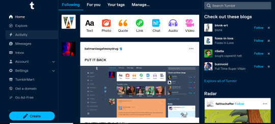
As seems to be a common reaction: not a fan.
Let's talk about some of the issues:
1. Really visually cluttered
The new sidebar crowds out the dashboard content and the bright blue popup notifications (now at the side AND top) and create-post bar pull your eyes in different directions. There is no space for the eye to rest on anymore - it's all noise. The end result is that everything flattens - there's no focal point anymore.
It's also pretty overwhelming - even for someone like me - so I can't imagine it would be very user-friendly to someone who was photosensitive or struggled with visual overload (especially when paired with the high-contrast 'true blue' default site palette and animated icons for the changes-on-tumblr/staff-picks/trending buttons).
2. The activity pop-up now covers dashboard content
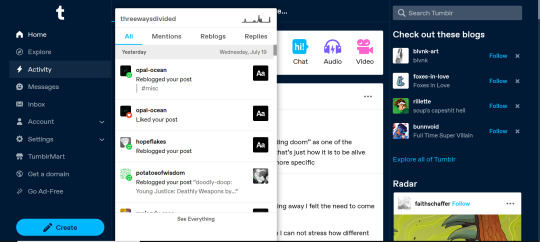
This is really bad from a usability standpoint. In the old layout the activity pop-up used to drop down over the recommended blogs sidebar. Now it actively gets in the way of looking at core content. The dash is why we are here, burying it like this is baffling.
The search bar now drops down over the recommended blogs banner instead, but where the old design had non-critical space on each side of the dashboard to visually allow both features to pop in, this new layout is way worse for efficiency. And for what? Having a rarely-used former drop-down menu now permanently active? The old banner with quick-links for the key use-features (notes, messages, askbox) made much more design sense.
It also means that the activity pop-up gets now completely covered by the blog pop-up that opens when you click the notification, so double demerit there. 0/10.
3. It's harder to navigate to the activity page, and the new page-stretch means you can't see new notes without scrolling down
That first bit is kind of a nitpick but cramming the 'See everything' link down at the bottom of a browser window isn't a great navigation choice. (Again, the visual signifiers and eye-direction in this new design are incredibly poor.)
That the main activity page now requires you to scroll to even see the top note due to the new display ratio is really egregious. It makes another key site feature just slightly less convenient and accessible in a very irritating way. Bad choice.
4. The new ratio pushes the Radar and Main Sponsored slot completely off-screen
This one is directed the tumblr staff: that's also a bad choice, guys. That's your main ad-slot for people loading into Tumblr so hiding it is going to hurt both your ad-impressions and your ability to promote the ad-free option. The new layout ratio also means that the in-dash ads are going to be a lot more invasively screen-filling - and let's be real most users will either add-block or leave before purchasing ad-free. I have no idea what the new layout is trying to achieve but if ad optimisation is the goal then this ain't it, chief.
To be honest I cannot comprehend the rationale for this change. I guess it's visually a bit more like Twitter... but that site is currently being demolished from the inside by poor management decisions so maybe it's not the best aesthetic to be aping.
Well then, what do?
Okay so, new dash bad. And so, in true Tumblr spirit: we complain. However, to get results we must deploy the art of kvetching productively.
If you want the old dash back (or at least, a better new-dash design that corrects some of these big weaknesses) what you should do is head over to https://www.tumblr.com/support and lodge a feedback ticket pointing out the problems. The more users who do that, the more likely you are to see an effective response.
Remember, tagging @staff and @support in posts won't fix this. There's no guarantee they'll see it among the notes barrage.
Also: please don't be rude or abusive when you lodge tickets. Whoever is manning those blogs and inboxes probably isn't the person who forced through this change. Save an intern, be polite.
Go forth in disgruntlement to keep this hellhole a hellhome.
#tumblr#tumblr problems#new dashboard#yes it's bad#but there is a way#I've already lodged tickets about it
1K notes
·
View notes
Text
How to get old dashboard
#tumblr layout#tumblr update#dashboard#old dashboard#new dashboard#tumblr changes#yes it works i tested it and have the old one back#literally lifesaver thank you so much#to think users have to fix this smh
273 notes
·
View notes
Text
dashboard is an ugly twitterfied mess and i can't see my own posts. my perfectly healthy laptop has crashed twice today, and only while using tumblr. this might be the update that finally makes me go touch grass
252 notes
·
View notes
Text
i could live bitterly with the new web dash layout but there's just something about the fine dividing lines between everything, the lack of symmetry on the two side columns, the different font weights & sizes & the general overcrowding of information distracting from the actual content... i just can't put my finger on it
229 notes
·
View notes
Text
When giving feedback on Tumblr's new dashboard, it's going to help if you can give specific feedback about why you feel it doesn't work for you.
Valid but not spedific
I don't like it
Put the old one back
You done Musked it up
Specific
the choices feel overwhelming
I'm confused on how to create a post
I interact a lot with community X through tags and this does help me with that
I'm mainly here for X and this doeesn't help with that
Look, it's obvious the design is to try and make Twitter refugees feel more comfortable. But many of us left twitter because it made us uncomfortable. The more specific we can be, the better chance we have of at least reaching a middle ground
185 notes
·
View notes
Text
IF YOU'RE UNHAPPY WITH NEW FEATURES, SUBMIT A FEEDBACK FORM
In light of recent events (shitty new dashboard) I would like to remind everyone that tagging staff on rant posts does nothing. The staff blog doesn't have a line to the people making calls about new features. The people who do don't use tumblr at all. They are executives looking to make more money, they don't read your posts on tumblr because they don't actually care about it. But they are who you have to reach if you want to stop the twitterification of tumblr.
Aren't you angry? Aren't you frustrated? Yes you are. Parroting to each other about why this sucks won't do anything, we all know why it sucks. Go submit a feedback form.
Here's how.
Go to the Tumblr help centre and navigate to the submit request option. It will look like this.
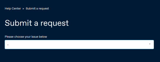
Scroll down and select feedback form.

Select feedback on new features.
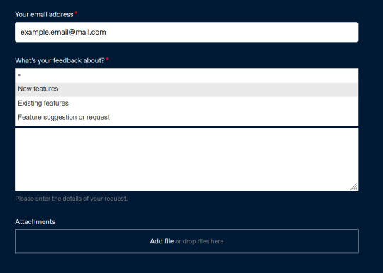
Be concise and legible. Present what you don't like and what you want. Maybe mention that if the site becomes any more unusable, you're going to leave. Remember that "staff" doesn't care if you like the changes or not, as long as you keep using the site. So tell them you will leave.

Needless to say, don't troll.
Do your part before this site becomes entirely unusable!!!
134 notes
·
View notes
Text
@staff @support much appreciation for all you do but listen
do yall not understand that a vast majority of your user base is either autistic af or otherwise hella neurotic for any number of reasons, and we have a profoundly hard time (neurologically emotionally or otherwise) processing change that is frivolous, unsolicited, and ineffectual.
I don't mean "we don't like it" or "we reserve the right to whine about it" I legitimately mean that significant changes in interface make it extremely difficult to take in and process any or all of the visual information and this renders the website effectively unusable.
Annoyed and overstimulated in unfamiliar surroundings is the exact opposite of the experience I'm looking for on this website.
Please be inclusive of all disabilities all neurotypes by changing it back or giving us the option to do so. Thanks so so much
#actually autistic#new dashboard#I thought I would come back from hiatus and start fresh with a new blog but fucking ew gross disgusting nevermind#asd problems#neurodiversity#accessibility#inclusivity#disability accessibility#disabled community#neurological disability#disability advocacy#autistic advocacy#asd stuff#autistic things#autistic community#old dashboard#tumblr changes#tumblr staff
135 notes
·
View notes
Text
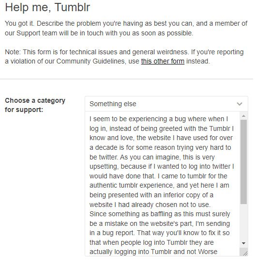
Here's an idea: Let's report the new abomination dash as a bug. That way they might actually fix it
#tumblr update#new dashboard#put that thing back where it came from or so help me#hellsite#garbage talking trash
90 notes
·
View notes
Text
48 notes
·
View notes
Text
in light of the new changes that @staff is rolling out...
pls rb to spread the word!
#stop the twitterfication#tumblr update#changes on tumblr#tumblr protest#new dashboard#spn#goncharov#tumblr trends
47 notes
·
View notes
Text
Sent this to tumblr staff this morning
Good morning,
I have recently seen this post: https://www.tumblr.com/changes/726375529346973696/tuesday-august-22nd-2023?source=share going around about the new dashboard changes and I’ve looked at the updates since. There is a huge accessibility issue.
The removal of icons in the reblogs make the post impossible to read for visually impaired and blind members. The entire post just becomes a jumbled mess with no separation. This needs to be fixed. If you leave it like this you are being ableist and clearly no longer care about the people actively trying to use your site.
I’ve seen others sending similar emails and they get a crappy, clearly generated response about how there will be no return to the previous dashboard and everyone will just have to accept and report bugs or glitches. That does not address your decision to ignore people with disabilities calling you out.
I know I have no power to do anything and more than likely this message won’t change anything on your end. But I’m going to add another voice to the pile because you are not listening to the people who fund and use your hellsite and you’re just furthering ableist agendas.
Hatefully signed,
One of the many users who deserve to be treated fairly and accommodated ✌🏻
Help boost this via reposting here, emailing tumblr support, and filling out the feedback form on tumblr support blog with these complaints!
EDIT: also IT LIMITS ZOOM ABILITY WHICH FURTHER MAKES IT ABLEIST FUCK THIS GUYS
#boost#abelism#tumblr#changes#dashboard#new dashboard#dashboard update#blind#accessibility#signal boost
35 notes
·
View notes
Text
Tweetblr Twitblr Hellscape
Every day since The Change I search tags for posts about the new Twitterfication and I am clicking hearts in solidarity.
And... some of my hearts *magically* disappear. Hmm, didn't I click that one yesterday? Pretty sure I did. CLICK IT AGAIN
Staff may be "committed" to the change but Tumblrs hate it.
Posts are smaller. The left navigation is huge. Tags broken. Tumblr Live is ick. Drafts are buried. Cluttered. Whyyyyy does it look like Twitter? Ads play audio now. Weird stuff in suggested/you might like.
Oh and.. the porn bots are back. Just got a new follower with big boobs and no posts. Fuck it. Vulgar is the new black.
Search & Change 'Top' to 'Latest'
change it back
tumblr update
new dashboard
tumblr settings
tumblr changes
tumblr layout
tumblr feedback
tumblr ui
hate it
hellsite
ewwww
tumblr staff
#tumblr#tumblr update#new dashboard#tumblr milestone#tumblr ui#new layout#hellsite#tumblr culture#tumblr staff#is it the end#this is fine#not really
20 notes
·
View notes
Text
just logged back on to say @staff i HATE this layout, please get me out of this testing group bc i do NOT like it >:(((
#the twitterification of tumblr dot com is real and i hate it#please#please i want my old dash back#i miss her#tumblr update#new dashboard#i hate it here#tumblr#although the ability to edit tags is nice
25 notes
·
View notes
Text
#bracket#tournaments#polls#poll#tumblr bracket#tumblr tournament#tumblr poll#tumblr polls#poll bracket#mystery bracket#round 1#france#slime#tumblr#new dashboard
30 notes
·
View notes
Text
I use tumblr more than any other social media site because it's unique.
I hate the new dashboard that looks like twitter. Give us the old dashboard back, @staff
Or hell, give us a way to turn it off of we don't want it.
19 notes
·
View notes
Text

Hmmm. Don't like that
#whose brilliant idea was to get rid of the icons? the harry potter terf?#tumblr update#tumblr mobile#tumblr icons#new dashboard
11 notes
·
View notes
Last Seen Blogs

dearserenesoul
Serene

fiiiishfry
Untitled

geepman
dan doesn't know
mybodychoseviolence
this is not what i had planned

uvurgunuaufta
Untitled