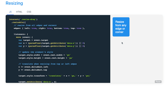
#interact.js
Explore tagged Tumblr posts
Visit Tumblr Blog
Explore Tumblr blogs with no restrictions, modern design and the best experience.
Last Seen Tumblr Blogs


Fun Fact
Tumblr was created by web developers David Karp and Marco Arment.
Text
Interact.js
(\__/) ( o。o) / つ wow look at how cool this is!!!!
This is a JavaScript drag and drop, resizing, and multi-touch gestures for modern browsers (and also IE9+)
Some other things that can be done:
Dragging
Drag and drop
Snapping
Resizing
Multi-touch Rotation (touchscreen only)
Pinch-to-zoom (touchscreen only)
Use in SVG files
Tap, doubletap and hold
I can't wait to find a way to incorporate this into a future project! If you have any ideas let me know!
Check it out here: https://interactjs.io/
#progblr#codeblr#programming#coding#resources#tech#frontend#comp sci#computer science#javascript#interact.js#cool javascript things
176 notes
·
View notes
Text
How to Create a Draggable Element in Themes/Pages
Sometimes, we want to create ‘fun’ elements in our blog while retaining its functionality. Here, in this tutorial, I will share with you guys how to create a draggable element in themes/pages using interact.js with only three steps.
Here's the final result:

Static Preview
Example of a theme that uses interact.js (Qinni Han) - Try to drag the main links, left sidebar, and post :)
Do reblog and like as a sign of support! You can also join my theme selection survey as a sign of support too!
1. Copy the script below and paste it between <head> and <style type="text/css">:
<script src="https://unpkg.com/interactjs/dist/interact.min.js"></script>
2. Copy this script and paste it beneath </style>:
<script> const position = { x: 0, y: 0 } interact('.draggable').draggable({ listeners: { start (event) { console.log(event.type, event.target) }, move (event) { position.x += event.dx position.y += event.dy event.target.style.transform = `translate(${position.x}px, ${position.y}px)` }, } }) </script>
3. Now, at the <body> area where you would like it to be draggable, simply add draggable inside the said class.
Example!:
<!---Qinni Han's Left Sidebar--> <div class="kiriw draggable"> <div class="kiri"> </div> </div>
If you want to create a draggable image, simply add class="draggable" inside the <img> tag.
Example!:
<img src="https://static.tumblr.com/v6akjgz/r9Nqpdra0/45.jpg" class="draggable">
4. Done! Enjoy some interactivity in your blog!
Take note of the following matter:
Once you make it draggable, it would be impossible for people to highlight or copy the texts.
However, the users will still be able to click the link inside the draggable element.
If you disable [Save Image as...] by using the pointer-events, you cannot use this as the code shall override the script.
Related: Want to disable the [Save Image as...] without disabling the right click? Follow this tutorial!
Should you have any questions, let me know via message or FAQ.
28 notes
·
View notes
Text
Swipeable card stack using Vue.js and interact.js
I recently had an opportunity to work on a fantastic research and development project at Netguru. The goal of project (codename: "Wordguru") was to create a card game that anyone can play with their friends. You can see the outcome here.
One element of the development process was to create an interactive card stack. The card stack had a set of requirements, including:
It should contain a few cards from the collection.
The first card should be interactive.
The user should be able to swipe the card in different directions that indicate an intent to accept, reject or skip the card.
This article will explain how to create that and make it interactive using Vue.js and interact.js. I created an example for you to refer to as we go through the process of creating a component that is in charge of displaying that card stack and a second component that is responsible for rendering a single card and managing user interactions in it.
View Demo
Step 1: Create the GameCard component in Vue
Let’s start by creating a component that will show a card, but without any interactions just yet. We’ll call this file GameCard.vue and, in the component template, we’ll render a card wrapper and the keyword for a specific card. This is the file we’ll be working in throughout this post.
// GameCard.vue <template> <div class="card" :class="{ isCurrent: isCurrent }" > <h3 class="cardTitle"></h3> </div> </template>
In the script section of the component, we receive the prop card that contains our card content as well as an isCurrent prop that gives the card a distinct look when needed.
export default { props: { card: { type: Object, required: true }, isCurrent: { type: Boolean, required: true } } },
Step 2: Create the GameCardStack component in Vue
Now that we have a single card, let's create our card stack.
This component will receive an array of cards and render the GameCard for each card. It's also going to mark the first card as the current card in the stack so a special styling is applied to it.
// GameCardsStack.vue <template> <div class="cards"> <GameCard v-for="(card, index) in cards" :key="card" :card="card" :is-current="index === 0" /> </div> </template> <script> import GameCard from "@/components/GameCard"; export default { components: { GameCard }, props: { cards: { type: Array, required: true } } }; </script>
Here’s what we’re looking at so far, using the styles pulled from the demo:

At this point, our card looks complete, but isn't very interactive. Let's fix that in the next step!
Step 3: Add interactivity to GameCard component
All our interactivity logic will live in the GameCard component. Let's start by allowing the user to drag the card. We will use interact.js to deal with dragging.
We’ll set the interactPosition initial values to 0 in the script section. These are the values that indicate a card’s order in the stack when it’s moved from its original position.
<script> import interact from "interact.js"; data() { return { interactPosition: { x: 0, y: 0 }, }; }, // ... </script>
Next, we create a computed property that’s responsible for creating a transform value that’s applied to our card element.
// ... computed: { transformString() { const { x, y } = this.interactPosition; return `translate3D(${x}px, ${y}px, 0)`; } }, // ...
In the mounted lifecycle hook, we make use of the interact.js and its draggable method. That method allows us to fire a custom function each time the element is dragged (onmove). It also exposes an event object that carries information about how far the element is dragged from its original position. Each time user drags the card, we calculate a new position of the card and set it on the interactPosition property. That triggers our transformString computed property and sets new value of transform on our card.
We use the interact onend hook that allows us to listen when the user releases the mouse and finishes the drag. At this point, we will reset the position of our card and bring it back to its original position: { x: 0, y: 0 }.
We also need to make sure to remove the card element from the Interactable object before it gets destroyed. We do that in the beforeDestroy lifecycle hook by using interact(target).unset(). That removes all event listeners and makes interact.js completely forget about the target.
// ... mounted() { const element = this.$refs.interactElement; interact(element).draggable({ onmove: event => { const x = this.interactPosition.x + event.dx; const y = this.interactPosition.y + event.dy; this.interactSetPosition({ x, y }); }, onend: () => { this.resetCardPosition(); } }); }, // ... beforeDestroy() { interact(this.$refs.interactElement).unset(); }, // ... methods: { interactSetPosition(coordinates) { const { x = 0, y = 0 } = coordinates; this.interactPosition = {x, y }; }, resetCardPosition() { this.interactSetPosition({ x: 0, y: 0 }); }, }, // ...
We need to add one thing in our template to make this work. As our transformString computed property returns a string, we need to apply it to the card component. We do that by binding to the :style attribute and then passing the string to the transform property.
<template> <div class="card" :class="{ isCurrent: isCurrent }" :style="{ transform: transformString }" > <h3 class="cardTitle"></h3> </div> </template>
With that done, we have created interaction with our card — we can drag it around!
You may have noticed that the behavior isn’t very natural, specifically when we drag the card and release it. The card immediately returns to its original position, but it would be more natural if the card would go back to initial position with animation to smooth the transition.
That’s where transition comes into play! But adding it to our card introduces another issue: there’s a lag in the card following as it follows the cursor because transition is applied to the element at all times. We only want it applied when the drag ends. We can do that by binding one more class (isAnimating) to the component.
<template> <div class="card" :class="{ isAnimating: isInteractAnimating, isCurrent: isCurrent }" > <h3 class="cardTitle"></h3> </div> </template>
We can add and remove the animation class by changing the isInteractAnimating property.
The animation effect should be applied initially and we do that by setting our property in data.
In the mounted hook where we initialize interact.js, we use one more interact hook (onstart) and change the value of isInteractAnimating to false so that the animation is disabled when the during the drag.
We’ll enable the animation again in the onend hook, and that will make our card animate smoothly to its original position when we release it from the drag.
We also need to update transformString computed property and add a guard to recalculate and return a string only when we are dragging the card.
data() { return { // ... isInteractAnimating: true, // ... }; }, computed: { transformString() { if (!this.isInteractAnimating) { const { x, y } = this.interactPosition; return `translate3D(${x}px, ${y}px, 0)`; } return null; } }, mounted() { const element = this.$refs.interactElement; interact(element).draggable({ onstart: () => { this.isInteractAnimating = false; }, // ... onend: () => { this.isInteractAnimating = true; }, }); },
Now things are starting to look nice!
Our card stack is ready for second set of interactions. We can drag the card around, but nothing is actually happening — the card is always coming back to its original place, but there is no way to get to the second card.
This will change when we add logic that allows the user to accept and rejecting cards.
Step 4: Detect when the card is accepted, rejected, or skipped
The card has three types of interactions:
Accept card (on swipe right)
Reject card (on swipe left)
Skip card (on swipe down)
We need to find a place where we can detect if the card was dragged from its initial position. We also want to be sure that this check will happen only when we finish dragging the card so the interactions do not conflict with the animation we just finished.
We used that place earlier smooth the transition during animation �� it's the onend hook provided by the interact.draggable method.
Let's jump into the code.
First, we need to store our threshold values. Those values are the distances as the card is dragged from its original position and allows us to determine if the card should be accepted, rejected, or skipped. We use X axis for right (accept) and left (reject), then use the Y axis for downward movement (skip).
We also set coordinates where we want to place a card after it gets accepted, rejected or skipped (coordinates out of user's sight).
Since those values will not change, we will keep them in the static property of our component, which can be accessed with this.$options.static.interactYThreshold.
export default { static: { interactYThreshold: 150, interactXThreshold: 100 },
We need to check if any of our thresholds were met in our onend hook and then fire the appropriate method that happened. If no threshold is met, then we reset the card to its initial position.
mounted() { const element = this.$refs.interactElement; interact(element).draggable({ onstart: () => {...}, onmove: () => {...}, onend: () => { const { x, y } = this.interactPosition; const { interactXThreshold, interactYThreshold } = this.$options.static; this.isInteractAnimating = true; if (x > interactXThreshold) this.playCard(ACCEPT_CARD); else if (x < -interactXThreshold) this.playCard(REJECT_CARD); else if (y > interactYThreshold) this.playCard(SKIP_CARD); else this.resetCardPosition(); } }); }
OK, now we need to create a playCard method that’s responsible for handling those interactive actions.
Step 5: Establish the logic to accept, reject, and skip cards
We will create a method that accepts a parameter telling us the user’s intended action. Depending on that parameter, we will set the final position of the current card and emit the accept, reject, or skip event. Let's go step by step.
First, our playCard method will remove the card element from the Interactable object so that it stops tracking drag events. We do that by using interact(target).unset(). Secondly, we set the final position of the active card depending on the user's intention. That new position allows us to animate the card and remove it from the user's view.
Next, we emit an event up to the parent component so we can deal with our cards (e.g. change the current card, load more cards, shuffle the cards, etc.). We want to follow the DDAU principle that states a component should refrain from mutating data it doesn't own. Since our cards are passed down to our component, it should emit an event up to the place from where those cards come.
Lastly, we hide the card that was just played and add a timeout that allow the card to animate out of view.
methods: { playCard(interaction) { const { interactOutOfSightXCoordinate, interactOutOfSightYCoordinate, } = this.$options.static; this.interactUnsetElement(); switch (interaction) { case ACCEPT_CARD: this.interactSetPosition({ x: interactOutOfSightXCoordinate, }); this.$emit(ACCEPT_CARD); break; case REJECT_CARD: this.interactSetPosition({ x: -interactOutOfSightXCoordinate, }); this.$emit(REJECT_CARD); break; case SKIP_CARD: this.interactSetPosition({ y: interactOutOfSightYCoordinate }); this.$emit(SKIP_CARD); break; } this.hideCard(); }, hideCard() { setTimeout(() => { this.isShowing = false; this.$emit("hideCard", this.card); }, 300); }, interactUnsetElement() { interact(this.$refs.interactElement).unset(); this.interactDragged = true; }, }
And, there we go!
Summary
Let's recap what we just accomplished:
First we created a component for a single card.
Next we created another component that renders the cards in a stack.
Thirdly, we implemented interact.js to allow interactive dragging.
Then we detected when the user wants takes an action with the current card.
Finally, we established the to handle those actions.
Phew, we covered a lot! Hopefully this gives you both a new trick in your toolbox as well as a hands-on use case for Vue. And, if you’ve ever had to build something similar, please share in the comments because it would be neat to compare notes.
The post Swipeable card stack using Vue.js and interact.js appeared first on CSS-Tricks.
Swipeable card stack using Vue.js and interact.js published first on https://deskbysnafu.tumblr.com/
0 notes
Text
How to Choose the Best React Drag and Drop? Top 15 Free Libraries to Set Up
New Post has been published on https://flatlogic.com/blog/how-to-choose-the-best-react-drag-and-drop-top-15-free-libraries-to-set-up/
How to Choose the Best React Drag and Drop? Top 15 Free Libraries to Set Up
What is Drag and Drop? Drag and Drop types Basic Concepts How to choose the Drag and Drop? Typescript vs Javascript How to build a custom React Draggable Component? How do I drag and drop in React dnd? React Drag and Drop Library List Wrapping Up About Flatlogic
User experience is crucial when you interact with your website or web app. Though it may seem that choosing a drag and drop element is no big deal, after all, it’s just a basic functionality component! But, the drag and drop module lets you transfer the items between drag handlers, tables and lists, touch devices, animations, previews, and placeholders, thus resolving the simple but still integral step that allows you to ‘take an object’ and drag it to another location.
What is Drag and Drop?
Drag and drop is an action carried out by the user in order to move one or another element to a different place in UI. There are lots of well-known applications where you use the drag and drop function as the basic one, let’s remind ourselves of just a few of them: Trello, Jira, Zapier, Monday, and others, where we one way or another using drag and drop to move things.
This simple action may be comfy not only as a part of the modern user experience, especially for those people who have disabilities or some difficulties with performing manual-type actions.
But why does such a simple element take quite a while to develop? The answer is simple: it takes a lot of code to build high-quality, neat and clean JavaScript forms. And it is much faster to run any ready-made library where you can easily borrow some pieces of code.
Check out React Material Admin Full!
Material UI No jQuery and Bootstrap! Fully Documented Codebase
Drag And Drop Types
There are dozens of open-source libraries that help to create draggable and movable elements (e.g. lists, cards, tables, etc) in your React app. And, this option can simplify the UX route, in comparison to the process of filling in forms, and shortens the time of one or another formal action.
The most common use cases for drag-and-drop in React include: uploading files; replacing the components within created lists and rearranging images and assets.
Basic Concepts
DragDrop Container: where you held and then taken out the component (data)
Children: the content of dataItem; DragDropContext: is the place where drag-and-drop is carried out;
Droppable: the component which allows draggable components to be able to drop at the targeted area;
Draggable: the component which will be replaced;
As well as Droppable, it requires several properties to make the component displaceable;
onDragStart: onDragStart component occurs when the user starts to drag an element;
onDragEnd: the component known as DragEnd occurs after the action has been accomplished;
DataTransfer: the component that can hold data about the dragged object;
DropTarget: component that contains drop data;
How to Choose a Good Drag and Drop?
Surely, this is a relatively controversial question, because if you have enough time at your disposal, you may start coding on your own. Moreover, if you’re a junior programmer, we would not recommend that you use any ready libraries, but try to figure out the problem using your own code. Yes, bugs are inevitable, though after each challenge there will surely be progress.
In Flatlogic we create web & mobile application templates built with React, Vue, Angular and React Native to help you develop web & mobile apps faster. Go and check out yourself! See our themes!
Typescript vs. Javascript Library
The vast majority of drag and drop libraries are written with the help of Typescript prevalence because Typescript is known for being structured, highly secure, and more consistent than vanilla Javascript. At the same time, it takes longer to compile the code in TypeScript, whereas JavaScript is more easy and flexible in terms of development.
Do you like this article? You can read also:
React Pagination Guide And Best React Pagination Libraries
So, if you are an old-school adherent, who is devoted to JS, you should understand that you need to know Typescript peculiarities to write with it. Plus, the size of the code will increase, because Typescript requires extremely detailed and accurate coding.
How to Build Custom Draggable Components in React?
To enable dragging on the component we need to proceed this path:
First off, create a drag component (drop area), in other words — container, where you will further drag dataItem. Set the draggable attribute on the dataItem
Handle onDragStart event Add here event.dataTransfer.setData
event.dataTransfer.setData component will contain some data, dataItem Create a function startDrag event Create a dropTarget component; it will call an event handler when dataItem with children will be dropped in Handle onDragOver event Create event.preventDefault() function that will enable the dropping process of the component Handle onDrop event Set the consent function – getData
Call the dropped component onItemDropped
Finally, return the components to their initial state,
<div onDragOver=dragOver onDrop=drop> props.children </div>);
Voila! This way your component will be ‘transferred’ from the container to the DropTarget.
How to Make Drag and Drop With React dnd library?
React Drag’n’Drops Libraries List
1. React Beautiful Dnd
React beautiful dnd is the most popular library to build React Drag and Drop lists easily. It has already won the heart of 23.8k developers on GitHub, thanks to its high performance. It has a clean and powerful API that is easy to work with and it fits well with any modern browser.
GitHub
2. React Drag and Drop Container
Here the name of the library speaks for itself. React Drag Drop container offers functionality for mouse and touch devices; i.e. it allows you to set up a draggable element, drop a target for it, plus, it highlights the drop target when dragging over it (highlightClassName). Also, you can drag an element copy of the element, or let the element disappear while dragging (disappearDraggedElement).
GitHub
3. Draggable
Another well-deserved library, does not perform any sorting behaviour while dragging, it has the following modulers: Droppable, Sortable, and Swappable. Draggable itself does not perform any sorting behaviour while dragging, but does the heavy lifting, e.g. creates mirror, emits events, manages sensor events, makes elements draggable.
GitHub
4. React Grid Layout
React Grid Layout library has 13,5k stars on GitHub. Inside you will get a fluid layout with sensible breakpoints, static widgets, draggable and resizable widgets. You can drag the elements, and resize them. The closest similar instrument is called Packery, though this is a bin-packing layout library using jQuery, which React Grid Layout doesn’t use.
: React-Grid-Layout works well with complex grid layouts that require drag-and-drop, such as dashboards which can be resized(e.g., looker, data visualization products, etc.)
: Because of the clunky API, React-Grid-Layout may need more calculations and it’s obviously a better fit for large-scale apps.
5. React Dropzone
React Dropzone is an example of simple HTML5 drag and drop zone with React.js. It requires a standard installation process with npm command and using a module bundler like Webpack or Browserify. React Dropzone has 8.2 Github stars and is based on Javascript.
GitHub
6. React DND
React DND got 15.9k stars on GitHub, and was written mainly with the help of TypeScript, as well as JavaScript and CSS. It has the sort option, group option, delay option, delayOnTouchOnly option, swapThreshold option, and many other essential features for implementing drag and drop components. React DND works well with grids, one-dimensional lists, but it’s harder to work with than for instance the well-known react-beautiful-dnd when you need to customize something individually.
GitHub
7. React SortableJS
React sortable is one more brilliant instrument made with Javascript and HTML, commonly used for creating drag-and-drop lists. It has all the basic functionalities of sorting/delaying/swapping/inverting and lots of others. Available on all touch modern browsers and touch devices.
GitHub
8. Interact.js
Snap, resize, customize your drag and drop elements with Interact.js. The library has also an advanced version, check it here. It also supports evoking simultaneous interactions; interaction with SVG and works well with desktop and mobile versions of Chrome, Firefox, and Opera as well as Internet Explorer 9+. Sharp has 10.2 k on GitHub and
GitHub
9. React Kanban
React Kanban is a relatively young but super pluggable library positioning itself as ‘one more Kanban/Trello board lib for React’. Kanban was written with the help of JavaScript, SCSS and HTML. But, be careful using this library with lots of cards (more than 1k), cause then you may face some performance hurdles. In this case, virtual lists may become the solution.
GitHub
10. Juggle and Drop
Juggle and Drop is an instrument to manage your tasks made with pure Javascript, with the help of React, redux, MLAB, express mongodb, Google Analytics. With Juggle and Drop you can add, edit, delete cards and lists; clone the component, navigate to the root directory, and other.
GitHub
11. React Motion
One more highly recommended and really powerful package for working with animation functions in JS. This package has 19.7k on GitHub, and 612,446 installations according to NPM. And among others, it has sorting lists with drag and drop. How to get started? npm install — save react-motion and keep working!
GitHub
12. React Smooth DnD
The React-smooth drag and drop package is a super lightweight and highly customizable library for React with 1,5k stars on GitHub and with lots of configuration options covering d&d scenarios. The cardboard and fonts look really neat and pleasant to the eye.
GitHub
13. Nested DND
Nested DND in juicy colors helps to drag a part of the stack with the items lying on top of the dragged one. Drop it on top of any plays, and see how simple and intuitive it is.
GitHub
14. React Nestable
React Nestable, an example of JavaScript drag and drop library, is a drag & drop hierarchical list made with a neat bit of deduction. This package is finalizing our list of open-source drag and drop libraries recommended while building the dnd option.
GitHub
15. React Files Drag and Drop
One more relatively fresh library to manage and customize your inner drag and drop component easily is React-files-drag-and-drop. It has a list of basic properties and was developed with TypeScript and CSS language.
GitHub
Check more examples of React drag and drop on codesandox or here.
Wrapping Up
Now you know enough about React DnD libraries and it is high time to explore further the rest of the documentation in detail! Stay motivated, don’t be afraid of making mistakes, and debugging them! Well, this is a good place to tell: if you’ve never made a mistake, you’ve probably never done anything.
About Flatlogic
At Flatlogic, we carefully craft dashboard templates on React, Vue, Bootstrap and React Native to bootstrap coding. We are mentioned in the Clutch top-performing agencies from all over the world. In the last 6 years, we have successfully completed more than 50 templates and large-scaled custom development projects for small startups and large enterprises. We love our work and know that only beauty (beautifully designed templates 🙂 ) can save the world.
Suggested Posts:
Top 30 Open Source And Paid React Charts + Examples React Table Guide And Best React Table Examples Best React Open Source Projects
The post How to Choose the Best React Drag and Drop? Top 15 Free Libraries to Set Up appeared first on Flatlogic Blog.
1 note
·
View note
Photo

Swipeable card stack using Vue.js and interact.js https://ift.tt/2QgUDi4
0 notes
Text
Swipeable card stack using Vue.js and interact.js
I recently had an opportunity to work on a fantastic research and development project at Netguru. The goal of project (codename: "Wordguru") was to create a card game that anyone can play with their friends. You can see the outcome here.
One element of the development process was to create an interactive card stack. The card stack had a set of requirements, including:
It should contain a few cards from the collection.
The first card should be interactive.
The user should be able to swipe the card in different directions that indicate an intent to accept, reject or skip the card.
This article will explain how to create that and make it interactive using Vue.js and interact.js. I created an example for you to refer to as we go through the process of creating a component that is in charge of displaying that card stack and a second component that is responsible for rendering a single card and managing user interactions in it.
View Demo
Step 1: Create the GameCard component in Vue
Let’s start by creating a component that will show a card, but without any interactions just yet. We’ll call this file GameCard.vue and, in the component template, we’ll render a card wrapper and the keyword for a specific card. This is the file we’ll be working in throughout this post.
// GameCard.vue <template> <div class="card" :class="{ isCurrent: isCurrent }" > <h3 class="cardTitle"></h3> </div> </template>
In the script section of the component, we receive the prop card that contains our card content as well as an isCurrent prop that gives the card a distinct look when needed.
export default { props: { card: { type: Object, required: true }, isCurrent: { type: Boolean, required: true } } },
Step 2: Create the GameCardStack component in Vue
Now that we have a single card, let's create our card stack.
This component will receive an array of cards and render the GameCard for each card. It's also going to mark the first card as the current card in the stack so a special styling is applied to it.
// GameCardsStack.vue <template> <div class="cards"> <GameCard v-for="(card, index) in cards" :key="card" :card="card" :is-current="index === 0" /> </div> </template> <script> import GameCard from "@/components/GameCard"; export default { components: { GameCard }, props: { cards: { type: Array, required: true } } }; </script>
Here’s what we’re looking at so far, using the styles pulled from the demo:

At this point, our card looks complete, but isn't very interactive. Let's fix that in the next step!
Step 3: Add interactivity to GameCard component
All our interactivity logic will live in the GameCard component. Let's start by allowing the user to drag the card. We will use interact.js to deal with dragging.
We’ll set the interactPosition initial values to 0 in the script section. These are the values that indicate a card’s order in the stack when it’s moved from its original position.
<script> import interact from "interact.js"; data() { return { interactPosition: { x: 0, y: 0 }, }; }, // ... </script>
Next, we create a computed property that’s responsible for creating a transform value that’s applied to our card element.
// ... computed: { transformString() { const { x, y } = this.interactPosition; return `translate3D(${x}px, ${y}px, 0)`; } }, // ...
In the mounted lifecycle hook, we make use of the interact.js and its draggable method. That method allows us to fire a custom function each time the element is dragged (onmove). It also exposes an event object that carries information about how far the element is dragged from its original position. Each time user drags the card, we calculate a new position of the card and set it on the interactPosition property. That triggers our transformString computed property and sets new value of transform on our card.
We use the interact onend hook that allows us to listen when the user releases the mouse and finishes the drag. At this point, we will reset the position of our card and bring it back to its original position: { x: 0, y: 0 }.
We also need to make sure to remove the card element from the Interactable object before it gets destroyed. We do that in the beforeDestroy lifecycle hook by using interact(target).unset(). That removes all event listeners and makes interact.js completely forget about the target.
// ... mounted() { const element = this.$refs.interactElement; interact(element).draggable({ onmove: event => { const x = this.interactPosition.x + event.dx; const y = this.interactPosition.y + event.dy; this.interactSetPosition({ x, y }); }, onend: () => { this.resetCardPosition(); } }); }, // ... beforeDestroy() { interact(this.$refs.interactElement).unset(); }, // ... methods: { interactSetPosition(coordinates) { const { x = 0, y = 0 } = coordinates; this.interactPosition = {x, y }; }, resetCardPosition() { this.interactSetPosition({ x: 0, y: 0 }); }, }, // ...
We need to add one thing in our template to make this work. As our transformString computed property returns a string, we need to apply it to the card component. We do that by binding to the :style attribute and then passing the string to the transform property.
<template> <div class="card" :class="{ isCurrent: isCurrent }" :style="{ transform: transformString }" > <h3 class="cardTitle"></h3> </div> </template>
With that done, we have created interaction with our card — we can drag it around!
You may have noticed that the behavior isn’t very natural, specifically when we drag the card and release it. The card immediately returns to its original position, but it would be more natural if the card would go back to initial position with animation to smooth the transition.
That’s where transition comes into play! But adding it to our card introduces another issue: there’s a lag in the card following as it follows the cursor because transition is applied to the element at all times. We only want it applied when the drag ends. We can do that by binding one more class (isAnimating) to the component.
<template> <div class="card" :class="{ isAnimating: isInteractAnimating, isCurrent: isCurrent }" > <h3 class="cardTitle"></h3> </div> </template>
We can add and remove the animation class by changing the isInteractAnimating property.
The animation effect should be applied initially and we do that by setting our property in data.
In the mounted hook where we initialize interact.js, we use one more interact hook (onstart) and change the value of isInteractAnimating to false so that the animation is disabled when the during the drag.
We’ll enable the animation again in the onend hook, and that will make our card animate smoothly to its original position when we release it from the drag.
We also need to update transformString computed property and add a guard to recalculate and return a string only when we are dragging the card.
data() { return { // ... isInteractAnimating: true, // ... }; }, computed: { transformString() { if (!this.isInteractAnimating) { const { x, y } = this.interactPosition; return `translate3D(${x}px, ${y}px, 0)`; } return null; } }, mounted() { const element = this.$refs.interactElement; interact(element).draggable({ onstart: () => { this.isInteractAnimating = false; }, // ... onend: () => { this.isInteractAnimating = true; }, }); },
Now things are starting to look nice!
Our card stack is ready for second set of interactions. We can drag the card around, but nothing is actually happening — the card is always coming back to its original place, but there is no way to get to the second card.
This will change when we add logic that allows the user to accept and rejecting cards.
Step 4: Detect when the card is accepted, rejected, or skipped
The card has three types of interactions:
Accept card (on swipe right)
Reject card (on swipe left)
Skip card (on swipe down)
We need to find a place where we can detect if the card was dragged from its initial position. We also want to be sure that this check will happen only when we finish dragging the card so the interactions do not conflict with the animation we just finished.
We used that place earlier smooth the transition during animation — it's the onend hook provided by the interact.draggable method.
Let's jump into the code.
First, we need to store our threshold values. Those values are the distances as the card is dragged from its original position and allows us to determine if the card should be accepted, rejected, or skipped. We use X axis for right (accept) and left (reject), then use the Y axis for downward movement (skip).
We also set coordinates where we want to place a card after it gets accepted, rejected or skipped (coordinates out of user's sight).
Since those values will not change, we will keep them in the static property of our component, which can be accessed with this.$options.static.interactYThreshold.
export default { static: { interactYThreshold: 150, interactXThreshold: 100 },
We need to check if any of our thresholds were met in our onend hook and then fire the appropriate method that happened. If no threshold is met, then we reset the card to its initial position.
mounted() { const element = this.$refs.interactElement; interact(element).draggable({ onstart: () => {...}, onmove: () => {...}, onend: () => { const { x, y } = this.interactPosition; const { interactXThreshold, interactYThreshold } = this.$options.static; this.isInteractAnimating = true; if (x > interactXThreshold) this.playCard(ACCEPT_CARD); else if (x < -interactXThreshold) this.playCard(REJECT_CARD); else if (y > interactYThreshold) this.playCard(SKIP_CARD); else this.resetCardPosition(); } }); }
OK, now we need to create a playCard method that’s responsible for handling those interactive actions.
Step 5: Establish the logic to accept, reject, and skip cards
We will create a method that accepts a parameter telling us the user’s intended action. Depending on that parameter, we will set the final position of the current card and emit the accept, reject, or skip event. Let's go step by step.
First, our playCard method will remove the card element from the Interactable object so that it stops tracking drag events. We do that by using interact(target).unset(). Secondly, we set the final position of the active card depending on the user's intention. That new position allows us to animate the card and remove it from the user's view.
Next, we emit an event up to the parent component so we can deal with our cards (e.g. change the current card, load more cards, shuffle the cards, etc.). We want to follow the DDAU principle that states a component should refrain from mutating data it doesn't own. Since our cards are passed down to our component, it should emit an event up to the place from where those cards come.
Lastly, we hide the card that was just played and add a timeout that allow the card to animate out of view.
methods: { playCard(interaction) { const { interactOutOfSightXCoordinate, interactOutOfSightYCoordinate, } = this.$options.static; this.interactUnsetElement(); switch (interaction) { case ACCEPT_CARD: this.interactSetPosition({ x: interactOutOfSightXCoordinate, }); this.$emit(ACCEPT_CARD); break; case REJECT_CARD: this.interactSetPosition({ x: -interactOutOfSightXCoordinate, }); this.$emit(REJECT_CARD); break; case SKIP_CARD: this.interactSetPosition({ y: interactOutOfSightYCoordinate }); this.$emit(SKIP_CARD); break; } this.hideCard(); }, hideCard() { setTimeout(() => { this.isShowing = false; this.$emit("hideCard", this.card); }, 300); }, interactUnsetElement() { interact(this.$refs.interactElement).unset(); this.interactDragged = true; }, }
And, there we go!
Summary
Let's recap what we just accomplished:
First we created a component for a single card.
Next we created another component that renders the cards in a stack.
Thirdly, we implemented interact.js to allow interactive dragging.
Then we detected when the user wants takes an action with the current card.
Finally, we established the to handle those actions.
Phew, we covered a lot! Hopefully this gives you both a new trick in your toolbox as well as a hands-on use case for Vue. And, if you’ve ever had to build something similar, please share in the comments because it would be neat to compare notes.
The post Swipeable card stack using Vue.js and interact.js appeared first on CSS-Tricks.
😉SiliconWebX | 🌐CSS-Tricks
0 notes
Text
Swipeable card stack using Vue.js and interact.js
Swipeable card stack using Vue.js and interact.js
I recently had an opportunity to work on a fantastic research and development project at Netguru. The goal of project (codename: “Wordguru”) was to create a card game that anyone can play with their friends. You can see the outcome here.
One element of the development process was to create an interactive card stack. The card stack had a set of requirements, including:
It should contain a few…
View On WordPress
0 notes
Link
via Instapaper: Unread
0 notes
Link
interact.js is a JavaScript module for Drag and drop, resizing and multi-touch gestures with inertia and snapping for modern browsers (and also IE8+). Background ...
3 notes
·
View notes
Text
Swipeable card stack using Vue.js and interact.js
I recently had an opportunity to work on a fantastic research and development project at Netguru. The goal of project (codename: "Wordguru") was to create a card game that anyone can play with their friends. You can see the outcome here.
One element of the development process was to create an interactive card stack. The card stack had a set of requirements, including:
It should contain a few cards from the collection.
The first card should be interactive.
The user should be able to swipe the card in different directions that indicate an intent to accept, reject or skip the card.
This article will explain how to create that and make it interactive using Vue.js and interact.js. I created an example for you to refer to as we go through the process of creating a component that is in charge of displaying that card stack and a second component that is responsible for rendering a single card and managing user interactions in it.
View Demo
Step 1: Create the GameCard component in Vue
Let’s start by creating a component that will show a card, but without any interactions just yet. We’ll call this file GameCard.vue and, in the component template, we’ll render a card wrapper and the keyword for a specific card. This is the file we’ll be working in throughout this post.
// GameCard.vue <template> <div class="card" :class="{ isCurrent: isCurrent }" > <h3 class="cardTitle"></h3> </div> </template>
In the script section of the component, we receive the prop card that contains our card content as well as an isCurrent prop that gives the card a distinct look when needed.
export default { props: { card: { type: Object, required: true }, isCurrent: { type: Boolean, required: true } } },
Step 2: Create the GameCardStack component in Vue
Now that we have a single card, let's create our card stack.
This component will receive an array of cards and render the GameCard for each card. It's also going to mark the first card as the current card in the stack so a special styling is applied to it.
// GameCardsStack.vue <template> <div class="cards"> <GameCard v-for="(card, index) in cards" :key="card" :card="card" :is-current="index === 0" /> </div> </template> <script> import GameCard from "@/components/GameCard"; export default { components: { GameCard }, props: { cards: { type: Array, required: true } } }; </script>
Here’s what we’re looking at so far, using the styles pulled from the demo:

At this point, our card looks complete, but isn't very interactive. Let's fix that in the next step!
Step 3: Add interactivity to GameCard component
All our interactivity logic will live in the GameCard component. Let's start by allowing the user to drag the card. We will use interact.js to deal with dragging.
We’ll set the interactPosition initial values to 0 in the script section. These are the values that indicate a card’s order in the stack when it’s moved from its original position.
<script> import interact from "interact.js"; data() { return { interactPosition: { x: 0, y: 0 }, }; }, // ... </script>
Next, we create a computed property that’s responsible for creating a transform value that’s applied to our card element.
// ... computed: { transformString() { const { x, y } = this.interactPosition; return `translate3D(${x}px, ${y}px, 0)`; } }, // ...
In the mounted lifecycle hook, we make use of the interact.js and its draggable method. That method allows us to fire a custom function each time the element is dragged (onmove). It also exposes an event object that carries information about how far the element is dragged from its original position. Each time user drags the card, we calculate a new position of the card and set it on the interactPosition property. That triggers our transformString computed property and sets new value of transform on our card.
We use the interact onend hook that allows us to listen when the user releases the mouse and finishes the drag. At this point, we will reset the position of our card and bring it back to its original position: { x: 0, y: 0 }.
We also need to make sure to remove the card element from the Interactable object before it gets destroyed. We do that in the beforeDestroy lifecycle hook by using interact(target).unset(). That removes all event listeners and makes interact.js completely forget about the target.
// ... mounted() { const element = this.$refs.interactElement; interact(element).draggable({ onmove: event => { const x = this.interactPosition.x + event.dx; const y = this.interactPosition.y + event.dy; this.interactSetPosition({ x, y }); }, onend: () => { this.resetCardPosition(); } }); }, // ... beforeDestroy() { interact(this.$refs.interactElement).unset(); }, // ... methods: { interactSetPosition(coordinates) { const { x = 0, y = 0 } = coordinates; this.interactPosition = {x, y }; }, resetCardPosition() { this.interactSetPosition({ x: 0, y: 0 }); }, }, // ...
We need to add one thing in our template to make this work. As our transformString computed property returns a string, we need to apply it to the card component. We do that by binding to the :style attribute and then passing the string to the transform property.
<template> <div class="card" :class="{ isCurrent: isCurrent }" :style="{ transform: transformString }" > <h3 class="cardTitle"></h3> </div> </template>
With that done, we have created interaction with our card — we can drag it around!
You may have noticed that the behavior isn’t very natural, specifically when we drag the card and release it. The card immediately returns to its original position, but it would be more natural if the card would go back to initial position with animation to smooth the transition.
That’s where transition comes into play! But adding it to our card introduces another issue: there’s a lag in the card following as it follows the cursor because transition is applied to the element at all times. We only want it applied when the drag ends. We can do that by binding one more class (isAnimating) to the component.
<template> <div class="card" :class="{ isAnimating: isInteractAnimating, isCurrent: isCurrent }" > <h3 class="cardTitle"></h3> </div> </template>
We can add and remove the animation class by changing the isInteractAnimating property.
The animation effect should be applied initially and we do that by setting our property in data.
In the mounted hook where we initialize interact.js, we use one more interact hook (onstart) and change the value of isInteractAnimating to false so that the animation is disabled when the during the drag.
We’ll enable the animation again in the onend hook, and that will make our card animate smoothly to its original position when we release it from the drag.
We also need to update transformString computed property and add a guard to recalculate and return a string only when we are dragging the card.
data() { return { // ... isInteractAnimating: true, // ... }; }, computed: { transformString() { if (!this.isInteractAnimating) { const { x, y } = this.interactPosition; return `translate3D(${x}px, ${y}px, 0)`; } return null; } }, mounted() { const element = this.$refs.interactElement; interact(element).draggable({ onstart: () => { this.isInteractAnimating = false; }, // ... onend: () => { this.isInteractAnimating = true; }, }); },
Now things are starting to look nice!
Our card stack is ready for second set of interactions. We can drag the card around, but nothing is actually happening — the card is always coming back to its original place, but there is no way to get to the second card.
This will change when we add logic that allows the user to accept and rejecting cards.
Step 4: Detect when the card is accepted, rejected, or skipped
The card has three types of interactions:
Accept card (on swipe right)
Reject card (on swipe left)
Skip card (on swipe down)
We need to find a place where we can detect if the card was dragged from its initial position. We also want to be sure that this check will happen only when we finish dragging the card so the interactions do not conflict with the animation we just finished.
We used that place earlier smooth the transition during animation — it's the onend hook provided by the interact.draggable method.
Let's jump into the code.
First, we need to store our threshold values. Those values are the distances as the card is dragged from its original position and allows us to determine if the card should be accepted, rejected, or skipped. We use X axis for right (accept) and left (reject), then use the Y axis for downward movement (skip).
We also set coordinates where we want to place a card after it gets accepted, rejected or skipped (coordinates out of user's sight).
Since those values will not change, we will keep them in the static property of our component, which can be accessed with this.$options.static.interactYThreshold.
export default { static: { interactYThreshold: 150, interactXThreshold: 100 },
We need to check if any of our thresholds were met in our onend hook and then fire the appropriate method that happened. If no threshold is met, then we reset the card to its initial position.
mounted() { const element = this.$refs.interactElement; interact(element).draggable({ onstart: () => {...}, onmove: () => {...}, onend: () => { const { x, y } = this.interactPosition; const { interactXThreshold, interactYThreshold } = this.$options.static; this.isInteractAnimating = true; if (x > interactXThreshold) this.playCard(ACCEPT_CARD); else if (x < -interactXThreshold) this.playCard(REJECT_CARD); else if (y > interactYThreshold) this.playCard(SKIP_CARD); else this.resetCardPosition(); } }); }
OK, now we need to create a playCard method that’s responsible for handling those interactive actions.
Step 5: Establish the logic to accept, reject, and skip cards
We will create a method that accepts a parameter telling us the user’s intended action. Depending on that parameter, we will set the final position of the current card and emit the accept, reject, or skip event. Let's go step by step.
First, our playCard method will remove the card element from the Interactable object so that it stops tracking drag events. We do that by using interact(target).unset(). Secondly, we set the final position of the active card depending on the user's intention. That new position allows us to animate the card and remove it from the user's view.
Next, we emit an event up to the parent component so we can deal with our cards (e.g. change the current card, load more cards, shuffle the cards, etc.). We want to follow the DDAU principle that states a component should refrain from mutating data it doesn't own. Since our cards are passed down to our component, it should emit an event up to the place from where those cards come.
Lastly, we hide the card that was just played and add a timeout that allow the card to animate out of view.
methods: { playCard(interaction) { const { interactOutOfSightXCoordinate, interactOutOfSightYCoordinate, } = this.$options.static; this.interactUnsetElement(); switch (interaction) { case ACCEPT_CARD: this.interactSetPosition({ x: interactOutOfSightXCoordinate, }); this.$emit(ACCEPT_CARD); break; case REJECT_CARD: this.interactSetPosition({ x: -interactOutOfSightXCoordinate, }); this.$emit(REJECT_CARD); break; case SKIP_CARD: this.interactSetPosition({ y: interactOutOfSightYCoordinate }); this.$emit(SKIP_CARD); break; } this.hideCard(); }, hideCard() { setTimeout(() => { this.isShowing = false; this.$emit("hideCard", this.card); }, 300); }, interactUnsetElement() { interact(this.$refs.interactElement).unset(); this.interactDragged = true; }, }
And, there we go!
Summary
Let's recap what we just accomplished:
First we created a component for a single card.
Next we created another component that renders the cards in a stack.
Thirdly, we implemented interact.js to allow interactive dragging.
Then we detected when the user wants takes an action with the current card.
Finally, we established the to handle those actions.
Phew, we covered a lot! Hopefully this gives you both a new trick in your toolbox as well as a hands-on use case for Vue. And, if you’ve ever had to build something similar, please share in the comments because it would be neat to compare notes.
The post Swipeable card stack using Vue.js and interact.js appeared first on CSS-Tricks.
Swipeable card stack using Vue.js and interact.js published first on https://deskbysnafu.tumblr.com/
0 notes
Text
New Post has been published on iPixel Creative | Singapore Web Design & CMS Development Company Blog
New Post has been published on http://www.ipixel.com.sg/blog/web-design/interact-js-plugin-for-drag-and-drop-resizing-etc/
Interact.js – Plugin for drag and drop, resizing, etc
Interact.js is a JavaScript plugin for drag and drop, resizing and multi-touch gestures with inertia and snapping for modern browsers.
The post Interact.js – Plugin for drag and drop, resizing, etc appeared first on Freebiesbug.
0 notes