#intro2D
Explore tagged Tumblr posts
Visit Tumblr Blog
Explore Tumblr blogs with no restrictions, modern design and the best experience.
Last Seen Tumblr Blogs


Fun Fact
Tumblr has 411 employees.
Photo


If I were to market this to an end-user, I would absolutely focus on the user-friendliness of the product. The idea that a layman could utilize this piece of equipment (with ease) to save a human life, in my opinion, would be an optimal selling point.
To describe this device, I would say that this is a lightweight, compact, user friendly device. It is safe, easy to use, using clear and concise language---simple enough for a child to understand. The AED comes fully ready for use, with pads stored inside. All you need to do is turn the machine on, apply the pads as shown on the easy to read diagrams, and follow the prompts.
If I were to choose six images to convey the importance of this device, I would begin with: 1. Image of a person in cardiac arrest; 2. Image of ‘layperson’ coming upon said scene; 3. Image of same layperson identifying the brightly colored AED on the wall and securing it; 4. Image of same person opening AED and seeing pictures to guide him; 5. Image of person applying pads and listening for prompts; 6. Image of victim in recovery position.
Objects that might be especially helpful for demonstration to an audience would be: CPR dummy to demonstrate possible arrest--to assist in the feeling of an actual emergency, AED trainer to practice ease of use---gives user the opportunity to feel the machine and see how it opens, how the pads are positioned, how the stickers indicate the procedure, to hear the machine and follow the prompts without an actual emergency at hand. CPR ‘cheat sheets’ and barrier masks to hand out so that people who are in attendance feel a bit more secure and prepared in the event of an actual emergency.
As both the DiNardo (2015) and Eagle (2016) articles summarize, nurses are an integral part of designs conducive to the demands of the healthcare professions, the patients and their families.
7 notes
·
View notes
Text


The safety design principle of automate where possible really resonates with me because my home care company uses paper charting. There are numerous problems that have come up with this type of system. First, the paper charts take up a lot of room in my patient’s drawers. Sometimes it monopolizes the entire area leaving no room for anything else. This is troublesome for the family who may want to use that area of space for something besides a mountain of paperwork that they do not use. Second, with so much paper many sheets get lost. This would be an enormous problem if my patient had many different nurses or if a fill in nurse needed to know about specific care. Medication errors and treatment errors are bound to happen with such clutter. The charts sometimes have wrong dates on them and the newest ones are nowhere to be found. Since the paperwork gets mailed to the family, it is up to them to keep track of it until they give it to us. Lastly, the paperwork has to be handed in at the end of the week, every week. Since it has the time sheets on it and the care for the day they are very important. However with so many nurses handing in their paperwork at the same time, some are bound to be lost and as a result paychecks can be incorrect. To fix this problem the conceptualization and exploration phases in the design process would likely be used. This is because the problem has already been identified, but new solutions and prototypes would need to be developed. From SCAMPER, the substitute option would be the best choice since it will fix all of these problems. By replacing these paper charts with IPads or secure applications on cell phones, paperwork would become unnecessary, all the time stamps would be uploaded automatically, treatments, medications, doctors’ appointments, plans of care would all be accessible at the click of a button. In addition, the program would not let the user submit the forms without them being fully completed. It is easy to visually scan a paper chart and think everything is filled out, until the office calls and states one box wasn’t checked off. In conclusion the switch to electronic health record would save everyone time and money.
7 notes
·
View notes
Photo

The hospital where I work at has this toilet design that a lot of our patients find convenient but most chose not to use it becasue they’re not comfortable using it. The patient rooms are very small, and therefore we don’t have enough space for bathrooms. I personally wouldn’t use this toilet if I was a patient there. Our rooms then become even crowded because patient always request bedside commode and that takes extra space. We have patients who come for peritoneal dialysis and these patients can’t use those rooms, so they’re sent to B-side where bathrooms are available to prevent them from acquiring infection. A patient told me that it feels awkward when she washes her hand on that sink, “I feel like my hands are dirty even after I wash them because there is a toilet under the sink”.
To change this design and make our patient more comfortable during their hospital stay, I would use the first step in the SCAMPER and completely substitute this design. A smaller bathroom can perfectly be built in the room that fits just the toilet and a sink. That’s how B-side rooms are. It will also make the room more appealing to patients.
5 notes
·
View notes
Text
Portfolio #4: Scamper-Elements analysis-redesign
The unit I presently work on is lacking in natural light available to staff and patients. Due to the location of my unit, there are only windows present in each patient’s room. However, the windows are completely frosted which allows some natural light to enter, but feels very confining to the outside world. As referenced by Naccarella, 2016, the aesthetics of the working environment allow nurses to feel a sense of value by their employers. Many employees, including myself and patient’s, have asked why the windows are completely frosted over. The response to our inquiry was that the view from these windows was of duct work and that they felt this would not be aesthetically pleasing to patients. In order to improve this design, I would use the “modify” technique within SCAMPER, and remove the frosted portion of the window on approximately 1/4 of the top section of the window. This would allow individuals to see the sky, and what kind of weather was occurring. I feel this would help staff and patients to feel more connected to the outside world, and eliminate any feelings of being trapped in a stuffy, clinical environment. One of the quotes in the article by Naccarella, 2016, states, “I wouldn’t have a ferret in a box without a window, so why would you have an employee in a box without a window?”. I think this statement is truly reflective of how something as simple as having a window to see the outside world can influence how an employee perceives his or her value or lack of by their employer.
BEFORE

AFTER

4 notes
·
View notes
Text

For this weeks portfolio assignment I have chosen my apartment kitchen. While it has all of the elements needed for kitchen usage, I feel the design has a major flaw - space. With the window wall separating the kitchen and dining room, it limits the amount of space in the kitchen. This firstly limits cabinet space for organizational needs. It also limits the amount of counter space needed to cook meals. As most individuals living in apartments can not afford the costs of owning a home, cooking at home to save money is a must. My first step in designing a solution to this problem is first identifying the problem and brainstorming how to correct it. Then using conceptualization I would design a way to implement addressing the problem. My design solution would envolve knocking out the window wall, as it is non-weight bearing. This would allow for a more open concept where more cabinets and counter space could flow into an eat in kitchen as opposed to two individual rooms for cooking and eating. This would help with physical ergonomics as it would allow more space for movement as well as more space for additional persons in the kitchen to assist with cooking. This would also help with organizational ergonomics as it would organize the kitchen to be more functional.
5 notes
·
View notes
Photo

This photo of my front door of a 3 story apartment building with the door handle on the left is simple. The door swings in and to the right. My apartment is on the first floor and the door to get into the living room in my apartment is on the right behind the front door while it is open and the staircase is on the left side of the entryway and there is only room for the door to swing open. There is another door on the left but it goes into the bedroom and is not functional.
The simple fix to this design problem could be to switch the door so it opens to the left. When designing apartments out of 200-year-old homes, there may have been the utility to have the front door open in this way and over the course of the years, the tenants may have changed and had different needs. I know now that it is a struggle for more than one person/animal to get in the door around the door with your hands full or empty.
3 notes
·
View notes
Photo

This is where my air conditioning unit sits in the warm months. Although the landlord has used a neutral color paint that carries throughout the apartment to include this wooden cover, it still sticks out like a sore thumb in our house. I am not a fan of wall unit air conditioners. Not me mention the strange outlet that sits above our lamp. This is a bad design because no matter how much I try It’s difficult to cover this up. I have thought about covering it with a picture or extending my curtains to cover this, but I have yet to do anything. The first step is to create a focal point within the room. For us, I have made the fireplace the focal point. When people come over to visit they are immediately drawn to the fireplace. I have a piece of artwork above the mantel that is colorful and draws the eye towards the seating area rather than this wall. My plan to have my husband build a tall shelf that will include doors at the top to allow us to open them up in the warmer months for the cool air to blow in. The piece will look like built in furniture and hopefully no one will be able to tell what is inside.
1 note
·
View note
Photo

Galera corre lá no canal do YouTube: Controle Rosa, que vai ter um vídeo te ensinando a como fazer uma intro do seu celular pro seu canal do YouTube. Super fácil!!!! #introvertproblems #tutoriaisinspirations #introsrp #introvideo #introsfoda #introvertsunite #introspeccion #introverts #tutoriaisbrasill #introvertlife #intro2d #introducaoalimentarsaudavel #introvertedextrovert #introyoutube #introtravel #introverted #introduction #intromaker #intros #introvertmemes #introrp #introvertmeme #introvertquotes #introverting #intro #tutoriais #videotutoriais #tutoriaisbrasil #intro3d #introduçãoalimentarparticipativa https://www.instagram.com/p/CQZL1b5jVfE/?utm_medium=tumblr
#introvertproblems#tutoriaisinspirations#introsrp#introvideo#introsfoda#introvertsunite#introspeccion#introverts#tutoriaisbrasill#introvertlife#intro2d#introducaoalimentarsaudavel#introvertedextrovert#introyoutube#introtravel#introverted#introduction#intromaker#intros#introvertmemes#introrp#introvertmeme#introvertquotes#introverting#intro#tutoriais#videotutoriais#tutoriaisbrasil#intro3d#introduçãoalimentarparticipativa
0 notes
Photo

So, if you didn’t already know from my profile, I work in a prison. That being said, I am unable to photograph my facility or our detainees. This, however, is a fabulous depiction of what ‘med line’ looks like. To elaborate, a med cart, topped with a jug of water, drinking cups, and a book of MARs is rolled into each housing unit, twice daily. The detainees line up, get their cups of water, their meds and carry on with their days. The problems with this system are numerous. I will focus on two: Identification of detainees and legibility of MARs.
As you might imagine, this process is lengthy. We are a facility of 500+ at this time and have an ever-changing staff (people don’t like to be incarcerated---even ‘on the clock’). Med line procedures dictate that the nurse/med tech on med line check each ID, and match it to the MAR before administering meds. Sounds quite obvious, right? Here’s the issue...there are many people that have similar names....sometimes the same name...and sometimes they live in the same housing unit....ugh.
Now, while the name issue is quite challenging at times, there is also the issue of the half hand-written (by multiple staff---some of us have horrible penmanship), half computer generated (only as good as those entering the orders) MARs. Needless to say, this can be quite taxing on an employee, as they are trying to ensure they are delivering the right meds, in the right amount, to the right person at the right time. Oh, yeah, under not so fantastic lighting (save this issue for another post).
In my opinion, this issue could be solved with automation. A simple program in which the detainee could scan his badge, subsequently having his name, picture and current meds and allergies appear. It could drastically reduce the incidence of the wrong person getting meds, or the right person getting the wrong dose or at the wrong time. A system in which the person is identified and the meds are summoned would, from the SCAMPER model, demonstrate ‘Combine’, as we are taking two tasks and making them one.
Taking the hierarchy of needs into consideration, our current system is stuck at ‘functionality’ at best. It doesn’t even climb one rung to ‘reliability’, as the errors are quite common, indicating flaws.
For the design process, I would begin at conceptualization, as the inspiration for a change and the identification for the need is present. Now, it’s time to get admin on board....
7 notes
·
View notes
Text

1. Concept map for mounted computer stations in each patient room.
2. What is especially important about this design is the scanner being within reach of all personnel. With the computer mounted right in the room and the scanner right next to the monitor, it makes patient charting and giving medication much more efficient. Nurses no longer have to search the floor for a free mobile computer which will also save time and money. This leaves more time for nurses to focus on patient care. In addition, they are always plugged in so they will never run out of battery.
3. To someone who has never seen it before I would tell them it is basically a normal looking computer that is attached to a wall via a moveable, metal arm. I would also describe it can be moved up, down, left and right with this hinge. The keyboard is present with a small metal arm as well making it easy to move.
4.

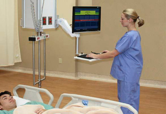


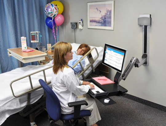
The design can vary from facility to facility with moveable arms, moveable keyboards or moveable computers being interchangeable. Regardless having these mounted computers in the room is much more convenient. These pictures can attest to that.
5. One physical object could be a computer with the scanner. The presenter could ask for a listener to be a patient with the computer at their side. Very easy to demonstrate its effectiveness. Another object could be a computer on wheels. The presenter could put this at the other end of the room or in another room. Therefore showing it takes precious time to locate and bring a mobile station to the patient. The last object could be the moveable wall hinge to demonstrate how helpful it is to be able to adjust it to users height or patient’s location.
6. Since nurses spend the most time with patients, they know what designs would help the facility and the ill. This computer design is constructive input on how to make nurses work more efficiently. They are uniquely qualified according to Eagle (2016). Nurses understand the needs of patients and families and if this computer is already in the room it could save space not having to bring a mobile station in the room, time and give the nurses more time to focus on medications and treatments.
4 notes
·
View notes
Text
Portfolio #4: Scamper

At my job the rooms are very small which give me limited space to move around, some times I have to walk sideways to get to the patient. The poor design of the indoor environment and the multiple patient equipments don’t allow families to visit long with patient, at times family have to switch because the room doesn’t fit everyone at once. The rooms can only fit one chair and it’s not the very comfortable one, which does not encourage families to stay for long time. According to Naccarella (2016) “The three elements of workplace design that most significantly affected nurses were space, proximity and indoor environment quality (p. 6).” These three factors impact nurses performance as these are empirical for the nurses to get task done.

Scampering
Using scampering, I would modify the rooms by making it bigger so that family has enough room to visit with patient, adding a comfortable chair/couch for visitors. place equipment where the wires are out of the way. Good lightening so that patients who has impaired vision have no trouble seeing at night. Also, use a more vibrant color that is happy and welcoming to patients and families.
Changing the physical elements of the room can radically help patients not to feel so stressed, as being in the hospital can affect both the patients and family as well. For that reason, indoor environment must address patient and family needs. Nurses consequently, benefits from this design because not only we have more space but also our patients is happy spending longer time with family. This leads to job satisfaction, staff attraction and retention.
2 notes
·
View notes
Text
Portfolio #3: Elements
Use of Line: The following picture is of a Jeep Patriot, the car I presently drive. I chose this object to describe the use of line because I feel this is what drew me to type of vehicle. I found it very interesting when car shopping that my husband and I have very different tastes in cars, and he has trouble understanding why I was attracted to this style. The shape of this car is boxy, with very defined lines. The preciseness and clear definition of the shape makes me feel safe, and evokes a feeling of ruggedness and strength. I felt the use of the shape gave this vehicle a sharp appearance and even though this may sound silly, it gave me a feeling of invincibility on the road. After discussing this with my husband and visiting several dealerships, we discovered that my husband enjoys a vehicle that has curves and a more sleek design.

Use of Color: This picture displays a living room that is quite similar to the living room I have in my home. I am particularly fond of light blues, browns, and creams. The brown and cream color in this picture make me feel warm and cozy. These colors help me to feel relaxed and make me want to snuggle up on the couch with a soft blanket. While these emotions are great, there is something to be said of the expression “too much of a good thing”. This is why I like the blues in this picture for a few reasons. For one, the blue in this picture can be seen in the middle of the room, which draws your attention to the center of the room which creates a feeling of closeness. The second feeling the blue color gives me is a sense of energy and awakens my mind. I feel the combination of warm (browns and creams) and cool (blues) help to complement each other and create a balance. While I enjoy feeling relaxed at home, I don’t necessarily want to feel like a “slug”, and the use of cool colors helps me feel relaxed, but alive!

1 note
·
View note
Text

This picture represents a typical acute hospital room. Often there are two patients occupying this same size room. This posses a problem for both patient and staff safety. The rooms are small and there are multiple machines used to administer and monitor patient care. The clutter of these rooms, especially when dual occupies, lead the patient vulnerable to negative consequences. The problem this photo represents goes back to the indentification phase of the design process. The specific design problems need to be identified before they can be corrected. Regarding the SCAMPER actions, I believe this problem falls into the Eliminate or Elaborate action. We first need to look at what is essential to this environment and what can be eliminated. By eliminating unnecessary objects, we can create more space to conceptualize a better working model. This design falls in the usability hierarchy of design. While it is functional, it is not safely usable. It posses great safety risk for error. After using the Elimate and Elaborate SCAMPER action, this problem would then rise to the proficiency level of design needs.
4 notes
·
View notes
Text
RN Portfolio 3: Elements * I used all my own photos / artwork for this portfolio*

Color:
This is more powerful with the sunset behind it. The both warm and cool colors surrounding a dark figure in the foreground give the statue a more commanding presence. The straight and angular lines in the background elements (powerlines and barn) not only draw the eye inward to the figure but from the foreground to the background towards the sunset. They create a contrast to the curverlinear statue which has no straight lines. It gives the statue sense of fertility and new growth.
I feel empowered when I look at this photograph. Depending on the lighting and the angle of how you are looking at the statue, it can give a different feel. In the morning this statue always looked fresh and new to me, but at dusk it was empowering and invergrating. This statue was designed to make you think about Mother Nature but was placed in a rotary in the middle of an almond orchard. This creates a dichotomy of the nature it is supposed to represent and the dark hard bronze it was made of.

Pattern/ Texture:
There are 2 types of texture in this photo. Texture of the grape itself and the texture of the light and shadow in the background. In combination it feels like you could feel the texture through the computer screen. There is is also a pattern created by the background colors. They are out of focus but you can tell by the shape, color, and contrast that they are leaves.
0 notes
Photo
RN Portfolio #4: SCAMPER - Elements analysis - redesign
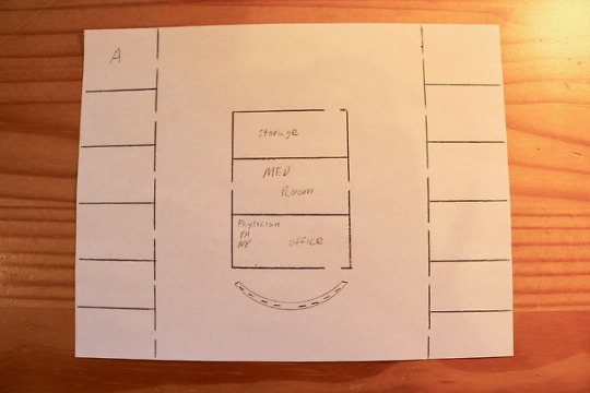
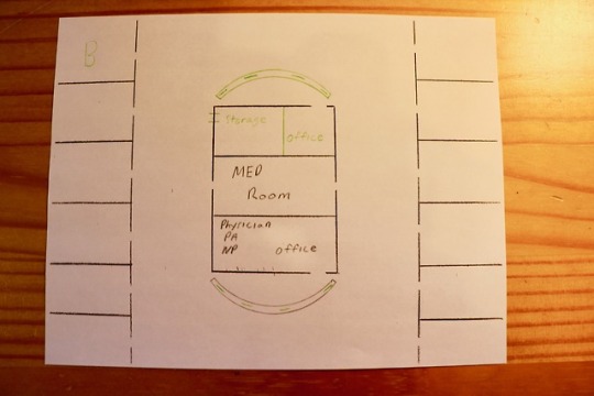
Naccarella (2016) explains that the physical environment has an effect on nurses workflow, and that workplace design can make a meaningful contribution to a hospitals staff attraction and retention. The design change I would like to make would be one that creates a new nurses station on the opposite end of the hall, picture B. The one nurses station, picture A, creates a cramped, overcrowded and ineffective work station. Nurses are “stepping” over each other, “rubbing” elbows and can't seem to find adequate room to place paperwork or other items while documenting. Not only is it crowded but noisy as well. The proximity to each other seems to amplify the conversations which can be distracting. After utilizing the SCAMPER method, I would modify and elaborate by creating a new nurse station at the end of the hall, and divide the storage room so that another office could be added. This would lessen the number of computers and people at one station and create a more comfortable and spacious work environment. This would also allow healthcare professionals to be closer to the patients at the end of the hall. This design change would be beneficial, as Naccarella (2016) states lack of appreciation can be countered by providing an effective, efficient and comfortable workplace.
0 notes
Text
RN Portfolio #3: Elements


Texture/Patterns
I chose this table runner for my dining room table because of its simplistic look, yet elegant. It definitely compliments my dining/kitchen as the theme is gray, white, and black. However, what draws me to choose this item was because of its intricate embroidery patterns. The runner is made of gray fabric which gives that simplistic look. The intricate line, which has a gray/silvery sheen to it, intertwines with other lines which create this classic, regal and elegant look. When you touch the lines, you can feel it slightly elevated, not flat and can even follow the lines through touch. I think the embroidery work on this fabric is absolutely beautiful!


Shape/Volume
This Chesterfield chair definitely brings sophistication to my living room at home. I have two of these chairs and also a matching loveseat couch. With its upholstered barrel frame, diamond button tufts, rolling arms, hardwood turned feet in dark brown, and shimmering nailhead trim, this beautiful Chesterfield chair instantly adds dimension, completion, and super chic style to any space.

My Backpack
I use this backpack whenever I go home to Maryland. I commute to work and this backpack has so many spacious pockets that I can store all the essentials I will need. The teal color definitely adds to its beautiful design. With its color it definitely draws the eyes, not overwhelms it. It is also one of my favorite colors. This wonderful backpack helps my commute is several things. It has a support cushion at the back which definitely helps when I carry a lot of things. It also has multiple pocket dividers which help with organization and it definitely helps me finds things immediately. This bag not only brings me joy, but it provides a nostalgic feeling as this was the bag that I used during nursing school. This item is definitely sturdy as I received this bag as a gift 3 years ago. With its sturdy design, I am positively optimistic that I will have this item for a long time.
0 notes