#it was a combination of 2 things: 1) i couldn’t decide on a colour scheme & couldn’t decide whether i should trust the yarn colours
Text
Gotta love seeing a cute knitting pattern that is free for Valentine’s day only, being excited at the prospect of saving money, and then immediately spending almost £30 on materials to make the damn thing 🤦🏻♀️
#it was a combination of 2 things: 1) i couldn’t decide on a colour scheme & couldn’t decide whether i should trust the yarn colours#in the photo; so i decided to buy a few different options#like i trust this navy blue but is the white going to be too stark? should i go with beige? but is the beige too dark?#will the duck egg blue clash with everything else? especially the beige#so i ended up buying the white the beige the navy the duck egg And also purple#at least i can have variations. tbh the pattern itself has variations (it’s a colourwork pattern and there’s two different design options)#so it’ll be easy to tell them apart if one is beige and purple and the other is white and duck egg#or some other combination idk#that was when i noticed the second thing which was the free delivery promotion#yes i got swindled#i don’t think i have double pointed needles in the size i need for this specific pattern so i bought some just in case magic loop confounds#me. and then i was £5 off the free delivery promotion so i was like ‘fuck it’ and ordered a random sock yarn that was on sale#i figure at some point i need to get over my hatred of making socks. also my mom will stop asking me to make them if i make her one pair#i mean she hasn’t actually Asked but she goes on and on about the socks my godmother makes and how good they are and then looks at me like 🥺#and i’m like oh my GOD. you saw me have a breakdown trying to make those slipper socks. can you chill#anyway tl;dr i have once again spent money for no reason. lol#personal
0 notes
Text
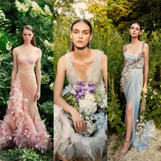
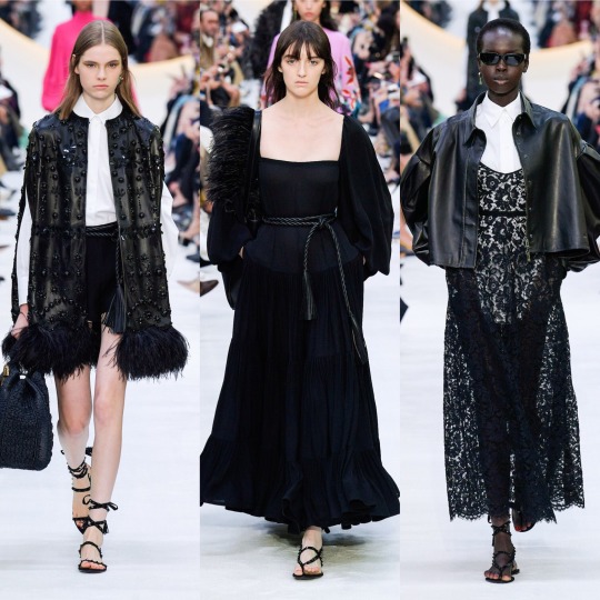
Final shoot.
For my final shoot, I feel as though I couldn't be happier with the way things came together. I feel as though it was the perfect combination of every avenue I explored within this project. I kept the theme of shooting ‘real’ women throughout and mixed that with each aspect of each test shoot which I think worked the best.
From my initial shoots, I decided that I wanted my final images to take more of an editorial than documentary approach. Therefore I exaggerated the colour scheme, set and props to create a sort of fantasy approach to the images.
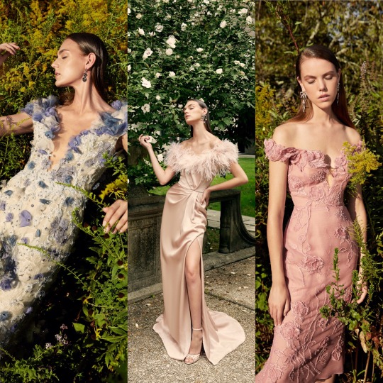
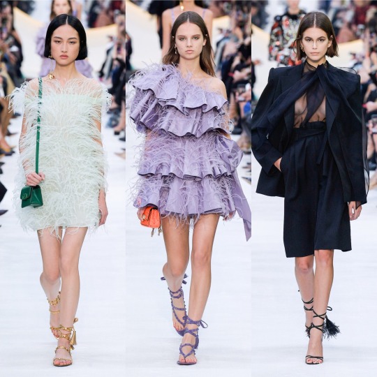
As a woman there are certain things we are taught from getting wrapped up in a pink baby blanket- 1. that is our favourite colour (pink) and 2. we will be judged on face value and (if we’re lucky) showered with compliments of our hair, eyes and smile, but rarely our brains, kindness or humour.
We are taught the social construct of femininity from the moment we are gifted toy kitchens and play dress up in pretty little dresses. I wanted to challenge this social construct.
Men often see women how the way to see us. Sexual beings, there to be looked at, but never too look back. There to project sexual fantasies on too. There to be judged and our chests made the topic of locker-room talk.
I wanted to adequately explore the notion of women being looked at and women being seen, because my God are they different things. This is why it was absolutely crucial that every image had the model making direct eye contact with the viewer, as they are there to be seen.
I also thought it would be a really fun idea to play with the idea of femininity and what it actually means in the 21st century. Because say what you want, but I have never held a pint in my hand without a man making a comment. I have never sat “un-lady-like” without a man making a comment. And I certainly have never been on a night out without a man making a comment of mine, or my friends ‘melons’.
Does a woman sparing her ‘feminine’ traits for ‘masculine’ traits threaten a man? Is that why it recieves impolite remarks? Or is it the idea that men have grown up longing for a ‘perfect’ woman who will ooze pink femininity?
Thats why I wanted to develop the notion of masculine and feminine constructs and create images which will provoke a reaction. I wanted too create interest and depth. Images that take a second glance. Images that capture everything which I initially deemed so important.
So, in summary, my collection of images are real women with real bodies, real skin, real body hair, in a pink fantasy looking directly at the viewer, doing all things that make men oh so manly while also being the picture of sugar and spice and all things nice.
3 notes
·
View notes
Text
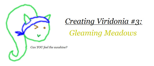
It goes without saying: the first level always matters. If it doesn’t leave a good impression, it would hardly motivate you to give the rest of the journey a chance, would it? Being in fanfic form aside, Beyond the Stars is no exception, and because of this, Gleaming Meadows was actually one of the longest zones to work out. Viridonia is meant to stand out from previous Sonic settings after all, and kicking things off with a poor man’s Green Hill wouldn’t cut it.
Since the first level in a Sonic game usually tends to be either a hilly area (Green Hill, Emerald Hill, Seaside Hill) or an urban area (City Escape, Westopolis, Windmill Isle to an extent), I decided a good way to set this zone apart would be to... combine the two! This was inspired very much by Neo Green Hill from Sonic Advance, since although that zone wasn’t a city, it did add some minor urban elements the further it went on, most notably the bridge at the end where you fight Eggman. So as tribute to a forever underrated installment, Gleaming Meadows does that too, but in a different way.
Creating Zone 1: Gleaming Meadows
1-1: Blossom Fields
What’s a good way to make your first level stand out from all the Green Hills? Give it more than green, obviously. While it’s important that the entire adventure is full of interesting locations, I really wanted the first level to sound as gorgeous as possible in order to leave a strong first impression for this new journey, so what better inspiration than tulip fields, particularly those of the Netherlands?

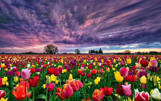
The added use of yellows, oranges, reds and pinks already help set it apart, but there’s also the fact that although there are some lakes and rivers here and there, it’s not particularly coastal.
This aesthetic not only serves to get things off to a good start, but it also sums up the running theme with Beyond the Stars in general. Namely, that although plenty of the basic level tropes will be familiar to us all, many of them will be handled in rather different ways, thus proving that as long as you can think outside the box, there’s plenty of life in them yet. Some examples are more extreme than others, but other times, even a simple change of colour, weather, or time of day can make all the difference.
I mentioned in Chapter 1 proper that the cliffs in Blossom Fields have unique markings that convey a vague, lore-hinting narrative. I couldn’t find a better image to explain how this would look, so I’ll have to resort to this shot from Paper Mario:
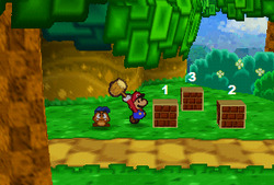
See the cliff behind them, with its starry patterns on the soil? That’s basically the gist, but with a more complex pattern.
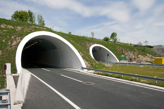
Also mentioned was the addition of a tunnel near the end of the stage, which is one example of the Neo Green Hill-esque hillside with minor urban elements that I intended.
Don’t assume the inside is drab however. On the contrary, it comes with abstract graffiti in a style reminiscent of the Colinton Tunnel in Edinburgh:
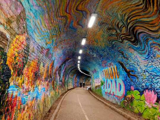
Very Jet Set Radio, eh? In addition to simply being more interesting this way, I figured it fit Sonic perfectly.
But you might question what a tunnel inspired by Edinburgh is doing in a level inspired by the Netherlands. Well, this is another running gag with Viridonia. While not always the case, a lot of times there’ll be combined aspects of real world inspiration, as opposed to Unleashed and its clear cut Not-Greece, Not-New York, etc. This is not just me throwing things at the wall to see what sticks, there is in fact a purpose to it, as it’s one of the more subtle ways of showing how peculiar Viridonia can be compared to other places in Sonic history - partly due to the Ethereal Zone - with only the Little Planet truly competing with the island in that field.
And y’know, it gives it that extra bit of identity and variety, eh?
Now, with music choices to explain what sort of musical atmosphere I’d have in mind for each level, I’m gonna have to use basic links from now on, since I rediscovered the hard way that Tumblr only allows up to five or so direct posts. It’s also worth noting that if this were a real game, it would do what SA1 (and, uh, ‘06) did before it, with each level having at least two different bits of music for the appropriate sections to add even more flair. I’ll still be listing two examples each for extra comparison’s sake, so with that said...
First Section (the fields):
Opening Demo (Sonic Mega Collection)
Ending B (Sonic Advance 3)
Second Section (the tunnel):
Topical Tropical (Sonic: Before the Sequel)
Shooting Ristar
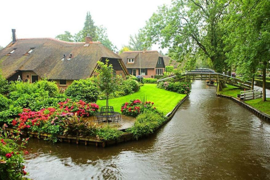
1-2: Swanky Suburbs
Continuing the Netherland theme going on, the local town has a touch of Giethoorn to it, with its calming rivers and little pathways. Though unlike Giethoorn, there would be some cars and short roads sprinkled about.
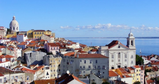
Again, really wanted to convey that feeling of low-key beauty and coziness, and provide more justification for why Sonic and Co would come here for a vacation. But that’s not all: when it comes to the houses and other buildings, the red and white colour scheme is more based on those of Portugal:
And of course, you have the local parks as well. You can even interact with the slides and swings if you want, because you’re never too old to make the kids wait their turn.

First Section (calm):
Neo Green Hill Classic
The Amazon (DuckTales Remastered)
Second Section (when Badniks start wrecking things up):
Wave Ocean ~The Inlet~ (Sonic ‘06)
Andy’s Neighborhood (Toy Story 2)
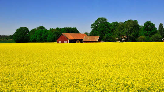
1-3: Yellow Hills
As we go on, we leave the Netherland influence behind, and with the countryside in sight, the clue is in the name. Lots of yellow to be had indeed.

And inbetween all these fields, we have some villages, of which the rural vibe suits the place just fine.


Then as we go into farmyard territory, the yellow actually starts taking a back seat in favor of red, because I guess even I’m not immune to the subverting expectations fever. Hopefully I’ve done it in a way that isn’t asinine though.

The barnyards would be the stereotypical red and white, since it works well enough with the autumn colours, and can still pop out despite there being so much red surrounding them.
And yes, there are many farm animals hanging around here.
Yes, that includes horses.
No, they’re not Trudy’s family.
First Section (yellow):
Tornado Alley (Crash Bandicoot: The Wrath of Cortex)
Mount Lineland (Super Paper Mario)
Second Section (red):
Green Hill ‘12 (Tee Lopes)
Menu (Mario Tennis)
1-4: Rusty Mill
A wooden mill doesn’t leave a lot to the imagination, so it would look pretty much exactly as you’d expect, albeit a tad more old and worn.
The same goes for inside, really. Since the interior of mills are tricky to find interesting images of when elaborating on your quirky Sonic the Hedgehog zone, I’ll be using another game for comparison instead, specifically Donkey Kong Country 3:

Except multiply the cobwebs by five.
It’s decayed, and a bit grim, but not enough to the point where it would feel like it’s near the endgame. Yet another thing I go in hard on in this story: escalation. In order for later zones and climactic moments to be more striking and impactful, you gotta start off by taking it easy. There’s still action to be had, and there’s still mysterious and/or ominous touches here and there, but it’s for the purpose of organically building things up, so that when things do escalate, you actually feel it when shit starts going down. Pacing, boys and girls! Learn it!
Then again, as with Angel Island in S3&K, this place gets set on fire halfway through, so maybe I need to remember my own lessons. But on the other hand, also like S3&K, it still pales in comparison to what happens later, so...
Lastly for today, when you’re fighting the fearsome Paindozer, the section of the mill that you confront it in suspiciously takes a form more akin to a old fashioned warehouse. Like... IKEA, I guess. But on fire.

So congratulations, you got through IKEA Zone. Looks like Eggman should have stuck with B&Q Zone instead.
First Section (calm):
Pogo Painter (Crash Bash)
The Walk of Life (Rayman 2)
Second Section (on fire):
Vs. Rotatatron & Refreshinator (Sonic Colours)
Set Point - Match Point (Mario Tennis)
11 notes
·
View notes
Text
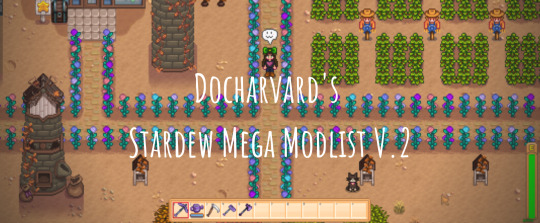
docharvard’s stardew mega modlist v.2
howdy doody everyboody!
my last modlist did pretty well with regards to notes, but there have been some major changes to both stardew and my modlist since then, so i thought it was high time i made a new one!
once again, this is mostly graphical overhauls, with a few gameplay tweaks and cheats here and there. most of these mods are fairly popular, so chances are you would already know them, but i hope this compilation finds its use anyway. now, without further ado, the list starts under the cut!
one final warning before i proceed, as of today 21st of February 2020, some of these mod’s official releases do not work with Stardew 1.4.5, but they do have unofficial patches floating around on the forums that update them to work with this patch, and i will be linking to those instead of the official releases for those mods (you will need a chucklefish forums account to download them). if you see this in a few months or weeks time from when it is posted, it is probably in your best interests to check the official releases for updates.
ENGINES/PRE REQS
most of, if not all, the mods on this list will require some combination of the following engines to run. i know nothing about coding, so i cannot give an apt description of what they do or how they work, but trust me, you will need them. if you don’t download all of the mods in this list, you might not need all of them, check the requirements segment on a mods nexus page to see which of these engines you will need to run it.
SMAPI - SMAPI is the modding API for Stardew, necessary for all modding (besides old xnb mods).
Content Patcher
Custom Critters
Json Assets
Mail Framework Mod
More Grass
PyTK
SpaceCore
TMXL Map Toolkit
QUALITY OF LIFE
mods that don’t change the game significantly, but slightly improve the base mechanics to make it easier/better.
Auto Animal Doors - automatically opens all barn and coop doors at a set time every morning, and closes it once all animals are back inside at night.
Big Silo - increases the hay capacity of silos to around 200k.
Casks Everywhere - gives the player the ability to put casks anywhere, instead of only in the basement of the house.
Crop Transplant - gives the player the ability to move crops and trees without destroying them.
Mod Update Menu - puts a handy-dandy extra button on the main menu that shows you your modlist and whether any mods are out of date. clicking on a mod in the list will take you to its web page, if you want to download the updated version. (sometimes, like SMAPIs console, it is wrong. occasionally will tell you a mod is out of date when it isn’t, but is more often right than wrong.)
No Crows - removes crows, no more losing crops to those thieving corvid so-and-so’s.
No Fence Decay - fences no longer decay and break down over time. they stand for time immeasurable, like the monolith in space odyssey, or the empty shell of a blockbuster video.
Safe Lightning - lightning will only strike lightning rods, or if none are available, it will not strike at all.
Stack Everything - gives the player the ability to stack every item in the game, items like casks can now be stacked instead of having a 1:1 ratio in inventory/chest space.
UI Info Suite - ui overhaul(ish) that adds things like being able to see if you’ve pet an animal that day, whether the travelling merchant is in town, what your luck is for the day, or how many days a crop/keg has until it’s finished, etc. this mod is a must have for any playthrough, even if you’re going completely vanilla. possibly the most useful mod that exists for stardew.
GAME TWEAKS
things that add mechanics or change gameplay.
immersion (i don’t know what else to call it)
Babies Take After Spouse - makes your children actually look like the offspring of your chosen spouse. also adds some more outfits for toddlers, if you’re into that.
Canon Friendly Dialogue Expansion - adds a metric buttload of new dialogue for all of the friendable characters, in case you’re sick of seeing the same four sentences on loop.
Cat Gifts - bit of a misnomer, makes your pet (either cat or dog) occasionally bring you gifts of random items. it’s pretty darn cute.
Climates of Ferngill - expands the games weather system, as well as tweaking the original one, to add new things like fog, and weather that changes over the span of a day instead of being one set thing.
Eemie’s Bees - adds bees! they hang around your beehives! very cute!
Lunar Disturbances - adds a rad lunar system to the game, including an overhead moon that goes through phases. also adds stuff like eclipses and blood moons.
Mizu’s Flowers - adds so many new flowers to the game. frankly, it’s quite homophobic how few variations are in the base game.
Oasis Greenhouse - completely reworks the greenhouse to be way bigger (on the inside, it doesn’t take up more space on the actual farm) and have more rooms in which to do greenhouse things, like spots to grow trees.
Seasonal Villager Outfits - stardew residents will now change clothes on the reg, including during different events, depending on the weather, and with the seasons.
Slime Hutch Winery - retextures the slime hutch to look Not Garbage, and adds a customisable inside space that you can combine with Casks Everywhere to make a usable winery.
cheats
there is only one mod in this section but i couldn’t figure out what other section to put it in.
CJB Cheats Menu - it’s a cheats menu. for cheating. amongst normal cheaty things like infite health and stamina, gives you the ability to increase your movement speed, and harvest crops with a scythe, which i find immensely useful.
AESTHETIQUE
who needs the orignal graphics when you’ve got soft pastel versions? most of these are by elle, aka junimods. she’s good at aesthetic overhauls, sue me.
Bathroom Replaces Spouse Room - replaces the spouse room with one of three nicer looking bathrooms, in case your spouse has decided to have an unchangeable hideous colour scheme that does not go with the rest of your house, like all of them do.
Better Artisan Goods - retextures the artisan goods (milk, cheese, fruits, etc) to look prettier/more accurate.
Elle’s Cat Replacements - highly customisable cat retexture, including fur patterns, and the colour of its collar.
Elle’s Critter and Butterfly Replacements - retextures the little critters and butterflies that hang around the valley.
Elle’s Dog Replacements - same as the cat replacements but for dogs. the nomenclature is difficult to grasp, i know.
Elle’s New Barn Animals - retextures of all the barn animals, with a whole bunch of customisation options to choose from for each.
Elle’s New Coop Animals - same as the barn animals one. shocker.
Elle’s Seasonal Buildings - highly customisable retexture of all the buildings on the farm. pick from a bunch of designs and colour palettes to make your farm the best representation of you it can be. or don’t, i’m not your dad, i can’t tell you what to do.
Flippsie’s Alternative Lamp Posts - retextures lamp posts to look a little more victorian and aesthetic-y.
Garden Variety UI - customisable ui colours! let’s you customise the look of all the menus, inventory bar, etc, from a buuuunch of different colours and designs.
Industrial Kitchen and Interior - retextures the kitchen appliances and benches to a softer aesthetic.
Starblue Valley - reshades the whoooole of stardew to make it colour gooder. greens are more green, blues are more blue, and the whole game looks a lot less yellow and harsh. much softer and easier on the eyes.
Wildflower Grass Field - retextures and adds a bunch of variation to the grass that grows around the valley. instead of one grass texture everywhere, there is now over 50 possible combinations, really makes the whole place look much more realistic and varied.
Yellog’s Wood Craftables - retextures and redesigns the craftables (chests, beehives, kegs, cheese press, etc) to have a softer palette, with a rustic wooden aesthetic.
and that’s that folks! i also use these two harvey dialogue expansion packs, but that’s because he’s my favourite bachelor, so i kept them off the general list.
i hope y'all found this modlist useful, sorry it took me so long to get around to making/updating it.
thank you so much for all the followers on this newer sideblog of mine, it’s really cool to see other people enjoying a game that i love so much.
catch y'all on the flipside! ^-^
#stardew#stardew valley#stardew valley modding#stardew modding#stardew mods#stardew valley mods#stardew modlist#stardew valley modlist
75 notes
·
View notes
Text
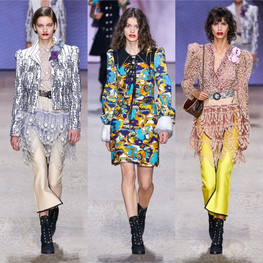
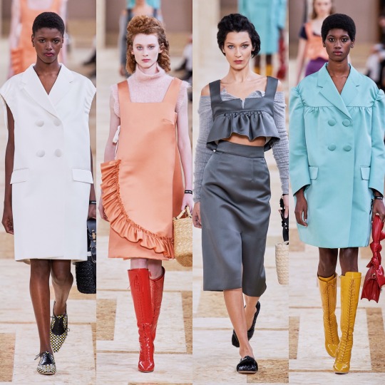
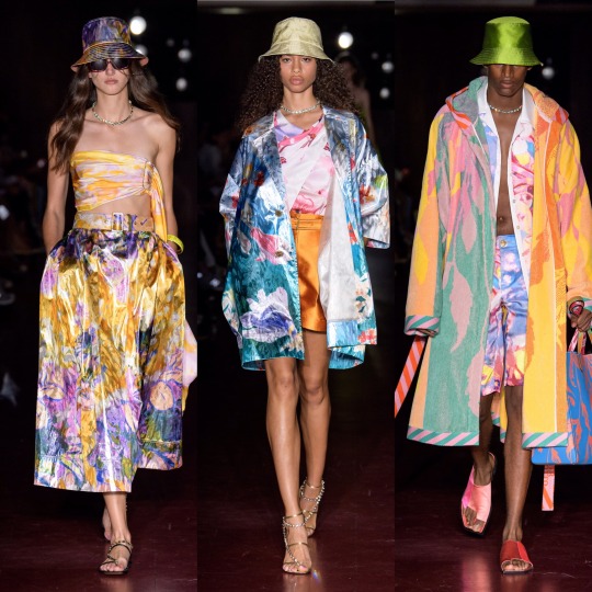
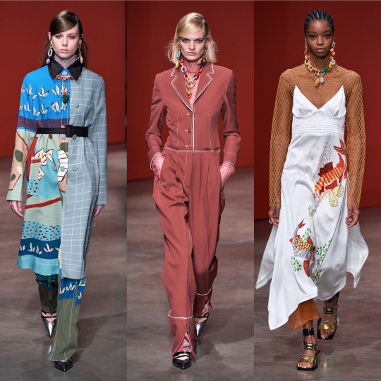
S/S 2020 Fashion Month: A Basic, Uneducated Fashion Heaux’s A-Z of Everything Noteworthy (Part 2/3)
Hi to anyone reading,
Back at it again with the giving my unsolicited opinion on 2020′s spring/summer offering, I’m gonna hop straight into part 2 of my fashion month review!
Sorry to start with an underwhelming few but my compulsive tendencies are making it really hard to break out of this alphabetical structure (cry laughs whilst thinking about how long it took me to face up at my retail job last night because it would give me vaguely homicidal urges and make my fingers tingle every time a customer moved something slightly out of line), so I’m gonna whizz through a handful of collections. First up, Halpern:
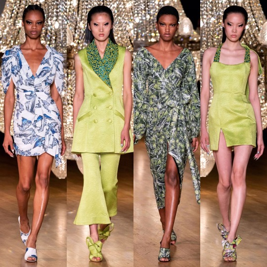
Not much to say but I’m envious of the heavy liner (my hooded eyes could never) and I like the colour scheme. As for the 80s style metallic pink dress?

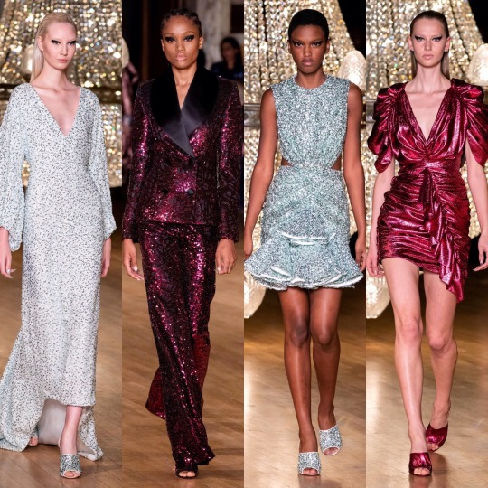
Helmut Lang:

And Hermes:


Of these 3 collections, Hermes is definitely the most interesting. I like the colour scheme and the utilitarian shapes and the tan coloured jackets are an absolute shoot. This is how you make safari look fresh, D&G take note.


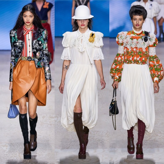
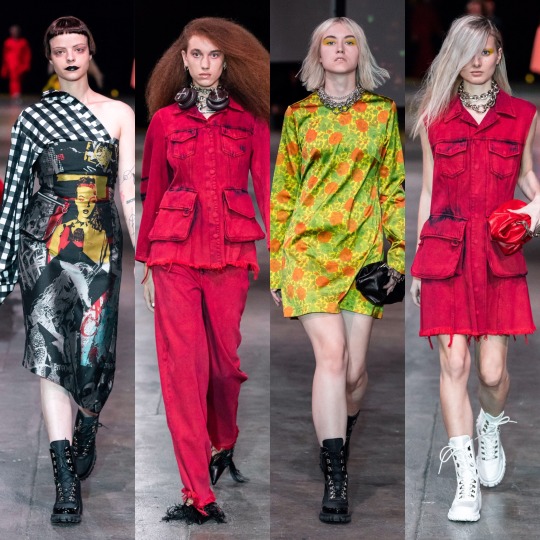
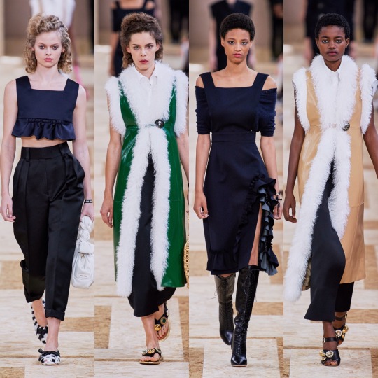
Isabel Marant was okay. It’s cute, sure, reminds me of something Mary-Kate and Ashley would’ve come out with/worn in the 2000s, and there’s definitely some things I would wear, but I wouldn’t say it looks all that luxury. Pricey, sure, but like, Free People pricey, not designer pricey. As a collection, it’s not all that conceptual, unless the concept is L.A girl does a Starbucks run after her bikram yoga class. What I will say though is that some of the S/S 2020 commercial trends are becoming clear: white cheesecloth pieces, peasant blouses, cowboy boots, scrappy sandals, neutral tones, and bandana print.
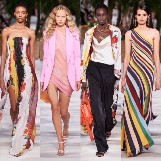
Now onto the darling of high fashion Twitter: Jacquemus.
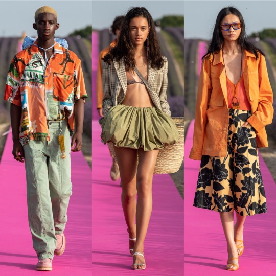

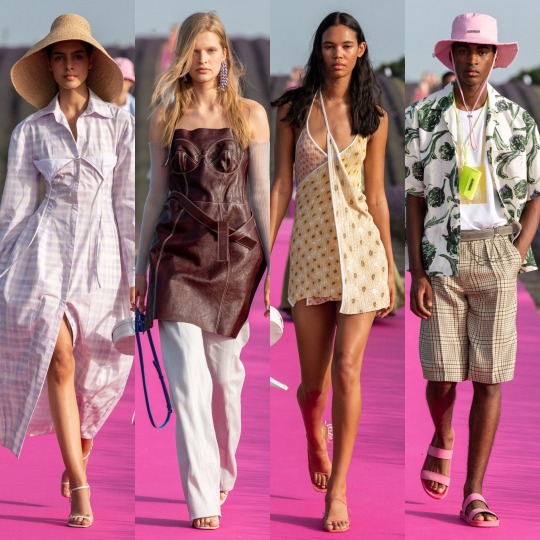
As far as presentation goes, this has to be one of my favourite set-ups of the season; a hot pink runway running through a lavender meadow is as canny and serene as those who sing the praises of Simon Porte Jacquemus would have you expect, and the clothes were easy, breezy and beautiful, even if there is an element of getting dressed in the dark going on with the styling which put me off including a few otherwise gorgeous pieces. It might not be 100% my style but you can tell this is a brand of the future which is only going to go from strength to strength.


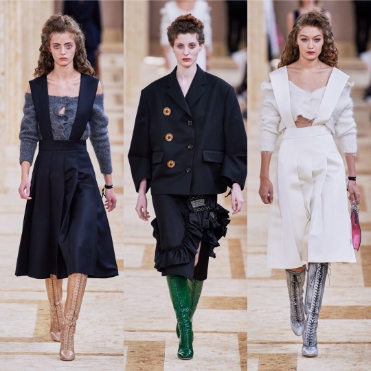
And everything was beautifully and purposefully crafted on the runway with J.W Anderson this year. The pieces are graceful and timeless whilst still easy to envision as something a modern woman would throw on to (very fashionably) run some errands in the city. This was also one of the handful of shows (IIRC! This might be a case of extreme deja-vu!) where we saw the sandal straps tied over the trousers, I’m guessing to accentuate the ankles, and...I’m surprisingly here for it? Though in a sense it kinda resembles when I accidentally get my work trousers tucked into my slipper socks, it’s an interesting touch and adds a bit of a shape to otherwise billowing bottom halves.


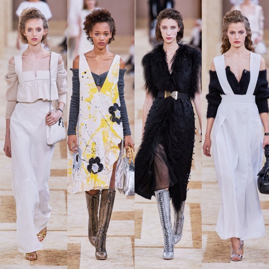
Following Jacquemus’ lead (or vice versa, I’m way too deep into this fashion month haze to work out who went first at this point), Lacoste also put on a co-ed show. Otherwise crisp and preppy as per, the neckerchiefs (even if seeing them all next to one another does give off a bit of a Disneyland Main Street barbershop quartet vibe) and vinyl/wet-look/PVC/I’m still not sure what differentiates the 3 coats were an out of the box touch for them and I really liked it. It’s athleisure, but more like something Hayley Bieber would’ve worn as part of her Princess Diana inspired shoot than anything I’d wear to the gym.
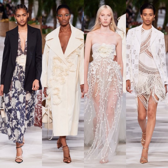
LMAO, as if I go the gym. But you get my point. Next, Loewe:

Delicate, feminine and all around delightful, the S/S 2020 Loewe collection is up there with Chloe and Brock when it comes to most spring appropriate. More chiffon, lace and doily-like detailing, please, the old woman in me lives for this kinda thing made fashionable. Like with J.W Anderson, you can tell the design team wanted to do something different without just throwing shit onto their pieces for the sake of being wacky, and so we end up with these dramatic, slightly geometric waistlines and almost angelic Victorian nightgown inspired dresses that kinda make me wished that 1). ghosts existed and that 2). I lived back in that era so I could die some tragic death wearing any one of the dresses on the left in the top 3 rows and then haunt the shit out of everyone. That would really be an iconic fashion moment. Also wonderful, imo, was Louis Vuitton:

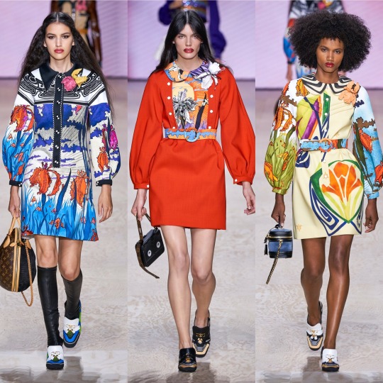

The mix between 60s and Edwardian I never knew I needed, as opposed to Gucci’s forward thinking take on the former decade, Louis Vuitton takes it back even further and throws in late 19th/early 20th century structures and references. I adore the what seems to be a mix between brocade and paisley print and the exaggerated collars are a very cute touch. The jacket on the top left is a highlight, a more neutral version of the similar catsuit seen at the Longchamp show (I couldn’t personally pick enough highlights from that to include it), and I now more than ever really want to try and pull off a sweater vest. The shoes might not be the most exciting thing ever but they’re also a personal favourite, from the knee high boots to the loafers with the LV moniker.


Maison Margiela was very cool and again, I’m in love with the shoes and just the accessories in general, ESPECIALLY those hats. I don’t know if I’m way off base here but this show is almost a modernised, fashionable version of a 1940s period drama about WW2 pilots and evacuees. Yes, maybe I am just getting that solely from the trench coats and the naval influences and the exaggerated collars but I think with that list I made quite a case for that perspective, right? Right.


And completing this holy trinity (appropriating the term I usually reserve for Emma Watson, Emma Stone and Emma Roberts is not without careful consideration) is Marc Jacobs. One of my ultimate favourites of this season, this collection is absolutely EVERYTHING: kitschy, dream-like, whimsical, over-the-top, and totally appropriate for your slightly eccentric aunt who always drinks too much wine and talks a lot of shit every time she comes over for dinner. I really feel like I walked into wonderland looking at this collection, and in the best way possible, it gives me a female Russell Brand in the 2000s’ wardrobe on crack. On the one hand we have these insanely beautiful and ethereal chiffon floral dresses but then we also have fricken top hats. Basically, it’s everything I love about fashion and I don’t know if anything can top it. Periodt (and I type that with a totally straight face).
Next, onto another personal fave, Marchesa:
Which is as always, beautiful. I was going to write that if Disney princesses came to life and lived in the modern world (so, in other words, Elle Fanning), they would be wearing Marchesa and then I remembered that the film Enchanted exists and had a lightbulb moment and thought OH MY GOD IF THEY REMADE THAT IN 2019, THE DRESS ON THE RIGHT IN THE MIDDLE ROW WOULD BE A PERFECT LEVELLING UP OF THE CURTAIN DRESS.
Anyways, favourites of the favourites are the bottom row; I would die for that feather trim.

BUT where Marchesa is everything opulent, overly ornate and err-ing on “fussy”, Margaret Howell’s S/S 2020 collection is completely stripped back and just as effective, if not as to my taste. Very cool, very current, and altogether effortless (in a good way!), with this show Margaret Howell made mid-20th century utilitarianism relevant. I never thought I’d be praising the combination of bermuda shorts, crew socks and a beanie and yet here I am. Character development.
Next is Marine Serre:


Which I really like! The bottom row isn’t really to my personal taste but I can acknowledge that if I saw somebody wearing any one of those outfits I’d think they looked sick, and as for the first two rows, those mesh tops and the slightly chintzy florals are right up my alley.

Marques Almeida put out a really strong collection, imo. The blending of luxurious silhouettes and fabrics with street wear inspired prints and styling is a really interesting and unique contrast and if Billie Eilish ever decided to stop wearing those tweenie clothes and wanted to actually seduce somebody’s dad (I LOVE BILLIE EILISH AND I KNOW WHY SHE DRESSES THE WAY SHE DOES, IT’S A JOKE, PLS DON’T HATE ME), I’d love to see her wearing something like this. It’s a blend of punk, urban, and 2019 e-girl and has the kind of edge that Topshop has lost over the past couple of years that used to make it so aspirational to my 13 year old self. Of all the shows, it also probably has the most personally wearable accessories, and a shit tonne of cool make up looks I’d love to try if it weren’t for my lack of visible eyelid, lol.
Make up looks were a highlight of the Max Mara show too, for me anyway.

I otherwise wasn’t hugely keen on the collection, it being a little too matronly/Miss.Trunchbull-esque for my liking (wild card fashion inspiration of 2019, apparently?). The light paisley print dresses are very dreamy, though, and I can never resist a good suit.


As for Michael Kors, dare I say it, but the basic bitch in me loved it. I know as a designer he’s not held in very high regard by the fashion community and I'm not saying it’s at all original but it did what it set out to do well; I mean, it’s quite fitting that he cameo-d in an episode of Gossip Girl because every outfit would be perfect for the Constance attending incarnation of Blair Waldorf, which is probably why I like the collection. Like yeah, it’s a bit of a Polo Ralph Lauren/Lacoste rip off but it’s daintier and more feminine and so I’m not gonna lie, I’m on board with it.
Next, Miu Miu.


One of the collections I was most excited for, I was a little disappointed. Don’t get me wrong, I really like the collection, but I have never once disliked anything Miu Miu and I usually love it. There are things I love about this line too: the cream, floral lace-up boots, the off-the-shoulder cardigans, the houndstooth oversized coats and of course the fur-lined gilets. My mum used to buy me similar ones when I was a little girl and so they give me childhood nostalgia in the best way possible. I mean, the collection is as girly and eccentric as ever. I think it’s just a little too on the primary school librarian side for me, this time round. Sorry Miu Miu xoxo
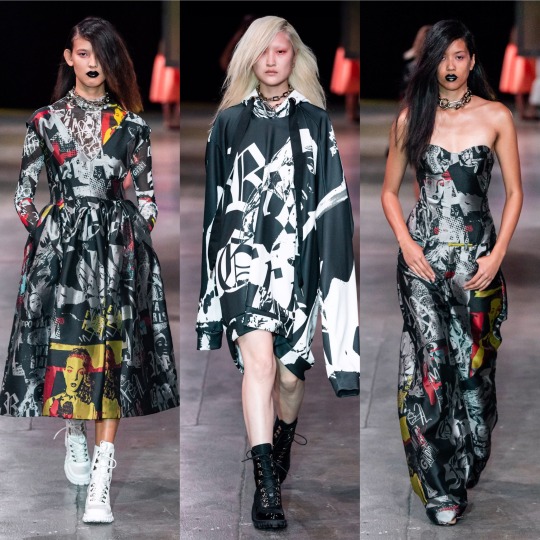
Now I’m just gonna speed through a couple, starting with MM6 Maison Margiela, the younger sister to the more expensive regular Maison Margiela line:


And Monique Lhuillier:

So that I can get to one of my other ultimate favourite collections for S/S 2020: Moschino.
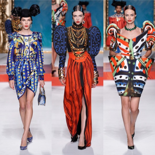
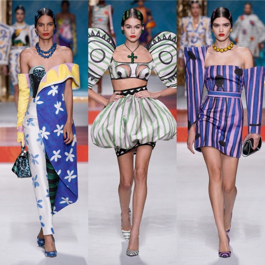

Oh my god, where to even start. Firstly, I might be reaching, but if this show is even remotely to thank for art nouveau mesh tops showing up in the Urban Outfitters new in section, then a very sarcastic thank you to Jeremy Scott. You just made ethical shopping a lot harder. HOW am I supposed to not buy an Alphonse Mucha top? HOW!? I mean, I’m sure I’ll manage (I’m on month 3 without a shopping spree I can’t actually afford now and yes, I am very much patting myself on the back), but HOW!?
But on a serious level, if renaissance was the print of 2019, which I’m still very much into BTW, bring on modern art as its 2020 replacement. The Pablo Picasso inspired show not only livened up a generally pretty predictable fashion month but it’s also got me searching up other times art has met fashion on the runway and thrown me down a particularly aesthetically pleasing wormhole I’m not sure I ever want to escape from (https://frontrowmagazine.ca/art-inspired-looks-were-all-over-the-runways-of-fashion-week-a74e8bc7ff0d and https://www.vogue.com/article/spring-2017-ready-to-wear-fine-arts-trends are good starting points!).
Mugler was also up there with the best of them, imo:

See, if the Moschino collection was all about dabbling in art class, Mugler’s S/S 2020 collection is its more mathematically inclined sister, all about sharp lines and deconstructed silhouettes and symmetry all whilst looking hot as fuck. So very Mugler, basically.
Now, this reference might be slightly off because I haven’t actually SEEN Ex-Machina yet but I imagine if Kim Kardashian were to channel that movie for a costume party she’d end up wearing something from this collection. That sounds like a roast because Kim has worn some questionable outfits but I blame Kanye for most of that and I’m referring to her on a good fashion day, alright!?
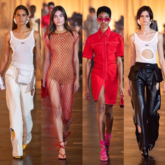

As for Off-White, it’s obviously a lot more commercial than most of the lines I’ve reviewed so far. Like, I can see a lot of these outfits on a mannequin in Urban Outfitters (no, I am not being paid to namedrop them, about 3 people in total read this Tumblr so any kind of sponsorship money would be severely wasted on me). That’s not necessarily a bad thing, and I love all of these looks; it just seems unfair to compare them to the the Mugler or Moschino collections, for example.
The stand outs for me are all on the bottom row: I would buy the utility vest, leather blazer and the all mesh turtleneck under washed-out tie-dye on the spot if I saw them in a high street store. Unfortunately, I feel like that’s kinda where they belong. You just expect collections to be a bit more conceptual, and this one is a little watered down, as much as it’s my style.


Oscar de la Renta was beautiful, of course. Not like I’m shook by how beautiful it is but kinda just what you’d expect from a brand with a name as poetic and fun to say as Oscar de la Renta. The silhouettes are dreamy and the details are as fit for a fairy princess (lmao) as ever. Plus can I just say how happy I am to see butterflies on dresses for adult women again!? And dresses worn by Blanca Padilla nonetheless!? Very here for it.
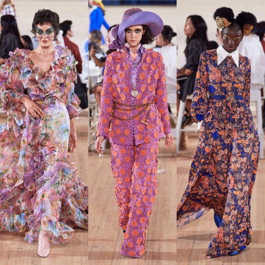
Next up is another on one of my fashion month highlights: Paco Rabanne.


LOOK AT THIS SHIT!
I mean, don’t get me wrong, something about this collection (I’m pretty sure it’s the knee high coloured socks) is giving me primary school teacher vibes, but I'm not mad about it. It’d be the kind of teacher who’s actually really good at their job and has loads of cool hobbies and a really hot boyfriend or girlfriend or wife or husband who you secretly want to be then you grow up/and or have a huge crush on.
Like with Marc Jacobs, there’s obvious flower child elements here, and whilst on the whole the former took my breath away slightly more, this is a lot more wearable. My favourites are the paisley print dress and cape on the left in the very bottom row and all the chainmail pieces (which remind me of the dress Naomi Smalls wore in that whole club ninety-sixxxxx skit on drag race), plus that floral cut out dress with the trailing flute sleeves, which is absolute PERFECTION.

The 70s influence was clear in Peter Pilotto’s S/S 2020 collection too from the abundance of tie-dye to the knit v-neck dress, zany colour and print being the very on-brand focus. That being said, this is definitely more of a street-style inspired collection than usual and whilst the floral suits and dresses on the 3rd row down are very typical Peter Pilotto, the tie-dye corset and combat trousers on the far right, second row from the bottom, are very Jaded London. As for the reoccurrence of the bucket hat, I’ve remained steadfastly against them for several years now (even when our Lord and Saviour Miss Robyn Rihanna Fenty started wearing them) but the way they’re done in this collection even I could definitely get behind; all in all, the show surpassed my expectations.
The same goes for Ports 1961, which was a lot more eccentric than I gathered is the norm from a few google searches. Honestly, I hadn’t really heard of the brand which, upon reading up on it, I feel very dumb for considering it has been around since (in the shock twist of the century) 1961.

Yes, I know how that sounds! But forgive me, I’m still learning:)
Anyway, the fishnet detailing alone pretty much sold the looks I picked out. Seriously, I got a pair of those bloody tights, like, 2 years ago when they became a thing again and now any outfit where I have my legs out feels incomplete without them.
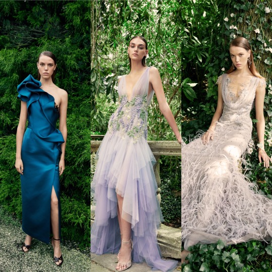
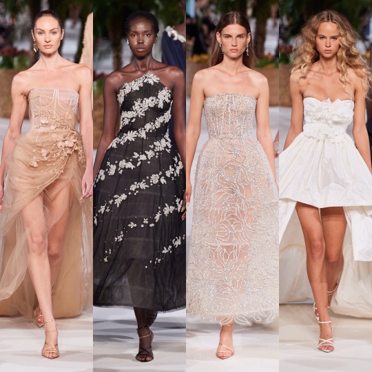
Next is Prabal Gurung, which, as far as presentation goes, was fucking STUNNING:
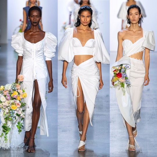


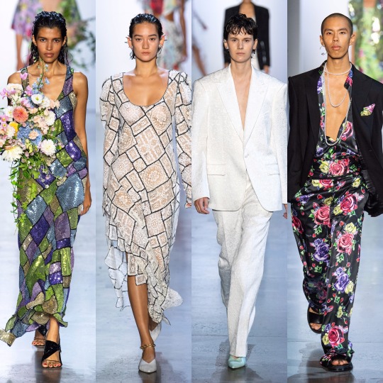
I mean, you could say that I’m easily impressed and that the presence of the bouquets won me over (and you’d definitely have a point there), but it’s also this year’s Givenchy haute couture-esque feathers, the trailing pearl necklaces, the exaggerated shoulders, the dreamy colouring, the everything looking like it could’ve grown off a very fashionably-inclined tree. Like, there’s a lot to love here, from the naturalistic elements, to the context behind the show, an ode to American fashion history and those cast out of it (and the notion of “being American” in general) for so long.
Going from a high to a (personal) low, however, next we have Prada:

I don’t know, I get that it’s supposed to be simple and stripped back and dignified and whatever and I like the looks I picked but it’s just a bit blah for me. The bonnets that kept cropping up just didn’t do it for me and almost ruined what is an otherwise nice skirt suit (top right). Nonetheless, I like the silhouette of the sheer black dress and the the brocade print suit is really luxurious looking, even if the pattern is a *little* Wetherspoons carpet.
Anyways, here’s a quick overview of Rag and Bone:
So that I can stop moaning and get onto a collection I REALLY liked:


I am of course talking about Ralph and Russo. See, this is kinda what I expected from, like, Chanel and yet it’s Ralph and Russo that delivered. Also, it gives me Alessandra Rich vibes which is very much a compliment considering how much I love her designs. I mean, if Valley of the Dolls were to get another film remake in 2019, this is exactly what I’d like to see the female leads wearing, from the pastel suits to the satin kaftan style dresses. The yellow feather trimmed dress is practically a copy of something Marchesa has already done but it’s cute all the same. In my top 10 collections of the season, for sure.

Rick Owens was another strong collection; it goes without saying that it’s not the most wearable but that’s not really what Rick Owens is known for, so I wouldn’t expect anything else. If you want fashion on an alien planet, or something Lady Gaga would’ve worn in 2010, he's your man.
Next, Rodarte:
Obviously the dresses are beautiful and the set is magnificent, BUT...I’m really not a fan of the whole celebrities filling in for high fashion models thing. I like Lili Reinhart and I adore Kirsten Dunst, she’s been in a load of my favourite films, but in a similar vein to Dolce and Gabbana’s influencer show, it’s just distracting from the actual garments, if even worse because I don’t WANT to be distracted here (the same can’t be said for the D&G show, lol). If anybody has read this far, let me know your thoughts!


Roland Mouret was nice, and I always like a coed show, especially when a designer isn’t afraid to blur the lines of masculine and feminine. It’s fresh, lightweight and luxurious looking, Cannes film festival street style eat your heart out, and I love the colour palette.
Similarly, colour was my favourite thing about Sally LaPointe’s S/S 2020 collection.

I would never think that teal and burnt orange would work together, let alone in some kind of faux leather, and yet here we are. Orange is in itself always an interesting colour choice, perfect for the summer with a tan, and I really love monochrome outfits, even though they’re something that ends up being quite pricey to put together; slight differences in tone are okay but if you just randomly throw together a few things and they’re too off, it really doesn’t work and you’d have been better off wearing contrasting colours. For that reason, I’m just gonna admire that all-pink outfit from a distance.


As for Schiaparelli, it’s one I always look forwards to for the sheer weirdness. RTW isn’t quite as kooky as haute couture but still, the interesting choices are still there; what at first glance appears to be flame print is actually coils of hair, and paired with a water print suit is a sequinned jacket emblazoned with a paradisiacal mirage. Ornament-like facial decorations as seen in the over-exaggerated glasses worn with the pony hair suit are also one of my favourite new things to happen in the high fashion scene in the past couple of months and I can’t wait to see how they get watered down to become more approachable for us...regular, non-structurally blessed folks who can’t pull off anything and everything.
Simone Rocha was STUNNING. Romantic and ethereal, it’s druid goddess crossed with upper class Victorian woman of leisure, equal parts delicate and grungy, like a modern, fashion version of Lady Gaga’s Scathach in the Roanoke season of American Horror Story. You know, in the flashbacks, not in present day when she was all gross and like...scalping people and shit. Each dress is so ornate and has such an interesting structure, and the fabric choices give off an organic kinda vibe that create a handmade feel; the collection is, imo, really worthy of being shown under a haute couture heading. When it comes to my favourite element of the show, I’m torn between the petticoats and the hair accessories. I’m just gonna give a cop-out answer and say both.
Stella McCartney on the other hand, is very much a clear ready-to-wear collection.


It’s pretty, for sure. The pastel blazers paired with delicate white mesh tops underneath are a gorgeous combination for spring and I like the reoccurrence of the chain glasses (Gucci, right?). But I mean, when you go from Simone Rocha to this, it’s a bit anticlimactic. Plus, if I’m honest, kaftans are always going to remind me of Honey Mahogany from season 5 of Drag Race. Don’t get me wrong, I’m sure she’s a lovely person but her runway looks aren’t really ones I look back fondly on, and you’re lying if you say you enjoyed them for anything other than meme purposes.
Temperley is equally meh, though the return of the Erdem-style boating hats is getting me excited that high street retailers might actually pick up on the trend and bring out some cheap ones for me to embarrass myself by wearing.

I also love a good 70s suit, the neckerchiefs are cute and there are some really delightful prints here that are a more unique approach to florals for spring.

Coming towards the end now, next is Thom Browne:


I LOVE this. Like, don’t get me wrong Rick Owens was cool but I adore how on the nose the concept is here; time to bring back all the Marie Antoinette puns I didn’t get to use in my Versailles Instagram post. I don’t know if it’s the history buff in me or the Sofia Coppola Stan but I will always be willing to sign any kind of treaty for anything related to the excesses of the 18th century French monarchy, and this is that turned up to 1000 infused with a dash of the Teletubbies, which sounds like a nightmarish concept, I know, but as high fashion it WORKS.

Tory Burch was very commercial, seemingly half inspired by Monterey yoga moms and the other half by Hamptons socialites.

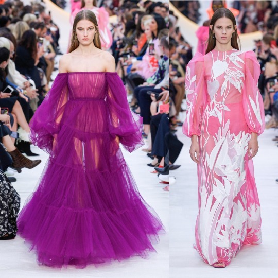


And then there was Valentino, which was fucking exquisite, imo. LIKE, CALLING DOCLE & GABBANA: THIS IS HOW YOU MAKE TROPICAL PRINT INTERESTING. YOU MAKE THE VELVET MONKEY’S ARM THE FRICKEN WAISTBAND.
Seriously, though, I am enamoured with this colour palette; all the whites and golds are angelic and fr, I didn’t know until now that you could make neons this elegant. I’m also getting an almost clerical feel from a lot of these looks, with the plaited waistband on the black dress that’s 7th row down in the middle, the stunning red cape and the multitude of exaggerated neck ruffs. I think I’ve mentioned before but I always love religious references in clothing-I don’t think I’ll ever get over the 2018 Met Gala-and so whether I’m reading too much into it or not, this collection really did it for me.


Whilst it’s probably as far removed a collection from Valentino’s S/S 2020 contribution you can get, I also loved Vera Wang this season. It might purely (I PROMISE THIS IS MY LAST GOSSIP GIRL REFERENCE) be because it gives me Jenny Humphrey vibes and *controversial* she did have my favourite style of any of the main characters, but sue me, this is just the right amount of late 90s/early 2000s grunge. Deconstructed trashy goth it girl is an interesting concept to see on the runway and I completely support it.

Versace on the other hand was very hit or miss. The looks I picked out I really loved but ultimately, for one of the household name brands, a lot of the actual garments were a bit pedestrian. I will say though that for me, it’s a case of the whole being greater than the sum of its parts. The slicked back mermaid hair and the pops of colour in the makeup and the interesting necklines meant that when it was good, it was GOOD. However, overall, still a bit too 80s Miami businesswoman, and please GOD, can we leave that hideous J-Lo dress in the past, it should really not be the climax of the show in 20-fucking-19!


As for Victoria Beckham, I liked it, but it’s a bit of a Gucci copy, no? And no way near as interesting?
And on that note, I’m gonna have to cut this off. Super annoying but with only 5 collections left that I want to talk about, Tumblr is being a little bitch and will not let me add anything more to this post. So, see you in 5 for the final post!
Lauren x
#valentino#ss20#fashionmonth#nyfw#pfw#lfw#mfw#versace#rickowens#rick owens#simone rocha#schiaparelli#moschino#mugler#style#fashion#runway#details#trend#ralph&russo#off-white#oscar de la renta
12 notes
·
View notes
Text
Paint to play
By now every Warhammer 40,000 player will have heard that we have a new edition—9th edition—coming. And by now people will have heard of one of the most controversial decisions. Leaked pages from the new rules book include a rule that punishes people who don’t paint their miniatures.
It’s ridiculous. This stupidity must stop.
Now, first of all, I make no apologies for couching this in terms of “punishes people who don’t paint”. That’s exactly what it is. People are writing lengthy opinion pieces concerning “it’s not punishing people who don’t paint, it’s rewarding those who do”. That’s exactly the same thing. The rule is aimed at people who don’t paint, it’s aimed at making them paint, and it does so by not providing a reward if they don’t paint. Whether you take 10 VP from people who don’t paint or give 10 VP to people who do, the net effect is exactly the same.
Secondly, let me address a common misconception. There is a perception that the two sides of this debate are People Who Paint And Support The Rule vs People Who Don’t Paint And Oppose It Because It Disadvantages Them. Take a look down my Tumblr and you’ll see that this is bunk. I paint. In fact, in recent years, I have painted far more than I have played. I paint, and I hate this rule. I will never enforce it in any game I play. I will never play in a tournament where it is enforced.
The fact that the “you must paint” train has gained a hell of a lot of momentum recently, and tournaments have been enforcing some variation of these rules for a while, pretty much made me withdraw from tournament play. And that’s the larger effect of these rules: a lot of people will leave the tournament scene altogether. Some may even feel driven from the hobby itself. And why? Why do people get so uptight over people who play the game but don’t paint the miniatures? There is serious anger out there about this issue.
Most people would agree that there are, broadly, three sides to the Warhammer 40k hobby. I would argue further that the three aspects form separate, though related, hobbies. They are, of course, playing, painting, and the lore. The great Venn diagram of Warhammer 40k looks like this:
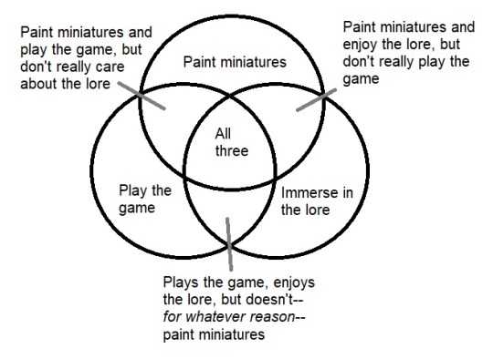
Fig 1: How this hobby works
Nobody cares—let me repeat that: nobody cares—where you fall in there unless you play but don’t paint. Like this:

Fig 2: Who we hate
This can be proven by a simple thought experiment. Imagine you walk into a Warhammer store and see a friend from work. They’re holding an Imperial Knight kit and looking at the Armiger boxes.
“Hey!” you exclaim, “I didn’t know you play 40k!”
“Oh, I don’t,” they reply, “My parents gave me the St. Celestine model for my birthday and I just loved it, the detail, the quality, it was amazing. So now I build anything I really like the look of. But I don’t play, that doesn’t interest me.”
No problem, right? You wouldn’t think any less of someone who buys models for the sheer love of making them and has never played the game because it just doesn’t interest them. Let’s be clear, the models are beautiful, and a joy to paint. You wouldn’t hold it against them that they don’t play, right?
And the exact same scenario plays out if your colleague is there to buy the latest Horus Heresy novel and they explain that they’re a fanatic for Black Library and just love the console games, but have never had any interest in the modelling side because they just don’t want to. Let’s be clear, the novels are pretty great, and the universe GW have created is enthralling. You wouldn’t hold it against them that they don’t play, right?
Combine them and it’s fine. A person who reads the novels and paints miniatures but doesn’t play the actual tabletop game is fine.
Let’s extend: Imagine your friend has an army and is playing. A Space Marine army in a blue-and-yellow livery with a snake emblem on their shoulder pads. “The Emperor’s Vipers”, your friend explains. “Oh awesome! Who is their parent legion? Who are they a successor to?” you ask. “Oh I never bothered with all that. I just came up with the colour scheme and emblem and started playing.”
Slightly odd, you might think, but you wouldn’t fly into a fit of high dudgeon and lecture them on how coming up with a backstory for your chapter is, like, part of the hobby. You wouldn’t quietly pull them to one side and advise them to spend some time writing because a lot of people just won’t play them if they don’t have a detailed history for their homegrown chapter. In fact, you’d find it quite unreasonable for a person to demand a player be removed from a tournament because they don’t have a self-published glossy Codex: The Emperor’s Vipers tome.
The only one that is demonised is Play-but-don’t-paint. Paint-but-don’t-play is fine. Read-but-don’t-play is fine. Play-but-don’t-read is fine as long as it’s Play-AND-PAINT-but-don’t-read.
And this is not new. I’ve been playing since Rogue Trader. I don’t remember this attitude in RT, nor in 2nd. In fact, during the 2nd Edition of 40k I played many games and a couple of tournaments hosted at my local Games Workshop store and saw unpainted armies by the dozen. Nobody cared. As I remember it, 3rd edition (or maybe it was in the run-up to 3rd) was where this really came in, along with a dark period in Games Workshop’s history when the Tyranny of Goblin Green came about. Ask the longbeards if you’re too young to know.
It was a dark time for painters but a curiously colourful one for base edges.
So that’s the “what”, what’s the “why”? Why do people get so bent out of shape over this?
Let’s be clear, the root cause is Games Workshop themselves. Read the rules books, White Dwarf, their website, and they are very clear: as far as they are concerned, painting is “part of the hobby”. Games Workshop has paints and brushes and all kinds of painting-adjacent products to sell, so of course they want to promote the painting side.
That explains where the idea comes from, but not why the question causes such irrational anger. I mean, try it, try arguing against paint-to-play and people get really intense about it. There is a way to find out why: keep on arguing.

Stock photo of an argument. Please don’t do this.
See, the paint-to-play argument usually starts off quite calm and rational. Proponents will usually start with the Games Workshop argument: painting is part of the hobby. If you chose to play, painting is just part of that. This argument falls apart almost instantly. Simply put, you do not get to decide what my hobby is. And I want to be crystal clear, here, it’s not that you have no right to make that decision, it’s that you simply cannot make that decision. You cannot decide what I do for a hobby any more than you could decide whether or not I like bananas. If I decide that I want to play Warhammer 40,000 and also decide that I do not want to paint, you don’t get to decide that painting is my hobby. You simply have no means whatsoever to make that decision. Your input is not only not required, it is not possible.
Proponents may fall back on the Games Workshop position, that—how is it phrased in the rules book? Something like—there’s nothing like seeing two fully-painted armies going at it on the tabletop? Okay, fair enough, and I even agree, but that’s an opinion, it’s a preference, it’s aesthetics. It doesn’t mean I must paint if I have chosen not to.
Proponents might then move on to attempting to show that, in fact, painting is vital to gameplay. This is nonsense. They may cite WYSIWYG rules: how are you to know what a figure is if it’s not painted? Well, call me weird if you want, but you could look. Back in the day, Warhammer 40,000 figures were a bit more eclectic. Without paint it might have been difficult to tell an Apothecary from a Chaplain from a Librarian, simply because there was no definitively established look for those types.
Think you could pick Kribins out of a lineup?
But two things render that argument moot.
The first is that the modern range is far more developed. A Space Marine Apothecary looks like a Space Marine Apothecary. You’d be very hard pressed to find a Chaplain that could, even in poor light, be mistaken for a Librarian.
The second is the question of imagination. When designing a new Chapter you are free to make stylistic choices. The Emperor’s Vipers from our thought experiment are a non-Codex Chapter. Their Chaplains wear white, to symbolize their purity. Their Apothecaries wear blue, the ancient colour of healers from their home planet. Their Librarians wear black, as a mark of their shame for violating the Edict of Nikea and the chapter’s belief that the Emperor’s word is eternal. If you couldn’t tell these guys apart when they were unpainted, them being painted the wrong colours is going to really confuse you.
And bear in mind that only Space Marines can possibly suffer from this. When your opponent brings an Eldar (I know, they have a new copyrightable name, but I’m old school) army there is no way you’d look at a Grim Reaper and think to yourself, “Is that a Swooping Hawk? I can’t tell, it’s not painted.”
An ordinary Seraphim, yesterday.
The normal reaction to the dismantling of the WYSIWYG argument is to then rely on a slippery slope argument. If you’re not going to paint, why bother sticking the models together at all? Why not just throw down a sprue? Or an unopened box? It’s the same thing as plonking down a load of grey plastic, right?
This is stupid. You can’t measure range to and from a sprue of unassembled figures. You can’t assess LOS or cover or unit coherency. You can’t remove casualties from a squad. You can do all of those things with models that are assembled but not painted. Assembly is vital to gameplay.
You might also hear “Why not just use wadded up tissues or empty Coke cans?”. My response to that is “I’ve played those kind of games with no problems.” It’s not a reason to require paint.
Let’s not forget that the 2nd edition Warhammer 40,000 boxed set came with a two-dimensional cardboard cut-out Ork dreadnought.

This was a real thing, and it was fabulous.
Proponents may try to show how reasonable they are. They don’t demand Golden Demon standard, they will say, just tabletop-ready. They don’t demand your entire army be painted, it’s enough that you can show you’re working on it. If you have a good reason for not painting, a disability or something, they’ll allow it. They will talk about how easy it is, with the new contrast paints, to produce a painted army. We’ll get back to the arrogance of these in a moment, but first we should note that these arguments are merely red herrings. It’s not about how hard it is, or whether you have a good reason, you have decided not to paint and that is your decision alone. Your reasons are irrelevant.
They may also play the reasonable card by pointing out that a lot of tournaments have been using paint-to-play rules for a long time, but are still free to use or ignore this rule as they see fit, as are you in your personal game. If this is the case (and it is, let’s be fair) why have the rule at all? And why is it being celebrated as if it were the end of a dark period in GW history?
We must touch on “net listers” because proponents surely will. Net listing is a boogeyman that proponents bring up a lot. The urban legend is of multiple players ruining tournaments by going online, seeking out the latest overpowered army lists (mostly posted by other net listers), buying the relevant models, assembling them, turning up and wiping the floor with the opposition thanks to their net list, winning the big prizes, and then recouping their investment by selling the army on eBay. Big money big money big money.

The Grand Tournament’s new banner.
Doesn’t take a genius to see the titanic hole in this argument. We’re not talking about blackjack in Vegas or high stakes poker in Atlantic City. Nobody is getting rich traveling the country dominating Warhammer 40,000 tournaments. Most 40k tournaments are for bragging rights, maybe a small trophy, or a Polaroid with your army on THE WALL OF CHAMPIONS at your local gaming store or on your gaming club website. If there is a prize it might be a small amount of store credit, or a boxed set. Maybe everyone chips in $5 to the pool and winner takes all. It’s small fry. People still play 40k almost exclusively for the fun and for the love of the game. Even the few “high stakes” 40k tournaments are for prizes in the $1000 range. The biggest tournament I could find with a search on Google had a $1500 prize. Is it possible that there is an underground tournament scene with 5 and 6 figure pots on the line? Sure, maybe. But the people who enter these tournaments aren’t looking for a fun Saturday afternoon with like-minded individuals. Their experience is not going to be ruined by some dude rolling up with the grey hoard.
And let’s compare and contrast with the “tournaments already ban unpainted armies” argument from above. If a tournament has paint-to-play rules, net listers are already out. If they allow unpainted armies, they are free to ignore this rule, and net listers are in. Net listing is a non-argument.
By this point in any online discussion you should be seeing a change in tone. I’ve slipped a few in here, did you notice? Pay attention because the truth is coming out. I used “why bother sticking the models together at all?” I described a person setting out an unpainted army in terms of “throwing down” and “plonking down” their armies. I described an unpainted army, not as an army, but as “a load of grey plastic”. I described a person arriving to play as “some dude rolling up with the grey hoard”. This type of phrasing is common in the latter stages of the argument. It is an attempt to paint (pun very much intended) the person with the unpainted army as careless, uncaring, slovenly. They don’t come to games, they “roll up” or “rock up”. They don’t set out their army, they “plonk it down” or “throw it down”. Their army isn’t a collection of figures, it’s a “load of grey plastic”. Proponents will take it further. They will tell tales of unpainted units being “chucked in a heap” on the table, the player moving them as a heap, removing casualties and “throwing them aside”. Of course these stories are crap. As the meme goes, “this didn’t happen so hard it actually made some things that did happen unhappen”. But it plays into the perception that people who don’t paint don’t care. The core of the “reasonable” argument above is that it’s easy to paint to their standard and you, not doing so, clearly cannot be bothered to put in the effort. You’re lazy. You probably have BO (trust me, they have those stories, too, of the stinky, greasy-haired, individual with the heaps of grey plastic stuffing pizza into his face and burping and farting their way around the store). You probably live in your mum’s basement and download illegal copies of the Codex for printing. You probably don’t even buy GW figures, you use a 3d printer. The only thing stronger than the stink of bullshit is the stench of ad hominem.
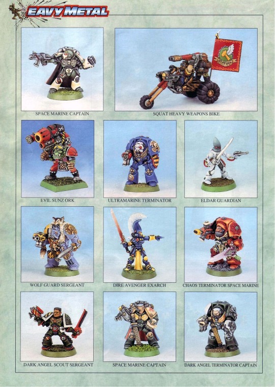
This one’s easy. Ask anyone who has been playing for a while and most will admit, however reluctantly, that one sure sign of a bad opponent is the presence of a meticulously painted army. I’m not saying everyone with an ‘Eavy Metal standard army is a cheater, a rules lawyer, a sulky loser or an insufferable winner, but I am saying that an awful lot of this type of player have well painted armies. Most of them do not play “the grey hoard”. I’ve often stated, and its amazing how many people agree with me on this, that if I were to rank every single game I’ve ever played in terms of how much fun they were, or on how I would rank my opponent as an opponent I would happily play against again, most of the top ten were opponents with unpainted armies, and most of the bottom ten had beautifully painted figures.
It follows that, as the game has evolved and more and more tournaments and gaming groups have brought in paint-to-play rules punishing unpainted armies (I’m sure you’ve seen those strategy cards with Duncan’s face on them giving an advantage to people with a painted army against an unpainted army), and given that the “it’s not hard to paint, especially with contrast paints” argument is correct (if irrelevant to the larger question), people who value winning games more than having fun are most definitely painting their shit.
BTW: “Paint your shit” is another emotional term used by people trying to convince you that they have the right to impose their beliefs on other people.
But we’re getting there. We’re getting to the truth.
Once you eliminate the impossible, whatever remains, no matter how improbable, must be the truth.
Proponents are already, as their “reasonable” arguments get dismantled, starting to talk about their opponents as the bad guys. And of course, the other guys must be the bad guys because we’re the good guys, right? It’s an emotional reaction to any divide. And the discussion is most definitely becoming emotional. The discussion is becoming emotional because the reasons for the discussion are emotional. Some proponents are upfront about it, some will only admit it once they’ve been backed into the corner, but sooner or later you will hear the root cause:
I deserve this.
The phrase may be “It’s insulting when one player puts down a fully-painted army and their opponent rocks up with a load of grey plastic.”
The phrase may be “I put in a lot of effort in painting my army and it’s a slap in the face when someone plonks down a grey hoard.”
The phrase may be “It’s an insult to see this douche throwing down unpainted plastic when you’ve spent time making your army fit for the tabletop.”
The phrase may be “If I can manage to paint my army it’s insulting that you can’t be bothered to do the same.”
What the person is really saying is “I deserve your effort.”
And there’s really two levels: the pro and the amateur.
The first is “I honed my craft over many years, I watched all of Duncan’s videos, I bought all the White Dwarf issues, I learned at the feet of the masters, and I developed my own techniques, and here you are, you infuriating oik, without having even cracked a single pot of paint, and we are at the same table, at the same stage, of the same tournament. By you not putting in the same effort, you are insulting me. I should be rewarded for what I have done. You shouldn’t even be here. How dare you?”
The second is: “My painting sucks. My figures look like somebody ate a starter paint set and a bunch of figures and shat out the results. I did this because I believe in The Hobby and that Painting Is Part Of The Hobby, but you didn’t and here we are at the same table, at the same stage, of the same tournament, and you are proving that my effort was wasted. By you not putting in the same effort, you are insulting me. I should be rewarded for what I have done. You shouldn’t even be here. How dare you?”
I don’t know if there’s one of those long compound German words for “the feeling of self-betrayal that starts inward and turns outward into irrational anger when you realise that the effort you put in wasn’t matched by other people, and you get nothing extra for having put in the effort”, but there ought to be. It certainly applies here.
By-the-by, lets return to the arrogance I mentioned in the “reasonable arguments” section, because it’s a vital clue. They’ll claim “They don’t demand your entire army be painted, it’s enough that you can show you’re working on it. If you have a good reason for not painting, a disability or something, they’ll allow it.” The arrogance here is breathtaking when you stop and examine it. The sheer hubris of declaring—and doing so as if it’s reasonable—that you are the arbiter of whether or not a person is worthy of playing the game, as if they are but supplicants, lined up before you, presenting their humble efforts, and you must cast an expert eye over the figures they’ve painted since last we met and decide whether the progress is enough before holding out a thumb like Caesar’s to decide each gladiator’s fate. Get out of here with that crap.

Caesar, with that crap, at a gaming tournament yesterday.
And it’s not peculiar to Warhammer 40k, or to Games Workshop, or to wargaming. That attitude is everywhere. The phrase is “pay your dues”. In the music industry, artists who explode onto the scene because of some chance encounter are often looked down upon by artists who “paid their dues” by playing grungy pubs and dingy rec club halls and having to load the band’s equipment into Steve The Bass Player’s rusty old van and hoping to have enough petrol to drive home and then having someone from a bigger band spot them and give them a shot at opening for them when a scout from a record label happened to be at the gig and even then they were a minor signing for the label and didn’t really get much support and yet here we are, playing the same arenas, our records on the same radio shows, our records climbing the same charts. By you not putting in the same effort, you are insulting me. I should be rewarded for what I have done. You shouldn’t even be here. How dare you?
Pay your dues.
Paint your shit.
Let me be crystal clear: You do not deserve my effort in painting. The effort I put into painting is put in because I enjoy having a painted army. I enjoy the challenge of coming up with a way to convert ordinary Games Workshop models to represent Forge World models. I like having a unique army. I decide this. You don’t.
When we face each other over the tabletop, what you deserve from me is my gaming. You deserve that I play my best, that I am not distracted, playing with my phone or chatting up the ladies. You deserve that I have knowledge of the rules (unless we’re playing a starter game, that’s different) so we don’t have to suspend play every time I need to look something up. You deserve that I play fair, according to the spirit of the rules, and in the interests of us both enjoying ourselves. You deserve that I am gracious in defeat and magnanimous in victory. You deserve to have a good game against a decent player.
And I deserve the same from you.
1 note
·
View note
Text
Business Card Project - Part 1
Around the time this module started, I got back into contact with someone by the name of Josh Hitchcock who I met and worked with back in college. We met when we were 16 and worked on several projects with each other during our year studying photography together, I learned a lot from Josh and we’ve stayed loosely in contact ever since leaving school but haven’t collaborated on anything for around 5 years despite having always had similar interests, styles and aesthetics. Josh is also still pursuing his passions and talents in visual communication and is beginning to build a portfolio with the aim of applying for a BA, just like I was doing this time last year. Alongside getting himself prepared to do a degree, he has been expanding his online presence and slowly establishing a business and brand identity for himself. He reached out to me originally to ask if I could potentially create him a logo that he could use across all of his platforms which he needed fairly quickly as he was building a website, unfortunately I couldn’t meet the turnaround deadline and so he commissioned someone else to do a logo, later reaching out to me again to ask if I might be able to create business cards instead.
Josh had already started sketching out ideas and so he sent me his drawings as a starting point for the design
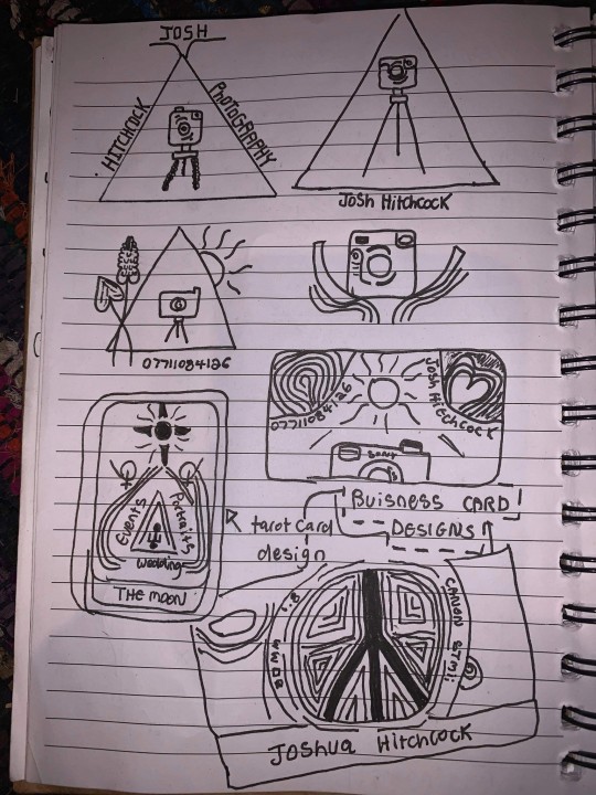
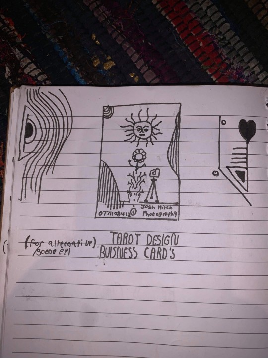
After some discussion and a little bit of time, Josh came to the decision that this was his favorite prospective card design and even began experimenting with it's colors.
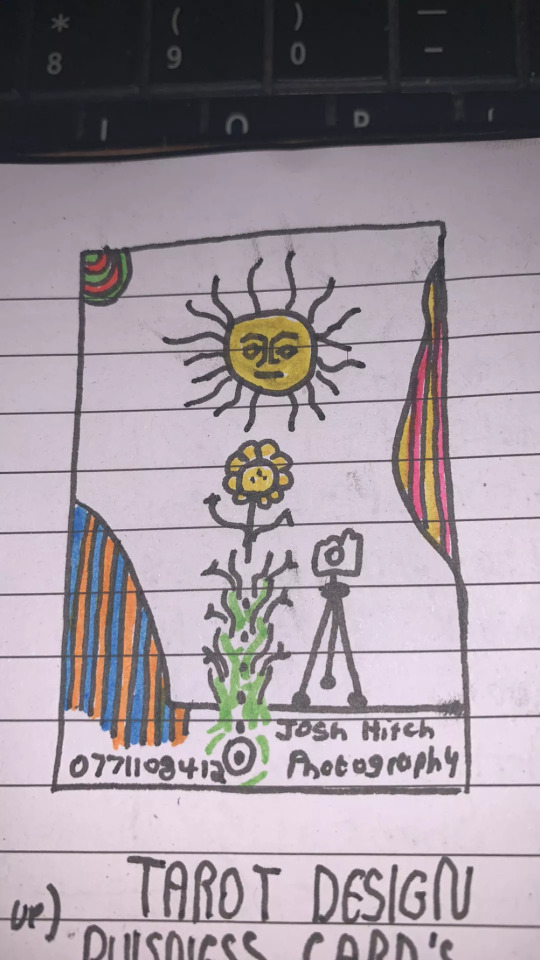
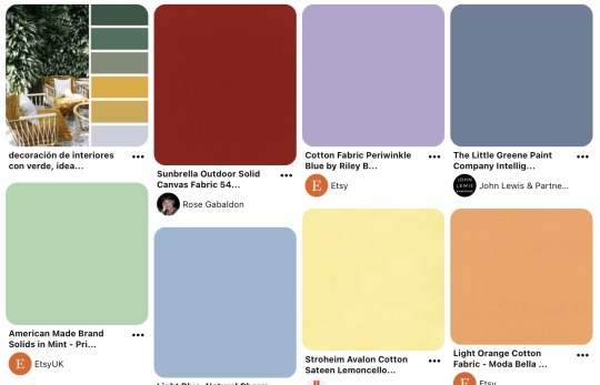
It was at this point that I asked him to create a Pinterest board to help gather all of the ideas together which he promptly delivered on. Pinterest’s description of the board “Clean, simple doodles. Photography orientated based on nature and ancient art. A perfect combination of tech, nature and aesthetic.” sums it up perfectly. This was a really strong starting point for the overall design as it includes everything from small decorative graphic details such as flowers, vines and suns; to a concise range of colors for the palette of the art itself. The board isn’t overcrowded, it's clearly well thought through and does good job of clearly communicating the kind of style that I was expected to reflect in my design.
Coincidentally around the same time I started this project, I decided to treat myself to an iPad Pro and Apple Pencil to support my University work, these have become increasing popular in the art world because they are incredibly powerful creative tools, I chose to invest in it mainly for it’s capabilities in creating digital art using the Adobe suite and Procreate using the pencil which is exclusive to iOS and has is slowly becoming the standard for digital drawings.
Having recently attended the Illustrator workshop, I thought that I would experiment with using this software both on my iPad and computer as I figured if I could learn to use them in conjunction with one another from the get go, I would be in a better position overall later on; but in doing so, I threw myself two learning curves at once as I was not only dabbling in software I wasn’t comfortable with but also using that software on a device that I am a complete beginner to which was a definite challenge for myself.
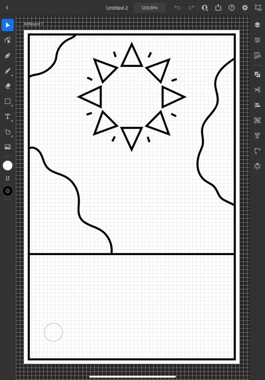
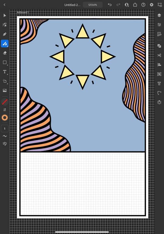
I started out by doing a Google search to find out what the standard size is for business cards and found out that is generally 3.5 x 2 inches (1050 x 600 pixels at 300 DPI, which is the standard DPI for printing). This is how I decided to set my document up which is what gives me the white rectangular shape that you see me working on to start off with.
To begin the design, I picked out my favorite things from Josh's sketch which were the wavy line details and the bohemian style sun. I created some simple outlines using the line tools on iPad Illustrator starting with the border and dividing horizontal line where I intended the design to end, from this I was able rough out where patches of lines would go and add the sun. For the sun, I originally tried to draw one with wavy points but I was struggling to get it proportionate, even when I'd figured out how to use the reflect tool to make my drawing symmetrical, it seemed to be throwing the design off and so I threw this idea out and went for a pointed sun design instead. I chose triangles for the points as a subtle reference to the exposure triangle which is a rule that dictates camera settings when it comes to photography so it ties in with the business well and was also a concept that Josh was trying to reflect in his logo. I achieved the geometrically accurate shape of the points around the sun by creating the very top triangle and then using the Radial Reflect tool whilst using my iPad which automatically created the rest of the points for me with even spacing and perfect symmetry; all I had to do then was resize the points as I pleased. Once I had done this, I decided to repeat the process but with a small line between each point to give it an extra beaming sunshine look, this also fits in with how some of the sun's and graphics are drawn on the Pinterest board that I'm referring to as I design this.
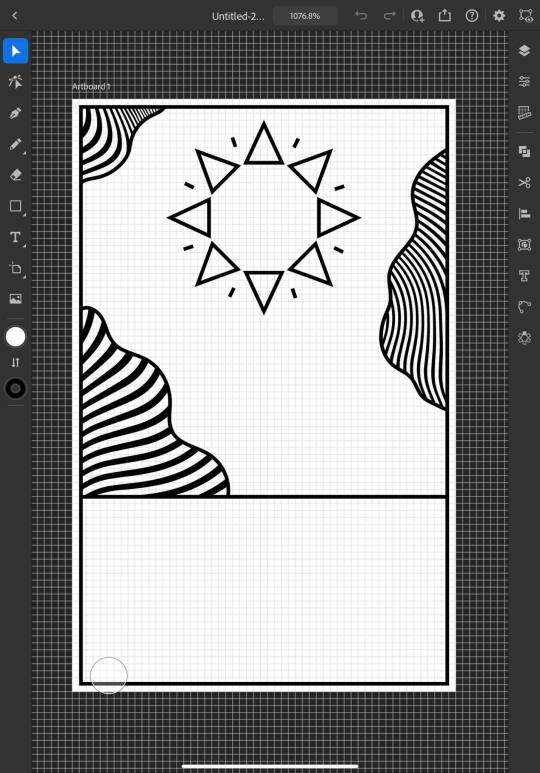
Once the outlines were complete, I started experimenting with filling in the patches with lines, this is an effect that is featured on the album art of one of my favorite albums of all time, Currents by Tame Impala which I previously learned how to do using a vector pack from Spoon Graphics as I did work inspired by it for my University portfolio. Although I have used these particularly line textures before, I have only used them in Photoshop and not Illustrator so I haven't actually used the vector versions of them up until this point. I inserted these into my work using my computer as that's where they were saved, I was able to use Adobe Cloud to sync my work between my PC and iPad making it easy and convenient to switch between the two whilst working. Adjusting the waves worked similarly to how it does when I use them in Photoshop, I just added them in as a layer and then used direct selection mode to delete the extra lines around the outlines and border that I’d drawn in leaving me with what you see above. At this point, I sent what I’d done so far to Josh so that I could begin to get his feedback and make sure that what I was doing was in line with his vision.
Whilst I was waiting for him to reply, I started experimenting with adding color to the design hoping that it would help us visualize it better; I used colors directly from the Pinterest board for my palette by taking a screenshot of the webpage, opening it up in Illustrator, swatching all of the colors and adding them to my Color Library so that they could be easily accessed whenever I needed them.
At this point, I just filled in the colors according to what made sense to me, blue for the sky, yellow for the sun and something contrasting for the wavy lines, honestly, I chose orange because it’s my favorite color and I really like the way that the purple looks next to it, especially against the blue background where it appears slightly more subtle whilst still being effective at breaking up the image in the way that it needs to.
I continued to add colour, changing every other point on the sun to be red to give it more dimension and incorporate more of the colours from the chosen scheme; I then added green to the bottom section which I chose because I thought it would represent grass and fit in with the sun and sky theme that seemed to be emerging. I also added some small stars as I was experimenting with the shape tools dotting them into some small empty spaces on the design so that they line up in a triangular shape which is another subtle reference to the expose triangle.
Then I started experimenting with adding text and social media icons, Josh had told me that he wanted his name, website and social media information on the card, we decided to leave his phone number out as he only has a personal mobile number and didn’t want to risk handing it out to strangers. I chose this Art Deco style font for the name because I liked the lines in it and thought it went well with the lines in the top half of the design which are probably my favourite thing about it at this point. I didn’t use the same font for the website because it doesn’t look as good when it’s small, you can’t really see the lines and it made the website hard to read so instead I chose this glyph font which I thought Josh would like based on some of the imagery from the Pinterest board; I was unsure about this choice at first but it quickly grew on me as it’s subtle and yet it makes the website look bold on the bottom of the image which draws your eye down to it when you’re reading the information. I also added some social shapes to the front keeping Josh updated on my progress as I went along.
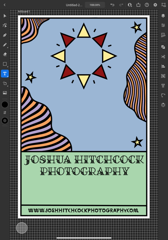
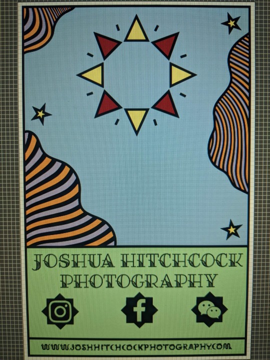
It was at this point that I started to receive some feedback from him, he was really happy with the first impressions of the design but did want to make a few changes. He started out by asking if I could change the green on the bottom to the orange colour in the waves with the hope of giving the card a more uniform look which we both agreed looked much better. He then asked me if I’d started designing the back which I hate to admit that I hadn’t actually thought about at this point and so we started discussing the layout; collectively agreeing to move the social media information to the back of the card and have that there along with some sort of bio which I much preferred the idea of as I wasn’t too keen on how the social shapes looked on the front of the card and I was worried about how I was going to fit all of the contact details on without making it look messy.

Originally we thought it might be nice to add some floral details to the front of the card where the space had now been freed up but we quickly decided that this didn’t look quite right.
0 notes
Text
Reflection 24/03/2020: Middle Stages
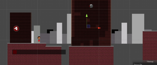
So, here we are in the middle stages of the FMP, or as I call it, the TFMP. Here, I’m going to reflect on what I have done so far, and what I’m going to do in the next 6 weeks. While that may not be a lot of time, I’ll do my best to do as much as possible.
Week 1 - 03/02/2020 - Start

It all began with what everything starts out as... an idea. I started out doing some concept art, which is not one of my best features, but I gave it a shot anyway as I was going to have to make some at some point, because I wanted to.
Here is the concept art for my main character. The name in the top left “Darohn Terlex” is just a random name I came up with by combining multiple names together (Darren, John, Terry and Alex). I did this because I couldn’t think of a suitable name for my character who both has a male and female variant, as seen in the picture above.
But how about the actual design of it? Firstly, I chose to focus on an outfit style. I had ten in mind, five for both male and female individually. Each of them follow a different outfit (and hair style) that is worn by that, or both gender(s), excluding the headsets.
While the headset styles were wildly random ones I have thought of with no inspiration or facts, I chose to stick with the first one (Virtual Reality) as it is more realistic than the other ones. Like... have you ever seen anyone wear a headset that looks like a pair of bog-standard glasses? ...me neither.
As for colour schemes, I chose to stick with the grey, red and black one I mentioned in my Colour Schemes post. I have added those colours to the concept art, which is not a thing people normally do as concept art is mostly outlines and rough sketches. More on that in an upcoming post.
Week 2 - 10/02/2020 - Creating the character + base game logic
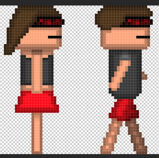
Creating the character in Adobe Photoshop proved to be tricky at times. Mostly because I didn’t know what outfit to pick. I chose to go with the Fashion style for the male character, and a mix of Summer and Fashion for the female. I have chosen to do this because I liked both designs, but didn’t feel comfortable with using just one. That, and I felt it was more appropriate.
As you can see, in the concept art, the character is wearing boots, while in the sprites, they’re barefoot. This is because I was originally going to give them jet-boots in the game, but decided to go with a more advanced approach instead, as I’m using this time to expand upon my skills. However, that doesn’t mean I’m going to keep them barefoot. I’ll probably give them basic shoes or something, but it all depends on if I feel like it or not.
After the characters were finished, I took to the game. This allowed me to experiment with animations and sound effects. During this time, I was using placeholder sound effects that were dumped from a video game called Undertale (more info on that in posts mentioning it), which I quickly removed shortly afterwards.
Unfortunately, I came down with an dizzy illness near the end of the week, causing me to feel dreadful throughout the majority of February half-term, unable to work on anything. I recovered just before the next week started, though.
Week 3 - 23/02/2020 - Enemy intelligence

What is a game without intelligence... ARTIFICIAL intelligence. Okay, granted, it is not programmed intelligence that lets a virtual being learn as things goes, it’s just hard-coded intelligence (meaning it cannot be edited without editing the source files).
During this time, I got to work on the first level of the game. While doing that, I also got to work on the parallax background (learn more about that in my 2.5D Platforming post).
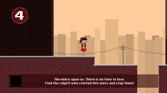
You can also see that I have implemented a pie chart. But not just any pie chart... a life pie chart!

Basically, this pie chart is the artistic way of telling the player how many hits they can take before dying. More info on that in an upcoming post. Alongside the pie chart, there is a semi-transparent shape at the bottom of the screen with text on it. That is the game’s way of guiding you through what to do. It has been programmed to show for 6 seconds, after which it goes completely transparent, hidden from view.
You’re probably wondering how I keep track of every detail I have implemented... that is because I have been taking videos and screenshots of development! I won’t share any footage yet, but here is a picture of every video I have taken (as of 16/03/2020).

As you can see, I have captured over 13 hours of footage! I actually have over 17 hours now, as some of it has been recorded recently but isn’t shown in this image. I am not uploading these raw, but I will provide a link to an unlisted playlist on YouTube with these videos in, except for #5, which dragged on for too long. I’m putting all of these raw videos into an hour long time-lapse so you can see how this game was made from the ground up if these screenshots aren’t enough for you.
Week 4 was mostly bug fixes, I’ll post a video here when I have created it, and as such this section will be edited.
Week 5 to 6 - 09/03/2020 to 16/03/2020 - Sound design and playtesting
youtube
This video goes over what program I used to create the sounds. Adding them to the game wasn’t hard, as I knew exactly how to add sounds and trigger them to play on demand at random intervals.
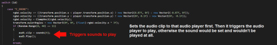
The source code needed to play the sound isn’t hard to understand when looked at, but since I’m not posting source code online (apart from small extracts in images I’m posting here), I’m pointing out what does what, since you probably don’t understand source code anyway.
The Break... Out
As you’re probably already aware, the UK became part of a pandemic called the SARS-CoV-2 outbreak, which affected over 5,000 people in less than a month. To contain the spread of the virus, all schools, colleges and universities had to shut... including mine. I picked up everything digital and stored it online via Google Drive (except for the timelapse video, which I exported then uploaded it in private to YouTube for me to download it later on so I can still edit it), YouTube and GitHub (which is a development platform that I can upload and download my source code from), seeing as we may not be back in college until the summer holidays... which would be too late to do anything.
Now that I’m stuck in my house for goodness knows how long, I can still work on my project with ease seeing as I have a powerful computer to deal with the situation, as well as having all the software I use at college, which has been made free for students by the software developers so that we can temporarily work with them during this difficult time without having to pay a penny.
Soon, I will have my time-lapse video ready, as well as a full playthrough (and download link) of the game when it is finished. Keep an eye out as I will have more development posts coming soon.
0 notes
Text
Project Management: KU Pop Up Shop
The Brief: To create a project plan for a student ran pop up shop in Kingston town centre, in connection with the student union.
Stakeholders: Anyone involved in the project (effected) in project management, people shouldn’t be treated equally.
** You shouldn’t spend time with each person in a project equally...
Due to:
- the output, the more you spend time with the weakest link the less you come out with.
- you will need to design how you will communicate with each person putting more in for stronger people in the group.
**Learn the names of the stakeholders

- Responsible: in charge
- Accountable: the one who gets the blame, they manage the people who are responsible
Project Pipeline:
1. Research
2. Research approval
3. Concepts
4. Concepts approval
5. Development
6. Development approval
7. Testing
8. Soft launch
9. Launch

In need of a:
- project start date
- project leed: KSA/SU
- project name
Doc Needed:
- Stakeholder map and wins
- Overall accession
- User requirements (scoping)
- Work break down the structure
- Risk Assessment

Research - Pop Up Stores
UAL: Not Just A Shop


Location: Holborn, London
Design Layout of the store:
- simplistic
- white and metal
- clean spaces
Goldsmith - Lewisham Shopping Centre


Location: Lewisham
Design layout of the store:
- florescent lighting
- old
Store changes amount the different projects throughout the year
for example: In the pictures above, the exhibition currently shown is on 1970′s Caribbean theme: Black History Month
Brainstorming shop’s features:


Ideas board:

Group brainstorming:

We were able as a group to come to the decision of creating four main features for the shop: retail, cafe, workshop and reading area and screening area/cinema. I felt very strongly about the idea of the cinema area since personally, I love film and as a Kingston university student I would love to have the opportunity to go to watch films somewhere which is university student-friendly, which wouldn’t only screen Hollywood films but instead cult classics.
Shop’s final features:
- Retail: sell Kingston university student’s art pieces and merchandise
- Cafe: student-friendly prices (compared to common cafe prices such as; Starbucks, Costa and Nero cafe)
- Workshops: give students and locals the opportunity to learn different types of skills - give locals the chance to learn these skills without having to go back to university
-Cinema: screen cult classics with a reduced student-friendly pricing and amateur film critic sessions for film lovers
- Reading spot: give students and local a quiet place to study and read in comfort in the centre of Kingston
Cinema inspo:
When it came to the cinema part of the shop, I suddenly thought about the vintage looking cinema, especially since my group loved the vintage aesthetic. I started looking at Pinterest and found these images

Reading space - loft idea inspo:
When it came to the reading spot for our shop, I thought the idea of having a loft was perfect. Lofts can separate space within a room which is exactly a reading spot would need, separation from the rest of the shop. So I went back to Pinterest and found these images.

Mood Boards:
1st mood board:

I produced this mood before my group and I decided on-brand colours and shop concept. I wanted to show my group some ideas which I had in mind such as; plants, creams and natural colours for the colour scheme, vintage light bulbs and recycled furniture.
After group discussion - mood board:

This mood board is influenced by the design ideas which we all decided in week 3 of the project. We decided we wanted to have ‘screening nights’ which would include a cinema experience for the customers, incorporating beanbags and food and beverage services. We decided to go for a blood-red for our main colour and have wooden and concrete interiors, to have a sense of nature and urban interiors collide together.
Group’s inspiration mood board:

This mood board started the main inspiration for our pop shop, the lines and mainly the far left centre picture gave us the inspiration of the using red as our main colour, since we all love the colour red and the simplicity of the lines was exactly the design concept we wanted, simple and clean.
Final mood boards:


In the final mood board, you can see the combination of the main colour red being used as a statement colour among the shop, along with the red line feature from the group mood board previously seen. Overall I would describe our shop to have a clean simple vintage aesthetic with a European interior design which I would characterise by using the space’s original interior and concrete.
Digital design layouts:
Since we still don’t know the shop’s potential space, I decided to create prototypes of store influenced by the feature we have decided for the shop.
Plan A: If the spaced tall ceilings and vast space
The space layout for screening nights:

The space in the retail layout:

Plan B: If the space was narrow but with tall ceilings
The first version of screening night - projector has to be moved on another wall due to its angle.

A better angle on the tailoring service below the loft area.

Research trip
We were given multiple Pop Up shops around London to go visit to have a better understanding of the characteristics of Pop Up shops. Before deciding which locations to go to, we decided to make a list of elements in which we would like to see in other Pop Up shops to have a better idea on how to organize our shop.
- Storage layout
- Visual display
- Cafe layout
- Store management
- Pricing

We decided we wanted to see: Peckham Levels, Copel and Park, Adia, and The Modern Society. Unfortunately, I couldn’t go when we were told to go but I decided to go by myself the following week to have my own opinion on these places and view them in my own perspective.
Peckham Levels:


This was one of my favourite Pop Up we saw, it previously was a car park and remodelled into a Pop Up squared with various retail and social areas. The interior was the most attractive element, in my opinion, neon lights separated the areas in a kind of sections in a sense. Also, I believe that neon lights are a simple solution to decorate a plain space since lights are an important factor to the aesthetic of a room I believe it should be something to consider for our Pop Up shop. Another important factor I saw was the use of colours throughout the building, they used colours in their signage which made it simpler for us to know our way through the area and they also used colour for decoration which is again referencing to the neon lights.
Cope and Park:


Cope and Park was an interesting space, it was all about taking an old structure and creating something modern while still preserving the original features. Just like in Peckham Levels, they used colour as a navigational tool. Most of their signage had locations marked with a certain colour which made it easy to find our way to where we wanted to go. We also liked how they incorporated a recycling theme among the space, the fact that they remodelled the original building which is basically recycling and on top of that they incorporated reusable and sustainable products in retail and catering locations.
Adia:


This shop gave me the sense of homely vibe even though the first thing you see once you walked in is a huge bar top, but overall I the lighting and visual display of the shop was homely and cosy. The only thing is that even though this might sound contradictory but there was something about the shop which even those the visual display and lighting was cosy, it didn’t make me as a university student want to sit down and study or socialize there. So that is something that we as a group need to keep in mind while deciding the interior of the shop, that even though our designs are aesthetically pleasing it still needs to be appealing for a university student to want to chill there.
The Modern Society:


This shop had a more relatable store layout of what our Pop Up shop would look like. One factor which I really liked was the mini loft platform they had jewellery and clothing at, it was a creative way to separate the floor in a room. Since we have the idea of incorporating a loft in our space we need to be realistic in case we can not find a space with high ceilings, so I think having a mini platform as a separation tool for our shop would be the best way for us to go.
After going to all these places, we decided that we need to corporate another colour so the shop can have a more inviting outlook.
Name, Logo & Brand guidelines:
Name of the shop:
When it came to the name of the shop, Anael and Natalie already had the idea of naming the shop Elbowroom since the expression elbowroom is all about having your own space which is something we found very important for the shop, having the option of coming into the shop and being able to have a space where you can come in and read or work on your projects or course work. Unfortunately, when I started doing some research on the word Elbowroom, the name was already being used for a bar in Bristol, which made us change our mind since we wanted our shop’s name to be completely new.
Further thinking, we wanted to focus on the real-life experience, since the shop is going to be run and made for Kingston university students, we focused on the idea of students heading over to the shop after class, hence the “after hours” part and the skippin part we decided to add as a rebellious streak for the excitement

For the shop’s logo, we decided to use Neonoir font since handwritten style is viewed as friendly, approachable and family-oriented. As clearly used in several well-known logos such as Disney, Harrods and Kleenex just to state a few.

Colour research:
Since we wanted to add another colour to our palette from the main three colours: Red, Black and White. I thought best to look a the colour wheel to see which colours work with blood-red or red in general. As a result, I found out that red can go with serval colours like:
- red and green
- red and orange
- red and purple
- red, orange, and yellow
- red, orange and purple
- red, yellow, blue and green
- red, yellow, blue and purple


With the brand colors being red, black and white, we thought we should add another two colors for a pop of lightness in our color scheme. While I was researching the color wheel to see what was aesthically pleasing I noticed that yellow went very well with red, which I noticed in other well knonw brands such as Mac Donalds, DHL and Lego. Further along we decided to use pink as the other other color since it was in the same color scheme as red.

The final brand guidelines:

Looking around Kingston for potential shops:


We found both of these locations in the Crown Plaza which is located right behind Kingston high street. The first image is the first location which we found, it's right in the middle of the plaza, the downgrades of it is that the only window is the storefront and it’s not accessible for people on the streets to notice it which might cause issues in the future to reach out for more customers.

Once we were told that the Bental’s centre is open to giving the university an empty store for our Pop Up shop we wanted to see which empty there were and which stores will commodity of the design layout we have in mind. After walking around we noticed that there aren't any stores which could potentially have a second floor, we simply thought we could change our idea into having a mini platform instead of a whole separate loft.

This shop is located right next to Boots and in front of the Poundland in the shopping centre walkthrough which attracted us straight away. We really want a shop that has display windows facing a busy pedestrian path to gain more community interest. As you can see in the picture it is a big space, big enough to separate the space in different sections for the different sections we want to create (cafe, tailoring, screening and reading area, and exhibit space).
Potential store located in Eden’s Walkway:
Store’s location -


In this sketch, I wanted to show a potential layout of how the store would look like and the organization of the separation of the space for the different aspects of the store will provide.

Design space:

Final result:


In the final result, I decided to use the dark red which we choose for our brand colours to be the main colour which runs throughout the store, since red is an eye-catching colour. I wanted to have a mini barista bar to implement the idea of on the go coffee (another market: ‘on the go’), so students have another option where to get their coffee run, and all revenue would be given to a charity.
New Floor Plan:
New Store Location -
KSA found a new potential space for the pop-up store in Kingston, its located on the roundabout of Brook St and Eden St.

New Store -


Floor Plan Sketch -

Digital Visuals -


In both images right above, I was able to create the structure of the building digitally on Sketchup and then I moved the doc onto photoshop to add the store’s logo.


With my digital designs the group didn’t take much consideration of them which lead with the devleopment of the shop’s interior design to a stop. Natalie took charge of that section of the project, which stopped my development of my designs
Final interior designs of the shop:


Launch Ideas:
For our launch, we decided to start a list on potential launch ideas on Basecamp to be able to go back and add any other ideas we might get further along with the project.

More Ideas:

Kingston Walk of Fame:
As a play on ‘Hollywood Walk of Fame’ I thought stations around Kingston such as all the Kingston campus and right in the centre of Kingston, where people can make their own Kingston stars and put down their name and their own star goal. People following these stars would end up at the store. Having different star-making stations around Kingston as an Off-Site Event helps with expended our advertisement and create Earned Media.

Famous Film/Art Scenes around Kingston:
I had the idea of creating several picture frame stands around Kingston where people can take a picture with a famous film/art scene in the background and if they upload it on their social media they get the chance of entering a raffle (chances of winning store credit or a gift card)


As final result the shop’s launch idea, we decided to use the idea of the red line running through out Kingston to be the best launch concept for our shop. It was a clean simple idea which is the concept we were going with through out the whole development of this project, in addition having such a simple clean idea would be key for budget costs and preparation as well. Also to be honest if I saw a red line all over Kingston I would personally be interested in finding out what that was all about, such a simple idea to grab people’s interest.
Prototype of launch advertisement:

In addition to having launch advertisement through out Kingston, back at the shop we decided to not only have one launch event but a whole week of them. Anael and I started looking into what type of events we could have for the shop which would relate with our shop’s theme. I started getting inspiration from The Camden Art’s Centre since I volunteer there every Sunday, they have amazing art programes for the community such as Sunday familiy days which is where I got the idea of having the same concept of family sundays for our launch week, inaddition to having workshops in the shop for the communtiy to also have the opportunity to create different types of art mediums and learn the skills without having to go to an art school. In addition to family Sunday, I straight away though of typically events such as Tuesdays always being Taco Tuesdays (which is typically in America) ,Women Wednesday since both of them start with the letter W and Friday’s being for American Frat themed parties, to embrace the university life. Further development of the launch event concept were made in group skype sessions and with the contribution of everyone’s ideas.
Final launch week events:

My launch week posters:
Inital designs -


With the intial designs I wanted to keep the design very simple and only using the brand colors, also I used the logo to represent the shop’s important red line which would be the key factor that people would identify as the shop’s signature logo.
But when I presented my posters the group didn’t take much consideration of them so I decided to change and re design all of them again to see if the group would reconsider them.
Re designed launch week posters:


After re designing the launch event posters the group still did not consider them for the project and simply kept the one poster which Natalie created.
Notes on Jonathan’s conference notes:
Due to the Coronavirus classes were made online due the social distancing. Since the others in my group couldn’t make it to the coference I made a couple notes which I thought were important for the rest of my group to stay in the loop of what was happening during class.


Shop’s merchandise:
With the shop’s merchandise I wanted to create a couple of pieces which the shop could sell or even give out during luanch week events, such as; match boxes, t shirts, tote bags and coffee mugs
Inital merchandise designs -


But once again the group did not take them in consideration for the project, so just like with the launch week posters I decided to re design to see if the group would take another look and consider them.
Re designed merchandise -


Once again the group didn’t even consider any of my designs and simply used the one tote bag that Anael created for the project.
My posters for the launch event in Kingston:


Since none of my posters were considered for the project I decided to still create prototypes of how they would lok around Kingston just to have a clear idea of the work and design concept I created for the shop.
Project management documents:

When it came to the project management documents, as a group we decided to crea them on shared google document for everyone to have a chance to edit them, since from the very beginning of this project there has always been a lack of communication on the developement and management of this project, by me feeling left out of most decisions made on the shop, which is why even though these documents were made on a share google document sometimes I wouldn’t be granted access till later on once the document was finished. I’m not here to complain or to point fingers, this was a key learning experience for me since I never thought I was a person to be shy but I did find myself in hard position communicating with the group. I simply felt like my voice wasn’t being heard and simply looked over at, almost as if I was an assistant instead of part of the group and at some point that was my fault for not establishing my stance in the group at the start but then that’s what university is for, to learn on your mistake for when I do graduate and actually work in my career field to not let that happen again.
I was able to add a couple of points in some of the documents and I was even given the task to create the cinema membership document which atleast shows my type of design and organizational skills.
Cinema membership:

cinena membership notes: decided to do some research on other cinema’s membership to have a clearer idea how I should create ours.

membership card prototype: the group didn’t consider my prototype but this was an idea how the shop could have a membership card
Cinema Membership document-


Creation and development of the project’s presentation:
Creation of the presentation came right at the time that the Coronavirus outbreak happened, my group and I all went back to our countries which gave us the new task of having to stay in contact through out social platforms such as basecamp, google shared documents and Skype. Since I went back to America I had to manage my time well due to the five hour time difference between my group and I, we were able to coordinate a mutual time when to have a group skype call and Natalie decided to create the group’s presentation since she had all the programs that were needed to create it.
skype call log -

Keynote preperation:
Since the Coronavirus changed the way our course ran, for the presentation part of our project we had to create our presentation on Keynote instead of being able to present our powerpoint in person. Since we as a group, we were all in different countries we decided for Natalie to create the keynote presentation since my laptop was having difficulties so I couldn’t use my mac laptop and Anael didn’t have a mac in the first place. We decided on skype to seperate the presentation in parts and record our parts on seperate mp3 voicenotes and sent them to Natalie to gather and combine them.
As a way to prepare myself for my part in the keynote presentation I create a speech outline of my parts. This gave me the ability to freely talk and pronunciate my thoughts and ideas I had without making any mistakes during my recordings.
In a strange way I find it a bit more difficult to present on Keynote compared to presenting in person. Some people would prefer to have the opportunity to not have to present in person but I rather enjoy the task of public speaking, it gives me the opportunity to improve my public speaking skills, while being able to read the client’s face expressions and gather even more motivation to explain our group’s concept and my ideas.


Conclusuion:
This project has been my hardest project I’ve had so far in my university career. I found myself in such a difficult situation, being placed into a group that orginally had choose themselves and then had to accept an outsider, while at the same time having to realize that I am not as confident with my university work as I thought I was. Through out this whole project I had to face the difficulty of miscommunication with the other two people in the group and with out communication I found myself out of the loop with several key decisions of the project, also felt through out the whole project that my voice and work was’t considered what so ever and that especially un motivated me to work in this project, which I have never felt in any of my university projects. I have definatly learnt that I need to be more confident within myself and must learnt to speak up when I feel that my work isn’t being considered or even acknowledge, I dont know for some reason I felt very insecure to speak up of that situation and that is something I must work on before going into my third year. As you can see in the final presentation that none of my create work was used which is the reason why I posted all of it on my blog. Over all this project I must admit isn’t the best representation of my work ethic or even my skills but I truly tried to involve myself within the group and within the project’s brief. Project management has been a very important class to me, learning how to organise a project and how to manage people is esstential in any career but I do find it even more esstential especially in events which is the field I would love to apply myself in. I will remember the lessons I have learnt in this semester and absolutely apply them in my life and into my thrid year.
0 notes
Photo
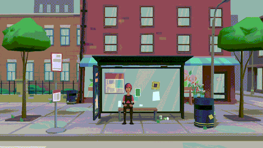
Are You Happy: one year later
Today marks the first anniversary of Are You Happy, a dumb web series I made in a terrible bit of animation software. In celebration, I’m... un-unlisting the series and writing a post to pat myself on the back. Huh.
Normally I wouldn’t bother with this kind of thing, but I think my own general appraisal of this series has shifted somewhat since I put it out into the world. I’ve yet to receive any feedback of any kind from the internet at large, but a few friends of mine have ended up watching it at various points - the last of whom suggested that I should “totally” make the videos public. Well, fine, now I totally have.
I’ve rewatched the series a handful of times since its release and have come to the conclusion that it’s a pretty mixed bag. I’ve come to like many of the individual episodes a lot more, but as a whole the series doesn’t come together for me. In this post, I’m gonna build on what I wrote in the original commentary by briefly shooting through the episodes one by one.
As the first episode of the series, “I Hate You” is pretty much just me getting to grips with the program. I like the way Chris storms out, gets as far as the elevator before he starts feeling bad, and comes back - only to find that, naturally, Samir also left. Back towards the tail end of secondary school, my friends and I got in the habit of just hanging around in classrooms outside of classes - the teachers weren’t technically supposed to let us do that, I think, but they did. I figure that’s what Chris and Samir are doing here - just standing about in a quiet spot. Chris does something annoying, Samir slaps him... business as usual for these two.
Anyway, I showed that first episode to one of my friends, and he helped me out with “The Meaning of Life” by offering a Genghis Khan quote and sitting around as I made it. Plotagon has relatively few options for direct interaction between characters, and I immediately pegged the “slap” action as the funniest of these. It’s even funnier when combined with a sharp cut and a scare chord.
Back in school, we had these two acronyms: WALT and WILF. These stood for “What Are (We) Learning Today” and “What I’m Looking For” and were used by our teachers to lay out the objectives for each class. I guess it seemed funny to me to go completely in the opposite direction for “What are we Learning Today?” - it’s the student who has to try and poke the teacher into giving the class any kind of information whatsoever - but the execution’s poor. This episode is funnier if you imagine the five preceding minutes of silence, during which Mr. Hernandez is having a completely undetectable internal meltdown.
I knew that the stuff I was making would be quote-unquote “in continuity” - but I wasn’t particularly expecting it to “have continuity”. That changed with “Why Nobody Likes You”, which establishes that Lizzie and Chris are friends of a sort. I like to imagine that Lizzie is one of just two people Chris ever talks to (the other being Samir), and that the only reason they interact at all is because they happen to be the only people catching their particular bus. They really have nothing in common, and struggle to hold an actual conversation - although I figure that’s mostly Chris’s fault.
A fair bit of time has probably passed in-universe between the first and second times Mr. Hernandez and Santa meet on-screen. In “A Bad Teacher”, Santa seems a little more chill - rather than sitting at a distance on the bench, he’s standing. Perhaps Mr. Hernandez just treated him to a coffee, or something, and they’ve just exited the shop. Whatever. I’ve suffered my fair share of bad teachers, and one of the things they all have in common is that they’re completely oblivious to the fact that they’re bad. It’s like... bad students exist, but if (as a teacher) you honestly think your entire class consists of bad students, that’s the point where you should realise that you’re the problem. I think that tendency to place the blame on the students is the kind of thing that leads to whole-class detentions, which are a hallmark of bad teachers.
I’d originally pegged “White-Hat Hacking” as my least-favourite episode - for reasons outside of my control, it’s the first to break the one-minute mark - but upon subsequent rewatches I’ve come to feel more positively about it. Jessica’s line about V for Vendetta and zip bombs always takes me off guard, and I like the way Detective Raymond describes himself as “the smartest and most controversial detective”. It’s also funny to me going back to the source file and seeing a ton of lines marked “JESSICA (flirty)” and a single line marked “JESSICA (surprised)”.
My opinion on “The Faculty Bathroom” hasn’t really changed. As far as self-contained concepts in this series go, “insecure teacher talks to himself while on a smoke break, then dies in a fire” is easily the strongest.
Of all the episodes, I think “Nobody to Talk To” is probably the most forgettable. It opens with Chris, who’s lamenting the destruction of the school (mostly because it means he's even more bored than usual). There’s a medal hanging above his bedside table - I like to think that he bought it himself, only to find that he couldn’t think of something to get inscribed on it. Maybe it just says “CHRIS”. Anyway, the rest of the episode is a soliloquy from Lizzie - I’m not sure how exactly the idea of her being a well-connected anarchist came about, and the way that aspect of her character is introduced here feels a little jarring in retrospect. Still, I guess this episode does slightly redeem itself with a surprise appearance from Detective Raymond.
I’m gonna have to take a few paragraphs to talk about “Ever Get Tired of Movies?” - there’s a lot that I failed to cover in the original commentary. In terms of sound design, it’s probably one of the most ambitious episodes - all the sound effects come from the TV, so there’s nothing in the way of ambient music - but I’m not convinced that having the movie drown out the dialogue at the beginning was a good choice. I still love that Katia and Philippe’s colour schemes each match those of their sides of the room; I didn’t design the characters that way!
In the last commentary, I mistakenly said that I’d forgotten to use Ms. Green - when in fact, I’d used her as the reporter in this episode. I repurposed Plotagon’s “convention booth” scene as the newsroom, which works surprisingly well - combined with Ms. Green’s dialogue, which was intended to sound entirely unlike that of an actual reporter, the overall effect is one of a really incompetent production team on the show. This is entirely accurate: the production team consists of me.
Katia and Philippe have an odd role in the narrative - they’re basically an atomic unit from a completely different story. Of the teens in the series, Philippe is the only one who’s happy with where his life is; Katia is suffering from existential boredom. I think, in showing a failure in communication between these two, the episode fails to properly communicate what’s going on to the audience: Philippe is usually content just to do the same stuff over and over - watching movies, as it may be - but that doesn’t mean that he dislikes new things, only that he’s not the sort to actively seek them out. So the conflict is that Katia is doing the same stuff because she wants Philippe to be happy, while Philippe is fully expecting Katia to be pushing for new things - which she finally does here, when she suggests breaking Lizzie out of jail. Another aspect of this dynamic which I think is unclear is the fact that Philippe’s happy to do pretty much anything - including literal crime - but draws the line at taking off his sunglasses. Katia’s presumably been trying to get him to do so for months; her narrativist instincts are telling her that he must be hiding something. I figure he’s not - he just really likes his sunglasses.
Anyway, enough of that. “The Easy Way” is another fairly-forgettable plot-centric episode - but I like the way it handles the third and final appearance of Santa, who at first glance seems to have no reason to be at the office. The reveal that the whole thing’s been a distraction for the breakout is probably the closest the series comes to ever having a plot twist - I think it sits very well in the series as a whole, which (for technical reasons) never shows the big, important moments on-screen. I’m pretty proud of Santa’s monologue, which I wrote myself as a bookend to his opening quote, and the little glimpses of his history given within. I also like the moment towards the middle of the episode, where Detective Raymond - having been left to his own devices - wonders aloud “how can one man be so based”, right after threatening a teenager with torture and right before getting duped by a homeless man in a Santa suit.
Getting four characters into a single scene was a real challenge, let me tell ya, but I think “The Agenda (Part 1)” pulls it off decently enough. It offers some decent closure for the minor characters: Katia and Philippe get their adventure; Jessica’s mad hacks keep the cops off their backs. I think Lizzie’s “true power of love” realisation is a sincere one, but she won’t get her closure until a little later. Her expression upon seeing Chris again strikes me as similarly sincere. By this point, I’m banking on the audience having forgotten about Samir - so Lizzie’s actual goal here should come as something of a surprise.
In “The Agenda (Part 2)”, the penultimate episode, the series comes full circle. There isn’t really much to say about this one; the way Chris and Samir make up is pretty much the same as the way they fell out in the first place. Lizzie is just a facilitator here - she’s still planning to leave, but this time has decided that she doesn’t want to leave Chris entirely on his own.
Finally, in “The Agenda (Part III)”, we end up back at the bus stop, where Lizzie talks to Literally The Devil - who turns out to be a much better conversational partner than Chris ever was. This episode tries to strike a balance between jokes and introspection, but I don’t really think that it properly achieves either. Still, Lizzie’s shift to optimistic nihilism here feels like a good conclusion to her arc within the series.

It’s obvious that I was writing Are You Happy by the seat of my pants. While this lead to a pretty unpredictable plot, it lead to fairly poor economy of narrative. Although many of the characters get rudimentary arcs of their own, there isn’t a clear throughline which connects them all - I didn’t know what I wanted to say with this series, and so it ended up saying pretty much nothing.
On the other hand, this is just fifteen minutes of content - and I think it packs a lot of individually-quite-good snippets into that runtime. Usually, when I’m writing something, I hit a point where it starts to be a chore; that wasn’t really the case with Are You Happy, thanks to the fast turnaround provided by Plotagon and - perhaps more importantly - the fact that I didn’t need to worry about writing full descriptive prose.
Plotagon provided a huge amount of great background music - seeing as I didn’t go into detail in the last commentary, here’s a breakdown of which pieces I used:
“cruising rap battle” is something of a leitmotif for Chris, appearing during “I Hate You”, “The Agenda (Part 2)” and his scene in “Nobody to Talk To”
Lizzie, meanwhile, has “hideout”, which appears during “Why Nobody Likes You”, her scene in “Nobody to Talk To”, and the final scene in “The Agenda (Part 1)”
Santa naturally has “jingle bells” for all three of his appearances
I guess you could say that “happy music (care free)” from “What are we Learning Today?” is technically a Mr. Hernandez song, but I’d consider this to be more true of “sentimental” which plays throughout “The Faculty Bathroom”
Detective Raymond’s theme is “Detective Noir background”, which appears during the endings of “White-Hat Hacking” and “Nobody to Talk To”
Jessica gets two songs - “pirate ditty” and “suspenseful”, appearing in “White-Hat Hacking” and “The Easy Way” respectively
Katia and Philippe technically get “zombie theme” and “news intro” in “Ever Get Tired of Movies?”, but that’s just the stuff that plays from the TV - it’s not until “The Agenda (Part 1)” that they get “anticipating”, which I consider to be theirs
Fitting neatly with the vague stabs at liminality present in “The Agenda (Part III)”, Literally The Devil gets “muzak”: elevator music
Other bits of music include “lounge” in the actual elevator in “I Hate You” and “french bistro” for the cafe in “The Meaning of Life”
Upon booting up Plotagon, I was greeted with the disconcerting news that it’s being discontinued on desktop at the end of next month - ostensibly so the developers can focus on mobile platforms, although I can’t help but notice that this announcement was shortly followed by a flash sale on their “Plotagon Studio” subscription service for desktop: just $49.99 monthly, or $499.99 annually! Yeah, uhh, I’m good. This is pretty disappointing, but not entirely surprising - I’ve always kinda felt like the software was about to disappear in a poof of smoke, and now it kinda has.
However, I was also greeted with some good news: apparently, it turns out that I’d previously revisited the program all the way back on the 21st of September last year, to start work on a sequel to Are You Happy. Although I knew that I’d made vague plans to do so, I’d completely forgotten that I’d actually gone ahead and produced any new material! The sequel will likely share a portion of its cast with the original series, but based on what I’ve currently got it’ll probably end up dealing with pretty different themes.
With any luck, the application will continue to work offline past that date - but just in case it doesn’t, I’m going to try and accelerate production on the sequel. Don’t get your hopes up. If I can’t finish it, or I’m not happy with it, I’ll still try and put it out - but it’ll be more as a “bonus feature” than as a fully-fledged instalment in the continuity. More importantly, as is the case with everything made in Plotagon, I can’t promise it’ll be good - I can only promise that I’ll have fun making it.
0 notes
Text
Coming up with my Final Idea
My project went through a lot of variations in the first few weeks before I settles on a final idea.
Inital Ideas & Thoughts-
Before I really knew what this project was about, I knew that I wanted to make something due my love of cosplay and fantasy armour. I also knew that I really wanted to make a set of wings, as it’s something i’d never done before and would give me a chance to push myself.
I knew that I would have to design the costume I made - thus I decided to also venture into character design & concept art, as this was also something I was really interested in earlier in the year.
Most cosplay armour i’d previously seen was from World Of Warcraft, so this was my primary inspiration from this stage - as well as the design of typical medieval armour. I started designing some armour ideas for fun.
First Ideas - using the Titles
This idea began to evolve as we officially started the project and had to consider the titles we were given as a starting point.
I picked the following titles and made some notes relating to them, trying to think of a possible narrative that could work:
Rose Tinted Spectacles
To have a certain view on something – i.e. you can only see the good things or the bad things. Having something that could allow you to access another view of a world - for example Spiderwick.
Anything involving separation between two worlds – i.e. like the real world and a fantasy one - or hell and the real world. So like something from another world – could be something underwater.
Virus – something infected by something else – so like maybe the character has been infected by something from another world so the armour is like covered in moss or plants/decay.
Things being hidden from plain sight - is the main character hiding a secret?
Having a character travel to a place and become infected by it.
Behind Closed Doors
Secrecy – something people aren’t meant to know about – maybe the main character has come from another world and is being kept hidden. Maybe the wings are like the result of an illegal experiment.
Crimes, undercover police, illegal actions etc.
Having an assassin style character - someone who has two jobs
Crossover
Literally crossing over to another world – so the character’s come from another universe etc. Heaven and hell – dreams/nightmares – day/night – different time periods.
I guess mixing two themes together - in her armour design?
Having a character that unites two worlds - similar to Aquaman – has both worlds in their design.
Host
Having a possessed character or something like venom – transforming character
E=MC2
Having a sci-fi/ inspired futuristic character
Aliens and characters from another world
Science experiments, linked to Behind Closed Doors - such as Maximum Ride
After considering each of these ideas, I really liked the concept of an assassin character, so I chose Behind Closed Doors as my initial starting point.
Having now decided that this character I wanted to create the costume for would be an assassin, I could work on a few other designs that would actually incorporate this theme.
Idea 1
My first proper idea was to have this concept set in a fantasy world. My character would be part of a royal guard who works to defend the king. However, at the same time she works as an assassin. No one one knows that she is the same person. She has a reputation for being able to take out 100% of people she’s asked to kill. One day she received a request to kill the king himself - while at the same time being one of the people trusted to protect him.
I really liked this idea at the time (and would perhaps like to expand it in the future) but it eventually fell short as I realised that I wanted to go more for a science fiction theme - similar to the designs in Marvel and Overwatch.
This inital idea is why several of my design sheets turned out to be fantasy based (rather than science fantasy as I am now doing) as shown below:

Idea 2
When making the pinterest boards (as well as seeing other people’s work and ideas) I was inspired by all of the science fiction designs. Because of this, I thought it would be fun to try and design a more futuristic costume for the character to see if would look good.
I designed this (right), inspired by the designs from this pinterest board which I had created.
The left design was my original fantasy armour concept. The middle design was an outcome which I created by combining the two. I took my favourite aspects from both and kept the colour palette (which was my favourite out of all the initial designs).
This was the result below. Ever since I combined both science fiction and fantasy I knew that I wanted to continue with this theme for the rest of my project.
Idea 3
I came up with this next idea after struggling to really think of a narrative for the science fantasy character. This concept was created based on my GCSE Media studies project - a show about Ancient Egypt. Along with Egyptian mythology, I was also really interested in conspiracy theories, aliens and government secrets - these all combined really well with the E=MC2 starting point.
Still liking the science fantasy concept, I began to think of an alternate reality of earth in which Ancient Egypt and its events happened in the future when everything was futuristic and technologically advanced - but also still had the egyptian gods present. These gods I thought could possibly actually be aliens (which would explain their armour design) in this world - much like Stargate. The idea would be that Egypt would be like Wakanda - completely hidden from outsiders and actually extremely advanced despite everyone’s belief. My character I planned to have based on a cat - as they were highly worshipped (and the bird/jackal appearances were already claimed by the two gods) and known for being very silent and sneaky, perfect for an assassin.
My character would be an assassin who would venture outside of Egypt and reclaim lost artefacts that have been taken.
This lead to this armour design (right) which was a redesign of the previous (left) with a more prominent aesthetic - I wanted an eye, cat and wing motif as these were all common symbols in Egyptian Mythology.
This idea was invented in a mere few days and was really more of an impulse concept - I should have developed my other ideas further before rushing into this one as it was also quickly off the table for several reasons.
For one, people that i’d asked didn’t really think that the black & gold armour was very ‘Egyptian’ looking. I also couldn’t really find a plausible reason for the character to have wings. But the major turning point was when I discovered all the research I’d have to do to back up this idea - into Egyptian films and actual factual information about the country - which honestly didn’t really interest me at all - I just liked the concept of the animal themed gods and alien conspiracies.
Idea 4
I remember shortly after coming up with the Egypt concept that I was sitting in a room surrounded by people all working on their science-fiction stories. I felt like i’d made a serious mistake in choosing it for such a huge project when it wasn’t something I was insanely passionate about. I had to sit down and consider if, three/four weeks into the project, if it would actually be worth changing my idea again. It was actually looking at my favourite artist’s work that fully convinced me to revert back to the science fiction/fantasy theme I wanted to do previously. Simon Stalenhag’s dystopian universe and environment paintings full of giant machines made me realise that this was really the sort of thing I was interested in.
I still had my main idea in mind: to create a costume with wings. But now I had to try and incorporate a typically fantasy character into a futuristic science fiction universe.
I still wanted my character to be somewhat secretive, with not everything known about her - for example an assassin built by the government as an experiment with actual wings.
Another reason for this decision change was because I didn’t want to have to ground my work into reality - with Egypt I would have to stick to realistic conventions and history whereas with sic-fi, anything was possible and would give me a lot more freedom to imagine where technology could possibly take us in the future.
I was originally going to have this story set in Egypt as a homage to my previous idea. I also wanted to have a large company who pretty much ruled the entire world - something my character could fight against and overthrow. I wanted the company to be ruled by an AI, and I really liked the concept of a future where everything you do is watched, recorded, etc. As it was set in Egypt, I wanted this AI to be called Anubis after the god. The company was known as Anubis Robotics for a while.
The company would offer people a way to live forever inside a machine - having a second chance at life even after death. But having everyone living as a machine would also make them controllable by the corporation- making them able to achieve whatever they want, including world domination.
Sakura (the protagonist) would be an assassin who wants to overthrow this company. But the point was made that she would have no reason to care as it was not involving her in any way. For this reason I decided to scrap the idea of her being a random assassin and instead, she became the scientist who invented the technology that the company uses - a benevolent girl who just wants to help people who have lost their bodies live again. Having the company turn on her and use it as a world domination and money making scheme was a lot more plausible of a reason for her to take them down.
As this idea grew, the world i’d created started to drift away from Egypt little by little - and since I wanted the company to be world dominating (not just an Egyptian company) I thought it would be better to name it after something else. I wouldn’t really be able to explain the name ‘Anubis’ anymore, but I was still really attached to it so I picked something similar sounding - Atlas.
It is interesting to note that Atlas’ design and the company’s logo was still created with Anubis in mind - hence the pointed ‘jackal ears’ he has on his head and the dog-headed logo itself.
The only thing missing was an explanation as to why the main character had wings.
This was when my story ended up becoming an alternate version of earth - a new world in itself. Since I wanted to focus on both science fiction and fantasy, I incorporated a magical energy into the world which is shared between all living creatures - thus connecting them to each other. As the magical energy transfers between each creature and returns to the earth, it is possible for it to transfer DNA between organisms - creating mutations from other species resulting in fantasy races. This allowed me to instantly have mermaids, dragons, angels etc while still maintaining the science fiction aesthetic. This magical energy was then named as Mana - one of my inspirations behind the logic of the energy was based on Annihilation’s lore with DNA refraction (which sounded ridiculous to me and everyone else watching but was still believable enough for the suspension of disbelief.).
While I started out wanting to create just a winged character with a backstory and a suit of armour, it eventually turned into wanting to create an entire narrative and alternate future which I named Windfall.
The name ‘Windfall’ is the name of the planet that is alternate Earth.
0 notes
Text
Surprises (Part 3)
A/N: I’m not super happy with this but also I don’t hate it so I’m sticking with it because I am committed. I’m also an angst qween, I enjoy expressing my dormant rage through literature. It’s cathartic, you know?
Part 1 / Part 2
Summary: He’s lying and you know it, but the fallout for confronting it is going to be painful. Is it really worth it?
Word Count: 1,631
Warnings; Swearing, angst, Jughead has so many emotions, he just wants to be loveD, this ain’t gonna make sense if you havent read at least Part Two
“No, nothing.” He said quickly, too quickly, as though he’d anticipated the question coming before you’d even said it.
“Well, then what does it mean?” You asked, fiddling with the dish towel you had in your hands, studying his face.
“Nothing, I just said that.” He snapped at you and you frowned, shaking your head at him.
“You don’t have to get shitty with me, Jug, I was just asking if it meant anything.” You mumbled, wiping down the bench top slowly to give yourself something to focus on,
“Why does it have to mean anything, Y/N?! It was a stupid dream, that’s all, there’s nothing deeper to it!” He yelled across the kitchen counter, you backed up slightly your brow furrowing. There was no reason for him to be acting like this, you hadn’t done anything wrong, hell, you couldn’t imagine what had him upset now, you were just asking.
“Right, well obviously that’s true, because why else would you be irrationally yelling at me?” You said sarcastically, throwing your towel in the sink with all the force of your frustration.
“Irrationally?” He scoffed, “You’re giving me the third degree for a dream I had that you shouldn’t even know happened!”
“I came into check you were sleeping! Because you never fucking do and I was worried, you know? Worried? People feel it sometimes when they give a shit!” You snapped back and he rolled his eyes.
“I’m going to bed.” He said simply, you could see the anger in the lines on his face but yours matched in equal ferocity. He turned to walk away.
“Yeah, well have sweet dreams.” You grunted. He ignored you as much as he was tempted to turn back and say something unsavoury, he bit his tongue and went up to bed. You pulled the cookies out of the oven, they were burnt so bad they were blackened, you tossed the tray on the counter, it clattered loudly and you sniffled. Your eyes were already stinging with tears and your heart was aching. Maybe he was right. Why did it matter so much?
It had been four days since that argument, neither of you had said anything to each other, at all. Not a single word. You barely looked at each other even though you were in the same damn house. It was uncomfortable and weird and you missed your best friend already, you barely went five minutes without talking to him usually and here you were, in a constant state of discomfort because you’d been avoiding each other.
School was boring, it was quiet and uninteresting without Jughead beside you, scheming and investigating away, going on about something that meant something that you were entirely lost on. The confusion was something you started to miss, simply because it came from him, and because you knew he only ever got that way with you, he was comfortable with you. He could get wound up and talk so fast his words ran together, and he could laugh and smile freely, he could be entirely himself around you and you missed him entirely. You had time to think about why you had reacted the way you did to him that night, and it was becoming clearer and clearer that maybe you wanted him to say it was more, because you wanted it to be more. You definitely wanted it to be more. You loved him.
As it always seemed to go with the two of you, your feelings and his weren’t far from each other’s, he hated it as much as you did, he missed you as much as you missed him, and to make matters worse, he was afraid of losing you entirely because he got angry, having nowhere to go wouldn’t be fun either, but it was nothing compared to losing you from his life. It had only been half a week and the stress had built up enough to almost floor him, there was so much to tell you, he couldn’t tell anyone else because by the time he’d paused for a minute to let someone else speak the conversation had moved on. With you he talked until his lungs were so starved of air he had to stop for fear of suffocation, and even then you would sit there in silence and wait to hear the rest, he’d get it all out and then it would be your turn. The two of you just had a dynamic that made him feel safe, comforted and completely free, and he was craving so badly it was starting to hurt him physically.
Admitting wrongdoing wasn’t a strong suit for either of you, stubbornness was just a way of life and giving in rarely seemed an option, but if something didn’t happen soon the two of you would probably have a combined breakdown, which wasn’t really a good option for anyone. Still, you were in deadlock, neither yielding, neither caving nor coming to the other, or at least you thought that was the case.
The night was miserable, rain was beating against the town like it was trying to drown everything out, and thunder rolled so loudly across Riverdale that it shook the ground, it seemed to suit your mood though, so you didn’t complain. Since you’d arrived from school you’d locked yourself away in your bedroom, trying to take your mind off the situation at hand. Unfortunately for you, not thinking about him wasn’t an option, so you thought about him when you were happiest, when the two of you were last sublimely blissful and hopeful for your future together, even if it was only as friends. You thought of the drive in a few weeks ago, even though it seemed as though it was years before that moment. You laid back on your bed, eyes falling shut as you sighed heavily and tried to focus on that.
There was a soft knock on your bedroom door and you opened your eyes, you didn’t move, “Come in.” you said over the violent rain outside. The door opened and you finally pulled yourself up as Jughead stepped in slowly and wandered over to sit on your bed in front of you. There was a long silence, the two of you sitting in wait as he tried to find his words in scrambled thoughts, and you tried not to panic about what he might say.
“Y/N, I…” He paused and looked down for a moment, it was an odd change in his demeanour, one you had only seen rarely despite your years of friendship, “I’m so sorry.” He finished slowly, still not looking up at you, “I shouldn’t have reacted the way I did, you had every right to ask, and I know you were just trying to look after me. God knows I don’t do a great job of that myself.”
“It’s okay” you sighed, the weight of the entire universe lifted from your shoulders as he spoke, “I shouldn’t have pushed you, I guess I just wanted it to mean more than it did.” His brow furrowed in confusion at the admission, but he chose not to press on the subject for fear of a repeat of the argument.
“I know I screwed up, but I don’t want to lose you.” His voice was unsteady and it broke your heart, “You’re my best friend, you do so much for me, and I’m terrified of fucking this up. You are everything to me, I don’t think I could function if I lost you now.” In all your years of friendship he’d never spoken to you like this, he’d never become so emotional over anything, maybe that was because you ever fought, no matter the reason it hurt you to watch him so afraid.
Carefully, you pulled yourself off the edge of the bed and stood, holding out your arms for him. He got up immediately and came to you, wrapping his arms around you in a grip that was almost bruising it was so tight. You moved your arms around his shoulders and hugged him tighter to yourself, rubbing his back soothingly. “Please, Jones, you couldn’t lose me even if you did want to, I’m not going anywhere.” And you stood there, holding him close to you for quite a while before he finally pulled away, his arms stayed against your waist and that action alone made it mildly harder to breathe. His eyes flicked over all the features of your face as he stared at you, a soft smile on his face. Out of instinct your hands moved to the side of his neck.
“What are you thinking about, Jug?” You asked softly
“When you said you wanted my dream to mean something more, why?” it was a simple question and yet it made you want to run screaming and dive out the nearest window to escape.
“Just that, uh, if you’d told me it meant you were in love with me or something, just as an example, of course,” You stumbled over your words hopelessly, a dark blush colouring your cheeks. “I wouldn’t have minded.” You admitted, closing your eyes and cringing away for a moment.
“Good,” he said quietly, you felt him pull you in and your eyes opened again to meet his as he ducked his head so your lips almost touched, “because I lied.” He breathed out quietly, his lips colliding with yours gently. His entire body relaxed into you in an instant and you could only assume yours did the same.
There were three things you were sure of in that moment,
One; Jughead jones was your best friend,
Two; He was also the love of your life, someone you couldn’t live without.
And Three; He felt exactly the same.
(I decided to tag all the people who replied to Part Two because some of you asked and I love and appreciate all of you who took the time to say a thing for me, thankyou! @teenagegrungephotograph @murderyoursoul @xxwoahitsbrinaxx @betty-coopers-number-one-stan @hella-gay-and-depressed @cryingbellamy @heir-of-light-33 @sl-eep-ing )
#riverdale#jughead#jughead jones#jughead imagine#jughead jones imagine#jughead fic#jughead jones fic#riverdale imagine#riverdale fic#mine#riverdale jughead#riverdale blog#jughead x reader#jughead jones x reader
263 notes
·
View notes
Text
7 graphic design tips you absolutely need to know
Visuals can really pack a punch, depending upon the asset you’re designing and how you balance text with graphical elements.
Whether you’re just starting out or you’re a pro designer, there are a few rules that you should keep in mind to take your visual elements from “meh”, to “WOW”.
First things first, we’re going over the basics – these are the rules that you should follow no matter if you’re creating a feature image for a blog, visuals to support whitepaper content, or a full-fledged eBook or infographic.
Consider these your cardinal design rules:
Abide by the style guide.
Consider your colour palette.
Limit your fonts and choose them wisely.
Build in negative space.
Scale is your friend.
Take a step back.
Take it all in.
Now, let’s break these down, one by one:
1. Abide by the style guide
Your brand style guide (whether you’re designing for your own employer or a client) is your bible.
When in doubt, you can always fall back on the the guide.
Often, this asset will contain the company’s choices of fonts, colours and other elements that help ensure all of its visual assets are consistent with its brand identity.
Be sure that your designs don’t stray from the style guide. And if they do, be prepared to have a really, reallyyyy good reason for the decision to break away – or show your reasoning through examples (one that aligns with the style guide, and one that incorporates your own design choices).
2. Consider your colour palette
While the style guide may direct the palette in certain instances (i.e. the brand logo, header/footer elements, etc.), you’ll likely have a bit of artistic freedom when it comes to the overall colour choice of the graphic.
colours can convey a certain mood and message all of their own – for instance, using bolder, warm colours can evoke a different response in your target audience than cooler, complementary colours.
When choosing your colours, consider not only the content and message you’re designing around, but the reaction you want to bring out in viewers.
You should use contrasting colour combinations, or those directly across from each other in the colour wheel. It’s important to ensure that your palette is not only complementary, but also aligns with the style guide .
Selecting a high-contrast colour palette can draw viewers in, and make your designs, well …
3. Limit your fonts and choose them wisely
Full disclosure, I have quite the opinion on typography, as you can see from this piece I wrote on email font choices.
Similar to colours, your choice of font(s) can send a message depending on the shape and size of the typeface. And if the look and feel of your font doesn’t match up with the purpose and content of your graphic, it can really throw readers off.
Using a different typeface for the heading, subtitle and any body text can be visually appealing. However, as Canva put it, for font’s sake, limit the number of typefaces you choose.
Selecting and mixing too many fonts is a rookie mistake, and can make your graphic look messy and just all over the map.
Overall, both sans serif and serif fonts are good for readability. Sans serif has become the more popular option for web content, while serif fonts are typically used for print assets. Remember to follow the guidance from your style guide, though.
4. Build in blank space
While I immediately want to make a Taylor Swift reference here, we’ll push forward without one.
When creating visual elements, it’s good to leave a bit of white space, or negative space, in and around your design. Consider this breathing room for your design – smoosh too much into a graphic, and viewers won’t know what to look at first.
White space can be a design element all on its own, helping to direct the eye to the other shapes and visuals therein.
What’s more, building in negative blank space can help keep your graphics simple, and prevent you from going overboard with visuals or colours.
Take Apple, for example, the veritable king of white space.
The brand really knows how to work blank space into its visuals, and the use of white also helps provide a clean and polished look.
Plus, when the brand does decide to include more colourful elements, including white space around these visuals helps give them the attention they’re due.
Okay, I couldn’t help myself:
See how your eye is drawn to Tay and her shiny red apple? Blank space, people! It’s a must for great graphic design.
5. Scale is your friend
In addition to thinking about your colour scheme, fonts and negative space, you should also put thought into the scale of each of these elements. Scale is particularly important when it comes to any included icons, shapes or illustrations. Giving a greater scale to certain visual elements can shake up your composition while providing emphasis in areas where it’s needed.
Using scale strategically is also a great way to help lead readers’/viewers’ eyes from one compositional feature to the next.
6. Take a step back
This is best practice for anyone who stares at screens all day, but is especially important for designers – don’t forget to take a step back every now and then and rest your eyes.
It’s super easy to get lost in your visual elements if you’ve been looking at them all damn day.
But taking even a short break to go look at the sky or that patch of grass that your dog likes in the park is important. When you come back with fresh eyes, you never know what might jump out at you or what inspiration may come to mind.
7. Take it all in
Building off this last point, it’s also important to avoid getting tunnel vision on a single visual element, icon or shape.
Remember to zoom out and take everything in as a whole, because that’s what your target audience will be doing.
Check to ensure that your fonts, colour scheme, scale and other compositional features support the content, message and purpose of the graphic. And if anything feels off, make adjustments where needed – your goal is to create something cohesive, while still providing a path for readers’ eyes.
Let’s get specific
The above cardinal rules should represent the standards you use for good design in every instance. However, as any great designer will tell you, things get a bit different when it comes to designing for assets like feature images, whitepapers, infographics and eBooks. So let’s drill down a bit further into each one:
Tips for feature images
As a writer, I can certainly attest to the power of a well-placed feature image within a blog – it takes the entire piece of content to the next level. And unlike typically non-specific (and often low grade) stock imagery, feature images can draw on information or stats directly from the text (hence “feature”).
A few tips and tricks to keep in mind with your feature designs:
Pick an engaging fact, stat or quote to design around. I tend to prefer feature images that include statistics, because throwing your target audience a number to drive your point home is a strong strategy. However, a main talking point from the article, or in some cases a powerful quote, can work well too.
Custom imagery or dressing up stock images? While our graphics team usually creates custom designs for our feature images, time or other factors can sometimes prevent this approach. In these instances, another route to take is to start with an image (stock or otherwise) and dress it up with some extra elements and text overlay. Check out the example here from Magnet4Blogging:
The initial stock image, spiced up with a lens flare effect.
Here comes our custom text, in an opaque overlay.
A mockup of the final result. Replace that filler “This is a headline title…blahblah” with something more engaging and voila! A feature image to be proud of.
Tips for whitepapers
Whitepapers are beasts in their own right.
This long-form, in-depth informational content can span across multiple pages, but unlike an eBook (which we’ll delve into below), in a whitepaper, it’s the written content that is the main focus.
Thus, designing for whitepapers can get a bit tricky.
With a few tips, though, you can take on any length of whitepaper like a pro. Keep these things in mind:
Use graphical elements to break up the text. Yes, the writing is the shining star of a whitepaper, but no reader wants to be greeted by a gigantic block of text. Use visual elements to strategically break up the content, and consider adding in bulleted “takeaways” lists, pull-quotes, featured statistics and more. These can help break up blocks of text without taking away from the content.
Be mindful of page breaks. With so much text to account for, it can get a bit difficult to ensure that page breaks happen naturally. However, as the designer, it’s your job to watch for and avoid things like awkwardly cramming new sections in too close to the footnotes. The same goes for weird breaks in the typography – if you can make a few adjustments to avoid hyphenating almost every word landing on the right side of a column, definitely do so.
Choose images wisely. Keep in mind that, more often than not, the target audience reading a whitepaper is particularly savvy and knowledgeable. They’ve downloaded the whitepaper to read something more in-depth and want to come away with the feeling that they’ve learned something new. For this level of reader, clunky stock images can be a quick turnoff, so choose your images thoughtfully. Avoid the smug-looking business person, wearing a suit typing at their computer – your audience has seen this, or a version of it, a million times before, and we can do better.
Tips for eBooks
Ebooks are like the more bite-sized, visual-heavy cousin of the whitepaper.
Wee limit the number of words per page to about 150 for our eBooks – this gives readers just enough written content, while providing room for the graphical elements to really shine.
When designing an eBook, keep these tips and tricks handy:
Keep the front cover simple, yet engaging. This is the first thing your readers will see on a dedicated eBook landing page, and it serves to draw them in and encourage them to complete the form fill and download the asset. Your front cover should be bold, yet simple, and picking the ideal image, icon or other graphical element is key. B2B Marketing Lab contributor Kim Glazier recommends using a striking image as part of the front cover, but remember to keep the message of the content and the brand style guide in mind.
Things should easily flow from page to page. Page breaks in an eBook give readers a moment to digest the content they’ve just taken in, and then head on to the next page. Unlike whitepapers where readers will spend a few minutes or more on each page, eBooks are shorter and meant to be thumbed through. So when you’re creating the design, make sure that things flow, and that readers will be encouraged to flip to the next page.
Include sharable and engaging elements: Ebooks are meant to be shared, and your design should include buttons so readers can easily post the content to top social networks to drive up readership. Remember, though, that sharable links should lead readers to your dedicated landing page and form fill so you can support solid lead generation.
Mirror the design on the landing page: Speaking of the landing page, you can take cues from your eBook design to create something visually engaging. Plus, using this strategy will help make the form fill more streamlined for your target audience, as they’ll get a taste of what the eBook will look like from the landing page.
Consider trying something new: Because eBooks rely so heavily on graphics, this could provide just the opportunity to break out of the box a bit (while still observing the brand guidelines). For instance, the flat design technique has gained popularity recently.
Tips for infographics
In the hierarchy of graphic design, infographics just might be considered the king of the jungle. Here’s how to get the most value out of them:
Show, don’t tell. This means that writers should keep text to the bare-bones minimum, as you’ll be using graphical elements to drive the main points of the graphic home. A bite-sized fact supported by an icon, for example, is often all readers will want or expect.
Don’t go overboard. This includes written content and graphical elements. This is one of those things that’s hard to explain, but you know when a designer has taken things a biiiit too far when you see it:
As Neil Patel pointed out, the above example could have easily been four or more separate graphics. Your eye doesn’t know where to go first, and while the recognisable brand icons help, this graphic is all over the place – what do those dots mean? Why are they different sizes? There’s also a bar graph at the bottom?? As a reader, I wouldn’t even take the time to begin deciphering this.
Go with a theme: This can help inform your choices for colour, font, icons, shapes and more. Take this example, for instance (which also just happens to be about infographic best practices :
The recipe/ingredients theme here ties the content together. The numbered items and dash-line border help to keep everything distinct, yet simple. The reader’s eye is drawn from point to point without being overwhelmed.
A theme is a crucial element that can take your good design to great. Check out the rest of our best practices here.
Learning resources
While the above is certainly by no means an exhaustive list of tips, tricks and best practices, it can help put you on the path to great design work.
When you’re ready to brush up a bit further, check out some of these top educational resources:
Niice – the place to go for inspiration.
Design Taxi – for trending graphic design industry news.
Adobe colour CC – helping you pick an appealing colour palette.
Noun Project – for all things icons.
FontSquirrel – 100% free fonts, ready for use.
Get out there and take your designs to the next level.
Brief
from http://bit.ly/2mBsPrJ
0 notes
Text
Making The Items - Evaluation
In this post I’m explaining the process I undertook to creating each of my items. I was going to explain the process for each item individually but I’d just be repeating myself 12 times so I’m just going to explain the generic process and evaluate my thoughts on the specific items.
The generic process like all other digitally drawn components started with a basic/simplified black outline. I then started to experiment with different colours and tones, starting with the main base colours. Once I’d found the appropriate colour scheme I started to add more tones and details including highlights, shadowing and text. All the tones were added in a block style, rather than as a gradual gradient, not only to save time but to also match the rest of the theme of my game. Most of my items were fairly quick to make because they were simple to design and have less details than a lot of other elements in my game. There were only a few that were a little time more time consuming. These can be identified by and increased number of screenshots for that item. e.g. tool kit, space food or rover.
Item # 1 - Biomonitor.
I mainly used the initial sketch in my sketchbook and vector image moodboard as inspiration/reference when creating this. The realistic images were too much much like a thermometer, which would probably confuse children. I really like this design. I basically adapted a digital watch to read heart rate, temperature, pressure and oxygen levels as well as time to make it a biomonitor. It was the subtle details that transformed this piece. I didn’t really test many colours out for this piece. I liked the red and yellow colour scheme in the image I used as reference so I copied it’s coloured scheme. I particularly liked this colour scheme because it’s unlike all the other item colours - so it’ll add a bit of variation.
There is nothing that I would change to this piece aside from possibly adding a few more details linking to Mars’ atmosphere to the face of that bio monitor to emphasise it a bit more. I’m just not entirely sure where I’d put the additional details as there’s not a lot space.
Item #2 - First Aid Kid
I looked at both mood boards for this item. The realistic images were used as inspiration for the shape of the box and and the vector image moodboard was used for the tones. I was going to make the first aid kit different shades of green originally. But as I was creating it, I couldn’t get the different tones to complement each other. So I looked at a different colour scheme. I tried red but this didn’t work either which is why I moved onto a blue colour scheme which surprising worked a lot better. Once the colour scheme was decided, I added all the details. Although not conventional, I really like the blue colour scheme, it’s brighter that the original green colour schemes making my overall game more vibrant and interesting.
This was one of my simpler items. After finalising the colour schemes it didn’t talks long to make at all. I really like the first aid. The only thing I could think of doing to improve the item would be to draw some of the contents of the first aid kit like a plaster, bandage or medicine. I think this would have been really nice but unfortunaltey I didn’t have time to do this.
Item #3 - Microwave
I used both moodboards as inspiration for this as well as my initial sketch. I used the basic shapes of the microwave in my realistic miodbaord as well as the initial sketch and then the vector image moodboard for colour inspiration. The shape was fairly easy to draw out. Deciding the colours was a little harder. In my initial design I made the microwave a grey colour to make is seem metallic but I didn’t like it. It’s colourscheme was too similar to the other items i designed like then oxygen take and RTG. The realstic moodboard was also very grey so I had to look to the vector image moodboard as inspiration. Most of these were also grey but there was one that was a blue-green colour so I took this colour scheme as inspiration. I wasn’t sure about this at first but after creating the item I really like it. Although a little colourful and not very realistic, I really like this item. It’ll be fun and interesting for kids. There was very little I would do to improve this piece aside from maybe showing the turn table inside the glass window. Unfortunately I didn’t have time to do this,
Item #4 - Oxygen tank.
This was a fairly simple item, I took inspiration from all moodboards and designs for this. Then initial design for the shape which made a little more square in my final design, the realistic moodbaord for the colour scheme and the vector image moodboard to show me how to make the oxygen tank more vector-like (where to put the tones)
This was fairly simple. I particularly like the wavy tones on the tank. It emphasised the fact that it was rounded whilst looking more fun and interesting. Had I just done some basic tones, it would have make the tanks seem boring and flat. This was a fairly simple item. There is very little that I would do to improve this piece aside form making the top of the take a little more detailed. It’s currently all blacked out which is a bit basic, considering my capabilities but the only thing I could think to do to finish it in time.
Item #5 - space food.
The space food was created in 2 parts the potato and the packaging. I was only going to use the packing originally but then I decided to include the potato because it linked to the film the martian where Watney successfully grew his own potatoes in order to survive. Because this linked so strongly to my the them of my game I thought it was necessary to incorporate it. I started with the potato. I only took inspiration from the vector for this. Because it’s a very rounded and mis-shapen item, it was really hard to use actual images as reference so I used the vector image i mandated to find. This was really easy to follow. I made it even easier for myself in the actual drawing my creating it to be an exact oval because the curved tones inside it could more accurately follow the shape of the potato.
I then added this as an image onto the packaging drawing and combined them to be one piece. The packaging drawing was a little harder that I had anticipated. The images I found were really hard to adapt into drawings because they were other transparent and vacuum packed or really intricately designed. Because of this, I took inspiration from some crisps packet vector images which i adapted to become space food. This made the space food much easier to draw. I also used the vector images for colour inspiration to make the space food packaging grey because I hated the red packaging in my intial design sketches.
Now that they’re both combined I really like this the space food item(s). I was conscious when I first tried combining them that they wouldn’t work but the do. My favourite is the potato. I like so the details within it it like the spots. There is only one this that I would change about the space food item. That’s where I placed the text on the packaging. Currently, you can’t see the letter e on the end of space which could be confusing to children. If I was to do it again I would ether shrink the text slightly or moe all the text downwards so that all letterforms fan clearly be seen.
Item #6 - Rover
The rover was one of the harder items to draw. It started with difficulty in finding an image to use as reference. I wanted to take create a vector image version of the photos I collected of the rover like in the film The Martian but it was too complex for the time I had left and I would have struggled to draw it accurately without ruining it, so I had to simplify the design. This was where the quad bike style rover from the vector image mood board came into it. This was a much better image to use as reference for the time raimaining. I felt the finish was much more achievable than the complex design. The initial design illustration looks very similar to the image on the moodboard because I’d already done some inspiration research for this item in advance because I was struggling to find a way to draw it.
The rover doesn’t quite look as good without the astronaut which was on the original image but I tried to adapt it as best as I could. I think this is because the central bit is quite the or that I needed to change the tone on the seat slightly. However, I sill like the design overall. My favourite section it’s the details in the tyres. I like how all the different layers of tone made them appear 3D
Like I said earlier on, the way to improve this piece if I had more time would be to make it looks more rover-like by taking inspiration from the realistic images.
Image #7 - RTG (heater)
I only took inspiration from the vector images for this because it was hard to find appropriate photos for the realistic moodboad. In the end, I ended up copying a drawing from a diagram because image references were so scarce. The initial sketch looks similar to this because I had to do some inspiration research in advance because I had no idea what an RTG looked like - the scene in the film only showed it covered in foil.
Due to photo quality reference, I didn’t really know what colour the RTG should be so I ended up copying the colourscheme shown in the diagram (for both the initial sketch and final design)
This item looks alright but it definitely wasn’t my favourite. I think this is because I didn’t know how it should have looked, so i was constantly questioning every design choice. All I can hope is that no-one else knows how it should look and so will assume that what I have drawn is correct. Plus it’s for a kids game so it doesn’t exactly need to be scientifically accurate.
Item #8 - Solar Panels
The solar panels were one of the easiest items to create because they’re flat so I didn’t need to worry about loads of tones. They’re also a fairly common item so I could easily collect photos as realistic inspiration and then use the vector image mood board for inspiration on how to turn it into an illustration. The initial sketch was also pretty easy to draw because I knew how they should look. So in the end i used inspiration from all 3 image references.
I loved how simplistic this design was. All it took was a simple basic base tone, a couple of lines to represent reflections and then I white grid over the top and it was done, yet you can instantly tell it’s a solar panel. There is nothing that I don’t like about this piece, therefore I can’t improve it in anyway. It works simply and elegantly the way it is.
Item #9 - Tool kit
The tool kit was one of my most time consuming items, not because it was hard, just because it was the most complex. It contained the most individual components compared to all other items. However, the image referencing was really easy to source. I could find lots of images which linked to my original design sketch making it really easy to design the final tool kit.
Because it was so complex this was my favourite item. I like that I payed attention to detail in each specific section ensuring the tone fell in all the right spaces. The tool kit wouldn’t have looked anywhere near as good with out this. I particularly like the different tones in the wood, they make it appear much more interesting and fun.
The only thing I would change about the tool kit now I’ve finished it is the colours on the handles of some of the tools. I ended up making all the handles yellow but I wished I’d made them multicoloured to make it appear more interesting and vibrant.
Item #10 - Torch
This was another one of the simple items. The only hard bit was getting the tones to follow the shape of the torch aside from that it was dead easy. I’d already decided in advance that I was going to make the torch black because it’s the colour I naturally associate with a torch. The realistic and vector images I searched were only there to support the colour scheme and give inspiration for the shape of the torch. Which was fairly similar to to torch I drew in my initial sketch, just a little more interesting.
I really like this torch, especially the way in which I applied the different levels of tone, making it appear 3D. The only thing I would have to done to improve this piece would be to try adding the light beam. I chose not to include it because I wasn’t sure whether it would work against the white border which I intend to leave but it should have emphasised to the player that the item is a torch not a different item.
Item #11 - water bottle
The water bottle was a lot harder to make than you would think. Although the images for inspiration were really easy to source on both moodboards, the actual process of making the water bottle was lot harder to make than I had anticipated. It was all the tones that I had to make follow the water bottle in order to look right that were difficult because I make the shape a lot more complex that what I should have done. Had I made the bottle straight it would have taken me half the time and still look just and good. Why do I have to make things harder for my self? It payed off in the end though as the bottle looked really good and 3D, even if it was in a vector image style. My favourite bit was definitely the tones on the bottle, considering I spent so much time getting them right. I also liked the water bottle label - H20. I could have just labelled it water but to make it more scientific and educative for kids, I chose to write it in it symbolically. I think this worked, it was a subtle way to teach kids whilst still being fun.
Item #12 - space canvas
This was my final item. Thank goodness. The space canvas was a hard one. The item itself wasn’t hard to make once I’d got the outline and shape sorted it was just designing it that was hard. There were any images online that I could use as reference. The real images were either too transparent or showed them being used not just the sheets themselves so I couldn’t really use photos as references. The vector images were just as bad, these were all representing transparent sheets and so had too many highlights making them too complex to draw. The other vector images were too soft and contain gradients which I couldn’t really use because I wanted to go for a block tone style of drawing. In the end I used the drawing I created initially in my design and used the inspiration for the moodboards very loosely to create the final design.
I chose to go for a white and light grey colourscheme because they were supposed to represent a white translucent material. I considered summer other colours but they didn’t work any where near as well as this.
I’m not sure how much I like this item. I have a feeling that I’ve made it too complex. I think if if was to do this again, I would have held back the complexity of the tones. It would have made the piece more subtle and work better overall. Unfortunately, I don’t have time to go back and re-draw it again with how much time I have left.
Now that all my items are finished. I can send them off to be printed out on high quality lustre photo paper. Once I’ve done that, I can move the item cards which will have the designs item designs incorporated onto them. This was why I had to complete all the items prior to making the cards
0 notes
Text
Infinix is a brand that I believe not many of you would have heard of. I don’t blame you. It’s a fairly new brand and it’s attempting something brave with its Note 4 Pro (X571). Positioned as THE alternative to the much beloved Samsung Galaxy Note series, Infinix even claims this is “The Better Note.”
Flattering impersonator or flat copy? I spent some time with the Note 4 Pro to find out if it’s really “The Better Note.”
Design & Build
On the design front, the Note 4 Pro has definitely taken cues from the device it’s trying to impersonate. In fact, it looks quite similar to older Galaxy Notes. That’s not entirely a bad thing though, and it would give Galaxy Note users “a sense of familiarity.”
For a device with such an affordable price tag, the Note 4 Pro is surprisingly well built. The all-metal unibody is solid and feels quite hefty. Depending on your preference, that could be a good or bad thing. I’ll tell you why in a little bit. The review unit I received came in an elegant champagne gold colour scheme but if that isn’t to your taste it there’s also sandstone black, prussian blue or lilac gray options.
Seeing as it bears the Note moniker, this device comes with a large 5.7-inch display and if you have fairly small or average sized hands like me, the combination of the weight and display size does make it quite hard to hold or even use one handed. I even found swiping to type on the keyboard quite challenging as I had to resort to a bit of finger gymnastics.
Situated right under the 5.7-inch display are two capacitive keys, which don’t bear the usual Back or Recent App symbols. Instead, they are both just dots. I thought they would be programmable but I couldn’t find a way to change them. So the left dot is for the Recent Apps while the right dot is the familiar Back button. Sitting between these two dots is the Home key which also doubles up as a fingerprint scanner. Again, it looks very much like Samsung’s previous devices.
On the left side of the device you’ll find the dual SIM slot, do take note (pun intended) that this phone still uses micro-SIM cards and not nano-SIM. Right below the dual SIM slot, you will see three gold pins and these are there because the Note 4 Pro doesn’t have built-in stylus storage and these pins connect to a bundled case which charges the stylus. More on this later in the review.
As for the right side, you’ll find the volume rocker and also power/lock button. Both buttons are tactile and seeing as the power button is textured, it’s quite easy to find.
One of the biggest surprises to me is also the fact that Infinix decided to take a different route and forego the hybrid SIM and microSD slot we’re so accustomed to these days. So right above the volume rocker, you actually have a dedicated microSD slot, which to me is great as you won’t have to choose between expandable storage or extra SIM.
As we move to the rear, all we have is the 13MP camera and at the bottom you’ll find the single bottom firing speaker, and the a micro-USB port. Finally, on the top, you have the 3.5mm headphone jack, which is great as I always prefer my headphone jacks to be on the top.
Again, considering its price point, the Note 4 Pro definitely is a looker and feels solid overall.
[nextpage title=”Hardware, Software, In the Box”]
What’s in the box
Note 4 Pro Unit
Micro USB cable
XCharge Power adapter
User guide/Warranty card
SIM Insertion Tool
Screen Protector
3.5mm Earphones
Xpen & Smart Cover (bundled)
Hardware
Seeing as the Note 4 Pro is a mid-range device, I really didn’t expect it to boast high-end specs but at the same time, we’ve seen phones that bear almost similar price tags that feature much better hardware. On that note, Infinix’s phablet comes out looking quite disappointing.
At the heart of the Note 4 Pro is an octa-core MediaTek MT6753 CPU running at 1.3GHz and is paired with just 3GB of RAM and an ARM MALI-T720 MP3 GPU. This doesn’t look all too bad until you take into account that the MT6753 is actually a two-year old CPU based on 28nm architecture, which isn’t quite up to snuff in terms of efficiency and performance compared to the newer 14nm CPUs.
Storage wise, the phone comes with 32GB of internal storage but almost half of that is used up by Infinix’s XOS bloatware. The only saving grace here is that you can equip the Note 4 Pro with a microSD card of up to 128GB.
In terms of battery, the Note 4 Pro comes with a massive one. That’s 4,500mAh worth of juice to be precise. Considering the large display and less efficient 28nm CPU, it does need a bigger battery.
Speaking of the large 5.7-inch display, the Note 4 Pro uses a Full HD 1920×1080 LCD IPS panel by Sharp. This is definitely one of the better features of the device as it is bright, clear and produces very accurate and vivid colours. Even when it comes to text, they’re crisp, with hardly noticeable bleeding when zoomed in.
When it comes to network and connection support, the Note 4 Pro supports networks up to 4G LTE, supports Bluetooth 4.2, Wi-Fi 802.11 a/b/g/n/ac, GPS, AGPS and GLONASS.
Software
After using the plain vanilla and snappy version of Android on the Xiaomi Mi A1, coming to Infinix’s XOS just seems like a major step backwards. There’s a lot of unnecessary bloatware and also the entire design of the skin seems cartoonish.
I understand that it isn’t just Infinix that does this but do users really need two browsers, two galleries and a whole bunch of other junk we’ll probably never ever use? What makes things even worst is the fact that you can only disable these unwanted apps and not uninstall them.
Unlike other Chinese manufacturers, Infinix has included an app drawer in XOS that takes it cue from launchers like Action Launcher as it organises all the installed apps alphabetically and on the side. Alphabets let you easily jump to the app you’re looking for. This is quite a nice touch as I’ve always found Action Launcher to be one of the easiest third-party launchers to use.
Remember how I said earlier in the review that the Note 4 Pro bears resemblance to the older Samsung Galaxy Notes? Well, it even sounds like them. If you weren’t a fan of Samsung’s water droplet (blooping) sound effects, sorry fellas, they’re making a comeback. The good thing is, it only bloops when you lock or unlock it.
[nextpage title=”Performance, Pros, Cons, Verdict”]
Performance
As far as performance goes, I would say that the Note 4 Pro is “just okay” at best. As mentioned earlier in the review, it uses a fairly dated CPU and this is clearly reflected in its benchmark scores. In AnTuTu’s benchmark rankings, it ranks below the likes of the Galaxy Note5 and Redmi Note 4 with at least a 50,000 score difference.
I understand that synthetic benchmark scores aren’t everything. But do hear me out. Day to day usage for me was okay on good days, and down right unbearable on bad days.
When I’m not multitasking and doing too many things at once, the device did run quite smoothly but when there was heavy multitasking, the lag in response grew more substantial. Even scrolling up and down on the web browser and invoking the recent apps screen saw major slowdowns and jittering.
So be warned, if you’re a heavy multitasker, this device isn’t going to do you any favours.
Gaming wise, the Note 4 Pro was able to handle games like Dead Trigger 2, WWE Immortals and Into The Dead 2 but only if they were set to Medium graphical settings. Even so, there was still noticeable frame drops, lag and slowdowns especially when things got a little too busy on screen.
Also, another thing to note is that the device did warm up quite quickly when I was gaming for just about 15 minutes or so. The good news is, it didn’t get too a point where it was too hot to handle.
In terms of battery life, the Note 4 Pro’s 4,500mAh battery worked wonders for a medium user like me. After taking it off the charger at 6.30am, the device would still have about a good 30% after a 16-hour day. As mentioned though, I’m not exactly a heavy user. My day-to-day routine consists of streaming music on Spotify, reading articles using Google Chrome or the Bleacher Report app, checking emails, replying texts on Whatsapp and Telegram and maybe watching videos on YouTube occasionally. So your mileage may vary.
To add another feather to the cap of this device is the proprietary XCharge 4.0 charger (5V/5A) which tops up the phone very quickly. It will charge up 0-50% in less than an hour, and Infinix claims that just 5 minutes of charge time can give the phone up to two hours of call time.
The Note 4 Pro comes bundled with a nicely designed case and Xpen stylus. The problem here lies with the fact that the phone itself isn’t designed to store the stylus, which is why if you’re planning to rely on it, you’ll have to slap the case on the phone.
Another major niggle I had with the stylus is the fact that it needs to be charged from time to time to keep it functional. A 20-second charge would give you about 30 minutes of usage. However, if the stylus is low on juice, you will be notified so you can slide it back into the case.
Overall, the X-Pen is quite nice to use and even feels almost as good as Samsung’s S Pen. It doesn’t feel as solid or nice to hold but it does have accurate pressure sensitivity and features like Smart Select and Screen Write.
Last but not least, let’s talk about the cameras on the Note 4 Pro. For the main camera, it sports a 13MP shooter with autofocus and a dual LED flash. It’s the standard fare if you will. The rear camera isn’t too bad and comes with most of the features you would expect from a smartphone these days. It has a pretty decent Pro mode and a Picture-in-Picture (PIP) mode which is like Nokia’s new bothie mode.
In terms of camera performance, the autofocus is fast and I found colours to be quite accurate and details are nicely retained when photos are taken in daylight or well-lit areas. Without Optical or even Electronic Image Stabilisation, the photo taking experience in low-light suffers tremendously as the phone gets slow to focus and images tend to turn out blurry.
Another gripe I have with the camera is the fact that HDR isn’t activated by default. Also, the camera interface feels a little clunky and it’ll take you multiple swipes to get to the HDR settings.
As for the front 8MP camera, it also does well in daylight and well-lit situations but faceplants when in low-light conditions.
The “Pro” interface is kind of interesting.
Check out sample photos in the Gallery.
Pros:
Solid premium metal build
Very good battery life
Rapid charging
Dual SIM and microSD support
Large and vibrant display
Decent camera performance
Cons:
Hard to hold or use one handed
Subpar performance
Only 32GB internal storage
Still uses micro-SIM
Stylus needs to be charged using a case
A case is required to store the stylus
XOS and its bloatware
HDR isn’t auto
Pricing and availability
The Infinix Note 4 Pro retails for MYR999 (incl. GST) and comes bundled with the Xpen and Smart Cover.
Verdict
Overall, I have to say that the Infinix Note 4 Pro is a good effort from the company. As for its”The Better Note” claim. That’s a moonshot. But without a doubt, it’s “The Cheaper Note.” Just as Samsung’s Galaxy Note8 rules the roost without competition, the Note 4 Pro carves its own niche by virtue of its price point. Call it king of the molehill if you will, but hey, it’s still king.
So, if you’re really looking to get an Android smartphone that has a stylus without having to take out a loan from a bank or loanshark or deal with silly 24-month contracts, this could be what you’re looking for.
That being said, you could also consider the Samsung Galaxy Note FE (for a wad of hundred dollar bills more, no less), which is the true alternative to the Galaxy Note8. And if you don’t need a stylus, there are plenty of other Android One devices that cost about the same or less that provide a better overall package.
For more information about Infinix, visit the official website.
[nextpage title=”Gallery”]
Shots from the Note 4 Pro in various conditions. Photos are straight from camera, unedited aside from being watermarked.
Auto, ISO450, 3.5mm, f/2.0, 1/35s
Auto, ISO954, 3.5mm, f/2.0, 1/35s
Auto, Front camera, ISO574, 3.5mm, f/2.0, 1/20s
Auto, ISO773, 3.5mm, f/2.0, 1/35s
Auto, ISO1650, 3.5mm, f/2.0, 1/13s
Auto, ISO1650, 3.5mm, f/2.0, 1/13s
Auto, ISO122, 3.5mm, f/2.0, 1/3000s
Auto, ISO114, 3.5mm, f/2.0, 1/2800s
Auto, ISO120, 3.5mm, f/2.0, 1/1050s
Auto, ISO701, 3.5mm, f/2.0, 1/100s
Infinix Note 4 Pro: Is this the alternative to the Galaxy Note8? Infinix is a brand that I believe not many of you would have heard of. I don't blame you.
0 notes
Text
Digital Billboard Evaluation
For this part of my blog I shall be evaluating my process of designing a Digital Billboard. My initial ideas were to design a billboard on a passion of mine which is the Famous British Spitfire. I also have a massive passion for cars and the car industry and thought about combing these two ideas to produce a digital billboard advertisement, which advertises cars but also the history of the Spitfire.
I brain stormed some ideas to start with and had to take multiple things into consideration. I firstly proposed that I use Jaguar Land Rover for my car manufacture because in the Second World War Spitfires were made in the Castle Bromwich Factory, not far away from me, but now they produce the new top of the range luxury cars. I thought about combing those two factors and having an advert which showcases both.

First idea that I had is the one above, not exactly that one but that is the best way of showing my idea as it has never been done before. My idea was to have half of the billboard with this archive image of the spitfires being made back in 1940, and then one the adjacent side having a picture of the same place today with the jaguars lined up, to show that the world has evolved from making the best planes in the world to making what some may say the best cars in the world. I also had the same idea but this time instead of in the factory it would be outside of the factory shown underneath. Also underneath is my final idea and that was too take the front side of a Spitfire and the rear end of an iconic Jaguar such as the new F-type and the famous E-type, this was the only idea I had which would not need to be done in the Castle Bromwich factory, however would still be a difficult task under the circumstances that I had to acquire footage of both and the time frame I had to it in.
To do what I wanted to be as authentic as possible. I wanted the real Castle Bromwich factory where those spitfires were being made. I used multiple factual websites to give me information on the Castle Bromwich factories such as [1]‘The Spitfire site’ and the [2]‘BirminghamPost’ With this I have the massive issue of actually being able to film there, I thought this was highly unlikely but decided to get in contact with jaguar Land Rovers Media Enquires team. I sent them this email, however the never got back to me unfortunately.
“I am contacting you regarding a certain project I have on my University Course which I’m studying at Solihull Colleges University centre. I have had to design a Digital billboard for my project and need to generate a short form of advertisement which I want to intertwine my love of cars and Spitfires. Due to my passion for cars and spitfires I feel that Jaguar Land Rover would be the ideal place for me to conduct my project. My Initial idea was that because the Spitfires were made in the Castle Bromwich Factory and that factory is still being used to this day producing the brand new Jaguars that I could incorporate both of those ideas together and have a product where half of the screen is an archive picture of the factory line with the spitfires down the one side for as far as the eye could see, and on the adjacent side a line of the new Jaguar cars being built showing that over nearly 80 years have passed and that the factory and innovation of new technology is still transforming ”.
I waited two and half weeks for them to get back to me in regards to me email but I received nothing unfortunately, which I was very much disappointment about as my idea was my passion and I couldn’t fulfil it, I did however think that It was a massive task that I had given myself, I took from it ideas and inspiration and a thought that in the future I may get another chance. I decided to have to rapidly brainstorm an idea. I wanted to stick with my idea of a Jaguar and thought of an advertisement for one of their cars which a close friend’s father owned. I prepared myself on what I was doing felt confident in this, however agreeing on a time of meet at the location of his own home did not live up to expectation. He unfortunately cancelled on me due to miss calculating dates and meetings so I was then back to square one with time slowly running out and my deadline approaching. I was to stick with the same idea I had planned but with a different car, sadly not a jaguar but still a vehicle.
What I have learned from the first stage and the later stage of planning is that preparation is key, and when I have a project like this in the future I will plan even more ahead of time and I will have already produced a backup product if the first one doesn’t come through, as what has happened with my first project. However, I did predict that it would happen and did begin to brainstorm other ideas while waiting for Jaguar to contact me back, and then once I had not heard back from them I commenced with my back up. In the prospect of undertaking another project much like this one, I will have a backup in place from the beginning, definitely if I feel something like this could happen again. Because I had to change ideas, even from the manufacture of car, I had to change the Mise en Scene. Because I was using a luxury car such as a Jaguar I wanted the background of the video to fit the same criteria with a historic and impressive feel to match the history of Jaguar. Jaguar use large space and have a targeted audience at more upper class and an age range from 30 plus. I had to change from that idea to a car with a more urban feel. I needed to construct a background that matched the car; the lighting and colour scheme also had to match so I chose the urban environment of Birmingham.
My plan was too use a series of photos in a clockwise motion going around the vehicle to seemingly look as if it a video, and give them affect to how the lighting and weather was on that specific day. I had chosen a black fiat 500 and thought because of the urban nature of the car a multi-story car park would be perfect. I thought a skyline background would also contrast well with the car. I found a car park that would do this well and did a risk assessment on site to deem it was safe to film. I firstly positioned the car where I thought looked well and took the photos; I used a variety of low angle shots, medium shots and one or two long shots. I used the low angle shots to give the car a powerful presence, I then used the medium shot to have the main focus being the car, but with the background clearly visible to give a contrasting effect and to set the scene, which brings me onto the long shot which is too show the setting but also the main source from a distance. I was pleased with of my images that I had taken, I feel however with more time, because of the pushed deadline I felt I was rushed on what I wanted to do, but in the final product I was more than pleased with the outcome. On the way to the shoot I had found a landscape billboard that I thought this advertisement
Because I had used a mobile device for the images I decided to stay with the device for editing and choose to use an app called ‘Inshot video editor music, cut’. I found this application easy to use and professional in the outcome. It had everything I needed to produce my Digital Billboard and had everything I was familiar with on editing software which are usually considerable amounts of money but this being free easy to get your hands onto but also professional in the tools it offered me. It was easier to get to grips too than Premier Pro and the top selling editing software’s. The obvious downsides being that it would more complicated if you was filming on a DLSR and you wanted to edit on there, there would be ways but not as easy as filming on the mobile device and editing on it as well. Phones are becoming cameras and computers combined, with superb megapixel cameras and fast editing applications, it is what I thought to be an ideal tool for a project which was behind d on time and brought me up to speed.
When I was brainstorming ideas for the Fiat Billboard advertisement I looked into advertisements they have previously done. I found that Fiat in there advertisements for Fiat 500s use a variety of bright and attractive colours to draw the audience in such as reds and yellows.
I compared this to Jaguar advertisements and the colours were a lot less vibrant, the colours of the cars were darker shades such as different shades of grey, darker shades of white and black. However they did contrast this with the Union Jack which made the Union Jack stand out. Jaguar uses the heritage of the name and brands it in that way, with examples being the poster advertisements, but also television adverts with iconic British actors. [3]They did this to entice followers of these actors to interact more with the advert which advertised the UK for its famous actors but also there automobiles.
Fiat on the other hand tries to connect more with the younger audience, which is Fiats main target audience in the 21st Century. In their advertisements the actors they use are in the age range from around 17 -30, all aimed at the target audience. In my billboard I didn’t want an actor and want it to be focusing on the car for a short advertisement and the background and lighting.

In the editing part because It was a free application I did not have a massive amount of options, however the options I had I thought were the main factors of editing. I placed all the shots together that I had taken which then added up to 25 seconds of footage in a video; however I want it to be much shorter. I wanted it to have a large number of shots together showing the car in a montage effect so made the shots all 0.5 seconds long. Once I had done this, I dimed the lighting on all of them and gave them a grey look to emphasise the Urbaneness of the car and surroundings. The main edit is the ‘glitch’ used which I wanted to add to draw the audience in as it is an unusual edit to have in a advert and emphases the urban meaning of the advert and the car. Once I felt my billboard advert looked complete I then exported it and saved it onto my computer.
Overall I felt I had achieved a professional Digital billboard that I was proud of. I did have a large amount of problems in the time I was planning and creating my billboard, but I overcame them all and made sure at all times my billboard looked professional and I met deadlines. I will ensure on further projects my planning is made weeks in advance and that I have ideas that I can see becoming a reality.
[1] Spitfiresite.com. (2017). Castle Bromwich Spitfire and Lancaster Factory in Pictures — Historic Photographs | 1943 | 1944 | 1945 | history | Lancaster | Spitfire Mk. II | Spitfire Mk. IX | Spitfire Mk. V | Spitfire Mk. XVI. [online] Available at: http://spitfiresite.com/2012/07/castle-bromwich-spitfire-and-lancaster-factory-photos.html [Accessed 4 Dec. 2017].
[2] Post, B. (2017). A 70-year history of the Castle Bromwich assembly plant. [online] BirminghamPost. Available at: http://www.birminghampost.co.uk/business/manufacturing/70-year-history-castle-bromwich-assembly-3940359 [Accessed 4 Dec. 2017].
[3] British Villains - 2015 One Show Automobile Advertising of the Year Finalist. (2014). [video] Available at: https://www.youtube.com/watch?v=e7gR7EYjcP8 [Accessed 4 Dec. 2017].
youtube
youtube
0 notes
Last Seen Blogs