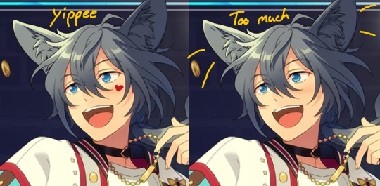
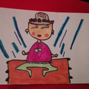
#less sketch and more of. cant make it look how i wanted
Text
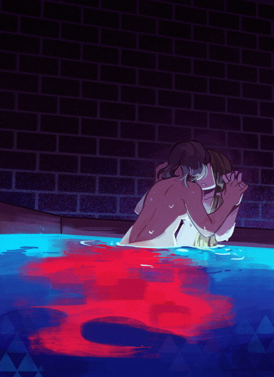
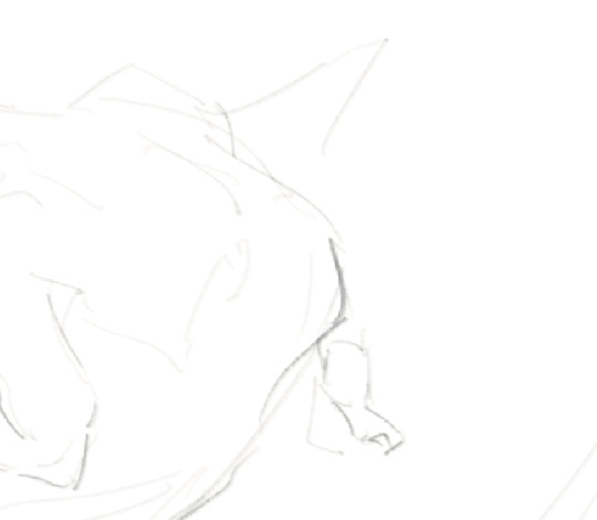
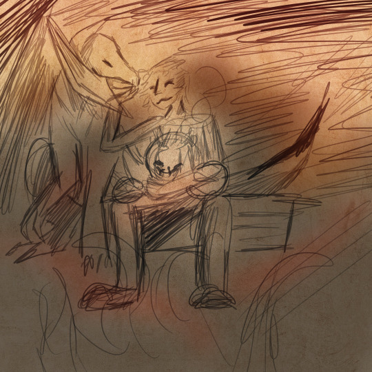
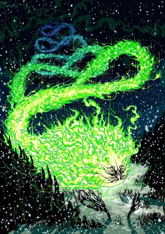
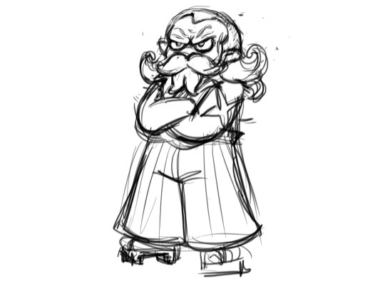
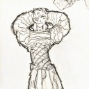
(sketch) blood in the water
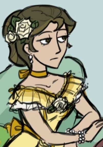
#dungeon meshi#dungeon meshi spoilers#delicious in dungeon#delicious in dungeon spoilers#dunmeshi#dunmeshi spoilers#farcille#falin touden#marcille donato#less sketch and more of. cant make it look how i wanted#had the idea of a blood trail forming the red dragons shape#but if i make it look more like the dragon it looks less like blood#and vice versa#alas. this is what i got#orphe’s art
11K notes
·
View notes
Text
I wrote this on twitter but I thought I'd put it here too, since I occasionally get asks on how I draw/any tips I might have. On twitter I also made the caveat that I don't feel I'm qualified to give anyone tips, LOL, but I was drawing today for an assignment and felt like this is worth noting to any beginner artists who have a tendency of clinging onto sketches that they feel like they finally got right! (A.K.A, a habit I still have years later HA!) This isn't so much of a tutorial as expressing my thought process in this discovery of how to draw more dynamic pieces. I found it to be satisfying on my end, seeing it unravel, so hopefully it can help someone who may be struggling with the same thing I am.
MAKING MORE DYNAMIC PIECES, A PERSONAL STUDY!:
I wasn't upset by this drawing, but I could tell there was something stagnant about it so I ended up pushing it and redrawing it a million times to see if I could somehow make it look more dynamic.

Here's one part of the timelapse - I'm clearly adamant on trying to make this pose/composition work but while the sketch itself may look better, the stagnation hasn't changed. Perhaps this works for some people, but anyone seeking a dynamic visual will be able to spot that this simply isn't working as anything more than a semi-decent anatomy study attempting to be applied.
I changed the position of both arms, I tried to play around with the angle of the head, I tried to just the hips forward more so that the spine had increased curvature, but the main issue, really, was that the initial composition lacked the dynamism in general. It prioritised dramaticism over dynamism. Both can exist in the same piece - it did not, in this one.
This was the new sketch I started with. Less rigid base to go off of. Just getting down the general shape I wanted to score - make the spine and tail take a sort of mid-whip path, shoulders hunched, hips cant forwards, as if he's curling in on himself. I think for a dynamic piece, it's more helpful that your initial sketch uses the body as a general marker as opposed to something to do lineart over (granted, I don't really do lineart anyway, my sketch is usually the extent of my "lineart", but since this is just looking at creating a more dynamic composition, I think it still applies!)
Here it's the same principle. For the left image (the legs) I've established where the knee of the right leg goes, and where the hip that precedes the left leg will sit. These are just base anatomical structures that help me figure out 1. Whether or not the mere idea of this composition will work, and 2. where I have to stop once I start drawing. For me, having some sort of limitation for the body helps me stay within range of proportionate anatomy (not that I particularly care for the anatomy to be realistic, just proportionate to the style I'm drawing in)
On the right image is also the same principle. Establishing the movement of the arm, the elbow/arm bend, and the hand. (If you see the full sketch before the two above, I established the hand in that one too - it really is helpful figuring out the placement of the hand ahead of time.) If it looks atrocious afterwards I always have the lasso tool/eraser to save me.
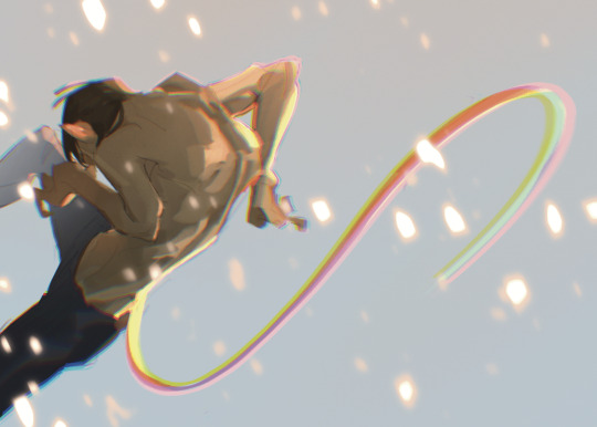
The new attempt brings me to this. While preference in art is subjective, I do think I'd be staying in SOME realm of objectivity when I say this is more dynamic than my initial sketch, LOL. Of course, lighting/rendering choices help push the composition a little more, but this achieves what I couldn't do with that first sketch. I had a general idea, but it's important to know when to let go of something that clearly isn't working.
Would love for anyone to add their own tips or ideas to this post - I'm not particularly known for dynamic pieces so I'm always looking to learn. This was a really valuable study for me so I wanted to share it, but everyone has their own method and what works for me may not work for the next person!
There's a few other asks that asked me for tips on general anatomy, and more specifically legs (oh dear god, I'M going to need to study for that before writing out any sort of resource guide for that, lol) that I hope to get around to doing in the near future. Thank you for your guys' vote of confidence, haha! ❤️
#nc111 tutorials and studies#sketch#art tips#art help#study#I had a lot of fun with this piece so while part of this was definitely to passively respond to my inbox requests#a big part was also just me wanting to talk about my brain expanding as I realised how to Push A Composition#I can't wait to try more things in the future to try and get more dynamic compositions#let me know if this was helpful let me know if it was utterly useless#I'm not a great teacher but I used to tutor my neighbours 7 year old daughter and she found my methods boring but hey she got better
66 notes
·
View notes
Note
how clean are you colors before you merge them into the lines for painting? because i cant seem to find a balance between "my god i need to do this whole thing from scratch (too sloppy)" and "well whats the point of painting here (nothing left to paint if i merged the lineart)". sorry if this doesnt make any sense idk how to word myself better sometimes
I think I get you! Honestly I have a kind of threshold I reach where I know that I’ve done all that I can on separate layers and if I were to keep them separate, I’d just be creating more hassle for myself/forced to select layers and keep everything properly organised and it becomes a drag when I’d just rather be painting. And this is usually because I want to take advantage of the mixing effect of Sai’s paintbrush tool to start blending stuff. Also all my colours are on one layer anyway from the beginning (if I need especially ‘clean’ colours I might have a layer for them but I always merge them to the main colour layer before continuing). (also sorry I am away from my pc for a bit so I can’t show you actual Sai screenshots.. you will have to imagine). I ended up writing out the whole process in a way which is probably unhelpful
So for a painting like that one in the last post, I do my lines. Then I close the lines with a separate layer in the same folder (because the lineart looks better with gaps, but i fill colour by selecting outside the lineart while the folder is active, inverting selection, and paint bucket tool. Then delete the layer that closes the lineart). Base colour is usually the most common one in the palette. When I plan to merge the lines I usually make them solid/normal layer mode and colour the lines exactly to match the colours beneath, which is tedious but helps avoid the kind of translucent look lines on multiply layer give. But for that one the lines are on multiply. I lock the colour layer and paint in the other colours - different markings, materials, etc. It can be pretty rough because I know I can just paint over a wonky looking edge, but not so rough that I will have to go over it excessively later. Then with the lines and colours still on 2 separate layers, I put them both in a folder and clip a multiply layer onto that for cast shadows. Paint in cast shadows (again, it’s pretty rough, I know I will be merging & touching up everything at the end so it doesn’t have to be perfect. I hate multiply as a way to shade but I wanted shadows fast, again like I said it was a sketch I over-rendered I didn’t plan to polish it up so much. Normally I choose shadow colours and paint them like normal in the colour layer).
Then I merged the folder and the multiply layer into one layer (i usually make a copy of the lineart to keep it intact, just in case, and keep it hidden in the psd file). I make a new layer and paint in details that need to be sharp - usually around the eyes and face, where there is a focal point. This is because the default paintbrush in Sai has a slight mixing effect, and if I went in on the same layer it would not be as sharp. I use this new layer to paint in areas that need this sharp contrast and clean, tapered lines - like the stray hair and fluffy bits. Then merge all. Now I paint over the main layer all the things that don’t need that sharp treatment, this time taking advantage of the slight mixing effect of Sai’s paintbrush - I like this effect a lot and it’s what I use to blend the lineart into the colours, you can kind of ‘pull’ the lines out a little into the surrounding colour to make them less stark. Then I clip a new multiply layer to it, all one shade, to dim the entire painting so that the stark white highlights stand out more, clip a new layer on that, do the white highlights, merge all and bam it’s done
79 notes
·
View notes
Text
heavy spoilers for chapter 23 of Always by your side by @ingo-ingoing-ingone!!
this chapter was so fantastic i. didnt have words for it. ended up doing 6 (nearly 7) drawings for it instead. i think this is my record- it took me roughly 7 hours.
a fair warning! this is both art and a comment to the fic in one. so its rather long!
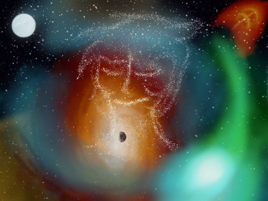
ok i had an Unreasonable amount of fun doing the background on this one. ended up looking up a lot of the celestial bodies mentioned in the fic, man are they cool! it was implied that Emmet didn't really have a body so! stars instead. the colors were fun- i dont often let myself just. color like this haha!
this one was... reall amazing. a fantastic opener! i immediately latched onto the visuals and painted a picture in my mind. it was just so... astronomical?
i actually struggled with how i was going to position these two for a while. at first it was just them coloring in a clearing- then i made them watching pokemon, and then. this! idk- there just something sweet in how Ingo turns around to look at Emmet and...
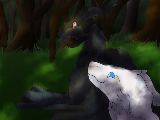
lighting was funky for this one- how a forest shades the things beneath it will always hold a special place in my heart.
these two interacting is always so wonderful to read. the gentle ribbing and teasing and... just them chilling and talking was so nice. the fact that it was dragons was even better! dragons are the best. i felt a very sweet and gentle moment needed an equally sweet and gentle drawing. if i could, i might have gone for line less on Ingo and Emmet here as well.

right- this was the last one i did. i think its the only one that i didn't get specifically from what was written. i just... wanted to give Emmet cuddles alright? /lh i had another sketch exploring exactly what Emmet might look, but i think ill revisit that when i... haven't been drawing for 7 hours straight hgfireohgope. the one in this is more simplified.
the horror of having your face show one emotion- not even the one your most known for... your voice is toneless and the only was you can show even a fraction of what you feel is by copying what you (supposedly) dead brother used to do. there is a quiet horror in that- and yet Emmet still goes on. he cant feel texture and yet... he deserves many nice things.
this one!!! was originally going to be an Entire piece with a more "realistic" drawing of Ingo sitting behind a fire just like this. when i sketched this out (in the middle of reading it) that was the plan. Jedi saved me by making Emmet draw it like this. you saved me probably an hour ghirepoghpeirh. i... still might draw it how i wanted at some point. also the lighting was added last minute! i thought it would look... more messy with the light of the fire shining on it. i think it looks nice.
the scene was sweet and, like Emmet mentioned he did, i put emphasis (or uh... thicker more defined lines) around peoples faces to better define their happiness. it made me happy to read them being happy and then draw them being happy <3
them!!!!!! i do not think it is a secret at All how much i love this au. i was More than happy to draw them again. and!!! being happy!!! perfect. i remembered this was a dream, and decided to blur the background quite a bit of this one- lopsided like its not really being thought about.
adored this one. them!! teasing each other!! just!! going through a day!! perfect. amazing. it was really fun the way the small details of their routine was captured. from Ingo just. turning to goop so he doesn't have to pick up his clothes to Emmet just. accepting everything that happened from the mental connection to the shared feelings.

DRAMATIC FORESHORTENING!!!! i almost wanted to play it up More but then i might lose Ingo's expression. the background for this was fun to do- emphasis! strong colors!! looks like something broke. like something was torn away.
this whole bit is just. exactly what Emmet fears and its just. ough. Ingo would never do this- we know this, Emmet knows this two- he knows how ridiculous Ingo was being here. and then the climax with Emmet just... falling off... amazing. Ingo's horrified expression is what caught my attention here, though i had a few more ideas depicting Ingo leaning over Emmet. i figured a dramatic drawing here would fit.
so! there ya go. i had. so much fun doing this and! thank you so much for writing this and sharing with us Jedi. if you keep this up, ill just have to keep making more drawings!! i don't think words are enough- not even sure if these can properly express how i felt reading it all (i actual had to get up and pace around bc i got so excited) but! i think that your art inspired my own art is a very beautiful thing.
lets all keep making art with one another forever.
#submas#submas au#ray's art#ingo#emmet#ray rambles#man.#sometimes#you encounter something that strikes you hard enough to let you work for 7 hours straight#and its freaking amazing#ah- apologizes for any misspellings#i am rather tired haha- im not checking as thoroughly as usual#thak you jedi <3
23 notes
·
View notes
Note
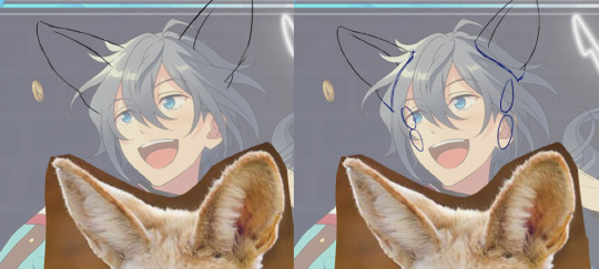
(If you're comfortable with this) could you make a tutorial on how you make your creations??? It'd okay if not, thank you for making them :D
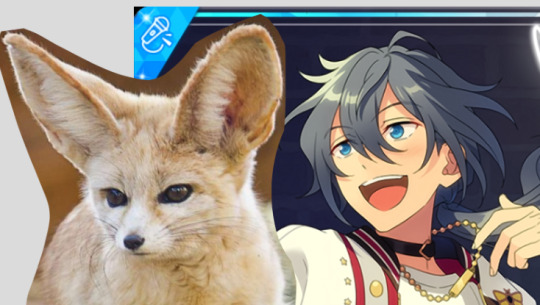
WAA i can try!! baby's first tutorial ft. this guy

🐾 first, a picture of your blorbo
i use waifu2x to up the quality, not always neccessary but it makes everything a bit easier and prettier. i use firealpaca to edit but you can use whatever you like, im not your mom
🐾 probably get a reference
yeah i dont always do this. but you should! i should! so google whatever creature you want to turn blorbo into and maybe scroll for a bit to get a feel for what they look like :3
try to find one at a similar angle to your blorbo picture and paste it/open as a layer. look this is close enough ↓
🐾 onto the actual editing! human ear surgery
in case you prefer just one pair of ears. you have to understand the style so you can imitate it.... so look at their hair, maybe theres more colors or gradients than you can see at a glance or something ! i colorpick a bunch of them and put them over their ears, then blend them together with a low opacity watercolor brush
ALSO, notice the.. lighter glowy aura thing around his ear in the og? i try to imitate details like that too, used watercolor for this again
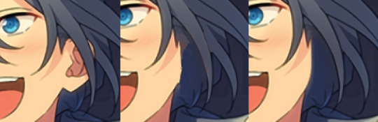
now maybe you wanna make it look like theres something covering that spot, since theres kinda nothing there now. soo if that looks weird to you, (open a new layer and) put some hair over it. i cant tell u how to imitate Any style so just. study it and keep trying
with enstars here the lines are pretty soft, so i go over it with watercolor brush after doing the general shape. with a higher opacity you could probably just use a softer brush from the start, i just like starting with the basic pen
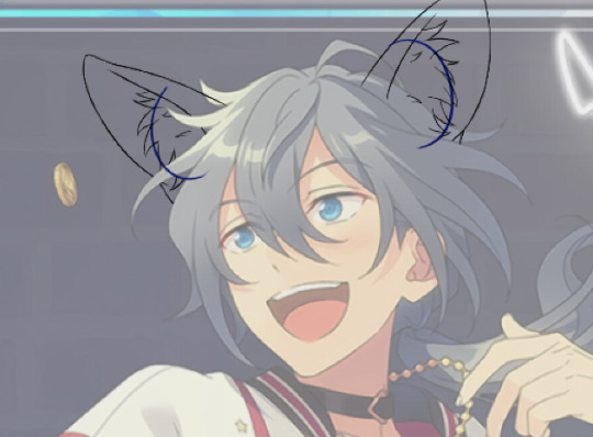
🐾 the lines!!!
nowww i lower the blorbos opacity to around 50%, bring the reference somewhere i can see and just kinda... start sketching. lot of redrawing and transform tooling here sometimes
TIPS 1. you can clean the lines up at the end so dont stress
2. think of your blorbos new ears as a real tangible part of their body and how they fit on their head since you dont wanna make it look too flat !
3. and for the placement i always end up at roughly one human ear length above their og ears if that makes sense. tried to visualize it
as for inner ear fluffs phew i dont know either. draw a circle and start from there? maybe there are actual animal ears in blorbo artstyle out there you could reference
🐾 coloring 🏳️🌈
finally some progress huh. i color the lines in a contrasting color first so i see the lines properly and dont miss anything, then fill it in with the actual color :3 OH and for gradients i just use the airbrush at the ear tips or sides
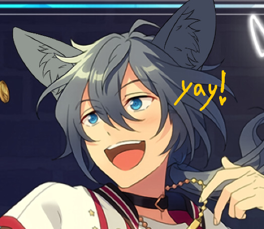
noww shading! new layer, basic pen brush and try to follow the shapes in the og art. it's best if you pick the colors from the actual picture!!! take notes mentally and just do your best i dont know how to explain this more
taking this as an example, the shading is mostly in pretty simple wider areas, so not a lot of seperate strands in there. and its again pretty soft around the edges of shades and highlights, so i'll go over it with my beloved watercolor. keep things like that in mind so the creaturing blends in well :3
if you like more detail better you can still go with that. or less detail on a complex artstyle. the world is your oyster
🐾 and the rest
what else could there be???? making the lineart more cohesive for example ★ oftentimes it's not one solid color, thicker or thinner than yours, things like that.
for things like piercings or fangs you can just draw them on top i believe in you <3 if its like an intricate earring use the lasso? magic wand? the one that lets you select an area to copy and move on top of your ear layers
+ remember details like shadows, if you put a tail on top of say blorbos leg there's gonna be a shadow under it! put a layer under the tail ones and freehand draw the shadow, OR copy the tail layer, put the copy under the og one and change color/opacity until it fits
30 notes
·
View notes
Note
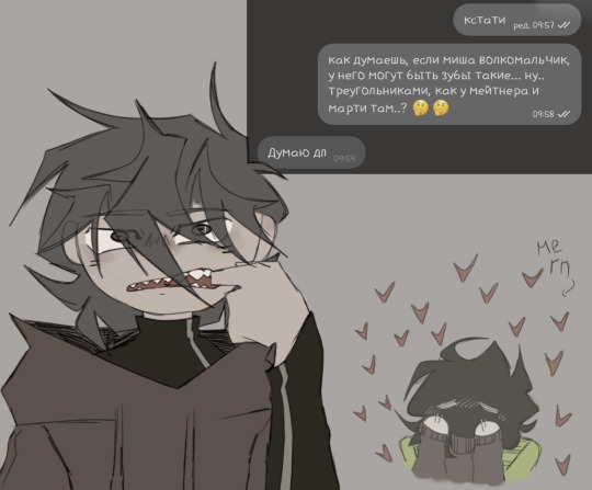
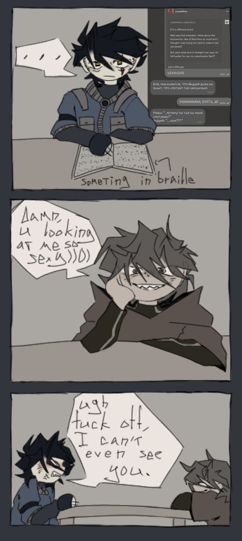
nyanyame nyanyajyuu nyanya do no nyarabi de nyaku nyaku inyanyaku nyanyahan nyanyadai nyan nyaku nyarabete nyaganyagame- or short about how I feel myself for the third wednesday in a row..)
I’ll say again that I love your work, let’s go.
1. oke, do your characters have an approximate age? I know you were already replying to a similar question, but you said that it would be a spoiler. soooo... how about now? are you ready to show your cards??
2. I remember ferry making headcanons on the voices of pafl characters. do you have something like that? like... are there any songs that you associate with adm characters voices? or maybe the vocaloids that you use would be suitable for this roles?
3. I would like to know a little more about daily interactions between misha and andrey. what could it have been before misha got into a time loop? these two "hate eachother basically"(©my fav pic), right? was it something like the cold war and them trying to ignore each other's existence, accompanied by contemptuous glances? or maybe frequent and loud quarrels?? OR maybe they pretended that everything was fine and there was no tension whatsoever, but any of them often irritated the other one or threw caustic phrases in order to offend him???
4. and in general, how did this hatred arose? how did it begin? did something suddenly happen, ruining the calm relationship? accident?? or guys didn't get along from the beginning for some reason??? (god I love these two, I need to know everything *NotLikeThis NotLikeThis*)
(I hope I managed to fit it into less space, huh? . . . okay, but this time there are four sketches! see? no need to hit me, enki, god, please, no!!!)
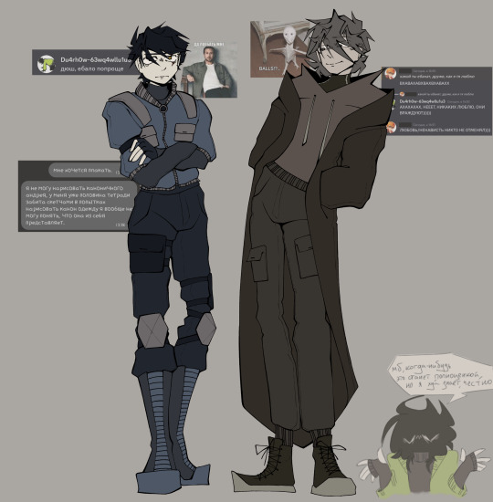
(eh.. I kindly ask you not to take these..... concept arts(??) in full high, as well as headcanons(???) on misha's teeth and eyes of boiis(<зз), seriously. these are just silly things that I thought about briefly and my wife and I thought it was interesting (however, if you don't mind these ideas, I'd like to know what you think about them.....!! (*´∇`)ノ))
(and also, I had to greatly simplify the design of the dyusha's clothes for myself because... I spent a too much time, trying to copy the horror that happens in the canon art, but I SWEAR TO GOD I almost burst into tears, because nothing worked *laughter that turns into the start of a nervous breakdown*)
(I.. should probably be very ashamed for the last sketch, and... to be honest, yes, that’s it, I’m ashamed. (IT'S ACTUALLY SUPPOSED TO LOOK LIKE ANDREY IS BEING MOCKED INSTEAD OF HIM GETTING A SINCERE COMPLIMENT) but my wife made me show this to you, so...... *blinks twice*)
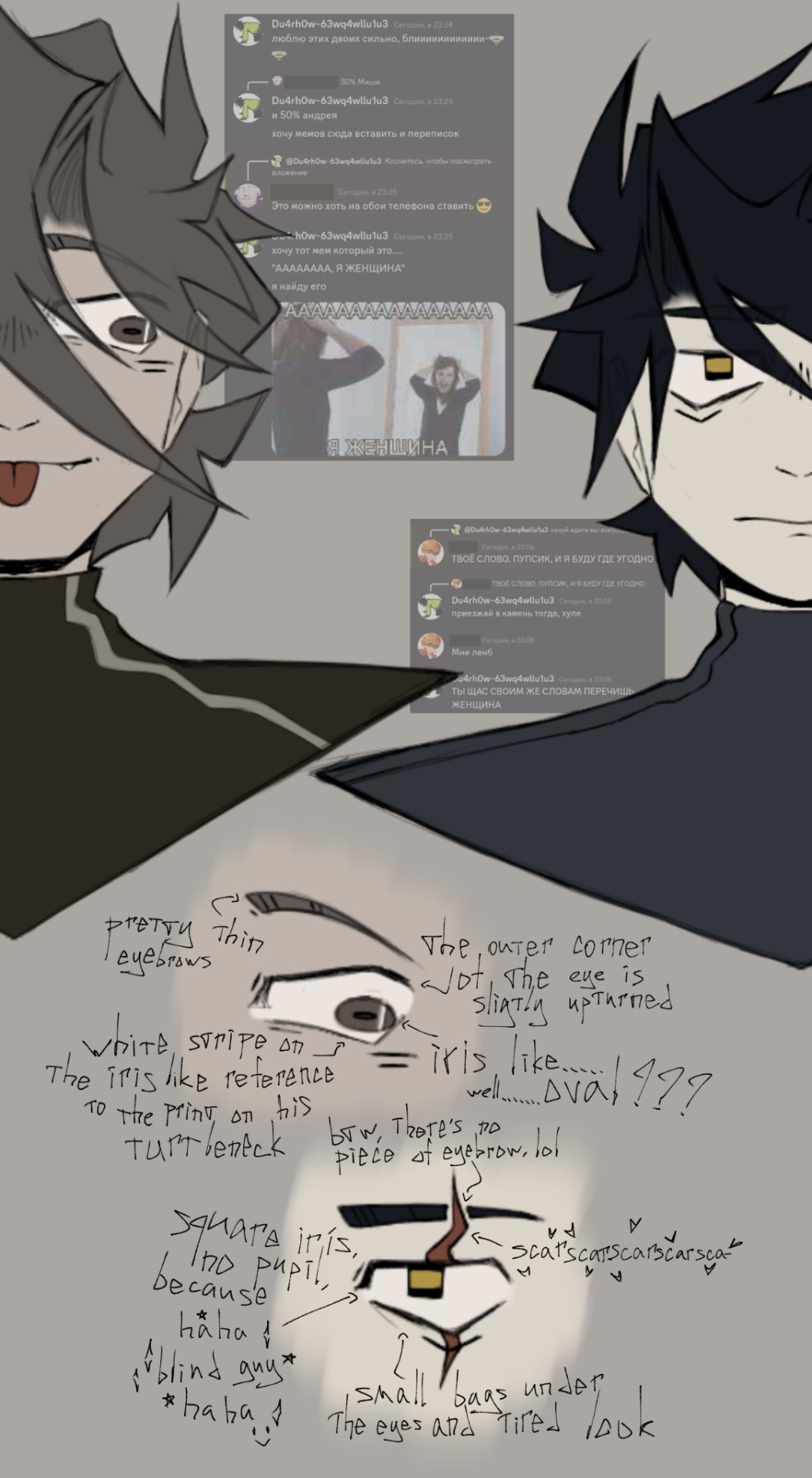
i want to say they are around 20-25 yrs old
after thinking about this for awhile i cant think of any good voiceclaims for my characters..... but i might make one in the future now that i am reminded that that is a real thing
its like a love hate releationship but mostly hate
maybe ill reveal what happened between them in a future song or maybe not. it can also be kinda inferred from the current songs i think
the sketches are so cute!! you have such a fun and silly style and i love seeing my characters come to life :) ty
25 notes
·
View notes
Note
I am all about constructive criticism. I mean, how am I supposed to get better at writing/drawing if people won't be honest with me and give me tips to get better. I personally think that people who can't take constructive criticism aren't very bright. How are they supposed to get better at things if they don't listen to others who are just trying to guide them?
Also, I would love some more tips on how to make the shell better. If you are willing, of course. :)
I am horrible at drawing. I usually have to trace things to get a decent drawing. (For instance, I traced like five different things to make Mikey a pony.)
I'm so much better at coloring than I am at drawing. My writing needs work, too, but I'm getting better.
First of all, can I just say that you shouldnt worry about tracing art to improve your own (as long as u aren't posting it as soley your own but thats a whole other rabbit hole) I did too! It helps build ground work for a good understanding of anatomy and poses.
However there are a few holes in tracing. Forst of all it is quite limiting in the outcome of your work, as your art is stuck static in one pose. this can alkost hinder your ability to see things in '3D' and visualise objects for multiple angles. it can also lead to 'skin wrapping' , which i think is the hole you fell into here (and also a term i just made up now)
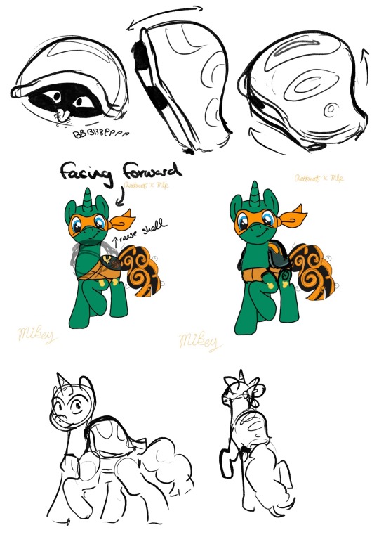
with the shell, you only coloured it within Mikey's trace lines - this caused the shell to loose a lot of its mass - making it look, quite frankly, not like a shell.
a way to improve on this is to look at more references of Mikey's shell in the show and its shape from different angles. this can help you get a good idea of how it should look, and it is a good idea to practice drawing it from these angles. this will improve your ability to think in a 3D space, (which is so darn hard, but seriously useful)
however, and you may have noticed this yourself, when you add new additions to the figure, the line art just doesnt line up! the line quality is different!
This is because the line you have done for the addition is Your Line. And we love your line.
so lets make the rest of the traced lineart fit into your style, instead of you fitting yours into theirs okay?
You may notice that when you trace art, the line work is just not the same, the lines are shakier than the original and it just doesn't look as good. this is not a reflection of your skill.
It is because, usually, (at least when I did it) you follow the original line so closely that it turns out shaky, probably taking your pen off the page a few times to take a break from the oen stroke. while the original artist did that line in one sweeping stroke.
a way to fix this, and make the line arr cleaner and more you, is to instead use the drawing as a very close reference. for example:
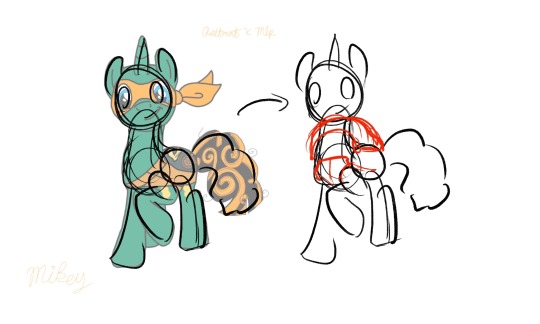
instead of tracing the exact lines of the art, merely trace the general shapes of the art. not only then do you add your own flair and gesture to the drawing, you are then more free to add more shapes to this sketch.
You can still use the reference drawing as closly as you want, but try to focus less on getting the exact lines copied, and more on the general shape. you linework wont be perfect the first time, it might be really messy compared to your usual tracing, and thats fine! you should see some of my sketches before i refine them!
But these will be your lines, theyll be smoother and more gestural, and overtime you will get better control over your penstrokes doing this.
Okay I cant really think of anymore to add here, I hope this helps! i think this was just one big word vomit lol. Keep drawing!! cause no matter what you do, as long as you are actively drawing you are always improving! dont be afraid to push yourself out of you comfort zone! who cares if it doesnt turn out the way you wanted it to? Its your art, You Created That with your Own Hands, and I think that is amazing.
<3
#asks#animal-lover-forever#i really hope this helped#its always hard for me to articulate my thoughts like this lol#YOU ARE GETTING BETTER#YOU ARE ALWAYS GETTING BETTER#art help#i hope#rottmnt#rottmnt mikey#mlp
36 notes
·
View notes
Note
Hi! I love your art a lot!
I saw a doodle page you did, and I’m curious how you got your brush to be darker with more pressure applied? (or at least that’s how it looked to me—)
aaa thanks so much!
first of all, i use Paint Tool SAI, so lemme grab a few screenshots of my brush settings. i made these for myself and @invadergrabass to use in order to blend our styles for collabs; theyre based on our combined preferences so they will more than likely require customisation if youre interested in using them. regardless, they will help me explain, since not everything is easy to put into words for me lol

to make my brush respond to pressure the way it does, i first start with a default brush tool as opposed to a pencil. i set the minimum density to a non-zero percentage (usually between 10 and 40) depending on what i want to use it for, and lower the pressure sensitivity to 60. (this may differ for you, since i know i have a heavy hand and ive set my tablet sensitivity to a custom value. but the minimum size is key here.)
heres a demonstration:
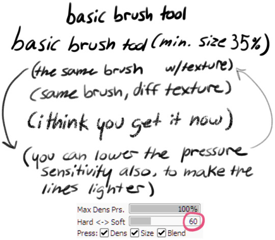
(the brush kinda thickens up when a texture is added, which is part of why i reduce the pressure sensitivity)
i find the brush tool feels a lot like a gel pen when being used for linework. this tool is called Butter Brush because its extremely smooth to work with for my partner and i.
heres a breakdown of each brush and how i tend to use it:
Butter Basic is an all purpose tool, i use it equally often for sketching lining writing and shading. it has a minimum size of around 20%
Butter Sharp is for writing and more bold linework. it has a low minimum size for detail work. i rarely use this tool for sketching but i do sometimes use it in shading, and i prefer it if i have to do a lot of writing on an image. its pressure sensitivity is at 100 so i see less of the texture when using it. (you can see the difference in the two drawn arrows above, where the left is at 100 and the right is at 60.)
Butter Soft is my favourite sketch tool, and predictably the one with the highest minimum size. it is also extremely soft, and cant easily be used for writing. i use it extensively for shading, more often than the tools ive made specifically for shading lmao. i sometimes use it for lining also, since it is the most comfortable for me personally to use.
i hope this helps you or anyone else looking for help with their art!
(note: in an earlier version of this reply i accidentally said "minimum density" instead of "pressure sensitivity" in Butter Sharp's description)
#paint tool sai#brush settings#talking with a ghoste#asked#long post mby i shoulda put it under a readmore...
17 notes
·
View notes
Note
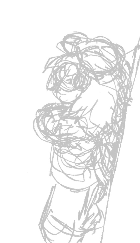
any advice for starting sketches? once i have a coherent foundation it's easier for me to work on the drawing but i struggle SO BAD with actually making my initial sketch something that makes sense. when i try to start the sketch it feels like im just trying to get lucky with something i can actually work on. it's like i cant transfer what i want to see in my head to the actual work and it's insanely frustrating. it's like i can only know what i want to do when it's already there, not when nothing is there. ive been drawing for over 10 years and this is something I've never been able to change no matter how many different ways I've tried to go about this and it's why ive gone everywhere from drawing multiple times a week to not doing it at all for months/years at a time. i never want to try because the process of attempting a new sketch is so frustrating a majority of the time and i wish i could enjoy it or know why i cant get my sketches started. it's fine when i do get lucky, it's just the blank page that torments me
hmmm this is a really good question. it's something i have an easier time with digitally than traditionally, somehow -- like, i can't tell you how many stacks of paper i have sitting around that are full of, like, 20% of a floating head because i keep getting that far on starting something and then deciding i hate it, vs with digital sketches i do still often scrap/give up on sketches very early but somehow there's less friction irt just making a new layer and trying again, over and over pretty quickly. maybe it's that digital feels faster + more ephemeral, vs w traditional i'm faced more confrontationally with the paper i'm "wasting," etc
also i think just like. "what's in my head will not show up on the paper" is just the universal problem forever, it's the tide we're always swimming against and we'll go through waves where it feels more or less true depending on the current development of our technical skill vs our critical eye, but i don't think it ever fully goes away
this is just what's true for me but if it always feels like you're just trying to get lucky, the fastest brute force solution for that is leaning into quantity, imo. draw a LOT, draw FAST, and -- easier said than done, but -- try your best not to CARE if they look bad. even in the shittiest drawing there is often something you can salvage for later. i can't remember where i saw it but i once saw it said that drawing is like a clogged pipe -- there's a bunch of shitty drawings stuck in there and you have to get those all OUT before you can expect the real stuff behind it to start flowing
lower the stakes, in whatever way you can. in my experience, it's not that drawing itself is really that hard or taxing -- it's that the emotional toll of doing drawings and then not being happy with them is hard, it's disappointment and being down on yourself that's hard. if we do our best to strip away all the emotional baggage, that's that part that can actually make art so grueling and difficult to keep up with imo. so try the best u can to just make it, like... not that serious. remind yourself over and over again that there's nothing actually wrong with making drawings you're not satisfied with. it's not doing anything bad to anyone. i literally mumble it to myself sometimes -- when a drawing is coming out shitty or i just can't get where i want to be on an illustration i say to myself "it's okay, that's fine" and try to pump the brakes on the negative thoughts before "ugh, that's not what i wanted" somehow internally transforms into "you SUCK and you're a HACK and there's no point to ANY OF THIS!!!!" lol
in terms of more concrete stuff to try -- one of my fav exercises to loosen up is song sketches. i put a huge playlist (usually like literally all my music, i have it all in a folder on spotify) on shuffle and then draw a bunch of quick sketches only for the duration of each song, and usually trying to match the drawing to whatever the song makes me think of -- so if it's a 2 minute song, i literally only have 2 minutes. if i hit some 7 minute club edit, then great, i have 7 minutes to bang out something slightly more polished. depending on how fast you're used to working, you may find that at first you struggle to get ANYTHING coherent down in 2-3 minutes -- that's OKAY!!! another point of this exercise is to acclimate yourself to making unfinished, incoherent, dogshit drawings without it being a big deal. the point is that if you're limiting yourself this much (in terms of actual drawing time AND in terms of not being able to overthink/plan, you have to hear the start of the song and decide what ur gonna draw IMMEDIATELY), you will end up churning out a lot more drawings without individually agonizing over each one as much, and there WILL be something salvageable in the pile.
i hope some part of this is helpful!!!! good luck!!!
71 notes
·
View notes
Note
hey sorry for bothering you but i was wondering how do you get your sketches to look i dunno even mildly comprehensive
all of mine look like this or 10 times worse its insanely impressive to me that yours look complete and presentable
hi sorry for taking so long to answer this i got the flu again </3 but anyway ill take something that i did recently!! i typically just try to get the general idea of the silhouette and lines i want.. like ill try to make the sketches more square shaped or circle shaped depending on how i want to get the character across... something ive been struggling with recently is trying to put less effort into sketches cuz i get frustrated that i cant get the same Feel in the actual line art if that makes sense. but i always go for the General Shape first and then hope everything works out despite usually liking the sketch more lol........

11 notes
·
View notes
Note
HELLAOOO, IM THE SAME ANON WHO REQUESTED CHILDISH READER HNNN AND I LOVED IT WWWW. So making another request but this time reader is passionate about making art !Thy just become so focused when they work on artworks!!! Reader uses watercolors as a medium for their art and has a sketchbook that TOTALLY DOES NOT HAVE SKETCHES OF JINWOO’S HANDSOME FACE AHAHAH (They always have graphite or paint smeared on their hands and face. Totally did not one time tell jinwoo a story about them starving themselves just to buy the art materials before they became jinwoo’s beloved),,,, Reader also loves to do digital art so Ik jinwoo bought them an Ipad which reader cant put down most of the time unless its lovey dovey time with our favourite monarch hueheheh. Also also Reder loves to draw on their iPad while sitting on Jinwoo’s lap<333
Artist S/O Gets an IPad
“… and that’s why I didn’t eat last month.”
Jin-Woo was speechless at your explanation to your sudden weightless in the threshold of your art studio. There was plastic lining the entire room and a large canvas with water paint splatters on it. From the looks of water balloons placed on the floor, you had been tossing water balloons filled with paint at the canvas.
Jin-Woo didn’t have it in him to be mad. You made some obvious sacrifices for the art you were so passionate about and he didn’t have the heart to be mad, especially when he took in your shining eyes and paint covered face and plastic overalls. But still starving yourself was a bit too much
“Then next time why don’t you head over? Mom’s always happy to have you around.”
If you two had been any less closer in your relationship, you would have refused but instead you nodded enthusiastically.
“I will! It’s always fun bunking with Jin-Ah.”
‘Or me’ Jin-Woo couldn’t help but think.
As he made his way across the plastic floors he suddenly became aware of the box in his hand.
“Sarang? Could you come here for a moment? I have a present for you.”
You happily skipped over, unaware of the paint slipping off your overall to the floor.
“What is it, Woo?”
“Here. Why don’t you open it?” Jin-Woo said as he handed it to you.
You sat down on the floor and tore the box into pieces. Once you saw the IPad Pro equipped with the new generation Apple Pencil inside, your eyes welled up with tears. You held it delicately suddenly aware of you painted stained hands.
Jin-Woo sat himself down next to you.
“How is it, Sarang? Do you like it?”
You placed the tablet the down and tackled him.
“Are you kidding me? I love it and I love you. Thank you so much.”
Jin-Woo gently brought you down and settled you in his lap and kissed you nose, unbothered by the paint on his monochrome clothes.
“I love you more.”
You let out a giggle.
“Impossible. Oh wait! Before I forget…”
You reached over for the IPad and pencil and quickly started it up and downloaded your preference of a drawing app and began sketching.
Jin-Woo seemed a bit confused as he couldn’t quite see what you were drawing.
“Y/n-ah, what are drawing?”
You smile seemed to contain the Sun as you responded.
“You.”
A/N: I hope this is what you wanted ( ◕‿‿◕ )
#solo leveling#solo leveling x reader#sung jin woo#sung jin woo x reader#sung jinwoo#sung jinwoo x reader#sung jin woo imagines
295 notes
·
View notes
Note
how do you know when a piece like your groudon is finally “done”, or done Enough?
i dont have an answer for this but maybe when i just type a lot i will find one.
for the groudon pic specifically i had a mental image in my head of what scene i wanted. when i started rendering the lava, i did it really detailed and decided i couldnt leave the rest of it simpler and then when the lava was all like that i had to crank everything else in the picture up too. and that made everything take so long that it was far beyond the boundaries of it being "not enough" . it was pleny enough!! so from hour 30-52 i was pretty eager to get it over with. just everything up to the point where its uniform in rendering. sometimes thats a bad sentiment to work on a pic with, but this time it was ok. i kind of like arduous menial tasks. it makes me more patient. so for that one it was done once everything was on par with my detail standard i set for myself halfway thru.
i think i used to have more trouble with this, deciding when its done... my pice now always either end when they reach what i had planned or when theyre the type of pic without a plan then when i get bored / lose the flow of it. actually prior to the groudon pic even some planned ones stopped at a flowloss point.

these two picy both have immaculate rendering on parts but then i lost it and finishdd the rest of the pic with less vigor. in tve green comet one its all the surroundings. i had other versions for that and kept reworking and reworking but i was so ouf of power i just used a slightly polisjed up sketch, kind of works for the pic though. the eel one i also lost power at the backhground, beyond the water. the mountains and clouds i think i coulda put more effort in. but its ok cuz its like 0% the focus of the picture, just sometjing that bothers me alone. hey both of these pics are about a serpent type thing coiling down to earth gently from the sky oops. back to the question um ya im looking at my images and all of them either end when they reach what i had in my head or when i loose flow. when i used to do lsd more my process was that the picture ends when i go to bed. i want to do that again soon it was fun. i drew for like 6 hours while kind of crazy then for the next 12 hours in warm afterglow i just clean and render everything so sweetly and then with a body as hard as a hundred bodies i sink into my bed and click post on it which codifies it as completed. also towards tve end of the picture is usually when im stressing about tiny details and i will message like 1-2 consistent people and 1-2 random people from my discord friendslist to ask about opinions about which tiny detail looks better for the whole pic. when im at that point i cant think straight no more so well no more so i kind of know its time to stop soon. but those final feedbacks always help. ok i guess thats an answer lol i made it very long i will put a readmore. hope u dont mind reading but i think if i sent someone an anon the longer the reply the happier i would be. probably. im in bed but im gonna get up again in a sec and play some balatroooo, 2 people bought a groudon print so far and i spent that money on balatro eep hihi thank u for the ask which i twisted into my babbleplateau
15 notes
·
View notes
Text
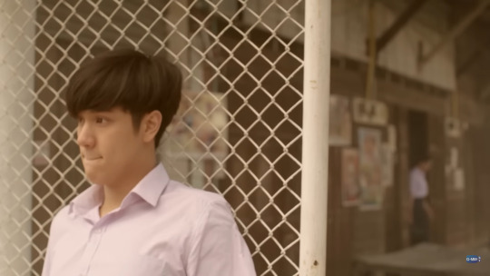
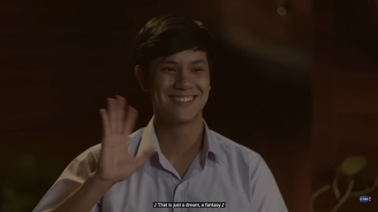
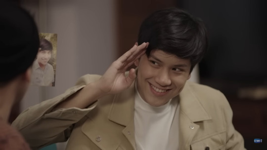
Nanon + Khao in 55:15 Never Too Late appreciation post
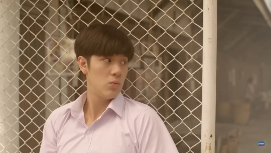
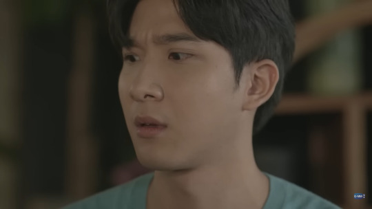
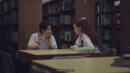
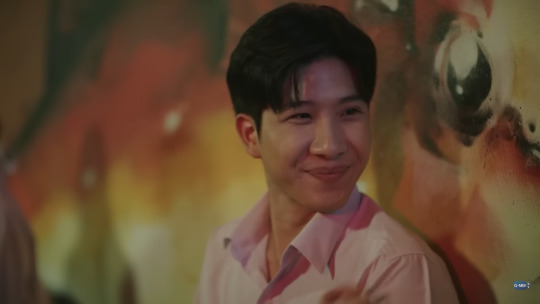
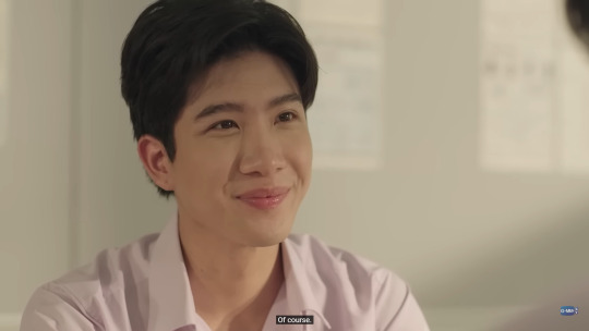
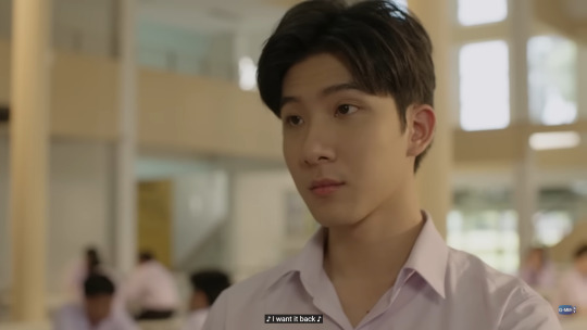
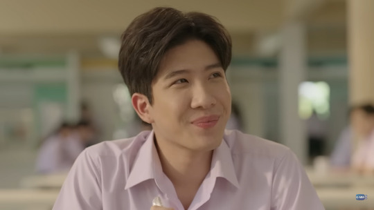
I had been wanting to watch "55:15 never too late" for the LONGEST time. For several reasons not least among them was that it featured two of my most favourite thai actors - nanon & khaotung. And pls the premise of five 55 year olds returning to their younger 15 yr old bodies in order to make some changes to their past selves and the hijinks that ensue is interesting enough. But ofc the prime reason i was there was to watch the acting masterclass that i knew nanon and khaotung would deliver. I'm only 3 episodes in but im already bowled over.
Nanon especially. I don't know if there is any role that he can't do. he just becomes the role he is doing. It's virtually impossible to see nanon in the role he is playing.
This scene where he is hiding from prim. What shook me was just how much of childishness nanon was able to convey in this scene. He's playing a 15 year old after all. And he does an excellent job of it. Not at all in a forced caricature sorta way. In fact he was so convincing i had to replay several scenes multiple times. It was so very impressive.
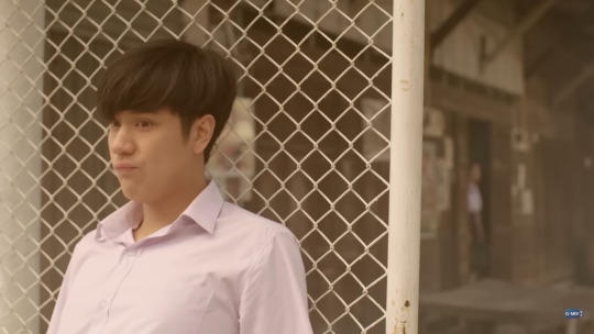
And look at that. That's pining personified and you cant even see his face. He is just THAAAT good.
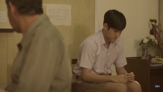
His body language, his micro-expressions, the delivery of dialogues, everything is just pure perfection.
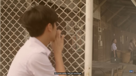
Look at him absolutely nail the look of a lost hurt child who doesn't know who or what to turn to. He really has no business being this good!?!
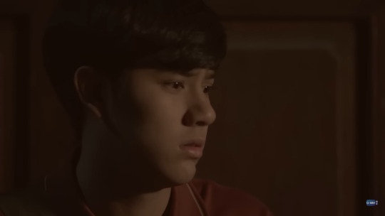
I was in a bad mood when i was watching that episode. But Nanon is just so good at his job that by sheer force of his acting brilliance he turned my mood around.
His dimples helped for sure. of course.
i mean LOOK AT THEM.
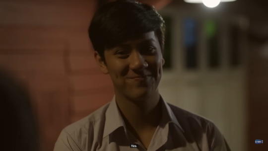
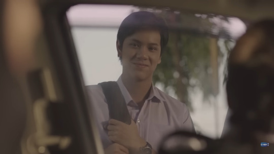
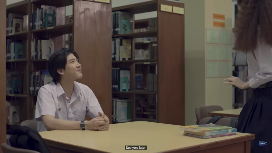
This scene was especially fantastic. Really fun to watch.
But i meant something much more intangible.
You know that feeling when you feel better just by seeing certain works of art, a painting or a sketch, or if you're looking at the sky, or listening to a piece of music, just knowing that such beauty exists in the world by itself enough to lift you up?
Watching Nanon do his thing in this episode felt more or less like that!
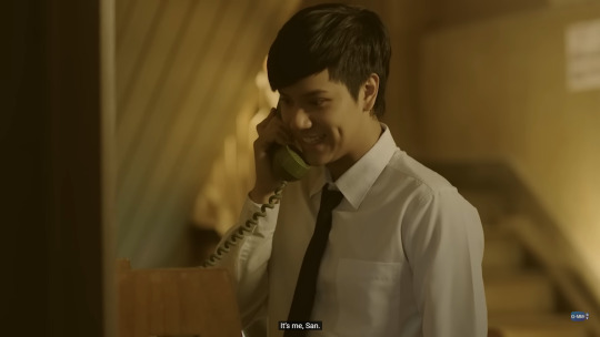
Especially this scene that took my breath away.
How was he just 20 when he did this??? it's so mind blowing!
I'll never not be beyond grateful that i decided to watch bad buddy, cos 1. it gave me patpran and 2. it gave me nanon! one of the finest actors i have seen in my entire life. EVER. And he's just 22? I really can't wait to see what all he does over the course of his acting career!
Episode 3 follows the adventures of Khaotung's character "Songpol". I loved his story the most out of all 5 of them. No surprises here. How it's about an adult closeted gay man decides to stop suppressing his identity and live out a life he had denied himself all along. How he has known that he was gay for decades but because he hid that part, he still remains a sorta baby gay at the age of 55, and how this time/body reversal situation gives him a second chance at a more free life.
And while there were fewer opportunities for moments of acting brilliance, he did amazingly well in whatever there was.
And more importantly there wasn't a single second where he was on screen where my heart wasn't brimming with affection.
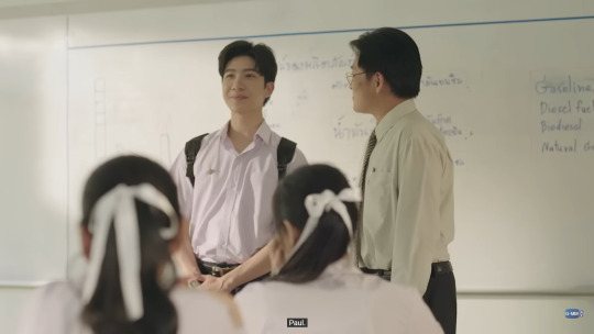
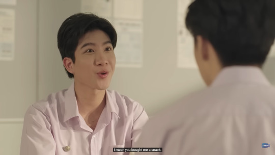
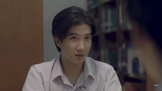
I especially am LOVING this gay uncle and supportive niece dynamic. We usually see it the other way around so loving this twist on the usual trope. Also khaotung does SO well in this scene where he is occupying his 15 yr old body but his facial expressions reveal the maturity of a 55 year old uncle of his niece who he is talking to.
Also LOVING the way he fanboys over "Jaya".
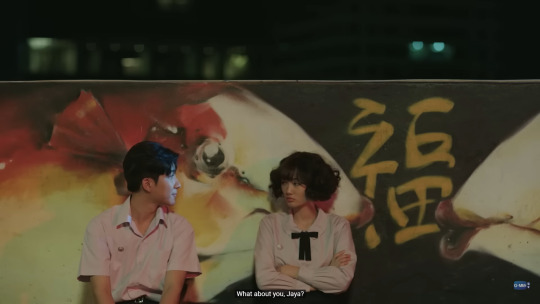
His devotion is so visible. It's unbelievably endearing. I would make a home for him in my pocket if i could.
Like that's MY baby. A whole cutie patootie.
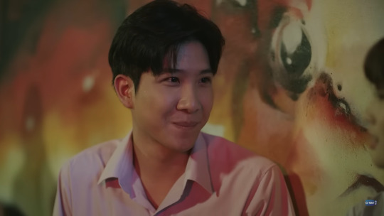
And also he is SO so handsome i could just watch him just existing for hours.
Gorgeousness🤌
I'm so excited for him to be living out his happy dream gay life. He deserves it so much. Pining for decades and then finally going to confess and then finding out he has found somebody else yet again, just next level of pain. He needs his happy ending. And he better be getting it. I am really looking forward to it.
What i'm not looking forward to is how the multiple love triangles the show has already set up is going to blow up in everyone's faces. It's such an annoying trope. But ANYTHING for a show featuring Nanon and Khao. And for the most parts i am LOVING this show, hopefully i will love it till the end :')
14 notes
·
View notes
Note
Wow thank you for the tips! I really appreciate it <3 I’ll try them this weekend and see how it goes. I hope it’s ok to ask, but do you have any tips when posting or making layouts for sketches? I get a little self conscious about posting sketches since it’s not finished and I worry about what people think but i’d like to improve on them. There’s something more fun in sketches for me at least over coloring every time.
I got over my embarassment early because I was so desperate for the positive feedback of posting online so all I can say is that when you think something isnt "finished enough" thats the devil talking dont listen!!!!
the only tips I can think of off my dome are really just general photo post tips:
try not to make images so long that you cant see the whole thing on the dashboard at once. (comics or images with lots of smaller drawings or things that are otherwise designed to be seen in pieces don't count for this. The point is being readable)
If you want to post a long image, there are ways to keep it from overwhelming the dash
1. put it on a wider, blank canvas
2. post it with another image of the same or similar length. (this isnt a sketch but it shows the concept)
3. post it with a white image of the same size, or that has a longer aspect ratio (so that tumblr will crop the white image and not your drawing) (Im out of images and cant add an example...)
try not to make images so wide that the dashboard makes detail difficult to see (or if you do, crop one or more zoom-in shots of detail to encourage people to look closer)
try not to do three-to-a-row if the images are busy/crowded. It might be difficult to make out the images & therefore less attention grabbing.
overwhelming at a glance:


easier to discern at a glance:

--
I hope this is what you meant by layouts? good luck and have fun!
126 notes
·
View notes
Note
Salutations! I adore the way you draw hair. Could you give a detailed explanation of your process?
sure ! FIRST AND FOREMOST THOUGH!
note that the way i do hair , can vary extremely in process depending on what style im choosing, hair type or even just like, the purpose of a picture, its gonna be different every way, i CANT give an indepth explanation of every single type , i do always reccomend to search up hairstyles and do your own studies and practice with good refs, also SEARCH UP BLACK HAIRSTYLE ART TUTORIALS even if you THINK you wouldnt be able to draw really curly hair or locs or protective hairstyles, learning is valuable, give yourself time.

lets take subject M for a spin , i think one of the basics here is to treat hair as a structure, depending on how its supported , draped, whatever, it looks awkward if you just draw it on its own without much rhyme or reason to how its coming out the head, SKETCH out a hairline , remeber to not make it too low (the eyebrows need their own space) or way too high ( i mean. unless your character is balding then you should search up how that looks lol)
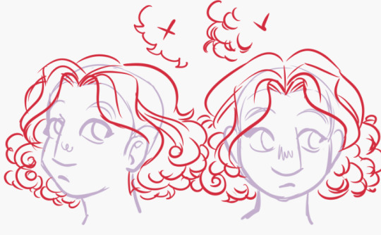
im a big fan of hair having its own gravity of sorts, the puffier the better if we talking about wavy to big curls, i like spiral shapes a lot that pile onto eachother when im rendering hair this way, rather than a repetition of curl-spike, google curled up ribbons because thats easier to copy structurally than hair head on . but you make your own rules.
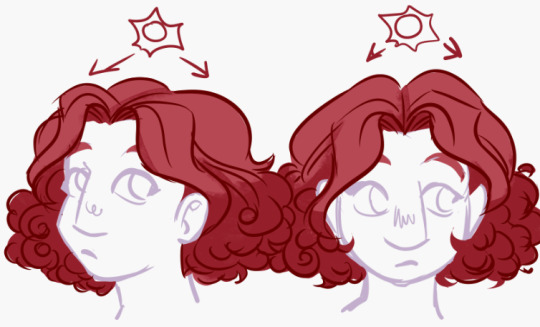
in terms of coloring, PUT a general big shadow of where the lighting hits before even rendering, its better to start simple than get caught up on detailing each strand head on and realizing it looks like you pasted a clip art of high rendered fur onto a piece of paper. it makes things already look less flat.
i think what really makes hair feel like HAIR is a second shadow color, this should go in only the darkest parts , giving depth to strands, redefine parts like the bangs or fringe by bringing the base color again to erase some of the general shading, follow the form , if you have to lower stabilization to have your lines be less straight then do so, not even the straightest hair is actually a full on straight line.
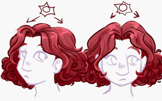
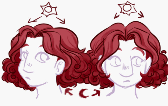
highlights are dependant on the intensity/distance of your light source, the more overhead and close to the hair they tend to form a "halo" shape as a highlight where the parting starts, IT ALSO DEPENDS ON HAIR TEXTURE , if the hair isnt smooth it reflects less and light dissipates more, this is why you should search refs to more hair textures.

last but not least, i think the beauty of hair comes from how , no matter what you do, itll do whatever it wants to do at the end of the day, unless youre wearing the most glued down structured wig in the world, hair frizzes, loosens up, puffs out ,sticks out , i think adding up detail loose strands adds a very naturalistic feel to things , it makes it feel more like the character is a living person who actually moves and not just like a statue. overall , this is the most simplified version of how i currently render hair in my more detailed style, this isnt a tutorial, just a showcase.
also i keep repeating this but i mean it, search up and practice, Every texture of hair , not just straight to wavy or loose curl, do Not box yourself , there is a limitless potential with hair in design and illustration, hair is art.
42 notes
·
View notes
Text
Narrator Design Process (so far (I need a second opinion))
Hello and welcome to this design journey of the Narrator from The Stanley Parable of course (this game is holding me hostage). Im going to take you through my process step by step. Why? Why not?
First I thought it would be fun to look at what the fandom has cooked up. Get a bit inspired and all that. I havent really looked into the fandom before, just saw a couple compilations that convinced me to buy the game.

(I linked all of the artist at the end of this mess. Am I making this more complicated than it should be? Probably.)
I love the creativity of the fandom, there are so many different designs for the Narrator. I picked ones I found interesting or are somewhat similar to what I had in mind.
The next step was research, a lot of it actually. I read the fanwiki for information about the narrator, there might be hints at what he actually looks like that I simply missed. Turns out there isnt much, nothing to be precise. I refused to give up yet, so I decided to look up the voice actor of the Narrator: Kevan Brighting.
The issue is there arent many pictures of him online(that I could find), which makes it hard for me to guess a bodytype. None the less I used Kevan Brighting as the base for my design. Judging from his twitter he likes being the Narrator and he did a phenomenal job in the game, so I think its fitting to honor him this way.
Since there arent many visuals to go off of I tried to guess more things about the Narrator based off of what he says, how he behaves and how he constructed the game. From here on out its heavy headcanon territory.
The story the Narrator wrote takes place in an office building. In the first rooms it all seems normal, but the further down you go things get messy. Messy in the way that no actual building is built like that. In my headcanon the Narrator works in an office building where he spends a lot of time.mainly at his desk somewhere. He wants to be free of that job but somehow cant, so he wrote a little story about the office and the mind control facility and freedom. Through Stanley he can live out this freedom he cant have.
If we boil this down to something that can be used for a design, its that the Narrator is an office worker, his outfit should reflect that.
In the confusion ending you can also hear the Narrator rustling with paper, so I thought it would be fun to give him a clip board with paper where he organises his story. At the same time he forgets he has a clip board, so he writes on his arms. Many see this as rather childish, it reflects how childish he can be.
The idea I def wanted to adopt from the already existing designs is the headset. I find it very creative and fitting, as the Narrator is well, a narrator.

This is my second ref board. Here I also started to think about colors, and what else would be more fitting than the game itself? When I design something for myself I use colors I like and I bet the Narrator did the same, so I want to use the colors of the office building for his design. Here Id also like to state that in my headcanon the Narrator is left handed, because he wants Stanley to go trough the left door cuz it might come more naturally to him (because he is left handed).
The thing Im the most unsure about is the Narratos tie. In many designs its yellow, a great spot for an accent color and its a direct reference to the Adventure Line. And thats the thing- its the Adventure Line. The Adventure Line is its own entity with its own will, and Im unsure if I want to make it part of the Narrators design. On the other hand it is genius character design.


Here are my sketches so far (The sketches with arrows are the ones Im going with). As you can see the hair was a struggle, because I wanted it longer which did not work out as intended. The body type needed a bit too but I am satisfied with how it is in its current form. (I swear he is shaped like my religion teacher)
Just to make it clear, he scribbled on his arm but cant read it afterwards.
Okay Im not actually finished with the design yet because I want a second opinion. So please, if you have any suggestions, ideas or things youve noticed do let me know.
https://www.tumblr.com/spookyspeks/694040150380101632/finally-made-a-proper-final-ref-of-my
https://thinking-outside-the-giftbox18.tumblr.com/post/696308843115954176/the-stanley-parable-stanley-and-narrator-designs
https://vega-482.tumblr.com/post/704296923697446912/my-stanley-and-narrator-refs-plus-more-info
https://cym-k.tumblr.com/post/700050862599471104/unauthorized-fucking-thing-send-them-to-the-void
https://www.tumblr.com/marsalta/713334348855869440/duketod-s-narrator-design
https://www.tumblr.com/scooterofficial/713357064372731904/more-narrators-idek
https://www.tumblr.com/entorandy/713377431714725888/heres-some-stanley-parable-narrator-stuff-i
https://sketchy--d00dles.tumblr.com/post/713528541321494528/sad-wet-creature
#the stanley parable#the stanley parable the narrator#the narrator#the stanley parable ultra deluxe#tspud#tspud narrator#the stanley parable narrator#design#character design#design process#character design process#tsp
12 notes
·
View notes
Last Seen Blogs

organicproducts-world
Untitled
weglitteryvoidstudentthings-blog
Conclusiones
flixel
Orangepaint
skyrimxrp-blog
SKYRIM
maristy
nonsense galore