#letterform
Photo
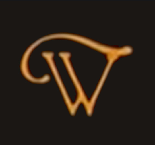


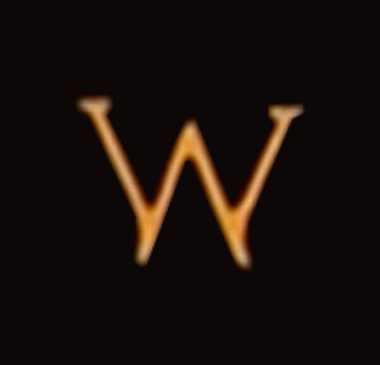

the enchanting letter ‘W’ from the intertitles to The Blue Bird (1918).
#w#intertitles#hand-drawn#hand-painted#letterforms#letterform#letters#typography#custom typography#type#font#alphabet#1910s#1918#film#cinema#movies#the blue bird#the blue bird (1918)#serif#swash#vintage#vintage typography#silent film#silent era
15 notes
·
View notes
Text
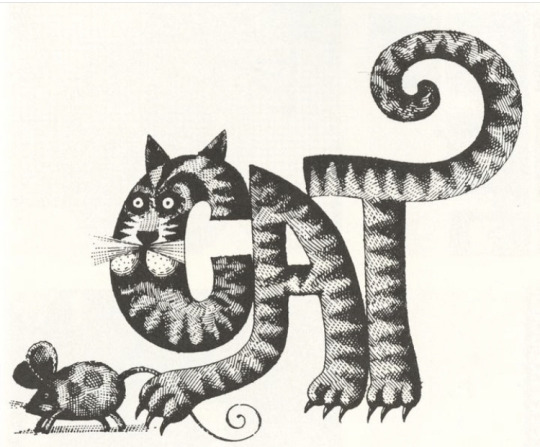
Attribution: John Alcorn (New York, USA, 1935-1992) and Lou Dorfsman (New York, USA, 1918-2008). Snippet from a promotional publication of the CBS Broadcast Group, 1973. Thanks to @letterformarchive for making this visible and available.
#cats in art#letterform#typography#graphic designer#graphic design#1970s#novelty typeface#typeface#graphisme#grafik#cbs#John alcorn#Lou dorfsman#cat#tabby cat#gato#gato tigrado#gato atigrado#chat tigre#getigerte katze#katze#gatto#drole de chat
18 notes
·
View notes
Text

06
THATS THE SPIRIT
#art#artist#designer#graphic design#letterforms#artists on tumblr#collage#design#graphic design is my passion#graphic designer#letterform#letterformdesign#typographer#typography#collagedesign#graphics#typedesign#typedesigner#typographydesign#art of the day#spirit halloween
2 notes
·
View notes
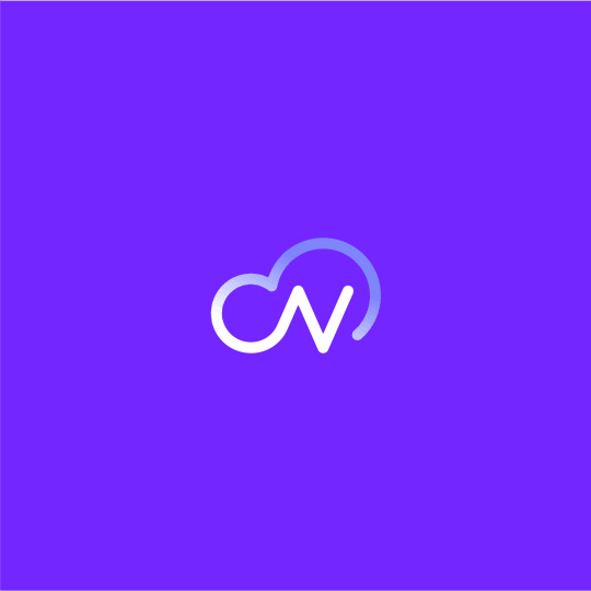
Text
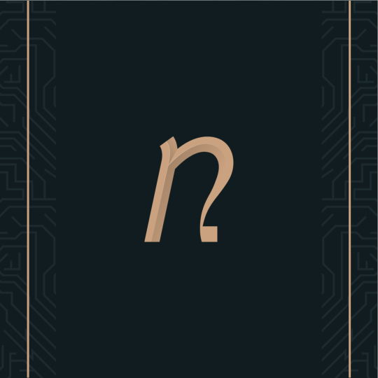
#Nimbus.#logo#design#logo design#icon#branding#cloud#nimbus#letter mark#monogram#sky#n#gradient#purple#graphic#letterform#typography#logo type#type#doodle#funny#business#curators#art#illustration#illustrators on tumblr#graphic design#developers & startups#logo designer#creative logo
3 notes
·
View notes
Text


Intervention + Interpretation Workshop
0 notes
Text
Novatique - Logo and branding
The final colored logo and branding along with stylization and decorations for the online modernized antiques store: Novatique.
Follow:
Behance - Dribbble - Instagram - Twitter - Reddit - Pinterest
Check the stores:
Shirts & Hoodies - Stickers & Accessories
#graphic design#design#art#artists on tumblr#logo#digital aritst#logo design#digital#brand#branding#designer#graphic designer#type#typography#letterform#artdeco#retro#modern#novatique#zalgraphics
0 notes
Photo


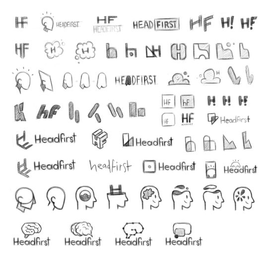
HEADFIRST // Logo Design
This is one of the pieces of network branding I had the chance to develop, similar to Witness Docs, under the Stitcher brand. Sadly we’ve been sun-setting these networks and integrating the shows into Stitcher Studios, but I’m very proud of the process and final logo that was developed for Headfirst.
The network was pitched as a place for fun and smart podcasts. And hopefully you’d learn something in the process! As usual, I started with thumbnails and a few different concepts then presented them to the team. We narrowed down a few different directions and I took to Adobe Illustrator to refine. I’m rather proud of each of these pieces and really wish I could’ve seen them on some cover art.
#podcasts#branding#logo design#process#progress#headfirst#smarts#vector#raster#sketching#thumbnails#big-brain#typography#letterform
0 notes
Text
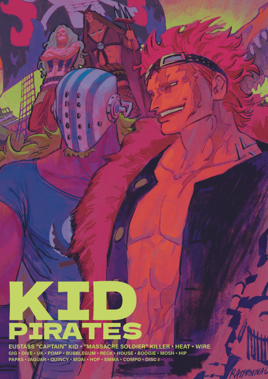
#one piece#kid pirates#eustass kid#killer one piece#op killer the guy ever#and the goober he picked off the street#eustass captain kid#ive been looking at the works of bob peak#i wanna get good like that one day…#also#is the lettering ok#or is it giving graphic design is my passion#let me know#all i learned in typography class was that i should be sorry for existing#and to never letterspace lowercase letterforms#thank u A type primer#i have design school trauma
1K notes
·
View notes
Text
David Klein | Letterform
45 notes
·
View notes
Text
“1512”
1 note
·
View note
Photo

This is my final poster design that displays my typeface. My aesthetic I wanted to focus on was a darker colour to make the 3D assets and the flat assets stand out. I used to word ‘adhesion’ to diplay the different types of letter forms within my typeface.
Within my poster design I placed a small information text box in the bottom right hand corner so the audience has a breif understanding of what I want my type face to convey. Sitting above this is the subtitle that has the name of my typeface.
0 notes
Text
Typography Toolkit Project
This is more a personal project goal but if anyone sees this and wants to join in and do something similar, you’re welcome to!
GOAL: Establish a personal “toolkit” of fonts across the major groups of (Latin) typography.
TASKS:
Look through font resources (Books, letraset books, resellers like myfonts or online libraries like google fonts or adobe fonts) [EDIT: I forgot about the top 100 lists from some foundaries - this handy one from FontShop has heaps of different lists for different things! https://www.fontshop.com/fontlists ]
Make a list of fonts that appeal to you. Not what’s popular, what makes your art brain go brrrrr.
Pick out a top 5, but keep the shortlist. It might come in handy.
**OPTIONAL: Set up template for index reference cards with standard Latin glyphs (Capitals, lower case, numbers, !@#$%^&*()+-? etc as applicable).
***OPTIONAL: Go through shortlisted fonts and determine list of adjectives that the font evokes (i.e. “Strong”, “Bold”, “Elegant”, etc)
WEEK 1: SERIF fonts.
WEEK 2: SAN SERIF fonts.
WEEK 3: SCRIPT fonts.
WEEK 4: BLACKLETTER fonts.
NOTES:
** I found a bunch of reference cards while cleaning, and this seemed like a good way to put them to use! If I keep at it, I’ll try and share progress as I go.
*** Trying to work out what fonts fit a particular mood is something I want to work on for hand-typography purposes so this is more a personal challenge than a requirement!
• I left Display fonts out on purpose; they’re a whole beast of their own. If I manage to do the first four, I might try to come back and do a Display-specific version?
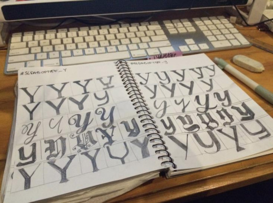
[ABOVE: Typography studies from 2019, ligature formations across multiple types of serif, san-serif, script, blackletter and display fonts. Variations of the letter ‘Y’ sketched by hand with mechanical pencil in an A5 Sketchbook]
#typography#study#project#letterform#brief#yeah apparently I'm a glutton for punishment but here we are#it's just 4 weeks right what could possibly go wrong (universe no stop that)#sketchysketchy#etluwips#challenge#Typography Toolkit
0 notes
Text
Hey, Need a logo design? 👉 hire us
#logo design#logo#design#negative space#negative space logo#h#monogram#pictorial mark#letterform#letter mark#brush#paint#modern logo#minimalist logo#smart logo#businesscards#businesscard
0 notes

Last Seen Blogs