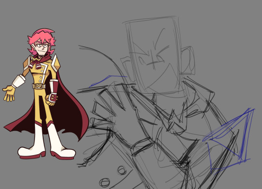
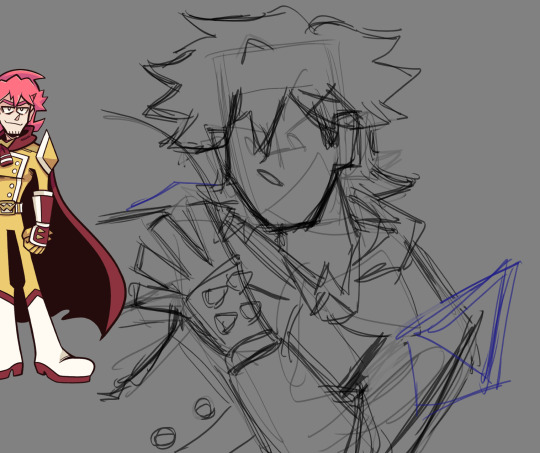
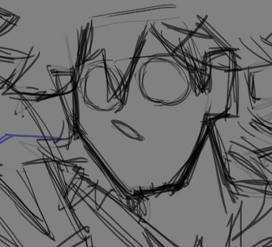
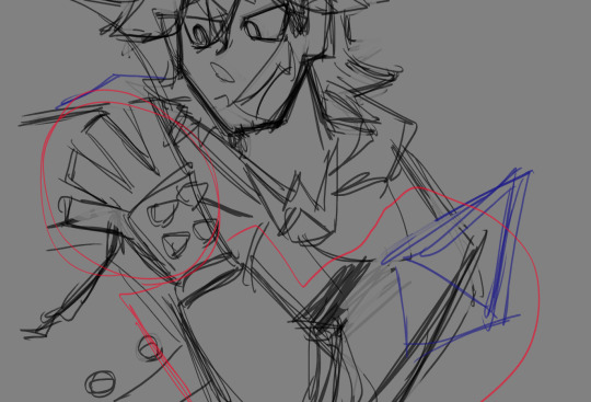
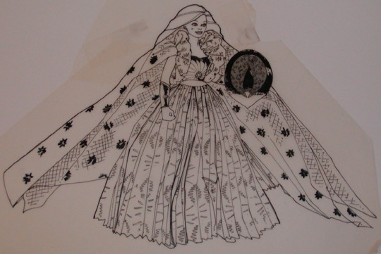
#lineart first bc I prefer it
Text
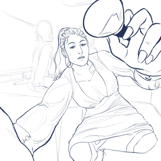
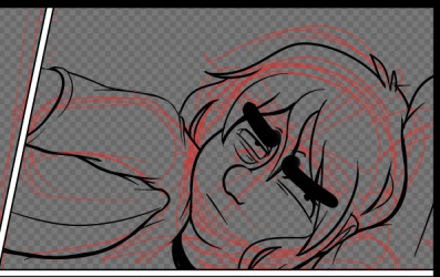
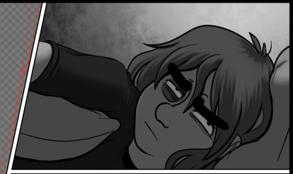
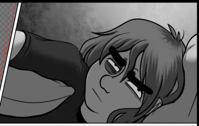
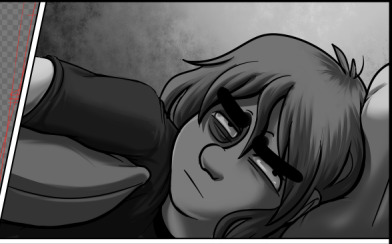
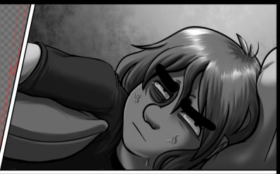
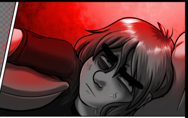
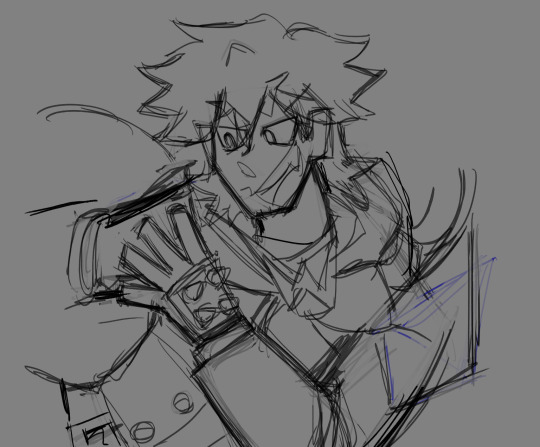
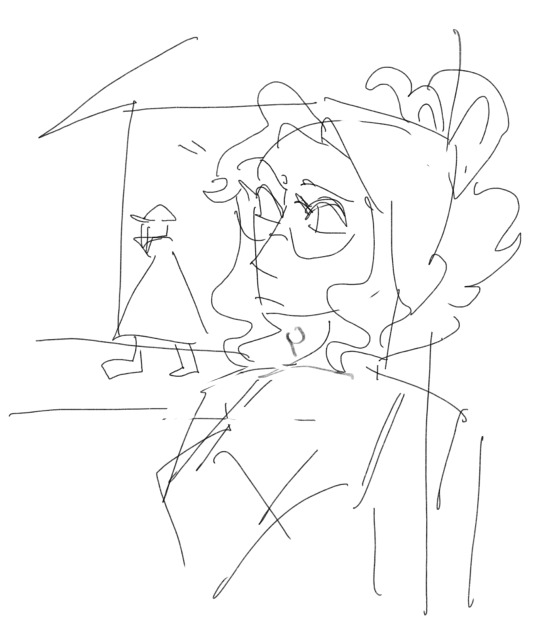
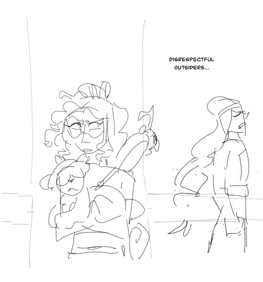
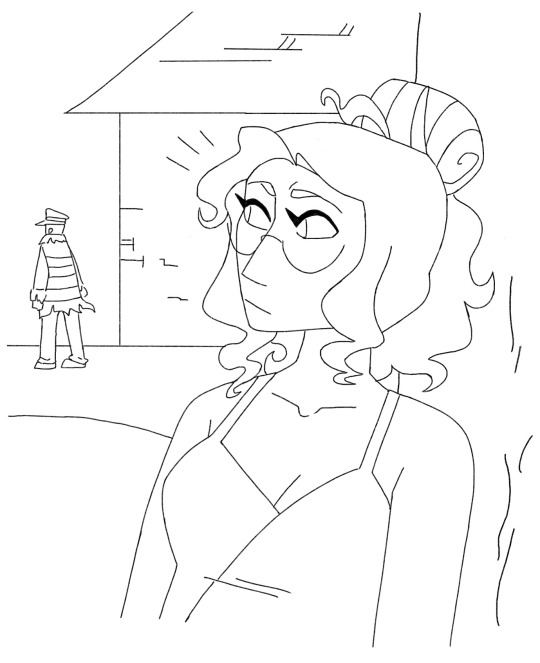
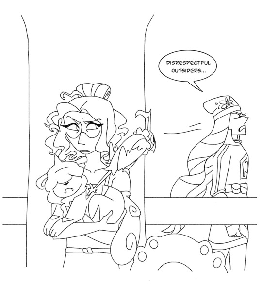
POV: it’s lunchtime, Wednesday, January 4th, 2007. You’ve been beaten black and blue by a sports cult. She’s trying to hide your bandages. You wonder if she blames you for her boyfriend’s death. You should ask her. The memorial banner was put up today. You… you keep your mouth shut.
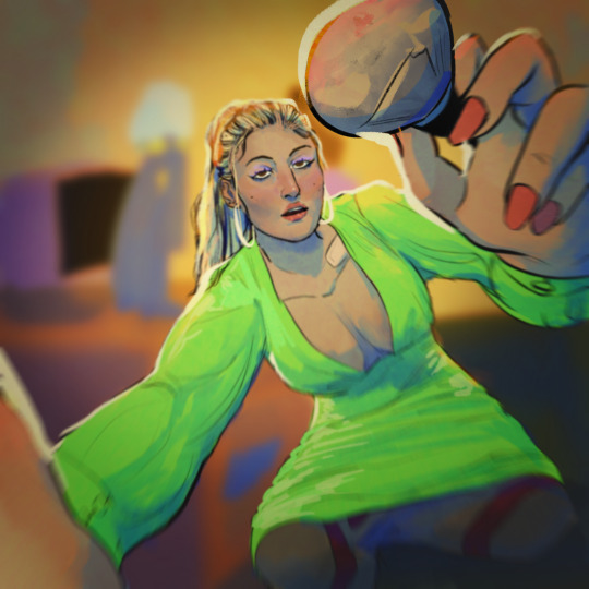
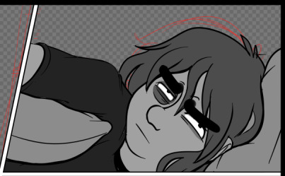
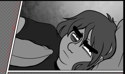
#(she has forgiven you. she asks you to pass the ketchup)#back on my Allison & Neil shit#can I really be an Allison fan if I don’t draw my favourite scene?#lineart first bc I prefer it#especially the anatomy#once I colour it it stopped working? idk why#so I adjusted it in the coloured version#but the lineart is actually how I see her#also.#she’s wearing a Paris Hilton dress thing#it was hard to find good outfit inspo for her that was era accurate#my art#aftg#the kings men#allison reynolds#neil josten#all for the game
446 notes
·
View notes
Text


there's no way you'll make it out alive.
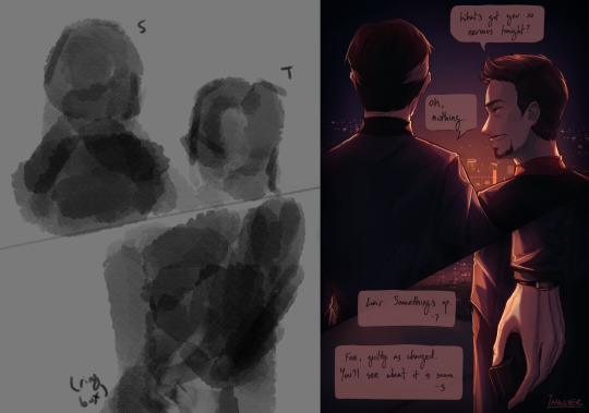
alright so this one came out hornier than expected HERE ME OUT. i'm going to explain the original vision and then i'm going to explain what happened. so the concept is the viewer and vere are chained together on his leash, like you're both collared to each other, and he's about to eat you like that scene in the alleyway where he kills u bc that was the scene that made decide i want him. discoveries were made about myself that day, not sure what it says about me, but it feels related to me also strongly believing that i should've been daniel malloy in that scene in iwtv where he gets like tortured and death brainwashed by armand. like the death via seduction thing and the thinly veiled violence thing and the uhhh pretty man thing is all very similar. anyway. this is not about me
so i think already the about-to-eat-you aspect is a little lost with this, and i think the framing more implies that you're holding vere's chain than like attached to it in the same way he is. i don't think that this came out quite as threatening as i intended it to, like it was supposed to straddle a bit more of a line between horny and horror. and now to explain the cum. SO, that was supposed to be sweat, but the way i colored it in made it look a little sus, and eventually i was just like whatever i'll just lean into it. and now you have this :) there are a couple little design inconsistencies i know. you do not see them
as for the coloring, WOWIE! i don't know why i suddenly felt like doing slightly more painterly shit, but this was really fun. also used a less textured and extremely plain brush, which i used to think was like bad to do for no reason, but i think i actually prefer it. still a bit of that signature haphazard quality that a lot of my coloring and lineart has i think, but maybe a bit more polish and depth with this one. i always have the most fun with the highlights, which is really where i feel like i can get away with doing more funky shapes and shit
also one of my friends just followed this blog and i think it is HILARIOUS that this will probably be the first post they see. if you're reading this. hey
#touchstarved#touchstarved game#vere touchstarved#touchstarved vere#vere#art#fanart#digital art#no id#fartposting
37 notes
·
View notes
Text

@drawmanda ik I already dmed you about this but my inbox ate your ask up so I'm responding to it this way now! <3
first of all thank you so much!! sdkjhsdkfh
And well, technically I also draw almost everything by hand too :o
I understand the frustration of being slow, but "fast" digital drawing actually has very little to do with not drawing things by hand (a trap most people infatuated with this terrible AI ""art"" trend unfortunately keep falling into) so much as optimizing your workflow!
admittedly a lot of this is also a matter of both personal preference and practice - but you can hardly practice and have preferences on what you can't know should be a focus right?
Under the cut is a list of the things I do that speed up my own digital art workflow (this one got hella long, sorry):
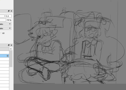
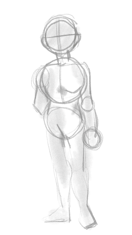
1) I sketch very loosely and often often skip the lineart entirely.
Something that's imo really important for actually almost all artists to practice is reducing sketches to their essentials!
A good working sketch should be rough and block in the shapes and placement of the features you have in your mind - the details don't come in until later, so they actually have very little business being put in at this stage!
It's meant to be a guideline and foundation for the upcoming detail work after all, not a finished, tidy drawing in and of itself.
Use quick, airy brush strokes to roughly pencil in some vague shapes and don't be afraid of indecipherable scribbles or flyaway lines! All that isn't needed won't be visible later anyways (either bc you turned off the sketch layer or erase the offending bit of sketch away)
Naturally, cleaned sketches are a thing people post plenty of online too (me included), but I promise you most artists that do proper lineart and/or render out insanely polished pieces have a very rough and probably barely legible sketch underneath those pieces lmao
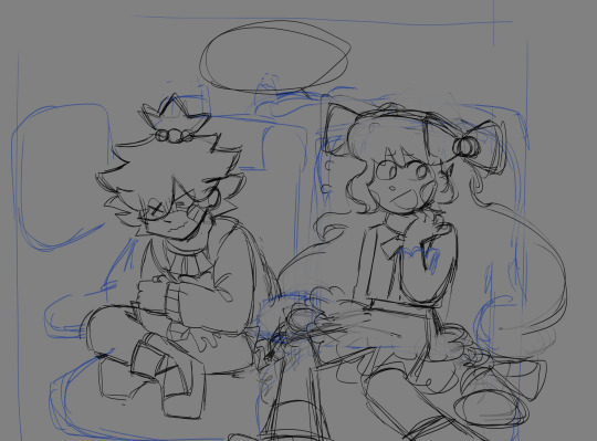
And guess what! Most of my own "lineart" is nothing but cleaned sketches! :'D

I erase the construction lines like the circles for the heads and redraw a few bits and bops, re-trace some lines for legibility and/or to make them more visible and voila! Sometimes this is faster than lineart and keeps the original flow and energy that's in the sketches, other times this takes me just as long as lineart would lmao (highly depends on the amount of details and how lost you get in those).
Note how I didn't even "finish" a lot of the lines in the rough versions and many pieces of the og sketch were kept unaltered? I also tend to focus more on detailing out the faces than the rest - this is one part pure laziness and one part knowing that the faces will draw the eye's focus the most lmao
But see, sometimes I don't even bother with all of that noise! I just color the sketch as is:

This is a bit of a "trust the process" thing sometimes because a sketch can look utterly incomprehensible until you block out some colors and/or silhouettes to give your eyes context!
All in all most sketches take me between 10 minutes and half an hour, if it's a more complex pose or set of poses of interacting characters it can take closer to 2 hours, but in that case I also tend to use multiple layers for various iterations of rough sketching and to separate the characters on their own layers so it's a bit easier to keep track of the limb placements etc - it's best to keep a flexible mind when it comes to your approach to sketches.
Not every drawing will need the same level of care put into its sketches, don't be afraid of being rough with it and trying out different things if your usual way of doing things doesn't feel right!
2) Understanding the tools at my disposal!
Imo something every learning digital artist needs to get in the habit of is experimenting around with the tools at their disposal :D
It can seem incredibly daunting, especially when a program is absolutely packed with functions, but the more you work with different things and figure out what you like using and find ways to use them in your workflow, the easier it gets and the quicker you become! You'll be surprised what knowing your way around well can do to your work speed :D
Dick around with different presets, settings, colors, layer blend modes, filters etc
One of the first things I did when I first downloaded CSP was to just pick up every tool in the list one by one and doodle a few strokes across the empty canvas - no real goal or direction in mind, just getting a feel for it and then did a few drawings using different sets.
Imo even if you end up never using certain tools, it's still handy to know how they work!
3) HOTKEYS!!!!
I use my pc's keyboard hotkeys for. Every. Fucking. Thing. Mind you I'll be mostly talking in the terms and list hotkeys specifically for Clip Studio Paint since that's the program I use for my art, so if you use something else please do your own research on what the corresponding hotkeys are for your program if the ones I tell don't work!!!
I promise you most of them have very similar functions just on different key combinations and will also usually let you edit them in the settings :D
(this comes from someone who's at least tried out most of the available ones - Such as Medibang, FireAlpaca, Gimp, Krita, Rebelle 5, Paint Tool SAI (this one used to be my main before CSP) and I even tried photoshop and procreate on someone else's devices in the past)
The reason I use hotkeys is so I don't have to drag my curser around and click things by hand unnecessarily, the hotkeys save me a ton of time in the drawing process!
some examples of hotkeys I use for basically every drawing:
the classic undo (ctrl+Z) and redo (ctrl+alt+Z, other programs often use ctrl+Y for this tho); on touch-input compatible screen tablets you can often tap with two fingers to undo and 3 fingers to redo
zooming (this has multiple methods, you can use the ctrl+"+" and ctrl+"-" combo to zoom in and out, you can use the scrollwheel on a mouse or you use what my personal preference is: hold ctrl+space and drag the stylus to zoom in and out; if you have a touch-input compatible screen tablet you can also use two fingers to zoom in and out like you would on phone!)
rotating the canvas (technically has more than one way as well but I'm ngl I can't remember the way that isn't what I use anymore lmao, hold shift+space and drag the stylus - pro tip, you can reset the rotation with the Pos1 button, in the navigation window if you have it docked or in CSP's case also at the bottom of the screen!)

mirror canvas (in the viewport only! permanent rotation requires a transform!) using the M button (this is handy for checking proportions and when you just can't get your hand to do a curved line that goes against the natural range of rotation of your dominant hand's wrist)
drag viewport (i.e. move along the canvas by holding space button, then clicking and dragging)
merging layers (ctrl+E)
selecting multiple layers (click on layer, then hold ctrl and click on any other layers you want selected individually; if you want to quickly select a long and uninterrupted list you can also click on the first layer, then hold shift when you click on the last, this will select all layers in between too)
grouping selected layers (ctrl+G)
deselect all (ctrl+D)
transform selection (ctrl+T)
bring up hue/saturation/luminosity sliders for currently selected layer for quick color adjustments (ctrl+U)
switching between tools (I memorized which keys correspond to which tool categories in CSP and then use the "," and "." keys to move between presets within the category; I also have my CSP set up to have multiple presets in my tool bar that I can cycle between using the same tool button)
changing brush size (hold AltGr and drag cursor to increase or decrease brush size)
switching between drawing colors
This is an especially big one for me!!!
Did you know that using the little transparent color underneath or near your front and back colors turns your currently selected tool into an eraser? It keeps all of the texturing and blending settings too!
I often use larger round brushes to block out an area and using this I can just use the same brush as an eraser to taper the strokes or refine corners without losing the texture using the C-key :D
When I'm coloring switching between front and back colors helps a ton too, and for that I use the X-key!
Here an example of how that looks executed in practice:
Notice how I never have to stop moving my cursor away from the drawing unless I'm picking new colors? :D
I also use this a lot for my shading process! I will often use two tones on a layer with its blending mode set to add or multiply in order to shade and quickly switch between them for easy blocking and blending! Tumblr doesn't allow more than one vid per post so here's a youtube link to a little demo to show what I mean!
4) I aim for vibes > visual accuracy, especially in backgrounds!
(though this applies to how I approach character illustrations too)
A background doesn't have to be mega detailed or coherent to get across what you need it to!
I often use blurred photographs and video game screenshots as backdrops for my art, other times I roughly block in some squares and silhouettes to give the viewer some implied context of where they're at


Detailed backgrounds, unfortunately, will almost always cost you tons of time to do, so the speed with those unfortunately really does come from extended practice more than any shortcuts I can offer :')

for at least big room layouts like this tho I can recommend building the scene in sims 4 or something similar first and roughly tracing the screenshot for proportional guidance, something I've done in this one^ for example!
5) STENCIL BRUSHES <3
BOY THESE THINGS CAN BE DAMN USEFUL!
None of the things in this image below were hand-drawn by me!

These are just some of the ones CSP comes with by default! I downloaded quite a few handy custom ones over time too lol

I really implore you to not get too overly reliant on them however, they can be a huge help for when it doesn't need to be super accurate, but unless you're really good at making them match your style they can stick out a little sorely, so use them sparingly and only where you can easily make them blend in with the rest of your piece!
Also I've seen your lovely art in the tags I frequent a few times now and while the insane amount of detail you lovingly pour into it makes it a really cool and recognizable style that genuinely wows me anytime I see it, I can also see how time consuming it'd be to create it!
I do however think it's a gorgeous style that is worth every minute you put into it, so please don't be discouraged by any slowness! :3
I do of course still hope that any of my tips helped even just a little bit!!!
Keep up the amazing work and take care <3<3<3
21 notes
·
View notes
Text


my favourite lodger <333 mr aneurin sinnett you have my whole heart
sorry that it's been a while since I posted any art, this was a bit of an exercise in shading and anatomy, plus trying out a different lineart brush! :3
under the cut is a warm light version because I loved it a bunch and also a bigger version of the doodle! plus hcs if you're interested!

warm light version!!! he's so autumn-coded I need to see that fucker with a pumpkin spice latte in a scarf walking overy crunchy leaves STAT. preferably holding arthur's hand. (that's probably what I'll draw next lmao)

plus the doodle! I feel like he's the kind of guy to wear t-shirts with puns and I'm extremely proud of coming up with this one myself.
hcs:
his first name is aneurin. I saw ppl hc his name as anthony and while I respect that I think he'd probably be more likely to have a welsh name so yeah 👍 definitely did not nick it off the founder of the nhs (←lying) 👍
he's a really good hugger although sometimes he squeezes a bit too hard with the metal arm and nearly cracked griffin's ribs once.
I do think he was just born without his arm like there's no traumatic fire incident behind it he's just always had a stump.
if he was an animal he would be a dog, specifically an irish setter (begging you to read the wikipedia article, especially the temperament section bc it fits so well)
his bffs are flowers and pennebrygg!!! they all joined around the same time and so they kind of bonded by virtue of being the three new kids. pennebrygg and flowers also worked together to build his prosthetic, pennebrygg did the machinery work and flowers coded it to be able to move as naturally as possible.
he does know quite a bit of welsh but he can't speak it with many people- usually he speaks it with arthur or jekyll.
he has two sisters, one older and one younger.
#the glass scientists#tgs sinnett#my art#yeah I know he has no goggles. sometimes he takes them off. it's definitely not because I couldn't bring myself to erase the hair linework.#anyways i will be drawing more often soon bc I only have one more week until the holidays!!! yippee!!#fun fact this was drawn whilst repeatedly watching the elisabeth das musical schönbrunn proshoot! :3#btw it's soooo hard to find references for sinnett because the prosthetic keeps swapping arms#during the fight with moreau I'm pretty sure he has two 😭😭😭 I ended up using references from the sommeil de la mort incident
25 notes
·
View notes
Text
yesterday was webcomics day. i am bea and i make "A Ghost Story" - part 4: the art
this part i feel like gets done semi-easy once the rest of the shit is dealt with. yesterday, my knuckles continued to swell and feel like rotten wood so i had to cut it short. this shit happens more frequently than i would prefer. today i need to run to the store and also pick myself up a lil treat (an eighth). for right now tho i have some cbd rich stuff that should help. maybe. while the index finger still hurts, only the middle knuckle is swollen anymore. let's see.
i started with panels 2 and 3 bc they seemed the least immediately labor intensive. ill be copy/pasting the line/flats for panel 3 to edit from there. t...there's going to be a lot of copy/paste this page. its not usually like that. but i usually only copy/paste the lines and flats. i will re-shade things so that they look different
unlike the sketch, the lineart has more "weight" to it. wait thats not how the pillow would deform. hold on.
ok that's better. did people even notice that before i changed it. probably not. but it matters to me!!!!! these little things add up and add weight to your world!!!! ive been trying new things with line as as of [looks at watch] last week. so it looks bad right now. like someones vague idea of what good lineart is supposed to look like. practice makes perfect tho....or breeds familiarity or something.
some parts of this look weird. dont worry. we will cover up that shit with speech bubbles. thank you comics for your ways of obfuscating bad art.
flats are easy. select everything that isnt your line art, invert the selection, and dump a base layer. then color that base layer with a mask
this page will, blessedly, not have any complex backgrounds. i already established the scene previously and can skate on doing my textured backgrounds. the background gradients in the direction the light in the room is being cast, usually.
first, a multiply layer at 50%. since she's facing away from the light source, she'll be mostly in shadow. then a white overlay layer at 50%; this is to make the first shadow layer pop and keep from getting too muddy. then a second multiply layer at 50% for the next layer of shadows.
added some sweat beads to make her look more haggard and some shine to her hair, since she's so close to the light. i've started bothering doing this bc it unfortunately looks good. finally i add one more multiply layer at 40% over her eyes to make her look more over this entire thing. and then added the red glow in another overlay layer (100%) where it would land if being cast from above.
completely servicable and theres room for like. a speech bubble later. usually i do text first, but in this case its so secondary to the actions being performed, i want to prioritize one over the other.
looking at it, im not going to be able to copy/paste this after all. she's going to settle in more and her body will rotate too much in the process. i can use this as a base to trace over, though, which will get me started.
but pain is occurring so im going to eat breakfast. what a bitch!
24 notes
·
View notes
Text

Sooo I actually decided to make better commission sheets, anddd... open commissions!! Sharing would be absolutely appreciated, whether that be reblogging, sharing on discord, or other social media platforms! Also, before I get into this, wanted to say that two examples have stars on it, which are art trades. The characters belong to Sebhris so go check them out!
Also (forgot to mention this before) but I am a student! I may be able to message throughout the day but don’t always count on it. My schedule for school is 8:30am to 3:40pm so keep that in mind!
This will probably be my pinned post for awhile, my about moving to my bio instead.
Now onto the info:


These are the main options I'm offering, but definitely feel free to ask if want a specific coloring style or lineart style I do, and we can discuss! Adding an extra character will be doubling the price as it takes just as much effort as the first character will take.
Also, if you rather just have a sketch, any sketch is just 4 dollars as long as it isn't colored/has very VERY simple coloring
I also am placing a policy where you have to pay half the price before I get started. I'm doing this so I know that you're legit about this transaction and so I don't get scammed. If you don't like it, don't request a commission.
I take paypal, cashapp, and venmo! (don't ask to use something else bc I only take those as pay options! sorry!)
Heres some examples of my work!

As I said both before and in this image, if you want a specific lineart, coloring, and or rendering style that isn't shown on the price option images, please don't hesitate to ask about it and we can discuss it!
#my art can definitely show you more of my work if you need some inspo!
feel free to ask any questions whatsoever!
to commission me, you can dm me either on tumblr, discord (preferred ngl) (antsypantsy is my user), or email me at [email protected]!
cya around!
#splatoon#fanart#commissions#digital commisions#digital commissions#digital art#art commissions#open commissions#commission info#oc art#my art#yippee
59 notes
·
View notes
Note
Hello! I absolutely love the way you color your digital pieces. I was curious about the colored highlights you sometimes add to your art. They always seem to just fit with the other colors, especially in the hair. How do you choose what color to add so it doesn't look so out of place?
Oh, hi! thank you so much. Well about the highlights on the hair let me show you quickly how i decide what color to put in it!

So there is a lot of stuff happening here but lets center our attention in the highlights of the hair

As you can see Yao yaos hair is very light, so instead of analogous colors i choose to go for a triad, in this way the highlight wont lose itlself in the painting. First observe the yellow color that is a bit lighter than the base color, if you see this in the painting you would observe that this color occupies more space in the highlight, then it follows the greenish one( I used to add a "contrast" in the edges of the hglight) then at last, the blue one that represents a minor percentage of color in the whole hair part( blue tones are my personal favorite to add a variety in my paintings!)

Lets go with a different example now, the darker tone of Nari s hair. Now his hair is very special he has some green strands that changes everything.

In this case i take the green parts as a piece of the triad, in this way all the colors in the hair can communicate, and even if the two colors, green and pink are very different, this works! bc they are part of the harmony. Finally as you can see, the blue tone i choose this time for the highlight of the lineart forms an analogous harmony with the base color.

There is a lot of harmonies to try! so go ahead and have fun with them!

So right now maybe you are thinking, do I have to think all of this when I just want to paint? And I tell you yes but really no, if I can give you and advice if you are as lazy as me, is to observe nature, nature is the real king in color theory!! Also you dont have to pick up pink for your next Nari illustration, this is just all my personal preferences and you can try as many variations as you want!! There is a lot of stuff in color theory and well my recommendation for you is to not torment yourself in every drawing you make with this rules, first have fun and practice and have this maybe as a side note in your mind( Maybe if I can try this it would look even better! What if I try this instead? ) Hope this helps you!! and have a great day evryone!!
364 notes
·
View notes
Note
Do you mind explaining how you make your art style.
I pride on imitation but I can't seem to crack how you make art like yours.
HELLO no problem (using this as an excuse to not forget my process too 😭)
for my style you just have to know how to use diff layer modes (for colouring) but also how to put this option

for lineart details (^ it makes you colour inside of the flats from the layer below) IM EXPLAINING HORRIBLY
i dont know if you were asking for the colouring or everything in general? but okay lets take giovanni as a lab rat
LETSGO so what i recommend is a lot of defining

so you first are going to have something like this , no details just focus on the pose
NOW TO THE SECOND SKETCH you should do the head and body in different layers bc sometimes u might mess up in proportions and its easier like this
^(on the first sketch the face is all over the place and not accurate so what helps me is check the forehead size for guidance of where to start the eyebrows and eyes )


see u got a head shape BUT ITS MESSY so time to do the body
awesome
now you make it fit
this looks creepy but sometimes its good to make these as a guide of where the limits of their eyes (+position of their eyebrows) are (also helps for the distance between the nose and eyes)

i prefer their eyes dont touch the corners/sides of their heads idk if that makes sense

SOO IT TAKES SHAPE just get them surgery anytime you see something that looks bad / or that could look better
LIKE THIS WHOLE SECTION
this man and his weird shoulderpads whatever . theres always stuff to modify , here by example i personally dont like the head size so
wooo giovanni exists
let me know if you wanted the colouring process or a character in specific 👍
#long post#i made a colouring tutorial another time but it was a different type of shading idk if thats useful#giovanni potage
20 notes
·
View notes
Text
i was happy with this one bc my attention span usually sucks and i either lock in and start/finish art in a few hours or i just get distracted and get nothing done.
ideation/sketching is like the WORST part of the drawing process imo, i actually dread it. but i forced myself to do the first 3 steps on ipad while on a drawing call w friends, and then the next day i did the last two steps on my computer. i also forced myself to do something i avoid all the time: Full Body Drawing. my absolute fave part of the drawing is lineart but i guess that's obvious.
personally, i actually kind of prefer it with flat colors only, but i think the shading is better for presentation online. if i ever got merch made of this though i would prob revert it to flats.
#gif#it's been a while since i had cohesive steps to follow bc usually it's like sort of a sketch and then suddenly lineart#anyways i always think something is 'lost' the moment u start shading so i'm always chasing a compromise
34 notes
·
View notes
Text
Oblivion Group
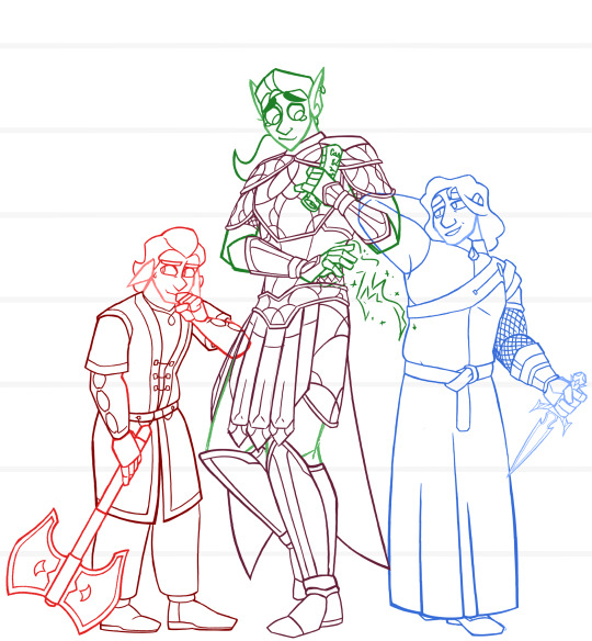
Something I planned on finishing for a ref but I did that that where I put too much effort into the sketch layer and now have zero motivation to do the lineart layer
Ignoring that, though! I drew this not long after I’d finished my first playthrough of Oblivion! God a little story idea going on, maybe I’ll write it — it’s not super high priority though as I’ve already got TDI to focus on.
Still, though, in the main trio we have Glarthir (yes I’ve latched onto him that hard, his quest makes me so fuckin sad), Sweetheart (my HoK who misses his girlfriend), and ofc Martin (yes that is Mehrunes’ Razor. I thought it’d be funny).
Glarthir and Sweetheart are most often seen traveling together while Martin hangs back in Cloud Ruler Temple, but there are many missions where Martin is able to sneak away and come along with them. Glarthir, despite his build, insists on being a heavy fighter. His “battleaxe” is really just a waraxe made for orc warriors much bigger than him. He at first got it for home protection, but now carries it around as his weapon of choice on travels. He can cast magic, but just. Really. Likes the axe. He’s also supposed to have antlers, but I had drawn this before I made that headcanon for him.
Sweetheart is the speediest of the three, and prefers a type of “gun and run” tactic. He holds a powerful shock spell that he lovingly named “Heart Attack” that damages on touch. His nimbleness allows him to slip away before the enemy can get a counter hit on him. He’s also a thief, though much prefers to steal in plain sight than try and sleuth around (he was the distraction while his girlfriend was the sneak, before the Crisis separated them). He wears glass armor stylized like actual glass pane artwork. Bc that’s cool.
Martin is much less of a fighter compared to the other two, but does do his best to play defense. He and Sweetheart shake hands about always getting asked “are you alright?” due to their Resting Wet Cat Faces, and they’d much rather talk their way out of a situation than fight through it. Sweetheart, with the best of intentions, raided a Mythic Dawn encampment for the Razor specifically to bring it back to Cloud Ruler to gift it to Martin. Jauffre and Baurus were… less than stoked. The very weapon that killed Uriel Septim and many emperors beforehand—quite literally dubbed the “Kingslayer”—was not a very good gift to give to the last remaining emperor. Martin thought otherwise, and uses it for defense against Daedra (due to it’s unique ability to instantly banish Daedra with one cut). He has is wielding arm completely armored to protect against any accidental nicks, for it’s other unique ability involves producing a wound tenfold the damage of the actual cut.
#Glarthir#sweetheart#martin septim#tes#tesblr#tes art#tesiv#tesiv oblivion#oblivion#Bosmer#altmer#imperial#mehrunes razor#mortal intentions#my art#hok#hero of kvatch
22 notes
·
View notes
Text
I'm a little late to the #webcomicday party but I still thought it'd be fun to break down my process a little bit using the latest Way Out chapter as an example!
So I have a rough outline for the whole comic but I don't go into too much detail planning each story arc until I'm about to get stuck into it. The rough outline is for jotting down ideas as they come along, acting as a skeleton for what will eventually happen, while the more detailed arc outlines are for plotting and pacing the story beats.
Planning each chapter out like this means that each one feels like its own mini-story, and more importantly, stays on track and achieves something to further the story or character progression. You'll notice that the chapter notes are still pretty barebones, which leaves me room to fine tune the smaller beats within the script.


Then, it's scripting time! I'll only have a script for the chapter I'm working on and a script for the next chapter, so as I'm currently working on Chapter 66 I have a script for chapter 66 & 67 but not 68. This is ideal for me in keeping the story flexible, allowing me to take a chapter in a bit of a different direction without feeling tied to a whole arc's worth of scripts that I'll need to rework otherwise.
Around 20 panels is the sweet spot for a chapter of Way Out; there are some with fewer and some with more, but shooting for that number makes me think about whether a scene ought to be extended or cut down in order to meet that goal. If I only plan out 18 panels then I can probably squeeze something extra in, while if I plan out 23 panels, I have a look and see if there isn't anything that can't be condensed.
The scripts themselves are pretty sparse, mostly just dialogue with basic action notes that I highlight as I finish. I'm usually pretty good with visualising things in my mind so the notes are more of a reminder to self about angles & expressions more than anything- if this were a collaborative project I'd probably put more effort into making it descriptive, but it's not.

I've never been one for thumbnailing, which is bad comic practice, I know. But once I have my script I just want to get stuck straight into drawing and don't like slowing down to jot down what is already pretty vivid in my head when I can just. draw the thing.
(a large part of why I started my first webcomic in the vertical format is because you don't need to consider variety in panelling and page flow, which is something thumbnails are very important for).
And so the sketching begins! My sketches are rarely pretty with little focus on anatomy and shape and more focus on blocking and size. I use Procreate to draw the panels and its resizing tool has a tendency to obliterate the quality, which I can sharpen in small amounts but it saves a lot of pain if I plan it all out in the ugly stage.
In some ways I often prefer the sketches to the clean lineart, but that's mostly the stylistic scratchy-ness of it that I have to do away with in favour of clean lines. I'm not always super proud of the art in the end but not every panel needs to be a masterpiece and it's all practice. I think a quantity over quality approach is kind of necessary if you want to make a comic and not lose your mind.
I sharpen up and clean any spots up as I go, but once they're all done I glue all the panels together on my desktop so that I can adjust the spacing between them, then I cut them back up again into smaller slices for posting! And that's the whole chapter process!
I also have a quick (and by quick I mean 4 minute) rough timelapse of chapter 65's coloured panel I can post, if anyone would be interested in seeing that, but it'll probably need to be its own post bc it'll crash this one.
10 notes
·
View notes
Note
Would you be willing to talk about the inspiration for you sinti, shunti, kanunuk, & nunni designs? They're really cool!
absolutely !!! :D i usually have pretty explicit stuff that im referencing or am inspired by so im always happy to share <3
*ramble incoming*
[the dr pepper cans are how you know im a real southern usa babe. earlier today there was 5 empty cans in a row until i put them in the recycle bin]
i take a Lot out of the book "sun circles and human hands: the southeastern indians - art and industry" (2001 edition, not the 1957 one) which i have a physical copy of and i have sticky notes tabbing out out and also annotated highlighting every mention of the chickasaw and of sites where i know the chickasaw [or our ancestors, like the chicaza and other early mississippian/SE ntv cultures] so i can reference stuff i know would be from us, but i also take inspiration from all the designs in it because we were all a part of an interconnected cultural network of art
if you are from a tribe that would be from mississippian culture or the southeastern ceremonial complex/southeastern cult as it used to be called, or you know your people wouldve come from places within that like spiro or moundville, and you want to bring more native styling into your art this is THEEE book i would recommend. it is insanely useful. i cant vouch 100% for the text of it, and the second half is mostly kinda grainy b&w scanned photos of pottery and other items lmao, but the first half has lineart depictions OF designs found, with the attribution for the site they were found at. it is a Massive wealth of symbols and style and has been the best thing for wanting to study and emulate SE ndn art. for real i lent a copy to my grandma and then couldnt find where it was and i had to just order a new copy bc i use it so damn much
like i would post pages of it, and before i bought it i survived off the pinterest pics of scanned pages, but i cannot say enough just buy the book and look through it bc its just perfect its so useful. just posting a few pages doesnt do any justice to the wealth of style and art in it. ive tried to make myself some mock style/symbol guides from it, but even those fail to capture the variety of stuff in there and its why i still have it on hand for reference bc every time i get stumped theres so many ideas in there
but ok . book rec rant over (partly.)
i had done sinti homma, the red snake earlier, and i wanted to do a little motley of other simple transparent animals to go with it. so i did! ive got a few different animals that i played with doing, but a lot of them ended up veering too much off of the more hardline ntv style i wanted to do, and the others didnt fit the guideline i had made - i wanted them all to have a pointed tail that pointed to some corner of the frame, and curl around in the square a bit to have more of a sense of motion. i was thinking deer, turtle, spider... but none of those really fit that. so i flipped thru SC&HH for some ideas and came up with some :3

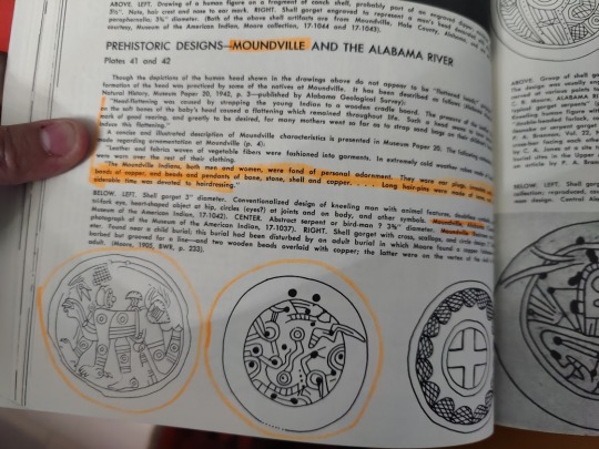

the bottom left one on the first pic there gave me a good idea of what to do with a rat tail, and on the bottom right of that same pic is the Fattest fucking fish and i lifted a lot of that design to use for my fish (and while we're here, the rattler tails on the top right of that pic were what i used for sinti hommas tail), and the bottom left on the second pic gave me the idea for the lizards legs/feet shape, and then i used the chickasaw vocab flashcards of animals to think of animal ideas and so i used the pinti from there to jump me off into doing a rat
theyre all named after the chickasaw words - sinti (snake), shunti (rat/rodent), kanunuk (lizard, specifically green striped lizard, which is why i made it green with stripes lol), nunni (fish) . i use the chickasaw dictionary webpage a lot these days though i should use my dictionary copies more bc they use the spelling style i dont prefer lol
i also want to do maybe a sort of pop art style big print of them, like repeated with different colors behind them? and/or them in a medicine wheel? but those are still wip so we shall see!
#anompolili#TY FOR ASKING ........... i feel so like. patronized. but i never get to talk abt this except into the void so i will seize the chance T_T#hatuk upi homma
9 notes
·
View notes
Text
just because i feel like it:
some random thoughts about the art i made for ironstrange week + the very rough thumbnails for each piece (putting this under the read more so this doesn't take up too much space bc this is a Very long post)
day 1 - red/wrath

first fanart for this fandom! there are a few things i don't like about this piece (questionable anatomy, use of values could be improved, + stephen's hair makes him look like a wet cat /hj) but i do like the lighting and the theme of red spider lilies. i've always wanted to draw them and i love their symbolism of death and final goodbyes—feels very fitting for these goofs :b
i started working on this a good amount of time in advance, and i'm glad i did—this was one of the only pieces i used a painterly style for despite it being my preferred style; it takes me a lot longer than lineart + color, so i didn't get the chance to use it again throughout the event (with the exception of day 6)
day 2 - nervous/orange
i struggled with the anatomy on this one—i don't draw back views often (or, at all really) so the first panel was pure pain. the second panel wasn't much better; it took several attempts to pose the hand in a way that looked somewhat natural. pretty pleased with how this turned out all things considered, though! my only qualm with this is the rushed shading, but that's what happens when you're a slow artist on a time constraint :,)
day 3 - yellow/cheerful

i think this may be one of my favorites from this event. i'm very very happy with the lighting and overall atmosphere of the piece :)
i realize now that i used flowers as a theme for every color prompt—anyways, like i said in the tags of the original post for this, i very loosely referenced yellow primrose (symbol of happiness, warmth, & love, conventionally given to those in long-term relationships or someone who has always been there for you through thick and thin)
day 4 - intrigued/green
i ended up liking this better than i expected to! i had to play around a lot with the lighting/color scheme before i was satisfied with it, though that's on me for not having much of a plan for it beforehand (with most pieces, i already have an idea of the color scheme when i start working on them). not much else to say about this one except surgeon stephen my beloved <3
day 5 - blue/serene

this was the first time i've properly drawn a kiss and holy hell how do ship artists do it. that shit is so difficult. i struggled a lot with the anatomy and ended up changing the poses a bit; i also flipped the composition because 1. it looked slightly better that way and 2. i could include tony's ring <3
and yes stephen's mug says 'cunt' (with the handle being painted in black to form the 'c'—very much inspired by jacksepticeye's mug); for tony's i had to search for funny mug designs lmfao
i was going for a very domestic/warm atmosphere, which i think was more or less accomplished, so i'm pretty happy with this overall :)
also, not really pertinent but i was listening to sweater weather on loop while drawing this so. make of that what you will.
day 6 - grief/indigo

ah, this piece. definitely my favorite of the 7, love how this turned out despite ripping my own heart out a bit while making it :,) listening to hyacinthus on repeat didn't help
my initial idea for this—the thumbnail in the top left—was going to be one of them bleeding out in the other's arms, but i had another idea that i felt more drawn to so i chose that instead (this was a very last minute change so the thumbnail is pretty much just a couple of stick figures pfft).
i decided to go back to the painterly style since it felt more fitting for this & i'm glad i did, although it was a little rushed towards the end when i was adding in the final details (the butterflies are pretty much just lasso tool + glow layer). this was also my first time drawing stephen's robes and. man that was a pain to figure out. get a simpler outfit stephen.
day 7 - purple/disdain

had to end the event on a happy note! this was very rushed but i still like how it looks, though the bg petals are a bit janky.
the prompt 'purple' immediately made me think of violets, which were used as gifts for newlyweds so. here we are (they also happen to be symbolic of faith, mystical awareness, and spiritual passion—pretty fitting for our favorite wizard)
i didn't dedicate as much time i should've to actually making the violets look like violets instead of some generic flower but again, slow artist under time constraint. i did spend a lot of time with the expressions in this one though! i really wanted to convey a sense of pure joy and love, and i'm very happy with the result in that regard :)
something that i noticed was that it had become a lot easier for me to draw these two by this point. suppose it makes sense considering i'd literally been drawing them nonstop for 2 weeks lmao, but it was still pretty cool to see how quickly i managed to finish a sketch i was happy with, compared to when i was working on the first few days (good lord was it difficult drawing stephen in the first piece, especially at that angle)
anyway, prepare to see more of them in the near future because the brainrot is far from over. if i am this attached to them without having seen the majority of marvel movies featuring them (i'd literally only watched ds1 until yesterday when i watched im1—yes i started shipping them without knowing who tony was, i don't know how either), i think i'd be a puddle by the time i catch up on everything :D
whoo that was a lot—if you've read this far, thank you and have a cookie 🍪
#ink rambles#ironstrange#not gonna use any other tags bc there's no art i haven't posted already pfft
15 notes
·
View notes
Note
Art asks: 1, 27
1 (Do you prefer traditional drawing, or digital?): depends! sometimes i need to feel the pencil on paper, sometimes i need a physical space for my first go at lineart, sometimes i just want to blast everything with the fill tool
27 (For digital artists: how many layers does a typical piece require?):
traditional sketch (optional)
digital sketch (optional)
lineart
various extra layers for hair/face/details that are eventually combined onto the main lineart
various extra layers for each new person/prop
colors (when colorblocking)
background lineart/colors
various extra layers for background details that are eventually combined onto the main background layer
overall there's a lot less layers in the final piece bc most of them get combined.
2 notes
·
View notes
Text
1/16/24
hey if i ever die can you guys promise to make sure somebody goes through my "She-Ra Shit" folder and just like. mass uploads everything? like obviously i'd prefer it be tagged and transcribed and maybe annotated and color-corrected, i'm working on it, but sometimes i'm like oh fuck what if i get hit by a car truck bus* and i'm the only idiot crazy enough to have downloaded this poorly photographed lineart for a Fantastic Fashion outfit that was never released from a website section which technically went down like at least five years ago, you know?
they never made her. who was she
*nobody's hit me with a bus yet, maybe it's the only vehicle i'm not impervious to. we just don't know
EDIT: addenda. the folder named "Z" is just shit i already uploaded, i named it that so it'd come last in alphabetical order. and "personal art" isn't my personal art it's from the crew so like, make sure they're credited appropriately or i'll haunt you, i guess. their names are in the file names it's not rocket science. and there is some she-ra stuff in the MOTU folder but it's only like, the 2016 SDCC one and Adora's cameo in Origins (ugh) except for the Vintage POP folder. god i really have a folder problem huh. um. the commercials in the Filmation materials folder were actually animated by Duck Soup i just put them in there bc animation shit yk? i feel like a parent going on their first post-child outing leaving instructions for a babysitter. ummmm the 'manip catra concept' isn't finished yet i was trying to clean up some of the jpeg artifacts by hand but like that's a matter of interpretation and i keep getting distracted by googling art restoration shit like some kind of nerd or something, the raw image is in that same folder. look it's 1:50 i gotta go to sleep. promise me you guys
4 notes
·
View notes
Note
As someone who does a lot of digital art as hobby/job (tattoo artist) it really all comes down to doing it regularly and consistently, also finding brushes that work for you are a huge plus. Personally I prefer the more textured ones that you can get really funky with
What also seems to help is giving the background an off white or neutral grey color, sketching on a screen is a lot more comfortable when you're not being blinded by the white background
also! If you're drawing on ipad specifically get a paperlike screen thingy! I HATE drawing on the glass directly so that really helped a lot,,
What software/ hardware are you using? Maybe I can give some specific tips as I've tried myself both on apps and desktop programs :>
Or any specific problems you've encountered that you need answers to?
- art anon from a while ago
art anon, my beloved!!!!!
Thank you so much for reaching out in these trying times!!
I’m actually already doing a lot of your tips and I have definitely seen a difference from when I first tried out digital art. Btw I use my iPad, that has a paperlike foil, and procreate.
What I struggle with most is lineart bc no matter what I do as soon as I try to over line my sketches it just look meh, so I’ve started to just clean up my sketch and work with that one and it’s so much better (but also sometimes a bit frustrating bc why the f did I draw so many lines here????)
Colouring is also a struggle. Just all the layers and ways to do it????
I suppose if I had more time I could try and draw more regularly but currently I don’t have much free time (apprenticeship is slowly killing me but at the moment I also have all the exams I have to study for which ugh 😭)
Also what I’ve noticed and maybe it’s just my unknowing ass but when I post art it looks smudged, like it’s fine on my iPad but when I open it on my phone later is not as clear anymore (I export is as PNG and it’s set on DPI 300) so idk if you have any tips for that.
But yeah thank you again for even trying to help!
2 notes
·
View notes
Last Seen Blogs
ossielv
Ossiel V

my-kitty-toulouse
My cat could beat up your cat.

neosoulnicecream
Black Lesbian
26

sparklywafflehorse-blog
Deadbeat

taysonmartindale
Tayson Martindale