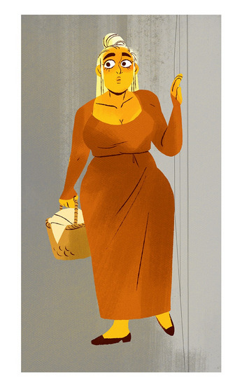
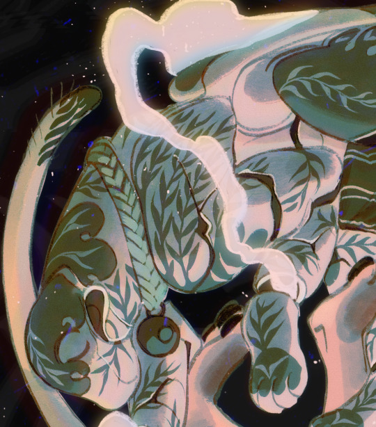
#but the lineart is actually how I see her
Text
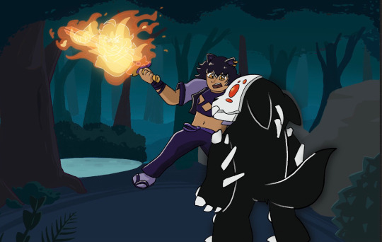
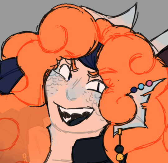
POV: it’s lunchtime, Wednesday, January 4th, 2007. You’ve been beaten black and blue by a sports cult. She’s trying to hide your bandages. You wonder if she blames you for her boyfriend’s death. You should ask her. The memorial banner was put up today. You… you keep your mouth shut.
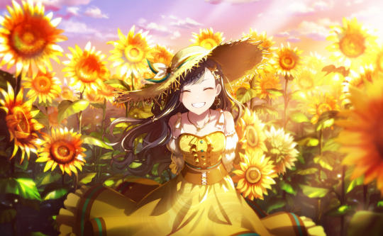
#(she has forgiven you. she asks you to pass the ketchup)#back on my Allison & Neil shit#can I really be an Allison fan if I don’t draw my favourite scene?#lineart first bc I prefer it#especially the anatomy#once I colour it it stopped working? idk why#so I adjusted it in the coloured version#but the lineart is actually how I see her#also.#she’s wearing a Paris Hilton dress thing#it was hard to find good outfit inspo for her that was era accurate#my art#aftg#the kings men#allison reynolds#neil josten#all for the game
446 notes
·
View notes
Text

caught in your own web, just like your mother
#murder drones#murder drones fanart#murder drones uzi#md uzi#uzi doorman#murder drones nori#nori doorman#glasswingdraws#i've mentioned before how the parallels between nori and uzi are interesting to me#and i really hope we get to see more of what nori was like when she was alive#or just more nori in general because we've all gone insane over the implications of her lmao#most of uzi's papers are copied directly from her conspiracy board#i had to make up/copy most of nori's because we don't know what info she actually had#i had a lot of fun writing articles for the fake newsletters :)#its a shame i made 85% of them too small to fucking read :)#and text editing in medibang paint is a fucking hassle so i'd have to go back and rewrite all of them :)#it's fine i'm fine#also this piece taught me a valuable lesson about layer management#the entire time i was like where is that layer why is that in the lineart folder why is that in the background folder#anyway. hopefully lesson learned#see ya'll after ep 4 drops
344 notes
·
View notes
Text


"Melting under blue skies,
Belting out sunlight,
Shimmering love,
Well baby, I surrender to the strawberry ice cream,
Never, ever, end will this love,
Well, I didn't mean to do it, but there's no escaping your love,
These lines of lightning mean we're never alone, never alone, no, no,
Come on, come on, move a little closer,
Come on, come on, I wanna hear you whisper,
Come on, come on, settle down inside my love,
Come on, come on, jump a little higher!
Come on, come on, if you feel a little lighter,
Come on, come on, we were once upon a time in love,
We're accidentally in love,"
Magnolia May belongs to @abyssnighthawk
#have a simple alamag tried something to try and make things a bit simpler for me#mainly not trying to get alastor's hair perfectly placed and shaped like I normally do#forced myself to not pick at his hair if it wasn't just right enough for me#and surprisingly this was rather quick my computer battery still ran out while drawing like it always does#but I managed to get a lineart and a few colors before then when I can usually only do lineart#just thought this song fit alastor with how he was hit in the face with actually being in love with maggie#he can deny it all he wants and pretend he just likes seeing what she does and her reactions#but he's in love with her and he must accept that we have proof seen them kissing#alastor doesn't have eye shines so I instead did them with a darker color hope they look okay#hazbin hotel#the radio demon/alastor#fan character#magnolia may
4 notes
·
View notes
Text
coloured the yellow fellow

now i gotta do EVERYONE ELSES full body ref
might as well cnp the whole description i wrote for him on the lineart one coz everyones seeing this one
B-127 is also a transport bot, but for Cybertronian needs. Even though he can transform into his car alt-mode, he enjoys zooming around cities with his wheelies! He spends the whole day delivering things, with his shift end being around 9PM Earth time. Despite the long day with angry customers, traffic jams and accidents that happen, he actually loves his job.
He's a yapperpacker. Whatever you bring something up in a conversation, he will go into complete detail about that thing, then it'll switch into another thing he brings up while talking, then into ANOTHER thing. He's got no filter, but at least he has really good social skills.
Since he has a car alt-mode, he has an internal radio. So he listens to music while working but also to current news, podcasts and traffic notices. On very rare occasions - one time he had a dance-off with a customer - he can blast the music. The song he was playing was 'THE BADDEST' by Joey Verlance & Brae.
He's like that one little cousin to Elita. Always hangs around her, can get annoying, but overall just a funny guy. Him and Meg share the same energy, just in their own ways.
How he met Orion was kinda funny. Meg was showing Paxton (Orion) around the construction site and introducing him to his co-workers, then Bee's tires slipped on something while delivering, he lost control, and then he was thrown towards them both. Meg was actually really happy to see him and of course helped him up, and introduced him to Paxton. Bee was really excited to meet him, and Paxton actually felt the same way.
179 notes
·
View notes
Text
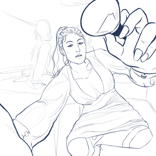
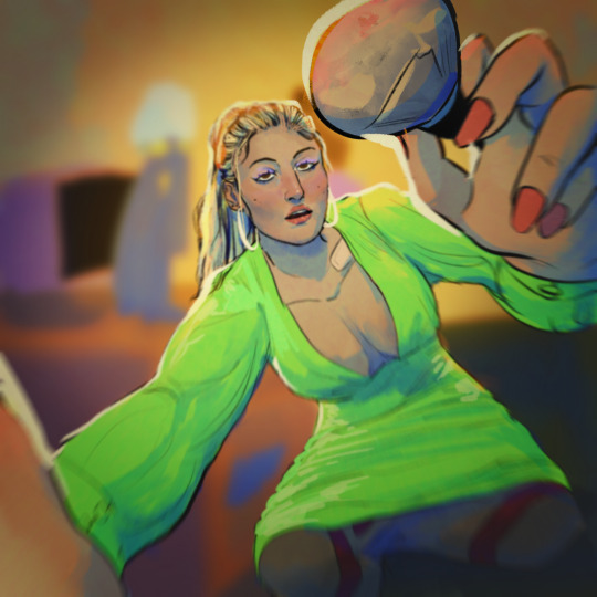
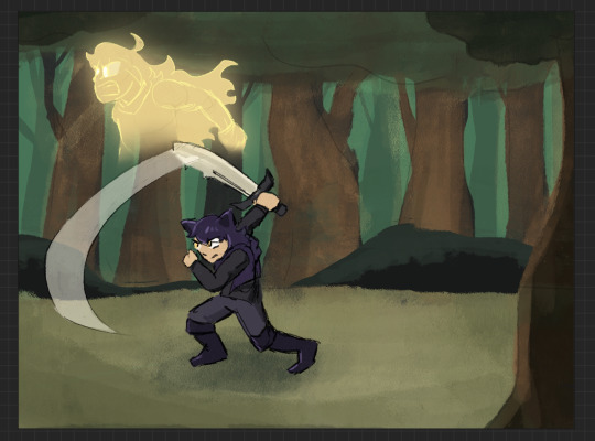
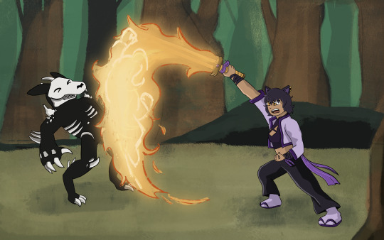
HOWDY EVERYONE- so excited to FINALLY be able to show off my piece for this year's Bumbleby Big Bang!
Unfortunately no accompanying story as of yet- but I really hope you guys get to read it someday! The premise involves Yang cursed to be trapped inside a sword, which was an idea I KNEW I had to make move.
Details and development stuff under the cut!
Lots of fun collaboration with the author, Celeste! We worked together to find the look-of-picture, Blake's outfit, how the Grimm look, the style of the sword, the whole shabang! I'm really happy with how it all turned out!
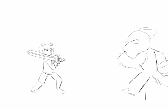
When I first saw all the prompts, even before claims opened, I got to work on a handful of exploration pieces based on some of the summaries, to decide which of the stories I was interested in would be the best fit. Here's the initial idea for this one I put together over a lunch break:
After showing Celeste, we got to work finding the look we wanted! Went back and forth a bit and found this great look for Blake! Also shoutout to Pinterest boards for visdev inspiration I love you Pinterest boards.

Just about everything stayed to final anim, with the simplification of getting rid of that purple cloth hanging from her belt, (since I already had the rope ends to think about working with), and the light purple strap across the chest, since leaving it out would simplify the linework on her chest.
The sword also went through a bit of change! Celeste had the idea of Yang making the sword catch on fire, which I LOVED. I went with a split design so we can see the fire more clearly start from the hilt and grow to cover the whole blade.
And from there we brainstormed animation ideas! I went all over Youtube for video reference of sword work (that would be complex enough to be interesting, but short enough to be manageable). I found something we liked from Motion Actor Inc., a channel I've used LOTS for both personal and professional work (I work in 3D Animation, for those who don't know). I edited this together, to see the action from multiple places at once, which gave me the idea for that camera move that's in the final anim!
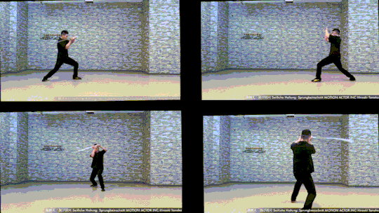
Now for the fun part! Make that badboy MOVE. For the cam turn, the first frame she's in the air I'm referencing the top left video, and the frame she lands I'm referencing the bottom left one. While she's airborne I'm just inbetweening that! No reference for the Grimm, just wanted it responding to her attacks, but I end up tweaking the roughs later on to make the block feel stronger.
Then from there we had to actually figure out Grimm designs! Nimona had just released, and Celeste and I loved it, so she asked if I could take some inspiration from Nimona's shadow form! GLADLY. Here's what I came up with!

I was going between how the movies and comic designed Nimona, really loving the almost liquid shadow of the movie, but also how the comics had this broken up/held together rougher form. Celeste liked the second to last one the best! The original plan was to have it leave a wispy shadow trail like the concept art, but to simplify the animation we left it solid instead!
Next up is tiedown! Basically just getting the roughs more on-model, so the lineart comes out nice and clean. I've also transferred the new Grimm design to the base from earlier, and fire's also outlined orange so it reads clearer. (SPOILER- if you look REAL close here, you can see Yang visible in the fire! I liked the idea of Blake's slash also doubling as Yang throwing a punch. The idea is in the concept art earlier but now it's working with the action.)

Next step- final look of picture!! I asked Celeste for sources of inspiration to draw from when thinking about environment design, and we got Nimona, She-Ra, and Owl House! Used each of those as springboards for shading style, colour palettes, and how the fire would look!

From there, we kept the straight trees/bush/lake/foreground greenery from the first one, the blues from the second, and the fire from the third!
Once I had this frame, it was a matter of working backwards and making the background work pre-camera turn (which was ABSOLUTELY the most challenging part of this process). Learned a lot doing this! Procreate isn't quite equipped to make something like this efficient, but I'm pleased to say that Dreams would make something like this easier in the future (keyframing objects instead of hand-drawing/spacing duplicates by hand, for example).
From then on it was just colouring the lineart, adding shading, and finishing up the background! Beginning-to-end this whole process was beginning of July to end of October!
I had an absolute BLAST putting all this together. Here's to next year where I find a way to do something even more ridiculously complicated!! It's fun!!!
#rwby#bumbleby#bumbleby big bang#bbb2023#blake belladonna#yang xiao long#(technically!!! look at the fire!!)#officialrocketart#officialrocketanimates#greatest hits#HOOO WHAT AN UNDERTAKING#so glad I came up with an idea pretty outside of my comfort zone but having the CLEAREST idea on how to execute it#means things went smoothly it just took a Long Time#AND I LEARNED LOTS#hope you guys can read the story one day!! its dope!!#bonus bonus fact for tag readers i didn't put in the post proper: i showed the rough pass to ANIMATION INDUSTRY COLLEAGUES for feedback#shoutout to ioana and v love you both lots#ioana for tightening up the rough pass and suggesting i smear the sword#and v for notes on my sword smears#okay i hope you guys enjoy!!!#it has been true for ages now but The Bees Motivate Me To Create#and in these trying times i thank them for that
394 notes
·
View notes
Text
…Okay, you may end up seeing these drawings yet again on a later date
I finished the page, which was small at 500x500 px, but I wanted to make the page bigger. I did that, and I drew one new thing, but now I don’t know what else to draw on there. So for now, I figured I might as well post the original full page right now
Yeah, sorry for the laziness
This is the other sketch I finished on there, for those curious
Anyways, so yeah, this new style practice I’m trying
The original page I tried these out on is this, which also isn’t full, but I thought trying it out with actual characters instead of just random poses and shapes would be better, so I switched over to Cookie Run characters
The method is still a work in progress when it comes to all the shapes and the red sketch layer
I suppose what I should do now is try drawing a bunch of different Cookies that have different body shapes, so that I have practice with that. As well as maybe attempt some full body ones
I suppose you can suggest some if you want, considering I don’t know who to draw other than like, Hollyberry or Avocado, since I should try drawing large but not buff characters here. But I should also probably draw more skinny, and also chubby
But on to what I actually drew
So I already talked about Peach Blossom and the top Dark Choco drawing prior, so no real need to elaborate
The Dark Choco and Dark Cacao one was me drawing them in their younger forms to see how they compare. Not for any sort of study thing, but just in a symbolic sort of way. Since they’re so similar looking
I think I had a lot more fun with Choco, especially his hair. I remember Cacao being mostly annoying for his weird cloak thing that I don’t understand
The hand pose was ass though. I knew the general idea of what I wanted, that being them with their hands over their swords, but I was struggling to figure out how to draw the hands. Not to mention I had to change the pose from the red sketch because the swords were further down than I put them. I still don’t think I did the pose exactly correct, but screw it, it’s good enough
I’m also noticing that Choco looks way lighter in skin tone compared to Cacao. Like yeah, I know he’s normally slightly lighter, but it’s far more noticeable here. I’m pretty sure it’s because I used Dark Choco’s ToA colors here (bc they work better with my black lineart), which are slightly lighter, as well as just that Dark Choco is wearing much lighter colors while Dark Cacao’s are relatively darker. So maybe it just makes them contrast more
I liked drawing them, but I also did basically do the same body type 3 in a row, so I should probably draw different characters
Anyways, let’s talk about that extra sketch
So for those who likely don’t remember, that there is an OC of mine called Prickly Pear Cookie
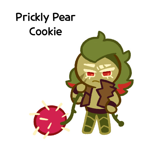
I made her entirely on a whim one day, and she doesn’t really have any character or story, just vibes, but I really like her design and wanted to draw it again
I probably should give her some sort of bra though. The shirtless chest looks cool but in my opinion sounds really uncomfortable without at least that
I did originally draw her with the green skin, but it looked weird so I shifted it to more of a yellow so it looks more human
Honestly I really like how she turned out
But yeah, I think that’s about it for now. Just wanted to show this
#I need to tweak and perfect it more#but it’s turning out relatively nice#I just need to stop falling back on old drawing habits#I need to relearn hands a new way#I have a reference that I found later on so I might use that#anyways#cookie run#dark choco cookie#dark cacao cookie#peach blossom cookie#art stuff#art style#cookie run oc#prickly pear cookie#my art
153 notes
·
View notes
Note
Hello! I’m just here bc I’m a little confused on what you meant by Smythe drawing out “each individual asset” when she was making comics? Now, granted, I can see that it made her file ginormous, but me personally as someone who knows nothing about making online comics but is really wanting to get into it (and also as someone who has a ‘too many layers’ problem myself), is there a way to avoid using too many layers?
My current way of making comics has been to draw the panels individually and then format them (which I know is terrible management wise and also messes with the quality) but I honestly have no other idea of how to do it properly, and seeing how stunning Lore Rekindled looks, I don’t know how you would manage to put all that lighting effects and little details on the same layers. (But also I may be thinking of it wrong so I’ll let you talk qwq)
Ah I can actually give you a visual breakdown of what I meant by that!
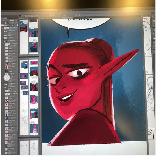
So in this you can see there are a TON of layers, and not even all of them are visible because some of them are stuffed into FOLDERS that have been left closed. BUT if you look REEEEALLY carefully-

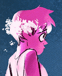
^^^ These layers right here? That's specifically Minthe from this panel in Episode 61:

(the unique pose here makes it real easy to tell that this is the corresponding panel, you can see the matching body shape with the dark shading that's clipped to the base layer below it!)
So what this means is that Rachel didn't draw all her characters on one base layer, she drew every single character in every single panel separately. Now of course, she could merge all these layers together as working on separate layers helps make it easier to work on elements that collide separately (like one character being 'underneath' another character like Hades is here) but because she has all of those clipping layers with the shading already added in, she likely didn't merge them afterwards because that would actually create MORE problems (because if she merged the Minthe layer in with Hades, then the shading for Minthe that she painted outside of the lines would show up on Hades and then she'd have to erase it which is just a bunch of extra work).
You can also tell all these characters are on their own layer because the layer thumbnail EXCLUSIVELY shows those characters. A layer will show as much canvas length as it needs to cover what's in that layer, so if the thumbnail is only showing one character, that means there's NOTHING ELSE on that layer. If there were more elements on this layer than just Minthe, the layer thumbnail would look more like this:
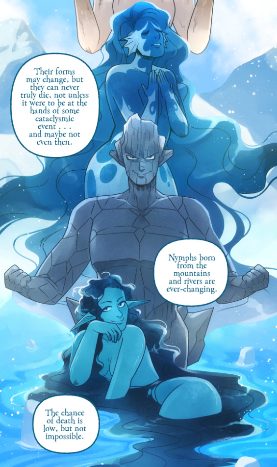
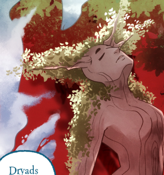
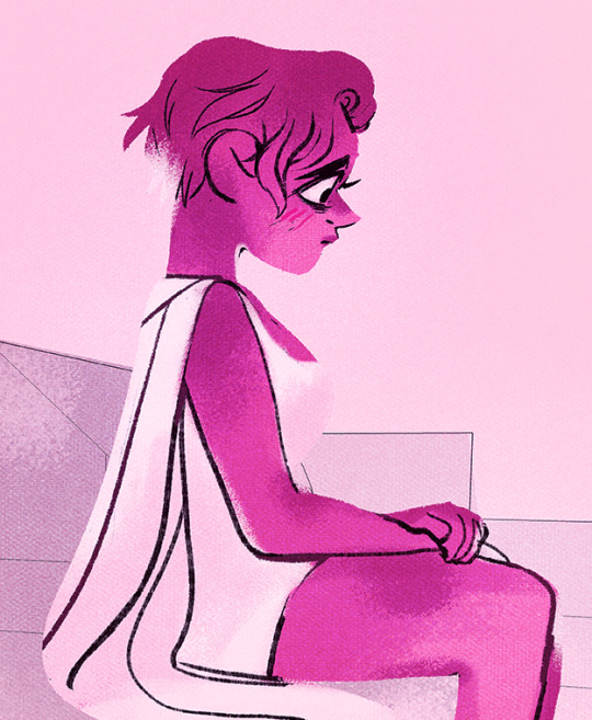
Now let's compare it to Rekindled's layers! I'll use a completed page to make it fair as we use a lot of extra layers in the post-production phase where we add the texture effects and glow and all that fun stuff, plus I'll even make it a more complicated page like that big nymph explanation spread from Episode 51:
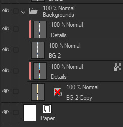
So I'll break it down to make this make more sense:
BG 2 Copy (technically this is supposed to be BG 1) - Basically the panel shapes, what I'll do is mark out the panels with flat blocks and through that we'll add background elements in a clipping layer (usually done by Banshriek). Often times they'll do multiple layers to make the process easier and then merge them all together in the end. With these shapes operating as panels, it means I can just auto select the whole layer, invert the selection, and easily erase whatever's outside of it (such as the lineart and base colors that I put down afterwards). I could just use masking layers like I did in [AFTERBIRTH] but I find this way works better for the process of making Rekindled.
BG 2 - This is where we add objects / foreground elements. So stuff like furniture, interactables, anything that needs to be kept separate from the larger background to make it easier to work with. This can also include "floating" panels that need to be above other panels, such as this:

All of the backgrounds are then nested in a folder for organization purposes (we also sometimes use clipping layers on top of those folders to apply extra effects over anything contained within that folder without affecting other folders, that's a common technique that Banshriek applies)
Then we get into our Characters folder:
BASE - This is where I do the majority of my work, all the characters in every panel on a page are flatted into this layer. Sometimes I do have to create separate layers to, again, make it easier to work with overlapping characters, but usually those layers will be merged before I go into the shading process. I simply shade on a single layer by using the lasso / magic wand tool to select my area for painting, the flat colors make it really easy to do that. Sometimes I need to create a secondary shading layer if I've put down dark colors that start to bleed into the lighter colors, but again, I merge when I'm done into a single shading layer. We also sometimes employ an Add (Glow) layer into the clipping set if we need a glow effect that's exclusive to the characters and doesn't travel outside of their base colors.
There's a (leaves) layer here that I used for the dryad because I needed the leaves to be above the base layer, after that I selected the leaves elements so that I could erase the lineart in the layer above it where needed.
LINEART - It's lineart, enough said haha That said, I do think Rachel actually uses clipping layers for her lineart in places, it seems to be visible in some of her process videos where you can see the lineart present in a clipping layer, and that would explain why there are panels where the lineart suddenly 'cuts off' and doesn't travel outside of the base layer, like so:
GLOW - This is where we do an Add (Glow) layer that isn't restricted to the base layer, it's where we add all the fun lil' glow and sparkle effects over the characters !
The CLOUDS layer is, like the leaves, a background element that needs to be above the base layers rather than constricted to the background.
Above the Characters folder you can see what I mentioned earlier where Banshriek has added more post-production effects that are exclusively clipped to the contents of the Characters folder. This means the effects / blend modes do NOT affect the background layers or anything above it.
The BLUR (Overlay) layer is something we just started doing over the past several episodes, it's a technique I actually picked up from 66 of City of Blank where I merge all the layers into a new visible layer which I then apply a Gaussian Blur to at around 60% and then set to Overlay (and then I adjust the layer opacity until it looks right, usually around 25-35%), it gives it a bit of a softer "dreamier" vibe in the final colors and really helps unify everything!
CANVAS - This is an Overlay layer which is also set to an opacity of 25-35% where I go over the panels with the Add Canvas brush from the Kyle Webster set, unlike the Canvas overlay texture in CSP I can actually choose the colors I want to use which means I can match the canvas texture color to the mood and environment of the scene (ex. I'll use a very light blue for scenes in the Underworld). Not only does it give it that signature texture from S1 of LO, but it also helps balance out the effects of the BLUR layer.
The SKETCH layer sits on top of everything and gets turned off once all the base layers and lineart are down, and ofc the SPEECH folder is just where all the text is kept.
I know everything I just laid out is a LOT but ultimately it's how we operate, it works for us! But it also begs the question of why Rachel operates the way she does because a lot of it seems extremely unnecessary and more likely to bite her in the ass (the more layers there are, the bigger your file size gets, the risk of drawing on the wrong layer increases as well as the risk of posting a panel that's missing elements because the layer was left turned off by mistake, etc.) And it's more so concerning with how she operates with her assistants because if she's still using this many layers when collaborating with other people, hooo boy. Though based on what I've observed of what her assistants contribute, I get a lot more of the sense that she circumvents this by having the artists do the flats separately and then importing them in as separate assets that she then just imports into the page and places them where they need to be. Still not a great workflow IMO because it's what's led to a lot of the issues of characters "floating" rather than feeling like they're actually in the environment-
-but that's still an issue that could be solved by Rachel just taking more time to actually flesh out the backgrounds and lighting to give more of an impression of the characters actually existing in the space. Like that Hestia panel could easily be fixed by just giving the background a bit more detail and putting actual shading underneath her (and lighting from whatever direction it's coming from).
Either way, regardless of whether or not Rachel's process is productive or not, I hope that breakdown helps explain how we do it in Rekindled! Learning how to manage layers is definitely a skill that can be tricky to harness, but once it "clicks" there's a lot you can get away with. Ultimately how you do it is up to you, but my best piece of advice to offer is to just be open to other types of workflows because you don't know how much you might be shooting yourself in the foot doing things the hard way when there are often way easier and more efficient ways to get the same job done. That's basically the vibe I get from observing Rachel's workflow, it seems like she's still using methods that she thinks are working for her (and probably did work just fine for her when it was JUST her) but could be vastly improved for her and her team if she'd just get over the initial hump of stepping outside of her comfort zone. Would probably make for a better comic too LOL
I hope that helps! Good luck! ( ´ ∀ `)ノ~ ♡
#ask me anything#ama#anon ama#anon ask me anything#lore olympus critical#anti lore olympus#lo critical#lore rekindled#webcomic advice
151 notes
·
View notes
Text

I wanted to try to finish it before my birthday, and I did it!
The main first idea was to express that feeling when you get messages from people dear to you. How you can be happy to see it, how it warms up your heart and even can make you smile - in ideal case, I wanted to achieve this effect, so I needed proper face expression, and the overall atmosphere was supposed to be a combination of cute, happy & cozy.
So at this point I decided to draw Nene in her room checking her phone. And it must have been something simple enough, because I had only five days
And I got this

But, when everything was already more or less ready for lineart, I decided to go to the Nene's gallery on Wiki for some ideas about colors for her clothes, and then I suddenly remembered that she actually has a LOT of cool official outfits, and I always wanted to draw at least some of them

So I just felt that it would be shame to draw something this simple, while I could draw something really ✨beautiful✨. Of course, I'd need to change the background, because home background won't fit any fancy outfit anymore, but anyway I didn't manage to express needed emotion on Nene's face either (…it's hard to show it for her type of personality, who wouldn't have a ":D" face), so I didn't care about it either ¯_(ツ)_/¯ So I basically exchanged simple outfit with more or less detailed background to fancy clothes with very simple background
Still, I'm happy that I finally could try to draw something with Nene again. Funny enough, but before checking wiki I didn't even know about this outfit at all! After all, it isn't in the game, it was an outfit for some event I think?.. But it instantly stole my heart thanks to its colors and concert-like style 💙 In result, it wasn't even hard to choose which one I'll use. Meanwhile, if I'd like to draw her in one of other outfits someday again, then it'll be an interesting task: I really have no idea, they all are so pretty. Besides, I think I know where I can use something simple and casual like one in this first sketch too. Anyway, I wanna draw something creepy/gloomy for Halloween, and in that case I'll get an opposite situation: I'll feel bad to use any of fancy outfit for such a theme, so why not
90 notes
·
View notes
Photo

IT’S POWER, EVERYONE!!!
Check out my etsy shop
If you want to see how I made this piece, check out the extended stuff below!
Okay, the story behind this piece is nuts, but. I’ve known I’ve needed to work on improving my art for a while, so as you can tell from all the newest pieces, I’ve been trying to push myself. It started like this:

This was actually the fourth sketch I made. I knew I wanted Power to be looking down at us (you know, what she does with everyone), and I wanted to have her swinging a blood scythe in one way or another. I set up composition lines, but the more I looked at the sketch, the more frustrated I got. I finally just had to accept my anatomy and my 3d understanding of the body is very much lacking, and If I wanted to improve I had to work on something.
I watched a bunch of tutorial videos, and decided to try out the 3D model in Clip Studio paint. It didn’t take too long to learn how to manipulate the model, and I came up with this:
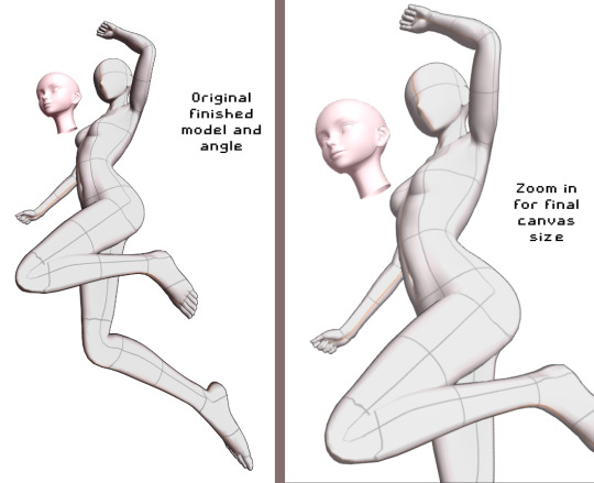
From here, I decided to do my quick sketch with Power

While I was experimenting with Clip studio’s art stuff, I decided to try playing around with their new “Shade Assist”. I figured it could give me some more ideas to make my shadows feel more ‘real’ or have me look at my art in a different way. Once I finished the lineart, got the color in there, and drew in Meowy, this is what I tried.
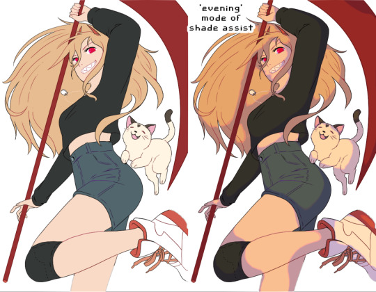
I really loved how the ‘evening’ mode of shade assist looked, even after playing around with my own colors, but I liked how it gave her a slightly more ‘yellow’ tone, and how the shadows were actually just lavender and light pink. So I took those colors, and worked on the shadows.

From there, I made the background layer. I used one of the Clip Studio gradient pre-sets, the ‘evening’ one, and painted a texture on top of it to have it match more with the textured painting style I went with. I added blood splatters, and ‘rectangles’ in the background, just to have more things visually going on.
On top of all of that, I added another layer on top of Power herself, with a very slight tone color of the gradient behind her, to make her and the background feel like they’re supposed to be together. And that’s it!!
I’m really happy with this so I wanted to explain my process. Looking around at tutorials on youtube, talking to artist friends who- tbh, are WAY more knowledgeable then me, helped a ton. And using the 3d model helped visualize the body, and different angles, WAY better then anything else I could find.
So uhhh thank you, and enjoy!
649 notes
·
View notes
Text
FULL FEM FORTRESS LINE UP


i finally FINALLY finished this lineup. those fuckers are in my head more that they should be. after writing my ideas for them i HAD TO DRAW THEM, i had such a clear image in my mind. the only one I've drawn before where engie, medic, sniper and scout, but those were just sketches.
if you wanna read what I wrote about them you can find the three posts here: defense | offense | support
full lineup, sketch lineup and design thoughts under the cut:


i always like the sketches more but i love the clear lineart, it makes the character more readable, so now it's time for some design thoughts:
engie - she was the first, she has seen everythin- no ok wrong franchise. i meant, she was the one i was more certain of. the outfit didn't change from the og but i made her have two small pigtails. i always viewed them as a cow girl hairstyle, and they're also practical. a stable hairstyle that keeps your hair out of your face.
heavy - the sleaves where kinda an instant idea i KNEW i had to incorporate. so i did a bit of reaserch on traditional russian clothes and their patterns. they seems to be very geometrical with not more than 5 colors, which two of them are white and black, usually at the seams or borders of the clothing. so i tried to do that. i really like how it came out.
demo - not much to say aside from me winging the hairstyle. i honestly didn't know which one to give to her, but i knew i didn't want a long hair style. maybe one day i'll draw her without the hat.
scout - she is the one with my favorite design. i LOVE how it came out. i fell it express her cockiness the best. i tried putting her in the og outift but eh, i prefer this one.
soldier - this is literally just normal soldier. i tried to but more "femminine" traits in her face. but still, just soldier with boobs.
pyro - it's normal pyro, with some stickers cause why not.
medic - she's my love. my beauty, the absolute perfection. i love her and every time i draw her she becomes more and more creepy. and i love her so much. at first i was unsure about the hairstyle, i tried to but her in a high bun but it didn't fit the face shape, so i just gave her a side swoosh. also you may have noticed she has the nurse hat, well, that's just because i think it's cute, and i mean, she is a field doctor and usually the women there where red crosses so, made sense to me.
sniper - ah, my beautiful, unkept woman. i had a hard time making her face look rugged without giving her 30 years more and doing that on women is actually pretty difficult. i had one time an art teacher saying to me "every line on a woman's face gives her 10 years more" and holy fuck if that's true. the second problem was the body type. a lot of people do her slim, and at first i drew her like so, but i found myself appreciating a bigger waist line, creating a sort of square siluette.
spy - finally the beautiful femme fatale. i will ALWAYS have problems with spy's suit color. i can't. it always feels so wrong aaaa. but that aside, i did a simple google search for 60s women's suit and i kinda went with it. it's a bit different from the og spy suit but it's also different from modern suits, so i had a bit of an hard time adjusting the jacket.
my asks are open if you wanna know more of them or if you wanna see them in some specific scenario!! and if you like tf2 i also did a team furtress lineup with explainations.
consider supporting me on my KOFI, i recently opened commissions!!
#art#artists on tumblr#tf2#fanart#tf2 medic#team fortress 2#tf2 engineer#fem fortress#tf2 fanart#tf2 scout#spy tf2#tf2 sniper#tf2 spy#tf2 art#team fortress 2 fanart#medic tf2#tf2 demoman#tf2 soldier#tf2 pyro#tf2 heavy#demoman tf2#engie#scout#medic#spy#sniper#pyro tf2#fem heavy#fem sniper#fem engineer
73 notes
·
View notes
Note
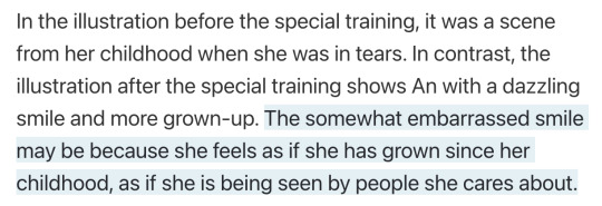
the way i only JUST realized that in An's "The Overflowing Feelings" card behind her isn't An's reflection no that is NAGI.....
and im pretty sure there is a bunch more symbolism in it because like. i think nagi is wearing a hospital gown in that card instead of her regular clothes but it is kinda hard to tell
sometimes i see an ask and think "i could make this so much worse" and this is one of those times.
that's not a reflection, that is straight up ghost Nagi. if you notice the grunge texture is actually overlaid over the entire illustration, not just behind the fence. it's not a mirror, it's a fence that separates the living (an) and the dead (nagi). i also like how everything except Nagi on the dead side is blurry even the plants that are right next to her. i can't give an actual explanation because annoyingly this set didn't get a blog post, but my personal interpretation of this is that it's meant to show how Nagi is still close to An even after she's gone (personally I like to connect it to An carrying her memory of Nagi in her heart becase she's clutching her shirt over her heart, but i think you could interpret it as Nagi watching over An from the spirit world too if you want).
i think it could be a hospital gown based on general appearance and the way it ties at the back, but as you said it's hard to tell. it would make some sense though since she died in hospital. but it could just be a generic black dress, since it doesn't look like the hospital clothes she wore in the story. also if you look closely you'll notice her lineart is in a white-grey color which makes her look more ghostly than An.
Also notice how all the other pillars have the red flowers on them (the ones from the gekokujo jacket). I believe these are gerberas, which are sometimes used as funeral flowers. i.e the flowers placed on the other pillars are to say goodbye, but she's actually right there with An.
i think i can still make this worse.
contrast with An's card from Vivid Old Tale. y'know, the one all about her relationship with Nagi and the first time they actually implied that Nagi's dead (they subtly hint at it in BFBY but it was far more obvious in VOT).
This set actually did get a blog post so I can go on about the symbolism. The cards in this set were based on the theme of "warmth and nostalgia", which heavily connects to the event being about An looking back at her childhood and time spent with Nagi, and how much she loves her home.
Sunflowers obviously tie in to that warmth, but they also symbolise positivity, happiness, and hope (the color yellow does as well). These connect with both her dreams in the present and memories of the past.
Also this part of the interview:
The people she loves have seen her grow up and smile compared to when she was a kid and crying after running away. Now while people she loves who have watched her grow up could be her mom or dad, or even Taiga, considering the untrained card...
The person she's smiling at is Nagi.
And that's what makes the LUTF set so fucked up because just LOOK there's so much contrast between them. Sunflowers representing VBS' hope compared to the despair in the LUTF set caused by their defeat to Taiga. The bright colors next to greyscale (and red, which has several different connotations multiple of which are applicable here), how cold the LUTF set is next to the VOT set. An holding flowers in both but in one they're flowers symbolising joy and in one they're flowers symbolising grief. The VOT set is youthful and lively but in the LUTF set everyone is angry, despairing and grieving a life lost.
The fact that the POV in An's VOT card is probably Nagi watching her all grown up (which she never got to do in reality) vs Nagi being dead and separated from An in her LUTF card, not to mention that Nagi is not watching her anymore but instead facing away because she's left An behind (but was she ever really with An in the VOT card in the first place?). An crying in both untraineds but in one she's being comforted by Nagi and in one she's crying because Nagi is gone.
In some ways it's like the VOT set is An's idealistic look at what life will be like when Nagi gets home and the LUTF set is An coming to terms with the reality.
this card fucks me up.
388 notes
·
View notes
Text

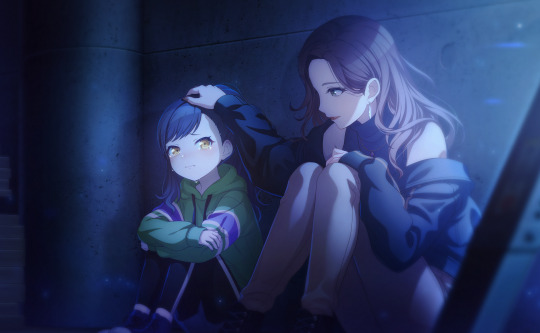
fish love me women fear me
should note her hair isnt ACTUALLY see-through i just didnt want it obscuring the outfit
design notes under tha cut smth smth reblog this i beg of u
heres the screenshot of The design board, as u can See wormtimes design was inspo and Sorta what kicked this off..??
honestly the vibe i was Going with was LITERALLY just pirate, its was i Latched onto first and its what i was goin with. SECOND vibe was sea monster, as u can see by the leviathan image And the siren image (which the idea Was scrapped i just went with lavi)
nothing was colour picked it was All sorta done by eye, i had a hard time figuring out How the colours would sit with each other (i went through like Several. different blues for the jacket ALONE before i was.. tolerant of how it Looked with everything else)
ignore the uncoloured lineart on The tail. i just noticed that 😭😭
i genuinely think this is The best ive ever drawn anyone, and like. god this was So much fun to work on, i literally conceptualised this on the Spot and ran with it (which ISNT good art habits but whatEVER i just watch 7 different hermits FISH give me a BREAK)
applestrudas designs Of the magic mountain people also inspired me (as Seen with the bell earring) just A tad
heres the original concept + Sketch of the design


honest 2 god i started with The little details and the BOOTS. before actually sketching the rest Of the outfit. originally the sash Was gonna be a belt, but the dimensions of it ended up Looking weird enough for me to scrap it entirely. bonus doodle i was Gonna add to the main thing but forgot to. more Sea beast gem!!

ok time for The close-ups (not a lot, everything is Fairly visible)

the boots get A close-up bc SHUT UP I LIKE HOW I DREW THEM :(
tis all :p bye bye reblog my art or dont idrc anymore
#rad1oart#hermitcraft#hermitcraft fanart#hermitcraft s10#hermitcraft season 10#geminitay#geminitay fanart#thats right u get ALL of the main tags NO ONE is safe from my gem design. mwahaha.
146 notes
·
View notes
Note
Hi Dema!! Your art is fantastic and even the lineart is awesome! Solid and confident in where it's thick and where thin. I really like how your style has characters look more realistic and they have specific consistent features. Your blog has a pleasant atmosphere, and you're skilled in weaving AUs! There's a lot of details and structure, and I'd like to ask if any of them have a full story arc? Could you do a list of all of the AUs? Is there a motif that you especially like that repeats in any of the AUs? And whenever you add comments to my stuff in the tags I literally smile, it makes me want to keep at my plan to create everything I have in mind. So I'd like to spread this joy! I hope you have a nice day! (from late-draft ^^)
Hello, Late-Draft! I wasn't expecting this ask at all but I'm so glad to have received it!
First of all—I'll try to hold myself back from giggling like a schoolgirl. I'm having a sempai noticed me moment over here and that's just embarrassing. So give me a second to compose myself, if that's alright?
Okay, I'm back.
Now, on to business.
Character design, especially when it comes to facial features and how they're unique to each person, has always been a passion of mine. I always try to have a solid design for each character. I choose which features feel like the character in question, which face feels natural to draw, and go along with it. I love drawing Katara as much as I love drawing Zuko. Meanwhile, I seem to be on a never-ending battle against Sokka's features. Woes of an artist, I suppose.
Character design is actually one of the reasons I love your work so much, in case you hadn't noticed. I'm currently experimenting a bit with a different style... Hopefully it won't be long before the artwork is done and I can share it over here. I'm so excited for everyone to see it!
Now it's time for the reason we're all here.
I have said it before and shall say it once more: AUs are my lifeblood.
I love them so much! Building them, daydreaming the scenes, thinking of the characters and how they differ from their canon versions. The arcs and the themes and the worldbuilding. Building AUs is my passion, and I have so many of them!
There are a lot of motifs and themes that tend to repeat themselves in several of my AUs, I believe.
You'll notice that most of my stories are Zuko-centric, with a heavy emphasis on grief and humanity. There's the question of what makes us human and how to move forward when the whole world seems to push you back. I put a lot of stock in metaphors and symbolism within the narrative itself. I'm especially interested in the nuance of war and how it affects people emotionally, physically, and psychologically
I also tend to reutilize some elements of the lore and/or worldbuilding! Such as the Painted Lady's backstory, or the existence of War Children within the ATLA universe.
Now, the list!
I think I'll start with my current project, if that's okay :)
For the Spirits (New Gods AU)
Zuko was a child when he met Agni. Then, the spirits started coming to him. Eyes hidden in the hallways, voices pleading for help, for recognition, for remembrance.
Zuko could see Agni. He could see the broken remains of a Great Spirit and the empty smiles of amnesiac ghosts.
And they could see him in return.
I've been working on this AU for a long time, but only now did I get the chance to start writing the fic (linked up there!). I'm extremely excited about FTS and where the story will lead us in the future, but I'll try not to spoil too much.
It's a Zuko-centric story, with a heavy emphasis on Spirits and humanity. I'd like to add a warning for depression/mental health issues.
To Hesitate (Lee & Kya AU)
As she watches Lee and Kya avoid each other's eyes from across the room, the phrase comes back to her, swift and silent:
"To hesitate is to lose."
.
As Song treats the victim of an unfortunate interaction with a rare poisonous flower, her day takes an unexpected turn when it becomes apparent that the old man's nephew and her assistant have history.
A vivid history.
The Lee & Kya AU is a vibe, a feeling. It's probably one of my oldest AUs out there as well as one of my dearest.
A classical Lee and Kya From The Tea Shop AU, full with wholesome fandom tropes such as: fake (but not really) dating, fake identities, Ba Sing Se shenanigans, vigilante stuff, White Lotus missions, Iroh is a great Uncle, Zuko is an awkward turtleduck, and, of course, the fluffiest fluff you'll ever see.
Other than that, Lee & Kya is probably one of the less plot-focused AUs I have. However, that doesn't mean that there aren't scenes I can't wait to write or a canon divergence or two where Zuko is concerned.
(I have another fic posted but I'll leave that one to the end. You asked for a full story arc and, oh boy, does Soundless deliver.)
Kintsugi AU
Closer to being canon-adjacent than canon-divergent, Kintsugi is yet another Zuko-centric AU (and are we not noticing a pattern over here?).
I'd love to explain it in depth, but I believe the caption of the artwork linked above does a better job at explaining than I ever will.
Kintsugi is the art of decorating your scars with pieces of Agni.
In the Fire Nation, the amount of golden marks are a sign of status. Only the Royal Family can afford to seal every single wound with Kintsugi. Such is the weight of this tradition that, among the ones with Agni's blood, it is the highest mark of dishonor to have a natural scar, for it proves you aren't worthy of the privilege.
After the Agni Kai, Ozai forbid Zuko's scar to be sealed with Kintsugi. The boy wasn't worth his title, his traditions or his pride. Zuko would be broken, but he wouldn't be beautiful. Not anymore.
(And sometimes it's easier to pretend he never was)
Kyoshi Warriors AU
One of my absolute favorites!
In this AU, Ursa took Zuko and Azula with her when she was banished, so they could start anew. With help from Iroh and the White Lotus, she managed to relocate her freshly burned eight-year-old child and her crying daughter to Kyoshi Island.
Years later, when Avatar Aang and his companions first arrive at Kyoshi Island, they're met by the Kyoshi Warriors and their leader, Noriko of pale skin and warm brown eyes.
The Gaang leave Kyoshi Island many weeks later with a new companion. And if Jian Li, with his war paint and his scar and his dual dao, gives the island that he has called home for so long one final, longing glance as they fly away on Appa, they pretend not to notice.
Hunters AU
We're starting to dwelve deep into dangerous waters!
This is a Katara Joins Zuko In His Quest To Find The Avatar AU, with a twist!
This AU was born as a writing experiment. What if we take Katara's character, and change one of her core characteristics? Katara, who looked up to the Avatar as a saviour figure, now blames him for leaving and allowing the Fire Nation to wage war on the world.
Then comes Zuko, a banished Prince with a crew full of traitors and his own agenda. Zuko wishes for nothing more than to dethrone his father and end the war. He is a White Lotus member, an honorable, driven young man, and he has a plan.
The catch? He needs to take the Avatar to his father if he wishes to regain his title and be able to rightfully take the throne. Oh, and he will deliver the Avatar to the Fire Lord—but nobody said it had to be in chains.
Halfblood AU
I watched Blue Eye Samurai a few months ago and it destroyed me. The idea of a half-blooded child dead set on getting revenge for their very existence stuck with me, and this AU was born.
Kanna made a life for herself in the Earth Kingdom after leaving the North. Katara was raised by her grandmother in a small village, being taught to hide her bending if she wanted to live peacefully in a place she was only half of. Her mother had died in childbirth. Her father, a nameless warrior from the Southern Water Tribe who had loved Kya and left her behind, didn't know of Katara's existence.
Katara took over Kanna's clinic after she passed away. Always taking care of others. Always suppressing her need to bend. Always wishing for more.
One day, he arrived. A half-child, just like her. But while she was of Water, he was a son of Agni. He was searching for the man who brought him to this world. The man who scarred him. The man whose face he couldn't recall, whose name he did not know. The man whose specter had chased his mother to her grave. The man who would die at his hand.
The answers were hidden in a small teashop deep within Ba Sing Se. Lee offered her a way out, and Katara took it.
Soundless (Uiscefhuaraithe)
Katara of the Southern Water Tribe has hands scarred by fire and great talent, though no teacher.
Zuko is a mute War Child, a herbalist and healer, and the Blue Spirit. He bears the mark of fire, and the scar of the blade that took away his voice.
The first time they met, the Blue Spirit had just saved her, tough not before her hands got burned. The second time they met, his name was Lee, and he was healing her.
They live in war and they will fight, if not for the world, then for themselves.
You asked for a full storyline, and I shall deliver!
Soundless is probably the only AU I have fully planned. Three-books, Azula redemption arc, role-reversals and all.
This AU has everything. From travelling through the Earth Kingdom together, to odd character team-ups that somehow manage to work, and a major goal/conflict to resolve.
Zuko and Katara must find their way to Omashu in an Earth Kingdom ravaged by war as they also grow to understand each other, themselves, and the world around them. They meet with new and old alliances, keep their ears open for rumors of the Avatar (They say he is an airbender, Lee. Do you truly belive that?), and do their best to always be two steps ahead of their pasts.
Meanwhile, both the Northern and Southern Water Tribes are searching for the runaway heiress, Aang must find his way alone on this new, hostile world, and Azula must face the revelation that, despite what her father has stated for the last two years (liar, he lied at her! Her! He lied he liedliedliedlied), her brother might just be alive.
I'm sorry for making this such a long answer! I just get very excited about these subjects and don't know when to stop. If you made it all the way down here: thank you again.
I hope you have a good day ❤️
#dema answers#zutara#atla#zuko#avatar the last airbender#katara#zutara au#for the spirits#new gods au#Spirit Touched Zuko#to hesitate#lee and kya from the tea shop au#lee and kya from the tea shop#soundless au#Soundless (Uiscefhuaraithe)#soundless#kintsugi au#halfblood au#kyoshi warrior ursa au#kyoshi warrior zuko#kyoshi warriors au#hunters au#Katara joins Zuko AU#There's another AU I didn't mention#It's set in Ba Sing Se and it's shhhh a secret#Thank you again for writing to me!#I love to share my AUs and stories and headcanons and general craziness#This took me like two hours or so to write#They were absolutely worth it
130 notes
·
View notes
Text

“you’ve always been a blight to the rebellion, adora. i should have never taken you in.”
chipped glimmer is done! like a lot of people said, chipped glimmer would have been a lot more effective since she would actually be out of character, like the trope demands. plus, it would have been interesting to see how horde prime would use glimmer’s magic and teleportation against adora.
my headcanon is that she lost her hair sparkles (and the star freckles that i personally give her in my designs) when she got chipped and only gets them back after adora brings her back to life.
lineart under the cut!

#spop#she ra#spop glimmer#glimmer spop#glimmer#glimmer fanart#spop fanart#she ra fanart#spop au#she ra au#she ra and the princesses of power#she ra and the princess of power fanart#glimmadora#fanart#art#do not steal
134 notes
·
View notes
Note
Not ship chart related but I think your art is so pretty!! Do you have any tips? Especially with coloring if it’s okay <] (/nf)
waah thank you very much! i'll try and explain but here’s my colouring-specific tips, or at least how i choose my colours !! <3
unless for stylistic reasons (e.g. greyscale drawing), i personally avoid pure black, greys and white for colouring. go and choose off-colours instead!
for lineart, black is okay but i always go for an actual colour anyways heheh. for the background colour of your canvas, sometimes an actual colour (rather than white or grey) may help you pick your palette to be more harmonised!
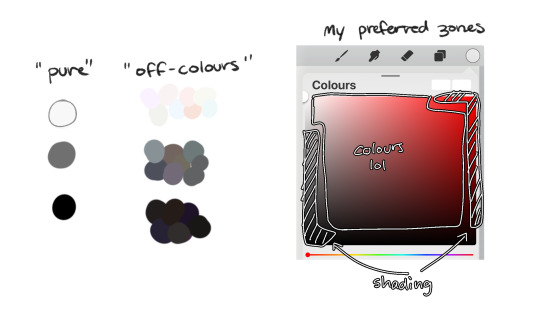
following this, i also don't like using pure/neon for colours, unless it's for a certain aesthetic or artstyle (e.g. the character has a "toxic/radioactive" aesthetic; the character is a scenedog (or similiar); or highlights).
see below for examples! they may be subtle but sometimes the subtly can make the difference you are looking for... if you're looking for a natural look. if you're aiming for the bright/old 2000's artstyle, then pure/neons may be your friend!
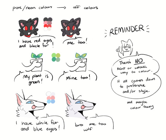
when i'm casually drawing characters (oc or not), i rarely colour-pick from the reference image.
i find that when you're "forced to make the palette", it can come out more pleasing to your style/atmosphere of the drawing!
it’s more personalised that way... like yea, that’s my favourite versions of those colours! i'm not saying that my colours are better though, only that "hey that's me! in those colours!!"
you can have the reference image on the side or go by memory. here’s me doing this with pride flags:
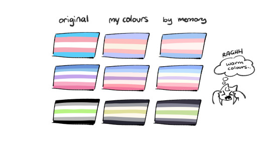
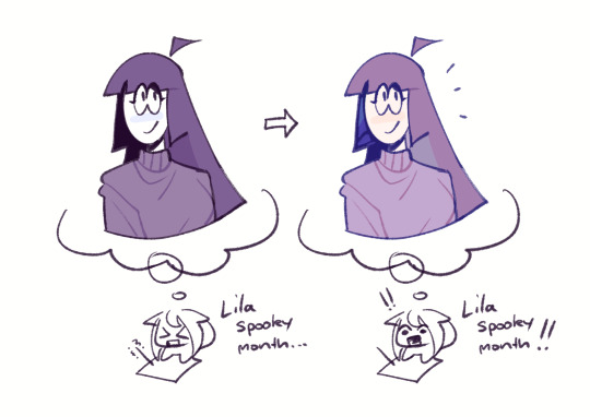
nowadays, when drawing the spooky month characters—who have simple designs god bless—i can just imagine their reference and adjust the colours in my head lol
example: if i know that Lila's colour palette is purple, and that her winter sweater is coloured lighter than her hair, then i can just go ahead and pick whatever shade i want following that rule!
(of course, always double check with the actual reference for physical design inaccuracies and skin tone if it applies. my advice above is just for general hair/clothing colours!
…because yknow you don't want to accidentally whitewash a character's skin in the name of aesthetics lol. if you’re unsure and want to be on the careful side, please do colour pick the skin at least !!)
moving on...
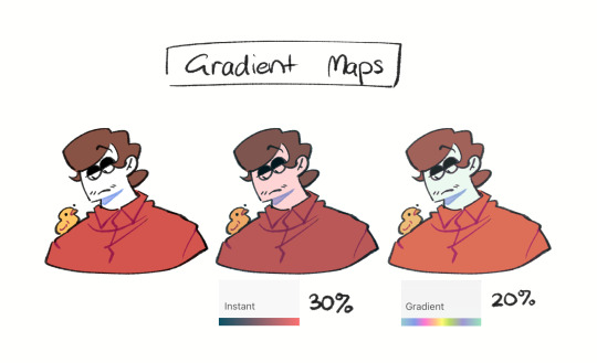
gradient maps and certain blending modes (like exclusion, luminosity and darken) can be a game changer too.
for normal drawings (e.g. drawings with no environment), i use darken the most because it changes a few colours rather than the entire piece...
(the percentages are opacity levels!)

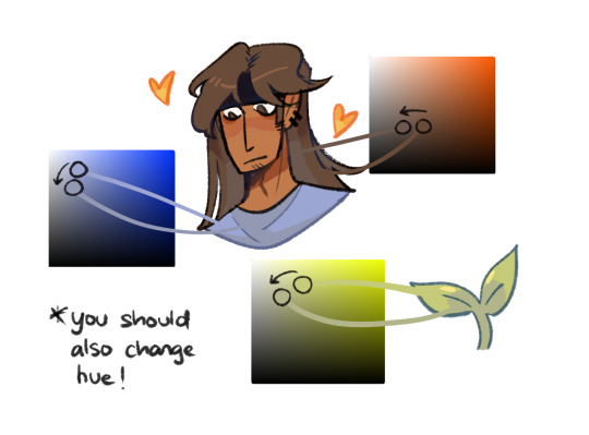
oh and as a really basic shading tip without using blending modes: sometimes, you just gotta go for grey. shading a warmer colour? use grey to make a cool tone. shading a cool colour? use grey to make a warm tone. not all the time (because you don’t wanna make your shading seem muddy), just sometimes…
and that's that! there's always exceptions to rules and often times, your headshot doodle ends up as one big experimental mess (in a fun way, hopefully)!
this is how i choose my colours though most of the time, it is just me going “good enough”
i think we're pretty similar on how we like warm colours! i enjoy going the simple/lazy route and avoid blend modes but then again, shading is a whole different thing…
hope this helps in any way !! <:3 !!! <3
#if anyone wants to ask for specific tips i’m happy to share!#if i have any lol#[ the askbox mourns ]#[ the art of mourning ]#[ mourn's mourns ]#anyways yea i kinda do just imagine the spooky month characters with a light orange multiply layer and then try to replicate it irl#my personal/lazy rule is that if it looks good faraway its good enough AHAHA#spooky month lila#spooky month jaune#spooky month rick#spooky month aaron#spooky month#“actuallyyy the 'black cat' is actually dark grey—” SHHHHHH SHUT SHUT IT. SHUTUT !!!!! i need u to see the lineart /silly
86 notes
·
View notes
Note
I was wondering how achieve such a wonderful textured finish on your pieces? They are wonderful and I love their resemblance to aged photographs and the speckles of colors in the backgrounds. Your art is mesmerizing :)
you can see some of the texture brush sets i use in my #info_asks tag but i have some more (procreate) tips aside from just brushes
also hi i made this whole thing and then stupidly hit ctrl z to erase ONE word and i lost the entire bottom half of the post and all my image descriptions so fuck you tumblr i had to make this twice
to get a faded photo or old digital screen look, consider duplicating the canvas (once all the layers are merged) and using a gaussian blur tool on the new duplicated layer. then set that to low opacity to add a misty sort of look. looks nice in combination with some chromatic abberation and a small bloom effect. then a subtle noise filter on top:
for faded print effects, it's really worthwhile to learn how to use layer masks. you can use a layer mask to non-destructively 'weather' blocks of colour or lineart, without erasing the layer itself. the weathered ink/block print effect here was made using layer masks which means that if i just hide the mask, the lineart becomes solid black again and easy to alter or colour in:

for old paper effects you can just set a paper texture on multiply over the art sure, but you can also combine it with the blur & bloom thing, a really subtle drop shadow and canvas tilt, and highlights to make it look like an aged photograph of a card. this originally had a transparent bg but i'll post it here with a white bg so that the drop shadow is more obvious. the scuffed edges of the card (left) were hand drawn, simple white stucco brush. the bigger patch of scuffed ink (top right) was a texture stamp.

for block print looks you can move the colour layer out of alignment by a few pixels - but only after you're absolutely sure you're done with it, otherwise you'll get something like this -

i forgot to erase out her eye before i moved the red layer so now her eye defeats the 'look' of a misaligned print. the black lineart and red layer were also given the same layer mask treatment as described above to make them look faded or like the ink didn't stick down right to the paper
you can do this with multiple colour layers too. if the colour layers are separated and set to multiply (as in this cmyk example), it'll leave halos and edges around each shape which mimic old comic book print
just to show what you can do WITHOUT any special brushes, here's a piece of one of my mez tarot cards from before i got any extra brushsets at all. for this one, i added a green tint over everything to mimic a sun-bleached or faded print (my actual goal wasn't 'medieval illustration' but actually 'trading card from the 60s that got left on someone's windowsill for decades'). the background texture is the procreate noise brush. the texture under the green lion drawing is the procreate concrete brush (to make it look painted onto a wall). the lettering and lineart is procreate's 6B pencil. but to properly aim for The Look of it being a printed physical object, i also used a perspective blur so that the edges are out of focus, and metallic gold highlights which don't match the lighting of the actual illustration and appear to be catching some other external light. that texture was made from the procreate noise brush
it's pretty simple compared to my later stuff but i still really like the effect
in terms of colours, you need to keep them unified so that they all appear to be acting under the same external light source, like if someone is holding up a torch to a painting then the painting colours will be glazed with firelight even if there's no painted fire. a really easy way to do this is to slap a multiply layer over everything in one shade - grey-yellow for a weathered paper look, or greenish blue for sunbleached photos. this unifies all the colours of the drawing. or you can apply a gradient map at a low opacity so that there's only a subtle change. or just do it by hand - if you want everything to be slightly tinted yellow, just pick the colours you normally would, but move the colour wheel towards yellow to get a yellowfied version of the base colour. easy
it's really important to consider how fading and weathering can affect printed colour. white paper yellows, black fades. you will rarely see pure black or pure white. which means you can use pure black or pure white to add external effects like the white scuff marks on the hierophant card. if the whole drawing is yellowed from age but there's some white somewhere, it's an easy shorthand to show that the scuff mark or whatever was not originally part of the drawing (great way to add some nasty stains lol)
#info asks#i don't have like a specific set of steps i follow i kind of freestyle it every time#obviously i have favourites i like to use but like that sphinx drawing? don't ask me how i did it because i don't remember#i just played with it until it looked nice. the blue dots are ... some sort of effect layer i don't remember which
647 notes
·
View notes
Last Seen Blogs