#load more button html css
Explore tagged Tumblr posts
Visit Tumblr Blog
Explore Tumblr blogs with no restrictions, modern design and the best experience.
Last Seen Tumblr Blogs


Fun Fact
Tumblr has been banned in Indonesia for providing people with access to pornographic content.
Text
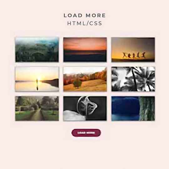
HTML CSS Load More Button
Our Telegram Channel
#load more button html css#css load more button#css tricks#html#css#css3#html5#html css#learn to code#code#divinectorweb#frontenddevelopment#html5 css3
0 notes
Text
Working on my javascript for my web page. Turns out I have the perfect kind of setup to accomplish some of the project requirements, specifically with even handlers and user interactions
My website, conceptually, will load a different employee details page depending on what employee name is clicked on. But I need to load it dynamically (instead of hard-coding it) so that the user can add or delete employees & it'll be able to still load the relevant shit.
So! Only one employee details page, but depending on how it's loaded, it'll load a different employee's information. Still working on getting down Exactly how to do it (I'm thinking using URL parameters that'll read a different object depending on what ID is used)
It's entirely doable. In fact, it's probably extremely common to do in web pages. No one wants to hard-code information for every new object. Of course not. And thus the usefulness of dynamic javascript stuff.
I can do this. I can very much do this.
#speculation nation#i wasnt very good when i got home and i read fanfic for a while#then took a nap. and now im up again and Getting To Work.#i dont have to have this 100% perfect for final submission just yet. bc final submission isnt today.#but i need to have my final presentation over my thing done by noon (11 hours from now)#and im presenting TODAY. and part of that will be giving a live demo of my project website#so. i need to have all of the core functionality of my website down at the Very Least#might not be perfect yet. but by god if im gonna show up to my presentation with my website not working.#i need to have the employee list lead to employee details with personalized information displayed per employee#i need to create an add employee field that will Actually add an employee. using a form.#and that employee will need to show up on the list and have a new id and everything. the works.#need to set it up so that employees can be deleted. shouldnt be too much extra.#and it would be . interesting. to give an actual 'login' pop-up when someone clicks on the login button#with some kind of basic info as the login parameters. this cant be that hard to code.#the project requirements are: implement 5 distinct user interactions using javascript. at least 3 different eventhandlers#at least 5 different elements with which interaction will trigger an event handler. page modification & addition of new elements to pages#3 different ways of selecting elements. one selection returning collection of html elements with customized operations on each...#hm. customized operations on each... the example given is a todo list with different styles based on if an item is overdue or not#i wonder if my personalized detail page loading would count for this... i also have some extra info displayed for each#but i specifically want the employees to be displayed in the list uniformly. that's kinda like. The Thing.#actually im poking around on my web pages i made previously and i do quite enjoy what i set up before.#need to modify the CSS for the statistics page and employee details to make it in line with what i actually wanted for it#maybe put a background behind the footer text... i tried it before & it was iffy in how it displayed...#but it looks weird when it overlaps with a page's content. idk that's just me being particular again.#theres also data interchange as a requirement. but that should be easy if i set an initial employee list as a json file#good god im going to have to think of so much extra bullshit for these 10 made up employees#wah. this is going to be a lot of work. but. im going to do it. i just wont get very much sleep tonight.#that's ok tho. ive presented under worse conditions (cough my all nighter when i read 3gun vol 10 and cried my eyes out)#and this is going to be the last night like this of my schooling career. the very last one.#just gotta stay strong for one more night 💪💪💪
6 notes
·
View notes
Text
my neocities site used to have a bunch of javascript.
for example, i had a page that existed to load up chapters of various stories so that you could read all of the chapters in one page, sort of like ao3's view full work feature. because it was scripted dynamically, i didn't have to maintain a separate copy of the text, and it was actually more flexible than what ao3 offers, because you could read specific arcs, heck, you could read a specific sequence of chapters (e.g., 2-13 specifically)
another thing i didn't want to maintain by hand was header at the top of the page with navigational links, so i had a script that updates them on page load.
problem is, it kind of just feels bad to load a page, then see a visible delay before the header pops in.
i spent almost a year living like that, but i eventually stopped maintaining my html by hand, and learned the joys of the static site generator.
i didn't need the chapter loader anymore, either - i could code my site generator to concatenate chapters into a full-text page, and since it's static, it'd load much faster than make the user's browser stitch together the html every time they want to open that page.
slowly but surely, everything i might've used js for was getting replaced by simpler, faster, and easier means.
i don't make much use of it, but my site actually has discord-style spoiler text. blocks of text you can click to reveal (and the css is uses currentColor, so it works even on different themes)


i don't even need javascript for this; the way i accomplish it is a bit clever:

it's a checkbox! even if you hide the actual box, you can still click the label to toggle its state
this was something i implemented early, based on this blog post where a similar trick was used for a no-js dark/light mode toggle.
but i took this to a new height this year: i added fancy footnotes

but under the hood, it's the same principle

check box to toggle the state, then some fancy css it position it to float above the text.
but of course, if i'm doing all of this without javascript, what do i need javascript for?
and there was only one feature that stuck around. it's something that i think no one really used, but i'm attached to it.
you see, i'm notorious for writing long chapters. i could split them up, but i have particular stopping points in mind. still, i am merciful, so in my stories with consistently long chapters, i'm gone out of my way to insert break points, "subchapters" seamless into the main text.

those little roman numerals would trigger a script that reformatted the page to hide all the other subchapters, and reconfiguring the next/prev buttons so that clicking them takes you to the next section rather than the next chapter
in theory, you could read Hostile Takeover as if it were a fic with 72 chapters instead of 16.
now, this is a very complex feature. you cant use checkbox tricks to emulate this, unless you want to go crazy writing a dozen css rules for every permutation of checkboxes, or force the user to figure out an arcane system where you need to uncheck one section before loading the next
but it turns out, while i wasn't paying attention, the css committee added a crazy new feature. there are :has selectors, enabling you to style elements based on the properties of elements that come below it in the document.
the whole game has changed now.
couple this with learning about :target selectors courtesy of wonder how a couple of really ambitious ao3 fics do their magic, i had everything i need
all it took to make subchapters happen now a few simple rules

really, you only need that first line. it says "if main has a target element, hide all subchapters that aren't the target"
the other lines are convenience; they had the next/prev chapter buttons if you're in the middle of the chapter. there's a couple other rules (beside the subchap nav i added a button that takes you to the top of the page, which resets the anchor target), but overall, it was quick and painless. really, the actual struggle was teaching my site generator spit out the right html. (i spent five minutes tearing out my hair and rebuilding to no effect because i forgot i had two layers of caching. whoops)
this new approach does sacrifice the ability to make the arrow buttons do double duty, but i don't think it's a big loss when the subchapter buttons are right there, and arguably retaining the single function of each button is a win for usability.
the biggest loss is that there's no real way to style the buttons differently if they've been clicked, so you don't actually know which subchapter you're actually browsing.
(maybe if anyone i actually uses this feature, they can complain to me and i'll whip up a quick bit of js to patch it :v)
but until then, i'll take some satisfaction in delete my site's scripts entirely. in a way, that's the biggest loss, but it's one of i'm proud of
2 notes
·
View notes
Text
STAGHUNTERS NEOCITIES WEEE
Figured I should make a new post at this point because the other one is getting too long to keep reblogging. I've been tinkering away at the site and it is shaping up! Here's a lil page by page tour under the cut
you can view the site here!

Splash screen!
It's a little bumper so the css can load without it scrabling the home page. It looks alright, but to add some more text to the image, I have to make a new one in the death screen generator, which is not ideal.
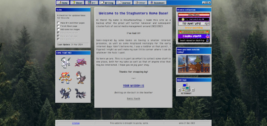
The home page!
I've changed the middle window so it fits in better with the rest. Not very visually exciting there in terms of color, but it is for now the best look imo. Text there is aligned justified, I've condensed it a bit more and added the randomized quote section underneath it instead of it being a seperate window on the side.
To do list needs an update but is still accurate. The team is still there, but on the other side, I have set the blinkies to be a bit larger. The music player has been removed because I couldn't find a way to add songs to it that weren't included on the source site. Snufkin is here now. The webrings will need some more. Retronaut is there, but not functioning as it should. it just forwards you to random sites in the ring instead of where it should be, but I can't find what exactly I'm doing wrong with the code.
Another thing that is not working on neocities itself is the "last updated" part. For some reason it doesn't display there what it does display on my local html. Maybe a bug at neo.
And icons at the top on the nav par! Adds some more flair to the place. The footer has also received a minor update: it now has a sitemap link instead of another back-to-home url.
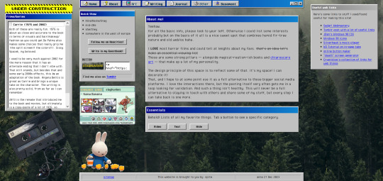
About!
I'm thinking of moving the small window with the short info to the right, but it is here for now. Links that are web-building related are on the right, also for my own referencing. The essentials lists on the left are hidden on load, but can be revealed by tapping the puttons. The lists are in tree-view and the window shouldn't expand over the cassette image once the construction sign is removed. Speaking of, the cassette has a lil playlist.
I might expand on the info a bit more, but that is for me to ponder. I liked including links to tumblr, the guestbook, and a button in case anyone wants to link my site on theirs.

Writing!
Hasn't really changed much. I've been looking at moving the sidebar info to be in the main section upon load, but idk if that would just make things more complicated. Right now it loads to an empty section there, stuff appears once you click a button. PDF support is only available once I'm a supporter of neocities, which i do wanna do but isn't a priority atm just for getting this part running. The links to ao3 will do just fine for now.
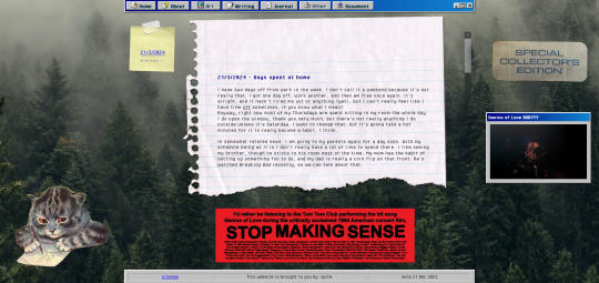
Journal!
The space for my rambling. It can be browsed by entry through the post-it, and all that seems to be functioning alright. Added a kitty and a sticker for decoration. The Stop Making Sense bumper sticker will now load a local video of the performance, but once again I won't be able to add this to the site until I get a supporter thing going. It plays/pauses on click, hehe.

Basement!
Decided to add a page for it. Basic info, schedule, link to the room, my letterboxd, and an overview of past movies. It's a nice spot on the site that is also the most cramped, but I like how it turned out.

BLUE SCREEN OF DEATH
In case any page/url error happens, you can send a movie recommendation to B (their askbox is linked when you open on desktop)


UNDER HEAVY CONSTRUCTION
The art and other pages are very much works in progress. Art can be up and running once I upload art to the site, but I'm not sure if I want to post full pieces here. Maybe I'll make it a space for sketch stuff that I'd otherwise discard.
As for the other page: I might be filing it under the writing page as a section, since the only thing here is WvW atm. It's cool that it has it's own thing, but I'm not sure if something that is basically a fanfic warrants such a space. That, or I keep it and drop all my other-media stuff in here so there's more to look at.
That's it for now! I got some ideas on how to continue, but they're not super-duper set in stone.
#stagcities#it's so much fun ough#takes time out of my other activities but certainly isn't a bore#neocities#web development
9 notes
·
View notes
Text
Page Optimization Best Practices: A Blueprint for Online Growth
Page optimization is an essential system in virtual advertising and net development that ensures websites are person-friendly, functional, and aligned with seek engine tips. It encompasses quite a few techniques and practices aimed at improving a website's performance, visibility, and general user revel in (UX). By optimizing a page, companies and content creators can achieve better search engine ratings, force organic visitors, and ultimately enhance conversion costs. This complete manual explores the facets of page optimization, from its technical factors to consumer-centered techniques.

On-Page Optimization
The Importance of Page Optimization
In the state-of-the-art competitive digital landscape, merely having an internet site is inadequate. Users anticipate rapid-loading, cellular-friendly, and easily navigable pages. Moreover, serps like Google prioritize web sites that supply value through optimized overall performance. Here’s why page optimization is essential:
Enhanced User Experience: Optimized pages load quickly, are visually appealing and provide intuitive navigation. This maintains users engaged and decreases bounce costs.
Higher Search Engine Rankings: Search engines reward optimized pages with better ratings, growing visibility, and natural reach.
Increased Conversions: A properly optimized web page encourages customers to take desired movements, including creating a purchase, signing up for a publication, or downloading content.
Better Accessibility: Optimization guarantees your content is on the market to all customers, such as people with disabilities, through features like alt textual content and proper structure.
Cost Efficiency: Pages optimized for speed and overall performance lessen server load and bandwidth utilization, reducing hosting expenses.
Key Elements of Page Optimization
Page optimization is multi-faceted, involving each technical and content-associated components. Below, we delve into its middle elements:
Page Speed Optimization
Page speed refers to how quickly a webpage masses its content. It's a crucial rating issue for search engines like Google and Yahoo and significantly affects consumer retention. A postponement of even a 2nd can bring about massive drops in personal engagement and conversions.
Minimize HTTP Requests: Reduce the number of factors like photographs, scripts, and CSS documents.
Compress Images: Use equipment like TinyPNG or ImageOptim to lessen image sizes without compromising quality.
Enable Browser Caching: Cache static files so returning site visitors don’t need to reload all factors.
Use a Content Delivery Network (CDN): Distribute content across more than one server to reduce latency.
Optimize Code: Minify CSS, JavaScript, and HTML to put off unnecessary characters.
Mobile-Friendliness
With over half of internet traffic coming from cellular gadgets, ensuring a web page is cell-pleasant is non-negotiable.
Responsive Design: Use CSS frameworks like Bootstrap to ensure the page adapts to specific screen sizes.
Viewport Settings: Define the viewport for your HTML to govern how your website is displayed on cell devices.
Clickable Elements: Ensure buttons and hyperlinks are properly sized and spaced for touchscreens.
Content Optimization
Content is at the heart of any website. Optimizing content for relevance, readability, and engagement is crucial.
Keyword Research: Identify and use goal key phrases naturally in your content.
Structured Data: Use schema markup to help serps recognize your content material.
Readability: Use brief paragraphs, subheadings, and bullet points to make content material scannable.
Engaging Visuals: Incorporate great images, movies, and infographics to complement textual content.
On-page search engine marketing
On-page search engine marketing entails optimizing character internet pages to rank better in seek engine results.
Title Tags: Create compelling and keyword-rich titles within 50-60 characters.
Meta Descriptions: Write concise descriptions that summarize the page content material and consist of target keywords.
Header Tags (H1, H2, and so forth.): Use headers to shape content material logically and improve readability.
Internal Linking: Link to different applicable pages in your website to enhance navigation and search engine optimization.
Technical Optimization
Technical optimization makes a specialty of backend upgrades to beautify overall performance and seek engine crawlability.
Robots.Txt File: Guide engines like Google on which pages to crawl or ignore.
Canonical Tags: Avoid duplicate content material problems by specifying the favored version of a website.
SSL Certificate: Secure your website online with HTTPS to reinforce consideration and ratings.
404 Error Pages: Create consumer-friendly error pages to guide users to lower back to practical parts of your website online.
Tools for Page Optimization
Several tools can simplify and streamline the optimization manner:
Google PageSpeed Insights: Analyzes web page speed and affords actionable guidelines.
GTmetrix: Offers insights into website performance and areas for development.
Ahrefs/Semrush: Helps with keyword studies, content optimization, and search engine marketing monitoring.
Hotjar: Tracks user behavior via heatmaps and session recordings.
Strategies for Effective Page Optimization
To reap meaningful effects, you want a well-rounded strategy. Here’s a step-by-step approach:
Conduct an Audit
Before enforcing modifications, conduct a comprehensive audit to identify existing troubles. Tools like Screaming Frog or Google Analytics can reveal overall performance bottlenecks, broken hyperlinks, and content gaps.
Prioritize User Intent
Understand your target market's wishes and design pages that cope with them. Whether users are seeking data, products, or services, make certain your content aligns with their intent.
Focus on Core Web Vitals
Google’s Core Web Vitals — Largest Contentful Paint (LCP), First Input Delay (FID), and Cumulative Layout Shift (CLS) — are crucial for web page optimization. Aim to meet their benchmarks for stepped forward user revel in and scores.
Test and Iterate
Optimization is an ongoing system. Use A/B checking out to experiment with web page layouts, calls-to-movement (CTAs), and different elements. Monitor overall performance and refine based on results.
Keep Up with Trends
The digital landscape evolves swiftly. Stay knowledgeable about updates to look engine algorithms, layout developments, and emerging technologies.
Common Challenges and Solutions
While web page optimization gives huge advantages, it also affords challenges:
Balancing Speed and Functionality: Advanced capabilities like animations can sluggish down your website online. Use light-weight libraries and green coding to strike stability.
Content Overload: Too a whole lot of content material can crush users. Focus on turning in concise, cost-driven information.
Managing Multiple Platforms: Ensuring steady overall performance across desktop, cell, and drugs requires thorough testing and responsive design.
The Future of Page Optimization
As technology advances, web page optimization will keep evolving. Emerging tendencies like voice seek, AI-pushed personalization, and augmented truth (AR) integration will redefine consumer expectations. Websites will want to leverage these improvements at the same time as adhering to foundational optimization ideas.
Additionally, the rise of privacy policies emphasizes the want for transparent facts practices. Optimized pages will not only perform nicely but additionally build acceptance as true through secure and ethical dealing with of personal records.
2 notes
·
View notes
Text
Play This: DOL-OS

Play This is a place for me to tell you about games or game demos that I love and want everyone to play! Right. Now.

Year 3XXX, you discover an old computer, an antique, in some ruins. Surprisingly, it still powers up when you press its buttons. Wonder what you found within its files?
Play the game for yourself!
Y'all, this is a special game. Originally published in French, DOL-OS won Best Game of Concours de Fiction Interactive Frachophone. Luckily for me, @manonamora-if recently released a remastered and translated version of her game in English.
The narrative and story of the game are excellent, but I've gotta talk first about the UI and the loading screen because....dang. Just, mind-bogglingly good. I'm not particularly knowledgable/experienced/good when it comes to the combo move of css, html and javascript that is Twine and clicking Run Game for the first time--you know in Fallout 3 when the vault door rolls away and you're like wooooooah? It was like that. It's so impressive and neat and I've reloaded the game many times now just to watch it start. This game belongs in an art gallery for IF.
Once I picked my jaw up off the floor and started playing, another delight was in store for me. The game sparked the same kind of excitement and interest as Her Story. You are presented with a computer desktop and free to do with it what you will. It invites the player to explore (to snoop! I love snooping) and once you find what's there you can make of it what you will. There's no explicit instruction or implication in what kinds of opinions or thoughts you should form. Explore and think freely. And wonder, are you the player part of this narrative?
And solve puzzles! I love puzzles. I got so excited about the first one that I think I missed a lot of other world-building. Oops!
The more you play the more you learn about the history of this computer, of the world it came from and the influence it's had. Complex moral questions are raised again with no clear directive from the game. You'll have to decide for yourself how you feel about this machine...and what you do about those feelings.
There are so many great moments in this game. [SLIGHT SPOILERS] Though my favorite: while playing the game I enjoyed the ever-present sound effect of the gentle whir of a cooling fan--a nostalgic noise from my youth. Well into the game, a principal character starts suffering deleterious effects from something he refers to as "the Humming Machine" and I'm like !!! Wait, is that a gentle fan blade sound or am I hearing the Humming Machine, too?! It was so creeeeeeepy! Loved it! [/SPOILERS]
Also, there are minigames. Come on, people! Minigames!
DOL-OS is a great game and I highly recommend playing it. I'm excited to play again and discover what I missed the first time through. Give yourself a Sunday treat and play the game!
15 notes
·
View notes
Text
Prezenta - The AI-Powered Presentation Architect HTML Landing Page Template
Prezenta, the AI-Powered HTML template, offers a modern design, responsive layout, and RTL support. It’s SEO-optimized with accessible and interactive features for a superior user experience.
Live Demo Buy Now
Overview:
Step into the future of presentations with Prezenta, the AI-Powered Presentation Architect HTML Landing Page Template. Designed to transform your ideas into visually stunning and interactive experiences, Prezenta is the epitome of innovation in web design. With its clean and modern design, this template offers a canvas that makes your content stand out in the most sophisticated way possible. It’s not just about looks; Prezenta is responsive across all devices, ensuring your audience enjoys a flawless experience whether on desktop, tablet, or mobile.
Prezenta understands the global market, offering RTL language support for scripts like Arabic and Hebrew, making it an inclusive solution for diverse audiences. The template’s adaptability extends to its light and dark themes, catering to user preferences and different lighting environments. Behind the scenes, Prezenta is fortified with W3C validated HTML and CSS, guaranteeing maximum compatibility and top-notch performance across all major web browsers. It’s built on the latest technologies and coding standards, promising regular updates and ongoing support to keep your presentations at the cutting edge.
Dive into a world of possibilities with comprehensive documentation that guides you through easy customization, allowing you to tailor your landing page to perfection. Prezenta’s accessible design ensures that it’s a landing page for everyone, including users with disabilities. It’s not just user-friendly; it’s also optimized for search engines, ensuring your content gets the visibility it deserves. With fast loading times, Prezenta respects your audience’s time, providing an efficient browsing experience.
Social media integration means your landing page can achieve increased fame with just a click. Customize to your heart’s content with SCSS files, and captivate your audience with interactive animations and effects. Prezenta doesn’t just present content; it enhances it with advanced features for an unparalleled user experience. Add visual flair with icon and badge libraries, and build trust with testimonial and review sections. Showcasing your content is a breeze with customizable sliders and carousels, and navigation is made effortless with a back-to-top button. Lastly, stay connected with your audience through a PHP contact form. Prezenta is more than a template; it’s a comprehensive landing page that empowers you to create, share, and succeed.
Live Demo Buy Now
2 notes
·
View notes
Text
Solutions for web designers out there
( All animations and movement on a page should be considered for photo-sensitivity including motion sickness and vertigo. )
For animated .GIF image files:
Create a .JPG or .PNG still image version of the animations from their most important or appealing frame. That should be loaded into the HTML first instead of the .GIF.
And before we go into the optimal JavaScript interaction, let’s stick with the HTML a little more...
If you have images that are not already hyperlinked, you can instead make them link to their animated GIF version to open in a new tab (target=“_blank”). Be sure to have appropriate warnings about those links leading to the animated version of that image, right before/above the image itself for those who may be going through the page in order with some accessibility devices. (Thus, they read the warning before they interact with the link.)
Then, from there, we do the script side for this. You can store the different image file paths into your JavaScript and use mouseover/mouseout events to change the file path inside your src=“” attribute. (Here’s how you can dynamically and efficiently do this for many images and give them their own Event Listener: My JSFiddle Example.)
EDIT: I've updated the example to have a 1-second delay for the images to change into animations in case someone accidentally has their mouse over the image after the page loads in. It'll be best to also make hover/active animations optional, which will tie into the JavaScript needed to achieve the hover/active functions to begin with.
Also added a few more in-code comments for extra instruction and clarity.

Another idea with JavaScript is to have a “toggle” sort of <button> on your page that someone can click/confirm whether or not everything on a page should animate/move or not. If you’re nicely familiar with JavaScript, you can make a more in-depth options menu for this sort of thing too!

This is also a great solution since there are web users who look at webpages either in a simplified view or blocking all scripts (like JavaScript) from your website. They could be viewing your website like this due to personal needs, or technological limitations. And so, having a still image in your HTML by default is MUCH preferred!
For CSS @ keyframe animations:
In the raw CSS file, the default value for the animation-play-state property should be paused. We have to keep simplified view users and script-blocking users in mind for moving objects and images on our webpages. So, whatever is loaded in by default must maintain this priority.
Thankfully, sticking with the CSS, we can just as easily changed the animation-play-state to running when the element is hovered (for mouse users) or active (for touch-screen users).
For sprite sheet animations:
If you’ve figured out how to make sprite animations on a web doc, then you’re already involved in the JavaScript for it and familiar with the code. Or, you're doing it the pure CSS way (see here). In which you can refer back to the @ keyframe section above.
So, here’s a general guideline that you can follow in JavaScript!
The sprite sheet element in your CSS should focus on your most important frame that you want to be seen by users on the default page appearance. Set its background-position to that frame inside the CSS.
For users who can load JavaScript on the page, set that element to toggle its animation by mouseover/mouseout or clicking.
For users who cannot load the JavaScript, the next best thing is to build the sprite animation from CSS keyframe steps().
And for most absolute safe case scenario in case of browser or device compatibility issues with any of these properties in the CSS, you could make an animated .GIF file of your sprite sheet. Make sure it's under 1Mb for users in this category who are also likely to be viewing your page from slow download speeds. With that, refer back to the section for handling image files without JavaScript.
Hopefully this is of great help, if not a starting point for accessibility ideas and considerations for your websites!
pleeeeeeeease indie web and scenecore and whatever other subcultures.... have fun and be cringe but PLEASE be careful with your blinkies. if your website has flashing lights that are on by default or that can't be turned off, then it is inaccessible to photosensitive people. if your post has flashing lights, it needs to be tagged. PLEASE. i love indie web stuff but the prevalence of unavoidable flashing lights makes me really anxious!! people have migraines and seizures! please use tags like "flashing lights" and "eye strain," NOT "epilepsy" or "epilepsy warning," and please consider making your site accessible by removing flashing lights or making them avoidable. PLEASE. make the web usable for photosensitive people.
#web design#web development#retro internet#old internet#neocities#accessibility#a11y#wk speaks#wk replies#reference#resources#guides#important#epilepsy support#disability awareness#internet safety#photosensitivity#old web#html#css#javascript
5K notes
·
View notes
Text
Common Web Development Mistakes and How to Avoid Them
Introduction
Launching a website is exciting—but in the back of the smooth user interface and flashy animations, there’s a complex web of code, content material, and strategy. And in case you're no longer careful, even the smallest internet improvement errors can hurt your web page’s overall performance, usability, and search scores.
Whether you are a business proprietor, startup founder, or aspiring developer, understanding what not to do is just as vital as understanding the satisfactory practices. In this guide, we'll spoil down the most not unusual internet development errors—and extra importantly, the way to keep away from them for a quicker, purifier, and more person-friendly website.

1. Ignoring mobile Responsiveness
The error:
��constructing a site that handiest seems right on computer and falls apart on mobile.
Why it matters:
With over 60% of internet traffic coming from cell devices, a non-responsive design ends in high leap fees, poor UX, and a dip in search engine optimization scores.
A way to keep away from it:
Use responsive frameworks like Bootstrap or Tailwind CSS.
Frequently check your website online on diverse screen sizes and gadgets.
Layout with cell-first concepts—optimize for small displays earlier than scaling up.
2. Sluggish Load times
The mistake:
Heavy photographs, bloated code, and too many scripts slow your website online to a crawl.
Why it subjects:
pace is an immediate ranking thing in Google and a first-rate person revel in difficulty—traffic will depart if a web page takes greater than 3 seconds to load.
A way to avoid it:
Compress pictures the use of tools like TinyPNG or WebP.
Minify CSS, JavaScript, and HTML.
Use lazy loading and caching.
Opt for a dependable, overall performance-centered internet host.
Three. Poor Navigation shape
The mistake:
customers can’t locate what they’re searching out because of a cluttered or confusing menu.
Why it topics:
horrific navigation frustrates users, increases bounce costs, and hurts seo crawlability.
How to keep away from it:
Keep navigation easy, smooth, and predictable.
Use breadcrumb trails, a properly-based sitemap, and clear category labels.
Restriction pinnacle-level menu items to five–7 to reduce decision fatigue.
Four. Loss of seo basics
The mistake:
Skipping primary seo like identify tags, meta descriptions, and header hierarchy.
Why it topics:
engines like google want dependent records to index and rank your content material nicely.
How to keep away from it:
Implement unique title tags and meta descriptions on every page.
Use proper heading tags (H1 for titles, H2/H3 for subsections).
Add alt text to all snap shots for accessibility and seo.
Submit your sitemap to Google seek Console.
5. No longer the use of Semantic HTML
The error:
the usage of <div> and <span> for the whole thing as opposed to suitable semantic tags.
Why it subjects:
Semantic HTML improves accessibility, search engine optimization, and code readability.
A way to keep away from it:
Use tags like <header>, <footer>, <article>, <section>, <nav>.
Make your code logical and descriptive to help screen readers and seek bots.
6. Broken hyperlinks and 404 errors
The mistake:
links that lead nowhere or to removed pages.
Why it subjects:
damaged links frustrate customers and signal terrible renovation to search engines.
How to keep away from it:
Run normal audits using tools like Screaming Frog or Ahrefs.
Set up 301 redirects for moved content.
Create a custom 404 web page that facilitates users navigate some other place.
7. Inconsistent design and Branding
The error:
blending fonts, colors, or button styles across pages with out a coherent gadget.
Why it topics:
A fragmented visual identity erodes believe and professionalism.
How to keep away from it:
Create and stick to a style guide.
Use steady coloration palettes, typography, and layout components.
Adopt design systems or UI kits for higher cohesion.
8. Not Optimizing for Accessibility
The mistake:
Ignoring customers with visible, auditory, or mobility impairments.
Why it matters:
Accessibility isn't always just ethical—it's regularly legally required and complements person reach.
A way to keep away from it:
Use sufficient color evaluation.
Make certain keyboard navigability.
Upload ARIA labels and proper semantic shape.
Test with equipment like WAVE or Lighthouse.
Nine. Forgetting go-Browser Compatibility
The error:
Your web site appears outstanding in Chrome, but breaks in Safari or Firefox.
Why it subjects:
not all customers browse the equal way—your web site have to paintings seamlessly everywhere.
The way to keep away from it:
Check throughout all main browsers regularly.
Keep away from browser-particular code.
Use standardized CSS and JavaScript practices.
10. No clean call-to-action (CTA)
The error:
users don’t know what to do subsequent—subscribe, contact, or purchase.
Why it topics:
A susceptible or missing CTA kills conversions and leads.
The way to avoid it:
Vicinity clear, visible CTAs on every page.
Use actionable language: “Get started out,” “down load Now,” “communicate to Us.”
A/B take a look at CTA styles, positions, and colours for maximum effectiveness.
End
Internet improvement isn’t pretty much making something that appears accurate—it’s about developing a site that works nicely, loads speedy, ranks high, and converts site visitors. Via averting these not unusual pitfalls and applying clever, strategic fixes, you’ll construct a virtual revel in that wins over both customers and engines like google.
Don’t simply build a internet site. Build a clever, user-pleasant, seo-optimized revel in.
FAQs
1. How regularly need to I audit my website for those issues?
As a minimum as soon as every three–6 months, or after predominant updates.
2. Can i fix those mistakes myself?
A few are clean (like compressing pictures), at the same time as others may need a developer’s help.
3. What gear can assist me pick out web improvement mistakes?
Use Google Lighthouse, GTmetrix, SEMrush, or Ahrefs for targeted diagnostics.
4. What’s the most damaging mistake from this listing?
Sluggish load instances and terrible cellular responsiveness are the various most critical.
5. How do I prioritize which problems to restore first?
Consciousness on anything that influences consumer enjoy or seo—like speed, broken hyperlinks, or cell problems.
0 notes
Text
Getting Creative With HTML Dialog
New Post has been published on https://thedigitalinsider.com/getting-creative-with-html-dialog/
Getting Creative With HTML Dialog
Like ’em or loath ’em, whether you’re showing an alert, a message, or a newsletter signup, dialogue boxes draw attention to a particular piece of content without sending someone to a different page. In the past, dialogues relied on a mix of divisions, ARIA, and JavaScript. But the HTML dialog element has made them more accessible and style-able in countless ways.
So, how can you take dialogue box design beyond the generic look of frameworks and templates? How can you style them to reflect a brand’s visual identity and help to tell its stories? Here’s how I do it in CSS using ::backdrop, backdrop-filter, and animations.
Design by Andy Clarke, Stuff & Nonsense. Mike Worth’s website will launch in June 2025, but you can see examples from this article on CodePen.
I mentioned before that Emmy-award-winning game composer Mike Worth hired me to create a highly graphical design. Mike loves ’90s animation, and he challenged me to find ways to incorporate its retro style without making a pastiche. However, I also needed to achieve that retro feel while maintaining accessibility, performance, responsiveness, and semantics.
A brief overview of dialog and ::backdrop
Let’s run through a quick refresher.
Note: While I mostly refer to “dialogue boxes” throughout, the HTML element is spelt dialog.
dialog is an HTML element designed for implementing modal and non-modal dialogue boxes in products and website interfaces. It comes with built-in functionality, including closing a box using the keyboard Esc key, focus trapping to keep it inside the box, show and hide methods, and a ::backdrop pseudo-element for styling a box’s overlay.
The HTML markup is just what you might expect:
<dialog> <h2>Keep me informed</h2> <!-- ... --> <button>Close</button> </dialog>
This type of dialogue box is hidden by default, but adding the open attribute makes it visible when the page loads:
<dialog open> <h2>Keep me informed</h2> <!-- ... --> <button>Close</button> </dialog>
I can’t imagine too many applications for non-modals which are open by default, so ordinarily I need a button which opens a dialogue box:
<dialog> <!-- ... --> </dialog> <button>Keep me informed</button>
Plus a little bit of JavaScript, which opens the modal:
const dialog = document.querySelector("dialog"); const showButton = document.querySelector("dialog + button"); showButton.addEventListener("click", () => dialog.showModal(); );
Closing a dialogue box also requires JavaScript:
const closeButton = document.querySelector("dialog button"); closeButton.addEventListener("click", () => dialog.close(); );
Unless the box contains a form using method="dialog", which allows it to close automatically on submit without JavaScript:
<dialog> <form method="dialog"> <button>Submit</button> </form> </dialog>
The dialog element was developed to be accessible out of the box. It traps focus, supports the Esc key, and behaves like a proper modal. But to help screen readers announce dialogue boxes properly, you’ll want to add an aria-labelledby attribute. This tells assistive technology where to find the dialogue box’s title so it can be read aloud when the modal opens.
<dialog aria-labelledby="dialog-title"> <h2 id="dialog-title">Keep me informed</h2> <!-- ... --> </dialog>
Most tutorials I’ve seen include very little styling for dialog and ::backdrop, which might explain why so many dialogue boxes have little more than border radii and a box-shadow applied.
Out-of-the-box dialogue designs
I believe that every element in a design — no matter how small or infrequently seen — is an opportunity to present a brand and tell a story about its products or services. I know there are moments during someone’s journey through a design where paying special attention to design can make their experience more memorable.
Dialogue boxes are just one of those moments, and Mike Worth’s design offers plenty of opportunities to reflect his brand or connect directly to someone’s place in Mike’s story. That might be by styling a newsletter sign-up dialogue to match the scrolls in his news section.
Mike Worth concept design, designed by Andy Clarke, Stuff & Nonsense.
Or making the form modal on his error pages look like a comic-book speech balloon.
Mike Worth concept design, designed by Andy Clarke, Stuff & Nonsense.
dialog in action
Mike’s drop-down navigation menu looks like an ancient stone tablet.
Mike Worth, designed by Andy Clarke, Stuff & Nonsense.
I wanted to extend this look to his dialogue boxes with a three-dimensional tablet and a jungle leaf-filled backdrop.
Mike Worth, designed by Andy Clarke, Stuff & Nonsense.
This dialog contains a newsletter sign-up form with an email input and a submit button:
<dialog> <h2>Keep me informed</h2> <form> <label for="email" data-visibility="hidden">Email address</label> <input type="email" id="email" required> <button>Submit</button> </form> <button>x</button> </dialog>
I started by applying dimensions to the dialog and adding the SVG stone tablet background image:
dialog width: 420px; height: 480px; background-color: transparent; background-image: url("dialog.svg"); background-repeat: no-repeat; background-size: contain;
Then, I added the leafy green background image to the dialogue box’s generated backdrop using the ::backdrop pseudo element selector:
dialog::backdrop background-image: url("backdrop.svg"); background-size: cover;
Mike Worth, designed by Andy Clarke, Stuff & Nonsense.
I needed to make it clear to anyone filling in Mike’s form that their email address is in a valid format. So I combined :has and :valid CSS pseudo-class selectors to change the color of the submit button from grey to green:
dialog:has(input:valid) button background-color: #7e8943; color: #fff;
I also wanted this interaction to reflect Mike’s fun personality. So, I also changed the dialog background image and applied a rubberband animation to the box when someone inputs a valid email address:
dialog:has(input:valid) background-image: url("dialog-valid.svg"); animation: rubberBand 0.82s cubic-bezier(0.36, 0.07, 0.19, 0.97) both; @keyframes rubberBand from transform: scale3d(1, 1, 1); 30% transform: scale3d(1.25, 0.75, 1); 40% transform: scale3d(0.75, 1.25, 1); 50% transform: scale3d(1.15, 0.85, 1); 65% transform: scale3d(0.95, 1.05, 1); 75% transform: scale3d(1.05, 0.95, 1); to transform: scale3d(1, 1, 1);
Tip: Daniel Eden’s Animate.css library is a fabulous source of “Just-add-water CSS animations” like the rubberband I used for this dialogue box.
Changing how an element looks when it contains a valid input is a fabulous way to add interactions that are, at the same time, fun and valuable for the user.
Mike Worth, designed by Andy Clarke, Stuff & Nonsense.
That combination of :has and :valid selectors can even be extended to the ::backdrop pseudo-class, to change the backdrop’s background image:
dialog:has(input:valid)::backdrop background-image: url("backdrop-valid.svg");
Try it for yourself:
Conclusion
We often think of dialogue boxes as functional elements, as necessary interruptions, but nothing more. But when you treat them as opportunities for expression, even the smallest parts of a design can help shape a product or website’s personality.
The HTML dialog element, with its built-in behaviours and styling potential, opens up opportunities for branding and creative storytelling. There’s no reason a dialogue box can’t be as distinctive as the rest of your design.
Andy Clarke
Often referred to as one of the pioneers of web design, Andy Clarke has been instrumental in pushing the boundaries of web design and is known for his creative and visually stunning designs. His work has inspired countless designers to explore the full potential of product and website design.
Andy’s written several industry-leading books, including ‘Transcending CSS,’ ‘Hardboiled Web Design,’ and ‘Art Direction for the Web.’ He’s also worked with businesses of all sizes and industries to achieve their goals through design.
Visit Andy’s studio, Stuff & Nonsense, and check out his Contract Killer, the popular web design contract template trusted by thousands of web designers and developers.
#:has#2025#Accessibility#ADD#amp#animation#animations#applications#aria#Art#Article#Articles#Assistive technology#attention#background#background-image#book#Books#border#box#box-shadow#Branding#change#Color#content#CSS#css animations#data#Design#designers
1 note
·
View note
Text
Seo Step by Step Guide for Beginners

Welcome to the world of SEO. What is SEO, you ask? SEO stands for Search Engine Optimization. It helps your website show up in search results. This guide will help you learn SEO step by step.
What is SEO?
SEO is like a map. It guides people to your website. It uses words and links to show search engines your site is good. With good SEO, your site appears at the top of search results.
Why is SEO Important?
SEO brings more people to your site. More visitors can mean more sales. It also helps people trust your site. When your site is at the top, people think it is reliable.
>>> Get started Free >>>
Step 1: Find the Right Keywords
Keywords are words people type in search engines. Choose words that match your site. Use tools like Google Keyword Planner. Look for words that many people search for. Choose words that are not too hard to rank.
Think about what your site is about.
Make a list of words people might use.
Use those words in your content.
Step 2: Create Good Content
Good content is key to SEO. Write clear and helpful information. Make sure it is easy to read. Use your keywords naturally. Do not stuff them in.
Write about what your audience needs.
Keep sentences short and simple.
Use bullet points and lists.
Step 3: Optimize Your Title and Description
Each page needs a good title. The title should have your main keyword. The description should tell what the page is about. Keep it short and clear.
Step 4: Use Headers Correctly
Headers help organize content. They make it easier to read. Use H1 for the main title. Use H2 and H3 for subheadings. This helps search engines understand your content better.
Step 5: Add Internal Links
Internal links connect pages on your site. They help people find more content. They also help search engines crawl your site. Use links that make sense with your content.
Link to related articles.
Use clear anchor text.
Do not overdo it.
Step 6: Optimize Images
Images make your site look nice. But they need to be optimized. Use small-sized images. Add alt text with keywords. This helps your site load faster.
Compress images before uploading.
Use descriptive file names.
Include alt text for each image.
Step 7: Make Your Site Mobile-Friendly
Many people use phones to browse. Your site must look good on phones. Use a responsive design. Check if buttons and text are easy to read on small screens.
Step 8: Improve Site Speed
Fast sites keep visitors happy. Use tools like Google PageSpeed Insights. Fix issues that slow down your site. This could be large files or too many plugins.
Minimize CSS and JavaScript.
Use browser caching.
Optimize server response time.
Step 9: Build Backlinks
Backlinks are links from other sites to yours. They show your site is trusted. Write guest posts for other sites. Share your content on social media.
Get links from reputable sites.
Use links that are relevant.
Do not buy links.
Step 10: Monitor Your SEO Progress
Check how your site is doing. Use tools like Google Analytics. See which pages get the most views. Find out which keywords bring visitors to your site.
Track your rankings.
Look at traffic patterns.
Adjust your strategy as needed.
>>> Get started Free >>>
Frequently Asked Questions
What Is Seo?
SEO stands for Search Engine Optimization. It helps websites rank higher on search engines like Google.
Why Is Seo Important?
SEO improves website visibility. Higher visibility means more traffic. More traffic can lead to more customers.
How Do Keywords Affect Seo?
Keywords help search engines understand your content. Right keywords improve your search ranking.
What Is On-page Seo?
On-page SEO involves optimizing website elements like content and HTML. It improves site visibility.
Conclusion
SEO takes time and practice. Follow these steps to start. Keep learning and improving. Your site will start to see results.
Remember, patience is key. Good luck on your SEO journey!
#seo#seotips#beginnerseo#digitalmarketing#searchengineoptimization#onpageseo#offpageseo#seo2025#contentmarketing#bloggingtips#googletraffic#rankongoogle#websiteoptimization#marketingguide#stepbystepseo#seoforbeginners#growyourblog#technicalseo#keywordresearch#learnseo
1 note
·
View note
Text
Best Practices for Reducing JavaScript and CSS Bloat
When a website takes too long to load, visitors don’t stick around. In most cases, the reason behind this slow experience is something hidden under the hood—too much JavaScript and CSS code. If your site feels sluggish, it’s time to take a closer look at the code that's running in the background.
Let’s talk about what JavaScript and CSS bloat is, and more importantly, what you can do to fix it without getting lost in technical stuff.
What Is Code Bloat and Why Should You Care?
JavaScript and CSS are essential parts of any modern website. They handle everything from styling the layout to making buttons clickable and menus slide open. But when these files get too big or too messy, they slow down your site. That means longer load times, higher bounce rates, and lower rankings on search engines.
And it’s not just about speed. A slow site makes users frustrated. And frustrated users don’t become customers.
If you're running a business website or an online store, this could be the difference between gaining and losing customers. Even the best digital marketing company in Bhubaneswar would agree: speed matters.
Clean Up Unused Code
One of the easiest ways to cut down on bloat is to remove unused code. Websites often include large libraries or frameworks but only use a small part of them. For example, you might load the entire Bootstrap or jQuery library but only use a couple of features.
Use tools like Chrome DevTools, PurifyCSS, or UnCSS to scan your pages and remove the code that's not being used. This step alone can shave off a lot of unnecessary weight from your site.
Combine and Minify Files
Each time a visitor lands on your website, their browser sends requests for different files—CSS, JavaScript, images, fonts, and so on. The more requests, the longer it takes to load everything. A smart move is to combine multiple JavaScript or CSS files into one and then compress (or minify) them.
Minification removes spaces, comments, and unnecessary characters, making your files smaller and faster to load. Tools like UglifyJS for JavaScript or CSSNano for CSS are popular and easy to use.
Load Only What’s Needed
Why load everything on every page if it’s not needed? For example, a slideshow script is not needed on your blog page if the slideshow only appears on the homepage. You can use conditional loading or lazy loading to bring in files only when they’re required.
This reduces the initial load time and keeps your site snappy.
Use Asynchronous and Deferred Loading
JavaScript can block your page from loading if it’s not handled right. By using the "async" or "defer" attributes when linking JavaScript files, you tell the browser not to pause everything just to load a script.
Async loads scripts while the page continues to load. Defer waits until the rest of the page has loaded before running the script. Both can make a huge difference in how fast your page feels.
Avoid Inline Styles and Scripts
Adding CSS and JavaScript directly inside your HTML may seem easy, but it can get messy quickly. It also makes your files larger and harder to manage. Keeping your CSS and JS in separate files makes them easier to update and cache.
Plus, browsers store these external files so they don’t need to be downloaded again the next time someone visits your site.
Keep Your Code Organized
Even if you’re not a developer, it helps to keep your team—or your web agency—in the loop about best practices. Clean code isn’t just for show. It’s easier to maintain, faster to debug, and less likely to cause problems.
The best digital marketing company in Bhubaneswar will always make this part of their process when building or upgrading a website.
Final Thoughts
A fast, smooth website doesn’t just happen on its own. Reducing JavaScript and CSS bloat takes a little planning, a few smart tools, and regular cleanups. But the payoff is big: better user experience, faster load times, and improved search rankings.
You don’t need to be a tech expert to get started. Begin with the basics—remove what you don’t need, compress what you do, and load things wisely. Your visitors (and your bottom line) will thank you.
#online reputation management agencies#website development companies in bhubaneswar#ecommerce website development companies in bhubaneswar#shopify website development agency#best digital marketing company in bhubaneswar#digital marketing company near me
0 notes
Text
How to Optimize Your Website for Mobile SEO?
With mobile devices accounting for more than half of all web traffic globally, optimizing your website for mobile is no longer optional — it's essential. Google uses mobile-first indexing, meaning it primarily uses the mobile version of your site for ranking and indexing. If your website doesn’t perform well on smartphones and tablets, you're likely losing visibility, traffic, and conversions. This is where mobile SEO services become critical.
Optimizing your website for mobile SEO involves far more than just having a responsive layout. It's about delivering a seamless, fast, and user-friendly experience that meets both user expectations and search engine standards. In this guide, we’ll explore the key strategies for improving mobile SEO performance across your website.
Understand Mobile-First Indexing
Before diving into tactics, it’s important to understand how mobile-first indexing affects your site. Google now prioritizes the mobile version of your website when determining rankings. That means if your mobile site is poorly optimized, even your desktop rankings can suffer.
To align with mobile-first indexing:
Ensure all essential content on the desktop site also appears on the mobile version.
Avoid hiding important text or links behind click-to-expand buttons unless it’s a UX improvement.
Make sure your mobile site includes structured data, meta tags, and internal links.
Consistency across devices helps Google understand your site’s structure and content, boosting your chances of ranking well.
Use a Responsive Design
A responsive design ensures that your website layout adapts to different screen sizes and orientations. It eliminates the need for a separate mobile site and provides a consistent user experience across devices.
Benefits of responsive design include:
Better crawlability for search engines.
Improved load times on mobile devices.
Simplified maintenance compared to managing two separate sites.
Test your website on various screen sizes to ensure everything looks right, especially navigation menus, forms, and call-to-action buttons.
Improve Page Load Speed
Mobile users are often on slower networks and expect pages to load quickly. According to Google, 53% of users will abandon a page if it takes more than 3 seconds to load. Page speed is also a known ranking factor.
To speed up your mobile site:
Compress images without losing quality.
Minimize CSS, JavaScript, and HTML.
Leverage browser caching.
Use a content delivery network (CDN).
Tools like Google PageSpeed Insights or GTmetrix can help diagnose performance issues and provide actionable suggestions.
Optimize Mobile UX and Navigation
A mobile-friendly site isn’t just about design—it’s about how easily users can navigate and interact with your content. Mobile users rely on intuitive layouts, tap-friendly elements, and clear pathways.
Mobile UX tips:
Use large, easy-to-tap buttons.
Ensure navigation menus are simple and accessible.
Avoid pop-ups or interstitials that disrupt the user experience.
Keep forms short and optimized for mobile input.
Clear, simple navigation keeps users engaged and reduces bounce rates, signaling to Google that your site is valuable.
Focus on Mobile-Friendly Content
Content plays a major role in SEO, and on mobile, it should be optimized for readability and engagement. Mobile users often skim content, so structure is key.
Best practices for mobile content:
Use short paragraphs and plenty of white space.
Break content into sections with headings.
Use bullet points for easy scanning.
Place key information at the top of the page.
Also, ensure font sizes are legible on smaller screens. Avoid cluttering the page with too many elements that compete for attention.
Implement Local SEO (If Relevant)
If your business serves a local audience, optimizing for mobile SEO also means focusing on local visibility. Mobile users frequently search for nearby businesses while on the go.
Here’s how to improve local mobile SEO:
Claim and optimize your Google Business Profile.
Use consistent Name, Address, and Phone (NAP) information.
Add local keywords and location-based landing pages.
Encourage customer reviews on platforms like Google and Yelp.
By integrating local SEO into your mobile strategy, you improve your chances of appearing in local search packs and maps.
Test with Mobile-Friendly Tools
After implementing changes, it’s essential to test how your site performs on mobile. Google’s Mobile-Friendly Test is a great place to start.
This tool analyzes your website and provides:
A visual preview of your site on mobile.
Errors related to mobile usability.
Suggestions for improving performance.
Regular testing ensures that new updates or design tweaks don’t accidentally harm your mobile SEO efforts.
Collaborate with Mobile SEO Experts
While many of these strategies can be implemented in-house, working with professionals can fast-track results and avoid costly mistakes. Reputable mobile SEO services offer in-depth audits, competitor analysis, and a tailored action plan to maximize your mobile visibility.
An expert team can help with:
Technical SEO adjustments.
Content optimization.
Schema implementation.
Performance monitoring and analytics.
For enterprises or growing businesses, partnering with SEO specialists is a smart investment for long-term growth.
Conclusion
Optimizing your website for mobile SEO is no longer a niche strategy—it’s essential for success in today’s search landscape. From responsive design and fast load times to mobile-friendly content and user experience, each element contributes to better rankings and user satisfaction.
By leveraging best practices and, if necessary, expert mobile SEO services, you can create a site that’s not just mobile-compatible but truly mobile-optimized. The result? Higher visibility, lower bounce rates, and more conversions from mobile traffic.
Make mobile SEO a priority, and your users—and your rankings—will thank you.
0 notes
Text
Improving User Experiences: The Power of Modern Front-End Web Development
In the digital age, a website or web application’s front-end is often the first impression users have of a business. As the portion of a site that users directly interact with, front-end development plays a crucial role in shaping how people perceive a brand’s credibility, professionalism, and user-friendliness. This article explores the essential components of modern front-end development, highlights emerging trends, and discusses the impact of local opportunities for businesses seeking frontend web development in Ottawa and beyond.
1. Why Front-End Matters
When a user lands on a webpage or opens a web app, the design, layout, and interaction elements collectively influence their decision to stay or leave. If the site loads slowly, lacks intuitive navigation, or appears cluttered, the likelihood of user drop-off escalates quickly. Conversely, a clean and responsive interface fosters trust, encourages engagement, and even drives conversions.
An effective front-end ensures not only aesthetic appeal but also smooth functionality. Buttons must behave as expected, pages should load promptly, and design elements have to adapt seamlessly to different screens or devices. By focusing on front-end best practices, companies can significantly boost user satisfaction and maintain an edge in highly competitive digital markets.
2. Core Elements of Modern Front-End Development
Front-end development is more than simply coding what the user sees. It involves a careful blend of design principles and technical expertise. Here are some vital components:
HTML and CSS: These backbone languages structure and style the page. Semantic HTML improves search engine visibility, while optimized CSS ensures quick load times and consistent design.
JavaScript: This scripting language adds dynamism and interactivity. Through event handling, animations, and real-time updates, JavaScript ensures users remain engaged.
Responsive Design: Given the variety of devices in circulation, creating layouts that adapt to different screen sizes is non-negotiable. Responsive design practices accommodate everything from smartphones to large desktop monitors.
Performance Optimization: Techniques like code minification, image compression, and lazy loading not only speed up sites but also enhance the overall user experience.
3. Essential Tools and Frameworks
Modern front-end developers often rely on a robust ecosystem of tools and frameworks to streamline workflows:
React: Backed by Facebook, React is a component-based library that excels at handling dynamic data and complex user interfaces. It encourages code reusability and is known for its virtual DOM feature.
Angular: Developed by Google, Angular offers a more opinionated structure, making it ideal for larger projects requiring a standardized approach. It leverages TypeScript, adding static typing and advanced tooling to the development process.
Vue.js: Striking a balance between React’s flexibility and Angular’s out-of-the-box features, Vue is celebrated for its gentle learning curve and scalable architecture.
Bundlers and Build Tools: Webpack, Parcel, and other bundlers compile and optimize code, while task runners like Gulp or Grunt automate tasks such as file compression and testing.
4. The Intersection of Performance and SEO
Beyond aesthetics, front-end performance significantly impacts how a site ranks on search engines like Google. Page speed is a direct ranking factor, and a slow-loading site can hamper visibility. Modern SEO strategies also consider mobile responsiveness and user engagement metrics. When bounce rates rise due to slow pages, search engines interpret this as a negative signal, potentially pushing the site lower in search results.
To combat this, developers employ tactics like code splitting, asynchronous loading, and caching. When executed effectively, these strategies ensure that essential components load quickly while secondary features follow in the background.
5. The Accessibility Imperative
Inclusive design goes hand-in-hand with a superior user experience. Accessibility ensures people with disabilities or varying technical constraints can comfortably navigate a site. Developers achieve this by:
Incorporating alt tags on images for screen readers
Maintaining adequate color contrast
Structuring headings for logical screen-reader flow
Providing keyboard navigation options
Such considerations not only demonstrate social responsibility but also widen a website’s reach. Many regions have legal guidelines prompting businesses to adhere to specific accessibility standards, adding another layer of importance to this aspect of front-end work.
6. Responsive, Mobile-First Approaches
With mobile web traffic outpacing desktop usage in many sectors, adopting a mobile-first design strategy is key. Rather than retrofitting a desktop site to smaller screens, developers start with the mobile layout, then scale up. This approach ensures the essential content and features take precedence on limited screen real estate, promoting an uncluttered, user-centric interface.
Effective use of CSS media queries, fluid layouts, and flexible images result in pages that adjust smoothly to every screen size. This not only meets modern user expectations but also boosts site performance.
7. Local Opportunities in Ottawa and Ontario
As front-end technologies evolve, businesses seek specialized talent to keep their websites and apps on par with user expectations. Those looking to level up their digital presence through frontend web app development in Ontario will find a growing community of skilled professionals offering innovative solutions.
Ottawa, in particular, has seen a surge in tech-focused firms and startups. Companies seeking local expertise for frontend web development in Ottawa can benefit from face-to-face communication, region-specific insights, and ongoing support. By partnering with seasoned developers, businesses gain access to custom interfaces optimized for both user satisfaction and operational efficiency.
8. Collaboration with Back-End Teams
Although front-end and back-end tasks are often distinct, they intersect frequently. Effective coordination ensures data is fetched, displayed, and manipulated seamlessly. APIs (Application Programming Interfaces) serve as the bridge, enabling front-end clients to retrieve data from servers without overburdening the user’s browser.
Maintaining open communication between front-end and back-end developers prevents compatibility issues and accelerates troubleshooting. It also fosters a cohesive user experience — from the initial page load to every subsequent interaction. This synergy is especially crucial for complex applications involving frequent data updates or integrations with third-party services.
9. The Future of Front-End Development
Technologies like WebAssembly, progressive web apps (PWAs), and server-side rendering (SSR) are pushing the boundaries of what’s possible in a browser. Moreover, design trends continue to evolve, with minimalism, dark modes, and micro-animations shaping user expectations.
Meanwhile, front-end developers increasingly adopt headless architectures, decoupling the front-end from specific back-end systems. This approach fosters flexibility, enabling teams to swap or upgrade their tech stacks without complete overhauls. The overarching goal remains constant: deliver user experiences that are seamless, visually engaging, and fast.
Thus, front-end development is the digital gateway between users and the wealth of information or services a brand offers. By balancing responsive design, performance optimization, and best-in-class frameworks, businesses can stand out in today’s crowded online environment. Whether you’re a startup aiming to impress prospective clients or an established enterprise looking to modernize, investing in front-end excellence can pay significant dividends.
0 notes
Text
Custom Website Design That Works: Build a Site That Reflects Your Brand
Custom Website Design: What It Really Means for Your Business
If your website doesn’t align with your brand, it’s holding you back. Off-the-shelf templates won’t cut it anymore. What you need is custom website design that fits your business, your audience, and your goals.
At Webster America, we build sites from the ground up. Whether you’re launching a new business or upgrading a site that no longer works, our job is to create a design that not only looks clean—but works hard.
Why Go Custom?
A custom website gives you control. You decide how it looks, how it works, and how people use it.
Benefits of Custom Web Design:
Fully branded look and feel
Fast load times with optimized code
Clean structure for SEO
Better user experience across devices
Scalable features for future growth
We don’t use pre-built themes or bloated builders. Everything is built with your business in mind.
Our Web Design Process
We use a simple, transparent process so you know what’s happening at every stage.
Step-by-Step:
Discovery – We talk goals, audience, features, and pain points.
Wireframing – We map out page structure and layout.
Design – We create a clean, brand-aligned UI.
Development – Code is written for speed, SEO, and usability.
Testing – We run checks across devices and browsers.
Launch – We go live and monitor performance.
You get real progress updates—no jargon, no surprises.
e-Commerce Website Design
Selling online? Your storefront needs to do more than just show products. We build e-commerce website design that helps convert traffic into sales.
What We Include:
Clean product pages
Easy cart and checkout flows
Mobile-optimized shopping
Secure payment gateways
Inventory and order tracking
We work with platforms like Shopify, WooCommerce, and custom-coded solutions.
Affordable Website Design, Built for ROI
You don’t need a massive budget to get results. Our affordable website design services are built around value, not fluff.
Pricing Depends On:
Page count
Features (blog, e-commerce, contact forms, booking tools)
Custom development needs
CMS selection (WordPress, Webflow, custom build)
We offer honest pricing. No upselling. No locked-in contracts.
Website Redesign Services That Fix What’s Broken
Already have a site but it’s not working? We offer website redesign services to upgrade speed, design, and structure without starting over.
We Focus On:
Faster loading speeds
Better mobile responsiveness
Modern visual updates
Improved page structure and flow
Updated content and visuals
We keep what’s working and fix what’s not.
Professional Web Development
Design is only part of the equation. Behind every site is code that makes it run. We handle professional web development so your site functions smoothly.
We Build:
Responsive layouts for all screen sizes
SEO-ready HTML and schema markup
Backend logic and database connections
Secure contact forms and integrations
We build for the long run—not just to launch.
Who We Work With
We’ve helped:
Local businesses build their first web presence
Online shops launch clean, functional stores
Service providers connect better with local clients
Nonprofits grow visibility with tight budgets
We work with small teams and growing brands who want websites that support growth.
CMS Platforms We Work With
We design and build on the platforms that best fit your needs:
WordPress – Good for blogs, service sites, small stores
Webflow – For clean front-end designs with CMS
Shopify – For e-commerce brands
Custom HTML/CSS/JS – When speed and full control matter
We’ll help you pick the right tool.
Mobile-Responsive Design
Your users are mobile. Over half of traffic comes from phones. We build sites that load fast and look good on every screen.
Mobile-First Features:
Thumb-friendly navigation
Compressed, responsive images
Clear CTAs for mobile users
Touch-friendly buttons and forms
Every site we launch is fully responsive and tested across major devices.
SEO Built into Every Site
If search engines can’t crawl and understand your content, you won’t get traffic. We optimize every page with clean code and best practices.
SEO We Handle:
Meta titles and descriptions
Header tag structure (H1, H2, H3)
Image optimization and alt text
Clean URLs
Fast-loading, mobile-ready code
We give you a structure Google loves.
Add-On Features We Can Build
Looking for more functionality? We can integrate tools that improve user experience or automate your workflows.
Popular Add-Ons:
Booking systems
CRM integration
Newsletter signup forms
Blog and article templates
Live chat tools
Just tell us what you need—we’ll make it work.
Post-Launch Support
A website isn’t a one-time thing. We offer optional support plans for updates, backups, performance monitoring, and content changes.
Monthly check-ins
CMS training and video walkthroughs
Uptime and speed tracking
Bug fixes and security patches
You stay supported even after we launch.
Why Choose Webster America?
We’re not a big agency with layers of red tape. We’re a focused team that builds smart, fast websites for real businesses.
Transparent pricing
No BS communication
Fast timelines
Real experience with design and development
We work like your in-house web team—without the overhead.
Ready for a Custom Website That Delivers?
Whether you need a brand-new build, an e-commerce storefront, or a site redesign that finally works, we’re here to help.
Webster America builds custom sites with clean code, SEO optimization, and scalable design. From affordable website design to professional web development, we’ve got you covered.
#e-commerce website design#Website redesign services#affordable website design#professional web development#web development
0 notes
Text
How to Make Your ASP NET Website Work Smoothly on Mobile Devices
Turning your ASP NET website into a mobile-friendly platform starts with designing a layout that can flex and adapt to different screen sizes. One of the smartest moves is to use a responsive front-end framework like Bootstrap, Tailwind CSS, or Foundation. These tools come with built-in grids and mobile-first design features that help your website look great and function well across desktops, tablets, and smartphones.
Don’t forget the small but essential stuff—like adding a viewport meta tag in your HTML <head>. This tag helps the browser adjust the page’s width and scale according to the device, so users don’t need to zoom or scroll sideways. Without it, even a responsive layout might display incorrectly on smaller screens.
When designing for mobile, keeping things simple is key. Make sure buttons are big enough to tap comfortably, skip hover-based features that won’t work on touchscreens, and use a clean menu style—like a hamburger menu—for easier navigation on compact screens.
To fine-tune how your site looks on different devices, CSS media queries come in handy. They let you tweak your styles depending on the screen’s size, ensuring your content stays readable and well-organized whether it's viewed on a phone or a laptop.
Testing your site across a variety of screen sizes is just as important as building it. Use browser dev tools to preview how things appear on mobile, or go further with device-testing services like BrowserStack to spot issues on real phones and tablets.
If you’re still using an older version of ASP NET, it might be time to upgrade to ASP NET Core. It runs faster, works across platforms, and plays nicely with modern front-end tools—making it a great match for mobile web development.
Speed matters a lot on mobile. To keep your site fast, minimize the size of your CSS and JavaScript files, compress images, use caching wisely, and load static files from CDNs. This not only shortens load times but also improves the overall experience, especially for users on slower mobile networks.
Think beyond design and performance—add touch-friendly features too. Tools like Hammer.js can bring in swipe gestures, and FastClick.js helps reduce touch input delays on older devices. These small upgrades make your site feel more polished and responsive to real users.
Making your ASP NET site mobile-compatible doesn’t have to be complicated. Focus on clean design, smart navigation, fast loading, and thorough testing. Whether you’re starting fresh or updating an existing site, these steps can help you create a better experience for every visitor—no matter what screen they’re using.
1 note
·
View note