#background-image
Explore tagged Tumblr posts
Visit Tumblr Blog
Explore Tumblr blogs with no restrictions, modern design and the best experience.
Last Seen Tumblr Blogs


Fun Fact
Mobile US users spent an average of 115.8 minutes on Tumblr app monthly.
Text
The Lost CSS Tricks of Cohost.org
New Post has been published on https://thedigitalinsider.com/the-lost-css-tricks-of-cohost-org/
The Lost CSS Tricks of Cohost.org
You would be forgiven if you’ve never heard of Cohost.org. The bespoke, Tumblr-like social media website came and went in a flash. Going public in June 2022 with invite-only registrations, Cohost’s peach and maroon landing page promised that it would be “posting, but better.” Just over two years later, in September 2024, the site announced its shutdown, its creators citing burnout and funding problems. Today, its servers are gone for good. Any link to cohost.org redirects to the Wayback Machine’s slow but comprehensive archive.
The landing page for Cohost.org, featuring our beloved eggbug.
Despite its short lifetime, I am confident in saying that Cohost delivered on its promise. This is in no small part due to its user base, consisting mostly of niche internet creatives and their friends — many of whom already considered “posting” to be an art form. These users were attracted to Cohost’s opinionated, anti-capitalist design that set it apart from the mainstream alternatives. The site was free of advertisements and follower counts, all feeds were purely chronological, and the posting interface even supported a subset of HTML.
It was this latter feature that conjured a community of its own. For security reasons, any post using HTML was passed through a sanitizer to remove any malicious or malformed elements. But unlike most websites, Cohost’s sanitizer was remarkably permissive. The vast majority of tags and attributes were allowed — most notably inline CSS styles on arbitrary elements.
Users didn’t take long to grasp the creative opportunities lurking within Cohost’s unassuming “new post” modal. Within 48 hours of going public, the fledgling community had figured out how to post poetry using the <details> tag, port the Apple homepage from 1999, and reimplement a quick-time WarioWare game. We called posts like these “CSS Crimes,” and the people who made them “CSS Criminals.” Without even intending to, the developers of Cohost had created an environment for a CSS community to thrive.
In this post, I’ll show you a few of the hacks we found while trying to push the limits of Cohost’s HTML support. Use these if you dare, lest you too get labelled a CSS criminal.
Width-hacking
Many of the CSS crimes of Cohost were powered by a technique that user @corncycle dubbed “width-hacking.” Using a combination of the <details> element and the CSS calc() function, we can get some pretty wild functionality: combination locks, tile matching games, Zelda-style top-down movement, the list goes on.
If you’ve been around the CSS world for a while, there’s a good chance you’ve been exposed to the old checkbox hack. By combining a checkbox, a label, and creative use of CSS selectors, you can use the toggle functionality of the checkbox to implement all sorts of things. Tabbed areas, push toggles, dropdown menus, etc.
However, because this hack requires CSS selectors, that meant we couldn’t use it on Cohost — remember, we only had inline styles. Instead, we used the relatively new elements <details> and <summary>. These elements provide the same visibility-toggling logic, but now directly in HTML. No weird CSS needed.
These elements work like so: All children of the <details> element are hidden by default, except for the <summary> element. When the summary is clicked, it “opens” the parent details element, causing its children to become visible.
We can add all sorts of styles to these elements to make this example more interesting. Below, I have styled the constituent elements to create the effect of a button that lights up when you click on it.
This is achieved by giving the <summary> element a fixed position and size, a grey background color, and an outset border to make it look like a button. When it’s clicked, a sibling <div> is revealed that covers the <summary> with its own red background and border. Normally, this <div> would block further click events, but I’ve given it the declaration pointer-events: none. Now all clicks pass right on through to the <summary> element underneath, allowing you to turn the button back off.
This is all pretty nifty, but it’s ultimately the same logic as before: something is toggled either on or off. These are only two states. If we want to make games and other gizmos, we might want to represent hundreds to thousands of states.
Width-hacking gives us exactly that. Consider the following example:
In this example, three <details> elements live together in an inline-flex container. Because all the <summary> elements are absolutely-positioned, the width of their respective <details> elements are all zero when they’re closed.
Now, each of these three <details> has a small <div> inside. The first has a child with a width of 1px, the second a child with a width of 2px, and the third a width of 4px. When a <details> element is opened, it reveals its hidden <div>, causing its own width to increase. This increases the width of the inline-flex container. Because the width of the container is the sum of its children, this means its width directly corresponds to the specific <details> elements that are open.
For example, if just the first and third <details> are open, the inline-flex container will have the width 1px + 4px = 5px. Conversely, if the inline-flex container is 2px wide, we can infer that the only open <details> element is the second one. With this trick, we’ve managed to encode all eight states of the three <details> into the width of the container element.
This is pretty cool. Maybe we could use this as an element of some kind of puzzle game? We could show a secret message if the right combination of buttons is checked. But how do we do that? How do we only show the secret message for a specific width of that container div?
In the preceding CodePen, I’ve added a secret message as two nested divs. Currently, this message is always visible — complete with a TODO reminding us to implement the logic to hide it unless the correct combination is set.
You may wonder why we’re using two nested divs for such a simple message. This is because we’ll be hiding the message using a peculiar method: We will make the width of the parent div.secret be zero. Because the overflow: hidden property is used, the child div.message will be clipped, and thus invisible.
Now we’re ready to implement our secret message logic. Thanks to the fact that percentage sizes are relative to the parent, we can use 100% as a stand-in for the parent’s width. We can then construct a complicated CSS calc() formula that is 350px if the container div is our target size, and 0px otherwise. With that, our secret message will be visible only when the center button is active and the others are inactive. Give it a try!
This complicated calc() function that’s controlling the secret div’s width has the following graph:
You can see that it’s a piecewise linear curve, constructed from multiple pieces using min/max. These pieces are placed in just the right spots so that the function maxes out when the container div is 2px— which we’ve established is precisely when only the second button is active.
A surprising variety of games can be implemented using variations on this technique. Here is a tower of Hanoi game I had made that uses both width and height to track the game’s state.
SVG animation
So far, we’ve seen some basic functionality for implementing a game. But what if we want our games to look good? What if we want to add ✨animations?✨ Believe it or not, this is actually possible entirely within inline CSS using the power of SVG.
SVG (Scalable Vector Graphics) is an XML-based image format for storing vector images. It enjoys broad support on the web — you can use it in <img> elements or as the URL of a background-image property, among other things.
Like HTML, an SVG file is a collection of elements. For SVG, these elements are things like <rect>, <circle>, and <text>, to name a few. These elements can have all sorts of properties defined, such as fill color, stroke width, and font family.
A lesser-known feature of SVG is that it can contain <style> blocks for configuring the properties of these elements. In the example below, an SVG is used as the background for a div. Inside that SVG is a <style> block that sets the fillcolor of its <circle> to red.
An even lesser-known feature of SVG is that its styles can use media queries. The size used by those queries is the size of the div it is a background of.
In the following example, we have a resizable <div> with an SVG background. Inside this SVG is a media query which will change the fill color of its <circle> to blue when the width exceeds 100px. Grab the resize handle in its bottom right corner and drag until the circle turns blue.
Because resize handles don’t quite work on mobile, unfortunately, this and the next couple of CodePens are best experienced on desktop.
This is an extremely powerful technique. By mixing it with width-hacking, we could encode the state of a game or gizmo in the width of an SVG background image. This SVG can then show or hide specific elements depending on the corresponding game state via media queries.
But I promised you animations. So, how is that done? Turns out you can use CSS animations within SVGs. By using the CSS transition property, we can make the color of our circle smoothly transition from red to blue.
Amazing! But before you try this yourself, be sure to look at the source code carefully. You’ll notice that I’ve had to add a 1×1px, off-screen element with the ID #hack. This element has a very simple (and nearly unnoticeable) continuous animation applied. A “dummy animation” like this is necessary to get around some web browsers’ buggy detection of SVG animation. Without that hack, our transition property wouldn’t work consistently.
For the fun of it, let’s combine this tech with our previous secret message example. Instead of toggling the secret message’s width between the values of 0px and 350px, I’ve adjusted the calc formula so that the secret message div is normally 350px, and becomes 351px if the right combination is set.
Instead of HTML/CSS, the secret message is now just an SVG background with a <text> element that says “secret message.” Using media queries, we change the transform scale of this <text> to be zero unless the div is 351px. With the transition property applied, we get a smooth transition between these two states.
Click the center button to activate the secret message:
The first cohost user to discover the use of media queries within SVG backgrounds was @ticky for this post. I don’t recall who figured out they could animate, but I used the tech quite extensively for this quiz that tells you what kind of soil you’d like if you were a worm.
Wrapping up
And that’s will be all for now. There are a number of techniques I haven’t touched on — namely the fun antics one can get up to with the resize property. If you’d like to explore the world of CSS crimes further, I’d recommend this great linkdump by YellowAfterlife, or this video retrospective by rebane2001.
It will always hurt to describe Cohost in the past tense. It truly was a magical place, and I don’t think I’ll be able to properly convey what it was like to be there at its peak. The best I can do is share the hacks we came up with: the lost CSS tricks we invented while “posting, but better.”
#2022#2024#ADD#advertisements#amazing#animation#animations#apple#Art#Articles#attributes#background#background-image#Blue#border#burnout#buttons#change#checkbox hack#Children#code#Color#Community#comprehensive#container#continuous#creators#CSS#css animations#css-tricks
0 notes
Text
Código HTML encabezado con 3 imágenes de fondo, junto con un menú de navegación simple. He utilizado CSS para dar estilo al diseño y posicionar los elementos:
HTML <!DOCTYPE html> <html> <head> <title>Encabezado con Imagen de Fondo</title> <style> header { height: 300px; background-image: url('tu-imagen.jpg'); /* Reemplaza 'tu-imagen.jpg' con la ruta a tu imagen */ background-size: cover; background-position: center; position: relative; } header h1 { position: absolute; top: 50%; left: 50%; transform: translate(-50%, -50%); color: white; text-align:…
#accesibilidad#background-image#código#CSS#desarrollo web#Diseño web#ejemplo#elementos HTML#encabezado#enlaces#estilos#estilos CSS#header#HTML#imagen de fondo#lista no ordenada#menú de navegación#nav#personalización#personalizar#posicionamiento#position#responsive design#transform#tutorial
0 notes
Text

"The Big Dipper as it is today (left) and as it will look in 50,000 years." Dream of stars. 1940.
Internet Archive
#big dipper#future#diagram#contellation#astonomy#black background#processed image#stars#nemfrog#1940#1940s#50k
121K notes
·
View notes
Text

how many hoodies can i give this kid
#my art#jujutsu kaisen#jjk#jjk fanart#itadori yuuji#yuji itadori#yuji mood continues with no signs of stopping ig#i love drawing folds on big ol hoodie sleeves gotta b one of my favourite items of clothing 2 draw#lmao idk if any1 remembers th band au that i was turning over in my head a year ago but ths where i got th hoodie logo idea#imaginary band merch. easter egg fr me and the 2 other people who were paying attention while i hyperfixated on tht au for a week#anyway i am wearing this yuuji i love him so much#this always happens sdhsdfj i draw myself a Dedicated Icon but then end up ditching it for some other random piece i finish the next week#2025 year of the yuuji ig#unless i fall in love w th next megu i draw and decide to go back 2 my roots which is always a possibility#u know ive been megumi on a dark red background for so long tht when i swapped i ws like. who is this who am i#i feel like im breaking dress code. betraying my brand image#its chill tho ill get used 2 it#helps tht it still more or less goes with my header and preferred colour palette#also lil pockey yuuji 2 match th gojo i did i LOVE this chibi style i want 2 put them in jars#maybe ill draw more and compile them all sitting in a line
3K notes
·
View notes
Text
This is the actual plot of Hannibal
#it’s been so long since I did perspective backgrounds#hannibal#nbc hannibal#hannibal nbc#hannibal 2013#hannibal fanart#will graham#hannibal lecter#hannigram#hannigram fanart#art i made#image description in alt
6K notes
·
View notes
Text


More DP panoramas
#danny phantom#environments#backgrounds#panorama#screenshots#art reference#<- this is the tag for all these BGs i'm putting together#also a link is on my pinned#episode: shades of gray#episode: d-stabilized#episode: urban jungle#episode: double cross my heart#episode: infinite realms#next two images are both#episode: kindred spirits#episode: torrent of terror
1K notes
·
View notes
Text

January: Snowy Shenanigans 🩵
#linked universe#linkeduniverse#myart#digital art#i am so sorry i haven't posted any art in a while!!#but here is my first LU/JoJo inspired monthly art piece!!#i hope you all like it!!#tried a more painterly style for the background and limited myself to less layers and it was a fun challenge!!#i am working on requests so thank you all for your patience!!#college has been super busy#and very very cold lol#click the image for better quality!#kinda have to zoom in to find all the details but that makes it fun ;)
1K notes
·
View notes
Text

happy feast of the winter star from 1 willow lane ♡
#stardew valley#stardew valley fanart#sdv sam#sdv vincent#sdv jodi#sdv kent#feast of the winter star#stardew valley 1.6 spoilers#1.6 spoilers#my art#nonzero chance this is my last drawing of the year#black background on the first image because of transparency issues with the upload :(#consider this a canon image in the jojamart mockumentary universe#but not where the timeline currently is#i don’t want it to be winter yet#not for a while
3K notes
·
View notes
Text
Us when the Lotus Casino episode drops
#IF I DONT SEE A THOUSAND GRAINY ZOOMED IN IMAGES IN THE TAG AFTER THAT EPISODE DROPS IM GONNA BE VERY DISAPPOINTED#I’m straight up gonna watch that one and then watch it again for the sole purpose of searching for Nico in the background#percy jackson#nico di angelo#heroes of olympus#hoo#mine#pjato#pjo#rick riordan#rrverse#percy jackson and the olympians#1k#5k
10K notes
·
View notes
Text

For the art prompt "if i was a fish..."
#fish#acrylic#fortis arbor's art#traditional#original#painting#fortis arbor's oc#moonbeast (oc)#image described#made with acrylic paint markerrrrrs and white gel pen. and regular acrylics for the background.
953 notes
·
View notes
Text

That one google street view meme
#doodles#my art#natsume yuujinchou#natsume takashi#nishimura satoru#kitamoto atsushi#I had to blur the background bc I obliterated that poor image when I resized it LMAO#nyanko sensei#natsume's book of friends#nbof#natsuyuu
2K notes
·
View notes
Text
Revisiting CSS border-image
New Post has been published on https://thedigitalinsider.com/revisiting-css-border-image/
Revisiting CSS border-image
In my last article on “Revisiting CSS Multi-Column Layout”, I mentioned that almost twenty years have flown by since I wrote my first book, Transcending CSS. In it, I explained how and why to use what were, at the time, an emerging CSS property.
Ten years later, I wrote the Hardboiled Web Design Fifth Anniversary Edition, covering similar ground and introducing the new CSS border-image property.
Hint: I published an updated version, Transcending CSS Revisited which is free to read online. Hardboiled Web Design is available from my bookshop.
I was very excited about the possibilities this new property would offer. After all, we could now add images to the borders of any element, even table cells and rows (unless their borders had been set to collapse).
Since then, I’ve used border-image regularly. Yet, it remains one of the most underused CSS tools, and I can’t, for the life of me, figure out why. Is it possible that people steer clear of border-image because its syntax is awkward and unintuitive? Perhaps it’s because most explanations don’t solve the type of creative implementation problems that most people need to solve. Most likely, it’s both.
I’ve recently been working on a new website for Emmy-award-winning game composer Mike Worth. He hired me to create a highly graphical design that showcases his work, and I used border-image throughout.
Design by Andy Clarke, Stuff & Nonsense. Mike Worth’s website will launch in April 2025, but you can see examples from this article on CodePen.
A brief overview of properties and values
First, here’s a short refresher. Most border-image explanations begin with this highly illuminating code snippet:
border-image: [source] [slice]/[width]/[outset] [repeat]
This is shorthand for a set of border-image properties, but it’s best to deal with properties individually to grasp the concept more easily.
A border-image’s source
I’ll start with the source of the bitmap or vector format image or CSS gradient to be inserted into the border space:
border-image-source: url('/img/scroll.png');
When I insert SVG images into a border, I have several choices as to how. I could use an external SVG file:
border-image-source: url('/img/scroll.svg');
Or I might convert my SVG to data URI using a tool like Base64.Guru although, as both SVG and HTML are XML-based, this isn’t recommended:
border-image-source: url('data:image/svg+xml;base64,…');
Instead, I can add the SVG code directly into the source URL value and save one unnecessary HTTP request:
border-image-source: url('data:image/svg+xml;utf8,…');
Finally, I could insert an entirely CSS-generated conical, linear, or radial gradient into my border:
border-image-source: conical-gradient(…);
Tip: It’s useful to remember that a browser renders a border-image above an element’s background and box-shadow but below its content. More on that a little later.
Slicing up a border-image
Now that I’ve specified the source of a border image, I can apply it to a border by slicing it up and using the parts in different positions around an element. This can be the most baffling aspect for people new to border-image.
Most border-image explanations show an example where the pieces will simply be equally-sized, like this:
However, a border-image can be developed from any shape, no matter how complex or irregular.
Instead of simply inserting an image into a border and watching it repeat around an element, invisible cut-lines slice up a border-image into nine parts. These lines are similar to the slice guides found in graphics applications. The pieces are, in turn, inserted into the nine regions of an element’s border.
The border-image-slice property defines the size of each slice by specifying the distance from each edge of the image. I could use the same distance from every edge:
border-image-slice: 65
I can combine top/bottom and left/right values:
border-image-slice: 115 65;
Or, I can specify distance values for all four cut-lines, running clockwise: top, right, bottom, left:
border-image-slice: 65 65 115 125;
The top-left of an image will be used on the top-left corner of an element’s border. The bottom-right will be used on the bottom-right, and so on.
I don’t need to add units to border-image-slice values when using a bitmap image as the browser correctly assumes bitmaps use pixels. The SVG viewBox makes using them a little different, so I also prefer to specify their height and width:
<svg height="600px" width="600px">…</svg>
Don’t forget to set the widths of these borders, as without them, there will be nowhere for a border’s image to display:
border-image-width: 65px 65px 115px 125px;
Filling in the center
So far, I’ve used all four corners and sides of my image, but what about the center? By default, the browser will ignore the center of an image after it’s been sliced. But I can put it to use by adding the fill keyword to my border-image-slice value:
border-image-slice: 65px 65px 115px 125px fill;
Setting up repeats
With the corners of my border images in place, I can turn my attention to the edges between them. As you might imagine, the slice at the top of an image will be placed on the top edge. The same is true of the right, bottom, and left edges. In a flexible design, we never know how wide or tall these edges will be, so I can fine-tune how images will repeat or stretch when they fill an edge.
Stretch: When a sliced image is flat or smooth, it can stretch to fill any height or width. Even a tiny 65px slice can stretch to hundreds or thousands of pixels without degrading.
border-image-repeat: stretch;
Repeat: If an image has texture, stretching it isn’t an option, so it can repeat to fill any height or width.
border-image-repeat: repeat;
Round: If an image has a pattern or shape that can’t be stretched and I need to match the edges of the repeat, I can specify that the repeat be round. A browser will resize the image so that only whole pieces display inside an edge.
border-image-repeat: round;
Space: Similar to round, when using the space property, only whole pieces will display inside an edge. But instead of resizing the image, a browser will add spaces into the repeat.
border-image-repeat: space;
When I need to specify a separate stretch, repeat, round, or space value for each edge, I can use multiple keywords:
border-image-repeat: stretch round;
Outsetting a border-image
There can be times when I need an image to extend beyond an element’s border-box. Using the border-image-outset property, I can do just that. The simplest syntax extends the border image evenly on all sides by 10px:
border-image-outset: 10px;
Of course, there being four borders on every element, I could also specify each outset individually:
border-image-outset: 20px 10px; /* or */ border-image-outset: 20px 10px 0;
border-image in action
Mike Worth is a video game composer who’s won an Emmy for his work. He loves ’90s animation — especially Disney’s Duck Tales — and he asked me to create custom artwork and develop a bold, retro-style design.
My challenge when developing for Mike was implementing my highly graphical design without compromising performance, especially on mobile devices. While it’s normal in CSS to accomplish the same goal in several ways, here, border-image often proved to be the most efficient.
Decorative buttons
The easiest and most obvious place to start was creating buttons reminiscent of stone tablets with chipped and uneven edges.
I created an SVG of the tablet shape and added it to my buttons using border-image:
button border-image-repeat: stretch; border-image-slice: 10 10 10 10 fill; border-image-source: url('data:image/svg+xml;utf8,…'); border-image-width: 20px;
I set the border-image-repeat on all edges to stretch and the center slice to fill so these stone tablet-style buttons expand along with their content to any height or width.
Article scroll
I want every aspect of Mike’s website design to express his brand. That means continuing the ’90s cartoon theme in his long-form content by turning it into a paper scroll.
The markup is straightforward with just a single article element:
<article> <!-- ... --> </article>
But, I struggled to decide how to implement the paper effect. My first thought was to divide my scroll into three separate SVG files (top, middle, and bottom) and use pseudo-elements to add the rolled up top and bottom parts of the scroll. I started by applying a vertically repeating graphic to the middle of my article:
article padding: 10rem 8rem; box-sizing: border-box; /* Scroll middle */ background-image: url('data:image/svg+xml;utf8,…'); background-position: center; background-repeat: repeat-y; background-size: contain;
Then, I added two pseudo-elements, each containing its own SVG content:
article:before display: block; position: relative; top: -30px; /* Scroll top */ content: url('data:image/svg+xml;utf8,…'); article:after display: block; position: relative; top: 50px; /* Scroll bottom */ content: url('data:image/svg+xml;utf8,…');
While this implementation worked as expected, using two pseudo-elements and three separate SVG files felt clumsy. However, using border-image, one SVG, and no pseudo-elements feels more elegant and significantly reduces the amount of code needed to implement the effect.
I started by creating an SVG of the complete tablet shape:
And I worked out the position of the four cut-lines:
Then, I inserted this single SVG into my article’s border by first selecting the source, slicing the image, and setting the top and bottom edges to stretch and the left and right edges to round:
article border-image-slice: 150 95 150 95 fill; border-image-width: 150px 95px 150px 95px; border-image-repeat: stretch round; border-image-source: url('data:image/svg+xml;utf8,…');
The result is a flexible paper scroll effect which adapts to both the viewport width and any amount or type of content.
Home page overlay
My final challenge was implementing the action-packed graphic I’d designed for Mike Worth’s home page. This contains a foreground SVG featuring Mike’s orangutan mascot and a zooming background graphic:
<section> <!-- content --> <div>...</div> <!-- ape --> <div> <svg>…</svg> </div> </section>
I defined the section as a positioning context for its children:
section position: relative;
Then, I absolutely positioned a pseudo-element and added the zooming graphic to its background:
section:before content: ""; position: absolute; z-index: -1; background-image: url('data:image/svg+xml;utf8,…'); background-position: center center; background-repeat: no-repeat; background-size: 100%;
I wanted this graphic to spin and add subtle movement to the panel, so I applied a simple CSS animation to the pseudo-element:
@keyframes spin-bg from transform: rotate(0deg); to transform: rotate(360deg); section:before animation: spin-bg 240s linear infinite;
Next, I added a CSS mask to fade the edges of the zooming graphic into the background. The CSS mask-image property specifies a mask layer image, which can be a PNG image, an SVG image or mask, or a CSS gradient:
section:before mask-image: radial-gradient(circle, rgb(0 0 0) 0%, rgb(0 0 0 / 0) 60%); mask-repeat: no-repeat;
At this point, you might wonder where a border image could be used in this design. To add more interactivity to the graphic, I wanted to reduce its opacity and change its color — by adding a colored gradient overlay — when someone interacts with it. One of the simplest, but rarely-used, methods for applying an overlay to an element is using border-image. First, I added a default opacity and added a brief transition:
section:before opacity: 1; transition: opacity .25s ease-in-out;
Then, on hover, I reduced the opacity to .5 and added a border-image:
section:hover::before opacity: .5; border-image: fill 0 linear-gradient(rgba(0,0,255,.25),rgba(255,0,0,1));
You may ponder why I’ve not used the other border-image values I explained earlier, so I’ll dissect that declaration. First is the border-image-slice value, where zero pixels ensures that the eight corners and edges stay empty. The fill keyword ensures the middle section is filled with the linear gradient. Second, the border-image-source is a CSS linear gradient that blends blue into red. A browser renders this border-image above the background but behind the content.
Conclusion: You should take a fresh look at border-image
The border-image property is a powerful, yet often overlooked, CSS tool that offers incredible flexibility. By slicing, repeating, and outsetting images, you can create intricate borders, decorative elements, and even dynamic overlays with minimal code.
In my work for Mike Worth’s website, border-image proved invaluable, improving performance while maintaining a highly graphical aesthetic. Whether used for buttons, interactive overlays, or larger graphic elements, border-image can create visually striking designs without relying on extra markup or multiple assets.
If you’ve yet to experiment with border-image, now’s the time to revisit its potential and add it to your design toolkit.
Hint: Mike Worth’s website will launch in April 2025, but you can see examples from this article on CodePen.
About Andy Clarke
Often referred to as one of the pioneers of web design, Andy Clarke has been instrumental in pushing the boundaries of web design and is known for his creative and visually stunning designs. His work has inspired countless designers to explore the full potential of product and website design.
Andy’s written several industry-leading books, including Transcending CSS, Hardboiled Web Design, and Art Direction for the Web. He’s also worked with businesses of all sizes and industries to achieve their goals through design.
Visit Andy’s studio, Stuff & Nonsense, and check out his Contract Killer, the popular web design contract template trusted by thousands of web designers and developers.
#2025#ADD#amp#animation#anniversary#ape#applications#Art#Article#Articles#assets#attention#background#background-image#background-position#Blue#book#Books#border#borders#box#box-shadow#browser#buttons#Cells#challenge#change#Children#clockwise#code
1 note
·
View note
Text
Código html con encabezado cuyo fondo sea una imagen
código HTML que crea un encabezado con una imagen de fondo, junto con un menú de navegación simple. He utilizado CSS para dar estilo al diseño y posicionar los elementos: HTML <!DOCTYPE html> <html> <head> <title>Encabezado con Imagen de Fondo</title> <style> header { height: 300px; background-image: url('imagen1.jpg'); background-size: cover; background-position: center; position:…
#accesibilidad#background-image#código#CSS#desarrollo web#Diseño web#ejemplo#elementos HTML#encabezado#enlaces#estilos#estilos CSS#header#HTML#imagen de fondo#lista no ordenada#menú de navegación#nav#personalización#personalizar#posicionamiento#position#responsive design#transform#tutorial
0 notes
Text
Oh goodness this request was so far back but I do plan on doing all requests. Background and no background versions below cut.
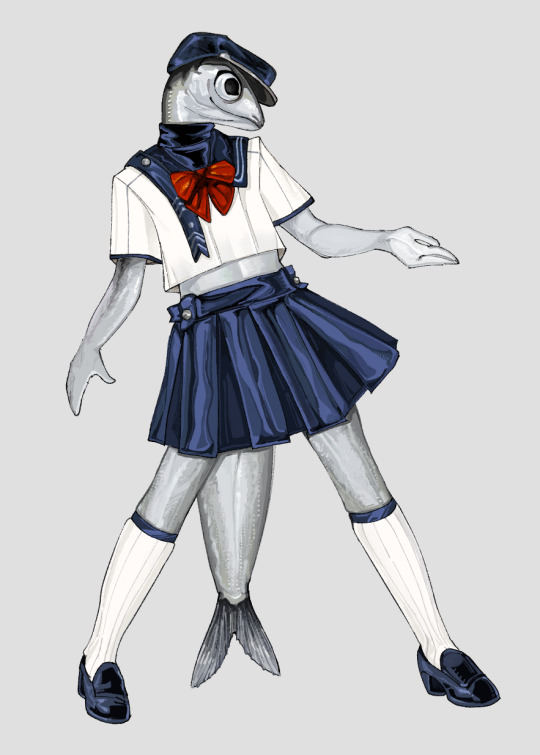
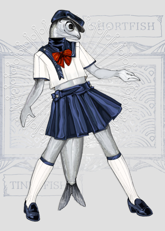
#i try not to complain abt my art in public 2 much but man im never satisfied with my backgrounds and i have uni stuff so like...whatever go#go my unsatisfying art#im gonna be semi offline because of uni so ill be queuing other doodles#art#digital art#artists on tumblr#image described#furry#rendered art#fish#anchovy
460 notes
·
View notes
Text


two blonde divas
#love that all we get is blurry background images of samuel#like he's a cryptid or something#interview with the vampire#ben daniels#sam reid
575 notes
·
View notes
Text


"smaller mass" you say
#she was punted first. the implications of nori still being in the pit when uzi comes down later#long post#i think. does it count if theres a lot of images and they are long#too lazy to draw 4 more lazy backgrounds so just pretend they're falling#or a second cyn. im losing my touch#struggled so hard to draw her.stupid people proportions kinda#go read ad astra per aspera its so good im munching#no like genuinely i love it so much its what got me thinking about this post#not dead just too busy reading ao3 twenty four seven to actually draw anything#art#murder drones#murder drones nori#murder drones cori#i think cori is a really funny name#murder drones cyn#murder drones flesha#cw blood and gore#thanks tumblr user digitalcatastrophes#if only i knew how to animate. not trying my old method again
2K notes
·
View notes