#looking at gouache and watercolor sets as if i can even draw anything in my sketchbook that takes longer than 4 minutes if at all
Text
i need someone to keep me from making more purchases on traditional mediums. I will not use them. Do not buy any more paints or tools or clay or pencils or markers. Cut that shit out.
#looking at gouache and watercolor sets as if i can even draw anything in my sketchbook that takes longer than 4 minutes if at all#talkys#u know how your body craves foods that are rich in things you are deficient in sometimes#i think this is whats happening her#*here#i want to buy All the Trad Mediums#but i know i wont use them. i find it rly hard to draw traditionally#in the way of content not mechanical skill#i mean just look at all my doodle pages its all lines of figures just standing or sitting there#very boring to do that on a traditional sketchbook and take much longer to do it#i dont even color half the things i draw#im just achey for art i cant make for no reason#i wanna buy paints i wanna buy markers and clay and lino blocks#but i have nothing to paint nothing to color nothing to sculpt and nothing to carve....
31 notes
·
View notes
Note
ur colors r so good and so vivid and beautiful all your art really stands out to me, it’s so bright and vibrant and brimming with character. howd u get so good w color?
thank you! and hm good question. I think like anything its ultimately just practice but thinking on it there's a few things that helped 4 me that I don't see mentioned a lot:
the single most important thing that made my art improve almost immediately once I realized it is that you can legitimately do fucking whatever. I think a lot of younger artists that look at like social media art tutorials a lot get it in their heads that there's a single perfect "system" that art functions in, like using a particular brush for lineart, a particular color and overlay filter to shade and highlight, a particular way to draw noses or hair or hands and while I think this certainly works for some people and even kinda happens automatically as you get better at art bc you create shortcuts for yourself you shouldn't really try to force it! I think the mark of a good artist is being able to vary these things, sometimes even within the same piece, and this goes doubly for color bc when you know how to use it well it can shift the mood of a painting a lot! Unless you're going for realism you can always say fuck it; red skin, purple shadows, green highlights. Whatever gets across the feeling you're going for y'know!
learning some basic color theory is obviously super important. I'm not gonna break it down here bc there's like hundreds of youtube videos on it but smth I recommend looking into is the distinction between local and non-local color! It'll help you start looking at art with more of an analytical eye so you can figure out what exactly artists you like are doing so you can try to imitate it in your own work. I personally learned a lot of what I know abt color from post-impressionist painters like Les Nabis, Toulouse-Lautrec, etc but you could just as well look at more contemporary art or even other people on social media
smth that helped me a lot is learning how to mix my own paint! I really think you only really need a handful of base colors (red, blue, yellow, green, pink, sienna, black and white) and should mix everything else from there. Those huge gouache or watercolor paint sets look very pretty but ultimately are mostly just a lot more expensive than they need to be, and mixing the paint yourself helps you figure out a lot about what base colors actually make up a certain hue. This knowledge even carries over into digital art bc the color wheel you have in most art programs is based off of traditional paint mixing so by familiarizing yourself with that you're simultaneously getting better at colorpicking! I used to be a digital-only artist and I saw a huge improvement in my digital art once I started working traditionally
I hope these helped somewhat! I should reiterate I'm not really classically trained in art at all and these are just what helped me figure stuff out! I've found a lot of it is just trying at it until you find something that works for you but maybe this'll speed it along :]
29 notes
·
View notes
Note
4, 5, 9, 24, 25, 30 :D
from The Year Wrapped: Artist's Edition ask game
4. How many different styles/medium (e.g., digital art, traditional art, comics, sculpture, paper craft, etc.) did you try this year?
I don’t have a consistent signature style so each piece even in the same medium was unique lol. but in terms of medium, I used graphite pencil, colored pencil, watercolor, gouache, oil pastel, marker, crayon, pixel art, digital drawing, & digital painting. I guess that’s 10?? did I do anything else this year that I’m forgetting???
5. What work are you most proud of (regardless of likes/reblogs)?
jock strap obi-wan lol. i know it’s still a WIP but i’m so proud of how far my anatomy/shape and light/shadow/color skills have come in the past year. and i mean come on. look at him
9. What's your favorite set of tags/comments you received this year?


these tags on my padawan anakin piece are so similar I just had to include them both 😌
24. What did you listen to while creating this year?
according to spotify I listened to a lot of mitski, and the kids, cocteau twins, the mountain goats, and hop along. i also have a LOT of moody obikin playlists i’ve made over the past few years that i cycle through depending on the vibe
25. What is your favorite work that you created this year?
obi-wan and anakin’s lightsabers :) they just make me so happy when i look at them
30. Share a fun quick little sketch because why not!

ahsoka!!! is she sad or tired or just thinking about how she left her lunch at home in the freezer. who can say
3 notes
·
View notes
Note
I related so much to what the previous person wrote
“I plan obsessively, then either fail to meet the high standards I've set for myself or procrastinate too much since I've got overwhelmed by the sheer size of the task... it's like an active procrastination, where I'll do anything but the task I've got to do or over-sleep or over-eat, while continuously worrying and berating myself in my head... I tend to push people away when I'm stressed, or get snappy with them. I find I get hypercritical of others and myself when I'm stressed. “
That’s exactly what I do.
I always thought I was a tripe withdrawn type 954
And yet I relate a lot to what the other person wrote.
I do this thing where I plan for something (usually a personal project) and I collect as much resources as I can so I’ll be able to do it.
I’m somewhat of a perfectionist and I want the things that I personally care about to come out as good as possible, but there’s also this underlying fear in that, what I’m doing will not be good enough.
And I get so stressed by this way of thinking that I end up postponing it or procrastinating on it.
This sometimes happens in my personal live as well and is sort of a recurring problems
For example I’ve been meaning to draw a small comic, I’ve made research and I’ve seen and saved tutorials for watercolor, inking, gold leafing, Gouache and much more.
I’ve collected a lot of references. I’ve planned the layout. I even got the tools.
I pretty much have everything that I need right?
And when I start drawing it, it just doesn’t feel enough. There’s a particular page I’ve drawn over and over and I’m just not completely happy with how it’s turning out.
This was a problem I had when I first started making oil paintings. Even my professor noted that it shouldn’t be perfect. I wasn’t a printer. But sometimes I couldn’t help it.
And all of this feel so overwhelming and difficult specially because of the high standard I set to myself. That what ends up happening is that I stop working on the project and distract myself with more comfortable, low-effort activities.
And then at the end of the day. I’m like:
Wait, why didn’t I finished this project? I should have had already, is it too late to start again? and I stress over that too and it adds to the overall problem.
Could that be a 9-5 or 9-6 in my tritype?
Is used to thing I had a 4 fix (frustration type), but I usually don’t put effort or thought on how I present myself to other people
I also tend to go with that the other people want and what ends up happening is that when I get indolent or stubborn about it.
And then I end up wondering why I accepted something I didn’t wanted to do in the first place.
(For example I ended up studying medicines for a year and agreed to prepare myself and even passed the entrance exam even though that’s just something if didn’t wanted to do, but I did it anyway because I knew it would make one of my parents happy)
Because I’m such a withdrawn person (I withdraw when I’m stressed and generally have a calm/low energy) that I always thought I was triple withdrawn.
But now I’m not too sure and I just related a lot to the previous ask said .
I’m almost sure I’m a 9, but what do you think are my other fixes?
What you describe seems very, very 9-5 -- being super desirous of competency in what you want to do (gathering so much information and being prepared / really thinking about it), but then getting a little anxious and maybe feeling like you could learn a bit more, and stalling out. 9 and 5 together are super withdrawn / private, so you don't need a 4 fix for that; I would look into the idea of 953/952 as well. The 953 is more concerned with adapting to others' needs and wants in matters where they don't really care either way (maybe you?) and wants to be doubly-competent, so both 5 and 3 are demanding that you be prepared, prove you can do it, and get it RIGHT. The 592 seems softer, more approachable, and more amenable, wheres the 954 is pretty unapproachable and distant in comparison to the 2 fix.
15 notes
·
View notes
Note
Always wondered how Katakuri would react to a painter S / O ? The strange way they look at life from an artistic view , Since it probably wouldn't be practical for a pirate to be an artist : ( Like them randomly stopping to admire a flower and talking about how the color makes them feel only to hear someone like Luffy say " it's just a flower , what's the big deal ? " ) You can make is angst if you want , but can it please have a happy ending ? ( I don't wanna cry!😫)
P.s. My angst idea is the Katakuri's S / O has some ability to do with water and her belief is that is the only reason Katakuri and the Charlotte fam like her (she might be right about some of them🤔) after all I imagine they would think being a painter is stupid . You don't have to do this it's just my idea . 🌸Please and thank you💖
A/N: Thank you for requesting! So I changed a few things up but I hope you liked it!

Through the eyes of an Artist
Finding a secluded area away from everyone else you pulled out your sketch book and charcoals, your most cherished possessions. Glancing up to the spring that was surrounded by beautiful flowers of all colors you grinned a little and started drawing away, drifting away into your own mind. Times like these were your favorite, times when you could be yourself and not the woman you had been forced to play the part of.
Your mother and father owned a large sugar cane plantation and had made many business investments over the years by marrying off your brothers and sister. now however it was your turn, your parents chosen suitor had been none other than a man from the Charlotte family, one of the notorious Big Mom's sons. For weeks now you parents had been doubling down on your 'princess' training along with your lessons on how to make be a proper wife. You hadn't known to just two days ago when your ship had arrived at Toto Land Island that your betrothed just happened to be the most feared of them all, Katakuri. Having only been in his presence once, he had said nothing to you, only looked down at you with a cold stare that told you everything you needed to know. He didn't want you. Your parents and brothers had seen it as well apparently and the moment all of you had been shown to your temporary rooms they had all started jumping you.
"You couldn't smile a little?"
"Why did you not curtsy like we talked about?"
"Couldn't you have made yourself even the slightest bit attractive tonight?"
"You are such a disappointment..."
"Why oh why did we have to be cursed with such a worthless daughter!"
"The only thing good she has going for her is her devil fruit powers..."
On and on they went, your eyes focused on the floor as tears brimmed and threatened to spill down your cheeks. That night when you had laid in bed all you could think about was how not even your husband would care about you. You were doomed to be forever unloved. What sucked even more was that you were being ripped away from the only friend that you had ever had, the only person that didn't see you as a failure and waste of space. Tika had been the only person to seem to like you for you not just because of your water manipulation devil fruit powers.
Before you knew it splotches were messing up your art piece and you sniffled as you reached up to wipe away the tears falling from your eyes. Closing your eyes you took a deep breath and sighed. Opening your eyes a bit you looked towards the blueish purple hyacinth and blinked slowly, turning the page to capture that single flower, the one that represented how you felt. Adding in different shades and blending them together with your fingertip you tilted your head to the side in concentration, not even hearing the person walk up behind you.
"You shouldn't be out here." a deep voice spoke.
Completely caught off guard by the sudden voice you threw your sketch book and charcoal out of your hands and let out a little yelp. Snapping your eyes up you saw the two crimson eyes looking at you with the same coldness and disdain as they had two days ago. Opening and closing your mouth you quickly bowed your head. "I'm sorry. I... I didn't know it was off limits o..or anything I just... well I..." Stupid you had done it again, you had messed up again. Just like you always did. "I'm sorry." you said in a whisper.
He just stood there watching as the woman, his bride to be stumbled over an apology. Seeing her bow her head low and then move to gather her things he moved his eyes to the ground and saw a pad of paper of sorts and what looked to be a set of colorful charcoals, many of which were very small. She had been drawing? Crouching down he began helping her gather all the little pieces for her.
When his large hand started picking the pieces of charcoal out of the grass to hand them to you you glanced up to him and saw his face buried in his scarf. Taking them when he held them out for you, you quickly thanked him and went about placing them in the small bag you had. Being so focused on the task at hand you didn't even notice him lift your sketch pad up and flip it over to examine your flower piece until it was too late. "No! Don't look at tha...." you tried saying but it was too late.
Standing back to his full height he looked over the different drawings and art pieces. "You did all these?" he asked, his voice emotionless.
Curling up some you mumbled out a small 'yes' and readied yourself for the cruel words you were so used to hearing. When he said nothing you bit your lip and looked down. "I know it's a useless pass time, stupid even but I..."
Looking to a painting of the sea he grinned a little behind his scarf. "You are an exceptional artist." Hearing her small gasp he looked down to see a small blush dusting her cheeks and her eyes looking up at him in pure shock. She wasn't used to such compliments apparently.
You could honestly say your heart warmed a bit at his kind words and you swallowed thickly before replying. "Thank you."
Humming he began leading her back to the palace. "Do you preferer to use Charcoals?" he asked.
Shaking your head you reached up to brush your hair back behind your ear. "No, paints are my favorite."
"Gouache, Watercolors, acrylics or oil?" he asked.
You had never had anyone to talk about art with before and could feel yourself smiling a little at the conversation. "Well I've only ever been able to use Acrylics and oil based paints before. I have seen some watercolor pieces from other artist before though and hope to one day try them as well."
Humming he continued walking with her all the way to the palace doors, the both of them quietly talking about this and that until he heard a man and woman yell his fiancé's name.
Quickly looking up when you heard your parents yell your name you saw them both waiting at the front entrance, deep scowls on their faces. Instantly the smile that Katakuri had managed to bring to your lips disappeared. "Mother, fath..."
"Where have you been?! We have been searching for you for hours!" you mother screeched. "Just look at your dress, covered in those damn charcoals again." she snapped.
"I.. I'm sorry.. I..." You started but were quickly cut off by your father.
"No more of your excuses. I am sick and tired of this worthless hobby of yours." he growled, snatching your sketch pad and charcoals from you.
"No, please father I..."
"Y/n that is enough." your mother hissed out between clenched teeth.
"Now, you will apologize to Katakuri for no doubt wasting his time with your foolishness." your father demanded.
He had stood there quietly, listening to Y/n's parents belittle her. Crossing his arms over his chest he continued to remain silent, even when his bride to be turned to him and whispered out a sorrowful apology. Not responding because he knew if he opened his mouth he would say too much he just stood there and watched as her mother grabbed her wrist, too hard judging by the small wince she made, and quickly pulled her back towards their rooms.
Sighing your father pinched the bridge of his nose and turned towards the commander. "I assure you Katakuri she isn't as useless as she seems. While she may be stuck on this junk and her looks aren't very good, my daughter does have a powerful water power unlike any other. I have no doubt that she will prove to be a valuable asset to your family. Not to mention she will also be able to give you plenty of heirs. I only hope this little mishap hasn't made you change your mind about marrying her. I will be having a long talk with her and I promise that she will give this up." he said, holding up the art supplies in his hand .
Gritting his teeth he glared down at the man. "I intend to keep my families side of the deal." Without another word he walked away from the man before he did something he would regret or rather something his mother would not be happy about.
........................
Today was the day, your wedding day but you couldn't find a reason to be happy. All day you had been getting ready. People pinning you up in an attempt to make you look somewhat acceptable. Your mother's harsh comment about Katakuri not looking to your face too long making a knot form in your throat. Walking down the isle towards him you could only think back on the last few days where he had went back to ignoring you. To your knowledge the two of you had been hitting it off pretty good the other day, speaking of this and that. Perhaps though your family had been right and he was only being nice for the sake of your upcoming union.
Standing beside him as the priest spoke you looked him over through your veil and noticed how handsome he looked. Before too long your mind had began making notes about how you could draw this moment later but then you remembered your father's words and frowned. Never again would you be allowed to practice your art skills, having brought enough shame to your family.
When it came time to kiss and he lifted your veil you looked up into his crimson eyes and saw them not as cold as they were before and blinked. Feeling him kiss your head through his scarf you heard one of your brothers make a quiet comment about not blaming Katakuri for wanting to kiss you, the words making your heart clench painfully.
During the reception you sat beside Katakuri and kept your head down.
"Congratulations..."
Looking up you saw a thin, tall looking woman standing there and straightened up when you realized it was one of the other Charlotte children. "T..Thank you." you said politely.
"My name is Brulee, we haven't met yet but Big Brother here tells me you are an artist." she said with a smile.
"An Artist!?" Big Mom questioned around a mouthful of cake.
Gasping a little you looked between her and your husband. Nodding a bit you opened your mouth to speak when you caught sight of your father staring daggers at you and dropped your shoulders. "I... I used to be."
Knitting his brows at her sudden change in emotion he looked across the hall to see her father looking at her with a very strict look and raised his chin as father went on talking to his mother.
"It was a childhood hobby, nothing to brag about." you father laughed off with the rest of your family joining in.
Seeing his wife's eyes look to her lap and noticing a droplet of water fall to her lap he let out a deep breath and stood. "Mama, Y/n and I are going to retire for the night." he spoke deeply.
"Yes, yes. Of course you both are ready for the honeymoon." she laughed.
Blushing behind his scarf he said nothing as he held his hand out for Y/n to take, noticing her hand shaking a bit. "Brulee." he said and heard his little sister hum. Without a word they led her from the room and out to the hall. Seeing Brulee stand before a mirror he continued holding his wife's hand as his sister opened the mirror world.
Going through one mirror and then being led to another you felt Katakuri stop and glanced up just the tiniest amount.
"Thank you sister." he said.
"Of course." She told her brother with a smile before looking down to the smaller woman. "I can't wait to get to know you Y/n. Congratulations again."
With that you felt Katakuri pull you through another mirror and looked around when you saw you were now in a large house of sorts.
Seeing her look around curiously he grinned, "Welcome home."
Looking up to him you blinked and then scanned your eyes around the house. From where you were, which seemed to be a front foyer you could see a living area, kitchen and dining room. There was a massive stairway in front of you with many doors on the upper level that were closed.
"I will give you the grand tour tomorrow but there is one room I have been wanting to show you." he said. Holding her hand he led her up the stairs and down the hall a bit to the third door down from his... their bedroom. Grabbing the knob he looked down to her and grinned behind his scarf. "I wanted you to have a room to call your own... I guess you could call it a wedding gift from me to you." he told her, noticing her confused look. Opening the door he turned on the light and instantly heard her gasp.
Gasping you moved your hand to cover your mouth. Staring into the room you saw it filled with different art supplies. A large easel sat in the middle of the room with a chair in front of it. New paints of all different colors and types sat on the built in shelves and any other kinds of supplies you could ever dream of having. For the first time in your life you felt happy tears fill your eyes. You had to be dreaming, this had to be a dream.
Watching her quietly he said nothing until a few minutes had passed and he started getting nervous, maybe he had went overboard and it was now creepy. "So is this acceptable... do you like..." He didn't get to finish his sentence before she was pulling him down by his scarf and smashing her lips to his. Freezing he felt his breath catch in his throat and his eyes go wide. Her soft lips stayed on his for a moment before she slowly pulled away and opened her eyes to look at him. Readying himself for the cruel comments he felt his body tense but to his surprise she only smiled and it made him even more uncomfortable. "Well go on say something." he grunted out.
Cupping his scared cheek you felt his large teeth against your skin and smiled, "You're beautiful, a true masterpiece. Maybe one day you might let me paint you?"
A deep blush tinted his cheeks and now it was him that thought he was dreaming.
#Charlotte Katakuri#one piece katakuri#katakuri x reader#Katakuir fanfiction#one piece#One Piece Fanfiction#fluff#light angst
79 notes
·
View notes
Text
obra de arte || joel pimentel
word count: 2,499
requested by/request: my own idea I threw into my queue lmfao
description: you draw joel pimentel per request, but you don’t expect him to see it.
warnings: fluff
masterlist
tags: @quierick @mepuserojito @ericks-mala-actitud @woowoodaaboo @ella-se-vuelve-loca @joelsaww @honeyzhong @sarswilltakeyouout @pimentelssmile @whippedforcnco @notsoteenagegirl @richukisbb @besosdecnco @emsy55 @cloudfiveclub @erickspretend1 @hardtoadore
———————————————————————————————————--
Everyone has their outlet in life, as you like to call it.
An outlet, to you, any activity you do that brings you a happiness high or gives you a sense of calamity. For some, it’s working out. The intensity and achievement of small goals gives a lot of people a shot of dopamine that becomes an addiction. For others, a creative outlet suits them best. Some people sew, draw, sing, do DIYs, and/or dance and use it as their escape from the stressors of life. Then there’s the rare few, that their outlet is their job.
For you, you’re lucky to say that you have been able to take your favorite thing in the entire world, art, and make a living off it. Never in your life did you think you’d be able to do such a thing, but after beginning to innocently post a few artworks on your art Instagram account your friends encouraged you to make, you began to grow.
It was a snowball effect, starting slow, but as soon as the bigger art accounts began to repost your drawings, it grew faster then you could ever imagine. Whimsical art was never your forte, but realism for you came naturally. You could draw anything; humans, nature, dogs, cats, buildings, etc, as easily as breathing air. Some people even began to call you an art prodigy, which you never truly believed.
Your favored medium? Anything that you can make art with. You go through phases, sometimes loving markers for quick art, topping them with colored pencils for details. Sometimes, especially for nature, you enjoy pastels, oil, and chalk, to get the beautiful blending of colors needed to successfully make the picture come alive. Your favorite, however, seems to be painting, specifically watercolor. As much as you love oil paints, there’s nothing like layering watercolors together, giving a gentle and soft finish, but also an imperfect look that seems to draw the whole piece together as one.
Most say you have the ability to make anything come alive; from highlights to lowlights, from perfecting skin colors and providing the correct background to make it all tie together. It’s a special gift of yours; being able to find whatever makes people’s eyes sparkle, and this is how you have your success as an artist. You have the ability to make your models look alive by putting them in a situation where they automatically feel the most lively, where you can see the natural glow coming off their skin. The sparkle in their eyes isn’t painted on, and the flush in their cheeks isn’t just the paint, but it’s the model, and artist, in the prime. People look better when you decide to paint them, it’s like magic, how everything comes together so perfectly on the canvas. It’s like you have an innate ability to make absolutely anything, beautiful.
Now on a full-ride scholarship to your favored art school in LA, you’re living a dream. Most of your artworks for school, you sell for money, but in the summer, you take commissions and requests to keep your talent and extra money up. So, at the moment, you’re working on a gouache watercolor painting of Joel Pimentel, a request you recently got. You know the band he’s from, since you’ve been listening to them for quite a while, but never so much into it to learn their names.
When you got the request, you decided to do it out of other’s you’d received since, for some reason, you had an incredibly good feeling about it. Your intuition is usually fairly good and right, so you decided to paint the curly-haired boy, whose name you just learned.
Finding the right picture seemed to take you longer than the drawing, but after searching his Instagram account, photographer’s accounts, and google images, you found the most candid photo you could find of him smiling, seeming to be in his element, and he is.
The picture was taken inside of what appears to be a recording studio, but that’s not going to matter anyway since you’re making the background a single color; blue ombré, light blue at the top to accentuate his hair, and then dark blue at the bottom. Painting him, however, would be done in black and white. You enjoy messing with colors in such a way, just to experiment and keep creativity flow up.
With the picture in front of you, you begin your sketch. For some reason, once you get the basic shapes of his face and body down, you always start with the eyes. Eyes are your favorite thing to sketch because they are so versatile. With a few highlights, you can make them look alive and glowy, and with a few more highlights and some shadings, tear-filled and irritated. To perfect them, that’s where you always start. Then you move up to the hair, and then down the rest of the body.
When the basic outline is done, you already have pride in the drawing, excited to finish it. Painting it is your favorite part, and once you get a basic grey wash across the entire drawing, you start with, surprise, his eyes. Once you get down the basic color blocking, you begin to add details; small white highlights around the inner corner to make his eyes look extra radiant. From there, you work outwards, building shadows in his face and hair, then letting it dry while you start on the bottom half of his body.
This is how you work, layer by layer, until the clock reads 3:11 A.M. and your eyes are shutting every few seconds, requiring you to jolt yourself awake. After cleaning up your art hands, which is what you call your hands after they’ve been covered with whatever medium(s) you’ve been using for the day (A/N: this is what I call my hands after I’ve made some art since they’re trashed lol) and you wash your face, you practically collapse in bed.
Upon waking up the next morning with the brilliant sunlight of the morning lighting up your room, you groan at the light pounding of your head. It’s your own curse, you’re a perfectionist, and you absolutely cannot stop doing anything you’ve started until it’s completed.
You pop a few Advil that you leave by your bed, gulping them down with some water before pulling back the covers, exposing your body to the AC. A hiss escapes your lips as the cold meets your body rather gently, brushing over your skin like a light kiss, yet leaving behind shivers and goosebumps in its wake. Quickly, you snatch your favorite hoodie you wear around the house, pulling it on your body, before letting your toes greet the chilly floor.
After you freshen up in the bathroom, your feet pad against the floor towards the kitchen to get yourself a cup of coffee. While it brews, you head back to your art desk you keep by the window of your apartment, finding the painting of Joel staring back up at you. A gasp escapes your lips as you hold it up, heart-swelling at how good it turned out. Just as you take out your camera to take a photo of it, you can hear your Keurig spit out the last bit of your fresh cup of coffee.
Once you have mixed in enough cream and sweetener, you head back into the living room, setting the cup down on a coaster on your desk. From there, you pick up the painting, signing it quickly, before hanging it on the white wall of your apartment. After you set up some white lights, you snap a picture of it with your camera.
While you work at your desk, you leave the painting on the wall for fear of spilling your coffee on it, yet you have no fear of it spilling on your computer. The realization of your art life makes you chuckle as you plug in your camera to your computer.
After a few quick edits, you send the photo to your phone before uploading it to Instagram and your story, making sure to tag Joel and CNCO to help with exposure. From there, you set down your phone and put away your computer, sipping on your coffee as you think about your next possible artwork.
Once you’ve downed your first cup of coffee, you stand up, putting all your lights away and placing the painting of Joel in a portfolio case, before picking up your phone.
A gasp escapes your lips as you find your phone blowing up with notifications from Instagram, a few specific ones catching your eye.
cncomusic has uploaded your post to their story.
cncomusic has tagged you in a post.
cncomusic has mentioned you in a post.
joelpimentel has uploaded your post to their story.
joelpimentel has tagged you in a post.
joelpimentel has mentioned you in a post.
joelpimentel wants to send you a message.
Quickly, you open Instagram, reposting the notifications to your story as you squeal with excitement. Then, you head to your direct messages, accepting the request to allow him to message you.
joelpimentel: Hey! You’re drawing is so good, I love it so much and so does my mom. We were wondering if we can buy it off you if you’d be willing to sell it to us. Thanks so much! You’re really talented :)
Your jaw practically hits the floor as you stare bug-eyed at the message. Before your brain can even process it, your thumbs are typing.
artbyy/n: Hey! Thank you so much! I really appreciate it. Unfortunately, I won’t sell it to you, but I will send it free of charge :)
Almost immediately, you see he begins typing back.
joelpimentel: You’re welcome, anytime :). No, there’s no way I’m not paying for it! That had to take forever. My mom says she’s going to pay you.
artbyy/n: LOL it didn’t take me that long. The medium I used wasn’t my most expensive medium and it was a request, not a commission, so I don’t really mind. I mean you already reposted my art and tagged me in it on your account and on CNCO’s account, that’s payment enough. My follower count is skyrocking lol thank you!
joelpimentel: Fine, okay. You’re welcome lol. Do you want to ship it to me?
artbyy/n: Sure! I can get it in the mail today if you send me your address right now.
joelpimentel: Alright, here it is! Thanks again :)) My mom is really excited.
artbyy/n: LOL well, tell her I said thanks! And you’re welcome, anytime!
Quickly, you take one of those long yellow envelopes and write the address on it with a brush pen to add to the artsy vibe. Calligraphy is also something you do in your free time, just to take a break from art sometimes. Then, you take the artwork and slide it in between two pieces of cardboard inside the yellow envelope before sealing it off with a rubber stamp with your initials on it.
After putting on a stamp and paying for shipping, you take your keys and slide on some shoes, before walking outside to find your mailbox. Unfortunately, all the mailboxes are on the first floor of your apartment building, so you hop on an elevator and take the ride all the way down.
Around ten minutes later, you find your way back into the apartment, locking the door and kicking off your shoes. You head back over to your phone, finding many new notifications from Instagram.
joelpimentel liked your photo.
joelpimentel liked your photo.
joelpimentel liked your photo.
joelpimentel liked your photo.
It goes on and on for many notifications making you giggle, and then you see there’s a new message from him.
joelpimentel: Your art is amazing holy crap is there anything you can’t draw? Sorry for bombing your phone my mom and I were looking LOL.
artbyy/n: LOL I tend to draw the same things over and over again, so probably haha. It’s totally okay! A celebrity is liking all of my pictures and you think I’M complaining? Also, hi mom lol.
joelpimentel: I think you’re wrong you could probably draw blind. LOL you still have a right to complain. She said hi and wants to know if you speak Spanish cause she saw some of your captions are in Spanish.
artbyy/n: I actually have drawn blind before! It’s a form of art called the blind contour line drawing! Lol yeah I do! I love speaking Spanish so much I would speak it over English if I could. I took classes in high school and now I’m getting a minor in it! Last year I went to Ecuador to study abroad and I just got back a few weeks ago. It feels weird to speak English lol.
joelpimentel: I know the feeling. When I travel with my band and speak Spanish all the time then flip languages it feels unnatural. That’s so awesome you learned it though! Not a lot of people speak it that weren’t raised in a Latin family. My mom says that’s really cool and wants to know how you liked Ecuador.
artbyy/n: Thanks! I know right. I love the language and culture. I just love languages and cultures in general though. Really I could sit and listen to someone tell me about their culture for hours. In my free time last year I started teaching myself Italian too just because languages are cool.
artbyy/n: Ecuador is the most beautiful country I have ever been too. I cried like a baby when I left. Everyone was so nice there, including my host family. I miss my host mom so much :( she’s the light of my life lol.
joelpimentel: I love languages too! I try to learn a few words from every country I visit. The world is an incredibly cool place haha. I’m interested just like you are :).
joelpimentel: Ecuador is amazing. One of my bandmates, Chris, is from Ecuador! He’d be so happy to hear you loved it. Aw, I’m sorry :( hopefully, you can visit soon.
The conversation goes on for hours like this, and you only realize when your stomach starts rumbling from lack of food. Really, you’re never on your phone, so it’s odd for you to sit, staring at a screen all day long. A smile has been plastered across your face the entirety of the conversation, and you can’t help but hope he keeps talking to you for a while. It seems you both have the same likes and dislikes, so the flow of conversation is some of the easiest you’ve ever had.
The smile on your face lasts the rest of the day as you two happily text until it is time to go to bed. When he wishes you goodnight, you swoon, phone dropping onto your chest as you stare up at the ceiling grinning.
Oh boy, you’re in for some trouble.
———————————————————————————————————--
do we want a part two?
#joel pimentel#joel imagines#joel one shots#joel pimentel imagines#cnco#cnco imagines#cnco one shots#my imagines#my one shots
157 notes
·
View notes
Text
Cheering Up Marc: Part 1, Annalise
(TW depressive episode + slight mentions of suicidal thoughts. Also blood mention)
On a bright Saturday morning, Annalise sat on the little couch in the living room, listening to music through headphones, and sketching on her notebook. She looked up and slid off her headphones when she noticed Marc walk into the room. They were at the apartment alone, because Rosencrantz was working, Ophelia and Hamlet were doing something together (they hadn’t said what, but Anna guessed it was a date), and Guildenstern was in classes all morning.
“Hey Marc,” she said cheerfully, “How are you doing today?”
He forced a smile onto his face and turned to her, “I’m doing okay, thanks.”
Anna frowned, seeing through his expression immediately. But she hesitated to say something, and watched him walk to the fridge and grab his leftover chinese takeout from the night before.
He warmed it up, glancing at Annalise who quickly bent back over her notebook to hide her staring, and began to walk back to his room.
Anna spoke quickly, “I was planning on finishing up a painting for my class next week, would you maybe wanna join me?” She could tell he was still feeling low, how could he not, and hoped doing something with his hands would help take his mind off it all.
Marc hesitated, having already reached the door, and turned back to her with a slight smile. “Actually, I think I do. That sounds good.”
Anna beamed, “Great! I can set up my easel and stuff while you finish eating. I typically paint out on the porch.” She added, putting down her notebook and standing up. Marc nodded, and sat down on a chair to finish his noodles.
Anna walked to the sliding glass door, and walked out to set up two canvases, one that already had a half-finished painting on it.
Marc watched her through the glass. She buzzed around, gingerly setting up the easels and getting the paint out. She had simply bloomed here in England, far away from her parents, father especially. She had gone through things herself many times before, but her unbreaking smile shined through the heaviest of storms. Marc envied her. She waved awkwardly when she noticed Marc watching her. He waved back.
Truthfully, he was going through one of the worst depressive episodes he’d been through yet. He didn’t feel like he could do anything, and was wrestling nightly with the pros and cons of just letting it all go and jumping. He hated to admit it to himself, it made him feel so helpless and hard to handle. He knew that his friends were worried about him, and wanted to help him by taking him to England with them. Things were simply harder than he could handle. And he hated the thought of asking for help. The littlest things reminded him of Ben.
He finished his food and threw out the small box. He walked out to where Annalise was sitting on a short stool with dried paint on it. There was a similar seat next to hers, and she smiled and motioned for him to sit. She turned on some light piano music and gave him a small container for him to hold the paint in while he worked. He had taken quite a few art classes in high school, and had enjoyed it a lot until it had become too expensive for his family.
“Gouache?” He asked, studying the paint she was using as she dabbed the canvas.
“Mm-hm,” She nodded, and he put some different colors into the palette in his hand.
“I always liked the stuff- acts like watercolors but paints like acrylics.”
“Yeah, I think they give you more freedom.” She smiled, happy to have someone to talk about this with. “What are you gonna do?”
Marc looked around at the view off the porch, which was on the third floor of the apartment building. He pointed at a group of shiny buildings surrounded by trees and foliage, “Maybe that? I like landscapes.”
“Oh yeah! That’ll look great!” Annalise smiled, and looked back at her canvas, humming along to the piano music. Marc took a deep breath, and picked up a brush.
He began drawing what he saw, filling in details and such. Annalise glanced at him slightly and smiled to see him so focused on the picture. He caught her eye and smiled back.
“So, what have you been up to?” She asked, trying to make small talk.
Marc shrugged, “Reading a lot, I guess. Taking naps. Catching up on some stuff.” He looked at the canvas intently, searching for something to say. He dropped his voice, and Anna looked at him.
“It’s okay to be struggling. Whatever is going on is not something to be embarrassed about. If you wanna talk about it, that’s okay. If you don’t, that’s okay too.”
Marc forced a grateful smile, “Thanks, I think I just wanna paint for a bit.”
“Okay,” Annalise smiled, and continued dabbing her brush on her canvas. Her painting was a somewhat abstract yet thought provoking picture of what looked like the inside of a public bathroom. There were ugly green stalls flooded with the uneven sickly light from the obviously busted light above. The sinks were sitting to the right, with soap spilling over the plastic porcelain.
“What are you drawing?” Marc asked, perplexed by her choice. It was beautifully done, though a bit off putting.
“Well, it’s actually for a class I’m taking. They wanted to test our skills for the first week, to see what we could do. So they gave us all prompts, and mine,” She hesitated, thinking of how to say what it was. “Well, mine was the most-recent painful memory you have. Some were a bit more optimistic than others, and I think the teacher thought I was all smiles and wanted to stretch my skills.” She laughed a bit awkwardly. “Little did he know, right?”
Marc was still confused, “Wait so, what does it mean?”
Annalise’ eyes widened as she remembered, “Oh, that’s right, you weren’t there. Um, this is the bathroom from the… the hospital. After we got back with Horatio, I was helping Ophelia wash the blood out of her clothes and…” she hesitated, and took a breath, “Well, it’s just kinda hard to wash your friend’s blood out of something, that’s all.” Annalise stared at the canvas, as if reliving that whole long week. Marc stiffened. He hadn’t thought about just how hard it had been on his friends as well as himself. Anna looked up, “Sorry, kind of a mood killer, I know. It’s also why I’m painting it out here. I don’t really want Ophelia to see it. I know it’ll just take her back there, and even though it’s therapeutic for me it probably wouldn’t be for her. Anyways,” She said, trying to shift the conversation from this topic, “I think it’ll be a bit of a shock to the class when I present it,” she laughed.
Marc laughed too, imagining her standing up and telling them what the circumstances were, “Oh my god, they’ll be so confused. You have to tell me how it goes when you do it.”
“Oh for sure,” Annalise said. They continued to joke and talk. Laughing about all the shit they’d been through was oddly fun. Anna and Marc hadn’t spent a lot of one-on-one time with each other until the whole France thing, and Marc was now glad that he had someone like her in his life. She was so positive, and yet so blunt about what she was going through. He appreciated that.
“This is fun, thanks for suggesting it,” he said when the conversation lulled. He was a fair way through his painting, it being a smaller canvas and less detailed. The scene was a very good likeness to the view around them.
“Yeah, no problem. You can paint with me whenever, I like the company.” Annalise smiled.
The wind blew through their hair lightly, keeping them cool as they sat above the world below and talked.
#hamlet&co fics#hamlet modern au#tw depressive episode#tw suicide mention#tw blood#oc annalise#marc#yay more fluff#idk how many of these there will be but#we need to help this guy#he is sad#hatg1
1 note
·
View note
Photo
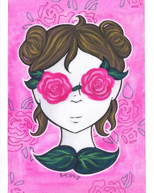
Roses in Your Eyes
Oh look, a not-Inktober thing!
So after my first dive into The Realm of Gouache, I really wanted to play with the medium a little more and try doing some different things with it. More accurately, I wanted to try using the gouache more opaquely, since last time I took a more transparent/watercolor approach.
Full disclosure, I actually had the sketch for this done before the gouache set even arrived to me. My original plan was to do the rose part of the "glasses" in the watercolor style from my In Bloom Le Plumes piece, maybe the leaves too, and then do the hair and possibly the skin in the more opaque gouache style. That was the plan so that I could try to get the most out of both sides to what gouache can do.
But after I got the gouache and swatched it out, I wanted to try something a little more experimental before I jumped into this drawing so that I'd have a better handle on what I was actually working with. So that's where the first gouache painting came in.
So it was after that when I made the decision to commit a little more closely to using gouache in it's more opaque form.
The concept for the drawing is something of a play on the phrase "looking through rose-colored glasses," (or whatever the full version of that phrase is, you know what I mean). The original expression, as I'm sure we all know, means seeing something as being better than it actually is, usually because of personal bias. This idea takes it to a bit of an extreme; the glasses aren't just tinted in a rose color, they're straight-up roses. Instead of just viewing something as better than it actually is, the person is willfully ignoring or otherwise blinded to seeing things as they really are entirely. And possibly hurting themselves in the process, if the roses have thorns. (I didn't draw any but they could be there, unseen.)
A couple of other notes on the drawing design before I move on: I went with buns in the hair since I usually draw loose/down hair and wanted to mix it up a bit, and to "close off" the drawing I added the leaves at the base of her neck, which also kind of double as a shirt-collar in terms of appearance, which I thought was neat. The leaves and the bit of vine across the nose, as may be obvious, are supposed to represent the frame and bridge of glasses.
I transferred the lines from the sketch to piece of Strathmore mixed media paper since I didn't think I'd be using enough water or watercolor techniques to warrant breaking out some 100% cotton paper, but I wanted something thick enough to handle paint, and I thought the smooth-ish texture would suit the gouache based on what experimenting I'd already done.
The roses for the eyes had no lines, and admittedly I probably could've gotten away with even fewer lines than the ones I did transfer since the gouache is opaque. I actually had a fair number of hairlines drawn in that got totally covered up since that was way easier than trying to carefully work around them.
Anyway. For all the gouache parts, I started with a darker base color, since it's usually recommended that you work from dark to light in gouache, and then I'd go back in with 2-3 lighter colors on top to add shading/depth.
The main issues I ran into were when the gouache color wasn't totally opaque, such as the rose base color (which is actually called "Rose," believe it or not) which gives me mixed feelings because on the one hand, it can look kind of interesting in giving you less structured, more unpredictable shading based on how you layer it, but also...well, it's not as opaque, so you have work with it slightly differently compared to the more opaque colors. The other issue was that I really struggled to have enough paint on my brush, particularly when doing tiny details, to get the full opacity and smooth color that I wanted, without leaving a glop of paint where it didn't need to be. Especially in areas like the hair that had a lot of fine tapering lines. I'm not sure how much of the problem is me and how my is or isn't my brushes or what, but this is something I occasionally have issues within acrylic painting too, but it felt way more prevalent here. I did manage to fix some areas that got away from me by layering darker colors back on top of the lighter ones, but then you also have areas like one of the loose hair strands around her chin that got away from me and I had to make noticeably longer than it originally was in order to fix it. (You can probably guess which one it was without me having to point it out for you.)
I also had an "issue" in that it was seemingly very easy to mix up way too much of custom color, but that's more of a me problem than a problem with the paint. (And admittedly the above aren't necessarily paint-specific problems either.)
Speaking of which, I'm still not sure if my "Titanium White" and "White" got mixed up or not, but since I suspect they did, I used the one I felt like looks more like the mixing white to do so. (Although admittedly I probably could've tried some mixing tests with both to see if I noticed a difference there whatever, perhaps some other time.) And I specifically avoided using black, since I thought it would be too harsh in mixes. For the hair, I just used one of the pre-mixed browns for my darkest and then used lighter colors and made my own lighter mixes to go over it. For the leaves, I actually mixed some of the Prussian Blue into one of the greens to make it darker. I think I may have benefitted from going a little lighter on how much of the blue went in, though.
The roses were actually one of the more fun parts since they didn't have to be so precise or specific to make the look work. I started with a base of the Rose/hot pink color, mixed a lighter pink to make sections that probably should've been a little less light in color and slightly larger in shape, and then a slightly lighter pink than should have been lighter to layer on top of the already lighter pink parts. Partly because of some the issues I mentioned earlier and partly because I was just kinda going for whatever with only a minimal plan, I did have to go back and forth with the lights and darks in some areas on these, and I still don't think they look quite alike enough, even though I never intended to make them perfectly symmetrical.
I also decided to not totally abandon gouache's watercolor properties with the background, since at this point I was thinking I didn't want to leave it plain white, but I also didn't want to do anything too complicated or intense that might take away from the rest of the art and the concept behind it. So I watered down some of the pink I used for the roses' base color and just kinda went over the background to my heart's content until I was happy with what the textures were doing since I knew it was unrealistic to expect to be able to get the background totally smooth trying to work around the rest of the drawing.
Now, originally I was planning on painting in the skin with the gouache, however, I made the grave mistake of not thinking about it until after I'd pretty much finished with all the other painted parts, and I really did not feel like trying to paint around everything. And, honestly, I really did like the contrast of the white skin against the other colors.
I did acknowledge that I could have mixed a gray from the gouache and shaded the white skin with that, but it felt like too much of a risk and still like too much of a hassle, so I conceited that I could bring other mediums into this since I'd already done my gouache-exclusive test piece. I grabbed a couple of very, very light gray Copic markers and added some very careful, very subtle shading to the skin. And you guys haven't seen the first time I used this mixed-media paper just yet (it's coming down the pipeline, I promise!), but for the second time I'm kind of in love with how it handles alcohol markers and I really need to try a more marker-heavy illustration on it sometime.
After all that though, it was still missing a couple of things.
I ended up breaking out my white uni-ball Signo gel pen to line around the girl just so she really would pop off the background, opting for it instead of the white gouache because, again, that seemed like too much of a chore to try and do. And my white Sakura gelly roll tends to be a little more transparent compared to the Signo, and I really wanted the stronger, stark white look.
Then after some thinking, I added the rose lines in the background using a pink and a green Sakura gelly rolls and the stencil I've toyed with using on other projects before.
And overall it, it has its faults (especially if you look at it too closely), but I really like how the whole thing turned out. It has almost a surreal vibe to it that I think drives home the initial concept really nicely, and just, in general, it's very sweet colors but has a more eerie feel to it. (At least when I look at it, anyway.)
It also very vaguely gives me Luna-Lovegood vibes, so of course, I like it for that alone.
I'm not sure what I'm going to make with the gouache next, as so far it seems its planning requires a slightly different thought process than I'm used to, but I have some ideas and all this has succeeded in doing is making me want to use the gouache more. This definitely isn't the last we'll be seeing of it, that's for sure!
____
Artwork © me, MysticSparkleWings
____
Where to find me & my artwork:
My Website | Commission Info + Prices | Ko-Fi | dA Print Shop | RedBubble | Twitter | Tumblr | Instagram
1 note
·
View note
Text
People Profiles - W.
I am an interdisciplinary arts major, with 4 minors: illustration, drawing, animation, and art history. Because of the field of study I’m pursuing, primarily illustration and animation, the majority of people I’m surrounded by in my environment at the institution are people more focused on the commercial forms of art. Even in my drawing classes, a lot of students are also interested in producing work for commercial purposes or aspire to attain a career in that artistic field, with less interest in producing work for a gallery space.
NSCAD seems to be hesitant in providing courses more suited to the commercial art world. You’re either a design student... or a fine art student.
What does NSCAD offer
For resources - certain classes have a fee that isn’t specified where it goes to and how it is available and what purpose it serves...
For learning - In art history, take home exams do not work. Not beneficial to the student in the end, people don’t retain that information. I did two readings in 20th Century, only because there was a question on the take home midterm and final exams. Sandra Alfoldy is an example of a good art history professor, while I didn’t do the readings, Sandra explained all of them so well that I was able to retain all the necessary information from her explanation for the exam. We were also required to do a research paper, which enables better learning by applying knowledge we’ve acquired from the lectures. 20th Century, you don’t learn anything, you don’t retain anything.Studio courses, as a learning environment, are debatable in how much you learn. For example, rules such as “never use black in painting”. Studio class learning is largely self directed. The school doesn’t really teach you much, they give you a task and you just need to do it, and you learn from doing the work. Design classes provide you with a task, but also with one or more solution. It teaches problem solving.
The bar of expectation is set so low. And it creates a false hope. It needs to push its students more. Less babying. NSCAD is almost set up to the point where everyone can pass with little effort. You do the work, you pass. (excluding art history courses).
“Why doesn’t Marilyn McAvoy teach any higher level classes? She was really fucking good. She was able to appreciate your work and recognize your effort and growth and give you good criticism. She was tough but good.”
“David Howard epitomizes a lot of things that are wrong with NSCAD.” He’s overly cynical, fear-mongering, and says that we are “fortunate that we don’t have people from galleries coming and looking at our work to buy it”. Almost everyone at NSCAD is here to make money. Most of us are not very wealthy. We don’t want to be poor. We want to live at least comfortably within our means. What you pay at NSCAD, you’re not receiving your money’s worth.
NSCAD has a bias towards certain departments, such as painting...
The painting program is far more selective and confined to certain mediums. No gouache. No watercolor. The courses are structured and rigid. In contrast, courses in fields such as drawing, animation, and sculpture are far less structured, and are more diversified and open to experimental practices...
The school seems to treat drawing solely as a base point, as a fundamental for serving "higher art" rather being recognized as "high art" itself...
NSCAD students seem to be segregated by their departments...
NSCAD is both a struggling business as it is a struggling artwork...
1 note
·
View note
Text
maggies hot sketchbook tip corner
try to pick out a sketchbook that you think you’ll actually like. maybe even splurge a lil. or not, because then you might be afraid to mess up in the sketchbook if its expensive. if you dont draw a lot or get stressed out maybe get a small one. make sure the paper is good enough for whatever medium you wanna use - for example, watercolor and marker wont really work on basic paper
find a medium you wanna use!! try a LOT of mediums!!! this is a good way to fill up a book and get practice AND find out what u like. maybe buy just a few basic colors of marker, pencil, or a small watercolor or gouache kit?? i tried a little bit of everything and realize i hate marker and love watercolor
using color makes ur book look so much nicer tbh like. even if you’re just filling in negative space with a highlighter or smth it makes it rlly pop yknow
washi tape and sticking random things you wanna remember (tickets, receipts, etc) is cool too
DECORATE THE COVER OF THAT BAD BOY ITLL MAKE YOU MORE ATTACHED TO IT. that way u cant just throw it out bc wtf you put cute stickers on it
if you’re stumped for inspiration, try to watch sketchbook tours on youtube. they’re like my favorite way to pass the time now!! there’s so many different artists w different styles and they all approach it in a different way so there’s a lot of cool ideas out there that might inspire you
having OCs or a comfort character to draw really helps move things along
maybe try to set a goal or habit. like, i will draw in my sketchbook every day after school/work for 30 minutes, or maybe, i will finish this sketchbook by the end of next month
its risky but also buying a new tool or supply or whatever to play w can help with the art block
remember your sketchbook is just for you and you dont HAVE to make it presentable. personally for me the idea of sharing it with others makes me want to do better work, but you can be as messy and silly as you want!!! its ur book!!! nobodys entitled to see it but you!!
i dont rlly like them but there’s a lot of ~challenges~ to do on youtube and instagram like. only using 1 marker for one drawing or following certain prompts/themes for a month. those can help too i think??
thats really all i got i just really like to watch sketchbook videos i hope this doesnt make me sound like an entitled asshole or anything im just a kid who likes to draw and people are always like :( my sketchbook is so sad
WELL BITCH IT DOESNT HAVE TO BE SAD IF YOU BELIEVE IN YOURSELF
go make some good art i love you
#maggie.txt#hi i hope this doesnt look dumb i just think more people should use sketchbooks#if you want to get into drawing pls pls pls do it#its not scary after a while i promise
16 notes
·
View notes
Text
On a random shopping trip to Poundland, I spotted these miniature easels and immediately thought about how great they would be for creating a small scale gallery for my hamster which fits perfectly with my running theme of wanting to create art with animals themselves as the target audience. Referring again to my hamster drawings, I recreated a few of my favorites in this miniature form starting with a Sharpie hamster as this was my main medium for the drawings. Doing this on a smaller scale and on canvas was much more difficult than it had been on paper, I struggled with some of the smaller details and whilst it defiantly resembles a hamster, it could be much neater. My favorite part of this one is the background which I added to make the white parts on the hamster stand out more; I did this in Sharpie like the rest of the drawing but the way that the ink bleeds on the canvas gives it more of a watercolor effect which I really like.


Then I moved on to paint to see if this would help me in creating a more realistic impression and experiment with different mediums. I started off with a yellow acrylic background and marked the outline of the hamster in Sharpie as I thought it would take me a long time to do with paint and that I’d probably get it neater with pen. After I’d done this, I went in with some gouache paint as I know it’s thick and would easily cover the acrylic yellow paint underneath; I started with white for the underbelly and chin areas but extended it upwards to help give the paint I was going to put over it an extra base layer to cling on to in hopes of helping the colors pop more and also to add some textured brush and paint marks to further resemble fur.

After letting the white layer dry, I started adding some darker colors for the rest of the fur, deciding to go with an orange again like I had in my drawings but this time adding some flecks of light and dark brown in to give the fur more dimension in the hopes of making it look more realistic, along with continuing to try and get some nice textures in the paint; I added some stippled marks around the chin area and legs for shading which I think look really effective. I then added pink for the ears, mouth and feet which I had to mix myself using a red and white as there was actually no pink in my paint set.

I then dabbed in to a tiny bit of white paint and a tiny bit of orange and wiped them almost completely off my brush and used this to blend some of the stippling out and neaten up some of the brush strokes, particularly around the face. Even though I had been trying to pay attention to the marks I was making for the fur, I did make a crucial error that I should have learned from with my drawing exercise and this was to make sure that the marks that represent the fur come from the inside of the face outwards like it grows whereas I have made a couple of rounded marks here, particularly noticeable on the left hand side of the face. Finally, I went back over the details in the nose and eyes and the black outline that I had drawn originally just to neaten it all up, I did this with black gouache paint and as predicted, I did find it slightly more difficult to control the marks I was making with a brush than I do with a pen but equally, a Sharpie would have been too thick too create the lines I wanted for the nose and mouth and so I went for it and was actually really happy with how it came out. I did make what I think is a little bit of a mess of the line between the hamsters two front legs but if anything it looks like a shadow and I feel like the rough line adds to my fur effect and so I chose to leave it. Upon writing this reflection, I have also realized that my hamster has an extra toe on his right foot that wasn't intentional but I do find it quite funny considering I had initially tried to make this somewhat realistic despite it being in a cartoon style.

After doing my first two tiny canvas paintings, I moved on to this slightly larger one because I wanted to recreate my Hamtasia cover on a small scale to place in the gallery; I mentioned before how I would like to have a go at creating some actual sound to go along with my pieces and so I thought that having this painting alongside the music playing in the gallery would be a fantastic way to incorporate the two ideas.
The drawing on the original cover is a simple black line drawing and so I chose to use Sharpie again to create this piece. I vaugley marked out the drawing of the people first as lightly as I could and then went over then with the pen and I was actually really happy with how it came out. I thought I would be able to freehand the hamster as I had already drawn so many but I found this to be the most difficult part, I messed it up several times and had to paint over it with white which I was a little dissapointed about as up close you can see the difference in the texture of the paint on the plain canvas like you can see in the photo above.

I eventually drew a tiny hamster that I was happy with and added a little carrot in the top left hand corner just to fill in some extra space and give it a bit more character, I considered doing a mirrored version of the carrot on the right hand side but I didn't want to overcrowd the piece. This is probably my favorite canvas so far, I feel as though it's the most well informed work I have done for the tiny gallery as it is a development of work I had already done inspired by my research.
0 notes
Text
My name is Deboshree, born in Kolkata, a self taught painter and a failed 9-6 employee, who now stays home with my family in Bangalore, India. I work with acrylics, oil and love to paint with watercolours while studying, observing and absorbing the sights and sounds of my surroundings. I love to read and I’m a big time day dreamer. To me, every story is real, fairies, dragons, ghosts and monsters all exist.
It’s a beautiful mysterious universe that we live in. I draw inspiration from almost everything I see, from kids waiting for their school busses to the fallen leaves, waiting to be swept away.
Every dreamy thing attracts me, every story, poem and rhyme inspires me to look beyond those lines and visualize the moments. At present, I am not traveling much and rekindling my childhood, wondering and pondering over books, images, sky and atmospheric dramas.
How It All Started
In my youth, I always carried my drawing books, pens and pencils, brushes and paints with me, wherever I travelled or shifted due to my jobs. I never actually quit drawing. The box easel, my very limited brushes, canvas pad and the paint palette were my prized possessions then and still are today. I always find my happiness while I’m painting. Weekends, after stressful workdays, I was coming back home, opening my sketchbooks and kept sketching with all my heart. It is my way of meditation.
Ten years passed, miserable and with a loaded and stressed mind, I looked for the true purpose of my life. In the process of finding my true purpose and happiness, I left my well salaried, promising corporate career to pursue the ultimate dream of being an artist. I did a certificate course from Karnataka Chitrakala Parisath, Bangalore along with lots of self studies. As I said earlier, I am a avid reader, too.
My Inspiration
Free spirited, Bohemian, Gypsy soul, day dreamer, a loner, whatever I may be called, I get my inspiration from the mysteries of nature and the cosmos. Ranging from human emotions to cosmic catastrophes.
I love to capture the mystical energies of the universe in my artwork, thus the way I convey my gratitude to mother nature for everything.
Painting Tools I Use
I follow no rules or techniques, so I can’t categorize my works under any pre-written descriptions. I like to work with spontaneous brush strokes and playful colors.
For watercolour sketches – I use Winsor & Newton Cotman series and our Indian brand Camlin tubes, sometimes Koi field watercolour boxes. I also cherish one Daler Rowney artists watercolor set of 24 half pans, that I own, but I seldom use them. These are really expensive here.
I use Indian Chitrapat Brand, handmade papers, I prefer papers, that can be anything with little toothy textures, cold press, more than 200 gsm at least for wet on wet process or loose watercolour paintings. I also use Brustro, Canson, and Strathmore frequently, as their sketchbooks are affordable and easily available. I even did my many light watercolour sketches in 160 gsm sketchbooks as well. Many of my daily sketch works have ben done in pen and wash. For pen drawing, I use Micron pens, I also use Brustro pens, I think its a local brand here. I also love to use Koh-i-noor water-soluble pencils, Mondeluz Aquarell, and sometimes gouache too.
I am fascinated with colors and their spontaneous, flowing, spirited nature, so I retain those qualities of my working medium in my paintings and sketches.
My Life And Daily Routines
My days starts with, getting my three year old daughter ready for her playschool and, of course, listening to all her dreams she had last night. When I wait for my daughter to come out from her playschool, I spend my time drawing and sketching outdoors, capturing daily lives of people in just 1 mins quick sketches, sometime taking a leisure walk around the parks and playground here.
I even do watercolour sketches while sitting inside a moderately crowded café nearby. I love to sketch and observe people a lot, they fascinate me. If I am not out, I will be working on my canvases with acrylic paints.
My medium varies as per my mood. My mantra is: If you are expressing yourself, be free, and choose your own methods.
Deboshree Chatterjee
Website
Facebook
Doodlewash
GUEST ARTIST: "Chasing Dreams With The Curious Mind Of A Child" by Deboshree - #doodlewash #WorldWatercolorGroup #India My name is Deboshree, born in Kolkata, a self taught painter and a failed 9-6 employee, who now stays home with my family in Bangalore, India.
#WorldWatercolorGroup#artist#doodlewash#featured#illustration#Urban Sketchers#Urban Sketching#watercolor#watercolour
1 note
·
View note
Text
PAGE x PAGE ANALYSIS — ‘THE SHADOW STRIKES!’ #13 (1990)

PUBLISHED: DC Comics, October 1990
SCRIPT: Gerard Jones
PENCILS/INKS: Eduardo Barreto
LETTERS: John Workman
COLORS: Anthony Tollin
EDITORIAL: Brian Augustyn
THE SHADOW STRIKES! is high on my list of favorite ongoing series ever. As far as I’m concerned, of the many four-color iterations of The Shadow, this is the one that truly gets it right. The Shadow of STRIKES! is a lurking, manipulating hybrid of The Phantom of the Opera and John Wick, the action of the series playing out mainly through the perspectives of his agents and his criminal quarry. This book is tight, hard-edged, and restrained; it avoids a lot of hacky pulp comics pitfalls because it understands that the original Walter Gibson Shadow novels weren’t “trying to be pulpy” — they were trying to be lean, lurid action thrillers. This is almost entirely down to writer Gerard Jones, but it works better than anywhere else in the issues drawn by the artist that defined the look and feel of the series — Eduardo Barreto. STRIKES! sometimes suffers from being the type of lower budget 80’s/90’s DC book where the fill-in issues can be sloppy to unreadable and the truly great issues mainly succeed by virtue of being the product of creators who weren’t really being watched that closely, but that doesn’t mean I’m grading on some kind of a curve when I say the truly great issues are truly great.
Today, we’re looking at one of those issues — the second installment of an amazing four-part storyline that sees The Shadow, along with his most trusted agent Margo Lane and the begrudgingly complicit Inspector Cardona, taking his private war on crime from their habitual New York haunts to the streets of Chicago. In this analysis, I’ll be looking at how tightly Barreto’s pencils and inks hew to Jones’ script, and how the diligence of colorist (and Shadow historian) Anthony Tollin actively facilitates the near-seamless transitions between the plot’s many storylines. This is a full comic that never feels crowded, a dense comic that keeps light, and a very comic booky comic book that never loses sight of the emotional reality of what it’s depicting.
THE SHADOW STRIKES! #13 and all characters contained therein are property of DC Comics and/or Conde Nast Publications, reproduced here solely for educational purposes.
COVER
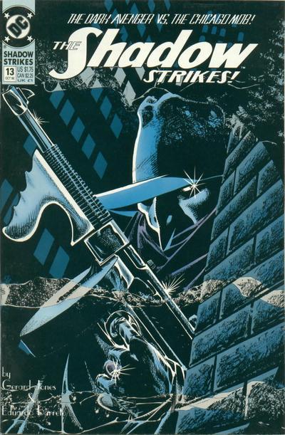
I love how conceptually simple this cover is. Graphic, understated buildings. A mostly obscured main character. Smoke and mist wafting around for a little atmosphere. There’s only one thing that’s clearly rendered — a tommy gun, unfired. The Shadow is usually depicted using handguns, so him holding this universal visual signifier for “MOB STORY” immediately lets you know what you’re in for. And that’s even without the blurb at the top. You wanna see The Shadow fight the Chicago Mob? I know I wanna see The Shadow fight the Chicago Mob.
PAGE ONE

Something THE SHADOW STRIKES! does particularly well is maintaining the balance between mainstream comic book sensibility and HBO subject matter without making either seem out of place. We open with a prime example — the hand acting in panels one through four clearly conveys uncomfortable reality of a woman having sex she doesn’t enjoy with a man she doesn’t like. This transitions to her reaching over to grab a cigarette and light up in panels five and six (along with the barb “what was even quicker than usual” for those in the back). This establishes her as our POV character for the scene, something every scene going forward will have in some form or another. The point of this opening scene is to establish bad guy mobster Anthony ‘Half-Step’ Sbarbarro as a detestable macho prick in his personal as well as professional life. By identifying with this woman, we share her lack of fulfillment and, soon, her ongoing victimization. We quickly learn to hate Half-Step by seeing him through her eyes. We also see a hint of a gun in a shoulder holster, in case you didn’t realize what kind of comic you’re about to read.
PAGE TWO
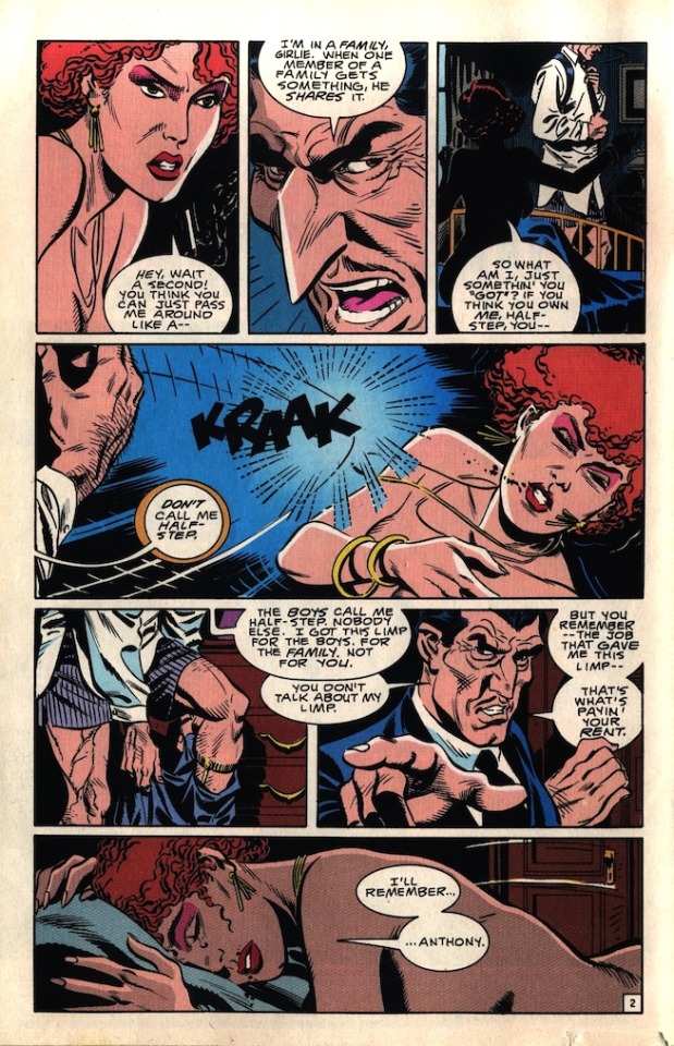
This page validates the bad feeling we got about Half-Step on the previous page. Not only so we establish the leg injury that gives him his nickname, we show how petty and violent he is. Note how loose his fingers are as he strikes her in panel four — it’s a casual, low-effort act in between tying his tie and pulling on his pants, and it absolutely demolishes her. Half-Step is a powerful man who callously uses that power to abuse those weaker than him. The scene ends on her, leaving us stewing in the emotional trauma Half-Step leaves behind him. Imagine a version of this scene that focuses on him instead of this nameless woman; his hands on the first page instead of hers, him walking out into the hall in this last panel instead of her crying into her pillow. One version of the scene encourages you to identify with Half-Step, or, jesus, maybe even thrill in his violent savoir faire. This other version shows him for the monster he is by humanizing the people around him.
PAGE THREE
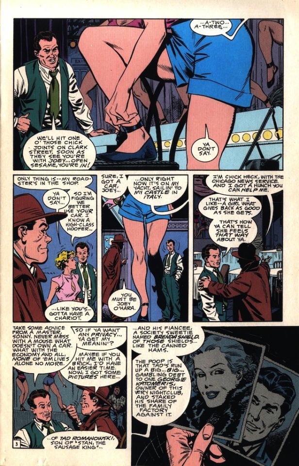
Chick Heck — a dynamite name — catches us up on the events of the previous issue and shows us pictures of the main players so we’ll recognize them when we see them later. While Joe O’Hara is mainly just a quippy mannequin to help Chick with the recap, there’s some great staging between him and the showgirl in the first couple panels. She’s way too smart for him, and even though she’s constantly placed in positions of power in her panels (larger than him in panels one and three, walking past/in front of him in panel two) he just keeps checking out her legs with the unearned confidence of a white man with a little hair.
PAGE FOUR

More concise, well-written recapping, which Barreto livens up even further with a variety of camera angels and some cool lighting and drapery. We see Half-Step (who I keep accidentally and only quasi-understandably calling “Johnny Stomp” before correcting myself) near the end of the page, connecting this scene to the last and reminding us how much we would like for somebody to kill him. Chick does us a final narrative solid by setting us up for the next page with a great dramatic line.
PAGE FIVE
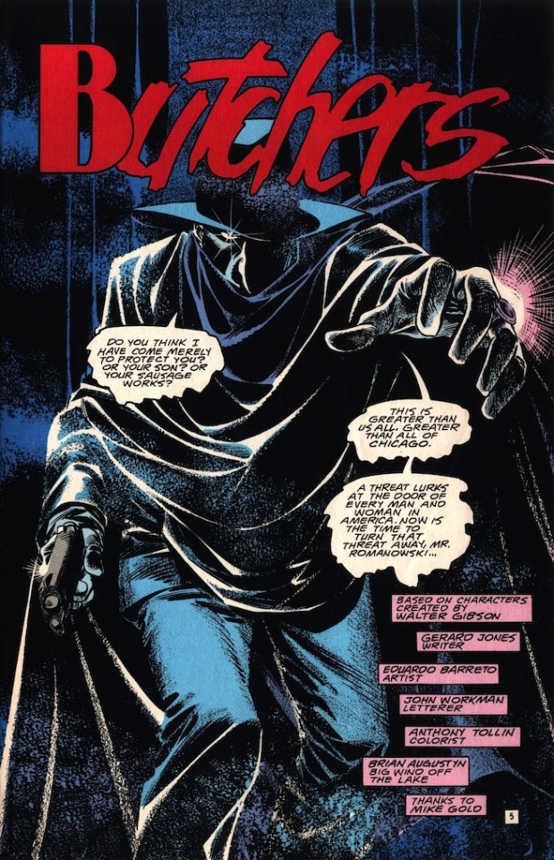
And now, after getting to know the distinct personalities and motivations of five characters across four pages, we get our title page. The Shadow stretches out onto the scene, speaking like goddamn Dracula and dressing the part. Between Barreto’s smoky effects* and Tollin’s icy, atmospheric coloring, The Shadow really feels like a different kind creature than anything else in the book. Also worth mentioning is John Workman’s great work on the issue’s title, with the rigid ‘B’ adding extra viciousness to the sketchy, violent ‘UTCHERS.’
*I was curious how exactly Barreto achieved this affect. I consulted with Jesse Hamm and Lukas Ketner, and the consensus is that Barreto probably drew these pages on coquille board, using graphite or lightly-applied colored pencil for the smaller areas of texture and watercolor sponge with white gouache, or possibly even just correction fluid, for the large smokey areas. If any collectors or collaborators of Mr. Barreto know otherwise, please let me know. I’m still curious.
PAGE SIX

This page does a great job of immediately changing the focus of the scene from The Shadow to old man Romanowski. The Shadow is a non-character who will never learn anything new about himself or struggle with a decision, so the drama of the series usually centers around how ‘normal’ people react to him. In this case, it’s the equally resolute Romanowski, whose whole motivation is neatly laid out in the first three panels. “And I will owe NOTHING... to NOBODY...Not even YOU,” Mr. Devil-Man With A Gun.
There’s a nice leftward motion as Romanowski tries to hustle this intruder out of his house, followed up by the overwhelming rightward motion of The Shadow as he silences the old man and makes his final pitch. This panel’s layout, its placement on the page, and even Tollin’s blue coloring all loosely mirror the Half-Step slap on page two; I think this is the first instance in the issue of the creative team setting up parallels between the two men. The Shadow also possesses a frightening degree of physical power, but he uses it carefully. He’s scary, but not dangerous. Or at least less dangerous. He’s not actively a woman-beater, how about that. The two panels in question, so you can draw your own conclusions:

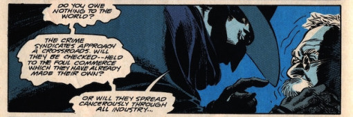
Continuity note: the money on the floor in panel two carries over from the previous issue — Tad came to his father asking for money to pay out his gambling debts, and Romanowski, enraged at his son’s weakness, grabs glass jars containing his savings and smashes them to the floor, yelling “take it! Take it!” He uses jars because he doesn’t trust the banks — having his own money during the stock market crash was what allowed him to grow his business to what it is today. This goes further toward establishing that Romanowski sees himself as a man who doesn’t owe anything to anybody. This scene here doesn’t rely on that information, but it’s useful garnish, no?
PAGE SEVEN

Tad’s brief show of spine on the previous page immediately melts once The Shadow leaves — Barreto keeps him wobbling and weak while his father is still and resolute. The scene transitions from being about Romanowsky the senior to being about Tad, tears in his eyes as he speeds away. The last panel switches it again to the Shadow, watching silently from high above. Note how Barreto makes liberal use of the graphite shading, but leaves The Shadow’s hat and Tad’s car flat, highlighting them by omission. And man, how insane is this angle? We somehow see the train and the car at the same time without it feeling forced. The complexity of the El Tracks The Shadow’s hanging on might at first seem punishingly complicated, but I think it’s actually the parallel beams of that structure that makes the warped perspective visually legible in the first place. Using something difficult to depict something impossible. Eduardo Barreto. I tell ya.
PAGE EIGHT
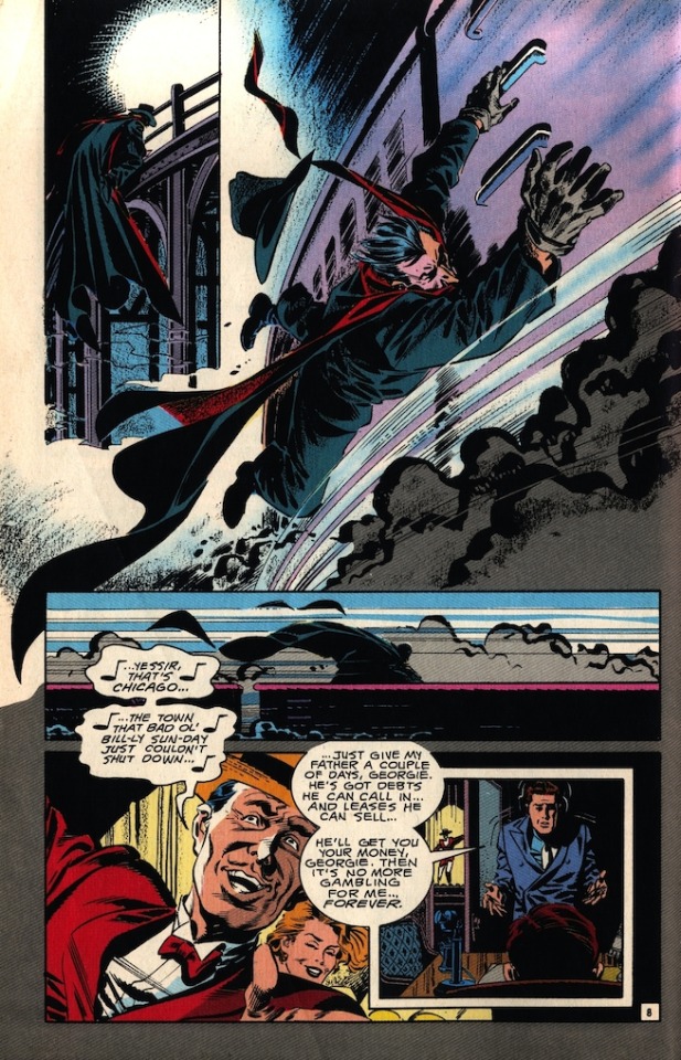
This page gives us what I like to call ‘an artificial action beat.’ The Shadow catching a ride on this train is hardly a conventional action set piece, but it’s a splashy, physically extraordinary Thing That Is Happening and it breaks up a couple of dialogue-heavy scenes. It also gives us a private moment from The Shadow, helping us like him as our macroprotagonist by seeing him successfully doing something difficult. How do we know it’s difficult? The acting in his face in panel two, plus the fact that he loses his hat. On some level we know he can’t fly or teleport, but seeing him actually have to put effort into getting around helps us identify with him, without sacrificing too much of his mystery.
At the bottom of page: the return of shaky Tad. Jones does a good job of keeping small NPC type characters around, like the singer in panel four, making their Chicago feel full. It’s easy for large-cast crime comics like this to start to feel like the only people in the world are the people involved in the case in question; bizarrely, this can actually serve to make the case seem less important. What’s so bad about bad guys if there’s no society at large to be threatened by them?
PAGE NINE
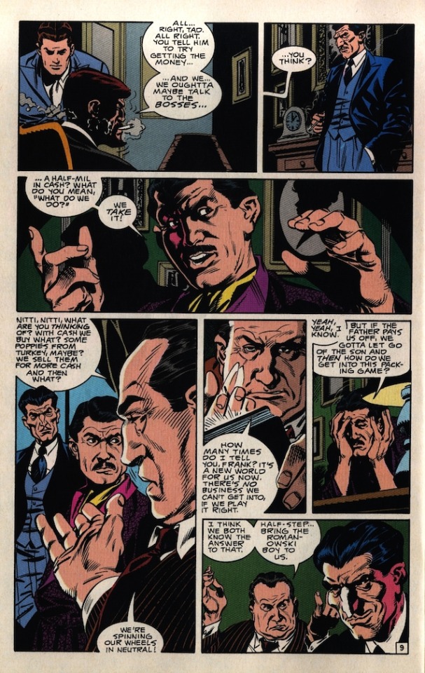
Georgie Katomeris’ office (containing Georgie, Tad and Half-Step) and Frank Nitty’s drawing room (containing Nitti, Jake Guzik, and Half-Step again after some passage of time) are indistinguishable from each other as Barreto draws them, but are still kept distinct by three things. One is Jones’ dialogue — the ellipsis in that precedes Nitti’s panel three dialogue indicates a jump in time. Another is Nitti’s smoking jacket — he wouldn’t be going out in it, so we must have changed locations from the office to his private residence. The last and most effective is Tollin’s coloring — the grey of George’s office gives way to the green walls of Nitti’s drawing room. I admit this transition felt abrupt to me at first read, but these three clues let me easily find my footing again.
PAGE TEN
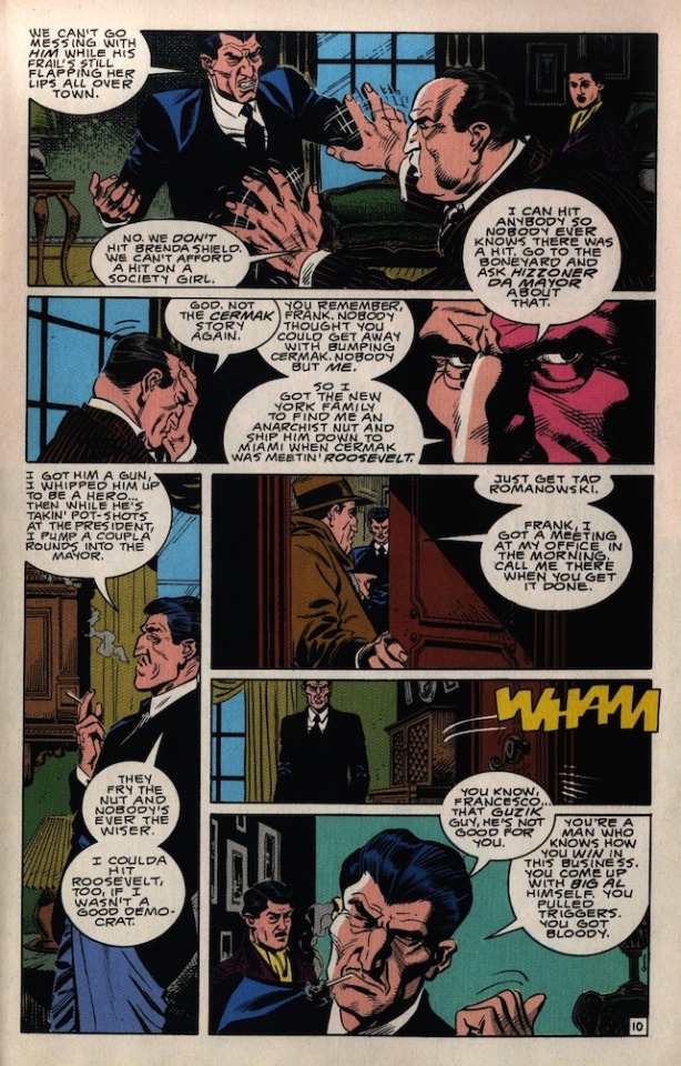
We spent the first two pages of the issue showing Half-Step to be detestable; now we show him to be truly dangerous. His patience and planning further draw him into parallel with The Shadow — having him tell a story that essentially ends with “I could have killed the President of the United States but didn’t want to because of my deeply held principles” does a great job of showing us his crazy ego and, more importantly, his ambition. The point of the end of this scene is clear: this is not someone who’ll willingly stay in a subordinate role forever. But he’s not just going to throw his weight around. He’s going to be smart about it. Note how he goes from very small in panel five, cut off by the top of the panel, to large in panel six, crowding Nitti into the corner.
PAGE ELEVEN
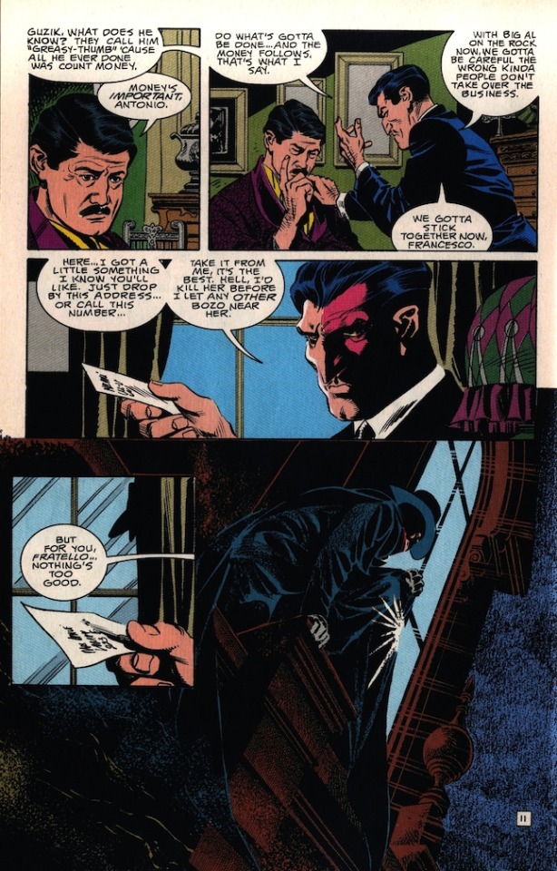
Half-Step dominates his half of the page. The heavy shadowing on his face in panel three indicates there’s something dark going on in his mind. The other half of the page is all about The Shadow. We finally have the two of them in the same location here, with the Shadow placed in a position of power — the low angle of his glory shot in panel five, the fact that Half-Step doesn’t know he’s being watched. They’re even sort of almost facing each other down, with Half-Step facing left in panel three and the Shadow creeping in towards the right in panel five. But like Half-Step, The Shadow won’t just smash in guns ablaze— he’s playing a longer game. This page really sets them up as worthy enemies, with a lot of good, or at least better, people caught in the metaphorical crossfire between them.
PAGE TWELVE
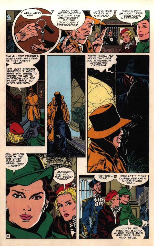
Here we finally catch up with Inspector Cardona, Brenda Shield, and Margo Lane, who Chick Heck introduced us to by proxy in his earlier scene. This page has what for my money is the only real misstep this issue makes; although Margo and Cardona are both name-checked on this page, Brenda is not, and it’s been so long since the Heck scene that it’s asking a lot of the readers to remember her by sight — especially since there isn’t really much going on with her design to visually distinguish her, big polka dot bow or not. That said, this page does still somehow manage to give us that cool, spacious three-panel sequence of Cardona walking away from the ladies only to be waylaid by The Shadow while still leaving room for a nice big ‘Identify With This Character Please’ shot of Margo in the penultimate panel. Jones also manages to give us clear ideas of both Margo and Cardona’s characters, their dynamic with each other, AND their individual dynamics with the Shadow while he’s at it. Lastly, I like Tollin’s choice to give Margo a Green color scheme, making her instantly as visually distinct in the issue as the Shadow in his blacks and reds. For a page that makes the issue’s one arguable mistake, it sure does a hell of a lot right.
PAGE THIRTEEN
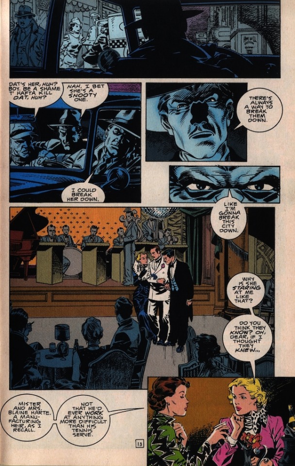
Half-Step is back, haunting the plot just like the Shadow does. Seems to be a theme of men preying on women in this issue — let’s keep an eye on that going forward. Note how much real estate on the page is given up, letting the panels float around; this is used in the top half to separate Half-Step from the other guys in the car, painting his “Like I’m gonna break this city down” line as an unthinking quasi-crazy utterance, as well as to separate Margo and Brenda from the gossiping nightclub crowd in the bottom half.
PAGE FOURTEEN

Here we explain Brenda’s stakes in this scene. Even if you don’t empathize with her high-society worries, it’s worth noting that Jones has made clear through action and dialogue that every character in every scene has something they want, need, and/or fear, and Brenda is no exception. Tollin draws attention to the dreaded encroachment of gossip in the last panel with a change in background color from a neutral yellow to a threatening orange.
Now, bear in mind, Margo might be genuinely supportive here, but all of what he’s saying about herself is a lie. There is no Dick. She's never met the Hartes. She’s working Brenda as per the Shadow’s orders — she and her fellow agents are basically Ocean’s Eleven if Danny Ocean decided to start dressing like Doctor Sax and fighting crime, and if that means pulling a hustle on a pie-eyed heiress, then I guess that’s just what's on the agenda for the evening.
(Fun personal trivia: This comic came out the month my girlfriend was born. She also sort of has the face Barreto gives most women he draws. Coincidence? One wonders.)
PAGE FIFTEEN

Margo is the only person in this issue who gets an internal monologue, which she uses here to reveal the way her charade chafes, but also the freedom she feels from being anonymous, from being unconnected to her past mistakes. So, of course, enter: the man who knows all her secrets, here to spoil her reverie. This scene takes place in the ladies room — another example of a man trespassing against a woman, except that while our gangsters are doing it for personal gain, the Shadow (here unsexed and dehumanized to the point of being almost a silhouette) does it in service of his theoretically higher calling. He dominates panel four, almost encircling her. Margo’s body language tells it all — not afraid, but very uncomfortable. We keep the scene in her perspective by cutting from the Shadow in panel five to Brenda in panel six, both more or less in her literal point of view. Note again how Barreto employs negative space above and below the final panel to create a zoom-in effect on Brenda’s eyes.
PAGE SIXTEEN

More Big Sister Margo; see how she controls Brenda’s body in panels one through three. Half-Step is inside now — I think we’re supposed to infer that he’s responsible for loosing the rumor that’s upsetting Brenda. A slightly abstract example of a man invading a female space? I might be reaching, there.
Barreto does a great job of changing locations by making panel five a round panel with poor Joe Cardona on the right of the frame, contrasting with Half-Step’s leftward placement in the square panel opposite. Tollin helps with a cold color shift. The last panel might not seem like it does a lot, but it actually sets up two things for later in the issue: One is that it makes for the second time we see The Shadow and Cardona together, so when we see them together again at the end of the issue it benefits from a satisfying ‘rule of threes’ thing. The other is that it sets up one of The Shadow’s later appearances — I’ll touch on why this was necessary when it comes up.
PAGE SEVENTEEN
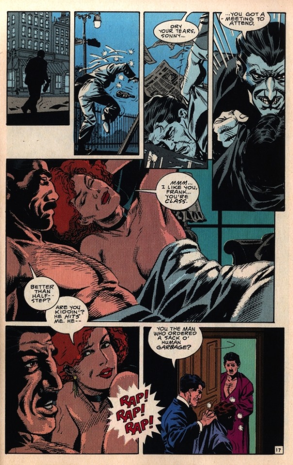
A great falling line of action as Tad stumbles and falls across the top four panels. Employing steadily lengthening panels like this is something Barreto does so well, and here it has the side benefit of giving Half-Step room to really loom over Tad in panel four. Meanwhile, I’m glad Half-Step’s poor, mistreated girlfriend had a good lay. She deserves it.
PAGE EIGHTEEN
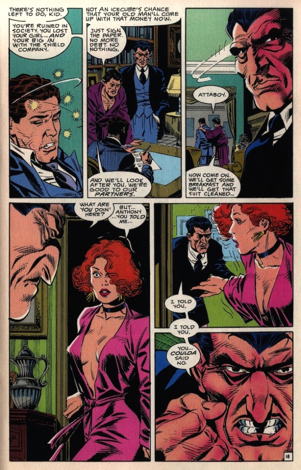
Barreto is so good at clothing and drapery that you start to take it for granted — and then you remember it all over again when he draws a disheveled suit like the one Tad’s stuffed into. As soon as Nitti shuffles Tad out of the apartment, Half-Step’s attention turns to the woman. We get super close to him, the rendering becomes denser, meaner. Tollin even gives him an angry rage-flush. He’s huge in panel four, crowding her to the edge of the frame. His dialogue transverses panel five into panel six, implying he’s following her as she tries to get away from him. The final panel puts us back in her shoes, as Half-Step’s rage is directed straight at us.
PAGE NINETEEN
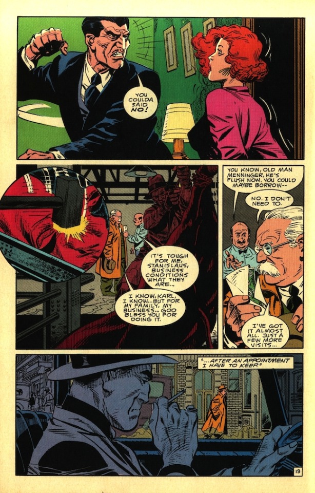
Panel one to panel two is the kind of cut we don’t see much in comics, despite it being incredible effective. We get the point of her abuse without — man, I guess the phrase I want to use is cheapen it by showing it explicitly on the page. Clearly implying something and then cutting away can be even more effective than showing it outright. If we were to see this scene play out, we’d still know in the backs of our heads that this is, essentially, a superhero comic, and that it’d be possible that when we turned the page, The Shadow might show up to save this woman. When the scene is over and the hero never appears, we might be left wondering, “Christ, then what was the point of seeing all that?” This method here conveys what happened with a haunting finality, but without any creepy exploitation.
On a characterization front, the thread that culminates in this scene is massive. Half-Step treats this woman like an appliance, but claims he’d kill any man who touched her. He actively entraps her into this weird “gotcha” self-cuckold and then punishes her for falling for it. This shows us so much about the depth of his bizarre self-loathing, his warped pride, the outright evil of him. And yet, again, staging these as events in her life keeps her from being just a prop to let us know how super duper bad this story’s bad guy is. She has an internal life outside of him. This all actually makes these displays of his violence more effecting because we’re seeing its effects on a “real person,” not just some Real Doll who doubles as a speedbag.
Note also how well panel two and the butcher hanging up the cow in panel three frames the interaction between Romanowski and his debtor, Karl. Size continues to equal power as we get the huge foregrounded gangster (rendered into one monotone shape by Tollin’s colors) making the bright, full-figured Romanowsky look smaller and more vulnerable than he realizes.
PAGE TWENTY
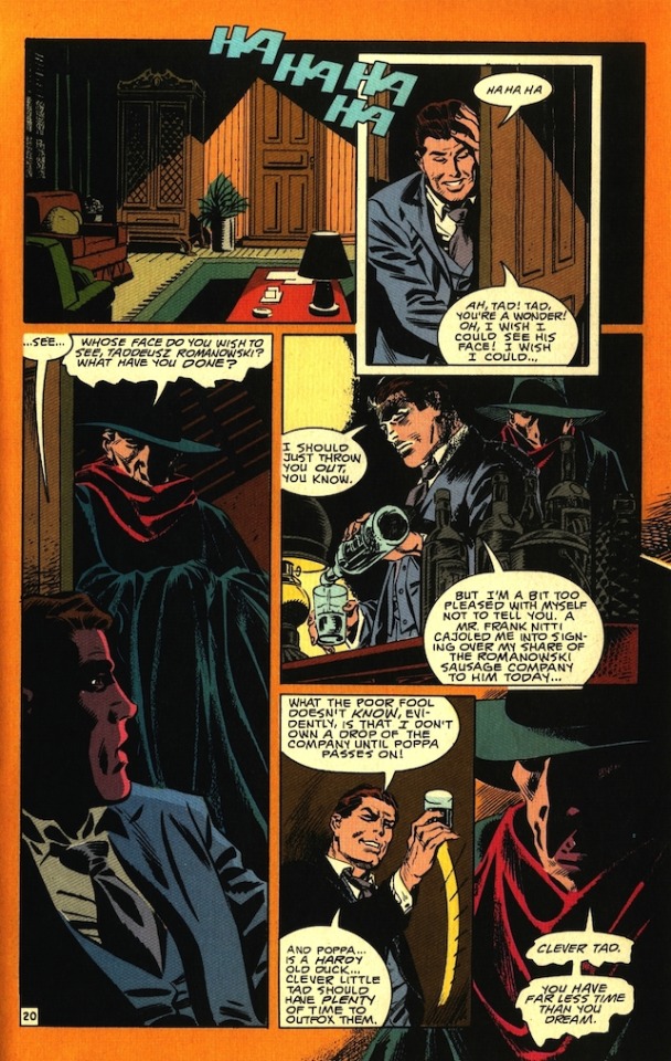
The empty room in panel one gives us a moment to breathe as we head into a tense scene. At the same time, we know we’re getting close to the end of the issue, so an entire panel dedicated to an empty room makes us slightly nervous — we’re aware we’re running out of time. Which, by design or by happenstance, is the Shadow’s point at the end of the page. Tad is consistently rendered in a clear, clean comic book style, while The Shadow is rendered in planes of light and darkness, making him seem elemental, powerful, spectral.
PAGE TWENTY ONE
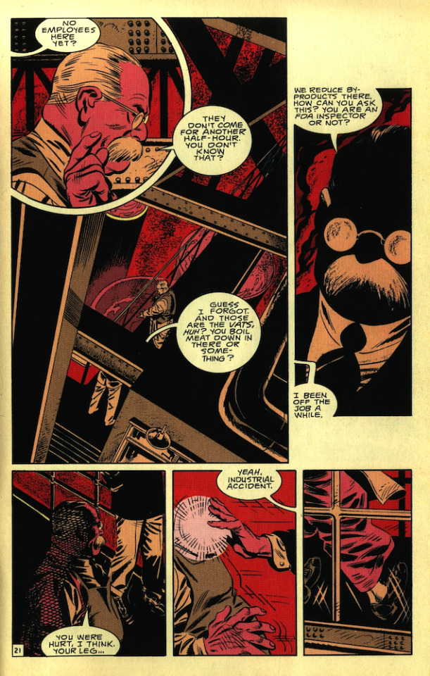
This is the best page in this comic. I lost my mind when I saw this page. It’s AWESOME. Look at how well rendered Romanowski is in panel one. The oppressive dark architecture in panel two, drawing the eye to the small, bright Romanowski. That unnecessary but oh so cool-looking graphic black-out in panel three. The hatching on Romanowski in panel four. The callback to Half-Step’s leg injury, set up nearly twenty pages ago. The cascade of action across those last three panels. Tollin’s colors across the whole damn thing. I love this page. This page is why they have comic books.
PAGE TWENTY TWO
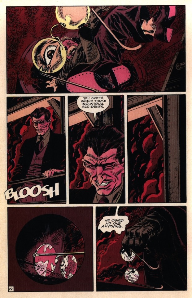
Look at Romanowski’s face in panel one, highlighted by the falling glasses. The FURY. The reveal of Half-Step is so pat, so understated. The little throw-away line to himself further cements him as a bona fide evil psycho criminal — one more reason we want to see him go down. The circular panel inside the square field of panel five, a technique I can’t ever remember seeing before, gives the impression that a notable amount of time has passed since the glasses fell — glasses that Barreto made sure to pointedly re-establish as a visual signifier for old man Romanowski in these last few pages.
So, The Shadow shows up late. This is why it was important to set up The Shadow’s intent to see Romanowski in that panel at the end of page sixteen; to have The Shadow appear too late would come off as arbitrary, or even as an intentional delay on his part, if we hadn’t established The Shadow’s intentions beforehand. Or, put more simply: in order to show a character failing at something, you have show they were trying to accomplish that thing in the first place — especially when so much work has gone into conveying that character’s competence.
PAGE TWENTY THREE
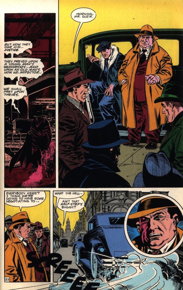
The Shadow respects Romanowski’s principles. Of all the characters in this story, the two of them are the most alike in that regard. But while Romanowski was a stubborn old butcher and easy prey for Half-Step and his guys, The Shadow is an unkillable psychic murder man.
Panel two is full of space, both geographic and negative, giving us another much needed moment of breathing room. All the gangsters present have distinctive color cues, easily letting us get a feel for the size of the gathering as opposed to an amorphous clutch of same-colored “GANGSTERS (tm),” which often happens in comic book scenes depicting groups of men in suits. They can become like zebras if you don’t take the time to make him distinct, as they are here. Half-Step’s buggy zooms into panel four from beyond the page, a nice way to emphasize that the vehicle is coming at them from out of nowhere.
PAGE TWENTY FOUR
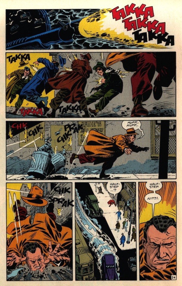
The tommy gun EXPLODES through panel one, dissolving the panel border itself. Those carefully color-coded mobsters from the previous page all catch bullets, which wouldn’t mean as much to the reader if they weren’t distinct from one another. “A bunch of gangsters got shot” becomes “several men were brutally murdered by machine gun fire.” Said gunfire chases Guzik from left to right in panel three — note the diagonal line that tracks his presence in panels two, three, and four, making his plunge to the ground in panel four seem like an extension of his movement in the other panels, even though the they happen on radically different parts of the page. Barreto keeps the same angle on Guzik in panels four and six, cementing him as the lone survivor of this drive-by and the default POV character for the scene. Or, to put in visually:
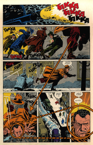
This is some seriously solid craft.
PAGE TWENTY FIVE
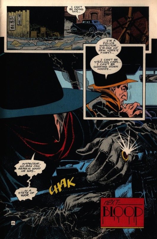
The Shadow is HUGE on this page. This drawing of him the biggest thing in the entire comic — the same size as he is on the cover. He bookends this story, dominating it. Cardona’s fear and uncertainly help sell the terrifying finals words of his boss, seen here in full on What-If-Hannibal-Lecter-was-Batman mode. This drive-by was easily the biggest act of violence in the issue, and the heavy blacks of The Shadow on this last page emphasizes him as this dark presence bringing doom to the Chicago mob. This page cements what we can expect from the next issue: The Shadow’s done his ground work. He’s ready to start making some moves.
FINAL THOUGHTS
Despite having three more pages than your typical modern comic, the page for page action is always dense and well-paced. Every scene feels necessary and the story never lingers long on any one place or character, and yet it never feels overstuffed or rushed. It takes time for some impressive visuals to break up the action, but never to the point of self-indulgence. There’s always something happening, even in a scene that basically boils down to ‘Two women go a club and a third woman talks shit.’ I talk a lot about Barreto — and I would, he remains one of the best artists of all time — but I don’t think enough can be said for Jones’ masterful pacing and lean yet conversational dialogue. These are two creators at the top of their game, with a solid coloring/lettering/editorial team backing their play. Almost thirty years after its publication, there’s still a lot to learn and even more to admire in these pages. This is definitely the kind of read that makes me want to up my game.
When possible, I’ll be placing links at the end of these so you can buy better copies of the comics I’m analyzing with out my words getting in the way.
Retroactively, here’s Comixology links for the comics I covered in my first two reviews:
BATMAN: GOTHAM ADVENTURES #17
PETER PARKER: SPIDER-MAN #13
As far as I can tell, THE SHADOW STRIKES! has never been collected in print, nor does Comixology doesn’t carry it, so I’ll link to another great Shadow story by someone else who really understands the material: Matt Wagner’s GRENDEL vs THE SHADOW, with Brennan Wagner on colors. I’ll also throw in a link to another Eduardo Barreto DC comic I’ve always dug, written by this issue’s editor, Brian Augustyn: BATMAN: MASTER OF THE FUTURE.
As always, feel free to check me on any mistakes I might have made, add your own commentary, or share similar examples of good comics done well. I’ll be back next week with a different comic to peruse.
#The Shadow#The Shadow Strikes!#Analysis#Educational Purposes#comics#pulp#DC Comics#Eduardo Barreto#Gerard Jones
11 notes
·
View notes
Text
Caran d'Ache Workshop Book
Caran d'Ache Workshop Book
Just over a year ago, perhaps a bit longer, Caran d’Ache published a book, the book is called the “Caran d’Ache Workshop Book”. I was first alerted to it when a good friend of mine, Vinnie Gracanin from Australia who used to be a representative for Caran d’Ache, told me about it.
I took a look at the Caran d’Ache website, trying to find out a few more details; I knew from Vinnie that the book contained a lot of art work from various artists using Caran d’Ache products, but I didn’t know too much more.
(adsbygoogle = window.adsbygoogle || []).push({});
I took a look around YouTube and other art related blogs, just to see if there was other reviews or write ups about the book and I couldn’t find anything at all, other than a video of someone unboxing the book. So I took the plunge and purchased to book for myself and I was so happy that I did. However, I didn’t want people to go through the same issues I experienced before purchasing the book and having to blindly by it, and so completed this review. I know watching or reading reviews of books is not the most exciting thing in the world, especially as actually reviewing books can be very tricky. I can’t show too much of the book, to the extent people know everything there is in the book and don’t need to buy it, but I have to show just enough to help you see what the benefits of the book are.
Caran d’Ache Workshop Book Languages
Before getting into the contents of the book and why I love it so much, it is important to let you know just who can purchase this book. Of course anyone can buy the book, but what I mean is who can purchase it and read it in their own language. Luckily, Caran d’Ache haven’t just published a wonderful book and done so in English, the Caran d’Ache Workshop Book comes in many different languages.
Obviously English, which serves a good portion of the speaking world, Swiss, French, German, Italian, Japanese, Dutch and Austrian. On the Caran d’Ache website they also have an option for Belgium, however the main language spoke in Belgium, or one of the languages spoke there is Dutch, there is also French speaking and Brabantian. So as you can see, the book is available to most of the speaking world.
Caran d’Ache Workshop Book Status
The format of the Caran d’Ache Workshop Book is what I would call a “Coffee Table Book”, the type of book that you would have out on display in your living room our lounge for anyone, artist or not, to pick up and browse through. For those of you who may not be old enough to remember, before the internet and Google, if you wanted to learn something new or research a topic, you had to pick up a book with pages, not an e-book, and read it. No question a much more laborious task than that of the methods we use today, non the less, this book is not only full of incredibly interesting information, this is also an visually stunning, page turning master piece in its own right.
There are 192 pages, protected in a sturdy hard backed binder, the spine of the book is a little different to other books you may have read, I am not quite sure how to explain it to you, other than show you some images of it. With the binding of the pages in such a format, it allows you to open the book out with worry of splitting or cracking the other spine.
Caran d’Ache Workshop Book Contents
When you first open the book, the inside of the hardback cover have the image of a swatch on them, which I thought was quite funny given that when us colored pencil artist buy a new set of colored pencils the first thing we all do is create a swatch.
The book is split into manageable and easy to follow sections and within each section are sub sections, I wouldn’t really call them chapters, but I guess if you would prefer to call them chapters, that would be fine.
The first section in the book is called “Background”, and I personally think this is such an interesting section that it grips you and pulls you into the book and company right from the beginning. Here they discuss the materials Caran d’Ache use and their commitment to the environment. For a lot of artists, this is such an important subject and one I am happy to report, many art supply companies are really taking seriously.
The next section is called “Practice”, this section talks about possible tips and techniques for using Caran d’Ache products such as Graphite, Gouache, Watercolor, Coloured Pencils, Fibre Pens, Pastels, Acrylic and Modelling Clay.
The next section is called “Know-How” and this is quite a comprehensive section with lots of topics covered. Topics such as the Colour Wheel according to Wilhelm Ostwald, Paper, Colour Theory, Techniques, which has so many subsections in itself.
The next section is called “In The Caran d’Ache Workshop” which I am sure you can guess what is covered here? Subjects such as mixing techniques, tonal drawing techniques, modelling clay techniques and so much more.
The next section is called “Passe-partout” which is a French phrase and according to the Collins English dictionary means
“A mounting for a picture in which strips of strong gummed paper are used to bind together the glass, picture and backing”
This section discuss framing, the different types of framing processes and frame types that can be used, storing your finished work and presenting it. This information is of course incredibly useful to artists wishing to sell their work and present it in the best possible way.
(adsbygoogle = window.adsbygoogle || []).push({});
The final two sections are pretty self explanatory, “The Gallery” and “Caran d’Ache History. I know from previous reviews I have completed that a lot of people are not interested in the history of a company, however, I personally find to understand a companies current situation and future aspirations, it is important to understand the history.
the Gallery is full of wonderful images from artists all over the world using various products from Caran d’Ache, no matter what your favourite Caran d’Ache product is, be it the Museum Aquarelle, the pigment bursting Neocolour II, the Royalty quality Luminance, the precision of the Pablo or the enormous color selection of the Supracolor Soft, there is an art piece to represent your favourite product.
However, you don’t just have to flick to the back of the book to see images of artwork, the entirety of the book is littered with beautiful and detailed images of Caran d’Ache products. For those of you who follow The Art Gear Guide reviews and like the style that I have tried to incorporate into the reviews with extreme, Hi-Def, close ups images of the products and enjoy this format, then you will love the Caran d’Ache Workshop Book.
The images throughout the book are amazing and so incredibly inspirational. We all find inspiration in different things and ways. For me, there are a few YouTubers who I watch all the time, re-watching videos they have created over and over again and I find inspiration in this. Caran d’Ache actually have a YouTube Channel were they show case and demonstrate their products, watching these videos help ignite inspiration and now the Caran d’Ache Workshop Book helps stimulate my inspiration,
Caran d’Ache Workshop Book Price
the price for the Caran d’Ache Workshop Book is very much a universal price just with the different exchanges at play. Buying the actual book is difficult to get hold of via the likes of Amazon or Ebay regardless of the country. I looked on these platforms for months and just couldn’t find one. So the best place to go is directly to the companies website. From here you will have no problems whatsoever getting hold of a copy and you can select which language you want the book in.
The price of the book is £41 and as I mentioned, because the only place selling the book is the Caran d’Ache website, it is the same price regardless of the country you reside in. I personally think for a book of this type, a wealth of important information, a gallery of beautiful art work created by amazing artists from all over the world and a detailed catalog of the companies most desired and favoured products.
Caran d’Ache Workshop Book Conclusion
I am sure most of you who know me, know just how much I love the Caran d’Ache products I have used and reviewed thus far, so when I learnt of a book published that detailed the products, demonstrated techniques about the products and spoke of the company’s history among many other things, I really had to get a copy. Before getting the book, as it was an online purchase, as opposed to walking into a book store and flicking through it, I would have liked to know a bit more information on the book, in the form of a review, prior to buying it.
So I hope for anyone who is interested in the Caran d’Ache Workshop Book or, perhaps a bit like myself, has been interested and just wanted to know a bit more about the book before buying it, I hope this review will be of some help to you. I know some people may think that £41 is a bit too much for a book, however if you take a look around Amazon and other book stores, books in this particular genre and size, mostly cost in and around this price point.
For any colored pencil enthusiast, be that watercolor pencils, pastel pencils, colored pencils, graphite pencils or even supplies such as modelling clay, acrylic paint and felt tip pens, I really think this book will be a source of knowledge, inspiration and visual stimulation. I have also completed a youtube video showcasing the book as much as I can without damaging sales for the company, follow the link to watch if you are interested.
(adsbygoogle = window.adsbygoogle || []).push({ google_ad_client: "ca-pub-0244044993544446", enable_page_level_ads: true });
#Caran d'Ache Workshop Book#Caran d'Ache#Caran d'Ache Workbook#Caran d'Ache Work book#Work book by Caran d'Ache#Caran d'Ache products
0 notes
Text
5 Ways to Overcome and Use Creative Block Effectively
What Is Creative Block?
Creative block is when you feel like you are in a rut with your art. You can be outputting art regularly and one day just feels like you’re stuck. It’s like you forgot how to create art and feel bored with what you’re creating. It’s a feeling of total loss while everyone else around you is excited about creating wonderful works of art. You feel like you lost an ability. A sense of dissatisfaction with what you create or what you think you can create. These feelings are okay as an artist. It’s okay because it happens to us all. Picasso, Matisse, Pollack. — All of these artists have most likely gone through a creative block which impacted the work they created. You can tell because their work changed over their span of life. Picasso went from having a blue period to cubism. Matisse went from colorful still life and Fauvism to modern pieces that only used one color. Pollock went from abstract expressionism to the more infamous contemporary drip paintings he is now known for. We tend to think the creative block is a negative, but maybe we need to shine a positive light and begin thinking it’s a way our art is about to evolve.
Helpful Ways To Overcome & Use Creative Block Effectively
1. Start sketching and doodling in a personal sketchbook
Keeping a personal sketchbook by your side is a great way to keep your pencil active while your brain or heart isn’t. The first thing I pick up when I have creative block is my sketchbook. I don’t have to show my work to anyone but myself, and I don’t have to worry about what I put down on that paper. It can be a doodle, a quick sketch, a still life. It’s freedom from critique, and I can be free to go back to basics with just drawing shapes. I’m also able to pick up other mediums like different colored pens, inks, pencils, pastels, charcoal, or even lay down some collage. Not only do you leave the criticism aside, but a sketchbook is the best way to get your creativity sparked because you forget about the cost of paper. A sketchbook is a cheaper source to free your mind from using an expensive piece of canvas or paper. I can’t tell you how many times I’ve looked at a blank canvas and felt lost on what to create. Sometimes a new canvas or expensive piece of watercolor paper can create my creative block because I worry about the cost too much. When this happens, find your sketchbook. It might lead to your next great painting.
2. Visit museums and gardens for inspiration
Creative block can be a great excuse to get yourself outdoors and explore. Removing yourself from your creative space and studio can help ease your mind from thinking about the need to create. A great place to visit is the museum. I like to visit a museum to find inspiration and educate myself on other artists, color, imagery, mediums, and more. It’s a good way to keep your brain actively thinking about your art without the stress of creating at the moment. Being outdoors is a good way to find inspiration. Everywhere you look is color and shape. You can look at a building or landscape and think about what you're looking at to see if anything sparks your creativity. Switch it up and visit a botanical garden. Botanical gardens are therapeutic and relaxing while being very inspiring with loads of color, landscape, and shapes. While in Phoenix, Arizona, I visited the Desert Botanical Garden and left with loads of pictures and inspiration. I went home and painted tons of cacti and landscapes. Whenever I feel like I get a bit of creative block coming, I look back in my photo album from that trip and it gets me excited to paint.
3. Take a trip to the art store and seek out new mediums/materials
Not only will visiting the art store spark some creativity but coming home with a bunch of new supplies will get you excited to create. If you’re still feeling lost while in the art store, you can always pick up a new medium or paper product. As artists, we have so many different mediums at our disposal. Last year, I went through a creative block while I was painting with watercolors. I had seen some artists using gouache as a medium and I really wanted to give it a try. I was a bit torn about spending more money on a new medium but I’m so happy I did. I have found a new medium that I’m in love with, and if I never gave it a shot I think I could be going through more cycles of creative block. If you’re unsure what type of medium to switch to, a good source of inspiration can be found on Instagram and Pinterest. You can always look at an artists social page to see what products they tag or click on their website to see if they have a section that lists the products they use. Don’t be shy to ask the artist. I’ve had many people ask me what type of paint I use, and I always tell them. I also have a list of products I use and recommend that you can find here.
4. Play with line, shape and color
Another good way to battle the creative block is taking a step back and playing with line, shape, and color. It can be fun and less stressful when you allow yourself to play around. Often, even when I don’t have a creative block, I like to sit down and paint different colors on paper. This not only helps me see what my paint will look like when it’s dry but also gives me a sense of what colors look great next to each other. This might set you up with a future palette that you’ll want to try out with an old drawing or painting. Drawing senseless shapes and lines are also a good way to let your mind be at ease. Try drawing shapes and lines on a piece of paper while allowing your mind to be stress-free. Don’t think about the lines and shapes you create. After it dries, go back and use colors to fill the spaces. Another way to ease your mind on creating but staying active is by creating a color wheel. You can create a variety of color wheels using different colors you might have. Try creating a color wheel with colored pencils, gouache paints, acrylics, oils, or watercolors. All of these color wheels will help you in the future when you find that boost back into creating.
5. Take a break
Sometimes, you just need to take a break altogether. It’s okay to take a break. Especially if it will help you forget that you even have creators block. You’re mind and heart will let you know when it’s time to create again. I once took a year or more off while I was in college, but there was always something within myself that made me have an urge to create a piece of art. Whether it was creating a large collage on canvas or a simple sketch — the urge of creating has never left my mind. While taking a break, spend some time cleaning out your art supplies, organizing your art bins, and archiving old artwork into archival storage boxes. You might come across a pen, a tube of paint, or a piece of paper that will excite you to create something. During your break, take a class such as a cooking class, learn how to give a massage, or try a new workout studio to keep your mind active. I’ve taken mixology classes that are very interactive and you can be creative while creating a drink. These can be fun and less stressful while being creative. While you’re at it, you can invite a friend or have a fun date night.
Conclusion
I hope these tips on overcoming and using creative block effectively are useful. I know it’s never easy battling creative block, but if you can find any positivity through it, then you might just find a new artistic style or hobby. Whether it’s taking a new class, playing with colors, taking a trip to the art store, or visiting the museum; I hope that you keep your mind actively seeking creativity.
My personal feeling: Recently, I’ve been battling with my own creative block. I have spent time painting different shades of gouache in several shapes to see what palettes I love, I picked up new art supplies (oil paint sticks) at the art store, and started a passion project creating different patterns of color and geometric shapes to create different styles of packaging. These have helped me tremendously and I have felt a new spark of creativity.
0 notes
Text
This time of year most of my art commissions are gifts and are top secret. No blogging about them. Well this time a couple asked me to create a double portrait of their two cats and since it’s a gift to themselves they’ve let me blog about it! (Happy Holidays to all of us!) Here’s how it went:
In September Sue and Dean asked me via Caplan Art Designs, my Portland gallery, to create a double portrait of their two cats. They were pretty sure they wanted it to be 12 inches by 18 inches and on handmade paper to be framed.
A time to meet to discuss the commission was arranged and my wife, Judy, and I went to dinner at Sue and Dean’s house. I brought an example of the 100% cotton handmade paper that I’d use at the size they’d requested and a few other sizes just in case. I also brought my camera, a note pad and an extra pen.
After we’d been there a short while the cats came out. So did my camera. As the cats got used to me, and over the evening, I took over 41 photos of them. Here are two of the photos I took.
Ollie
Tony
I asked questions of the humans about the cats favorite places, toys and habits. I asked questions about the humans favorite places, drinks and memories. On my note pad I wrote down the answers. Where possible I photographed the answers . For example on of my questions was: “What drink do you reach for most often when you want to relax? And what kind of glass do you have it in?” Here was the answer:
Generally we just talked about one thing and another. You know, dinner party talk. I asked questions, kept my ears open, and my notepad ready for recording things that might be relevant to the commission. I like to include in any pet portrait elements from the humans’ lives: favorite objects, drinks, food, anything that sparks pleasant memories. Helpfully, Sue and Dean both volunteered lots of information about themselves such as a favorite artwork that was meaningful to them.
They told of past travels that were particularly memorable. Famous people they’d met in Hawaii. All kinds of things were talked about and without interrupting flow I asked more questions and made as many notes as I could. Without being too obvious I also looked around their house noting colors and patterns, writing those notes down too. This is what I call the “data dump” phase of a commission. At this point I have no idea what information will be relevant for the final artwork.
We relaxed into the evening; just talking, having a very yummy dinner with a good wine. Slowly as Sue and Dean talked I began to get ideas… The cats got comfortable too and began doing their “normal” behavior.
Ollie likes to sit in a basket that holds magazines. Tony likes to sit on the couch and watch Nature on television. The cats behavior prompted me to ask which human had the magazine subscriptions (Sue did) and what magazines were favorites. Dean has worked in technological fields…so technological advances (including TV) were discussed..
Later in the evening I floated a general portrait concept: Ollie reading magazines and Tony watching TV…perhaps the basket Ollie likes so much could become a “table” in the artwork, perhaps… They both seemed to like my concept direction. They verified the size of artwork they wanted. I said I’d send them, via the gallery, a sketch for their approval before I began the finished artwork. We enjoyed a bit more conversation (and wine) – I glanced at my notes and racked my brain to make sure I had all the data I needed – and then we said our good-nights.
In the driveway pulling away from their house about 9:30pm I texted the gallery owner with the gist of what size artwork Sue and Dean wanted etc. Then my wife, Judy, and I discussed the evening in the car as we drove home. I still had my note pad out and was writing notes in the moving car by flashlight. (Judy was driving.)
Occasionally it had happened during the evening that I was talking with Sue in one room while Judy was in another room talking with Dean. So Judy filled me in on what I’d missed. At this point I am still in “data dump” mode. I have a rough direction for my design. But the details are very fuzzy. (Over the many years I’ve done special commissions this kind of uncertainty is normal and I trust it as a part of the process.)
The next day I went over my notes and began making 4 x 6 inch size thumbnail sketches. Over several weeks I did this; going over my notes and photos, drawing possible poses of the cats, possible objects, considering composition and colors. I also showed my sketches to Judy discussing the possibilities. At one point Judy said that they had both talked of Nova Scotia, Newfoundland and Hawaii enough that she was sure that they were important. I agreed and adjusted my drawings so that a reference to those travels was emphasized. Slowly an idea began to come together in the small thumbnail size anyway. What works visually at a small size doesn’t always work at a larger size but it’s a place to start.
On my easel I put the 12 x 18 inch handmade paper. Then I covered that with tracing paper and drew a grid (you can see it in the photo below). Then I put tracing paper over the grid and drew one of the thumbnail ideas to that scale. Then another tracing paper was put over that and that drawing tweaked…. And so it went, with multiple tracing paper overlays and re-draws, for a week or more. Tweak, tweak, tweak, until I had something I felt good about. The “good drawing” I sent to the gallery and to Sue and Dean for their approval. Here is what I sent:
They approved the drawing! Yippee! I did a happy dance and then I got serious about colors.
Upon arriving home after the dinner with Sue and Dean I had gotten out one of my interior design color swatch books. Flipping through the pages I found a couple of color spreads that I felt had the “vibe” of Sue and Dean’s house. I showed the pages to Judy to get her input. With those interior design book pages as a rough guide along with my photographs taken inside their house I began mixing colors and making color notes. I used my thumbnail drawings to play with color schemes too, painting blobs of color here or there. Anyway, here’s a photo of the interior design book page as well as a few pages of my sketchbook color notes. I did 6 pages of color notes but this one photo will give you the idea.
As I decided on the colors I made pencil notes on the approved to-scale drawing where the colors would go. You can see some of this in the photo above.
Then I began on the finished artwork. The actual painting took about 10 days start to finish. As I say often – the sketching/drawing/planning is where the bulk of creation happens. I transferred the approved sketch/drawing to the handmade paper I intended to use for the finished artwork. Then I began to make tiny adjustments to the drawing directly onto the handmade paper in prep for painting. I also discovered gaps in my visual data base.
For example I realized that I didn’t know what the back of a vintage TV set looked like. Not well enough to paint it in detail anyway. Fortunately there are some vintage shops where I live – so a few visits downtown with my sketchbook and the problem was solved!
I also realized that I had an opportunity to make a portrait of Sue and Dean on the front cover of the “magazine” that Ollie, the cat, would be reading in the finished artwork. So I asked for, and got, a picture of the couple that I could use as a reference photo. From the photo I did several pencil drawings on tracing paper to design the magazine cover and to get the humans to look like themselves. I drew until I had a cover design and human portrait that worked. Here it is:
Once I had the magazine “cover” drawing ready (drawn to the scale needed in the artwork) I transferred it to the appropriate spot on the handmade paper. At another point I realized that I could include the stain glass windows I’d seen in their house as part of the “back cover” of the magazine. But I hadn’t gotten photos of the window when we visited for dinner. And neither Judy nor I could remember the exact details of the windows. So I contacted Amy at the Caplan Art design gallery and she helped fill in the missing data! Whew!
Here’s what the finished artwork “Ollie and Tony” looks like. I’ve photographed it as it was on my easel when I finished it, so you can see the four deckled edges of the handmade paper. I used acrylic, gouache, watercolor and ink.
I sent the photo of the finished art to Amy the gallery owner to let her know it was done. Then I spray varnished the piece with a removable varnish that has UV protection in it.
When that was dry I contacted Amy and arranged for a time to deliver it to the gallery. The date was set and the varnish dry so I slipped the artwork into an archival plastic sleeve and into a cardboard portfolio to protect the artwork from being bent on its travels between my studio and the gallery or between the gallery and the framer. (It rains in the Pacific Northwest – so artwork needs all the protection it can get.)
We delivered the artwork to the gallery and as a nice surprise Sue and Dean were there! Here we all are looking at the artwork and talking about it:
Amy will take the artwork to the professional framer the gallery works with and have the art floated on a neutral mat, with spacers so the artwork won’t touch the glass. It will be given a simple black frame.
What a fun project!! I love getting to make highly personal and meaningful visual stories like this! Thank you!! And thank you, Sue and Dean, for letting me share it on my blog!
Happy Holidays Everyone!!
portrait commission of two cats This time of year most of my art commissions are gifts and are top secret. No blogging about them.
0 notes
Last Seen Blogs
psadler1
Peyton

art-e-ficial
REAL FAKE ART

lalailalove
lalaila ✿🎀
mysterious-secret-garden
Mysterious secret garden

rebeldcs
𝐀𝐍𝐎𝐓𝐇𝐄𝐑 𝐋𝐈𝐅𝐄.