#meta comic design
Text
Beasts Without Burden Update!
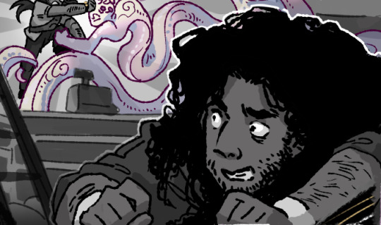
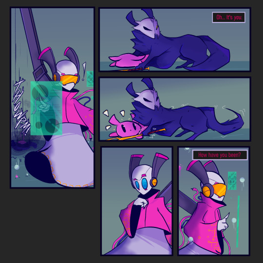
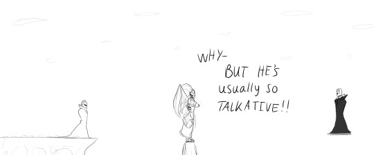
[Image ID: A black and white comic panel. It is a close up of Angel, a Puerto Rican man lying on his stomach on the floor, from the shoulders up. His eyes are wide and his hands are balled up into fists as he looks over his shoulder at where Whit, another human, and Wilbur, a snake-like nephilim with arms who glows faintly mauve, are fighting. In the background, Whit continues to struggle with Wilbur, trying to keep his footing on Wilbur’s slippery tail and a hand on Wilbur’s head as Wilbur grabs Whit’s leg.
There is a ladder leaning against the counter. End ID]
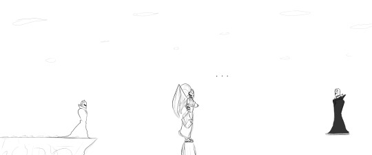
Whit goes out of bounds.
Read it on tapas // Read it on webtoons
Click here for image IDs of all published comic pages.
#webtoon#tapas webcomic#webcomic#bwbcomic#meta comic design#that's the best way i can figure out how to describe it lol#if it sucks!!! just leave#get out#hit the bricks
6 notes
·
View notes
Text
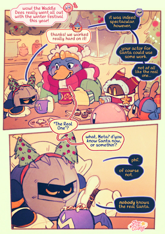

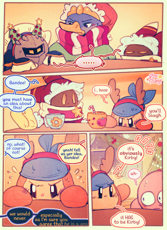
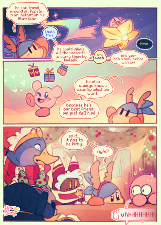
alas, it seems the christmas mystery shall remain unsolved 🎁 happy holidays!
#running a little late on this one but i was determined to get it out this year!!!! i hope you'll enjoy it nonetheless!#there was an additional page i had to cut where kirby bid them all farewell; smacked the wall; and a whole workshop of stuff fell down#but it proved too clunky and too hard to capture within my time limit so you'll just have to imagine it 😂#also this is featuring my festive designs from the advent stickers i did this year!#finally i get to draw boggle eyed kirby and V-face meta knight. christmas present to myself.#happy holidays and best wishes to everybody for the new year!#kirby#bandana waddle dee#meta knight#king dedede#magolor#my art#my comics
1K notes
·
View notes
Text
i haint watched the dang chibisode and idk if ill actually watch it with sound on sdfjk but i have a hurt feeling about them casually imbuing perry with speech for a one off gag because the idea that he needs to talk to communicate is fake. we had 4 seasons of wacky magic hijinks cartoon where perry never needed verbal speech to communicate. they couldve done this gag at any point in the show but they didn't, and the fact that they didn't felt significant. perry's muteness is such a core part of his character, to me, to the way i conceive of him/write him. i don't wanna overreact to a goofy little side cartoon (even tho i'm doing it anyway) but it's still the characters, and it still upsets me! ok that's it i've said my piece
#ill watch it at some point but despite my silence i have been like obsessively anxious about this cartoon#and pestered my friend to watch it for me sDFJKL#in a month this will have either ruined pnf for me forever or i'll have changed my mind and i like it actually its fine#for now anyway i have tons of comic sketches about perry's muteness that i no longer wanna finish and share...maybe someday but not now#i had a rly great day actually but now im falling asleep in bed tipsy and a little teary over this. cuz i love perry a lot he's#really special to me. i also got that star wars perry shirt in the mail today btw. and. it's such a good pj shirt#but back on topic#it sucks when an aspect of a character that is CORE to your appreciation of them becomes casually disregarded by the writers at some point#like im certainly not ever accepting an interpretation of perry like 'secretly hed really like to be able to talk' because its#never ever been communicated. like the idea that heinz wd prefer if perry was human. its just not in the show. the opposite is true in fact#so im left feeling stupid for caring about something that some writers(inc. dan) felt was unimportant. makes me not wanna continue my art#which sux cuz i like my comic ideas! id love to finish them. i hope i get over this.#i overreact to live-updating media when im fixated on it wh is why i prefer getting into dead fandoms haha#but they keep on bringing them back to life dont they...im never safe#it was funny me trying to explain to my friend why i efel so strongly about this meanwhile hes tried to explain why he feels so strongly ab#ut AYA and my stance on that episode has always just been “cute! its fine” lmao#@ dwampy you guys made the show that follows a specific rhythm and set of rules designed to appeal to obsessive autistic brained people ok#you invited my overreaction. unsheathes katana etc#ok im goint to sleep#meta
72 notes
·
View notes
Text
This is HEAVILY inspired by @das-a-kirby-blog because I came across their post and thought it was cute. (If you’d like me to, I can take this down 🫶🏽 I just really loved the idea but don’t want to come off as stealing it)
-
The main thing I loved about it was how Meta Knight is actually a soft squishy boy and it got me thinking, how would that idea work with my design? I didn’t exactly make my Meta Knight a pretty boy or a young looking guy so because my MK is a short king, I wanted to incorporate that into this idea.
QUICK EDIT: DeDeDe is designed by @//_danktrash on Instagram. They just gave me permission to use it however I want but I feel bad that some ppl think I designed him 😭 I love the design sm but it is NOT my design. Meta knight is my design tho 👍🏽
-
I’ve also fallen deeper into the Metadede rabbit hole 🧍🏽


#please ignore my inconsistency#I’m still practicing how to draw these designs 😭#I also don’t have the skill to make quick comics so this took me forever lol#king dedede#meta knight#metadede#gijinka
134 notes
·
View notes
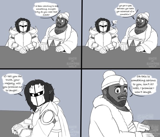
Note
Not sure if you've been asked this before (I checked the archive, but didn't see it), so sorry if this is a repeat.
I was just wondering if you had a favorite version of Kryptonian traditional wear (between the different Superman media)?
Seeing different takes on Kryptonian fashion is fun, I personally love stas version.
I have not been asked this yet, so no worries!

Ooh I love the STAS version too! I tend to enjoy the designs that lean towards long flowy robes. I do wish the colors didn't lean so heavily towards red with gray armor platting though? It reads more as villain colors from the lack of cool colors. I would prefer either a subtle echo of Superman's primary colors or if you want the Kryptonian parents to have more individuality, a nod to their original colors instead!

Which is what the Smashes the Klan version does! I love the bright colors of these. Even if it's a little classic camp core, they do look actually related to Superman and the red and yellow connects them together as a color accent. I think sometimes folks go too far into making them look sci fi that Supes sticks out in a way where his outfit doesn't match Krypton's look at all. Which narratively is fine if you're going for the origin where Superman purposefully dresses as a circus strongman (which SSTK does)- but if the suit it gifted from the Kryptonians? Then it should look some sort of similar surely (cough MAWS cough).

MY ALL TIME FAVORITE THOUGH (or at least stuck out immediately to me) is the design of Jor-El from the Battle of the Supersons movie! Something about this look just spoke to me. It's a clear echo of STAS' shape language with the long flowing robe and the buckle across his chest, but with green and yellow colors (it's tinted by the hologram look but you can tell those are the colors)! It looks sci fi but still related to Superman's iconic look while being distinct. Not fashion related but I love me a bearded Jor-El heheh.
I think it's critical to get the look of Kryptonian fashion in comparison to Superman's look right. Because you get a narrative out of that! How connected is Clark to his Kryptonian heritage? What level of self-acceptance is he in to embrace the more alien aspects of his wear? Was the suit gifted by the Kryptonians or approximated by Ma Kent? Does the S symbol look alien, or did Clark choose the more "S" looking shape to be recognizable? You get a different diasporic Superman with these little character design choices.
#askjesncin#jesncin dc meta#I drew Jor-El and Lara once for a joke comic and I pulled from the Battle of the Supersons look. I just like it. I think it's neat#there's so much more thought you can put into these designs to tell a story outside of “pick bright colors” and “make it sci fi”#because all this informs Clark's character
43 notes
·
View notes
Text
Geiger by Geoff Johns and Gary Frank is compelling to me because it's the first time I've ever seen someone put two-and-two together by having a superhero whose stock powers-from-radiation-exposure origin story wasn't a lab accident or experimental detonation gone awry, but a world-ending nuclear war- resulting in a guy who'd be on the Justice League in a better timeline instead puttering about a fallout/mad-max style wasteland doing folk-hero shit.
#More of a fun comic than a great comic but conceptually this circle goes largely unsquared#thoughts#meta#helps that the character design is kickass
49 notes
·
View notes
Text

take two on my ric with scars concept. (first explored here). i wanted to try it out in my rendered style (i still like the old style for quick drawings). i added a few scars in addition to the electrical burn and explosion scars. on his temple i put a scar from when he got shot by freedom force and on his chest i added claw marks from sabretooth.
further design notes: i brought back his earring from the 80s and i gave him curls bc he should have them. i also gave his hair an auburn tint bc in x force 1991 his hair was typically a dark red.
#my art tag#julio richter#rictor#x force#marvel#x men#meta#character art#character design#x men comics#ric tag
31 notes
·
View notes
Text
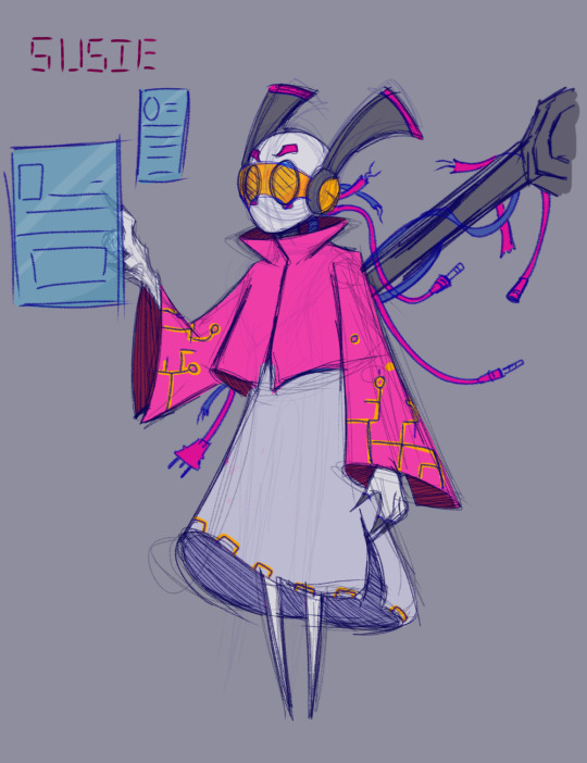
Got inspired by @macchitea 's Rain Land au (Who designed the Meta Knight and Kirby slugcats) and decided to design Susie as an iterator for fun.
I would imagine she is made to research further advancements in their technology and more study focused than the other iterators. Think of her as a very tone down Glados, though like her she wouldn't mind a few sacrifices.
Feel free to interpenetrate whatever is happening in the comic, it was made all in good fun.
Again the Meta and Kirby slugcats and rain-land au were made by macchitea! :)
#found out that not much is going on with susie besides her feminine figure and antenna things#So trying to design an interator that is her and not some recolor was a bit of a challenge for me. I think I did alright.#kirby#kirby series#susie haltmann#rainworld#meta knight#comic#vio.txt#vio.png
210 notes
·
View notes
Text

Knightfall in Dream Land - Page 3
Meta Knight starts telling the kids the story of how he arrived on Popstar.
#Kirby#Kirby fanart#my art#comic#all of the parts of the comic that are set in the past will be drawn in the Kirby’s Adventure/Dream Land 1 art style#so that’s why Nightmare has his old design here and not his updated design#I’ve seen a lot of people going with the headcanons that Nightmare created Meta Knight or that he’s Meta’s father#but in my interpretation he didn’t create Meta he just found him in space and was like ‘hey a free baby’ lol#so Nightmare didn’t create him but he did raise him we’ll get into his motivations for this on the next page#I also have a headcanon that the reason Meta Knight has a Spanish accent and speaks Spanish is because he learned it from Nightmare#it might take a little longer for me to get the next page done I’m traveling for some school/work stuff pretty soon#but I hope that the next page will be worth the wait I’m glad that people are liking this comic so far!#Meta Knight#Bandana Dee#Sailor Dee#King Dedede#Nightmare#Knightfall in Dream Land#Metadede
86 notes
·
View notes
Note
Not a question, but I love your blog so much. Makes me so happy :) I'm very excited to see the Yi City trio in your style.

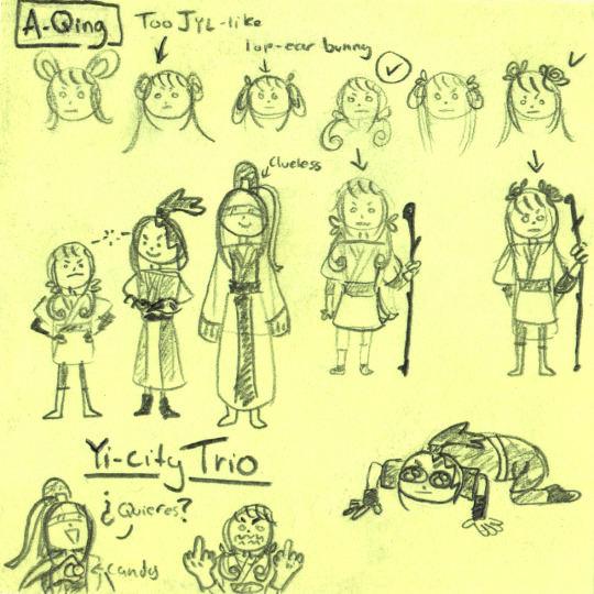
We're getting close to the Yi-City arc! In the meantime, have some behind-the-scenes sketches of me trying to figure out their designs!
#poorly drawn MDZS#MDZS#Xue Yang#A-Qing#xiao xingchen#song lan#Ask#I really love the yi-city arc so I wanted to make sure I was happy with designs!#Im not the best at subtle complexity...so I go for a combo of readability and personality#It ends up turning into 'throwing a ton of stuff at a metaphorical wall and seeing what sticks'#These aren't the only sketches of these guys either. A-Qing my beloved and beloathed I could not figure her out#This is definitely a bit of a step to the left in terms of my usual content but I hope this sneak peak tides you over!#(XXC offering candy and A-Qing's rage are *not* related btw. They are separate goofs)#Meta-meta commentary: Upload schedule is a bit off today due to script overhauls. I will post today's comic...sometime today.#EDIT: Im not gonna upload again today. Im going to sleep u_u
221 notes
·
View notes
Text


So anyways, here's a goofy episode plot thing I basically made in one sitting.
Connie is a saint.
..
(my hands feel like they're on fire)
#Escargoon#Meta Knight#King Dedede#kirby oc#Manny Moth#Connie Dot#my character(s)#my design(s)#my art#kirby series#krbay#kirby right back at ya#chibi's krbay au#my comics#sword knight#blade knight#krbay tiff#ALMOST FORGOT TO TAG THOSE THREE 🧍
57 notes
·
View notes
Text
a crack in the wall
The thing that struck me immediately, like the first time I saw the scene, was the Director saying “...and now, we have a monster in our kingdom.”
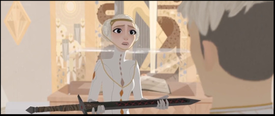
framed like that, holding the sword she stole so she could frame Ballister.
My literal first thought was “yeah, I’m looking at one right fucking now”. Two seconds later she’s using that sword to get rid of a threat to her order, so like yeah.
It’s not subtle cinema language at all, it’s basically shouting it at me, but I liked it anyway. She’s a threat and the movie is no longer remotely hiding it.
#Nimona#meta#spoilers#ssh spoilers#Nimona (2023)#I have more Thoughts going on about this and around this#That I read this as a villain monologue from my position as a queer jobless person#while my datemate reached the end of the movie and said he wondered why they didn't show her reason for doing what she did#from his position as a straight white-passing male#he called it boring when I tried to explain it to him#while I found it real and horrifying because the banality of evil does so much more damage than the theatrical chaotic evil in fantasy#That her opening with her nightmare about a crack in the wall had me understand her motivation and her irrational reaction to fear#hell I saw this before I read the comic and now that I have read the comic#my thoughts about the banal evil vs theatric evil feel even more like it was INTENTIONAL DESIGN#congrats to the team tbh#Disney so clearly never deserved to have this movie under its umbrella#movies I would show my kid if I were a parent
74 notes
·
View notes
Text
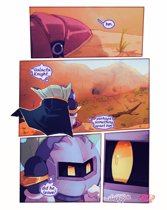
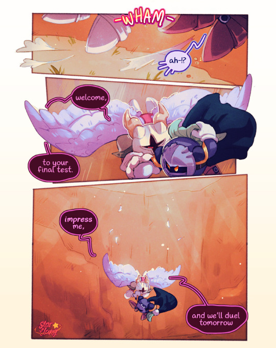
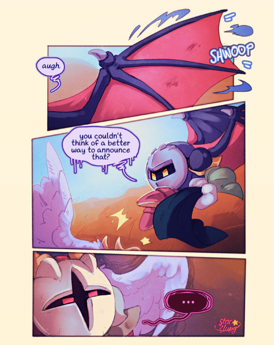
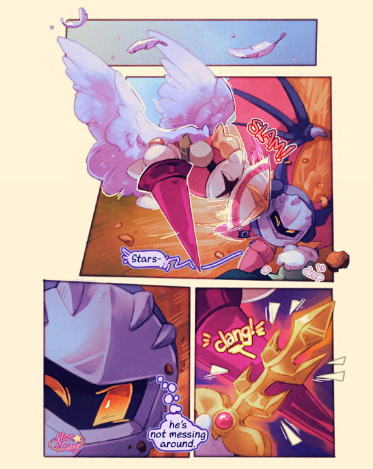
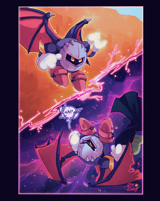
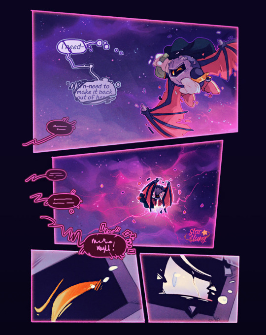
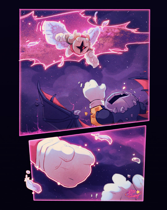
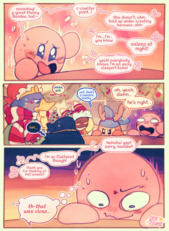
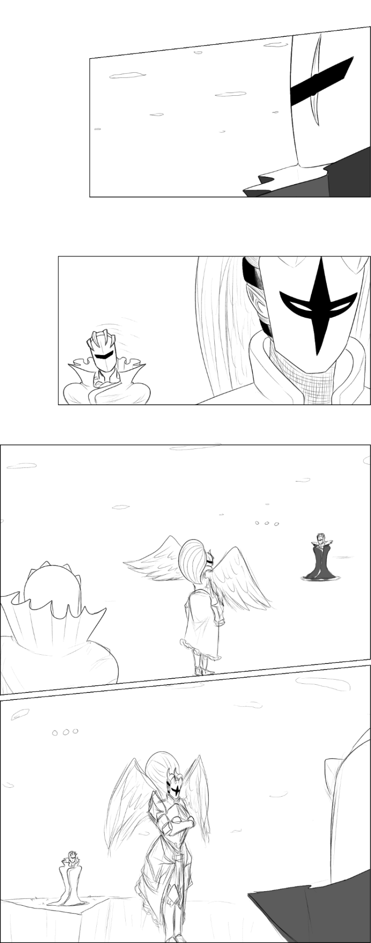
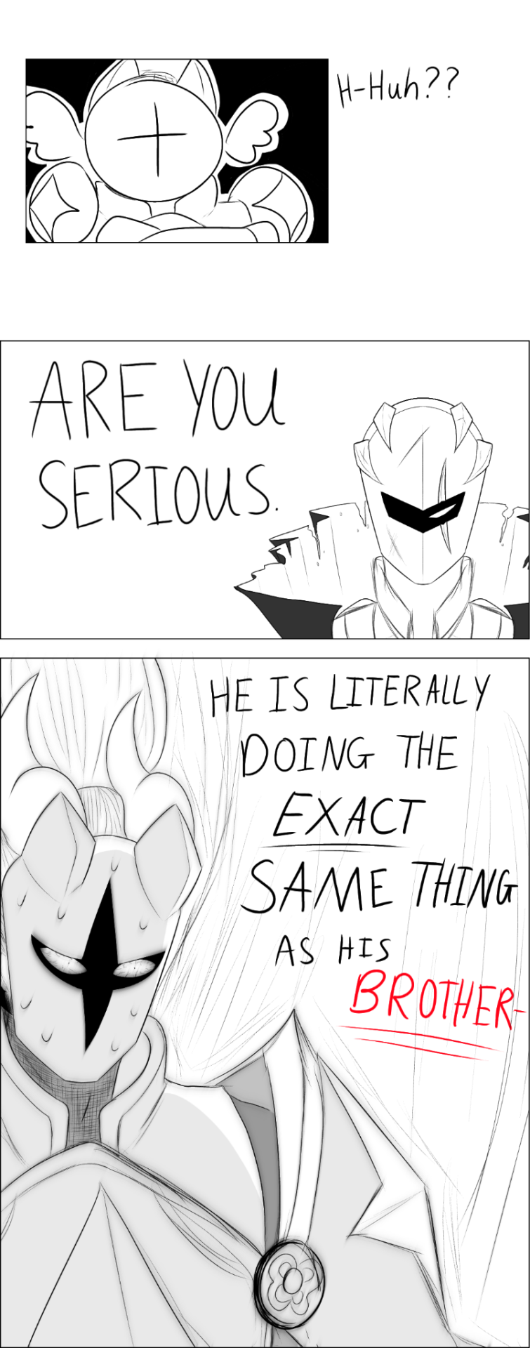
from: @starflungwaddledee
to: @post-it-notes7
message from santa:
"happy holidays post-it-notes! 🎄🥳 i know you very politely only wished for a few modest things- characters high fiving, or struggling in christmas attire- but i hope you'll still enjoy this given that i kinda went the opposite direction entirely! i'm an enormous fan of your work and most times you post anything i wind up browsing your art tag from tip-to-tail in enraptured delight. as such, i thought it was only fair i give back something a little more significant in gratitude for all the joy your work has given me.
i knew i wanted to do a comic, so i was thrilled you already had a whole storyverse for me to work from!! this scene seemed the most obvious choice (chapter 8 of "wishful thinking" on ao3) given that i enjoy a dramatic fight scene 😂 i tried to stick as beat-by-beat to the writing as i could and worked in as many details as possible; i hope it'll be fun to see it envisioned this way! merry christmas!
~starflung 🎀🔔 "
#phew... this is by far the most ambitious piece i've ever posted here! 12 pages! this is why i've been so afk from other work haha!#shout out to the poor mods who sent through assignments and received no small amount of all-caps panicked screaming from me in response!!#me?! draw a gift for THE post-it-notes7!? immediately knew i had to overachieve to stand any hope of being up to the bar haha#if you feel these characters look a little different to how i usually draw them- that's totally on purpose!#i worked really hard to match post's designs and styling for them rather than my own; seeing as this was a gift!#actually think it stands out a *lot* surprisingly- given that they are still the exact same orbs. really interesting to compare to my usual#i hope some folks will notice all the details from the story in here! if you've read it and you recognised it please let me know!#genuinely hoping someone just recognises it on the first page. iconic canyon fight... what an honour to draw for this fic tbh#also thank you to the mods for handling all the wips and progress on this ridiculously sized entry from me with such grace#it's being posted on my personal blog due to length for anyone wondering. should be seamless... fingers crossed.#my art#my comics#meta knight#galacta knight#hnk secret santa#cw violence
891 notes
·
View notes
Text

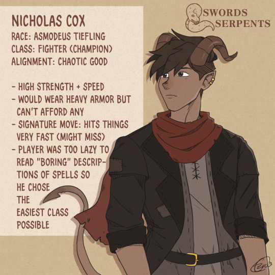
Reworked character sheets for my Dungeons and Dragons AU! The Kings Row boys are playing "Swords and Serpents" with Seiji as the long-suffering Dungeon Master. Who do you want to see next?
#fence comic#fence#seiji katayama#nicholas cox#nichoji#dungeons and dragons au#swords and serpents#i wanted to give seiji a magical class thats also kinda dark#warlock was my first pick but then i remembered that they depend on having a high charisma stat and...#seiji and high charisma? yeah thats not gonna happen#so necromany it is :D#he is also proficient with daggers so he might stab you#champion is the most basic class you can choose in dnd#no complicated spells or talents#just hit things very hard!!#so yeah thats perfect for nick#I'll possibly redo the first comic page in the link bc my style changed as well as the designs#After looking at all races again zariel tiefling might have been a better race for nick#But I'm sure no one will go further into dnd meta... Right?#My art#fence fanart
60 notes
·
View notes
Text
Finally got around to redrawing an old pic of Meta and Contego! Full version will be up on my Patreon this Saturday for the biweekly art dump, along with some more Nielson family doodles and other character intros 👀
#ladypepperofdavenshire#original characters#character design#parallels comic project#twins#Jenna Nielson#Jesse Nielson#Jenna#Jesse#meta#Contego#superheroes#siblings
8 notes
·
View notes
Text
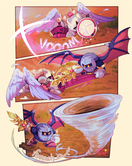
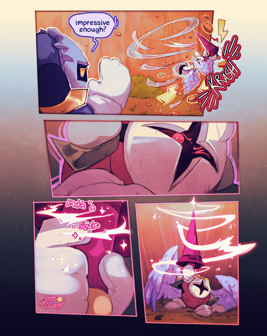
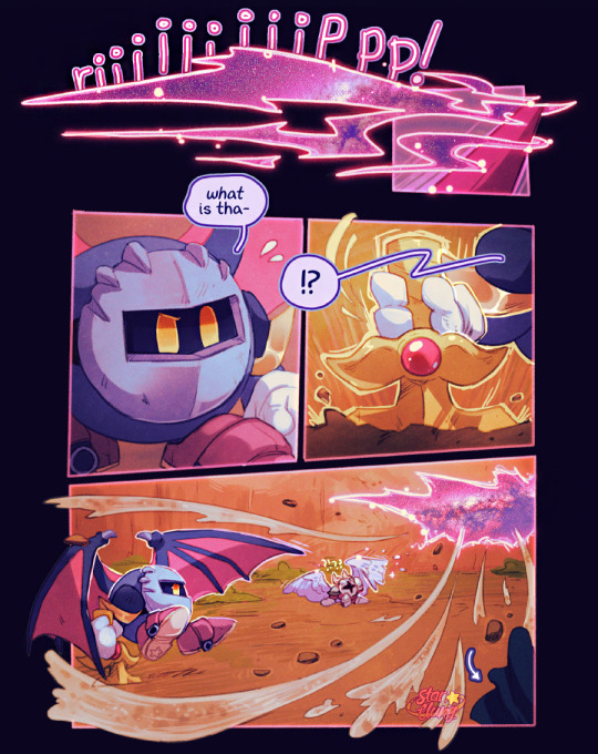
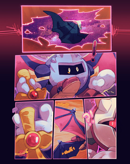
Pt 2: [PREV]


[Next]
#HE'S GOING TO BE STUCK THERE.#FOREVER.#NOVA this is even worse than crystal imprisonment! -GK /j#quan blovk#my art#digital drawing#fanart#kirby nintendo#comic#galacta knight#Meta Knight#Dark Meta Knight#demeta#galacta knight gijinka#dark meta knight gijinka#meta knight gijinka#1 more part and finally GK's FREEEEE#Or.......will he?#DUN DUN DU-#Dameta's design looks clunky cuz i didnt get to fully do a ref of it yet#bleh
122 notes
·
View notes
Last Seen Blogs

gamingmarketplace
Adia Samra

slivpremiuscourses-blog
Слив премиум курсов

oneandonlywhalesharklover
🌊Mazie's Lighthouse🌊

lilfoxbabies
All For The Game
welshflyingpig
welshflyingpig🐷