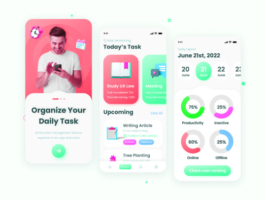
#mobile ux
Text
I will design stunning ui ux for mobile app.
Follow me on FIVERR
What you get from me :
Creative mobile app design
Custom UI
PNG, JPEG and fig and XD editable source files.
100% money back guarantee if you don't like our work.
Fast service.
24/7 customer support.
10 notes
·
View notes
Text
My project on Behance. I’ll be very happy if you see it 🤍🤍🤍
#ui kit#website#web design#app design#mobile ux#uxinspiration#uxuidesign#uxjobs#mobile ui#ui ux design#design#portfolio#behance
4 notes
·
View notes
Text
I dropped the long-press delay to 150 ms and doubled the UI animation speed on my phone, and it feels so much more responsive 😮
I wouldn't recommend everyone do this because it is much easier to trigger a long-press by accident, and it reveals some animations that take as long as they do to hide loading times, but I am really liking it 😄
#UX#UI#System UX#System UI#Mobile UX#Mobile UI#Animation#User Experience#User Interface#Responsiveness#Me
0 notes
Text
What type of UX/UI do I need for a mobile app?

A well-designed website with a scratch and professional curves can give a conscious appearance about your company's ambitions and objectives. Because of the relevance of reality, the website transforms into an effective marketing and advertising tool. XcelTec provides a professional solution for creating the best UI UX design for users using cutting-edge technologies to give an original user experience.
The subjective experience that a user experiences with a mobile app is referred to as mobile UX. This encompasses both positive and negative events as well as emotions.
UX design is the process of developing a product that is enjoyable to use and gives a meaningful and relevant experience. It involves, but is not limited to, interaction, content, and sound design, as well as taking into account the entire consumer journey.
Everything related to graphic design is included in the UI.
UX extends beyond the purely graphical depiction of the user interface. It is also concerned with designing the user experience before, during, and after using the app.

Mobile UX design is difficult. As previously said, there are numerous factors to consider, such as the expanding number of mobile devices, how people engage with them, and the fact that users demand consistent and delightful experiences across all device kinds.
You must select the following options that must be addressed for your mobile app via UI/UX design.
UX Research
Clutter
Prioritize
Touch targets
Label Text
UI Feedback
Accessibility
Most UX designers strive to create enjoyable experiences and beautiful designs that achieve both discoverability (what actions are feasible) and understanding (how is the product supposed to be used). However, due to the size, portability, and environments in which these devices are used, there are some limits associated with mobile.
Thank you for your time. Stay tuned for more information and updates!
Visit to explore more on What type of UX/UI do I need for a mobile app?
Get in touch with us for more!
Contact us on:- +91 987 979 9459 | +1 919 400 9200
Email us at:- [email protected]
0 notes
Text
Last year: re-did the whole front page of our app to be flat and more modern, per UX designer's design, round the edges of elements less
This year: re-doing the whole front page of our app to use elevation/shadows and round the edges of elements more
#software development#mobile ux#ux design#I mean it's okay I don't mind and the design is different#I just find it funny
0 notes
Text

Nokia 3310 Windows Phone (2014)
#2014#2010s#art#cell phone#cellphone#design#frutiger aero#frutiger metro#graphic design#graphics#mobile#nokia 3310#nokia#old tech#phone#photo#queuetiger#techcore#tech#technology#ui ux design#vector#windows 8#windows phone#yellow
43 notes
·
View notes
Text


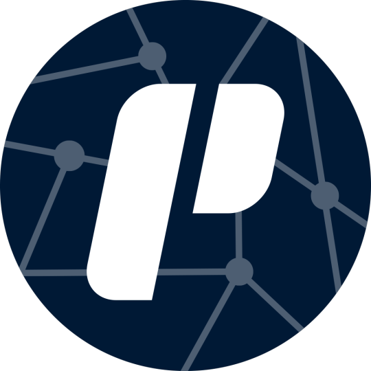
Check out the new app icon designs for Praxis — a blend of neo-brutalist color schemes and network concepts
join the praxis discord - praxis github
#open source#praxis#free software#typescript#nodejs#foss#ui design#logo design#design#app design#mobile app design#ux design
71 notes
·
View notes
Photo
happy dark road finale to all those who celebrate
#thnak you damo279 on behalf of every person too lazy to play the whole game by themselves#you've done more for kh mobile games than square enix#kh#kingdom hearts#kingdom hearts dark road#dark road#xehanort#kh ux#khdr#fanart
985 notes
·
View notes
Text
To think I take a nap and within the....... uh...... 6 hours(?) I've been asleep.... The Kingdom Hearts fandom exploded..... because of two KHML pictures....
#I honestly would love to get into missing link. but I feel like I wouldn't understand it cause I just CAN'T get through UX or DR#I've never been good at committing that much time and effort to a mobile game. I am NOT a 40 year old facebook user 😭#BUT AT THE SAME TIME I REALLY WANNA KNOW WHAT'S GOING ON WITH IT 😭😭😭#kingdom hearts#kingdom hearts missing link#KHML
42 notes
·
View notes
Text
I think after getting Strelitzia as Lauriam's little sister in UX and Hoder as Baldr's older sister in DR we deserve to have a main character in ML like Sigurd or something with a twin sister, just to leave us all in suspense. Will she murder him? Will he kill her? Will they actually have a normal and non-tragic sibling relationship for once? Who knows! Only the writers and they're not telling us until the end <3
#kingdom hearts#khml#people getting into ml after ignoring the other mobile games: wow look siblings how sweet and cute :)#ux/dr fans: please no i cant take this again theyre gonna kill each other arent they
21 notes
·
View notes
Text
The most undervalued, misunderstood job in software is security. If the security team is doing their job right, then the only visible effect is that they'll make features slower to develop, slower to run, more expensive, and sometimes so prohibitively difficult that you have to scrap parts of the feature. If that's the case, then your security team deserves a raise for how much hard work they're doing. When it comes to security, anything noticeable happening is VERY BAD.
#codeblr#progblr#information security#the second most undervalued job is ux#but at least its relatively easier to understand their contributions#except for a11y work#when you make an app usable for blind people or people with mobility issues#the only people who notice the improvement are blind people and people with mobility issues#product owners are not checking how things sound on a screen reader or testing if it works without a mouse
13 notes
·
View notes
Text
As someone who doesn’t use Twitter and hasn’t used it since 2016, at this point I feel like every even slightly Twitter-esque (let alone overt Twitter-esque) design choice Tumblr makes gets yelled about because People Really Just Fucking Hate Twitter whether they realise it or not.
Which, like. Fair ‘nuff. I also hate Twitter, which is why I don’t use it. But nobody ever really gives these design decisions any time to percolate on this site in favour of kneejerk “they changed it and we hate it” reaction. Public likes are not new. Multiple tabs on a dashboard (some of them not things you opted into seeing) are not new. Having to block ads with external tools is not new (and it’s a big deal that photomatt said the words “ad blocker”, like, you couldn’t get that shit on any other profit-driven site, everyone is too scared for their precious monetisation)
The new sidebar, also, I think is pretty ugly right now but it’s probably going to go through a few iterations. I, personally, really wish they’d put the search bar literally anywhere else (maybe group search and discovery together IDK I’m not an UX designer) and I think accessing sideblogs has been too complicated for a while now, but none of those are the same as “this looks like The Other Blue Site”.
Like I’m not a graphic designer. I am certainly not a fucking UX designer, and I think those people are either all nuts or all geniuses. I’m pretty sure the new layout is being extensively heatmapped rn, and what changes it’ll undergo are gonna be done based on that, based on comments that are along the lines of ‘this change would make me more productive’ and less on “WEEEEEH CHANGE IT BACK CHANGE IT BACK CHANGE IT BACK”.
Your animosity towards change is not meaningful user experience information. You misclicking on shit more *is*. If this layout is really *that* bad and terrible, Automattic’s research tools will demonstrate it as such. The developers now are actually much better versed in Web 2.0 design, for better and for worse.
#van stuff#Also like yes I also hate the touchscreenification of desktop sites#as someone who does not have and does not want a touch screen computer#but that's not a design trend I get to dictate as I am in fact a minority user for this site#and the complaints I am tired of seeing are also coming from other legacy minority users of desktop#There are many good UX reasons to opt for a vertical layout instead of a horizontal one#and I think the majority reason is so that people who are on mobile and desktop simultaneously don't have to have two different brainmaps#for their muscle memory on this site#but like... the vertical sidebar is not the same as 'randomly swapping 'Close' and 'Post'' lol#the top of the screen horizontal bar still does things and there's way less empty space there now#and I get wanting negative space and less screen clutter#like... that's the ONE criticism of this update I can agree with#but that's STILL NOT THE SAME as 'arbitrarily fucking over the muscle memory of EVERY site user'#how many people on this site *ever* move out of their dashboard? I know I do!#but I think it's the minority of people considering the user-curated model of propagation this site is still#*actively* promoting#This site looking superficially more like twitter doesn't change that!#like the sky is not falling call me when they eliminate the ability to browse the tags in favour of a flat search#AGAIN#remember when we had that? Remember how *BAD* it was?#remember how much easier finding stuff became when we got 'browse tags' back as the default search?
11 notes
·
View notes
Text
hot take but the tumblr app interface is almost too fiddly compared to the mobile browser interface
I want to do things with a minimum of touches/'clicks'!
3 notes
·
View notes
Text
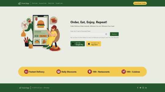
// building a landing page for a food app I wanna build ...
2 notes
·
View notes
Text
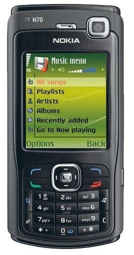
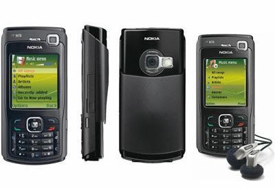
Nokia N70 Music Edition (2005)
#2005#2000s#05#00s#abstract#art#black#cell phone#cellphone#design#frutiger aero#graphic design#graphics#green#mobile#nokia#nokia n70#old tech#phone#photos#techcore#tech#ui ux design#technology
51 notes
·
View notes
Last Seen Blogs

diegorocky
Untitled
bunnyplushys
my bunnies!

secretsteaseyourhead
Bambi Eyes
thatsmydogfoodtruck
Untitled

emylilas
"A heart can be broken, but it keeps beating just the same" -FGT