#mobile-first design
Explore tagged Tumblr posts
Visit Tumblr Blog
Explore Tumblr blogs with no restrictions, modern design and the best experience.
Last Seen Tumblr Blogs


Fun Fact
The “We are the 99%” Tumblr blog became the slogan for the Occupy Wall Street movement.
Text
Mastering Mobile: Why Your Website Needs to Be Mobile-First in 2025
If you’re still treating mobile design like an afterthought, 2025 is going to leave you in the dust. Seriously—we live on our phones now. From grocery shopping to job hunting to late-night scrolling through services we might need—mobile is the battlefield. And if your website doesn’t show up fully armed? Game over. Let’s break down exactly why your website must be mobile-first in 2025—and how…
0 notes
Text
How to Design a Seamless Mobile Experience
UI/UX Best Practices

In today’s mobile-first world, a smooth and intuitive mobile user experience isn’t just nice to have—it’s essential. Whether you’re building an app or a responsive mobile site, the way users interact with your design can make or break their perception of your brand.
For more articles please visit: https://pixelizes.com
In this blog, we’ll walk through UI/UX best practices to help you design seamless mobile experiences that keep users engaged and coming back for more.
1. Understand User Behavior on Mobile
Design starts with empathy. Mobile users:
Are often on the go
Prefer quick access to information
Use thumbs for navigation
Expect fast loading and fluid interactions
By designing with these behaviors in mind, you’re already creating a more intuitive experience. Learn more about mobile usage patterns.
2. Prioritize Content with a Mobile-First Mindset
Start your design process with the smallest screen in mind. Focus on:
Core content and functionality
Clean, minimal layouts
One task per screen (to avoid overwhelming users)
Once the mobile experience works beautifully, scaling up for larger devices becomes easier.
3. Simplify Navigation
Clear and consistent navigation is crucial. Follow these tips:
Use bottom navigation bars for thumb-friendly access
Keep menu items to a minimum (ideally 4–5)
Make icons recognizable (home, back, search, etc.)
Use sticky headers or floating buttons for important actions
4. Optimize Performance and Speed
Slow apps or sites = frustrated users. Improve speed by:
Compressing images and media
Minimizing API calls
Lazy-loading content below the fold
Avoiding heavy animations unless necessary
Fast experiences feel more responsive and reduce bounce rates. Check Google Page Speed Insights to assess your performance.
5. Make Touch Interactions Effortless
Ensure that every tap and swipe feels natural:
Use tap targets of at least 48x48dp
Leave space between buttons to prevent accidental taps
Support common gestures (swipe, pinch, scroll)
Provide instant feedback (e.g., button highlights, animations)
6. Follow Visual Hierarchy and Readability
Small screens mean you need to be crystal clear:
Use bold headings and ample spacing
Stick to 1–2 fonts with clear contrast
Break up content with cards or sections
Make sure all text is legible without zooming
Explore typography best practices for mobile .
7. Design for Accessibility
Make your mobile design inclusive:
Use sufficient color contrast
Enable screen reader support
Avoid relying on color alone for information
Ensure controls can be accessed with one hand
Accessible design benefits everyone—not just users with disabilities.
8. Test, Iterate, Repeat
No design is perfect out of the gate. Use tools like:
Figma prototypes for early testing
Maze or UserTesting for usability studies
Hotjar or Google Analytics for real user behavior
Use real feedback to refine your mobile UX over time.
Final Thoughts
Designing a seamless mobile experience takes thoughtful planning, user-centered thinking, and a dedication to simplicity. By following these UI/UX best practices, you’ll create mobile interfaces that not only look great but work beautifully—turning casual users into loyal fans.
Want more tips on UI/UX, web design, or mobile optimization? Stay tuned for our upcoming posts, or get in touch to learn how we can help design your next digital product.
#Mobile UX#Mobile-first design#UI/UX best practices#Mobile app design#Responsive design#User behavior on mobile#Navigation design#Mobile performance optimization#Touch interactions#Visual hierarchy#Mobile accessibility#UX testing#Mobile design tips#User experience design#Mobile optimization#Design for accessibility#Digital product design#User-centered design#Mobile usability.
0 notes
Text
Stand Out with SEO-Optimized Website Design in Toronto 💻✨

A website should be more than just a pretty face—it needs to perform! At Pat's Marketing, our website design in Toronto merges the connection between SEO and web development to create stunning, high-performance sites. From mobile-friendly designs to lightning-fast load times, we focus on SEO-friendly code, intuitive URL structure, and site security to keep your website reliable and ranking high. Ready for a website that not only looks great but performs even better? Let’s create something amazing together!
#website design Toronto#SEO#web performance#SEO and web development#mobile-first design#site optimization#Pat's Marketing#seo company toronto#seo company#web design company#web design#best seo company toronto#seo consultant#toronto seo expert#seo services#ppc toronto#ppc management services
0 notes
Text
Why Mobile-First Design is Crucial in 2023
In today’s digital landscape, where smartphones are practically an extension of ourselves, it’s no surprise that mobile-first design has become a cornerstone of modern web development. With an ever-increasing number of users accessing the internet via mobile devices, the emphasis on creating responsive websites that cater to the mobile user experience is more critical than ever. Let’s explore why…
0 notes
Text
UX/UI Best Practices for E-Commerce Platforms in 2025
Table of Contents Introduction to UX/UI for E-Commerce in 2025 Why UX/UI Matters in E-Commerce Success Key UX/UI Trends for E-Commerce in 2025 AI and Automation in UX/UI Design Essential UX/UI Best Practices for E-Commerce a. Mobile-First Design b. Simplified Navigation & Search c. Personalization & AI Recommendations d. High-Speed Performance & Load Time Optimization e. Secure &…
#A/B testing#accessibility design#AI chatbots#AI personalization#bounce rate reduction#conversion rate#digital experience#E-commerce UX#fast-loading websites#future of UX/UI#intuitive navigation#lazy loading#mobile-first design#online shopping#personalized shopping#progressive web apps#seamless checkout#SEO for e-commerce#smart recommendations#trust signals#UI best practices#user-friendly interface#UX design trends#voice search#website optimization
0 notes
Text
Responsive Design: Why It’s Non-Negotiable
Having a responsive website is no longer optional—it’s essential. With mobile devices accounting for more than half of global web traffic, responsive design ensures that your website performs seamlessly across all screen sizes. Whether you’re a business owner, developer, or marketer, understanding the importance of mobile-friendly designs and how to implement them is critical to staying…
0 notes
Text
#mobile-first#mobile-first design#mobile app design#mobile web#mobile-first strategy#Mobile performance#Mobile strategy#mobile app development
0 notes
Text
0 notes
Note
TUMBLR LEGWND ITSDEIFNITLEY ALSO DRAWS SANDERS SIDES?!?!???
i dabble
#sanders sides#remus sanders#janus sanders#id in alt text#definitely art#(patton voice) now what did we learn#sigh. don't rewatch selfishness v selflessness + the redux and working through intrusive thoughts first thing in the morning#i couldnt find a good reference for their bottom halves and i didnt want to spend too long looking for one. so i improvised#i designed a more flashy cane for janus i just didn't want to draw it. maybe he was focused more on mobility than style. who knows#i didn't want to shade this. or like. put too much effort into this because it was a warmup#so if you see imperfections. n. nuh uh. no you don't
3K notes
·
View notes
Text


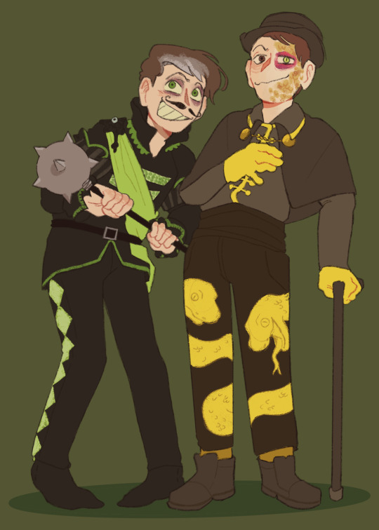
oops ponied more lifers (Jimmy and Joel are redesigned lol, design notes and original under cut)
With Tango I wanted to play with half body/split coloring and make him look scorched, including his horn which will just smoke while he's not using magic. I'd like to think he's absolutely fine and all that's changed is that he can only conjure fire magic but he doesn't care that much. His tail and mane can burst into flame whenever
BigB is a big guy with a thousand yard stare and prey animal behavior with his ears constantly tucked back. I really like the idea of him having a huge tail dragging behind him, adds to the unnerve a tiny bit. When people look away he turns into a hyperrealistic creaking horse

Why did I make Jimmy all yellow. His color is blue!!! Blue!!!! Even if I usually highlight him with yellow because it just looks nicer but!! Blue..!! Seeing Lizzie build a blue parrot for him inspired me to finally redesign him, his coloration is based on the blue quaker parrot! The canary theme can still work with this, I'd like to imagine his flight feathers started going yellow and he wasn't just born with canary feathers. Also tried to get across that he's a lanky ass pony but makes himself look smaller
Joel I think works so much better when he's relatively monotone and the green highlights are implemented sparingly (you know, as highlights). I think it makes him look more special even with normal horse colors than if he was mostly green, kinda loses that bit of the design that really identifies Joel AS Joel. Yeah my first Joel design was garbo. Also he's very angry that god made him an earth pony and tiny. sorry little guy
Also also I made this little video where Joel eats Scott and runs away with Jimmy you're welcome
#jimmy solidarity#tangotek#joel smallishbeans#bigb#bigbstatz#omg whaaat a blue pony bigb....? no way#My first set of designs were kinda. bland. a lot of them. so I went a little wild with the different patterns and details in this one#trafficblr#ponyfication#? I guess thats a tag that exists I might as well use it#tubby art#I accidentally deleted BigB's name on the 1st image and added it back on mobile lol please ignore that
674 notes
·
View notes
Text
We all know that I’m very clumsy, that’s a fact.
I have broken my mobile phone case by dropping it from my jacket pocket on concrete.
Don’t ask me how I did this, I don’t even know myself 🙈
But that gave me the opportunity to get a new one. I got it custom printed with art from the wonderful @la-sera and it turned out amazing! 🤩
I love this so much!
Thank you for letting me use your art, La-Sera!
(The art is her “ For Hylia” pic)

323 notes
·
View notes
Text


HI TUMBLR!!!
Little beginner art dump wahoo!!!
#first post#beginner artist#art#i hate car seat headrest#hyperpop#the magnus archives#oneshot#csh#the vast#car seat headrest#design#enby#the spiral#artist#fashion#photography#tma#curse you mobile 10 image limit#tiktok refugee#im cool i promise#elena fortune#100 gecs#sfw furry#underscores#wallsocket#trans#kandi#fraxiom#furry#SkellerzArt
44 notes
·
View notes
Text
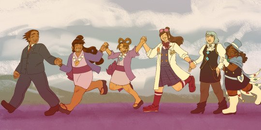
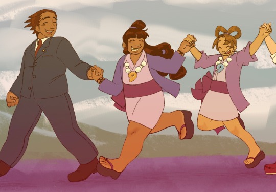
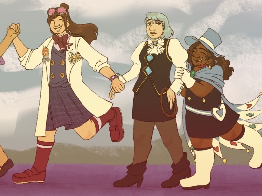
Weirdgirl parade
[Image Description: A drawing featuring 6 characters from Ace Attorney, holding hands in a chain and walking towards the left side of the image. Phoenix leads, looking back and smiling. Maya is next, also looking back with a wide grin at the next character, Pearl. Pearl is being lifted off of the ground a couple inches by Maya and Ema, who is next in the line. Ema is gripping Franziska’s hand, and finally Trucy brings up the rear, clasping her hands around Franziska’s elbow. Behind them is a simple background with a blue sky that has fluffy clouds and some greenery at the side of the sidewalk they are walking on. End Description.]
#as a mobile user. mobile users im sorry in advance if you have been having the same issue of images being very blurry like i have#that would probably make this whole thing practically unreadable#but i rly like this one so.#skench art#ace attorney#OH also i know its not timeline accurate bc trucy is there and none of them are their older designs but a. i have only made it to the first#apollo justice so ive only rly seen older phoenix and ema and b. i really wanted her in there so i just decided to do it like this#phoenix wright ace attorney#maya fey#pearl fey#ema skye#franziska von karma#trucy wright
151 notes
·
View notes
Text
Dive into the ultimate guide to mobile-first design. Learn how to build responsive, user-focused mobile sites and apps that perform seamlessly on mobile device.
0 notes
Text


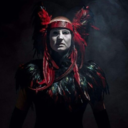
Quick dragonborn design I whipped up!
I got a prompt and just tried to pump something out in one sitting. Anyway, if you take a look at the feet, you may notice that I really really really really really wanted that wolves-howling-at-the-moon shirt when I was in middle scho-
#not my best work but i challenged myself to just go with the first thing that came to mind!#i aimed to make everything more feminine and floaty while also maintaining the practicality and mobility a druid fighter might want#anyway dragonborns have long necks and no one can change my mind#d&d#dragonborn#character design#siphisketches#my art#artists on tumblr#csp#id in alt
11 notes
·
View notes