#User-centered design
Explore tagged Tumblr posts
Visit Tumblr Blog
Explore Tumblr blogs with no restrictions, modern design and the best experience.
Last Seen Tumblr Blogs


Fun Fact
In 2020, 44% of users from Denmark used Tumblr daily.
Text
Why User-Centered Design is the Key to Online Success: Leveraging Psychology and Design Principles to Create Meaningful Experiences
User-Centered Design (UCD) is crucial in today’s digital world, where success relies not just on aesthetics or functionality but on crafting a user experience that resonates with users on a deeper psychological level. UCD prioritizes not only visual appeal but also the way users think, feel, and behave. Creating effective User-Centered Design is simpler than it may seem; it involves applying psychological principles, such as understanding cognitive load and paying careful attention to even the smallest design details. By focusing on these aspects, we can develop experiences that are not only intuitive but also rewarding. In this blog, we will explore why this approach is essential and how real-world examples highlight its significant impact.

Understanding Human Behavior: The Psychological Pillars of User Centered Design
Every user interaction with a product involves mental processing. If this process is considered overly cumbersome—in other terms if the user experiences a high cognitive load then—there is a likelihood that users will feel an overload and thus get annoyed and quit your site/product. One of the key ideas in user-centric design is reducing cognitive load, or the amount of mental effort required to use and understand a product.
Hick’s Law: Simplifying Choices
Hick’s Law states that the time taken to make a decision increases with the number of alternative choices available to the individual user and hence the more choices available to be used by or have the decision the more prolonged it will take for the user to make a decision. Thus, if a website bombards users with too many actionable options then the users may hesitate or leave entirely. Because of this same reason platforms like Netflix offer recommendations to its users to limit the choices and to show the user what’s most relevant. So, Instead of overwhelming users with the entire library, Netflix focuses on curating options that best fits the user preferences, thus making decision-making easier and faster.

Netflix Interface Showcasing Uses Hick’s Law to Simplify Choices
Fitts’s Law: Designing for Ease of Access
Fitts’s Law explains that why large, well-placed buttons are more effective than small buttons that are hard to reach. Users must have no friction or struggle to find key actions on your website/product. Amazon implements this really well by placing the "Add to Cart" buttons in prominent locations.

Design comparison showing familiar interface versus unfamiliar
These buttons are easy to spot and are large enough to click effortlessly, and also the buttons are placed so strategically to minimize user effort. This simple but thoughtful design element can significantly increase conversions because by doing so Amazon reduces the friction in the user's buying journey.
The Impact of Small Design Decisions: Tiny Tweaks that Leads to Big Results
Small design decisions can lead to a significant difference in how users interact with a product, even if the differences seem atomic or minute at first glance.
The Importance of Spacing
Strategic spacing between elements can drastically improve focus and comprehension. According to the Gestalt Principles of Perception, specifically the Proximity Principle, items placed closely together are perceived as related, while those spaced apart draw more attention individually. Even something as simple as reducing visual clutter makes an enormous difference.
For example, Airbnb uses this principle beautifully. Their listings have plenty of white space, making it easier for users to digest information like pricing, property details, and reviews without feeling overwhelmed. By strategically spacing elements, they guide user attention to what’s most important—booking a stay.
FAQ
Que 1. What is User-Centered Design (UCD)?
Ans 1. User-Centered Design (UCD) is a design method that prioritizes the end user's demands, behaviors, and preferences. It entails studying and understanding customer expectations in order to develop products that are intuitive, simple to use, and aligned with user objectives.
Que 2. How does psychology influence user-centered design?
Ans 2. Psychology has an effect on UCD because it helps creators understand how people think, act, and make decisions. Making digital systems easier to use and more interesting is based on psychological principles such as Hicks' Law (choice time), Fitts' Law (interaction efficiency), and the Gestalt principles (perception and organization).
Que 3. What is the difference between user-centered and conventional design?
Ans 3. The user's demands are prioritized in user-centered design, as opposed to traditional design that prioritizes aesthetics or corporate goals. Whereas traditional design may overlook important user feedback, resulting in usability problems, UCD constantly tests and refines based on user input.
Discover the Full Story
#User-Centered Design#UX design principles#psychology in design#cognitive load#Hick's Law#Fitts's Law#UCD#web design#UI/UX#online success#user behavior#scarcity effect#user experience#digital success#e-commerce UX#Miller's Law#UX design#conversion optimization#UX laws#web design psychology#psychology in Ux#netflix#amazon#Millar's Law#Jakob's law#Instagram#shopify#client centric design#spotify#werbooz
2 notes
·
View notes
Text
How to Create a User-Centered Web Design: A Step-by-Step Guide

In today's digital landscape, crafting a website that resonates with users is paramount. As a leading Website Design Company in Mumbai, we understand the significance of user-centered design in creating impactful online experiences. This guide delves into the step-by-step process of developing a user-centered web design that not only meets business objectives but also delights users.
Understanding User-Centered Design (UCD)
User-Centered Design is an iterative design process that focuses on the users and their needs at each phase of the design process. It involves users throughout the design and development process to create highly usable and accessible products for them.
Step 1: Research and Understand Your Users
Objective: Gain deep insights into your target audience's behaviors, needs, and motivations.
Actions:
Conduct User Interviews: Engage with potential users to gather qualitative data about their preferences and challenges.
Surveys and Questionnaires: Distribute surveys to collect quantitative data on user behaviors and expectations.
Analytics Review: Analyze existing website data to understand user interactions and identify pain points.
Outcome: A comprehensive understanding of your users, forming the foundation for design decisions.
Step 2: Define User Needs and Business Goals
Objective: Align user needs with business objectives to ensure the website serves both effectively.
Actions:
Create User Personas: Develop detailed profiles representing key segments of your audience.
Establish User Scenarios: Outline scenarios that depict how users will interact with your website.
Set Clear Objectives: Define what success looks like for both users and the business.
Outcome: A clear roadmap that guides design decisions, ensuring they meet user expectations and business goals.
Step 3: Design Solutions
Objective: Translate user insights and business objectives into tangible design solutions.
Actions:
Information Architecture: Organize content logically to facilitate easy navigation.
Wireframing: Create low-fidelity sketches to outline the structure and layout of pages.
Visual Design: Develop the aesthetic aspects, including color schemes, typography, and imagery, ensuring they align with brand identity.
Outcome: A cohesive design that provides a seamless and intuitive user experience.
Step 4: Prototype and Test
Objective: Validate design solutions through user testing to identify areas for improvement.
Actions:
Develop Prototypes: Build interactive models of the website to simulate user interactions.
Conduct Usability Testing: Observe real users as they interact with the prototype to uncover usability issues.
Gather Feedback: Collect user feedback to understand their experiences and perceptions.
Outcome: Refined designs that have been validated by actual users, ensuring usability and satisfaction.
Step 5: Implement and Launch
Objective: Develop the website based on the refined designs and prepare for launch.
Actions:
Front-End Development: Translate designs into functional code, ensuring responsiveness and accessibility.
Back-End Development: Set up the necessary infrastructure to support website functionalities.
Quality Assurance: Test the website across different devices and browsers to ensure consistency.
Outcome: A fully functional, user-centered website ready for deployment.
Step 6: Monitor and Iterate
Objective: Continuously improve the website based on user feedback and performance metrics.
Actions:
Analytics Monitoring: Track user behavior and engagement metrics to identify areas for enhancement.
User Feedback Collection: Encourage users to provide feedback to gain insights into their experiences.
Regular Updates: Implement changes and updates to address user needs and technological advancements.
Outcome: An evolving website that adapts to user needs and maintains relevance over time.
Conclusion
Creating a user-centered web design is a dynamic and ongoing process that places users at the heart of every decision. By following this step-by-step guide, businesses can develop websites that not only meet their objectives but also provide meaningful and engaging experiences for their users.
As a Website Design Company in Mumbai, we specialize in crafting user-centric websites that drive results. Our approach ensures that every aspect of your website is tailored to meet the unique needs of your audience, fostering engagement and loyalty.
#User-Centered Design#Web Design#UX Design#Website Design Company in Mumbai#Web Development#Mumbai Web Designers
0 notes
Text
How to Design a Seamless Mobile Experience
UI/UX Best Practices

In today’s mobile-first world, a smooth and intuitive mobile user experience isn’t just nice to have—it’s essential. Whether you’re building an app or a responsive mobile site, the way users interact with your design can make or break their perception of your brand.
For more articles please visit: https://pixelizes.com
In this blog, we’ll walk through UI/UX best practices to help you design seamless mobile experiences that keep users engaged and coming back for more.
1. Understand User Behavior on Mobile
Design starts with empathy. Mobile users:
Are often on the go
Prefer quick access to information
Use thumbs for navigation
Expect fast loading and fluid interactions
By designing with these behaviors in mind, you’re already creating a more intuitive experience. Learn more about mobile usage patterns.
2. Prioritize Content with a Mobile-First Mindset
Start your design process with the smallest screen in mind. Focus on:
Core content and functionality
Clean, minimal layouts
One task per screen (to avoid overwhelming users)
Once the mobile experience works beautifully, scaling up for larger devices becomes easier.
3. Simplify Navigation
Clear and consistent navigation is crucial. Follow these tips:
Use bottom navigation bars for thumb-friendly access
Keep menu items to a minimum (ideally 4–5)
Make icons recognizable (home, back, search, etc.)
Use sticky headers or floating buttons for important actions
4. Optimize Performance and Speed
Slow apps or sites = frustrated users. Improve speed by:
Compressing images and media
Minimizing API calls
Lazy-loading content below the fold
Avoiding heavy animations unless necessary
Fast experiences feel more responsive and reduce bounce rates. Check Google Page Speed Insights to assess your performance.
5. Make Touch Interactions Effortless
Ensure that every tap and swipe feels natural:
Use tap targets of at least 48x48dp
Leave space between buttons to prevent accidental taps
Support common gestures (swipe, pinch, scroll)
Provide instant feedback (e.g., button highlights, animations)
6. Follow Visual Hierarchy and Readability
Small screens mean you need to be crystal clear:
Use bold headings and ample spacing
Stick to 1–2 fonts with clear contrast
Break up content with cards or sections
Make sure all text is legible without zooming
Explore typography best practices for mobile .
7. Design for Accessibility
Make your mobile design inclusive:
Use sufficient color contrast
Enable screen reader support
Avoid relying on color alone for information
Ensure controls can be accessed with one hand
Accessible design benefits everyone—not just users with disabilities.
8. Test, Iterate, Repeat
No design is perfect out of the gate. Use tools like:
Figma prototypes for early testing
Maze or UserTesting for usability studies
Hotjar or Google Analytics for real user behavior
Use real feedback to refine your mobile UX over time.
Final Thoughts
Designing a seamless mobile experience takes thoughtful planning, user-centered thinking, and a dedication to simplicity. By following these UI/UX best practices, you’ll create mobile interfaces that not only look great but work beautifully—turning casual users into loyal fans.
Want more tips on UI/UX, web design, or mobile optimization? Stay tuned for our upcoming posts, or get in touch to learn how we can help design your next digital product.
#Mobile UX#Mobile-first design#UI/UX best practices#Mobile app design#Responsive design#User behavior on mobile#Navigation design#Mobile performance optimization#Touch interactions#Visual hierarchy#Mobile accessibility#UX testing#Mobile design tips#User experience design#Mobile optimization#Design for accessibility#Digital product design#User-centered design#Mobile usability.
0 notes
Text
Transforming Interaction: A Bold Journey into HCI & UX Innovations.
Sanjay Kumar Mohindroo Sanjay Kumar Mohindroo. skm.stayingalive.in Explore the future of Human-Computer Interaction and User Experience. Uncover trends in intuitive interfaces, gesture and voice control, and emerging brain-computer interfaces that spark discussion. #HCI #UX #IntuitiveDesign In a world where technology constantly redefines our daily routines, Human-Computer Interaction (HCI)…
#Accessibility#Adaptive Interfaces#Brain-Computer Interfaces#Ethical Design#Future Trends In UX#Gesture-Controlled Systems#HCI#Human-Computer Interaction#Innovative Interface Design#Intuitive Interfaces#Multimodal Interaction#News#Sanjay Kumar Mohindroo#Seamless Interaction#user experience#User-Centered Design#UX#Voice-Controlled Systems
0 notes
Text
Crafting Seamless Experiences: UI/UX Excellence by Kickr Technology
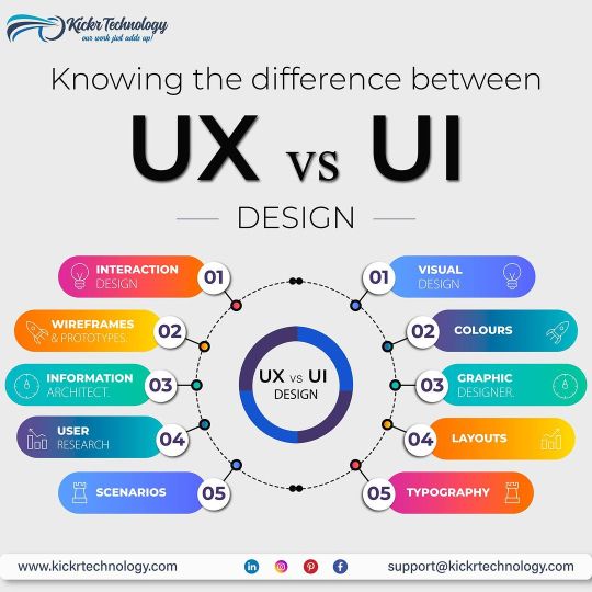
At Kickr Technology, we redefine digital interactions through unparalleled UI/UX design. Elevate user experiences with our innovative approach, blending intuitive design with cutting-edge technology. Discover the art of user-centric interfaces – choose Kickr Technology for a journey into seamless, visually stunning digital realms.
#User Interface Design#User Experience Development#UI/UX Services#Responsive Design#Mobile App Design#Web Design Agency#Interaction Design#User-Centered Design
0 notes
Text
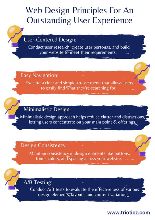
In today’s digital age, a web page is often the initial point of interaction between a business and its customers. To know which layout, and design suite to your website, consult a reputed Website Development Company in Coimbatore or a Web Development Company in Chennai and know the best for your business.
#A/B Testing#Accessibility for Everyone#Attractive Imagery and Visuals#Design Consistency#Easy Navigation#Minimalistic Design#Quick Loading Times#Responsive Design#User-Centered Design#Visual Hierarchy#Web Design#Web Design Company#Web Design Principles#Web Development
0 notes
Text
never volunteer for anything university related man. also go listen to this
#first i thought oh it would just be this one poster. why not. i can do that. i have time. so i did#they told me the general aesthetic and no further details so i thought‚ oh‚ okay‚ so i can basically freestyle this. yknow‚ like an idiot#they told me to change the color scheme‚ the font‚ the color of the font too‚ pretty much redo the entire poster#and these are notes i would be getting late at night. like around 12-2am. i had to revise that poster a shitload of times and was#tired. and then i was done and i thought Welp! at least that's over!#little did i know they were actually planning for me to do MORE WORK: design diplomas/certificates and make one for all the people needed#So here i am 12 diplomas‚ 24 certificates‚ 31 letter of thanks later#all done in one person. all done in two days (deadline was until the end of the week but i couldnt start until at least thursday)#I couldnt start because they sent me the wrong list of people first. so i had to cram(heh) a lot. of hours of work in these past 2 days#Yknow at least they liked my design the first time and i didnt have to revise anything. but ohhhh the fucking. filling out the papers for#each person. absolutely daunting. especially in something like ibispaint x that doesnt have an option to align text to the center#of the canvas. which is more my fault because i am an ibispaint x user. but anyway#They sent me the correct official document. it had incomplete information because they just didnt write patronymics or grades in the#official document. so i had to go and check the first table and figure out everyone's information myself#but the thing is that‚ that table must've been written by the students/participants because stuff like Name Of University wasn't consistent#some literally wrote their school's names wrong and i had to double-check that and fix that for the certificates. fine. whatever#but remember the official document? now imagine it even MORE incomplete because there is a list of at least 10 people and just their#SURNAMES AND INITIALS. so like a digital archeologist i had to go and dig up the names and patronymics of teachers and students i've never#heard of in my fucking life. i had to ask my older friends like Hey is there any chance you know the patronymic of your groupmate thanks???#and the cherry on top. is that the Official Document has a bunch of grammatical errors in it. the most fucking basic ones.#'анастасие' instead of 'анастасии'‚ 'преподователь' instead of 'преподаватель'#so i had to look out for those TOO‚ While Tired (i almost copied the mistakes because all of my work required referencing the doc#but they couldnt even write a fucking grammatically correct or consistent doc so that's nice)#anyways i sent all 67 files and my supervisor said she will look over them 'during the evening'#I dont know what her fucking definition of evening is considering it's already 6pm. i guess i expect to be messaged at 2am once more to fix#some inconsequential bullshit#let's just say i am just a liiiiiittle bit . just sliiightly . burnt out#Call me a vessel the way im full of void but also completely hollow#alas . at least there is fanmade threat music to listen to on loop#crammerposting
21 notes
·
View notes
Text

Sniper doodle I think I’m getting better w his face
#team fortress 2#tf2#team fortress fanart#fanart#tf2 fanart#team fortress two#tf2 sniper#team fortress sniper#sniper tf2#drew this in my user centered design reading notes 🫡#my spring break is almost over i don’t wanna go back to school
73 notes
·
View notes
Text
also while im talking about doordash i think that the weird prevailing hatred of doordash drivers thats predicated on how "theyre rude and only shove their phone in our faces without talking to us" is like. ok well 90% of the doordash drivers we get speak very little english and are honestly on tighter deadlines than we are so maybe there is a reason they dont want to chitchat
#my doordash post keeps going around and keeps getting people being like ok well just dont use the apps!#like. the problem is that the apps HAVE to be used by some people and REPLACE current infrastructure#and that this is BECAUSE of the design that creates a poor user experience#and centering it in personal choice is possibly the worst most incorrect takeaway you can get from my post#GRRR BARKING AND GROWLING
19 notes
·
View notes
Text
tumblr staff will do and add all kinds of weird shit to the dash but wont give us back prev reblogs
42 notes
·
View notes
Text

As AI continues to evolve, so does the need for intuitive, human-centered design. How do we ensure AI-driven experiences remain seamless and user-friendly?
In our latest blog, Nauman Ahmad, Head of Marketing & Design, shares expert insights on the intersection of AI and UX—covering best practices, challenges, and the future of AI-driven interfaces.
Don’t miss out on these valuable takeaways! Read now to explore how AI is reshaping user experience.
6 notes
·
View notes
Text


least spirited extortion campaign
#(describes things that are just a new look with less customization) more than just a new look!#(the right click menu is a mess in win 11 requiring an extra button press and clashing ui design to reveal basic functionality) find things#with fewer clicks!#i mean no wonder 60% of users haven't upgraded. they do not even spindoctor their new evil technology like copilot in their own copy.#is it because most older hardware does not even have the architecture to support the “neural engine accelerated” features?#like let me go through it. 1. added dedicated “weather and news” widget that in practicality just displays ads. 2. start is centered now#and less customizable. you cannot move the taskbar anymore. 3. native integrated zone snapping. i mean. not bad in itself but works worse#than powertoys. which is a win app to begin with. that i would use instead in win 11. and that you can install to win 10.#4. new ui design for multiple desktop overview. basically just a macos copy but i'll give them it looks slightly less confusing than what's#in win 10. win 10 does have multi desktop natively though? 5. you call it simpler and quicker when you kill the native calendar and mail#apps and replace them with the horrible outlook wrapped webapp. which comes with ads you cannot deactivate????
3 notes
·
View notes
Text
10 UX Mistakes That Are Costing You Conversions
How to Fix Them?

User Experience (UX) is one of the most critical factors influencing conversions on your website or app. A poor UX can frustrate users, leading them to abandon their journey before completing a purchase or desired action. In this post, we’ll explore 10 common UX mistakes that could be hurting your conversion rates—and how you can fix them.
1. Slow Loading Speed
Problem: If your website takes more than 3 seconds to load, users may leave before even seeing your content. Solution:
Optimize website speed using tools like Google PageSpeed Insights
Compress images and enable caching
Use a Content Delivery Network (CDN)
2. Poor Mobile Optimization
Problem: A website that isn’t mobile-friendly leads to a frustrating experience for smartphone users. Solution:
Implement a responsive design
Test across various screen sizes
Ensure buttons and links are easily clickable on mobile screens
3. Complicated Navigation
Problem: If users struggle to find information, they’ll bounce rather than explore. Solution:
Use simple, intuitive navigation
Reduce the number of clicks to reach key pages
Follow UI/UX navigation best practices
4. Lack of Clear Call-to-Action (CTA)
Problem: If your CTA buttons are unclear or blend into the background, users won’t know what action to take. Solution:
Use action-focused text like “Get Started” or “Claim Offer”
Apply contrasting colors for visibility
5. Cluttered Layout & Too Much Text
Problem: Overloading users with excessive text or elements can overwhelm and confuse them. Solution:
Embrace minimalist design principles
Use whitespace effectively
Break up content into sections and bullet points for easy reading
6. Annoying Pop-ups & Auto-Playing Media
Problem: Intrusive pop-ups or auto-playing media can negatively impact user experience. Solution:
Use pop-ups sparingly and based on user behavior
Offer value (e.g., discount or newsletter) to justify interruptions
Allow full control over autoplaying content
7. Forms That Are Too Long or Complex
Problem: Long or complex forms can result in form abandonment. Solution:
Keep forms concise
Enable auto-fill where possible
Use progress indicators for multi-step forms
8. Ignoring Accessibility Standards
Problem: A non-accessible website may exclude a large audience and violate legal standards. Solution:
Follow WCAG accessibility guidelines
Ensure high contrast, readable fonts, and alt text
Design for screen readers and keyboard navigation
9. Unclear or Missing Trust Signals
Problem: Lack of trust leads to hesitation during transactions. Solution:
Display trust badges, verified reviews, and client testimonials
Offer secure payment options and clear return policies
10. Lack of User Testing & Feedback
Problem: Relying on assumptions instead of real feedback often leads to UX flaws. Solution:
Use tools like Hotjar or Crazy Egg for heatmaps and session recordings
Conduct usability testing
Collect user feedback through surveys or interviews
Final Thoughts
Fixing these UX mistakes can significantly improve your website’s conversion rate and overall customer satisfaction. Prioritize continuous testing, user feedback, and performance tracking to ensure your design evolves with your users’ needs.
Need help auditing your UX? Contact us for a UX consultation.
#UX mistakes#UX design#conversion rate optimization#user experience tips#website UX issues#mobile UX design#call to action#form optimization#website speed#accessibility in UX#trust signals#user feedback#usability testing#responsive design#UI/UX best practices#web design flaws#boost conversions#improve UX#user-centered design#digital product design
0 notes
Text
The Role of Technology in Driving Business Innovation.
Sanjay Kumar Mohindroo Sanjay Kumar Mohindroo. skm.stayingalive.in Explore how technology drives business innovation. Real stories, practical tips, and debates that spark fresh thinking. Join the conversation. A Compelling Hook Technology is the spark behind many breakthroughs. It helps companies grow, adapt, and stand out. I have watched organizations move from simple processes to…
#AI And Automation#Balanced Approach#Business Innovation#Cross-Functional Teams#Data-Driven Decisions#digital transformation leadership#Employee Empowerment#Ethical Tech#Global Reach#Innovation Debate#Leadership Insights#News#Sanjay Kumar Mohindroo#Tech Culture Shift#Tech Strategy#Technology Adoption#User-Centered Design
0 notes
Text
Dive into the world where human intuition seamlessly integrates with AI brilliance in web development. Elevate your online presence with the perfect fusion of creativity and technology.
#Benefits of incorporating human touch in AI-driven web development#Enhancing user experience through human-centered AI web development#Balancing automation and human input in modern web development#The role of empathy in AI-driven web design and development#Strategies for infusing creativity into AI-powered web development#Understanding user behavior for personalized AI web development#Building trust through human-like interactions in AI web development#Improving accessibility with human-centric AI web design#Ethical considerations in integrating human touch with AI in web development#Tailoring AI algorithms for diverse user experiences in web development
5 notes
·
View notes
Text
Visual Diary 13: Design Solutions - Duolingo
From a user experience standpoint, the way that Duolingo has game-ified learning a language is truly impressive. The app functions very intuitively and the different game-like functions keep users coming back.
Though its true effectiveness at learning a new language is debated, I think Duolingo is one of the few app-based programs that truly works to better the user by making the product as fun and effective as possible.

Only vaguely threatening!!!
6K notes
·
View notes