#monotype my true love
Text

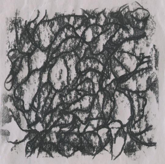


monotype samples for the class i taught last fall
5K notes
·
View notes
Text

Every Man Gets His Wish - Lana Del Rey
#lana del rey#lana lyrics#lana unreleased#every man gets his wish#gif warning#glitter text#lyrics#gold#bloggif.com#55px#monotype corsiva font#golden grill#true love never dies#baby you'll never grow old in my eyes#we're forever young in paradise
77 notes
·
View notes
Note
i guess the solosis line is sort of a cell
(Sorry this ended up being long but as I was typing I really started thinking about this more and I feel like I ended up going down a rabbit hole and wanted to catalogue my thought process. Context for everyone else, post is here.)
That is true but with it being a psychic type I cannot think of other psychic types that would fit the "dna" or chemical-based theme. (not counting deoxys because it's a special pokemon)
Though with psychic type basically being like, the mystic Literal Psychic type I could probably make some joke here about how there's those new age crystal healers who will be like "you have to activate your ancient angel DNA to reach spiritual enlightenment" but I do NOT want to be associated with that.
I think poison type is a decent enough fit for my tumblr username since it's associated with corrosion and chemical burns, and anything sufficiently alkaline or acidic enough will do that.
Part of the problem with picking a monotype for me is also the fact I have like a ton of names. Like, if we're going with my Native name then I'd go with a very aggressive type, like Fighting.
A lot of people associate me with ice type because of my other themes and the fact that one of my other preferred names is Dess (short for December) and I will have other handles that deal with ice-related stuff. But I don't do that so much anymore.
But I also don't really consider myself to "have" a true true name, DNA is just my "stage name", usually when I put representations of myself they're named variants of Null/Nil/Untitled/Undefined/Zero/Etc. Now, this combined with the fact that job-wise people associate me with ghost types (because my job is basically summoning or banishing demons and spirits for people) would probably make someone more inclined to assume I'd also be a ghost type.
However: My job is being a professional occultist for people. Which means I have to resist ghost, psychic, and possibly dark-types.
Therefore, the best typing based on my lack of name and line of work would be dark type, since literal dark is just the absence of light, and also it fits with everything else thematically. I am also not above biting people, I am practically nocturnal at times, and since my spirit guide is the red fox, I'd like to have a zoroark. I know thievul exists but it kinda sucks even though it looks neat so I'm ignoring it.
(I guess with the name bit and the resistance to ghost you could maybe get away with pinning me as a normal type, but I feel like everyone would agree that doesn't fit nearly as well.)
I am still kinda torn though because psychic, poison, ice, ghost, and steel are my other favorite types in general. Solosis are funny little guys, I love the "weird" mons that aren't just animals.
#endorphinmachine#ask#long post kind of#fun fact: my pokesona is a hisuian zoroark#that used to be a normal zoroark that died
2 notes
·
View notes
Note
top five fonts!!!!!

oh shit oh fuck ok this is really tough bc of how contextual fonts are but so i think i gotta do one for general common uses my workhorse besties and another for my fun accent fonts
again in no particular order right now my standbys are
garamond my best friend. i like adobe garamond the best out of all the versions cuz she’s a little tighter and has a little bit of a smaller x height really sets a great mood
mrs. eaves is another fun serif i think she’s fun and quirky and i use her a lot
i like futura!! she’s good you don’t mess with a classic i don’t care if some people think it looks dated the 70s are coming back
theinhardt is a great all-purpose font that used to be my "brand" font for my resumes etc. people act like sans-serifs are all the same or all easy to design but that's not true!! i think this font is a really great example of how clean and timeless a well designed sans-serif can look
hhhh okay for some variety my last one is gonna be DIN even tho it's tied with a bunch bc 1) i love grotesks and there isn't one on this list yet and also the condensed version is great
for more statement fonts i love:
bodoni is a classic but for a reason. it's used in a lot of branding/magazines and i get why it feels luxurious. like garamond it has a million versions but the one i like/have become accustomed to is bodoni 72
justice for handwriting fonts some of them can be GOOD actually. clattering is a font i love that i've been wanting to find a use for for a while
programme is a really fun statement font and i'd love a reason to use their rotated version
i'm a sucker for a big wide slab serif as a statement font. my current goto for that is mighty slab
bc alphapipe is another font i love as a piece of design and wish i could find an application for
apologies for all the adobe links 🤢 that's often where i source my fonts. anyway please remember that just like with pirating blockbusters vs indie films, font design is hard work and designers are rarely compensated fairly for the massive time investment font design can be. pirate from the big typehouses like monotype. don't pirate fonts from indie creators.
#thank you!!#niche interest completely activated i spent at least 20 min on this#hailing frequencies open
9 notes
·
View notes
Text
Pangolin grass type starter
Roots for ears and underside of tail Baby is Oblossum
It’s final evo is grass steel
Wooly bear caterpillar that turns into a cat moth cause Virgin tiger moth is what wooly bears turn into
Rhino beetle hyena big dark maybe?
It’s baby is a grub puppy
Water starter goes from like a leopard gecko to a ribbon eel dragon. Coral horns and bits. It’s sleepy and likes to put others to sleep water psychic final evo type
Fire ferret into fire couatamundi or what ever or like. Civet something long with a bit tail that’s fire rock with lava and rock making the tail stripes baby fire ferret tail is a sparkler
Spider with a grass knot or a tumble weed for a butt
Psychic beluga
Succulent ant. Succlant
Butterfly that is actually a carnivorous plant
Water grass type loch ness shape based on lotus flowers growing up above the muck
It’s baby form is just a little messy leafy plesiosaur or something
Fighting type babirusa 2 stage
Catnip cat
Shadow thing under blanket/coins/etc like has a mimic vibe it’s like mimikyu like u never see it’s true form it’s just little grabby hands that reach out from under the piles.
Thylacine fossil?
Coffee bean that is either grass psychic or grass dark
Because like. Idk man but coffee has dark effects on my body. Fast effects. But dark.
Grass fire incense Pokémon
Rat king three stage more rats? More rats.
Grackle to dragon pipeline final evo looks like it fucked a bedazzler
Honey pot ants that r like eevee. What ever they got in their butts is the type. Idk if it’s like. A evo sitch with three different elemental ants or if it is a gimmick Pokémon that just like. Changes type.
Anubit anubould
Tenneric poison electric pikachu clone
Psychic olm pseudo legendary dragon
pseudo legendary ‘mythic’ like celebi or victini that a cuttlefish that changed type depending on the environment or the weather effects so like it would completely wreck a team built around sandstorm it’s a kittlefish like it’s tails are like the tentacles of cuttlefish and it’s eyes are OwO eyes it’s a cute baby cat
Fairy flying golden heron 2 stage maybe ghost fairy because like. They’re said to carry souls to the after life?
Grass whale. It’s like a hump back cause they’re my fave two stage???
Two headed fawn that turns into the two headed unicorn like that one taxidermy
I want it to split apart and be connected by a spine and like ectoplasm and the girls get little ectoplasm unicorn horns and the boys get ectoplasm antlers
Lamb of tartary Pokémon 3 stage grass wife
I think I already have the grass wife trope but like. Idk I love grass types I’m sorry. I can’t help myself.
There should be a water fighting type based off of a betta and the adult evo can have different color patterns assigned at random like Spinda
Fairy rock konpeito
Water steel hippocampus the baby form is just a little pony but with a dolphin tail
Poison steel based on mercury
Pure steel type that’s just a mailbox. They’re delivery Pokémon. The little red flags are on both sides and are like. Puppy ears.
Scarab beetle that imitates luxury balls when baby form. Adult form is opulent very fancy black and gold bug rock type
Solid rock type Minotaur two stage. The baby is just a liddol calf very cute
Dark poison type two stage based on the shaggy inkcap mushroom
Also I want a fairy type that’s pure fairy because monotypes are actually p important to cannon Pokémon games anyway. Fairy type two or three stage that starts off as just a little deer but ends up like a big stag that looks like it’s made of wood and is covers in mushrooms. Like the ruff around the neck is just layers of oyster mushrooms or turkey tails
Flat normal type hedgehog into porcupine
Split evo spider one is bug fairy one is bug dark both jumpers just the fairy is a peacock spider the dark is a bold jumper
Fire steel red river hog two or three stage
I want a Pokémon that evolves differently if it’s in the wild vs if it’s caught and trained
And now that I’ve decided to make Pokémon based off my cats there we go like the base is normal and it’s a kitten like it’s a very small baby super baby tiny and if it’s caught as this baby and raised by someone it turns into a big soft normal flying but if it’s left to the wilds it becomes a normal fighting and it’s like. A Bamf
Hummingbird mouse griffin that’s flying fighting because grasshopper mice and hummingbirds are both so Aggro
Gold orb weaver that can use a move like pay day that gets you money it’s baby form is often mistaken for gold nuggets 77
Normal type that is a like. A harp like idk deer with harp antlers or something with strings between spines on its back idk idk
I kno I have a couple mushroom Pokémon already I think but like what about a lion with a lions mane mushroom for a mane tho
Like the region is already kinda apocalyptic feels so maybe it makes sense there’s a lot of mons that are kinda fungal. Idk. …
Make a quest beast that isn’t a giraffe
Mahoganbee. It’s not a bee it’s a mahogany wasp it’s a solo Pokémon and it’s bug and grass and it’s a friend
Water fairy solo Pokémon that’s a manga ray with like rainbow elements so like when it breaches the water it leaves like. The wrainbows in the air and idk I’m sleeping
An object Pokémon that’s a snake Made outta horse shoes. Solid metal but then the evo is steel dragon and you add spurs as spikes on the back to make it bulky and sharp
Also maybe a Capricorn cause like. Fish goat. Oh maybe a foil to the hippocampus
Grass type that is a lion with a mane made of peacock feathers
Shrimp horse
I already have Anubis so like I kinda wanna do set or like a typhonic beast so like the baby is pure dark and then the evo is dark electric or dark dragon
I Dont think there are any rock ghost Pokémon so like a ghost that is fused with a tombstone? Ough maybe a stego that has headstones as it’s back fins and it can have like a Celtic cross for its tail this isn’t a fossil Pokémon tho I don’t vibe with a fossil being revived just to be a ghost maYBE it’s Jersey Devil shaped. Like idk idk idk but I’m scheming this feels close
Regional variant one is a deaths head hawk moth and one is a Luna moth 94
Ok but a fire type that is a lava lamp like maybe a giraffe with lava lamp neck or a Fox with a lava lamp tail
Baby bat that is normal type that just has a big honking nose like big v shaped nose it can’t fly yet it’s head is like the size of the rest of the body it’s all shnoz and all ears the grown up form has like frilly wings like a parasol
European starling that is flying steel because the gold on the wings the end form is steel fairy or psychic? Something what ever it’s gonna be spacey
Wait another shark that is water ghost and it’s a shark with ghost fins because of shark fin soup
Psychic poison scorpion. The baby is bug poison. There’s eyes inside the claws and like the lore is that people use it as a psychedelic. Is that too much for a Pokémon game? Oh well I guess.
Rock water type that’s like. The baby is a grotesque and it’s just rock but the gargoyle is rock water because. Architecture. Idk.
The regional rodent is raccoon based and it gets more rabid looking as u go
A pair of pokes that’s like. One is a wolf in sheeps clothing one is a sheep in wolfs clothing
Pure water type that is a brittle star sea star that like. Walks around like u used to walk ur hand around U kno? Like it is just a little creachur
The grass wife will be oak based and the baby will be acorns and the adult will be oak tree based but there’s three kinds there’s live oak red oak and bur oak and all of them have diff leaf shapes and maybe the acorn babies are shaped dif too
Legendaries maybe growth and decay themed so the decay legendary is mushroomy and the growth is flowery ofc But like what animals the third legendary is based on like the pure core of life and I want it to have a crazy god particle feel it’s got like a double helix tail and maybe horns oh maybe it’s a kirin. The decay Pokémon is maybe named Endtrophy 116
Manticore Pokémon but instead of a human face it has a baboon face because I don’t like human mons and also baboons are cool as fuck
I want a shark Pokémon that’s fairy and very sweet because everyone loves dolphins and they’re shitty and sharks are good
Bug dragon that’s like. The frills of the face are the moth wings with like the eye spots like it’s. Complicated but it’s good it’s very cool ok I swear
Ghost psychic that is a chameleon that is like. Glow in the dark skeleton idk maybe it’s body and shape is like made of smoke like the gengar line
I want a white rabbit with red eyes that looks at first glance very fairy type but it’s actually dark type and it’s not a rabbit it’s a hare so it’s inherently rly fucked up the baby form of it is like a little puff ball dust bunny or mochi bunny or something that’s strict normal
Firefly shooting star Pokémon it’s bug lightning the baby is just a little sparkle star the middle is a uhhh it’s a rock like it’s a meteor u kno and yeah shooting star firefly
There is a sheep Pokémon that is the like. Poster child for Delta Pokémon it’s a normal type but at any point u can take it to a Modico station and change its type and form. Like froufrou or what ever it was called. It’s a sheep because of dolly the cloned sheep
I need a fire type that has spikes like maybe a stego? But basically the spikes are made of fire and like high intensity torch style flames so they look sharp
Abrice the ice psychic abra and koldabra there isn’t a third evo because the psychic power is dampened 129
The evil corp is called Modico Corporation
They front as a company of good will and change progress etc etc
The evil team people is called Team ChimeRNA
Cause like. DNA and rna like. And they’re doing gene splicing.
Some of the original canon pokes u can catch you can also take to a Modico station ‘modicubes’ that are like in Pokémon centers and stuff anyway u can take them and some you can change to like Entolian Forms and some you can just change their types. Not all can be changed like there will only be like 20 or so and the company says it’s because cracking the Genome of different Pokémon takes time because Pokémon vary so widely.
U can se delta Pokémon in the wild as well tho it’s not common. When a Pokémon is delta variant it has a different color or pattern so it’s like easy to see. It’s kinda like finding a shiny but it’s not that rare. They also don’t sparkle when u find them just different colors. If u breed a delta there’s a percentage that u can breed a delta. Some Pokémon can only get one delta type but some have like idk maybe three options. It’s not like. U can take any Pokémon and add any element. That’s what Modico wants but they’re not there yet.
The region is a series of islands. Not like Hawaii more like. Iceland and Greenland and like. A third idk. Anyway most travel is don’t by bird like that’s the fast travel mechanic and it’s by a giant condor themed bird that also takes flavor from bearded vultures. The babies are a bit stupid cute but useless. They’re dodos.
0 notes
Note
sorry if this is a stupid question, but what's printmaking? it looks cool but all google brings up is something about. blocks and also japan
It's not at all a stupid question! Printmaking is definitely one of the lesser-known mediums, and it deserves more love, tbh.
Printmaking is a broad term, but wrt fine art it refers to the process of creating art by transferring an image from a matrix (like a carved block you roll ink onto, a piece of plexiglass you paint, or a piece of copper with lines etched into it to old ink) onto another surface.
The most common form you'll see is relief printmaking; carving a flat surface, rolling ink across the raised areas, and then transferring that ink to paper. I used relief printmaking to create this:

And you can check out some gifs I made of the process here!
Another common version is Intaglio, which is sort of the opposite of relief; instead of carving away the blank space, you can cut, scratch, or etch (i.e. use acid to eat away) lines in a plate (usually copper) which will then hold ink, and then transfer that ink to paper.
I used Intaglio (etching) to create this:
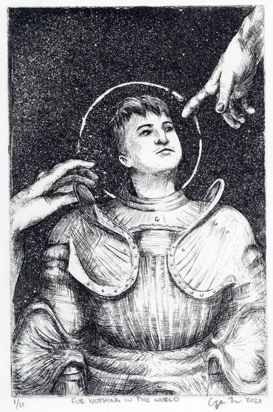
And you can check out my process video here!
There are a ton of mediums that fall under the printmaking umbrella (lithography, monotype/monoprint, screenprinting, etc.), and oftentimes artists will mix & match and layer different methods on top of each other to get the result they want.
A big draw for a lot of people (aside from the process and look of it) is that prints are all hand-made, but (usually) still repeatable. Unlike a painting which can only have one "true" copy and maybe some reproductions, plus photos/digital images of the original, each print is considered an original itself.
That means you can show your prints in multiple galleries at once, sell them as originals for less, give originals away, keep originals for yourself even if you do also sell them/give them away, etc.
It's also got a lot of history as a way of providing access to art, literature, and information that poor and illiterate folks wouldn't have had access to at the time, which @thequeer-quill has written about here! It's kinda punk as hell.
121 notes
·
View notes
Text
Hi so I've not been in a true writing mood lately thanks to this fun thing called depression so have some random ass thoughts from foggy morning brain!
_
Okay but if Wallace had shown up in the XY anime series?
Chespie probably would have been fine. Unlike Steven who's awkward and tries to keep his nose out of things, and is easily distracted, Wallace would have straight up noticed the missing child while they were watching Alain battle.
He's more blunt and has a neice he seems close with so probably would know how to comfort Mairin and stop Chespie from running off...... then promptly give Alain an earful on how to treat others.
Also him being skeptical of Lysandre since meeting him? "He looks like a damn Pyroar." "Wallace please, he's right there. This isn't the time." "Fine, but I don't trust this guy. His sense of fashion is terrible, not to menttion he's acting quite creepy."
Helping Steven manage his two newly found.... siblings? Smol™️ friends I guess? You can't tell me Alain and Mairin wouldn't have their journey in Hoenn too. Mr. Champion finds and excuse to slip off with them leaving Wallace in charge of his spot.... again. He swears this is why the other asked him out, assured free coverage.
Also why wouldn't Wallace want to see Kalos? Is the pokemon world of France; a place most cartoons depict to be elegant, beautiful, and literally everything Wallace loves and is. "Yeah so I helped this kid out of a dead bush and her friend forced me into a battle. His boss showed up and asked for my help with Mega Evolution stuff so I'll be away to Kalos a while. " Wallace, opening his eyes as they were about to go to sleep, only to find out his boyfriend is leaving in the morning and is just NOW telling him. "Kalos? And you didn't invite me? Your best friend, your boyfriend?!" Bad Steven! Milotic does a gentle, sleepy tail slap.
Wallace has to keep Mr. Stone loving shiny distracted Steven from being dumb.... which obviously doesn't work as the world nearly ends but that's fine.
Mairin being so entranced by Wallace's beauty? She thinks he's a girl at first because he's so pretty?
"And this is my um.... partner, Wallace," Steven awkwardly states to the fifteen and ten-year-old. "It's a pleasure to meet you," Alain replies. Mairin is just quiet, staring with wide eyes at this beautiful man. "Mairin," older brother mode engaged as he gently elbows her for manners. "Ah, sorry," she jumps a bit looking from Alain to Wallace again. "Just, your really pretty! I honestly thought you were a girl at first." Wallace blushes a bit with a small snort as Alain is like, shocked. "Mairin!" She huffs and turns to him. "Oh like you didn't question it at first!" Wallace doesn't take any offense, Steven is blushing though.
Wallace helping Mairin learn to properly groom and care for her pokemon. She's eager to show off Chespie and her Flabebe.
Alain wants to practice against him as his monotyping would be good to strengthen Charizard for his next battle with Siebold.
Steven isn't as stressed and worried about saying the right things to Alain when he starts his pushing people away ordeal. Wallace can correct or straight up do it for him becuase he will not be having any of that. "That girl admires you. Would be a shame to just up and drop her like that," he says after Steven states he knows Alain cares for her. Alain is a bit stunned as this walking embodiment of elegance just struts passed him and Steven.
Triple champion fight? Triple champion fight.
Lysandre not only doing his creepy beauty speech with Diantha but with Wallace? The kids and Steven ran off to their next mission and Lysandre wanted a word with Wallace.
He's just sitting in the villain's office, petting his Milotic when Lysandre finally stops watching out the window. "I understand your the water specialist gym leader of Hoenn, correct? You've also held the title of champion once before." He slowly turns to face Wallace who feels a wave of "oh shit" washing over him. The way Lysandre sounds reminds him of when Juan was mentoring him and was rather displeased with his behavior. The "you strive for, so be. Your actions don't align." tone.
"That's correct." Lysandre smiles a bit. "You also hold quite a few titles in the coordinator feild, correct?" Not wanting to correct him that it's one title, Wallace gives a nod. "Miltoic and I both. After all, it was her that did the work to get us there." Lysandre gives a nod and starts in on his wierd speal about beauty like in the generations short.
"It's your duty to stay forever beautiful then, yes?" Wallace just kind of gives him a look, feeling a bit uneased about where this could be going. "Well, that depends. After all, beauty is in the eye of the beholder. Those blinded by the inside may not notice when the outside starts to wither away." Lysandre gives a nod before Wallace changes the subject. "So tell me, what kind of job did you send Steven and those kids on?" Which gets things back on track.
Unless before that Lysandre brings up Juan? "I hear you were mentored by a man who holds similar titles, is that correct?" Wallace sitting up a bit more snorky. "What, is this some kind of interveiw?" Lysandre chuckles. "Just trying to get to know you a bit better is all." They talk about Juan's beauty fading over time and Wallace goes back to "in the eye of the beholder. To his lovers, he's the most beautiful man they've ever met. To children, he's a handsome old guy with a charming accent that keeps their attention when he talks. Theres more to beauty theb what meets the eye."
Also him straight up lashing into Lysandre later on before he dies about how humans are the filth of the earth not pokemon? That he's after the wrong target. Steven just standing there like, "Wallace, please stop talkong." Don't give him ideas babe!
Kidnapping Wallace? Maybe. He's one of the chosen to survive and make it into the new world. Ooo, maybe that's why he wanted to talk to him earlier on. He's with Mairin and protects her from being taken by Flare grunts before nearly being taken from behind; but like in Masters(?), Steven is like fwoosh! I AM HERE! SHALL NOT TAKE MY MAN SO DIRTILY YOU COWARDS! But like.... in a Steven way.
Sycamore takes Mairin as Steven and Wallace battle along side Diantha? Wallace and Milotic set on protecting the smalls as his man and Sycamore handle the science junk behind mega evolution. Though stone Zygarde wouldn't have obsorbed Chespie becuase Wallace stopped him from running off. It would find something else.
And finally, when Alain and Mairin decide to further on an adventure, Wallace suggests since Alain has basically bested every gym in Kalos they try Hoenn. "They have different pokemon you know. Some capable of mega evolving too." Mairin gets a damn Mudkip or something, beats Alain, runs in big brother's face. Fight me.
#not the t stuff#pokemon#wallace#steven#lysandre#mairin#alain#xy#oras?#pokeime?#pokeme?#the anime and games#here#just#have
16 notes
·
View notes
Photo
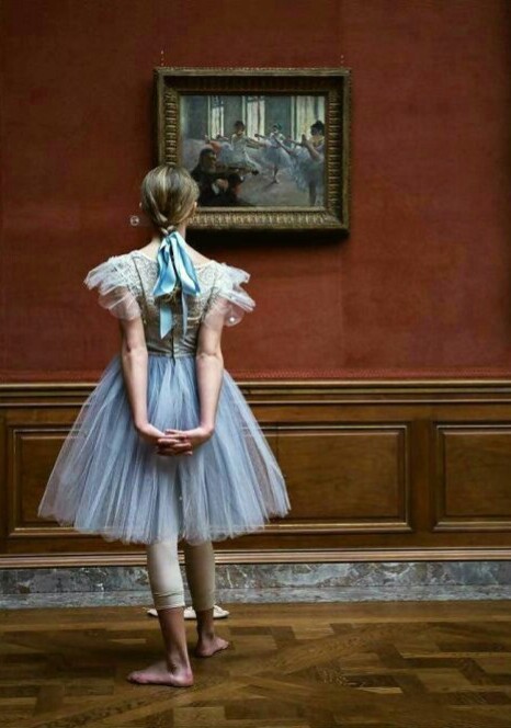
People call me the painter of dancing girls. It has never occurred to them that my chief interest in dancers lies in rendering movement and painting pretty clothes.
- Edgar Degas
It’s hard to believe but in some ways, ballet was despised in Degas’ time. Despite this - or perhaps because of this - Degas made ballerinas the central theme of his artwork. I have always wondered why.
Whilst Degas loved to deflate the image people had of him, his words in the quote above ring true.
As a student Degas dreamed of drawing like Raphael and Michelangelo, and he later revived the French tradition of pastels that had flourished with the 18th-century master Chardin. But like his contemporaries, Manet, Cézanne and the Impressionists, he lived in an age of photography and electricity, and he turned to aspects of modern life - to slums, brothels and horse races - to apply his draftsmanship. Bathing nudes became a favorite subject, but he once compared his more contemporary studies to those of Rembrandt with mocking wit. “He had the luck, that Rembrandt!” Degas said. “He painted Susanna at the bath; me, I paint women at the tub.”
At the ballet Degas found a world that excited both his taste for classical beauty and his eye for modern realism. He haunted the wings and classrooms of the magnificent Palais Garnier, home of the Paris Opéra and its Ballet, where some of the city’s poorest young girls struggled to become the fairies, nymphs and queens of the stage. As he became part of this world of pink and white, so full of tradition, he invented new techniques for drawing and painting it. He claimed the ballet for modern art just as Cézanne was claiming the landscape.
The ballerinas Degas bequeathed to the world remain among the most popular images in 19th-century art. He cropped his pictures as a photographer would (and also became one); he defied traditional composition, opting for asymmetry and radical viewpoints; and he rubbed pastels over his monotype (or one-of-a-kind) prints, creating dramatic effects. Yet he always managed to keep an eye on the great masters of the past.
Degas’ friend, the French poet Paul Valéry, described Degas as, “divided against himself; on the one hand driven by an acute preoccupation with truth, eager for all the newly introduced and more or less felicitous ways of seeing things and of painting them; on the other hand possessed by a rigorous spirit of classicism, to whose principles of elegance, simplicity and style he devoted a lifetime of analysis.”
Though Degas exhibited his work with the Impressionists, his realism always set him apart. “Drawing is not the same as form; it is a way of seeing form.” He said, as a proud representative of impressionist art. With his discerning eye, Degas depicted the highly romanticised world of dance with a strong sense of realism.
Degas’s pictures of ballerinas performing onstage convey exquisitely what makes ballet ballet—all that balance, grace and radiance that a contemporary critic called “mimed poetry, dream made visible.” But, paradoxically, Degas preferred to portray ballet by stripping away the poetry and illusion to show the hard work, the boredom, the more common beauty behind the scenes.
John Berger, the formidable debunking art critic, believed that what obsessed Degas was closer to what obsessed Michelangelo and Mantegna. All three were fascinated by the human capacity for martyrdom. All three wondered if it wasn't this that defined mankind. The human quality Degas most admired was endurance. Berger might be onto something because increasingly as I reflect on the art of Degas one can see why he was obsessed by the art of classical ballet, because to Degas it said something about the human condition.
54 notes
·
View notes
Text
man, haha, im glad i took a perigree off from here. any less after my double time break up and yall vwouldvwe been dealing vwith a sad sack of shit.
luckily my feelings on the matter havwe diminished and buried themselvwes to the point that they no longer matter nor exist, and i nowv thereby dub myself as the happiest ghost to havwe evwer graced paradox space. taking things vwith stride in that glorious me vway because nothing vwvwvwrong has evwer happened to me.
ivwe nevwer had a single problem in my life,
ivwe nevwer had problems in my single life.
quads are gluttonous, saturated, sugary conflicting tripes,
ending quick unlike ghosts, lovwe and heartbreak that nevwer dies.
if you snort untaught and gloat that your true love is the rife,
dont cry call me hours later vwhen you obtain that single rife.
ill just keep playing lovwe doc for those rose tinted reds;
those monogomous monotype pitch black pipes that play dead.
(bass guitar solo)
#did you guys like my song? #i blanked out for fivwe minutes and suddenly there vwas diction spilling like a sad truth. #ivwe been avwake for tvwo.
14 notes
·
View notes
Photo
Road Without Exit (Anarchy in UK), Fabio Coruzzi
All artists are my heroes, because being a true artist is the hardest choice that an intellectual can make. I believe that living with my art is a proper challenge. Choosing freedom means lots of sacrifice, commitment, self discipline. It's a huge challenge. So when I take a look at other artists and their own struggles, I feel I am not alone and I stop believing I am a total crazy, alienated dude. If art is about good skills, then good skills are determined by how much coherence, how much love and passion I want to put into my art and into my vision of life in general. Creating art is not only about space and materials. I just need a bit of heart and passion, that's what really count, any corner of the house can be come a studio and any material can become art. Only through this vision I can keep myself enough detached from all the fluffy cliches about contemporary art. It's hard time for artists, whoever say the contrary is telling a lie, because we live in a society saturated with social networks and useless consumption, never like before. Selfishness, hyper individualism, raw desires, this culture of happy ignorance has spread all over the Earth and all over our popular culture. The art path is full of traps and obstacles. Artists have to see life in the most simple way, keeping distance from all these temptations...the reality is different, new generations are mixing art and commerce too easily, making money is an art but the way young artists want to make money looks like young financial brokers assaulting wall street. There will be future only if artists believe that ideas come before money, not viceversa. Art requires courage, so it requires valuable solutions beyond concepts like money, property, possess. All artists that think beyond these useless desires, are my heroes ORIGINAL ARTWORK AVAILABLE FOR SALE AT: ARTSPACE WAREHOUSE GALLERY LOS ANGELES "My artworks are made using printing technique mixed with other media such as oil pastels, acrylics, water colors, liquid ink pens, pencils on paper, canvas, wood, fabrics. During my working process, I never make any difference between artworks regarding size, client, price or timetable. Each single work is made with the same intensity, dedication, effort, commitment, passion and love. Each work is made covering the surface, millimeter by millimeter, with no rush and lots of patience. I touch and retouch the surface many times with my pens and brushes, making sure the artwork has its right composition of colors, shapes and textures. I want that my works make always the difference in terms of quality, price and value for money. I want that my art collectors must be fully satisfied and 100% sure that there is no art deal better than the one they’ ll have purchasing my art. I will always challenge anyone to offer a better product for a better price than mine. Thanks a lot for your trust and respect Screen print, oil pastels, acrylics, water colors, liquid ink pens, pencil on canvas original monotype Fabio Coruzzi has exhibited at galleries, museums, art fairs around the world. He is represented by galleries in UK, IUSA, Italy
https://www.saatchiart.com/art/Painting-Road-Without-Exit-Anarchy-in-UK/33545/2277441/view
1 note
·
View note
Text
Smashing Podcast Episode 5 With Jason Pamental: What Are Variable Fonts?
Smashing Podcast Episode 5 With Jason Pamental: What Are Variable Fonts?
Drew McLellan
2019-12-17T05:00:00+00:002019-12-17T07:36:22+00:00
In this episode of the Smashing Podcast, we’re talking about variable fonts. What are they, how do they differ from regular fonts, and how can they help in the design and performance of our websites? Drew McLellan talks to a font of knowledge on the matter, Jason Pamental.
Show Notes
Weekly update:
Brand Illustration Systems: Drawing A Strong Visual Identity
Struggling To Get A Handle On Traffic Surges
Building A CSS Layout: Live Stream With Rachel Andrew
Web Design And Development Advent Roundup For 2019
Should Your Portfolio Site Be A PWA?
Variable Fonts
Find Jason on the web at rwt.io
Web Typography News newsletter
Variable Fonts: What web authors need to know
Ellen Lupton’s book Thinking with Type
Erik Spiekermann’s book Stop Stealing Sheep & Find Out how Type Works
Transcript
Drew McLellan: He’s a design strategist, UX leader, technologist, expert in web typography, and invited expert on the W3C Web Fonts Working Group. He writes, speaks, and works with teams and brand owners on how to set type better on digital platforms. He’s spoken with organizations like Adobe, Audible, Condé Nast, GoDaddy, IBM, and given presentations and workshops and conferences all over the world. His newsletter, Web Typography News, is popular with those wanting latest updates and tips on typography on the web. He’s clearly an expert in web typography. But did you know he represented Sweden at Lawn Croquet in the 1984 Olympic Games? My smashing friends, please welcome Jason Pamental. Hello, Jason. How are you?
Jason Pamental:I’m smashing. Especially after that intro.
Drew: I wanted to talk with you today obviously about web typography because that’s really your thing. You are a real expert with web typography. About that in general, but in particular, talk a little bit about variable fonts. I’ll be the first to admit I’m no typography expert. I mean, please consider me as uninformed as anyone listening. You cannot patronize me with any information about typography. I guess we’ve had usable web fonts on the web for probably about a decade now. Is that right?
Jason:Yeah. Actually, wasn’t it you that started something on Twitter a couple days ago? It was like November 9th in 2009. It’s like 10 year in two days since Typekit launched. I know Font Deck was right in the same time frame. Then Google Fonts and Monotype Service not long after. I had a beta invite that was given to me by my friend, John Cianci, who is actually now still a colleague of my wife’s at the agency where she works to Typekit sometime in 2009. That was a complete reinvention of my interest in the web. I mean, it was nothing short of a revolution for me. I mean, I’d always loved typography when I’d studied it in school, but we couldn’t do anything with it on the web for 15 years. That was pretty amazing.
Drew: There must be designers working on the web now having had web fonts for 10 years plus potentially. There are designers working on the web now who have never designed a site without the ability to select from a huge range of typefaces.
Jason:Yeah, it’s true. Nobody without that experience had to push the pixels uphill in both directions like we did growing up. We’re not some cranky old men shaking their fists at the sky. But yeah, it is kind of amazing just with all of the things that have changed on the web, the idea that some people never experienced in any other way is remarkable.
Drew: By the time we got web fonts, that was a massive shift in how we started to use typography on the web because we could really start to use typography on the web. There were obviously things that we could do with web safe fonts, but we were pretty limited to a very restricted palette. But there’s potentially now another big shift almost as significant perhaps with variable fonts. I mean, what are variable fonts? What do they do for us? Where do we begin?
Jason:I always try and start with giving people a frame of reference. So when we think about using fonts on the web, the thing we have to remember is that currently with “traditional” fonts, every font is an individual width, weight, slant, variant of that typeface. For every one we want to use on the web, we have to load a file. For a typical website where you’re using it for body copy, you’re loading, usually, four fonts: the regular, bold, italic, and bold italic. All of those things have to get loaded. Each one of those is a little bit of data that has to be downloaded and processed and rendered.
Jason:So typically, what we’ve done over the years is constrain ourselves to using that very small number of fonts, which is actually not particularly great typography practice. It’s much more common in graphic design to use a much broader range. You might use eight or 10 different weights and variants of a typeface in a given design. On the web, we’ve been very constrained because of performance. The big difference in a variable font is all of those permutations, those variations are contained in a single file. That format is really efficient because what it’s doing is storing the regular shape of that character and then what are called the deltas of where the points along those curves would move to render it as bold or thin or wide or narrow.
Jason:So by only storing the differences, you don’t have to store the whole outline. It’s a much more efficient format. While it’s not as small as a single font file, it’s still much smaller than all of the individual ones taken separately. If you look at something like Plex Sans from IBM, all of those separate files might be nearly a megabyte where two variable font files that contain all the widths and weights in the upright in one file, the italics in the other is like 230K. That’s for really, really complete character sets. Most people could use a subset of that and get it even smaller. I’ve generally been seeing those file sizes around 50 to 100K for a typical Western language website need. That’s not that different from loading… Once you load three or four individual font files, you’re probably loading more data than that. It’s an interesting win for performance, but it also then opens up the whole range of the typeface for us to use on the web through CSS.
Drew: So it’s almost like delivering the recipe rather than the meal. Rather than here’s the italic version, here’s the bold version. It’s like, “Here’s the regular version and to make it italic, you would do this, to make it bold, you would do that.” That reduces the file size that goes down over the wire.
Jason:Yeah. Well, in a way, it’s giving you all the ingredients and then you can make any recipe you want. Because you could really go everywhere from… To go back to the Plex example, from 100 to 700 weight where 700 is sort of the typical bold, 400 would be kind of a normal weight. But then you have much lighter. So you could do really big and really fine line headings or block quotes or different items or like emphasis, and then be able to kind of modulate what you want bold to be at different sizes. There’s all kinds of different things that you can do for better typography, better user experience, all the while getting better performance. That’s the gatekeeper.
Drew: So there’s almost an infinite number of tweaks of steps between what we would think of today as regular and bold? You actually got the ability to go anywhere along that axis to tweak between the two?
Jason:Right. What I think is really exciting to me as somebody that studied graphic design and has looked fairly closely at print design for many years, the idea of what bold is really should change based on the size of the text that you’re rendering. So by default, that 400 and 700 for normal and bold is kind of what the web defaults to. But in truth, the only reason you’re calling out bold is you want some emphasis, you want something to stand out. But the heavier the font gets out of small size, the harder it is to read. It kind of fills in the little open spaces. Instead of using 700 for body copy when it’s set at that roughly 16 pixel size or whatever we’re using there, you use maybe 550, 575 where you get enough emphasis but the letter forms are still more open. Then as it gets bigger, you might use a heavier weight.
Jason:But again, it’s sort of your choice at that point. By modulating that for getting the right level of emphasis, but still maintaining really good legibility, we have so much more flexibility. I’m really hoping that as these become more popular and more widely used, that we can start to teach people to be a little bit more nuanced with the way they use that range and actually get more expressive and also more readable at the same time.
Drew: One thing I’ve noticed implementing designs as a front end and implementing designs that I’ve been given is that different color contrast combinations and light text on a dark background versus dark text on light background, the weights can look completely different. So presumably, this would help to even out and sort of finesse the visual and the reading experience based on changes like that?
Jason:Absolutely. That’s one of the things that I usually will showcase in workshops and talks is adding in support for that light mode media query. You can flip that contrast but then you do want to do it in kind of a nuanced way. Depending on the typeface, it can end up looking really heavy or kind of spindly with a serif typeface. Sometimes you want to go a little heavier or a little lighter, but you then also tend to need to space the lettering out when you have it on a dark background or else the letter forms kind of bleed together. There’s little things that you can adjust in the typography. The media query is dropped dead simple. I mean, it’s like two lines of code to add that to your site. Then it’s what you do with that. It’s not necessarily just inverting the colors. Sometimes you need to adjust for contrast, but also tweak the type itself for better legibility.
Drew: So presumably, it’s not just weight that can be varied in a variable font. There are other ways we can change our font as displayed?
Jason:Yeah. It’s completely up to the type designer. I think it’s really good to reinforce that this is not a free for all in the browser. The browser can only render what has been enabled in the font. Ultimately, it’s the type designer who says the weight ranges this to this. You might have a width axis. It would get a little bit narrower or a little bit wider, but there’s also the ability to have what are called registered axes. There’s width, weight, slant, italic, and optical size. Those are all sort of core things that are mapped to CSS properties. Slant allows an angle in between one and another, so upright and I’ve actually seen ones with a reverse slant as well as a forward slant. That’s totally open. Italic is generally on or off but not necessarily. You can actually have… Well, there are type designers that have experimented with changing the letter forms over gradually as you shift from normal to italic, and sort of substituting letters along the way. That’s kind of an interesting thing.
Jason:But then there’s the ability to have custom axes. The type designer can define whatever custom axes they want to vary. You’ve seen ones that add sort of a gravity spread drippiness and all kinds of fun twisting shapes, or extending serifs, changing the height of the ascenders and descenders. On the lowercase letter forms, changing whether or not they are serifs or not. There’s all kinds of things that you can do. It’s really up to the imagination of a type designer. I think we’re only scratching the surface as to what could realistically happen with all those things. It’s all accessible through CSS.
Drew: Yeah. All of these properties can be tweaked just through the normal CSS that you’re delivering with the rest of your design. What sort of things can we do in CSS to sort of trigger those changes? Is it just like we would do with a responsive layout where we have media queries to trigger that?
Jason:There’s all kinds of ways you can do it. There’s a small change that you have to make. I’m assuming that we’ll provide a bunch of links to some stuff that will help people kind of play around with this stuff. I mean, I’ve written a bunch. Hopefully, that will help people out. Then on the use side, the font weight axis is just mapped to font weight. Instead of saying regular bold, you just supply a number. You can change that with media queries. You can change it with JavaScript. You can kind of do it whatever you want with that. I’ve been using a technique called CSS Locks that I learned from Tim Brown to basically use math. CSS custom properties and calculations to scale it from, once you hit a small break point up to a large break point, it kind of smoothly scales the font size and line height.
Jason:Then you can also use a little bit of JavaScript to do the same thing with their weight if you want to. The weight axis maps to font weight, the CSS property. The width axis in the font will map to font stretch, and that’s just expressed as a percentage. I should note that many type designers are not necessarily thinking through how this is expressed so you might see weight ranges that do weird things like go from 400 to 650. You still have to express it as a percent, but it works. It’s fine. You just need to know what normal is and all the fonts are documented. Then with anything other than those two, currently, there’s a little bit uneven support in the implementation for slant and italic. A lot of those things you sort of need to fall back to using font variation settings and then you can supply several things at once. It’s kind of like font feature settings. It’s sort of a lower level syntax where you can supply a comma separated list of this four letter axis and the value, the next one, the next one.
Jason:The one thing that people need to keep in mind is that when you use font variation settings, you lose all the semantic understanding of that and you lose the fallback. Font weight and font stretch are universally supported in all the browsers. You should definitely use those attributes. For anything else, you might use font variation settings. But the advantage to using font weight the way you normally would is if the variable font doesn’t load, the browser can still do something with that. Whereas if it doesn’t understand variable fonts, or it doesn’t load, if everything is in font variation settings, then you lose all of the styling information. That’s just a little side note there just in terms of what is supported where. But I should also say that it is supported in all the shipping browsers that you’re likely to encounter in most circumstances. I-11 doesn’t work, but you can deliver static web fonts, and then use ad supports in your CSS to change over to the variable fonts. Then you’ll avoid any duplicate downloads of assets and it works really well. I have that in production on several sites already.
Drew: I think like many of the sort of more modern web technologies you’re seeing, if there’s a variable font that has been bubbling away quietly for a while, and is only when it sort of finally boils over and we get support in browsers and people like yourself making noise about it and letting everyone know that it’s there. It can almost feel to the standard designer or developer who’s just day-to-day getting on with their job and not tracking all the latest downloads. It can seem like it’s come out of nowhere. But I guess this has been bubbling away for quite… I mean, you mentioned the two slightly different implementations that we’re now dealing with. There’s a sort of older and a newer standard for implementing?
Jason:Well, it’s actually not older and newer. They’re both very intentional. I’ll come back to that in a second because it is really worth kind of understanding what the difference is with those. But you’re right. The format was introduced just over three years ago, was in September of 2016. We actually had the first working implementation in the nightly build of Safari three weeks later. It was pretty remarkably quick that we had working browser. Safari was the first one to ship full support for it. I think it was when High Sierra came out. I don’t know, it was like Safari 12 or something like that.
Jason:But not that long after, we ended up getting support shipped in Firefox, Edge, and Chrome. We’ve actually had browser support for almost two years. But there weren’t a ton of fonts. There’s been this sort of steady evolution. The support for using them on the web has actually been there longer than anywhere else. I mean, technically, this format works on desktop OS as well. So if you have a TTF format, you can install it in your desktop OS on Windows or Mac, and you can use it in any application. You can’t always get to vary the axes the way you might want to play with them kind of infinitely, but there are this notion of named instances embedded in that font file that map it back to what we’re used to.
Jason:In Keynote, for example, there’s not explicit support for variable fonts, but the format does work if there are things like in Tech Sense, again, condensed, light. You’ll have those normal, regular, regular bold, narrow, etc, all would be available in a drop down menu just like installing the whole family. Then if you’re in Illustrator or Photoshop or now InDesign that just shipped last week or Sketch that shipped a couple weeks ago, they all support variable fonts now, so that you can then access all of the different axes and play with it to your heart’s content. But in the browser, that’s where we’ve had a lot more to work with. Taking a cue from your wife, I have been kind of beating this drum for a while trying to get people to be more aware of it. Then thanks to the work that the Firefox team has done in creating developer tools. With Jen Simmons kind of pushing that along, we have incredible tools to work with on the browser that help us understand what the fonts are capable of.
Drew: You mentioned type designers and the font capabilities. There are lots of fonts that are available?
Jason:Well, a lot of people are doing it now. Probably the best and most comprehensive place to go look for them is Nick Sherman’s site, v-fonts.com, v-fonts.com. That’s just a catalog site. It’s rapidly becoming really, really big. There’s more variable fonts coming out all the time now. There’s not a huge number of open source ones, but if you search on GitHub for variable fonts, you actually will find a whole bunch of projects there. But Google has launched a beta of their new API with about a dozen variable fonts available there. There’s more coming from them. They just released Recursive at recursive.design, which is a fantastic new typeface from Stephen Nixon. The Plex variable, one is available, that’s open source. Then there’s tons of commercial ones.
Jason:The cool thing about that is Monotype has released some pretty big ones. But it’s lots of smaller foundries and individual designers that are just kind of leading the way in experimenting with this format. I think that’s really great for design and great for the web that we’re seeing all of these new designs from new designers or smaller designers that are kind of breaking this new ground. Because I like to see them succeed with this because they’ve really taken the initiative to kind of put some great stuff out there.
Drew: Are we seeing any updating of existing fonts to be variable fonts to have families replaced by a single variable font? Is that happening at all?
Jason:It is. The ones that Monotype released are updates to some really classic typefaces. FF Meta was one that I helped them launch by designing the demo for that last year. They’ve got that. Univers, Frutiger, Avenir, I think those are the ones that they’ve released so far, those four. Those are really kind of core classic brand typefaces. They’re working on more. I know they have at least another half dozen or so that are kind of in various stages of production. I know that Dalton Maag which does a ton of custom typeface work for large corporations has several really nice variable fonts. I’ve been doing some work with TypeTogether. They also have several really great typefaces. I know that one…
Jason:I’ve shown at some of the conferences where I’ve spoken about these things that Adidas has their own too that they’ve been using for all of their brand work in print for almost two years now. Which is really, really remarkable stuff. But also Mark Simonson is working on a variable version of Proxima Nova. That’s kind of a big deal. That’s been one of the best selling web fonts of all time. It’s happening. It’s happening in bits and pieces kind of all up and down the scale. But even something as simple as subscribing to David Jonathan Ross, Font of the Month Club, will get you a variable font almost every month. I mean, he’s been really incredible on the stuff that he’s been putting out. It’s like $72 for the year or something like that. He’s been putting out all kinds of really beautiful stuff.
Drew: It is quite interesting then, because obviously, with the capabilities of variable fonts, you could create new designs that make use of these. But potentially, there could be sites that are in production where there are variable font versions now available where somebody could go back, revisit that, and replace out multiple font files with a new implementation based on a new variable font version.
Jason:Yeah, absolutely. That’s some of the questions that I get fairly regularly. Recently, I was looking at a pretty large sports broadcasting website that the development team asked me about that same question. I looked, and sure enough, for two of the typefaces they’re using, there are variable fonts available. A quick bit of research showed us that we could replace four instances of one typeface and three of the other with two variable font files and take over 70% of the file size away in five requests. I mean, it would be a question win from a performance standpoint. For really large scale site, when you look at removing almost 300K of data download across millions of users, that actually adds up to real dollar savings and bandwidth cost. Even from that purely practical standpoint without rewriting any of their CSS, just replacing those fonts, it’s already going to be a significant win for them in performance, in page render time and then in actual bandwidth costs for them.
Drew: In practical terms, is it as simple as it sounds, just swapping one out for the other?
Jason:It can be. I think the perfect example of that is something that Google sort of casually let slip at ATypI in September that they have started doing that with Oswald to the tune of 150 million times a day. They made a variable font version of it, and they just started surfing it on websites that were using enough instances where it would yield a significant benefit. They didn’t tell anybody. They didn’t tell the site owners. Nobody had to do a thing. Because it had the right mapping of the weight axis so the defaults would just work. 150 million times a day is a lot of font serving. That’s starting to give them some better insights into what would this landscape look like for them if they could start to switch over the top five web fonts that they serve? I’m assuming Open Sans is probably one of those. I know Lato is probably in there, Roboto.
Jason:So if you look at those and look at what optimized versions of those might look like, then you can see that there are some very clear reasons why Google would be interested in that. Then if you look on the other side, just the design space and how much truer to a brand voice a company could be if they’re working with the whole range of their own brand typeface rather than having to swap in different ones or be more limited in their palette. So there’s really interesting things to learn and explore on kind of both ends of that spectrum.
Drew: It sounds like an exciting brave new world of typography and opportunities for doing type in a more sort of sensitive and potentially more creative way on the web than we’ve had been able to do before.
Jason:Well, that’s certainly what I hope. I think that one of the biggest barriers to adoption with fonts on the web at all stages has been performance. So what happens? How long does it take to load? What does that mean to the render time on the page? We’ve got those issues of that sort of flash of invisible text or unstyled text. Grappling with all those things, really, it comes back to how long does it take everything to get there? How does the browser react to that? There’s lots of things we can do to mitigate some of those issues. But it really comes down to if we have a better font and a better way to serve it, then all of those issues become much less significant. So having that in place, then we get to be way more expressive. We can really try and push the design end of this and try and be a little more creative.
Drew: Because you’ve written lately sort of expressing the feeling that perhaps the web has drifted into a bit of a trap of designing an article template per site maybe with some variations for a few different types of content. But everyone’s sort of drifting towards this medium.com style of single column of text very readable to my eyes. Nicely typeset. Is that such a bad thing?
Jason:I don’t think it’s bad. I just think it’s going to get boring. I mean, when Medium came out, that was pretty novel. I mean, I think that one column of… Like you say, it was pretty nicely typeset copy. It has nice an area. It wasn’t crowded. It wasn’t cramped and sidebars and all this other stuff. There’s always going to be questions of business model and what will support that. That’s why a really beautiful redesign of, I think, it was the Seattle Times that Mike Monteiro for Mule Design did a few years ago. Absolutely gorgeous until it launched. Then they had these massive banners down either side of the column and it just kind of took away all that whitespace. It was a real shame.
Jason:I understand that companies have to make money. There are ramifications to that. So it would be wonderful to have that be one option. To have that nice clean layout. But it shouldn’t be the only one. We have all these capabilities in CSS that allow us to do really interesting things with margins and layout. I mean, it’s not even just the fact that we have grid now. But the fact that we can do calculations in the browser in CSS allows us to do a lot more interesting stuff. You layer in with that, the ability to be much more expressive with type, then we could start to look at what they do in magazines. Vanity Fair doesn’t have one article template. They have six or seven or eight. If you really look at how they lay those things out, there’s a tremendous amount of variability but it is playing within a system.
Jason:So when we create a design system for our website, instead of stopping at just one layout, we have a relatively easy way to build some switches into our content management systems. Most of them support a fair amount of flexibility. There’s no reason why we couldn’t give people a choice. I want to use layout one, two, three, four, five, six. That’s going to introduce different margins, different offsets. Maybe introducing the ability to create some columns. There’s lots of different things that we could do that would make for a much more interesting web. I think that type can play a really big part in that.
Drew: Is type our savior when it comes to adding a bit more personality back to the web?
Jason:Well, I think it can be. I think we’ve had this long evolution on the web towards better usability. But I think that one of the casualties there is when all we’re ever concerned about is that utilitarian, is it usable approach? That tends to beat out personality. Then when every single website is… Again, we had web fonts come along and that created a new level of expressiveness that we didn’t have before. Then all of a sudden, we could… Displays got better. So serifs came back into the mix. We could use those again on the web. These things added some life. Then we’ve kind of optimized back to everybody using one or two San-serifs. It’s Open Sans or it’s Roboto or Oswald or whatever. We’re kind of back to the same thing where there are tons of really good, really readable typefaces. We haven’t really taught this current generation of UX designers who are often the ones driving a lot of this anything about typography. Anything about how expressive it can be, how much it can alter the mood and the tone.
Jason:So we have a huge number of people that are dictating the design direction of things on the web who have ideas about type that are perhaps not as well-informed as somebody who studied graphic design and those notions of readability. We need to bring those things together. It’s not one or the other. It’s an and. It needs to be.
Drew: Especially when we talk about personality and about tone and mood. From a business point of view or from what we’re talking about is aspects of a brand. So in making everything look the same, are we losing the ability to communicate a brand to customers?
Jason:Absolutely. Not to dive into politics, but I think the whole… One of the major issues that we certainly experienced in the US, and I’m sure it’s not that different from what happened in the UK over the last few years. When all the news is consumed through a single platform, and everything looks the same, there’s no distinction of voice. So it’s something like 75% of adults in the US say that they get a significant portion of their news from Facebook. I mean, let’s set aside just how generally horrifying that is. But given that everything is presented uniformly, there’s no difference between an article from The Guardian, to New York Times, The Wall Street Journal, The Washington Post, and Joe’s right wing news. It’s all presented exactly the same.
Jason:When we see that logo, that type style, the Guardian is so characteristic. The Wall Street Journal is so characteristic. We recognize instantly when we see it, even just a headline. We know where that came from. Then there’s this automatic association with that brand and that authenticity. When you strip all of that away, you’re left with, “Okay, I’m going to evaluate this on a headline. Then it’s on, who wrote a better headline? That’s not a lot to go on. So I think that we have lost a tremendous amount. If you look at what Apple News Plus is trying to do, there are some efforts on a part of a few companies to try and reintroduce that. Blundell did a really interesting job of that in Europe. They launched in the US, but I’m not really sure they’re ever really that successful. That was a platform that would allow you to subscribe and see content from all these different top level newspapers and publications. It would always be in their own design. So that was really kind of an interesting approach there. It was always preserving the brand voice, that authenticity and that authority that would go along with that news. It really helped provide some cues for you as a reader to kind of evaluate what you’re reading.
Jason:I think that’s important. I think it’s not something to be taken lightly.
Drew: Thinking back to RSS readers in days gone past, the same sort of problems we were seeing then where everyone’s content was being just distributed via RSS and appearing in a reader in identical format, identical layout. I think you do lose something of the personality and the voice.
Jason:Yeah. It’s true. I don’t think that’s an entirely solvable problem. I think if you can imagine an RSS reader with a different typeface for every headline, it would be crazy. There’s a reason why that that doesn’t work that well, but there has to be some middle ground. Type does play a role in that. Then certainly, once you get back to the website, there is that sort of instant recognizability that will help that experience stand apart from seeing it anywhere else.
Drew: So say I’m a designer. I’m working in a small agency. I’m turning out designs for all sorts of different clients. I look at my work. I think, “This is all good. This is readable, but it’s got no personality in it.” Where do I start to actually put back some interest, some excitement, and not just lean on this sort of uniform UX driven layout that I’ve sort of conditioned myself to use?
Jason:Well, I think the thing to do is if you’ve never studied typography, you haven’t necessarily kind of trained your eyes to see what the differences are in one typeface to another. Even when you have studied graphic design, you have to remind yourself of these things all the time. So I think oftentimes that I’ll recommend, and actually, I wrote about this a few weeks ago because I kept getting asked like, “Where do you start?” I made a list of books that I think are really helpful. So something like Ellen Lupton’s book, Thinking with Type is a fantastic introduction to looking at type and seeing it. Erik Spiekermann’s book, Stop Stealing Sheep is a great one although I think at the moment, it’s out of print. I think that he might be working on another edition but that’s so… If you find that one, that’s a good one as well.
Jason:Those will help introduce you to the terminology and understanding what the differences are between the different styles of text. Then once you have that basic introduction, it gives you a better frame of reference when you look at other websites. Getting a sense of like, why does this one feel warmer than that one? What are the combinations of type? What are the characteristics? As a web developer often does or web designer often does, you inspect an element, see what the typeface is that’s being used there, and that can start to help build a palette of ones that you become familiar with. Very often, designers do hone in on a few that they get to know well and they tend to use them on a lot of different projects. That’s not necessarily a bad thing. It’s certainly better now if you’re working with a variable font and you can be that much more varied.
Jason:So you can decide that on this website, this is what I want to call normal. This is the width that I want to use and the other aspects of it. So even using the same typeface across websites because you have access to the full range of characteristics, it could still look quite different.
Drew: So I think there’s a lot of reading to be done. I’m sure we’ll add some links to the show notes of all the excellent articles you’ve written up and some references to these books and what have you. Because I think there’s so much to learn. I think we’ve always got to be learning with these things. The learning never ends.
Jason:It’s true. It is true. That is something that I’ve enjoyed immensely when I started writing this newsletter. Every week when I’m writing it, I’m reading more of the specs. I’m reading more of what other people have discovered and written. There’s tremendously knowledgeable folks out there. Rich Rutter, for instance, from Clearleft, wrote a fantastic book called Web Typography. He was one of the founders of Font Deck, which was one of the very first services to launch. He’s always been kind of the most scholarly of authors about this stuff. I mean, he’s really tremendously thoughtful in the way he puts those things together. But there’s a bunch of people doing really interesting stuff. That has kind of forced me to kind of keep up with what other people are doing all the time, which is really fantastic.
Drew: Is there anything in particular that you’ve been learning lately?
Jason:The stuff that I’ve been learning the most is actually the corners of the specs. I think it’s something that… I mean, again, probably the biggest influence for me on that is probably Rachel [Andrew]. That she’s always talking about like, “Well, if you actually read what’s written here, there’s actually really good stuff to know.” So in reading exactly what the specs are, there’s a tremendous amount of great typographic control that is available to us. Then layering into that different things like mix blend modes and CSS and learning more about different size units and how they interact together and learning how to use and where you can use CSS custom properties. I keep reading little bits more and more and then kind of compare that to what the browsers are doing. It really has been a tremendous experience for me in what I’ve been learning every week. Even having been doing this stuff for 25 years, there’s still like a new gem every time I dig into one of these things.
Drew: That’s fantastic. Thank you. So if you dear listener would like to hear more from Jason or perhaps hire him to work with you on your web typographic challenges, you can follow him on Twitter where he’s @jpamental, or find his website at rwt.io where you can also find the web typography newsletter to sign up to. So thanks for talking to us today, Jason. Do you have any parting words?
Jason:Yeah, experiment. I mean, there’s lots of open source stuff to play with. I think once people get this in their hands and get familiar with it, that I think they’ll start to see more and more how much fun they can have with this stuff and how much more expressive they can be. I think I was talking to the design director at The Wall Street Journal actually on Friday. I was then talking to their design team. We were talking about it’s great that you have a design system that standardizes things, but it’s then like any good design where you break that rule. That’s where the exciting things really happen. So we’ve gotten this necessary evolution of like getting really good at the system. Now we’ve got to break it some. That’s when we can get excited again. Break the rules. That’s my best advice, I think.

(dm, ra, il)
0 notes
Text
Smashing Podcast Episode 5 With Jason Pamental: What Are Variable Fonts?
Smashing Podcast Episode 5 With Jason Pamental: What Are Variable Fonts?
Drew McLellan
2019-12-17T05:00:00+00:002019-12-17T05:37:15+00:00
In this episode of the Smashing Podcast, we’re talking about variable fonts. What are they, how do they differ from regular fonts, and how can they help in the design and performance of our websites? Drew McLellan talks to a font of knowledge on the matter, Jason Pamental.
Show Notes
Weekly update:
Brand Illustration Systems: Drawing A Strong Visual Identity
Struggling To Get A Handle On Traffic Surges
Building A CSS Layout: Live Stream With Rachel Andrew
Web Design And Development Advent Roundup For 2019
Should Your Portfolio Site Be A PWA?
Variable Fonts
Find Jason on the web at rwt.io
Web Typography News newsletter
Variable Fonts: What web authors need to know
Ellen Lupton’s book Thinking with Type
Erik Spiekermann’s book Stop Stealing Sheep & Find Out how Type Works
Transcript
Drew McLellan: He’s a design strategist, UX leader, technologist, expert in web typography, and invited expert on the W3C Web Fonts Working Group. He writes, speaks, and works with teams and brand owners on how to set type better on digital platforms. He’s spoken with organizations like Adobe, Audible, Condé Nast, GoDaddy, IBM, and given presentations and workshops and conferences all over the world. His newsletter, Web Typography News, is popular with those wanting latest updates and tips on typography on the web. He’s clearly an expert in web typography. But did you know he represented Sweden at Lawn Croquet in the 1984 Olympic Games? My smashing friends, please welcome Jason Pamental. Hello, Jason. How are you?
Jason Pamental:I’m smashing. Especially after that intro.
Drew: I wanted to talk with you today obviously about web typography because that’s really your thing. You are a real expert with web typography. About that in general, but in particular, talk a little bit about variable fonts. I’ll be the first to admit I’m no typography expert. I mean, please consider me as uninformed as anyone listening. You cannot patronize me with any information about typography. I guess we’ve had usable web fonts on the web for probably about a decade now. Is that right?
Jason:Yeah. Actually, wasn’t it you that started something on Twitter a couple days ago? It was like November 9th in 2009. It’s like 10 year in two days since Typekit launched. I know Font Deck was right in the same time frame. Then Google Fonts and Monotype Service not long after. I had a beta invite that was given to me by my friend, John Cianci, who is actually now still a colleague of my wife’s at the agency where she works to Typekit sometime in 2009. That was a complete reinvention of my interest in the web. I mean, it was nothing short of a revolution for me. I mean, I’d always loved typography when I’d studied it in school, but we couldn’t do anything with it on the web for 15 years. That was pretty amazing.
Drew: There must be designers working on the web now having had web fonts for 10 years plus potentially. There are designers working on the web now who have never designed a site without the ability to select from a huge range of typefaces.
Jason:Yeah, it’s true. Nobody without that experience had to push the pixels uphill in both directions like we did growing up. We’re not some cranky old men shaking their fists at the sky. But yeah, it is kind of amazing just with all of the things that have changed on the web, the idea that some people never experienced in any other way is remarkable.
Drew: By the time we got web fonts, that was a massive shift in how we started to use typography on the web because we could really start to use typography on the web. There were obviously things that we could do with web safe fonts, but we were pretty limited to a very restricted palette. But there’s potentially now another big shift almost as significant perhaps with variable fonts. I mean, what are variable fonts? What do they do for us? Where do we begin?
Jason:I always try and start with giving people a frame of reference. So when we think about using fonts on the web, the thing we have to remember is that currently with “traditional” fonts, every font is an individual width, weight, slant, variant of that typeface. For every one we want to use on the web, we have to load a file. For a typical website where you’re using it for body copy, you’re loading, usually, four fonts: the regular, bold, italic, and bold italic. All of those things have to get loaded. Each one of those is a little bit of data that has to be downloaded and processed and rendered.
Jason:So typically, what we’ve done over the years is constrain ourselves to using that very small number of fonts, which is actually not particularly great typography practice. It’s much more common in graphic design to use a much broader range. You might use eight or 10 different weights and variants of a typeface in a given design. On the web, we’ve been very constrained because of performance. The big difference in a variable font is all of those permutations, those variations are contained in a single file. That format is really efficient because what it’s doing is storing the regular shape of that character and then what are called the deltas of where the points along those curves would move to render it as bold or thin or wide or narrow.
Jason:So by only storing the differences, you don’t have to store the whole outline. It’s a much more efficient format. While it’s not as small as a single font file, it’s still much smaller than all of the individual ones taken separately. If you look at something like Plex Sans from IBM, all of those separate files might be nearly a megabyte where two variable font files that contain all the widths and weights in the upright in one file, the italics in the other is like 230K. That’s for really, really complete character sets. Most people could use a subset of that and get it even smaller. I’ve generally been seeing those file sizes around 50 to 100K for a typical Western language website need. That’s not that different from loading… Once you load three or four individual font files, you’re probably loading more data than that. It’s an interesting win for performance, but it also then opens up the whole range of the typeface for us to use on the web through CSS.
Drew: So it’s almost like delivering the recipe rather than the meal. Rather than here’s the italic version, here’s the bold version. It’s like, “Here’s the regular version and to make it italic, you would do this, to make it bold, you would do that.” That reduces the file size that goes down over the wire.
Jason:Yeah. Well, in a way, it’s giving you all the ingredients and then you can make any recipe you want. Because you could really go everywhere from… To go back to the Plex example, from 100 to 700 weight where 700 is sort of the typical bold, 400 would be kind of a normal weight. But then you have much lighter. So you could do really big and really fine line headings or block quotes or different items or like emphasis, and then be able to kind of modulate what you want bold to be at different sizes. There’s all kinds of different things that you can do for better typography, better user experience, all the while getting better performance. That’s the gatekeeper.
Drew: So there’s almost an infinite number of tweaks of steps between what we would think of today as regular and bold? You actually got the ability to go anywhere along that axis to tweak between the two?
Jason:Right. What I think is really exciting to me as somebody that studied graphic design and has looked fairly closely at print design for many years, the idea of what bold is really should change based on the size of the text that you’re rendering. So by default, that 400 and 700 for normal and bold is kind of what the web defaults to. But in truth, the only reason you’re calling out bold is you want some emphasis, you want something to stand out. But the heavier the font gets out of small size, the harder it is to read. It kind of fills in the little open spaces. Instead of using 700 for body copy when it’s set at that roughly 16 pixel size or whatever we’re using there, you use maybe 550, 575 where you get enough emphasis but the letter forms are still more open. Then as it gets bigger, you might use a heavier weight.
Jason:But again, it’s sort of your choice at that point. By modulating that for getting the right level of emphasis, but still maintaining really good legibility, we have so much more flexibility. I’m really hoping that as these become more popular and more widely used, that we can start to teach people to be a little bit more nuanced with the way they use that range and actually get more expressive and also more readable at the same time.
Drew: One thing I’ve noticed implementing designs as a front end and implementing designs that I’ve been given is that different color contrast combinations and light text on a dark background versus dark text on light background, the weights can look completely different. So presumably, this would help to even out and sort of finesse the visual and the reading experience based on changes like that?
Jason:Absolutely. That’s one of the things that I usually will showcase in workshops and talks is adding in support for that light mode media query. You can flip that contrast but then you do want to do it in kind of a nuanced way. Depending on the typeface, it can end up looking really heavy or kind of spindly with a serif typeface. Sometimes you want to go a little heavier or a little lighter, but you then also tend to need to space the lettering out when you have it on a dark background or else the letter forms kind of bleed together. There’s little things that you can adjust in the typography. The media query is dropped dead simple. I mean, it’s like two lines of code to add that to your site. Then it’s what you do with that. It’s not necessarily just inverting the colors. Sometimes you need to adjust for contrast, but also tweak the type itself for better legibility.
Drew: So presumably, it’s not just weight that can be varied in a variable font. There are other ways we can change our font as displayed?
Jason:Yeah. It’s completely up to the type designer. I think it’s really good to reinforce that this is not a free for all in the browser. The browser can only render what has been enabled in the font. Ultimately, it’s the type designer who says the weight ranges this to this. You might have a width axis. It would get a little bit narrower or a little bit wider, but there’s also the ability to have what are called registered axes. There’s width, weight, slant, italic, and optical size. Those are all sort of core things that are mapped to CSS properties. Slant allows an angle in between one and another, so upright and I’ve actually seen ones with a reverse slant as well as a forward slant. That’s totally open. Italic is generally on or off but not necessarily. You can actually have… Well, there are type designers that have experimented with changing the letter forms over gradually as you shift from normal to italic, and sort of substituting letters along the way. That’s kind of an interesting thing.
Jason:But then there’s the ability to have custom axes. The type designer can define whatever custom axes they want to vary. You’ve seen ones that add sort of a gravity spread drippiness and all kinds of fun twisting shapes, or extending serifs, changing the height of the ascenders and descenders. On the lowercase letter forms, changing whether or not they are serifs or not. There’s all kinds of things that you can do. It’s really up to the imagination of a type designer. I think we’re only scratching the surface as to what could realistically happen with all those things. It’s all accessible through CSS.
Drew: Yeah. All of these properties can be tweaked just through the normal CSS that you’re delivering with the rest of your design. What sort of things can we do in CSS to sort of trigger those changes? Is it just like we would do with a responsive layout where we have media queries to trigger that?
Jason:There’s all kinds of ways you can do it. There’s a small change that you have to make. I’m assuming that we’ll provide a bunch of links to some stuff that will help people kind of play around with this stuff. I mean, I’ve written a bunch. Hopefully, that will help people out. Then on the use side, the font weight axis is just mapped to font weight. Instead of saying regular bold, you just supply a number. You can change that with media queries. You can change it with JavaScript. You can kind of do it whatever you want with that. I’ve been using a technique called CSS Locks that I learned from Tim Brown to basically use math. CSS custom properties and calculations to scale it from, once you hit a small break point up to a large break point, it kind of smoothly scales the font size and line height.
Jason:Then you can also use a little bit of JavaScript to do the same thing with their weight if you want to. The weight axis maps to font weight, the CSS property. The width axis in the font will map to font stretch, and that’s just expressed as a percentage. I should note that many type designers are not necessarily thinking through how this is expressed so you might see weight ranges that do weird things like go from 400 to 650. You still have to express it as a percent, but it works. It’s fine. You just need to know what normal is and all the fonts are documented. Then with anything other than those two, currently, there’s a little bit uneven support in the implementation for slant and italic. A lot of those things you sort of need to fall back to using font variation settings and then you can supply several things at once. It’s kind of like font feature settings. It’s sort of a lower level syntax where you can supply a comma separated list of this four letter axis and the value, the next one, the next one.
Jason:The one thing that people need to keep in mind is that when you use font variation settings, you lose all the semantic understanding of that and you lose the fallback. Font weight and font stretch are universally supported in all the browsers. You should definitely use those attributes. For anything else, you might use font variation settings. But the advantage to using font weight the way you normally would is if the variable font doesn’t load, the browser can still do something with that. Whereas if it doesn’t understand variable fonts, or it doesn’t load, if everything is in font variation settings, then you lose all of the styling information. That’s just a little side note there just in terms of what is supported where. But I should also say that it is supported in all the shipping browsers that you’re likely to encounter in most circumstances. I-11 doesn’t work, but you can deliver static web fonts, and then use ad supports in your CSS to change over to the variable fonts. Then you’ll avoid any duplicate downloads of assets and it works really well. I have that in production on several sites already.
Drew: I think like many of the sort of more modern web technologies you’re seeing, if there’s a variable font that has been bubbling away quietly for a while, and is only when it sort of finally boils over and we get support in browsers and people like yourself making noise about it and letting everyone know that it’s there. It can almost feel to the standard designer or developer who’s just day-to-day getting on with their job and not tracking all the latest downloads. It can seem like it’s come out of nowhere. But I guess this has been bubbling away for quite… I mean, you mentioned the two slightly different implementations that we’re now dealing with. There’s a sort of older and a newer standard for implementing?
Jason:Well, it’s actually not older and newer. They’re both very intentional. I’ll come back to that in a second because it is really worth kind of understanding what the difference is with those. But you’re right. The format was introduced just over three years ago, was in September of 2016. We actually had the first working implementation in the nightly build of Safari three weeks later. It was pretty remarkably quick that we had working browser. Safari was the first one to ship full support for it. I think it was when High Sierra came out. I don’t know, it was like Safari 12 or something like that.
Jason:But not that long after, we ended up getting support shipped in Firefox, Edge, and Chrome. We’ve actually had browser support for almost two years. But there weren’t a ton of fonts. There’s been this sort of steady evolution. The support for using them on the web has actually been there longer than anywhere else. I mean, technically, this format works on desktop OS as well. So if you have a TTF format, you can install it in your desktop OS on Windows or Mac, and you can use it in any application. You can’t always get to vary the axes the way you might want to play with them kind of infinitely, but there are this notion of named instances embedded in that font file that map it back to what we’re used to.
Jason:In Keynote, for example, there’s not explicit support for variable fonts, but the format does work if there are things like in Tech Sense, again, condensed, light. You’ll have those normal, regular, regular bold, narrow, etc, all would be available in a drop down menu just like installing the whole family. Then if you’re in Illustrator or Photoshop or now InDesign that just shipped last week or Sketch that shipped a couple weeks ago, they all support variable fonts now, so that you can then access all of the different axes and play with it to your heart’s content. But in the browser, that’s where we’ve had a lot more to work with. Taking a cue from your wife, I have been kind of beating this drum for a while trying to get people to be more aware of it. Then thanks to the work that the Firefox team has done in creating developer tools. With Jen Simmons kind of pushing that along, we have incredible tools to work with on the browser that help us understand what the fonts are capable of.
Drew: You mentioned type designers and the font capabilities. There are lots of fonts that are available?
Jason:Well, a lot of people are doing it now. Probably the best and most comprehensive place to go look for them is Nick Sherman’s site, v-fonts.com, v-fonts.com. That’s just a catalog site. It’s rapidly becoming really, really big. There’s more variable fonts coming out all the time now. There’s not a huge number of open source ones, but if you search on GitHub for variable fonts, you actually will find a whole bunch of projects there. But Google has launched a beta of their new API with about a dozen variable fonts available there. There’s more coming from them. They just released Recursive at recursive.design, which is a fantastic new typeface from Stephen Nixon. The Plex variable, one is available, that’s open source. Then there’s tons of commercial ones.
Jason:The cool thing about that is Monotype has released some pretty big ones. But it’s lots of smaller foundries and individual designers that are just kind of leading the way in experimenting with this format. I think that’s really great for design and great for the web that we’re seeing all of these new designs from new designers or smaller designers that are kind of breaking this new ground. Because I like to see them succeed with this because they’ve really taken the initiative to kind of put some great stuff out there.
Drew: Are we seeing any updating of existing fonts to be variable fonts to have families replaced by a single variable font? Is that happening at all?
Jason:It is. The ones that Monotype released are updates to some really classic typefaces. FF Meta was one that I helped them launch by designing the demo for that last year. They’ve got that. Univers, Frutiger, Avenir, I think those are the ones that they’ve released so far, those four. Those are really kind of core classic brand typefaces. They’re working on more. I know they have at least another half dozen or so that are kind of in various stages of production. I know that Dalton Maag which does a ton of custom typeface work for large corporations has several really nice variable fonts. I’ve been doing some work with TypeTogether. They also have several really great typefaces. I know that one…
Jason:I’ve shown at some of the conferences where I’ve spoken about these things that Adidas has their own too that they’ve been using for all of their brand work in print for almost two years now. Which is really, really remarkable stuff. But also Mark Simonson is working on a variable version of Proxima Nova. That’s kind of a big deal. That’s been one of the best selling web fonts of all time. It’s happening. It’s happening in bits and pieces kind of all up and down the scale. But even something as simple as subscribing to David Jonathan Ross, Font of the Month Club, will get you a variable font almost every month. I mean, he’s been really incredible on the stuff that he’s been putting out. It’s like $72 for the year or something like that. He’s been putting out all kinds of really beautiful stuff.
Drew: It is quite interesting then, because obviously, with the capabilities of variable fonts, you could create new designs that make use of these. But potentially, there could be sites that are in production where there are variable font versions now available where somebody could go back, revisit that, and replace out multiple font files with a new implementation based on a new variable font version.
Jason:Yeah, absolutely. That’s some of the questions that I get fairly regularly. Recently, I was looking at a pretty large sports broadcasting website that the development team asked me about that same question. I looked, and sure enough, for two of the typefaces they’re using, there are variable fonts available. A quick bit of research showed us that we could replace four instances of one typeface and three of the other with two variable font files and take over 70% of the file size away in five requests. I mean, it would be a question win from a performance standpoint. For really large scale site, when you look at removing almost 300K of data download across millions of users, that actually adds up to real dollar savings and bandwidth cost. Even from that purely practical standpoint without rewriting any of their CSS, just replacing those fonts, it’s already going to be a significant win for them in performance, in page render time and then in actual bandwidth costs for them.
Drew: In practical terms, is it as simple as it sounds, just swapping one out for the other?
Jason:It can be. I think the perfect example of that is something that Google sort of casually let slip at ATypI in September that they have started doing that with Oswald to the tune of 150 million times a day. They made a variable font version of it, and they just started surfing it on websites that were using enough instances where it would yield a significant benefit. They didn’t tell anybody. They didn’t tell the site owners. Nobody had to do a thing. Because it had the right mapping of the weight axis so the defaults would just work. 150 million times a day is a lot of font serving. That’s starting to give them some better insights into what would this landscape look like for them if they could start to switch over the top five web fonts that they serve? I’m assuming Open Sans is probably one of those. I know Lato is probably in there, Roboto.
Jason:So if you look at those and look at what optimized versions of those might look like, then you can see that there are some very clear reasons why Google would be interested in that. Then if you look on the other side, just the design space and how much truer to a brand voice a company could be if they’re working with the whole range of their own brand typeface rather than having to swap in different ones or be more limited in their palette. So there’s really interesting things to learn and explore on kind of both ends of that spectrum.
Drew: It sounds like an exciting brave new world of typography and opportunities for doing type in a more sort of sensitive and potentially more creative way on the web than we’ve had been able to do before.
Jason:Well, that’s certainly what I hope. I think that one of the biggest barriers to adoption with fonts on the web at all stages has been performance. So what happens? How long does it take to load? What does that mean to the render time on the page? We’ve got those issues of that sort of flash of invisible text or unstyled text. Grappling with all those things, really, it comes back to how long does it take everything to get there? How does the browser react to that? There’s lots of things we can do to mitigate some of those issues. But it really comes down to if we have a better font and a better way to serve it, then all of those issues become much less significant. So having that in place, then we get to be way more expressive. We can really try and push the design end of this and try and be a little more creative.
Drew: Because you’ve written lately sort of expressing the feeling that perhaps the web has drifted into a bit of a trap of designing an article template per site maybe with some variations for a few different types of content. But everyone’s sort of drifting towards this medium.com style of single column of text very readable to my eyes. Nicely typeset. Is that such a bad thing?
Jason:I don’t think it’s bad. I just think it’s going to get boring. I mean, when Medium came out, that was pretty novel. I mean, I think that one column of… Like you say, it was pretty nicely typeset copy. It has nice an area. It wasn’t crowded. It wasn’t cramped and sidebars and all this other stuff. There’s always going to be questions of business model and what will support that. That’s why a really beautiful redesign of, I think, it was the Seattle Times that Mike Monteiro for Mule Design did a few years ago. Absolutely gorgeous until it launched. Then they had these massive banners down either side of the column and it just kind of took away all that whitespace. It was a real shame.
Jason:I understand that companies have to make money. There are ramifications to that. So it would be wonderful to have that be one option. To have that nice clean layout. But it shouldn’t be the only one. We have all these capabilities in CSS that allow us to do really interesting things with margins and layout. I mean, it’s not even just the fact that we have grid now. But the fact that we can do calculations in the browser in CSS allows us to do a lot more interesting stuff. You layer in with that, the ability to be much more expressive with type, then we could start to look at what they do in magazines. Vanity Fair doesn’t have one article template. They have six or seven or eight. If you really look at how they lay those things out, there’s a tremendous amount of variability but it is playing within a system.
Jason:So when we create a design system for our website, instead of stopping at just one layout, we have a relatively easy way to build some switches into our content management systems. Most of them support a fair amount of flexibility. There’s no reason why we couldn’t give people a choice. I want to use layout one, two, three, four, five, six. That’s going to introduce different margins, different offsets. Maybe introducing the ability to create some columns. There’s lots of different things that we could do that would make for a much more interesting web. I think that type can play a really big part in that.
Drew: Is type our savior when it comes to adding a bit more personality back to the web?
Jason:Well, I think it can be. I think we’ve had this long evolution on the web towards better usability. But I think that one of the casualties there is when all we’re ever concerned about is that utilitarian, is it usable approach? That tends to beat out personality. Then when every single website is… Again, we had web fonts come along and that created a new level of expressiveness that we didn’t have before. Then all of a sudden, we could… Displays got better. So serifs came back into the mix. We could use those again on the web. These things added some life. Then we’ve kind of optimized back to everybody using one or two San-serifs. It’s Open Sans or it’s Roboto or Oswald or whatever. We’re kind of back to the same thing where there are tons of really good, really readable typefaces. We haven’t really taught this current generation of UX designers who are often the ones driving a lot of this anything about typography. Anything about how expressive it can be, how much it can alter the mood and the tone.
Jason:So we have a huge number of people that are dictating the design direction of things on the web who have ideas about type that are perhaps not as well-informed as somebody who studied graphic design and those notions of readability. We need to bring those things together. It’s not one or the other. It’s an and. It needs to be.
Drew: Especially when we talk about personality and about tone and mood. From a business point of view or from what we’re talking about is aspects of a brand. So in making everything look the same, are we losing the ability to communicate a brand to customers?
Jason:Absolutely. Not to dive into politics, but I think the whole… One of the major issues that we certainly experienced in the US, and I’m sure it’s not that different from what happened in the UK over the last few years. When all the news is consumed through a single platform, and everything looks the same, there’s no distinction of voice. So it’s something like 75% of adults in the US say that they get a significant portion of their news from Facebook. I mean, let’s set aside just how generally horrifying that is. But given that everything is presented uniformly, there’s no difference between an article from The Guardian, to New York Times, The Wall Street Journal, The Washington Post, and Joe’s right wing news. It’s all presented exactly the same.
Jason:When we see that logo, that type style, the Guardian is so characteristic. The Wall Street Journal is so characteristic. We recognize instantly when we see it, even just a headline. We know where that came from. Then there’s this automatic association with that brand and that authenticity. When you strip all of that away, you’re left with, “Okay, I’m going to evaluate this on a headline. Then it’s on, who wrote a better headline? That’s not a lot to go on. So I think that we have lost a tremendous amount. If you look at what Apple News Plus is trying to do, there are some efforts on a part of a few companies to try and reintroduce that. Blundell did a really interesting job of that in Europe. They launched in the US, but I’m not really sure they’re ever really that successful. That was a platform that would allow you to subscribe and see content from all these different top level newspapers and publications. It would always be in their own design. So that was really kind of an interesting approach there. It was always preserving the brand voice, that authenticity and that authority that would go along with that news. It really helped provide some cues for you as a reader to kind of evaluate what you’re reading.
Jason:I think that’s important. I think it’s not something to be taken lightly.
Drew: Thinking back to RSS readers in days gone past, the same sort of problems we were seeing then where everyone’s content was being just distributed via RSS and appearing in a reader in identical format, identical layout. I think you do lose something of the personality and the voice.
Jason:Yeah. It’s true. I don’t think that’s an entirely solvable problem. I think if you can imagine an RSS reader with a different typeface for every headline, it would be crazy. There’s a reason why that that doesn’t work that well, but there has to be some middle ground. Type does play a role in that. Then certainly, once you get back to the website, there is that sort of instant recognizability that will help that experience stand apart from seeing it anywhere else.
Drew: So say I’m a designer. I’m working in a small agency. I’m turning out designs for all sorts of different clients. I look at my work. I think, “This is all good. This is readable, but it’s got no personality in it.” Where do I start to actually put back some interest, some excitement, and not just lean on this sort of uniform UX driven layout that I’ve sort of conditioned myself to use?
Jason:Well, I think the thing to do is if you’ve never studied typography, you haven’t necessarily kind of trained your eyes to see what the differences are in one typeface to another. Even when you have studied graphic design, you have to remind yourself of these things all the time. So I think oftentimes that I’ll recommend, and actually, I wrote about this a few weeks ago because I kept getting asked like, “Where do you start?” I made a list of books that I think are really helpful. So something like Ellen Lupton’s book, Thinking with Type is a fantastic introduction to looking at type and seeing it. Erik Spiekermann’s book, Stop Stealing Sheep is a great one although I think at the moment, it’s out of print. I think that he might be working on another edition but that’s so… If you find that one, that’s a good one as well.
Jason:Those will help introduce you to the terminology and understanding what the differences are between the different styles of text. Then once you have that basic introduction, it gives you a better frame of reference when you look at other websites. Getting a sense of like, why does this one feel warmer than that one? What are the combinations of type? What are the characteristics? As a web developer often does or web designer often does, you inspect an element, see what the typeface is that’s being used there, and that can start to help build a palette of ones that you become familiar with. Very often, designers do hone in on a few that they get to know well and they tend to use them on a lot of different projects. That’s not necessarily a bad thing. It’s certainly better now if you’re working with a variable font and you can be that much more varied.
Jason:So you can decide that on this website, this is what I want to call normal. This is the width that I want to use and the other aspects of it. So even using the same typeface across websites because you have access to the full range of characteristics, it could still look quite different.
Drew: So I think there’s a lot of reading to be done. I’m sure we’ll add some links to the show notes of all the excellent articles you’ve written up and some references to these books and what have you. Because I think there’s so much to learn. I think we’ve always got to be learning with these things. The learning never ends.
Jason:It’s true. It is true. That is something that I’ve enjoyed immensely when I started writing this newsletter. Every week when I’m writing it, I’m reading more of the specs. I’m reading more of what other people have discovered and written. There’s tremendously knowledgeable folks out there. Rich Rutter, for instance, from Clearleft, wrote a fantastic book called Web Typography. He was one of the founders of Font Deck, which was one of the very first services to launch. He’s always been kind of the most scholarly of authors about this stuff. I mean, he’s really tremendously thoughtful in the way he puts those things together. But there’s a bunch of people doing really interesting stuff. That has kind of forced me to kind of keep up with what other people are doing all the time, which is really fantastic.
Drew: Is there anything in particular that you’ve been learning lately?
Jason:The stuff that I’ve been learning the most is actually the corners of the specs. I think it’s something that… I mean, again, probably the biggest influence for me on that is probably Rachel [Andrew]. That she’s always talking about like, “Well, if you actually read what’s written here, there’s actually really good stuff to know.” So in reading exactly what the specs are, there’s a tremendous amount of great typographic control that is available to us. Then layering into that different things like mix blend modes and CSS and learning more about different size units and how they interact together and learning how to use and where you can use CSS custom properties. I keep reading little bits more and more and then kind of compare that to what the browsers are doing. It really has been a tremendous experience for me in what I’ve been learning every week. Even having been doing this stuff for 25 years, there’s still like a new gem every time I dig into one of these things.
Drew: That’s fantastic. Thank you. So if you dear listener would like to hear more from Jason or perhaps hire him to work with you on your web typographic challenges, you can follow him on Twitter where he’s @jpamental, or find his website at rwt.io where you can also find the web typography newsletter to sign up to. So thanks for talking to us today, Jason. Do you have any parting words?
Jason:Yeah, experiment. I mean, there’s lots of open source stuff to play with. I think once people get this in their hands and get familiar with it, that I think they’ll start to see more and more how much fun they can have with this stuff and how much more expressive they can be. I think I was talking to the design director at The Wall Street Journal actually on Friday. I was then talking to their design team. We were talking about it’s great that you have a design system that standardizes things, but it’s then like any good design where you break that rule. That’s where the exciting things really happen. So we’ve gotten this necessary evolution of like getting really good at the system. Now we’ve got to break it some. That’s when we can get excited again. Break the rules. That’s my best advice, I think.

(dm, ra, il)
0 notes
Photo

It’s been a mysterious journey living on a little island with lots of people. When I picked this as a place to live in 1973, I thought it would be a good place to leave and to come back to. That has remained true and is still important to me. These days, the departures and the returning‘s are more internal. I find that I continually need to come home to myself. And the home of myself is most truly found here. The trees, waters and community of Martha’s Vineyard are my familiars. This place has made me who I am. I’ve been raised by an island. Come see me at the Featherstone Flea on Tuesday’s and the Chilmark Flea on Wednesday’s. I’d love to show you my work. #marthasvineyardartist #artisaboutinteraction #printmaking #monotype #artforsale (at Vineyard Haven, Massachusetts) https://www.instagram.com/p/B0E3TvIgS2F/?igshid=1kkq3ya9h32g2
0 notes
Text
Always on my mind, forever in my soul (Classicberry)
Blue smiled as he rolled around where he was resting in Sans’ arms. Looking at his husband’s – his husband, how amazing was that, he was married and soul-bonded to Sans – peaceful face. Sans never looked quite as peaceful as he did when he slept next to Blue, and he adored it. He knew that Sans still had awful nightmares sometimes, about dust and blood and RESETs, despite them having ended a long time ago but Sans had told him he never slept as well as he did when he either held Blue or was being held by Blue.
Blue believed him. Both because he trusted that Sans told him nothing but the truth and because Sans’ Papyrus – his brother-in-law now – had commented on it as well.
Sans began to stir, and Blue smiled as his husband slowly opened his eyeholes and the white orbs in them began to shine. His own were mirrors; simple white orbs instead of his usual blue stars, because he was too relaxed, too serene and too quietly happy to show that kind of excitement.
”Hey.” He whispered. ”You know what?”
Sans yawned and held him closer, a wonderful, wonderful smile on his face.
”what?”
”I love you.”
Sans’ smile grew wider and he nuzzled into Blue’s skull, pressing a kiss there.
”you know what?” He imitated, and Blue giggled quietly as he nodded slightly. He knew.
”i love you too.” Sans told him anyway, and Blue’s souls soared with happiness.
He had never dreamed about being this happy. He hadn’t even know one could. But stars, he was more grateful than he ever could express that he had been given the possibility to learn, and taken it.
-
It was raining. No, it was pouring. The ground was covered with at least a centimeter water, and it showed no signs of stopping anytime soon, with how dark the sky was. Anyone with any sense stayed inside a day like this, when the gods seemed intent on drowning the Earth.
”COME ON, SANS. PLAY WITH ME!” Blueberry was quickly putting on his raincoat and rainboots, and looking so excited that his husband couldn’t help but smile and nod, doing the same. As soon as the coat was in place the shorter skeleton grabbed his hand, dragging him out in the rain. They were drenched within seconds, but neither could bother to care.
Blue did a spin, looking up at the clouds and letting the rain fall into his face and eyesockets, before he jumped as high as he could. The water splashed everywhere when he landed, and Sans spluttered as it got into his face.
”hey!” He complained, but wasn’t able to act annoyed for more than two seconds before his wide grin came back as his husband laughed. His husband. He still couldn’t understand how someone like Blue had wanted to marry and get a soul-bond with someone like him, but Blue had made it his mission to show him, so perhaps he could understand in the future. But still. The fact that Blueberry, loving, caring, simply-a-good-person Blue, had wanted to marry him… Stars, he was so lucky. There could not be anyone happier than him on or in this planet.
Blue pressed a kiss to his cheek before getting that devious look in his eyeholes that Sans loved so much, and bowed down and threw water on Sans’ face.
Sans let out a little shriek as it went into his eyesocket.
”blue!”
Blue just laughed, grinning widely.
”ADMIT I AM THE MOST MAGNIFICENT EVER, BUT THAT YOU ARE ALMOST AS BRILLIANT!” He shouted, proud of himself.
”i’ll gladly admit the first, but the second part is simply not true, love. i can never come even close to your awesomeness.”
”THAT’S WHAT I THOUGHT YOU WOULD SAY. BUT THE MAGNIFICENT BLUE HAS A PLAN!”
He threw himself on Sans, throwing him to the ground, although he made sure they hit it gently. Sans’ health was still fragile even though it had gotten better. Then he simply produced a cup made of bone and scoped up water, pouring it over Sans’ face while holding him in a steady grip.
”ahhh!” Sans yelled, but couldn’t help but laugh. ”i’m being attacked! tell my brother i love him!”
”ADMIT IT!”
”okay okay!” Blue stopped for a moment, but still held the water-filled cup menancingly above Sans’ head. ”you’re the most magnificent ever, but i am almost as brilliant!”
”HA!” Blue exclaimed as he stood up before helping Sans back to his feet. ”I WON! AS ALWAYS!”
Still laughing, Sans threw his arm around his husband and pressed a kiss to his teeth.
-
”blue?”
Blue turned to where his significant other was standing, holding a hand above his stomach. He smiled, but felt a little concerned. Sans looked happy, but worried. What did the other have to be worried for? He put his physics book down and stood up, walking up to the other.
”YES?”
Sans seemed to take a deep breath, and then he spoke.
”i’m pregnant.”
Blue’s mouth fell open, and he stared at the other in complete disbelief. Sans opened his hoodie, and sure thing, his blue ecto stomach was materalized and in there a tiny, white souling rested. He looked a little worried, even though the happiness never left his eyeholes. Blue felt tears fill his own sockets, and just as Sans seemed like he was about to say something he broke out into a great smile, throwing himself around his husband’s neck.
”THAT’S WONDERFUL!” Blue cried out, hardly believeing what he was hearing. ”SANS, I’M GOING TO BE A FATHER! I’M GOING TO BE A PARENT WITH YOU! OH MY STARS, I’M SO HAPPY.”
Sans began to smile, and kissed Blue’s skull. Gently he took one of Blue’s hands, discarded the glove on it and guided it to his ecto-stomach. Blue gasped when he felt the pulsing. The souling was far too young to be noticed by anyone except the mother – and only because of the stomach, so for a monster who normally had a stomach it wouldn’t be noticed at all – but he could feel Sans’ magic. And the tiny souling was beautiful.
”WHEN CAN WE GO BABYSHOPPING?”
-
Stars. Sans was so filled with love for this little babybones that was resting in his arms. He had never been happier in his life; his Blue sitting next to him, Papyrus and Stretch there as well to meet their nibling, and his and Blue’s own child in his arms. Outside the delivery room Sans’ Frisk and her parents – Sans’ Tori and Agore – and Blue’s Chara and her parents were waiting, as well as both Alphynes, and all their other friends as well as Papyrus’ and Stretch’s significant others.
The baby was so beautiful. As expected they looked more or less exactly like their parents, as he and Blue were almost identical, but somehow they appeared even prettier than Blue.
”Do you know their font yet, brothers?” Papyrus’ voice was hushed so he wouldn’t wake up the newborn, but filled with such love and pride.
Blue nodded, smiling bigger than he ever had done before.
”Yeah. They screamed enough during their birth, so it was easy to identify. Their name is Monotype Corsiva. I’m thinking Mono for short, if that’s okay for Sans, until they’re old enough to give their opinion.”
Sans smiled. He hadn’t had enough presence of mind during the delivery to recognize any fonts, so it was lucky Blue had. Their child. Their Mono. He kissed their still soft skull.
”welcome to the family, mono.”
-
Sans was exhausted. He had been at work the entire day – he was getting closer to a breakthrough and therefore worked harder than ever – and then picked up Mono at school and the twins at daycare before coming home to cook supper. Blue had a meeting with one of his oldest clients who had needed a few hours extra, and therefore Sans was alone at home with both household chores and three children – an eight year old and two five year olds upon that. He wasn’t even used to cooking, it was normally Blue who did that.
”please, mistral,” he pleaded to the little girl clinging onto his apron. ”go play with fleurie. i need to cook. i’m sure your brother is doing something fun.”
The oldest twin did not seem to be inclined to listen, only twisting her legs around his, to keep him from moving. Sans sighed.
”okay, that’s enough.” Picking her up with blue magic she stopped struggling. It was real lucky all skeleton children seemed to find the presence of blue magic on their souls calming. But Sans was so tired even using blue magic was effortful. ”i love you, lil’ rascal, but you must let me cook. your father will need food when he gets home.”
”Mama!” Mono came running into the kitchen just as Sans had managed to get Mistral to play with her twin brother in the corner. ”I need help with my homework!”
Mono was extremely bright. She had inherited the combined intellects of her parents, and was already doing school work four years above her age group.
”later, darling.” Her mother replied while shaking around the contents of a pan. ”i’m really busy. which subject is it?”
”Religion.”
”call tori. i think she’s got the day off, and she’s the best at the humanitarian subjects, y’know.”
”’Kay.”
Then he was alone with the toddlers again. Luckily Fleurie seemed to have distracted his sister, so for the moment Sans could focus on his cooking. Then Fleurie began to cry, because his tower had toppled over.
”stars.” Shortcutting to the other side of the kitchen he picked up their youngest, rocking him. ”shh. it’s okay, sweetheart. we’ll build your tower again, ok?”
Then suddendly the door in the next room got throw up, just as Fleurie was rubbing his tear-stained face into his mother’s apron.
”I’M HOME.” Blue announced, and soon enough he walked into the kitchen. ”OH DEAR.”
Sans could only laugh at the picture Blue had to be seeing. The kitchen was a mess since Mono had decided to play with the spices earlier while he was distracted with the twins and he hadn’t had time to clean, his cooking was everywhere, Mistral was once again clinging to his legs and he had a crying babybones in his arms.
”EVERYTHING ALRIGHT?”
Sans chuckled as he walked up to his husband, kissing him lightly, while he petted the skull of the child in his arms.
”everything’s perfect.”
And it really was. He might be exhausted and the kitchen may be a mess, but he had a job he loved, his brother had an amazing life, he had a wonderful husband, his kids were the most wondrous and extraordinary kids in the whole world despite being tiny demons sometimes, and Sans couldn’t be happier.
#classicberry#sans/sans#sans/blueberry#undertale#underswap#blueberry#sans#my writing#babybones#marriage#papyrus#stretch
17 notes
·
View notes
Text
Evaluation:
This unit focused on celebrating a community through a typographic campaign. D&AD offers realistic yet very thought provoking challenges and I think all the briefs were testing. I found this unit a struggle right from the start! I went into it with a really open mind but over the weeks became more confused by the brief. Coming up with a concrete idea is always a struggle. I have so many ideas which often clouds my judgement of which to actually choose to drive forward. I flick between ideas rather than choosing one specific one and driving it into a developed project. Saying this, pretty early on in the process I had the concept of my community being the hotel I work at and this never changed. The fact I work there is very personal and allows me to have a different perspective on the community rather than an outsider looking in. This led me to focus on celebrating the hotel community from a staff point of view because this is very often overlooked in hospitality.
The design style of my project was one area I found particularly hard to steer. It went through so many changes, mainly because I didn’t settle on one focused idea. However, I knew I wanted to use type to communicate my idea throughout. My design choices were influenced by a range of typographic designers but one main one is Alan Kitching mainly. His type based projects are very similar to the contemporary style I developed my project into. I decided upon celebrating the hospitality environment through a campaign called StaffStories. Through a series of quotes from interviewees who work in hospitality this unique family can be celebrated.
Overall I managed my time well particularly towards the end of the project. But, it is always a struggle to balance every project. To try and help with this, I made weekly timetables counting down the days until the deadline so I could visually organise my mind. This really helped but going forward to FMP I know the one area I can improve on is working consistently to produce a body of work. I don’t want to be in a rush at the end of a project, I want to develop my work as much as possible. In terms of feedback, I think I responded quite well. I always took notes and wrote down the feedback from the tutors in order to look up the necessary points to move my ideas forward. However, sometimes I struggled to understand the advice given to me but I think I need more confidence and less critical views in order to develop my own direction and stop stressing!
My experimental process I really enjoyed despite the fact I found it hard to grasp an idea. I created a digital book just to show how the progression of my digital ideas as they visually look quite cool. Moving forward this is one area I really need to work out how to improve, starting with having more confidence. Overall, I think the idea for my project is really interesting and lovely but the outcome maybe doesn’t celebrate the community enough as it could. If I had more time, in an ideal world I would definitely revisit this because I really enjoyed the design process despite the idea struggles.
Solo D&AD Bibliography
https://digitalmarketinginstitute.com/en-gb/blog/14-06-17-7-of-the-most-impactful-digital-campaigns-of-2017
https://www.monotype.com/fonts/
https://journals.sagepub.com/doi/10.1177/0011392104041808
https://www.behance.net/gallery/50406411/Letter-M-Development
https://www.behance.net/search?content=projects&sort=appreciations&time=week&featured_on_behance=true&search=type%20campaigns
https://digitalmarketinginstitute.com/en-gb/blog/14-06-17-7-of-the-most-impactful-digital-campaigns-of-2017
https://www.behance.net/gallery/13853615/Demeter-corner-shops-POS
https://www.cornerhousepublications.org
https://www.citipostmail.co.uk/blog/typography-in-direct-mail-campaigns/
https://www.dandad.org/awards/new-blood/2017/monotype/3146/immigration-town/
https://www.telegraph.co.uk/gardening/9813272/Dirty-tricks-in-allotment-wars.html
https://campaignsworthsharing.wordpress.com/2012/06/23/ambient-media-for-breast-cancer-awareness/
https://www.behance.net/search?content=projects&sort=appreciations&time=week&featured_on_behance=true&search=type%20campaigns
https://speckyboy.com/typography-print-ads/
https://www.adsoftheworld.com/collection/creative_typography_in_advertising#
https://www.campaigntoendloneliness.org
https://www.dandad.org/awards/new-blood/2017/monotype/3209/fabric-of-the-nation/
http://ravensbournegraphicdesign.com/Year-2-Project-Something-in-Common-s
https://www.hoxtonminipress.com/collections/books/products/along-the-hackney-canal
https://www.yell.com/s/cafes+and+coffee+shops-hungerford-berkshire.html
https://www.designweek.co.uk/issues/1-7-october-2018/mailchimp-rebrand-aims-to-unify-bran/
https://www.itsnicethat.com/news/monotype-graphic-design-130617
https://www.police.uk/hampshire/13HS01/crime/stats/
https://fleetstatistics.com/
https://www.designweek.co.uk/issues/21-27-january-2019/islington-giving-gets-new-identity-show-its-about-positive-change/
https://curvehospitality.com/projects-gallery/
https://www.researchgate.net/publication/304608109_The_role_of_foreign_languages_in_hospitality_management
0 notes
Text
Inspired Design Decisions With Max Huber: Turning Mundane Subjects Into Exciting Visual Communication
In this ninth issue of Inspired Design Decisions, Andy Clarke will explain how studying the work of Max Huber — one of the less well known but most distinguished Swiss designers — will teach you how to turn mundane subjects into exciting visual communication.
Years ago, I wished I could work on advertising projects for household names because I thought that above-the-line work would bring creative satisfaction. I’ve been lucky to work with many well-known businesses and charities, but looking back, my smaller projects were the most satisfying creatively.
Often, big brands have already established guidelines which mean there’s less room for me to experiment and exercise my creative muscles. I’m not saying brand guidelines are unimportant, but I prefer to work on projects where I feel I add the most value and a little of myself.
These days, product companies seem more interested in refining interfaces and simplifying user experiences. I value those things when I use a product, but I find working on these projects less rewarding. Well-known clients still have a certain allure — and having logos in my portfolio has been good for business — but I now look for projects which offer me the freedom to develop my creative interests.
I’m fascinated by how design can tell engaging stories about products and services, even those which might be considered mundane by some. I enjoy exploring how images, layout, and typography can be used to communicate messages in visually distinctive ways. Above all, I love using my experience and interests in art direction and graphic design to help businesses, charities, and sometimes individuals, who might otherwise be exposed to them.
“I do not attempt to speak on behalf of the machines. Instead, I have tried to make them speak for themselves, through the graphic presentation of their elements, their operations and their use.”
— Giovanni Pintori
Even highly regarded, well-known designers spent time working with mundane subjects and produced iconic work. After moving from Switzerland to the United States, Erik Nitsche for magazines including Harper’s Bazaar, Life, and Vanity Fair. But it’s his work for General Dynamics which became his most recognized. In his five years as an art director at the aerospace and defence company, Nitsche developed an information design system which resulted in annual reports, posters, technical data, and Dynamic America, a 420-page book tracing the company’s history.
Italian designer Giovanni Pintori worked for business products manufacturer Olivetti for 31 years where the simple style and geometric shapes he applied to advertisements, calendars, and posters developed into the company’s design vocabulary.
1 & 2: General Dynamics design by Erik Nitsche. 3 & 4: Olivetti designs by Giovanni Pintori. (Large preview)
Born in Switzerland, Max Huber also spent most of his career working in Italy. While his portfolio contains work for many leading Italian brands, his food labels and wrapping paper designs for La Rinascente supermarkets are fascinating too.
What these three designers, and plenty more like them, can teach us that even the most mundane subjects can offer exciting opportunities to communicate through design. And that’s something I try to remember every day.
Read More From The Series
Inspired By Max Huber
Although less well known than many of his contemporaries, Max Huber was one of Switzerland’s most distinguished designers. Born in Baar in 1919, Huber moved between Switzerland and Italy until the end of the Second World War.
In his early career in Milan, Huber worked at the studio of Antonio Boggeri where he was influenced to mix media, including illustration, photography, and typography. From 1950–1954, Huber worked for the high-end Italian department store chain La Rinascente and won the first of its Golden Compass (Compasso d’Oro) awards in 1954.
In the 1940s, Milan was the centre of Italy’s avant-garde movement. While there, Huber mixed with artists, designers, and intellectuals. This mixture stimulated Huber, and he experimented blending creative work from many disciples.
Huber never took these influences at face value. He manipulated photographs, cut subjects from their backgrounds, and mixed them with blocks of color and shapes. Colorful strips add movement to Huber’s designs and his poster designs for Monza Autodromo — Milan’s famous race track — are as exciting as the races themselves.
Huber often used flat shapes — arrows, circles, and swirling patterns — and overlapped them with monochrome and duotone photographs. His record cover designs and the cases he made for his own jazz collection, swing with energy.
While not always recognized for his skill as a typographer, Huber’s work is filled with inspiring typography. He effortlessly switched between modern serif and contemporary sans-serif typefaces and seemed comfortable when using both. While the Swiss style is most associated with Neo-grotesque sans-serif typefaces, Huber’s work with serifs is equally inspiring.
Huber defined grids to emphasise text alignment, then used large headlines followed by text in a strict hierarchy. But he was also unafraid of playing with type, setting it at unusual angles and experimenting with perspective.
From the 1960s until death in 1992, Huber worked on a variety of commissions including a brand redesign and a jazz-based wallpaper design which featured Louis Armstrong, which he called Rhythm. His client, Oscar Braendli, commissioned Huber to design exhibitions.
Huber also designed for Adriano Olivetti and embraced these projects with the same enthusiasm for experimentation. Both are clear examples of how distinctive design can turn even the most mundane subjects into exciting visual communication.
They prove that synergy and trust in a relationship between client and designer can bring extraordinary results which can last for decades.
Although his signature style developed throughout his lifetime, Huber’s commitment to experimenting remained. Even he included individual elements of his style — bold blocks of color, iconic shapes, photographic manipulation, and strong typography — throughout his lifetime, Huber built a portfolio of work which is remarkably varied. In later life, Huber taught graphic design in the southern Swiss town of Lugano, which coincidentally is where I stay when I work in Switzerland. He died in Mendrisio — where my Swiss office is located — in 1992 and there’s a museum dedicated his work in nearby Chiasso.
There’s been only one book on Max Huber and you should find space for it on your bookshelf or coffee table. “Max Huber” (2006) by Stanislaus von Moos, Mara Campana, and Giampiero Bosoni. It’s a thorough catalogue of work from throughout his career written by people who knew Max Huber personally.
From left: Rivoluzione Industriale magazine, 1960. Imbalaggio magazine cover, 1955–65. Electroacoustic Radio and Television: Electronic Parts catalogue cover, 1969. 12th Contemporary Music International Festival poster designed by Max Huber, 1949. (Large preview)
Identifying Old Style (Humanist) Typefaces
The periods where design changes often go step-by-step with advances in technology. What’s true of the web today — and how developments in CSS affect what’s possible online — was also the case with early typography developments. Some early typefaces were Humanist because their origins were in handwriting from the middle of the fifteenth century.
But when steel punchcutting techniques — the metal blocks used for typesetting until the nineteenth century — became more precise, typefaces became more refined.
This precision allowed type designers to add flourishes to what we now call Old style typefaces.
Left: Jenson Pro (Humanist) Right: Garamond Pro (Old style). (Large preview)
Whereas Humanist typefaces commonly include a lowercase “e” with a slanted crossbar, Old style typefaces introduced a horizontal crossbar.
Stress in a typeface is the angle drawn between thinner parts of a letter. In typefaces with vertical stress, this line is drawn vertically from top to bottom. In typefaces with a diagonal (Humanist) stress, the line between the thinnest parts of a letter is drawn at an angle.
Old style typefaces continue in the Humanist style of diagonal stress, but have more contrast between their thickest and thinnest strokes. Old style typefaces are frequently bracketed as they have curves which connect their serifs to a stroke.
Left: Garamond Pro Right: Jenson Pro. (Large preview)
Left: Minion Pro Right: Palatino. (Large preview)
Baskerville was designed in the 1750s by John Baskerville. His typefaces have remained popular, and there are many modern interpretations. Garamond-style fonts remain popular in print design, and Monotype Garamond is bundled with several Microsoft products.
Old Style Type
Left: My large-screen design, inspired by Max Huber. Right: A Trabant emblem remains circular while filling any available space. (Large preview)
Despite its unconventional layout, I need only four conventional elements to develop this old-style design. A header, banner division, paragraph, and footer element:
<header>…</header> <div id="banner">…</div> <p>…</p> <footer> <svg>…</svg> </footer>
As I’ve shown in past issues, my process begins by adding foundation styles including this Old style typeface:
body { background-color: #6e2838; font-family: "old-style"; color: #f7eed7; }
A Trabant header dominates my design on even the smallest screens. This header blends two images. The first is a scalable SVG Trabant logo mark. To hide this presentational image from assistive technology, I add an ARIA role and set its hidden attribute to true. Then, I add a different ARIA role of img to the second image, a picture of what’s been called “the worst car ever made:”
<header> <img src="header.svg" alt="" role="presentation" aria-hidden="true"> <img src="header.png" alt="Trabant" role="img"> </header>
I need the large Trabant logo to remain perfectly circular whatever the width of its parent element. An aspect ratio is a ratio between an element’s width (x) and height (y.) A 1:1 ratio for squares, 1.618:1 is the golden ratio, and 16:9 for widescreen media.
A popular technique for maintaining intrinsic ratio was developed in 2009 by Thierry Koblentz, and it uses padding-top applied to an element or a pseudo-element inside it. Different padding percentages create different ratios:
1:1 100% 4:3 75% 16:9 56.25%
This logo is circular, so the box it occupies should always remain square. I add a :before pseudo-element and set its top padding to 100%:
header:before { content: ""; display: block; padding-top: 100%; }
I now have three elements inside my header. By placing the pseudo-element and my images into the same grid area, CSS Grid makes stacking them easy:
header { display: grid; } header:before, header img { grid-column: 1; grid-row: 1; }
To centre these images horizontally and vertically — no matter how wide or tall they might become — I align and justify them both to the center:
header { align-items: center; justify-content: center; }
Finally, to blend the photograph of my Trabant and its SVG logo together, I add a mix-blend-mode with a value of overlay:
header img:last-of-type { mix-blend-mode: overlay; }
My banner division contains a large two-tone headline followed by three short paragraphs:
<div id="banner"> <h1>Sparkplug <span>with a roof</span></h1> <p>VEB Sachsenring Automobilwerke Zwickau</p> <p>Manufactured in East Germany</p> <p>1957–1990</p> </div>
I align this headline to the right, then tighten its leading to complement its large size. Then, I apply an accent color to the span element inside which adds the two-tone effect:
h1 { font-size: 4.875rem; line-height: 1.1; text-align: right; } h1 span { color: #f85981; }
To de-emphasise the banner’s second paragraph, I use an :nth-of-type pseudo-class selector and reduce its size:
#banner p { font-size: 1.424rem; } #banner p:nth-of-type(2) { font-size: 1rem; }
With those foundation styles in place for every screen size, I introduce layout for medium-size screens by adding a three-column symmetrical grid with three automatically sized rows:
@media (min-width: 48em) { body { display: grid; grid-template-columns: repeat(3, 1fr); grid-template-rows: auto auto auto; padding: 4rem; } }
The header and banner division both fill the full width of my layout. I place the banner into the first row, even though it comes second in my HTML:
header, #banner { grid-column: 1 / -1; } header { grid-row: 2 / 4; } #banner { grid-row: 1; }
Adjusting type sizes to maintain a balanced hierarchy is one of the most satisfying aspects of developing designs across screen sizes. It’s also one of the most challenging. I increase the size of the headline and two paragraphs by moving them up my typographic scale:
h1 { font-size: 8rem; line-height: 1.1; text-align: center; } #banner p { font-size: 2.027rem; } #banner p:nth-of-type(2) { font-size: 1.266rem; }
My header dominates a large screen by filling half its width, and I balance its visual weight with the remaining content, including the oversized headline. Although this design appears asymmetrical, it’s grid is symmetrical and contains six even-width columns:
@media (min-width: 82em) { body { grid-template-columns: repeat(6, 1fr); grid-column-gap: 2vw; grid-row-gap: 2vh; } }
The header covers the first three columns and all three rows in my layout:
header { grid-column: 1 / 4; grid-row: 1 / 4; }
I need to place the banner’s headline and division onto my grid, and not the banner which contains them. I change the display property of that division to contents, which effectively removes it from the DOM for styling purposes:
#banner { display: contents; }
I place the banner’s child elements opposite my header using column and row line numbers. Next, I increase the size of my headline again, then place the division and paragraph of running text, leaving the column before them division empty. This creates a space for my footer:
#banner h1 { grid-column: 4 / -1; grid-row: 1; font-size: 6.5rem; } #banner div { grid-column: 5 / -1; grid-row: 2; } body > p { grid-column: 5 / -1; grid-row: 3; }
Finally, I place the footer alongside my running text which adds to the asymmetric look of this Old style design:
footer { grid-column: 4; grid-row: 3; }
Poster for Museum Bellerive by Max Huber, 1969. (Large preview)
Fusing illustration and photography with bold shapes and clear typography was a defining aspect of Huber’s signature style. By choosing contemporary Old style typefaces and using today’s technologies — including blend-modes and web fonts — we can follow Huber’s example and create modern-day designs with a classic feel.
From left: Garamond Pro, Jenson Pro, Palatino. (Large preview)
Transitional Typefaces
During the 17th century, The Age of Enlightenment was an intellectual movement which rejected traditional art, literature, and philosophy. In 1692 Louis XIV commissioned a new typeface which was based on scientific principles rather than calligraphy. The result was Romain du Roi, a typeface with letters based on a grid of 2,304 squares.
Romain du Roi was more precise in its design than most previous typefaces and featured strokes with a sharper contrast between thick and thins. It influenced now-famous type designers John Baskerville, Giambattista Bodoni, and William Caslon. Their work removed all traces of Humanist calligraphy to create Transitional (neo-classical) typefaces which took advantage of new inks and better quality papers.
In transitional typefaces, lowercase letters have vertical, or almost vertical, stress. The head serifs on ascending letters including “b,” “d,” “h,” and “l” are usually more horizontal. The ends of many strokes are marked by ball terminals in place of angled or blunt or serifs.
Mrs Eaves. (Large preview)
Times New Roman. (Large preview)
Contemporary transitional typefaces are popular, including Cambria which was designed by Jelle Bosma in 2004 for Microsoft’s ClearType Font Collection. Cambria was released with Windows Vista. Georgia was designed by Matthew Carter in 1993. Designed by Zuzana Licko in 1996, Mrs Eaves is a Baskerville variant and was named after Sarah Eaves, John Baskerville’s wife.
Identifying Modern Typefaces
While Old Style and Transitional typefaces heightened the contrast between thick and thin strokes, Modern typefaces took this characteristic to the extreme. The term Modern can be misleading as the first typeface in this style was designed in 1784 by Firmin Didot. Didot was the son of François-Ambroise whom several typefaces including Ambroise and, of course, Didot are named after.
Giambattista Bodoni gave his name to Didone style typefaces with a sudden change in contrast between thick and thin strokes. These typefaces also feature unbracketed serifs with sharp angles between thicks and thins, vertical axes, and small apertures in open letters, including the lowercase letter “a.”
Left: Ambroise Std. Right: Cabrito Didone. (Large preview)
Left: Didot. Right: Moderno FB. (Large preview)
Modern typefaces are often seen as elegant and stylish choices. This is why, when you browse shelves full of fashion magazines, you’ll find they often use Didone typefaces for their mastheads.
But those same characteristics — extreme contrast, smaller apertures, and vertical axes — are also found in modern typefaces with very different personalities.
Left: Blenny. Right: Dedica. (Large preview)
Left: Ohno Blazeface. Right: Lust. (Large preview)
Modern Typefaces
Left: My large-screen design, inspired by Max Huber. Right: A blended background adds depth to this design at all screen sizes. (Large preview)
I need just three structural elements to implement my next Huber-inspired design; a header which contains the two Trabant logos, a banner division, and my main content:
<header> <div><svg>…</svg></div> <div><svgv…</svg></div> </header> <div class="banner">…</div> <main> <ul>…</ul> <p>…</p> </main>
These foundation styles add personality to every screen, whatever its size. They add a modern high-contrast typeface and a background blending an outline of the Trabant with a linear gradient to adds depth to this design:
body { background-color: #34020B; background-image: url(body.svg), linear-gradient(180deg, #6E2838 0%, #98304D 21%, #34020B 99%); font-family: "modern"; color: #fff; }
I position the Trabant blueprint half-way horizontally, while the gradient repeats across my page:
body { background-position: 50vw 2rem, 0 0; background-repeat: no-repeat, repeat-x; }
The banner includes a large headline. I add explicit line breaks to my HTML and a span element to add color to specific words. Then, I group the paragraphs in my banner into a division. This will allow me to alter its position within my layout on larger screens later in the process:
<div id="banner"> <h1>The worst <span> car ever made</span></h1> <div> <p>VEB Sachsenring Automobilwerke Zwickau</p> <p>Manufactured in East Germany</p> <p>1957–1990</p> </div> </div>
The position of my blueprint background image leaves room for a large headline. To make sure it doesn’t escape the space I’ve allowed for it, I restrict this headline’s maximum width to half the viewport width:
#banner h1 { max-width: 50vw; }
Then, I add color to the span element and size the banner’s type, increasing the headline size and reducing its leading to create a solid block of text:
#banner h1 { font-size: 4rem; line-height: 1; text-transform: uppercase; } #banner h1 span { color: #f85981; } #banner p { font-size: 1.424rem; } #banner p:nth-of-type(2) { font-size: 1rem; }
This design includes a list of Trabant specifications; its fuel capacity and consumption, plus the car’s price, which was defined by the East German government:
<li> <h3>Two-stroke fuel tank</h3> <p><b>6.3</b>gallon</p> </li> <li>…</li> <li>…</li>
This HTML order makes sense when reading without styles, but I need the headline and paragraph combination reversed visually to form a tighter block of copy. I flip the order of my headline and paragraph by specifying list items as flex containers and changing their default direction from row to column-reverse:
li { display: flex; flex-direction: column-reverse; } ul p { font-size: 1.802rem; } ul p { color: #f85981; }
Numeral design is an important consideration when choosing a typeface. Your choice might depend on clarity and readability when the type is set at small sizes. The numerals in many characterful modern typefaces have distinctive curves and other characteristics which can contribute to the personality of a design when used at larger sizes.
I want to make a feature of the numerals in this design, so I oversize the bold element. And while I wouldn’t normally advocate altering the tracking of any typeface, increasing the letter-spacing of these numerals helps to accentuate their character:
ul p b { font-size: 4.5rem; letter-spacing: .05em; line-height: .8; color: #fff; }
The price in my list of specifications also includes a span element which contains the East German currency code, DDM:
<li> <h3>Official state price</h3> <p><b>7,450</b> <small>DDM</small> </li>
To me, every typographic element — no matter how small — is an opportunity to experiment with interesting type treatments. The tiny footprint of this small element makes it perfect for rotating into a vertical position so it sits neatly alongside the large numeral:
ul p small { font-size: .889rem; text-align: right; transform: rotate(180deg); writing-mode: vertical-rl; }
This level of typographic detailing might seem excessive for foundation styles, but I put as much thought into designing type for small screens as I do into a layout for larger ones.
Before implementing any design, I make a simple storyboard to demonstrate how my elements will flow across a selection of screen sizes. (Large preview)
It also means I need only make minor adjustments for medium-size screens, first by changing the color values in my CSS gradient background and repositioning my Trabant blueprint to the centre of the screen and 30rem from the top:
@media (min-width: 48em) { body { background-image: url(body.svg), linear-gradient(180deg, #6E2838 0%, #98304D 20%, #34020B 100%); background-position: 50% 30rem, 0 0; } }
Introducing layout to medium-size screens involves little more than placing the two header logos at opposite sides of the screen. I add two symmetrical columns to the header and align the logos to balance their centre lines:
header { display: grid; grid-template-columns: 1fr 1fr; align-items: center; width: 100%; }
I align the first logo to the left and the second to the right:
header > *:first-child { text-align: left; } header > *:last-child { text-align: right; }
Supersizing a headline is a fabulous way to showcase the intricate details in many modern typefaces, so I increase its size and utilise the whitespace I added to my HTML to split its words across three lines:
#banner h1 { white-space: pre; max-width: 100vw; font-size: 8rem; }
Whereas on small screens, the banner’s paragraphs follow the headline as they do in the HTML, I want to combine them with my headline to create an interesting typographic element.
I use absolute positioning to move the division which contains these paragraphs into place. The text-based top and left values allow these paragraphs to stay in the correct position when the headline changes size:
#banner { position: relative; margin-bottom: 25rem; } #banner div { position: absolute; top: 8.25em; left: 20em; }
For my final medium-size screen adjustment, I turn my unordered list into a flex container and set its items to occupy an even amount of available horizontal space:
ul { display: flex; } li { flex: 1; }
Adapting a design for several screen sizes is a challenge I really enjoy. To make use of the extra space available on large screens, I apply grid values to the body element to create three symmetrical columns:
@media (min-width: 82em) { body { display: grid; grid-template-columns: repeat(3, 1fr); grid-column-gap: 2vw; }
Elements in this design don’t overlap, so I use grid-template-areas for their simplicity. This design has nine grid areas, and I give each one a name which reflects its content; header, banner, data, and main:
body { grid-template-areas: "header header ." "banner banner data" ". . main"; }
Burattini, marionette, pupi poster designed by Max Huber, 1980. (Large preview)
I place those elements using area names which allows me to change where they appear in my layout without altering their position in my HTML:
header { grid-area: header; } #banner { grid-area: banner; } main { display: contents; } main > p { grid-area: main; } ul { display: block; grid-area: data; }
From left: Cabriro Didone, Didot, Lust. (Large preview)
Spotting Slab Serif (Egyptian) Typefaces
This final serif typeface classification first appeared in early 19th-century advertising posters and — with its blocky letterforms — was designed to capture attention. One defining feature of a Slab serif is an often unbracketed serif which meets the stem at a 90° angle.
Left: Archer. Right: Clarendon URW. (Large preview)
Left: Jubilat Bold. Right: Lexia. (Large preview)
Clarendon isn’t just the name of a typeface but of a style of Slab serif typefaces. While the letterforms in many Slab serifs have an even line width, the Clarendon style breaks convention with a more pronounced difference between the thickest and thinnest strokes. Unlike other Slab serifs, Clarendon has curved brackets.
Archer’s ball terminals give it a distinctive look which is popular with designers in print and online. Sentinel, also by Hoefler & Co., was used by Barack Obama in his 2012 reelection campaign. Like Archer, it comes in a variety of weights and includes an italic.
I chose ITC Officina Serif by Erik Spiekermann and Ole Schäfer for my first book Transcending CSS, even though at the time I wasn’t well-versed in typography design. FF Unit Slab, also by Erik Spiekermann, comes in several weights, italics, and support for 107 different languages.
Dalton Maag is the type foundry whose fonts I use most often. I’ve chosen their Lexia for my most recent book covers, and I love the personality of its thickest Advertising weight, especially in italics. You should be familiar with Mokoko, also by Dalton Maag, as I chose it for the headlines and titles in this series.
While Barack Obama chose his Slab serif from Hoefler & Co., fellow democratic candidate Bernie Sanders chose Jubilat by Joshua Darden for his 2016 presidential campaign. Jubilat is one of the most versatile Slab serifs and comes in 11 weights with matching italics.
Left: Mokoko. Right: Rockwell. (Large preview)
Slab Serifs Demand Attention
Left: My large-screen slab serif design, inspired by Max Huber. Right: A graphic introduction on small screens. (Large preview)
Developing my final design requires very few structural elements, despite its visual complexity. The elements I chose should seem familiar because I’ve used them already in several combinations.
The header again contains two SVG images, a banner division includes the headline and stand first paragraph, and an unordered list which displays Trabant specifications. This time, I also include two SVG elements. One for the massive 57 numerals, the second for the decorative text which follows a curved path:
<header> <svg>…</svg> <svg>…</svg> </header> <svg>…</svg> <div id="banner">…</div> <div id="content">…</div> <ul>…</ul> <div id="curve"> <svg>…</svg> </div>
Bringing three of those elements together forms a graphic introduction to this design. I start with foundation styles which include color and introduce the slab serif typeface:
body { background-color: #8a8988; font-family: "slab"; color: #f7eed7; }
I limit the width of my header to 220px and centrally align its content:
header { margin-bottom: 2rem; width: 220px; text-align: center; }
To give me accurate control over their appearance, and to enable them to scale to fit the width of any viewport, I developed my oversized numerals using SVG. This scalable graphic includes two paths and to ensure it communicates its content to everybody, I add an ARIA label and a title element to my SVG:
<svg xmlns="http://www.w3.org/2000/svg" viewBox="0 0 750 690" role="img" aria-label="1957. The year Trabants were first produced"> <title>The year 1957</title> <path d="…"/> <path d="…"/> </svg>
The two numerals in this SVG overlap, so to add depth; I lower their opacity, then use a blend-mode to mix their colors:
body > svg path { opacity: .75; } body > svg path:nth-of-type(1) { fill: #f5e3B4; } body > svg path:nth-of-type(2) { fill: #ba0e37; mix-blend-mode: multiply; }
The final component in my introduction graphic is the vertical word “Duroplast,” the fibre-reinforced plastic used to make Trabant bodies. You can look for this element in my HTML, but you won’t find it, because I generate this content using a pseudo-element. I position the generated content, change its writing-mode to vertical, then rotate it by 180 degrees:
body { position: relative; } body:after { content: "duroplast"; position: absolute; top: 2rem; right: 2rem; font-size: 7rem; transform: rotate(180deg); writing-mode: vertical-rl; }
As this pseudo-element effectively follows the flow content, it appears above it in the stacking order, making it possible to blend it with other elements and add extra depth to this design:
body:after { mix-blend-mode: overlay; }
The number of Trabants produced during its lifetime is developed using a lower-level heading, followed by two paragraphs:
<div id="content"> <h3>Units produced</h3> <p>1957–1990</p> <p>3,096,999</p> </div>
The visual order of these elements is different from that HTML, and I use Flexbox to change their order within their parent division. First, I change the flex-direction from the default row to column:
#content { display: flex; flex-direction: column; }
Then, I use the order property to reorder the three elements, placing my headline last:
#content h3 { order: 3; font-weight: normal; text-transform: uppercase; }
Finally, I increase the size of my second paragraph to match the list-item numbers below. This gives the impression this content and the unordered list which follows are part of the same element:
#content p:nth-of-type(2) { font-size: 4.5rem; }
Space on small screens may be at a premium, but that doesn’t mean we can’t be bold with our typography. As screens become larger, there are even more opportunities to be adventurous with typographic designs.
I introduce layout to medium-size screens by applying grid values to the body element to create six symmetrical columns and four automatically sized rows:
@media (min-width: 48em) { body { display: grid; grid-template-columns: repeat(6, 1fr); grid-template-rows: repeat(4, auto); } }
Then, I place my header and banner division into the first row using line numbers. My banner occupies the first three columns, while the header fills the last three:
header { grid-column: 5 / -1; grid-row: 1; } #banner { grid-column: 1 / 4; grid-row: 1; }
I place the now enormous numerals onto my grid and lower their z-index value so they appear behind other elements in my layout:
body > svg { grid-column: 1 / -1; grid-row: 2 / 4; z-index: -1; }
I replace the previous :after pseudo-class positioning with grid values and increase its font-size to fill more of the space available:
body:after { position: static; grid-column: 4; grid-row: 1 / 3; z-index: 1; font-size: 10rem; }
Despite being built on a symmetrical grid, leaving some columns empty creates an unusual asymmetrical design:
#content { grid-column: 2 / -1; grid-row: 3; mix-blend-mode: difference; } ul { grid-column: 1 / -1; grid-row: 4 / -1; }
I then increase the size of my type overall to make a big impression on medium-size screens:
#content h3, #content p { color: #31609e; } #content h3 { font-size: 1.75rem; } #content p:nth-of-type(1) { font-size: 3rem; } #content p:nth-of-type(2) { font-size: 8rem; }
SVG Text On Path
Text which follows a path is one of the most exciting reasons to use SVG. (Large preview)
One of the most exciting reasons to use SVG for rendering text is so it follows a path, a design device which isn’t possible using CSS alone. My curvy SVG includes a rounded path, plus a text element which contains my content. I enclose this text within an SVG textPath element and use its href attribute value to link it to the ID of the path above:
<div id="curve"> <svg viewBox="0 0 750 700" xmlns="http://www.w3.org/2000/svg"> <path id="curve-path" fill="none" stroke="none" d="…"/> <text> <textPath href="#curve-path">…</textPath> </text> </svg> </div>
I don’t want this curve to appear on small screens, so I change its parent division’s display value to none in my foundation styles. Using a min-width media query, I then revert that value to block to reveal it for medium-size screens, placing it onto my grid and increasing its z-index value. This brings it forward in the stacking order:
#curve { display: none; } @media (min-width: 48em) { #curve { display: block; grid-column: 1 / 6; grid-row: 2 / 4; z-index: 2; transform: translateY(-1.5rem); } }
With this text in place, I use familiar font-size and text-transform styles, followed by SVG fill and text-anchor properties which sets my text from the start of its path:
#curve text { font-size: .889rem; text-transform: uppercase; fill: #fff; text-anchor: start; }
My confident typography choices demand I’m also courageous with my choice of layout for larger screens. The six symmetrical columns and four rows I chose earlier offer the potential to place my elements in any number of ways.
With all my typography styles already defined, all that remains is to move my elements into new positions which place the header, banner division, and unordered list alongside my now gigantic numerals:
Voices and Images of 1958 record cover designed by Max Huber, 1958. (Large preview)
@media (min-width: 64em) { body { grid-column-gap: 2vw; align-items: start; } body > svg { grid-column: 1 / 5; grid-row: 2 / 5; z-index: -1; } header { grid-column: 5 / -1; grid-row: 1; } #banner { grid-column: 5 / -1; grid-row: 2; } #content { grid-column: 1 / 4; grid-row: 4; } #curve { grid-column: 1 / 5; grid-row: 1 / 4; } ul { grid-column: 5 / -1; grid-row: 3 / -1; display: block; } }
From left: Mokoko, Jubilat Medium, Ohno Blazeface. (Large preview)
NB: Smashing members have access to a beautifully designed PDF of Andy’s Inspired Design Decisions magazine and full code examples from this article. You can also buy the PDF and examples from this, and every issue from Andy’s website.
Read More From The Series
(ra, yk, il)
Website Design & SEO Delray Beach by DBL07.co
Delray Beach SEO
source http://www.scpie.org/inspired-design-decisions-with-max-huber-turning-mundane-subjects-into-exciting-visual-communication/
source https://scpie.tumblr.com/post/618896237178028032
0 notes
Last Seen Blogs

owterspaceman
Owterspacemans Space

sugaflor
꒰ఎ( ᵒ̴̶̷̥́ ·̫ ᵒ̴̶̷̣̥̀ )◞‧⁺ ✩‧🫧

nessful
Simply Nessful

wordgoods
Good Words

2amazing-art-n
Удивительное искусство