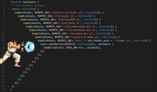
#nest js tutorial
Explore tagged Tumblr posts
Visit Tumblr Blog
Explore Tumblr blogs with no restrictions, modern design and the best experience.
Last Seen Tumblr Blogs


Fun Fact
The KCSC sent more than 20K requests to delete posts related to prostitution and porn to Tumblr from January to June 2017.
Video
youtube
Nestjs Middleware Tutorial with Coding Example for Beginners | Functiona... Full Video Link - https://youtu.be/3-l7fk1CFQ8 Check out this new video on the CodeOneDigest YouTube channel! Learn nestjs middleware with example. Learn how to create middleware, what is functional & global middleware #nestjsmiddleware #nestjs #nestjstutorial #middleware #dependencyinjection #nodejs #javascript #codeonedigest@java @awscloud @AWSCloudIndia @YouTube @codeonedigest @nestframework @typescript @Shopify @springboot @nodejs @JavaScript
1 note
·
View note
Text
Calling Js Promise Inside Another Promise: A Real-World Example
Dive into the world of JavaScript promises! Learn how to call a js promise inside another promise, with real-world examples.
Introduction In the world of asynchronous JavaScript, calling a Js promise inside another promise can enhance the efficiency and readability of your code. Let’s explore this concept through a real-world example. Consider a scenario where you need to fetch user data from an API and, based on that data, initiate a secondary operation like fetching additional details for each user. “If you’re new…
View On WordPress
#creating new promise#define javascript#JavaScript Async Functions#JavaScript Real-World Example#javascript tutorial#js promise#Nested Promises#Promise Error Handling#what are promises in javascript
0 notes
Link
The written version of the video: nest js auth
This video is the fourth lesson of the Node.js Course, where we are going to create Node js login with PostgreSQL and user authentication. In this course, we are building a banking app backend using Nest.js, Sequelize, PostgreSQL, and Typescript.
#node js login with postgresql#node js course#node js course for beginners#nestjs#nest js#nest js auth#node js tutorial#nodejs tutorial#node.js tutorial for beginners#node js authentication#json web token#node jsnode authentication#node js user login tutorial#node js login tutorial#node js user login#node js tutorial for beginners#node js login#node js authentication tutorial#node js user authentication#rest apinode tutorial#user authentication#node js crash course
0 notes
Photo

Nested Components in vuejs – Vuejs tutorials – Tutorial 24 Master CSS Grid Course: Nested Components in vuejs - Nested component is component nested in its parent component. source
#child component#component vuejs#components#components basic vuejs#components vue#Nested#nested componentns vue#nested components#nested components in vuejs#nested components vue js#nested components vuejs#nesting components in vuejs#parent component#tutorial#tutorials#vue#vue js nested components#vue js tutorial#vue nested components#vue tutorial#vuejs#vuejs component#vuejs components basic#vuejs nested components#vuejs nesting components#vuejs tutorial
0 notes
Text
Breathe
I believe as we learn we grow, and as we grow we learn. In January, I believe I rush a few lectures because I was in a hurry to know JS and start building apps and whatnot and it was very dissatisfying because I would learn something and understand and forget it afterward and the entire process was so stressful and I didn't feel like I was going any further with it so I just kept going anyway, I tried my best to do what I could but I didn't quit and then I stumbled upon a quote that said
"When you force the pace out of fear and impatience, you create a nest of problems that require fixing and you end up taking much longer..."
I meditated on this quote (which is a fancy way of saying, I thought about it deeply) and I have decided to ensure that I fully understand whatever concept I was learning to my satisfaction and cleared all the confusing theories I have before I move onto the next thing. I just wanted to share my progress with y'all.
Javascript Resources that you might need:
JS Tutorial (Site)
30 Days of JS (Github)
JS Info (Site)
MDN JS (Site)
HONOURABLE MENTION - Google (Site)
Have a nice day and a productive week ahead!
1 note
·
View note
Text
Tutorial React JS Part 6: Cara Membuat Nested React Element
Tutorial React JS Part 6: Cara Membuat Nested React Element
Di tutorial React sebelum ini, sudah dipelajari tentang cara membuat React Element dan merender React Element. Namun itu baru 1 element saja. Untuk praktek sebenarnya, kita butuh element HTML “bersarang” atau nested element, maksudnya ada banyak element di dalam element lain. Struktur tabel, form, atau list HTML butuh perpaduan banyak element HTML. Inilah yang akan dibahas dalam lanjutan tutorial…

View On WordPress
0 notes
Text
ReactJS Tutorial
ReactJS Tutorial – Design Your Web UI Using ReactJS JavaScript Library
The majority of you have probably heard about ReactJS, often known as React. For anyone interested in learning further, I'll go through all of the essential React ideas you need to know. I'm confident that at the end of this
ReactJS Tutorial,
you'll understand all of the principles of React. Let me begin by providing an outline of the topics covered in this ReactJS tutorial.
React's Evolution
React is a JavaScript library for creating web application user interfaces. React was created and maintained by the Facebook team, and it was eventually used in their products (WhatsApp & Instagram). It is now a free and open-source project with a vibrant developer community. Netflix, Airbnb, Yahoo! Mail, KhanAcademy, Dropbox, and a slew of other well-known websites use React to create their user interfaces. The MVC (model view controller) architecture is used to create modern websites. React is the ‘V' in MVC, which stands for view, while Redux or Flux offers the architecture. React native is a programming language that is used to create mobile apps, such as the Facebook app.
React Fiber and ReactVR were both announced at Facebook's annual F8 Developer Conference 2017. React Fiber is a thorough rebuild of the previous release, concentrating on gradual rendering and snappy responsiveness. ReactVR is a framework built on top of the React Native frameworks that allows you to create UI with 3D models to simulate a 360-degree environment, resulting in fully immersive VR content.
Why should you learn how to react?
“Let's just write less and accomplish more!!” says the author.
React is one of the most straightforward JS libraries to learn. Vanilla JavaScript takes longer to write; why waste time creating long code when you can get things done quickly with React? On GitHub, React has 71,200 stars, making it the fourth most starred project of all time. I'm confident you'll see why front-end developers all around the world are migrating to React after looking at the sample below. Let's try developing a series of nested lists in React and see how it compares to traditional JavaScript syntax.
React Features Overview
Learning Curve
React has a shallow learning curve and it is suitable for beginners. ES6 syntax is easier to manage especially for smaller to-do apps. In React, you code in the ‘JavaScript’ way, giving you the freedom to choose your tool depending upon your need. Angular expects you to learn one additional tool ‘typescript’ which can be viewed as the ‘Angular’ way of doing things. In ‘Angular’ you need to learn the entire framework even if you’re just building a simple UI application.
The Simplicity Of Virtual DOM
How Does It Work?
While React is easier to understand for those who have never used JavaScript before, the nitty-gritty of transpiring JSX code might be intimidating. This establishes the foundation for tools like Babel and Webpack. All of the JavaScript files are bundled together in a single file by Webpack and Babel. Webpack performs a similar role to that of including a link to the CSS and JS files in our HTML code, removing the necessity for explicitly linking files.
I'm sure you're all on Facebook. Imagine Facebook is separated into components, with each capability assigned to a different component, and each component producing HTML that the DOM renders as output.
https://www.phptpoint.com/reactjs-tutorial/
0 notes
Text
Node.js Async Await Tutorial – With Asynchronous JavaScript Examples
One of the hardest concepts to wrap your head around when you're first learning JavaScript is the asynchronous processing model of the language. For the majority of us, learning asynchronous programming looks pretty much like this

If your first time working with async wasn't like this, please consider yourself a genius
As hard as it is to pick up, async programming is critical to learn if you want to use JavaScript and Node.js to build web applications and servers – because JS code is asynchronous by default.
Asynchronous Programming Fundamentals
So what exactly is the asynchronous processing model, or the non-blocking I/O model (which you've likely heard of if you're a Node.js user)?
Here's a TL;DR description: in an async processing model, when your application engine interacts with external parties (like a file system or network), it doesn't wait until getting a result from those parties. Instead, it continues on to subsequent tasks and only comes back to those previous external parties once it's gotten a signal of a result.
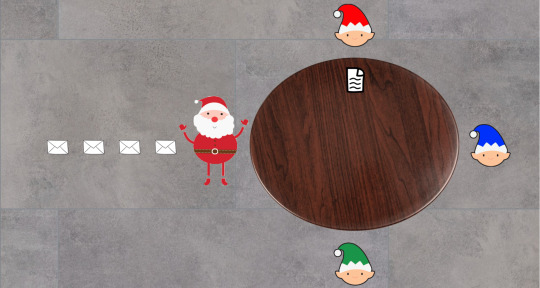
To understand the default async processing model of Node.js, let's have a look at a hypothetical Santa's workshop. Before any work can begin, Santa will have to read each of the lovely letters from kids around the world.

He will then figure out the requested gift, translate the item name into the Elvish language, and then pass the instruction to each of our hard working elves who have different specialisations: wooden toys for Red, stuffed toys for Blue, and robotic toys for Green.
This year, due to the COVID-19 pandemic, only half Santa's elves can come to his workshop to help. Still, because he's wise, Santa decides that instead of waiting for each elf to finish preparing a gift (that is, working synchronously), he will continue translating and passing out instructions from his pile of letters.

So on and so forth...
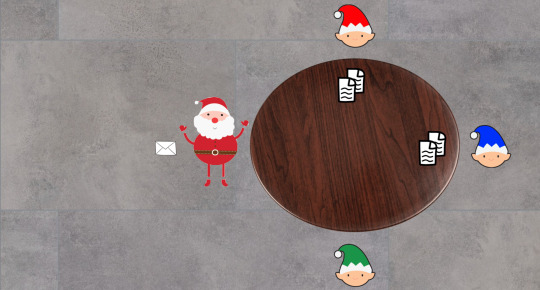
As he is just about to read another letter, Red informs Santa that he has completed preparing the first gift. Santa then receives the present from Red, and puts it to one side.

And then he continues translating and passing instructions from the next letter.

As he only needs to wrap a pre-made flying robot, Green can quickly finish preparation and pass the present to Santa.
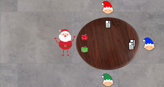
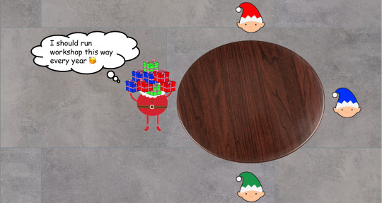
After a whole day of hard and asynchronous work, Santa and the elves manage to complete all present preparation. With his improved asynchronous model of working, Santa's workshop is finished in record time despite being hard-hit by the pandemic.
So that's the basic idea of an asynchronous or non-blocking I/O processing model. Now let's see how it's done in Node.js specifically.
The Node.js Event Loop
You might have heard that Node.js is single-threaded. However, to be exact, only the event loop in Node.js, which interacts with a pool of background C++ worker threads, is single-threaded. There are four important components to the Node.js processing model:
Event Queue: Tasks that are declared in a program, or returned from the processing thread pool via callbacks. (The equivalent of this in our Santa's workshop is the pile of letters for Santa.)
Event Loop: The main Node.js thread that facilitates event queues and worker thread pools to carry out operations – both async and synchronous. (This is Santa. 🎅)
Background thread pool: These threads do the actual processing of tasks, which might be I/O blocking (for example calling and waiting for a response from an external API). (These are the hardworking elves 🧝🧝♀️🧝♂️ from our workshop.)
You can visualize this processing model as below:

Diagram courtesy of c-sharpcorner.com
Let's look at an actual snippet of code to see these in action:
console.log("Hello"); https.get("https://httpstat.us/200", (res) => { console.log(`API returned status: ${res.statusCode}`); }); console.log("from the other side");
If we execute the above piece of code, we would get this in our standard output:
Hello from the other side API returned status: 200
So how does the Node.js engine carry out the above snippet of code? It starts with three functions in the call stack:
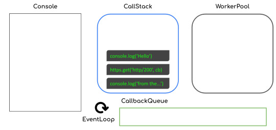
"Hello" is then printed to the console with the corresponding function call removed from the stack.
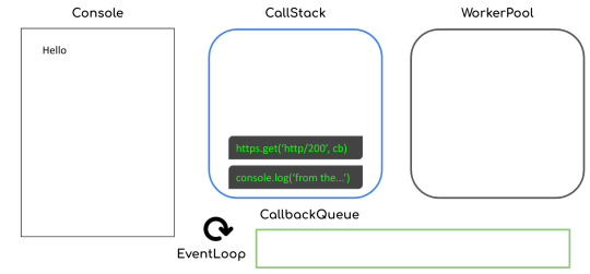
The function call to https.get (that is, making a get request to the corresponding URL) is then executed and delegated to the worker thread pool with a callback attached.
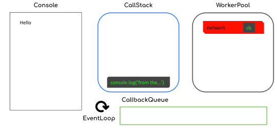
The next function call to console.log gets executed, and "from the other side" is printed to the console.

Now that the network call has returned a response, the callback function call will then get queued inside the callback queue. Note that this step could happen before the immediate previous step (that is, "from the other side" getting printed), though normally that's not the case.

The callback then gets put inside our call stack:

and then we will see "API returned status: 200" in our console, like this:
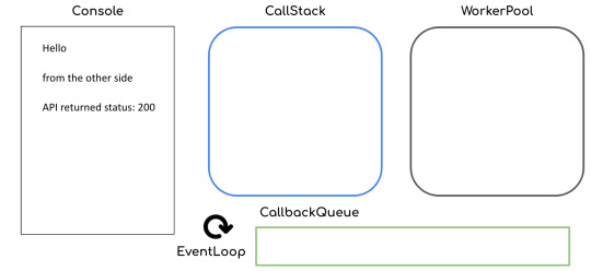
By facilitating the callback queue and call stack, the event loop in Node.js efficiently executes our JavaScript code in an asynchronous way.
A synchronous history of JavaScript & Node.js async/await
Now that you have good understanding of asynchronous execution and the inner-workings of the Node.js event loop, let's dive into async/await in JavaScript. We'll look at how it's worked through time, from the original callback-driven implementation to the latest shiny async/await keywords.
Callbacks in JavaScript
The OG way of handling the asynchronous nature of JavaScript engines was through callbacks. Callbacks are basically functions which will be executed, usually, at the end of synchronous or I/O blocking operations.
A straightforward example of this pattern is the built-in setTimeout function that will wait for a certain number of milliseconds before executing the callback.
setTimeout(2000, () => { console.log("Hello"); });
While it's convenient to just attach callbacks to blocking operations, this pattern also introduces a couple of problems:
Callback hell
Inversion of control (not the good kind!)
What is callback hell?
Let's look at an example with Santa and his elves again. To prepare a present, Santa's workshop would have to carry out a few different steps (with each taking different amounts of time simulated using setTimeout):
function translateLetter(letter, callback) { return setTimeout(2000, () => { callback(letter.split("").reverse().join("")); }); } function assembleToy(instruction, callback) { return setTimeout(3000, () => { const toy = instruction.split("").reverse().join(""); if (toy.includes("wooden")) { return callback(`polished ${toy}`); } else if (toy.includes("stuffed")) { return callback(`colorful ${toy}`); } else if (toy.includes("robotic")) { return callback(`flying ${toy}`); } callback(toy); }); } function wrapPresent(toy, callback) { return setTimeout(1000, () => { callback(`wrapped ${toy}`); }); }
These steps need to be carried out in a specific order:
translateLetter("wooden truck", (instruction) => { assembleToy(instruction, (toy) => { wrapPresent(toy, console.log); }); }); // This will produced a "wrapped polished wooden truck" as the final result
As we do things this way, adding more steps to the process would mean pushing the inner callbacks to the right and ending up in callback hell like this:
Callbacks look sequential, but at times the execution order doesn't follow what is shown on your screen. With multiple layers of nested callbacks, you can easily lose track of the big picture of the whole program flow and produce more bugs or just become slower when writing your code.
So how do you solve this problem? Simply modularise the nested callbacks into named functions and you will have a nicely left-aligned program that's easy to read.
function assembleCb(toy) { wrapPresent(toy, console.log); } function translateCb(instruction) { assembleToy(instruction, assembleCb); } translateLetter("wooden truck", translateCb);
Inversion of Control
Another problem with the callback pattern is that you don't decide how the higher-order functions will execute your callbacks. They might execute it at the end of the function, which is conventional, but they could also execute it at the start of the function or execute it multiple times.
Basically, you are at the mercy of your dependency owners, and you might never know when they will break your code.
To solve this problem, as a dependency user, there's not much you can do about it. However, if you're ever a dependency owner yourself, please always:
Stick to the conventional callback signature with error as the first argument
Execute a callback only once at the end of your higher-order function
Document anything out-of-convention that is absolutely required and always aim for backward compatibility
Promises in JavaScript
Promises were created to solve these above mentioned problems with callbacks. Promises make sure that JavaScript users:
Stick to a specific convention with their signature resolve and reject functions.
Chain the callback functions to a well-aligned and top-down flow.
Our previous example with Santa's workshop preparing presents can be rewritten with promises like so:
function translateLetter(letter) { return new Promise((resolve, reject) => { setTimeout(2000, () => { resolve(letter.split("").reverse().join("")); }); }); } function assembleToy(instruction) { return new Promise((resolve, reject) => { setTimeout(3000, () => { const toy = instruction.split("").reverse().join(""); if (toy.includes("wooden")) { return resolve(`polished ${toy}`); } else if (toy.includes("stuffed")) { return resolve(`colorful ${toy}`); } else if (toy.includes("robotic")) { return resolve(`flying ${toy}`); } resolve(toy); }); }); } function wrapPresent(toy) { return new Promise((resolve, reject) => { setTimeout(1000, () => { resolve(`wrapped ${toy}`); }); }); }
with the steps being carried out nicely in a chain:
translateLetter("wooden truck") .then((instruction) => { return assembleToy(instruction); }) .then((toy) => { return wrapPresent(toy); }) .then(console.log); // This would produce the exact same present: wrapped polished wooden truck
However, promises are not without problems either. Data in each eye of our chain have a different scope and only have access data passed from the immediate previous step or parent scope.
For example, our gift-wrapping step might want to use data from the translation step:
function wrapPresent(toy, instruction) { return Promise((resolve, reject) => { setTimeout(1000, () => { resolve(`wrapped ${toy} with instruction: "${instruction}`); }); }); }
This is rather a classic "memory sharing" problem with threading. To solve this, instead of using variables in the parent's scope, we should use Promise.all and "share data by communicating, rather than communicate by sharing data".
translateLetter("wooden truck") .then((instruction) => { return Promise.all([assembleToy(instruction), instruction]); }) .then((toy, instruction) => { return wrapPresent(toy, instruction); }) .then(console.log); // This would produce the present: wrapped polished wooden truck with instruction: "kcurt nedoow"
Async/Await in JavaScript
Last but definitely not least, the shiniest kid around the block is async/await. It is very easy to use but it also has some risks.
Async/await solves the memory sharing problems of promises by having everything under the same scope. Our previous example can be rewritten easily like so:
(async function main() { const instruction = await translateLetter("wooden truck"); const toy = await assembleToy(instruction); const present = await wrapPresent(toy, instruction); console.log(present); })(); // This would produce the present: wrapped polished wooden truck with instruction: "kcurt nedoow"
However, as much as it's easy to write asynchronous code with async/await, it's also easy to make mistakes that create performance loopholes.
Let's now localise our example Santa's workshop scenario to wrapping presents and loading them on the sleigh.
function wrapPresent(toy) { return Promise((resolve, reject) => { setTimeout(5000 * Math.random(), () => { resolve(`wrapped ${toy}`); }); }); } function loadPresents(presents) { return Promise((resolve, reject) => { setTimeout(5000, () => { let itemList = ""; for (let i = 0; i < presents.length; i++) { itemList += `${i}. ${presents[i]}\n`; } }); }); }
A common mistake you might make is carrying out the steps this way:
(async function main() { const presents = []; presents.push(await wrapPresent("wooden truck")); presents.push(await wrapPresent("flying robot")); presents.push(await wrapPresent("stuffed elephant")); const itemList = await loadPresents(presents); console.log(itemList); })();
But does Santa need to await for each of the presents to be wrapped one by one before loading? Definitely not! The presents should be wrapped concurrently. You might make this mistake often as it's so easy to write await without thinking about the blocking nature of the keyword.
To solve this problem, we should bundle the gift wrapping steps together and execute them all at once:
(async function main() { const presents = await Promise.all([ wrapPresent("wooden truck"), wrapPresent("flying robot"), wrapPresent("stuffed elephant"), ]); const itemList = await loadPresents(presents); console.log(itemList); })();
Here are some recommended steps to tackle concurrency performance issue in your Node.js code:
Identify hotspots with multiple consecutive awaits in your code
Check if they are dependent on each other (that is one function uses data returned from another)
Make independent function calls concurrent with Promise.all
Wrapping up (the article, not Christmas presents 😂)
Congratulations on reaching the end of this article, I tried my best to make this post shorter, but the async topic in JavaScript is just so broad.
Here are some key takeaways:
Modularise your JavaScript callbacks to avoid callback hell
Stick to the convention for JS callbacks
Share data by communicating through Promise.all when using promises
Be careful about the performance implication of async/await code
We ❤️ JavaScript :)
Thank you for reading!
Last but not least, if you like my writings, please head over to my blog for similar commentaries and follow me on Twitter. 🎉
If you read this far, tweet to the author to show them you care.
0 notes
Text
youtube
#nest js#nestjs framework#nestjs project#nestjs development#nestjs#typescript development#typescript class#typescript tutorial#typescript#youtube#video#codeonedigest#microservices#microservice#typeorm#orm#object relation mapping#postgres tutorial#postgres database#postgresql#postgres#Youtube
0 notes
Text
Implementation of dark mode in reaction devices
One of the apps features most requested is the dark mode (or night mode, as others call it). In the apps which we use every day, we see dark mode. From smartphones to web applications, the dark mode has become important to businesses wishing to look after their users' eyes.The dark mode is an add-on feature that often shows dark surfaces in the UI. Most big corporations (such as YouTube, Twitter, and Netflix) have brought their smartphone and web applications into dark mode.Although we are not going to go into React and styled-components in detail, a simple knowledge of React, CSS, and styled-components would be useful.
A few days before this article was written, StackOverflow announced its release of dark mode, offering users the opportunity to switch between the two modes.Dark mode eliminates eye pressure and aids when operating on a device or cell phone for a long period of time. What Is Dark Mode?The dark mode is the color scheme of any device showing light text and device elements on a dark backdrop, making it a little easier for the user to view cell phones, tablets, and computers. Dark mode decreases the light produced by the screen while preserving the minimum color-contrast ratios that are appropriate for reading. Why Should You Care About Dark Mode?Dark mode improves visual ergonomics by reducing eye strain, adapting the screen to current light conditions, and ensuring ease of use in dark environments or at night.Let's look at its benefits before we introduce dark mode in our app.
BATTERY SAVINGDark mode in Web and mobile apps will extend a device's battery life. Google stated that dark mode on OLED screens has been a tremendous help to battery life.For example, the dark mode in the YouTube app saves about 15 percent more screen energy than a flat white background at 50 percent brightness. The dark GUI saves a whopping 60 percent of screen energy at 100 percent screen brightness. DARK MODE IS BEAUTIFULThe dark mode is stunning, and can greatly enhance the screen's appeal.Although most products go for the same bland white look, the dark mode offers something else that looks both mysterious and fresh.It also offers great opportunities for a fresh presentation of graphic material, such as dashboards, videos, and images.
Now that you know why you should implement dark mode in your next web app, let's dive deep into style-components, which in this tutorial's defining resources.The dark mode is the color scheme of any interface that displays light text and interface elements on a dark background, making viewing on mobile phones, tablets, and computers a little easier.
What Are Styled-Components?We will be using the styled-components library very much in this post. There have always been a lot of ways to design a modern web application. A document-level there is the conventional styling approach which involves creating an index.css file and linking it to the HTML or styling within the HTML file.A lot has changed in the way web apps are recently designed after CSS-in-JS was introduced.CSS-in-JS refers to a pattern where JavaScript is used to compose the Html. To style components in a JavaScript file, it uses tagged template literals. The styled component is a CSS-in-JS library that allows you to use all the
CSS
features you need, including media queries, pseudo-selectors, and nesting.
Why Styled-Components?For the following reasons styled-components were created:
No hell class name Instead of scratching your head to find an item class name, styled-components can create unique class names for your types. You will never have to think about misrepresentations, or using class names that have no meaning.
The use of designed component props allows one to expand the styling properties using the props parameter widely used in React — thereby dynamically influencing the component's feeling through the state of the application. Supports Sass syntax
Writing Sass syntax out of the box without having to set up any preprocessors or extra build tools is possible with styled-components. In your style definitions, you can use the & character to target the current component, use pseudo-selectors, and experiment with nesting.
• Theming modeled components have full thematic support through the export of a ThemeProvider wrapper. This framework provides a theme for all components of React within itself via the Context API. All styled-components will have access to the given theme in the rendering tree, even though they are deeply multi-level. As we continue this tutorial, we will investigate the thematic features of modeled components more deeply SETTING UP
1. CREATE THE FILE STRUCTURECreating a folder and inserting within it three empty text files: one with.html, one with.css, and one with.js. Also, create a folder of images for the photos you wish to view on the website.JQuery also makes use of our "dark mode in CSS" demo. In the example, we are going to add the script right from the Cloudflare CDN to the HTML file so that it is always up to date. If you like, however, you can download and add the jQuery library as a local.js file as well.Here's how the file structure will look before coding begins:
- dark-mode-css/ - images/ - cake.jpg - index.html - script.js - style.css
2. MARK UP THE HTMLAdd the dark-mode switch to the top of the page in the HTML. Then create a < h1 > title tag, and a semantic < article > tag for the page's content. Finally, just before the < /body > tag closes add the two < script > tags.Please note that before the custom script you are adding the jQuery library so it can use its functionalities. The style.css file will go into the page's < head > section.
<!DOCTYPE html> <html lang="en"> <head> <meta charset="UTF-8"> <meta name="viewport" content="width=device-width, initial-scale=1.0"> <meta http-equiv="X-UA-Compatible" content="ie=edge"> <title>Demo | Dark Mode in CSS</title> <link rel="stylesheet" href="style.css"> </head> <body> <div class="switch">Dark mode: <span class="inner-switch">OFF</span> </div> <h1 class="title">The Best Recipes of All Time</h1> <article> <h1>Raspberry Cake</h1> <p><small>Created with Cupcake Ipsum</small></p> <p>...</p> <img src="images/cake.jpg"> <p>...</p> </article> <script src="https://cdnjs.cloudflare.com/ajax/libs/jquery/3.4.0/jquery.min.js"></script> <script src="script.js"></script> </body> </html>
3. CREATE THE CSS FOR THE LIGHT MODEFirst, let's build the CSS for light mode, since this is the page's default state. The following CSS makes use of a column-based flexbox style that allows you to easily place elements on the page, specifically the.switch class that handles the dark mode toggle wrapper and the < img > elements.
body { font-family: sans-serif; font-size: 1.125rem; display: flex; flex-direction: column; max-width: 50rem; margin: 0 auto; padding: 0 0.9375rem; } small { font-style: italic; } article { display: flex; flex-direction: column; } img { max-width: 100%; display: block; align-self: center; } .switch { align-self: flex-end; margin: 0.9375rem; } .inner-switch { display: inline-block; cursor: pointer; border: 1px solid #555; border-radius: 1.25rem; width: 3.125rem; text-align: center; font-size: 1rem; padding: 0.1875rem; margin-left: 0.3125rem; }
The display: flex; rule applied to the tag allows the align-self to be used: flex-end; rule over the dark mode turn. The align-self CSS property aligns individual flex elements along the cross-axis (which is the left-to-right axis when a column is set to flex-direction).In this way, the move is located automatically to the top right corner of the flex container — for all viewport sizes. .switch is a full-width layout row due to the flexbox, and its height does not fall at smaller screen sizes either.Similarly, the display: flex; and flex-direction: column; rules added to the < article > tag allow align-self to be used: center; rule on all images inside the post. As a result, all the images can be conveniently focused without adding extra elements to the HTML, only for positioning purposes. 4. ADD THE SWITCH FUNCTIONALITY WITH JQUERYThe.js script file provides the toggle switch feature. Therefore, the dark mode is activated when the user clicks the toggle and the mark on the switch switches to "ON." And if, when the page is in dark mode, the user clicks the toggle, the light mode is added and the mark switches to "OFF."
$( ".inner-switch" ).on("click", function() { if( $( "body" ).hasClass( "dark" )) { $( "body" ).removeClass( "dark" ); $( ".inner-switch" ).text( "OFF" ); } else { $( "body" ).addClass( "dark" ); $( ".inner-switch" ).text( "ON" ); } });
The script above makes use of the following jQuery functions:·
on(“click”, function() {…})
is an event handler that triggers the action inside the function when the user clicks the .inner-switch element,·
hasClass()
checks if the .dark class is assigned to the .inner-switch element or not (this is based on the state of the toggle),·
removeClass()
removes the .dark class from the HTML when the user switches to light mode,·
addClass()
adds the .dark class to the HTML when the user switches to dark mode,·
text()
sets the text of the label on the switch — it’s either “OFF” or “ON”.· 5. ADD THE CSS FOR THE DARK MODEThe last thing you need to do is to define those styles for the.dark class that the jQuery script above added to the HTML when dark mode is turned on. In addition to the.dark class, apply the dark mode theme to both its direct and indirect children using the.dark * universal CSS selector.
.dark, .dark * { background-color: #222; color: #e6e6e6; border-color: #e6e6e6; }
The CSS belonging to the.dark class goes to the file ending with style.css. This is because CSS (= Cascading Style Sheets) is cascading in nature. The cascade may thus bypass the colors all over the page without bumping into specificity or other probelms.You can also create a separate dark.css file for the dark mode styles if you are creating a more complex website. In this case, be careful that you always add the unique dark.css in the < head > section of the HTML after the generic style.css file, so that the cascade will work properly.
CREATING THEME-TOGGLING FUNCTIONALITY1. Add HTML:Using any item that should store the content for which you want the interface toggle. In our case, for simplicity we'll use < body >:
Example
<body>
Add CSS:Design the item < body > and build a toggle class in.dark-mode:
Example
body { padding: 25px; background-color: white; color: black; font-size: 25px; } .dark-mode { background-color: black; color: white; }
3) Add JavaScript:Get the < body > item and switch between the class of dark-mode:
Example
function myFunction() { var element = document.body; element.classList.toggle("dark-mode"); }
ConclusionDark mode is increasingly becoming a choice for the consumer, and it is much easier to integrate it into a web app by using the Theme Provider theme wrapper in styled components. Go ahead and play with styled-components as you implement dark mode; you could add icons instead of a button.
As a reputed Software Solutions Developer we have expertise in providing dedicated remote and outsourced technical resources for software services at very nominal cost. Besides experts in full stacks We also build web solutions, mobile apps and work on system integration, performance enhancement, cloud migrations and big data analytics. Don’t hesitate to
get in touch with us!
#b2b ecommerce
#b2b content marketing
#b2b market research companies
#b2b seo
#Ecommerce
0 notes
Text
Implementation of Dark Mode in React Devices
One of the apps features most requested is the dark mode (or night mode, as others call it). In the apps which we use every day, we see dark mode. From smartphones to web applications, the dark mode has become important to businesses wishing to look after their users' eyes.The dark mode is an add-on feature that often shows dark surfaces in the UI. Most big corporations (such as YouTube, Twitter, and Netflix) have brought their smartphone and web applications into dark mode.Although we are not going to go into React and styled-components in detail, a simple knowledge of React, CSS, and styled-components would be useful.
A few days before this article was written,
StackOverflow
announced its release of dark mode, offering users the opportunity to switch between the two modes.Dark mode eliminates eye pressure and aids when operating on a device or cell phone for a long period of time. What Is Dark Mode?The dark mode is the color scheme of any device showing light text and device elements on a dark backdrop, making it a little easier for the user to view cell phones, tablets, and computers. Dark mode decreases the light produced by the screen while preserving the minimum color-contrast ratios that are appropriate for reading. Why Should You Care About Dark Mode?Dark mode improves visual ergonomics by reducing eye strain, adapting the screen to current light conditions, and ensuring ease of use in dark environments or at night.Let's look at its benefits before we introduce dark mode in our app.
BATTERY SAVINGDark mode in Web and mobile apps will extend a device's battery life. Google stated that dark mode on OLED screens has been a tremendous help to battery life.For example, the dark mode in the YouTube app saves about 15 percent more screen energy than a flat white background at 50 percent brightness. The dark GUI saves a whopping 60 percent of screen energy at 100 percent screen brightness. DARK MODE IS BEAUTIFULThe dark mode is stunning, and can greatly enhance the screen's appeal.Although most products go for the same bland white look, the dark mode offers something else that looks both mysterious and fresh.It also offers great opportunities for a fresh presentation of graphic material, such as dashboards, videos, and images.
Now that you know why you should implement dark mode in your next web app, let's dive deep into style-components, which in this tutorial's defining resources.The dark mode is the color scheme of any interface that displays light text and interface elements on a dark background, making viewing on mobile phones, tablets, and computers a little easier.
What Are Styled-Components?We will be using the styled-components library very much in this post. There have always been a lot of ways to design a modern web application. A document-level there is the conventional styling approach which involves creating an index.css file and linking it to the HTML or styling within the HTML file.
A lot has changed in the way web apps are recently designed after CSS-in-JS was introduced.
CSS-in-JS refers to a pattern where JavaScript is used to compose the Html. To style components in a JavaScript file, it uses tagged template literals. The styled component is a CSS-in-JS library that allows you to use all the CSS features you need, including media queries, pseudo-selectors, and nesting.
Why Styled-Components?For the following reasons styled-components were created:
No hell class name Instead of scratching your head to find an item class name, styled-components can create unique class names for your types. You will never have to think about misrepresentations, or using class names that have no meaning.
The use of designed component props allows one to expand the styling properties using the props parameter widely used in React — thereby dynamically influencing the component's feeling through the state of the application. Supports Sass syntax
Writing Sass syntax out of the box without having to set up any preprocessors or extra build tools is possible with styled-components. In your style definitions, you can use the & character to target the current component, use pseudo-selectors, and experiment with nesting.
• Theming modeled components have full thematic support through the export of a ThemeProvider wrapper. This framework provides a theme for all components of React within itself via the Context API. All styled-components will have access to the given theme in the rendering tree, even though they are deeply multi-level. As we continue this tutorial, we will investigate the thematic features of modeled components more deeply SETTING UP1. CREATE THE FILE STRUCTURECreating a folder and inserting within it three empty text files: one with.html, one with.css, and one with.js. Also, create a folder of images for the photos you wish to view on the website.JQuery also makes use of our "dark mode in CSS" demo. In the example, we are going to add the script right from the Cloudflare CDN to the HTML file so that it is always up to date. If you like, however, you can download and add the jQuery library as a local.js file as well.Here's how the file structure will look before coding begins:
- dark-mode-css/ - images/ - cake.jpg - index.html - script.js - style.css
2. MARK UP THE HTMLAdd the dark-mode switch to the top of the page in the HTML. Then create a < h1 > title tag, and a semantic < article > tag for the page's content. Finally, just before the < /body > tag closes add the two < script > tags.Please note that before the custom script you are adding the jQuery library so it can use its functionalities. The style.css file will go into the page's < head > section.
<!DOCTYPE html> <html lang="en"> <head> <meta charset="UTF-8"> <meta name="viewport" content="width=device-width, initial-scale=1.0"> <meta http-equiv="X-UA-Compatible" content="ie=edge"> <title>Demo | Dark Mode in CSS</title> <link rel="stylesheet" href="style.css"> </head> <body> <div class="switch">Dark mode: <span class="inner-switch">OFF</span> </div> <h1 class="title">The Best Recipes of All Time</h1> <article> <h1>Raspberry Cake</h1> <p><small>Created with Cupcake Ipsum</small></p> <p>...</p> <img src="images/cake.jpg"> <p>...</p> </article> <script src="https://cdnjs.cloudflare.com/ajax/libs/jquery/3.4.0/jquery.min.js"></script> <script src="script.js"></script> </body> </html>
3. CREATE THE CSS FOR THE LIGHT MODEFirst, let's build the CSS for light mode, since this is the page's default state. The following CSS makes use of a column-based flexbox style that allows you to easily place elements on the page, specifically the.switch class that handles the dark mode toggle wrapper and the < img > elements.
body { font-family: sans-serif; font-size: 1.125rem; display: flex; flex-direction: column; max-width: 50rem; margin: 0 auto; padding: 0 0.9375rem; } small { font-style: italic; } article { display: flex; flex-direction: column; } img { max-width: 100%; display: block; align-self: center; } .switch { align-self: flex-end; margin: 0.9375rem; } .inner-switch { display: inline-block; cursor: pointer; border: 1px solid #555; border-radius: 1.25rem; width: 3.125rem; text-align: center; font-size: 1rem; padding: 0.1875rem; margin-left: 0.3125rem; }
The display: flex; rule applied to the tag allows the align-self to be used: flex-end; rule over the dark mode turn. The align-self CSS property aligns individual flex elements along the cross-axis (which is the left-to-right axis when a column is set to flex-direction).In this way, the move is located automatically to the top right corner of the flex container — for all viewport sizes. .switch is a full-width layout row due to the flexbox, and its height does not fall at smaller screen sizes either.Similarly, the display: flex; and flex-direction: column; rules added to the < article > tag allow align-self to be used: center; rule on all images inside the post. As a result, all the images can be conveniently focused without adding extra elements to the HTML, only for positioning purposes. 4. ADD THE SWITCH FUNCTIONALITY WITH JQUERYThe.js script file provides the toggle switch feature. Therefore, the dark mode is activated when the user clicks the toggle and the mark on the switch switches to "ON." And if, when the page is in dark mode, the user clicks the toggle, the light mode is added and the mark switches to "OFF."
$( ".inner-switch" ).on("click", function() { if( $( "body" ).hasClass( "dark" )) { $( "body" ).removeClass( "dark" ); $( ".inner-switch" ).text( "OFF" ); } else { $( "body" ).addClass( "dark" ); $( ".inner-switch" ).text( "ON" ); } });
The script above makes use of the following jQuery functions:·
on(“click”, function() {…})
is an event handler that triggers the action inside the function when the user clicks the .inner-switch element,·
hasClass()
checks if the .dark class is assigned to the .inner-switch element or not (this is based on the state of the toggle),·
removeClass()
removes the .dark class from the HTML when the user switches to light mode,·
addClass()
adds the .dark class to the HTML when the user switches to dark mode,·
text()
sets the text of the label on the switch — it’s either “OFF” or “ON”.· 5. ADD THE CSS FOR THE DARK MODEThe last thing you need to do is to define those styles for the.dark class that the jQuery script above added to the HTML when dark mode is turned on. In addition to the.dark class, apply the dark mode theme to both its direct and indirect children using the.dark * universal CSS selector.
.dark, .dark * { background-color: #222; color: #e6e6e6; border-color: #e6e6e6; }
The CSS belonging to the.dark class goes to the file ending with style.css. This is because CSS (= Cascading Style Sheets) is cascading in nature. The cascade may thus bypass the colors all over the page without bumping into specificity or other probelms.You can also create a separate dark.css file for the dark mode styles if you are creating a more complex website. In this case, be careful that you always add the unique dark.css in the < head > section of the HTML after the generic style.css file, so that the cascade will work properly.CREATING THEME-TOGGLING FUNCTIONALITY1. Add HTML:Using any item that should store the content for which you want the interface toggle. In our case, for simplicity we'll use < body >:Example<body> Add CSS:Design the item < body > and build a toggle class in.dark-mode:Example
body { padding: 25px; background-color: white; color: black; font-size: 25px; } .dark-mode { background-color: black; color: white; }
3) Add JavaScript:Get the < body > item and switch between the class of dark-mode:Example
function myFunction() { var element = document.body; element.classList.toggle("dark-mode"); }
ConclusionDark mode is increasingly becoming a choice for the consumer, and it is much easier to integrate it into a web app by using the ThemeProvider theme wrapper in styled components. Go ahead and play with styled-components as you implement dark mode; you could add icons instead of a button.
As a reputed Software Solutions Developer we have expertise in providing dedicated remote and outsourced technical resources for software services at very nominal cost. Besides experts in full stacks We also build web solutions, mobile apps and work on system integration, performance enhancement, cloud migrations and big data analytics. Don’t hesitate to
get in touch with us!
0 notes
Text
Implementation of dark mode in reaction devices
One of the apps features most requested is the dark mode (or night mode, as others call it). In the apps which we use every day, we see dark mode. From smartphones to web applications, the dark mode has become important to businesses wishing to look after their users' eyes.The dark mode is an add-on feature that often shows dark surfaces in the UI. Most big corporations (such as YouTube, Twitter, and Netflix) have brought their smartphone and web applications into dark mode.Although we are not going to go into React and styled-components in detail, a simple knowledge of React, CSS, and styled-components would be useful.
A few days before this article was written, StackOverflow announced its release of dark mode, offering users the opportunity to switch between the two modes.Dark mode eliminates eye pressure and aids when operating on a device or cell phone for a long period of time. What Is Dark Mode?The dark mode is the color scheme of any device showing light text and device elements on a dark backdrop, making it a little easier for the user to view cell phones, tablets, and computers. Dark mode decreases the light produced by the screen while preserving the minimum color-contrast ratios that are appropriate for reading. Why Should You Care About Dark Mode?Dark mode improves visual ergonomics by reducing eye strain, adapting the screen to current light conditions, and ensuring ease of use in dark environments or at night.Let's look at its benefits before we introduce dark mode in our app.
BATTERY SAVINGDark mode in Web and mobile apps will extend a device's battery life. Google stated that dark mode on OLED screens has been a tremendous help to battery life.For example, the dark mode in the YouTube app saves about 15 percent more screen energy than a flat white background at 50 percent brightness. The dark GUI saves a whopping 60 percent of screen energy at 100 percent screen brightness. DARK MODE IS BEAUTIFULThe dark mode is stunning, and can greatly enhance the screen's appeal.Although most products go for the same bland white look, the dark mode offers something else that looks both mysterious and fresh.It also offers great opportunities for a fresh presentation of graphic material, such as dashboards, videos, and images.
Now that you know why you should implement dark mode in your next web app, let's dive deep into style-components, which in this tutorial's defining resources.The dark mode is the color scheme of any interface that displays light text and interface elements on a dark background, making viewing on mobile phones, tablets, and computers a little easier.
What Are Styled-Components?We will be using the styled-components library very much in this post. There have always been a lot of ways to design a modern web application. A document-level there is the conventional styling approach which involves creating an index.css file and linking it to the HTML or styling within the HTML file.A lot has changed in the way web apps are recently designed after CSS-in-JS was introduced.CSS-in-JS refers to a pattern where JavaScript is used to compose the Html. To style components in a JavaScript file, it uses tagged template literals. The styled component is a CSS-in-JS library that allows you to use all the
CSS
features you need, including media queries, pseudo-selectors, and nesting.
Why Styled-Components?For the following reasons styled-components were created:
No hell class name Instead of scratching your head to find an item class name, styled-components can create unique class names for your types. You will never have to think about misrepresentations, or using class names that have no meaning.
The use of designed component props allows one to expand the styling properties using the props parameter widely used in React — thereby dynamically influencing the component's feeling through the state of the application. Supports Sass syntax
Writing Sass syntax out of the box without having to set up any preprocessors or extra build tools is possible with styled-components. In your style definitions, you can use the & character to target the current component, use pseudo-selectors, and experiment with nesting.
• Theming modeled components have full thematic support through the export of a ThemeProvider wrapper. This framework provides a theme for all components of React within itself via the Context API. All styled-components will have access to the given theme in the rendering tree, even though they are deeply multi-level. As we continue this tutorial, we will investigate the thematic features of modeled components more deeply SETTING UP
1. CREATE THE FILE STRUCTURECreating a folder and inserting within it three empty text files: one with.html, one with.css, and one with.js. Also, create a folder of images for the photos you wish to view on the website.JQuery also makes use of our "dark mode in CSS" demo. In the example, we are going to add the script right from the Cloudflare CDN to the HTML file so that it is always up to date. If you like, however, you can download and add the jQuery library as a local.js file as well.Here's how the file structure will look before coding begins:
- dark-mode-css/ - images/ - cake.jpg - index.html - script.js - style.css
2. MARK UP THE HTMLAdd the dark-mode switch to the top of the page in the HTML. Then create a < h1 > title tag, and a semantic < article > tag for the page's content. Finally, just before the < /body > tag closes add the two < script > tags.Please note that before the custom script you are adding the jQuery library so it can use its functionalities. The style.css file will go into the page's < head > section.
<!DOCTYPE html> <html lang="en"> <head> <meta charset="UTF-8"> <meta name="viewport" content="width=device-width, initial-scale=1.0"> <meta http-equiv="X-UA-Compatible" content="ie=edge"> <title>Demo | Dark Mode in CSS</title> <link rel="stylesheet" href="style.css"> </head> <body> <div class="switch">Dark mode: <span class="inner-switch">OFF</span> </div> <h1 class="title">The Best Recipes of All Time</h1> <article> <h1>Raspberry Cake</h1> <p><small>Created with Cupcake Ipsum</small></p> <p>...</p> <img src="images/cake.jpg"> <p>...</p> </article> <script src="https://cdnjs.cloudflare.com/ajax/libs/jquery/3.4.0/jquery.min.js"></script> <script src="script.js"></script> </body> </html>
3. CREATE THE CSS FOR THE LIGHT MODEFirst, let's build the CSS for light mode, since this is the page's default state. The following CSS makes use of a column-based flexbox style that allows you to easily place elements on the page, specifically the.switch class that handles the dark mode toggle wrapper and the < img > elements.
body { font-family: sans-serif; font-size: 1.125rem; display: flex; flex-direction: column; max-width: 50rem; margin: 0 auto; padding: 0 0.9375rem; } small { font-style: italic; } article { display: flex; flex-direction: column; } img { max-width: 100%; display: block; align-self: center; } .switch { align-self: flex-end; margin: 0.9375rem; } .inner-switch { display: inline-block; cursor: pointer; border: 1px solid #555; border-radius: 1.25rem; width: 3.125rem; text-align: center; font-size: 1rem; padding: 0.1875rem; margin-left: 0.3125rem; }
The display: flex; rule applied to the tag allows the align-self to be used: flex-end; rule over the dark mode turn. The align-self CSS property aligns individual flex elements along the cross-axis (which is the left-to-right axis when a column is set to flex-direction).In this way, the move is located automatically to the top right corner of the flex container — for all viewport sizes. .switch is a full-width layout row due to the flexbox, and its height does not fall at smaller screen sizes either.Similarly, the display: flex; and flex-direction: column; rules added to the < article > tag allow align-self to be used: center; rule on all images inside the post. As a result, all the images can be conveniently focused without adding extra elements to the HTML, only for positioning purposes. 4. ADD THE SWITCH FUNCTIONALITY WITH JQUERYThe.js script file provides the toggle switch feature. Therefore, the dark mode is activated when the user clicks the toggle and the mark on the switch switches to "ON." And if, when the page is in dark mode, the user clicks the toggle, the light mode is added and the mark switches to "OFF."
$( ".inner-switch" ).on("click", function() { if( $( "body" ).hasClass( "dark" )) { $( "body" ).removeClass( "dark" ); $( ".inner-switch" ).text( "OFF" ); } else { $( "body" ).addClass( "dark" ); $( ".inner-switch" ).text( "ON" ); } });
The script above makes use of the following jQuery functions:·
on(“click”, function() {…})
is an event handler that triggers the action inside the function when the user clicks the .inner-switch element,·
hasClass()
checks if the .dark class is assigned to the .inner-switch element or not (this is based on the state of the toggle),·
removeClass()
removes the .dark class from the HTML when the user switches to light mode,·
addClass()
adds the .dark class to the HTML when the user switches to dark mode,·
text()
sets the text of the label on the switch — it’s either “OFF” or “ON”.· 5. ADD THE CSS FOR THE DARK MODEThe last thing you need to do is to define those styles for the.dark class that the jQuery script above added to the HTML when dark mode is turned on. In addition to the.dark class, apply the dark mode theme to both its direct and indirect children using the.dark * universal CSS selector.
.dark, .dark * { background-color: #222; color: #e6e6e6; border-color: #e6e6e6; }
The CSS belonging to the.dark class goes to the file ending with style.css. This is because CSS (= Cascading Style Sheets) is cascading in nature. The cascade may thus bypass the colors all over the page without bumping into specificity or other probelms.You can also create a separate dark.css file for the dark mode styles if you are creating a more complex website. In this case, be careful that you always add the unique dark.css in the < head > section of the HTML after the generic style.css file, so that the cascade will work properly.
CREATING THEME-TOGGLING FUNCTIONALITY1. Add HTML:Using any item that should store the content for which you want the interface toggle. In our case, for simplicity we'll use < body >:
Example
<body>
Add CSS:Design the item < body > and build a toggle class in.dark-mode:
Example
body { padding: 25px; background-color: white; color: black; font-size: 25px; } .dark-mode { background-color: black; color: white; }
3) Add JavaScript:Get the < body > item and switch between the class of dark-mode:
Example
function myFunction() { var element = document.body; element.classList.toggle("dark-mode"); }
ConclusionDark mode is increasingly becoming a choice for the consumer, and it is much easier to integrate it into a web app by using the Theme Provider theme wrapper in styled components. Go ahead and play with styled-components as you implement dark mode; you could add icons instead of a button.
As a reputed Software Solutions Developer we have expertise in providing dedicated remote and outsourced technical resources for software services at very nominal cost. Besides experts in full stacks We also build web solutions, mobile apps and work on system integration, performance enhancement, cloud migrations and big data analytics. Don’t hesitate to
get in touch with us!
0 notes
Text
JavaScript CorelDRAW 2020
Tutorial ensinando a utilizar recursos de macro em JavaScript JS no CorelDRAW 2020.
JavaScrip – JS Olá caro leitor neste tutorial você irá aprender como usar Scripts do tipo<strong> JavaScript</strong> em suas macros no <strong>CorelDRAW</strong>. O JavaScript pode ser usado para automatizar tarefas, neste tutorial você irá aprender a como criar e executar um Script JS. Este Script irá adicionar uma marca d’água á página ativa do seu documento. Ele calcula a largura e a altura…

View On WordPress
0 notes
Photo

Node 15, React 17, and a cool JavaScript demo
#511 — October 23, 2020
Unsubscribe | Read on the Web
JavaScript Weekly
React 17.0 Released — The focus in React 17 is peace, harmony, and gentle progression, with subtle changes, making apps easier to upgrade gradually in future, and also to make it easier to embed React apps into apps built with other technologies.
Dan Abramov and Rachel Nabors
Node 15 Released — The new ‘release’ line (the one that gets all the new features first) of Node is here. Two key features:
An upgrade to the V8 8.6 engine (from 8.4) adding various JS features like Promise.any(), logical assignment operators, and String.prototype.replaceAll()
Unhandled rejections are now raised as exceptions by default. If there's any one change that'll cause you some head scratching, it's this.
For more, check this week's Node Weekly ;-)
New Course: Introduction to Next.js, The Full-Stack React Framework — Next.js is a complete framework built on top of React.js. You'll learn server-side rendering, static site generation, data fetching, code API endpoints, creating pages with the file system, add CSS modules, and more.
Frontend Masters sponsor
What Vue.js Does Better Than React — “I love and use React daily but was curious if there’s anything from Vue that React could learn from. Turns out there is! This post collects my findings.”
Harry Wolff
Skypack Discover: A Way to Discover and Test Recommended JS Packages — From the same folks as the Snowpack build tool, Skypack is basically a search engine for npm packages, but it’s added a ‘Discover’ feature which helps you pick the best options for you. You can then import them ES module style.
Fred K. Schott
⚡️ Quick bytes:
Want to see something cool? MONOSPACE is a demo (in the 'demoscene' sense) written in 1021 bytes of JavaScript and it won the 1024 byte demo competition at Assembly 2020.
Rich Harris (of Svelte fame) has shared a video exploring his thoughts on the future of Web development and where the Sapper Svelte-based framework slots in (or doesn't!) — Cool ideas here.
Vue 3.0.2 is out – almost entirely bug fixes. Or how about Ember 3.22 or the first RC of Angular 11?
Someone has noted that using const instead of var or let can cause big slowdowns in the JavaScriptCore engine Webkit (and Safari) uses. They're now on the case to resolve it.
We announced webpack 5 last week, but we're already getting webpack 5.2.0 this week.
💻 Jobs
React JS Developer (Remote) — Millions get inspired and plan adventures with our apps. To help us make komoot.com the place to go to plan outdoor adventures, we’re looking for an ambitious ReactJS developer to join our team.
Komoot
JavaScript/TypeScript Architect + Developer Advocate, London UK — It’s time to build your masterpiece – can you design a platform and a framework used by the NHS, HMRC, Valve, and Microsoft?
CareersJS
Find a Job Through Vettery — Create a profile on Vettery to connect with hiring managers at startups and Fortune 500 companies. It's free for job-seekers.
Vettery
📚 Tutorials, Opinions and Stories

Dissecting A Dweet: City Sunset — A fascinating exploration of how a mere 140 characters of JavaScript can produce beautiful procedurally generated cityscapes. You can play with/tweak the code here. Fun!
Killed By A Pixel
'Basic Authentication' with Lambda@Edge — An interesting way to use Lambda@Edge (lets you run code in front of a Cloudfront distribution) to add a rather old-school way of securing access to a static site. But does it work? Yes.
Sebastian Petterson
All the Canaries Lived: It’s Time to Adopt Progressive Delivery
LaunchDarkly sponsor
Getting Started with Next.js — Next.js is a React-based framework focused on providing a good developer experience for building complete, production-bound apps covering both backend and frontend.
Adebiyi Adedotun
Introducing the Async Cookie Store API (in Chrome 87) — A look at a new API that exposes cookies to service workers and provides an async alternative to document.cookie that also lets you react to cookie changes in real time.
Matan Borenkraout
Getting Started with OpenTelemetry in JavaScript and Node.js
OpenTelemetry sponsor
Managing Side Effects with Monads
Why `flatMap` Is So Great
🛠 Code & Tools
supported by

JSDB 1.0: An In-Memory, Streaming Write-on-Update Node.js Database — An easy-to-use, in-memory database that persists to a JavaScript transaction log and aimed at small scale (though Small Web is more nuanced than that as a concept) cases.
Aral Balkan
Pikaday: A Mature Date Picker with No Dependencies — This is an old project that has recently sprung back into life and gotten a release. I just love the name of it and its simple old-school nature. Demo here.
Bushell, Rikkert et al.
NSFW JS: TensorFlow-Powered Client Side Indecent Content Checking — Would it be helpful for you to detect.. ‘unseemly’ images on the client side? Enter NSFW JS. We first featured this over a year ago but it’s just had a significant performance-oriented update.
Infinite Red, Inc.
Stream Chat API & JavaScript SDK for Custom Chat Apps — Build real-time chat in less time. Rapidly ship in-app messaging with our highly reliable chat infrastructure.
Stream sponsor
JZZ: A MIDI Library for Node and the Browser — Brings the Web MIDI API to Node so you can send, receive and play MIDI messages from both Node and the browser on Linux, macOS and Windows. (Click on the logo on the official home page for a bit of fun.)
Jazz Soft
Fingerprint JS 3.0: Modern and Flexible Browser Fingerprinting Library — With v3 it’s become completely modular and has been rewritten in TypeScript. Definitely one of those ‘please use this for good, not evil’ type projects though.
FingerprintJS
73 Awesome NPM Packages for Productivity — This is one of those ‘grab bag’ list style posts we used to include a lot more several years ago, but it’s a reasonably good one if you fancy a quick browse.
Madza
🔗 From the queue..
We don't ever get to use all of the great links we have because we don't want to overwhelm you each week, but we thought it'd be neat to quickly feature some of them in case the titles jump out at you – so we'll be including this special section from time to time for you to skim through:
Enjoy!
The Flavors of Object-Oriented Programming (in JavaScript) Zell Liew
An Introduction To Running Lighthouse Programmatically Katy Bowman
Understanding Reduce in JavaScript Monica Powell
Working with JavaScript Media Queries Marko Ilic
Supercharge Testing React Applications With Wallaby.js Kelvin Omereshone
Three Approaches for Implementing Nested Forms in Angular Latish Sehgal
by via JavaScript Weekly https://ift.tt/37xfPc1
0 notes
Text
What is the best Full Stack Development Company in Nevada in 2020?

Full-stack development services are becoming the new trend in the web development industry with a good speed.
We are a trusted full stack development Company in Nevada. We offer an unparalleled experience of working with front-end as well as backend technologies like Node, Express JS, AngularJS, Laravel, GraphQL, Nest JS, React JS, and many others to suit your business and requirements.
We make our full-stack developers specialists in each stack by providing them assistance to obtain the latest tutorials, educational resources, and material facilities to learn new things with full concentration.
These developers have wide- experience in switching roles between the front-end & back-end development, thus they succeed to deliver end-to-end solutions to our clients.
We at HireFullStackDeveloperIndia offer better full-stack development services that reveal intensive skills of technologies and complete focus on success. We assure stickiness to the on-going methodologies of project execution like agile and DevOps that ensure a smooth flow of information between the teams of stakeholders.
0 notes
Text
How to Build a Chrome Extension
I made a Chrome extension this weekend because I found I was doing the same task over and over and wanted to automate it. Plus, I’m a nerd during a pandemic, so I spend my weird pent-up energy building things. I’ve made five Chrome extensions with that energy, yet I still find it hard to locate the docs to make them. Some things are outdated or deprecated. Some things are simply buried. I’m writing this as a bit of tutorial (1) in case it’s helpful to others and certainly (2) for myself the next time I want to build a Chrome extension.
Let’s get started.
Create the manifest
The very first step is creating a manifest.json file in a project folder. This serves a similar purpose to a package.json, only it provides the Chrome Web Store with critical information about the project, including the name, version, the required permissions, and so forth. Here’s an example:
{ "manifest_version": 2, "name": "Sample Name", "version": "1.0.0", "description": "This is a sample description", "short_name": "Short Sample Name", "permissions": ["activeTab", "declarativeContent", "storage", "<all_urls>"], "content_scripts": [ { "matches": ["<all_urls>"], "css": ["background.css"], "js": ["background.js"] } ], "browser_action": { "default_title": "Does a thing when you do a thing", "default_popup": "popup.html", "default_icon": { "16": "icons/icon16.png", "32": "icons/icon32.png" } } }
You might notice a few things, like not all of that data is necessary. The names and descriptions can be anything you’d like.
The permissions depend on what the extension needs to do. We have ["activeTab", "declarativeContent", "storage", "<all_urls>"] in this example because this particular extension needs information about the active tab, needs to change the page content, needs to access localStorage, and needs to be active on all sites. If it only need it to be active on one site at a time, then there’s no need for that line and it can be removed altogether.
A list of all of the permissions and what they mean can be found in Chrome’s extension docs.
"content_scripts": [ { "matches": ["<all_urls>"], "css": ["background.css"], "js": ["background.js"] } ],
The content_scripts section sets the sites where the extension should be active. If you want a single site, like Twitter for example, you would say ["https://twitter.com/*"]. The CSS and JavaScript files are everything needed for extensions. For instance, my productive Twitter extension uses these files to override Twitter’s default appearance.
"browser_action": { "default_title": "Does a thing when you do a thing", "default_popup": "popup.html", "default_icon": { "16": "icons/icon16.png", "32": "icons/icon32.png" } }
There are things in browser_action that are also optional. For example, if the extension doesn’t need a popup for its functionality, then both the default_title and default_popup can be removed. In that case, all that’s needed the icon for the extension. If the extension only works on some sites, then Chrome will grey out the icon when it’s inactive.
Debugging
Once the manifest, CSS and JavaScript files are ready, head over to chrome://extensions/from the browser’s address bar and enable developer mode. That activates the “Load unpacked” button to add the extension files. It’s also possible to toggle whether or not the developer version of the extension is active.
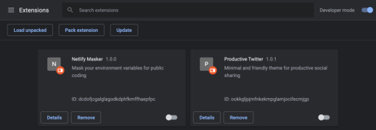
I would highly recommend starting a GitHub repository to version control the files at this point. It’s a good way to save the work.
The extension needs to be reloaded from this interface when it is updated. A little refresh icon will display on the screen. Also, if the extension has any errors during development, it will show an error button with a stack trace and more info here as well.
Popup functionality
If the extension need to make use of a popup, it’s thankfully fairly straightforward. After designating the name of the file with browser_action in the manifest file, a page can be built with whatever HTML and CSS… including a popup!
Now, we’ll probably want to add some functionality to a popup. That make take some JavaScript, so make sure the JavaScript file is designated in the manifest file and is linked up in your popup file as well, like this: <script src="background.js"></script>
In that file, start to creating functionality and we’ll have access to the popup DOM like this:
document.addEventListener("DOMContentLoaded", () => { var button = document.getElementById("submit") button.addEventListener("click", (e) => { console.log(e) }) })
If we create a button in the popup.html file, assign it an ID called submit, and then return a console log, you might notice that nothing is actually logged in the console. That’s because we’re in a different context, meaning we’ll need to right-click on the popup and open up DevTools.
We now have access to logging and debugging! Keep in mind, though, that if anything is set in localStorage, then it will only exist in the extension’s localStorage; not the user’s browser localStorage. (This bit me the first time I tried!)
Running scripts outside the extension
This is all fine and good, but say we want to run a script that has access to information on the current tab? Here’s a couple of ways we would do this. I would typically call a separate function from inside the DOMContentLoaded event listener:
Example 1: Activate a file
function exampleFunction() { chrome.tabs.executeScript(() => { chrome.tabs.executeScript({ file: "content.js" }) }) }
Example 2: Just execute a bit of code
This way is great if there’s only a small bit of code to run. However, it quickly gets tough to work with since it requires passing everything as a string or template literal.
function exampleFunction() { chrome.tabs.executeScript({ code: `console.log(‘hi there’)` }) }
Example 3: Activate a file and pass a parameter
Remember, the extension and tab are operating in different contexts. That makes passing parameters between them a not-so-trivial task. What we’ll do here is nest the first two examples to pass a bit of code into the second file. I will store everything I need in a single option, but we’ll have to stringify the object for that to work properly.
function exampleFunction(options) { chrome.tabs.executeScript( { code: "var options = " + JSON.stringify(options) }, function() { chrome.tabs.executeScript({ file: "content.js" }) } ) }
Icons
Even though the manifest file only defines two icons, we need two more to officially submit the extension to the Chrome Web Store: one that’s 128px square, and one that I call icon128_proper.png, which is also 128px, but has a little padding inside it between the edge of the image and the icon.
Keep in mind that whatever icon is used needs to look good both in light mode and dark mode for the browser. I usually find my icons on the Noun Project.
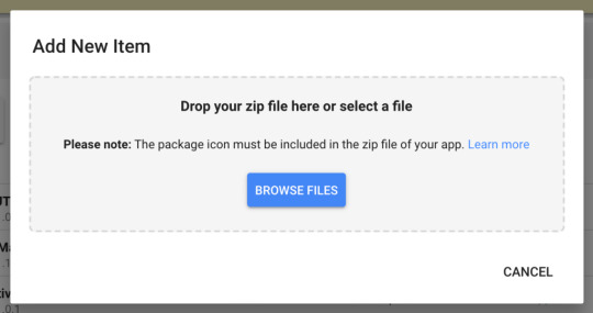
Submitting to the Chrome Web Store
Now we get to head over to the Chrome Web Store developer console to submit the extension! Click the “New Item” button, the drag and drop the zipped project file into the uploader.
From there, Chrome will ask a few questions about the extension, request information about the permissions requested in the extension and why they’re needed. Fair warning: requesting “activeTab” or “tabs” permissions will require a longer review to make sure the code isn’t doing anything abusive.
That’s it! This should get you all set up and on your way to building a Chrome browser extension!
The post How to Build a Chrome Extension appeared first on CSS-Tricks.
How to Build a Chrome Extension published first on https://deskbysnafu.tumblr.com/
0 notes