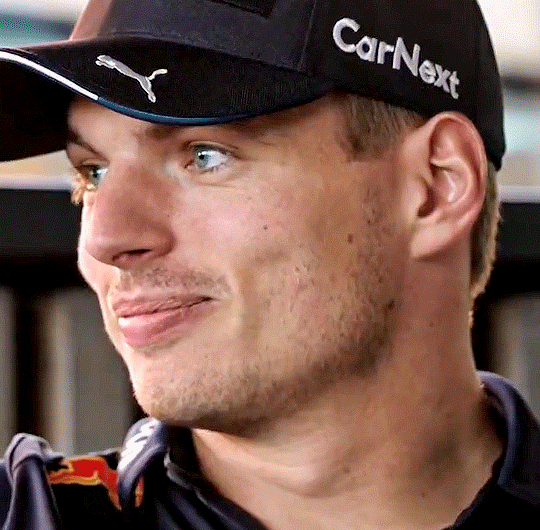
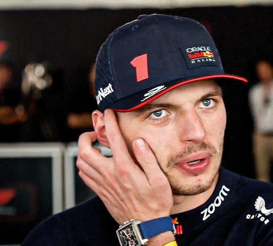
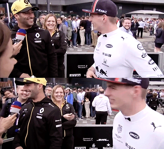
#no cohesion no theme no consistent colouring. just vibes.
Text


just a teenage girl, 26 years of age
#max verstappen#f1#formula 1#op#i was making a real edit but it fit better as a wdc celebration#so i just quit halfway through and made a ton of random gifs from my fave max videos#no cohesion no theme no consistent colouring. just vibes.#happy birthday to my best friend though :)
546 notes
·
View notes
Text


Some ramblings on the KDramas, “Missing: The Other Side”, “Uncanny Counter” and “Sohn: The Guest”.
I managed to finish another KDrama - Missing - recently, which I felt was quite an accomplishment to both the show’s and my credit.
I started it because of Go Soo and the premise, and was not disappointed. It was the same for Uncanny Counter (UC), a show which was recommended to me and which I jumped in for Yeom Hye-Ran. Both were good shows with interesting and coherent plots, fabulous performances and satisfying conclusions.
Missing was very solid, with cohesive, consistent and cogent world building and plotlines, memorable and wonderful performances, satisfying ending(s) and just an all around good vibes with plenty of tearjerker moments throughout. It was “healing and hopeful” and just a truly lovely drama.
But as I watched it, I just could not help comparing it with The Guest (TG). The comparisons were not done to bring down the dramas, which are all excellent on their own and served different narratives and objectives, though there were a few similarities, hence the comparisons.
Mostly, it brought me a starker understanding of the reasons for my love for The Guest.
All had related/overlapping themes - to a higher or lower degree - of trauma/crime/loss/grief, and the part about “moving on/healing”. The “found family” trope in play.
Missing’s bright visuals matched its narrative themes, which were generally messages of closure and hope for something better. They were consistent with this from start to finish, which was really nice.
UC and TH shared a similar visual/colour palette (darker, muted yet with gorgeous, colourful lightings). I have read of people who preferred UC’s visuals, which were sleeker, certainly, but personally, I much preferred TG’s. UC and TG also shared a similarly significant/climatic scene. Anyone who watched both would know which. (Unsurprising since both were OCN productions).
There was more obvious CGI on UC (due to fantastical elements of the plot as well) and colours were certainly pretty, but I was never wowed by it.
And as much as I enjoyed UC and would easily recommend it to people, it was just another good show (which deserves all the kudos and credit it got because well, not too many shows are “good shows”).
Still, they are not The Guest. (Not a shade at people who prefer those shows, just my own obsession).
All three had moments of deliberate humour and heartbreak, but TG made me laugh and cry harder. More. There were no episodes in TG which did not result in a crying fest (and laughter amidst the tears).
While all three had degrees of supernatural fantasy in them, TG was the most grounded in realism. All three shows touched on social issues/crime/loss, but I don’t think I am being biased when I say that TG had the most “realistic and gritty” takes on the subject matter. The one with the highest stakes. The most visible scars and traumas.
Although all three resolved satisfyingly, TG was the one which had you guessing till the end about whether there will be more sacrifices, something less of a worry in Missing and even UC.
If there was one element from the three shows which I can unequivocally state that TG did better without any qualification was the soundtrack. The OST in TG was one its more outstanding features, no ifs or buts. UC had quite a good OST, but Missing’s was somewhat lackluster.
Both Uncanny Counter and Missing will be getting Season 2, which I plan on catching when they air. (Their plot lines/world-building are conducive to a continuation, and hinted as much in the shows themselves).
While there were rumours of a movie for TG and calls for a S2 continuation, I will be that fan who is more than happy enough with the canon we got. (I won’t mind a movie, but will have to pass on another long drama, unless a special episode and such). As much as I love them, I am not sure I want to watch those beloved characters go through more “trauma”. I will watch if the main, original cast are back but I don’t want it, honestly.
And there lies the main difference for me, perhaps. Missing was “healing” (on similarly traumatizing loss) and UC was an action-oriented/superhero-ish take on crime/supernatural fantasy (I have to thank the mild desensitization to violence/gore in UC for allowing me to start on TG), and made for sort of a thrilling and fascinating watch, but TG was harrowing.
TG was a truly difficult watch, unlike Missing and UC (UC was midway between TG and Missing).
TG horrified and frightened me (I had to cover the screen with a hand during the first round I watched it). Made me gaped in awestruck eyes at the visuals and aesthetics, stomped on my heart and wrung it out and made me wallow in fixation with a rare pair (in purgatory/hell/paradise) for the last year and a half. It was everything I never knew I wanted (or needed).
Not an experience I care to repeat too often, however. Hence, TG is a much cherished treasure but not a high I want to chase. I am content and happy with what we have.
Now, I just want calm and peace for them (in my headcanons), and I hope they will visit sometime. It had been quite nice when they did.
All three KDramas are good shows and worth a watch - Glitch as well - but every time I manage to complete a show (no matter how good), I am reminded of my fixation with TG.
#KDrama ramblings#just an opportunity to rave about The Guest again#good KDramas#sohn the guest#손 the guest#the guest#Missing: The Other Side#Uncanny Counter#KDramas with overlapping themes/genre#netflix kdrama
11 notes
·
View notes
Text
CTS B - Week 2 Reflection

In Week 2's class, we reflected on how personality shapes one's approach to graphic design. I am spontaneous and energetic in my design process, often jumping into projects with bold ideas or quirky twists. I love to romanticise life, which adds a whimsical layer to my creative thinking. I’m also drawn to vibrant, unexpected colour palettes and contemporary, playful elements in my designs—mirroring my love for quirky interiors and bold aesthetic choices.
These traits shape my design decisions. I gravitate towards colourful, dynamic layouts that feel fresh and engaging, much like a good DJ set that keeps the energy high. I approach design with an appreciation for both rhythm and visual harmony, pulling from my love of pop R&B and chill vibes to create work that’s balanced yet alive. My inclination toward spontaneity brings in a level of risk-taking, while my "chill af" mindset means I’m not afraid to let ideas breathe and evolve organically.


One iconic designer whose personality and design align perfectly is Paula Scher. Her work often exudes confidence and boldness, traits that are clearly reflective of her fearless, outspoken personality. This unique combination has made her stand out in the design world.
In terms of strengths and weaknesses, my personality brings a playful, energetic flair to my designs, but spontaneity can also make it hard to focus or stick to a consistent theme. Just like Paula Scher, I need to learn to channel my strengths into my design.
To my advantage, I can lean into my creative risks and vibrant colour palettes to stand out in projects. Furthermore, I can use that spontaneity into focused exploration, and I can also balance creativity with structure to ensure my designs are both dynamic and cohesive.
1 note
·
View note
Text
Dino Watches Anime (Jan 13)
With the snow outside and cancellations everywhere, I have more time to kick back, relax, and not do anything. Seriously, playing out in the snow and being an absolute bum is my specialty.
Dropped
Darwin's Game
It just seemed like Mirai Nikki but updated to smartphones instead of flip phones and with a new interface and system. Seriously, it’s like someone watched Mirai Nikki and went “I can remake this and rake in the money”. The animation wasn’t good (according to our local sakuga geek, there were less than 10 animators who worked on the 40 min premiere because of the inhumane conditions of the studio which adds to the yikes), the soundtrack was great (but I won’t watch a show just for the soundtrack/seiyuu cast), and overall, I felt like I didn’t want to put myself through a show like this.

Uta no Prince-sama
I couldn’t do it fam. I watched two episodes and nearly cried on the inside because it felt like Kiniro no Corda but with a new bland face with new bland characters. I never watched either of these fully. I tried to watch just for the seiyuu (*ahem* Miyuki Sawashiro), but imagine having your life hobbies made into an absolute joke by a character who can’t even read music and is in the composition department while her main song of choice is “Twinkle Twinkle Little Star” and the ikemen around her and swooning over it and writing their own songs for her. The guys all have the same faces too! They’re triangle heads that can only be differentiated by colour palette. I’m telling the difference based on voices at this point. I don’t want the ikemen, but I would like people to be into my music too ya know! You may think that I’m dropping this anime purely out of spite for the story and characters, and you’re damn right I am.

Seasonal Stuff
Pet
This is this close to being dropped, and I don’t mean for the strong BL vibes. It’s a little cringy but not that bad (I’ve watched a lot of cringe straight romance and to me it’s all the same). It just feels so poorly constructed right now. The universe just hangs by a thread with characters I feel ABSOLUTELY NOTHING for. Everything in this anime feels so cheap. I’m giving this one more week before I give it the axe.

Rikei ga Koi ni Ochita no de Shoumei shitemita
Okay, this anime is stupid, but we all went in knowing it was going to be very stupid. You’ve seen the screencaps. You’ve seen the cliches. Now get ready to have a pretentious science spin on it as if you haven’t seen these scenes a million times before elsewhere, and the characters (at least one of them) know it. The art... it’s present. I mean, character designs are giving the guys of Reddit what they want (especially with Sora Amamiya being really popular and singing the OP along with voicing the main character). Yuuma Uchida is also there. Nothing really worth noting here except “stay in school kids so you can become a pretentious science kid with no people skills!”

Dorohedoro
I might just watch this anime in place of “Pet” because this anime has a much brighter outlook and despite being CG genuinely looks better anyway. It’s the horror that I wanted to fill the void with (since Pet genuinely isn’t scary or innovative). Everything was pretty good with the first episode! I’m looking forward to seeing more!
From here on out, the rest of the seasonal list are the ones I look forward to the most! Get that head lizardman!

Runway de Waratte
At first, this doesn’t seem like something that would come out of Shonen Weekly, but it inspires a good message about being who you want to be even with limitations if front of you. You have a girl too short to be considered a model and a guy who designs fashion without having the money to pursue it further. I know nothing about style, but I do know things about being short! Maybe that’s why I have such a soft spot for it...

ID:Invaded
This anime gets more interesting as we go along. I’m all into murder mysteries and things like that, and with the sci-fi mixed it, I checked to make sure I was up-to-date with this one. Each episode gives a new mystery with more details outline our jaded and imprisoned detective’s motives and backstory. I wasn’t sold on the character designs at first, but once you get over that hurdle, it’s all good. I like the psychological aspects of it too!

Kyokou Suiri
Ever wish you had a female protagonist who was upfront about her romantic motives? Ever wanted to watch a show involving youkai? Here’s the show for you! Plus, her character design is so cute. Mamo sang the ED for this anime too. The animation is great, the story looks amazing (read ahead a few chapters in the manga), and this is one of my most highest anticipated anime for the season!
Jibaku Shounen Hanako-kun
Here’s one of my favourite pilot episodes! This anime left such a strong impression on me that I went straight to my non-otaku friends going, “You’ve gotta see this guys”. The art style is consistent with the manga, and according to the not-so-quiet manga readers, we’re in for a really good anime.
All the characters in this anime are also adorable and really simple-minded on the surface. Hanako-kun being a boy is a really funny twist on the local urban legend (I’m one of those kids who never dared to say “Bloody Mary” in the washroom so what can I say?)

Recently Completed
Hana to Alice: Satsujin Jiken
Remember Aku no Hana? This is what happens when rotoscoping has a bit more budget. This anime was slow, a little cringy, but it felt really real. The voices felt real, the characters felt real, and the story felt... mostly real. I don’t regret watching this movie art style and all because I think it captures a bit of the exaggerations of being a teenager (rumours blow up like balloons)

Sennen Joyuu
Satoshi Kon really has a certain way of telling stories. I’ve watched Perfect Blue, Paranoia Agent, and Tokyo Godfathers, and while this didn’t have as strong of a punch as the latter, this film was still strong. It shows a story of a young maiden’s resilience, perseverance, and undying love... all things I can’t relate to... but it was good!

Sakurasou no Pet na Kanojo
This show was a trip. You thought it was a fanservice anime until things got really heavy. This anime was funny, it made me feel things with the themes it took on, and it made me remember that the best girl doesn’t always have to win to be a good anime. The art was cute and sweet, the voice acting was so fricking funny (according to the cast, the improv wasn’t always included but the ones that were left along with the dialogue were pure gold), and the story was exceptional for an anime which seemed to have no base whatsoever. And plus, this had something a lot of anime don’t... A CONCLUSIVE ENDING. Give this anime a watch if you haven’t. It’s melodramatic comedic romantic teen drama at its finest.

Orange
Speaking of melodramatic romantic teen dramas, here’s another one that fits that bill! Minus the comedy, more suicide, and far less cohesive plot. Imagine throwing letters into the Bermuda Triangle and having your 16-year-old selves really reading those letters. I was wondering how they were going to explain sending their letters to the past, but they should’ve come up with better BS than that. Aside from really bad plot holes, this anime was alright. It was slow... really slow. I finished this whole 13 episodes plus the movie in about 2.5 hours after trimming the slow recaps.
The art was alright. The story was slow, but near the end (excluding the last episode and the movie) it got really heavy. It hit close to home. I struggled with suicide for years, and I felt what this character felt. Certain lines of that dialogue just hit hard. It was depicted in a way that didn’t feel as romanticized. He wasn’t saved by just one person, his trauma didn’t go away just like that, it took a group of friends and planning to help him realize that there was more to life then just regrets.
Would I recommend this? I mean, it was recommended to me, but I’m not forcing this anime on anyone... not because of the themes but because it was darn boring and cliche 70% of the time.


Still Watching
Darker than Black: Kuro no Keiyakusha
Same things apply as previous entries

Hunter x Hunter (2011)
My brother expected me to finish this a while ago but I put it on the back-burner because the number of episodes seemed daunting. Everything else is good though.

Sousei no Onmyouji
I only watched the first episode.

Boku no Hero Academia Season Four
Same things apply as previous entries. It seems like the Overhaul arc will end in the next episode or two (depending on how much they milk this).

Re:Zero kara Hajimeru Isekai Seikatsu
Groundhog Day but isekai. Seriously, this is a pretty big staple in terms of big isekai. Everyone’s fighting over who’s the best girl meanwhile Subaru is trying his best not to die every five minutes. Seriously, Subaru is a champ and what I’d want out of a Mary Sue isekai protagonist. Get em Subaru. Prove to me you’re not a car.
This will be me for the next few days because it’s getting colder where I am so watch me slip on the ice and die!

28 notes
·
View notes
Text
acesotonic reviews | NIKI: “wanna take this downtown?”
the second music review on this blog is dedicated to one of my favourite artists to ever exist - Southeast Asian 88rising queen: NIKI. in her EP, “wanna take this downtown?”, we discover an interesting musical and lyrical atmosphere that is both cohesive and distinctly personal.

NIKI’s debut EP “Zephyr” was packed with lovely R&B tunes, soulful and seductive lyrics as well as some carefree vibes. In “wanna take this downtown?”, she gets more emotional and sensitive. Like the album cover, she bares her feelings even more than she has before. I thought “Zephyr” was already quite a pleasant invitation into her heart and mind. But this new EP opens new doors. And it is pleasant from start to finish, with zero inaccessibility on a listener-level. Let’s dive in.
The first song lowkey, which was a pre-release, unfurls a very pretty and fairy-like introduction. Using light and muted mallet sounds, it serves as a good contrast to the bass synth that comes in as soon as she starts to sing. The percussion in the introduction is delicate and gives the pretty instrumental a bounce. Her lyrics are immediately intimate, which suits the simple yet gentle music. After some piano chords, the song transitions into a chorus full of harmonies. The hook is addictive, repeating “lowkey” rhythmically with a lovely descending melody. In the first half of the second chorus, the drum pattern is seized and suspends the music in the air. NIKI’s vocals begin to soar and you can almost feel the pearly gates of heaven opening... or something like that. Then, the drums come back in together with another mallet sound. This time, the mallets create a staccato counter-melody, with an airy cadence. It is my favourite part of this song because it is playful and attractive. The EP begins very strong already, although my only gripe is that it should have been longer (as with most of NIKI’s discography... but this will pop up again).
Next, urs also begins similarly with fairy-like mallets with a digitised filter. This is a good way for the EP to be immediately cohesive. With light and block-like snaps to introduce a rhythm, the song picks up its pace. NIKI’s harmonies and graceful vocal melodies strengthen it, carrying her emotions of hurt and confusion about whether someone she loves knows that she is willing to give herself to them. She always uses great bass synths in her music, so I am not surprised that the one in this track melds so well with all the other elements. There are these marbly sound effects which act as atmospheric hi-hats, creating a wide empty space in the listener’s ear. This is an effective way to reflect NIKI’s loneliness and vulnerability, which shows in the chorus’ lyrics. The song ends cleanly, but again I feel that it can be longer. Furthermore, I was alright with the drum pattern in the first chorus being in a dance hall sequence. I felt that if there was a switch-up somewhere in the middle or an alternate drum pattern altogether, the track could have juiced out the vocal melodies even more than how it already appears.
The EP moves on with move! with a compelling beginning that prevents giving listeners a consistent tempo. A funky staccato synth is mixed in with NIKI’s low-pitched harmonies, which creates a flirtatious atmosphere - and this foreshadows the lyrics. The clean snaps give a good bounce to the song, and her voice singing “there’s something in the water” is charming, which comes in handy throughout the song’s themes of wanting to be in-charge and mischievous in an already healthy relationship. She even grunts it in the second verse, which is so cheeky and identifiable in NIKI’s real life personality. The pre-chorus features muted bendy synths, which then lead into the chorus: beautifully explosive and sporadic. The clearer bendy synths in the chorus remind me of an alternative pop kind of synthesiser sample. In the second verse and pre-chorus, there are horn-like synths sprinkled across which adds even more character to move!, as if it is a second voice complementing NIKI’s lyrics. I cannot get enough of the bendy funky pop-y chords in the chorus. It is interestingly almost off-pitch but still carries the vocal melodies perfectly. The song ends with the chorus, which really emphasises its sinfully short length. There is so much more unexplored power in the chorus, that could have bled out into a bridge. Nevertheless, move! is a special but very much NIKI piece.
Last but definitely not least, odds gives us a similar introduction that we found in urs with a singular synthesised sound. The difference here is the sound in odds has no reverb on it at all. It is solid and static. It sounds like a phone dial, which sort of creates an image of NIKI talking (singing) to someone on the other end of the line. it is an odd (pun intended) beginning to the song, but still attention-grabbing because of the potential concept it has and NIKI’s personal lyrics. Then, the track continues with a very slow riser and staccato bass synth, and progresses into the chorus. This is where the song gets striking to my ears. The chorus is in a lower register compared to what NIKI sings in most of the time! The low register gives the song a deep colouring, across this record and NIKI’s whole discography. It is full of attitude especially when she sings about how people have come to her for a relationship after they have broken up with someone else... basically reducing her to a “rebound”. Verse 2 plays around with NIKI’s vocals by bending it, while she mockingly calls someone a “mind-game mastermind”. The lyrics, once again, go onto another level of personal and truthful as she describes her desire for a genuine love despite her fame and success. And then we go into the bridge which is watered down slightly, supported by airy vocal harmonies and a soft drum set. The track becomes lyrically conversational, which becomes relatable for listeners. This is also a testament to NIKI’s cool personality, and it shines through even more as the last chorus hits with an extra push on the 808s. Again, I wish it was longer. Still, odds is an enjoyable listen.
Conclusion
NIKI’s 2nd EP “wanna take this downtown?” delivers with consistent tracks filled with personal lyrics, emotional vocal melodies and harmonies, and cohesive instrumentations. Although all 4 tracks could have been structurally extended, and even sonically fleshed out, NIKI has always kept a high standard in her music even with her previous successful songs that fall just below 3 minutes. She has matured in this album as an artist and undoubtedly as a person. I look forward to a full album, and my expectations will never be less than excellent when it comes to NIKI.
8.5/10
33 notes
·
View notes
Photo

Aleks Magnaye
The theme of my exhibition is study of emotion. I focus on emotions I felt throughout the day. I chose to use complementary colours since a lot of my artworks deal with colors through emotion. I chose to use colors like blue and orange since blue is perceived as a sad color and orange since it’s bright and gives off a vibe of happiness. I would like to portray these emotions through illustrations of women in the color that correlates with the mood.
I want the viewer to look at my artwork and feel the emotion I am trying to portray and also relate to my work. I also want to let people know if they have a hard time with portraying their emotions verbally, that they can paint their emotions and tell people indirectly how they feel.
I plan to illustrate my theme and deliver my intentions through my subject, colors, and composition. A way I will portray emotions is through facial expressions and composition of my subjects. For this to work in each artwork it will feature either a portrait of someone with a very vivid facial expression or a silhouette of a person. Most of my artworks will feature women with a mixture of men and women together or a simple background of the mood.
As for my mediums I used a lot of watercolors and Inks for my artworks, I used inks mostly because they dry relatively fast and once they dry the color is very vivid as opposed to watercolor which is a tad duller. I chose to use watercolor because you can play around with the opaqueness or transparency of a color to fit the type of emotion that I would like to portray. Let’s say I want my subject which is a woman to be more opaque than my background, watercolor gives me the flexibility because, when I use more water it’ll lighten the color I choose and if I use less water the fuller the color becomes which gives me more flexibility when I paint.Moreover I used watercolor paper, canvas’, and glass panes. With the glass panes I shatter/ crack the pane to portray the specific mood I’m trying to depict.
As for the arrangements of my artworks I would like to put them into a cohesive way where it's almost like a story with a good ending. My artworks consist of stages of a breakup, for example, in a relationship, after the breakup, during the breakup, etc.
First I will start the exhibition with artworks that portray the happy period in a relationship such as Ang aking lila (My violet) and Walang makakapigil sa atin ( Nothing’s gonna stop us). These pieces solely visualize the “honeymoon” period of a relationship, where they are naive and think that nothing will get in the way of their love. Second I chose a piece that will show the cause of the conflict, such as Bakit ganito ang itsura ko ( Why do I look like this). This piece is considered to be the cause of the conflict because it illustrates different body types in which society thinks of is perfect or imperfect. Thirdly the pieces that show the “climax” of the story are, Luha (Tears), Binasag mo ako (You broke me). Luha is portraying the period where you feel sadness after the breakup so it’s almost the beginning of the “climax.” As for Binasag mo ako it is more of the peak of the climax, the aftermath of the breakup, where you feel lost and broken. As for the falling action I chose to put Paglunas (Healing) and Bitaw (Let go) because it is the healing portion of the heartbreak, where the main character is recovering and becoming a better person. Lastly the resolution with the piece Ako (Me). I chose Ako for my last piece because it is showing the aftermath of the healing process and how much of a better person the main character turned out. I intend to end my exhibition with a good message saying that “It’s going to be okay eventually, it just takes time.”
0 notes
Text
Pinky’s Ca Phe
It's like stepping onto the set of Miss Saigon, a walk back in time to an American G.I. bar in Vietnam during the war. I can't say I have any personal experience with the experience in 1970 Vietnam but Pinky's Ca Phe, hidden in a small house in Little Italy is certainly what I would expect if someone asked me to describe one.
Something between a speakeasy and a diner, all with a vintage twist, Leemo Han has created a truly unique dining venue in what is sometimes considered a saturated restaurant scene, especially if you are tired of the same old phở shops and bánh mì joints that are ubiquitous across the city now.
Like many of the restaurants that take unique, themed risks in Toronto, Pinky's is not the first attempt of owner Han as he has plenty of experience with snack bars. He currently also operates Japanese-style izakaya Hanmoto and Korean tapas-like OddSeoul, both of which—like Pinky's—cater to the cocktail and late-night snacking crowd. At Pinky's, there is a definite Vietnamese slant to the menu but don't be surprised to see a little Thai influence as well as the dishes are the chef's own modern takes on diner fare from 70s Vietnam. So, if you'd like to be transported back in time, this hipster snack bar can check all the boxes for vintage vibe, cocktails, small plates, good music, and a look at Vietnam as perhaps you've never experienced, it's worth a trip to Little Italy.
Atmosphere & Decor
One word? Shiny! Complimented by old hardwood floors, bare brick walls, and vintage snackbar signs, everything is shiny and glowing with the sort of fluorescent lightning that is more common in old Hong Kong gangster movies and dive bars rather than the upscale eateries of Toronto. The entire area is covered in tinsel that reflects what little brightness is given off by the coloured lights, and is further adorned with old American and Vietnamese flags, as well as prints of old Saigon. Like many of these throwback speakeasies and diners, it's reminiscent of an era that is only familiar to some of us through movies or stories.
The music is a blend of popular oldies from the 60s, 70s, and 80s which are familiar enough to sing a few bars but not so much that the bar is going to launch into a Broadway chorus a la Miss Saigon. It fits the feel of the venue and the only thing this place would require to truly be an authentic replication of those scenes in film is a thick haze of cigarette smoke—which is thankfully absent here. Lighting is quite low with a golden glow of yellow. Out front is much better lit section and a patio outside is open in summer months.
Menu Range
As Pinky's is essentially a snackbar, the menu is limited to 13 choices of Vietnamese inspiration. However, if you're looking for the Vietnamese food you're familiar with elsewhere in the city, you may be in for a surprise. Absent from the menu are any of the take-out classics like spring rolls or eat-in big bowl soup favourites such as phở. Everything on the menu is a twist with a flair for something a little more upscale than the usual fare such as Han's take on butter beef or french dip. Sure, you'll see words like vermicelli, bánh mì, wings, and phở but each of these is taken up a level.
There's no clear definition between appetizers and entrees, mostly as it seems everything is generally the same size. At the top of the small menu is mango papaya salad with grilled squid for $15 and it's the only salad on the entire menu, followed by bánh xeo broccoli for $7 which is not actually the French-influenced crepe dish of the same name but rather a plate of battered broccoli. Then it's back to $16 for the ever-popular Tiger's Milk ceviche with tuna, scallop and surf clams. The latter half of the page consists of sticky wings or eggplant claypot for $10 each, and marrow beef for $16. It's worth noting that the marrow beef offering is a version of butter beef and quite possibly the most Instagrammed dish on the menu. Clearly, Toronto still isn't over the marrow-served-on-the-bone craze. And it's not for naught as it is indeed a good-looking plate of food.
If you're looking for something a little more pedestrian or familiar, the second page of the menu might be more appealing. Lemongrass chicken bánh mì could be the perfect choice, especially for the low $8 price tag or the So Fly! Rice which is fried rice with the added bonus of deep-fried soft-shell crab for $17. At $15, mushroom vermicelli is one of three vegetarian offerings on the menu and is exactly what the name implies. The take on french dip here is called phở beef dip for a very reasonable $10, but you won't find any rice noodles in this dish.
Down near the bottom of the menu are the charred chicken legs, beef curry claypot, and the "lucky" strip for $18, $16, and $25 respectively. Chicken legs are grilled over charcoal and the striploin is smoked or seared with phở butter and served alongside Viet chimichurri.
Following up is a small dessert offering of two dishes: the Vietnamese tres leches and purple yam smash at a very modest $8 and $10 but continue with the cohesive theme of the restaurant.
As this is authentically South-East Asian cuisine, it's very important to understand that most if not all the dishes likely include ingredients that many Western eaters may be allergic to such as shrimp (paste), fish sauce, shellfish, and nuts, especially peanuts. The servers will generally ask about allergies when ordering and it's important to check with the server if you have one of these common allergies. They are accommodating.
Appetizers
As previously mentioned, this snackbar doesn't divide itself into traditional apps and mains but instead has everything together with moderately-sized portions and mid-range prices across the board. After all, this place is about casual bites and tasty strong drinks, not complicated sit-down fine dining.
It was hard to make a decision about how best to start out the meal but being a huge fan of Thai green papaya salad and grilled squid, it seemed impossible to pass up the dish at the top of the menu that combined both of these things. It came fairly quickly in a looming tower of greens and reds on top of mango, papaya, and bean sprouts with a surprising amount of charred squid. Unless you order a specifically squid dish such as calamari, it's not all that common to be given so much at once. What a pleasant surprise! The best part of the squid was not only that it was cooked absolutely perfectly with a thick char on it (exactly the way I like it), but that it included both body and tentacles. It was crispy on the ends and a good bite without being too chewy. It actually reminded me more of various octopus dishes I've had in Toronto rather than squid in how it was cooked. Excellent.
The fruits and vegetables were all grated and mixed well, with various herbs like cilantro and Thai basil seemingly used more as a garnish than an ingredient. The heat wasn't particularly strong but came on eventually. This contributed partly to my opinion on the salad. As I'm quite familiar with the Thai version, I wondered if maybe I was too blinkered by what I'm used to a papaya salad tasting like instead of this new Vietnamese-style papaya salad. I miss the sharp and strong contrast of cilantro and Thai basil with the hot red chillis, and there seemed to being something more overpowering, possibly the ginger? Vietnamese mint was missing, lime juice was also lacking and the peanuts included where candied beer nuts, which I found a bit strange but not unappetizing. Nước chấm sauce was there but I could have had more and the delicious salty brine of fish sauce seemed to be tampered down for some reason. There were quite a few scallions mixed in but again, I'm not sure where I was losing their flavour but something else seemed to be overpowering most of the dish. It was not by any means a bad papaya salad but it was not exactly what I was expecting, and that is probably a good thing.
Entrees
For the "entree", I wondered about going the trendy way of the marrow beef, the tempting crab and fried rice, or something more unfamiliar. There are enough opinions of the marrow beef on every review of Pinky's and I wasn't sure if an entire bowl of fried rice to myself was exactly what I wanted despite my never-ending love of crab so I opted for what I didn't realize was basically a roast beef sandwich with broth dip. That may be my mistake for not thinking carefully enough since the words "dip" and "phở" were enough to catch my attention! Although, in my defense, there is no mention of bread on the menu.
It was a small pot of dark phở broth and cilantro with a sandwich based on french dip, which itself is an American invention. The bread here was not the fluffy and soft Vietnamese roll with a hard crust that is present at bánh mì shops but instead stays very close to traditional American french dip which uses a much harder baguette-style bread. I tasted no asiago cheese, nor much hoisin sauce but the trendy sriracha sauce that is omnipresent in all Asian restaurants in North America was definitely here as well. The broth itself was hot and quite delicious and paired exceptionally well with the beef. It managed to soften the slightly difficult hard bread. With the addition of lime juice, it really helped the broth's flavour to pop.
The contents of the sandwich were tasty and as I'm used to ordering rare beef for my phở, this tasted mostly like well-cooked phở beef, just on bread instead of with rice noodles in soup. On the whole, it was just a roast beef sandwich. That may sound dismissive but there is something to be said about a well-made, tasty comfort-type food. I can imagine an American soldier in a bar in Saigon (before it became Ho Chi Minh City) soaking up the familiar food and being incredibly grateful for it. So, for a restaurant that mimics such a place, it makes sense to include some dishes like this which hark back to meals its patrons would have indulged in as well.
Combined with the good prices, it has to be said that the plates are the perfect size for one person and anyone wanting a quick bite would not go amiss here. In fact, As I was sitting at the bar enjoying my meal, someone came in, ordered the ceviche and a pint, and was out again before I'd even started dessert so it is a place to stop in briefly and have a snack as well. Next to them were two friends who shared the marrow beef, beef curry claypot, and fried rice and they couldn't stop raving about what a good choice the curry pot was. So, whatever you choose off the menu, it seems to be a hit.
Dessert
There are only two options on the menu for those with a sweet tooth but both are well-priced. Tres leche cakes have never been a particular favourite of mine but perhaps the ones here are excellent. I was told by the bartender that the yam smash is the better of the desserts and I can't say I question that considering how tasty it was! Not only that, but it was massive. Three huge scoops of coconut milk ice-cream on top of a mashed purple yam with beer nuts, toasted coconut, and fresh lime. The ice-cream was obviously homemade and that is a good thing and the flavours were smooth and complimentary, especially with the squeezed lime on top. When taken with the tasted coconut and beer nuts, the crunch with the delicate ice-cream and grilled yam all brought out the best parts of each ingredient. By the time I was done with the salad and sandwich, it was impossible to finish all 3 scoops by myself but the yam went down really well. This is a dessert best shared between people if everyone has already had a meal but it wouldn't be a bad idea to just order this dessert for a snack if you're after something sweet.
Drink Options
The cocktail list here is where to look for a good drink to accompany your snack. It's small and each drink caters to a different taste but all of them maintain the feel of a Vietnamese dive bar taken up a notch. Whether it's lemon or lime, there will be a sour punch to each cocktail that harks back to subtropical Asian locales. All except the Pink Lady are at a reasonable $13 with the former being just one little loonie more. The Pink Lady with the housemade raspberry syrup seemed to be a particular favourite of patrons at the bar with one commenting that it is the best cocktail she'd had in quite some time. The Mango Popper includes a jalapeno-infused vodka which is done in-house as well.
I chose to try the Saigon Rock as a fan of gin, passionfruit, and lime. I had no idea what orgeat was, but that's all the more exciting in a cocktail. I know now that it's a sweet, almond-based syrup with orange or rosewater and also that I'm not much of a fan, as it turns out. The cocktail itself was nicely balanced and used fresh lime juice and if perhaps the orgeat had been absent, I would have enjoyed it more. I felt there was just a hint of that store-bought lime cordial in the drink even though I knew from watching the bartender that they used their own squeezed lime and lemon juices so it was just niggling on my tongue. It seems like it was the orgeat syrup causing that. Otherwise, it was a refreshing drink and if you enjoy almonds or amaretto (or Mai Tais which also use it) you'd likely enjoy the cocktail more than I did.
As it's based around expat Saigon bars, Pinky's has a full cocktail selection and a very good, enthusiastic bartender so beyond their signature offerings, they can probably whip up whatever you have on your mind. Bar rail drinks are an easy $7 a pop.
The other unique offering on the drinks menu are the $14 Foco Loco cocktails which you may recognise from Pinky's Instagram as being the juice cans on top of ice. In fact, they are either rum or vodka on the rocks with juice poured over top and served with the tin. It comes in 5 flavours: mango, coconut, passionfruit, guava, and lychee.
There's also the Hua-Hua Iced Tea which is a similar alcohol mix as a Long Island Iced Tea but with a Vietnamese tea blend instead of Coca Cola. It's made for two or four people.
Of course, a bar isn't complete without beer and Pinky's has 3 brews on tap including Sapporo (Japan), Laguintas IPA (USA) and 8 Man EPA (Canada) all for $8 a pint. They also a have small selection of beer by the can for $6-7, and tall boys for $7. Three Ontario ciders, two from Revel and one from West Avenue, round out the list, ranging from #13 to $24. There are also a few wines on offer by the 5oz glass or bottle: two whites and two reds, as well as a sparkling cava. Bottles are either $50 or $55, and glasses are only $11 or $12 a glass.
Service
Even showing up at around 6:30 PM, the restaurant was half-full and as a single, it's bar seating only. I quickly found a free spot and the bartender was prompt with water and asking if I had any questions about the drinks. Of course, I ordered after a quick glance over the cocktail list and from that point on, I still had no complaints about attentiveness despite she was often running hostess, bar, and taking guests orders all at once. As the place quickly filled up, even on an icky spring evening, servers and bar were on point. Food came quickly enough for the demand of the place and I was never left with an empty water glass or looking at my watch. All the food arrived hot and ready to eat, except the dessert obviously which must have just been dished up as the ice-cream hadn't even had the chance to begin melting yet.
The bartender was friendly, conversational, and skilful and overall, everyone seemed to be in good moods and happy to be there.
Feeling Afterwards
As I wandered out through the old house, I felt incredibly full. Had I forced down the entire dessert perhaps I would have felt a bit ill but as it stood all the flavours still remained pleasantly on my tongue with no hint of disappointment. The place was totally packed and stepping onto the darkened Toronto street was not jarring since, despite its small size, the restaurant itself never felt stuffy or overfull even with every seat filled.
Walking down the pathway, I met a young man who looked to be a backpacker who asked if it was a restaurant and I told him it was. He said, "I never would have found this!" and proceeded to go straight in. And that's how Pinky's works: it's word of mouth mainly as there is no signage and looks more like someone's old house is having a warm house party in the front room. So, if you're ever wandering down Clinton or across College, make sure to take a peek around the corner and keep your eyes peeled for a white house which otherwise is indistinguishable from its neighbours apart from the patio out front. This is definitely a place to come for a filling dinner, for a quick snack, for dessert, or even just for a flavoursome drink. Be prepared to be surrounded by vintage vibes, oldies, and crowds of young people who know a good deal when they see one.
VL00KV
from News And Tip About Real Estate https://jamiesarner.com/toronto-restaurant-reviews/pinkys-ca-phe/
0 notes
Text
27.11.17-03.12.17
Reading Week Task
Our reading week task involved an initial insight into fashion film. We were asked to look at a number of films suggested by our tutor Karen to watch whilst also answering a number of questions that she had set. It provided an easy, non-complicated way to engage with the unit before accessing any tutorials or seminars to provide more details.
Below are the questions that were asked:
1. What fashion films you have seen that give you an insight into the designer/brand?
2. What are the advantages of using film as part of promotional and marketing activity?
3. What role would film play as part of a campaign, positioning, marketing, publicity?
4. The advantages and disadvantages of creating a film for a brand/designer?
Question 1
I looked at not only the fashion films that we had been encouraged to look at but I also found a few myself. I felt it provided a real insight to the fashion film industry and potential elements that I could incorporate or reproduce that I found successful. Click on title of film to view it.
Lucky Star by Alan Crocetti
This fashion film really engages with the product it is trying to sell. There are no distractions away from the product. All the model’s activity is centered around the product. I think the music plays a really important feature of this film, I think it gives a really contemporary vibe to the video and creates a scene that may not have been created without the choice and style of music. The cinematography and lighting complements well, it has this dark, mysterious ambiance to it. It just displays really well what the product they are trying to sell is, whilst also making it an attractive product. The styling of the shoot is well done, as the eyes are not drawn into the garments that are worn only the accessories.
Tourne de Transmission x River Island
This fashion film focuses a lot more on the message and feel that the film delivers. Although features of the garment are enhanced such as zoomed shots of the boots or focused shots from the neck down highlight the garment, I feel the main striking element is the choice of location and scenery. I really liked the style of placing other videos over the location scenery in the background, it gave it a really contemporary feel. The simplicity in the choice of model, only having one made you focus solely on him, making it not confusing or cluttered. The continuous use of floating sheets added something unique and arty to the film, rather than just filming the plain scenery. The colouring and filter used gave a slightly cool mood to the film, making it feel edgy and modern. It takes a fairly common shooting location and makes it really interesting, well suited to the product.
"Rising Tensions" by Agi & Sam x the Woolmark Company
Although quite a simple concept, of a model walking through a series of locations, the combination of the two videos filmed in conjunction make it an interesting film to watch. The choice of location has a contemporary vibe to it, a lot of fashion shoots and films are set in these run-down council estates feeling places, I think it makes the clothing really stand out. I think what I found really interesting as well as it almost displays the type of consumer of the product, where they would wear the garments to, what their daily activities are without having to do much, by just following the series of models around you get a feel for it yourself. The music really adds the contemporary feeling this film gives off and works well in time with the videos. What is also interesting is you find it difficult of which side to follow so you end up watching bits of each one, whatever takes your eye at that particular scene, whether perhaps it is busier, or the lighting is more capturing. But I feel it is one of those films that you could watch many times and spot something new each time, which may draw a higher audience to watching it numerous of times. I don’t think it focuses solely on the product unlike Lucky Star, but it is clear what it is portraying, and the styling displays the clothing well. Sometimes over emphasis on the product can leave no questioning or real interest for the consumer as it is almost handed to them, how they should feel about the product. This defiantly has a more intelligent and artistic vibe to it.
Fear & Loafing by House of Holland
This fashion film was quite long compared to the others I had looked at. I think the length of the film actually made me disengage with it quite easily. I would say for the first two minutes I was watching I was really interested in it, but I slowly lost interest. I think the choice of few cut scenes towards the middle half especially in scenes such as the car driving up the hill made it tiering to watch. Clearly this film is largely based around it’s location choice and adapts the model regarding the particular scenes. I think the clothing and product stand out really well against the scenery and make the product look really desirable, using a fairly androgynous model make you focus solely on the clothing. The combination of scenery and location shooting make the film interesting. The section at the end where the model is going crazy adds a slightly odd side of the film, perhaps something quite different. The pink hue tones throughout give it a consistent colour theme and make it coherent.
The Chair Man by Alexandra Kinga Fekete
This fashion film takes quite a different approach. It stays in the same setting and location the whole time not moving the camera angle once. However, it remains really punchy and interesting. The colouring of the set works really well and lends itself to the garments displayed, all four outfits pop out from the wall colour, making it sell the product really well. I think the model used has a very charming alluring aesthetic to him which makes you not want to take your eyes of him. The constant and frequent cutting between shots makes the video almost dance to the beat of the music. It keeps it interesting and gripping. The movement and interaction the model has with the chair and books/ newspapers keeps him moving and working in different positions meaning although he is remaining in one solid place, he makes it interesting. The music works really well in relation to the vibe and the video style that the film is trying to produce. It gives a really retro vibe whilst also being contemporary and interesting.
Go Wild by Qiayi Hu
The coherent and cohesive colours used in the film make it really capturing. A sense of retro pop art theme is felt due to the pop like bright colouring. I think the product of the garments are sold well and stand out well although remaining with the colour theme of the section either the blue, pink, green etc. I think it has quite a weird edge to it, although a fairly simple concept the way the model behaves and acts in relation to unusual props etc. makes it really different. The styling of the model is an element really in fitting with the rest of the desired look of the film. The upbeat, uplifting music style works well in relation to the film and plays a key part in working well with the transitions of the clips. The continuous switching between angles and shots makes it engage constantly for the viewer. I think the timing of this film is ideal, it is neither to short nor too long and keeps the viewer engaged throughout.
Fashion Film: "OOF" - Lee Minhyoeng
This short and snappy film really sells the products well. The garments themselves are quite wacky, distinctive and unusual so the film is coherent with the product. The garments jump out at the viewer against the pastel pink background making it clear its desired purpose. The music works well in line with the quick transitions and movements of the model. The length of the film is quite short, but I feel it does it justice as you as the viewer are engaged the whole time. The styling of the model such as the strange hair style gives it that weird vibe. The use of the unusual props also achieves the slightly unusual vibe the film and garments give off. It has a really cohesive aesthetic that works really well in line with the product giving it a really desirable effect. I think it sells the products really effectively.
Girl On Fashion" ft. Kendall Jenner - A Fashion Film by Ben Toms
This film has quite a creepy, quite unique vibe to it. However, it works really well. The editing and effects used throughout the short film make it feel so unique. I think it displays the garments well, as they are so bold and out there it is not difficult for them to stand out well. The variations in hair and makeup make using just the one model work really well and each scene is something different. Interaction with large props makes the scenes eye catching and add to the quirkiness of the film. Coherent colouring is used with a slightly dated effect, using blush pink and pale blues making it feel slightly retro. The interesting music and quick cuts between scenes give it a modern feel.
Monsters - Fashion Film
The coherent colours used in this film is to what stands out to me the most. The fairly simple colour palette is used throughout, coherent across the garments, hair and makeup, backdrops and props used. The use of colour gives it a really clear and unique identity. It has quite a fun and poppy personality to the film. The choice of model expression and interaction gives it this fun and relaxed vibe. I think it sells the product well, without shoving it down your throat, simple angles zooming in on features combined with other features or activities draw you into the product well. The music is in keeping with the fun, upbeat feeling of the film. Again, there is something quite quirky and weird about the film but it keeps it interesting.
ARIES by Ben Sansbury and Fergus Purcell
This film had quite a creepy vibe to it. The haunting music and weird displays of models edited in a way to make it look quite homemade and thrown together gives it its really unique vibe, something I had not seen before. I think it sells the product ok, but I don’t think this is the purpose of the film. It has a greater artistic and creative identity than to just sell the product. I think the style of the film gives it quite a space age style and contemporary stylish theme to it. Its grungy style identity lends itself well to the products and the brand it is representing.
Le Picnic by Dom Jones x River Island
This film began with a quite cutesy, idealistic vintage theme to it, and quickly became a quirky, original and independent identity for a film. It had quite a humorous vibe to it. I think the products are displayed in a interesting way, with the model interacting with them but in quite a distinctive way such as squashing the jewellery flies on her cupcake. The music works well in line with the film and the speed of transitions and cut scenes. There is something quite contrastingly grungy about the film in the middle section when the use of varied colours take over the screen as the model thrashes around. I think it has a really interesting narrative and quite an interesting story to the film which isn’t normally seen within these kind of fashion films.
Beautiful Ones by Helen Lawrence
I think there is something quite nostalgic about this short film. It has quite a grungy, homemade stylized theme to it but that is what makes it quite relatable. It feels slightly retro and vintage but also modern, by use and choice of models, and the garments worn. It presents a really easy relatable theme of a group of young people going on a night out but does so in quite a beautiful way. The garments are displayed well and are obvious without making the film solely about the clothing. It presents characters of each model and gives a much more relatable feel than many fashion films. The colouring of the film is quite dark and dingy with coherent shades of purples, pinks and red hues given of from the club setting. The music works well and fits to quite a David Bowie style of theme.
Question 2
I think using film as a promotional and marketing activity could be seen to have many advantages. It is a universal means of advertising, pretty much everyone can relate to film, I feel all can be engaged by a successful film. Films can be displayed across a number of mediums such as the TV, social media, at showings, catwalks etc. Therefore there is a large opportunity for them to be viewed and therefore resulting in consumers perhaps showing larger interest into the products displayed. I feel they are more user interactive and user friendly, people engage with films better than perhaps written work of even photography as the catch the eyes of viewers and are easy to watch. Film can display quite a lot about a brands identity, personality and values, perhaps more than photos can do. Monetarily gain can also be a factor to why using film can be beneficial. Advertisement can make you a lot of money from videos such as on YouTube the non-skip advertisements make customers more likely to watch and engage with the video. Sharing videos can be largely cost effective such as through social media and other agencies you can advertise for pretty much next to nothing.
Question 3
Film could play a variety of roles dependent on the desired result of that film for that particular brand. It could act as the way that the product is advertised and displayed to the consumer, or the way the brand identity is displayed to the consumer, or even both. It can really help create a platform that can be displayed to a large consumer market to display whatever that brand wants to sell itself as, as well as its product. It can create such a larger scope for publicity and as a means of getting the brands name, image, identity and products out to a large audience. Through audio, visuals, themes, model choice, location, style a real image of a brand can be created. A lot of information about a product or brand can be displayed in a short space of time which is a crucial marketing strategy.
Question 4
Advantages:
• Cost efficient way of marketing and displaying products out to a larger audience.
• Easy way to display a lot of information about a brand/ designer in a short space of time.
• Some fashion films can be really cheap to make- especially those with a homemade feel to them and can have the exact desired effects for half the price of high budget fashion films.
• A really good way to portray a brands identity and message to an audience.
• Shows creative identity and style.
• Uses a different style of media to potentially boost sales which could work well in a campaign.
• Suitable to a larger cliental as film is an easy way to display information for ‘lazy’ consumers.
• In today’s modern media platform there is many cost efficient and easy ways to display fashion films for almost next to nothing.
• They can help spark debates, opinions, likes and dislikes of consumer feedback and response. A really good source of insight into the consumer. (e.g. like and dislike buttons, views, comments).
• Ad venue can have financial gain.
Disadvantages:
• Dependent on concept and final result films can be quite expensive to produce. There are many features required to make films successful which can be pricey as a result.
• To create an engaging piece of marketing the fashion film must be well thought through and considered to reach maximum positive response from the consumer.
• Caution needs to be attained with regards to social, ethical and environmental practice as placing a film on a viral platform will be subject to high criticism.
• Concept and individual artistic direction needs to be easily understood by the consumer. It is all very well creating a really out there film, but if the consumer doesn’t understand it then it is not going to work.
• A lot of work and research needs to go into the consumer, otherwise the film will be useless if it doesn’t meet consumers requirements or likes.
The work set in this reading work has helped me to engage with the project well as I am quite fearful of this project, so I think it gave me a clear starting point in beginning to research fashion films.
0 notes
Text
acesotonic reviews | Logic: “Confessions of a Dangerous Mind”
hello everyone! welcome to the first album review on this blog. i have always been reviewing music from all walks of culture, languages and ‘genres’ on my instagram, but i figured putting it on an actual blog would be way neater. and because my opinion is so important, it’s more accessible in this format. so without further ado, enjoy!

Logic’s latest 16-track release, “Confessions of a Dangerous Mind”, had me feeling all sorts of emotions; and not all of them for the better. Some tracks were so good on their own, and some tracks made me question, “Why is this here?”. 16 tracks is long. Especially when Logic himself kept emphasising how any upcoming album would be his last... then proceeds to release another album. That makes the 16 tracks seem way longer than it should.
We begin with the first song that takes the name of the album title. The instrumental begins with a pleasant melody, and reminds you that this is indeed a Logic project. When he begins to rap, his flow is calm and emotional which grounds the listeners into this track at its most foundational level. He gets sentimental and sensitive about the album’s main themes, success and its demons that haunt the mind. But the snare comes off at some points as disruptive; an odd alien semi-grunge hit. The chorus gets lyrically cheesy (which will pop up again later), especially when Logic starts to sing (this too). I would think it was a decent start to the album, but more weak than it was strong.
The next track Homicide, a pre-release featuring Eminem, remains my favourite off of this album. Logic’s rap is rapid-fire, his lyrics are hilarious and his rhyme is impeccable. He switches into characters with his voice, which makes the song prominent. The hook is playing its role as a hook, and transitions into Eminem’s verse cooly. The older rapper’s flow felt fresh, a mix of modern styles but still very much nostalgic sounding with old school sandwich-rhyme schemes. The ending is still odd to me - funny - but does not reduce the quality of the track in any way. Eminem’s feature was a good one, fully fleshed out and utilised. An addictive track indeed. A total repeat.
Unfortunately, Wannabe and clickbait take the album to a downturn when it was just starting to climb. Wannabe feels out of place and almost lacked in the content it intended to have. Similarly, clickbait suffers from cohesive and juicy lyrics. Some bars that had references were fun, but that was only 2 or 4. There’s a cheesiness that is starting to pop up in these weaker tracks, either through Logic’s serious attempts at vocalising melodies or other ways.
The next piece Mama/Show Love that features YBN Cordae does not veer off from passable. The saving grace of this track’s first portion was YBN’s rap - with great content and rhyme. When the beat switches to the Show Love section, Logic’s rap feels more magnetic compared to the Mama section. This makes me feel as if the first half of this piece was not necessary. The melody of the instrumental felt a bit cheesy compared to the previous sounds as well.
It is at this point listening to Out of Sight that I realised I was getting bored. “ALrEaDy?!”. Yes. And I don’t like that. The instrumental does not have anything special to it, almost too consistent with no risk (which is contrary to the album’s themes). There is no strong hook and leads me to question the purpose of the track in this record. The next song Pardon My Ego is slightly better with some unique sampling in the beginning. Logic’s flow and some of the funny lyrics make the track’s safety net. But again, the instrumental sounds repetitive after awhile. There is no lasting impact on my ears and mind.
I started to get excited again for the next track COMMANDO, but only because it features G-Eazy. Many have said that his rap has no personality, but many have also said that he has a distinct voice and accent. I believe in the latter. The instrumental starts to sound more trendy, which I thought made sense since it featured a new generation rapper. G-Eazy had the more interesting flow compared to Logic; fast, rhyme-filled, funny and had cool switch-ups. However... it was too short. Logic’s powerless segment in the beginning made up the bulk of the track, which made COMMANDO almost forgettable.
The next song Icy also has a feature, by Gucci Mane. Logic in the beginning hook uses a high-pitched voice that comes off as comedic, but his carefree and funny lyrics make up for it ever so slightly. Gucci’s segment has a mediocre delivery, but some creative lyrics. Again, it is a very short feature which could’ve expanded to make the song more entertaining. The hook starts to get a little annoying towards the end of the song, though the overall instrumental is quite cool. In the following track Still Ballin featuring Wiz Khalifa, the roles are reversed. Logic’s flow was straightforward with clean lyrics, while Wiz’s bars were basic and fundamentally useless to the song’s theme of hustling. This is when I rather the feature not be... well... featured. Though the song speaks of something important in the life of a reckless artist, the hook comes off as lazy and does not make the song important to the album lineup.
The following track Cocaine again gets me questioning the purpose of it in the record. The instrumental is your typical arpeggio piano-based hip hop beat which is nothing I’ve not heard before. Nevertheless, Logic’s lyrics in the second half of the song get very personal and emotional. It delves into the reality that drugs and poison in music sell better than real and traumatic stories. The 808s laid out across the track becomes progressively crazy and is the most distinct aspect of the instrumental. These 2 things have made Cocaine a tolerable piece.
At the 12th track Limitless, the album almost becomes irredeemable. The record could have stopped at 10 or 11 tracks... and when the 12th one is not of high quality, a listener’s stamina drops. This track is sonically boring, and Logic’s sudden singing comes off as out of tune to my ears. The hook was bland with a repetition of “you the man”, and the existence of this whole song in the album is vague. Although, the album starts to pick up a little bit in Keanu Reeves. Logic’s flow is not stellar, he sounds bored sometimes, and the flute sound in the instrumental feels random. The piece may seem forgettable, but some of the self-referential lyrics are entertaining enough for me to keep listening. Also, the second half of the song is where his flow picks up and reminds me again of Logic’s true potential.
With 4 tracks left, Don’t Be Afraid To Be Different features Will Smith who takes a very short first verse that is lyrically featureless. The chorus has a weird-sounding synth that does nothing to amp up the track’s quality. It is also so loud during Logic’s verse that I can barely be immersed in his part. The hook is overly repetitive and does not help to make the track cohesive, like it is one whole element. But what makes this track decent is the instrumental in general, with a slight callback to It Takes Two by Rob Base and DJ EZ Rock; with the rugged-sounding shakers and drum pattern. Will’s flow, while plain, was cute and nostalgic with references to his Bel Air days. It kept a part of the album a bit more interesting and colourful, to reflect the album art minimally.
As the record comes to an end, it hits hard and suddenly gives us pretty amazing final pieces. BOBBY features sampling with an attention-grabbing intro and background ad-libs chanting “Bobby!”. Logic’s lyrics are raunchy and whimsical, showing off his confidence and presenting himself as an original entity. He gets very personal about his cultural identity as well, but masks it with the funky beat that gives listeners a slightly uneasy feeling being able to access his “dangerous mind”. I do wish the drums went back to a consistent 4/4 beat after awhile and stopped going into half-time, because I was yearning for more speed in this up-beat sampling. Featuring his father’s lament about how great his son is is a sweet touch, and makes the song even more personal and unique. It adds more character to the record, even though at an arrangement stand-point, BOBBY feels oddly placed.
Finally, we reach Lost In Translation. It begins with a wistful 2000s R&B vibe with electric piano and a bit of organ rotations in the background. The bass is soulful. The drum set is muted and very much old school, taking you way back to the times of Ashanti and Ja Rule. Then almost 50 seconds into the track, the beat switches up. It still retains the soul and blues elements in the bass and electric piano. The drums, however, have become more hip hop and so is the drum pattern. I guess it is to keep the track melded into the mainly hip hop album... but I wouldn’t mind a full-on cool R&B-reminiscent outro. And then, the beat switches up for a second time. The bass has become much stronger, and electric piano melodies are funkier. Logic’s flow is so good, with catchy rhyme schemes and edgy references to Hannibal Lecter’s passion for human flesh. His rap is on-going and fresh. Suddenly though, a Japanese narrator starts to speak. I have not found an accurate translation of her segment but one thing’s for sure, she says “Rattpack, motherf***er”. The general gist of her part translates to “Thank you very much for your help” (Logic_301). This could be referring to how this album grapples with themes that may seem distant and unaccessible to most of Logic’s listeners, but uniting them all as music-lovers at the echo of his label. But why Japanese? The purpose is still unknown - at least to me. Some have argued that this is cultural appropriation, but I will leave this to Logic himself to explain. Overall though, an entertaining track with a pleasant and atmospheric finish.
Conclusion
“Confessions of a Dangerous Mind” sinks deeper into an abyss of half-starred quality at almost every track. While very few from the many 16 selections of songs stand out to be great, like Homicide and BOBBY, majority of the album barely skims the surface of “passable”. We expected to see a raw and unedited form of Logic on this record. Instead, it came off as unsealed and unready to be released into the wild. The good songs are very strong, while the weak songs are absolutely underwhelming.
4.75/10
#music: review#logic#logic: coadm#acesotonic#confessions of a dangerous mind#critique#young sinatra#bobby tarantino
2 notes
·
View notes
Last Seen Blogs