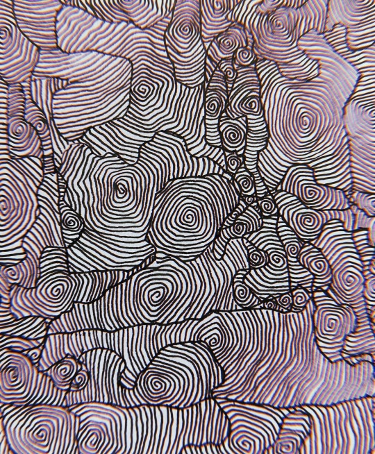
#nonrepresentational art
Text


"amazed about my resurrection" 🙏
#journal#personal#pic#vent#ventart#dadaism#found poetry#automatic art#nonrepresentational art#art#my art
7 notes
·
View notes
Photo
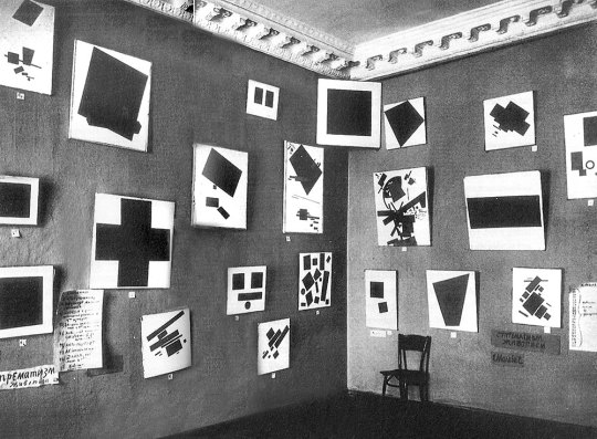
Kazimir Malevich’s work displayed in The Last Futurist Exhibition of Paintings 0.10, Petrograd, 1915.
#suprematist art#abstract art#nonrepresentational art#suprematism#black and white#black and white art#russian art#russian photography#black and white aesthetic#my post#art#russia#avant garde#russian avant garde#kazimir malevich
34 notes
·
View notes
Text
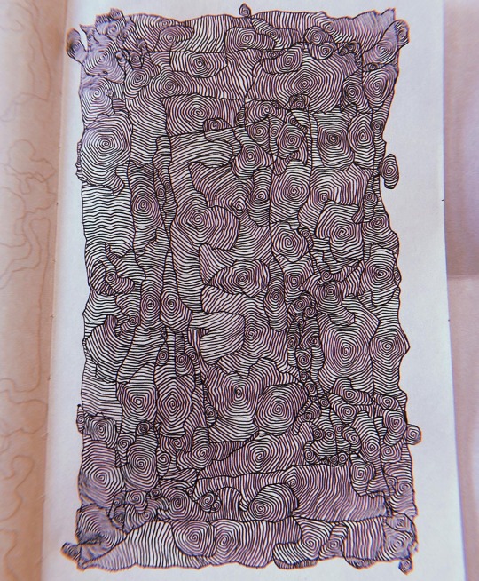


Feelin’ fine 🌀
#abstract#abstract art#nonrepresentational art#abstract expressionist art#abstract expressionism#artists on tumblr#maximalism#squigs#just filling in the suggested tags as I type. do people even use these?
45 notes
·
View notes
Text


Some stuff from late last year/early this year when i was experimenting with nonrepresentational art
#2021#2022#digital#abstract#nonrepresentational art#nonrepresentation#even though i would rather people decide for themselves what these mean#i will say. the last piece was meant to portray my brain when i eat a piece of fruit. not even kidding#thats what eating a fruit feels like#oooh lol. i forgot one of these is about adhd too#okay shutting up now not gonna spoil the rest
11 notes
·
View notes
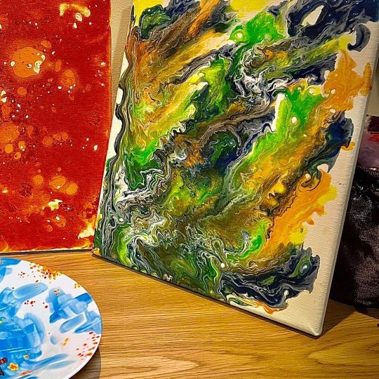
Text

Bought some new painting spatulas. They arrived yesterday, so I haven't used them yet, but here is a fun piece I made last year using a spatula and a roller. I am excited to see what I will make in the new year.
0 notes
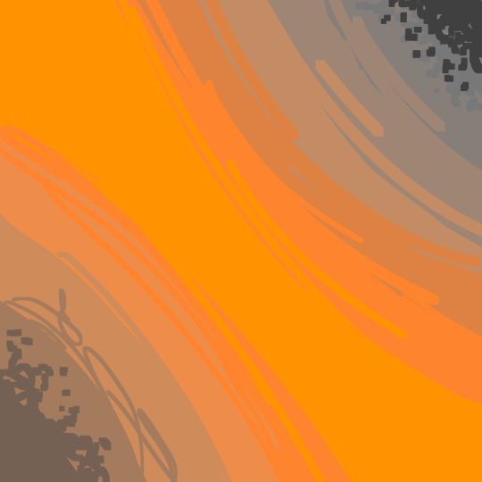
Text

Provoking My Anxiety // 2023
38 notes
·
View notes
Text
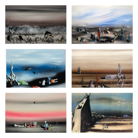
My Top 5 Painters
2/5 - Yves Tanguy
Tanguy's paintings have a unique, immediately recognizable style of nonrepresentational surrealism. They show vast, abstract landscapes, mostly in a tightly limited palette of colors, only occasionally showing flashes of contrasting color accents. Typically, these alien landscapes are populated with various abstract shapes, sometimes angular and sharp as shards of glass, sometimes with an intriguingly organic look to them, like giant amoebae suddenly turned to stone
#yves tanguy#dark academia#light academia#art academia#surrealism#nonrepresentational surrealism#surrealist art#art#artwork#art movement
5 notes
·
View notes
Text

16 x 20, acrylic on canvas
#abstract#abstraction#contemporary art#contemporary#nonrepresentational#nonrepresentationalart#colorful#rainbow#multicolor#acrylic#acrylic paint
4 notes
·
View notes
Photo
Part 1/2 See my profile for part 2/2 and the rest on the image! #acrylicpaint #paintingoftheday #acrylicpour #pouringpaint #pouringacrylic #representationalart #nonobjectiveart #pourpainting #paintpouring #acrylicpainter #acrylicpaintingoncanvas #acrylicpourart #paintingwithatwist #paintingoncanvas #newpainting #acrylpainting #paintingacrylic #nonrepresentational #acrylicpaintingartist #art #draw #sketching #instaart #artistoninstagram #artistofinstagram #contemporaryart #igartist #art_studio . . . https://www.instagram.com/p/Ci0e27ALHGC/?igshid=NGJjMDIxMWI=
#acrylicpaint#paintingoftheday#acrylicpour#pouringpaint#pouringacrylic#representationalart#nonobjectiveart#pourpainting#paintpouring#acrylicpainter#acrylicpaintingoncanvas#acrylicpourart#paintingwithatwist#paintingoncanvas#newpainting#acrylpainting#paintingacrylic#nonrepresentational#acrylicpaintingartist#art#draw#sketching#instaart#artistoninstagram#artistofinstagram#contemporaryart#igartist#art_studio
1 note
·
View note
Text
something something about tumblrs relationship to art that really troubled me a lot in my own development. it’s obviously the fandom and characters website but the incredible pinpoint focus on drawing people, drawing digitally, not knowing how to do backgrounds, making eyes of matching size, “same face syndrome”—all that stuff that i’m sure everyone else has seen ad nauseum as well—is honestly so reductionist. i remember being a teen and thinking my friends art would “never make it” because it was abstract and geometric. obviously in hindsight that’s so stupid, but that was what being online for so long had distorted me into believing. i mean im not saying drawing characters (original or fanart) is bad! im not saying drawing digitally is bad! im just saying that people of course engage more with art on here that they already have some kind of connection to. “wow you drew my favorite character!” etc. so of course that’s the kind of art you’re going to see more of online.
i feel like the only art advice posts i’ve seen circulate also are ones focused on this character-based art focus. things like: how to draw noses, you need to learn how to draw diverse people (true, but like. not if you never draw people. or do nonrepresentational/abstract art), how to do simple backgrounds. even the entire constant discussion of “1. sketch 2. lineart 3. color” i think probably reduces people’s thinking of their own art. idk. it’s not the biggest issue in the world by a long shot. i just wish young artists could hear that the only advice they really need is “make art.” make whatever you are drawn to. never try to compromise something for social media engagement. please
106 notes
·
View notes
Text

Georgiana Houghton, Eye of the Lord, 1870.
Georgiana Houghton’s only major showing of her drawings in her lifetime was not a success. It was an elaborate affair at the New British Gallery in London organized at her own expense, but of the 155 pieces produced over a ten-year period, she sold only one. Nor was the critical reception particularly warm. According to a recent account, “most of the critics were surprised and alienated, dismissive, malicious, or amused”
Despite this disappointment, today there is a growing recognition that Houghton’s art is quite beautiful and worthy of our attention and that she and not the Russian painter Wassily Kandinsky (1866–1944) may have been the first to introduce works that were not tied to recognizable objects—abstract art. For decades, art historians have placed the beginning of abstract art at 1910 when Kandinsky produced his first nonrepresentational works, but Houghton’s exhibition of abstract drawings was held forty years earlier in 1871. Furthermore, the Swedish artist Hilma af Klint began painting beautiful abstract works beginning in 1906, four years before Kandinsky. Given the many challenges faced by women artists well into the twentieth century, it seems likely that sexism played a role in the telling of this story.
vis theskepticalinquirer
133 notes
·
View notes
Text

I was able to stand and play with my paints for a little while. Trying to build up momentum!
#journal#personal#pic#art#ventart#abstract#nonrepresentational art#art journal#experimentation#painting#acrylics
3 notes
·
View notes
Text
New art exhibit where we fill the hall with nonrepresentational art. When people view it and inevitably say "I could do that" we put a bag over their heads and whisk them into a beginning art class. You can make art, and you will
22 notes
·
View notes
Text
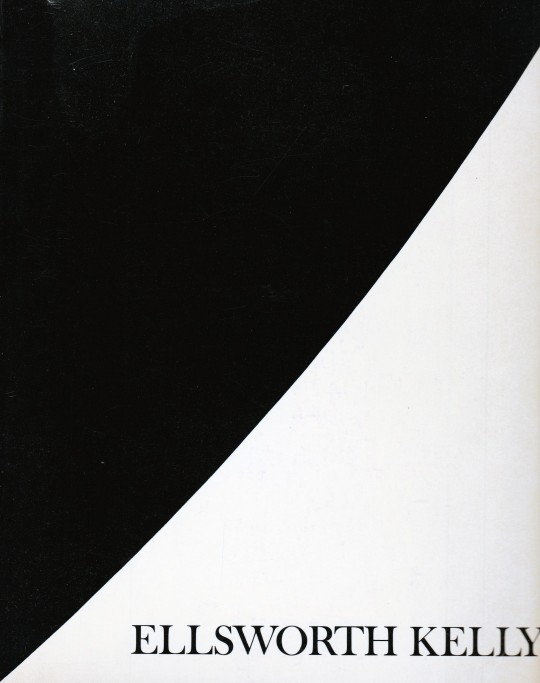


Ellsworth Kelly
E.C.Goossen
The Museum of Modern Art, New York 1973 , 128 pages,84 illustrations (18 in color), 51 reference illustrations, ISBN 9780870704130
euro 90,00
email if you want to buy [email protected]
Issued in conjunction with the exhibition at The Museum of Modern Art, New York, September - November 1973; notable for the appendix ("Kelly and Camouflage")
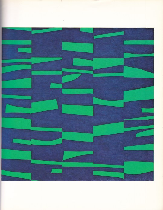
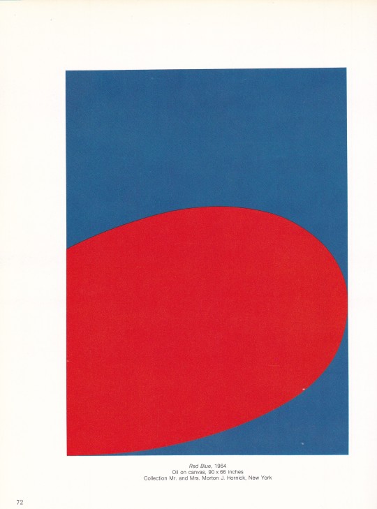
Considered a pioneer of hard-edge painting, Ellsworth Kelly is best known for his crisp nonrepresentational works, intensely colored and radically simplified. His early training in the applied art program at Pratt Institute, Brooklyn, was interrupted by his induction into the army in 1943. Art Historian E. C. Goossen has speculated that Kelly's assignment to a camouflage battalion provided him with invaluable lessons about the interaction of form and shadow in space, which were applied later in his collages, paintings, and sculpture.
After studying for two years at the School of the Museum of Fine Arts in Boston, Kelly went to Paris in 1948 to attend the École des Beaux-Arts until 1950. In France he encountered the works of Pablo Picasso, Henri Matisse, Jean Arp, and Piet Mondrian. His figurative work subsequently gave way to increasingly abstract paintings in which curvilinear and rectilinear forms suggest fragments of visual phenomena such as architectural elements and shadows.
In 1950 he began to explore the random selection of color and form by using collages, composed of torn details of his drawings, as the basis for his paintings. While in France Kelly also produced grid paintings built on modular and serial systems. By 1952 these concerns were expressed in large multipanel paintings in which each panel was a module of color. Kelly's concern with color as form was thus established.
After returning to the United States in 1954, Kelly worked with large single biomorphic shapes in black and white. Primary colors reappeared in his paintings after 1957, either in double or triple variations or singly in contrast with white, as in Blue on White
24/12/23
#Ellsworth Kelly#art exhibition catalogue#Museum Modern Art New York 1973#art books#fashionbooksmilano
4 notes
·
View notes
Note
Thoughts on Guy Davenport?
A great essayist, the generalist to rebuke all specialists, whose dizzying associations gradually overlap and braid together until all of humane culture appears as a unity. He was almost the last of that type, after his friend Kenner, or, in a more strictly academic vein, the likes of Frye and Auerbach. But Kenner, Frye, Auerbach—or even Bloom, Steiner, Sontag—all feel much heavier, more armored and therefore crushing in their erudition, while Davenport had the lightest touch. He was a true belletrist, an amateur in the etymological sense, who seemed to be doing it for fun.
I'll give just one example, from the title essay in the soon-to-be reissued collection, The Geography of the Imagination. I quoted part of it here before almost a decade ago, so I assume it's been forgotten by now: a literally extravagant ("from Latin extra- ‘outside' + vagari 'wander'") exegesis of Poe, who stands revealed, by the time Davenport is finished, neither as a panting pulp scribbler nor a dipsomaniacal poète maudit but as an encyclopedist of Joycean proportions, except in miniature:
Poe titled the collection of his stories published that year Tales of the Grotesque and Arabesque. These two adjectives have given critics trouble for years. Grotesque, as Poe found it in the writings of Sir Walter Scott, means something close to Gothic, an adjective designating the Goths and their architecture, and what the neoclassical eighteenth century thought of mediaeval art in general, that it was ugly but grand. It was the fanciful decoration by the Italians of grottoes, or caves, with shells, and statues of ogres and giants from the realm of legend, that gave the word grotesque its meaning of freakish, monstrous, misshapen.
Arabesque clearly means the intricate, nonrepresentational, infinitely graceful decorative style of Islam, best known to us through their carpets, the geometric tile-work of their mosques, and their calligraphy.
Had Poe wanted to designate the components of his imagination more accurately, his title would have been Tales of the Grotesque, Arabesque, and Classical. For Poe in all his writing divided all his imagery up into these three distinct species.
Look back at the pictures on the wall in his ideal room [in the essay “The Philosophy of Furniture”]. In one we have grottoes and a view of the Dismal Swamp: this is the grotesque mode. Then female heads in the manner of Sully: this is the classical mode. The wallpaper against which they hang is Arabesque.
In the other room we had a scene of Oriental luxury: the arabesque, a carnival piece beyond compare (Poe means masked and costumed people, at Mardi Gras, as in “The Cask of the Amontillado” and “The Masque of the Red Death.”): the grotesque, and a Greek female head: the classical.
A thorough inspection of Poe’s work will disclose that he performs variations and mutations of these three vocabularies of imagery. We can readily recognize those works in which a particular idiom is dominant. The great octosyllabic sonnet “To Helen,” for instance, is classical, “The Fall of the House of Usher” is grotesque, and “Israfel” is arabesque.”
But no work is restricted to one mode; the other two are there also. We all know the beautiful "To Helen," written when he was still a boy:
Helen, thy beauty is to me
Like those Nicaean barks of yore,
That gently, o'er a perfumed sea,
The weary, way-worn wanderer bore
To his own native shore.
On desperate seas long wont to roam,
Thy hyacinth hair, thy classic face,
Thy Naiad airs have brought me home
To the glory that was Greece
And the grandeur that was Rome.
Lo! in yon brilliant window niche
How statue-like I see thee stand,
The agate lamp within thy hand!
Ah, Psyche, from the regions which
Are Holy Land!
The words are as magic as Keats, but what is the sense? Sappho, whom Poe is imitating, had compared a woman's beauty to a fleet of ships. Byron had previously written lines that Poe outbyrons Byron with, in "the glory that was Greece / And the grandeur that was Rome." But how is Helen also Psyche; who is the wanderer coming home? Scholars are not sure. In fact, the poem is not easy to defend against the strictures of critics. We can point out that Nicaean is not, as has been charged, a pretty bit of gibberish, but the adjective for the city of Nice, where a major shipworks was: Marc Antony's fleet was built there. We can defend perfumed sea, which has been called silly, by noting that classical ships never left sight of land, and could smell orchards on shore, that perfumed oil was an extensive industry in classical times and that ships laden with it would smell better than your shipload of sheep. Poe is normally far more exact than he is given credit for.
That window-niche, however, slipped in from Northern Europe; it is Gothic, a slight tone of the grotto in this almost wholly classical poem. And the closing words, "Holy Land," belong to the Levant, to the arabesque.
Now I haven't read Davenport's fiction yet. Word on the street is that the best of it is a pederastic fantasia on themes from Fourier, but I could be wrong.
2 notes
·
View notes
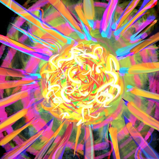
Text

Emotional Damage // 2023
18 notes
·
View notes
Last Seen Blogs