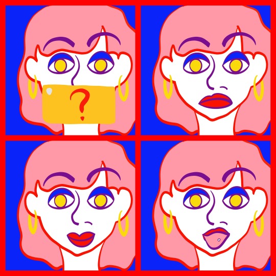
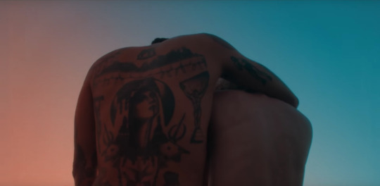
#of course the saturation and brightness of the colours are different but the specific red never changes
Text

I can’t believe I almost forgot about Undertale’s anniversary AGAIN.
Happy eighth anniversary Undertale!!!! This game is so important to me and I’m so glad I discovered it all those years ago. In 2016-ish, I watched a playthrough of Undertale’s pacifist route by one of my favourite youtubers at the time, and later in 2018, I got into the entire game and became obsessed with it. Soon after, I joined the fandom, and I found so much incredible fanart, which inspired me to start drawing as a hobby and start posting online.
It really doesn’t feel that long ago since I first got into Undertale and its fandom, but it’s been five whole years, and it’s so hard to wrap my head around that lol
#if i had remembered sooner i would have drawn something more elaborate but i didn’t so take an edgy looking frisk#fun fact: everything in this drawing is the same hue of red#of course the saturation and brightness of the colours are different but the specific red never changes#isn’t colour theory so fun#undertale#undertale fanart#frisk#undertale frisk#frisk undertale#undertale 8th anniversary#chara’s art#can you tell i can’t draw children lmao
6 notes
·
View notes
Note
hi Rahul! could you show us how you un-whitewash characters? I saw your 1000 stars sets and you always manage to un-whitewash Earth so well!
hiii nonnie! of course i can, no problem, i’ll just put this under a cut so it doesn’t clog up people’s dashes!
so i normally sharpen and colour my gifs from scratch and sometimes use psds i make myself, especially on atots because it’s super hard to un-whitewash earth with the natural lighting from outside. i’ll just walk you through the adjustment layers i use to try and un-whitewash earth specifically in atots, but this technique is something i use on pretty much every show and movie when characters of colour are involved. sometimes it works like a charm, sometimes you have to bite through some more blood, sweat, and tears, but un-whitewashing is a process. i’ll be showing you what i did on the phupha gif in this set specifically!
so after i sharpened this gif using vapoursynth, this is what it looks like without any colouring.

he’s a sharp boy, but he looks absolutely void of life and colour. so we’re here to fix that! normally the first adjustment layer i use is curves to make sure that all of the colours in the gif are balanced. for this, i use the black eyedropper to pick out the darkest spot in the gif, which balances the rest of the lighter tones out. normally if it gets too dark, i then use the white eyedropper to pick out the lightest tone so it brightens up again.

here’s what it looks like with just the curves layer! already so much better, no? the paleness of the background has reduced and his hair's become much darker and more saturated, so if that's what you're going for, then you got it. next up is brightness! i normally reduce the brightness around -20 and add contrast +20 to bring out the shadows and darker tones. don't worry, this'll balance out later.
now you can see how the shadows in his face, underneath his jaw especially, are coming out a lot more. just to emphasise this, i put in a layer of levels next. for that i normally increase the brightness to 20 and the shadows from anywhere around 10 to 20.
here’s what it looks like after the levels layer. we have momentarily made his skin lighter, but the shadows have become darker too. now is when the magic happens. because atots is devoid of vibrance, in some scenes you basically have to colour the actor from scratch. for this, i always recommend pulling up a photo of an actor to work with just to make sure that their base skintone is the same as what you’re trying to colour. it’s pretty crucial to not go overboard. so to first even pull out the colours i’m trying to darken, i first use a hue/saturation layer, where i normally turn up the saturation to around 20-35 depending on how lifeless my scene is. normally it becomes a bit too red, but you can fix that later or simply decrease the saturation.

that’s what our boy looks like after the saturation layer! his face has become a tiny bit more brown, and there are some soft reds that you can pull out. to emphasise this change and other colours in the background, i then used a vibrance layer, where i normally turn the vibrance up high and regulate the saturation as needed. here i used +50 vibrance and turned the saturation down low, around -10.
we’re getting there! now, if you wanted, you could stop here. it’s such a stark difference from the gif without any colouring. he has a bit more life to him, the browns in his face are darker. but because i personally was not satisfied with this and normally use more layers anyway, i decided to use my dearest friend, the selective colour layer. now this is THE lifesaver when it comes to wanting to unwhitewash people. basically, the general technique is to use the reds channel to its fullest potential. to darken the skintone, i normally add more magenta and yellow to the reds (in combination!) to replicate the original skintone the actor has. it’s important to use both the magentas and the yellows in the reds channel, otherwise your gif will end up looking too red/yellow, which i have definitely been guilty of in the past. i also use the blacks slider in the reds channel to darken the reds in his face. it’s mostly trial and error here, so just give it a whirl and see what happens, you can always undo it by deleting the layer if you need to. for me personally, i like my gifs to be a little redder, i always try and pull the reds out, so it’s possible that the actor will be slightly redder than their original skintone, but i always try to regulate it so they don’t end up looking like a tomato.
so there he is after the first selective colour layer! don’t mind the greens, i changed them to be a little more muted. you can see how he’s not red, because i also used yellows to create the illusion of brown here, and used the blacks slider to darken it all up a bit. this is a perfectly good place to stop, but because i’m kind of a perfectionist when it comes to things like these, i duplicated the selective colour layer and then adjusted accordingly.

and here’s the final result! on second thought and with fresh eyes, i still think i made him just a little bit too red, but i think i did a fairly good job of unwhitewashing him and getting him back to his original skintone, or at least what it would look like in this lighting. let’s put the original gif without any colouring and the final result in compaison.
see how much different that is? this technique can be used for whatever, be it actors, celebrities, idols... you name it. just make sure you check their base skintones, and try your hand at the reds channel. the yellows channel can also come in handy when it comes to increasing or decreasing the yellow in skin tones. be careful when decreasing the yellow, though, that can also lead to whitewashing.
i hope this helped! feel free to ask me in more detail what i do, i could also tell y’all the exact amounts i used for this gif lmaoo but in general, i hope it helped! i’m not a big fan of the pale gifset aesthetic, especially when it comes to colouring shows with poc in them, so that’s why my gifs are more saturated in terms of the skintone. you can do what you want, but this is how i do it!
good luck, friend!
#a tale of thousand stars#atots#1000 stars#earth pirapat#hope this helps friends!! thank you for asking nonnie!#rahul answers#ps help
104 notes
·
View notes
Text
#showyourprocess
From planning to posting, share your process for making creative content!
To continue supporting content makers, this tag game is meant to show the entire process of making creative content: this can be for any creation.
RULES — When your work is tagged, show the process of its creation from planning to posting, then tag 5 people with a specific link to one of their creative works you’d like to see the process of. Use the tag #showyourprocess so we can find yours!
i was tagged by @recapitulation (;; ♡) for this gif of my wife
this ended up pretty long, so to save people who aren’t interested from scrolling, i’m putting this under a cut & will reblog to tag people!
1. planning
planning is a generous word for what i do, since i tend to just stick with simple gifs without much of a theme beyond my appreciation for a character or moment; i tend to pick things out as i watch rather than watch for the sake of finding material. this particular gif exists because the slow zoom as she raises her chin in challenge exudes so much power. which gives me gay thoughts.
2. creating
again, i don’t really make complicated things in general since i’m just here to vibe and gifmaking allows me to spend more time looking at something beautiful so the process isn’t too involved — i brighten the gif a bit and lean on the selective colour tool to get things where i want them, which more often than not is bright and colourful without being too saturated. i’ll often set saturation to -10 too.
for final touches, i almost always add a solid colour layer (and it delights me that the person who tagged me does the same thing) and these three are my go-to:
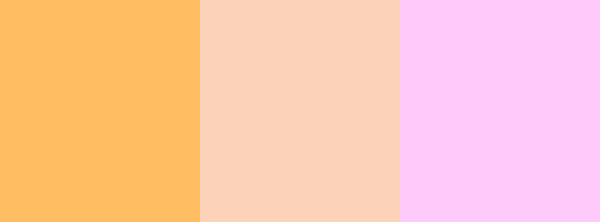
[id: a stripe divided into three equal sections, each a different colour — orange (#ffbe61), light peach(#fcd1b8), and a light pink(#fdc9fa). end id.]
for the gif this concerns, i went with the first one and set it to soft light at 20% which is what i usually do. it warms the image a bit and gives it an overall softer look. other times i’ll make it a luminosity layer at 10% instead but that works better if the scene in question has colder tones, imo, and the orange plays into all the red in that scene as well as the warm undertones in chen zihan’s skin.
in this gif i also decided to tween it because the cut as it looped was a little too harsh. for anyone unfamiliar, tweening means you layer two images, one of them at different opacities, to make them blend together. so the last three frames of the gif look like this:
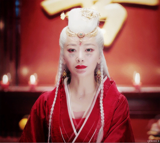
the last frame overlayed with the first at 25%
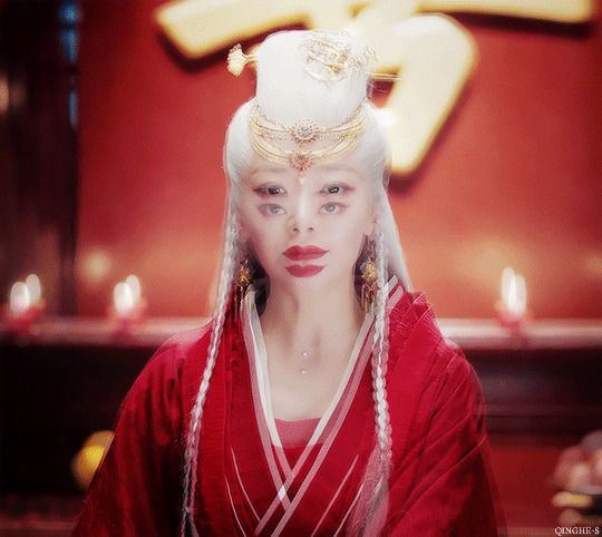
again, this time with the first frame at 50% giving her a double face but of course she’s still stunning and just looks like a really beautiful alien
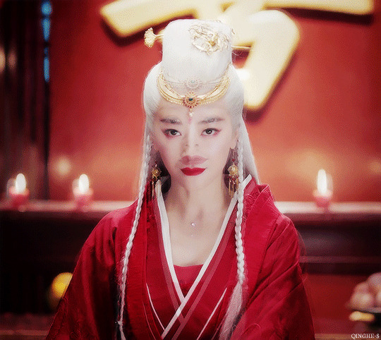
and finally at 75% before it loops and you just see the first frame!
these are also set at a different speed; my gifs are either at 0.1 or 0.7 seconds but i think tweened frames work better if they’re set to a shorter time so these three are set at 0.5
3. posting
i’ll usually make a few gifs at once; it’s rare that i just do one thing at a time, and then i drop them in my queue so they’ll post during my afternoon or evening because i’m vain and enjoy seeing my own things when i scroll down the dash and that’s when i’m usually active. occasionally i will let things sit in the drafts because i’m not sure how i feel about them, but eventually i go “fuck it” and throw it out there anyway! sometimes things don’t have to be good, as long as you liked making them
#showyourprocess#i cri at the thought of someone like. noticing my work and wanting to know anything about it?? i'm not a real creator!! gosh!#but thank you sm this was fun ♡#tag games#mine
12 notes
·
View notes
Note
Hi there! So I've been meaning to ask this for a while after realizing it, but don't O!Ciel's, Doll's, Alois', and Lizzy's color schemes kind of reveal their past and future a tad bit? I've know Alois outfits are bold yet kind of gothic colors like violet emerald green black and brown which all in the world of art are color forms of different emotions depending how you work with them, green being envy or disgusted but he hides it with royal purple, black means wounded which are his shorts & tie

Dear Blackbutlerfandomnerddomain,
While colour symbolism is popular, I personally don’t think the colours in Kuroshitsuji’s costumes are supposed to deliver any meaning other than aesthetic value. Especially with O!Ciel and Lizzie we can say with some certainty colour symbolism is not within the intention, because they change clothes in every single illustration, and every time they wear different colours. Yes, these characters do have tones they tend to wear, but that’s how real people dress themselves too. Somebody who likes calm colours is slightly less likely to have a rainbow assortment of neon, for example.
This is simply the way I understand Yana’s style, there’s not really ONE correct answer here. So feel free to read as much into the colours as it pleases you. But as I personally see it, Yana’s style of using symbolism tends to rely on objects rather than colours. Allow me to briefly analyse two artworks to illustrate what I mean and how I came to my understanding.
Case One
One of the most famous artworks is the front illustration of the second illustration book. Many colours including green, red, blue, white, gold are all present here.
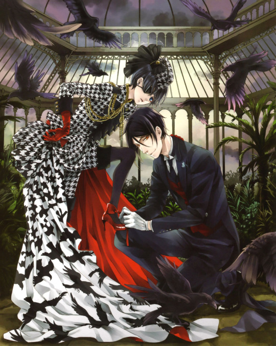
One could make arguments for the black and white of the Earl’s attire being symbolism, but this meaning is quickly overshadowed by the ravens emerging from the Escher patterns. Red is the most eye-catching colour in this illustration. One might say O!Ciel’s gloves being red means to symbolise his hands being blood-dyed, or his shoes red because he walks a bloody path... but then how do we explain the inside of the drape or Sebastian’s waistcoat?
The setting is a place that appears to be a type of greenhouse; a place built to maximise the function of sunlight. And yet, while the illustration seems to suggest it is daytime, the sun is failing miserably in face of the heavy clouds. Rather than painting the sky ominous red or just dark, Yana uses the unsuccessful sun to set a mood or convey symbolism. “Is the white light against the dark clouds not also a type of colour symbolism?” Yes, it may be, but then one should also ask the question: "why choose a greenhouse then, and not any other setting that could have conveyed the light/dark contrast?”
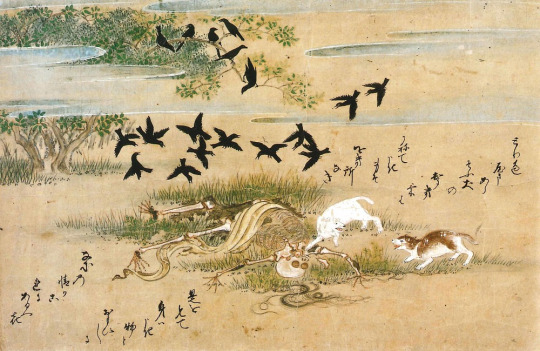
Case two
Another famous piece is this 2014 artwork. The overall tone is gloomy and is mostly lacking in colours. Though held back in terms of colour, there is a lot to be unpacked here!

The first thing that catches the eye is indeed the overwhelmingly sombre palate of this illustration. Black can symbolise many things, but when 70% of the illustration is black, one could say this illustration is either incompetent in conveying symbolism in it being over-saturated with “meaning”, or that the black is merely here to set a tone.
Instead, we can see white lilies in O!Ciel’s hair as well as one stem carried by Sebas. Rather than colour symbolism, Japan has a long history of flower-symbolism (花言葉・Hanakotoba), and Yana herself is big fan of this style. When Western culture was introduced to Japan, black and white lilies were accepted as symbols for death.

The composition of the artwork leads the eye from the bottom left corner to the top right. This guides our vision to the empty plate at the top of the table, where a bright white saucer lies with a conspicuous bit of red sauce.
Red might symbolise blood here, and it is befitting. But more importantly we also need to consider this choice from an artist’s point of view. How many different colours of edible sauces are there? There’s chocolate sauce and other dark sauces, but that would just blend in with the rest of the illustration. Yellowy sauce is certainly a thing, but that’d be overpowered by the golden details. So red is the only bright colour that would make the empty saucer pop out. The Empty saucer has a fork placed diagonally on top, meaning that somebody had consumed food and is now finished. Rather than the colour of red, I think it is the now-empty saucer that is supposed to symbolise Sebastian’s goal of consuming his master.

Next to the saucer is the skeleton of a bird; presumably a crow judging from the size. Skeletons universally symbolise death, but it has nothing to do with the colour.
In Japanese native culture the topic of ‘death’ is big taboo. In older Japanese buildings for example, the 4th floor would often be skipped because ‘4′ (四・shi) is a homophone of death (死・shi).
In the past when Buddhism was introduced, the Japanese embraced this religion with open arms because finally there was something else that would deal with ‘death’ while native culture could stay in its comfort-zone. It was a bit like: “we do we... Hey, Buddhism, can you take care of that thing we’re too afraid of for us? Thanks dude!” Since the introduction of Buddhism, images of skeletons came to not just mean ‘death’, but more specifically ‘impermanence’ (無常・mujou). Impermanence is one of the core teachings in Buddhism, reminding humanity that everything will eventually come to an end, be it good or bad. With Buddhism introduced, skeletons were no longer only associated with pure fear, but instead gained an additional meaning of acceptance of change and the cycle of nature.
The origins of the meaning of skeletons have blurred through the years, many Japanese people probably don’t even know why things evoke certain meanings in them (just like in other cultures, I presume). But fact remains that though still macabre, in Japan a skeleton is now assumed to symbolise the naturalness of death.
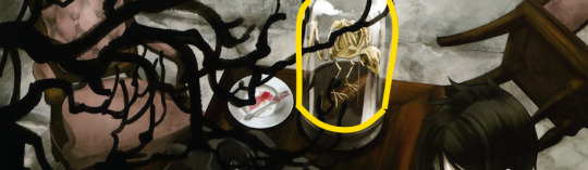
That the skeleton of the bird is preserved in a glass dome is interesting. Glass domes’ function is primarily display. Out of all things, Yana chose to specifically display the symbol of impermanence and death, meaning that within this artwork that skeleton is the key object of display. In human subjectivity death is finite and fearsome. To a demon like Sebastian however (from whose perspective we view this artwork as he’s the only one awake here), he probably views death more akin to the way Buddhism views it; as just impermanence. I am NOT saying that Sebastian subscribes to a Buddhist philosophy, but I am saying that he must view death a lot more neutrally than most humans do.
Most Japanese people are not raised consciously religiously, but everyone is always influenced to some extent, Yana included. And therefore it is no surprise that Yana might have been inspired by the neutral view towards death (for at least Sebastian), even if she might not know where this inspiration comes from.

The casualness of ‘death’ in this illustration is further indicated by the coffin that is set up as a dining table. There is no respect, no ceremony, objects are scattered on top and around. The message is rather straightforward so I shall waste no more time explaining the obvious here. But I do wish to point out how this gives further evidence for how the meanings of this illustration should be considered from Sebas’ perspective, just like the crow’s skeleton as explained above. What is finite to us, is just a fact of nature to Sebas.
Conclusion
Yana has created many illustrations. Not all include symbolism, but the more elaborate pieces are usually packed with them. Of course I have only analysed two illustrations, and I would not blame anyone for calling this post insufficient evidence. But... I could just go on and on forever, and I need to draw a line somewhere, right? What I can say with confidence however, is that if you were to grab any artwork by Yana and see it for yourself, rather than colour, item symbolism is stronger.
Also, the way Yana uses colour is just not very symbolism heavy; she has a much stronger tendency to use colours purely aesthetically. Take any of the inside covers of this series, and one would quickly find out there really is no pattern to be found here.

In a nutshell, Yana’s colouring style is mostly aesthetic and used to set a tone for her illustrations. What carries the symbolism instead is in the objects.
Again, this is merely how I personally read Yana’s illustrations and an elaboration of how I came to this reading. There is not one correct answer to read illustrations, because art is subjective in its core. So if the colours do mean more to you than they do to me, please do enjoy doing so by all means ^^
#Kuroshitsuji#Black Butler#Art#Illustration#art analysis#analysis#I did study art for a bit and it shaped the way I look at art#but the core lesson of art analysis class is that art is always subjective#ALWAYS#symbolism
59 notes
·
View notes
Text
Cataracts - What Surgery Is Like
As previously mentioned, I’d developed cataracts and am now going through surgery for them, and have elected to document a bit about what it’s all like from my viewpoint. Mostly because I think it’d make a nice reference for anyone wanting to write with some degree of accuracy about what it’s like from the inside.
This post contains a description of the surgical process involved and what that actually feels like, I’m trying not to be overly graphic but I’m also not elliding over any of the grosser bits (thankfully and surprisingly very little).
First off, a descriptiong of the preliminaries. This started for me with my vision going blurry over the last couple of years, and finally getting around to visiting my old optomitrist when I happened to be in Toronto over last Christmas (as my one up north just retired a couple years ago, and I hadn’t replaced her yet). Of the several potential causes for the vision loss I was experiecing, what I had turned out to be cataracts, of the variety that occurs at the back of the lens and therefor doesn’t cause easily-visible clouding. Which I actually said “Oh, thank god!” to when the optomitrist told me, since they are the absolute easiest thing to fix, while some of the other options (detached retina, or diabetes-related macular degradation, to name a couple) are much less so. Then he gave me a reference to an opthamologist. Thanks to COVID-19, it was this fall before I was finally able to actually get to the clinic and see her.
From my point of view, the process then went pretty quickly. Note that I was at an eye institute that specializes in cataract treatment; everything is contained in one building (a nicely renovated Victorian brick house in the Annex area of Toronto). So all tests and surgery are done on premises.
First appointment there, they did the same sort of vision tests my optomitrist generally does, plus some extra inner-eye photography to get a good look at what was going on. This was done by two different people, one doing the eye-chart related tests and a different one doing the photography. Then I met briefly with my doctor, who looked over my questionnaire (which included questions like whether near, mid, or distance vision was most important to me, and was there a focal distance I particularly needed to be glasses free for, etc.), and that I didn’t need nor have interest in a lens replacement that wasn’t covered under our provincial health care.
A week later I returned for them to perform eye measurement tests, which are used as a basis for manufacturing the replacement lens. They measure the size and shape of the eye, and mostly just involved staring into various machines while photos are taken. The weirdest one, which they did last, involved dripping numbing drops into my eyes, and then lightly pressing a small sensor to multiple places both directly on the eyeballs and then on the closed lids. Something to do with viscosity I’d assume.
And now for a description of the general surgical process, which you can also find summarized (or in more detail) at a number of medical web sites. In my case, it was a pretty basic surgery being performed; the opthamologist needed to make a small slit in the outer layer of my eye, used a tiny probe to break down the lens using ultrasound waves, vacuum out the broken down lens, then use a largish needle to insert a folded plastic lens into the eye, where it would unfold within the capsular space and could be tweaked as needed into the correct position. The cut in the eye is tiny enough that it usually doesn’t even need stitching, apparently.
I was asked to arrive at a specific time, and had to start applying dilating drops to my eyes an hour, half-hour, and five minutes before leaving for the clinic. No nail polish or facial makeup. Preferable wearing comfortable pants and a loosely short-sleeved button front shirt without any undershirt or long underwear beneath it (which turns out to be a “just in case things go crazily sideways” measure; they didn’t actually need to access anything on my torso).
The first step after I arrived at the clinic was being dressed in PPE - one of their own disposable masks to be sure I was wearing a good enough one (that wasn’t coated in whatever mine had picked up outside), a hair cap, a long-sleeved thigh-length blue plasticized robe (it had thumb holes to prevent the sleeves from slipping), and booties over my shoes.
Then I was taken to their surgical floor, where a nurse began a series of eye drops. These included more dilation, an antispectic, and an antibiotic, that I can remember - multiple drops of all. She also gave me a teeny tiny pill to place under my tongue and let dissolved, which contained a small dose of a relaxant/anti-anxiety med (Sorry, she told me the name of it at the time but it’s dropped out of my memory). I didn’t notice any particular change in my mood, but then I’d been counting slow deep breaths since arriving (4 seconds in, 4 seconds out...) to help keep myself relaxed and give myself something to focus on that wasn’t omfg I’m going to be awake during this! Because yeah, not having a clue what it was going to be like was stressful. Nurse also took my blood pressure to be sure I was fine in that regards, and put a sticker on the gown to remind the doctor that it was my right eye being done that day.
After a brief wait, I was moved into one of the surgical theatres, where there was a dentist chair they sat me in, then connected a blood pressure cuff, fingertip monitor (hence the no nail polish rule) and sensors on the backs of both hands and one ankle (I’m assuming those were measuring a mix of blood oxygenation and heartbeat, with the ankle one making sure my feet were still getting blood when I was spending the surgery in what ended up as a tipped-over-backwards with head lowest position). They then rinsed my eye and the orbital area with bactine (very yellow vision while that happens), then patted the area around the eye dry.
The doctor sat at my head, and applied a medical drape with a pre-cut adhesive-edged opening over my eye, then peeled off a translucent applique that was over the hole. Then they applied medical clamps that held my eyelids in the open position (which thanks to the numbing drops, I didn’t feel at all). A brightly lighted microscope was then positioned over the eye, and I was told to stay as still as possible and stare at the red dot in the lighted area. The doctor then did the surgery as described above. From my point of view, there was very little to feel; occasional dull pressure, some random coldness that I believe was the eye being irrigated. I could hear the occasional very quiet noise the probe made as the lens was sucked away, but mostly it was just staring at the red light as well as I could while my vision distorted oddly and I continue counting breaths. Within what felt like no more than 5-10 minutes (if that), it was all over with.
They had me continue to lie there for a couple minutes while they peeled off the drape, wiped the eye area clean, and removed all the sensors, then a brief rest before having me sit up.
I blinked once or twice, and... DAMN! Sudden near-perfect vision in an eye that hasn’t seen clearly without help since I was in single digit ages. And the saturation. The detail.
Now, my left eye of course still has a cataract (it gets treated next week). I’d been telling people for a while that basically all my right eye was seeing was blur, so my left eye was doing most of the seeing, and I thought my left eye wasn’t anywhere near as bad as my right. With my right eye now seeing perfectly, I could now alternate opening eyes from side to side, and see just how badly (and irregularly) blurred and yellowed the left lens actually is. To which I can only saw, WTF, how was I even seeing anything at all!?
Then they had me sit for a while in the waiting area, where the doctor came and double-checked I was fine, and gave me a kit in a plastic bag of a card that identifies that I have an interocular lens (and info about it), a prescription for two different eye drops (antibiotic and anti-inflamatory) which was enough for both this eye and the eye getting operated on next week, and a shield to wear at night for the first five nights, to be sure I don’t accidentally rub it or put pressure on it.
Then I put on sunglasses (because hugely dilated eye) and walked out.
Side note - they won’t do your operation unless you have a ride home arranged; because that tiny pill means you’re in a slightly altered state, among other reasons. Good thing it was my brother and not, say, a taxi, since among other things it took us three drugstores to find one that actually had both kinds of eyedrops in stock, yay super fun.
Also, remember me talking about the starburst rays I was seeing around lights due to cataracts? While my eye was still dilated (which lasted until after midnight) I was seeing what I can only describe as ‘Ferris wheels’ - a burst of rays expanding out like the spokes of a wheel, and ending in an uneven ring of dots of bright light, each wheel matching the colour of the light causing it. Looked wild at night. Thankfully that effect has now gone away.
Had a follow-up appointment this morning where they did an eye chart and the rebounce test where they puff air at your cornea, and the opthamologist says the vision in that eye tested as 20/20 (WOOO! Finally something good with that number). I can see sharply and clearly for blocks from the mid-range on out. Sadly when I try to use my computer, tablet, etc (near-range and close vision) the eye can’t focus down far enough; some of that may improve over the next month or two as the eye continues healing, and adapting to the lens. In the meantime my sister suggested I try a pair of her reading glasses and, yay, that worked. I am now planning that after my follow-up appointment for next week’s surgery on the left eye, I’ll run around and pick up 2-3 pairs of reading glasses of various strengths (which I will get will depend on what seems to work best with arm’s length and close-in viewing), to carry me through until I go back to an optomitrist in a month or three, and get my vision evaluated to see if I need actual prescription reading and/or far distance glasses.
In the meantime, apart from computer/tablet use, I am glasses free. I can’t even remember ever having such sharp, clear, and saturated vision (since I’ve been in glasses for such a long time). You know the “oh, trees are made of leaves!” effect? I am getting that with every single thing I look at. Oh, that’s how much grey is in my hair? Weird, I never noticed this wall was textured before. Oh geez, that text over there is so small and yet I AM READING IT. I mean, even with glasses I probably was never able to read that from this distance! Etc ad infinitum.
It’s just so, so nice.
And that’s with just one eye finished. I am now really looking forward to next week’s surgery. Stress? What stress!?
#Cataracts#Me Myself and I#If you've ever wondered what having cataract surgery was actually like...#CW: Surgery Details
6 notes
·
View notes
Text
Graphic Design Portfolio

01. Begin with the “C”
Media: Digital Design
Dimensions: 297mm x 420mm
Description: I took the initial of my name, “C”, as inspiration for designing the poster. As a student with a fanatical interest in graphic design, I hope that the letter “C” in my name,can represent infinite creativity. Just as my name begins with the “C”, I think the study of design should also begin with another “C”, which is creativity.

02. Product Similarity
Media: Scriptliner on sketch paper
Dimensions: 380mm x 580mm
Description: Each of us is a product produced by society. We may have different backgrounds, personalities and ideas originally, but, in the competition within society, we tend to be closer to each other's image, so as to form excellent competitiveness in a certain aspect. Society will continue to fill the gaps between people, so that the living environment will reach saturation. Under the influence of many factors, all the “products” become more and more homogeneous, and the pressure of survival also increases continuously.

03. Fist, Female, Fear
Media: Digital Painting
Dimensions: 297mm x 420mm
Description: The difficult position of women has always been a great concern to me. This work presents some of the issues that make me anxious and fearful as a female, such as domestic violence, being followed after 10pm, drinking drugged alcohol in a bar and so on. In addition, it also includes some social inequality restrictions on women. Such as thinking that it is shameful to wear short skirts, it is not allowed for women to smoke or drink, etc. The two fists in the painting are both society's fists against female and the fists that I want to break all this uneasiness and inequality.
04. Mask
Media: Digital painting
Dimensions: 400mm x 400mm
Description: During COVID-19, all of us wore masks, which could both protect us and facilitate a concealment of emotions. We can't see people's expressions under masks, and in many cases, happiness and sadness can't be conveyed only through the eyes. Maybe it prevents us from communicating with each other, or maybe it gives us a sense of security when we don't want to reveal our thoughts to the outside world.
05. “Humanlike”
Media: Photography
Dimensions: 300mm x 600mm
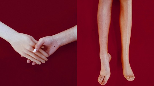
Description: When I was a little girl, I was very disgusted and afraid of the models in the window. When I grew up, I realized that this was because of the “Uncanny Valley”. So now I've chosen to face this fear and take pictures of human limbs next to a dummy. I hope to explore the similarities and differences between them, so as to more intuitively feel the temperature and texture of the human body.

06. Summer Memories
Media: PhotographyDimensions: 102mm x 152mm
Description: I love the summer in Beijing's Hutongs, the small theatre buildings full of creepers, the abandoned furniture and bicycles piled up on both sides of the road, and the boundless green. This work records my scattered memories of summer, and to me, I can nearly hear the sound of cicadas and the breeze blowing through the leaves when I see it.

07. “Be Fake or be True”
Media: 3D Installation/ Mixed Media
Dimensions: 500mm x 500mm x 500mm
Description: Our childhood fantasies about the world are like the perfect stories locked up in the TV. They are the combination of all good things, and the collection of all innocence. But as we get older, we see a more real side of the world. This is like breaking the TV screen, once the dream and cold reality collide, we can choose to believe in good, but also can choose to face the reality.

08. “Way Too Much”
Media: Scriptliner on sketch paper
Dimensions: 420mm x 594 mm
Description: This is a sketch of the dining table in my home. I have a slight hoarding habit, so the table is always filled with bottles and jars for a sense of inner satisfaction. But my mother always said that my things were “way too much” and too messy. Under her gaze I had to look at the table again in a more introspective manner.

09. The Prosperous Tang Dynasty
Media: Collage/ Mixed Media
Dimensions: 297mm x 420mm
Description: This work embodies my yearning and respect for the costume, culture, aesthetics and so on of the ancient Tang Dynasty in China. I wanted to use it to express the prosperous, open, majestic atmosphere of the Tang Dynasty, and also add my calligraphy work to it. The bright red color is the most important symbol of the Tang Dynasty, and the culture as gorgeous as peony is a beautiful dream buried in every Chinese heart.
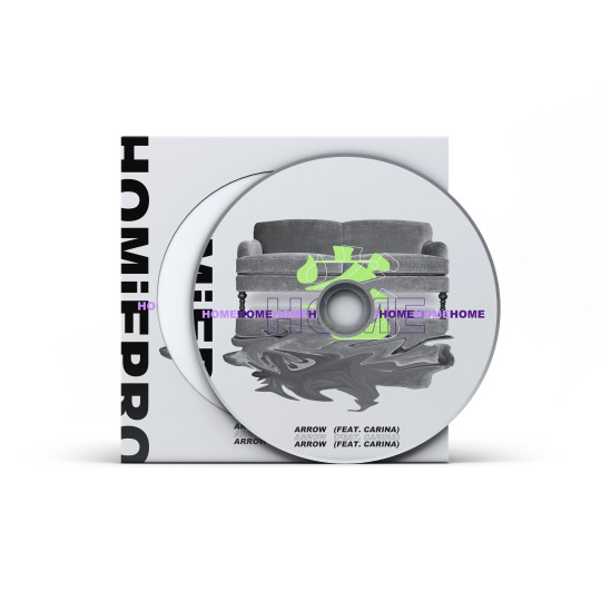
10. CD Cover Design
Media: Digital Design
Dimensions: 150mm x 150mm
Description: One of my rapper friends and I wrote a hip-hop song about life during quarantine, and I designed the album cover myself. The empty sofa expresses my loneliness and boredom. Fluorescent green and purple stand out against the grey background, representing that music and art are the only bright colors in my dull life.

11. City Starlight
Media: 3D Installation/ Mixed Media
Dimensions: 1500mm x 400mm x 200mm
Description: I once participated in the window design project of Hamleys, a famous British toy company, and I worked with several designers to make drawings and build models with the theme of city starlight. All the buildings and facilities were designed and cut by ourselves. We hope to remind everyone of the forgotten beauty of the city when they pass this window. Although the plan was not implemented in the end, it was an unforgettable experience for me.
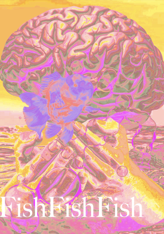
12. Fish Fish Fish
Media: Digital Design
Dimensions: 297mm x 420mm
Description: This is a small project about creative design. I randomly selected three keywords, which are brain, goldfish and hand, so I completed the poster creation with these three elements. The human brain is very complex, carrying a lot of emotional, knowledge burden, but fish only have seven seconds of memory, their worlds are very simple. I hope we can all live like fish, be happy and be simple, and not need to worry about all the mess.

13. Christmas Card
Media: Digital Design
Dimensions: 148mm x 210mm
Description: This is a Christmas card I designed for my friends. Christmas in my heart is different from others. It is purple and pink. And all of these objects, the Christmas tree, the gift box, are just abstract symbols, their specific shape, colour, size is not really important. I use this kind of vague image to express my wishes to my friends. May they not only have a merry Christmas, but also a pink and purple surprise every day.

14. SOS
Media: Photography/ Digital Design
Dimensions: 420mm x 594mm
Description: Born as a woman, sometimes we are bound by a piece of tape to seal the mouth of expression and seeking for help, so we must save ourselves, in the tide of the times to speak and to fight for freedom.

15. Consumerism
Media: Collage/ Mixed Media
Dimensions: 297mm x 420mm
Description: In this era of rampant consumerism, people are gradually constrained by material desire and money, and constantly pursue a more grandiose and luxurious consumption life. However, we are increasingly overwhelmed by endless commodities, so we have to keep struggling with it, trying to stay awake while continuing to consume uncontrollably.
16. Sketchbook scanned copy
Media: Charcoal and crayon on sketch paper
Description: I used charcoal to copy two paintings, Three Wicked Men by Denzil Forrester and Self Portrait In A Straw Hat by Vigee Lebrun.
youtube
17. Happy Birthday
Media: Stop-motion Animation
Description: In the summer of 2019, a friend and I took a course in stop-motion animation at RISD's summer school and made this short film. It was inspired by my grandparents. On my grandmother's birthday, my grandfather always gets up early to cook and make cakes for her. Although this seems to be a very simple thing, it has always been the most touching and warm picture in my memory. I hope I can take this short film as a souvenir.
18. Development Work - Collage Brainstorm
4 notes
·
View notes
Note
your gifs always look AMAZING!! do you have any colouring tips regarding skin?? sorry if youve answered this before!
hi omg 🥺🥺🥺 thank you first of all for saying my gifs are nice ; v ; !! i reallllly appreciate that !!! secondly so sorry that i took so long to get to this ask, i really didnt have a chance to open up ps and look at everything that i always use in my gifs and i wanted to give you a good answer to this question ; ___ ;
Colour Theory: i’d really recommend you look into colour theory and do some quick research on how colours work, what colours look good together, what colours cancel other colours out, etc, etc... it’s really important to get this sorta thing simply because it’ll make your life on photoshop a LOT easier, and that might be a personal opinion but !! i genuinely think that its a great first step when it comes to making gifs! its also super important bc every vid is obviously different, and knowing where to start from/go from is a big help and if you understand colour theory, the moment you look at a vid you’ll be able to kinda form a plan of how certain colours will look on this and how your psd will change it, etc etc!!
Red/Yellow/Green: skin is just mostly a mixture of reds and yellows, but also green plays a role there too. when you’re adjusting the colouring and trying not to wash out the skin tone, it’s important to add in yellows and reds without saturating it too much so that it doesn’t look unnatural. adding green in can mellow out the reds if they’re too intense (and blue can tone out yellow)!!!
Curves Adjustment: curves are really your best friend... i find that adjusting the curves helps to create a natural unnoticeable bias (if you’re not pushing it too much that is) with the RGB scale... it’s really useful and its my go-to when it comes to trying to keep the skin tone looking natural!
Selective Colour Adjustment: selective colour is also fantastic bc it targets the specific colours and can therefore easily darken or lighten a certain colour that you’re working with OR change it to a completely different colour. this is also why i really recommended learning some colour theory bc selective colour really depends on understand what you’re doing.. (of course for the first little while that i giffed i didnt know shit abt colour theory so i just guessed and you can always do that but i just really recommend to make your life easier!)
Hue/Saturation + Brightness/Contrast + Vibrance Adjustments: Also important, these 5 can also play a big part in colouring (in general and not just for skin) and you should also pay attention to how some problems are super easily fixed by dropping saturation, or upping brightness, or etc. its the little things that can up how good your colouring looks and paying attention to these can help!!
Practice (?): ig it sounds dumb but yeah... just with time it’ll become easier and more natural for you... you’ll probably create a psd you really love eventually and keep it and use that a lot! i recommend just testing different styles until you find something you really love!! its not an exact science and everyone has their own unique style so just have fun TT TT ik giffing gets bleh a lot for me but colouring is the part i usually enjoy the most !! and dont feel afraid to ask for advice from someone?? like i get second opinion from even my family when i’m making gifs so !! yeah ; __ ;
i hope this helped and made sense?? if there’s anything else?? i can help with or explain pls feel free to ask !! ik it can be hard when you’re learning to do smth like this but dont give up !!! :D mwah mwah good luck bb !!
#anon#answered#sorry i took so long...#i wanted to have my ps open to answer this !!#u__u im hoping this made sense and helped at least a little bit TT TT#thank you for liking my colouring im really touched and happy abt this ; ___ ;#mwah...#*tutorial
6 notes
·
View notes
Note
speaking of your awesome gifs do you have any tips or tutorials for how you colour the blood in dark scenes?
oh!! Yeah, actually!!! It’s funny that you point out the blood specifically bc it pops as actually a part of the coloring process I was already doing before I even started giffing for a show where emphasizing the blood was particularly important. And if this was brought up based on the post where I talked about how much work goes into gifs: I actually had to add a layer desaturating the red just a little to make the wotl gif look good with the other gif in the set it was originally from dsfhfhal
I use a full licensed version of adobe photoshop cc and idk how to translate this into any other thing a person might try to use
Anyway what I do is basically brighten the gif until it looks like this:

(this is probably not the Best way to do it but I just put a curves layer, hit auto, put another curves layer and hit auto on that, etc until it’s a bit brighter than I actually want it)
and then I know a lot of people will go back in and darken the shadows to reduce artifacts. But I have found that what I like the look of better is to add a color balance layer and fuck around with it until the artifacts disappear. I go to the shadows setting and increase the reds (red is a dark color so it darkens the shadows and makes them less blue) and then I go to the highlights setting and increase the yellows and cyans some (to avoid the image all just looking Red) and then I go back to midtones and slide things around until the overall image is more or less true-color looking (erring on the side of a warm tones rather than cool tones wherever possible). Usually I have to up the magenta in highlights and/or midtones too and then I usually go back and slide the green up in shadows; it really depends on the colors in the scene. The key is red WAY up in shadows and cyan up at least a little in highlights and the rest is just What Looks Good. Never slide toward blue more than a tick for anything though
anyway it then looks like this:

When it works well you get really clear colors and the characters pop well. It also has the side effect of making blood pop REALLY well. Sometimes that’s what I’m looking for and I keep it that way and sometimes I go back and add a hue-saturation layer, click where it says “master” and switch it to “reds”, then slide the saturation down a bit until it’s not quite so bright and in your face. It’s not a huge difference but it then looks like this:

just a little less bright and aggressive with the colors yk. Are there other ways of doing this? of course. Could I just not up the red that much to begin with? probably. But that’s what I do afjkdsalh
#gifmaking#gif tutorials#feel free to inquire further about this if it doesn't make sense#hannibal#asks#anon asks#mine
24 notes
·
View notes
Note
Looking to get into digital art. Any advice/sources/beginner tips you could share? Thanks a ton
Heyo! Thanks for your question! It took a while to get back to you, I know, but hopefully this lengthy post makes up for it, hehe. :D
Here’s some general advice/mini tutorials I thought might be useful for a beginner (some of it is just general art advice that I think is useful to remember when getting into digital art). Hope this helps and let me know how you go!
***
The boring important stuff
What kind of digital art do you want to create?
Might seem kind of redundant, but knowing what kind of art (highly realistic, illustration, manga etc.) will help you develop the right skills for you.
Focusing on one, maybe two, big styles/techniques/skills at a time will help you improve faster rather than focusing on a bunch of little things at once.
So just pick something you know you want to learn/improve etc. and go from there.
Draw. draw, draw. Play around and experiment.
The best thing you can do to learn and improve your digital art is draw a lot. When I first started there weren’t a lot of resources, especially the kind of stuff I wanted to do. And the tutorials I did find were so complicated I couldn’t do them anyway. Because of this, I think I did something like five drawings in three years. Pretty sad, huh? My work hardly improved at all and it felt demoralising. Sometimes I think back and wonder how much I could have grown if I had practiced regularly.
Resource: https://youtu.be/emcO79uteN4 (drawing advice)
Learn how to use your chosen tablet and program.
You don’t have to become a master at it, but learning the basics will go a long way. There’s a lot of tutorials for most of the digital art programs. You can just do a quick search and find videos explaining the basics. This will make your life easier!
Now for the basic digital art, mini tutorial stuff:
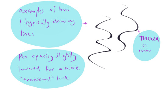
Linework basics:
Pen pressure
Each tablet will feel different, as will each program, so it never hurts to play around with your pen settings to find what’s comfortable. You can find quick tutorials that will show you how to adjust your specific pen pressure.
Stability
“Everyone has such clean, smooth lines! Except me! Mine are wobbly and terrible! They suck!”
No, friend, they have their pen stability adjusted to suit them, or have downloaded a brush set that helps them. Stability settings will depend on what program you’re using.
There are heaps of brush packs out there, but for linework specifically you’d want something that has a kind of slanted tip.
I often change what brushes I use, but some I like are:
https://gumroad.com/l/JYdba
https://sellfy.com/georgvw (lots of stuff here but costs a little. Inktober set it good)
They’re for procreate, but you could easily find some for photoshop or other programs too.
Inking/Line weight
This can be a little bit difficult to explain, and I’m not sure of any tutorial in particular that I think explains it completely. Your line work will add depth to your piece (unless the kind of art you’re doing is without linwork, then feel free to skip this).
The basics are:
Thicker lines are generally for things that need to be bolder, materials/substances that are more coarse or dense (e.g. thick jacket, boulders), for objects that are closer to you, and also for things that are more in shadow.
Thinner lines are generally for things that need to be more transparent, wispy (hair, for example), for light materials/substances (e.g negligee, leaves), objects that a further away or less important, and things that are in bright light.
Small example:
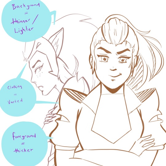
(yeah I couldn’t help but add a little she-ra to this post...)
The exception to the rule:
Overall, most people would agree that they want their art to look good/be compelling over something that is technically accurate. If this means making bolder lines on something that would typically be thin (maybe someone’s hair, for example) because it adds extra depth and an interesting look -- then you should do that.
Example, what I generally do with my lines:
Shadows/Light Source
This can make your art go up a notch, and give greater depth to your illustrations -- even if you’re doing just some sketching. Knowing where your light source is will add more depth to both colour and black and white works. It can be tricky getting them right sometimes, but here are some general examples/rules.
(also, I’m no expert at this. these are just some things that I find generally useful).
Light source/Shadow examples:
Depending on the direction of the light source, will depend on where the shadows are.
(and of course I had to use zuko too because the dramatic lighting is perfect on him)
Shadows will change depending on the object, and the direction of the light.
Some things to keep in mind:
Things in shadow will generally have less detail (unless you decide you don’t want to do that for certain effects).
Interesting shadow shapes will usually win over making things technically correct.
Even googling “light source references” shows some decent results:
https://www.google.com/search?rlz=1C1CHBF_en-GBAU805AU805&biw=1536&bih=754&tbm=isch&sxsrf=ACYBGNQPqF22f6P5Fsz2VnrUFzOJ-RV8TA%3A1574554362929&sa=1&ei=-srZXfmuOPSH4-EPwOWouAs&q=light+source+refernce&oq=light+source+refernce&gs_l=img.3...568.1258..1376...0.0..0.274.1470.2-6......0....1..gws-wiz-img.......0j0i5i30j0i8i30.X4dgUAjeEVQ&ved=0ahUKEwj5k-2LyIHmAhX0wzgGHcAyCrcQ4dUDCAc&uact=5#imgrc=_
Also, this is a good resource too:
https://youtu.be/ZJkIaMECW6c
Basic Colour Theory/Colour Tips
Complementary colours are those that are found opposite one another on the colour wheel. They go great together in work because it can add contrast, drama, intensity, and just some great colour design.
When using complementary colours, it’s easy to just pick two colours opposite each other and decide to colour with them in equal amounts.
While this can be nice, if it’s the look you’re going for, it can also be overbearing if that’s not the look you wanted. One of the things I was taught by an artist friend, was to try and use the complementary as an accent colour -- to make things pop and come to life in the work.
These are just some things to keep in mind, and either way is good.
Resources:
https://youtu.be/Qj1FK8n7WgY
Colour theory continued -- Building Palettes:
So, building palettes that work/using only a few colours (something I’m still trying to learn!). There are many ways to do this. You can use a complementary pallet, an analogous palette for a harmonious effect, or even a monochromatic palette .
There’s also a triadic approach (plus a few other ones I don’t often use), but I honestly haven’t thought much about this so I’m not sure what advice I can give.
It’s basically three colors that are equally apart on the wheel, for example: red, blue and yellow. If you find this interesting and end up using it, show me the results -- I’d love to see!
*I’m a big fan of doing things either complementary or analogue when building colour palettes, but monochromatic paintings can have an amazing effect and it’s something I will definitely be trying in the future.
note: colour theory is in-depth, and a lot more complicated than this (largely due to most of us being taught incorrect colour theory as children -- technically some of the colour theory above is not quite correct but a comprehensive colour theory guide would take tutorial of it’s own). So if you’d like to know more just let me know.
Resources:
https://www.google.com/search?q=color+palette+ideas&rlz=1C1CHBF_en-GBAU805AU805&sxsrf=ACYBGNQJtnt9SzKjFpxC-HXzuivXPW6vGg:1574906679811&source=lnms&tbm=isch&sa=X&ved=2ahUKEwjViNHJ6IvmAhUv6XMBHaaHAp8Q_AUoAXoECAwQAw
Over Saturation
Saturated work can look really great if that’s what you’re going for, but a lot of the time this is something that happens by accident when learning how to use colours and it can look quite garish.
There’s a few things you can do to help with this.
Make a colour palette or guide before you begin to colour so don’t accidentally over saturate
Find a colour palette that suits your work and use them as your palette
If you’ve finished a piece, and it’s already too late to change it you can play around with the colour settings in your program (photoshop and procreate both have some settings you can toy with that can reduce saturation intensity)
*just like using complementary colours as an accent, you can use minimal bits of saturated colour to draw attention to certain aspects of your work you want noticed
A few other little things
● Another thing to think about is composition -- planning how you want your art to look (which could be something like: including negative space, using the rule of thirds, making a specific feature the anchor of the piece, line of sight etc.)
● Make a pinterest board (or whatever else might help). I make boards for things that inspire me, tutorials I might like to try, references, and even separate boards for individual projects. It can be a great place to store your ideas!
● Also, remember that you don’t need to start doing all these things at once. Start small. Small is good. :)
● Every once and a while go over the things you think you know well. You’ll be surprised how much a little revision can improve your skills, even with something you’re good at.
● USE REFERENCES!!!
So how was this? If you’d like me to go more in-depth in a specific area, I can sure try! Excited to see how your journey goes and I hope this helped! ^_^
xoxo
Rora
7 notes
·
View notes
Text
The Huawei Band 4 Pro smartwatch has been released.
This device may be used to listen to music over Bluetooth, see real-time notifications from social networking apps, and do a range of other tasks. To see everything, you'll need to download the Huawei Health app to your phone.
As a result, you have a lot of options here, such as selecting which platforms' notifications should be transmitted to you via the bracelet.The Huawei Band 4 Pro is reviewed.
The Huawei Band 4 Pro is a cutting-edge fitness tracker that's ideal for everyday activities: It is fairly widespread due to its fairly high-resolution AMOLED screen with brilliant colours, strong companion software, integrated GPS, which makes it smartphone-independent, and sensors for monitoring the user's body.
Before making a purchase, users should be aware of the following information: When using a smartphone from a different manufacturer, the Huawei app prompts users to download Huawei mobile services.
On bright days, the screen must be protected to be readable because it is softly lighted. The navigation, which was made easier by the presence of a dedicated home key, could have been a little more precise.

The Band 4 Pro features a 100-mAh battery, just like the Band 2 Pro. Huawei offers a number of battery life situations; for example, the device should survive 7 days when the sleep tracker is switched off and the heart rate sensor is set to continuous. If sleep is monitored every night and the fitness tracker is used lightly, it should last 5 days.
Based on our field tests, everything seemed reasonable, including the manufacturer's claim of 7 hours of GPS-assisted training time.
Of course, battery life varies with ambient temperature, which is most obvious in the winter.
The device includes a built-in GPS, workout advice, a 24/7 heart rate monitor, and watch face storage. It includes Bluetooth connectivity as well as a variety of sensors, including an infrared wear sensor.
The Huawei Band 4 Pro is available in a range of colours. The device was released in December of this year.
The Huawei Band 4 Pro is 1.77 inches broad "(45 mm) in height,.75" (19 mm) in width, and.43" (11 mm) in depth, and weighs.88 oz (25 g). huawei smart band 4 pro The diagonal of the screen is.95 inches "(24.1 mm) with a 240 x 120 pixel resolution.
Enough Battery Life to Run a Marathon
THE MODEL'S SPECIFICATIONS
The HUAWEI Band 4 Pro features a 0.95-inch AMOLED touchscreen with excellent colour and contrast for a completely immersive visual experience. New colours include Graphite Black, Pink Gold, and Cinnabar Red.
One of the most essential indicators of the body's oxygen supply is blood oxygen saturation. The HUAWEI Band 4 Pro can measure SpO2 levels in real time, so you may check your blood oxygen levels anytime and wherever you choose.
This device can also recognise six main forms of sleep disorders and deliver scientific recommendations4 for improved sleep thanks to professional optical devices, processor chips, and AI algorithms.
If your heart rate exceeds the heart rate restriction, the HUAWEI TruSeenTM 3.5 monitors it and sends you intelligent vibrating notifications. 3 The device will continue to track your sleep even if the invisible light does not create any interruptions.
A good night's sleep is essential for a healthy existence. HUAWEI TruSleepTM 2.0 analyses sleep quality and uses your heart rate to detect the four stages of sleep.
In addition to identifying and diagnosing six different forms of sleep problems, this device can also provide scientific recommendations. 4 for a more restful night's rest
Vibrant colours are associated with a more intelligent existence.
The HUAWEI Band 4 Pro features a 0.95-inch AMOLED touchscreen with excellent colour and contrast for a completely immersive visual experience. New colours include Graphite Black, Pink Gold, and Cinnabar Red.
Make your smartphone as distinctive as you are by imbuing it with your personality. Sports, cartoons, brains, and hi-tech are just a few of the watch faces available in the HUAWEI Watch Face Store1.
Improve the Sleep Quality of Your Sleep
A good night's sleep is essential for a healthy existence. HUAWEI TruSleepTM 2.0 analyses sleep quality and uses your heart rate to detect the four stages of sleep.
Measurement of oxygen with the Huawei Band 4 Pro Smart Bracelet
The Band 4 Pro also has the capability of monitoring oxygen levels, which is a vital feature.
This feature, which was previously only accessible in Huawei smart watches and wristbands, allows you to measure blood oxygen saturation. The SpO2 test can help you gain a sense of your overall health.
A Life Coach is more than just a personal trainer.
Although fitness devices' major purposes are to count steps, maintain heart rhythm when exercising, and measure calories burned, they are capable of much more. Take, for example, the oxygen level that we just discussed.
1 note
·
View note
Text
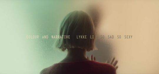
Colour And Narrative
The Human Eye has the capacity to recognize, and tell apart over a million different colours, yet language has failed to capture more than a handful in comparison. In Film, one was so desperate to include colour from the start of its creation, that there were numerous filmmakers around 1895 and 1950 that hand coloured each individual frame, as seen in the famous example by the Lumière Brothers and their Serpentine Dance from 1899. There was also a technique called ‘tinting’ which would allow filmmakers to tint the entire roll of Film, or larger sections of it in a colour of their choosing to deliberately shift or exaggerate the narrative of their stories.
With Digital Film a new world of opportunity opened for us as filmmakers and consumers. Every hue, luminance and saturation became available to us.
Directors like the Lumière Brothers were, or Wes Anderson is, have been fully aware of the fact that colour always produces a psychological reaction in us viewers. Historically we have gained knowledge of different associations to colour which, depending on the cultural background can vary, the sentimental knowledge however seems to be fairly accurate throughout all human beings.
Red for instance is globally associated with Fire and Blood. Therefore, also a symbol of warmth, passion and love but also aggression and destruction. These associations can be a striking tool to further elevate, or shape the narrative of a film.
Another great aspect or talent of colour and colour schemes is, that when used correctly, it results in cohesiveness. This is something we could all witness with the release of Lykke Li`s latest full length album called ‘So Sad So Sexy’. All three of the so far released Music Videos share a very similar colour scheme. This analysis deals with how the colours have been utilized in Lykke`s new releases, especially in the video for ‘Hard Rain’.
What we have established before, is that certain colours are chosen to be read and understood in certain ways. However, these previously mentioned associations (red = fire, blood, love) are not to be read as a clear set of rules to follow. It is less important to think of these colours as fixed expressions synonymous to certain adjectives but nonetheless important to pay attention to them, in order to find their specific place and meaning in a film. There have been decisions made on why, and where what colour appears. This is reason enough for us as viewers to stay alert and find the subjects which are connected to the colours. If they are actual protagonists which keep and hold a certain colour, or maybe a feeling which is visually expressed through colour.
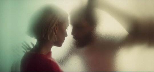
Hard Rain
Hard Rain has many visually compelling tools. What I find impressive about this project SoSadSoSexy by Lykke Li, is the cohesiveness in the Sound AND Look of the Album. The Colours in all three in the following order released Music Videos: Utopia, Deep End and Hard Rain, are reoccurring in every single one. In the Case of Deep End, there were even previews of certain settings, and locations for Hard Rain. These seemingly small details connect all three Videos beautifully, without it feeling forced or contrived.
What Hard Rain in particular works with, is the complementary colour scheme. Where you use two colours which are in direct opposition to their counterpart on the complementary scale. None of the pairs within complementary colours dominate the other. If mixed they would end up being a light to dark grey. They cancel each other out so to speak.
By taking these opposites we already have a platform for narrative. We know these are two polar opposites, we know that none is stronger than the other. Naturally when Lykke is placed in the middle, in between two colours, we expect a border, or the fading of.

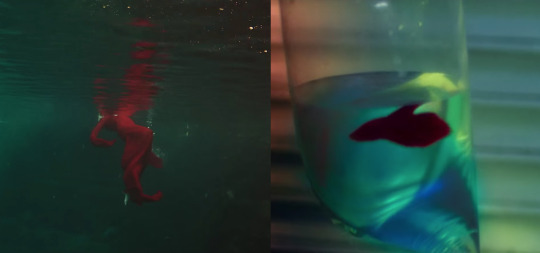
The Video starts out with Lykke and her Lover kissing in a shower, a clear shower curtain between them, keeping them mechanically and synthetically apart. There is a strong red light projected onto Lykke’s back, whereas her lover on the other side of the curtain is lit in green. These two colours are complementary to each other. Therefore, the border between the two is hereby the shower curtain. We know that these colours are vibrant on their own, but fail to mix and blend to produce another vibrant colour. So, there is a sense of danger which feeds into the Idea of both of them (LykkeRed and LoverGreen) touching or engaging with one another, as this may result in them losing themselves without gaining a new. Before we move onto the next shot, which is the title screen of the video for hard rain, also completely drenched in red, we witness the Lover`s hand slide under the curtain and grab onto Lykke`s shoulder blade. A trespassing, musically underlined like we`re used to in horror films. The story has begun.
Her Lover now walks down a hall which again is lit in red. He is now moving freely in her space. Lykke in her red jumper moves in the opposite direction. The red getting paler with each step, halting in a still vibrant pink. We see pond lilies from above, a pair of frogs walking on them. Both in a similar direction, sharing the pool like Lykke and her Lover. Here we see again the red and green imagery. Above water is red whereas everything beneath the waterline is green. And again, as a result to these opposites we have a clear accentuated border (here the waterline) cutting the image in half.

Still in the theme of water, we now arrive at a fish store with the couple. A sad trend in the pet-industry is to manipulate the lighting of fish tanks in order to let mainly tropical freshwater fish appear in a more toxic vibrant neon colour scheme, similar to the flashy colours of reef fish, rather than showing their natural colouration. This ‘fake’ light is flooding the entire room. Tinting the couple in their seemingly happy relaxed state. We see Lykke back in the pool alone, in a bright red dress creating gorgeous lavish shapes, followed by a ‘Match Cut’ through the Image of a red betta fish and it`s flowy fins, mimicking the dress we`ve just seen. Aligning these two images to one another, let’s us overlap Lykke`s and the fish’s experience in an elegant and obvious way. Her lover bought her the fish, trapped in a plastic bag. This could be read as an Omen to where Lykke is heading in the storyline, feeling trapped.
After clinical and playful neon lights and a quick flickering of images, one of which is the couple sharing a bed, the covers being green while bedsheets and pillows are dark red, we arrive in the heart, and seemingly most authentic raw part of the video. A short break, natural lighting, a sunset in the background, the couple`s touching foreheads, mimicking each other’s movements. What potentially could have been an awkward moment in a music video, is a refreshing and genuine halt within the story, Lovers being oblivious to the rest of the world, only perceiving each other.
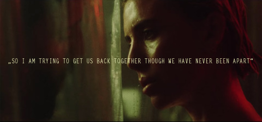
This Lyric is very well applicable to the usage of the complementary colour scheme within the video. It focuses on the opposites between the two, sharing the same space yet always divided, if through curtain or waterline or just natural occurring border where one colour ends and the other starts. It also, of course, is heart of the song itself and where the couple in their relationship are heading towards.
From here on the gap, or wall between the couple seems to manifest itself in growing impatience and frustration in Lykke. The colours mainly remain red and green or shift to orange and blue, which again are complementary. What is interesting when looking at the following Image, is the compositional aspect in addition to the colours. Whereas the blue on Lykke’s side claims more space than the orange, her lover does the same by occupying more space in the frame than her. The colours alone seem unbalanced, but once we add the associated bodies, it appears perfectly balanced.
We arrive at an image reminiscent of the opening scene. Lykke and her love interacting through a physical and transparent separation. Contrary to the opening scene this divider isn’t flexible, nor is it as clear for her to see through, as the shower curtain. It appears decisions have been made on her side which have set, like the glass dividing the two. She no longer interacts or even looks at her former love interest, who is still trying to reach out through the wall.
Interestingly we see three dominant colours this time around. Lykke occupying the left corner in her red jumper, stands near green, whilst her Lover on the other side of the barrier occupies the larger portion of the image in a peachy orange. Is the addition of a third colour introducing something new to the story? A dynamic implementing where the story is headed, or simply suggesting that the conflict might be resolved here? Lykke leaving him in this orange space while she leaves the green empty, maybe for someone else to fill?
Whichever way we choose to interpret these colours, there is an underlying theme and association with our subjects throughout the video which is undeniable. Let`s choose to see these colours and try to use language to expand on what we perceive as narrative. Colours can be a very reliable, unassuming and elegant way to further transport a story, as well as generate a sense of cohesiveness throughout a project, which relies on colour schemes, as a kind of by product.
Watch HARD RAIN
#lykke li#sosadsosexy#so sad so sexy#album#musicvideo#music review#pitchfork#nme magazine#online magazine#colour#colour theory#colour and narrative#taylor joe#complementary colours#color#music analysis#analysis#trackmag#trckmg
1 note
·
View note
Note
Rahul I really love the coloring on your Day6 set! Would you mind doing a before/after (maybe on a Dowoon gif? He's my bias!!) and telling us how you decide what you want your coloring to look like! Thank you~
hey there nonnie! of course i can. here is the set in question! and here is the before/after of dowoon's colouring for you (dowoon my meow meow!):

so i sharpen in vapoursynth and usually just use finesharp and no denoising, unless i'm giffing performances or stages. but colouring is the part of giffing that i love/hate the most! i colour from scratch for every new video or scene that i gif because i find different things look good in different lightings, which is why i think i don't particularly have a consistent 'style'. either way, this is what i chose for this video!
when i approach colouring a new video, i always think about what colours are prominent and what i want to emphasise or eliminate. for example, when i gif a stage that is blue, i want to emphasise a certain shade of blue and eliminate any other colours that might be showing apart from the idol's skintone. another thing i think about is unwhitewashing or colour correcting! so for example, when there is unnatural lighting in an mv or in a video (green lighting over a hand for instance), i either decide if i want to emulate the original by colour correcting or just use it as an aesthetic for the whole set.
how i approached this specific set was basically just regarding the colours and my dimensions. because this is a 3x3 set that doesn't occupy much space, there aren't many colour variations to focus on. here on dowoon we have his light brown skin and the brown of his shirt as well as the white of his t-shirt and the black of his hair. you have pretty much the same with young k and wonpil too, so i just decided that i was going to emphasise the reds/browns and decrease the black colour for a 'flatter' effect. and that's exactly what i did!
generally i use curves to even out any unnatural lighting > brightness/contrast to set the foundation for unwhitewashing > levels to adjust shadows > (hue/saturation to emphasise more colours that aren't necessarily prominent yet) > vibrance to emphasise colours again > usually multiple selective colour layer(s) to reduce or adjust colours for aesthetic. depending on what i'm giffing i throw in some gradient maps (are you proud of me, jo? haha) or colour balance in as well!
i hope this helped, nonnie! feel free to ask more about colouring, i love talking about it!
6 notes
·
View notes
Text
Camp Camp Colouring
So a while back @campdiem asked me how I coloured my camp camp gifs, so I’ve decided to show 4 different ways I colour them, sorry this took so long!
1.) Since camp camp is very heavily based on greens/yellows, they are typically the most saturated colours in the shows scenes. When colouring, I tend to try and mute the yellows slightly and add more red to my gifs so that other colours stand out etc, here’s an example:

By muting the yellows/greens beforehand, this allows me to make the gif more saturated without the yellows hurting my eyes, plus I’m also just a huge fan of gifs with warm colour tones.
2.) Because of camp camp being very overly saturated, I personally prefer a muted palette for gifs because I find a “softer” look often suits the gifs more than a saturated and vibrant palette

In the image above you can see I’ve both reduced the yellows, and also muted the general colours so it’s easier on the eyes.
3.) If I DO want a more vibrant and saturated gif, I have to saturate the gif by muting certain colours first and then making the rest of the gif vibrant/saturated, rather than just making all colours more saturated.

In the gif above, I show that if I were to just make ALL colours equally as bright and saturated, it becomes a bit too much, and doesn’t really look that nice and David’s skin colour starts to look weird etc.
4.) After I’ve finished the base colour I’ll try to choose one specific colour in the gif to brighten/manipulate. As you can see in the previous gif, I manipulated David’s eyes to be blue, but typically I’ll go with the blue of max’s hoodie, or Nikki’s hair:

Of course these are just a few styles of colouring that I use, I manipulate the colouring in a lot of ways but these four are what I believe affects my own gifs the most. Also although I prefer a more muted, red and warm palette for my gifs that doesn’t mean the reverse can’t look good.
Thanks for reading! :) I hope people enjoyed it!
278 notes
·
View notes
Text
Weddings Colours to Use in 2021
Some of the most significant details of your celebration are your wedding colours. They have the power to set the tone for the whole day, which is particularly important by today's standards, when over the past several months weddings have had to take on many different (and unexpected) forms. When it comes to affecting the mood and look of your wedding, a colour palette can go a long way, even if it's a microwedding, Zoom wedding, or elopement. Your colour scheme is one of the first things you'll want to finalise if you're in the process of planning your wedding, since it affects everything from the invitations to the decor, attire, and flower arrangements. Wondering where you should start? On the 2021 wedding colours, we asked industry experts for the inside scoop that will be trending in the months to come.
The short one: there are light and uplifting colours. Ashley Lachney, owner and lead planner of Alston Mayger Events in Kelso, Washington, says: "I think couples are taking a break from 'moderate' celebrations and seeing new life breathed into weddings with pale blues, sage greens, and (of course) classic ivory." "Colors take a more muted stance, so through photos we get that truly light and airy feeling."
And if what you had in mind is bright, unique wedding colours that make a statement, you're in luck. Jawana Onieé, owner and principal designer of Onieé's Engagements in Greensboro, North Carolina, says, "There will also be an increase in bold colours that have traditionally not been popular, such as yellow." She also expects to see the return of shimmering metallic tones, such as rose gold and copper, which for all types of pallets are versatile accent colours.
Here are the wedding colours of 2021 that you can expect to see next year everywhere (maybe even at your own wedding!).
Blue Powder
For 2021 wedding colours, pretty powder blue will come back into the mix, and the best part is that this colour is season-less and versatile for all kinds of aesthetics. It's practically impossible to go wrong with this pastel tone, from ultra-formal ballroom weddings to laid-back rustic dinners. It's saturated enough in an otherwise neutral palette to stand on its own, but if you want to pair it with another statement colour, such as pink or yellow, it won't be overpowering. With details such as bouquet ribbons, shoes, flowers (delphinium and hydrangeas, for starters), or even a pop of blue eyeshadow, incorporate powder blue into your
Lavender and lilac
Purple is another fashionable wedding colour that we expect to see refreshed in 2021. Lighter versions of this hue, specifically lilac and lavender, instead of dark plum and amethyst, are some of the most popular wedding colours in the coming months on our radar. Both are whimsical yet elaborate (and beautifully complement each other), making this pairing a stylish choice for garden weddings and springtime celebrations.
Orange Papaya
Papaya orange is one of the 2021 wedding colours we're most excited about right now. Hear us out on this one, if you're not convinced yet. Orange tones (especially dark orange and rust) have continued to grow in popularity for bohemian and rustic weddings over the past couple of years. This pastel alternative, with a slightly more playful vibe, is just as unique and eye-catching. Think of papaya orange for tropical wedding themes, beach elopements or any summer event as the new accent colour. The colour palette is an instant mood-booster when you pair it with other vibrant hues, such as fuchsia, lime, and teal.
'90's-inspired colours for weddings
Call us nostalgic, but we can't wait to see more of them in 2021 and we're so into those fun, bold wedding colours. It's not about a single colour for this trend, but rather a collection of colours that create a rainbow-style palette, maybe one inspired by your favourite Caboodles case or windbreaker colour block. Cherry red, fuchsia, cerulean, teal, and purple are some of the colours that you can use for your '90s-inspired colour scheme. For other wedding trends, such as balloon backdrops, neon signs, and ombré floral arrangements, these bright hues are a great match.
The green Matcha
When it comes to wedding colours, green is already an unsung hero (just think of how many trendy floral arrangements and bouquets depend on leafy greenery), and it will have its own moment to shine in 2021. But lighter greens will also come into play instead of the dark emerald and juniper tones, which give off a moody vibe. We've been planning more greens lately, to name a few, hunter, mint, and sage. We just love this masculine but feminine colour,' says Erica Trombetti of Newport, Rhode Island's Infinite Events. Brighter greens will give your wedding colour palette an energetic and fresh feel, but you can also use them to create a chic, bohemian look. Colors such as matcha green, olive and pistachio are directly out of the 1970s and are ideal for achieving a retro-cool effect.
Neutral Earthy wedding colours
You will be relieved to know that neutral wedding colours are still on track to be extremely popular in 2021, if bright palettes aren't your thing. For wedding decor and attire, colours such as ivory, taupe, grey, and cream will be a trend, but they will also be a huge trend for floral arrangements. It seems to be quite popular as of late to use all-white flowers in a natural, organic fashion, and we have had many customers requesting black and white colour palettes with nudes of earth tone as accents," says Brooke Avishay of Orange Blossom Special Events in Van Nuys, California." Texture becomes more important than ever when you work with a neutral wedding colour palette, since it will keep the monochromatic tones from falling flat. Emphasize these 2021 wedding colours for a minimalist chic look with details such as dried flowers, pampas grass, and bleached greenery.
Yellow of Tuscany
Last but certainly not least, this hue is in the race for 2021's boldest wedding colour. Even the smallest dose of yellow packs a punch, and since it's not the traditional colour of a wedding, it's ideal for couples who want to create a luxurious and unique palette. We call it Tuscany Yellow because the rich golden tones of this particular shade will immediately give a warm, sun-kissed feeling to your wedding aesthetic, ideal for eliciting visions of a European pastoral setting, even if you can not be there in person.
0 notes
Text
Discover what colours suit the home
Use of colour offers the developer a huge range of opportunities to implement his imaginative dream. Whatever is the size of your level, it can be visually raised with the help of colour setting. All the richness as well as selection of colours can be given the 7 colours of the basic range that adhere to each other.
Red, orange, yellow, eco-friendly, blue, dark blue, violet are colourful colours. White, grey and also black are achromatic, i.e. colourless.
Every colour generates particular associations, as well as choice for a specific colour is constantly individual and depends on characteristic attributes of the personality. It is popular that there is no accounting for tastes. Some people have highly established colour assumption, others do not. You should have focused on the fact that some colours or their combinations are aesthetically calming as well as set one's mind to rest, some convey the feeling of joy, some reason virtually physical pain and others have a dismal result. Of course, when you select the colours of the setup, it is best to consult a developer.
When you select the colour setup of this or that room of your home, you need to take into the account various factors: if the windows face the north, it is better to prefer warm colours, if it is the south, then cool colours will be appropriate. Various other variables are the top quality of lighting due to the fact that the colour reflects the light, as well as the type of area (whether it is a kitchen area or a drawing-room, a kids's room or a research). Saturated, brilliant colours are the most appropriate for the setup of a drawing room or a dining-room.
White and also blue (related to cleanliness and water) benefit the shower room, however are not suitable for a kitchen area; for an attracting space and also a cooking area you 'd much better pick yellow or orange colours, cozy as well as soft tints of red and white. Besides do not forget the specifications of the room - intense walls visually decrease the quantity of space, while dark ones broaden it. As an example, red, orange as well as yellow can aid make a massive area with little furniture look smaller as well as more comfortable. When you choose the wall surface colour, keep in mind that furniture, soft furnishings and drapes are to be in harmony with the wall surfaces. If furnishings upholstery, covering on the trestle-bed as well as curtains are formed, it is better to make wall surfaces plain. Combination of colours is to be come close to attentively, do not rely upon opportunity. For example, it is better not to combine red and also green, since it is challenging to regard this mix, particularly if these colours are given up equal proportions. Intense yellow can be an excellent background for any colour (in China collections of porcelain were constantly displayed versus a yellow history). Stencil looks well on a yellow wall surface. Eco-friendly improperly matches all colours, besides numerous tints of the very same colour.
Many peoples connect red with wealth, luxury and charm. It is perceived as a sign of enjoyment, loud interaction, hassle. Well-matched tints of red appearance well in the hall, cooking area, kids's area, drawing-room. If the room is embedded in cool tones, "patches" of red will certainly make it extra comfortable.
Orange is connected with the gold orange. And also this suggests heat, vivacity, delight. The interior of a cold north space can be embedded in orange tones.
Yellow is a very "cozy" colour. If your room is located on the northern side, a wealth of yellow in the inside will generate the perception that your areas are "pleasant", bright, even if as a matter of fact, sun rays are unusual guests in your home. Psychologists assume that yellow appropriates for individuals who have an energetic profession as well as can easily adjust to any kind of environment. At the same time, yellow can irritate, every little thing depends upon a specific colour.
Eco-friendly is considered to have a calming effect as well as be good both for eyes and also spirit. Most likely, it happens, because this colour is the closest to nature. Without a doubt, the canvases of old painters, where eco-friendly colours predominate, "heal" the souls. Environment-friendly is likewise taken into consideration to be the colour of traditionalists, maybe because it was favoured in Victorian England. Eco-friendly looks great in the interiors of huge and also light rooms. In the setting of the workplace, we advise that you make use of dark colours of dark blue as well as eco-friendly. Numerous tints of dark blue reason various feelings. Blue is the colour of the sky, space, air, liberty. Deep blue conveys a feeling of calmness.
Navy-blue casts sorrow, some peoples consider it to be the colour of mourning. Psycho therapists advise utilising dark blue for a bed room. Some individuals are extremely fond of fierce, others hate it. Violet is thought to be a "magic" colour - indeed, it hides some enigma. Maybe, the colour of the night skies generates such organisations? Musicians think that violet has something agonising and sad in it. It is better to utilise light colours of violet in living quarters, as deep and bright colours of violet bring about tiredness.
Grey is the "global" colour, it harmonises with nearly all various other colours. Possibly, it is the preferred colour of developers, as it has lots of tints and also is an excellent history. It is calm and also neutral, nevertheless, it is far better to use it in combination with various other colours, due to the fact that single grey can appear boring.
Lastly, black and white. 2 posts, 2 deeply symbolic colours, two extremes, but when incorporated, they highlight and color in each other, and thus develop elaborate standards. Both colours are elegant, "global" and never go out of style. We can claim that they are beyond fashion.
Black marvellously shades in any kind of colour and also makes it more meaningful. A verandah or a hall, if they are well-lit, can be completed with beaming marble panels. Black seems to diffuse the borders of the room. In a bathroom, you can use black mirror-like ceramic tiles. Yet take into the account that black soaks up light; abundance of black is possible, just when there is a lot of illumination.
Everyone likes white, it is the colour of quality, cleanness, coolness, related to cheerfulness and wellness. White is essential in small poorly-lit rooms. In a shower room without any daylight, white tiled wall surfaces will show the light of the light, increase the illuminance of the area and also aesthetically "draw apart" the walls.
Naturally, there is a terrific selection of all potential colour colours. Of greatest importance is your desire to discover that very mix that represents your vision of the indoor setting. If the colour is appropriately picked, it can stress the benefit as well as conceal the issue. Unleash your dream. Remember concerning colour properties, when you choose the setup. We have already pointed out that it is necessary to take into the account area of the space with regard to principal points. If the room faces the southern, chilly colours can predominate in the setup; if it is the north, select warmer colours. Tranquil scheduled colours are an excellent history for precious and pricey points. As an example, strong furnishings and a stunning image will look terrific versus a light grey history. The colour of the walls need to necessarily match the colour of the furniture upholstery and floor topping.
In the cooking area, it is far better to make use of light tones of walls in mix with light furniture. If you desire contrast, it can be created by bright dish ware on the shelves, brilliant curtains, a pattern.
A bathroom, lit by just electric illumination, looks finest in brilliant tones. It is recommended to make use of white, pastel, light tints of yellow, eco-friendly, blue and pink. Hygienic engineering pipes as well as joints are to repaint the same colour. In entrance halls, passages as well as halls you can use contrasting colours for wall surface ending up. The ceiling can be "drawn down" if its colour is numerous colours darker than wall surfaces. You can utilise wallpapers with straight red stripes. The same impact can be gotten to if the ceiling and the 30-40 centimetres of nearby wall surface area are covered with lighter paint.
The ceiling can be "lifted" if it is painted white, much better with a light blue colour. You can likewise repaint or paper the wall surfaces approximately the ceiling without slats if horizontal red stripes of cozy colours dominate the wallpaper pattern.
Saturated cozy and also dark tones or wallpapers with big pattern add to aesthetic minimisation of large rooms. If the area is long as well as slim, it is much better to paint longitudinal walls in lighter tones, and cross-walls in darker tones. After that the room will seem shorter and also lower. It works if one wall surface has a different colour. A little area can be aesthetically expanded, using light, but cool colours. Light eco-friendly, silver-grey and light blue will aesthetically increase the area. In tiny rooms, it is unwanted to have dark furniture, dark curtains as well as carpets with dark tints. It is better to repaint the doors in light tones white, light grey as well as ivory. Flooring with a light colour looks extra enjoyable than a dark one. So, make your choice.
0 notes
Note
Umm I don't have any specific gif in mind but do you use any colouring that goes well with most scenes ?
my coloring is different depending on the video but yeah I basically do! i like to use selective coloring (red, black & yellow mostly), exposure, solid fill color
selective color:
red: to bring out the color in their face esp. lips! i usually put cyan all the way to the left & black to the right so that it can be brighter & more pigmented
yellow: the settings before can make their skin look too overpowered by the red so I like to bring the black settings all the way to (-100%)
black: black section around +20% depending on the gif
I would duplicate these layers and fix the settings if it isn’t enough or up to my liking :)
exposure:
i usually just bring up all the settings until I like it!
exposure, offset (usually around +10-20%) and gamma correction to make things just a bit darker (I feel like this makes the colors pop out more?)
levels:
bring up the brightness to make their skins glow and overall brightnese
extras:
bring up the vibrance
I would use solid fill color: dark gray color and set the layer to “lighten”
use brightness/contrast (I focus more on increasing the contrast)
these are the most basic and crucial steps! of course it all depends on the gif and how I’m feeling! sometimes I would change colors too! for example any blues I see, I’ll change it to a greenish color maybe and I would do that with selective color (cyan & blue)
any extra settings: hue/saturation, color balance, curves etc..
#im still trying to figure out my coloring style; i feel like its too bland and tooo natural 😫#i hope this helps!!#ur welcome to ask as many questions; i hope i made sense 😊#asks#ps
0 notes
Last Seen Blogs

beautywithnature
Beauty with Nature

mundodatranca-blog
#mundodatranca

minaintoxicada
Mina intoxicada


erixdiego
ERIXDIEGO