#pandas histogram
Explore tagged Tumblr posts
Visit Tumblr Blog
Explore Tumblr blogs with no restrictions, modern design and the best experience.
Last Seen Tumblr Blogs


Fun Fact
US Tumblr user growth rate is estimated to slow down to 4.1%.
Text
Pandas Plot Histogram: Exploring Data Visualization in Python
In today’s data-driven world, effective data visualization is key to gaining insights and making informed decisions. One popular tool for data manipulation and visualization in Python is the Pandas library. In this article, we will delve into one specific aspect of data visualization: Pandas Plot Histogram. We’ll cover everything from the basics to advanced techniques, ensuring you have a…
View On WordPress
#Histograms#pandas histogram#pandas plot histogram tutorial#plot histogram#plotting multiple histogram
0 notes
Text
Python Libraries to Learn Before Tackling Data Analysis
To tackle data analysis effectively in Python, it's crucial to become familiar with several libraries that streamline the process of data manipulation, exploration, and visualization. Here's a breakdown of the essential libraries:
1. NumPy
- Purpose: Numerical computing.
- Why Learn It: NumPy provides support for large multi-dimensional arrays and matrices, along with a collection of mathematical functions to operate on these arrays efficiently.
- Key Features:
- Fast array processing.
- Mathematical operations on arrays (e.g., sum, mean, standard deviation).
- Linear algebra operations.
2. Pandas
- Purpose: Data manipulation and analysis.
- Why Learn It: Pandas offers data structures like DataFrames, making it easier to handle and analyze structured data.
- Key Features:
- Reading/writing data from CSV, Excel, SQL databases, and more.
- Handling missing data.
- Powerful group-by operations.
- Data filtering and transformation.
3. Matplotlib
- Purpose: Data visualization.
- Why Learn It: Matplotlib is one of the most widely used plotting libraries in Python, allowing for a wide range of static, animated, and interactive plots.
- Key Features:
- Line plots, bar charts, histograms, scatter plots.
- Customizable charts (labels, colors, legends).
- Integration with Pandas for quick plotting.
4. Seaborn
- Purpose: Statistical data visualization.
- Why Learn It: Built on top of Matplotlib, Seaborn simplifies the creation of attractive and informative statistical graphics.
- Key Features:
- High-level interface for drawing attractive statistical graphics.
- Easier to use for complex visualizations like heatmaps, pair plots, etc.
- Visualizations based on categorical data.
5. SciPy
- Purpose: Scientific and technical computing.
- Why Learn It: SciPy builds on NumPy and provides additional functionality for complex mathematical operations and scientific computing.
- Key Features:
- Optimized algorithms for numerical integration, optimization, and more.
- Statistics, signal processing, and linear algebra modules.
6. Scikit-learn
- Purpose: Machine learning and statistical modeling.
- Why Learn It: Scikit-learn provides simple and efficient tools for data mining, analysis, and machine learning.
- Key Features:
- Classification, regression, and clustering algorithms.
- Dimensionality reduction, model selection, and preprocessing utilities.
7. Statsmodels
- Purpose: Statistical analysis.
- Why Learn It: Statsmodels allows users to explore data, estimate statistical models, and perform tests.
- Key Features:
- Linear regression, logistic regression, time series analysis.
- Statistical tests and models for descriptive statistics.
8. Plotly
- Purpose: Interactive data visualization.
- Why Learn It: Plotly allows for the creation of interactive and web-based visualizations, making it ideal for dashboards and presentations.
- Key Features:
- Interactive plots like scatter, line, bar, and 3D plots.
- Easy integration with web frameworks.
- Dashboards and web applications with Dash.
9. TensorFlow/PyTorch (Optional)
- Purpose: Machine learning and deep learning.
- Why Learn It: If your data analysis involves machine learning, these libraries will help in building, training, and deploying deep learning models.
- Key Features:
- Tensor processing and automatic differentiation.
- Building neural networks.
10. Dask (Optional)
- Purpose: Parallel computing for data analysis.
- Why Learn It: Dask enables scalable data manipulation by parallelizing Pandas operations, making it ideal for big datasets.
- Key Features:
- Works with NumPy, Pandas, and Scikit-learn.
- Handles large data and parallel computations easily.
Focusing on NumPy, Pandas, Matplotlib, and Seaborn will set a strong foundation for basic data analysis.
6 notes
·
View notes
Text
What are the top Python libraries for data science in 2025? Get Best Data Analyst Certification Course by SLA Consultants India
Python's extensive ecosystem of libraries has been instrumental in advancing data science, offering tools for data manipulation, visualization, machine learning, and more. As of 2025, several Python libraries have emerged as top choices for data scientists:
1. NumPy
NumPy remains foundational for numerical computations in Python. It provides support for large, multi-dimensional arrays and matrices, along with a collection of mathematical functions to operate on them. Its efficiency and performance make it indispensable for data analysis tasks. Data Analyst Course in Delhi
2. Pandas
Pandas is essential for data manipulation and analysis. It offers data structures like DataFrames, which allow for efficient handling and analysis of structured data. With tools for reading and writing data between in-memory structures and various formats, Pandas simplifies data preprocessing and cleaning.
3. Matplotlib
For data visualization, Matplotlib is a versatile library that enables the creation of static, animated, and interactive plots. It supports various plot types, including line plots, scatter plots, and histograms, making it a staple for presenting data insights.
4. Seaborn
Built on top of Matplotlib, Seaborn provides a high-level interface for drawing attractive statistical graphics. It simplifies complex visualization tasks and integrates seamlessly with Pandas data structures, enhancing the aesthetic appeal and interpretability of plots. Data Analyst Training Course in Delhi
5. Plotly
Plotly is renowned for creating interactive and web-ready plots. It offers a wide range of chart types, including 3D plots and contour plots, and is particularly useful for dashboards and interactive data applications.
6. Scikit-Learn
Scikit-Learn is a comprehensive library for machine learning, providing simple and efficient tools for data mining and data analysis. It supports various machine learning tasks, including classification, regression, clustering, and dimensionality reduction, and is built on NumPy, SciPy, and Matplotlib. Data Analyst Training Institute in Delhi
7. Dask
Dask is a parallel computing library that scales Python code from multi-core local machines to large distributed clusters. It integrates seamlessly with libraries like NumPy and Pandas, enabling scalable and efficient computation on large datasets.
8. PyMC
PyMC is a probabilistic programming library for Bayesian statistical modeling and probabilistic machine learning. It utilizes advanced Markov chain Monte Carlo and variational fitting algorithms, making it suitable for complex statistical modeling.
9. TensorFlow and PyTorch
Both TensorFlow and PyTorch are leading libraries for deep learning. They offer robust tools for building and training neural networks and have extensive communities supporting their development and application in various domains, from image recognition to natural language processing. Online Data Analyst Course in Delhi
10. NLTK and SpaCy
For natural language processing (NLP), NLTK and SpaCy are prominent libraries. NLTK provides a wide range of tools for text processing, while SpaCy is designed for industrial-strength NLP, offering fast and efficient tools for tasks like tokenization, parsing, and entity recognition.

These libraries collectively empower data scientists to efficiently process, analyze, and visualize data, facilitating the extraction of meaningful insights and the development of predictive models.
Data Analyst Training Course Modules Module 1 - Basic and Advanced Excel With Dashboard and Excel Analytics Module 2 - VBA / Macros - Automation Reporting, User Form and Dashboard Module 3 - SQL and MS Access - Data Manipulation, Queries, Scripts and Server Connection - MIS and Data Analytics Module 4 - MS Power BI | Tableau Both BI & Data Visualization Module 5 - Free Python Data Science | Alteryx/ R Programing Module 6 - Python Data Science and Machine Learning - 100% Free in Offer - by IIT/NIT Alumni Trainer
Regarding the "Best Data Analyst Certification Course by SLA Consultants India," I couldn't find specific information on such a course in the provided search results. For the most accurate and up-to-date details, I recommend visiting SLA Consultants India's official website or contacting them directly to inquire about their data analyst certification offerings. For more details Call: +91-8700575874 or Email: [email protected]
0 notes
Text
Running my first program
Mars Crater Study explorations
import pandas as pd import matplotlib.pyplot as plt # Read the file data = pd.read_csv('marscrater_pds.csv', delimiter=",") # Getting first 5 rows of the data to check the name of the columns data.head()

First let's get an overview of the variables and their statistics.
# Statistics of the continuous variables data.describe()

Let's check the depth information and number of layers. It seems like 75% of the craters have values of 0.
# Crater depth histogram plt.rcParams["figure.figsize"] = (12,3) plt.subplot(121) plt.hist(data["DEPTH_RIMFLOOR_TOPOG"], bins='auto') plt.xlabel('Crater Depth') plt.ylabel('Number of Samples') # Crater layers histogram plt.subplot(122) plt.hist(data["NUMBER_LAYERS"], bins='auto') plt.xlabel('Number of layers') plt.ylabel('Number of Samples') plt.show()

Since the crater diameter is a continuous variable, the frequency table is not as informative as the histograms, so I chose to display these first.
#subset data to craters with diameters between 2 km and 20 km. sub1=data[(data['DIAM_CIRCLE_IMAGE']>=2) &(data['DIAM_CIRCLE_IMAGE']<=20)] plt.rcParams["figure.figsize"] = (6,3) plt.hist(sub1["DIAM_CIRCLE_IMAGE"], bins='auto') plt.xlabel('Crater Diameter') plt.ylabel('Number of Samples') plt.show()

The Diameter data has a very big span, so I chose to concentrate on a subset where the size goes from 2 to 20km. A scatter plot could give some insight about any correlation between the crater diameter and the depth.
# Getting a scatter plot to visualize both diameter and depth simultaneously plt.rcParams["figure.figsize"] = (4,3) plt.scatter(sub1['DIAM_CIRCLE_IMAGE'], sub1['DEPTH_RIMFLOOR_TOPOG']) plt.xlabel('Diameter') plt.ylabel('Depth') plt.show()

# frequency distributions of reduced crater subset print('counts for Crater Diameter') c1 = sub1['DIAM_CIRCLE_IMAGE'].value_counts(sort=True) print(c1) print('percentages for Crater Diameter') p1 = sub1['DIAM_CIRCLE_IMAGE'].value_counts(sort=False, normalize=True) print (p1)
counts for Crater Diameter 2.00 915 2.02 877 2.04 822 2.01 812 2.07 812 ... 19.27 3 18.51 3 17.94 2 19.61 2 19.06 1 Name: DIAM_CIRCLE_IMAGE, Length: 1801, dtype: int64 percentages for Crater Diameter 8.00 0.000381 2.00 0.007579 16.00 0.000066 14.08 0.000141 16.43 0.000083 ... 3.89 0.001350 7.99 0.000273 13.61 0.000091 7.90 0.000273 7.95 0.000331 Name: DIAM_CIRCLE_IMAGE, Length: 1801, dtype: float64
Additionally the frequency tables for the depth and layers is shown below:
# frequency distributions of depth and layers print('counts for Crater Depth') c2 = data['DEPTH_RIMFLOOR_TOPOG'].value_counts(sort=True) print(c2) print('percentages for Crater Depth') p2 = data['DEPTH_RIMFLOOR_TOPOG'].value_counts(sort=False, normalize=True) print (p2) print('counts for Crater Layers') c3 = data['NUMBER_LAYERS'].value_counts(sort=True) print(c3) print('percentages for Crater Layers') p3 = data['NUMBER_LAYERS'].value_counts(sort=False, normalize=True) print (p3)
counts for Crater Depth 0.00 307529 0.07 2059 0.08 2047 0.09 2008 0.10 1999 ... 4.75 1 2.84 1 4.95 1 2.97 1 3.08 1 Name: DEPTH_RIMFLOOR_TOPOG, Length: 296, dtype: int64 percentages for Crater Depth 0.00 0.800142 2.00 0.000036 0.22 0.003094 0.19 0.003546 0.43 0.001780 ... 0.78 0.000786 0.62 0.001160 0.16 0.004009 1.57 0.000114 1.14 0.000258 Name: DEPTH_RIMFLOOR_TOPOG, Length: 296, dtype: float64 counts for Crater Layers 0 364612 1 15467 2 3435 3 739 4 85 5 5 Name: NUMBER_LAYERS, dtype: int64 percentages for Crater Layers 0 0.948663 1 0.040243 2 0.008937 3 0.001923 4 0.000221 5 0.000013 Name: NUMBER_LAYERS, dtype: float64
We can see that most of the crater have 0 layers, and only a few have more than 5. Most of them also do not exceed the 1km depth, while a big amount does not have any depth information (Value 0). This could be a good criteria for filtering the data points of interest.
0 notes
Text
Your Essential Guide to Python Libraries for Data Analysis
Here’s an essential guide to some of the most popular Python libraries for data analysis:
1. Pandas
- Overview: A powerful library for data manipulation and analysis, offering data structures like Series and DataFrames.
- Key Features:
- Easy handling of missing data
- Flexible reshaping and pivoting of datasets
- Label-based slicing, indexing, and subsetting of large datasets
- Support for reading and writing data in various formats (CSV, Excel, SQL, etc.)
2. NumPy
- Overview: The foundational package for numerical computing in Python. It provides support for large multi-dimensional arrays and matrices.
- Key Features:
- Powerful n-dimensional array object
- Broadcasting functions to perform operations on arrays of different shapes
- Comprehensive mathematical functions for array operations
3. Matplotlib
- Overview: A plotting library for creating static, animated, and interactive visualizations in Python.
- Key Features:
- Extensive range of plots (line, bar, scatter, histogram, etc.)
- Customization options for fonts, colors, and styles
- Integration with Jupyter notebooks for inline plotting
4. Seaborn
- Overview: Built on top of Matplotlib, Seaborn provides a high-level interface for drawing attractive statistical graphics.
- Key Features:
- Simplified syntax for complex visualizations
- Beautiful default themes for visualizations
- Support for statistical functions and data exploration
5. SciPy
- Overview: A library that builds on NumPy and provides a collection of algorithms and high-level commands for mathematical and scientific computing.
- Key Features:
- Modules for optimization, integration, interpolation, eigenvalue problems, and more
- Tools for working with linear algebra, Fourier transforms, and signal processing
6. Scikit-learn
- Overview: A machine learning library that provides simple and efficient tools for data mining and data analysis.
- Key Features:
- Easy-to-use interface for various algorithms (classification, regression, clustering)
- Support for model evaluation and selection
- Preprocessing tools for transforming data
7. Statsmodels
- Overview: A library that provides classes and functions for estimating and interpreting statistical models.
- Key Features:
- Support for linear regression, logistic regression, time series analysis, and more
- Tools for statistical tests and hypothesis testing
- Comprehensive output for model diagnostics
8. Dask
- Overview: A flexible parallel computing library for analytics that enables larger-than-memory computing.
- Key Features:
- Parallel computation across multiple cores or distributed systems
- Integrates seamlessly with Pandas and NumPy
- Lazy evaluation for optimized performance
9. Vaex
- Overview: A library designed for out-of-core DataFrames that allows you to work with large datasets (billions of rows) efficiently.
- Key Features:
- Fast exploration of big data without loading it into memory
- Support for filtering, aggregating, and joining large datasets
10. PySpark
- Overview: The Python API for Apache Spark, allowing you to leverage the capabilities of distributed computing for big data processing.
- Key Features:
- Fast processing of large datasets
- Built-in support for SQL, streaming data, and machine learning
Conclusion
These libraries form a robust ecosystem for data analysis in Python. Depending on your specific needs—be it data manipulation, statistical analysis, or visualization—you can choose the right combination of libraries to effectively analyze and visualize your data. As you explore these libraries, practice with real datasets to reinforce your understanding and improve your data analysis skills!
1 note
·
View note
Text
Python Power for Data Science

Data Science with Python is a powerful combination for analyzing and visualizing data. You can use libraries like Pandas for data manipulation, NumPy for numerical operations, Matplotlib for graphing and Scikit-learn for machine learning tasks. If you are new to data science with Python, you can start by learning about these libraries and how to use them together. Here's a tutorial on getting started with data science in Python.
Learning data science with Python can benefit you by enhancing your analytical skills, enabling you to efficiently analyze data, create visualizations, and build machine learning models to make predictions and decisions.
Analytical Skills: By mastering data science with Python, you can enhance your analytical skills, allowing you to extract valuable insights from data and make informed decisions based on data-driven analysis.
Career Opportunities: Proficiency in data science with Python can open up a wide range of career opportunities in industries like data analysis, machine learning, artificial intelligence and more. It can make you more marketable to potential employers and increase your job prospects.
Topics in Data Science from TCCI
Pandas
Numpy
Statsmodel
Histogram
Matplotlib
Etc…….
To learn Data Science with Python detail Join us @ TCCI
Call us @ +91 98256 18292
Visit us @ http://tccicomputercoaching.com/
#TCCI computer coaching institute#computer institute near me#best computer class in iscon-ambli road-ahmedabad#data science with python course near me#computer coding courses near me
0 notes
Text
Module 4: Visualizing Data
Analyzing Productivity and Stress Levels Across Different Work Modes: A Visual Exploration
Introduction
In this assignment, we analyze the productivity and stress levels of employees under different work modes -Remote, Hybrid, and Office. The dataset includes various metrics such as Task Completion Rate, Meeting Frequency, Meeting Duration, Breaks, and Stress Level. Our goal is to visualize these variables and understand the relationships between productivity (Task Completion Rate) and stress levels across different work modes. We will employ univariate and bivariate analyses to interpret these data points effectively.
Step 1: Create Univariate Graphs
Create graphs of your variables one at a time (univariate graphs). Examine both their center and spread.
Example:
Univariate Graph for Task Completion Rate: Let’s start with the univariate graph for Task Completion Rate:
Interpretation:
The univariate graph displays the frequency distribution of Task Completion Rate across different employees.
Shape: The histogram reveals a roughly normal distribution, with most values clustering around the center.
Center: The center of the distribution lies around 85-90%, indicating that most employees have a task completion rate within this range.
Spread: The spread of the data is relatively narrow, with most values falling between 75% and 92%. This suggests a consistent performance level among employees.
KDE Plot: The Kernel Density Estimate (KDE) plot overlays the histogram, providing a smooth curve that estimates the probability density function of the variable. The peak of the KDE plot confirms the central tendency around 85-90%.
Overall, this graph shows that the majority of employees have high task completion rates, suggesting good productivity levels.
Source code: Python -
import pandas as pd
import numpy as np
import matplotlib.pyplot as plt
import seaborn as sns
# Creating the DataFrame
data = {
'Employee ID': range(1, 21),
'Work Mode': ['Remote', 'Hybrid', 'Office', 'Remote', 'Hybrid', 'Office', 'Remote', 'Hybrid', 'Office', 'Remote',
'Hybrid', 'Office', 'Remote', 'Hybrid', 'Office', 'Remote', 'Hybrid', 'Office', 'Remote', 'Hybrid'],
'Productive Hours': ['9:00 AM - 12:00 PM', '10:00 AM - 1:00 PM', '11:00 AM - 2:00 PM', '8:00 AM - 11:00 AM',
'1:00 PM - 4:00 PM', '9:00 AM - 12:00 PM', '2:00 PM - 5:00 PM', '11:00 AM - 2:00 PM',
'10:00 AM - 1:00 PM', '7:00 AM - 10:00 AM', '9:00 AM - 12:00 PM', '1:00 PM - 4:00 PM',
'10:00 AM - 1:00 PM', '8:00 AM - 11:00 AM', '2:00 PM - 5:00 PM', '9:00 AM - 12:00 PM',
'10:00 AM - 1:00 PM', '11:00 AM - 2:00 PM', '8:00 AM - 11:00 AM', '1:00 PM - 4:00 PM'],
'Task Completion Rate (%)': [85, 90, 80, 88, 92, 75, 89, 87, 78, 91, 84, 82, 86, 89, 77, 90, 85, 79, 87, 91],
'Meeting Frequency (per week)': [5, 3, 4, 2, 6, 4, 3, 5, 4, 2, 3, 5, 4, 2, 6, 3, 5, 4, 2, 6],
'Meeting Duration (minutes)': [30, 45, 60, 20, 40, 50, 25, 35, 55, 20, 30, 45, 35, 25, 50, 40, 30, 60, 20, 25],
'Breaks (minutes)': [60, 45, 30, 50, 40, 35, 55, 45, 30, 60, 50, 40, 55, 60, 30, 45, 50, 35, 55, 60],
'Stress Level (1-10)': [4, 3, 5, 2, 3, 6, 4, 3, 5, 2, 4, 5, 3, 2, 6, 4, 3, 5, 2, 3]
}
df = pd.DataFrame(data)
# Univariate Graph for Task Completion Rate
plt.figure(figsize=(10, 6))
sns.histplot(df['Task Completion Rate (%)'], kde=True)
plt.title('Univariate Graph for Task Completion Rate')
plt.xlabel('Task Completion Rate (%)')
plt.ylabel('Frequency')
plt.show()
Output:

Step 2: Create Bivariate Graphs Create a graph showing the association between your explanatory and response variables (bivariate graph). Your output should be interpretable (i.e. organized and labeled). Example: Bivariate Graph for Task Completion Rate and Stress Level by Work Mode: Interpretation: The bivariate graph shows the relationship between Task Completion Rate and Stress Level, colored by different work modes (Remote, Hybrid, Office). Overall Trend: The graph suggests a negative correlation between Task Completion Rate and Stress Level. Higher task completion rates tend to be associated with lower stress levels. Work Mode Comparison: Remote: The Remote work mode shows a clustering of points with high task completion rates (85-90%) and moderate stress levels (3-5). Hybrid: The Hybrid work mode exhibits a broader spread in both task completion rates and stress levels. This mode demonstrates flexibility with varying productivity and stress levels. Office: The Office work mode has a wider distribution of task completion rates, with some employees showing high stress levels even with moderate task completion rates. Source code :
# Bivariate Graph for Task Completion Rate and Stress Level plt.figure(figsize=(10, 6)) sns.scatterplot(data=df, x='Task Completion Rate (%)', y='Stress Level (1-10)', hue='Work Mode') plt.title('Bivariate Graph for Task Completion Rate and Stress Level') plt.xlabel('Task Completion Rate (%)') plt.ylabel('Stress Level (1-10)') plt.legend(title='Work Mode') Output:

Key Insights: Employees working remotely tend to have high task completion rates with relatively moderate stress levels. Hybrid mode shows flexibility, accommodating both high productivity and varying stress levels. Office mode presents a mixed picture, with some employees experiencing higher stress levels despite moderate productivity. These interpretations provide a deeper understanding of how productivity and stress levels vary across different work modes and help identify potential areas for organizational improvement.
Detailed Graphs and Their Outputs
Bivariate Distribution Plot:
The bivariate distribution plot visually represents the density of Task Completion Rate and Stress Level for each work mode.
Interpretation:
The plot shows varying densities for Remote, Hybrid, and Office work modes.
For Remote work mode, the density is higher around the moderate stress levels (3-5) and higher task completion rates (85-90%).
Hybrid mode shows a broad spread with moderate density across different stress levels but a concentrated density around higher task completion rates.
Office work mode shows higher density in moderate stress levels, but task completion rate densities are spread across a wider range compared to Remote and Hybrid modes.
Example: Let’s visualize productivity (task completion rate) and stress level based on work mode. Here’s how you can create a bivariate distribution plot and a bar plot to compare them:
Source code :
# Bivariate distribution plot for Stress Level and Task Completion Rate based on Work Mode
plt.figure(figsize=(12, 8))
sns.kdeplot(data=df, x='Task Completion Rate (%)', y='Stress Level (1-10)', hue='Work Mode', fill=True)
plt.title('Bivariate Distribution of Task Completion Rate and Stress Level by Work Mode')
plt.xlabel('Task Completion Rate (%)')
plt.ylabel('Stress Level (1-10)')
plt.legend(title='Work Mode')
plt.show()
Bar Plot for Average Task Completion Rate and Stress Level:
The bar plot compares the average Task Completion Rate and Stress Level for each work mode.
Interpretation:
The bar plot illustrates that Remote work mode has the highest average task completion rate and a moderate stress level.
Hybrid work mode shows a slightly lower average task completion rate but the lowest average stress level.
Office work mode displays the lowest task completion rate and slightly higher stress levels compared to Remote and Hybrid modes.
Source code:
# Bar plot for Productivity and Stress Level based on Work Mode
plt.figure(figsize=(12, 8))
df.groupby('Work Mode')[['Task Completion Rate (%)', 'Stress Level (1-10)']].mean().plot(kind='bar')
plt.title('Average Task Completion Rate and Stress Level by Work Mode')
plt.xlabel('Work Mode')
plt.ylabel('Average Value')
plt.legend(title='Metrics')
Output:


Summary
Describe what the graphs reveal in terms of the individual variables and the relationship between them. For example:
Univariate Graphs: The univariate graph for Task Completion Rate shows a normal distribution with most values centered around 85-90%.
Bivariate Graphs: The bivariate graph for Task Completion Rate and Stress Level indicates that higher task completion rates are generally associated with lower stress levels, but this relationship may vary depending on the work mode.
Conclusion
The visualizations provide insights into how work modes impact productivity and stress levels. The bivariate distribution plot suggests that higher task completion rates are associated with moderate stress levels in Remote and Hybrid modes. The bar plot reveals that while Remote work mode has the highest task completion rate, Hybrid mode maintains the lowest average stress levels, indicating a balance between productivity and stress. These findings can inform organizational strategies to optimize work modes for better employee well-being and efficiency.
0 notes
Text
What is the use of learning the Python language?
Python has become a commodity tool for data scientists because of its simplicity and readability along with myriad libraries. Following are some fundamental reasons behind learning Python and its essentials in data science learning:
1. Complete Data Science Libraries
NumPy: The efficiency in numerical operations on arrays and matrices is unparalleled, which is definitely indispensable for data manipulation and analysis.
Pandas: Provides powerful data structures like DataFrames to handle and clean structured data.
Scikit-learn: A complete library of machine learning algorithms including classification, regression, clustering, and many more.
Matplotlib: Plots, histograms, scatter plots, among others, for studying the data by visualization.
Seaborn: Built on top of Matplotlib, it provides a high-level interface for statistical visualizations.
TensorFlow: The most used deep learning framework to build and train neural networks. PyTorch: Deep learning framework; perhaps more flexible with a dynamic computation graph.
2. Readability and Simplicity
Python, with its clean syntax and readability emphasis, becomes quite easy for the learners to learn and understand even for the first time. This very simplicity cuts down on debugging time so that a data scientist can spend more time on problem solving and analysis.
3. Versatility and Integration
Python is not only used in data science; rather, it has uses in web development, automation, scientific computing, and a lot more.
The reason being, this versatility extends the capability to integrate well with other tools and systems involved in a data science workflow.
4. Large and Active Community
Python has an enormous active community of developers; hence, ample resources, tutorials, and forums for support.
The community promotes collaboration and sharing; hence, making it easier to learn and solve problems.
5. Career Opportunities
Python, being a much-sought-after skill in the data science industry,.
Learning Python opens completely new frontiers of career opportunities, ranging from data scientist and machine learning engineer to data analyst, and many others.
Finally, the powerful libraries, readability, versatility, and great community of Python turn it into the essential instrument for any data scientist. You will be perfectly prepared to perform any kind of data-driven challenge and get a head in your future career.
0 notes
Text
What libraries do data scientists use to plot data in Python?
Hi,
When it comes to visualizing data in Python, data scientists have a suite of powerful libraries at their disposal. Each library has unique features that cater to different types of data visualization needs:
Matplotlib: Often considered the foundational plotting library in Python, Matplotlib offers a wide range of plotting capabilities. Its pyplot module is particularly popular for creating basic plots such as line charts, scatter plots, bar graphs, and histograms. It provides extensive customization options to adjust every aspect of a plot.
Seaborn: Built on top of Matplotlib, Seaborn enhances the aesthetics of plots and simplifies the creation of complex visualizations. It excels in generating attractive statistical graphics such as heatmaps, violin plots, and pair plots, making it a favorite for exploring data distributions and relationships.
Pandas: While primarily known for its data manipulation capabilities, Pandas integrates seamlessly with Matplotlib to offer quick and easy plotting options. DataFrames in Pandas come with built-in methods to generate basic plots, such as line plots, histograms, and bar plots, directly from the data.
Plotly: This library is geared towards interactive plots. Plotly allows users to create complex interactive charts that can be embedded in web applications. It supports a wide range of chart types and interactive features like zooming and hovering, making it ideal for presentations and dashboards.
Altair: Known for its concise syntax and declarative approach, Altair is used to create interactive visualizations with minimal code. It’s especially good for handling large datasets and generating charts like bar charts, scatter plots, and line plots in a clear and straightforward manner.
Bokeh: Bokeh specializes in creating interactive and real-time streaming plots. It’s particularly useful for building interactive dashboards and integrating plots into web applications. Bokeh supports various types of plots and offers flexibility in customizing interactions.

Each of these libraries has its strengths, and data scientists often use them in combination to leverage their unique features and capabilities, ensuring effective and insightful data visualization.
Drop the message to learn more!!
0 notes
Text
Welcome to Data Analytics with Python
In today's data-driven world, the ability to harness the power of data for insights and decision-making has become essential across industries. Among the various tools and languages available for data analytics, Python stands out as a versatile and powerful option. Whether you're a newcomer to the field or an experienced professional looking to expand your skill set, mastering Data Analytics with Python can significantly enhance your capabilities and career prospects.
Why Python for Data Analytics?
Python has gained immense popularity in the realm of data analytics for several compelling reasons. First and foremost is its simplicity and readability, which makes it accessible even to those with minimal programming experience. The language's syntax is straightforward and easy to understand, allowing analysts to focus more on solving problems and less on deciphering complex code.
Furthermore, Python boasts a rich ecosystem of libraries specifically designed for data manipulation, analysis, and visualization. Libraries like Pandas provide powerful tools for handling structured data, allowing analysts to clean, transform, and merge datasets effortlessly. NumPy, another essential library, enables efficient numerical computing with support for multi-dimensional arrays and mathematical functions.
For visualizing data, Matplotlib and Seaborn offer robust capabilities to create a wide range of plots and charts, from simple histograms to complex heatmaps and interactive visualizations. These libraries not only facilitate clearer communication of insights but also enhance the overall understanding of data patterns and trends.
What You Will Learn
In a comprehensive Data Analytics with Python course, you can expect to cover a broad spectrum of topics designed to equip you with practical skills:
Python Fundamentals: Begin with the basics of Python programming, including variables, data types, control structures, and functions. This foundation is crucial for understanding how to manipulate and analyze data effectively.
Data Manipulation with Pandas: Dive deep into Pandas, the go-to library for data manipulation in Python. Learn how to load data from various sources, clean and preprocess datasets, perform aggregations, and handle missing data seamlessly.
Data Visualization with Matplotlib and Seaborn: Explore different plotting techniques using Matplotlib and Seaborn to create insightful visual representations of data. From simple line plots to complex scatter plots and heatmaps, you'll learn how to choose the right visualization for different types of data.
Statistical Analysis and Hypothesis Testing: Understand essential statistical concepts and techniques for analyzing data distributions, correlations, and conducting hypothesis tests. This knowledge is critical for making data-driven decisions and drawing reliable conclusions from data.
Machine Learning Basics: Gain an introduction to machine learning concepts and algorithms using Python libraries such as Scikit-learn. Explore how to build and evaluate predictive models based on data.
Real-World Applications and Projects: Apply your newfound skills to real-world datasets and projects. This hands-on experience not only reinforces theoretical concepts but also prepares you for practical challenges in data analytics roles.
Who Should Take This Course?
The Data Analytics with Python course is suitable for a wide range of professionals and enthusiasts:
Aspiring Data Analysts: Individuals looking to enter the field of data analytics and build a solid foundation in Python.
Business Analysts: Professionals seeking to enhance their analytical skills and leverage data for strategic decision-making.
Data Scientists: Those interested in expanding their toolkit with Python's powerful libraries and exploring its capabilities for data manipulation and visualization.
Programmers: Developers interested in transitioning into data-centric roles and expanding their expertise beyond traditional software development.
Conclusion
Mastering Data Analytics with Python opens doors to a multitude of opportunities in today's data-driven world. Whether you aim to advance your career, embark on a new path in data science, or simply gain insights from data more effectively, Python provides the tools and flexibility to achieve your goals. With a solid understanding of Python programming, data manipulation, and visualization techniques, you'll be well-equipped to tackle complex analytical challenges and contribute meaningfully to any organization.
Ready to dive into the world of Data Analytics with Python? Enroll in our course today and start your journey towards becoming a proficient data analyst with Python skills that are in high demand across industries.
Welcome aboard, and let's unlock the power of data together with Python!
0 notes
Text
Univariate and bivariate graphs
The code is the following:
import pandas as pd
import numpy as np
import seaborn as sns
import matplotlib.pyplot as plt
#Import data
data = pd.read_csv('gapminder_pds_2.csv', low_memory = False)
# Tranform data to numerical
data['incomeperperson'] = pd.to_numeric(data['incomeperperson'], errors='coerce')
data['breastcancerper100th'] = pd.to_numeric(data['breastcancerper100th'], errors='coerce')
data['lifeexpectancy'] = pd.to_numeric(data['lifeexpectancy'], errors='coerce')
data['co2emissions'] = pd.to_numeric(data['co2emissions'], errors='coerce')
data['relectricperperson'] = pd.to_numeric(data['relectricperperson'], errors = 'coerce')
# ----- Describe for income per person ------
d_inc = data['incomeperperson'].describe()
#print(d_inc)
data['income_quart'] = pd.qcut(data["incomeperperson"], 4, labels=["1=25% ~ 748.24","2=50% ~ 2553.49","3=75% ~ 9379.89","4=100% ~ 105147.4377"])
q1 = data['income_quart'].value_counts(sort=False,dropna=True)
#print(q1)
plt.figure(figsize=(8, 6))
sns.histplot(data['incomeperperson'].dropna(), kde=False, bins = 20); # --- Histogram --
plt.xlabel('Income per person')
plt.title('Income per person among the Countries')
# ----- Describe for breastcancerper100th ------
d_brcanc = data['breastcancerper100th'].describe()
#print(d_brcanc)
plt.figure(figsize=(8, 6))
sns.histplot(data['breastcancerper100th'].dropna(), kde=False, bins = 20); # --- Histogram --
plt.xlabel('Breast cancer per 100th')
plt.title('Breast cancer per 100th among the Countries')
# ----- Describe for co2emissions ------
d_co2 = data['co2emissions'].describe()
#print(d_brcanc)
plt.figure(figsize=(8, 6))
sns.histplot(data['co2emissions'].dropna(), kde=False, bins = 10); # --- Histogram --
plt.xlabel('Co2 Emissions')
plt.title('Co2 emissions among the Countries')
# ----- Describe for lifeexpectancy ------
d_life = data['lifeexpectancy'].describe()
#print(d_brcanc)
#plt.figure(figsize=(8, 6))
#sns.histplot(data['lifeexpectancy'].dropna(), kde=False, bins = 10); # --- Histogram --
#plt.xlabel('Life Expectancy')
#plt.title('Life expectancy among the Countries')
# ----- Describe for relectricperperson ------
d_elect = data['relectricperperson'].describe()
#print(d_brcanc)
plt.figure(figsize=(8, 6))
sns.histplot(data['relectricperperson'].dropna(), kde=False, bins = 15); # --- Histogram --
plt.xlabel('relectric per person')
plt.title('relectric per person among the Countries')
# ----- First scatter plots co2 emission & income ------
plt.figure(figsize=(8, 6))
scat_co2_income = sns.regplot(x="co2emissions",y="incomeperperson", data=data)
plt.xlabel('co2emissions')
plt.ylabel('income per person')
data['C02GRP4'] = pd.cut(data.co2emissions,4, labels=["1=25th","2=50th","3=75th","4=100th"])
c10 = data['C02GRP4'].value_counts(sort=False, dropna=True)
#print(c10)
sns.catplot(x='C02GRP4', y='incomeperperson', data=data, kind="bar", ci=None)
plt.xlabel('co2 emissions group')
plt.ylabel('mean income per person')
# ----- Second scatter plots co2 emission & breast cancer ------
plt.figure(figsize=(8, 6))
scat_co2_breastcancer = sns.regplot(x="co2emissions",y="breastcancerper100th", data=data)
plt.xlabel('co2emissions')
plt.ylabel('breast cancer')
sns.catplot(x='C02GRP4', y='breastcancerper100th', data=data, kind="bar", ci=None)
plt.xlabel('co2 emissions group')
plt.ylabel('mean breast cancer per 100th')
# ----- Third scatter plots co2 emission & life expectancy ------
plt.figure(figsize=(8, 6))
scat_co2_income = sns.regplot(x="co2emissions",y="lifeexpectancy", data=data)
plt.xlabel('co2emissions')
plt.ylabel('lifeexpectancy')
sns.catplot(x='C02GRP4', y='lifeexpectancy', data=data, kind="bar", ci=None)
plt.xlabel('co2 emissions group')
plt.ylabel('mean life expectancy')
# ----- Fourth scatter plots co2 emission & relectricperperson ------
plt.figure(figsize=(8, 6))
scat_co2_income = sns.regplot(x="co2emissions",y="relectricperperson", data=data)
plt.xlabel('co2emissions')
plt.ylabel('relectricperperson')
sns.catplot(x='C02GRP4', y='relectricperperson', data=data, kind="bar", ci=None)
plt.xlabel('co2 emissions group')
plt.ylabel('mean electric per person')
For every scatter plot that has been created, the dots were gathered on the one side of the graph. For this reason, and in order to have a better sense whether the variables have a relationship, categorization has been implemented. Finally it appeared that there is a relationship between the variables as follows:
Countries with high income have high CO2 emissions.
High breast cancer is seen in countries with high CO2 emissions.
High life expectancy is seen in countries with high CO2 emissions. But the differences are not great between countries.
Electricity consumption is higher in countries with high CO2 emissions.
0 notes
Text
Mastering Exploratory Data Analysis (EDA): Techniques and Tools
Mastering Exploratory Data Analysis (EDA) involves using statistical and graphical techniques to uncover patterns, spot anomalies, test hypotheses, and check assumptions. Key techniques include summary statistics, visualizations like histograms, scatter plots, and box plots, and data cleaning methods. Tools such as Python's Pandas, Matplotlib, Seaborn, and R's ggplot2 facilitate these processes. EDA is essential for understanding the data's structure, guiding data preprocessing, and informing subsequent modeling. It helps in making data-driven decisions, improving model accuracy, and ensuring robust analysis by revealing underlying trends and relationships within the dataset.
Enroll Now to become a Data analyst by joining in the Data Analytics course in Lucknow, Ghaziabad, Noida, Delhi and other your nearest cities.
0 notes
Text
Week 4
Creating graphs for your data code
import pandas import numpy import pandas as pd import seaborn import matplotlib.pyplot as plt
data = pd.read_csv('gapminder_pds.csv', low_memory=False)
bindata = data.copy()
convert variables to numeric format using convert_objects function
data['internetuserate'] = pd.to_numeric(data['internetuserate'], errors='coerce') bindata['internetuserate'] = pd.cut(data.internetuserate, 10)
data['incomeperperson'] = pd.to_numeric(data['incomeperperson'], errors='coerce') bindata['incomeperperson'] = pd.cut(data.incomeperperson, 10)
data['employrate'] = pd.to_numeric(data['employrate'], errors='coerce') bindata['employrate'] = pd.cut(data.employrate, 10)
data['femaleemployrate'] = pd.to_numeric(data['femaleemployrate'], errors='coerce') bindata['femaleemployrate'] = pd.cut(data.femaleemployrate, 10)
data['polityscore'] = pd.to_numeric(data['polityscore'], errors='coerce') bindata['polityscore'] = data['polityscore'] sub2 = bindata.copy()
Scatterplot for the Association Between Employment rate and lifeexpectancy
scat1 = seaborn.regplot(x="internetuserate", y="incomeperperson", fit_reg=False, data=data) plt.xlabel('Internet use rate') plt.ylabel('Income per person') plt.title('Scatterplot for the Association Between Internet use rate and Income per person')

This scatterplot show the relationship and seems to be exponential.
Univariate histogram for quantitative variable:
seaborn.distplot(data["incomeperperson"].dropna(), kde=False); plt.xlabel('Income per person')
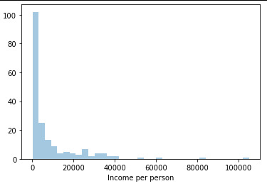
The graph is highly right skewed. Incomes are small for most of the world and the wealthy tail is quite long.
Univariate histogram for quantitative variable:
seaborn.distplot(data["employrate"].dropna(), kde=False); plt.xlabel('Employ rate')

Summary
It looks like there are associations between Internet use rate and income per person going up with internet use rate and going up an an accelerating rate.
0 notes
Text
Data Visualization in Python From Matplotlib to Seaborn
Data visualization is an Important aspect of data analysis and machine learning.You can give key insights into your data through different graphical representations. It helps in understanding the data, uncovering patterns, and communicating insights effectively. Python provides several powerful libraries for data visualization, graphing libraries, namely Matplotlib, Seaborn, Plotly, and Bokeh.
Data visualization is an easier way of presenting the data.It may sometimes seem easier to go through of data points and build insights but usually this process many not yield good result. Additionally, most of the data sets used in real life are too big to do any analysis manually.There could be a lot of things left undiscovered as a result of this process.. This is essentially where data visualization steps in.
However complex it is, to analyze trends and relationships amongst variables with the help of pictorial representation.
The Data Visualization advantages are as follows
Identifies data patterns even for larger data points
Highlights good and bad performing areas
Explores relationship between data points
Easier representation of compels data
Python Libraries
There are lot of Python librariers which could be used to build visualization like vispy,bokeh , matplotlib plotly seaborn cufflinks folium,pygal and networkx. On this many Matplotlib and seaborn very widely used for basic to intermediate level of visualization
Matplotlib is a library in Python being two of the most widely used Data visualization is a crucial part of data analysis and machine learning . That enables users to generate visualizations like scatter plots, histograms, pie charts, bar charts, and much more. It helps in understanding the data, uncovering patterns,and communicating insights effectively. Seaborn is a visualization that built on top of Matplotlib. It provides data visualizations that are more typically statistically and aesthetic sophisticated.
Matplotlib;- Matplotlib is a comprehensive library for creating animated, static, , and interactive visualizations in Python. It provides a lot of flexibility and control over the appearance of plots but can sometimes require a lot of code for simple tasks. Matplotlib makes easy things easy and hard things possible.
Basic Example with Matplotlib
Use a rich array of third-party packages build on Matplotli
Export to many file formats
Make interactive figures that can pan,zoom, update.
Embed in Graphical and jupyterLab User Interfaces
Crete public quality plots.
Seaborn;-Seaborn is a python data visualization built on top of Matplotlib . It provides a high-level interface for drawing attractive and informative statistical graphics. It is particularly well-suited for visualizing data from Pandas data frames
Basic Example with Seaborn
Advanced Visualizations
Plots for categorical data
Pairplot for Multivariate Analysis
Combining Matplotlib and Seaborn
Distributional representations
Both Matplotlib and Seaborn are powerful tools for data visualization in Python. Matplotlib provides fine-grained control over plot appearance, while Seaborn offers high-level functions for statistical plots and works seamlessly with Pandas data frames. Understanding how to use both libraries effectively can greatly enhance your ability to analyze and present data.
Can I use Matplotlib and seaborn together?
You can definitely use Matplotlib and Seaborn together in your data visualizations. Since Seaborn Provides an API on top of Matplotlib, you can combine the functionality of both libraries to create more complex and customized plots. Here’s how you can integrate Matplotlib with Seaborn to take advantage of both libraries' strengths.
0 notes
Text
Learn Data Science with Python

The Data Science with Python course empowers you to excel in Python programming. In this course, you'll delve into data science, data analysis, data visualization, data wrangling, feature engineering, and statistics. Upon finishing the course, you'll excel in using essential data science tools with Python.
Data science combines statistical analysis, programming skills, and domain expertise to extract insights and knowledge from data. It has become essential to various industries, from healthcare to finance, enabling organizations to make data-driven decisions.
One of the most common uses for Python is in its ability to create and manage data structures quickly — Pandas, for instance, offers a plethora of tools to manipulate, analyze, and even represent data structures and complex datasets.
Pandas. Pandas is one of the best libraries for Python, which is a free software library for data analysis and data handling. It was created as a community library project and was initially released around 2008.
Data science allows businesses to measure performance through data collection to make more educated decisions across the organization by using trends and empirical evidence to help them come up with solutions.
Data science helps businesses understand the market, develop new products, and make better decisions. It also enables the automation of routine tasks so employees can focus on important tasks requiring critical thinking. Many companies have already witnessed the power of data science. One such example is Netflix.
The Data Science with Python course empowers you to excel in Python programming. In this course, you'll delve into data science, data analysis, data visualization, data wrangling, feature engineering, and statistics. Upon finishing the course, you'll excel in using essential data science tools with Python.
Topics in Data Science from TCCI
Pandas
Numpy
Statsmodel
Histogram
Matplotlib
Etc.......
TCCI Computer classes provide the best training in online computer courses through different learning methods/media located in Bopal Ahmedabad and ISCON Ambli Road in Ahmedabad.
For More Information:
Call us @ +91 98256 18292
Visit us @ http://tccicomputercoaching.com
#Tcci computer coaching institute in Ahmedabad#Institute for the data science in bopal Ahmedabad#Computer class to learn data science in iskon amli Road Ahmedabad#Python Institute in bopal Ahmedabad
0 notes
Text
What is Data Science?
Data science has become one of the most influential fields in today's data-driven world. It encompasses a variety of techniques and tools aimed at extracting insights and knowledge from data. Whether you're considering a career in this dynamic field or just curious about what it entails, understanding the fundamentals of data science is crucial. This blog post will explore the definition, key components, essential skills, practical applications, and the importance of a structured data science course for those looking to dive into this exciting domain.
Definition of Data Science
Overview
Data science is an interdisciplinary field that combines statistical analysis, computer science, and domain expertise to analyze and interpret complex data sets. It involves several processes, including data collection, cleaning, exploration, and modeling, to uncover patterns and generate insights. These insights are used to make informed decisions and predictions in various sectors such as healthcare, finance, marketing, and more.
Historical Context
The evolution of data science can be traced back to the early days of statistics and computer science. With the advent of big data and advanced computational power, the field has grown exponentially. Today, data science is integral to the operations of many organizations, enabling them to harness the power of data to drive innovation and efficiency. A well-structured data science training typically covers the historical development of the field, providing context and understanding of its current relevance.
Key Components of Data Science
Data Collection and Cleaning
The first step in any data science project is data collection. This involves gathering data from various sources, such as databases, online repositories, and even real-time data streams. Once collected, the data must be cleaned to remove any inconsistencies, missing values, or errors. This step is crucial as the quality of data directly impacts the accuracy of the analysis. A data science certification will teach you various techniques and tools for efficient data collection and cleaning.
Exploratory Data Analysis (EDA)
Exploratory Data Analysis (EDA) is the process of analyzing data sets to summarize their main characteristics, often using visual methods. EDA helps in understanding the underlying patterns, anomalies, and relationships within the data. Techniques such as plotting graphs, histograms, and correlation matrices are commonly used. Learning EDA is a key part of any data science institute, as it provides the foundation for building robust analytical models.
Statistical Modeling
Statistical modeling involves applying mathematical models to the data to make predictions or infer relationships. Common techniques include regression analysis, hypothesis testing, and time-series analysis. A thorough understanding of these methods is essential for any data scientist. A data scientist course will delve into these statistical techniques, ensuring that students can apply them effectively in real-world scenarios.
Essential Skills for Data Scientists
Programming
Proficiency in programming is a fundamental skill for data scientists. Languages such as Python and R are widely used due to their powerful libraries and ease of use. Python, with libraries like Pandas, NumPy, and Scikit-learn, is particularly popular for data manipulation and machine learning. R is favored for its statistical capabilities and data visualization packages. A data scientist training typically includes extensive training in these programming languages.
Machine Learning
Machine learning is a subset of artificial intelligence that focuses on building systems that can learn from data and make predictions. It involves algorithms such as linear regression, decision trees, and neural networks. Machine learning is at the heart of many data science applications, from recommendation systems to fraud detection. A comprehensive data science course will cover the basics of machine learning, providing hands-on experience with popular frameworks like TensorFlow and PyTorch.
Data Visualization
Data visualization is the practice of representing data through graphical means. Effective visualization helps in communicating insights clearly and intuitively. Tools such as Matplotlib, Seaborn, and ggplot2 are commonly used to create various types of charts and graphs. Learning to visualize data effectively is a crucial skill covered in any data science course.
What is Features in Machine Learning
youtube
Practical Applications of Data Science
Business Intelligence
Data science plays a vital role in business intelligence, helping organizations make data-driven decisions. Techniques such as customer segmentation, sales forecasting, and market analysis enable companies to optimize their strategies and operations. By enrolling in a data scientist course, individuals can learn how to apply these techniques to real-world business problems.
Healthcare
In healthcare, data science is used for predictive analytics, patient care optimization, and medical research. For instance, predictive models can identify high-risk patients, allowing for early intervention and improved outcomes. A data science course often includes case studies and projects related to healthcare, demonstrating the field's impact on this critical sector.
Finance
The finance industry relies heavily on data science for risk management, fraud detection, and algorithmic trading. Data scientists develop models that analyze market trends, predict stock prices, and detect fraudulent transactions. A data science course provides the knowledge and skills needed to tackle these complex financial challenges.
What is Heteroscedasticity
youtube
Importance of a Data Science Course
Structured Learning
A data scientist training offers a structured learning path that covers all essential topics, from basic statistics and programming to advanced machine learning and data visualization. This structured approach ensures that learners build a solid foundation and progressively master more complex concepts.
Practical Experience
Hands-on projects and case studies are integral parts of a good data science course. These practical components allow learners to apply theoretical knowledge to real-world problems, enhancing their problem-solving skills and preparing them for the job market.
Career Advancement
Data science is a highly sought-after skill, and completing a data science course can significantly enhance your career prospects. Many courses also provide career support, including resume building, interview preparation, and job placement assistance, making it easier to transition into a data science role.
Conclusion
Data science is a multifaceted field that combines statistical analysis, programming, and domain expertise to extract valuable insights from data. Understanding its key components and essential skills is crucial for anyone looking to enter this field. Enrolling in a data scientist certification provides structured learning, practical experience, and career advancement opportunities, making it an excellent choice for aspiring data scientists. As the demand for data science continues to grow, now is the perfect time to start your journey in this exciting and impactful field.
0 notes