#plot histogram
Explore tagged Tumblr posts
Visit Tumblr Blog
Explore Tumblr blogs with no restrictions, modern design and the best experience.
Last Seen Tumblr Blogs


Fun Fact
Mobile Tumblr US users spend an average of 4.04 minutes per session on the app.
Text
Pandas Plot Histogram: Exploring Data Visualization in Python
In today’s data-driven world, effective data visualization is key to gaining insights and making informed decisions. One popular tool for data manipulation and visualization in Python is the Pandas library. In this article, we will delve into one specific aspect of data visualization: Pandas Plot Histogram. We’ll cover everything from the basics to advanced techniques, ensuring you have a…
View On WordPress
#Histograms#pandas histogram#pandas plot histogram tutorial#plot histogram#plotting multiple histogram
0 notes
Text
Making Sense - Flow Cytometry Charts
8 minutes In the realm of immunology and various biological disciplines, flow cytometry stands out as a formidable analytical instrument. It’s not just a tool; it’s a window into the microscopic world, revealing the intricacies of cells and particles like never before. Imagine having the ability to scrutinize thousands of cells in a blink of an eye, dissecting their physical and chemical makeup.…

View On WordPress
0 notes
Text
if you're ever on jstor or something browsing through research publications (as one does), you might come across a particularly striking data visualization and go "huh, that bar chart is using [insert pride flag] colors, but that's probably just a coincidence..."
my friend. take my hand. it is my joy and privilege to tell you that queer ppl in science and academia everywhere are 100% doing this on purpose. that IS a trans histogram. those ARE bi pride bell curves. that lesbian-colored scatter plot is the academic and scientific equivalent of wearing a pride pin on your work lanyard. peace and love on planet earth 🏳️🌈❤️
679 notes
·
View notes
Text
A guide to chromosomal variations
Over at Instagram Melly the Science Geek has published a mind blowing video about how chromosome decide (or do not the decide) the sex of a person.
The world is a a very complicated place, indeed.
And at this point we have not even begun to talk about gender identity.
The Science Vet on XX, XY and all the other variations
Melly's video reminds us of the very popular twitter thread made by the Science Vet back in 2018.
We take the liberty of republishing that thread here:
So. Hi new people! Apparently, we're gonna talk about sex. Like physical sex! Because... there's some confusion.
First, sex defined: We're talking physical sex here, not gender. Body parts, hormones, and genetics (and more).
BLUF: BIOLOGICAL sex is a spectrum
Ok, everyone's super familiar with the XX/XY dichotomy, right? Yeah, what we all learned in like... 4th grade? And that's great, it gives you a starting point. But it's... well it's only the very starting point.
The IDEA is, XX is girl, XY is boy, right?
Welllll... that's not totally right. There are XY people, who have ovaries! And give birth! AH! And XX people who have male bodies and functional sperm! Double AH!
These are usually written off as "abnormalities" and indeed, some cases have medical issues. But many don't (like the XY woman giving birth). And this is really only the very very tip of the iceberg of "wait, that doesn't fit into our M or F box unless we make it bigger"
There's a WHOLE HOST of things that can cause all sorts of "weird" things to happen, ranging from genetic (XXY, XYY, Y, X, XX with translocation, XY with deletion) to hormonal (Androgen Insensitivity, Estradiol failure), and disruptors like dioxins
So, you're a scientist, and you want to research stuff, right? Which means you have to categorize stuff. Without categories, data is hard! So you take allll these people, including the "weird" ones and you plot them on a graph. Logical!
You use all the differences there are, different genetics, different responses to hormones, different effectiveness in signalling pathways, different sizes in Aanteroventral periventricular nucleus (AVPV) (yeah that's a thing) and give everything numbers, add them up.
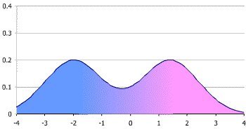
You get what's called a bimodal distribution (mostly, we'll get to that later) Which looks like this. Those two big peaks are what we call "male" and "female" (even conveniently colored pink for boys and blue for girls - we are using victorian gender colors right?)
/8
Now, when you're trying to look at data, we often group stuff. When we do that with a plot like this, it's called a "histogram." Basically we're breaking down a curved line into discrete "bins." Like this (image stolen from the web).
/9
Traditionally, we've used REALLY BIG bins for this when talking about sex. Basically you either group everything vaguely near a peak into the peak, or you just pretend there's nothing else but the biggest peaks. This makes it super easy, because 2 is simple to do data with.
However, as we've gotten to know more and more about signaling and brains and hormones and started to pay more attention to the outliers where standard stuff just didn't seem to work, we discovered that this isn't a great model to use.
Now I'm not talking feelings here. I'm talking about data. As you start to look at anything interesting, like say the effects of 2,3,7,8-Tetrachlorodibenzo-P-dioxin on animals, you start to realize that a 2 bin model doesn't predict your results well.
At first you say, "Well it was just weird." So you redo it, and it still doesn't work. So you look at your model and you say, "Well ok, what if the model's wrong?"
But the model sort of... almost predicts a lot of things, and it worked for years, so...
Some enterprising soul says, "Hey, remember that histogram where we said we'll just model using the peaks?" And everyone goes, "Uh, yeah?" And they say, "What if we... USED that data?" And everyone groans, because complicated data is hard.
But someone sits down and does the work, and lo, wow the model starts to work again. Where TCDD was "randomly" turning some boys into girls but then some girls into boys, now you can see there's a subgroup of what you'd called "female" that responds like the "male"
What's important here is that you haven't MISLABELED males as females. These are functional "females" who can do all the usual "female" things like gestate babies. But they respond to this one endocrine disruptor in a "male" way.
So you add another two categories, call them "Male2" and "Female2" and go on, happy that your model works! You've got 4 sexes now, but you don't really have to tell anyone that, right?
Exceeeept then you remember you've got those XY people that gestate babies. So you add "Intersex1" And then the XX people with penes... and ovaries? Ok, "Intersex2" because all these groups respond differently with signalling and brains when you get into the weeds
And the more you look, the more we LEARN, the more we're able to separate out those fine differences. Depending on what we're doing, we may not care. If a doc is giving you aspirin, it probably isn't a big deal.
But if they're using a steroid on you? Or treating dioxin poisoning? THAT SHIT COULD BE IMPORTANT. It's like saying, "the light's off so the power must not be flowing." It really matters if the light's off because the bulb blew.
If we go back to that histogram plot, we can keep breaking down your biological sex into smaller and smaller differences in brain areas, hormone levels, signalling differences, genetic variances. There's nothing stopping us from binning EVERY INDIVIDUAL into their own bin.
Technically, this wouldn't be "infinite sexes" but 7.4 billion sexes is functionally close for our brains. Now, our medicine isn't advanced enough for THAT level of detail to make any difference. BUT IT MIGHT BE in the future. Individualized medicine!
The thing to remember is that this isn't "new." We're not 'inventing sexes' here. Sex has ALWAYS been this curve. We were just using REALLY BIG bins. And now we're realizing that that's not representative of biology, it's inhibiting understanding of medicine and biology
In case anyone's curious, this isn't ideology. This is because I had to figure out why my data didn't match the prediction. Those rats I mentioned? Yeah, my lab. And lab rats are a really pure genetic monoculture, and they STILL don't fit the two peak model well.
So, since it's come up, an addendum!
Yes, we looked at other things we could do to make our data fit the existing model, that's how science works! The ONLY way the data fit was if we let "sex" be more than just those two narrow peaks.
Models purpose in science is to predict. If they don't predict correctly, first we check if we've measured the data correctly, and repeat the experiment a couple more times. If it still doesn't fit, we have to look at the model.
Intersex! Because I didn't specifically mention this.
"Intersex" is a grouping bin used for a lot of the "middle ground" of the spectrum between the "male" and "female" peaks. Any situation where easily assigning the person to one of those two peaks is challenging.
Intersex! Because I didn't specifically mention this above.
"Intersex" is a term used to collectively speak of the "middle ground" of biology where people can't easily be binned into those two big "male" and "female" peaks. It can include a large range of biology
It is worth noting that I never talk about transgender in this thread. Intersex is not the same as transgender. You can be one without the other, or be both.
For people who think this is just "outliers"
Current estimates are that the intersex population is at least 2%. We know that's low because there are a lot of "invisibly intersex" people. That means AT LEAST 150 million people in the world.
I apologize for the failure to use the word "intersex" higher up in the discussion. Many people in the middle ground (including the XY person who can carry a child, for example) use this term. I cannot go back and edit the thread, and apologize for my overly clinical description.
Part of the purpose of the thread, which may have failed, was to point out that "intersex" is not a condition, it is not a disease. It's natural with a bimodal distribution. Science not only supports this, it suggests that ignoring intersex people makes your conclusions wrong
References at the end of this page.
67 notes
·
View notes
Text
if you have a bunch of 2D points you can just plot them to get a sense of how they are distributed (a scatter plot), but that only shows you how x and y broadly relate to each other, it doesn't show you where the values are more dense as the points will simply overlap.
maybe you could do something where instead of plotting points you plot discs with a radius that overlap with opacity, or blobs / metaballs where the radius increases based on how many points are nearby?
because I think this gets even worse if you have a bunch of 1D points, single numeric values, as then you're compelled to bin them into a histogram and the exact choice of bins can create very different and occasionally misleading impressions of the distribution! don't like that
63 notes
·
View notes
Text
THE STARLINK INCIDENT IS NOT WHAT WE THOUGHT:
It never made sense. On Feb. 3rd, 2022, SpaceX launched a batch of 49 Starlinks to low-Earth orbit--something they had done many times before. This time was different, though. Almost immediately, dozens of the new satellites began to fall out of the sky.

Above: A Starlink satellite falls from the sky over Puerto Rico on Feb. 7, 2022. [video]
At the time, SpaceX offered this explanation: "Unfortunately, the satellites deployed on Thursday (Feb. 3rd) were significantly impacted by a geomagnetic storm on Friday, (Feb. 4th)." A more accurate statement might have read "...impacted by a very minor geomagnetic storm." The satellites flew into a storm that barely registered on NOAA scales: It was a G1, the weakest possible, unlikely to cause a mass decay of satellites. Something about "The Starlink Incident" was not adding up. Space scientists Scott McIntosh and Robert Leamon of Lynker Space, Inc., have a new and different idea: "The Terminator did it," says McIntosh. Not to be confused with the killer robot, McIntosh's Terminator is an event on the sun that helps explain the mysterious progression of solar cycles. Four centuries after Galileo discovered sunspots, researchers still cannot accurately predict the timing and strength of the sun's 11-year solar cycle. Even "11 years" isn't real; observed cycles vary from less than 9 years to more than 14 years long.
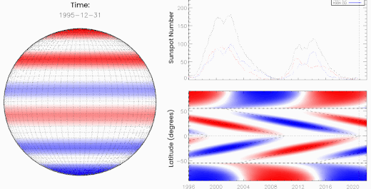
Above: Oppositely charged bands of magnetism march toward the sun's equator where they "terminate" one another, kickstarting the next solar cycle. [more]
McIntosh and Leamon realized that forecasters had been overlooking something. There is a moment that happens every 11 years or so when opposing magnetic fields from the sun's previous and upcoming solar cycles collide and cancel (see the animation, above). They called this moment, which signals the death of the old cycle, "The Termination Event."
After a Termination Event, the sun roars to life–"like a hot stove where someone suddenly turns the burner on," McIntosh likes to say. Solar ultraviolet radiation abruptly jumps to a higher level, heating the upper atmosphere and dramatically increasing aerodynamic drag on satellites.
This plot supports what McIntosh and Leamon are saying:

The histogram shows the number of objects falling out of Earth orbit each year since 1975. Vertical dashed lines mark Termination Events. There's an uptick in satellite decay around the time of every Terminator, none bigger than 2022.
As SpaceX was assembling the doomed Starlinks of Group 4-7 in early 2022, they had no idea that the Terminator Event had, in fact, just happened. Unwittingly, they launched the satellites into a radically altered near-space environment. "Some of our satellite partners said it was just pea soup up there," says Leamon.
SpaceX wasn't the only company hit hard. Capella Space also struggled in 2022 to keep its constellation of Synthetic Aperture Radar (SAR) satellites in orbit.
“The atmospheric density in low Earth orbit was 2 to 3 times more than expected,” wrote Capella Space's Scott Shambaugh in a paper entitled Doing Battle With the Sun. “This increase in drag threatened to prematurely de-orbit some of our spacecraft." Indeed, many did deorbit earlier than their 3-year design lifetimes.
The Terminator did it? It makes more sense than a minor storm.
7 notes
·
View notes
Text
Data Visualization: Transforming Data into Insight
In an technology wherein information is produced at an remarkable tempo, the ability to extract significant insights is extra vital than ever. Data visualization plays a vital function on this procedure, enabling individuals and corporations to understand complex statistics sets, pick out trends, and communicate findings effectively. By converting abstract numbers into intuitive visuals, information visualization bridges the gap among uncooked data and human cognition, turning complexity into readability.
Data Visualization In Research

The Importance of Data Visualization
Data visualization is the graphical illustration of information and facts. By the use of visible elements like charts, graphs, and maps, statistics visualization tools make it less difficult to see and understand styles, trends, and outliers in facts. Its importance lies in numerous key areas:
Improved Understanding: Visuals are processed 60,000 times faster than textual content by way of the human mind. Graphs and charts can screen insights that would pass omitted in spreadsheets.
Enhanced Communication: Well-crafted visualizations allow statistics to be shared in a manner that’s available to a broader audience, no longer simply records analysts or statisticians.
Data-Driven Decision Making: In enterprise, governments, and medical research, visualizations support selection-making via without a doubt showing the implications of various statistics tendencies.
Pattern and Anomaly Detection: They help users quick become aware of deviations, spikes, or drops in data, which could suggest possibilities or threats.
Types of Data Visualization
Data visualization encompasses a big selection of techniques, each applicable to precise types of records and analytical desires. Some of the most commonly used sorts include:
1. Bar Charts
Bar charts are best for comparing quantities throughout classes. They are simple however effective for displaying differences among agencies.
2. Line Graphs
Often used to music changes over time, line graphs display tendencies and fluctuations, making them a fave for time-series information.
3. Pie Charts
They’re satisfactory for simple, clear percent facts.
4. Histograms
Histograms display the distribution of a dataset, making them beneficial for understanding records spread, crucial tendency, and frequency.
5. Heat Maps
Heat maps use colour gradients to indicate value depth throughout two dimensions.
6. Scatter Plots
Scatter plots are used to pick out relationships between variables, often revealing correlations or clusters in facts.
7. Box Plots
Box plots show the distribution of a dataset thru its quartiles, highlighting medians, variability, and ability outliers.
8. Geospatial Maps
These visualizations display facts associated with geographic regions and are extensively utilized in demographic research, environmental tracking, and logistics.
9. Dashboards
Dashboards integrate multiple visualizations into one interface, supplying a actual-time assessment of key metrics and overall performance signs.
Tools for Data Visualization
A huge range of tools is to be had for growing effective statistics visualizations. Popular alternatives encompass:
Tableau: A leading platform for interactive, shareable dashboards with drag-and-drop functions.
Power BI: Microsoft's enterprise analytics tool with sturdy integration into the Office atmosphere.
Google Data Studio: A unfastened tool for developing customizable reports the use of Google records sources.
Ggplot2: A effective R package for constructing state-of-the-art plots the use of the grammar of snap shots.
Each device gives distinctive competencies depending at the user’s technical information, information complexity, and desired results.
Best Practices in Data Visualization
Creating effective facts visualizations requires more than just technical skill. It includes an information of design ideas, cognitive psychology, and storytelling. Here are key exceptional practices:
1. Know Your Audience
Tailor the visualization to the information stage and pursuits of your target market. What a statistics scientist unearths intuitive is probably complicated to a business executive.
2. Choose the Right Chart
Using an inappropriate chart kind can deceive or confuse the viewer. For instance, a line chart ought to not be used for specific information.
Three. Simplify and Clarify
Avoid muddle. Focus on essential statistics and put off unnecessary elements like immoderate gridlines, decorative snap shots, or redundant labels.
Four. Use Color Thoughtfully
Color can enhance know-how but additionally lie to if used improperly. Stick to a consistent color scheme and use contrasts to highlight key points.
5. Tell a Story
Effective facts visualizations guide the viewer through a story. Highlight tendencies, anomalies, or correlations that support your message.
6. Maintain Integrity
Never manipulate axes or distort scales to magnify findings. Ethical visualization ensures accurate illustration of statistics.
Real-World Applications
Data visualization is applied in nearly each region, transforming industries through stepped forward insight and communication.
1. Business Analytics
In commercial enterprise, visualization tools assist in monitoring sales, client behavior, supply chain efficiency, and extra.
2. Healthcare
In medicinal drug and public health, visualizations are crucial for tracking disorder outbreaks, affected person records, and treatment results. For example, COVID-19 dashboards performed a main function in information the pandemic's unfold.
3. Finance
Financial analysts use records visualization to recognize market tendencies, examine investment overall performance, and check chance.
Four. Education
Educators and researchers use visualization to track pupil performance, perceive mastering gaps, and gift studies findings.
Five. Government and Policy
Policymakers use visible facts to understand social trends, aid allocation, and financial overall performance.
6. Journalism
Data journalism is growing hastily. Visual stories on topics like weather change, election results, or social inequality use charts and infographics to inform and engage readers.
Challenges and Limitations
Despite its electricity, facts visualization isn't with out demanding situations:
Data Quality: Inaccurate or incomplete information can lead to deceptive visuals.
Over-Simplification: Trying to make information too easy can lead to lack of nuance or important info.
Misinterpretation: Poor design selections or biased displays can cause audiences to draw wrong conclusions.
Tool Limitations: Not all equipment aid the extent of customization or interactivity wished for unique projects.
Overcoming these demanding situations requires a mix of technical talent, area information, and moral responsibility.
The Future of Data Visualization
The future of statistics visualization is increasingly interactive, actual-time, and AI-assisted. Emerging traits include:
Augmented and Virtual Reality (AR/VR): Immersive visualizations permit users to explore records in three-dimensional environments.
Machine Learning Integration: Algorithms can now endorse or even vehicle-generate visualizations based on the information furnished.
Collaborative Platforms: Teams can now work collectively in actual time on visualization dashboards, improving communique and agility.
These advancements will hold to make records greater accessible and insightful throughout all domain names.
Difference Between Augmented Reality (AR) and Virtual Reality (VR)
What Is Data Analysis In Research
2 notes
·
View notes
Text
Python Libraries to Learn Before Tackling Data Analysis
To tackle data analysis effectively in Python, it's crucial to become familiar with several libraries that streamline the process of data manipulation, exploration, and visualization. Here's a breakdown of the essential libraries:
1. NumPy
- Purpose: Numerical computing.
- Why Learn It: NumPy provides support for large multi-dimensional arrays and matrices, along with a collection of mathematical functions to operate on these arrays efficiently.
- Key Features:
- Fast array processing.
- Mathematical operations on arrays (e.g., sum, mean, standard deviation).
- Linear algebra operations.
2. Pandas
- Purpose: Data manipulation and analysis.
- Why Learn It: Pandas offers data structures like DataFrames, making it easier to handle and analyze structured data.
- Key Features:
- Reading/writing data from CSV, Excel, SQL databases, and more.
- Handling missing data.
- Powerful group-by operations.
- Data filtering and transformation.
3. Matplotlib
- Purpose: Data visualization.
- Why Learn It: Matplotlib is one of the most widely used plotting libraries in Python, allowing for a wide range of static, animated, and interactive plots.
- Key Features:
- Line plots, bar charts, histograms, scatter plots.
- Customizable charts (labels, colors, legends).
- Integration with Pandas for quick plotting.
4. Seaborn
- Purpose: Statistical data visualization.
- Why Learn It: Built on top of Matplotlib, Seaborn simplifies the creation of attractive and informative statistical graphics.
- Key Features:
- High-level interface for drawing attractive statistical graphics.
- Easier to use for complex visualizations like heatmaps, pair plots, etc.
- Visualizations based on categorical data.
5. SciPy
- Purpose: Scientific and technical computing.
- Why Learn It: SciPy builds on NumPy and provides additional functionality for complex mathematical operations and scientific computing.
- Key Features:
- Optimized algorithms for numerical integration, optimization, and more.
- Statistics, signal processing, and linear algebra modules.
6. Scikit-learn
- Purpose: Machine learning and statistical modeling.
- Why Learn It: Scikit-learn provides simple and efficient tools for data mining, analysis, and machine learning.
- Key Features:
- Classification, regression, and clustering algorithms.
- Dimensionality reduction, model selection, and preprocessing utilities.
7. Statsmodels
- Purpose: Statistical analysis.
- Why Learn It: Statsmodels allows users to explore data, estimate statistical models, and perform tests.
- Key Features:
- Linear regression, logistic regression, time series analysis.
- Statistical tests and models for descriptive statistics.
8. Plotly
- Purpose: Interactive data visualization.
- Why Learn It: Plotly allows for the creation of interactive and web-based visualizations, making it ideal for dashboards and presentations.
- Key Features:
- Interactive plots like scatter, line, bar, and 3D plots.
- Easy integration with web frameworks.
- Dashboards and web applications with Dash.
9. TensorFlow/PyTorch (Optional)
- Purpose: Machine learning and deep learning.
- Why Learn It: If your data analysis involves machine learning, these libraries will help in building, training, and deploying deep learning models.
- Key Features:
- Tensor processing and automatic differentiation.
- Building neural networks.
10. Dask (Optional)
- Purpose: Parallel computing for data analysis.
- Why Learn It: Dask enables scalable data manipulation by parallelizing Pandas operations, making it ideal for big datasets.
- Key Features:
- Works with NumPy, Pandas, and Scikit-learn.
- Handles large data and parallel computations easily.
Focusing on NumPy, Pandas, Matplotlib, and Seaborn will set a strong foundation for basic data analysis.
6 notes
·
View notes
Text
More work whining under the cut.
@anything-thats-rock-and-roll this is basically in response to your comment because It Got Worse.
I had my usual weekly meeting with my fourth year honours student… this morning she tried to delay it to tomorrow and I said no. It's just an update, a chance to discuss progress and I am not sure I'm coming into the office tomorrow.
So she turned up today and said she'd graphed up the data I'd been asking for for a few weeks but that it was on a lab computer and it was still running. i asked what that meant... she could not explain it. So I sent her off to email the graphs to me or take photos, or something.
20 minutes of my life later she's sent me the graphs. Six of them. No labels and she can't actually explain them to me anyway. We do circle work for half an hour as I slowly try to work out what she's showing me (mind you there's no statistics, they are just a bunch of histograms).
She cannot explain what binning she's used or how she's nomalised the data (oh, i right click and select normalise...) and then she tries to tell me she's using a 0.1 bin size except I can clearly see over fifty bars between 0 and 1 (I later realize she's plotting multiple data sets on the one axis and is indeed using 0.1).
So I ask: How many times does 0.1 go into 1.
She says she doesn't know, I tell her to take her time, and she eventually guesses 100. And now an hour later I am still not convinced she understands why that's wrong. And certainly not why I want to stick my head underwater and scream.
A fourth year biotech student who is meant to be doing research. And yes, clearly the system is failing but also, I can see that she isn't actually going to go off and read the wiki articles on histograms and continuous/discrete data I just linked her. She'll just wait for another conversation with me to not know things and wait for me to provide an answer.
3 notes
·
View notes
Text
A new paper published October 26th discusses NO’s potential in ameliorating SARS-CoV-2/Spike associated inflammation and thrombosis. One from 2005 shows we already knew some of this.
Walter M Chesnut
Nov 22, 2024
DETA-NO inhibits the binding of the recombinant Gamma variant of SARS-CoV-2 spike to A549-ACE2 cells. (A) Cells (5 × 10⁵) were incubated with 2 mM DETA-NO for 15 min, followed by incubation with the indicated concentrations of spike and DETA-NO for another 45 min. The viability was determined by DAPI staining. (B,C) The dose-dependent binding of the Gamma variant of the spike to A549-ACE2 cells was determined by flow cytometry. The results are shown as mean FITC (B) or percentage of binding inhibition (C). (D) Representative histogram plots of the fluorescence of the spike protein bound to the A549-ACE2 cells. The results show the mean ± S.D. of 4 independent experiments (B,C); * p < 0.05 vs. the control condition. ns: not significant.
As we have discussed many times in this Substack, it would appear that preventing the Spike from entering cells and ameliorating inflammation caused by the SARS-CoV-2 virus are paramount in protecting not only one’s organs but also one’s very own genetic code. To that end, I have continuously searched for natural therapies which may assist us. Nature has yet another weapon to add to our prodigious arsenal against this virus and its malevolent protein: Nitric Oxide.
First and foremost, Nitric Oxide is a guardian of the Endothelium.
The vascular endothelium is a monolayer of cells between the vessel lumen and the vascular smooth muscle cells. Nitric oxide (NO) is a soluble gas continuously synthesized from the amino acid L-arginine in endothelial cells by the constitutive calcium-calmodulin-dependent enzyme nitric oxide synthase (NOS). This substance has a wide range of biological properties that maintain vascular homeostasis, including modulation of vascular dilator tone, regulation of local cell growth, and protection of the vessel from injurious consequences of platelets and cells circulating in blood, playing in this way a crucial role in the normal endothelial function.
2 notes
·
View notes
Text
In the subject of data analytics, this is the most important concept that everyone needs to understand. The capacity to draw insightful conclusions from data is a highly sought-after talent in today's data-driven environment. In this process, data analytics is essential because it gives businesses the competitive edge by enabling them to find hidden patterns, make informed decisions, and acquire insight. This thorough guide will take you step-by-step through the fundamentals of data analytics, whether you're a business professional trying to improve your decision-making or a data enthusiast eager to explore the world of analytics.
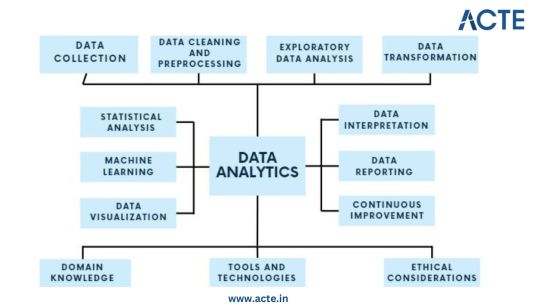
Step 1: Data Collection - Building the Foundation
Identify Data Sources: Begin by pinpointing the relevant sources of data, which could include databases, surveys, web scraping, or IoT devices, aligning them with your analysis objectives. Define Clear Objectives: Clearly articulate the goals and objectives of your analysis to ensure that the collected data serves a specific purpose. Include Structured and Unstructured Data: Collect both structured data, such as databases and spreadsheets, and unstructured data like text documents or images to gain a comprehensive view. Establish Data Collection Protocols: Develop protocols and procedures for data collection to maintain consistency and reliability. Ensure Data Quality and Integrity: Implement measures to ensure the quality and integrity of your data throughout the collection process.
Step 2: Data Cleaning and Preprocessing - Purifying the Raw Material
Handle Missing Values: Address missing data through techniques like imputation to ensure your dataset is complete. Remove Duplicates: Identify and eliminate duplicate entries to maintain data accuracy. Address Outliers: Detect and manage outliers using statistical methods to prevent them from skewing your analysis. Standardize and Normalize Data: Bring data to a common scale, making it easier to compare and analyze. Ensure Data Integrity: Ensure that data remains accurate and consistent during the cleaning and preprocessing phase.
Step 3: Exploratory Data Analysis (EDA) - Understanding the Data
Visualize Data with Histograms, Scatter Plots, etc.: Use visualization tools like histograms, scatter plots, and box plots to gain insights into data distributions and patterns. Calculate Summary Statistics: Compute summary statistics such as means, medians, and standard deviations to understand central tendencies. Identify Patterns and Trends: Uncover underlying patterns, trends, or anomalies that can inform subsequent analysis. Explore Relationships Between Variables: Investigate correlations and dependencies between variables to inform hypothesis testing. Guide Subsequent Analysis Steps: The insights gained from EDA serve as a foundation for guiding the remainder of your analytical journey.
Step 4: Data Transformation - Shaping the Data for Analysis
Aggregate Data (e.g., Averages, Sums): Aggregate data points to create higher-level summaries, such as calculating averages or sums. Create New Features: Generate new features or variables that provide additional context or insights. Encode Categorical Variables: Convert categorical variables into numerical representations to make them compatible with analytical techniques. Maintain Data Relevance: Ensure that data transformations align with your analysis objectives and domain knowledge.
Step 5: Statistical Analysis - Quantifying Relationships
Hypothesis Testing: Conduct hypothesis tests to determine the significance of relationships or differences within the data. Correlation Analysis: Measure correlations between variables to identify how they are related. Regression Analysis: Apply regression techniques to model and predict relationships between variables. Descriptive Statistics: Employ descriptive statistics to summarize data and provide context for your analysis. Inferential Statistics: Make inferences about populations based on sample data to draw meaningful conclusions.
Step 6: Machine Learning - Predictive Analytics
Algorithm Selection: Choose suitable machine learning algorithms based on your analysis goals and data characteristics. Model Training: Train machine learning models using historical data to learn patterns. Validation and Testing: Evaluate model performance using validation and testing datasets to ensure reliability. Prediction and Classification: Apply trained models to make predictions or classify new data. Model Interpretation: Understand and interpret machine learning model outputs to extract insights.
Step 7: Data Visualization - Communicating Insights
Chart and Graph Creation: Create various types of charts, graphs, and visualizations to represent data effectively. Dashboard Development: Build interactive dashboards to provide stakeholders with dynamic views of insights. Visual Storytelling: Use data visualization to tell a compelling and coherent story that communicates findings clearly. Audience Consideration: Tailor visualizations to suit the needs of both technical and non-technical stakeholders. Enhance Decision-Making: Visualization aids decision-makers in understanding complex data and making informed choices.
Step 8: Data Interpretation - Drawing Conclusions and Recommendations
Recommendations: Provide actionable recommendations based on your conclusions and their implications. Stakeholder Communication: Communicate analysis results effectively to decision-makers and stakeholders. Domain Expertise: Apply domain knowledge to ensure that conclusions align with the context of the problem.
Step 9: Continuous Improvement - The Iterative Process
Monitoring Outcomes: Continuously monitor the real-world outcomes of your decisions and predictions. Model Refinement: Adapt and refine models based on new data and changing circumstances. Iterative Analysis: Embrace an iterative approach to data analysis to maintain relevance and effectiveness. Feedback Loop: Incorporate feedback from stakeholders and users to improve analytical processes and models.
Step 10: Ethical Considerations - Data Integrity and Responsibility
Data Privacy: Ensure that data handling respects individuals' privacy rights and complies with data protection regulations. Bias Detection and Mitigation: Identify and mitigate bias in data and algorithms to ensure fairness. Fairness: Strive for fairness and equitable outcomes in decision-making processes influenced by data. Ethical Guidelines: Adhere to ethical and legal guidelines in all aspects of data analytics to maintain trust and credibility.

Data analytics is an exciting and profitable field that enables people and companies to use data to make wise decisions. You'll be prepared to start your data analytics journey by understanding the fundamentals described in this guide. To become a skilled data analyst, keep in mind that practice and ongoing learning are essential. If you need help implementing data analytics in your organization or if you want to learn more, you should consult professionals or sign up for specialized courses. The ACTE Institute offers comprehensive data analytics training courses that can provide you the knowledge and skills necessary to excel in this field, along with job placement and certification. So put on your work boots, investigate the resources, and begin transforming.
24 notes
·
View notes
Text
🌟 Hey crew! 🌟
📊 Here are some ideas and suggestions to report your data in multiple, meaningful ways:
Bar Graph: Showcase your data comparisons with stylish bar graphs. They're perfect for highlighting differences between groups or categories in a visually appealing way.
Pie Chart: Slice up your data and serve it in a pie chart! It's great for illustrating proportions and percentages, making complex data easy to digest.
Line Graph: Track trends over time with sleek line graphs. Perfect for showing changes or patterns in your data with a cool, dynamic vibe.
Scatter Plot: Scatter plots are your go-to for exploring relationships between variables. They're super versatile and can uncover hidden correlations like a data detective!
Histogram : Dive into the distribution of your data with histograms. They're awesome for visualizing frequency distributions and spotting trends at a glance.
Infographic: Get creative and craft an infographic masterpiece! Combine charts, graphs, and visuals to tell a captivating data story that'll leave your audience in awe.
💡✨ Don't forget to reblog and spread the graphing goodness! 🚀 #writ318mu #week10
3 notes
·
View notes
Note
Hey, do you have ideas on how one could discover the statistical laws of nature in D&D as an in game character? The 5% chance of failure for any attack seems rather trivial, but what about the rest of the distribution?
I haven't played D&D so I can't confidently answer, as I don't know what the in-game characters know. But I think the key comes down to being able to know the numerical (and in particular, integral) nature of D&D. Suppose an attack deals 2d6+2 damage. This follows a triangular distribution, which is easy to recognize. If you can figure out how much damage an attack does, you can record that number, repeat 100 times, plot a basic histogram, and you'll probably correctly guess the distribution.
But, you need to figure out how much damage an attack does. This is helped greatly by the fact that D&D (to my knowledge) only uses integers. You should hopefully be able to find something that deals or heals a consistent amount of damage/health, and it seems to be the minimum possible. That will be 1. (From a quick look at the wiki, the 5e blowgun looks like a good candidate). From there, you can build up chains by seeing how many of one thing equals another. This process will be helped a lot if you know when you're fully healed, and if you can use items or spells which aren't random. I imagine that if you've lived a life in this world those are things you should have decent intuition of, but I don't know for sure.
3 notes
·
View notes
Text
The Significance of Exploratory Data Analysis (EDA) in the Data Analysis Workflow
In the ever-expanding realm of data science, Exploratory Data Analysis (EDA) stands as a cornerstone in the data analysis workflow. It is the preliminary step that sets the stage for more complex analyses, helping analysts and data scientists unravel the mysteries hidden within datasets. In this article, we will delve into the significance of EDA and how it plays a pivotal role in understanding, cleaning, and preparing data for further analysis.
Introduction to Exploratory Data Analysis (EDA)
Exploratory Data Analysis is the process of visually and statistically summarizing, interpreting, and understanding the main characteristics of a dataset. It involves techniques that allow analysts to gain insights into the data's distribution, relationships, and patterns, aiding in the formulation of hypotheses and guiding subsequent analysis.
Data Quality Assessment
One of the primary functions of EDA is to assess the quality of the data. Analysts scrutinize the dataset for missing values, outliers, and inconsistencies. Identifying and addressing these issues early in the analysis process is crucial, as they can significantly impact the accuracy and reliability of subsequent analyses.
Identification of Patterns and Trends
EDA provides a lens through which analysts can identify patterns and trends within the data. Visualizations such as scatter plots, line charts, and histograms offer a comprehensive view of the data distribution and can reveal underlying structures that might not be immediately apparent. Recognizing these patterns can guide the formulation of hypotheses and influence the choice of analytical techniques.
Variable Relationships and Correlation
Understanding the relationships between variables is essential in many analyses. EDA tools enable analysts to explore the correlation between different variables, helping to uncover dependencies and interactions. This insight is invaluable when designing predictive models or making data-driven decisions based on correlated factors.
Outlier Detection and Handling
Outliers, data points significantly different from the rest, can distort analysis results. EDA helps identify outliers, enabling analysts to decide whether to exclude, transform, or investigate these data points further. Addressing outliers at the EDA stage ensures a cleaner dataset for subsequent analyses.
Feature Engineering Guidance
Feature engineering involves transforming raw data into a format suitable for machine learning models. EDA aids in the identification of relevant features and potential transformations. By understanding the distribution and characteristics of variables, analysts can make informed decisions about which features to include, exclude, or engineer for optimal model performance.
Data Visualization for Communication
EDA often involves creating visualizations that not only assist in understanding the data but also serve as powerful communication tools. Visual representations make it easier to convey complex information to stakeholders, facilitating better decision-making. From bar charts to heatmaps, the variety of visualizations generated during EDA enhances the interpretability of the data.
Hypothesis Generation and Testing
EDA serves as a fertile ground for hypothesis generation. Analysts, armed with a deeper understanding of the data, can formulate hypotheses about relationships and trends. Subsequent statistical tests can then be conducted to validate or refute these hypotheses, guiding the direction of more advanced analyses.
Enhancing Model Selection
The insights gained from EDA play a pivotal role in selecting the most appropriate modeling techniques. By understanding the distribution of the target variable and the relationships between features, analysts can make informed decisions about which models are likely to perform well on the given dataset. This ensures that computational resources are allocated efficiently, leading to more accurate and interpretable models.
Time and Resource Efficiency
Lastly, EDA contributes to time and resource efficiency in the data analysis workflow. By thoroughly exploring and understanding the dataset upfront, analysts can avoid unnecessary detours and focus on the most promising avenues of analysis. This iterative and interactive process helps streamline the overall analysis, making the entire workflow more efficient and effective.
Conclusion
Exploratory Data Analysis is not merely a preliminary step in the data analysis workflow; it is a fundamental and integral part of the entire process. From ensuring data quality to guiding feature engineering and model selection, EDA serves as the compass that steers analysts through the intricate landscape of data. Embracing the significance of EDA not only facilitates a deeper understanding of the data but also sets the stage for more robust, accurate, and actionable insights in the dynamic field of data science.
2 notes
·
View notes
Text
put in the tags/explain why if you feel like
personally I love me a good box plot
#why do i ask? i am doing statistics homework and i am half concious#was listening to this video and the guy said box plot and my barely awake brain was like “HECK YEAGH BOXPLOT”#and now amn curious#polls#tumblr polls#charts#graphs#uhhhh what else can i tag this#statistics#i guess right i mean i am doing statistics stuff#im so tired yall#giga posts
4 notes
·
View notes
Text
Statistics: Display and Shape


1 Categorical Variable: Class Make-up

Comparative Bar Charts
allows us to look at multiple groups of one categorical variable
can be a stacked bar graph or a clustered bar graph
One Quantitative Variable
A. Examining Quantitative Data
distribution = tells all possible values of a variable and how frequently they occur
Summarize distribution of a quantitative variable by telling shape, center, and spread.
Shape = tells which values tend to be more or less common.
Center = measure of what is typical in the distribution of quantitative variable.
Spread = measure of how much the distribution's values vary
B. Displays
Stemplot - advantage: most detail - disadvantage: impractical for large datasets
Histogram - advantage: works well for any size dataset - disadvantage: some detail lost
Dotplot - advantage: can show outliers - disadvantage: much detail lost

Stem Plot
quantitative data
combines the characteristics of a table and a graph
general steps: (1) Separate each observation into a stem (first part of number) and a leaf (remaining part of number) (2) Write the stems in a vertical column; draw a vertical line to the right of the stems. (3) Write each leaf in the row to the right of its stem; order leaves if desired.
Stem: 10's digit
Lead: 1's digit
5 I 3 = 53
Constructing Stem Plots


Comparative Stem Charts
used for comparison of two groups of 1 quantitative variable - ex. Compare exam scores from two classes.


Dot Plots
used for 1 quantitative variable
similar to a stem + leaf plot; each dot represents one value
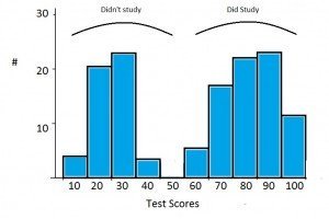
Ex. An instructor has obtained the set of N=25 exam scores: 82, 75, 88, 93, 53, 84, 87, 58, 72, 94, 69, 84, 61, 91, 64, 87, 84, 70, 76, 89, 75, 80, 73, 78, 60

Histograms
Show possible values of a quantitative variable along the horizontal axis, with vertical bars showing the count, percentage, or proportion of values in certain interval ranges.
shows quantitative data ONLY
display of a grouped frequency distribution
adjacent bars touch each other
Divide the possible values into class intervals (equal width). - How many intervals? One rule is to calculate the square root of the sample size and round up. - Size of intervals? Divide range of data (max-min) by number of intervals desired and round up. - Pick intervals so each observation can only fall in exactly one interval (no overlap). maximum-minimum/number of intervals
Count how many observations fall in each interval (may change to proportion or percentages).
Draw representation distribution.
Ex. An instructor has obtained the set of N=25 exam scores:
82, 75, 88, 93, 53, 84, 87, 58, 72, 94, 69, 84, 61, 91, 64, 87, 84, 70, 76, 89, 75, 80, 73, 78, 60


Grouped frequency distribution histogram vs. stem plot.
The stem plot is placed on its side to demonstrate that the display gives the same information provided in the histogram.
Scatterplots
Used for displaying the relationship between two quantitative variables.
Ex. Compare students' exam 1 vs exam 2 scores.


Interpreting Histograms
When describing the distribution of a quantitative (interval or ratio) variable, we look for the overall pattern and for striking deviations from that pattern. We can describe the overall pattern of a histogram by its shape, center (central tendency) and spread (variability).

Shape of Distribution
A symmetric distribution has a balanced shape, showing that it is just as likely for the variable to take lower values as higher values.

A skewed distribution is lopsided:
skewed left: few values that are relatively low compared to the bulk of the data
skewed right: few values that are relatively high compared to the bulk of the data values


Outliers
Extreme values that fall outside the overall pattern.
may occur naturally
may occur due to error in recording
may occur due to measurement error
observational unit may be fundamentally different
After identifying potential outliers, investigate why they obtain unusual values.

More Specific Shapes
unimodal distribution: has one peak
bimodal distribution: has two peaks
uniform distribution: has no peaks, showing that all possible values are equally common
normal distribution: symmetric, unimodal, "bell-shaped" or "mound-shaped" pattern
2 notes
·
View notes