#pixelr
Text

daily 2 • mushroom menagerie
#pixel illustration#pixel animation#pixel aesthetic#pixel art#pixels#pixelr#moth#moth art#mushroom#fairy#forest#full moon#gif
26 notes
·
View notes
Video

flickr
# Mili # 6366 por Mili Miklos
Via Flickr:
Blog: Mili Miklos SL Blog (sponsors ads in comments) ✨ Casual chic vibes with a touch of glam ✨ Check out my latest look featuring LeLUTKA Briannon head, UnorthodoxScalpz hairbase, and a fab Neve outfit! Full deets on the blog—click to read more! ■ Hairbase applier❤Unorthodox Scalpz- Alona Hairbase ■ Hairbase❤Unorthodox Scalpz UNITS v2.4 ■ Mesh Head❤LeLUTKA Briannon Head 4.0 ■ Face applier❤[theSkinnery] Kissa (LeLutkaEVOX) ebony ■ Top❤neve - annie top @ Fameshed ■ Bottom❤neve - oakley skirt @ Fameshed ■ Glass❤MONA - Appetizer Glass @ Cakeday .......... Facebook Twitter Instagram PrimFeed PixelVR PixelR AQConnect AQTwine
▀▀▀▀▀▀▀▀▀▀▀▀▀▀▀▀▀▀▀▀▀
Inventory Mess Blog - New Post!
▀▀▀▀▀▀▀▀▀▀▀▀▀▀▀▀▀▀▀▀▀
https://www.flickr.com/photos/milimiklos/53927368426/in/dateposted/
https://milimiklossl.wordpress.com/2024/08/16/mili-6366/
https://www.primfeed.com/mili.miklos/posts/de18980e-f3a6-4cb3-a005-988d4565e14c
#Lelutka#[theSkinnery]#MONA#Cakeday#neve#Fameshed#Unorthodox#spam#advertising#fashion#sexy#blog#blogger#secondlife#sl#new#release#fashionblogger#SecondLifefashion#LeLUTKAhead#neveoutfit#CakedaySL#virtualstyle#SLlook#SecondLifecommunity#SLphotography#flickr
2 notes
·
View notes
Text
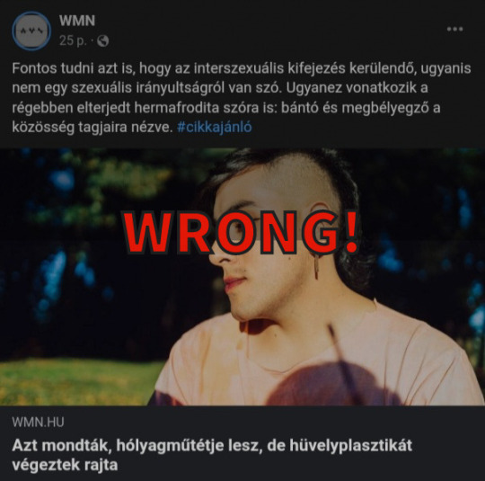
Csak tükröt mutatok hogyan teszitek tönkre ti magatok szépen és lassan a WMN-t...
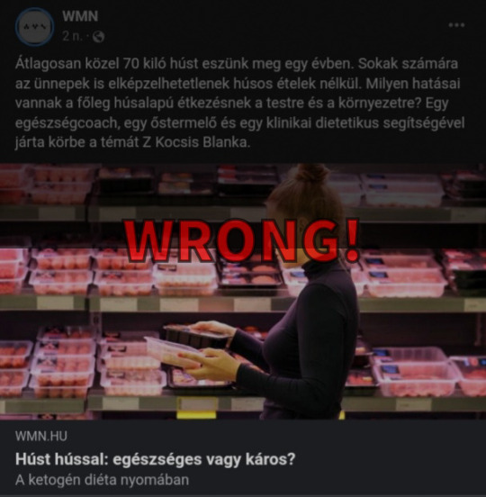
Amikor az interszexuálist kirúzsozott bizarr Punk-nak mutatjátok gúnyolódva, miközben bármennyire nem az eseteim, vagy legalábbis nem mindegyik tetszik, és nem úgy gondolok rájuk, azért ennyire undormányoknak még én sem látom őket. Tőletek pedig pláne nem gondolná az ember mennyire bunkók vagytok... Vagy amikor az ostoba illusztrátor a KetoDiétát sztereotipizálva, a húspultnál kóválygó könyvtárosnak öltözött nővel ábrázolja, miközben EZ AZ ÉTRENDJE A LEGTÖBB TESTÉPÍTŐNEK! Egészséges! Vagy amikor a digitális biztonságról szóló cikket, egy pixelre szétfolyt szemű nővel ábrázoljátok... WTF? Mi köze van ennek a beteg képnek a cikkhez? 🤔🤨 Segítek, SEMMI!
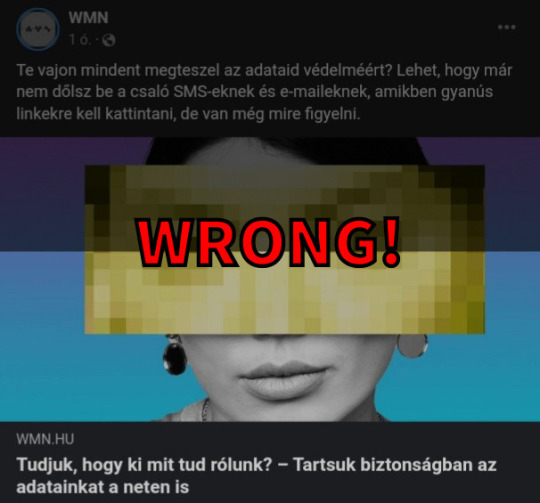
Aki ezeket a képeket válogatja, 100% boldogtalan, súlyosan depressziós, és egy szégyen felhő adta logikával gondolkozik. Borzalmas.
Velem is ha nem gúnyolódtok sunnyogva, akkor megaláztok, mintha én tehetnék arról, amilyenek vagytok.
Ömlik már a depresszió tőletek, és ez egyre rosszabb. Régen hetente egyszer, vagy kétszer volt ilyen téma feldobva, ma naponta ötször!
Amúgy a szponzor kért arra titeket, hogy legyetek undormány liberálisok, taszítóak, egy gyűlölni való oldal?
+
Ezt az adatot BOT generálja, nem pedig ember! Mert nincsen olyan, aki 1 másodpercre kattint! https://www.similarweb.com/website/wmn.hu/#overview
NINCSEN már olyan nagy olvasottsága A WMN-nek! 💯
.
0 notes
Video
youtube
Cinematic Presets | Lightroom Cinematic street Preset (Moody Tone) LR ED...
1 note
·
View note
Text
A múlt héten meg lettem alázva, de nagyon
részletek később
Egy abszolút kezdő kolléga szembesült a következő porblémával: van egy honlap, amin mindenféle adatokat egy olyan logika számol, amit a nem együttműködő ügyfél nem osztott meg velünk (valszeg ő sem éri el!), nekünk tehát nekünk az összes bemenő adat alapján kell reprezentálnunk a kimenő adatokat az ismeretlen logika alapján.
A csávó úgy oldotta meg a dolgot, és én mondtam, hogy ez NEM MŰKÖDHET, szóval, egy AutoHotkey-alapú cuccal automatikusan végigklikkelte az oldalt, minden állapotról automatikusan print screent csinált, és most figyelj, egy C#-os kódban automatikusan kivágta a megfelelő számot, és bitmap-bitmap matcheléssel gyakorlatilag csinált egy 200 soros OCR-programot, felismertette a számjegyeket, és kiírta egy CSV-be. (Könnyítés: minden szám ugyanolyan szín, méret és betűtípus. A karakter-reprezentációk ilyen 0-1 két dimenziós tömbökként voltak beírva, pixelről pixelre.)
Egy nap alatt végzett az egész cuccal.
Én beutifulsoup-pal néztem rá, de mivel szanaszét volt javascriptelve, nem tudtam vele mit kezdeni.
Érted, ennél sokkal-sokkal egyszerűbb dolgokkal is be tudok ragadni egy hétre, ha nem többre, erre itt ilyen advanced topikokat csinálnak faék toolokkal. Ráadásul AutoHotkey-jel, az az én territóriumom, mindjárt körbe is vizelem.
Jellemző a kezdőségre, hogy a C#-os kódot úgy futtatta a faszi automatikusan, hogy csinált neki GUI-t, gondolom, valamilyen vizuális eszközzel, és az AutoHotkey script nyomogatta a gombokat, szintén automatice.
PS Ide is beteszem, ne érjen az a vád, hogy nóthajhász.
63 notes
·
View notes
Text
IM CRYING LOOKING AT PIXELR EMASTER ZEROMUS HES SO PATHETIC WHO IS THIS GUYYYYYYYYYYYYYY
4 notes
·
View notes
Photo
Pixelated Inktober - Overgrown . . . #inktober #inktober2019 #inktoberpixels #pixel #pixels #pixelart #pixelartist #pixelring #pixelartring #retro #gameboy #64x64 #64x64px #64x64challenge🌟 #mindless #tent #husky #inktoberovergrown #inktoberovergrown2019 #overgrown #gba #gameboy #finalfantasy #pokemon https://www.instagram.com/p/B3ypllPA73W/?igshid=1k541kq3cvf83
#inktober#inktober2019#inktoberpixels#pixel#pixels#pixelart#pixelartist#pixelring#pixelartring#retro#gameboy#64x64#64x64px#64x64challenge🌟#mindless#tent#husky#inktoberovergrown#inktoberovergrown2019#overgrown#gba#finalfantasy#pokemon
0 notes
Text
Foreword: After a few weeks I finally took the time to reach your request dear Anon, I hope it will be useful to you. I advise you to read (or come back to) the tutorial of our famous De Villiers which is quite complete! Here are my personal priorities, what goes through my head when I take / prepare a screenshot.
My computer equipment is :
- Intel® Core™ i7-9750H CPU @ 2.60GHz
- RAM : 32 Go (16 at the beginning, I added some more)
- Nvidia GeForce GTX 1660 Ti
This allows me to play in "Ultra" graphics + some reshades... which helps for the quality of the rendering.
- My tips for screenshots -
> "WRITING LIKE A FILM"
When I go into camera mode, I project myself into the shoes of a cameraman on a film set. Or a photographer in terms of portraits, etc.
It's all about intention, and the choice of your angle of view is the means to achieve your intention.
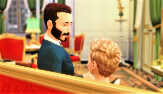
Here (Image A), it's a point of view with its back to the characters. It is an intention:
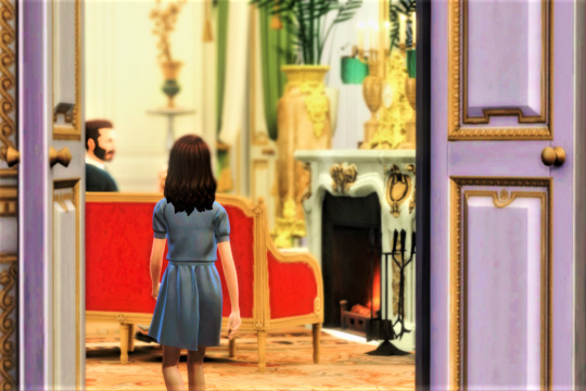
From the camera's perspective ("zoom out", image B), we can see that the first screen (A) was from the point of view of the approaching curious princess.
Notes :
There is a play of depth in the shot (a little badly done I admit) : the over-framing of the door, the princess, the sofa where we are talking and finally the background (4).
Ideally, you should have at least 3 levels of depth to give a realistic impression. More if you want to show the grandeur of a setting like a castle.
In my opinion, we must strive to find intentions in the screens. You have to see it as a kind of writing of the image.
Sometimes I don't necessarily have a clear idea when I shoot a scene, so I take the scene from absolutely every angle. Then comes a big sorting moment lasting several dozen minutes, where I observe the screens meticulously.
Don't hesitate to multiply the angles of view with different poses. This will give you more storytelling possibilities! Bring your camera closer to yours characters, for example, by positioning yourself over his/her shoulder.
> THE SETTING
The thing that takes me the longest to prepare for a shot is the placement of the objects/architecture. This is what creates the depth of field. I would advise you to take references to furnish your rooms, and take the time to test the screenshots during construction if you have TwistedMexi's Buildmod Freecam.
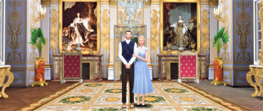
In the Tuileries Palace (Image C), I'm trying to create a more or less parallel setting with my Sims in the centre to give it a "French style" in reference to our dear Louis XIV.

For a nature holiday, nature and scenery invade the Sims, with a slight asymmetry (Image D).
Notes :
Present the screenshots from the most general shot, which sets the scene (e.g. a building), to the most specific (e.g. with a close-up on your sims). Or vice versa! This sets the mood for your scene.
I try to use as much natural light from outside as possible, even through the windows. But some people do completely artificial lighting :)
Avoid showing the white ceilings of the base game and unworked scenery... This disturbs the immersion, especially during a BTS. In movies or IRL, especially during a conversation, it is rare to see the ceiling or the floor.
Sometimes "show" is enough to describe a mood, a relationship or an action. In this case, the setting or close-ups can be very important without the characters speaking. For example, in image D, this screenshot can sum up the atmosphere of a whole weekend's holiday, without adding to it.
> YOUR COMPUTER SCREEN AND POST-PROCESSING
For Tumblr, consider the size of your computer screen when decorating. Because your screenshots will take the shape of your screen. As you can see, I have two computer screens: one more square (Images A & B) and one very horizontal (Images C & D).
My sims are naturally more discreet in my horizontal format, which is a landscape format. Whereas the square screen displays the sims better as it is closer to the portrait / small screen format.
You can adjust the format of your screens by cropping your shots with a software (some use Photoshop... I only use the Windows image gallery for my part, or the Pixelr site which is free).

For my last portrait (Image E), I had to crop to portrait size (Image F below). Otherwise my emperor is too much crushed by the background.

Further down, I took a closer screen, zoomed in (Image G). Result: considerable gain in sharpness. Cropping can cause a loss of sharpness, you have to be careful not to abuse it.

> CURIOSITY IS WELCOME EVEN FOR SCREENSHOTS
My main advice is to look with interest at the work of simblr that you like, but also at official films or portraits etc. Understand the intentions and the means used to achieve them. Informed work always makes a difference in terms of quality of rendering. When I like a post, I always take several readings and re-readings of the means used. There is a lot of creativity! There's no shame in taking inspiration from other creators (in Tumblr or outside Tumblr), it's the best way to forge your own style.
Mind you, I'm not talking about comparing yourself to others. Inspiration is an element of curiosity, not comparison, it shouldn't make you feel bad. Nor should it lead you to plagiarize.
> COLOURS IN THE SCREENSHOT
When I set up a set and dress my sims, I pay attention to the colours given to each of them. The colours are also a way to emphasize an intention (colour symbolism), or/and to bring balance to your screenshot.
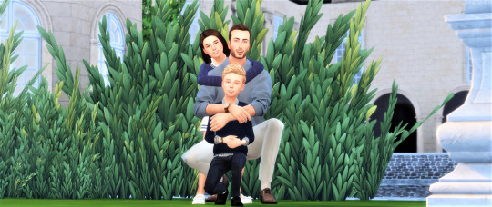
It's a soft and bright family picture with green/blue/beige colours (Image H). A bright colour would have brought a certain imbalance, either on the sims or the decor.
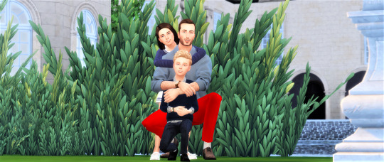
Bad editing to illustrate! (Image I) It seems a bit obvious when we talk about it here like this, but colour harmony is subtle and sometimes a bit forgotten. Breaking the harmony can be an intention of course, but it's still a dosage!
26 notes
·
View notes
Photo
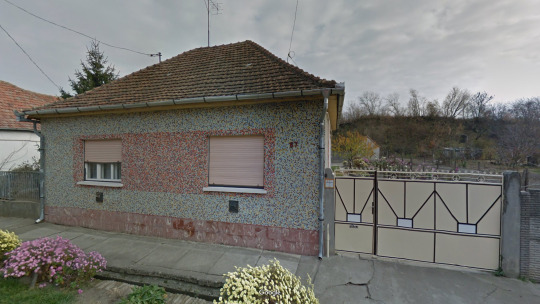
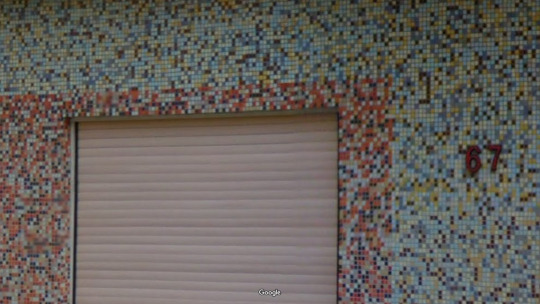
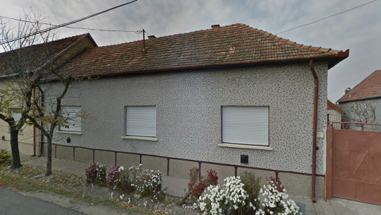
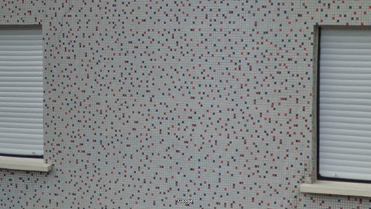
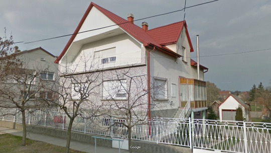
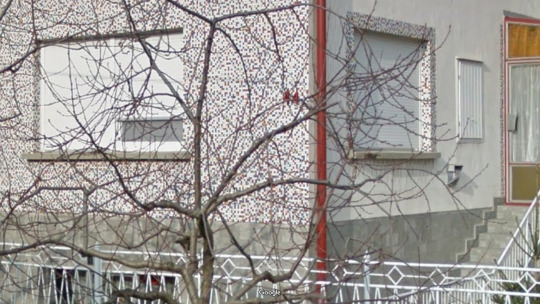
pixelre magyar!
Császártöltés, Bács-Kiskun
https://www.google.com/maps/@46.419818,19.1719558,3a,58.3y,120.45h,89.13t/data=!3m6!1e1!3m4!1s9svpQlHdgq3U9IEpykjIkw!2e0!7i13312!8i6656
https://www.google.com/maps/@46.4200004,19.1722357,3a,72.9y,301.39h,91.79t/data=!3m6!1e1!3m4!1sHoAFNdk0mjW348zYXYTp3A!2e0!7i13312!8i6656
https://www.google.com/maps/@46.4199395,19.1768514,3a,35.9y,28.39h,88.8t/data=!3m6!1e1!3m4!1sGE82EwAMjlG1hMiPqSOAQA!2e0!7i13312!8i6656
#vernacular#hungary#architecture#streetview#színez#díszít#elemi#néz#bátor#hangol#mesterhármas#kerítés#délalföld#bácskiskun#császártöltés
16 notes
·
View notes
Photo
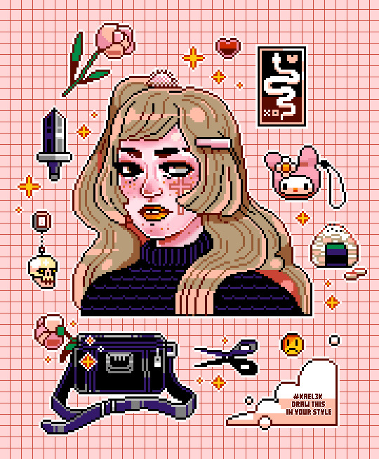
my attempt at @ka3l ‘s draw this is your style challenge (over on insta) a different colour palette for me, & it was cool to work on another pixelrs oc 💕
#pixel art#pixel#pixels#pixelins#pixel girl#snake#oc#drawthisinyoustylechallenge#drawthisinyourstyle#witchy#witch aesthetic#Aesthetic#Character Design#ka3l
818 notes
·
View notes
Text
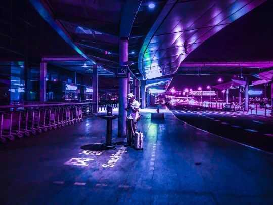
~ My edit 💜🌙 ~
Original photo: @pixelralli <- check them out!! 😊
If you repost, please credit me and the original artist :)
#purple#purple aesthetic#blue#blue aesthetic#night#night photography#city#citylights#city lights#cyberpunk#cyberpunk city#beon#neon noir#neon aaesthetic#neon lights#neon city#glow#street#street photography#streetlights#aesthetic#airport#lights#photography#color#colour#colourful#colorful
31 notes
·
View notes
Video

flickr
# Mili # 6394 por Mili Miklos
Via Flickr:
Blog: Mili Miklos SL Blog (sponsors ads in comments) 🍁 Fall vibes are in full swing with this cozy and edgy look! Loving the combo of the Wasabi hair, RIOT plaid outfit, and the flawless LeLUTKA Avalon head. Check the blog for more deets on where to grab these items! ■ Hair❤Wasabi // Elys Hair (K9 Weekend) ■ Mesh Head❤LeLUTKA Avalon Head 4.0 ■ Face applier❤[Glam Affair] Skyla [Lelutka EvoX] Velour Porcelain @ Equal10 ■ Complete Outfit❤RIOT / Oakley Outfit @ The ShotGun .......... Facebook Twitter Instagram PrimFeed PixelR AQConnect AQTwine
▀▀▀▀▀▀▀▀▀▀▀▀▀▀▀▀▀▀▀▀▀
Inventory Mess Blog - New Post!
▀▀▀▀▀▀▀▀▀▀▀▀▀▀▀▀▀▀▀▀▀
https://www.flickr.com/photos/milimiklos/54017527308/in/dateposted/
https://milimiklossl.wordpress.com/2024/09/23/mili-6394/
https://www.primfeed.com/mili.miklos/posts/53caebcc-8bb5-426c-a4a2-9c189b4f7640
#autumnfashion#avatarstyle#secondlifefashion#falloutfit#glamface#meshhead#secondlifebeauty#virtualstyle#fashionblogger#riotoutfit#lelutkaevox#glamaffair#secondlifeblogger#wasabihair#avatarbeauty#sltattoos#secondlifefashionista#Lelutka#EQUAL10#RIOT#The ShotGun#Wasabi#K9 Weekend#spam#advertising#fashion#sexy#blog#blogger#new
0 notes
Photo
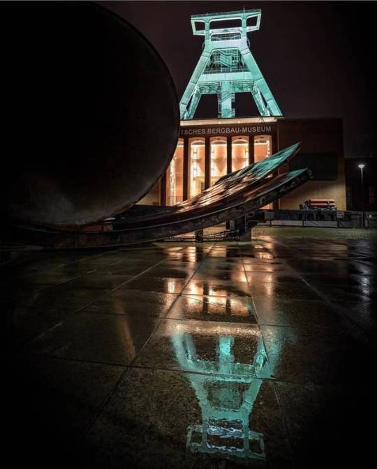
Der Ralf @pixelralli war neulich mit einer supertöften Truppe im Ruhrpott unterwegs - dabei entstand dieses wunderbare Foto vom Bergbaumuseum in Bochum. Schaut doch mal auf seinem Kanal vorbei - es lohnt sich wirklich! Wir wünschen Euch allen nun noch einen sonnigen Tag :) | Contributor: @pixelralli | selected by: @schichtmeister http://ift.tt/2w2CuYY
2 notes
·
View notes
Photo
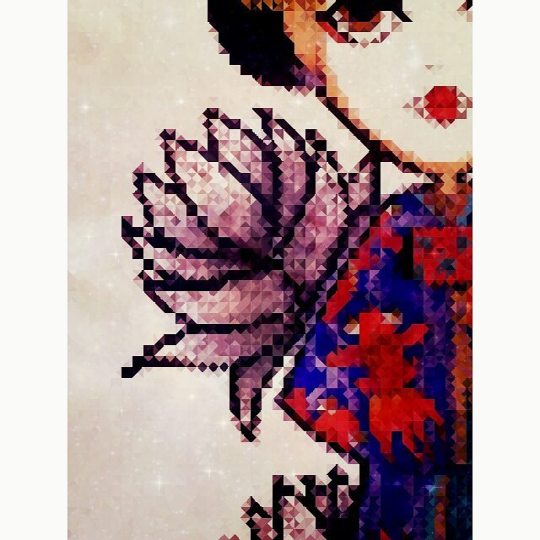
#illustration#drawing#digitalart#pixel#pixelr#art#motifs#fashion#mode#ink#tatouage #tatoo#japan#japon#carpe#lotus#fleurs#flower#bleu#love#me#instagood#geiko#geisha#asie#rouge
#motifs#asie#rouge#flower#me#drawing#ink#fashion#carpe#bleu#mode#geiko#art#tatoo#illustration#japon#geisha#pixel#lotus#tatouage#fleurs#instagood#digitalart#pixelr#japan#love
1 note
·
View note
Last Seen Blogs

miatienza
mitch

renjisharma-blog
Untitled

six6lack
e

airbulancewpb
Untitled

song-lyrics-of-love
Song Lyrics That Make Me Think Of You