#plain in design anyways
Explore tagged Tumblr posts
Visit Tumblr Blog
Explore Tumblr blogs with no restrictions, modern design and the best experience.
Last Seen Tumblr Blogs


Fun Fact
Tumblr was created by web developers David Karp and Marco Arment.
Text
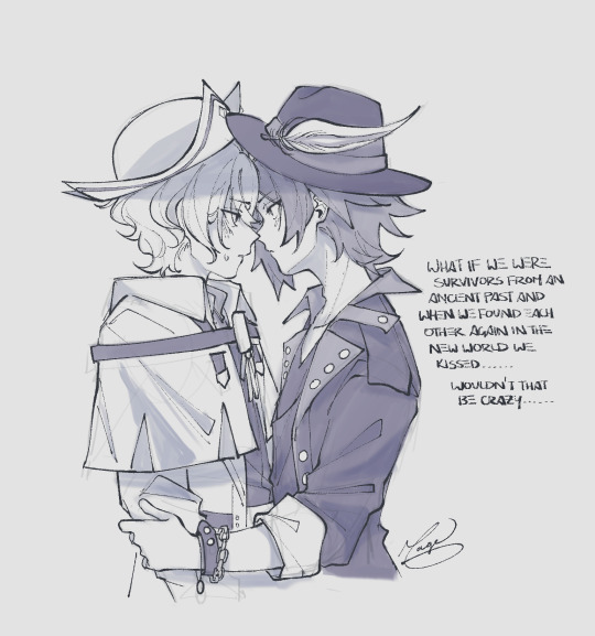
would you still love me if we were both worms,,
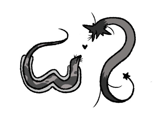
[Plain text ID : A monochrome digital drawing of two original Flatland characters, Ruth (left) and Liz (right).
They are both grey and worm-like in appearance; Ruth has dot-like markings and has a 2D blanket covering most of her edges, while Liz has two star shapes at either end of her body. These stars are a darker grey than the rest of her body. They both have cilia around their blunts ends (which are their faces), but Liz has extra cilia behind her head and near her tail.
Liz is in a backwards S-shaped pose looking down at Ruth, who is looking up at her. Ruth's tail curls around towards her head. Ruth also has a V-shaped ‘dent’ in her middle, which slightly disrupts the curve of her body. There is a small black heart between both of them. The background is white.
End ID].
#flatland#oc#elizabeth huntsworth#ruth galton#supernova#but yeah there’s ruth’s irregularity - it’s a dent in her side#she wasn’t born with it either it was from a rogue isosceles hitting her out of his way when she was younger#now she has a fear of all isosceles#that definitely won’t come back to bite her in the angle anytime soon#and her cloak in the plane is just two blankets she drags alongside herself#ruth looks so plain here but she is just#plain in design anyways#so whatevs
41 notes
·
View notes
Text
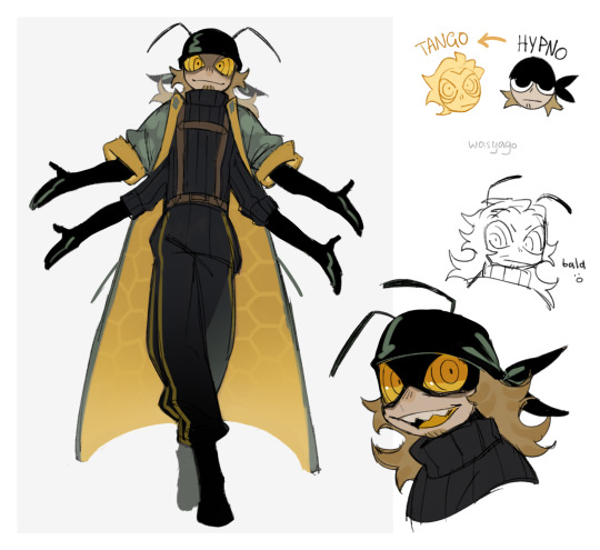
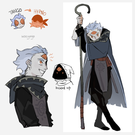
welp, didn't manage to get everything out before season 10 started, but i gotta post it one way or another so here we go! heard there was a fandom swap game going on, wanted to do a couple promts of my own :D
#guys with freaky eyes <3#i really didn't expect season 10 to be so soon what do i do now...#very sorry to all the naruto girlies. there might be a lot of minecraft art for a while 😔 bud ninja stuff is coming too eventually#anyways! about the drawing:#decided to turn hypno into the 'bug tango with 4 arms and antennae' variant instead of a regular one because it's just more fun and unique;#and tango is in his dungeon master color pallett because his regular one looked a bit plain.#and i think hypnosis really fits the theme of a dungeon master and wrangling ravagers.#plus i wanted to use the design i drew a while ago at least once#oh also yeah hypno is a bee here because of his honey shop and stuffs#hypnotizd#tangotek#hermitcraft#my art#sketch#season 10 fanart is coming but later. i wanna post everything in the order it was drawn. so...
3K notes
·
View notes
Text


Head breakdown and facial construction for Elias.
#solivaga#artists on tumblr#art reference#art process#artwork#pu art#my art#elias#this is more basic head construction tips but i’m working off of elias’ hesd breakdown so it csn be both lol#he’s not so hard to draw once basic facial construction and shapes are clear tho#quick expression doodles at the end#i should do a clean shape breakdown of his whole design and his hair since it’s also more simple than it looks#the overall shapes are really plain#just add some whispy flyaways tho and it looks complex#anyway here is a boy
327 notes
·
View notes
Text

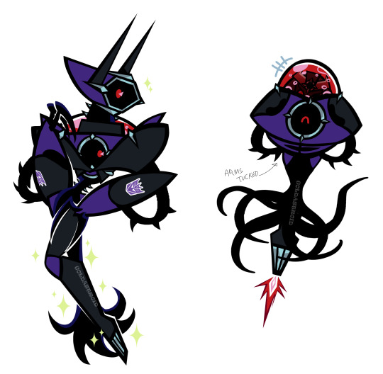
shock's robot mode! my pretty gurl......
#some of the stuff from the concept still apply i just simplified it a bit hehe#shockwave doesn't really find a reason to be in her robot mode unless in a fight so shes mostly in her alt mode#she does keep her arms in her alt mode mostly but when flying she tucks them in#i really dont like her eye (on her face) please pretend i left it just plain red#anyways I LOVE YOU SHOCKWAVE!!!#transformers#maccadam#maccadams#shockwave#my art#transformers fan design#transformers fan continuity#tf fan continuity#shockwave transformers#transformers shockwave#transformers tilt#my artwork#artists on tumblr
223 notes
·
View notes
Text

Guy on fire since 5 minutes old: "Stop complaining. Being on fire is fine actually. Why don't you just set yourself on fire."
#peace and love but i dont think youre a very objective judge on this actually da-ge#silly doodle things#i really need to come up with a re-design for jiggy. ive yassified mingjue but next to All That jiggy just looks plain.#this is a riverdale reference btw#anyway#jgy#nmj#nie mingjue#jin guangyao#artfromthefrogs#mdzs#the untamed#mo dao zu shi#nieyao#why not ill tag it
887 notes
·
View notes
Text
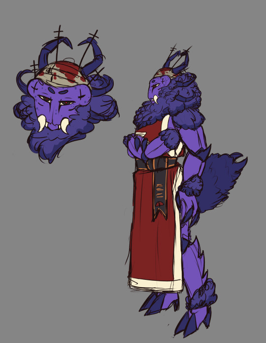
Celegorm for @feanorianweek day 3

Here are the portraits of:
Maedhros Maglor Caranthir Curufin
#im really bad at drawing bows#but this is supposed to be a war bow#they are rather big and have a heavy draw#i hc that celegorm gave his recurve bow to amras as a gift#normally war bows are really plain and made of lighter colored wood#but i like the darker color better 😌#really like his armor design here with the ropes :D#anyway#feanorian week#celegorm#silm art#silmarillion#traditional art
94 notes
·
View notes
Text

its been forever since i did any digital painting so i did a tiny Vile design to get back into it :3
#he's quite small which is why its kinda blurry but it is what it is#I think its said somewhere that viles armour is plain in design but thats BORINGGGG so i say he gets to be cunty and spiky#also i didnt pull up any references for this bc it wasnt supposed to be that deep so if you see any glaring problems please ignore them <3#anyway i love vile#squid art#skulduggery pleasant#lord vile
64 notes
·
View notes
Text
to put it lightly i was possessed
#khml#kingdom hearts missing link#kh#kingdom hearts#kh brain#kh player#keykid#brainplayer#plain (kh)#stray (keykid)#<- future note: i didnt have a design for stray at this point so i just used sou's design instead#i need u guys to listen to me. i think calling them Plain would be really funny /j (also /srs i really do find it hilarious)#anyway. i was really bored and i wanted to draw smth so i doodled a little brain as a warmup#and then i had a thought (<- my first mistake)#ive actually been thinking abt them for weeks but decided to materialize them today. they make me feel a little insane ngl#myart
545 notes
·
View notes
Text

the ff7 remake artbook : the honeygirl design was very cutesy so we thought the guys should wear fancy suits to compensate :))
me, throwing my coke from the bleachers : COMMIT, COWARDS
[get this babe as a print]
[Ko-Fi]
[Commission infos]
#i already did this to phoenix wright so it's only right#also don't hit me with that “cutesy” bs have u seen your designs for the girls. that's not cutesy man#that's plain sexy soooooo if u don't feel comfortable putting it on guys weeeeeeell#im gonna have to use the big M word buddy#anyway#cloud strife#ff7
181 notes
·
View notes
Text
Something I drew on yesterday's stream :3 my take on follower Shamura <- loves drawing silly bugs teehee
inspired by @chocosnowflake0's design!!'
#bubba doods#cult of the lamb#shamura cotl#my friend: lmao it looks like u got favorites#me. spending more time trying to come up with a nice design for shamura while narinder is a plain ass cat: whachu mean#anyways smash or pass. be honest
358 notes
·
View notes
Text

the point is that eye shape and style can add a lot to a character
#library of ruina#roland lor#digital#doodle#there was a post i saw talking about how Roland's design manages to feel unique despite being just black suit + black hair#but his plainness when surrounded by more colorful and distinctive characters makes him stand out#anyways the eyebags or wrinkles under his eyes are a part of that i think. it's a charm point
48 notes
·
View notes
Text

Pitaya Diavolo + Watermelon Bruno
Variants and closeups under cut.
Friend told me that dragon fruits come from cactuses and suddenly he was reworked to look more interesting.


While rewatching part five after not finishing it for 4 years, I just couldn’t get Diavolo’s hair looking like a dragon fruit out of my head. And then Bruno in the elevator with that pink and green colour scheme in the second opening. That’s so watermelon of him.
These two as a duo make my brain fry. I have all the thoughts and yet no thoughts about them.
#my art#oh boy#bruno bucciaratti#bruno buccellati#diavolo jojo#jjba#Jojo#jjba fanart#jojo fanart#coming back to wips feels so powerful#I feel so accomplished despite only working for less than two hours#I fear the designs leave much to be desired#but it’s not my fault their outfits are so odd yet plain.#I mostly just wanted to focus on their hair anyway
27 notes
·
View notes
Text

@dvdkisser after reading about your OCs I decided I just had to draw Akeshi, and ended up drawing Mahiro with her because it's cool that both of our Chronohaul kids stay with the Hassaikai and use their bodies as a resource to their own physical detriment, and generally I think their dynamic would be interesting. Hopefully you don't mind people drawing your oc's? In hindsight I should've asked but I got a little excited.
#Mahiro looks so plain next to her and I find it very funny. Alt sister and brother who looks like a gay librarian#his mask does a lot of the heavy lifting in his design but I feel like I could do something more#I kind of regret trying to make his design fit in the detail level of the bullets#Oh well. Not the point#the point is I love Akeshi. She did it all but I forgive her. (joking)#mahiro kurono#orb draws#oc stuff#anyways goodnight
36 notes
·
View notes
Text

I’m throwing my own top hat into the ring with a . Human? Bill design
I remembered the old theory that bill was controlling Gompers the goat and used it as an excuse for devil imagery <3 and I like the idea that he’s just not very good at approximating a human
#my art#gravity falls#bill cipher#human bill#I gusss?!#I’m in the process of rewatching gf for the 283748385th time and just got to dresmscapers while drawing this#anyways. no eyebrows bc I thought it was funny from Alex hirsch’s design#outfit based on silas birchtree and really just. a plain ol suit. bc his appearance is what all my thought was put into FHGJDFJ#also I was So excited abt the goat demon idea bc that portrayal of satan is pulled from Pan#I got mixed up and thought he was associated w Chaos which was perfect (I was wrong tho. it was panic which yknow that makes more sense)#so not quite as perfect as I thought but OH WELL I still think it’s fun#shoutout to my bf for helping me <3#I was having a dilemma over an earlier iteration where it really just looked like he was wearing half a fursuit (which it still kinda does)#but it’s definitely better now FHJDKFKDG
32 notes
·
View notes
Text
I went to a bachelorette party last night and went to bed at like 5am lmao I woke up pretty early today cause today is elections day here in my country and like I wanted to get that out of the way immediately
So if today I'm slower than usual is cause I'm sleep deprived lol BUT i will answer everyone's asks eventually
#it was pretty fun though i don't drink cause i have a histamine intolerance#and one of the many things that trigger it is alcohol lol#i was the only sober one there and acted as The Designated Driver lmao#but I'm so used to going to parties be sober and be the driver that i made peace with it years ago lol#plus u get drunk out of like the atmosphere/vibes especially if the vibes are great lol#anyway as a lesbian i think it was funny seeing all the d*ck decorations everywhere lmao#drinking my plain water with a straw in the shape of a d*ck was an experience lmao#bachelorette parties are so funny as a lesbian tbh like everyone tellinf stories of het sex while i was there like#WOMEN#lmao
40 notes
·
View notes
Text
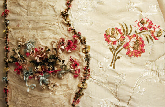
while i was away the other week, i picked up a potential trim for my lady Stede dress, and i wanted to talk a bit more about it with you guys and see what you think !! (you can skip to the end for an opinion poll if you dont wanna read all the background spiel!!! tldr: do we like what i picked?)
so, Stede's costume is not particularly historically accurate, but the use of trim between mens & womens fashion is completely different anyway, so im not too worried about trying to find something that matches 100%. i mostly want something that brings the same effect to the garment, particularly in the colour. i went and found some high def images, so you can sort of see the structure of the trim.
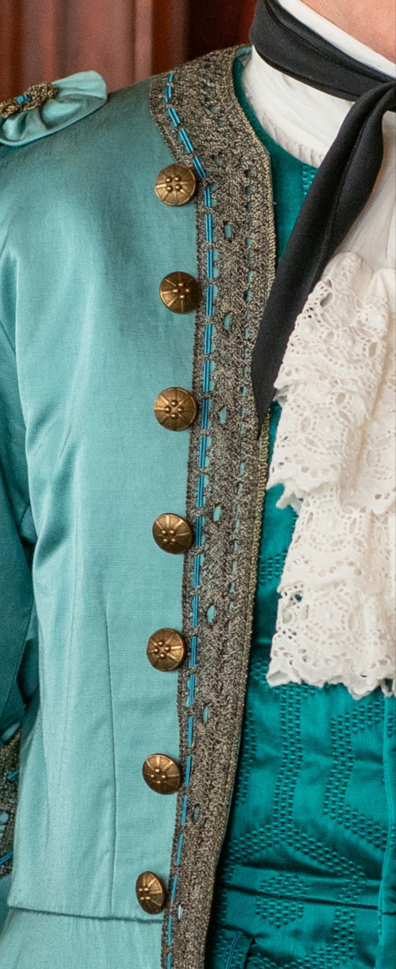
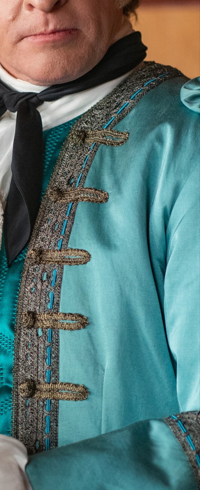
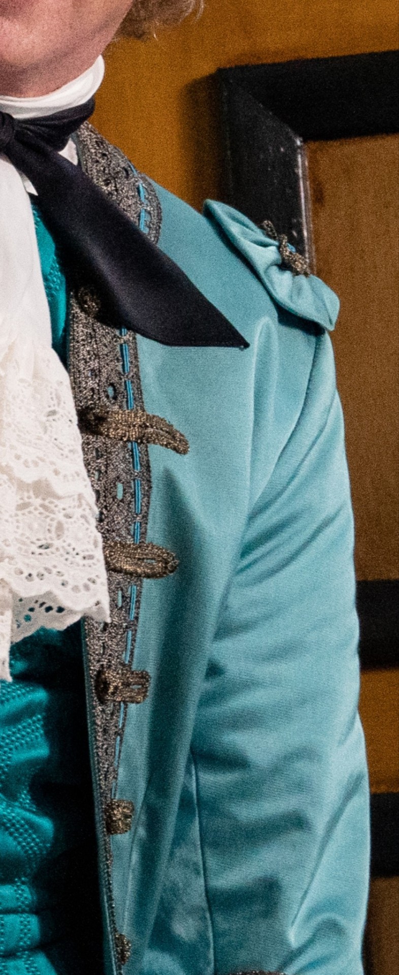
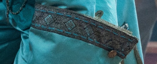
The colour is somewhat hard to pin down, but i tend to see it as a sort of antique gold colour? it looks to me like tarnished metal (but i would love to hear about your opinions on the colour!)
The trim is much more subtle on the style of dress im making- most of the decoration is created through pleated stripes in the same fabric as the dress, with the decorative element lining the edges (and occasionally running down the centre). looking at extant examples, ive seen many different shapes of trim, though most of it seems to be looped cord or "fly fringe" - loose filament tied into little puffs or flowers (its super cute but hard to get a hold of and i dont think i care enough to make it)
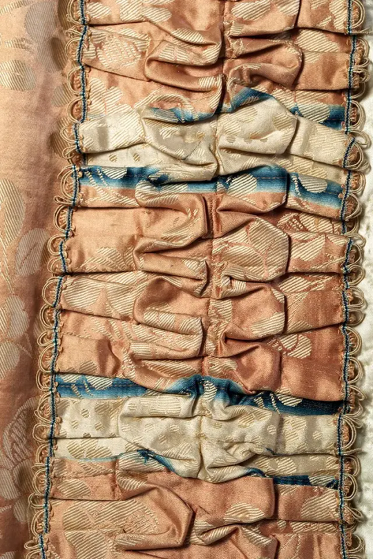
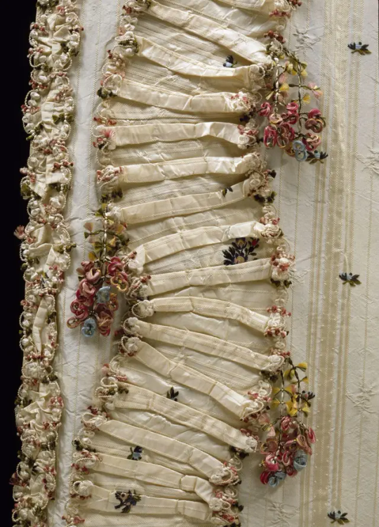
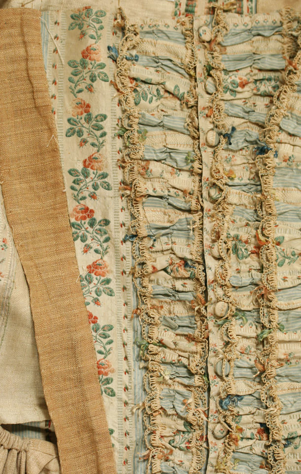
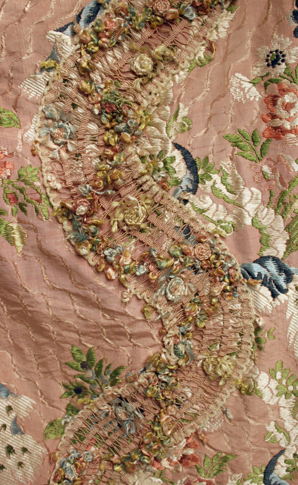
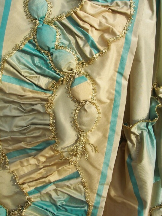
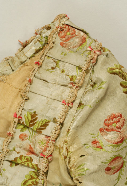

im not quite sure how im trimming this garment yet- i dont want to commit to anything until ive played around with what looks good on the actual dress, but i know i want to do at least some of this pleated design on there, so these styles are what i went out with in mind.
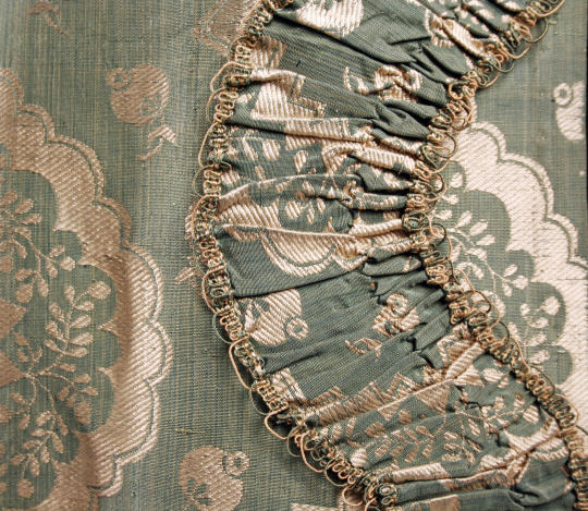
(ok, context established, onto my specific picks!) i really struggled to find trims i felt would work for this project- i wanted gold, but everything i was finding was too bright and shiny and not at all what i was going for. I ended up picking two things in the same dark gold colour that felt a bit more worn in, but definitely needed work to get the shapes i was looking for- one i think ill dismantle entirely and use the cord to make something new, if i end up using these.
the other was much closer to the kind of thing i wanted, but still needs work. it had two lines of loops and my plan is to remove one of the lines to create something more like the looping of the historic trims. ive pinned one line out of the way in the pictures below to give you a bit of a better idea of what i want, but please know this was a 5 minute edit, and the final result may be different!! (i also want to add that i dont think ill leave the border edge as wide, either- i want the trim to be a hint, not overwhelming)
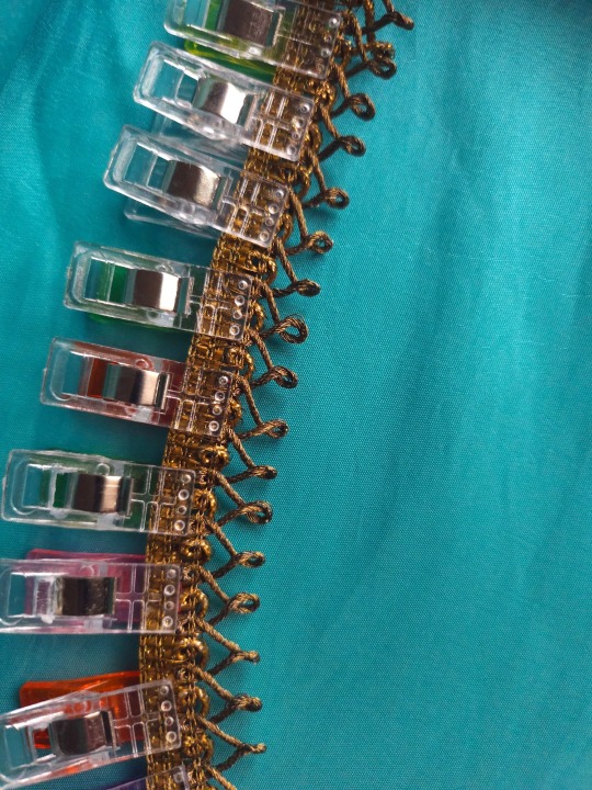
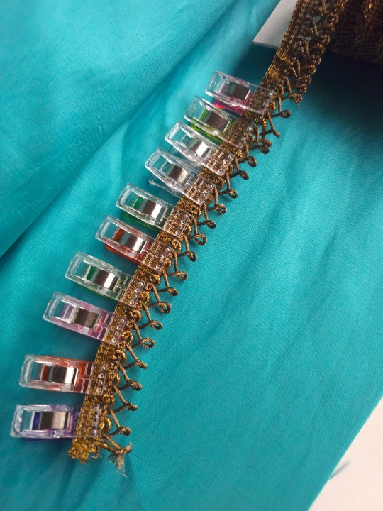
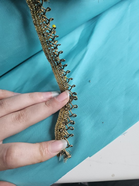
(these images have been edited a little to try and capture colour accuracy, as my phone Did Not want to make the blue blue :/ the last image is the most accurate to the trim, i think)
i think my pick was absolutely the best option out of the ones i saw... only now im looking at it with my fabric, im not sure. it was the best kind of gold colour they had, but i feel like stedes is even darker and cooler in colour, almost a brown-grey tone. (honestly, this one is pretty brown when you look close, but what matters is the bigger picture, so :/ ) it feels to shiny and sparkly, and like it might stand out in the wrong kind of way.
i want this dress to feel like a genuine historical garment first and foremost, id rather it look cohesive and intentional than be accurate to the show and im doubting myself with this trim- but also i know it was by far the best option that i saw when i was actually looking at hundreds of gold trims... so, what do you think?
#i have more notes on my thoughts about the design of this dress but i did want to keep this... topical; if not exactly short#i want the pleats definitely. but im not sure about the rest. i think filling space is Key to making plain fabric française look good#theres puffs and wreaths and... ive got a lot of ideas but ill see when i get further in what will actually work#anyway#i tried to include every opinion i thought people could have but i also. dont know what people are thinking#i would love feedback either way !! i think this is kind of nuanced as a discussion and a poll cant always cover it all#but most people. prefer to click the button and not /tell me/#sewing#poll#historical dress#costume#ofmd#our flag means death#stede bonnet#cosplay#design#pathetically begs for ur input into my costume 🙏🙏🙏 idk#also i think this sounds very negative to this trim but its because im doubting myself. vote with your heart boy. do not listen to my tone#Lady Stede Build
16 notes
·
View notes