#preloader in webpage
Explore tagged Tumblr posts
Visit Tumblr Blog
Explore Tumblr blogs with no restrictions, modern design and the best experience.
Last Seen Tumblr Blogs


Fun Fact
Kazakhstan’s Minister of Communications and Informatics has blocked the Tumblr site because it contained 60 sites of terrorism, extremism, and pornography in 2015.
Text
Little Things (The Envious Thirdborn)

characters: Leviathan, GN!MC navigation: Lucifer | Mammon | Levi | Satan | Asmo | Beel | Belphie content/warnings: little things you do for the brothers, out of love. fluff. established relationship (implied you are dating all seven brothers equally with the exception of mammon whom i love more) word count: 1334, this one got away from me a little notes: Each brother has their own part, linked above. I am still my own editor and I loathe editing, so please forgive any mistakes!

Adrenaline pulses through Levi’s veins. His hands shake with it, even as he sits back in his gaming chair, and cold shock ices over the hot rush of blood in his veins.
A Sucre Frenzy collectible has slipped from his grasp. It was a limited-time run, only live for a few minutes, given how quickly stock had sold out. He’d been watching the drop for days, even though the band had only posted vaguely to something happening, with a link to a blank webpage with a countdown. No one had known what it was they were hinting at, and even though Levi had what he thought was every e-commerce website preloaded to ensure a fulfilled order no matter what website hosted a flash sale, the limited edition merch he’d coveted since the launch went live was now nothing more than a distant dream. Maybe he didn’t click fast enough. Maybe the slight error in the shipping address that had forced him to re-enter his details had pushed him out of the running. Maybe Sucre Frenzy knew that he was just a worthless shut in, and didn’t deserve the special treatment. Maybe he just wasn’t good enough after all. He should have known.
A frantic knock at his bedroom door registered dimly in the midst of his self-deprecating spiral. It isn’t until his tail, flicking anxiously behind him, knocks over the stack of manga next to his desk and he hears the sound of your voice on the other side of the door, that his thoughts grind to a halt long enough to push his body into action.
It’s muscle memory that gets him up, still half-lost in his head, and leads him to the door. He’s speaking the other half of this week’s special passphrase before he even realizes he’s doing it. He reaches for the door handle, then pauses. For a moment, he watches his hand tremble, and hears you again.
“Levi?”
Sucking in a breath, he opens the door, and the smile you wear nearly blinds him. You’re clutching your DDD to your chest and look fit to bursting.
“So?” you chirp. “Did you see it? I bet you’re excited to get it all! We don’t even know exactly what they’re giving us!”
Us. You had managed to get your hands on the drop. Jealousy sparks in his chest, sharp and biting, and for a moment, he resents you. He was the one who introduced you to Sucre Frenzy, and now you were the competition. In the next moment, a bucket of cold shame is dumped over his head. He couldn’t be angry with you, not really, not when your eyes sparkle in the ambient light of Henry’s fish tank. The green monster still coats his tongue as he speaks. His tail swishes over the tile behind him as he grips the side of his bedroom door, attempting to shield himself from your exuberance.��
“I didn’t get it.” It sounds pathetic in his head, but comes out of his mouth as a snarl. Your expression falls.
“Oh.” You take a step forward, maybe without even thinking about it, and he begins to shut the door without thinking either. “Oh, Levi.”
Your foot stops him from shutting himself out completely, and you slip inside. “What happened? You’re usually lightning fast.” Your gaze slides to his monitor setup, and you take a step before stopping yourself, turning back to him to await a response and permission to continue. He can’t find anything to say, but forces something out anyway as jealousy clouds his mind.
“It’s stupid.”
Your hand settles on his arm, soft and unobtrusive. Your brow is furrowed, and while your eyes are sad, your voice is firm. “You’re not stupid.”
Levi realizes he’d said I’m stupid. Shame shocks down his spine twofold. You hated it when he talked down to himself. Hot tears well in his eyes as he shuts his bedroom door and crowds his body against it, forehead pressed to the wood and shoulders hunched forward. Your hand slips from him in the process, and his tail curls around both of his legs. Now he had not only lost out on this once-in-a-lifetime drop, but he’d disappointed you, too. He really was a useless idiot.
“I hope you like your merch,” he says. He means it, at least partially, but you can hear the jealousy in his voice. “Just leave me alone.”
You’re silent for a second. Levi waits for the word of encouragement you’re sure to leave before you go, holding back angry tears until he can hear the door shut behind you.
“Levi. I didn’t get this drop for me. You can have it.”
He doesn’t believe you. He was too slow, not well prepared enough, he didn’t deserve the merch. He wasn’t quick and bright, like you. He wishes you would leave him to his misery, but it seems you’re not done.
“Not to mention, I can’t leave.”
He glares at you from over his shoulder. “Why not?”
The corner of your mouth twitches as you gesture to him. “You’re standing in front of the door.”
He is, you’re right again, and the third hit to his fragile ego is enough to shatter it. All mirth vanishes from your face as his chin quivers and tears finally spill over his lashes.
“Leviathan,” you say, gently, and he allows you to take him into your arms. His tail wraps around you before the rest of him, and you hold him with one hand bracing the back of his neck, and the other secured around his waist, pressed as close as you can be. He buries his face into your neck, and your cheek rests over his ear. “I mean it,” you continue as he shakes. “I know you like to have one thing to use and one to preserve, so I figured I would try to snag a second set. It won’t be exactly how you want, but I really only wanted to get it at all for you.”
A whine pulls from his throat. He knows you well enough by now to know you’re telling the truth. You’re too good to him.
Your hand strokes his hair, nails catching on the base of one of his antlers. “Shit happens. It isn’t your fault you didn’t make it this time, but you also have your Henry as backup. I’d never let my Lord of Shadows miss out on something I know is important, if I can help it.”
You pull away, and he reluctantly lets you, but can’t bear to look at your face. Your gentle fingers brush his long bangs out of his eyes, and the hem of your sleeve brushes over his ruddy cheeks, catching a few more tears. “I love you more than any piece of merch. And who knows, maybe Mammon caught on to the hype and managed to get in to turn it at a million grimm markup. I bet I can convince him to -ahem- permanently loan it to you. Through me.”
This makes him chuckle, and he risks a glance at you to see you smiling. Your expression, coupled with your touch still tingling on his face, soothes over the hurt like a balm.
“Thank you, MC.”
You set his heart pounding again by pressing a trail of kisses across his cheek, to the corner of his mouth. “Of course. Now, they leaked a new music video link in my receipt email, so we have to watch it before anyone else does.”
This brightens him significantly. “Really? Yeah!” He breaks away to bound over to his computer. You forward him the link, and pull your matching gaming chair next to his, settling in to help him liveblog his reaction.
You’re true to your word, and when the conspicuously large package arrives a few weeks later, you’re breathless at his door in seconds. You hold the camera while he livestreams the unboxing, and neither of you is sure who is smiling brighter.
#obey me#levi#leviathan#obey me leviathan#levi x reader#leviathan x reader#levi x mc#leviathan x mc#om! levi#om! leviathan#obey me levi#obey me x reader
291 notes
·
View notes
Text
New website is up!
Finally, after like 2 months: I finished it!
I never want to touch HTML ever again.
Here it is:
I thought I should do a little commentary here as it isn't just some standard linktree/carrd.co thing anyone with a free afternoon can crap out (and also because I'm vain) so here's the commentary:
The problem with my old one was that it was getting too crowded for all the stuff I was chucking at it. I mean, look at this header:

It's a mess!
I wanted to make something that had everything in nice neat categories, and also this was in a time where I was unsatisfied at how flat UI design had become and was starting to long the futiger aero windows XP-7 days. I wanted to make it look detailed and shiny and more personal. I deleted everything off and for 2 months, this was what the website looked like:

(I didn't have a more up to date "under construction" picture so I used the one from Sci-Fi RaiRoboska!?).
I didn't realise it would take 2 months but I didn't want a repeat of last time where I was talking on discord with someone and they were looking at my website as I was designing it as I was doing it live in Neocities and I left the link in my bio.
I used the same layout builder as I still didn't know how containers worked then. It ended up causing some problems later down the line with media querys (FUCK media querys) but it's decent enough to get you started. I did some fiddling with the header so it was the right length (dear god that took a while) and had to do that airbrush thing multiple times just to get it looking right.

I drew this background at around the same time and used my OCs from San_Watsaku as it's my latest game and I don't really have another group of OCs from a game that's released. Annoyingly, I couldn't get the sizing to work on a regular 1080p widescreen display so the top and bottom cuts out. I was trying to go for a similar approach to how Newgrounds does the background arts.

I had a wayback machine page of Newgrounds in 2013 in the early days as reference on how to make things look cool, as well as some pages from this website that has a collection of screenshots of webpages, specifically for UI reference. I was trying to make it look like a website from the late 2000s-early 2010s where everything wasn't flat but also wasn't as shiny as windows 7 (usually).


I put little doodles of myself across the pages because it looks more interesting than a flat button saying "video games". That sidebar is annoying though as it has a habit of cutting off if the main box isn't the right shape by the pixel.

I was very proud of these buttons when I got them working. The design changed a bit as I realised that it needed to be longer to fit properly.


Wasn't sure what to do with tumblr though:

I used a speech bubble drawing for my bio thing to make it look more aesthetic and also to flex that I didn't use AI at all as AI can't replicate my shaky-ass hand. I found this file called "avocadoplaceholder.jpg" which seems to be what I was using to figure out sizing.


For the stuff below the main boxes, I googled for stuff to chuck on a neocities page as it was too boring just having the bluesky embed sitting there. I went on the gif hunt at 11 pm while some AI bro on discord was calling me an idiot for actually coding and drawing the UI. I put some other stuff to pad space, like the pixel art and the links to my older websites. I added some stuff to it over time, like the interests list and the music section once I finally figured out how to get audio players working (literally earlier today lol). I wanted to add music for each page but decided against that. I wanted music on the main page though but couldn't for the life of me get it to work until I was trying to add a preloader (didn't work) and the website I was on was another neocities one that had an audio player but had the "neocities.org" thing in the URL so I knew they weren't a supporter. I went into inspect element and figured out that dropbox works and that's why I now have a dropbox account. Couldn't find a tutorial on how to make it not look basic though, so all I did was make it shorter and blue.

I made unique backgrounds for each of the pages to differentiate them and I made these from scratch as I actually figured out how containers and grids worked.

And of course: matching headers:

For each page: there's a doodle of me doing something vaguely relevant to the topic, little circles as links for the socials I have that apply to that thing (Newgrounds is on all of them and YouTube is on 3/4 of them.) I then used that speech bubble thing to make backgrounds for all the little bios. The music one was originally much longer but I cut it down significantly so it would fit. I used the empty spaces for doodles.


continuing...
2 notes
·
View notes
Text
Top 10 UX/UI Best Practices for Your Website that transforms User Experience

You build a website, but does it offer the best user experience for optimum conversions? Without the right UX/UI best practices in place, even the most visually appealing sites can suffer from low impressions, poor CTRs, and weak engagement. A lot of it comes down to the front-end designers and developers who fail to factor in key UI/UX metrics, and your business ends up with a mildly aesthetic but otherwise cluttered site.
Inconsistent design, confusing navigation, or unresponsive layouts can quietly undermine user trust, lower engagement, and hurt conversions. Great UI/UX design, on the other hand, is not just about aesthetics — it is about performance, accessibility, responsiveness, and alignment with user behavior.
In this article, we break down 10 essential UX/UI best practices that can transform your website into a high-performing, user-first platform. These are the same principles Altumind follows to help clients build digital experiences that engage, convert, and retain.
Top 10 UX/UI Best Practices
1. Performance: Slow page loads diminish user experience (UX) and increase bounce rates. You must optimize your Core Web Vitals — CLS, FID, and LCP — optimize your database, compress multimedia assets, and use a Content Delivery Network (CDN). Minify CSS, JavaScript, and HTML, reduce server response time, eliminate render-blocking resources, and regularly audit site performance using tools like Lighthouse or GTmetrix.
2. Responsiveness: Frustration from poor mobile experiences leads to drop-offs. Ensure a mobile-first, intuitive design using responsive frameworks like Bootstrap or Tailwind. Optimize for multiple screen sizes, adjust typography for readability, use scalable images and icons, and prioritize essential content for smaller screens.
3. Images: Images breathe life into a webpage, but when used randomly, can bloat the same and diminish user experience. Use icons and visuals meaningfully, use proper formats (JPEG, PNG, WebP, or AVIF), compress images using TinyPNG or ImageOptim, cache images, and reduce dimensions. Avoid using large resolution images unnecessarily, enable HTTP/2 for faster loading, preload key images, use sprites to reduce HTTP requests, try adaptive device-specific delivery, and finally audit image assets and remove unused files.
4. Accessibility for all users: Make your website inclusive. Add descriptive alt-text, transcripts, semantic HTML, and accessible forms. Follow the latest WCAG guidelines. Consider screen reader compatibility, readable color contrast, and structured headings. As Design should not just work for most it should work for everyone.
5. Call-to-Actions (CTA): CTAs get users to buy or drop a lead for your business. So, you want them to be clear and concise. Keep them short & relevant, use action-oriented text such as “Get Started,” “Claim Your Offer,” etc., and maintain consistency across the page, avoid clutter, and have more whitespace instead. Optimize CTAs for mobile devices, position them strategically, and place primary CTAs above the fold. Always A/B test them to arrive at the best converting one.
6. Forms: Keep forms short and user-friendly. Minimize the number of fields, auto-format entries, and use clear validation cues. Consider multi-step flows for complex data and tailor forms for mobile entry. A well-designed form is the difference between a lost lead and a conversion.
7. Whitespace: Whitespace reduces cognitive overload, leading to higher engagement. Whitespace enhances readability and improves user focus. Maintain consistent spacing, avoid clutter, and balance visuals with text and leave sufficient margins between sections and to the left and right of the page content.
8. Videos: Videos are a great way to captivate resources, but they tend to get a bit heavy on the page resources. So, avoid auto-playing videos, only preload the metadata, use compressed formats, implement lazy loading, and optimize thumbnails. Keep load time in check and prioritize usability across devices.
9. Pop-ups: Pop-ups are a great asset for catching user attention and highlighting offers but can disturb user experience. So, limit the number of intrusive pop-ups per session, minimize heavy animations, compress text and image assets in it, make them responsive, use lightweight pop-up scripts, reduce HTTP requests, and use succinct messaging in pop-ups. Further, defer loading non-essential elements, avoid auto-play videos, prefetch resources for critical ones, and update outdated frameworks or libraries used in them.
10. Textual Content: Content is good for SEO and for readers but stick to some hygiene standards. Keep content concise, structured, and SEO-optimized. Use readable fonts, break text into digestible sections, and maintain brand tone. Clear content enhances both usability and discoverability. Further, localize content for multilingual websites, add metadata, use descriptive anchor text, left-align body content, and center-align headings, and fact-check the content.
Final Thoughts: UX/UI Best Practices
Your website is your digital identity, and the UX/UI is the personality and voice that shape how your site is perceived, not just by bots/crawlers for SEO but mainly by users. A bad sitewide UX/UI can leave a terrible first impression, ultimately affecting your branding, revenue, and profits.
54% of users want the content to appeal to their design sensibilities and 45% expect it to work across multiple devices for it to be successful — Adobe
Want to turn casual visitors into buyers? At Altumind, we specialize in building user-first digital journeys backed by data and design expertise. From wireframes to fully responsive designs, we help businesses deliver web experiences that don’t just look good they work, convert, and scale! We bring years of expertise in delivering exceptional data-driven UI/UX experiences that resonate across all touchpoints.
0 notes
Text
How to better Core Web Vitals Score And Google Page Experience Signals?
Page experience is a bunch of signs Google uses to quantify this present reality client experience of a site. Security, stacking execution, visual dependability, portable neighborliness, and intelligence are a portion of the elements they take a gander at.
All like Google's different drives, for example, AMP pages and Floc, page insight, and Core Web Vitals are reasonable methodologies that will make the web a quicker, more proficient, and safer spot.
There are three pristine Core Web Vitals benchmarks inside the page experience signals and these will begin carrying out as a piece of the Google positioning, calculation starting in mid-June 2021 and will be completely set up before the end of August 2021.
Your individual pages will get a name of either "Great", "Needs Improvement" or "Poor" for every one of the Core Web Vitals. On the off chance that your webpage meets the base limit (score "Great") for all the Core Web Vitals, it's anything but a potential SEO positioning lift and more traffic from Google's list items.
In 2021, Google will refresh its calculation to gain page insight as a positioning sign.
The point of this change is to factor in the client experience of pages being returned in the serps, instead of the conventional and more target signals like page rank and on-page focusing on that have been utilized generally.
With this forthcoming update drawing nearer, it is basic to comprehend the various aspects of page insight and how to improve your site for every single one of them.
Fortunately, Google has reported the various components that will take care of in deciding the general insight of a page. These are:
• Core Web Vitals: A mix of three key execution measurements – Largest Contentful Paint, First Input Delay, and Cumulative Layout Shift – that action the visual stacking, intelligence, and visual solidness of a page as it loads for clients.
• Mobile-Friendliness: Looks at how simple sites are to utilize and explore on cell phones, including the coherence of content regardless of whether joining and on-page components are interactive and available.
• Safe Browsing: Assesses whether a site has issues, for example, malware, phishing, and hacked content, to guarantee that clients can peruse securely.
• HTTPS: Focuses on whether the association of a site is secure and if the site is being served over HTTPS as suggested, or not.
• Non-Intrusive Interstitials: Ensures that significant on-page content isn't discouraged for clients as they are perusing.
To help you ensure your site is prepared for this change, we have assembled a few hints for enhancing your site for the vital spaces of the page in sight.
These cover regions, for example, quicker and smoother visual stacking, worked on versatile ease of use, and improved site security.
1. Preload Key Resources to high-speed Visual Load Times
One of the main pointers for a client that a page is stacked is the presence of the around-the-top substance.
This is the place where Largest Contentful Paint (LCP) and the principal, Core Web Vitals metric comes in to quantify how rapidly the primary on-page component loads.
To recognize what a page's LCP component is, basically assesses the page in Chrome details and it will be displayed in the cascade outline in the Performance tab.
When you know what the LCP component is, a simple method of seeing the visual improvement of how rapidly it loads is to utilize the Performance tab in Chrome dev tools.
Ensure Screenshots are chosen and begin profiling the page while it loads.
When your profile is finished, drifting over the heap graph at the top will show you a screen capture of the page as it stacked over the long haul.
This will assist you with envisioning how rapidly the distinctive page components load.
To help accelerate the stacking of the LCP component or more the-crease content, consider utilizing techniques like preloading to advise the program to bring these assets first as a need.
2. Streamline Main Thread Activity by Minimizing Long Tasks
There is a wide range of issues in the background that can make a client need to trust that the program will react to them tapping or tapping on a page.
Open (not gave) with Keyword Hero
See all your natural watchwords in GA and their particular presentations callings. Free Trial. Drop whenever. Proficient help. 4-minute arrangement.
Free Account
Commercial
This is the thing that is estimated continuously Core Web Vitals metric, First Input Delay (FID).
While this experience can be disappointing for clients, there are things we can do to determine this issue and decrease holding up occasions between human collaborations and program reactions.
Long errands are a typical supporter of this issue.
Basically, these are bits of javascript code that block the primary string for an extensive stretch of time and make the page freeze and become lethargic.
Long undertakings in Chrome dev tools can be found at the highest point of the cascade outline under the Main tab, and are featured with a red triangle.
3. Hold Space Images and Embeds to Load Into
The third Core Web Vitals metric, Cumulative Layout Shift (CLS), takes a gander at the sum that the visual design of a page moves around as the page loads.
This is to gauge a baffling space of UX that we have all most likely experienced:
A client goes to click a specific connection yet the page moves around and they end up coincidentally clicking into an alternate space of the page.
Quite possibly the most well-known reason for a high CLS score, and thusly poor UX, isn't saving spaces for pictures and installed assets to stack into.
For instance, by utilizing the Chrome development tools screen captures included in the Performance tab, we can see that the BBC Weather treat assent flag doesn't have a distributed space to stack into.
So when it loads it pushes the apparent substance to lower down in the viewport at around the 3-second imprint.
4. Ensure Key Page Templates Are Mobile-Friendly
After portable traffic surpassed work area traffic in 2016, it became critical to guarantee that the sites were enhanced for the cell phones that an expanding number of clients were perusing with.
The design and convenience of a site on a cell phone can represent the deciding moment of the client's experience.
For instance, clients ought to have the option to see significant substance unmistakably and openly, without zooming in.
An awful illustration of versatile ease of use on the left, and a genuine model on the right illustration of a helpless portable design on the left, close to a genuine model on the right.
There are two fundamental approaches to survey the convenience of your site on cell phones. The first is to screen the Mobile Usability report in Google Search Console.
This report will signal issues, for example, content not fitting the screen and text being excessively little, just as showing you a rundown of influence urls for each issue.
GSC - Mobile Usability
The subsequent strategy is to run key page layouts through Google's Mobile-Friendly Test.
This is a decent method of spot-checking singular pages.
Versatile agreeable Test screen capture
5. Review Your Site Security Issues
Close by load execution and versatile convenience, site security will likewise have an impact on the assurance of page in sight.
Google is quick to ensure that the sites introduced in the serps are all right for clients to peruse, without the danger of safety issues.
The fundamental security issues to know about being malware, undesirable programming, phishing, and misleading substance.
A simple method to check whether your site has issues that could put your clients in danger, investigate the Security issues report in Google Search Console.
This report can be listed under the Security and Manual Actions heading.
Google Search Console Security Issues report
6. Ensure Forms and Embedded Resources Are Served Over HTTPS
Fusing HTTPS as a page experience signal is another manner by which Google is attempting to guarantee the wellbeing of clients as they are perusing.
Serving content that requires client communication and contribution over a non-secure HTTP association represents a danger to clients and makes them and their information more defenseless.
This is especially imperative to recall for structures where clients are contributing any close-to-home data, for example, checkouts where installment data is being shared.
An illustration of an unstable association on the left, close to a safe association checkout page on the right illustration of an unstable association on the left, close to a checkout page with a protected association on the right.
One approach to check for these issues is to utilize the Security report in Screaming Frog.
Inside this report, you can see the number of occasions of structures being served on HTTPS urls, just as blended substance issues where a combination of page assets are being served over HTTP and HTTPS.
Shouting Frog Security reports
To permit your clients can peruse securely, ensure your site has cutting-edge SSL authentication, and move any of your urls and on-page assets to HTTPS.
7. Guarantee Interstitials Don't Obstruct Crucial Content
If a site has meddlesome interstitials that occupy a ton of room on a page and make it hard for clients to get significant on-page content, then, at that point, this can make negative and baffling encounters for clients.
An illustration of a meddlesome interstitial on the left, close to a non-noisy spring up on the right illustration of a nosy interstitial on the left, close to a non-meddling spring up on the right.
By physically assessing your pages on various gadgets or once more, utilizing the Chrome dev tools screen captures include, you can envision how interstitial could be affecting your clients.
To abstain from upsetting your clients' perusing encounters.
Consider upgrading pop-ups and interstitials so they don't deter significant on-page content, and so clients don't need to actually close them to have the option to proceed with their excursion on yours.
End
By following these tips and consolidating page experience streamlining into your SEO methodology, you can assist with further developing your site's page experience signals.
This will have beneficial outcomes in both the present moment and the long haul.
Not exclusively will improve page experience help to future-confirmation, your site's exhibition by placing it in the most ideal situation to exploit the impending calculation update, however, it will likewise guarantee positive encounters for clients on your site now.
Page experience improvement isn't tied in with meeting certain measures for web indexes.
It's tied in with giving the most ideal encounters to genuine clients.
Also, that is the ultimate objective that we would all be able to get tied up with.
0 notes
Text
The Impact of Core Web Vitals on SEO: Enhancing Rankings and User Experience

In the dynamic realm of SEO (Search Engine Optimization), staying ahead means understanding and adapting to Google’s evolving algorithms.
One of the latest and most significant updates affecting websites is Google’s Core Web Vitals. These metrics are designed not only to assess website performance but also to prioritize user experience—a crucial factor in today’s competitive digital landscape. For the reliable service choose a seo service provider company.
What are Core Web Vitals?
Core Web Vitals are a set of specific factors that Google considers essential in a webpage's overall user experience. These metrics focus on three key aspects
Loading Performance (Largest Contentful Paint, LCP)
This metric measures how quickly the main content of a page loads. Google recommends that LCP should occur within 2.5 seconds of when the page first starts loading to provide a good user experience.
Interactivity (First Input Delay, FID)
FID measures responsiveness and interactivity by quantifying the time from when a user first interacts with a page (e.g., clicking a link) to the time when the browser can begin processing event handlers in response to that interaction. A good FID score is less than 100 milliseconds.
Visual Stability (Cumulative Layout Shift, CLS)
CLS measures the visual stability of a webpage and quantifies how much content shifts around unexpectedly. Websites should aim for a CLS score of less than 0.1 to ensure a stable and enjoyable user experience.
Why Do Core Web Vitals Matter for SEO?
Ranking Signal: In mid-2021, Google officially made Core Web Vitals a ranking factor for search results on mobile devices. This means that websites that perform well on these metrics may rank higher in search engine results pages (SERPs).
User Experience Focus: Google’s algorithm updates increasingly prioritize user experience. Websites that deliver fast-loading, interactive, and visually stable experiences are more likely to retain users and receive positive engagement signals, which can indirectly impact SEO rankings.
Competitive Advantage: Adhering to Core Web Vitals not only helps in meeting Google’s criteria but also sets websites apart from competitors. Improved performance metrics can lead to lower bounce rates, longer sessions, and higher conversion rates—all contributing to better SEO outcomes.
How to Optimize for Core Web Vitals?
To enhance your website’s performance and SEO rankings based on Core Web Vitals, consider the following optimization strategies:
Optimize Loading Times: Minimize server response times, leverage browser caching, and prioritize critical resources to improve LCP.
Reduce JavaScript Execution Time: Streamline JavaScript code, defer non-critical scripts, and utilize browser features like preloading.
Prioritize Content Loading: Lazy-load images and videos to improve perceived loading times and overall page speed.
Minimize Layout Shifts: Ensure that all elements on a page have specified dimensions and reserve space for dynamically sized content to prevent sudden shifts.
Conclusion
Core Web Vitals represent Google’s commitment to enhancing user experience across the web. By aligning your SEO strategy with these metrics, you not only improve your chances of ranking higher in search results but also ensure that visitors have a positive and seamless interaction with your website.
SpaceEdge Technology: Best SEO service company
SpaceEdge Technology is redefining digital success through cutting-edge SEO solutions tailored to elevate your online presence. With a deep commitment to innovation and excellence, we specialize in crafting customized strategies that drive organic traffic, enhance visibility, and boost ROI for businesses of all sizes.
0 notes
Text
Optimizing Front-End Performance: Strategies for Faster Websites

Optimising front-end speed is essential in the digital age because people expect websites to load extremely quickly. In addition to improving user experience, a quicker website boosts conversion rates and ranks higher in search results. These are some essential tactics to make sure your website is loading as quickly as possible.
Cut Down on HTTP Requests Every element on a webpage—stylesheets, scripts, and images—needs an HTTP request. Page load times can be greatly accelerated by lowering the quantity of these queries.
Techniques:
Combine Files: To cut down on requests, combine CSS and JavaScript files. Small CSS and JavaScript Inlines: You should inline small code segments straight into your HTML. Use CSS Sprites: To display the necessary portion of a picture, combine numerous images into a single file and use CSS. 2. Image Optimisation A webpage's loading speed is frequently mostly attributed to its images. Enhancing them can result in significant increases in performance.
Methods:
Choose the Right Format: JPEGs are best for photos; PNGs are best for transparent pictures; SVGs are best for simple graphics and icons. Compress photos: Utilise tools like ImageOptim or TinyPNG to resize photos without sacrificing quality. Images with lazy loading load only after they appear in the viewer. 3. Use a content delivery network, or CDN. A content delivery network stores the static files for your website across several different sites (CDN). This speeds up load times by cutting down on the user's path to the server.
Benefits
By transmitting files from the nearest server, latency is decreased. Enhanced Reliability: Distributed servers reduce the possibility of downtime.
4. CSS, and Utilise Caching in Browsers Browsers can save static files using caching to avoid having to reload them on each visit.
Techniques:
Set expiration dates to specify how long files should be stored in browsers. For static materials like CSS, JavaScript, and pictures, use extended expiration dates. Control Headers for Caches: To define caching policies, use these. 5. Condense and Minify the Code Your code files may download and parse more quickly if they are smaller.
Techniques:
Minify HTML,avaScript: Get rid of extraneous characters, spaces, and comments. Gzip Compression: To compress files before sending them to the browser, enable Gzip on your server.
6. Set priorities Above-the-Fold Content By loading important content above the fold first, visitors to your website will have more time to interact with it.
Techniques:
Important CSS: For material that appears above the fold, extract and inline CSS are needed. JavaScript files that are not necessary should be loaded asynchronously or delayed until the primary content has loaded. 7. Improve Web Fonts Web fonts can speed up a website while also improving its looks.
Techniques:
Subset Fonts: Just add the characters that are required. Preload Fonts: To load fonts ahead of time, use the link rel="preload" element. Employ Contemporary Formats: For optimal compression and performance, use WOFF2.
8. Put Server Side Rendering (SSR) into Practice Server-side rendering can significantly enhance initial load times and SEO for websites with a lot of JavaScript.
Advantages:
Faster First Load: Users see a completely displayed page since HTML is created on the server. Improved SEO: The pre-rendered HTML is easily crawled by search engines. 9. Lessen Scripts from Third Parties Ads, social media widgets, and analytics tools are examples of third-party scripts that can significantly increase load times and cause performance problems.
Techniques:
Third-Party Script Audit: Continually examine and eliminate superfluous scripts. Load Asynchronously: To avoid blocking, make sure third-party scripts are loaded asynchronously.
10. Consistently check and assess performance Performance bottlenecks can be found and fixed with the aid of ongoing testing and monitoring.
Instruments:
Google Lighthouse: Offers recommendations and performance evaluations. WebPageTest: Provides in-depth performance analysis for websites. GTmetrix: Provides thorough insights by combining data from WebPageTest and Google Lighthouse.
In summary Front-end performance optimisation calls for a variety of strategies and constant work. By putting these tactics into practice, you may drastically improve the speed of your website, giving visitors a better experience and improving search engine rankings. Remember that in today's fast-paced digital world, having a quicker website gives you a competitive advantage. Enhance your expertise and stay ahead in the digital game by enrolling in our comprehensive front end developer course at LearNowx. Learn the newest methods and industry best practices to build lightning-fast websites.
0 notes
Text
Stitching Stories: Bringing Your Cross-Stitch Designs to Life with MP3 Audio
Welcome to our creative corner, where cross-stitching meets storytelling. Our cross-stitch patterns are not just visually stunning; they also come with an MP3 audio file that narrates the story behind each design. This innovative approach transforms your stitching experience, making it more immersive and meaningful. In this blog post, we’ll explore how you can use old MP3 players, computers, tablets, and phones—both old and new—to play these audio stories and integrate them with your finished cross-stitch projects.
The Beauty of Cross-Stitching with a Story
Every cross-stitch design we offer has a unique story to tell. Whether it's a tale inspired by a historical event, a beloved fairy tale, or an artist's creative journey, these stories enrich your crafting experience. Listening to the story as you stitch not only makes the process more enjoyable but also adds a personal connection to your artwork.
Using Old MP3 Players
Don't let those old MP3 players gather dust! They are perfect for playing the audio stories that accompany your cross-stitch patterns. Here’s how to get started:
Transfer the Audio: Connect your MP3 player to your computer using a USB cable. Download the MP3 audio file from our website and transfer it to your MP3 player.
Playback Setup: Place the MP3 player near your cross-stitch area. You can use earphones for a private listening experience or connect the player to a small speaker for better sound quality.
Interactive Display: Once your cross-stitch is complete, consider displaying it with the MP3 player attached. Visitors can press play and listen to the story behind the design.
Utilizing Computers and Tablets
Computers and tablets are versatile tools that can easily play MP3 audio files. Here’s how you can use them:
Download the Audio: Save the MP3 file to your computer or tablet.
Create a Playlist: Organize your cross-stitch audio stories into a playlist for easy access while you work.
Dedicated Display: After finishing your project, set up a digital frame or tablet next to your cross-stitch. Load the audio story and set it to play automatically when someone approaches or interacts with the display.
Repurposing Old and New Phones
Both old and new smartphones can be fantastic for playing MP3 audio. Here’s how:
Download the Audio: Transfer the MP3 file to your phone using a USB cable or cloud storage.
Playback Options: Use your phone’s built-in speaker, connect it to a Bluetooth speaker, or use earphones for a more intimate experience.
QR Code Integration: Create a QR code that links to the audio file or a webpage hosting the audio. Print the QR code and place it next to your cross-stitch display. Viewers can scan the code with their phones to listen to the story.
Enhancing Your Cross-Stitch Experience
Incorporating audio stories into your cross-stitch projects enriches the crafting experience in several ways:
Immersive Crafting: Listening to the story as you stitch immerses you in the narrative, making each stitch more meaningful.
Dynamic Displays: Adding audio to your finished pieces transforms them into interactive art, engaging viewers in a multi-sensory experience.
Personal Connection: Knowing the story behind your design adds a layer of personal connection and pride to your work.
Ideas for Using Audio Stories
Gift Giving: Enhance the sentimental value of your cross-stitch gifts by including a device preloaded with the audio story.
Craft Fairs: At craft fairs or exhibitions, set up a listening station where visitors can hear the stories behind your displayed pieces.
Home Decor: Integrate audio stories into your home decor by placing an MP3 player or tablet next to your framed cross-stitch pieces, making them conversation starters.
Conclusion
By incorporating MP3 audio stories into your cross-stitch projects, you bring your artwork to life in a unique and captivating way. Whether using old MP3 players, computers, tablets, or phones, the addition of audio transforms your cross-stitch from a visual delight into an immersive storytelling experience. Dive into the world of stitching stories and discover a new dimension of creativity and connection with your craft. Happy stitching!
Visit our store at DrewZeitlin.gumroad.com to discover patterns and accompanying audio stories, and start creating your multimedia masterpieces today. Happy stitching!
Remember this is not your Great Grandmother’s Cross-Stitch.
0 notes
Text
Optimizing Your Website for Core Web Vitals: A Guide to Better User Experieance

in the fast-paced world of online business, ensuring that your website is optimized for core web vitals is crucial to keeping users engaged and satisfied. in this comprehensive guide, we’ll walk you through everything you need to know about improving your site’s performance for better user experience. say goodbye to slow loading times and frustrating interactions, and hello to a smoother and more efficient website that will keep visitors coming back for more. let’s dive in!
Introduction to Core Web Vitals and their impact on user experience
core web vitals are a set of three specific metrics that measure various aspects of user experience on the web. these metrics focus on critical elements such as loading speed, interactivity, and visual stability, all of which contribute to a positive user experience. the three core web vitals are:
Largest Contentful Paint (LCP):
largest contentful paint (lcp) measures the loading performance of a web page by identifying the time it takes for the largest content element to become visible to the user. this element could be an image, a video, or a block-level element such as a heading or paragraph. lcp provides insights into how quickly users can perceive meaningful content on a webpage, directly impacting their perception of its loading speed.
optimizing for lcp involves various strategies such as:
optimizing images and videos: compressing and properly sizing media files to ensure faster loading times.
prioritizing critical resources: identifying and loading essential content first to expedite the rendering process.
utilizing lazy loading: deferring the loading of non-critical resources until they are needed, reducing initial page load times.
by focusing on improving lcp, website owners can enhance user satisfaction and decrease bounce rates, leading to improved performance metrics and better search engine rankings.
First Input Delay (FID):
first input delay (fid) measures the responsiveness of a webpage by evaluating the time between a user’s first interaction (e.g., clicking a button or tapping a link) and the browser’s response to that interaction. fid quantifies the delay users experience when attempting to interact with a page, reflecting its interactivity and responsiveness.
key strategies to optimize fid include:
minimizing javascript execution time: reducing unnecessary javascript execution and optimizing script performance to enhance responsiveness.
splitting long tasks: breaking down complex javascript tasks into smaller, manageable chunks to prevent blocking the main thread.
prefetching resources: preloading resources required for user interactions to minimize delays during actual interactions.
by prioritizing fid optimization, website owners can create a more engaging and interactive browsing experience, fostering increased user engagement and retention.
Cumulative Layout Shift (CLS):
cumulative layout shift (cls) measures the visual stability of a webpage by quantifying the amount of unexpected layout shifts that occur during the page’s loading phase. these shifts can be disruptive to users, causing frustration and leading to unintended clicks or interactions with adjacent elements.
strategies to minimize cls include:
setting size attributes for media: specifying dimensions for images, videos, and other media elements to prevent sudden layout shifts as they load.
avoiding dynamically injected content: ensuring that dynamically loaded content does not significantly alter the page layout once it appears.
reserving space for ads and embeds: pre-allocating space for ads and embedded content to prevent sudden layout changes when they load asynchronously.
by addressing cls issues, website owners can create a more visually stable browsing experience, reducing user frustration and improving overall usability.
How to measure your website’s Core Web Vitals using Google’s tools
Understanding Core Web Vitals:
before diving into measurement techniques, let’s briefly review the three main core web vitals:
largest contentful paint (lcp): this metric measures the loading performance of a webpage by assessing the time it takes for the largest content element to become visible to the user.
first input delay (fid): fid quantifies the responsiveness of a webpage by evaluating the delay between a user’s first interaction and the browser’s response to that interaction.
cumulative layout shift (cls): cls measures the visual stability of a webpage by calculating the amount of unexpected layout shifts that occur during the page’s loading phase.
Measuring Core Web Vitals with Google’s Tools:
google offers several tools that website owners can use to measure and monitor their core web vitals:
google pagespeed insights: pagespeed insights is a free tool provided by google that analyzes the performance of a webpage and provides optimization suggestions. it offers a comprehensive report on core web vitals, including lcp, fid, and cls scores, along with actionable insights to improve performance.
google search console: google search console provides a core web vitals report specifically tailored for your website. it offers an overview of your site’s performance across various metrics, including lcp, fid, and cls, along with specific recommendations for improvement.
chrome devtools: chrome devtools is an advanced tool built into the google chrome browser that allows developers to analyze and debug web pages. it includes performance monitoring features that can be used to measure core web vitals directly within the browser.
Steps to Measure Core Web Vitals Using Google’s Tools:
access the tool: navigate to the respective tool you wish to use, such as pagespeed insights or google search console.
enter your website url: input the url of the webpage you want to analyze.
analyze the report: review the generated report, paying particular attention to the core web vitals section. take note of the scores for lcp, fid, and cls, as well as any identified opportunities for improvement.
implement recommendations: follow the recommendations provided in the report to address any issues affecting your core web vitals scores. this may involve optimizing images, reducing javascript execution time, or minimizing layout shifts.
monitor progress: regularly monitor your core web vitals scores using google’s tools to track improvements over time and ensure ongoing optimization efforts.
Tips for improving Largest Contentful Paint (loading time)
in the fast-paced digital world, where users demand instant access to information, optimizing loading times has become paramount for website owners. among the key performance metrics that directly impact user experience, largest contentful paint (lcp) stands out as a crucial indicator of a webpage’s loading speed. by focusing on improving lcp, website owners can significantly enhance user satisfaction, reduce bounce rates, and improve search engine rankings. in this guide, we’ll explore actionable tips for optimizing your website’s lcp and delivering lightning-fast loading times.
1. Optimize Images and Videos:
large media files are often the primary culprits behind slow loading times. to improve lcp, optimize images and videos by:
compressing images: use tools like photoshop, squoosh, or online image compressors to reduce file sizes without compromising quality.
choosing the right format: select appropriate image formats (e.g., jpeg, png, webp) based on content and use cases to minimize file sizes.
lazy loading: implement lazy loading techniques to defer the loading of off-screen images and videos until they are needed, reducing initial page load times.
2. Prioritize Critical Resources:
load essential content first to ensure a faster perception of page loading. prioritize critical resources such as text, navigation elements, and interactive components to improve lcp. consider:
minimizing render-blocking resources: identify and defer non-essential scripts and stylesheets to prevent them from delaying the rendering of critical content.
asynchronous loading: utilize async and defer attributes for scripts to allow non-render-blocking loading, enabling the browser to parse html and render critical content swiftly.
3. Optimize Server Response Time:
reduce server response times to expedite the delivery of content to users’ browsers. improve server response times by:
leveraging content delivery networks (cdns): distribute content across geographically distributed servers to reduce latency and deliver content more quickly to users worldwide.
caching strategies: implement browser caching, server-side caching, and cdn caching to store frequently accessed resources and serve them quickly without re-fetching from the origin server.
4. Minimize JavaScript Execution:
excessive javascript execution can delay rendering and hinder lcp. mitigate this issue by:
minifying and gzipping javascript files: reduce file sizes by minifying and compressing javascript files to accelerate downloading and parsing.
deferring non-critical javascript: defer the execution of non-critical javascript until after the initial page load or user interaction to prioritize loading essential content first.
5. Monitor and Optimize Third-Party Scripts:
third-party scripts, such as analytics trackers and social media widgets, can impact lcp. manage third-party scripts by:
evaluating performance impact: assess the performance impact of each third-party script on your website using browser developer tools or performance monitoring tools.
opting for asynchronous loading: load third-party scripts asynchronously to prevent them from blocking the main thread and delaying lcp.
Strategies for reducing First Input Delay (interactivity)
in the realm of web performance optimization, ensuring swift and seamless interactivity is paramount for retaining users and driving engagement. first input delay (fid) measures the responsiveness of a webpage by evaluating the delay between a user’s first interaction and the browser’s response to that interaction. a high fid can lead to frustration and diminished user experience. therefore, implementing strategies to reduce fid is crucial for enhancing interactivity and maximizing user engagement. in this guide, we’ll explore effective strategies for minimizing first input delay and optimizing interactivity on your website.
1. Optimize JavaScript Execution:
excessive javascript execution can significantly impact interactivity and contribute to high fid. to mitigate this issue:
minimize and defer javascript: identify and minimize non-essential javascript code, and defer its execution until after the initial page load or user interaction. this prioritizes the loading of critical resources and improves responsiveness.
code splitting: break down large javascript bundles into smaller, more manageable chunks and load them asynchronously to prevent blocking the main thread and reduce fid.
2. Streamline CSS Rendering:
css rendering can also affect interactivity and fid. implement the following strategies to streamline css rendering:
critical css: serve critical css inline within the html to ensure that essential styling is applied promptly, enhancing the perceived loading speed and reducing fid.
reduce css complexity: simplify and optimize css stylesheets to minimize parsing and rendering times, thereby improving interactivity and responsiveness.
3. Optimize Web Fonts:
web fonts play a crucial role in the visual appeal of a website but can also impact interactivity and fid. to optimize web fonts:
preload fonts: preload web fonts in the html header to ensure they are available when needed, reducing delays in font rendering and improving interactivity.
limit font variants and weights: use only the necessary font variants and weights to minimize the number of font files downloaded and improve loading times.
4. Efficiently Load and Execute Third-Party Scripts:
third-party scripts, such as analytics trackers and social media widgets, can introduce delays and affect interactivity. manage third-party scripts effectively by:
asynchronous loading: load third-party scripts asynchronously to prevent them from blocking the main thread and delaying user interactions.
evaluate and remove unnecessary scripts: regularly audit and evaluate the performance impact of third-party scripts on your website, removing any unnecessary or redundant ones to reduce fid.
5. Prioritize Content Loading:
prioritizing the loading of critical content elements can enhance perceived performance and reduce fid. implement the following techniques:
lazy loading: defer the loading of non-critical content, such as images and videos, until they are within the user’s viewport or needed for interaction, optimizing initial page load times and improving interactivity.
progressive loading: load content progressively as it becomes available, allowing users to interact with the page even before all resources are fully loaded, thus reducing perceived latency and fid.
Techniques for minimizing Cumulative Layout Shift (visual stability)
in the world of web development, ensuring visual stability is essential for delivering a seamless and frustration-free browsing experience to users. cumulative layout shift (cls) measures the extent to which elements on a webpage shift unexpectedly during the loading process, disrupting user engagement and potentially leading to accidental clicks or interactions. minimizing cls is crucial for enhancing visual stability and optimizing user experience. in this guide, we’ll explore effective techniques for reducing cumulative layout shift and improving visual stability on your website.
1. Set Dimensions for Media Elements:
one of the primary causes of layout shifts is the loading of images, videos, and other media elements without predefined dimensions. to minimize cls:
specify width and height attributes: set explicit width and height attributes for images and videos in the html markup to reserve space and prevent sudden layout adjustments when media content loads.
use css aspect ratio boxes: employ css techniques, such as padding-bottom for intrinsic aspect ratios or the aspect-ratio property, to maintain consistent aspect ratios and prevent layout shifts as content loads.
2. Avoid Dynamically Injected Content:
dynamic content that is added to the dom after the initial page load can trigger unexpected layout shifts. to mitigate this issue:
reserve space for dynamic content: allocate space for dynamically injected content by predefining its dimensions or using placeholders to ensure that layout adjustments are minimized when the content appears.
optimize rendering order: ensure that dynamic content loads in a predictable order and does not push existing content down or shift it unexpectedly, preserving visual stability.
3. Optimize Font Loading:
font loading can also contribute to layout shifts, particularly when fallback fonts are replaced by web fonts during the loading process. to optimize font loading and reduce cls:
use font display swap: specify the font-display: swap property in css to display text using fallback fonts until web fonts are fully loaded, preventing sudden shifts in text layout.
preload web fonts: preload web fonts in the html header to ensure that they are available when needed, minimizing delays in font rendering and reducing layout shifts caused by font loading.
4. Manage Ads and Embeds:
advertisements and embedded content from third-party providers can introduce layout shifts and disrupt visual stability. to manage ads and embeds effectively:
reserve space for ads: allocate space for ads and embedded content by defining their dimensions or using placeholders to prevent sudden layout adjustments when these elements load asynchronously.
optimize ad loading: opt for asynchronous ad loading techniques to minimize their impact on page layout and ensure that content shifts are minimized during ad rendering.
5. Test and Monitor:
regular testing and monitoring are essential for identifying and addressing potential layout shift issues. utilize browser developer tools and performance monitoring tools to:
simulate network conditions: test your website under different network conditions to assess how layout shifts may vary based on network latency and bandwidth.
monitor cls metrics: keep track of cumulative layout shift metrics using tools like google pagespeed insights or chrome devtools, and address any significant shifts to maintain visual stability.
the role of mobile optimization in core web vitals
in today’s digitally driven world, mobile devices have become the primary means of accessing the internet for a vast majority of users. as such, optimizing websites for mobile performance has become more critical than ever. with the introduction of core web vitals by google, mobile optimization plays a pivotal role in determining a website’s overall user experience and search engine ranking. in this blog post, we’ll delve into the significance of mobile optimization in core web vitals and explore strategies to ensure your website delivers exceptional performance on mobile devices.
Understanding Core Web Vitals:
core web vitals are a set of performance metrics introduced by google to assess the user experience of a website. these metrics include:
largest contentful paint (lcp): measures loading performance by determining the time it takes for the largest content element to become visible to the user.
first input delay (fid): evaluates interactivity by assessing the delay between a user’s first interaction and the browser’s response to that interaction.
cumulative layout shift (cls): measures visual stability by quantifying the amount of unexpected layout shifts that occur during the page’s loading phase.
The Importance of Mobile Optimization:
given the widespread use of mobile devices for web browsing, mobile optimization directly influences core web vitals and, consequently, user experience and search engine rankings. here’s why mobile optimization is crucial:
user experience: mobile users expect fast-loading, responsive websites that provide a seamless browsing experience. optimizing for mobile ensures that users can access and interact with your content effortlessly, leading to higher engagement and satisfaction.
search engine rankings: google considers mobile-friendliness as a key ranking factor. websites that are optimized for mobile performance are more likely to rank higher in mobile search results, improving visibility and driving organic traffic.
user retention: a poorly optimized mobile experience can lead to high bounce rates and lower user retention. by providing a smooth and efficient mobile browsing experience, you can keep users engaged and encourage return visits.
Strategies for Mobile Optimization:
to improve core web vitals and enhance mobile performance, consider implementing the following strategies:
responsive design: utilize responsive design principles to ensure that your website adapts seamlessly to different screen sizes and devices, providing a consistent user experience across platforms.
optimize images and media: compress images and videos to reduce file sizes and improve loading times on mobile devices. use lazy loading to defer the loading of non-essential media elements until they are needed, conserving bandwidth and improving performance.
minimize javascript and css: reduce the use of unnecessary javascript and css to streamline page rendering and minimize processing overhead on mobile devices. optimize code delivery and execution to improve interactivity and responsiveness.
prioritize above-the-fold content: prioritize the loading of above-the-fold content to ensure that users can access essential information quickly. minimize render-blocking resources and prioritize critical content to improve largest contentful paint and cumulative layout shift metrics.
test and iterate: regularly test your website’s performance on various mobile devices and network conditions. use tools like google pagespeed insights and lighthouse to identify areas for improvement and iterate on your mobile optimization efforts.
Conclusion
optimizing your website for core web vitals is not just about meeting search engine requirements; it’s about prioritizing the needs of your users. by focusing on loading speed, interactivity, and visual stability, you can create a website that not only ranks well in search results but also delights and engages visitors.
remember, optimizing for core web vitals is not a one-time task; it’s a journey of continuous improvement. stay informed about best practices, leverage tools and resources provided by google and other reputable sources, and be proactive in addressing any performance issues that may arise.
ultimately, investing in core web vitals optimization is an investment in the success and longevity of your website. by delivering a fast, responsive, and visually stable user experience, you can differentiate your brand, foster customer loyalty, and achieve your business goals in an increasingly competitive digital landscape.
1 note
·
View note
Text
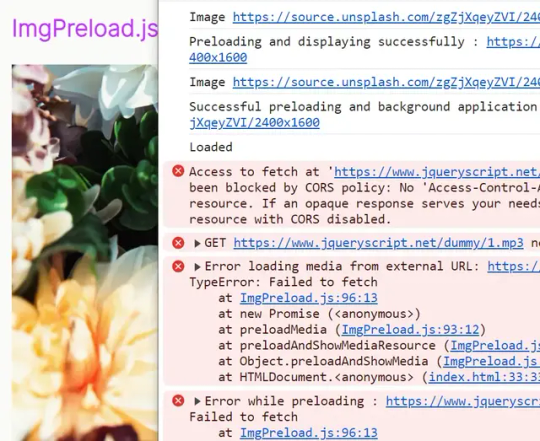
Asynchronous Media Preloading for Faster Webpages - ImgPreload.js
Images, audio, and video often represent large files that can delay page load if not handled efficiently. ImgPreload.js is a tiny yet robust JavaScript library that can reduce load times by preloading and displaying rich media content asynchronously, resulting in a smoother and more enjoyable user experience. How to use it: 1. Download and load the ImgPreload.js script in the document. <script…
View On WordPress
0 notes
Text
Unlock the Power of Email Marketing: Boost Your Online Business with a Targeted Subscriber List

Developing a solid email listing is an essential component in increasing your online service. This write-up will go over the importance of an e-mail listing and provide a step-by-step overview on how to develop one. For any kind of business whether offline or online you require consumers. It's a lot easier to obtain potential customers right into your online shop, or a company web site, by a number of various ways, online search engine web traffic, adverts of many kinds, or from web links on various other sites. It doesn't matter just how they arrived to begin with, as long as they purchase, you can record some information then and send them updates on your later offers or bargains. However, what concerns if these site visitors don't buy, just how do you bring them back again if you provide a better deal in the future, or have brand-new items they may want? An email listing is vital and very useful for on the internet organizations. It is important to gather e-mail addresses prior to visitors depart. The value of building a subscriber list is highlighted by popular on-line marketers. Although there might be some inaccuracies in the numbers stated concerning e-mail lists, I can confirm from my own experience that they are not too far off. Consequently, I will certainly state them right here. The worth of each client can vary from 50 cents to 1 buck per month, so the bigger your customer list, the more you can potentially make. However, it's important to note that having a huge listing doesn't always ensure success. The customers on your listing requirement to be targeted and interested in your product or service, otherwise, your initiatives may not produce the wanted results. Furthermore, it's been located that sending several e-mails to prospective customers can bring about raised sales, with some studies suggesting that over 50% of clients are most likely to purchase from a seller after receiving numerous emails. So now we understand the worth of having an email checklist, just how do we start to develop our own client base? The easiest approach is to utilize an on the internet "autoresponder" such as SendShark, which you can preload with messages all set to send out to anybody who joins. After that you will certainly require a means for your website visitors to register for your e-newsletter or sales letter collection, all great autoresponders will give you some html code ready to paste right into your webpages into which site visitors can place their name and email address as a minimum, and some will certainly allow you to include boxes for more information ought to you need it. Hang on a min, why would certainly they wish to sign up for your e-newsletter, or e-mail collection? You require to offer the site visitor a great factor to subscribe to your listing, nevertheless they possibly currently obtain enough emails from spam, close friends sending them the most recent joke, and other online services who have their address, so you need to sweeten the deal in their favour. One of the easiest methods to draw in customers is to supply a cost-free gift for subscribing. The present can be as easy as making the e-mails a course to instruct them something about the subject of your web site, a cost-free digital book (there are plenty readily available on a selection of subjects if you don't have one to distribute already, search in your favourite search engine) or you might offer competitors where subscribers can win one of your items. Whatever you do, attempt to make it an offer the site visitor will locate it difficult to deny, and they will subscribe to obtain it. So these are the factors to begin your own customer list, and a review of exactly how to start getting clients, yet what sort of emails should you send as your listing expands? If you're seeking to advise site visitors concerning your item(s) after they've left your site, consider sending them a series of interesting emails that include a subtle sales pitch. This strategy is much more effective than simply sending a reminder email with a web link back to your web sales page. Instead, supply valuable details that resolves the reasons people visited your site in the first place. You can even make use of articles from directory sites to produce interesting material for your e-newsletter, just make sure to follow the terms of use. When you've preloaded your autoresponder with insightful write-ups and advertising message, it can run automatically, saving you time and effort. Since you've learned the fundamentals of email customer lists for on-line companies, it's time to take action and begin constructing your very own list. The benefits of making use of e-mail e-newsletters to enhance your online business or web site gos to are clear, and with a little initiative, you can quickly start. While this short article has supplied an overview of the fundamentals, there's still plenty even more to discover staying clear of spam grievances and making best use of the performance of your e-mail campaigns. However don't let that stop you from taking the initial step - begin your very own e-mail customer list today and view your company prosper. To maximize the efficiency of your e-mail advertising and marketing campaign, it's essential to plainly show the code on your site and make it effortless for visitors to sign up for your e-mail listing. By doing so, you'll have the possibility to catch get in touch with details and potentially transform site visitors right into clients, also after they have actually left your site. So, just put the code in a visible spot and wait on clients to sign up. Video created with articlevideorobot.com Read the full article
0 notes
Text
Discover 15 CSS Perspective Examples

At CSS Monster, the realm of web design welcomes the captivating influence of Perspective Effects, bestowing depth and realism upon your projects and ushering in an immersive and engaging user experience. By skillfully manipulating the perspective of webpage elements, you conjure the illusion of three-dimensional space, breathing life into your designs. If your quest involves infusing perspective effects into your website, you've come to the right place! We've thoughtfully curated a collection of free HTML and pure CSS perspective code examples, sourced from reputable platforms like CodePen, GitHub, and other trusted resources. With our November 2022 update, we're thrilled to introduce five new additions, ready for seamless integration into your web projects. These code snippets have been chosen with care, highlighting a variety of perspective effects, allowing you to select the one that aligns with your design vision. Perspective effects prove versatile, embracing diverse elements on your website, from images and text to buttons and even entire sections. Their inclusion conjures a sensation of depth and motion, elevating your design's visual appeal and interactivity. Be it a portfolio website, an e-commerce platform, or a creative landing page, perspective effects lay the foundation for an unforgettable user experience. Beyond conventional perspective transformations, our collection delves into more creative and unique interpretations of perspective effects. Encounter code snippets that emulate 3D rotations, parallax scrolling, and interactive animations triggered by user interactions. These effects stand ready for customization, harmonizing with your website's branding and style, enabling you to craft a cohesive and visually stunning design. Perspective effects wield formidable influence in web design, and within our treasury of CSS perspective examples, you encounter a diverse array of options. Experiment with different angles, rotations, and animations to craft a design that commands attention and leaves an indelible mark on your users. So why hesitate? Immerse yourself in our collection and commence the journey of adding that extra dimension to your website today. Happy coding! Author Jhey July 20, 2022 Links Just Get The Demo Link How To Download - Article How To Download - Video Made with HTML / CSS About a code SIDE BY SIDE PERSPECTIVE LOADER Compatible browsers:Chrome, Edge, Firefox, Opera, Safari Responsive:yes Dependencies:- Author Alvaro Montoro October 27, 2021 Links Just Get The Demo Link How To Download - Article How To Download - Video Made with HTML / CSS About a code FILM Compatible browsers:Chrome, Edge, Firefox, Opera, Safari Responsive:yes Dependencies:- Author Fernando Cohen March 24, 2021 Links Just Get The Demo Link How To Download - Article How To Download - Video Made with HTML / CSS (SCSS) About a code 3D CSS PERSPECTIVE CARDS WITH DEPTH Compatible browsers:Chrome, Edge, Firefox, Opera, Safari Responsive:yes Dependencies:flexboxgrid.css Author Jon Kantner November 17, 2020 Links Just Get The Demo Link How To Download - Article How To Download - Video Made with HTML / CSS (Sass) About a code PERSPECTIVE SPHERE PRELOADER Compatible browsers:Chrome, Edge, Firefox, Opera, Safari Responsive:yes Dependencies:- Author CodyHouse November 12, 2020 Links Just Get The Demo Link How To Download - Article How To Download - Video Made with HTML / CSS About a code 3D PERSPECTIVE Compatible browsers:Chrome, Edge, Firefox, Opera, Safari Responsive:yes Dependencies:- Author Ryan Mulligan October 16, 2020 Links Just Get The Demo Link How To Download - Article How To Download - Video Made with HTML (Pug) / CSS About a code CSSOMETRIC Compatible browsers:Chrome, Edge, Firefox, Opera, Safari Responsive:no Dependencies:- Author Jon Kantner August 3, 2018 Links Just Get The Demo Link How To Download - Article How To Download - Video Made with HTML (Pug) / CSS About a code ISOMETRIC IPHONES Compatible browsers:Chrome, Edge, Firefox, Opera, Safari Responsive:yes Dependencies:- Author Henry Desroches September 28, 2017 Links Just Get The Demo Link How To Download - Article How To Download - Video Made with HTML (Pug) / CSS (SCSS) About a code PERSPECTIVE TILTY IMAGES Compatible browsers:Chrome, Edge, Firefox, Opera, Safari Responsive:no Dependencies:- Author Adriano Interaminense August 5, 2017 Links Just Get The Demo Link How To Download - Article How To Download - Video Made with HTML / CSS (SCSS) About a code CSS PERSPECTIVE Compatible browsers:Chrome, Edge, Firefox, Opera, Safari Responsive:no Dependencies:- Author Akhil Sai Ram December 24, 2016 Links Just Get The Demo Link How To Download - Article How To Download - Video Made with HTML / CSS About a code CSS 3D HOVER WORLD PLACES Compatible browsers:Chrome, Edge, Firefox, Opera, Safari Responsive:no Dependencies:- Author James Bosworth August 14, 2016 Links Just Get The Demo Link How To Download - Article How To Download - Video Made with HTML / CSS (SCSS) About a code CSS PERSPECTIVE TEXT HOVER Compatible browsers:Chrome, Edge, Firefox, Opera, Safari Responsive:no Dependencies:-

Author Alkshendra Maurya February 2, 2016 Links Just Get The Demo Link How To Download - Article How To Download - Video Made with HTML / CSS About a code CSS PERSPECTIVE EXAMPLE Compatible browsers:Chrome, Edge, Firefox, Opera, Safari Responsive:yes Dependencies:- Author Claudio Procida July 20, 2014 Links Just Get The Demo Link How To Download - Article How To Download - Video Made with HTML (Haml) / CSS (SCSS) About a code BUILDING A TRAPEZOID Compatible browsers:Chrome, Edge, Firefox, Opera, Safari Responsive:no Dependencies:- Author creotip July 9, 2014 Links Just Get The Demo Link How To Download - Article How To Download - Video Made with HTML / CSS About a code SIMPLE PERSPECTIVE PRELOADER Compatible browsers:Chrome, Edge, Firefox, Opera, Safari Responsive:no Dependencies:- Author Noah Blon July 1, 2014 Links Just Get The Demo Link How To Download - Article How To Download - Video Made with HTML / CSS About a code 3D CSS TYPOGRAPHY Compatible browsers:Chrome, Edge, Firefox, Opera, Safari Responsive:no Dependencies:- Read the full article
0 notes
Text
It's real! For those who are wondering why they don't see the news posted on the website right now, it's because you can only get unposted webpage entries through manually putting in its ID number in your address bar. They're preloaded pages scheduled to go live tomorrow. Here's my personal screenshot of it, and it's ID #705 while the latest posted is only #701. The 702-704 are GloMas next book announcement, maintenance announcement, and Shop Inventory Reset.
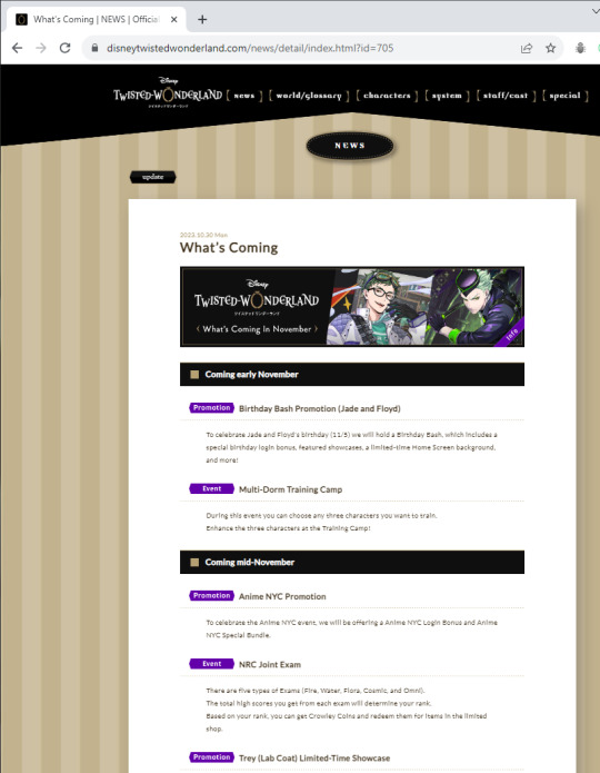

Twst Book 7 is coming in EN in November..! And from his Japanese title, Ruler of the Abyss, we got Lord of Malevolence instead. I personally think it lost a bit of depth because the original was both referring to him being the king of dark creatures and him caving in to despair, but Lord of Malevolence sounds more like Maleficent so it's great 👍
377 notes
·
View notes
Photo

easy way to set preloader in website Get Code on divinectorweb website
#CSS loader#how to set preloader#preloader in webpage#html css#javascript#webdesign#frontenddevelopment#learn to code#code#divinectorweb
0 notes
Text
Appify REVIEWS 2021 — ⚠️SCAM EXPOSED⚠️
APPIFY WHAT IS IT
Appify is the World’s First Future-Ready Mobile App Builder For Industry Domination Right Here Right Now. Stunning App Builder that build Unlimited Apps with Preloaded Templates and You will say thank you with huge Commission!
To Get these EXTRAS Bonuses CLICK HERE
If we think like users instead of marketers, we will come to the obvious conclusion that apps are what can save the day. If big brands & platforms have become entirely app-based… that says a lot about how people like to interact & buy online. Using the same formula for their small businesses & agencies can be a game-changer & introduce us to an unending stream of buyers. Hopping onto this trend can help make explosive profits. But Is It Really As Easy As It Sounds? Now You’ll Say, “Of Course The Big Brands Have Apps! They Can Afford It”. And they completely agree, friends.
It is common knowledge that apps aren’t easy to make. They require truckloads of: Time, Money, Skills. And as if that wasn’t enough, app store approvals & restrictions are a whole different level of tiring & cringe. They Wanted To Give You All The Chance To Succeed Using Apps Without Giving Away All. And Now, You Can Have It All. Here’s your chance to skip all the troubles surrounding app creation & have your own Gen-Z app instantly.
It gives you: The chance to create your high-converting app from scratch or an existing webpage; Lets you select templates from 500+ stunning choices; Gives you absolute control & power because now you can do everything with just a click of a button & no expertise; Create traffic magnetic web pages for you; Sets no restrictions on the number of apps & web pages; Helps you instantly publish them on IOS & Android. The best thing? You only have to pay once to create unlimited apps for yourself & for clients (Yes, you also get a free commercial license). Introducing Appify.
(AMAZING DISCOUNT) Get Appify For The Lowest Price Here

Create Your Own Next-Gen App In 3 Steps:
Step 1: Login & pick a done-for-you template to kickstart the process
Step 2: Personalize the app as per your needs & wants by simply dragging-and-dropping
Step 3: Instantly publish your app on IOS or Android in just one-click.
With free commercial license today, you can create & sell future-ready apps to clients. This means that you can save small businesses & marketers from vanishing during the pandemic while making a truckload of money. You’ve got absolutely no reason to contemplate. The more you wait, the more money you lose. Hit buy now to grab the opportunity to make huge profits & enjoy a beautiful tomorrow.
APPIFY FEATURES
Create Stunning PWA Ready Apps: With Appify, you can Create unlimited lightning-fast loading apps from scratch or your existing web pages
500+ High Converting DFY Templates: Pick from a range of 500+ mesmerising DFY app & web page templates that are sure to boost your sales
Web Page Builder: Access the in-built web page builder to explode your traffic
No Coding Required: Avoid paying huge amounts of money to coders using the one-click app & web page generator.
No Approvals Needed: Instantly share your app without waiting for app store approvals
Broadcast Push Notifications: Broadcast unlimited push notifications to prompt your audience to action
Works On IOS & Android: Make your brand accessible to all mobile users at once across Android & IOS
Compatible With WordPress: Enjoy great compatibility with WordPress for better results
No Limits: There is simply no limit on the number of webpages & apps you can create
Easy Installation: The installation is quicker than ever – you are only one click away
No Monthly Fee: You don’t have to pay platforms a huge monthly fee for restrictive & glitchy apps
Save Time & Energy: You get to save valuable time & energy while generating progressive apps that are designed to deliver
100% Cloud-Based: You can sleep well because their reliable cloud servers have you & your data covered
No Learning Curve: You don’t need any prior training or skills – profit as you are!
24/7 Support: Get support & training any time of the day or night!
Claim The 50% Off Available Only At the Appify Website Here

WHAT APPIFY CAN DO FOR YOU
App On-Demand: Getting the ‘best fitting’ App for you & your Client’s Business… Expose your Website, Business to Mobile Users with easy App. So, with Appify you can tap into millions of Mobile Visitors without doing any Hardwork.
Charge as You Wish: While most App creation portals want to subtly PUSH their user into monthly or yearly subscriptions with Appify they are granting access to all creatives for a super-low one-off friendly fee.
UNLIMITED Apps: With Appify users get unlimited access to create Apps which means you don’t need to fear how many times you need to create Apps to do a design for a client or your personal use.
Inbuilt Editor: With Super Power of Appify, you will get inbuilt App Editor to edit your favorite Apps in seconds. No Codding required.. No Developer Needed.
Unlimited Templates: They had Added more than 500+ Templates in the Appify and constantly adding new ones. You are going to get access to biggest template collection of Mobile App.
PWA+ other Ready Apps: Appify provides PWA Apps and you can also set push Notifications, IOS & Android ready Apps. You can also convert existing websites to App in just a click.
Access To Design Tools: Create Beautiful Apps using their inbuilt design tool. Even they had added amazing hosting feature to host all your Apps on fastest Servers.
===> (LIMITED STOCK) Click Here to Order Appify at a Special Discounted Price Today!
APPIFY FREQUENTLY ASKED QUESTIONS
What is unique about Appify? It is the World’s first mobile app builder for iOS/Android that allows you to create stunning PWA ready apps or turn your existing website into a lightning-fast future-ready mobile app in just 1 click. Simply pick one of our 500+ DFY templates & get started!
How can I use Appify? You can simply log into our cloud-based app from a web browser of your choice & begin creating. You can choose any device you like.
Is training & support included? Yes, you get access to step-by-step tutorials & 24*7 customer service.
Are there any restrictions? There are absolutely no restrictions. Create as many apps & webpages as you like, no stopping!
What is the monthly cost of Appify? It does not charge a monthly fee, unlike all other competitor platforms. Simply pay once and create limitlessly. You can pay much less during this special period offer.
Is it beginner-friendly? They pride themselves on the fact that Appify is so sophisticated yet incredibly easy to use. It is accessible to anyone & everyone.
#Appify#AppifyReview#AppifyPRice#AppifyOTO#AppifyDiscount#AppifyOfficial#AppifyDemo#AppifyBonuses#AppifyReviews
1 note
·
View note
Text
MeldaProduction is proud to announce availability of MDrumReplacer
MeldaProduction is proud to announce availability of MDrumReplacer

MeldaProduction is proud to announce availability of MDrumReplacer — an aptly-monikered drum replacement plug-in pairing the best drum-detecting algorithm on the market with perfectly-recorded multilayer samples as an easy-to-use tool to fix flaws, replacing weak- sounding snares, lousy kicks, and such like with a chosen multilayer sample in both single drum and mixed tracks in a matter of seconds
Appreciating advances inherent in MeldaProduction’s MDrumReplacer plug-in perhaps involves an appreciation of drum replacement itself. In modern music production parlance, drum replacement is the practice of an engineer or producer recording a live drummer and replacing (or adding to) the sound of a particular drum with a prerecorded sample — say, replacing all the recorded snare hits with the sound of a handclap. History has it that the technique was pioneered in the late Seventies by American engineer, inventor, and producer Roger Nichols (R.I.P.) while working with American rockers Steely Dan in the studio. Subsequently it became increasingly commonplace to replace every snare hit in a performance that may or may not sound subjectively ‘good’ with an ‘ideal’ snare drum hit, and has since grown in both popularity and complexity since computer-based technology took hold in music production — to the point where some suggest that the practice defeats the purpose of having a live drummer as opposed to a drum machine, making for an end result that is effectively exactly the same as what a drum machine would produce if equipped with a custom drum sample recorded especially for it. In reality, however, crafting more complexity in an increasingly automated world is not necessarily easy to achieve, but it does not have to be that way — which is exactly where MeldaProduction’s magical MDrumReplacer plug-in comes into play.
Putting it this way, MeldaProduction itself pulls no percussive punches when posing some hard-hitting questions with a semi-serious delivery: “Does your snare sound like a bird vomiting on a plastic table? Does your kick sound like a horse s**t falling on the ground? Then just replace them!” That, then, is MDrumReplacer’s raison d’être, effectively. After all, not every drum hit is perfect, not every drum take is flawless, and nor does every drum sound good. Get this, though: with MDrumReplacer no drum recording is gone for good necessarily. No matter if it was suffering from poorly-positioned microphones or the sound of the entire drum kit is, in retrospect, simply not up to scratch or even to taste, MDrumReplacer fixes flaws in a matter of seconds. But best of all, the recordings will still sound spectacularly live after applying MDrumReplacer’s magic, thanks to the plug-in pairing the best drum-detecting algorithm on the market with perfectly-recorded multilayer samples. MeldaProduction’s MDrumReplacer’s powerful drum-hit DETECTOR works with maximum precision, finding the hits to be replaced in both single instrument recordings and even mixed drum sessions with minimum user intervention. It is equipped with advanced analysis technology that thoroughly examines the audio material to identify the most prominent frequencies and sets the resonators accordingly, then users can audition just the filtered signal with the ‘listen’ feature so that they can easily adjust the filters to set them as precisely as possible. Ultimately, users can completely replace drum hits or get creatively effective by blending the original sound with the selected sample — enhancing kick drums with some added electronic flavour, for example. But better still, since MDrumReplacer basically includes MeldaProduction’s MDrumLeveler plug-in — itself marketed as the ultimate dynamics processing tool specifically designed for working with drums, MDrumReplacer need not necessarily only be used to replace ‘bad hits’ but also to iron out the drummer’s performance by simply letting the DETECTOR find an event and compute its correct level, with the requested DETECTOR GAIN then being applied to the event, so that the drummer sounds solid and firm-handed as a result.
It is simply a case of running the DETECTOR and speedily selecting a sample that best fits the track — from MeldaProduction’s massive multi-sample libraries (totalling over 80 GB), including the recently-released Drum Empire 2020, the latest in its lengthening line of free extension packs for its MDrummer virtual instrument plug-in, the most advanced drum machine and virtual drummer on the market — with which to replace the unwanted drum hits in most cases, however. Helpfully, MDrumReplacer uses the mighty MDrummer’s sound engine, enabling users to choose synthesized drums as well as top-quality drum multi-samples that respect the original drummer’s performance and feel, ensuring that it remains resolutely human and not robotic, though some imperfections can be fixed with the plug-in’s inbuilt drum LEVELING. Lending an air of further flexibility, MDrumReplacer’s presets are carefully stored in a system database and users can quickly access them from any project in any host, while the plug-in itself can automatically share users’ presets and also allows them to download other users’ presets from MeldaProduction’s servers. Turning to literally look at things from a visual viewpoint, it is well worth noting here that user interfaces need to be fast, simple to use, and easy on the eye. Everyone’s needs, of course, can be different, so flexibility is important. MeldaProduction’s MDrumReplacer meets those observations head on — as, indeed, do its many software siblings — with the most advanced GUI (Graphical User Interface) engine on the market, allowing users to choose colour and style to personalise what is also a freely- resizable plug-in, one which is accelerated by the host computer’s GPU (Graphics Processing Unit), making for lightening-fast graphics while freeing up extra power from the host computer’s CPU (Central Processing Unit) to focus on that all-important audio. Although current computers can clearly do their thing faster than ever before, algorithms are becoming more complex and projects bigger as a result, so processing power still needs to be used effectively. MeldaProduction’s MDrumReplacer uses the fastest algorithms, takes advantage of the newest processor capabilities, handles the graphics accordingly, and shares those resources with other MeldaProduction plug-ins. Indeed, it is amongst the fastest on the market, while providing the best possible audio quality using 64-bit audio processing to handle any sampling rate. Reality dictates that it does not make much sense to go over 192kHz, but if MDrumReplacer users think that it is a good idea to do so then the plug-in can do that.
MDrumReplacer makes for a creative user experience with an extensive feature set that is surely second to none, including a powerful MIDI (Musical Instrument Digital Interface) processor — listens to MIDI controllers and keyboards to allow realtime control of any parameters; multiple parameter control using a single so-called multiparameter — handy for automation or smartly morphing between banks of settings, for example; A to H slot switching — taking the A/B comparison concept to the next level by enabling users to access up to eight instances of the plug-in, copy and paste the slots, and freely switch between them, as well as allowing for morphing between the first four slots with an X-Y pad to find the perfect blend between four preloaded presets; and four fully-featured modulators that can control any set of parameters — including other modulators, to but scratch the surface of this deep diving-enabling plug-in par excellence.
MDrumReplacer makes for a compelling case for drum replacement that is light years beyond that which was first envisioned by Roger Nichols. Needless to say, anyone suffering from vomiting-sounding snares or horse s**t-sounding kicks knows where to turn! MeldaProduction’s MDrumReplacer is available to purchase — as an AAX-, AU-, VST-, and VST3-supporting plug-in for Mac (64-bit only) and Windows (32-bit and 64-bit) — at an introductory discounted price of €29.00 EUR (inc. VAT) until January 3, 2021 — rising thereafter to the regular price of€129.00 EUR (inc. VAT) — from its dedicated webpage, which also includes further information, here: https://www.meldaproduction.com/MDrumReplacer MDrumReplacer comes with a huge library of samples, multi-samples, rhythms, drum sets, loops, and other resources that are distributed for free via MeldaProduction’s MDrummer packs, including its latest Drum Empire 2020 addition available from here: https://www.meldaproduction.com/MDrummerDrumEmpire2020
Note that MDrummer Essentials (https://www.meldaproduction.com/MDrummerEssentials) is required for MDrumReplacer to work properly.
Watch MeldaProduction make a compelling case for drum replacement with its introductory video for MDrumReplacer here: https://youtu.be/o3CLjv3jYBc
youtube

#news#meldaproduction#vst#musicproduction#musicproducer#mixing#mixingengineer#sounddesign#sounddesigner
1 note
·
View note
Text
11 Simple (But Important) Things To Remember About WordPress Speed Optimisation🏆.
Are You Worried🙄 About Your Wordpress Websites Loading Speed ⏳?
Do you want to Improve Your Websites Speed 🚀? Then, This Post is Perfect for You...
Master WordPress Speed Optimisation In Just After Reading My Post😊!...
👋Hi, I'm Swapnil Sanghvi , this is a non-profitable post for me. That's a reason why you must Read My Post👍.
WITHOUT TIME WASTING, LET'S START...👇
✅Hosting Server
You should use good hosting provider for your website. The hosting server of any website is responsible for its loading speed. You target any one Specific country. So the data center of your hosting server should be of the same country. If you target more than one country, then the data center of your hosting server should be in your primary targeted country. If you don't have a budget So you do not need to buy a good hosting server by loaning.😁 I like Digital Ocean, A2hosting, Sitegroud, HostGator, Namecheap hosting provider.
✅Cloud Hosting
Instead of having all of your data on a single machine, cloud hosting spreads the data across a number of different machines, different servers in different places that are all connected together. Targeting more than one country, cloud hosting will be very beneficial for you.
✅CDN
CDN is short for content delivery network. A content delivery network is a system of distributed servers (network) that deliver pages and other web content to a user, based on the geographic locations of the user, the origin of the webpage and the content delivery server. Cloudflare (free) and StackPath (paid) are my favorite and Best cdn providers.
✅Themes
Choosing the right theme for a website is very important from user experience, website speed optimization and SEO's point of views. A perfect theme is that theme:- Which is lite weight, mobile and user friendly. There are some themes that follow all these things. Genesis child theme, generatepress and astra pro.
✅Cache
Cache is a collection of temporarily stored data for quick access upon request. In computers, information is usually stored on hard disk. When it is requested, a computer needs to run several processes before the information can be presented. Caching solves this issue by processing the frequently requested information and then storing it in a temporary storage or memory. This allows computers to access it the file quickly. The same caching concept can also be used by WordPress websites to improve performance and make your website load faster. From my experience this one is best plugin for website caching. Wp Fastest Cache (free+premium) Wp Total Cache (free+premium) Wp Rocket (Free+Premium) Some hosting providers provide website caching service with their plan. Site ground, Hostgator and Blue host...
✅Minify Html, Css, JavaScript
In computer science, minification is the process of removing unnecessary elements and rewriting code to reduce file size. It is commonly done to web page resources, such as HTML, CSS, and JavaScript files Best Wordpress Plugin For Minify Html, Css and Javascript:- Autoptimize (Free) Wp Fastest Cache (free+premium) Wp Rocket (free + premium)
✅GZip Compression
GZip is a form of data compression -- ie it takes a chunk of data and makes it smaller. The original data can be restored by un-zipping the compressed file. You can enable Gzip compression with two ways. 1st is adding some code in .httacess file It's risky. It can take down your site. This way is not for non-technical people. You can enable Gzip compression through Plugin. Best Plugin for Gzip Compression:- Wp Fastest Cache (Free+Premium) Wp Rocket (Free+Premium)
✅ Image Optimization
Image optimization is about reducing the file size of your images as much as possible without sacrificing quality so that your page load times remain low. Best WordPress Plugin for Image Optimisation:- Smush Imagify ewww image optimizer Website:- compresspng. com
✅Lazy Load
websites asynchronously — that is, after the above-the-fold content is fully loaded, or even conditionally, only when they appear in the browser's viewport. This means that if users don't scroll all the way down, imagesplaced at the bottom of the page won't even beloaded. Best Wordpress Plugin for Lazy Load:- Unveil Lazy Load Wp Rocket
✅Post Revision Control
Post revisions is a WordPress feature that allows you to undo changes and go back to an earlier version of your posts and pages. For each draft you are working on, WordPress automatically saves a temporary revision. This type of revision is called auto-save. The easiest way to manage WordPress post, Pages, Custom Css revisions is by using a plugin. This allows you to control revisions from the WordPress admin area. Best Plugin for Post Revision Optimisation:- Revision Control You Can Optimised Database from Wp Rocket(Free+Paid)
✅Render Blocking Issue
The most common render-blocking resources are JavaScript and CSS files that are located in the head of your web page. They load in above the fold area (or the area that you usually see on a website before scrolling down to see the rest of the content) and are a part of the critical rendering path used by a web browser.
This one option is easy to understand for a technical person. You can leave this issue😁.
You can find render-blocking issue resource from google page speed insights and fixed them through W3 Total Cache Plugin.
Plugin for fixing Render Blocking issue:- W3 Total Cache.
Wp Rocket Pro🏆 is only one of the best single plugin, which is providing a lot of features 😀... ✔ PAGE CACHING CACHE ✔PRELOADING SITEMAP ✔PRELOADING, ✔GZIP COMPRESSION ✔BROWSER CACHING DATABASE ✔OPTIMIZATION GOOGLE FONTS ✔ OPTIMIZATION REMOVE QUERY STRINGS FROM STATIC RESOURCES, ✔LAZY LOADING ✔MINIFICATION AND CONCATENATION ✔DEFER JS LOADING ✔CLOUDFLARE COMPATIBILITY ✔CDNDNS PREFETCHING MOBILE ✔DETECTION MULTISITE ✔COMPATIBILITY ECOMMERCE FRIENDLY ✔(WOOCOMMERCE)MULTILINGUAL ✔COMPATIBILITY IMPORT/EXPORT, ✔DEVELOPER FRIENDLY.
Wait🙈 , where are you going🙄.
I don't use Wp Rocket Pro Plugin for my blog speed optimization.
Do you want to know which plugin I used for my website speed optimization?😅 Tell me Comments👇... #swapnilsanghvi #wordpressspeedoptimisation #blogging
1 note
·
View note